
Mastering CSS3
251
Transcript of Mastering CSS3

Imprint
Copyright 2012 Smashing Media GmbH, Freiburg, Germany
Version 1: June 2012
ISBN: 978-3-943075-27-4
Cover Design: Ricardo Gimenes
PR & Press: Stephan Poppe
eBook Strategy: Thomas Burkert
Technical Editing: Talita Telma Stöckle, Andrew Rogerson
Idea & Concept: Smashing Media GmbH
Smashing eBook #19│Mastering CSS3│ 2
ABOUT SMASHING MAGAZINE
Smashing Magazine is an online magazine dedicated to Web designers and developers worldwide. Its rigorous quality control and thorough editorial work has gathered a devoted community exceeding half a million subscribers, followers and fans. Each and every published article is carefully prepared, edited, reviewed and curated according to the high quality standards set in Smashing Magazine's own publishing policy. Smashing Magazine publishes articles on a daily basis with topics ranging from business, visual design, typography, front-end as well as back-end development, all the way to usability and user experience design. The magazine is — and always has been — a professional and independent online publication neither controlled nor influenced by any third parties, delivering content in the best interest of its readers. These guidelines are continually revised and updated to assure that the quality of the published content is never compromised.
ABOUT SMASHING MEDIA GMBH
Smashing Media GmbH is one of the world's leading online publishing companies in the field of Web design. Founded in 2009 by Sven Lennartz and Vitaly Friedman, the company's headquarters is situated in southern Germany, in the sunny city of Freiburg im Breisgau. Smashing Media's lead publication, Smashing Magazine, has gained worldwide attention since its emergence back in 2006, and is supported by the vast, global Smashing community and readership. Smashing Magazine had proven to be a trustworthy online source containing high quality articles on progressive design and coding techniques as well as recent developments in the Web design industry.
Smashing eBook #19│Mastering CSS3│ 3
About this eBookNew possible uses of CSS appear every day, and you shouldn’t miss any of them. This eBook Mastering CSS3 brings together tips on the newest approaches to CSS, such as CSS animation guidelines, CSS grid frameworks and modern techniques for constructing page layouts, among others. Also, you will get guidelines on how to use CSS in email newsletters and how to code email designs with improved readability and usability for the Web, mobile and email desktop.
Table of ContentsCSS3 vs. CSS: A Speed Benchmark
Why We Should Start Using CSS3 And HTML5 Today
Connecting The Dots With CSS3
An Introduction To CSS3 Keyframe Animations
The New Hotness: Using CSS3 Visual Effects
Adventures In The Third Dimension: CSS 3D Transforms
How To Use CSS3 Pseudo-Classes
CSS3 Flexible Box Layout Explained
The Guide To CSS Animation: Principles And Examples
Beercamp: An Experiment With CSS 3D
Using CSS3: Older Browsers And Common Considerations
About The Authors
Smashing eBook #19│Mastering CSS3│ 4
CSS3 vs. CSS: A Speed BenchmarkTrent Walton
I believe in the power, speed and “update-ability” of CSS3. Not having to load background images as structural enhancements (such as PNGs for rounded corners and gradients) can save time in production (i.e. billable hours) and loading (i.e. page speed). At our company, we’ve happily been using CSS3 on client websites for over a year now, and I find that implementing many of these properties right now is the most sensible way to build websites.
Until today, all of that was based on an assumption: that I can produce a pixel-perfect Web page with CSS3 quicker than I can with older image-based CSS methods, and that the CSS3 page will load faster, with a smaller overall file size and fewer HTTP requests. As a single use case experiment, I decided to design and code a Web page and add visual enhancements twice: once with CSS3, and a second time using background images sliced directly from the PSD. I timed myself each round that I added the enhancements, and when finished, I used Pingdom to measure the loading times.
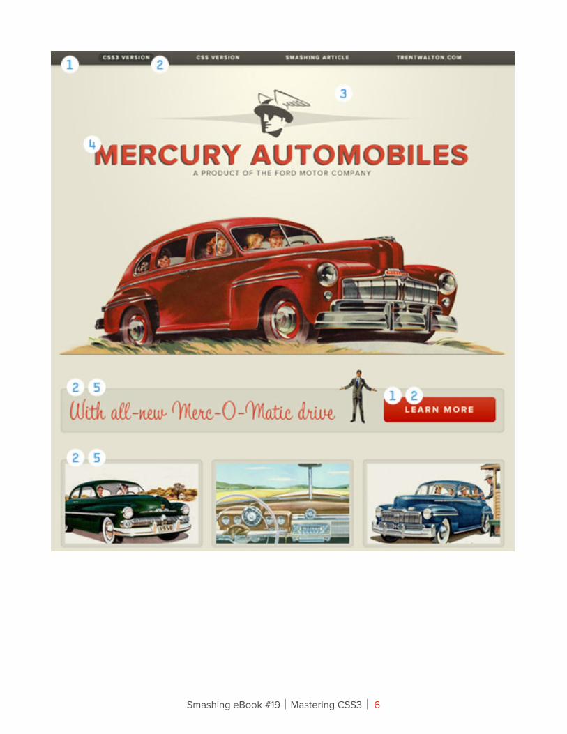
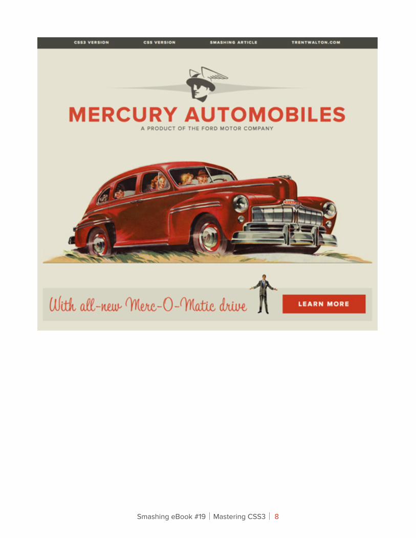
Here’s a fictitious Web page for Mercury Automobiles that might have been online had the Interweb existed back in the 1950s. The page was designed to showcase specific widely compliant CSS3 properties that in the past would have had to be achieved using background images.
Smashing eBook #19│Mastering CSS3│ 5
Smashing eBook #19│Mastering CSS3│ 6
Above is a diagram that breaks down where I applied visual enhancements first with CSS3, and then with CSS background images (i.e. the image-based approach):
1. linear-gradient
2. border-radius
3. radial-gradient
4. text-shadow
5. box-shadow with RGBa
!e Experiment ProcessDay 1I coded the HTML and CSS from a structural standpoint. That means no rounded corners, no shadows, no gradients and no images aside from logos and car photographs. I decided to include Web fonts at this phase because I wanted to focus on stuff that could also be done with the Web-safe font of your choice (Helvetica, Georgia, etc.). Furthermore, @font-face was around long before CSS3.
Smashing eBook #19│Mastering CSS3│ 7
Smashing eBook #19│Mastering CSS3│ 8
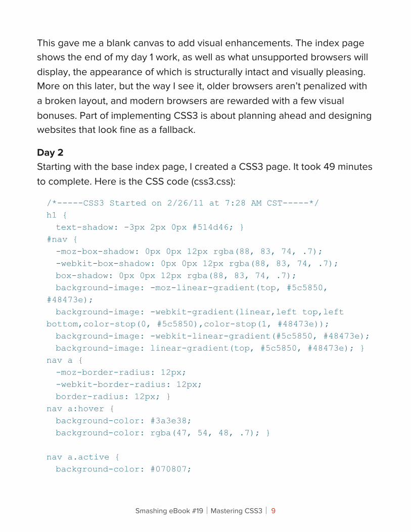
This gave me a blank canvas to add visual enhancements. The index page shows the end of my day 1 work, as well as what unsupported browsers will display, the appearance of which is structurally intact and visually pleasing. More on this later, but the way I see it, older browsers aren’t penalized with a broken layout, and modern browsers are rewarded with a few visual bonuses. Part of implementing CSS3 is about planning ahead and designing websites that look fine as a fallback.
Day 2Starting with the base index page, I created a CSS3 page. It took 49 minutes to complete. Here is the CSS code (css3.css):
/*-----CSS3 Started on 2/26/11 at 7:28 AM CST-----*/h1 { text-shadow: -3px 2px 0px #514d46; }#nav { -moz-box-shadow: 0px 0px 12px rgba(88, 83, 74, .7); -webkit-box-shadow: 0px 0px 12px rgba(88, 83, 74, .7); box-shadow: 0px 0px 12px rgba(88, 83, 74, .7); background-image: -moz-linear-gradient(top, #5c5850, #48473e); background-image: -webkit-gradient(linear,left top,left bottom,color-stop(0, #5c5850),color-stop(1, #48473e)); background-image: -webkit-linear-gradient(#5c5850, #48473e); background-image: linear-gradient(top, #5c5850, #48473e); }nav a { -moz-border-radius: 12px; -webkit-border-radius: 12px; border-radius: 12px; }nav a:hover { background-color: #3a3e38; background-color: rgba(47, 54, 48, .7); } nav a.active { background-color: #070807;
Smashing eBook #19│Mastering CSS3│ 9
background-color: rgba(7, 8, 7, .7); }body { background-image: -webkit-gradient(radial, 50% 10%, 0, 50% 10%, 500, from(#FBF8E3), to(#E6E3D0)); background-image: -moz-radial-gradient(50% 10%, farthest-side, #FBF8E3, #E6E3D0); }#learn_more, #details img { -moz-border-radius: 8px; -webkit-border-radius: 8px; border-radius: 8px; -webkit-box-shadow: inset 0px 0px 8px rgba(88, 83, 74, .2); -moz-box-shadow: inset 1px 0px 1px rgba(88, 83, 74, .2); box-shadow: inset 0px 0px 1px rgba(88, 83, 74, .2); }#learn_more a { -moz-border-radius: 8px; -webkit-border-radius: 8px; border-radius: 8px; background-color: #cc3b23; background-image: -moz-linear-gradient(top, #cc3b23, #c00b00); background-image: -webkit-gradient(linear,left top,left bottom,color-stop(0, #cc3b23),color-stop(1, #c00b00)); background-image: -webkit-linear-gradient(#cc3b23, #c00b00); background-image: linear-gradient(top, #cc3b23, #c00b00); }a { -moz-transition: all 0.3s ease-in; -o-transition: all 0.3s ease-in; -webkit-transition: all 0.3s ease-in; transition: all 0.3s ease-in; } /*-----CSS3 Finished on 2/26/11 at 8:17 AM CST (49 minutes) -----*/
Smashing eBook #19│Mastering CSS3│ 10
Day 3I added visual enhancements by slicing and CSS’ing background images directly from the PSD. Even though there is less code, all of the extra app-switching and image-slicing added up to a total of 73 minutes to complete. Check out the page for the CSS image-based approach. Here’s the code (css.css):
/*-----CSS (the image-based approach) Started on 2/27/11 at 12:42 PM CST-----*/#header { background: url(../img/navbg.png) left top repeat-x; }body { background: #e6e3d0 url(../img/radial_gradient.jpg) no-repeat center top; }#nav { background-color: transparent; }h1 { background: url(../img/mercuryautomobiles.png) no-repeat center center;text-indent: -9999px; }#learn_more { background-image: url(../img/learn_morebg.jpg);}#details img { background-image: url(../img/detailsbg.jpg);}#learn_more a { background: url(../img/learn_more_abg.jpg) no-repeat;}.css3 { background: url(../img/css3_hover.png) no-repeat center top; }.smashing { background: url(../img/smashing_hover.png) no-repeat center top; }.trent { background: url(../img/trentwalton_hover.png) no-repeat center top;}.css3:hover {
Smashing eBook #19│Mastering CSS3│ 11
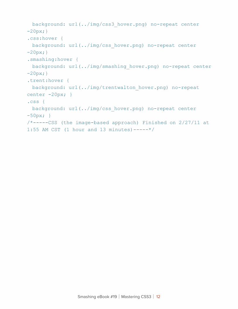
background: url(../img/css3_hover.png) no-repeat center -20px;}.css:hover { background: url(../img/css_hover.png) no-repeat center -20px;}.smashing:hover { background: url(../img/smashing_hover.png) no-repeat center -20px;}.trent:hover { background: url(../img/trentwalton_hover.png) no-repeat center -20px; }.css { background: url(../img/css_hover.png) no-repeat center -50px; }/*-----CSS (the image-based approach) Finished on 2/27/11 at 1:55 AM CST (1 hour and 13 minutes)-----*/
Smashing eBook #19│Mastering CSS3│ 12
Production Time ResultsSo, we’re looking at a 24-minute difference: 49 minutes to add visual enhancements with CSS3, and 73 minutes to do it with images. For me, CSS3 was not only quicker but far more enjoyable, because I was focused on only one window (my CSS editor), unless I opted to pull some of the code from CSS3 Please. On the other hand, slicing images and switching from Photoshop to FTP to the CSS editor and back again was a hassle, and it did take longer.
It’s also worth noting that I did my best to stack the deck against CSS3. I coded it first so that any initial hashing out would be done before heading into day 3. Also, the images I did slice are as optimized as I could reasonably make them: one-pixel repeating slivers, and medium-resolution image exports. Overall, 24 minutes may not seem like a lot of time, but this is a fairly simple page. Imagine how much time (and money) could be saved over the course of a year.
What? Still not convinced?…
File Size And Loading Time ResultsI took both of my pages over to Pingdom Tools to compare file size and loading times.
Smashing eBook #19│Mastering CSS3│ 13
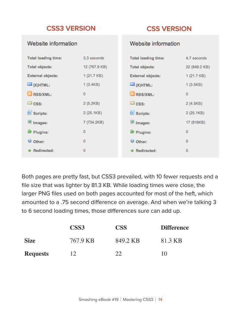
Both pages are pretty fast, but CSS3 prevailed, with 10 fewer requests and a file size that was lighter by 81.3 KB. While loading times were close, the larger PNG files used on both pages accounted for most of the heft, which amounted to a .75 second difference on average. And when we’re talking 3 to 6 second loading times, those differences sure can add up.
CSS3 CSS Difference
Size 767.9 KB 849.2 KB 81.3 KB
Requests 12 22 10
Smashing eBook #19│Mastering CSS3│ 14
For argument’s sake, I created yet another version of the image-based CSS version, with a sprite containing all four images used in the original version, and then I measured loading times. This CSS Sprited version did improve things, taking HTTP requests from 22 to 19 and the overall size from 849.2 KB down to 846.7 KB. The way I see it, these differences are minimal and would have added to the development time, so it’s all relative.
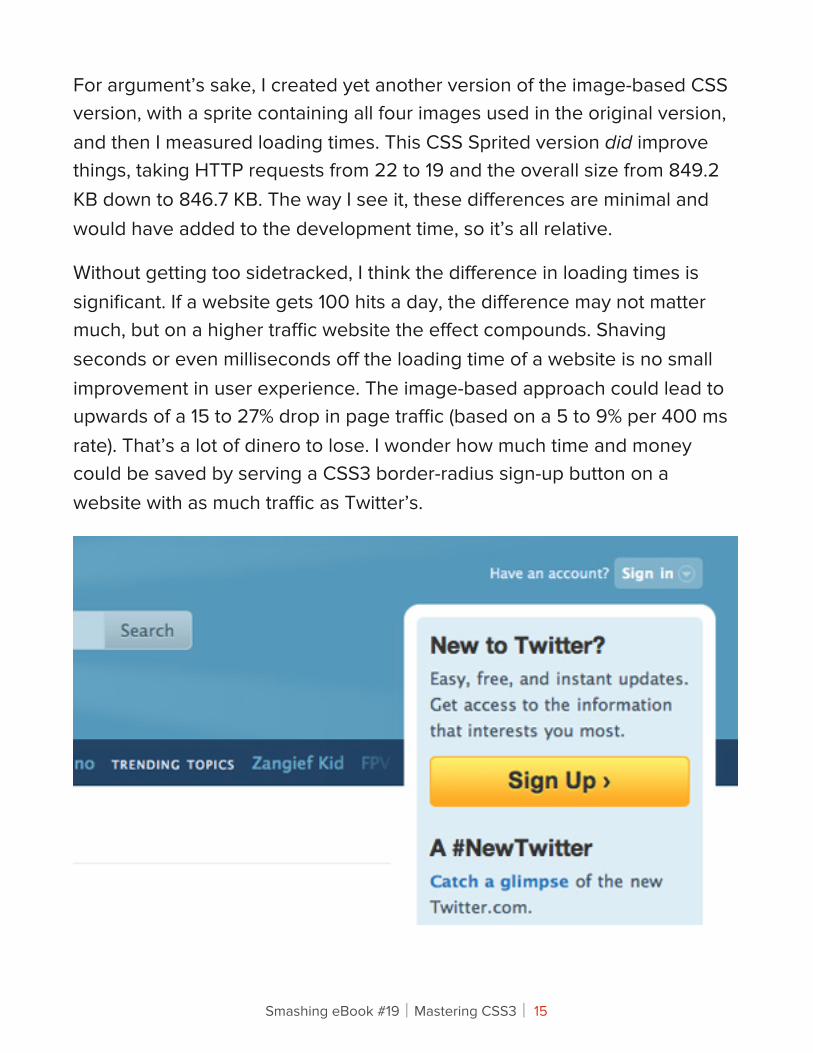
Without getting too sidetracked, I think the difference in loading times is significant. If a website gets 100 hits a day, the difference may not matter much, but on a higher traffic website the effect compounds. Shaving seconds or even milliseconds off the loading time of a website is no small improvement in user experience. The image-based approach could lead to upwards of a 15 to 27% drop in page traffic (based on a 5 to 9% per 400 ms rate). That’s a lot of dinero to lose. I wonder how much time and money could be saved by serving a CSS3 border-radius sign-up button on a website with as much traffic as Twitter’s.
Smashing eBook #19│Mastering CSS3│ 15
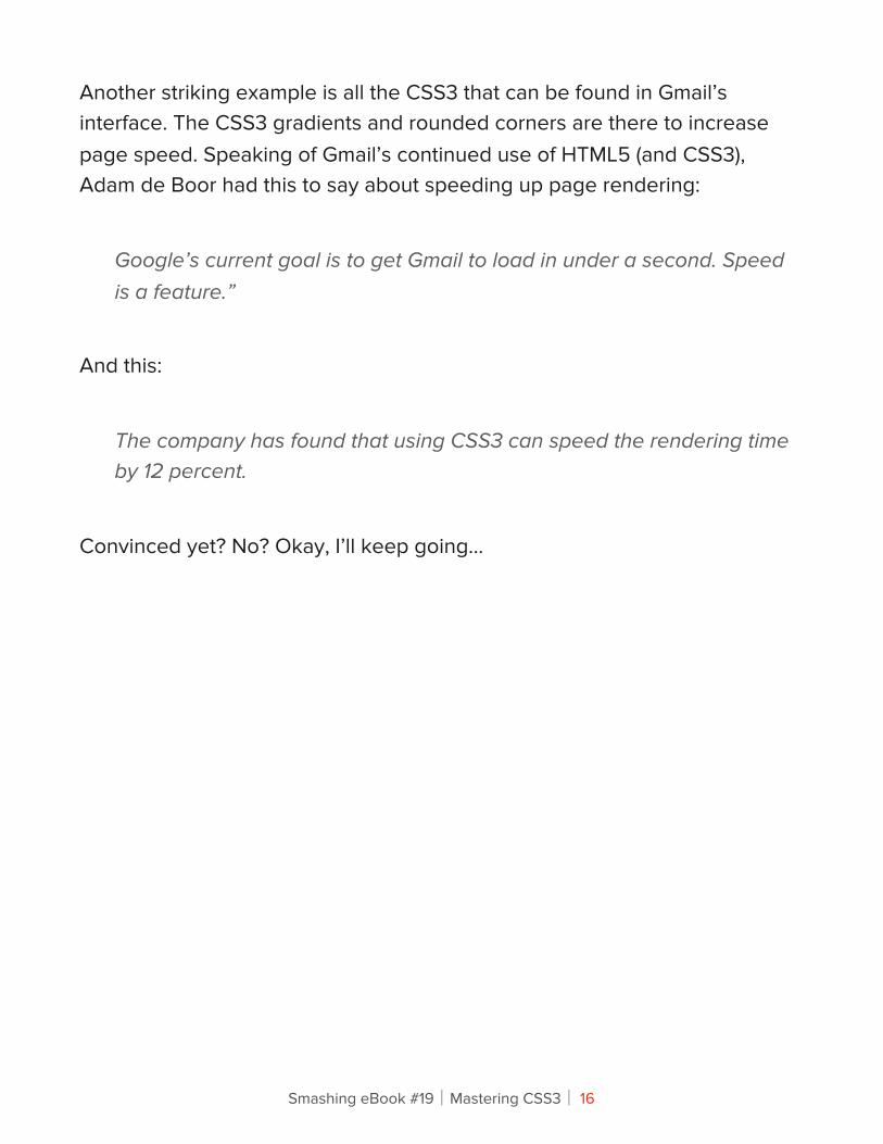
Another striking example is all the CSS3 that can be found in Gmail’s interface. The CSS3 gradients and rounded corners are there to increase page speed. Speaking of Gmail’s continued use of HTML5 (and CSS3), Adam de Boor had this to say about speeding up page rendering:
Google’s current goal is to get Gmail to load in under a second. Speed is a feature.”
And this:
The company has found that using CSS3 can speed the rendering time by 12 percent.
Convinced yet? No? Okay, I’ll keep going…
Smashing eBook #19│Mastering CSS3│ 16
!inking About !e Future
WEBSITE UPDATES: THE EASY WAY AND THE HARD WAY
CSS3 really pays off when it comes to making updates and future-proofing Web pages from a maintenance perspective. Looking at the Mercury Automobiles website, think about what would have to go into changing the height of the three-column car images or the width of the bubble hover states for the navigation. For the sake of a quick production, I sliced these images to match precisely. One option would be to open Photoshop, rebuild and resize the images, update the appropriate CSS properties, and upload. Another would be to plan ahead and slice “telescoping” images, making one end a short rounded corner cap and another longer image on the opposite end that slides to fill the interior space. You’ve probably seen and done this before:
<div class="border_box_top"></div><div class="border_box_bottom"> <img src="your_content_here.jpg" /></div>
Smashing eBook #19│Mastering CSS3│ 17
This isn’t ideal. While the technique comes in handy in a variety of instances, adding extra HTML just to achieve a rounded corner doesn’t seem efficient or sensible.
WHAT IF YOU WANT TO GO RESPONSIVE?
Serving different-sized images and changing the font size to suit a particular screen resolution simply couldn’t happen without CSS3. It’s wonderful how all of these new properties work together and complement each other. Imagine how time-consuming it would be to res-lice background images to accommodate varying image and font sizes that display at different screen resolutions. Yuk.
!e Take-AwayFor me, this simply proves what I’ve known all along: CSS3 pays off when it comes to production, maintenance and load times. Let’s revisit the numbers once more…
Smashing eBook #19│Mastering CSS3│ 18
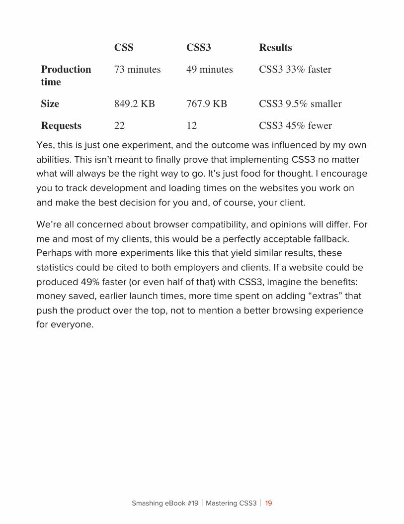
CSS CSS3 Results
Production time
73 minutes 49 minutes CSS3 33% faster
Size 849.2 KB 767.9 KB CSS3 9.5% smaller
Requests 22 12 CSS3 45% fewer
Yes, this is just one experiment, and the outcome was influenced by my own abilities. This isn’t meant to finally prove that implementing CSS3 no matter what will always be the right way to go. It’s just food for thought. I encourage you to track development and loading times on the websites you work on and make the best decision for you and, of course, your client.
We’re all concerned about browser compatibility, and opinions will differ. For me and most of my clients, this would be a perfectly acceptable fallback. Perhaps with more experiments like this that yield similar results, these statistics could be cited to both employers and clients. If a website could be produced 49% faster (or even half of that) with CSS3, imagine the benefits: money saved, earlier launch times, more time spent on adding “extras” that push the product over the top, not to mention a better browsing experience for everyone.
Smashing eBook #19│Mastering CSS3│ 19
Why We Should Start Using CSS3 And HTML5 Today Vitaly Friedman
For a while now, here on Smashing Magazine, we have taken notice of how many designers are reluctant to embrace the new technologies such as CSS3 or HTML5 because of the lack of full cross-browser support for these technologies. Many designers are complaining about the numerous ways how the lack of cross-browser compatibility is effectively holding us back and tying our hands — keeping us from completely being able to shine and show off the full scope of our abilities in our work. Many are holding on to the notion that once this push is made, we will wake to a whole new Web — full of exciting opportunities just waiting on the other side. So they wait for this day. When in reality, they are effectively waiting for Godot.
Just like the elusive character from Beckett’s classic play, this day of full cross-browser support is not ever truly going to find its dawn and deliver us this wonderful new Web where our work looks the same within the window of any and every Web browser. Which means that many of us in the online reaches, from clients to designers to developers and on, are going to need to adjust our thinking so that we can realistically approach the Web as it is now, and more than likely how it will be in the future.
Sometimes it feels that we are hiding behind the lack of cross-browser compatibility to avoid learning new techniques that would actually dramatically improve our workflow. And that’s just wrong. Without an adjustment, we will continue to undersell the Web we have, and the
Smashing eBook #19│Mastering CSS3│ 20
landscape will remain unexcitingly stale and bound by this underestimation and mindset.
Adjustment in ProgressSorry if any bubbles are bursting here, but we have to wake up to the fact that full cross-browser support of new technologies is just not going to happen. Some users will still use older browsers and some users will still have browsers with deactivated JavaScript or images; some users will be having weird view port sizes and some will not have certain plugins installed.
But that’s OK, really.
The Web is a damn flexible medium, and rightly so. We should embrace its flexibility rather than trying to set boundaries for the available technologies in our mindset and in our designs. The earlier we start designing with the new technologies, the quicker their wide adoption will progress and the quicker we will get by the incompatibility caused by legacy browsers. More and more users are using more advanced browsers every single day, and by using new technologies, we actually encourage them to switch (if they can). Some users will not be able to upgrade, which is why our designs should have a basic fallback for older browsers, but it can’t be the reason to design only the fallback version and call it a night.
Smashing eBook #19│Mastering CSS3│ 21
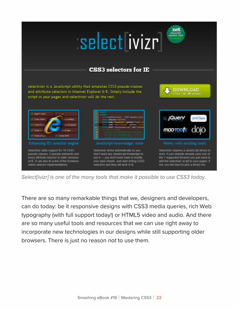
Select[ivizr] is one of the many tools that make it possible to use CSS3 today.
There are so many remarkable things that we, designers and developers, can do today: be it responsive designs with CSS3 media queries, rich Web typography (with full support today!) or HTML5 video and audio. And there are so many useful tools and resources that we can use right away to incorporate new technologies in our designs while still supporting older browsers. There is just no reason not to use them.
Smashing eBook #19│Mastering CSS3│ 22
We are the ones who can push the cross-browser support of these new technologies, encouraging and demanding the new features in future browsers. We have this power, and passing on it just because we don’t feel like there is no full support of them yet, should not be an option. We need to realize that we are the ones putting the wheels in motion and it’s up to us to decide what will be supported in the future browsers and what will not.
More exciting things will be coming in the future. We should design for the future and we should design for today — making sure that our progressive designs work well in modern browsers and work fine in older browsers. The crucial mistake would be clinging to the past, trying to work with the old nasty hacks and workarounds that will become obsolete very soon.
We can continue to cling to this notion and wait for older browsers to become outdated, thereby selling ourselves and our potential short, or we can adjust our way of thinking about this and come at the Web from a whole new perspective. One where we understand the truth of the situation we are faced with. That our designs are not going to look the same in every browser and our code will not render the same in every browser. And that’s the bottom line.
Smashing eBook #19│Mastering CSS3│ 23
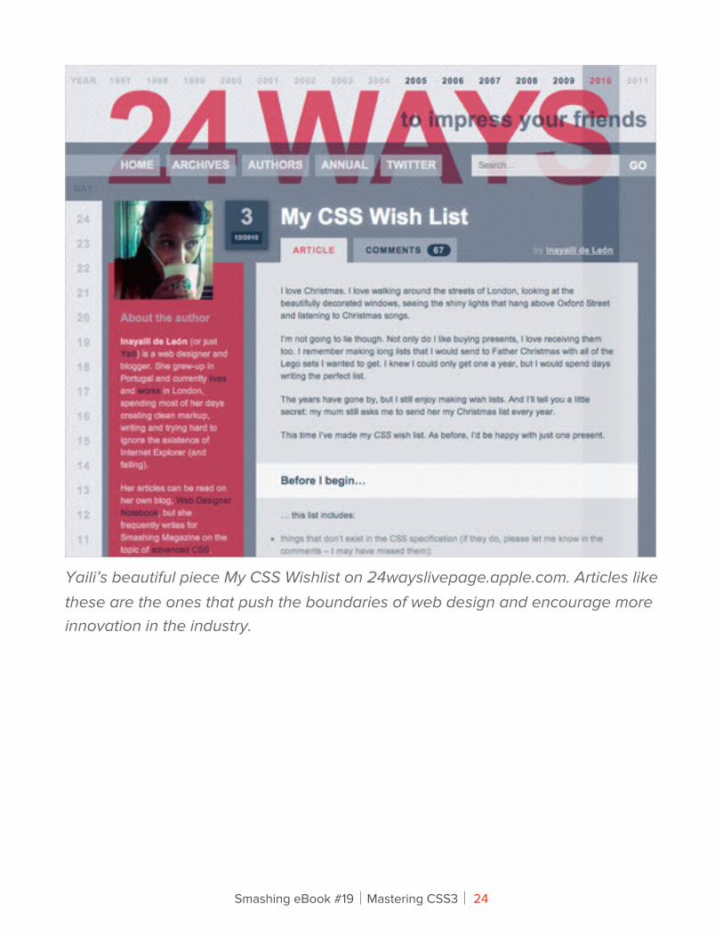
Yaili’s beautiful piece My CSS Wishlist on 24wayslivepage.apple.com. Articles like these are the ones that push the boundaries of web design and encourage more innovation in the industry.
Smashing eBook #19│Mastering CSS3│ 24
Andy Clarke spoke about this at the DIBI Conference earlier this year (you can check his presentation Hardboiled Web Design on Vimeo). He really struck a nerve with his presentation, yet still we find so many stalling in this dream of complete Web standardization. So we wanted to address this issue here and keep this important idea being discussed and circulated. Because this waiting is not only hurting those of us working with the Web, but all of those who use the Web as well. Mainly through this plethora of untapped potential which could improve the overall experience across the spectrum for businesses, users and those with the skills to bring this sophisticated, rich, powerful new Web into existence.
FOR OUR CLIENTS
Now this will mean different things for different players in the game. For example, for our clients this means a much more developed and uniquely crafted design that is not bound by the boxes we have allowed our thinking to be contained in. However, this does come with a bit of a compromise that is expected on the parts of our clients as well. At least it does for this to work in the balanced and idealized way these things should play out. But this should be expected. Most change does not come without its compromises.
In this case, our clients have to accept the same truism that we do and concede that their projects will not look the same across various browsers. This is getting easier to convince them of in these times of the expanding mobile market, but they may still not be ready to concede this inch on the desktop side of the coin. Prices might be adjusted in some cases too, and that may be another area that the clients are not willing to accept. But with new doors being opened and more innovation, comes more time and dedicated efforts. These are a few of the implications for our clients, though the expanded innovation is where we should help them focus.
Smashing eBook #19│Mastering CSS3│ 25
In short:
• Conceding to the idea that the project will not be able to look the same across various browsers,
• This means more developed and unfettered imaginative designs for our clients,
• This could lead to increased costs for clients as well, but with higher levels of innovation and
• Client’s visions for what they want will be less hindered by these limitations.
FOR THE USERS
The users are the ones who have the least amount invested in most of what is going on behind the scenes. They only see the end result, and they often do not think too much about the process that is involved which brings it to the screens before them. Again, with the mobile market, they have already come across the concept of varying interfaces throughout their varied devices. They only care about the functionality and most probably the style that appeals to them — but this is where their interest tends to end. Unless of course, they too are within the industry, and they may give it a second thought or more. So all this talk of cross-browser compatibility really doesn’t concern them, they really leave all that up to us to worry about.
Smashing eBook #19│Mastering CSS3│ 26
Users only ever tend to notice anything if and when something does not work the way they expect it to from one place to the next. In most cases, they are willing to show something to a relative, friend or colleague, and suddenly from one device to the next, something is different that disrupts their ability to do so. That is when they actually take notice. But if we have done our jobs correctly, these transitions will remain smooth — even with the pushing of the envelopes that we are doing. So there is not much more that is going to change for the users other than a better experience. Average user is not going to check if a given site has the same rounded corners and drop-shadow in two different browsers installed on the user’s machine.
In short:
• Potentially less disruptions of experience from one device to another and
• An overall improved user experience.
FOR DESIGNERS/DEVELOPERS
We, the designers and developers of the Web, too have to make the same concession our clients do and surrender the effort to craft the same exact presentation and experience across the vast spectrum of platforms and devices. This is not an easy idea to give up for a lot of those playing in these fields, but as has been already mentioned, we are allowing so much potential to be wasted. We could be taking the Web to new heights, but we allow ourselves to get hung up on who gets left behind in the process — and as a result we all end up getting left behind. Rather than viewing them as separate audiences and approaching them individually, so to speak, we allow the limitations of one group to limit us all.
Smashing eBook #19│Mastering CSS3│ 27
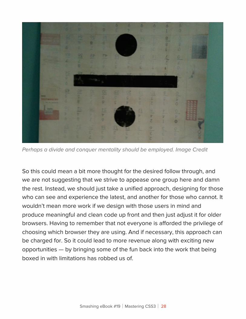
Perhaps a divide and conquer mentality should be employed. Image Credit
So this could mean a bit more thought for the desired follow through, and we are not suggesting that we strive to appease one group here and damn the rest. Instead, we should just take a unified approach, designing for those who can see and experience the latest, and another for those who cannot. It wouldn’t mean more work if we design with those users in mind and produce meaningful and clean code up front and then just adjust it for older browsers. Having to remember that not everyone is afforded the privilege of choosing which browser they are using. And if necessary, this approach can be charged for. So it could lead to more revenue along with exciting new opportunities — by bringing some of the fun back into the work that being boxed in with limitations has robbed us of.
Smashing eBook #19│Mastering CSS3│ 28
In short:
• Conceding to the idea that the project will not be able to look the same across various browsers,
• A more open playing field for designers and developers all around; less restricted by this holding pattern,
• More exciting and innovative landscape to attract new clientele,
• Division of project audience into separate presentational approaches and
• Probably less work involved because we don’t need the many hacks and workarounds we’ve used before.
So What Are We Waiting For?So if this new approach, or adjusted way of thinking can yield positive results across the browsers for everyone involved, then why are we still holding back? What is it that we are waiting for? Why not cast off these limitations thrown upon our fields and break out of these boxes? The next part of the discussion tries to suss out some of the contributing factors that could be responsible for keeping us restrained.
Smashing eBook #19│Mastering CSS3│ 29
FEAR FACTOR
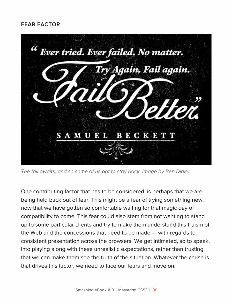
The fail awaits, and so some of us opt to stay back. Image by Ben Didier
One contributing factor that has to be considered, is perhaps that we are being held back out of fear. This might be a fear of trying something new, now that we have gotten so comfortable waiting for that magic day of compatibility to come. This fear could also stem from not wanting to stand up to some particular clients and try to make them understand this truism of the Web and the concessions that need to be made — with regards to consistent presentation across the browsers. We get intimated, so to speak, into playing along with these unrealistic expectations, rather than trusting that we can make them see the truth of the situation. Whatever the cause is that drives this factor, we need to face our fears and move on.
Smashing eBook #19│Mastering CSS3│ 30
It’s our responsibility of professionals to deliver high-quality work to our clients and advocate on and protect user’s interests. It’s our responsibility to confront clients when we have to, and we will have to do it at some point anyway, because 100% cross-browser compatibility is just not going to happen.
COMFORTABLE FACTOR
A possible contributing factor that we should also look into is that some people in the community are just too comfortable with how we design today and are not willing to learn new technology. There are those of us who already tire of the extra work involved in the testing and coding to make everything work as it is, so we have little to no interest at all in an approach that seemingly calls for more thought and time. But really, if we start using new technologies today, we will have to master a learning curve first, but the advantages are certainly worth our efforts. We should see it as the challenge that will save us time and deliver better and cleaner code.
To some extent, today we are in the situation in which we were in the beginning of 2000s; at those times when the emergence and growing support of CSS in browsers made many developers question their approach to designing web sites with tables. If the majority of designers passed on CSS back then and if the whole design community didn’t push the Web standards forward, we probably still would be designing with tables.
Smashing eBook #19│Mastering CSS3│ 31
DOUBT FACTOR
Doubt is another thing we must consider when it comes to our being in hold mode, and this could be a major contributor to this issue. We begin to doubt ourselves and our ability to pull off this innovative, boundary pushing-kind-of-work, or to master these new techniques and specs, so we sink into the comfort of playing the waiting game and playing it safe with our designs and code. We just accept the limitations and quietly work around them, railing on against the various vendors and the W3C. We should take the new technologies as the challenge to conquer; we’ve learned HTML and CSS 2.1 and we can learn HTML5 and CSS3, too.
FAITH FACTOR
Undoubtedly, some of us are holding off on moving forward into these new areas because we are faithfully clinging to the belief that the cross-browser support push will eventually happen. There are those saying that we will be better off as a community if we allowed the Web to evolve, and that this evolution should not be forced.
Smashing eBook #19│Mastering CSS3│ 32
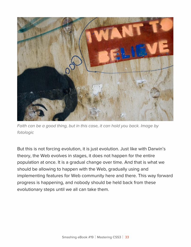
Faith can be a good thing, but in this case, it can hold you back. Image by fotologic
But this is not forcing evolution, it is just evolution. Just like with Darwin’s theory, the Web evolves in stages, it does not happen for the entire population at once. It is a gradual change over time. And that is what we should be allowing to happen with the Web, gradually using and implementing features for Web community here and there. This way forward progress is happening, and nobody should be held back from these evolutionary steps until we all can take them.
Smashing eBook #19│Mastering CSS3│ 33
“IT’S TOO EARLY” FACTOR
Another possible contributor is the ever mocking “It’s too early” factor. Some members of the online community faithfully fear that if they go ahead and accept this new way forward and begin designing or developing in accordance, then as soon as they begin completing projects, the support might be dropped and they would need to update the projects they already completed in the past. It’s common to think that it’s just too early to work with new standards until they are fully implemented in many browsers; because it’s just not safe to assume that they will be implemented at all.
However, one needs to understand the difference between two groups of new features: the widely accepted ones (CSS3′s media queries, border-radius or drop-shadows or HTML5 canvas are not going to disappear) and the experimental ones (e.g. some OpenType features are currently supported only in Firefox 4 Beta). The widely accepted features are safe to use and they will not disappear for certain; the experimental features can always be extracted in a separate stylesheet and be easily updated and maintained when necessary. It might be a good idea not to use experimental, unsupported features in large corporate designs unless they are not affecting the critical design elements of the design.
VALIDATION FACTOR
We cannot forget to mention that there are also many of us who are refusing to dabble in these new waters simply due to the fact that implementing some of these techniques or styles would cause a plethora of vendor-specific pefixes to appear in the stylesheet, thus impeding the validation we as professionals strive for.
Smashing eBook #19│Mastering CSS3│ 34
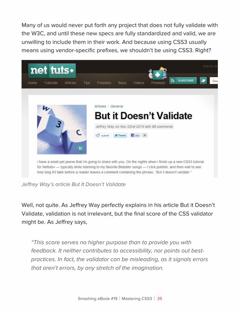
Many of us would never put forth any project that does not fully validate with the W3C, and until these new specs are fully standardized and valid, we are unwilling to include them in their work. And because using CSS3 usually means using vendor-specific prefixes, we shouldn’t be using CSS3. Right?
Jeffrey Way’s article But It Doesn’t Validate
Well, not quite. As Jeffrey Way perfectly explains in his article But it Doesn’t Validate, validation is not irrelevant, but the final score of the CSS validator might be. As Jeffrey says,
“This score serves no higher purpose than to provide you with feedback. It neither contributes to accessibility, nor points out best-practices. In fact, the validator can be misleading, as it signals errors that aren’t errors, by any stretch of the imagination.
Smashing eBook #19│Mastering CSS3│ 35
[...] Validation isn’t a game, and, while it might be fun to test your skills to determine how high you can get your score, always keep in mind: it doesn’t matter. And never, ever, ever compromise the use of the latest doctype, CSS3 techniques and selectors for the sake of validation.”
— Jeffrey Way, But it Doesn’t Validate
Having our work validate 100% is not always the best for the project. If we make sure that our code is clean and accessible, and that it validates without the CSS3/HTML5-properties, then we should take our work to the next level, meanwhile sacrificing part of the validation test results. We should not let this factor keep us back. If we have a chance for true innovation, then we shouldn’t allow ourselves to be restrained by unnecessary boundaries.
All in All…Whatever the factors that keep us from daring into these new CSS3 styles or new HTML5 coding techniques, just for a tangible example, need to be gotten over. Plain and simple. We need to move on and start using CSS3 and HTML5 today. The community will become a much more exciting and innovative playground, which in turn will improve experiences for as well as draw in more users to this dynamic new Web, which in turn will attract more clientele — effectively expanding the market. This is what could potentially be waiting on the other side of this fence that we are timidly facing — refusing to climb over it. Instead, waiting for a gate to be installed.
Until we get passed this limited way of looking at the situation, only then will we continue falling short of the full potential of ourselves and our field. Are there any areas that you would love to be venturing into, but you are not
Smashing eBook #19│Mastering CSS3│ 36
because of the lack of complete cross browser compatibility? Admittedly, I was a faith factor member of the community myself — how about you? And what CSS3 or HTML5 feature are you going to incorporate into your next design?
Smashing eBook #19│Mastering CSS3│ 37
Connecting !e Dots With CSS3Trent Walton
As a web community, we’ve made a lot of exciting progress in regards to CSS3. We’ve put properties like text-shadow & border-radius to good use while stepping into background-clip and visual effects like transitions and animations. We’ve also spent a great deal of time debating how and when to implement these properties. Just because a property isn’t widely supported by browsers or fully documented at the moment, it doesn’t mean that we shouldn’t be working with it. In fact, I’d argue the opposite.
Best practices for CSS3 usage need to be hashed out in blog posts, during spare time, and outside of client projects. Coming up with creative and sensible ways to get the most out of CSS3 will require the kind of experimentation wherein developers gladly trade ten failures for a single success. Right now, there are tons of property combinations and uses out there waiting to be discovered. All we have to do is connect the dots. It’s time to get your hands dirty and innovate!
Smashing eBook #19│Mastering CSS3│ 38
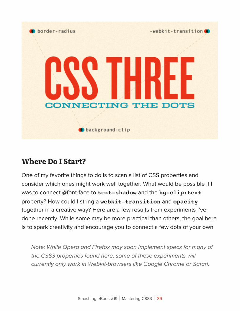
Where Do I Start?One of my favorite things to do is to scan a list of CSS properties and consider which ones might work well together. What would be possible if I was to connect @font-face to text-shadow and the bg-clip:text property? How could I string a webkit-transition and opacity together in a creative way? Here are a few results from experiments I’ve done recently. While some may be more practical than others, the goal here is to spark creativity and encourage you to connect a few dots of your own.
Note: While Opera and Firefox may soon implement specs for many of the CSS3 properties found here, some of these experiments will currently only work in Webkit-browsers like Google Chrome or Safari.
Smashing eBook #19│Mastering CSS3│ 39
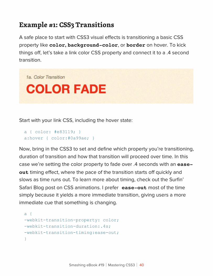
Example #1: CSS3 TransitionsA safe place to start with CSS3 visual effects is transitioning a basic CSS property like color, background-color, or border on hover. To kick things off, let’s take a link color CSS property and connect it to a .4 second transition.
Start with your link CSS, including the hover state:
a { color: #e83119; }a:hover { color:#0a99ae; }
Now, bring in the CSS3 to set and define which property you’re transitioning, duration of transition and how that transition will proceed over time. In this case we’re setting the color property to fade over .4 seconds with an ease-out timing effect, where the pace of the transition starts off quickly and slows as time runs out. To learn more about timing, check out the Surfin’ Safari Blog post on CSS animations. I prefer ease-out most of the time simply because it yields a more immediate transition, giving users a more immediate cue that something is changing.
a {-webkit-transition-property: color;-webkit-transition-duration:.4s;-webkit-transition-timing:ease-out;}
Smashing eBook #19│Mastering CSS3│ 40
You can also combine these into a single CSS property by declaring the property, duration, and timing function in that order:
a { -webkit-transition: color .4s ease-out; }
View the live example here
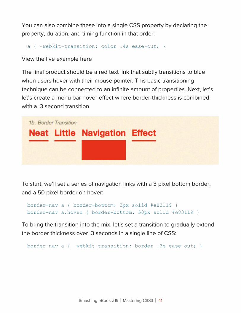
The final product should be a red text link that subtly transitions to blue when users hover with their mouse pointer. This basic transitioning technique can be connected to an infinite amount of properties. Next, let’s let’s create a menu bar hover effect where border-thickness is combined with a .3 second transition.
To start, we’ll set a series of navigation links with a 3 pixel bottom border, and a 50 pixel border on hover:
border-nav a { border-bottom: 3px solid #e83119 }border-nav a:hover { border-bottom: 50px solid #e83119 }
To bring the transition into the mix, let’s set a transition to gradually extend the border thickness over .3 seconds in a single line of CSS:
border-nav a { -webkit-transition: border .3s ease-out; }
Smashing eBook #19│Mastering CSS3│ 41
EXAMPLES
This is just one example of how to use these transitions to enhance links and navigation items. Here are a few other sites with similar creative techniques:
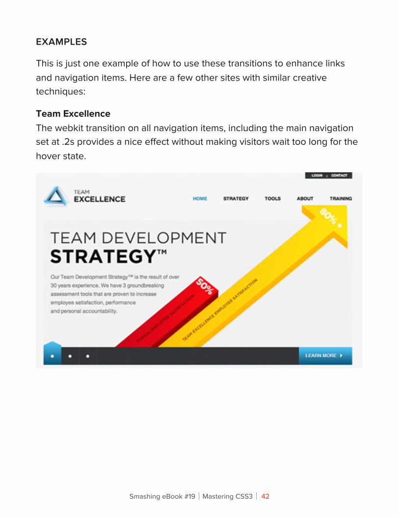
Team ExcellenceThe webkit transition on all navigation items, including the main navigation set at .2s provides a nice effect without making visitors wait too long for the hover state.
Smashing eBook #19│Mastering CSS3│ 42
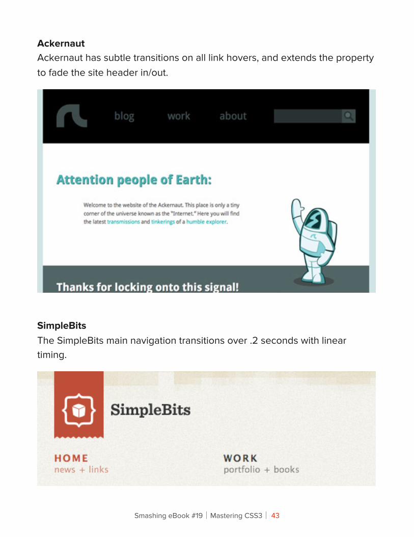
AckernautAckernaut has subtle transitions on all link hovers, and extends the property to fade the site header in/out.
SimpleBitsThe SimpleBits main navigation transitions over .2 seconds with linear timing.
Smashing eBook #19│Mastering CSS3│ 43
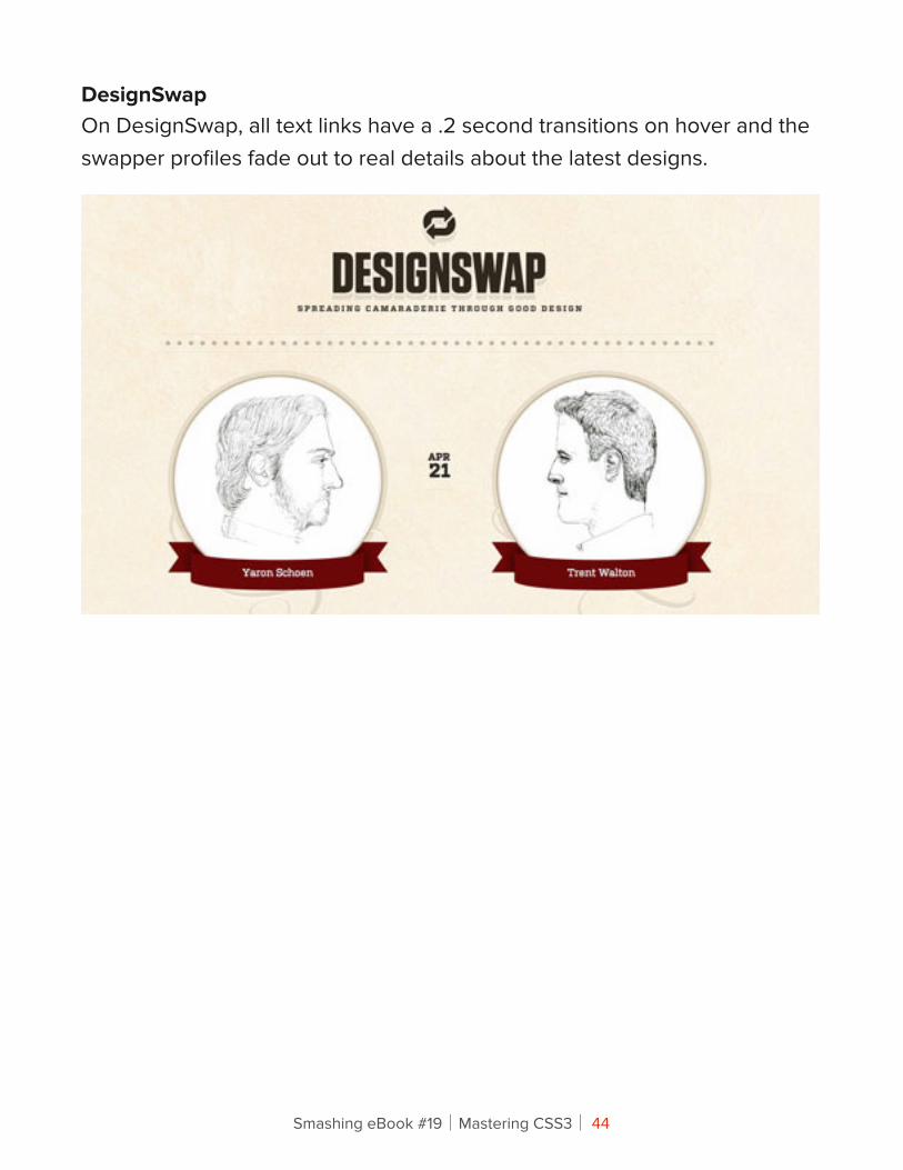
DesignSwapOn DesignSwap, all text links have a .2 second transitions on hover and the swapper profiles fade out to real details about the latest designs.
Smashing eBook #19│Mastering CSS3│ 44
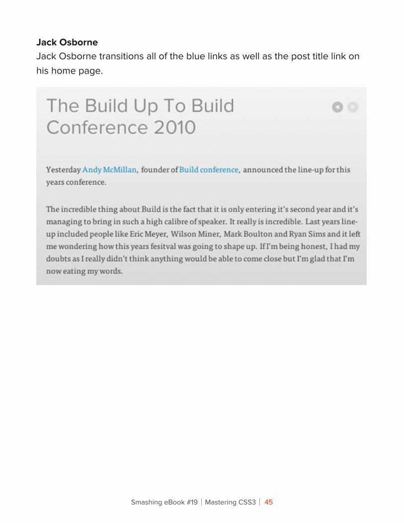
Jack OsborneJack Osborne transitions all of the blue links as well as the post title link on his home page.
Smashing eBook #19│Mastering CSS3│ 45
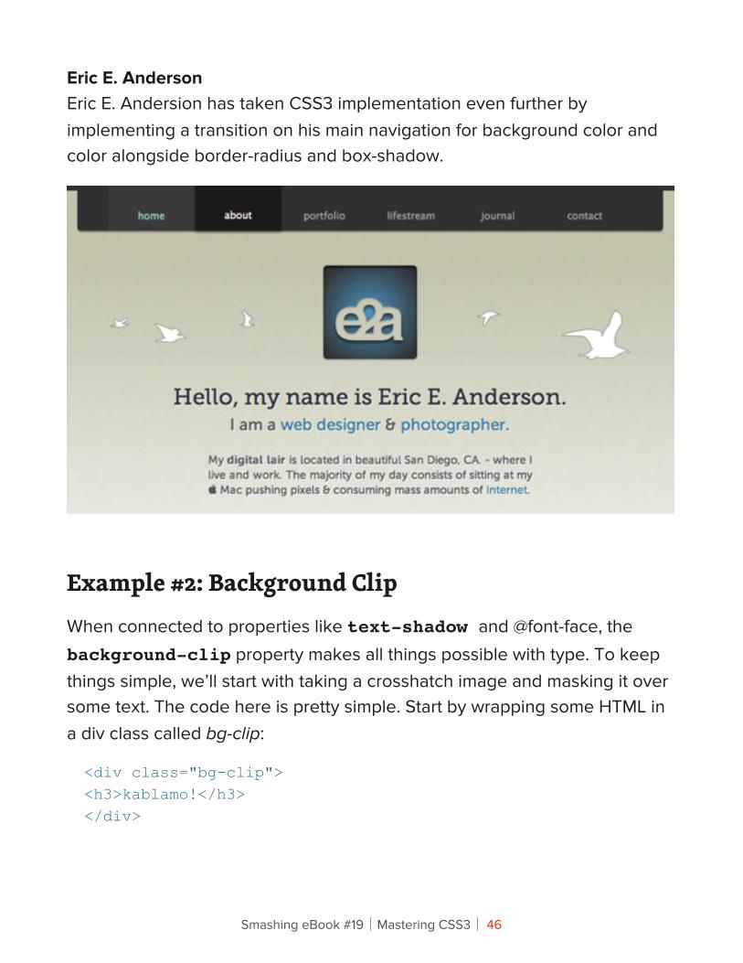
Eric E. AndersonEric E. Andersion has taken CSS3 implementation even further by implementing a transition on his main navigation for background color and color alongside border-radius and box-shadow.
Example #2: Background ClipWhen connected to properties like text-shadow and @font-face, the background-clip property makes all things possible with type. To keep things simple, we’ll start with taking a crosshatch image and masking it over some text. The code here is pretty simple. Start by wrapping some HTML in a div class called bg-clip:
<div class="bg-clip"><h3>kablamo!</h3></div>
Smashing eBook #19│Mastering CSS3│ 46
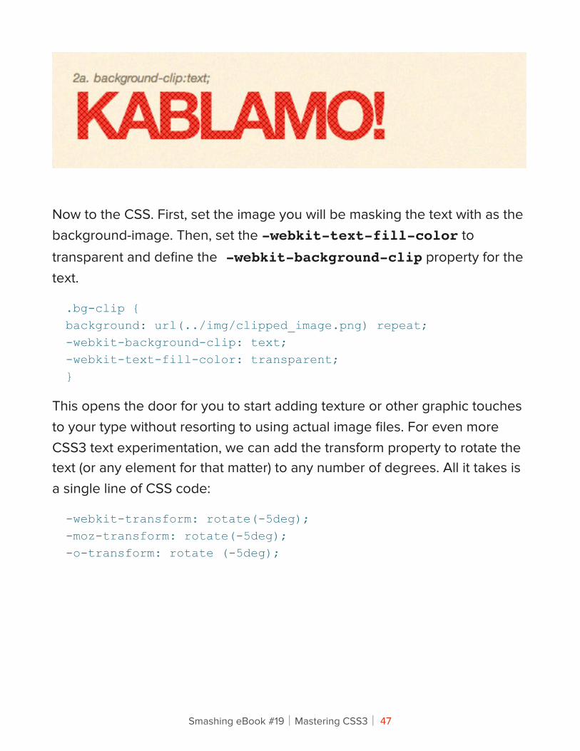
Now to the CSS. First, set the image you will be masking the text with as the background-image. Then, set the -webkit-text-fill-color to transparent and define the -webkit-background-clip property for the text.
.bg-clip {background: url(../img/clipped_image.png) repeat;-webkit-background-clip: text;-webkit-text-fill-color: transparent;}
This opens the door for you to start adding texture or other graphic touches to your type without resorting to using actual image files. For even more CSS3 text experimentation, we can add the transform property to rotate the text (or any element for that matter) to any number of degrees. All it takes is a single line of CSS code:
-webkit-transform: rotate(-5deg);-moz-transform: rotate(-5deg);-o-transform: rotate (-5deg);
Smashing eBook #19│Mastering CSS3│ 47
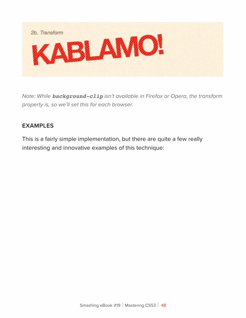
Note: While background-clip isn’t available in Firefox or Opera, the transform property is, so we’ll set this for each browser.
EXAMPLES
This is a fairly simple implementation, but there are quite a few really interesting and innovative examples of this technique:
Smashing eBook #19│Mastering CSS3│ 48
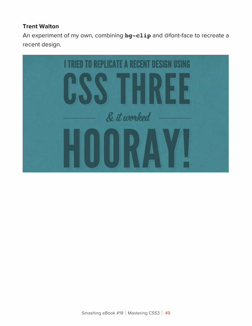
Trent WaltonAn experiment of my own, combining bg-clip and @font-face to recreate a recent design.
Smashing eBook #19│Mastering CSS3│ 49
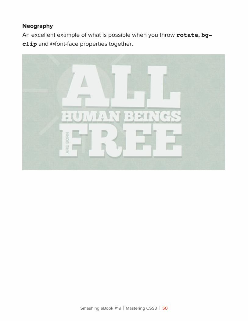
NeographyAn excellent example of what is possible when you throw rotate, bg-clip and @font-face properties together.
Smashing eBook #19│Mastering CSS3│ 50
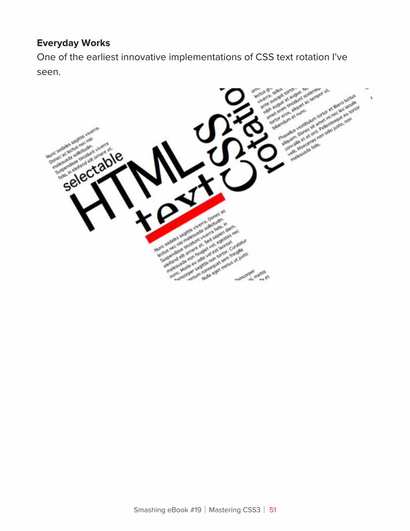
Everyday WorksOne of the earliest innovative implementations of CSS text rotation I’ve seen.
Smashing eBook #19│Mastering CSS3│ 51

Panic BlogThe Panic blog randomly rotates divs / posts. Be sure to refresh to see subtle changes in the degree of rotation.
Smashing eBook #19│Mastering CSS3│ 52
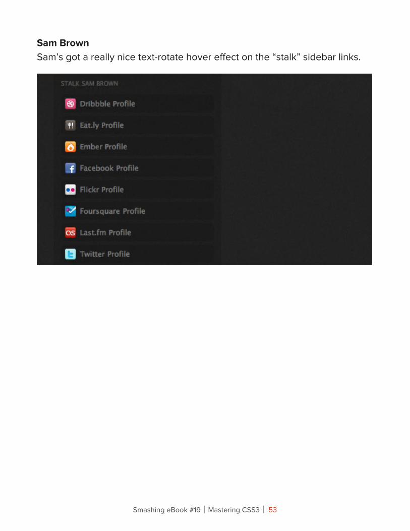
Sam BrownSam’s got a really nice text-rotate hover effect on the “stalk” sidebar links.
Smashing eBook #19│Mastering CSS3│ 53
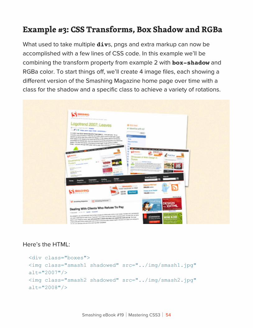
Example #3: CSS Transforms, Box Shadow and RGBaWhat used to take multiple divs, pngs and extra markup can now be accomplished with a few lines of CSS code. In this example we’ll be combining the transform property from example 2 with box-shadow and RGBa color. To start things off, we’ll create 4 image files, each showing a different version of the Smashing Magazine home page over time with a class for the shadow and a specific class to achieve a variety of rotations.
Here’s the HTML:
<div class="boxes"><img class="smash1 shadowed" src="../img/smash1.jpg" alt="2007"/><img class="smash2 shadowed" src="../img/smash2.jpg" alt="2008"/>
Smashing eBook #19│Mastering CSS3│ 54
<img class="smash3 shadowed" src="../img/smash3.jpg" alt="2009"/><img class="smash4 shadowed" src="../img/smash4.jpg" alt="2010"/></div>
Let’s set up the CSS for the RGBA Shadow:
.shadowed {border: 3px solid #fff;-o-box-shadow: 0 3px 4px rgba(0,0,0,.5);-moz-box-shadow: 0 3px 4px rgba(0,0,0,.5);-webkit-box-shadow: 0 3px 4px rgba(0,0,0,.5);box-shadow: 0 3px 4px rgba(0,0,0,.5);}
Before moving forward, let’s be sure we understand each property here. The box-shadow property works just like any drop shadow. The first two numbers define the shadow’s offset for the X and Y coordinates. Here we’ve set the shadow to 0 for the X, and 3 for the Y. The final number is the shadow blur size, in this case it’s 4px.
RGBa is defined in a similar manner. RGBa stands for red, green, blue, alpha. Here we’ve taken the RGB value for black as 0,0,0 and set it with a 50% alpha level at .5 in the CSS.
Now, let’s finish off the effect by adding a little CSS Transform magic to rotate each screenshot:
.smash1 { margin-bottom: -125px;-o-transform: rotate(2.5deg);-moz-transform: rotate(2.5deg);-webkit-transform: rotate(2.5deg);}.smash2 {-o-transform: rotate(-7deg);
Smashing eBook #19│Mastering CSS3│ 55
-moz-transform: rotate(-7deg);-webkit-transform: rotate(-7deg);}.smash3 {-o-transform: rotate(2.5deg);-moz-transform: rotate(2.5deg);-webkit-transform: rotate(2.5deg);}.smash4 {margin-top: -40px;-o-transform: rotate(-2.5deg);-moz-transform: rotate(-2.5deg);-webkit-transform: rotate(-2.5deg);}
Smashing eBook #19│Mastering CSS3│ 56
EXAMPLES
Here are a few additional sites with these properties implemented right now:
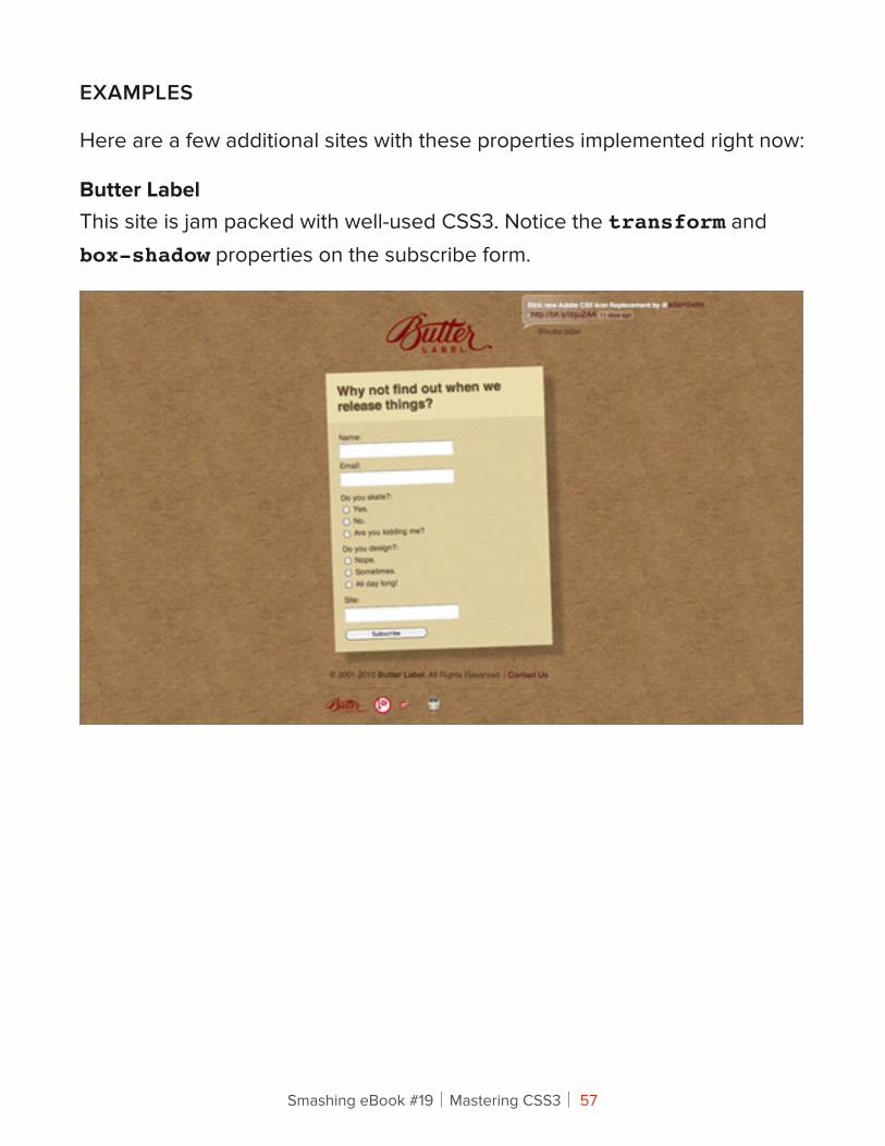
Butter LabelThis site is jam packed with well-used CSS3. Notice the transform and box-shadow properties on the subscribe form.
Smashing eBook #19│Mastering CSS3│ 57
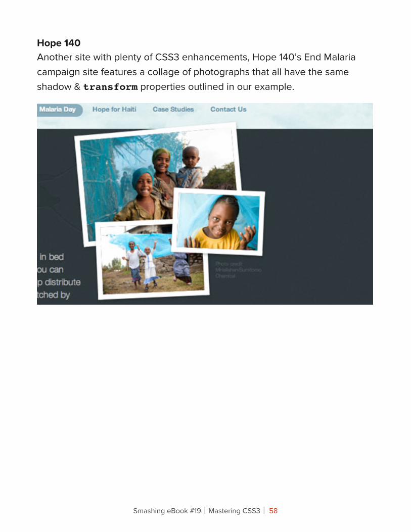
Hope 140Another site with plenty of CSS3 enhancements, Hope 140’s End Malaria campaign site features a collage of photographs that all have the same shadow & transform properties outlined in our example.
Smashing eBook #19│Mastering CSS3│ 58
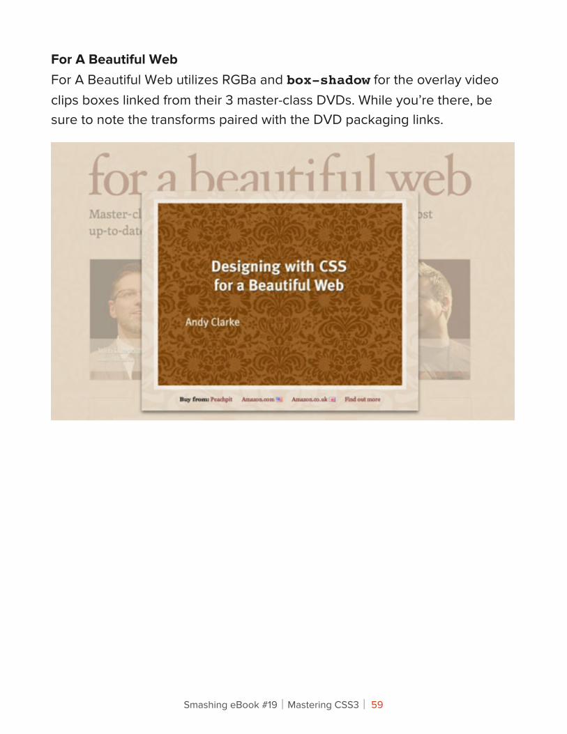
For A Beautiful WebFor A Beautiful Web utilizes RGBa and box-shadow for the overlay video clips boxes linked from their 3 master-class DVDs. While you’re there, be sure to note the transforms paired with the DVD packaging links.
Smashing eBook #19│Mastering CSS3│ 59
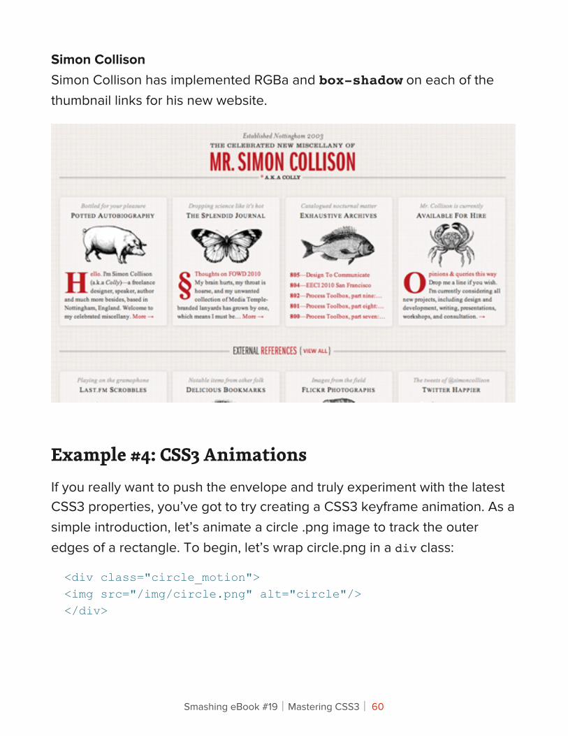
Simon CollisonSimon Collison has implemented RGBa and box-shadow on each of the thumbnail links for his new website.
Example #4: CSS3 AnimationsIf you really want to push the envelope and truly experiment with the latest CSS3 properties, you’ve got to try creating a CSS3 keyframe animation. As a simple introduction, let’s animate a circle .png image to track the outer edges of a rectangle. To begin, let’s wrap circle.png in a div class:
<div class="circle_motion"><img src="/img/circle.png" alt="circle"/></div>
Smashing eBook #19│Mastering CSS3│ 60
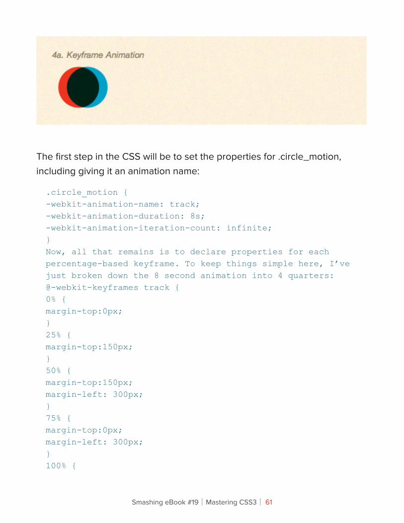
The first step in the CSS will be to set the properties for .circle_motion, including giving it an animation name:
.circle_motion {-webkit-animation-name: track;-webkit-animation-duration: 8s;-webkit-animation-iteration-count: infinite;}Now, all that remains is to declare properties for each percentage-based keyframe. To keep things simple here, I’ve just broken down the 8 second animation into 4 quarters:@-webkit-keyframes track {0% {margin-top:0px;}25% {margin-top:150px;}50% {margin-top:150px;margin-left: 300px;}75% {margin-top:0px;margin-left: 300px;}100% {
Smashing eBook #19│Mastering CSS3│ 61
margin-left:0px;}}
EXAMPLES
A few examples of CSS3 animations online now:
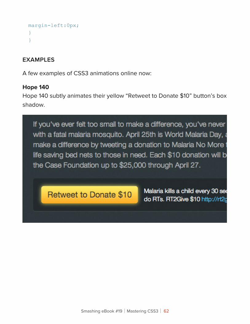
Hope 140Hope 140 subtly animates their yellow “Retweet to Donate $10” button’s box shadow.
Smashing eBook #19│Mastering CSS3│ 62
Connecting !e Dots With CSS3 (Part II)
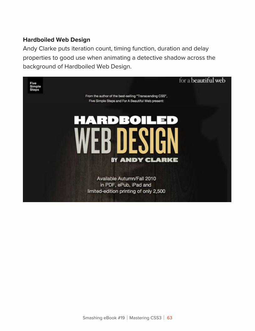
Hardboiled Web DesignAndy Clarke puts iteration count, timing function, duration and delay properties to good use when animating a detective shadow across the background of Hardboiled Web Design.
Smashing eBook #19│Mastering CSS3│ 63
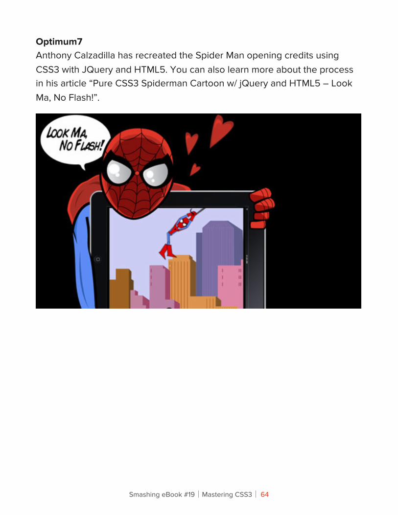
Optimum7Anthony Calzadilla has recreated the Spider Man opening credits using CSS3 with JQuery and HTML5. You can also learn more about the process in his article “Pure CSS3 Spiderman Cartoon w/ jQuery and HTML5 – Look Ma, No Flash!”.
Smashing eBook #19│Mastering CSS3│ 64
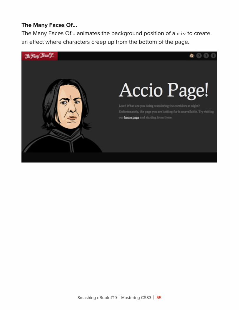
The Many Faces Of…The Many Faces Of… animates the background position of a div to create an effect where characters creep up from the bottom of the page.
Smashing eBook #19│Mastering CSS3│ 65
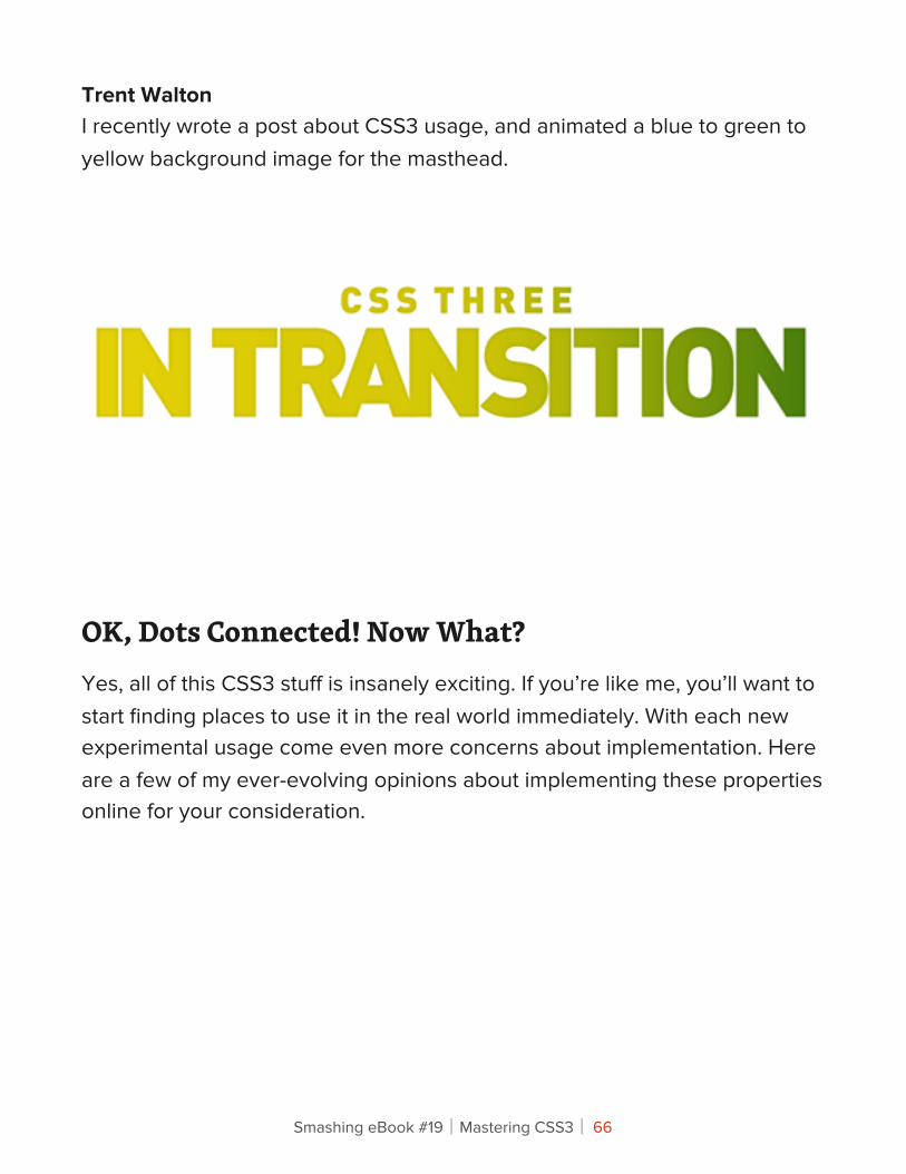
Trent WaltonI recently wrote a post about CSS3 usage, and animated a blue to green to yellow background image for the masthead.
OK, Dots Connected! Now What?Yes, all of this CSS3 stuff is insanely exciting. If you’re like me, you’ll want to start finding places to use it in the real world immediately. With each new experimental usage come even more concerns about implementation. Here are a few of my ever-evolving opinions about implementing these properties online for your consideration.
Smashing eBook #19│Mastering CSS3│ 66
• CSS3 enhancements will never take the place of solid user-experience design.
• Motion and animation demands attention. Think about a friend waving to get your attention from across a crowded room or a flashing traffic light. Heavy-handed or even moderate uses of animation can significantly degrade user experience. If you are planning on implementing these techniques on a site with any sort of A to B conversion goals, be sure to consider the psychology of motion.
• Don’t make people wait on animations. Especially when it comes to hover links, be sure there is an immediate state-change cue.
• Many of these effects can be used in a bonus or easter-egg type of application. Find places to go the extra mile.
• This is a group effort. Don’t be afraid of failure, enlist the help of other developers, join the online discussions, and above all, have fun!
Smashing eBook #19│Mastering CSS3│ 67
An Introduction To CSS3 Keyframe AnimationsLouis Lazaris
By now you’ve probably heard at least something about animation in CSS3 using keyframe-based syntax. The CSS3 animations module in the specification has been around for a couple of years now, and it has the potential to become a big part of Web design.
Using CSS3 keyframe animations, developers can create smooth, maintainable animations that perform relatively well and that don’t require reams of scripting. It’s just another way that CSS3 is helping to solve a real-world problem in an elegant manner. If you haven’t yet started learning the syntax for CSS3 animations, here’s your chance to prepare for when this part of the CSS3 spec moves past the working draft stage.
In this article, we’ll cover all the important parts of the syntax, and we’ll fill you in on browser support so that you’ll know when to start using it.
Smashing eBook #19│Mastering CSS3│ 68
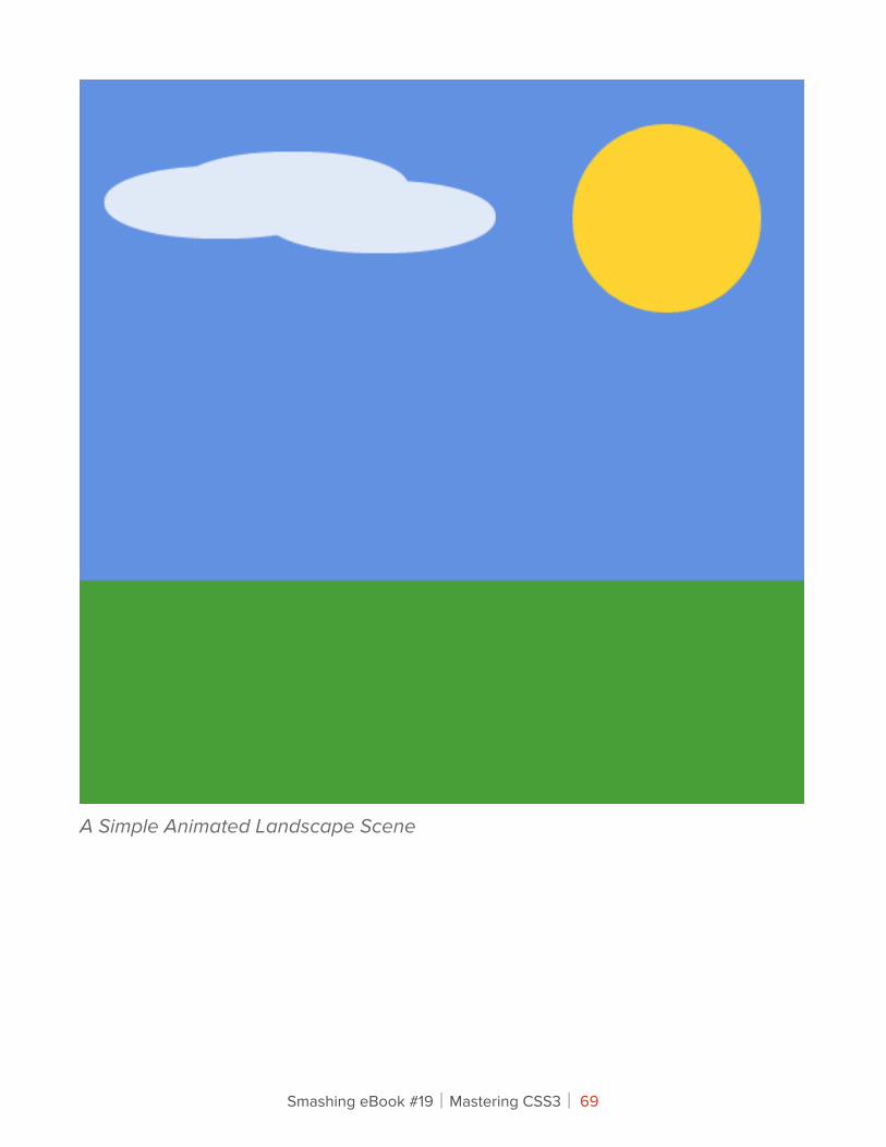
A Simple Animated Landscape Scene
Smashing eBook #19│Mastering CSS3│ 69
For the purpose of this article, I’ve created a simple animated landscape scene to introduce the various aspects of the syntax. You can view the demo page to get an idea of what I’ll be describing. The page includes a sidebar that displays the CSS code used for the various elements (sun, moon, sky, ground and cloud). Have a quick look, and then follow along as I describe the different parts of the CSS3 animations module.
(NOTE: Versions of Safari prior to 5.1 have a bug that prevents the animation from finishing correctly. See more under the heading “The Animation’s Fill Mode”)
I’ll describe the CSS related to only one of the elements: the animated sun. That should suffice to give you a good understanding of keyframe-based animations. For the other elements in the demo, you can examine the code on the demo page using the tabs.
!e @keyframes At-RuleThe first unusual thing you’ll notice about any CSS3 animation code is the keyframes @ rule. According to the spec, this specialized CSS @ rule is followed by an identifier (chosen by the developer) that is referred to in another part of the CSS.
The @ rule and its identifier are then followed by a number of rule sets (i.e. style rules with declaration blocks, as in normal CSS code). This chunk of rule sets is delimited by curly braces, which nest the rule sets inside the @ rule, much as you would find with other @ rules.
Here’s the @ rule we’ll be using:
@keyframes sunrise { /* rule sets go here … */}
Smashing eBook #19│Mastering CSS3│ 70
The word sunrise is an identifier of our choosing that we’ll use to refer to this animation.
Notice that I’m using not using any vendor prefixes for all of the code examples here and in the demo. I’ll discuss browser support at the end of this article, but for now just realize that currently no browser supports this standard syntax, so to get the code working, you have to include all the vendor prefixes.
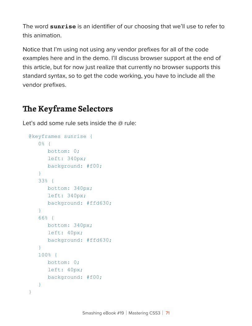
!e Keyframe SelectorsLet’s add some rule sets inside the @ rule:
@keyframes sunrise { 0% { bottom: 0; left: 340px; background: #f00; } 33% { bottom: 340px; left: 340px; background: #ffd630; } 66% { bottom: 340px; left: 40px; background: #ffd630; } 100% { bottom: 0; left: 40px; background: #f00; }}
Smashing eBook #19│Mastering CSS3│ 71
With the addition of those new rule sets, we’ve introduced the keyframe selector. In the code example above, the keyframe selectors are 0%, 33%, 66%, and 100%. The 0% and 100% selectors could be replaced by the keywords “from” and “to,” respectively, and you would get the same results.
Each of the four rule sets in this example represents a different snapshot of the animated element, with the styles defining the element’s appearance at that point in the animation. The points that are not defined (for example, from 34% to 65%) comprise the transitional period between the defined styles.
Although the spec is still in development, some rules have been defined that user agents should follow. For example, the order of the keyframes doesn’t really matter. The keyframes will play in the order specified by the percentage values, and not necessarily the order in which they appear. Thus, if you place the “to” keyframe before the “from” keyframe, the animation would still play the same way. Also, if a “to” or “from” (or its percentage-based equivalent) is not declared, the browser will automatically construct it. So, the rule sets inside the @ rule are not governed by the cascade that you find in customary CSS rule sets.
THE KEYFRAMES THAT ANIMATE THE SUN
For the purpose of animating the sun in this demo, I’ve set four keyframes. As mentioned, the code above includes comments that describe the changes.
Smashing eBook #19│Mastering CSS3│ 72
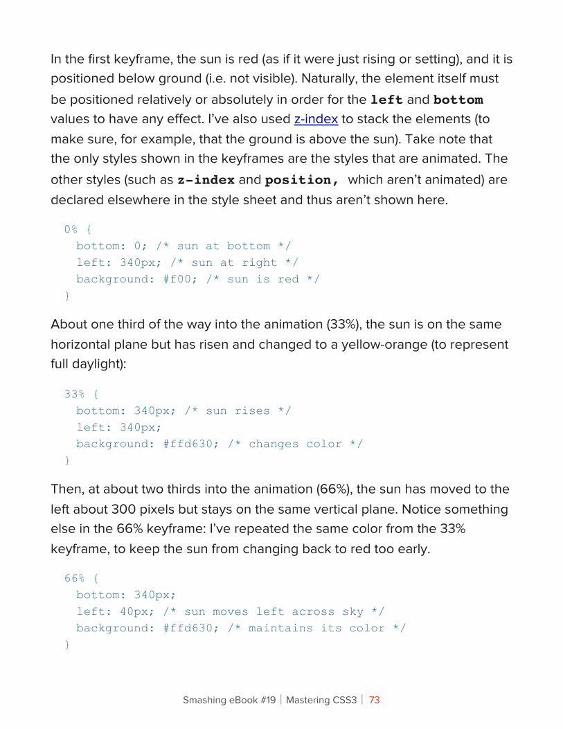
In the first keyframe, the sun is red (as if it were just rising or setting), and it is positioned below ground (i.e. not visible). Naturally, the element itself must be positioned relatively or absolutely in order for the left and bottom values to have any effect. I’ve also used z-index to stack the elements (to make sure, for example, that the ground is above the sun). Take note that the only styles shown in the keyframes are the styles that are animated. The other styles (such as z-index and position, which aren’t animated) are declared elsewhere in the style sheet and thus aren’t shown here.
0% { bottom: 0; /* sun at bottom */ left: 340px; /* sun at right */ background: #f00; /* sun is red */}
About one third of the way into the animation (33%), the sun is on the same horizontal plane but has risen and changed to a yellow-orange (to represent full daylight):
33% { bottom: 340px; /* sun rises */ left: 340px; background: #ffd630; /* changes color */}
Then, at about two thirds into the animation (66%), the sun has moved to the left about 300 pixels but stays on the same vertical plane. Notice something else in the 66% keyframe: I’ve repeated the same color from the 33% keyframe, to keep the sun from changing back to red too early.
66% { bottom: 340px; left: 40px; /* sun moves left across sky */ background: #ffd630; /* maintains its color */}
Smashing eBook #19│Mastering CSS3│ 73
Finally, the sun gradually animates to its final state (the full red) as it disappears below the ground.
100% { bottom: 0; /* sun sets */ left: 40px; background: #f00; /* back to red */}
Associating !e Animation Name With An ElementHere’s the next chunk of code we’ll add in our example. It associates the animation name (in this case, the word sunrise) with a specific element in our HTML:
#sun.animate { animation-name: sunrise;}
Here we’re introducing the animation-name property. The value of this property must match an identifier in an existing @keyframes rule, otherwise no animation will occur. In some circumstances, you can use JavaScript to set its value to none (the only keyword that has been reserved for this property) to prevent an animation from occurring.
The object we’ve targeted is an element with an id of sun and a class of animate. The reason I’ve doubled up the id and class like this is so that I can use scripting to add the class name animate. In the demo, I’ve started the page statically; then, with the click of a button, all of the elements with a particular class name will have another class appended called animate. This will trigger all of the animations at the same time and will allow the animation to be controlled by the user.
Smashing eBook #19│Mastering CSS3│ 74
Of course, that’s just one way to do it. As is the case with anything in CSS or JavaScript, there are other ways to accomplish the same thing.
!e Animation’s Duration And Timing FunctionLet’s add two more lines to our CSS:
#sun.animate { animation-name: sunrise; animation-duration: 10s; animation-timing-function: ease;}
You can specify the duration of the animation using the animation-duration property. The duration represents the time taken to complete a single iteration of the animation. You can express this value in seconds (for example, 4s), milliseconds (2000ms), and seconds in decimal notation (3.3s).
The specification doesn’t seem to specify all of the available units of time measurement. However, it seems unlikely that anyone would need anything longer than seconds; and even then, you could express duration in minutes, hours or days simply by calculating those units into seconds or milliseconds.
The animation-timing-function property, when declared for the entire animation, allows you to define how an animation progresses over a single iteration of the animation. The values for animation-timing-function are ease, linear, ease-out, step-start and many more, as outlined in the spec.
Smashing eBook #19│Mastering CSS3│ 75
For our example, I’ve chosen ease, which is the default. So in this case, we can leave out the property and the animation will look the same.
Additionally, you can apply a specific timing function to each keyframe, like this:
@keyframes sunrise { 0% { background: #f00; left: 340px; bottom: 0; animation-timing-function: ease; } 33% { bottom: 340px; left: 340px; background: #ffd630; animation-timing-function: linear; } 66% { left: 40px; bottom: 340px; background: #ffd630; animation-timing-function: steps(4); } 100% { bottom: 0; left: 40px; background: #f00; animation-timing-function: linear; }}
Smashing eBook #19│Mastering CSS3│ 76
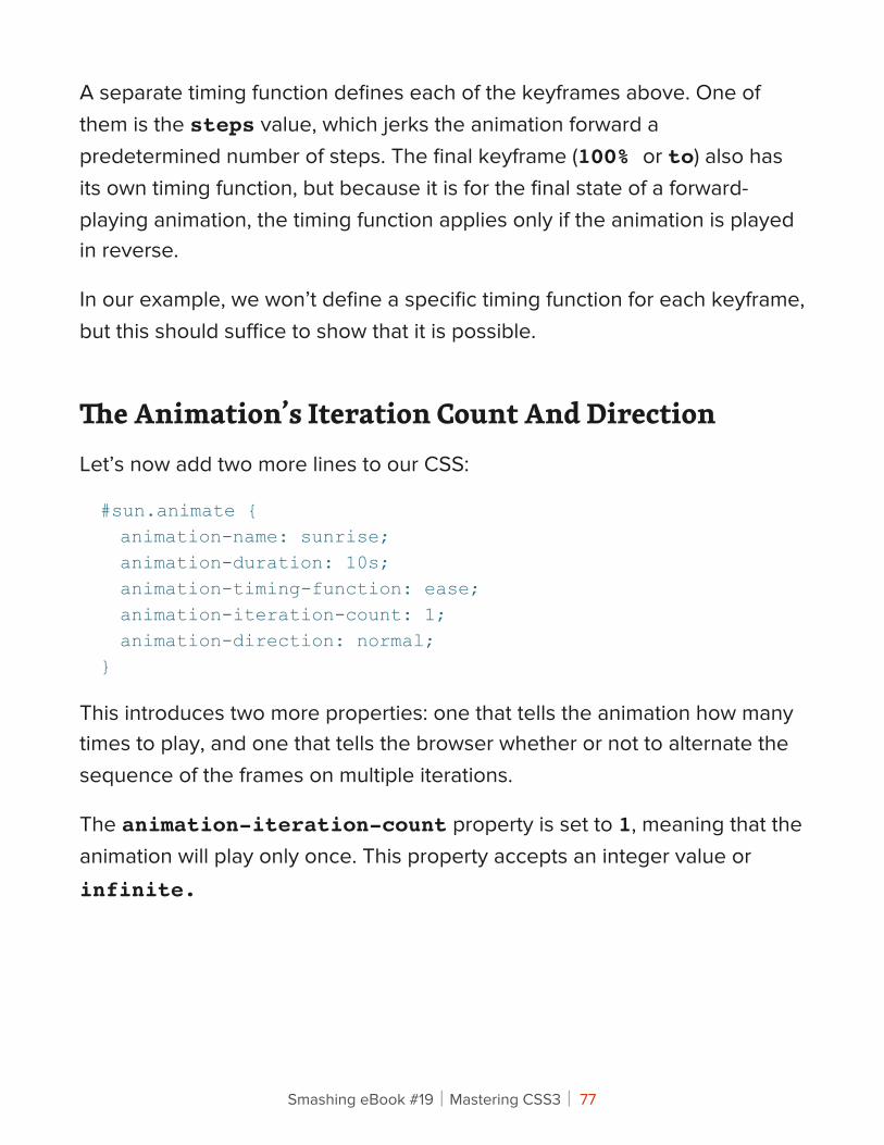
A separate timing function defines each of the keyframes above. One of them is the steps value, which jerks the animation forward a predetermined number of steps. The final keyframe (100% or to) also has its own timing function, but because it is for the final state of a forward-playing animation, the timing function applies only if the animation is played in reverse.
In our example, we won’t define a specific timing function for each keyframe, but this should suffice to show that it is possible.
!e Animation’s Iteration Count And DirectionLet’s now add two more lines to our CSS:
#sun.animate { animation-name: sunrise; animation-duration: 10s; animation-timing-function: ease; animation-iteration-count: 1; animation-direction: normal;}
This introduces two more properties: one that tells the animation how many times to play, and one that tells the browser whether or not to alternate the sequence of the frames on multiple iterations.
The animation-iteration-count property is set to 1, meaning that the animation will play only once. This property accepts an integer value or infinite.
Smashing eBook #19│Mastering CSS3│ 77
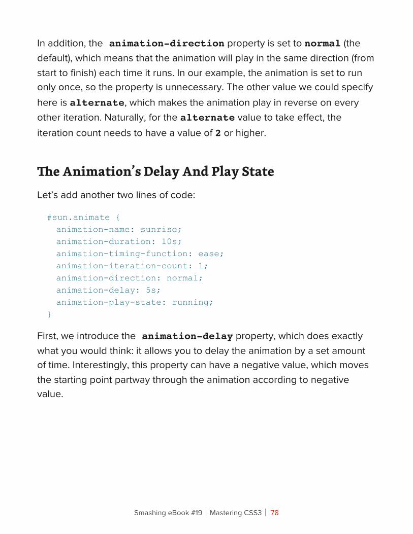
In addition, the animation-direction property is set to normal (the default), which means that the animation will play in the same direction (from start to finish) each time it runs. In our example, the animation is set to run only once, so the property is unnecessary. The other value we could specify here is alternate, which makes the animation play in reverse on every other iteration. Naturally, for the alternate value to take effect, the iteration count needs to have a value of 2 or higher.
!e Animation’s Delay And Play StateLet’s add another two lines of code:
#sun.animate { animation-name: sunrise; animation-duration: 10s; animation-timing-function: ease; animation-iteration-count: 1; animation-direction: normal; animation-delay: 5s; animation-play-state: running;}
First, we introduce the animation-delay property, which does exactly what you would think: it allows you to delay the animation by a set amount of time. Interestingly, this property can have a negative value, which moves the starting point partway through the animation according to negative value.
Smashing eBook #19│Mastering CSS3│ 78
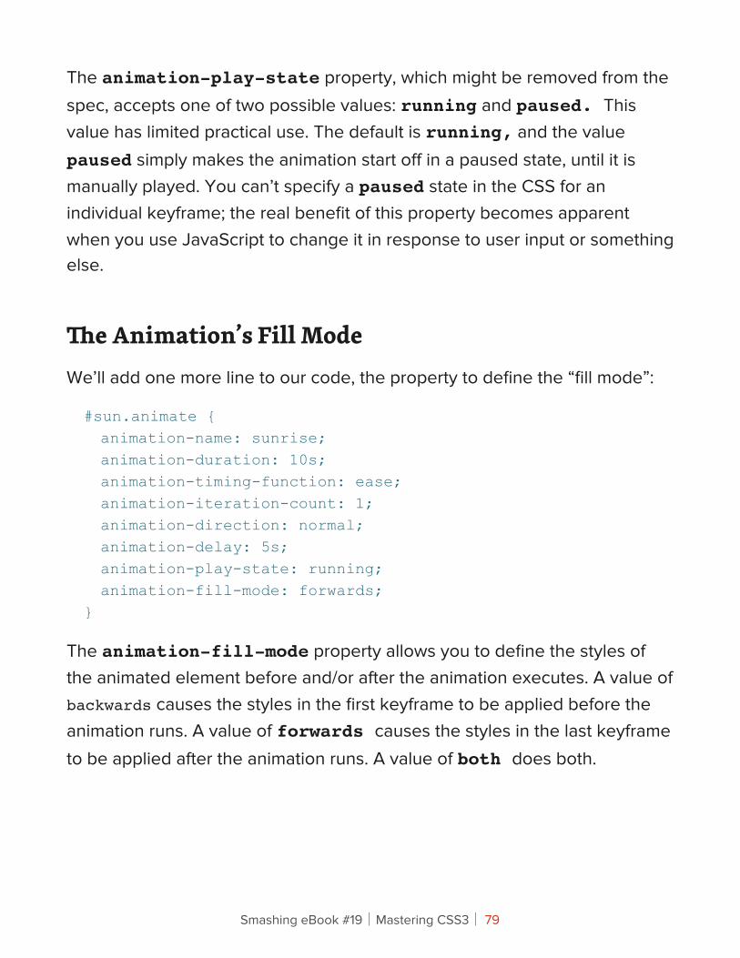
The animation-play-state property, which might be removed from the spec, accepts one of two possible values: running and paused. This value has limited practical use. The default is running, and the value paused simply makes the animation start off in a paused state, until it is manually played. You can’t specify a paused state in the CSS for an individual keyframe; the real benefit of this property becomes apparent when you use JavaScript to change it in response to user input or something else.
!e Animation’s Fill ModeWe’ll add one more line to our code, the property to define the “fill mode”:
#sun.animate { animation-name: sunrise; animation-duration: 10s; animation-timing-function: ease; animation-iteration-count: 1; animation-direction: normal; animation-delay: 5s; animation-play-state: running; animation-fill-mode: forwards;}
The animation-fill-mode property allows you to define the styles of the animated element before and/or after the animation executes. A value of backwards causes the styles in the first keyframe to be applied before the animation runs. A value of forwards causes the styles in the last keyframe to be applied after the animation runs. A value of both does both.
Smashing eBook #19│Mastering CSS3│ 79
UPDATE: The animation-fill-mode property is not in the latest draft of the spec, but it is found in the editors draft. Also, certain versions of Safari (5.0 and older) will only apply a value of “forwards” if there are exactly two keyframes defined. These browsers always seems to use the 2nd keyframe as the “forwards” state, which is not how other browsers do it; the correct behavior uses the final keyframe. This is fixed in Safari 5.1.
ShorthandFinally, the specification describes shorthand notation for animations, which combines six of the properties described above. This includes everything except animation-play-state and animation-fill-mode.
Some Notes On !e Demo Page And Browser SupportAs mentioned, the code in this article is for animating only a single element in the demo: the sun. To see the full code, visit the demo page. You can view all of the source together or use the tabs in the sidebar to view the code for individual elements in the animation.
The demo does not use any images, and the animation does not rely on JavaScript. The sun, moon and cloud are all created using CSS3’s border-radius, and the only scripting on the page is for the tabs on the right and for the button that lets users start and reset the animation.
Here are the browsers that support CSS3 keyframe animations:
• Chrome 2+,
• Safari 4+,
• Firefox 5+,
Smashing eBook #19│Mastering CSS3│ 80

• IE10 PP3,
• iOS Safari 3.2+,
• Android 2.1+.
Although no official announcement has been made, support in Opera is expected.
If you code your animations using a single vendor-based syntax, you can use a tool like Prefixr or Animation Fill Code to automatically fill in the extra code for you.
Smashing eBook #19│Mastering CSS3│ 81
!e New Hotness: Using CSS3 Visual EffectsZURB
Previously in this series on CSS3, we talked not only about how to create scalable and compelling buttons but about how to effectively use new CSS3 properties to speed up development and quickly create rich page elements. In this final article of the series, we’ll really get into it and use CSS3 visual effects to push the envelope.
Not everything in this article is practical, or even bug-free, but it’s a fun primer on what’s in the pipeline for Web design. To get the most from these examples, you’ll have to use Safari 4 or Chrome. (Firefox 3.5 can handle most of it, but not everything: WebKit is further along than Gecko in its tentative CSS support.) We’ll show you how to create impressive image galleries, build animated music players and overlay images like a pro. All set? Let’s rock.
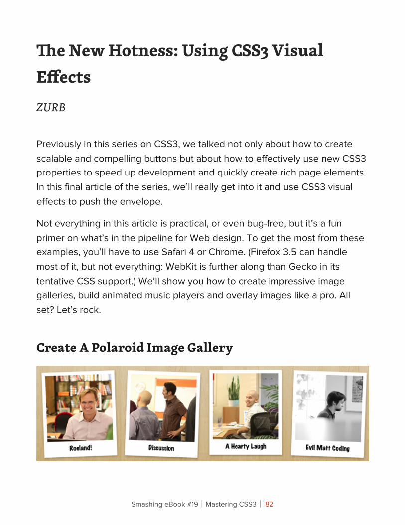
Create A Polaroid Image Gallery
Smashing eBook #19│Mastering CSS3│ 82
We always try to stay pretty active with our Flickr feed; our chief instigator Bryan does a great job of capturing the day-to-day and special events and even some of our old work. We wanted a great way to show off these photos, so we turned to CSS3 to create a compelling, fun image gallery. The Polaroid style is pretty common, but we wanted not only to make it dead-simple to create the gallery in the markup but also to add styles that would have required Javascript just a year or two ago.
THE POLAROID GALLERY MARKUP
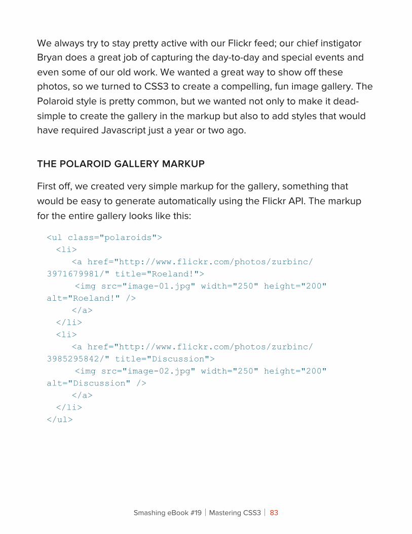
First off, we created very simple markup for the gallery, something that would be easy to generate automatically using the Flickr API. The markup for the entire gallery looks like this:
<ul class="polaroids"> <li> <a href="http://www.flickr.com/photos/zurbinc/3971679981/" title="Roeland!"> <img src="image-01.jpg" width="250" height="200" alt="Roeland!" /> </a> </li> <li> <a href="http://www.flickr.com/photos/zurbinc/3985295842/" title="Discussion"> <img src="image-02.jpg" width="250" height="200" alt="Discussion" /> </a> </li></ul>
Smashing eBook #19│Mastering CSS3│ 83
We’ll be using the title element in a minute.
THE BASE STYLE AND LABELS
Our next step was to create the simple Polaroid look. We placed our image inside an anchor with a white background and scaled the image container. This gave us space for the image labels, which we created using little-known CSS tricks: :after and content: attr.
ul.polaroids a:after { content: attr(title);}
What we’re doing here is telling the browser that after it renders the given anchor content, add another piece of content. We then generate that piece of content with the content: attr(title) element, which pulls a specific attribute from the element, in this case the title attribute. Using alt would make more sense, but neither Safari nor Firefox has implemented it for the content element.
The snippet above tells the browser to take the title attribute and render it immediately after the content. Note that the title attribute will be rendered within the anchor, which is exactly what we want. We would have liked to have used the alt attribute, but Safari and Firefox do not support the use of content with it.
Our styling of the anchor element takes care of the formatting of the title attribute as well, and we’ve now placed the image title attribute below it so that we don’t have to replicate that content in the markup.
Smashing eBook #19│Mastering CSS3│ 84
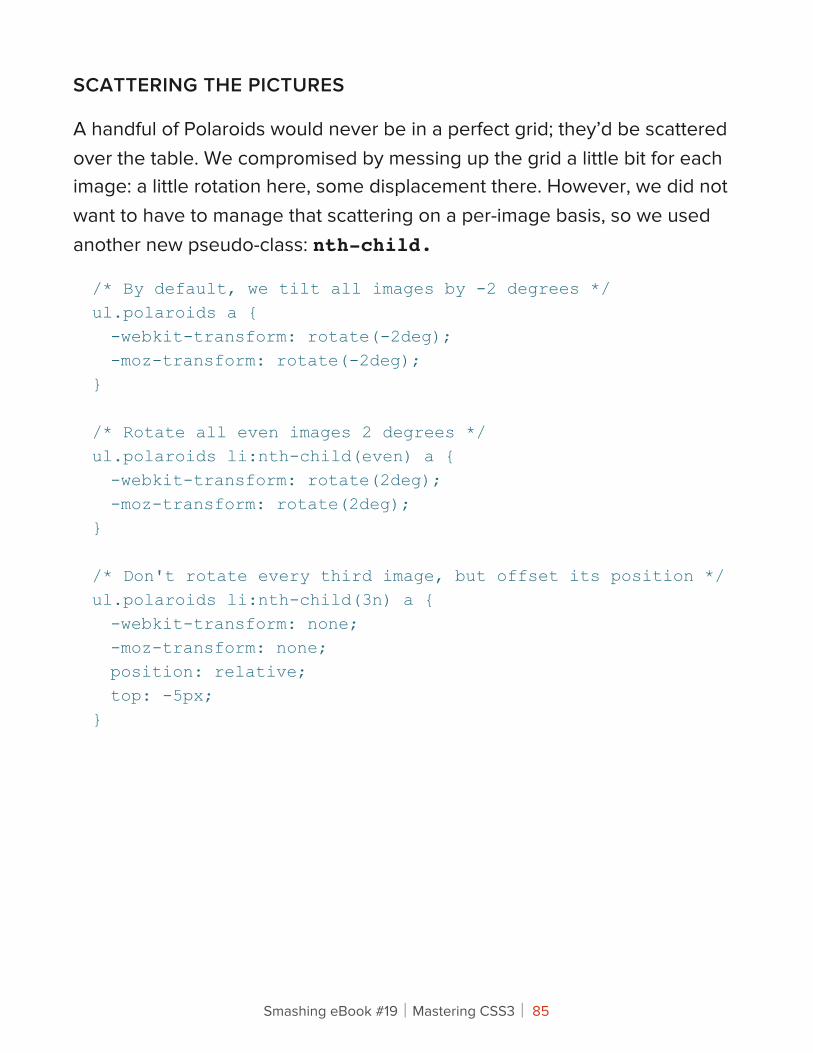
SCATTERING THE PICTURES
A handful of Polaroids would never be in a perfect grid; they’d be scattered over the table. We compromised by messing up the grid a little bit for each image: a little rotation here, some displacement there. However, we did not want to have to manage that scattering on a per-image basis, so we used another new pseudo-class: nth-child.
/* By default, we tilt all images by -2 degrees */ul.polaroids a { -webkit-transform: rotate(-2deg); -moz-transform: rotate(-2deg);}
/* Rotate all even images 2 degrees */ul.polaroids li:nth-child(even) a { -webkit-transform: rotate(2deg); -moz-transform: rotate(2deg);}
/* Don't rotate every third image, but offset its position */ul.polaroids li:nth-child(3n) a { -webkit-transform: none; -moz-transform: none; position: relative; top: -5px;}
Smashing eBook #19│Mastering CSS3│ 85
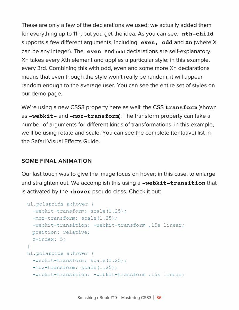
These are only a few of the declarations we used; we actually added them for everything up to 11n, but you get the idea. As you can see, nth-child supports a few different arguments, including even, odd and Xn (where X can be any integer). The even and odd declarations are self-explanatory. Xn takes every Xth element and applies a particular style; in this example, every 3rd. Combining this with odd, even and some more Xn declarations means that even though the style won’t really be random, it will appear random enough to the average user. You can see the entire set of styles on our demo page.
We’re using a new CSS3 property here as well: the CSS transform (shown as -webkit- and -moz-transform). The transform property can take a number of arguments for different kinds of transformations; in this example, we’ll be using rotate and scale. You can see the complete (tentative) list in the Safari Visual Effects Guide.
SOME FINAL ANIMATION
Our last touch was to give the image focus on hover; in this case, to enlarge and straighten out. We accomplish this using a -webkit-transition that is activated by the :hover pseudo-class. Check it out:
ul.polaroids a:hover { -webkit-transform: scale(1.25); -moz-transform: scale(1.25); -webkit-transition: -webkit-transform .15s linear; position: relative; z-index: 5;}ul.polaroids a:hover { -webkit-transform: scale(1.25); -moz-transform: scale(1.25); -webkit-transition: -webkit-transform .15s linear;
Smashing eBook #19│Mastering CSS3│ 86
position: relative; z-index: 5;}
What’s happening here is that we’re overriding the existing -webkit-transform to simply scale the image (this eliminates the rotation). The -webkit-transition tells Webkit-based browsers to animate the transform so that the move from one to another is smooth. -webkit-transition is actually extremely versatile, because it can just as easily support color, position (top, right, etc.) and most any other property.
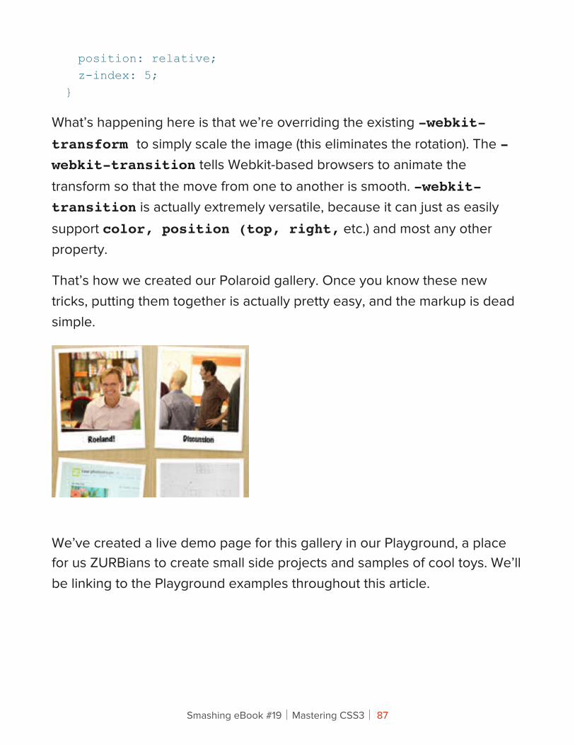
That’s how we created our Polaroid gallery. Once you know these new tricks, putting them together is actually pretty easy, and the markup is dead simple.
We’ve created a live demo page for this gallery in our Playground, a place for us ZURBians to create small side projects and samples of cool toys. We’ll be linking to the Playground examples throughout this article.
Smashing eBook #19│Mastering CSS3│ 87
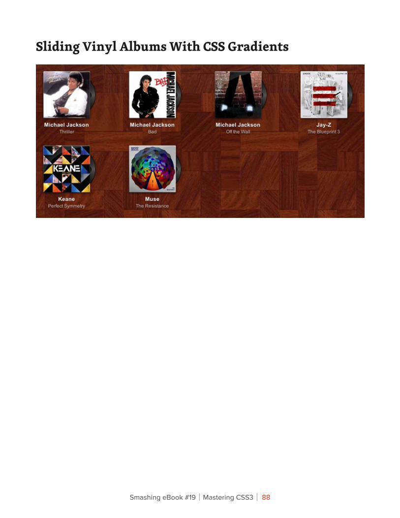
Sliding Vinyl Albums With CSS Gradients
Smashing eBook #19│Mastering CSS3│ 88
This example began as a simple experiment with CSS gradients and grew into a pretty detailed investigation not just of gradients but of new background properties and animation. We’ll show you how to create advanced gradients with no images and use layered backgrounds for some cool effects.
WRITING THE MARKUP
What we’ve created here is a simple unordered list of albums with slide-out album controls. You could use something like this to present your band’s albums or to showcase a series of podcasts or any other kind of audio (or potentially video) media. Each item in the list is an album, with some fairly simple markup:
<div class="album"> <a href=""><img src="/playground/sliding-vinyl/muse-the-resistance.jpg" width="500" height="375" alt="Muse: The Resistance" /></a> <span class="vinyl"> <div></div> </span> <ul class="actions"> <li class="play-pause"><a href=""></a></li> <li class="info"><a href=""></a></li> </ul> <div> <h5>Muse</h5> <small>The Resistance</small> </div> <span class="gloss"></span></div>
Smashing eBook #19│Mastering CSS3│ 89
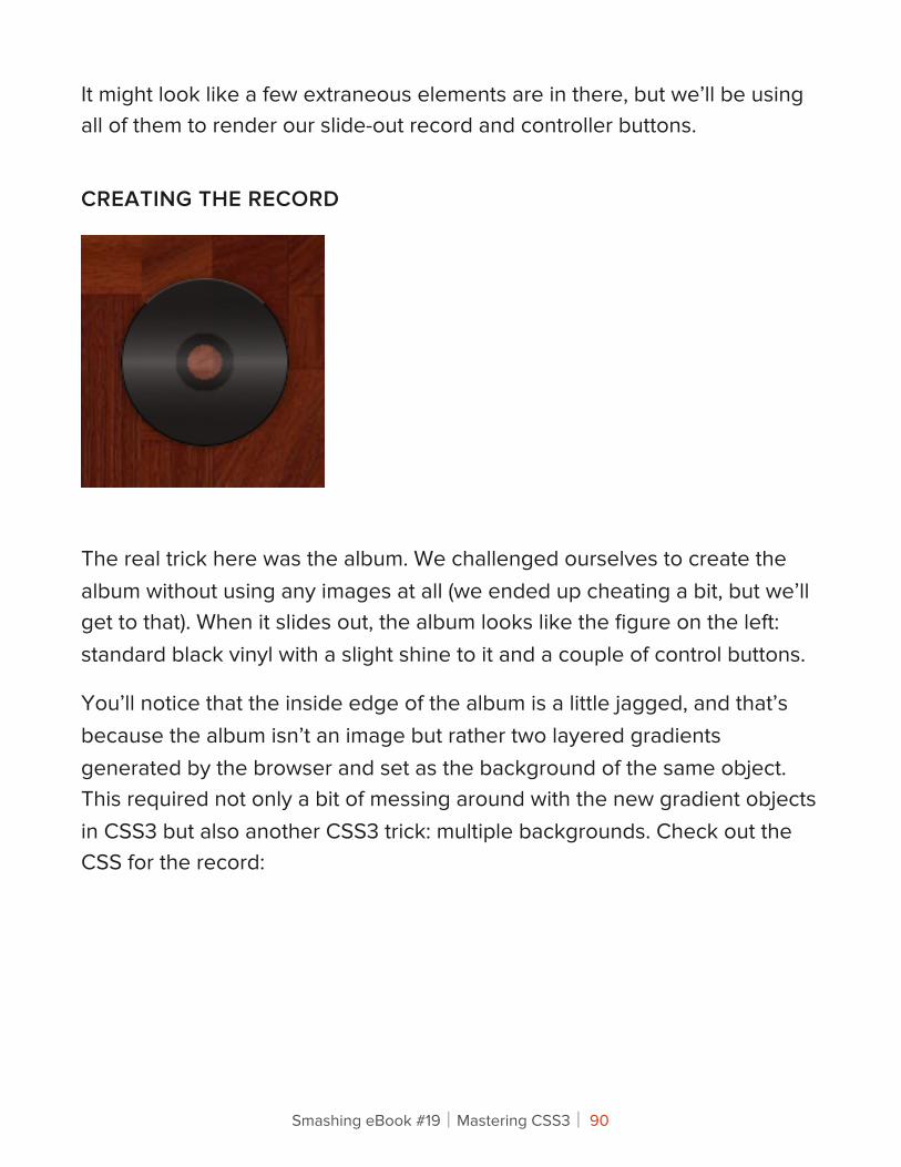
It might look like a few extraneous elements are in there, but we’ll be using all of them to render our slide-out record and controller buttons.
CREATING THE RECORD
The real trick here was the album. We challenged ourselves to create the album without using any images at all (we ended up cheating a bit, but we’ll get to that). When it slides out, the album looks like the figure on the left: standard black vinyl with a slight shine to it and a couple of control buttons.
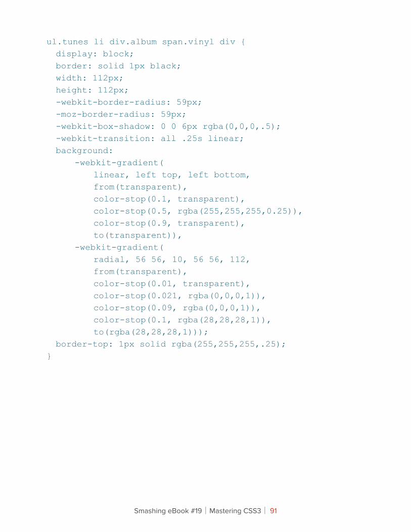
You’ll notice that the inside edge of the album is a little jagged, and that’s because the album isn’t an image but rather two layered gradients generated by the browser and set as the background of the same object. This required not only a bit of messing around with the new gradient objects in CSS3 but also another CSS3 trick: multiple backgrounds. Check out the CSS for the record:
Smashing eBook #19│Mastering CSS3│ 90
ul.tunes li div.album span.vinyl div { display: block; border: solid 1px black; width: 112px; height: 112px; -webkit-border-radius: 59px; -moz-border-radius: 59px; -webkit-box-shadow: 0 0 6px rgba(0,0,0,.5); -webkit-transition: all .25s linear; background: -webkit-gradient( linear, left top, left bottom, from(transparent), color-stop(0.1, transparent), color-stop(0.5, rgba(255,255,255,0.25)), color-stop(0.9, transparent), to(transparent)), -webkit-gradient( radial, 56 56, 10, 56 56, 112, from(transparent), color-stop(0.01, transparent), color-stop(0.021, rgba(0,0,0,1)), color-stop(0.09, rgba(0,0,0,1)), color-stop(0.1, rgba(28,28,28,1)), to(rgba(28,28,28,1))); border-top: 1px solid rgba(255,255,255,.25);}
Smashing eBook #19│Mastering CSS3│ 91
We’ve omitted some of the positioning and other boring CSS pieces (check out the live demo for the complete markup). We want to focus here on the pieces that are critical to creating the album visually: border-radius and -webkit-gradient.
The simplest part was creating a round object: by setting the border radius to exactly half of the height and width of the object, the browser masks the object to a perfect circle. Watch out, though: unlike in Photoshop, if the border radius is higher than half the object’s height or width, the browser might simply ignore the declaration. That said, rounding the object is the easy part; the tricky part is controlling the gradients.
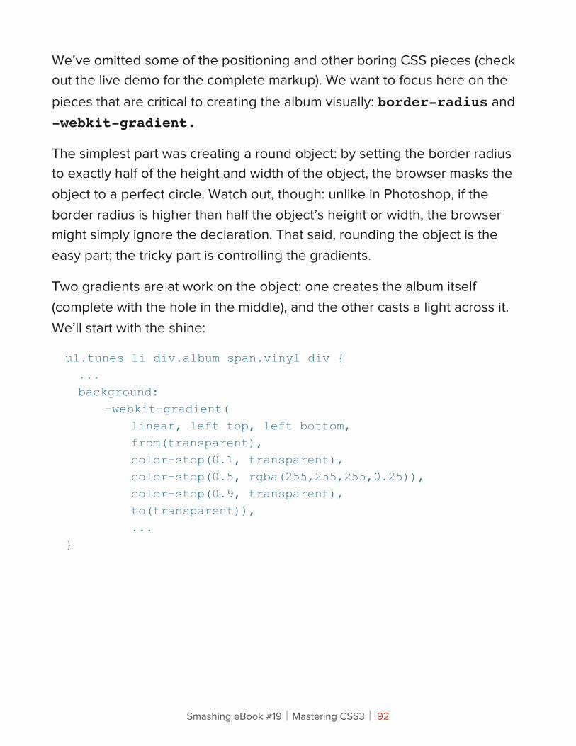
Two gradients are at work on the object: one creates the album itself (complete with the hole in the middle), and the other casts a light across it. We’ll start with the shine:
ul.tunes li div.album span.vinyl div { ... background: -webkit-gradient( linear, left top, left bottom, from(transparent), color-stop(0.1, transparent), color-stop(0.5, rgba(255,255,255,0.25)), color-stop(0.9, transparent), to(transparent)), ...}
Smashing eBook #19│Mastering CSS3│ 92
The shine gradient is a linear gradient from the top-left to bottom-left. We start with transparent so that the gradient fades in, then we shift the gradient to white at the 50% mark (halfway across the album), with 25% opacity. We’re using RGBa colors because they allow us to control both the color and opacity in the same declaration.
The album itself is more complicated, and it suffers a bit from early implementation of the radial gradient.
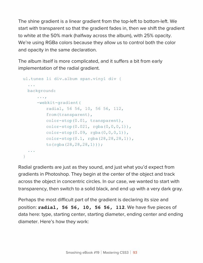
ul.tunes li div.album span.vinyl div { ... background: ..., -webkit-gradient( radial, 56 56, 10, 56 56, 112, from(transparent), color-stop(0.01, transparent), color-stop(0.021, rgba(0,0,0,1)), color-stop(0.09, rgba(0,0,0,1)), color-stop(0.1, rgba(28,28,28,1)), to(rgba(28,28,28,1))); ...}
Radial gradients are just as they sound, and just what you’d expect from gradients in Photoshop. They begin at the center of the object and track across the object in concentric circles. In our case, we wanted to start with transparency, then switch to a solid black, and end up with a very dark gray.
Perhaps the most difficult part of the gradient is declaring its size and position: radial, 56 56, 10, 56 56, 112. We have five pieces of data here: type, starting center, starting diameter, ending center and ending diameter. Here’s how they work:
Smashing eBook #19│Mastering CSS3│ 93
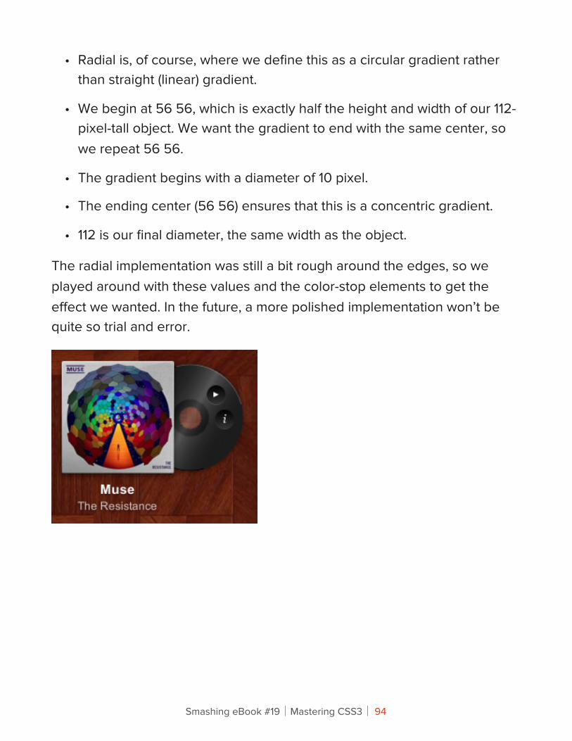
• Radial is, of course, where we define this as a circular gradient rather than straight (linear) gradient.
• We begin at 56 56, which is exactly half the height and width of our 112-pixel-tall object. We want the gradient to end with the same center, so we repeat 56 56.
• The gradient begins with a diameter of 10 pixel.
• The ending center (56 56) ensures that this is a concentric gradient.
• 112 is our final diameter, the same width as the object.
The radial implementation was still a bit rough around the edges, so we played around with these values and the color-stop elements to get the effect we wanted. In the future, a more polished implementation won’t be quite so trial and error.
Smashing eBook #19│Mastering CSS3│ 94
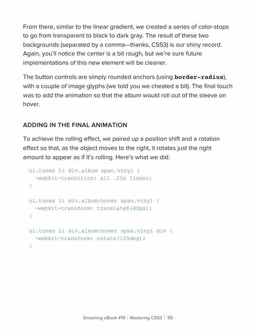
From there, similar to the linear gradient, we created a series of color-stops to go from transparent to black to dark gray. The result of these two backgrounds (separated by a comma—thanks, CSS3) is our shiny record. Again, you’ll notice the center is a bit rough, but we’re sure future implementations of this new element will be cleaner.
The button controls are simply rounded anchors (using border-radius), with a couple of image glyphs (we told you we cheated a bit). The final touch was to add the animation so that the album would roll out of the sleeve on hover.
ADDING IN THE FINAL ANIMATION
To achieve the rolling effect, we paired up a position shift and a rotation effect so that, as the object moves to the right, it rotates just the right amount to appear as if it’s rolling. Here’s what we did:
ul.tunes li div.album span.vinyl { -webkit-transition: all .25s linear;}
ul.tunes li div.album:hover span.vinyl { -webkit-transform: translateX(60px);}
ul.tunes li div.album:hover span.vinyl div { -webkit-transform: rotate(120deg);}
Smashing eBook #19│Mastering CSS3│ 95
We’re using two transforms, translateX and rotate, on two objects. We use the translate instead of standard positioning because transforms don’t impact the DOM—from a layout perspective, the object never really moves, and so we don’t have to worry about floats going awry or objects pushing each other around. Transitions also work better on translation transforms than on actual position (left: 20px, etc.) changes.
Gradients have a ways to go, but there are already some cool uses for generated gradients. You can even control them at runtime using transitions or JavaScript, which opens up yet more possibilities.
We’ve created a live demo page for this gallery in our Playground, so you can see it in action and delve deeper into the source code. Enjoy!
Smashing eBook #19│Mastering CSS3│ 96
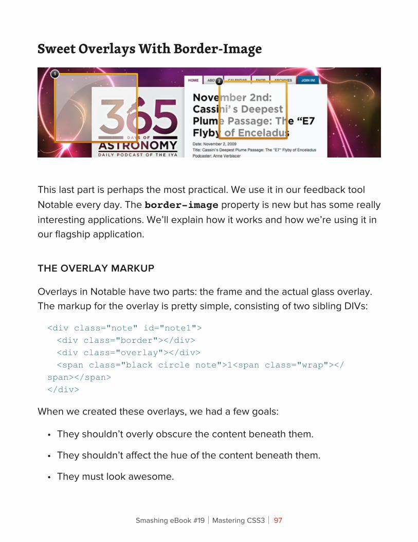
Sweet Overlays With Border-Image
This last part is perhaps the most practical. We use it in our feedback tool Notable every day. The border-image property is new but has some really interesting applications. We’ll explain how it works and how we’re using it in our flagship application.
THE OVERLAY MARKUP
Overlays in Notable have two parts: the frame and the actual glass overlay. The markup for the overlay is pretty simple, consisting of two sibling DIVs:
<div class="note" id="note1"> <div class="border"></div> <div class="overlay"></div> <span class="black circle note">1<span class="wrap"></span></span></div>
When we created these overlays, we had a few goals:
• They shouldn’t overly obscure the content beneath them.
• They shouldn’t affect the hue of the content beneath them.
• They must look awesome.
Smashing eBook #19│Mastering CSS3│ 97
To that end, we devised an overlay that would appear as a glass overlay, with a slight shine and a nice, fairly bold frame. For the purposes of this article, we’ll focus on the frame, which we created using the new border-image property.
USING BORDER-IMAGE
The new border-image property is a strange beast: very versatile, but takes a little getting used to. Here’s what the border-image declaration for our frame looks like in the CSS:
div.note div.border { border: 5px solid #feb515; -webkit-border-radius: 3px; -moz-border-radius: 3px; -webkit-border-image: url(/playground/awesome-overlays/border-image.png) 5 5 5 5 stretch; -moz-border-image: url(/playground/awesome-overlays/border-image.png) 5 5 5 5 stretch;}
Let’s get the easy stuff out of the way. The border element is both required and a fallback: older browsers will still render a usable border for the overlay, but border-image requires a defined border width. While we’ve been fairly unconcerned with backwards-compatibility in our articles, in this case we needed it (Notable has to work in more than just cutting-edge browsers). This is one of many examples of progressive enhancement (or graceful degradation, if you prefer): older browsers render something usable, just less pretty. The first progressive piece in here is the border-radius, which we’ve already discussed at length.
Smashing eBook #19│Mastering CSS3│ 98
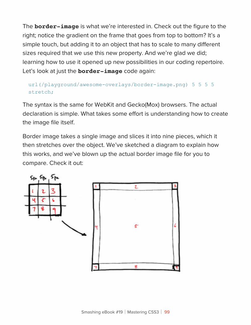
The border-image is what we’re interested in. Check out the figure to the right; notice the gradient on the frame that goes from top to bottom? It’s a simple touch, but adding it to an object that has to scale to many different sizes required that we use this new property. And we’re glad we did; learning how to use it opened up new possibilities in our coding repertoire. Let’s look at just the border-image code again:
url(/playground/awesome-overlays/border-image.png) 5 5 5 5 stretch;
The syntax is the same for WebKit and Gecko(Mox) browsers. The actual declaration is simple. What takes some effort is understanding how to create the image file itself.
Border image takes a single image and slices it into nine pieces, which it then stretches over the object. We’ve sketched a diagram to explain how this works, and we’ve blown up the actual border image file for you to compare. Check it out:
Smashing eBook #19│Mastering CSS3│ 99
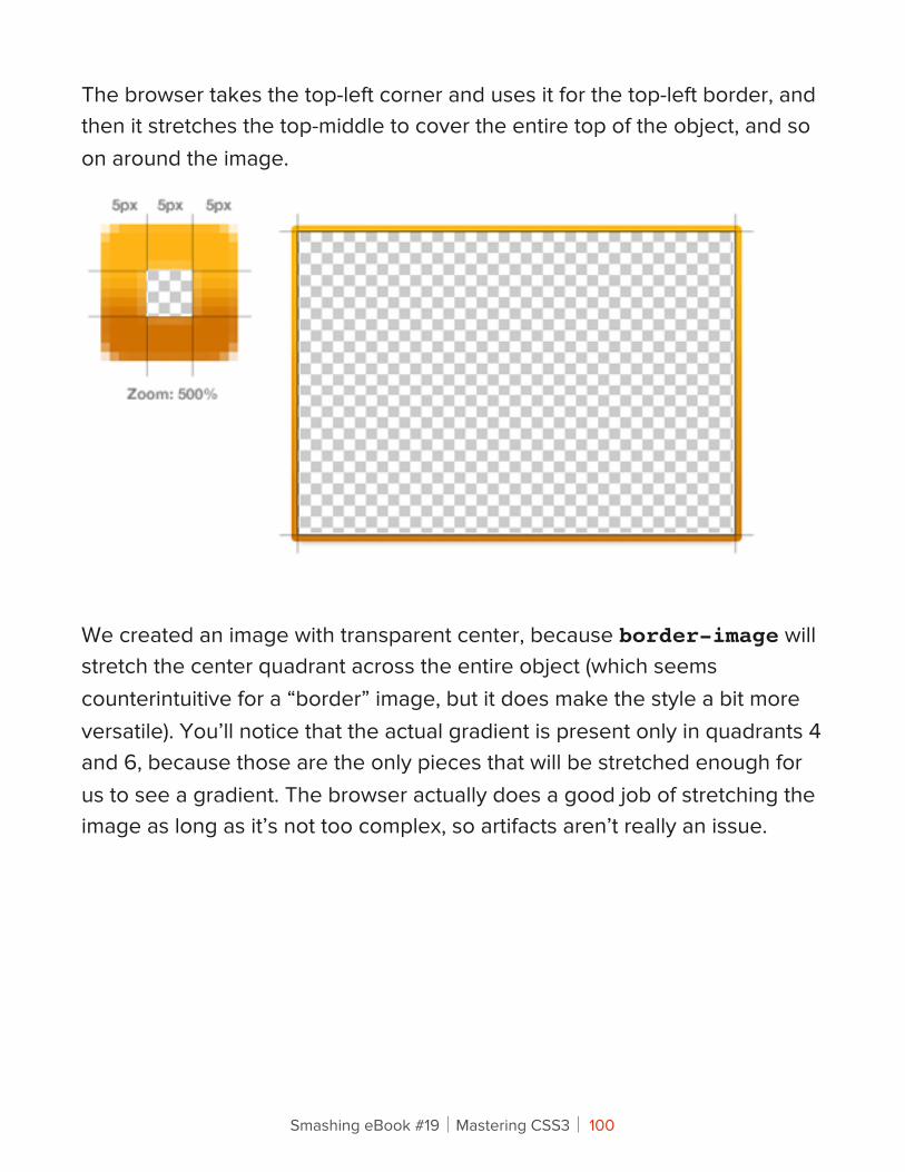
The browser takes the top-left corner and uses it for the top-left border, and then it stretches the top-middle to cover the entire top of the object, and so on around the image.
We created an image with transparent center, because border-image will stretch the center quadrant across the entire object (which seems counterintuitive for a “border” image, but it does make the style a bit more versatile). You’ll notice that the actual gradient is present only in quadrants 4 and 6, because those are the only pieces that will be stretched enough for us to see a gradient. The browser actually does a good job of stretching the image as long as it’s not too complex, so artifacts aren’t really an issue.
Smashing eBook #19│Mastering CSS3│ 100
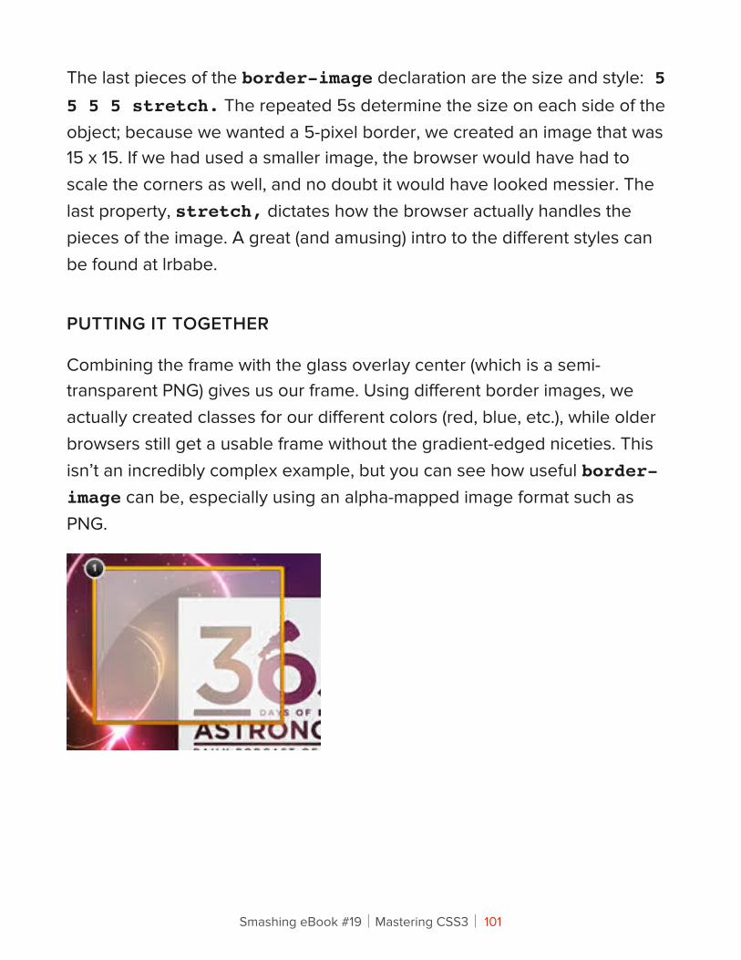
The last pieces of the border-image declaration are the size and style: 5 5 5 5 stretch. The repeated 5s determine the size on each side of the object; because we wanted a 5-pixel border, we created an image that was 15 x 15. If we had used a smaller image, the browser would have had to scale the corners as well, and no doubt it would have looked messier. The last property, stretch, dictates how the browser actually handles the pieces of the image. A great (and amusing) intro to the different styles can be found at lrbabe.
PUTTING IT TOGETHER
Combining the frame with the glass overlay center (which is a semi-transparent PNG) gives us our frame. Using different border images, we actually created classes for our different colors (red, blue, etc.), while older browsers still get a usable frame without the gradient-edged niceties. This isn’t an incredibly complex example, but you can see how useful border-image can be, especially using an alpha-mapped image format such as PNG.
Smashing eBook #19│Mastering CSS3│ 101
We’ve created a live demo page for this gallery in our Playground so that you can see it in action and delve deeper into the source code. You can also read up on why we created this overlay in our two-part Notable Behind the Scenes blog post: part 1 and part 2.
CSS 3 Is Totally Bad AssRight? We hope you’ve enjoyed this primer on what we can look forward to in the final CSS3 specification. Familiarize yourself with the properties and start using them—just be sure to account for browsers that, sadly, will never support all of these fun new tricks. You can see how we use CSS3 in our work for clients as well as in our own product, Notable. Found a super-awesome way to use these new properties? We’d love to hear about it in the comments!
Smashing eBook #19│Mastering CSS3│ 102
Adventures In !e !ird Dimension: CSS 3D TransformsPeter Gasston
Back in 2009, the WebKit development team proposed a new extension to CSS that would allow Web page elements to be displayed and transformed on a three-dimensional plane. This proposal was called 3D Transforms, and it was soon implemented in Safari for Mac and iOS. About a year later, support followed for Chrome, and early in 2011, for Android. Outside of WebKit, however, none of the other browser makers seemed to show much enthusiasm for it, so it’s remained a fairly niche and underused feature.
That’s set to change, though, as the Firefox and Internet Explorer teams have decided to join the party by implementing 3D Transforms in pre-release versions of their browsers. So, if all goes according to plan, we’ll see them in IE 10 and a near-future version of Firefox (possibly 10 or 11, but that’s not confirmed yet), both of which are slated for release sometime this year.
That being the case, this is an ideal time to get ahead of the curve and start learning about the possibilities and potential of adding an extra dimension to your Web pages. This article aims to help you do just that, by taking you on a flying tour of the 3D Transforms syntax.
Please bear in mind that in order to see the examples in this article, you’ll need a browser that supports 3D Transforms; as I write this, that’s Safari, Chrome, IE 10 Platform Preview or Firefox Aurora.
Smashing eBook #19│Mastering CSS3│ 103
!e !ird DimensionOn the Web, we’re accustomed to working in two dimensions: all elements have width and height, and we move them around the screen horizontally (left to right) and vertically (top to bottom). The move to a third dimension can be thought of as adding depth to elements, and adding movement towards and away from you (the viewer). Think about 3D films in which objects are constantly thrust out of the screen towards you in an attempt to demonstrate the possibilities of the extra depth.
To use 3D Transforms in CSS, you’ll need to know about axes (that’s the plural of axis, not the plural of axe). If you already know about working in three dimensions or remember using axes in math class at school, you can skip the next section. For everyone else, here is…
A Quick Primer On AxesI just mentioned that on the 2-D Web, we move elements around horizontally and vertically. Each of these directions is called an axis: the horizontal line is known as the x-axis, and the vertical line is the y-axis. If we think of the top-left corner of an element as our origin (i.e. the point from which movement is measured), a movement to the left is a negative movement along the x-axis, and a move to the right is a positive movement along the x-axis. The same goes for moving an element up (negative on the y-axis) and down (positive on the y-axis).
Smashing eBook #19│Mastering CSS3│ 104
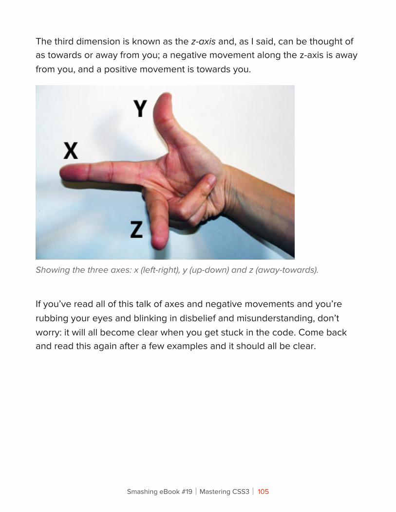
The third dimension is known as the z-axis and, as I said, can be thought of as towards or away from you; a negative movement along the z-axis is away from you, and a positive movement is towards you.
Showing the three axes: x (left-right), y (up-down) and z (away-towards).
If you’ve read all of this talk of axes and negative movements and you’re rubbing your eyes and blinking in disbelief and misunderstanding, don’t worry: it will all become clear when you get stuck in the code. Come back and read this again after a few examples and it should all be clear.
Smashing eBook #19│Mastering CSS3│ 105
Transformation FunctionsThe various transformations are all applied with a single CSS property: transform — yes, the same property that’s used for 2-D CSS Transforms. At the moment, this property is still considered experimental, so remember to use all of the browser prefixes, like so:
div { -moz-transform: foo; -ms-transform: foo; -o-transform: foo; -webkit-transform: foo;}
Note that Opera doesn’t currently have an implementation of 3D Transforms, but I’m including it here because work is apparently underway. For the sake of clarity, in the examples throughout this article, I’ll use only non-prefixed properties, but remember to include all of the prefixed ones in your own code.
Anyway, the transform property accepts a range of functions as values, each of which applies a different transformation. If you’ve used 2-D CSS Transforms, then you’ll already know many of these functions because they are quite similar (or, in some cases, the same). Here are all of the 3D functions:
• matrix3d
• perspective
• rotateX, rotateY, rotateZ, rotate3d
• scaleX, scaleY, scaleZ, scale3d
• translateX, translateY, translateZ, translate3d
Smashing eBook #19│Mastering CSS3│ 106
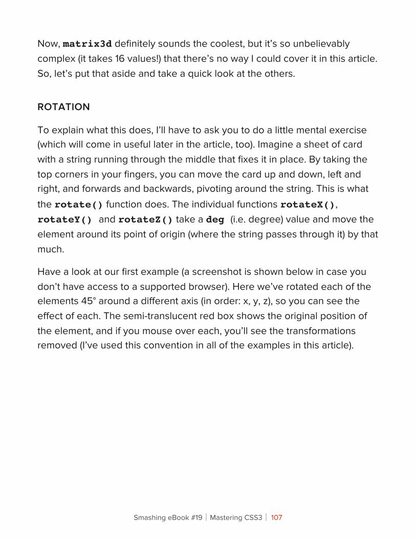
Now, matrix3d definitely sounds the coolest, but it’s so unbelievably complex (it takes 16 values!) that there’s no way I could cover it in this article. So, let’s put that aside and take a quick look at the others.
ROTATION
To explain what this does, I’ll have to ask you to do a little mental exercise (which will come in useful later in the article, too). Imagine a sheet of card with a string running through the middle that fixes it in place. By taking the top corners in your fingers, you can move the card up and down, left and right, and forwards and backwards, pivoting around the string. This is what the rotate() function does. The individual functions rotateX(), rotateY() and rotateZ() take a deg (i.e. degree) value and move the element around its point of origin (where the string passes through it) by that much.
Have a look at our first example (a screenshot is shown below in case you don’t have access to a supported browser). Here we’ve rotated each of the elements 45° around a different axis (in order: x, y, z), so you can see the effect of each. The semi-translucent red box shows the original position of the element, and if you mouse over each, you’ll see the transformations removed (I’ve used this convention in all of the examples in this article).
Smashing eBook #19│Mastering CSS3│ 107
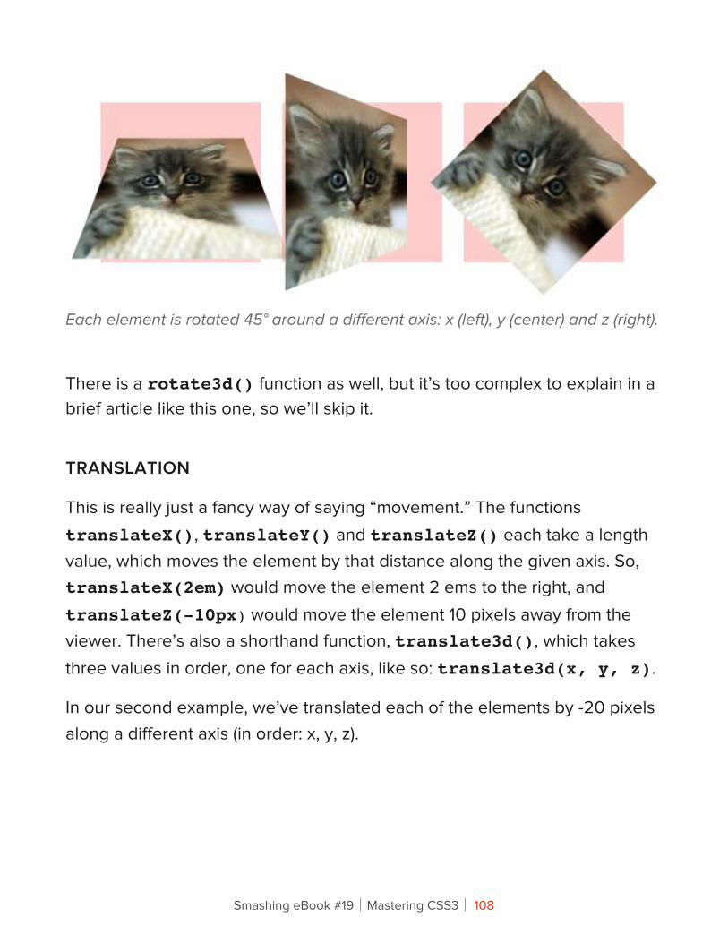
Each element is rotated 45° around a different axis: x (left), y (center) and z (right).
There is a rotate3d() function as well, but it’s too complex to explain in a brief article like this one, so we’ll skip it.
TRANSLATION
This is really just a fancy way of saying “movement.” The functions translateX(), translateY() and translateZ() each take a length value, which moves the element by that distance along the given axis. So, translateX(2em) would move the element 2 ems to the right, and translateZ(-10px) would move the element 10 pixels away from the viewer. There’s also a shorthand function, translate3d(), which takes three values in order, one for each axis, like so: translate3d(x, y, z).
In our second example, we’ve translated each of the elements by -20 pixels along a different axis (in order: x, y, z).
Smashing eBook #19│Mastering CSS3│ 108
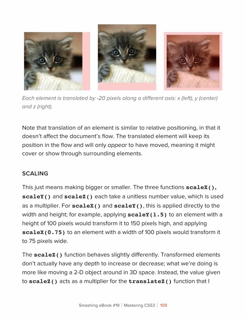
Each element is translated by -20 pixels along a different axis: x (left), y (center) and z (right).
Note that translation of an element is similar to relative positioning, in that it doesn’t affect the document’s flow. The translated element will keep its position in the flow and will only appear to have moved, meaning it might cover or show through surrounding elements.
SCALING
This just means making bigger or smaller. The three functions scaleX(), scaleY() and scaleZ() each take a unitless number value, which is used as a multiplier. For scaleX() and scaleY(), this is applied directly to the width and height; for example, applying scaleY(1.5) to an element with a height of 100 pixels would transform it to 150 pixels high, and applying scaleX(0.75) to an element with a width of 100 pixels would transform it to 75 pixels wide.
The scaleZ() function behaves slightly differently. Transformed elements don’t actually have any depth to increase or decrease; what we’re doing is more like moving a 2-D object around in 3D space. Instead, the value given to scaleZ() acts as a multiplier for the translateZ() function that I
Smashing eBook #19│Mastering CSS3│ 109
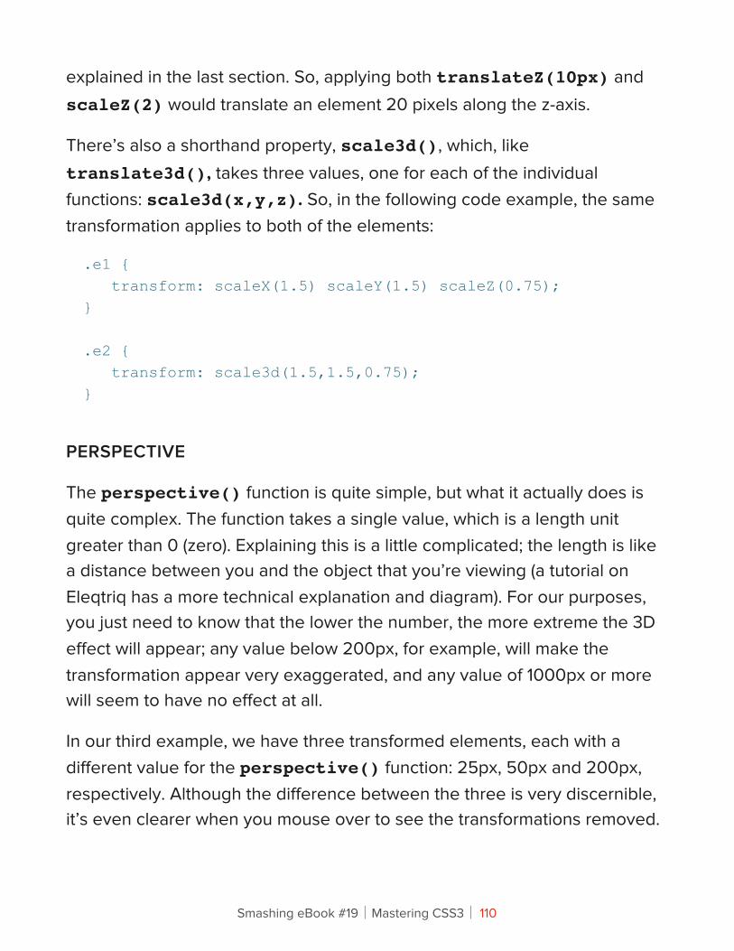
explained in the last section. So, applying both translateZ(10px) and scaleZ(2) would translate an element 20 pixels along the z-axis.
There’s also a shorthand property, scale3d(), which, like translate3d(), takes three values, one for each of the individual functions: scale3d(x,y,z). So, in the following code example, the same transformation applies to both of the elements:
.e1 { transform: scaleX(1.5) scaleY(1.5) scaleZ(0.75);}
.e2 { transform: scale3d(1.5,1.5,0.75);}
PERSPECTIVE
The perspective() function is quite simple, but what it actually does is quite complex. The function takes a single value, which is a length unit greater than 0 (zero). Explaining this is a little complicated; the length is like a distance between you and the object that you’re viewing (a tutorial on Eleqtriq has a more technical explanation and diagram). For our purposes, you just need to know that the lower the number, the more extreme the 3D effect will appear; any value below 200px, for example, will make the transformation appear very exaggerated, and any value of 1000px or more will seem to have no effect at all.
In our third example, we have three transformed elements, each with a different value for the perspective() function: 25px, 50px and 200px, respectively. Although the difference between the three is very discernible, it’s even clearer when you mouse over to see the transformations removed.
Smashing eBook #19│Mastering CSS3│ 110
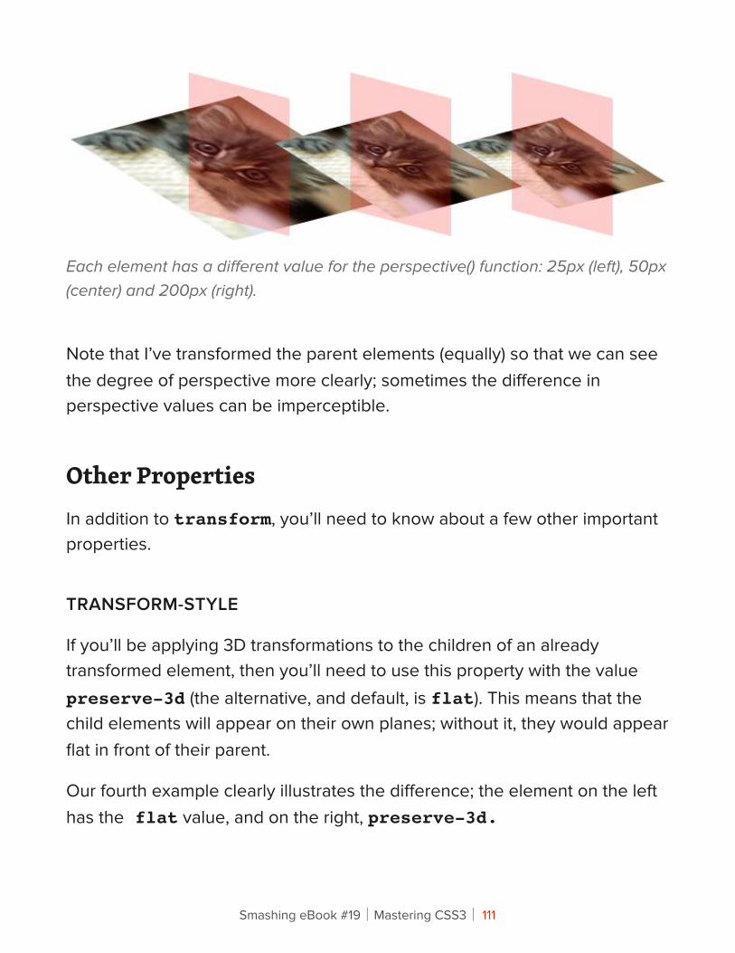
Each element has a different value for the perspective() function: 25px (left), 50px (center) and 200px (right).
Note that I’ve transformed the parent elements (equally) so that we can see the degree of perspective more clearly; sometimes the difference in perspective values can be imperceptible.
Other PropertiesIn addition to transform, you’ll need to know about a few other important properties.
TRANSFORM-STYLE
If you’ll be applying 3D transformations to the children of an already transformed element, then you’ll need to use this property with the value preserve-3d (the alternative, and default, is flat). This means that the child elements will appear on their own planes; without it, they would appear flat in front of their parent.
Our fourth example clearly illustrates the difference; the element on the left has the flat value, and on the right, preserve-3d.
Smashing eBook #19│Mastering CSS3│ 111
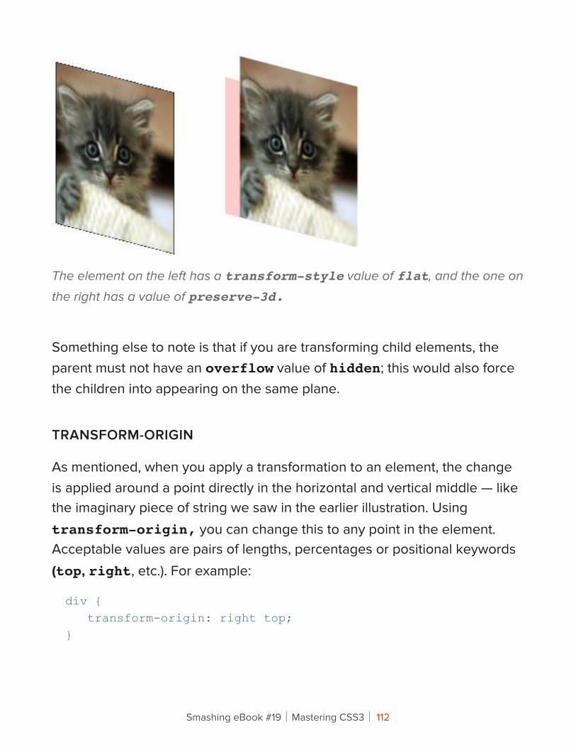
The element on the left has a transform-style value of flat, and the one on
the right has a value of preserve-3d.
Something else to note is that if you are transforming child elements, the parent must not have an overflow value of hidden; this would also force the children into appearing on the same plane.
TRANSFORM-ORIGIN
As mentioned, when you apply a transformation to an element, the change is applied around a point directly in the horizontal and vertical middle — like the imaginary piece of string we saw in the earlier illustration. Using transform-origin, you can change this to any point in the element. Acceptable values are pairs of lengths, percentages or positional keywords (top, right, etc.). For example:
div { transform-origin: right top;}
Smashing eBook #19│Mastering CSS3│ 112
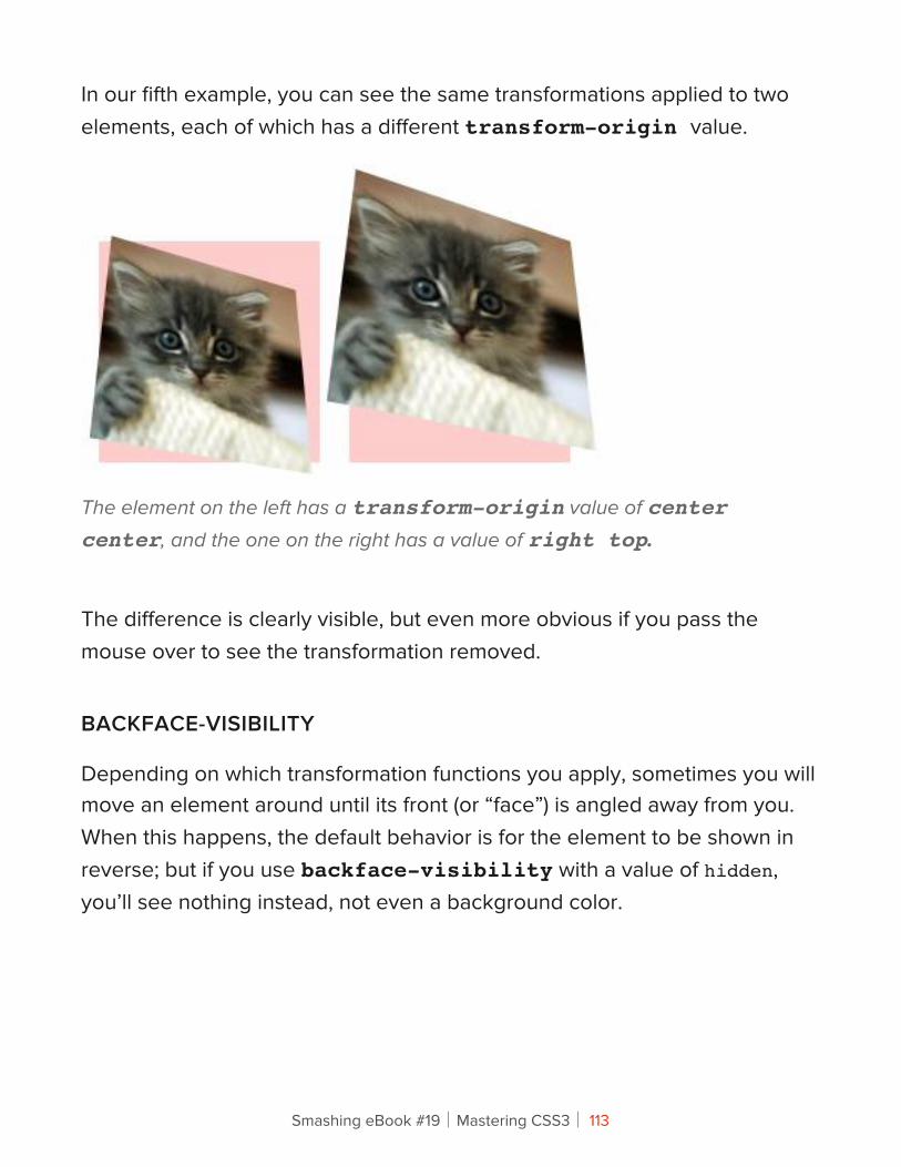
In our fifth example, you can see the same transformations applied to two elements, each of which has a different transform-origin value.
The element on the left has a transform-origin value of center center, and the one on the right has a value of right top.
The difference is clearly visible, but even more obvious if you pass the mouse over to see the transformation removed.
BACKFACE-VISIBILITY
Depending on which transformation functions you apply, sometimes you will move an element around until its front (or “face”) is angled away from you. When this happens, the default behavior is for the element to be shown in reverse; but if you use backface-visibility with a value of hidden, you’ll see nothing instead, not even a background color.
Smashing eBook #19│Mastering CSS3│ 113
PERSPECTIVE AND PERSPECTIVE-ORIGIN
We introduced the perspective() function earlier, but the perspective property takes the same values; the difference is that the property applies only to the children of the element that it’s used on, not the element itself.
The perspective-origin property changes the angle from which you view the element that’s being transformed. Like transform-origin, it accepts lengths, percentages or positional keywords, and the default position is the horizontal and vertical middle. The effect of changing the origin will be more pronounced the lower the perspective value is.
ConclusionBy necessity, we’ve flown through the intricacies of the 3D transformations syntax, but hopefully I’ve whetted your appetite to try it out yourself. With a certain amount of care for older browser versions, you can implement these properties in your own designs right now. If you don’t believe me, compare the list of “More adventures” on The Feed website that I built last year in a browser that supports 3D transforms and in one that doesn’t, and you’ll see what I mean.
Some of the concepts used in 3D transforms can be quite daunting, but experimentation will soon make them clear to you in practice, so get ahold of a browser that supports them and start making some cool stuff. But please, be responsible: not everything on the Web needs to be in three dimensions!
Smashing eBook #19│Mastering CSS3│ 114
How To Use CSS3 Pseudo-ClassesRichard Shepherd
CSS3 is a wonderful thing, but it’s easy to be bamboozled by the transforms and animations (many of which are vendor-specific) and forget about the nuts-and-bolts selectors that have also been added to the specification. A number of powerful new pseudo-selectors (16 are listed in the latest W3C spec) enable us to select elements based on a range of new criteria.
Smashing eBook #19│Mastering CSS3│ 115
Before we look at these new CSS3 pseudo-classes, let’s briefly delve into the dusty past of the Web and chart the journey of these often misunderstood selectors.
A Brief History Of Pseudo-ClassesWhen the CSS1 spec was completed back in 1996, a few pseudo-selectors were included, many of which you probably use almost every day. For example:
• :link
• :visited
• :hover
• :active
Each of these states can be applied to an element, usually <a>, after which comes the name of the pseudo-class. It’s amazing to think that these pseudo-classes arrived on the scene before HTML4 was published by the W3C a year later in December 1997.
CSS2 ARRIVES
Hot on the heels of CSS1 was CSS2, whose recommended spec was published just two years later in May 1998. Along with exciting things like positioning were new pseudo-classes: :first-child and :lang().
Smashing eBook #19│Mastering CSS3│ 116
:langThere are a couple of ways to indicate the language of a document, and if you’re using HTML5, it’ll likely be by putting <html lang="en"> just after the doc type (specifying your local language, of course). You can now use :lang(en) to style elements on a page, which is useful when the language changes dynamically.
:first-childYou may have already used :first-child in your documents. It is often used to add or remove a top border on the first element in a list. Strange, then, that it wasn’t accompanied by :last-child; we had to wait until CSS3 was proposed before it could meet its brother.
WHY USE PSEUDO-CLASSES?
What makes pseudo-classes so useful is that they allow you to style content dynamically. In the <a> example above, we are able to describe how links are styled when the user interacts with them. As we’ll see, the new pseudo-classes allow us to dynamically style content based on its position in the document or its state.
Sixteen new pseudo-classes have been introduced as part of the W3C’s CSS Proposed Recommendation, and they are broken down into four groups: structural pseudo-classes, pseudo-classes for the states of UI elements, a target pseudo-class and a negation pseudo-class.
Smashing eBook #19│Mastering CSS3│ 117
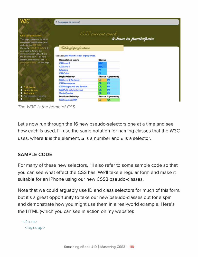
The W3C is the home of CSS.
Let’s now run through the 16 new pseudo-selectors one at a time and see how each is used. I’ll use the same notation for naming classes that the W3C uses, where E is the element, n is a number and s is a selector.
SAMPLE CODE
For many of these new selectors, I’ll also refer to some sample code so that you can see what effect the CSS has. We’ll take a regular form and make it suitable for an iPhone using our new CSS3 pseudo-classes.
Note that we could arguably use ID and class selectors for much of this form, but it’s a great opportunity to take our new pseudo-classes out for a spin and demonstrate how you might use them in a real-world example. Here’s the HTML (which you can see in action on my website):
<form> <hgroup>
Smashing eBook #19│Mastering CSS3│ 118
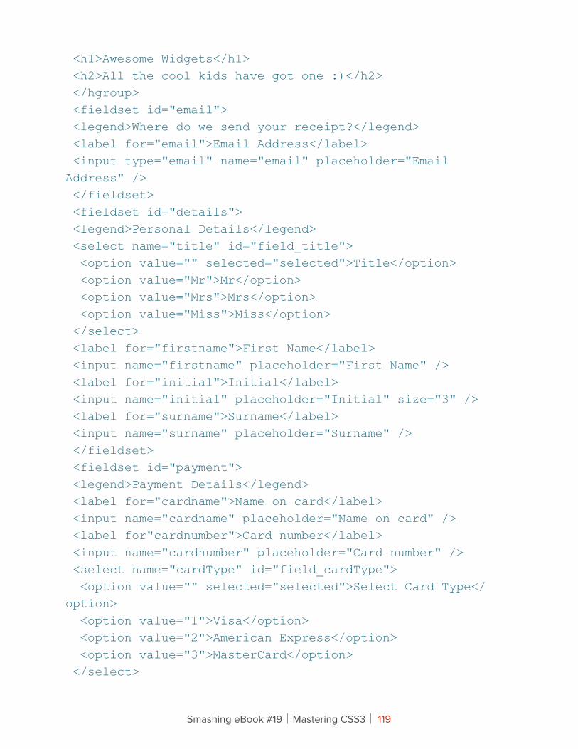
<h1>Awesome Widgets</h1> <h2>All the cool kids have got one :)</h2> </hgroup> <fieldset id="email"> <legend>Where do we send your receipt?</legend> <label for="email">Email Address</label> <input type="email" name="email" placeholder="Email Address" /> </fieldset> <fieldset id="details"> <legend>Personal Details</legend> <select name="title" id="field_title"> <option value="" selected="selected">Title</option> <option value="Mr">Mr</option> <option value="Mrs">Mrs</option> <option value="Miss">Miss</option> </select> <label for="firstname">First Name</label> <input name="firstname" placeholder="First Name" /> <label for="initial">Initial</label> <input name="initial" placeholder="Initial" size="3" /> <label for="surname">Surname</label> <input name="surname" placeholder="Surname" /> </fieldset> <fieldset id="payment"> <legend>Payment Details</legend> <label for="cardname">Name on card</label> <input name="cardname" placeholder="Name on card" /> <label for"cardnumber">Card number</label> <input name="cardnumber" placeholder="Card number" /> <select name="cardType" id="field_cardType"> <option value="" selected="selected">Select Card Type</option> <option value="1">Visa</option> <option value="2">American Express</option> <option value="3">MasterCard</option> </select>
Smashing eBook #19│Mastering CSS3│ 119
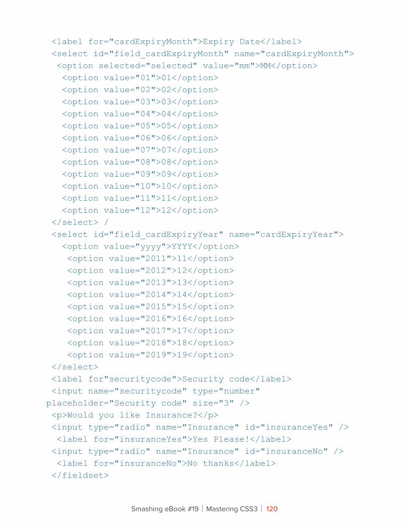
<label for="cardExpiryMonth">Expiry Date</label> <select id="field_cardExpiryMonth" name="cardExpiryMonth"> <option selected="selected" value="mm">MM</option> <option value="01">01</option> <option value="02">02</option> <option value="03">03</option> <option value="04">04</option> <option value="05">05</option> <option value="06">06</option> <option value="07">07</option> <option value="08">08</option> <option value="09">09</option> <option value="10">10</option> <option value="11">11</option> <option value="12">12</option> </select> / <select id="field_cardExpiryYear" name="cardExpiryYear"> <option value="yyyy">YYYY</option> <option value="2011">11</option> <option value="2012">12</option> <option value="2013">13</option> <option value="2014">14</option> <option value="2015">15</option> <option value="2016">16</option> <option value="2017">17</option> <option value="2018">18</option> <option value="2019">19</option> </select> <label for"securitycode">Security code</label> <input name="securitycode" type="number" placeholder="Security code" size="3" /> <p>Would you like Insurance?</p> <input type="radio" name="Insurance" id="insuranceYes" /> <label for="insuranceYes">Yes Please!</label> <input type="radio" name="Insurance" id="insuranceNo" /> <label for="insuranceNo">No thanks</label> </fieldset>
Smashing eBook #19│Mastering CSS3│ 120
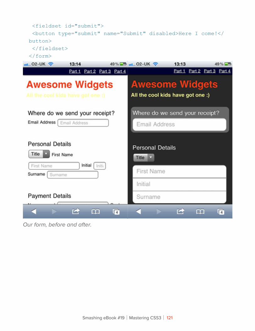
<fieldset id="submit"> <button type="submit" name="Submit" disabled>Here I come!</button> </fieldset></form>
Our form, before and after.
Smashing eBook #19│Mastering CSS3│ 121

1. Structural Pseudo-ClassesAccording to the W3C, structural pseudo-classes do the following:
… permit selection based on extra information that lies in the document tree but cannot be represented by other simple selectors or combinators.
What this means is that we have selectors that have been turbo-charged to dynamically select content based on its position in the document. So let’s start at the beginning of the document, with :root.
Level 3 selectors on the W3C website.
Smashing eBook #19│Mastering CSS3│ 122
E:ROOT
The :root pseudo-class selects the root element on the page. Ninety-nine times out of a hundred, this will be the <html> element. For example:
:root { background-color: #fcfcfc; }
It’s worth noting that you could style the <html> element instead, which is perhaps a little more descriptive:
html { background-color: #fcfcfc; }
iPhone Form ExampleLet’s move over to our sample code and give the document some basic text and background styles:
:root {color: #fff;text-shadow: 0 -1px 0 rgba(0,0,0,0.8);background: url(…/images/background.png) no-repeat #282826; }
E:NTH-CHILD(N)
The :nth-child() selector might require a bit of experimentation to fully understand. The easiest implementation is to use the keywords odd or even, which are useful when displaying data that consists of rows or columns. For example, we could use the following:
ul li:nth-child(odd) {background-color: #666;color: #fff; }
This would highlight every other row in an unordered list. You might find this technique extremely handy when using tables. For example:
table tr:nth-child(even) { … }
Smashing eBook #19│Mastering CSS3│ 123
The :nth-child selector can be much more specific and flexible, though. You could select only the third element from a list, like so:
li:nth-child(3) { … }
Note that n does not start at zero, as it might in an array. The first element is :nth-child(1), the second is :nth-child(2) and so on.
We can also use some simple algebra to make things even more exciting. Consider the following:
li:nth-child(2n) { … }
Whenever we use n in this way, it stands for all positive integers (until the document runs out of elements to select!). In this instance, it would select the following list items:
• Nothing (2 × 0)
• 2nd element (2 × 1)
• 4th element (2 × 2)
• 6th element (2 × 3)
• 8th element (2 × 4)
• etc.
This actually gives us the same thing as nth-child(even). So, let’s mix things up a bit:
li:nth-child(5n) { … }
This gives us:
• Nothing (5 × 0)
• 5th element (5 × 1)
Smashing eBook #19│Mastering CSS3│ 124
• 10th element (5 × 2)
• 15th element (5 × 3)
• 20th element (5 × 4)
• etc.
Perhaps this would be useful for long lists or tables, perhaps not. We can also add and subtract numbers in this equation:
li:nth-child(4n + 1) { … }
This gives us:
• 1st element ((4 × 0) + 1)
• 5th element ((4 × 1) + 1)
• 9th element ((4 × 2) + 1)
• 13th element ((4 × 3) + 1)
• 17th element ((4 × 4) + 1)
• etc.
SitePoint points out an interesting quirk here. If you set n as negative, you’ll be able to select the first x number of items like so:
li:nth-child(-n + x) { … }
Let’s say you want to select the first five items in a list. Here’s the CSS:
li:nth-child(-n + 5) { … }
This gives us:
• 5th element (-0 + 5)
• 4th element (-1 + 5)
Smashing eBook #19│Mastering CSS3│ 125
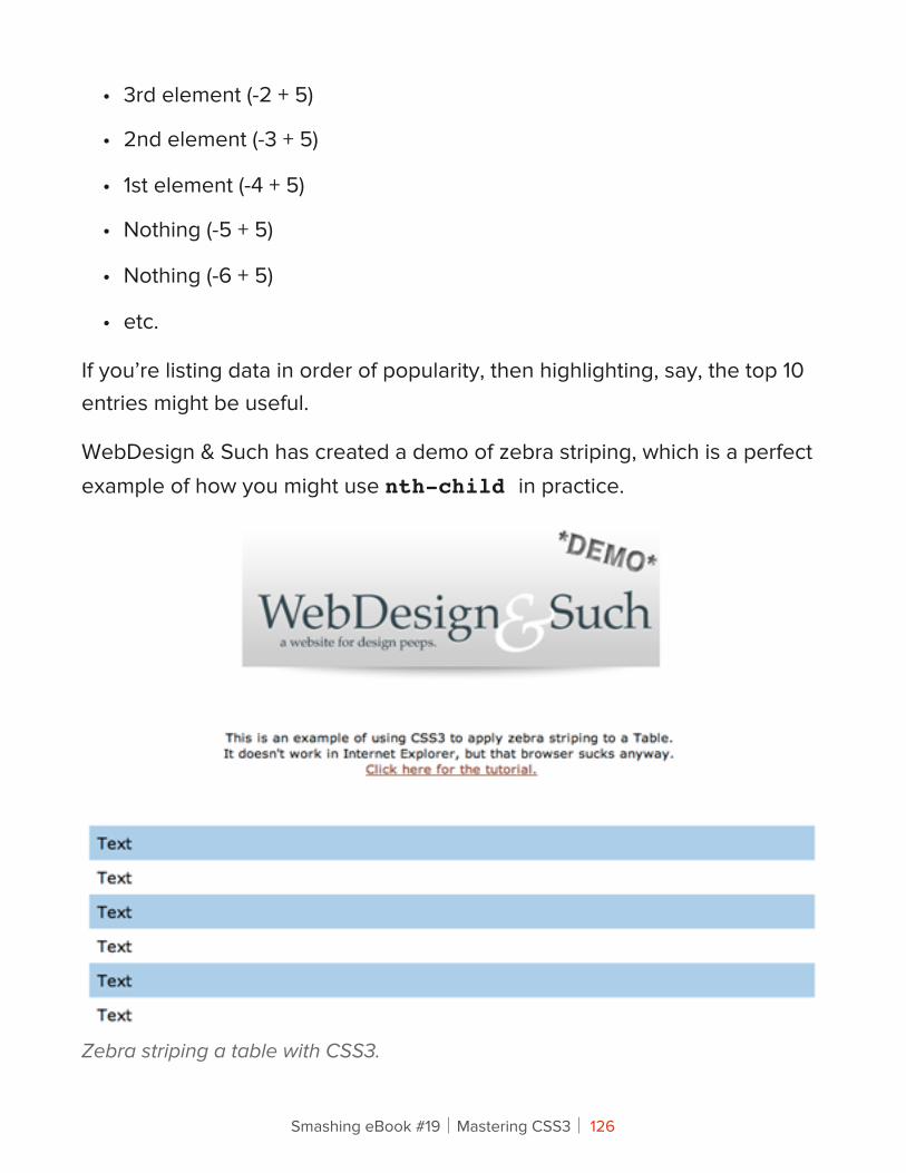
• 3rd element (-2 + 5)
• 2nd element (-3 + 5)
• 1st element (-4 + 5)
• Nothing (-5 + 5)
• Nothing (-6 + 5)
• etc.
If you’re listing data in order of popularity, then highlighting, say, the top 10 entries might be useful.
WebDesign & Such has created a demo of zebra striping, which is a perfect example of how you might use nth-child in practice.
Zebra striping a table with CSS3.
Smashing eBook #19│Mastering CSS3│ 126

If none of your tables need styling, then you could do what Webvisionary Awards has done and use :nth-child to style alternating sections of its website. Here’s the CSS:
section > section:nth-child(even) {background:rgba(255,255,255,.1)url("../images/hr-damaged2.png") 0 bottom no-repeat;}section > section:nth-child(even) {background:rgba(255,255,255,.1)url("../images/hr-damaged2.png") 0 bottom no-repeat;}
The effect is subtle on the website, but it adds a layer of detail that would be missed in older browsers.
The :nth-child selectors in action on Webvisionary Awards.
Smashing eBook #19│Mastering CSS3│ 127
iPhone Form ExampleWe could use :nth-child in a few places in our iPhone form example, but let’s focus on one. We want to hide the labels for the first three fieldsets from view and use the placeholder text instead. Here’s the CSS:
form:nth-child(-n+3) label { display: none; }
Here, we’re looking for the first three children of the <form> element (which are all fieldsets in our code) and then selecting the label. We then hide these labels with display: none;.
E:NTH-LAST-CHILD(N)
Not content with confusing us all with the :nth-child() pseudo-class, the clever folks over at the W3C have also given us :nth-last-child(n). It operates much like :nth-child() except in reverse, counting from the last item in the selection.
li:nth-last-child(1) { … }
The above will select the last element in a list, whereas the following will select the penultimate element:
li:nth-last-child(2) { … }
Of course, you could create other rules, like this one:
li:nth-last-child(2n+1) { … }
But you would more likely want to use the following to select the last five elements of a list (based on the logic discussed above):
li:nth-last-child(-n+5) { … }
Smashing eBook #19│Mastering CSS3│ 128
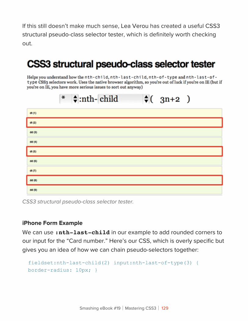
If this still doesn’t make much sense, Lea Verou has created a useful CSS3 structural pseudo-class selector tester, which is definitely worth checking out.
CSS3 structural pseudo-class selector tester.
iPhone Form ExampleWe can use :nth-last-child in our example to add rounded corners to our input for the “Card number.” Here’s our CSS, which is overly specific but gives you an idea of how we can chain pseudo-selectors together:
fieldset:nth-last-child(2) input:nth-last-of-type(3) {border-radius: 10px; }
Smashing eBook #19│Mastering CSS3│ 129
We first grab the penultimate fieldset and select the input that is third from last (in this case, our “Card number” input). We then add a border-radius.
:NTH-OF-TYPE(N)
Now we’ll get even more specific and apply styles only to particular types of element. For example, let’s say you wanted to style the first paragraph in an article with a larger font. Here’s the CSS:
article p:nth-of-type(1) { font-size: 1.5em; }
Perhaps you want to align every other image in an article to the right, and the others to the left. We can use keywords to control this:
article img:nth-of-type(odd) { float: right; }article img:nth-of-type(even) { float: left; }
As with :nth-child() and :nth-last-child(), you can use algebraic expressions:
article p:nth-of-type(2n+2) { … }article p:nth-of-type(-n+1) { … }
It’s worth remembering that if you need to get this specific about targeting elements, then using descriptive class names instead might be more useful.
Simon Foster has created a beautiful infographic about his 45 RPM record collection, and he uses :nth-of-type to style some of the data. Here’s a snippet from the CSS, which assigns a different background to each genre type:
ul#genre li:nth-of-type(1) { width:32.9%; background:url(images/orangenoise.jpg);
Smashing eBook #19│Mastering CSS3│ 130
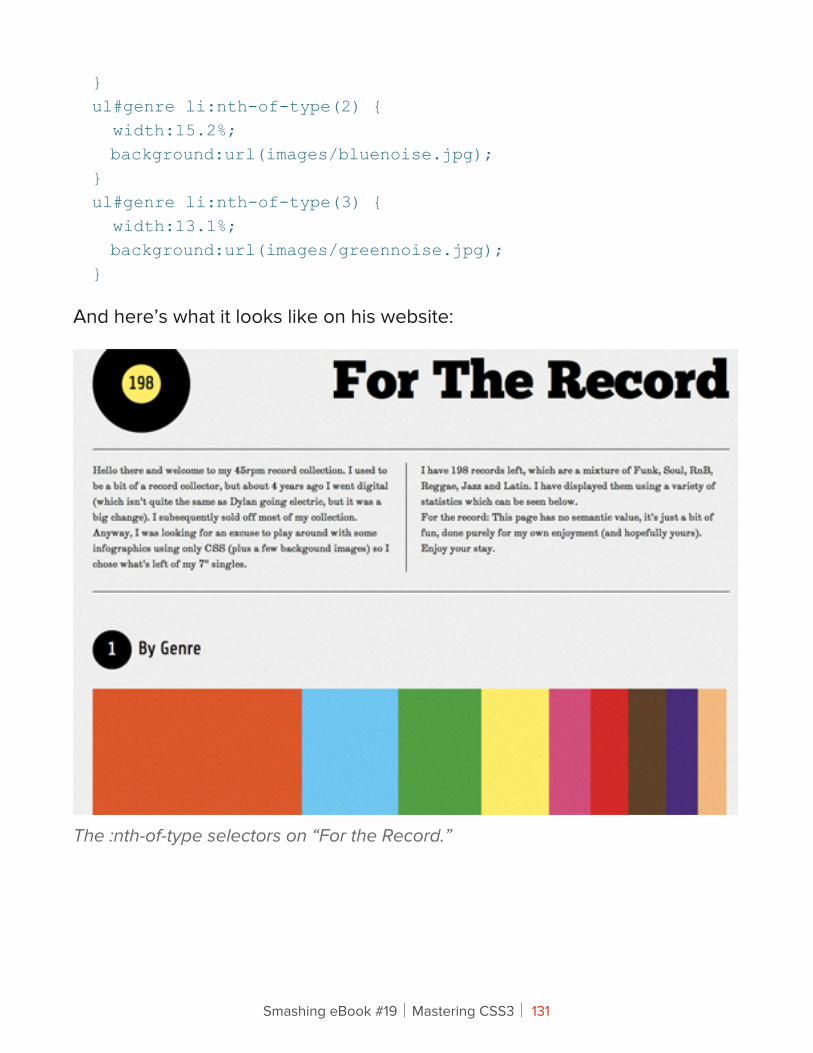
}ul#genre li:nth-of-type(2) { width:15.2%; background:url(images/bluenoise.jpg);}ul#genre li:nth-of-type(3) { width:13.1%; background:url(images/greennoise.jpg);}
And here’s what it looks like on his website:
The :nth-of-type selectors on “For the Record.”
Smashing eBook #19│Mastering CSS3│ 131
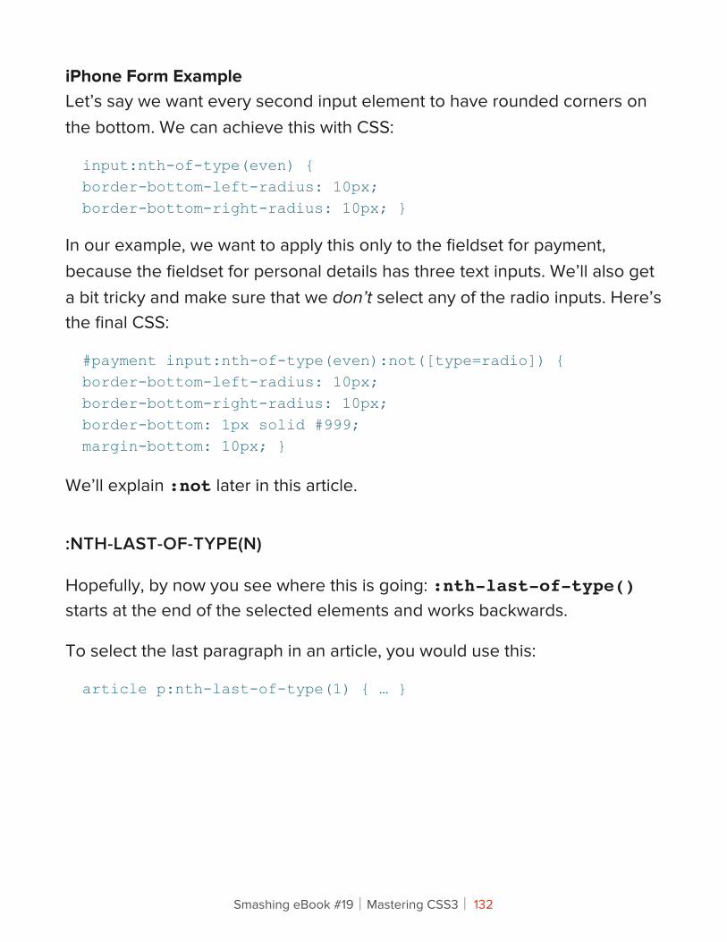
iPhone Form ExampleLet’s say we want every second input element to have rounded corners on the bottom. We can achieve this with CSS:
input:nth-of-type(even) {border-bottom-left-radius: 10px;border-bottom-right-radius: 10px; }
In our example, we want to apply this only to the fieldset for payment, because the fieldset for personal details has three text inputs. We’ll also get a bit tricky and make sure that we don’t select any of the radio inputs. Here’s the final CSS:
#payment input:nth-of-type(even):not([type=radio]) {border-bottom-left-radius: 10px;border-bottom-right-radius: 10px;border-bottom: 1px solid #999;margin-bottom: 10px; }
We’ll explain :not later in this article.
:NTH-LAST-OF-TYPE(N)
Hopefully, by now you see where this is going: :nth-last-of-type() starts at the end of the selected elements and works backwards.
To select the last paragraph in an article, you would use this:
article p:nth-last-of-type(1) { … }
Smashing eBook #19│Mastering CSS3│ 132
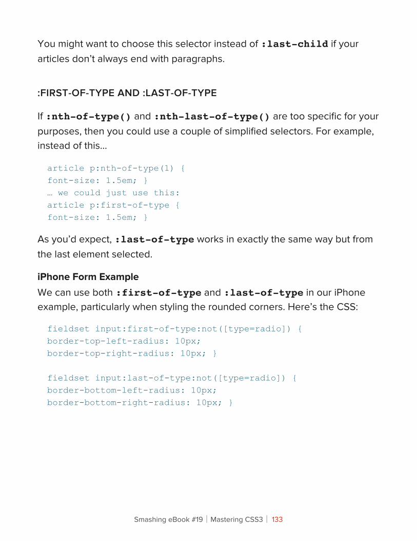
You might want to choose this selector instead of :last-child if your articles don’t always end with paragraphs.
:FIRST-OF-TYPE AND :LAST-OF-TYPE
If :nth-of-type() and :nth-last-of-type() are too specific for your purposes, then you could use a couple of simplified selectors. For example, instead of this…
article p:nth-of-type(1) {font-size: 1.5em; }… we could just use this:article p:first-of-type {font-size: 1.5em; }
As you’d expect, :last-of-type works in exactly the same way but from the last element selected.
iPhone Form ExampleWe can use both :first-of-type and :last-of-type in our iPhone example, particularly when styling the rounded corners. Here’s the CSS:
fieldset input:first-of-type:not([type=radio]) {border-top-left-radius: 10px;border-top-right-radius: 10px; }
fieldset input:last-of-type:not([type=radio]) {border-bottom-left-radius: 10px;border-bottom-right-radius: 10px; }
Smashing eBook #19│Mastering CSS3│ 133
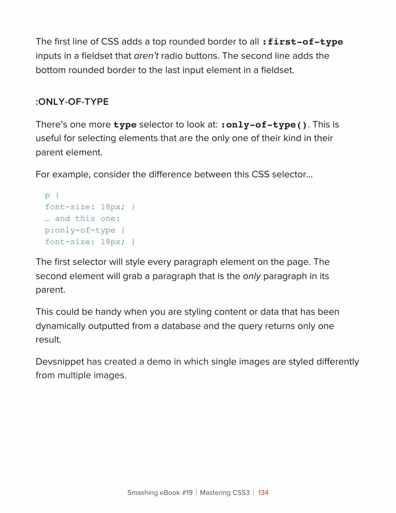
The first line of CSS adds a top rounded border to all :first-of-type inputs in a fieldset that aren’t radio buttons. The second line adds the bottom rounded border to the last input element in a fieldset.
:ONLY-OF-TYPE
There’s one more type selector to look at: :only-of-type(). This is useful for selecting elements that are the only one of their kind in their parent element.
For example, consider the difference between this CSS selector…
p {font-size: 18px; }… and this one:p:only-of-type {font-size: 18px; }
The first selector will style every paragraph element on the page. The second element will grab a paragraph that is the only paragraph in its parent.
This could be handy when you are styling content or data that has been dynamically outputted from a database and the query returns only one result.
Devsnippet has created a demo in which single images are styled differently from multiple images.
Smashing eBook #19│Mastering CSS3│ 134
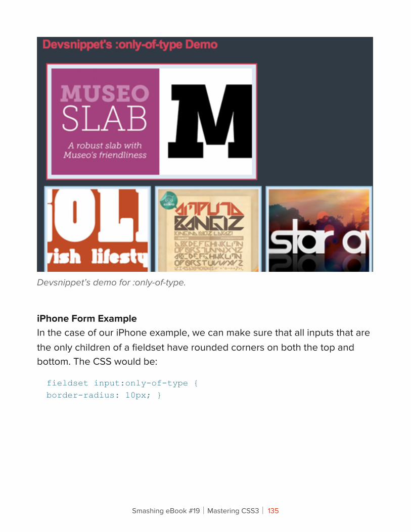
Devsnippet’s demo for :only-of-type.
iPhone Form ExampleIn the case of our iPhone example, we can make sure that all inputs that are the only children of a fieldset have rounded corners on both the top and bottom. The CSS would be:
fieldset input:only-of-type {border-radius: 10px; }
Smashing eBook #19│Mastering CSS3│ 135
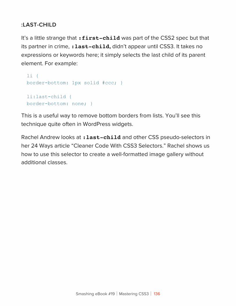
:LAST-CHILD
It’s a little strange that :first-child was part of the CSS2 spec but that its partner in crime, :last-child, didn’t appear until CSS3. It takes no expressions or keywords here; it simply selects the last child of its parent element. For example:
li {border-bottom: 1px solid #ccc; }
li:last-child {border-bottom: none; }
This is a useful way to remove bottom borders from lists. You’ll see this technique quite often in WordPress widgets.
Rachel Andrew looks at :last-child and other CSS pseudo-selectors in her 24 Ways article “Cleaner Code With CSS3 Selectors.” Rachel shows us how to use this selector to create a well-formatted image gallery without additional classes.
Smashing eBook #19│Mastering CSS3│ 136
The CSS for :last-child in action, courtesy of Rachel Andrew.
:ONLY-CHILD
If an element is the only child of its parent, then you can select it with :only-child. Unlike with :only-of-type, it doesn’t matter what type of element it is. For example:
li:only-child { … }
We could use this to select list elements that are the only list elements in their <ol> or <ul> parent.
Smashing eBook #19│Mastering CSS3│ 137
:EMPTY
Finally, in structural pseudo-classes, we have :empty. Not surprisingly, this selects only elements that have no children and no content. Again, this might be useful when dealing with dynamic content outputted from a database.
#results:empty {background-color: #fcc; }
You might use the above to draw the user’s attention to an empty search results section.
2. !e Target Pseudo-Class
:TARGET
This is one of my favourite pseudo-classes, because it allows us to style elements on the page based on the URL. If the URL has an identifier (that follows an #), then the :target pseudo-class will style the element that shares the ID with the identifier. Take a URL that looks like this:
http://www.example.com/css3-pseudo-selectors#summary
The section with the id summary can now be styled like so:
:target {background-color: #fcc; }
This is a great way to style elements on pages that have been linked to from external content. You could also use it with internal anchors to highlight content that users have skipped to.
Smashing eBook #19│Mastering CSS3│ 138
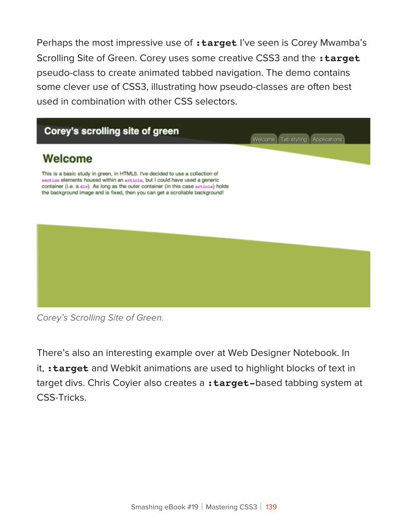
Perhaps the most impressive use of :target I’ve seen is Corey Mwamba’s Scrolling Site of Green. Corey uses some creative CSS3 and the :target pseudo-class to create animated tabbed navigation. The demo contains some clever use of CSS3, illustrating how pseudo-classes are often best used in combination with other CSS selectors.
Corey’s Scrolling Site of Green.
There’s also an interesting example over at Web Designer Notebook. In it, :target and Webkit animations are used to highlight blocks of text in target divs. Chris Coyier also creates a :target-based tabbing system at CSS-Tricks.
Smashing eBook #19│Mastering CSS3│ 139
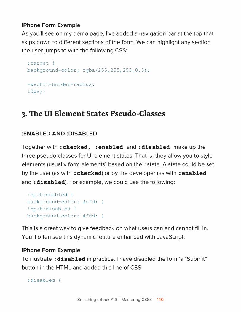
iPhone Form ExampleAs you’ll see on my demo page, I’ve added a navigation bar at the top that skips down to different sections of the form. We can highlight any section the user jumps to with the following CSS:
:target {background-color: rgba(255,255,255,0.3);
-webkit-border-radius:10px;}
3. !e UI Element States Pseudo-Classes
:ENABLED AND :DISABLED
Together with :checked, :enabled and :disabled make up the three pseudo-classes for UI element states. That is, they allow you to style elements (usually form elements) based on their state. A state could be set by the user (as with :checked) or by the developer (as with :enabled and :disabled). For example, we could use the following:
input:enabled {background-color: #dfd; }input:disabled {background-color: #fdd; }
This is a great way to give feedback on what users can and cannot fill in. You’ll often see this dynamic feature enhanced with JavaScript.
iPhone Form ExampleTo illustrate :disabled in practice, I have disabled the form’s “Submit” button in the HTML and added this line of CSS:
:disabled {
Smashing eBook #19│Mastering CSS3│ 140
color: #600; }
The button text is now red!
:CHECKED
The third pseudo-class here is :checked, which deals with the state of an element such as a checkbox or radio button. Again, this is very useful for giving feedback on what users have selected. For example:
input[type=radio]:checked {font-weight: bold; }
iPhone Form ExampleAs a flourish, we can use CSS to highlight the text next to each radio button once the button has been pressed:
input:checked + label {text-shadow: 0 0 6px #fff; }
We first select any input that has been checked, and then we look for the very next <span> element that contains our text. Highlighting the text with a simple text-shadow is an effective way to provide user feedback.
4. Negation Pseudo-Class
:NOT
This is another of my favorites, because it selects everything except the element you specify. For example:
:not(footer) { … }
Smashing eBook #19│Mastering CSS3│ 141
This selects everything on the page that is not a footer element. When used with form inputs, they allow us to get a little sneakier:
input:not([type=submit]) { … }input:not(disabled) { … }
The first line selects every form input that’s not a “Submit” button, which is useful for styling forms. The second selects all input elements that are not enabled; again useful for giving feedback on how to fill in a form.
iPhone User ExampleYou’ve already seen the :not selector in action. It’s particularly powerful when chained with other CSS3 pseudo-selectors. Let’s take a closer look at one example:
fieldset input:not([type=radio]) {margin: 0;width: 290px;font-size: 18px;border-radius: 0;border-bottom: 0;border-color: #999;padding: 8px 10px;}
Here we are selecting all inputs inside fieldset elements that are not radio buttons. This is incredibly useful when styling forms because you will often want to style text inputs different from select boxes, radio buttons and “Submit” buttons.
Smashing eBook #19│Mastering CSS3│ 142
What’s Old Is New AgainLet’s go back to the beginning of our story and the humble a:link. HTML5 arrived on the scene recently and brought with it an exciting change to the <a> element that gives the CSS3 pseudo-selector an additive effect.
An <a> element can now be wrapped around block-level elements, turning whole sections of your page into links (as long as those sections don’t contain other interactive elements). Whereas JavaScript was once popular for making entire <div> elements clickable, you can now do so by wrapping sections in <a> tags, like so:
<a href="http://www.smashing-magazine.com"><div id="advert"><hgroup><h1>Jackson’s Widgets</h1><h2>The finest widgets in Kentucky</h2></hgroup><p>Buy Jackson’s Widgets today,and be sure of a trouble-free life for you,your widget and your machinery.Trusted and sold since 1896.</p></div></a>
The implication for CSS pseudo-selectors is that you can now style a <div> based on whether it is being hovered over (a:hover) or is active (a:active), like so:
a:hover #advert {background-color: #f7f7f7; }
Anything that decreases JavaScript and increases semantic code has to be good!
Smashing eBook #19│Mastering CSS3│ 143
Cross-Browser CompatibilityYou had to ask, didn’t you! Unbelievably, Internet Explorer 8 (and earlier) doesn’t support any of these selectors, whereas the latest versions of Chrome, Opera, Safari and Firefox all do. Before your blood boils, consider the following solutions.
INTERNET EXPLORER 9
Unless you’ve been living under a rock for the last week, you’ll have heard that Microsoft unleashed its latest browser on an unsuspecting public. The good thing is, it’s actually quite good. While I don’t expect people who are reading this article to change their browsing habits, it’s worth remembering that the majority of the world uses IE; and thanks to Windows Update and a global marketing campaign, we can hope to see IE9 as the dominant Windows browser in the near future. That’s good for Web designers, and it’s good for pseudo-selectors. But what about IE8 and its ancestors?
Smashing eBook #19│Mastering CSS3│ 144
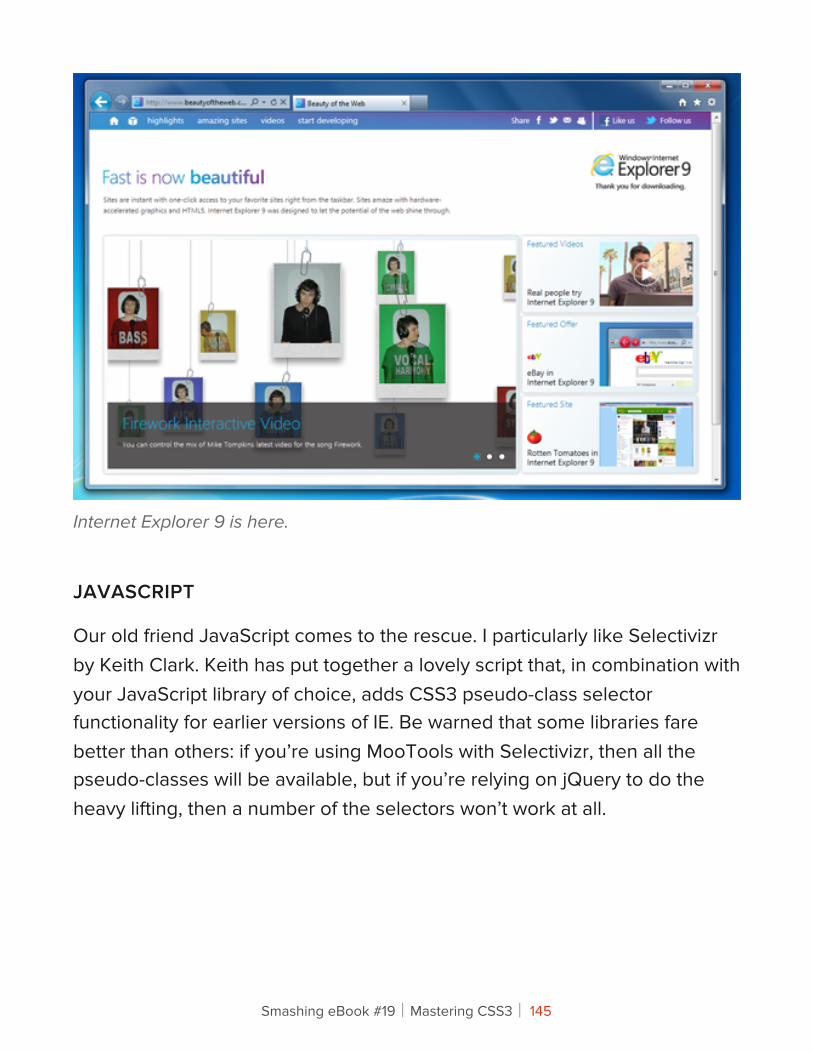
Internet Explorer 9 is here.
JAVASCRIPT
Our old friend JavaScript comes to the rescue. I particularly like Selectivizr by Keith Clark. Keith has put together a lovely script that, in combination with your JavaScript library of choice, adds CSS3 pseudo-class selector functionality for earlier versions of IE. Be warned that some libraries fare better than others: if you’re using MooTools with Selectivizr, then all the pseudo-classes will be available, but if you’re relying on jQuery to do the heavy lifting, then a number of the selectors won’t work at all.
Smashing eBook #19│Mastering CSS3│ 145
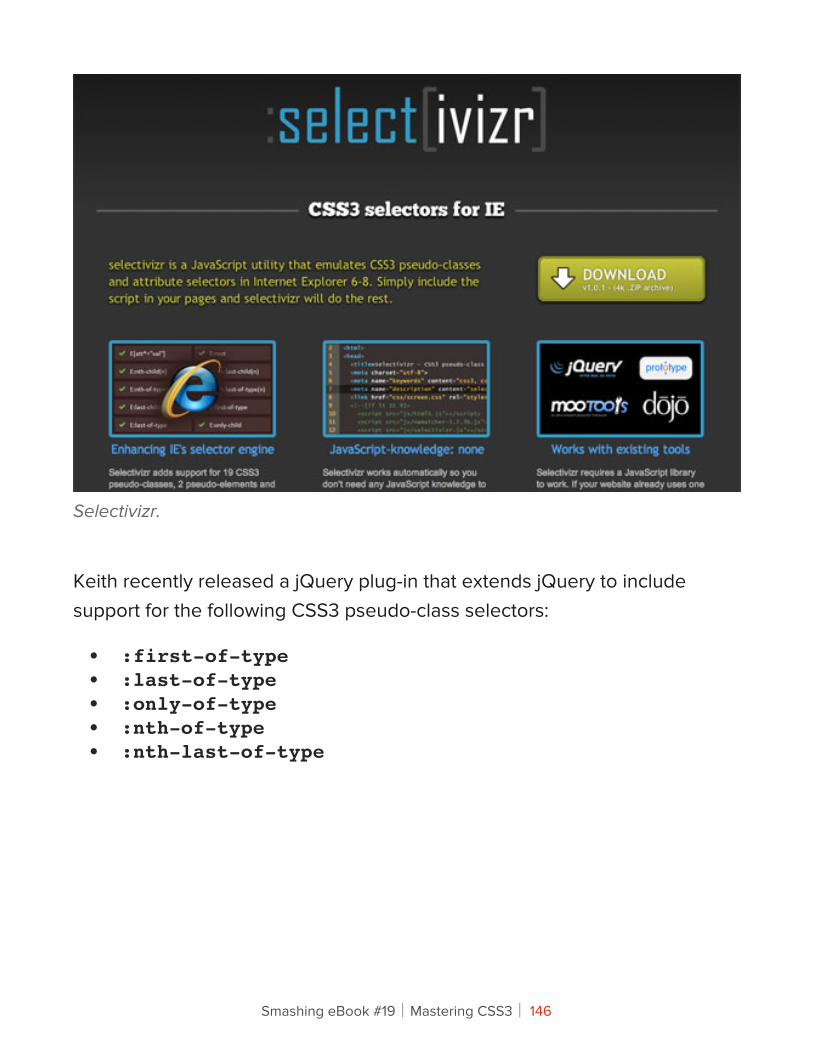
Selectivizr.
Keith recently released a jQuery plug-in that extends jQuery to include support for the following CSS3 pseudo-class selectors:
• :first-of-type• :last-of-type• :only-of-type• :nth-of-type• :nth-last-of-type
Smashing eBook #19│Mastering CSS3│ 146
It’s also worth looking at the ubiquitous ie7.js script (and its successors) by Dean Edwards. This script solves a number of IE-related problems, including CSS3 pseudo-selectors.
SO, SHOULD WE START USING CSS3 PSEUDO-SELECTORS TODAY?
I guess the answer to that question depends on how you view JavaScript. It’s true that pseudo-selectors can be completely replaced with classes and IDs; but it’s also true that, when styling complex layouts, pseudo-selectors are both incredibly useful and the natural next step for your CSS. If you find that they improve the readability of your CSS and reduce the need for (non-semantic) classes in your HTML, then it I’d definitely recommend embracing them today.
You could use two selectors and fall back on a class name, but that would just duplicate work. It also means that you wouldn’t need the pseudo-classes in the first place. But if you did choose to go down this path, the code might look something like this:
li:nth-of-type(3),li.third { … }
Smashing eBook #19│Mastering CSS3│ 147
This method is not as flexible as using pseudo-classes because you have to keep updating the HTML and CSS when the page content changes.
If a lot of your users don’t have JavaScript enabled, that puts you in a bit of a bind. Many Web designers argue that functionality (i.e. JavaScript) is different from layout (i.e. CSS), and so you should not rely on JavaScript to make pseudo-selectors work in IE8 and earlier.
While I agree with the principle, in practice I believe that providing the best possible experience to 99% of your users is better than accounting for the remaining 1% (or however big your non-JavaScript base may be).
Follow your website’s analytics, and be prepared to make decisions that improve your skills as a Web designer and, more importantly, provide the best experience possible to the majority of users.
Final !oughtsIt’s hard not to be depressed by IE8’s complete lack of support for pseudo-classes. Arguably, having the browser calculate and recalculate page styles in this fashion will have implications for rendering speed; but because all other major browsers now support these selectors, it’s frustrating that most of our users can’t benefit from them without a JavaScript hack.
But as Professor Farnsworth says, “Good news everyone!” Breaking on the horizon is the dawn of Internet Explorer 9, and Microsoft has made sure that its new browser supports each and every one of the selectors discussed in this article.
Smashing eBook #19│Mastering CSS3│ 148
CSS3 pseudo-selectors won’t likely take up large chunks of your style sheets. They are specific yet dynamic and are more likely, at least initially, to add finishing touches to a page than to set an overall style. Perhaps you want to drop the bottom border in the last item of a list, or give visual feedback to users as they fill in a form. This is all possible with CSS3, and as usage becomes more mainstream, I expect these will become a regular part of the Web designer’s toolbox.
If you’ve seen any interesting or exciting uses of these selectors out there in the field, do let us know in the comments below.
OTHER RESOURCES
You may be interested in the following articles and related resources:
• The Official CSS3 Selectors Proposed RecommendationEverything you need to know, from the folks in charge.
• Wikipedia’s Guide to Cascading Style SheetsA good background read, and the bibliography is a great resource.
• How nth-child WorksA comprehensive guide from the ever-reliable Chris Coyier.
• Internet Explorer 9If you haven’t yet played around with Redmond’s latest offering, you’re in for a pleasant surprise.
Smashing eBook #19│Mastering CSS3│ 149
CSS3 Flexible Box Layout ExplainedRichard Shepherd
The flexible box layout module — or “flexbox,” to use its popular nickname — is an interesting part of the W3C Working Draft. The flexbox specification is still a draft and subject to change, so keep your eyes on the W3C, but it is part of a new arsenal of properties that will revolutionize how we lay out pages. At least it will be when cross-browser support catches up.
In the meantime, we can experiment with flexbox and even use it on production websites where fallbacks will still render the page correctly. It may be a little while until we consider it as mainstream as, say, border-radius, but our job is to investigate new technologies and use them where possible. That said, when it comes to something as fundamental as page layout, we need to tread carefully.
!e Display PropertySo what is flexbox, and why was it created? First, let’s look at how we currently lay out pages and some of the problems with that model.
Until last year, most of us were using tables to lay out our pages. Okay, maybe not last year! But I suspect that many of you reading this have been guilty of relying on tables at some point in your career. At the same time, it actually made a lot of sense. And let’s face it: it worked… to a point. However, we all then faced the reality that tables were semantically dubious and incredibly inflexible. And through the haze of this mark-up hangover, we caught a glimpse of the future: the CSS box model. Hurray!
Smashing eBook #19│Mastering CSS3│ 150
The CSS box model allowed us to tell the browser how to display a piece of content, and in particular how to display it as a box. We floated left and right, we tried to understand what inline-block meant, and we read countless articles about clearfix, before just copying and pasting the clearfix hack-du-jour into our CSS.
For those of us testing our websites back to IE6, we had to grapple with hasLayout and triggering it with the following or some similar fix:
* html #element {height: 1%;}
The box model worked, and in most cases it worked well. But as the Web entered its teenage years, it demanded more complex ways of laying out content and — thanks to a certain Mr. Ethan Marcotte — of responding to the size of the browser and/or device.
PERCENTAGE + PADDING + BORDER = TROUBLE
Here’s another problem with the current box model: absolute values for padding, margin and border all affect the width of a box. Take the following:
#element {width: 50%;border 1px solid #000;padding: 0 5px;}
Smashing eBook #19│Mastering CSS3│ 151
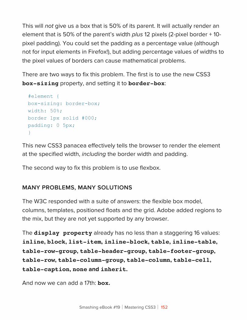
This will not give us a box that is 50% of its parent. It will actually render an element that is 50% of the parent’s width plus 12 pixels (2-pixel border + 10-pixel padding). You could set the padding as a percentage value (although not for input elements in Firefox!), but adding percentage values of widths to the pixel values of borders can cause mathematical problems.
There are two ways to fix this problem. The first is to use the new CSS3 box-sizing property, and setting it to border-box:
#element {box-sizing: border-box;width: 50%;border 1px solid #000;padding: 0 5px;}
This new CSS3 panacea effectively tells the browser to render the element at the specified width, including the border width and padding.
The second way to fix this problem is to use flexbox.
MANY PROBLEMS, MANY SOLUTIONS
The W3C responded with a suite of answers: the flexible box model, columns, templates, positioned floats and the grid. Adobe added regions to the mix, but they are not yet supported by any browser.
The display property already has no less than a staggering 16 values: inline, block, list-item, inline-block, table, inline-table, table-row-group, table-header-group, table-footer-group, table-row, table-column-group, table-column, table-cell, table-caption, none and inherit.
And now we can add a 17th: box.
Smashing eBook #19│Mastering CSS3│ 152
Living In A BoxLet’s take a look at flexbox, which brings with it a brand new value for the display property (box) and no less than 8 new properties. Here’s how the W3C defines the new module:
In this new box model, the children of a box are laid out either horizontally or vertically, and unused space can be assigned to a particular child or distributed among the children by assignment of flex to the children that should expand. Nesting of these boxes (horizontal inside vertical, or vertical inside horizontal) can be used to build layouts in two dimensions.
Sounds exciting! The Working Draft expands on this a little:
Flexbox… lacks many of the more complex text or document-formatting properties that can be used in block layout, such as “float” and “columns,” but in return it gains more simple and powerful tools for aligning its contents in ways that Web apps and complex Web pages often need.
Now this is beginning to sound interesting. The flexbox model picks up where the box model leaves off, and the W3C reveals its motivation by noting that “Web apps and complex Web pages” need a better layout model. Here’s a list of the new flexbox properties:
• box-orient,• box-pack,• box-align,• box-flex,
Smashing eBook #19│Mastering CSS3│ 153
• box-flex-group,• box-ordinal-group,• box-direction,• box-lines.
For the sake of brevity, I will use only the official spec’s properties and values, but do remember to add the vendor prefixes to your work. (See the section on “Vendor Prefixes and Cross-Browser Support” below.)
You might also want to check out Prefixr from Jeffrey Way, which can help generate some of the CSS for you. However, I found that it incorrectly generated the display: box property, so check all of its code.
EVERYTHING WILL CHANGE
If you take the time to read or even browse the latest Working Draft (from 22 March 2011), you’ll notice a lot of red ink, and with good reason. This spec has issues and is still changing; we are in unchartered waters.
It’s worth noting that the syntax used in this article, and by all current browsers, is already out of date. The Working Draft has undergone changes to much of the syntax used in the flexbox model. For example:
display: box;
This will become:
display: flexbox;
Other changes include some properties being split (box-flex will become flex-grow and flex-shrink), while others will be combined (box-orient and box-direction will become flex-direction). Indeed, anything that starts box- will be changed to flex-. So, keep your eyes on the spec and on browser implementations. (CanIUse helps, but it doesn’t cover all of the properties.)
Smashing eBook #19│Mastering CSS3│ 154
PARAPPA THE WRAPPER
Using flexbox often requires an extra div or two, because the parent of any flexbox element needs to have display set to box. Before, you could get away with the following:
<div style="float: left; width: 250px;"> Content here </div><div style="float: right; width: 250px;"> Content here </div>Now with flexbox, you’ll need:<div style="display: box"> <div style="width: 250px"> Content here </div> <div style="width: 250px"> Content here </div></div>
Many of you have already turned away, insulted by this extra mark-up that is purely for presentation. That’s understandable. But here’s the thing: once you master the CSS, this extra containing div becomes a small price to pay. Indeed, you’ll often already have a containing element (not necessarily a div) to add display: box to, so there won’t be a trade-off at all.
On a broader note, sometimes you need presentational mark-up. It’s just the way it goes. I’ve found that, particularly when working on cross-browser support for a page, I have to add presentational mark-up for browsers such as IE6. I’m not saying to contract “div-itis,” but because we all use HTML5 elements in our mark-up, we find that sections often need div containers. That’s fine, as long as it’s kept to a minimum.
With this in mind, let’s get busy with some code. I’ve put together a demo page, and you can download all of the source files.
Smashing eBook #19│Mastering CSS3│ 155
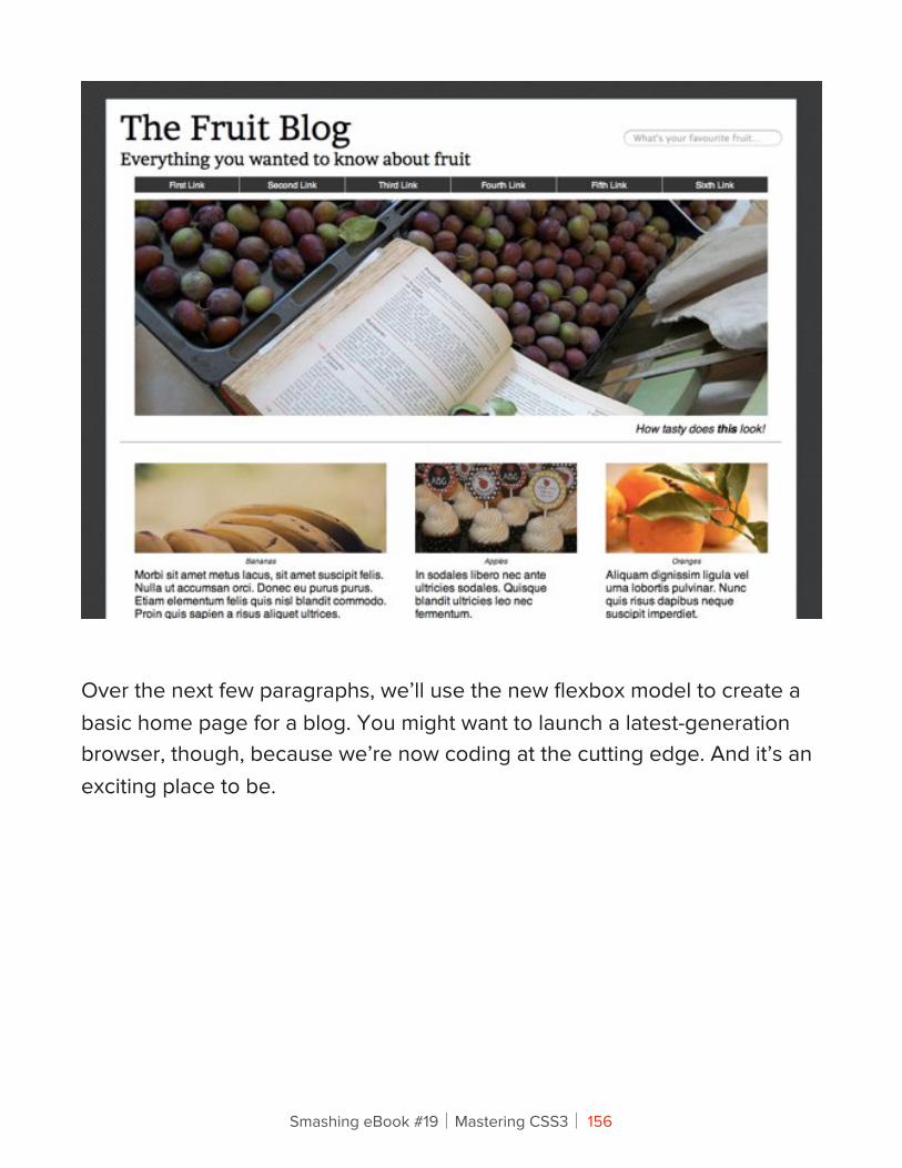
Over the next few paragraphs, we’ll use the new flexbox model to create a basic home page for a blog. You might want to launch a latest-generation browser, though, because we’re now coding at the cutting edge. And it’s an exciting place to be.
Smashing eBook #19│Mastering CSS3│ 156
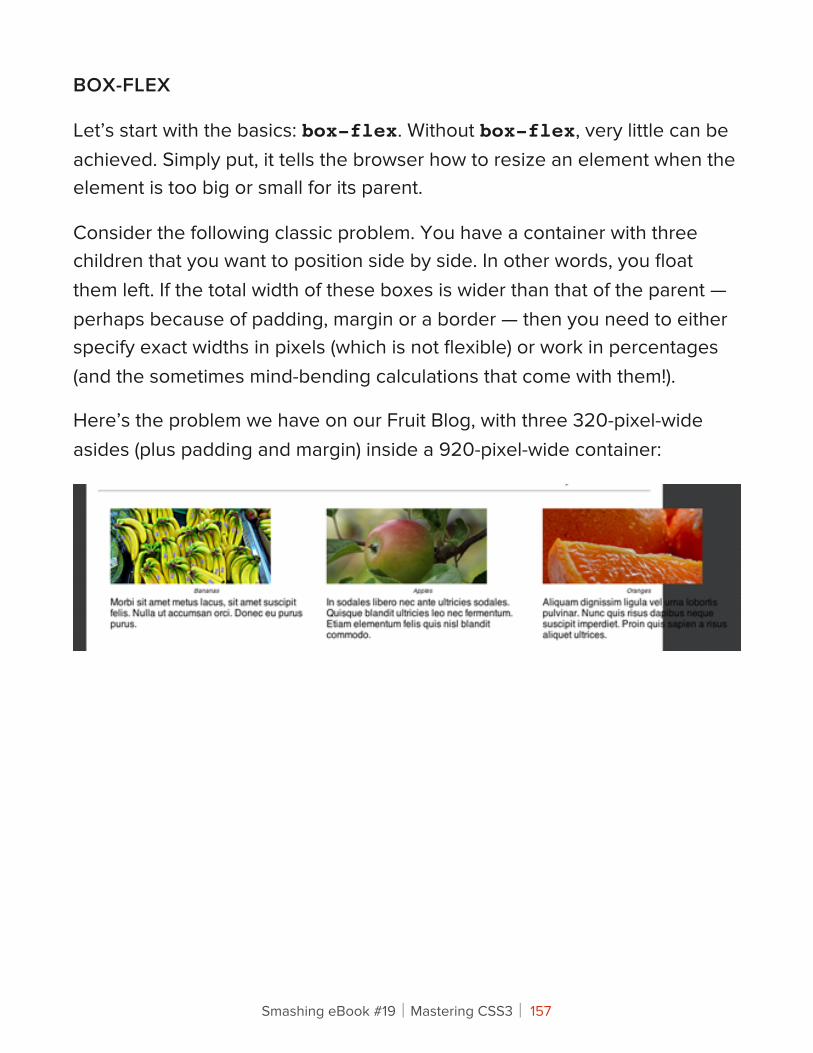
BOX-FLEX
Let’s start with the basics: box-flex. Without box-flex, very little can be achieved. Simply put, it tells the browser how to resize an element when the element is too big or small for its parent.
Consider the following classic problem. You have a container with three children that you want to position side by side. In other words, you float them left. If the total width of these boxes is wider than that of the parent — perhaps because of padding, margin or a border — then you need to either specify exact widths in pixels (which is not flexible) or work in percentages (and the sometimes mind-bending calculations that come with them!).
Here’s the problem we have on our Fruit Blog, with three 320-pixel-wide asides (plus padding and margin) inside a 920-pixel-wide container:
Smashing eBook #19│Mastering CSS3│ 157
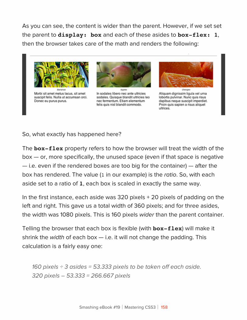
As you can see, the content is wider than the parent. However, if we set set the parent to display: box and each of these asides to box-flex: 1, then the browser takes care of the math and renders the following:
So, what exactly has happened here?
The box-flex property refers to how the browser will treat the width of the box — or, more specifically, the unused space (even if that space is negative — i.e. even if the rendered boxes are too big for the container) — after the box has rendered. The value (1 in our example) is the ratio. So, with each aside set to a ratio of 1, each box is scaled in exactly the same way.
In the first instance, each aside was 320 pixels + 20 pixels of padding on the left and right. This gave us a total width of 360 pixels; and for three asides, the width was 1080 pixels. This is 160 pixels wider than the parent container.
Telling the browser that each box is flexible (with box-flex) will make it shrink the width of each box — i.e. it will not change the padding. This calculation is a fairly easy one:
160 pixels ÷ 3 asides = 53.333 pixels to be taken off each aside.320 pixels – 53.333 = 266.667 pixels
Smashing eBook #19│Mastering CSS3│ 158
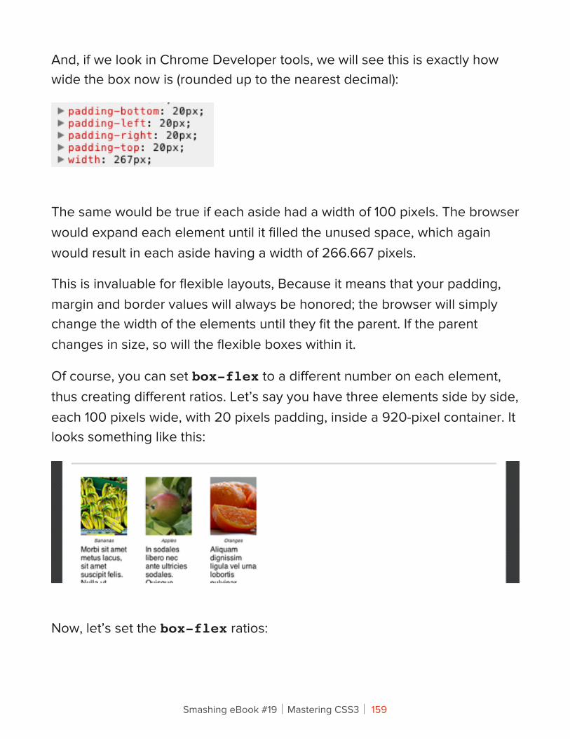
And, if we look in Chrome Developer tools, we will see this is exactly how wide the box now is (rounded up to the nearest decimal):
The same would be true if each aside had a width of 100 pixels. The browser would expand each element until it filled the unused space, which again would result in each aside having a width of 266.667 pixels.
This is invaluable for flexible layouts, Because it means that your padding, margin and border values will always be honored; the browser will simply change the width of the elements until they fit the parent. If the parent changes in size, so will the flexible boxes within it.
Of course, you can set box-flex to a different number on each element, thus creating different ratios. Let’s say you have three elements side by side, each 100 pixels wide, with 20 pixels padding, inside a 920-pixel container. It looks something like this:
Now, let’s set the box-flex ratios:
Smashing eBook #19│Mastering CSS3│ 159
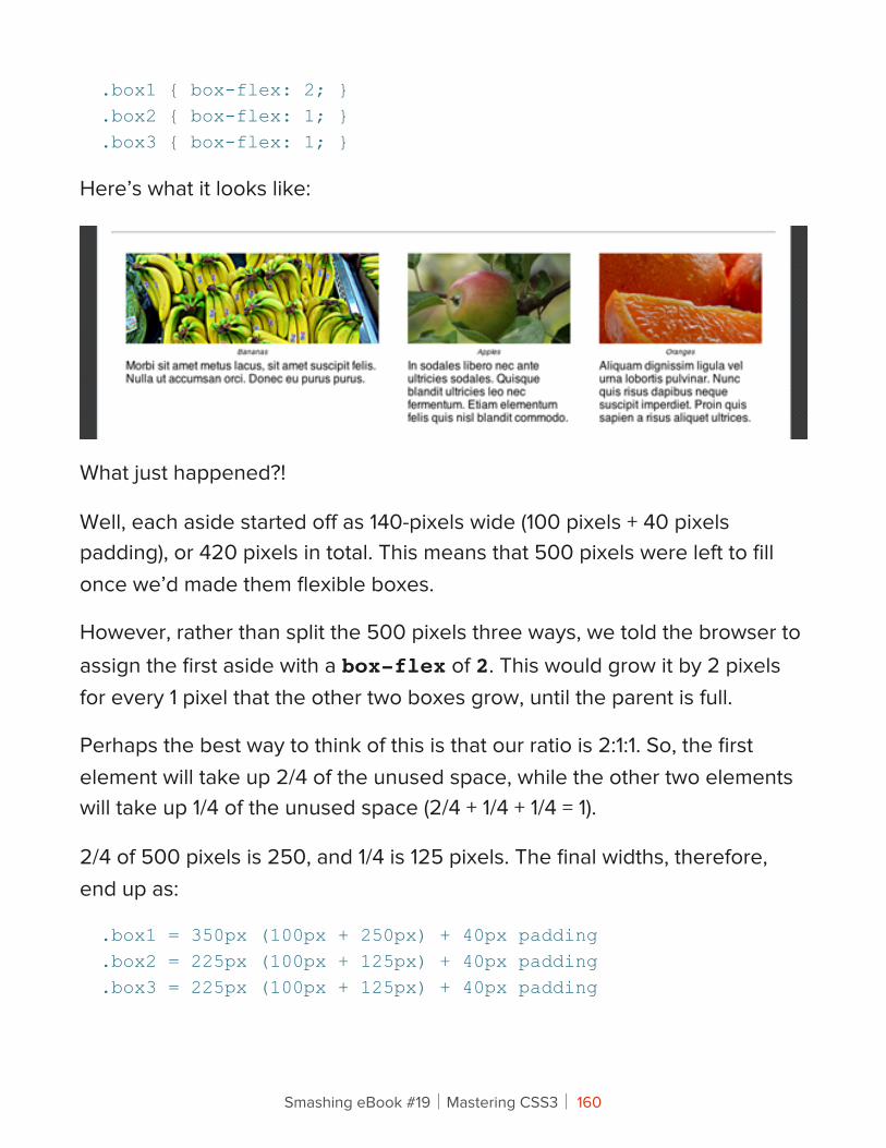
.box1 { box-flex: 2; }
.box2 { box-flex: 1; }
.box3 { box-flex: 1; }
Here’s what it looks like:
What just happened?!
Well, each aside started off as 140-pixels wide (100 pixels + 40 pixels padding), or 420 pixels in total. This means that 500 pixels were left to fill once we’d made them flexible boxes.
However, rather than split the 500 pixels three ways, we told the browser to assign the first aside with a box-flex of 2. This would grow it by 2 pixels for every 1 pixel that the other two boxes grow, until the parent is full.
Perhaps the best way to think of this is that our ratio is 2:1:1. So, the first element will take up 2/4 of the unused space, while the other two elements will take up 1/4 of the unused space (2/4 + 1/4 + 1/4 = 1).
2/4 of 500 pixels is 250, and 1/4 is 125 pixels. The final widths, therefore, end up as:
.box1 = 350px (100px + 250px) + 40px padding
.box2 = 225px (100px + 125px) + 40px padding
.box3 = 225px (100px + 125px) + 40px padding
Smashing eBook #19│Mastering CSS3│ 160
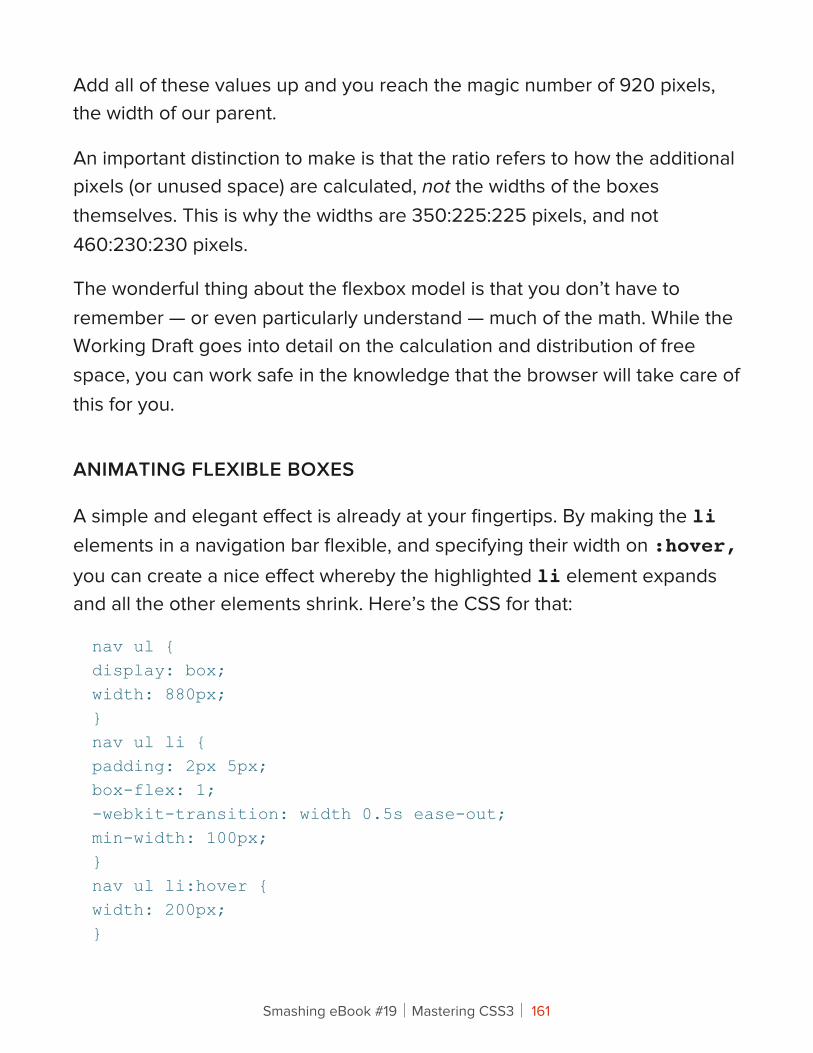
Add all of these values up and you reach the magic number of 920 pixels, the width of our parent.
An important distinction to make is that the ratio refers to how the additional pixels (or unused space) are calculated, not the widths of the boxes themselves. This is why the widths are 350:225:225 pixels, and not 460:230:230 pixels.
The wonderful thing about the flexbox model is that you don’t have to remember — or even particularly understand — much of the math. While the Working Draft goes into detail on the calculation and distribution of free space, you can work safe in the knowledge that the browser will take care of this for you.
ANIMATING FLEXIBLE BOXES
A simple and elegant effect is already at your fingertips. By making the li elements in a navigation bar flexible, and specifying their width on :hover, you can create a nice effect whereby the highlighted li element expands and all the other elements shrink. Here’s the CSS for that:
nav ul {display: box;width: 880px;}nav ul li {padding: 2px 5px;box-flex: 1;-webkit-transition: width 0.5s ease-out;min-width: 100px;}nav ul li:hover {width: 200px;}
Smashing eBook #19│Mastering CSS3│ 161
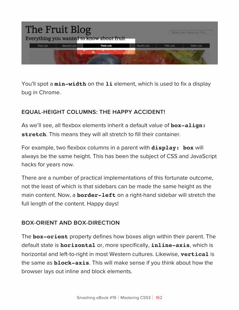
You’ll spot a min-width on the li element, which is used to fix a display bug in Chrome.
EQUAL-HEIGHT COLUMNS: THE HAPPY ACCIDENT!
As we’ll see, all flexbox elements inherit a default value of box-align: stretch. This means they will all stretch to fill their container.
For example, two flexbox columns in a parent with display: box will always be the same height. This has been the subject of CSS and JavaScript hacks for years now.
There are a number of practical implementations of this fortunate outcome, not the least of which is that sidebars can be made the same height as the main content. Now, a border-left on a right-hand sidebar will stretch the full length of the content. Happy days!
BOX-ORIENT AND BOX-DIRECTION
The box-orient property defines how boxes align within their parent. The default state is horizontal or, more specifically, inline-axis, which is horizontal and left-to-right in most Western cultures. Likewise, vertical is the same as block-axis. This will make sense if you think about how the browser lays out inline and block elements.
Smashing eBook #19│Mastering CSS3│ 162
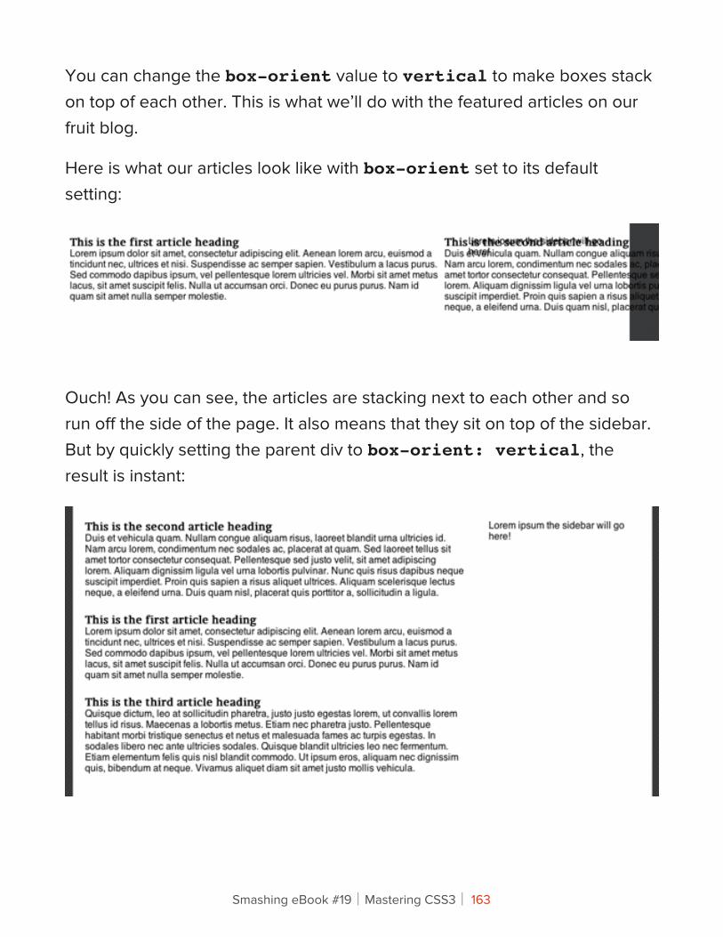
You can change the box-orient value to vertical to make boxes stack on top of each other. This is what we’ll do with the featured articles on our fruit blog.
Here is what our articles look like with box-orient set to its default setting:
Ouch! As you can see, the articles are stacking next to each other and so run off the side of the page. It also means that they sit on top of the sidebar. But by quickly setting the parent div to box-orient: vertical, the result is instant:
Smashing eBook #19│Mastering CSS3│ 163
A related property is box-direction, which specifies the direction in which the boxes are displayed. The default value is normal, which means the boxes will display as they appear in the code. But if you change this value to reverse, it will reverse the order, and so the last element in the code will appear first, and the first last.
While box-orient and box-direction are essential parts of the model, they will not likely appear in the final specification, because they are being merged into the flex-direction property, which will take the following values: lr, rl, tb, bt, inline, inline-reverse, block and block-reverse. Most of these are self-explanatory, but as yet they don’t work in any browser.
BOX-ORDINAL-GROUP
Control over the order in which boxes are displayed does not stop at normal and reverse. You can specify the exact order in which each box is placed.
The value of box-ordinal-group is set as a positive integer. The lower the number (1 being the lowest), the higher the layout priority. So, an element with box-ordinal-group: 1 will be rendered before one with box-ordinal-group: 2. If elements share the same box-ordinal-group, then they will be rendered in the order that they appear in the HTML.
Let’s apply this to a classic blog scenario: the sticky post (i.e. content that you want to keep at the top of the page). Now we can tag sticky posts with a box-ordinal-group value of 1 and all other posts with a box-ordinal-group of 2 or lower. It might look something like this:
article {
Smashing eBook #19│Mastering CSS3│ 164
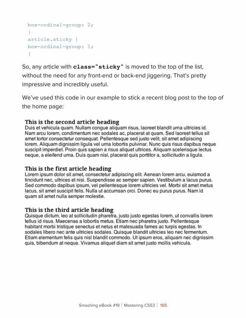
box-ordinal-group: 2;}article.sticky {box-ordinal-group: 1;}
So, any article with class="sticky" is moved to the top of the list, without the need for any front-end or back-end jiggering. That’s pretty impressive and incredibly useful.
We’ve used this code in our example to stick a recent blog post to the top of the home page:
Smashing eBook #19│Mastering CSS3│ 165
BOX-PACK AND BOX-ALIGN
The box-pack and box-align properties help us position boxes on the page.
The default value for box-align is stretch, and this is what we’ve been using implicitly so far. The stretch value stretches the box to fit the container (together with any other siblings that are flexible boxes), and this is the behavior we’ve seen so far. But we can also set box-align to center and, depending on the box-orient value, the element will be centered either vertically or horizontally.
For example, if a parent inherits the default box-align value of horizontal (inline-axis), then any element with box-align set to center will be centered vertically.
We can use this in our blog example to vertically center the search box in the header. Here’s the mark-up:
<header> <form id="search"> <label for="searchterm">Search</label> <input type="search" placeholder="What’s your favourite fruit…" name="searchterm" /> <button type="submit">Search!</button> </form></header>And to vertically center the search box, we need just one line of CSS:header {display: box; box-align: center;}header #search {display: box; box-flex: 1;}
Smashing eBook #19│Mastering CSS3│ 166
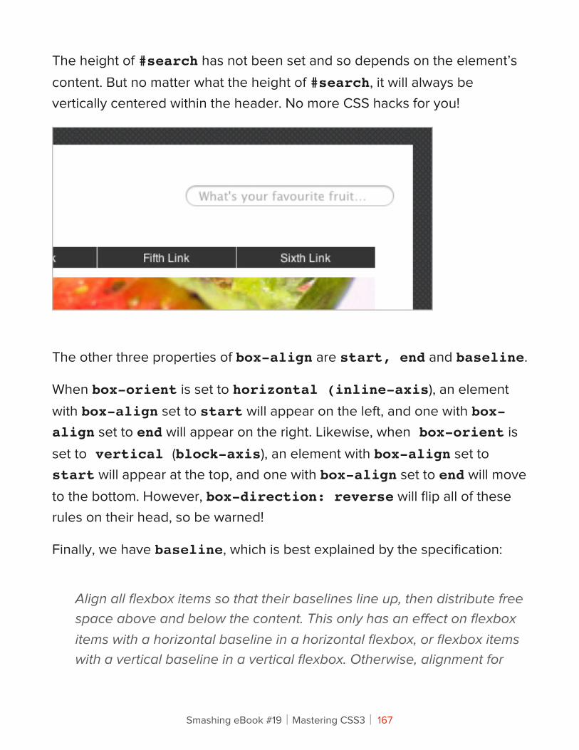
The height of #search has not been set and so depends on the element’s content. But no matter what the height of #search, it will always be vertically centered within the header. No more CSS hacks for you!
The other three properties of box-align are start, end and baseline.
When box-orient is set to horizontal (inline-axis), an element with box-align set to start will appear on the left, and one with box-align set to end will appear on the right. Likewise, when box-orient is set to vertical (block-axis), an element with box-align set to start will appear at the top, and one with box-align set to end will move to the bottom. However, box-direction: reverse will flip all of these rules on their head, so be warned!
Finally, we have baseline, which is best explained by the specification:
Align all flexbox items so that their baselines line up, then distribute free space above and below the content. This only has an effect on flexbox items with a horizontal baseline in a horizontal flexbox, or flexbox items with a vertical baseline in a vertical flexbox. Otherwise, alignment for
Smashing eBook #19│Mastering CSS3│ 167
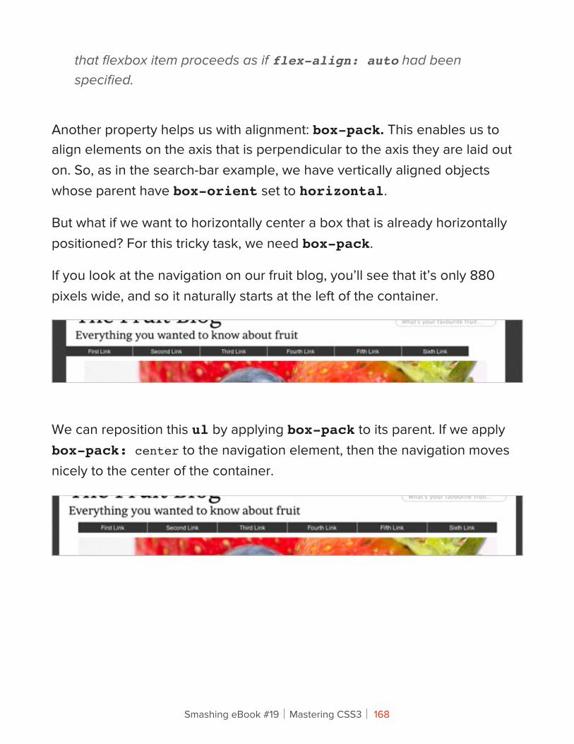
that flexbox item proceeds as if flex-align: auto had been specified.
Another property helps us with alignment: box-pack. This enables us to align elements on the axis that is perpendicular to the axis they are laid out on. So, as in the search-bar example, we have vertically aligned objects whose parent have box-orient set to horizontal.
But what if we want to horizontally center a box that is already horizontally positioned? For this tricky task, we need box-pack.
If you look at the navigation on our fruit blog, you’ll see that it’s only 880 pixels wide, and so it naturally starts at the left of the container.
We can reposition this ul by applying box-pack to its parent. If we apply box-pack: center to the navigation element, then the navigation moves nicely to the center of the container.
Smashing eBook #19│Mastering CSS3│ 168
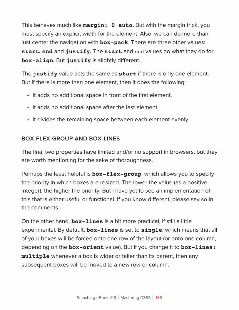
This behaves much like margin: 0 auto. But with the margin trick, you must specify an explicit width for the element. Also, we can do more than just center the navigation with box-pack. There are three other values: start, end and justify. The start and end values do what they do for box-align. But justify is slightly different.
The justify value acts the same as start if there is only one element. But if there is more than one element, then it does the following:
• It adds no additional space in front of the first element,
• It adds no additional space after the last element,
• It divides the remaining space between each element evenly.
BOX-FLEX-GROUP AND BOX-LINES
The final two properties have limited and/or no support in browsers, but they are worth mentioning for the sake of thoroughness.
Perhaps the least helpful is box-flex-group, which allows you to specify the priority in which boxes are resized. The lower the value (as a positive integer), the higher the priority. But I have yet to see an implementation of this that is either useful or functional. If you know different, please say so in the comments.
On the other hand, box-lines is a bit more practical, if still a little experimental. By default, box-lines is set to single, which means that all of your boxes will be forced onto one row of the layout (or onto one column, depending on the box-orient value). But if you change it to box-lines: multiple whenever a box is wider or taller than its parent, then any subsequent boxes will be moved to a new row or column.
Smashing eBook #19│Mastering CSS3│ 169
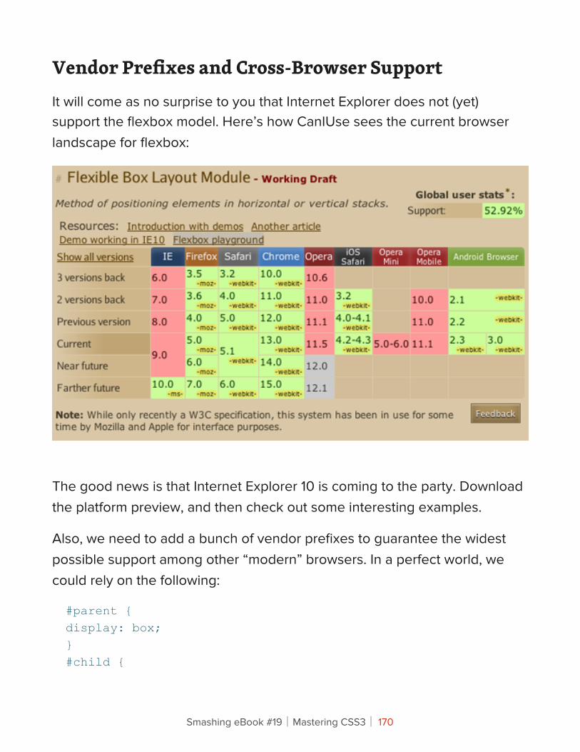
Vendor Prefixes and Cross-Browser SupportIt will come as no surprise to you that Internet Explorer does not (yet) support the flexbox model. Here’s how CanIUse sees the current browser landscape for flexbox:
The good news is that Internet Explorer 10 is coming to the party. Download the platform preview, and then check out some interesting examples.
Also, we need to add a bunch of vendor prefixes to guarantee the widest possible support among other “modern” browsers. In a perfect world, we could rely on the following:
#parent {display: box;}#child {
Smashing eBook #19│Mastering CSS3│ 170
flex-box: 1;}
But in the real world, we need to be more explicit:
#parent {display: -webkit-box;display: -moz-box;display: -o-box;display: box;}#child {-webkit-flex-box: 1;-moz-flex-box: 1;-o-flex-box: 1;flex-box: 1;}
HELPER CLASSES
A shortcut to all of these vendor prefixes — and any page that relies on the flexbox model will have many of them — is to use helper classes. I’ve included them in the source code that accompanies this article. Here’s an example:
.box {display: -webkit-box;display: -moz-box;display: -o-box;display: box;}.flex1 {-webkit-flex-box: 1;-moz-flex-box: 1;-o-flex-box: 1;flex-box: 1;
Smashing eBook #19│Mastering CSS3│ 171
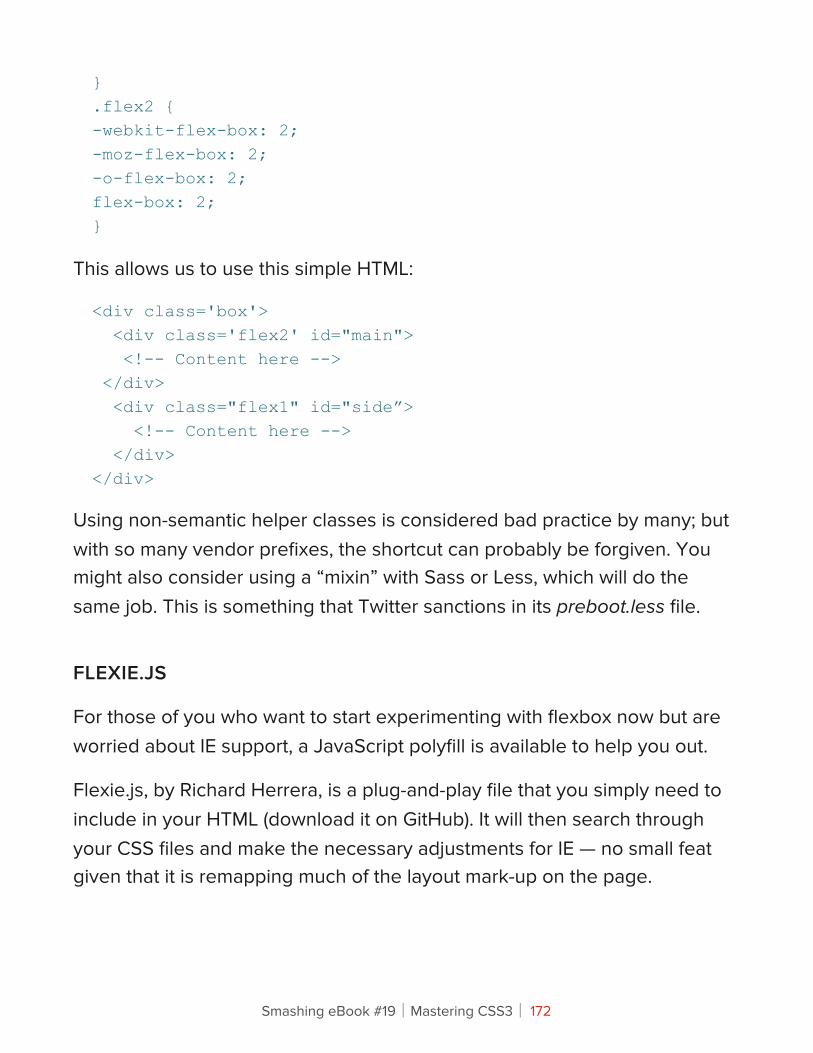
}.flex2 {-webkit-flex-box: 2;-moz-flex-box: 2;-o-flex-box: 2;flex-box: 2;}
This allows us to use this simple HTML:
<div class='box'> <div class='flex2' id="main"> <!-- Content here --> </div> <div class="flex1" id="side”> <!-- Content here --> </div></div>
Using non-semantic helper classes is considered bad practice by many; but with so many vendor prefixes, the shortcut can probably be forgiven. You might also consider using a “mixin” with Sass or Less, which will do the same job. This is something that Twitter sanctions in its preboot.less file.
FLEXIE.JS
For those of you who want to start experimenting with flexbox now but are worried about IE support, a JavaScript polyfill is available to help you out.
Flexie.js, by Richard Herrera, is a plug-and-play file that you simply need to include in your HTML (download it on GitHub). It will then search through your CSS files and make the necessary adjustments for IE — no small feat given that it is remapping much of the layout mark-up on the page.
Smashing eBook #19│Mastering CSS3│ 172

Smashing eBook #19│Mastering CSS3│ 173
A WORD ON FIREFOX
The flexbox model was, at least originally, based on a syntax that Mozilla used in its products. That syntax, called XUL, is a mark-up language designed for user interfaces.
The irony here is that Firefox is still catching up, and its rendering of some flexbox properties can be buggy. Below are some issues to watch out for, which future releases of Firefox will fix. Credit here must go to the uber-smart Peter Gasston and Oli Studholme, giants on whose shoulders I stand.
• Flexbox ignores overflow: hidden and expands the flexbox child when the content is larger than the child’s width.
• The setting display: box is treated as display: inline-box if there is no width.
• The outline on flexbox children is padded as if by a transparent border of the same width.
• The setting box-align: justify does not work in Firefox.
• If you set box-flex to 0, Firefox forces the element to act like it’s using the quirks-mode box model.
Smashing eBook #19│Mastering CSS3│ 174
SummaryThe flexbox model is another exciting development in the CSS3 specification, but the technology is still very much cutting-edge. With buggy support in Firefox and no support in Internet Explorer until version 10 moves beyond the platform preview, it is perhaps of limited use in the mainstream.
Nevertheless, the spec is still a working document. So, by experimenting with these new techniques now, you can actively contribute to its development.
It’s hard to recommend the flexbox model for production websites, but envelopes need pushing, and it might well be the perfect way to lay out a new experimental website or idea that you’ve been working on.
Offering a range of new features that help us break free of the float, the flexbox model is another step forward for the layout of modern Web pages and applications. It will be interesting to see how the specification develops and what other delights for laying out pages await the Web design community in the near future.
Smashing eBook #19│Mastering CSS3│ 175
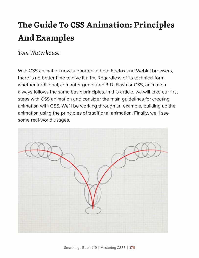
!e Guide To CSS Animation: Principles And ExamplesTom Waterhouse
With CSS animation now supported in both Firefox and Webkit browsers, there is no better time to give it a try. Regardless of its technical form, whether traditional, computer-generated 3-D, Flash or CSS, animation always follows the same basic principles. In this article, we will take our first steps with CSS animation and consider the main guidelines for creating animation with CSS. We’ll be working through an example, building up the animation using the principles of traditional animation. Finally, we’ll see some real-world usages.
Smashing eBook #19│Mastering CSS3│ 176
CSS Animation PropertiesBefore diving into the details, let’s set up the basic CSS:
Animation is a new CSS property that allows for animation of most HTML elements (such as div, h1 and span) without JavaScript or Flash. At the moment, it’s supported in Webkit browsers, including Safari 4+, Safari for iOS (iOS 2+), Chrome 1+ and, more recently, Firefox 5. Unsupported browsers will simply ignore your animation code, so ensure that your page doesn’t rely on it!
Because the technology is still relatively new, prefixes for the browser vendors are required. So far, the syntax is exactly the same for each browser, with only a prefix change required. In the code examples below, we use the -webkit syntax.
All you need to get some CSS animation happening is to attach an animation to an element in the CSS:
/* This is the animation code. */@-webkit-keyframes example { from { transform: scale(2.0); } to { transform: scale(1.0); }}/* This is the element that we apply the animation to. */div { -webkit-animation-name: example; -webkit-animation-duration: 1s; -webkit-animation-timing-function: ease; /* ease is the default */ -webkit-animation-delay: 1s; /* 0 is the default */ -webkit-animation-iteration-count: 2; /* 1 is the default */
Smashing eBook #19│Mastering CSS3│ 177
-webkit-animation-direction: alternate; /* normal is the default */}
First, we have the animation code itself. This can appear anywhere in the CSS, as long as the element that you’re animating can find the relevant animation-name.
When assigning the animation to your element, you can also use the shorthand:
div {-webkit-animation: example 1s ease 1s 2 alternate;}
We can cut this down further by not entering all of the values. Without a value specified, the browser will fall back to the default.
Those are the basics. We’ll work through more code in the following section.
Applying Principles of Traditional AnimationDisney — the masters of traditional animation, in my opinion — developed the 12 principles of traditional animation early on and documented them in its famous book The Illusion of Life. These basic principles can be applied to all manner of animation, and you needn’t be an expert in animation to follow along. We’ll be working through an example of CSS animation that uses the 12 principles, turning a basic animation into a more believable illusion.
These may just be bouncing balls, but you can see a world of difference between the two versions.
Smashing eBook #19│Mastering CSS3│ 178
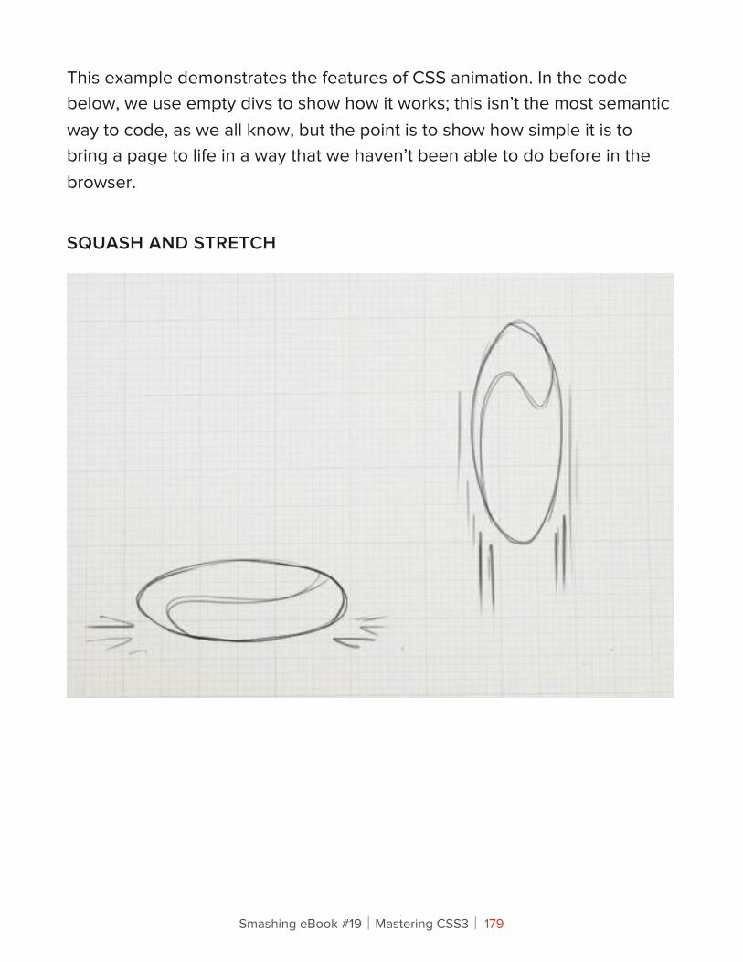
This example demonstrates the features of CSS animation. In the code below, we use empty divs to show how it works; this isn’t the most semantic way to code, as we all know, but the point is to show how simple it is to bring a page to life in a way that we haven’t been able to do before in the browser.
SQUASH AND STRETCH
Smashing eBook #19│Mastering CSS3│ 179
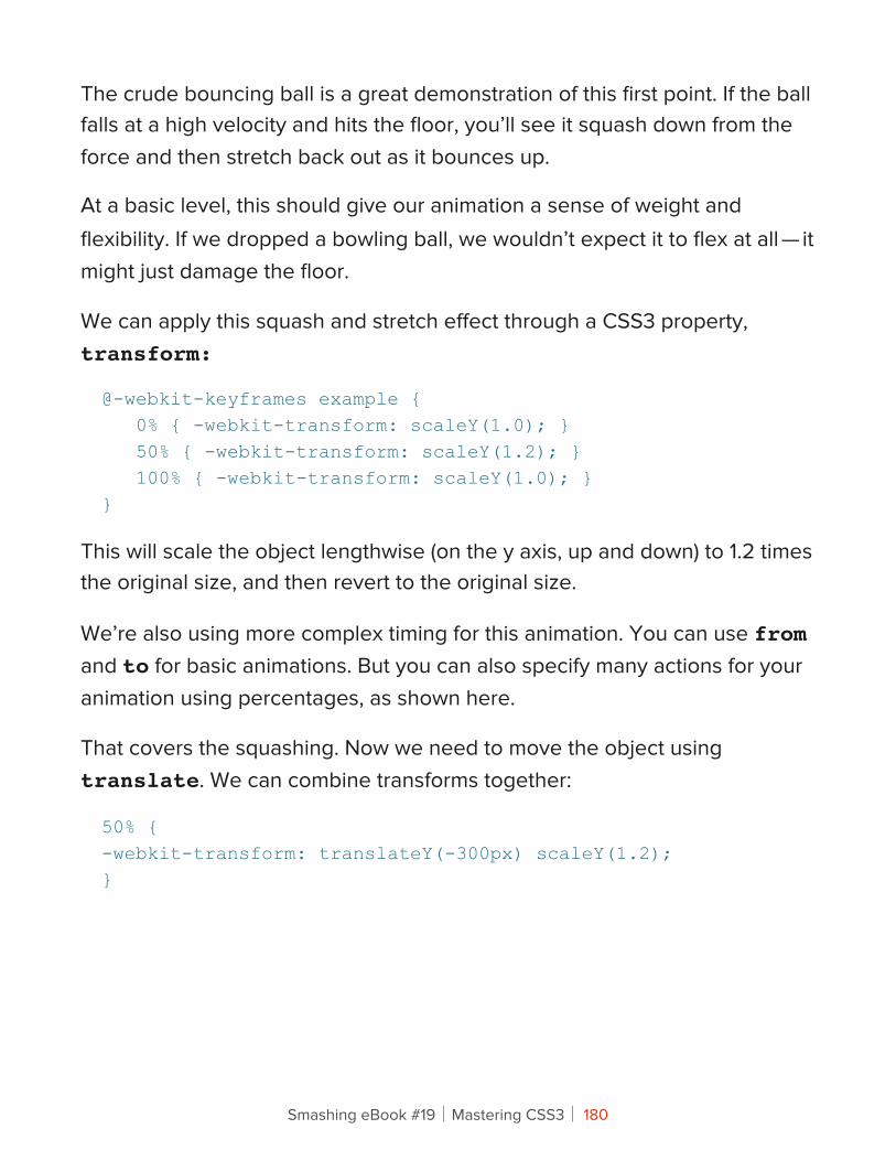
The crude bouncing ball is a great demonstration of this first point. If the ball falls at a high velocity and hits the floor, you’ll see it squash down from the force and then stretch back out as it bounces up.
At a basic level, this should give our animation a sense of weight and flexibility. If we dropped a bowling ball, we wouldn’t expect it to flex at all — it might just damage the floor.
We can apply this squash and stretch effect through a CSS3 property, transform:
@-webkit-keyframes example { 0% { -webkit-transform: scaleY(1.0); } 50% { -webkit-transform: scaleY(1.2); } 100% { -webkit-transform: scaleY(1.0); }}
This will scale the object lengthwise (on the y axis, up and down) to 1.2 times the original size, and then revert to the original size.
We’re also using more complex timing for this animation. You can use from and to for basic animations. But you can also specify many actions for your animation using percentages, as shown here.
That covers the squashing. Now we need to move the object using translate. We can combine transforms together:
50% {-webkit-transform: translateY(-300px) scaleY(1.2);}
Smashing eBook #19│Mastering CSS3│ 180
The translate property allows us to manipulate the object without changing any of its base properties (such as position, width or height), which makes it ideal for CSS animation. This particular translate property makes it look like the ball is bouncing off the floor at the mid-point of the animation.
Yes, it still looks rubbish, but this small adjustment is the first step in making this animation more believable.
ANTICIPATION
Anticipation adds suspense, or a sense of power, before the main action. For example, the bend in your legs before you jump helps viewers anticipate what will come next. In the case of our bouncing ball, simply adding a shadow beforehand suggests that something is falling from above.
We’ve added another div for the shadow, so that we can animate it separate from the ball.
To create anticipation here, we keep the ball from dropping into the scene immediately. We do this simply by adjusting the percentage timings so that there is no movement between the start point and the first action.
@-webkit-keyframes example { 0% { -webkit-transform: translateY(-300px) scaleY(1.2); } 35% { -webkit-transform: translateY(-300px) scaleY(1.2); } /* Same position as 0% */ 65% { -webkit-transform: translateY(0px) scaleY(1.2); } /* Starts moving after 35% to this position */ 67% { -webkit-transform: translateY(10px) scaleY(0.8); } 85% { -webkit-transform: translateY(-100px) scaleY(1.2); } 100% { -webkit-transform: translateY(0px); }}
Smashing eBook #19│Mastering CSS3│ 181
At the 35% point of the animation, the ball is in the same location, positioned off the stage, not moving. Then, between 35% and 65%, it suddenly moves onto the stage, and the rest of the animation follows.
You can also use animation-delay to create anticipation:
div {-webkit-animation-delay: 1s;}
However, this could have an undesired effect. The animation-delay property simply ignores any animation code until the specified time. So, if your animation starts in a position different from the element that you are animating, then the object will appear to suddenly jump as soon as the delayed animation starts.
This property works best for looping animations that begin and end in the same location.
Smashing eBook #19│Mastering CSS3│ 182
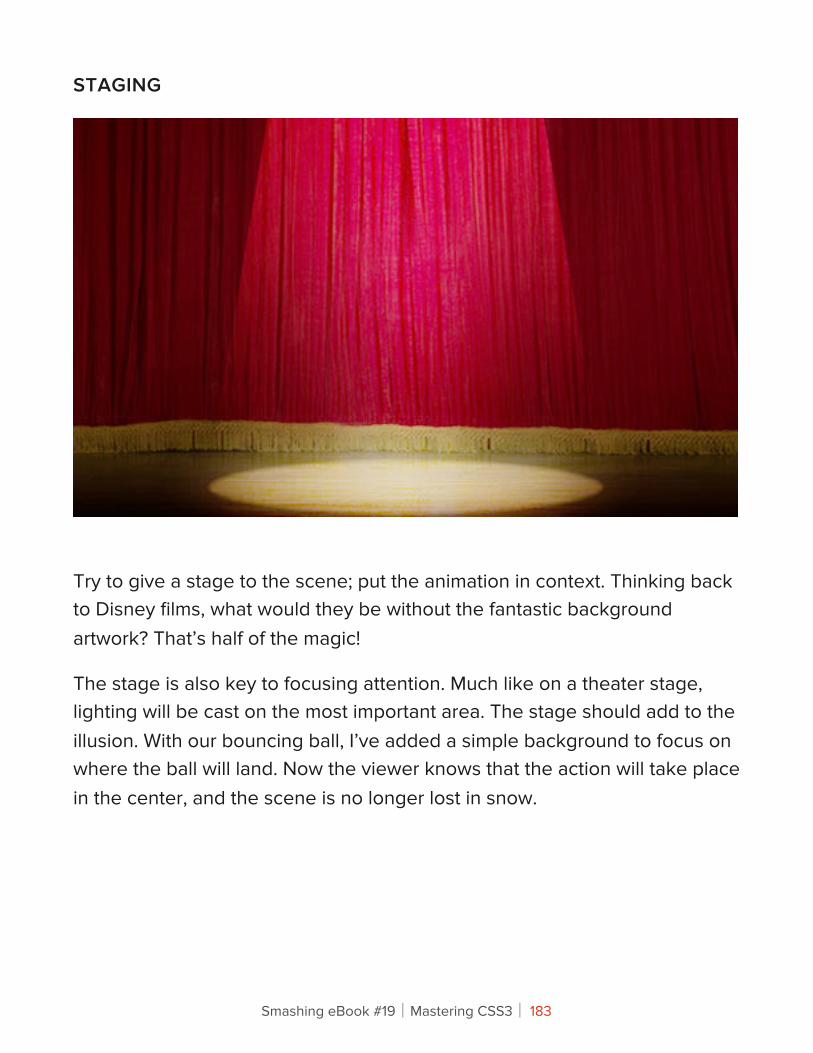
STAGING
Try to give a stage to the scene; put the animation in context. Thinking back to Disney films, what would they be without the fantastic background artwork? That’s half of the magic!
The stage is also key to focusing attention. Much like on a theater stage, lighting will be cast on the most important area. The stage should add to the illusion. With our bouncing ball, I’ve added a simple background to focus on where the ball will land. Now the viewer knows that the action will take place in the center, and the scene is no longer lost in snow.
Smashing eBook #19│Mastering CSS3│ 183
STRAIGHT-AHEAD VS. POSE TO POSE
In traditional animation, this is a choice in how to construct your animation. The straight-ahead option is to draw out every frame in the sequence. The pose-to-pose option is to create a few keyframes throughout the sequence, and then fill in the gaps later. Filling in these gaps is known as “in-betweening,” or “tweening,” a familiar term for those used to animating in Flash.
With CSS animation, we typically use the latter, pose to pose. That is, we’ll add keyframes of action, and then the browser will “tween” the intermediate frames automatically. However, we can learn from the straight-ahead technique, too. The browser can do only so many effects; sometimes, you have to do it the hard way and put in more animation hard-graft to get the desired effect.
FOLLOW-THROUGH AND OVERLAPPING
Also known as physics! Follow-through and overlapping are more commonly used in character animation for body movement, such as to show arms swaying as the character drops them or long hair falling. Think of someone with a big stomach turning quickly: their body will turn first, and their bulging gut will follow shortly after.
For us, this means getting the physics right when the ball drops. In the demonstrations above, the ball drops unnaturally, as if beyond the control of gravity. We want the ball to drop and then bounce. However, this is better achieved through the next principle.
Smashing eBook #19│Mastering CSS3│ 184
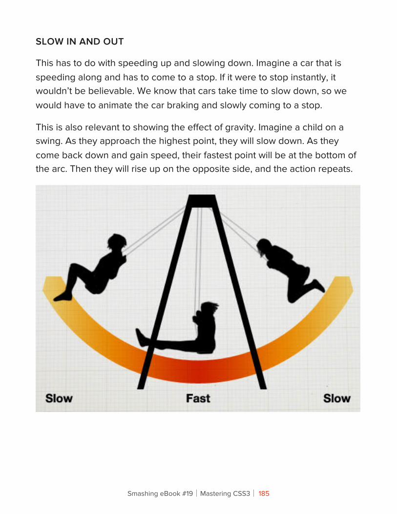
SLOW IN AND OUT
This has to do with speeding up and slowing down. Imagine a car that is speeding along and has to come to a stop. If it were to stop instantly, it wouldn’t be believable. We know that cars take time to slow down, so we would have to animate the car braking and slowly coming to a stop.
This is also relevant to showing the effect of gravity. Imagine a child on a swing. As they approach the highest point, they will slow down. As they come back down and gain speed, their fastest point will be at the bottom of the arc. Then they will rise up on the opposite side, and the action repeats.
Smashing eBook #19│Mastering CSS3│ 185
Back to our example, by adjusting the in and out speeds, we can make the ball much more believable (finally).
When the ball hits the floor, the impact will make it bounce back up instantly. As it reaches its highest point, it will slow down. Now it looks like the ball is really dropping.
In CSS, we can control this with the animation-timing-function property:
-webkit-animation-timing-function: ease-out;
This property takes the following values:
• ease-inSlow at the beginning, and then speeds up.
• ease-outFast at the beginning, and then slows to a stop.
• ease-in-outStarts slow, speeds up in the middle, and then slows to a stop.
• linearMoves at an even speed from start to finish.
Smashing eBook #19│Mastering CSS3│ 186
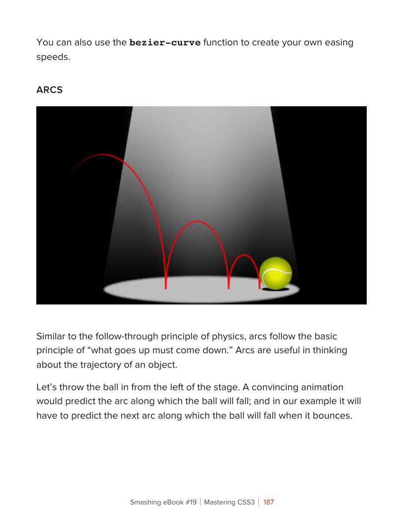
You can also use the bezier-curve function to create your own easing speeds.
ARCS
Similar to the follow-through principle of physics, arcs follow the basic principle of “what goes up must come down.” Arcs are useful in thinking about the trajectory of an object.
Let’s throw the ball in from the left of the stage. A convincing animation would predict the arc along which the ball will fall; and in our example it will have to predict the next arc along which the ball will fall when it bounces.
Smashing eBook #19│Mastering CSS3│ 187
This animation can be a bit more fiddly to adjust in CSS. We want to animate the ball going up and down and side to side simultaneously. So, we want our ball to move in smoothly from the left, while continuing the bouncing animation that we’ve been working on. Rather than attempt to capture both actions as one animation, we’ll do two separate animations, which is easiest. For this demonstration, we’ll wrap our ball in another div and animate it separately.
The HTML:
<div class="ball-arc"> <div class="ball"></div></div>And the CSS:.ball-arc {-webkit-animation: ball-x 2.5s cubic-bezier(0, 0, 0.35, 1);} /* cubic-bezier here is to adjust the animation-timing speed. This example makes the ball take longer to slow down. */@-webkit-keyframes ball-x { 0% { -webkit-transform: translateX(-275px); } 100% { -webkit-transform: translateX(0px); }}
Here, we have one animation to move the ball sideways (ball-x) and another animation to bounce the ball (ball-y). The only downside to this method is that if you want something really complex, you could end up with a code soup with poor semantics!
Smashing eBook #19│Mastering CSS3│ 188
SECONDARY ACTION
A secondary action is a subtlety that makes the animation much more real. It addresses the details. For example, if we had someone with long hair walking, the primary action would be the walking, and the secondary action would be the bounce of the hair, or perhaps the ruffling of the clothes in the wind.
In our example, it’s much simpler. By applying more detail to the ball, we make the secondary action the spinning of the ball. This will give the illusion that the ball is being thrown in.
Rather than add another div for this animation, we can be more specific by adding it to the new img element that we’re using to give the ball texture.
.ball img {-webkit-animation: spin 2.5s;}
@-webkit-keyframes spin { 0% { -webkit-transform: rotate(-180deg); } 100% { -webkit-transform: rotate(360deg); }}
Smashing eBook #19│Mastering CSS3│ 189
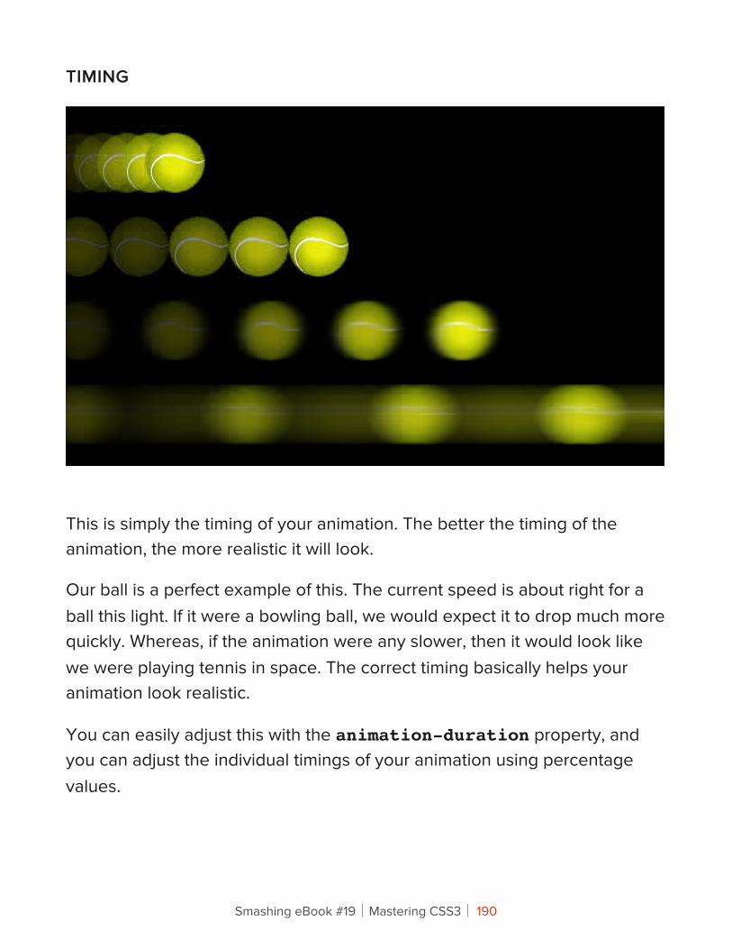
TIMING
This is simply the timing of your animation. The better the timing of the animation, the more realistic it will look.
Our ball is a perfect example of this. The current speed is about right for a ball this light. If it were a bowling ball, we would expect it to drop much more quickly. Whereas, if the animation were any slower, then it would look like we were playing tennis in space. The correct timing basically helps your animation look realistic.
You can easily adjust this with the animation-duration property, and you can adjust the individual timings of your animation using percentage values.
Smashing eBook #19│Mastering CSS3│ 190
EXAGGERATION
Cartoons are known for exaggeration, or impossible physics. A cartoon character can contort into any shape and still manage to spring back to normal. In most cases, though, exaggeration is used for emphasis, to bring to life an action that would otherwise look flat in animation.
Nevertheless, use exaggeration modestly. Disney had a rule to base its animations on reality but push it slightly further. Imagine a character running into a wall; its body would squash into the wall more than expected, to emphasize the force of impact.
We’re using exaggeration in combination with squash and stretch to make it really obvious when the ball hits the floor. I’ve also added a subtle wobble to the animation. Finally, we also stretch the ball in and out as it bounces up and down to emphasize the speed.
Just as when we added one animation onto another, here we’ll add another div, which will wobble in sync with the ball hitting the floor:
@-webkit-keyframes wobble {0%, 24%, 54%, 74%, 86%, 96%, 100% { -webkit-transform: scaleX(1.0);/* Make the ball a normal size at these points */}25%, 55%, 75% { -webkit-transform: scaleX(1.3) scaleY(0.8) translateY(10px);/* Points hitting the floor: squash effect */}30%, 60%, 80% { -webkit-transform: scaleX(0.8) scaleY(1.2);/* Wobble inwards after hitting the floor */}75%, 87% {
Smashing eBook #19│Mastering CSS3│ 191
-webkit-transform: scaleX(1.2);/* Subtler squash for the last few bounces */}97% -webkit-transform: scaleX(1.1);/* Even subtler squash for last bounce */}}
The code looks more complex than it is. It’s simple trial and error. Keep trying until you get the right effect!
SOLID DRAWING AND APPEAL
I have nothing more to teach you… at least not in code. These final two animation principles cannot be shown in code. They are skills you will have to perfect in order to make truly amazing animations.
When Disney started production on Snow White, it had its animators go back to life drawing classes and learn the human form again. This attention to detail is evident in the film, which goes to show that good animation requires solid drawing skills and sound knowledge of the form you are animating.
Most CSS animation will likely not be as complex as intricate figure animations, but the basic principle holds true. Whether a door is opening to reveal content or a “contact us” envelope is being sealed and delivered, the animation should be believable, not robotic… unless you’re animating a machine.
The appeal, or charisma, of each character will be unique. But as Disney has always shown, anything can have character: a teapot, a tree, even spoons. But with CSS, consider how the overall animation will contribute to the design and make the overall experience more satisfying. We don’t want to make clippy animations here.
Smashing eBook #19│Mastering CSS3│ 192
Go Forth And Animate!CSS animation is a great new feature. As with every new CSS feature, it will be overused and misused at first. There is even the slight danger that we’ll see a return of those long-winded Flash-style animated splash pages. Although I have faith in the Web community not to do this.
CSS animation can be used to really bring a website to life. While the code for our bouncing ball may not be the most semantic, it hopefully shows how simple it can be to bring almost anything on the page to life with CSS.
It can bring much-needed interaction to your elements (sans Flash!); it can add excitement to the page; and in combination with JavaScript, it can even be an alternative way to animate for games. By taking in the 12 principles above and working away at your animation, you can make your websites more convincing, enticing and exciting, leading to a better experience overall.
CSS ANIMATION TOOLS
While knowing the CSS itself is great, plenty of tools are popping up that will help you animate. The 12 principles apply regardless, but if you’re worried about the code, these great tools let you try out CSS animation without getting too technical.
• Sencha Animator
• Adobe Edge
• Tumult Hype (Mac only)
Smashing eBook #19│Mastering CSS3│ 193
CSS ANIMATION IN THE WILD
Finally, to get you excited about what is possible, here are some great examples of CSS animation being used on live websites:
• CSS Spider-Man animation, by Anthony Calzadilla
• CSS Tricks (animated typography person), by Mircea Piturca
• Walking man, by Andrew Hoyer
Smashing eBook #19│Mastering CSS3│ 194
Beercamp: An Experiment With CSS 3DTom Giannattasio
I recently had the pleasure of organizing this year’s 2012 Beercamp website. If you’re unfamiliar, Beercamp is a party for designers and developers. It’s also a playground for front-end experimentation. Each year we abandon browser support and throw a “Pshaw” in the face of semantics so that we can play with some emerging features of modern browsers.
This year’s experiment: a 3D pop-up book á la Dr. Seuss. If you’ve not seen it, hop on over and take a look. The website was a test to see how far SVG and CSS 3D transforms could be pushed. I learned a lot in the process and wanted to share some of the techniques that I found helpful when working in 3D space.
Smashing eBook #19│Mastering CSS3│ 195
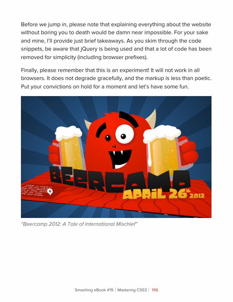
Before we jump in, please note that explaining everything about the website without boring you to death would be damn near impossible. For your sake and mine, I’ll provide just brief takeaways. As you skim through the code snippets, be aware that jQuery is being used and that a lot of code has been removed for simplicity (including browser prefixes).
Finally, please remember that this is an experiment! It will not work in all browsers. It does not degrade gracefully, and the markup is less than poetic. Put your convictions on hold for a moment and let’s have some fun.
“Beercamp 2012: A Tale of International Mischief”
Smashing eBook #19│Mastering CSS3│ 196
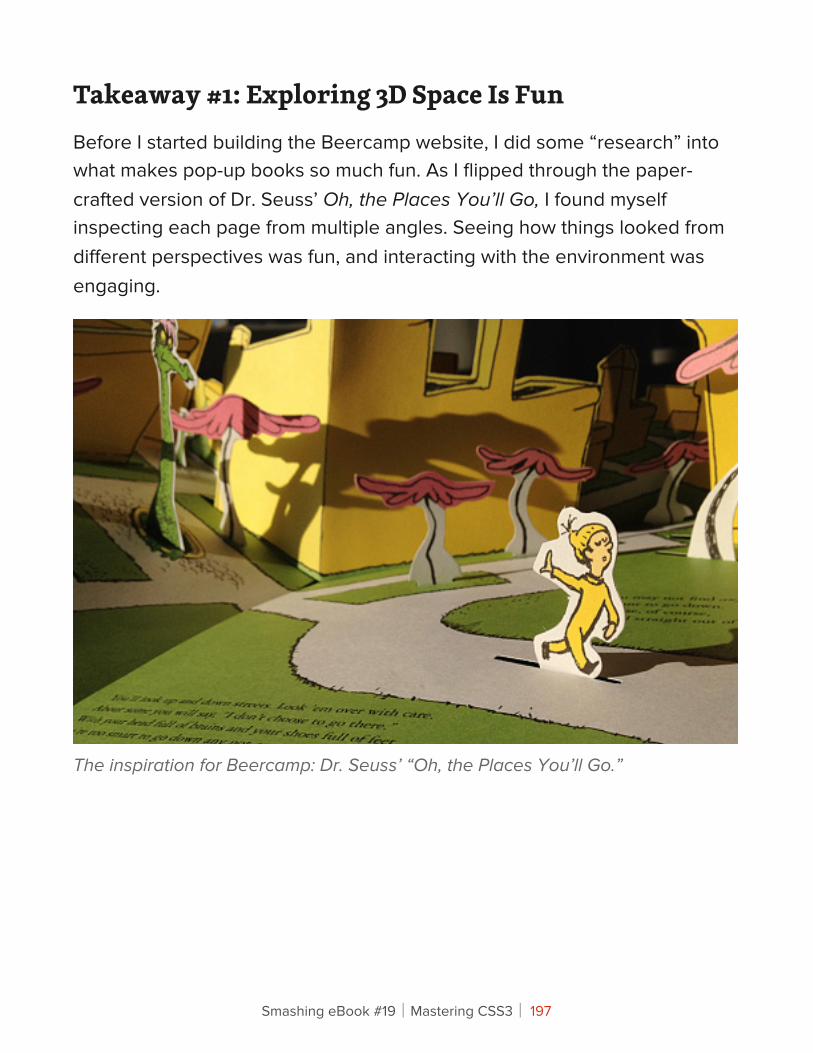
Takeaway #1: Exploring 3D Space Is FunBefore I started building the Beercamp website, I did some “research” into what makes pop-up books so much fun. As I flipped through the paper-crafted version of Dr. Seuss’ Oh, the Places You’ll Go, I found myself inspecting each page from multiple angles. Seeing how things looked from different perspectives was fun, and interacting with the environment was engaging.
The inspiration for Beercamp: Dr. Seuss’ “Oh, the Places You’ll Go.”
Smashing eBook #19│Mastering CSS3│ 197
I wanted to create that same engagement in my digital version with intuitive and unobtrusive controls. Thus, the scene rotates based on the mouse’s coordinates, allowing the user to move the book around without much effort. Achieving this was pretty easy:
6. Set up a listener.
This is for the mousemove event.
$document.mousemove(rotateScene);
7. Calculate the rotation.
I wanted the book to rotate between -15 and 15 degrees, based on where the mouse is located along the x axis. This can be calculated using the following:
rotationY = -15 + (30 * e.pageX / $body.width());
8. Apply the rotation.
$scene.css('transform': 'rotateY(' + rotationY + 'deg)');
Pretty simple, right? The only problem is that our friends on iPhones and iPads don’t have mouse coordinates. They do, however, have a gyroscope. Rotating a phone is very similar to rotating a book, so adjusting the scene based on the device’s orientation made for an intuitive and delightful interaction. Setting this up was similar but slightly more involved.
9. Set up a listener.
window.addEventListener('deviceorientation', rotateScene, false);
Smashing eBook #19│Mastering CSS3│ 198
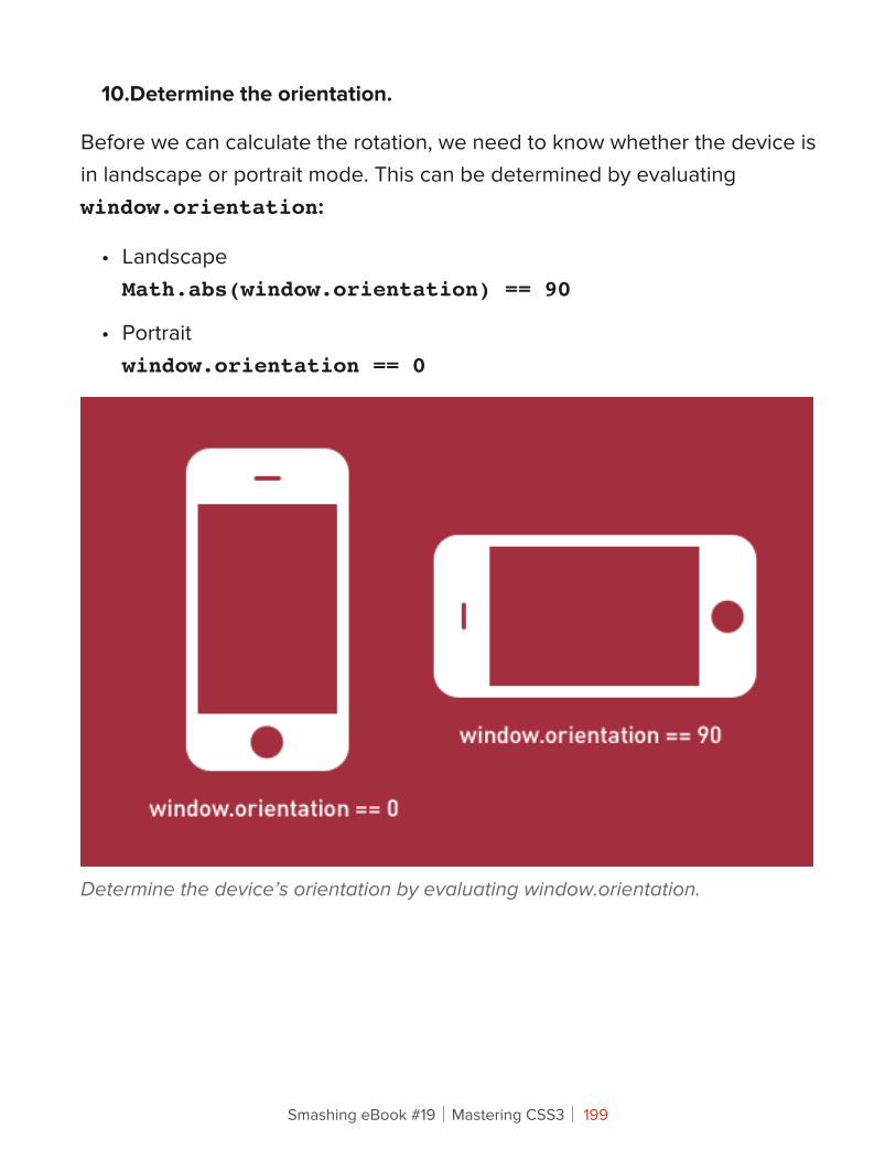
10.Determine the orientation.
Before we can calculate the rotation, we need to know whether the device is in landscape or portrait mode. This can be determined by evaluating window.orientation:
• LandscapeMath.abs(window.orientation) == 90
• Portraitwindow.orientation == 0
Determine the device’s orientation by evaluating window.orientation.
Smashing eBook #19│Mastering CSS3│ 199
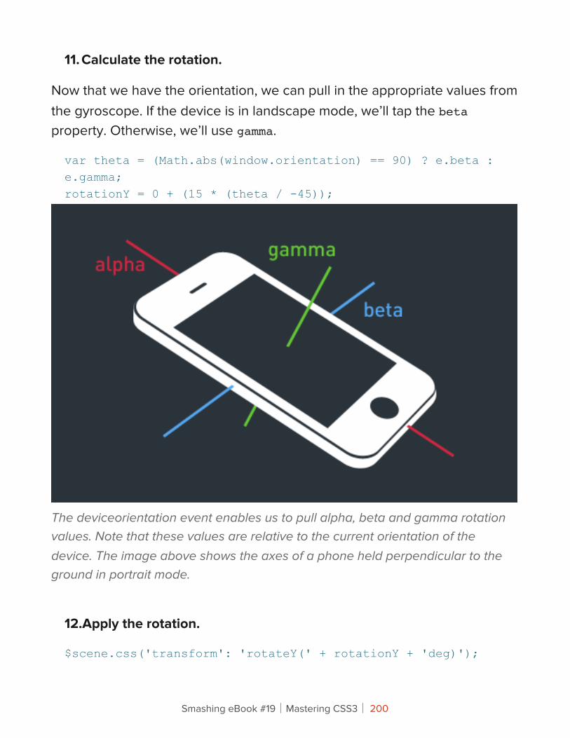
11. Calculate the rotation.
Now that we have the orientation, we can pull in the appropriate values from the gyroscope. If the device is in landscape mode, we’ll tap the beta property. Otherwise, we’ll use gamma.
var theta = (Math.abs(window.orientation) == 90) ? e.beta : e.gamma;rotationY = 0 + (15 * (theta / -45));
The deviceorientation event enables us to pull alpha, beta and gamma rotation values. Note that these values are relative to the current orientation of the device. The image above shows the axes of a phone held perpendicular to the ground in portrait mode.
12.Apply the rotation.
$scene.css('transform': 'rotateY(' + rotationY + 'deg)');
Smashing eBook #19│Mastering CSS3│ 200
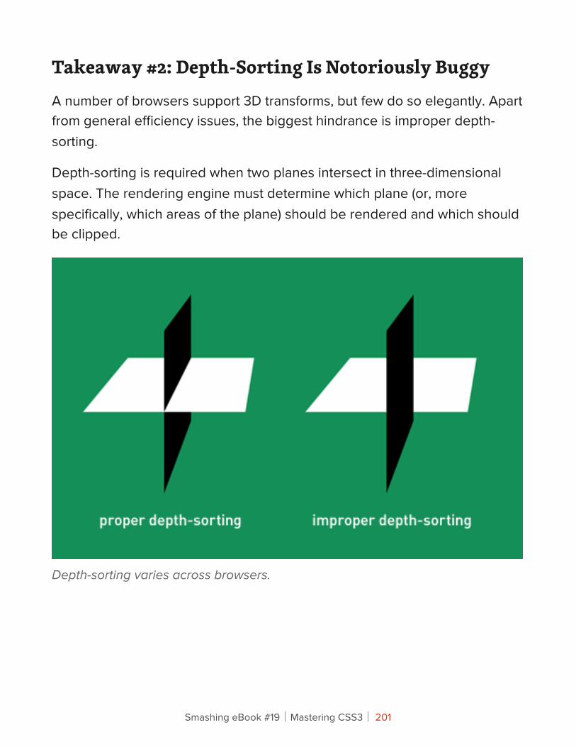
Takeaway #2: Depth-Sorting Is Notoriously BuggyA number of browsers support 3D transforms, but few do so elegantly. Apart from general efficiency issues, the biggest hindrance is improper depth-sorting.
Depth-sorting is required when two planes intersect in three-dimensional space. The rendering engine must determine which plane (or, more specifically, which areas of the plane) should be rendered and which should be clipped.
Depth-sorting varies across browsers.
Smashing eBook #19│Mastering CSS3│ 201
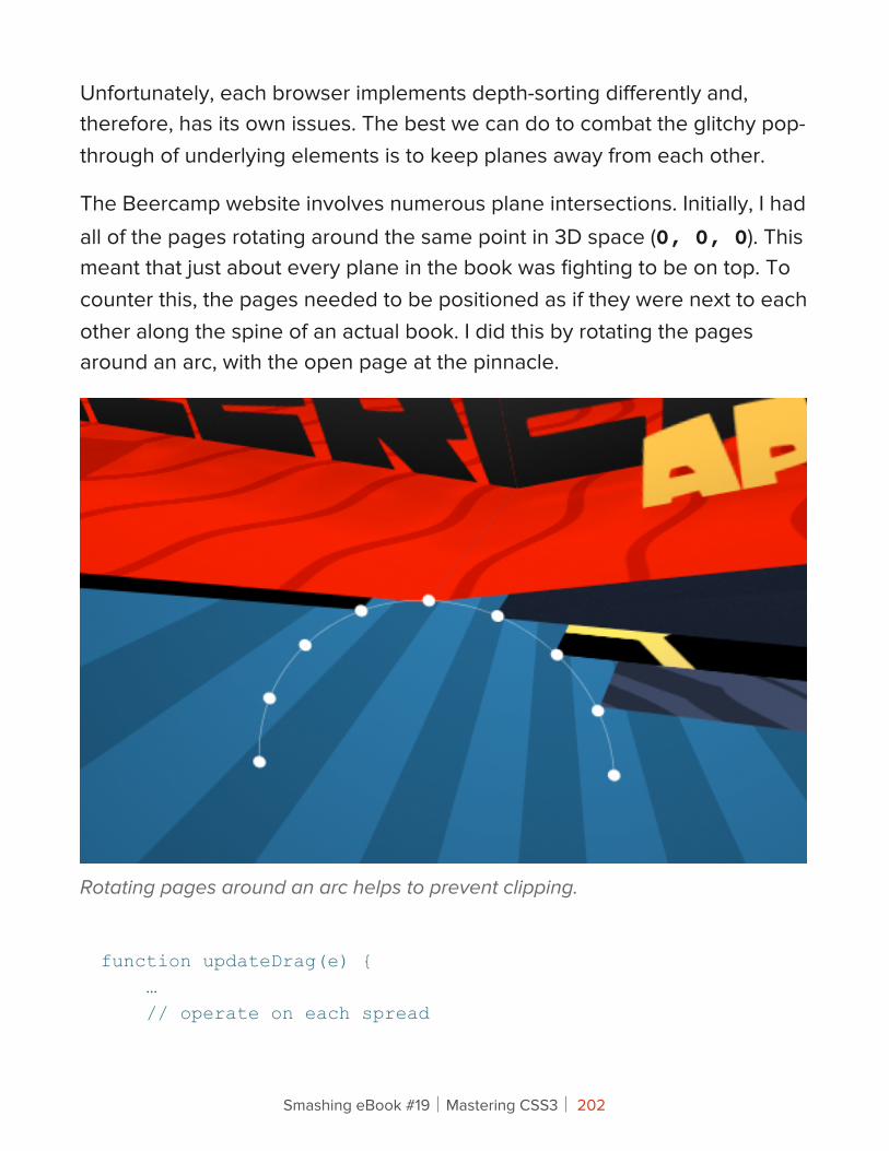
Unfortunately, each browser implements depth-sorting differently and, therefore, has its own issues. The best we can do to combat the glitchy pop-through of underlying elements is to keep planes away from each other.
The Beercamp website involves numerous plane intersections. Initially, I had all of the pages rotating around the same point in 3D space (0, 0, 0). This meant that just about every plane in the book was fighting to be on top. To counter this, the pages needed to be positioned as if they were next to each other along the spine of an actual book. I did this by rotating the pages around an arc, with the open page at the pinnacle.
Rotating pages around an arc helps to prevent clipping.
function updateDrag(e) { … // operate on each spread
Smashing eBook #19│Mastering CSS3│ 202
$('.spreads li').each(function(i) { // calculate the angle increment var ANGLE_PER_PAGE = 20; // determine which slot this page should be turned to var offsetIndex = per < 0 ? 5 + curPageIndex - i : 5 + curPageIndex - i - 2; // calculate the angle on the arc this page should be turned to var offsetAngle = per < 0 ? offsetIndex - per - 1 : offsetIndex - per + 1; // calculate the x coordinate based on the offsetAngle var tarX = 5 * Math.cos(degToRad(offsetAngle * ANGLE_PER_PAGE + 10)); // calculate the z coordinate based on the offsetAngle var tarZ = 5 * Math.sin(degToRad(offsetAngle * ANGLE_PER_PAGE + 10)); // position the page $(this).css('transform', 'translateX(' + tarX.toFixed(3) + 'px) translateZ(' + tarZ.toFixed(3) + 'px)'); });}
Smashing eBook #19│Mastering CSS3│ 203
This technique helped to clear up most of the depth-sorting issues, but not all of them. Further optimization really relies on the browser vendors. Safari seems to have things worked out on both desktop and mobile. Chrome Stable struggles a bit, but the latest Canary works wonderfully. Firefox does a fine job but suffers from slow frame rates. It’s a tough battle to win right now.
Takeaway #3: Vector Space Is Tricky But UsefulBuilding the pop-ups was by far the most difficult aspect of the project, but also the most satisfying. Other pop-up books have been built on the Web, but I’m unaware of any that use realistic pop-up mechanics. This is with good reason — achieving it is deceptively complex.
The magic of programming pop-up mechanics lies in the calculation of vector space. A vector is essentially a line. Knowing the lengths and directions of lines enables us to perform operations on them. Of particular use when building pop-ups is the vector cross product, which is the line that runs perpendicular to two other lines in 3D space.
The cross product is important because it determines the upward rotation of each pop-up piece. I’ll spare you the headache of play-by-play calculations (you can view the math below if you’re really interested). Instead, let’s try a visual representation.
Smashing eBook #19│Mastering CSS3│ 204
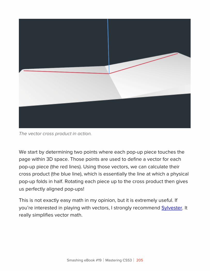
The vector cross product in action.
We start by determining two points where each pop-up piece touches the page within 3D space. Those points are used to define a vector for each pop-up piece (the red lines). Using those vectors, we can calculate their cross product (the blue line), which is essentially the line at which a physical pop-up folds in half. Rotating each piece up to the cross product then gives us perfectly aligned pop-ups!
This is not exactly easy math in my opinion, but it is extremely useful. If you’re interested in playing with vectors, I strongly recommend Sylvester. It really simplifies vector math.
Smashing eBook #19│Mastering CSS3│ 205
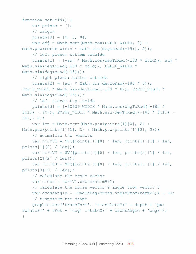
function setFold() { var points = []; // origin points[0] = [0, 0, 0]; var adj = Math.sqrt(Math.pow(POPUP_WIDTH, 2) - Math.pow(POPUP_WIDTH * Math.sin(degToRad(-15)), 2)); // left piece: bottom outside points[1] = [-adj * Math.cos(degToRad(-180 * fold)), adj * Math.sin(degToRad(-180 * fold)), POPUP_WIDTH * Math.sin(degToRad(-15))]; // right piece: bottom outside points[2] = [adj * Math.cos(degToRad(-180 * 0)), POPUP_WIDTH * Math.sin(degToRad(-180 * 0)), POPUP_WIDTH * Math.sin(degToRad(-15))]; // left piece: top inside points[3] = [-POPUP_WIDTH * Math.cos(degToRad((-180 * fold) - 90)), POPUP_WIDTH * Math.sin(degToRad((-180 * fold) - 90)), 0]; var len = Math.sqrt(Math.pow(points[1][0], 2) + Math.pow(points[1][1], 2) + Math.pow(points[1][2], 2)); // normalize the vectors var normV1 = $V([points[1][0] / len, points[1][1] / len, points[1][2] / len]); var normV2 = $V([points[2][0] / len, points[2][1] / len, points[2][2] / len]); var normV3 = $V([points[3][0] / len, points[3][1] / len, points[3][2] / len]); // calculate the cross vector var cross = normV1.cross(normV2); // calculate the cross vector's angle from vector 3 var crossAngle = -radToDeg(cross.angleFrom(normV3)) - 90; // transform the shape graphic.css('transform', 'translateY(' + depth + 'px) rotateZ(' + zRot + 'deg) rotateX(' + crossAngle + 'deg)');}
Smashing eBook #19│Mastering CSS3│ 206
Takeaway #4: SVG Is Totally TubularI know, I know: you’ve heard the case for SVG before. Well, you’re going to hear it again. SVG is an incredible technology that works really well in 3D space. All of the illustrations on the Beercamp website were done in Illustrator and exported to SVG. This provided numerous benefits.
BENEFIT 1: SIZE
Because the pop-up pieces required large areas of transparency, the file-size savings of SVG were enormous. PNG equivalents would have been 200 to 300% larger than the uncompressed SVGs. However, we can reduce file size even more by exporting illustrations as SVGZ.
SVGZ is a compressed version of SVG that is incredibly small. In fact, the SVGZ files for Beercamp are up to 900% smaller than their PNG equivalents! Implementing them, though, requires some server configuration. This can be done easily with an .htaccess file:
AddType image/svg+xml svg svgzAddEncoding gzip svgz
Smashing eBook #19│Mastering CSS3│ 207
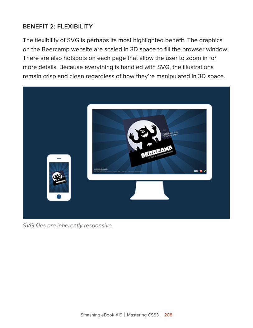
BENEFIT 2: FLEXIBILITY
The flexibility of SVG is perhaps its most highlighted benefit. The graphics on the Beercamp website are scaled in 3D space to fill the browser window. There are also hotspots on each page that allow the user to zoom in for more details. Because everything is handled with SVG, the illustrations remain crisp and clean regardless of how they’re manipulated in 3D space.
SVG files are inherently responsive.
Smashing eBook #19│Mastering CSS3│ 208

BENEFIT 3: SELF-CONTAINED ANIMATION
All of the SVGs on the Beercamp website are implemented as background images. This helps to keep the markup clean and allows images to be reused in multiple locations, such as with the pop-up pieces. However, this means we lose DOM access to each of the nodes. So, what if we need some animation on the background SVGs?
SVG allows us to define animations within the file itself. All of the pop-up images in the final Beercamp website are static, but an earlier version featured animated beer bubbles. To increase performance in some of the less-capable browsers, these were taken out. However, the SVG animations ran very smoothly in WebKit.
SVG animation gets less hype than its CSS cousin, but it’s just as capable. Within an element, we can add an animate node to specify typical animation settings: properties, values, start time, duration, repeat count, etc. Below is an excerpt from one of the Beercamp bubbles.
<circle fill="#fff" opacity=".4" clip-path="url(#right-mug-clip)" cx="896" cy="381" r="5"> <animate attributeType="XML" attributeName="cx" from="890" to="881" begin="7s" dur="5s" repeatCount="indefinite" /> <animate attributeType="XML" attributeName="cy" from="381" to="100" begin="7s" dur="5s" repeatCount="indefinite" /></circle>
Smashing eBook #19│Mastering CSS3│ 209
Takeaway #5: Experimentation Is Messy But ImportantNow that the practical tidbits are out of the way, I’d like to say a word about experimentation.
It’s easy to get boxed in by the reality of developing websites that are responsive, cross-platform, cross-browser, gracefully degrading, semantically perfect, progressively enhanced, _______, _______ and _______ (space to fill in upcoming buzzwords). These techniques are useful on production websites to ensure reach and consistency, but they can also limit our creativity.
I’ll be the first to admit it: the Beercamp website is buggy. Browser support is limited, and usability could be improved. However, the website is an experiment. It’s meant to explore what’s possible, not satisfy what’s practical.
A dogma is emerging in our industry — and the buzzwords above are its doctrine. Experimentation enables us to think beyond that dogma. It’s a wonderful exercise that indulges our curiosity, polishes our talent and ultimately advances our industry. If you’re not experimenting in some capacity, you should be.
Smashing eBook #19│Mastering CSS3│ 210
!e State of CSS 3DCSS 3D has yet to hit a tipping point. Browsers simply don’t support it well enough, but there is promise on the horizon. Mobile Safari, with its hardware acceleration, renders 3D transforms extremely fast and with very little depth-sorting issues. It’s only a matter of time until other manufacturers release stable implementations. It’ll be interesting to see how CSS 3D techniques hold up against other emerging technologies, such as WebGL.
Remember Flash? Me neither.
Smashing eBook #19│Mastering CSS3│ 211
Using CSS3: Older Browsers And Common ConsiderationsDave Sparks
With the arrival of IE9, Microsoft has signaled its intent to work more with standards-based technologies. With IE still the single most popular browser and in many ways the browser for the uninitiated, this is hopefully the long awaited start of us Web craftsmen embracing the idea of using CSS3 as freely as we do CSS 2.1. However, with IE9 not being supported on versions of Windows before Vista and a lot of businesses still running XP and reluctant (or unable) to upgrade, it might take a while until a vast majority of our users will see the new technologies put to practice.
While plenty of people out there are using CSS3, many aren’t so keen or don’t know where to start. This article will first look at the ideas behind CSS3, and then consider some good working practices for older browsers and some new common issues.
A Helpful AnalogyThe best analogy to explain CSS3 that I’ve heard relates to the world of film. Filmmakers can’t guarantee what platform their viewers will see their films on. Some will watch them at the cinema, some will watch them at home, and some will watch them on portable devices. Even among these few viewing options, there is still a massive potential for differences: IMAX, DVD, Blu-ray, surround sound — somebody may even opt for VHS!
Smashing eBook #19│Mastering CSS3│ 212
So, does that mean you shouldn’t take advantage of all the great stuff that Blu-ray allows with sound and video just because someone somewhere will not watch the film on a Blu-ray player? Of course not. You make the experience as good as you can make it, and then people will get an experience that is suitable to what they’re viewing the movie on.
A lot about CSS3 can be compared to 3-D technology. They are both leading-edge technologies that add a lot to the experience. But making a film without using 3-D technology is still perfectly acceptable, and sometimes even necessary. Likewise, you don’t need to splash CSS3 gradients everywhere and use every font face you can find. But if some really do improve the website, then why not?
However, simply equating CSS3 to 3-D misses the point. In many cases, CSS3 simply allows us to do the things that we’ve been doing for years, but without all the hassle.
To Gracefully Degrade or Progressively Enhance?In film, you create the best film you can make and then tailor the product to the viewing platform. Sound familiar? If you have dabbled in or even taken a peek at CSS3, it should.
There are two schools of thought with CSS3 usage, and it would be safe to say that the fundamental principle of both is to maintain a website’s usability for those whose browsers do not support CSS3 capabilities, while providing CSS3 enhancements for those whose browsers do. In other words, make sure the film still looks good even without the 3-D specs. In many ways, the schools of thought are similar, and regardless of which you adopt, you will face many of the same concerns and issues, only from different angles.
Smashing eBook #19│Mastering CSS3│ 213
GRACEFUL DEGRADATION
With graceful degradation, you code for the best browsers and ensure that as the various layers of CSS3 are peeled away on older browsers, those users still get a usable (even if not necessarily as pleasing an) experience.
The approach is similar (although not identical) to using an IE6-only style sheet, whereby you serve a certain set of styles to most users, while serving alternate styles to users of IE6 and lower. Normally, the IE6 version of a website removes or replaces styling properties that don’t work in IE6, along with fixes for any layout quirks. Graceful degradation differs in that it makes use of the natural fallbacks in the browser itself, and fixes are determined by browser capabilities rather than specific browser versions. Also, graceful degradation does not normally require an entirely different set of styles. The result, though, is that the majority of users get the normal view, and then tweaks are applied for people who have yet to discover a better browser.
Aggressive graceful degradation is at the heart of Andy Clarke’s recent book, Hardboiled Web Design, and the accompanying website makes great use of graceful degradation. There are plenty of other examples, including Do Websites Need to Look Exactly the Same in Every Browser.com, which was built to showcase the technique, and Virgin Atlantic’s vtravelled blog, designed by John O’Nolan, which shows some great subtle fallbacks that most users wouldn’t even notice. And if you’re a WordPress user, why not compare your admin dashboard in IE to it in another browser?
PROGRESSIVE ENHANCEMENT
Progressive enhancement follows the process in reverse: that is, building for lower-support browsers and then using CSS3 to enhance the experience of those with more capable browsers. This used to be done, and still is by some, with separate enhancement style sheets.
Smashing eBook #19│Mastering CSS3│ 214
As a starting point, most people will code for a sensible standards-based browser, then add some code to support browsers such as IE7 and 8, and then possibly thrown in some fixes for IE6 for good measure, and then step back and think, “How can I improve this with CSS3?” From there, they would add properties such as rounded corners, gradients, @font-face text replacement and so on.
As browser makers add support, progressive enhancement appears to be taking a back seat to graceful degradation. But progressive enhancement is a very good approach for getting started with CSS3 properties and learning how they work.
Examples of the technique include the personal websites of Sam Brown and Elliot Jay Stocks, which both feature enrichment-type style sheets, Elliot has spoken on the matter, and the slides from his 2009 Web Directions South talk, “Stop Worrying and Get on With It (Progressive Enhancement and Intentional Degradation),” make for good reading.
Smashing eBook #19│Mastering CSS3│ 215
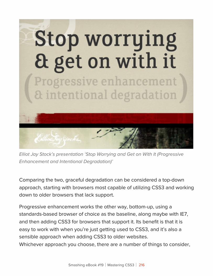
Elliot Jay Stock’s presentation ‘Stop Worrying and Get on With It (Progressive Enhancement and Intentional Degradation)’
Comparing the two, graceful degradation can be considered a top-down approach, starting with browsers most capable of utilizing CSS3 and working down to older browsers that lack support.
Progressive enhancement works the other way, bottom-up, using a standards-based browser of choice as the baseline, along maybe with IE7, and then adding CSS3 for browsers that support it. Its benefit is that it is easy to work with when you’re just getting used to CSS3, and it’s also a sensible approach when adding CSS3 to older websites.Whichever approach you choose, there are a number of things to consider,
Smashing eBook #19│Mastering CSS3│ 216
what with all the CSS3 properties that are coming out. Later on, we will look at considerations for certain key properties.
How To Do It?Whatever your approach, you will no doubt find yourself thinking through the common fallback process at some point: what would this element look like with a certain property, and what would it look like without it? Would it look fine or broken? If it would look broken, there’s a good chance you will need to do something about it.
As a typical path, you would first implement a feature with CSS3, then with CSS 2.1, then (maybe) with JavaScript, and then with whatever hack you used to use for legacy browsers. You could argue that progressive enhancement would slightly modify this path, using CSS 2.1 first, then CSS3.
At each stage, you should determine whether degrading or enhancing a feature would become unnecessarily complex and whether simply providing an alternative would be more sensible.
ORDERING PROPERTIES
Let’s take a quick look at ordering properties and how browsers interpret them. Browser makers initially offer CSS3 functionality via browser prefixes: -moz for Mozilla, -webkit for Chrome and Safari, -o for Opera, etc. Each browser then ignores any prefixes not meant for it. The convention is to list the browser-specific prefixes first and then the default property, as follows:
.somediv { -moz-border-radius: 5px; -webkit-border-radius: 5px; border-radius: 5px; }
Smashing eBook #19│Mastering CSS3│ 217
Yes, this creates a little overhead, but when you consider how such effects were achieved before CSS3, it’s really not much.
Browsers that don’t support the property will ignore it. Any browser that does support it will implement its browser-specific version; and when it eventually supports the generic property, it will implement that.
Why order it in this way? Once all of the browsers implement a property the same way, then they will adopt the default version of the property; until then, they will use the prefixed version. By listing the properties in the order shown above, we ensure that the standard version is implemented as the fallback once it is supported, hopefully leading to more consistent rendering across browsers.
JavaScriptJavaScript is the most common method of enabling cross-browser CSS3 features support, and it can either be used as a substitute for or to enable CSS3 properties in older browsers or be used as an alternative.
MODERNIZR
A useful JavaScript tool for implementing CSS3 fallbacks is Modernizr. For anyone working with CSS3 in a production environment (as opposed to merely as a proof of concept), it is essential. Modernizr enables you to use CSS3 for properties where it is supported, and to provide sensible alternatives where it isn’t.
Smashing eBook #19│Mastering CSS3│ 218
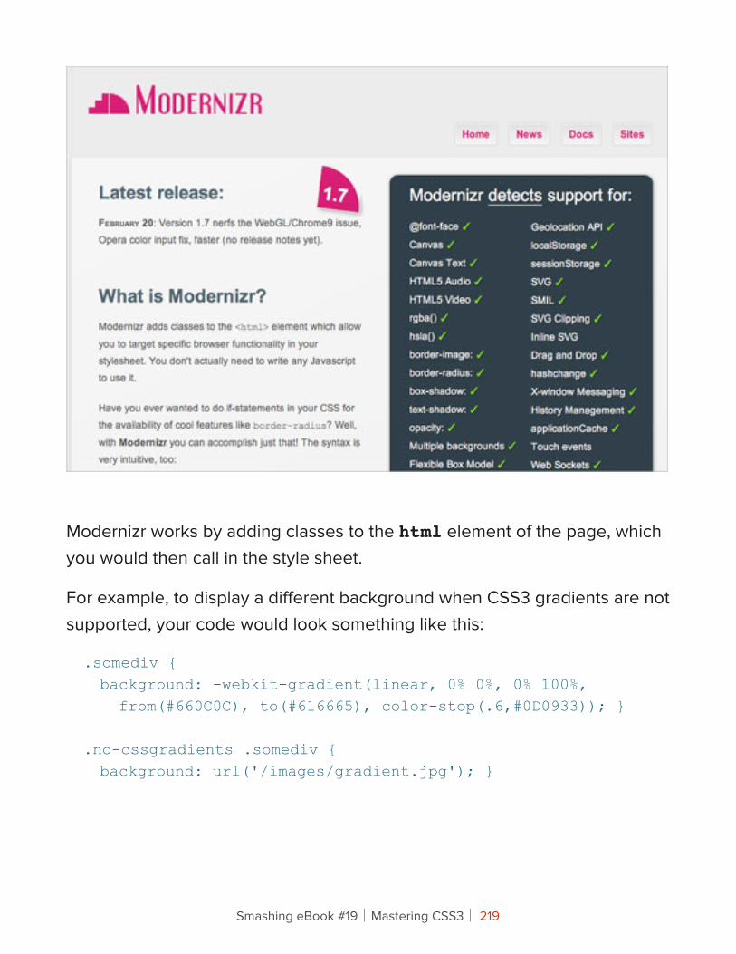
Modernizr works by adding classes to the html element of the page, which you would then call in the style sheet.
For example, to display a different background when CSS3 gradients are not supported, your code would look something like this:
.somediv { background: -webkit-gradient(linear, 0% 0%, 0% 100%, from(#660C0C), to(#616665), color-stop(.6,#0D0933)); }
.no-cssgradients .somediv { background: url('/images/gradient.jpg'); }
Smashing eBook #19│Mastering CSS3│ 219
Conversely, to display a different background only where the CSS3 property is supported, you would do this:
.cssgradients .somediv { background: -webkit-gradient(linear, 0% 0%, 0% 100%, from(#660C0C), to(#616665), color-stop(.6,#0D0933));}
.somediv { background: url('/images/gradient.jpg'); }
In this way, you control what is shown in the absence of a property, and you tailor the output to what is sensible. In this case, you could serve a gradient image in the absence of support for CSS3 gradients.
With this additional control, you can tailor the output quite accurately and avoid any clashes that might arise from a missing property.
CSS3 PIE
Sadly, this has nothing to do with the tasty dessert. CSS3 PIE stands for progressive Internet Explorer. As the official description says:
PIE makes Internet Explorer 6 to 8 capable of rendering several of the most useful CSS3 decoration features.
Smashing eBook #19│Mastering CSS3│ 220
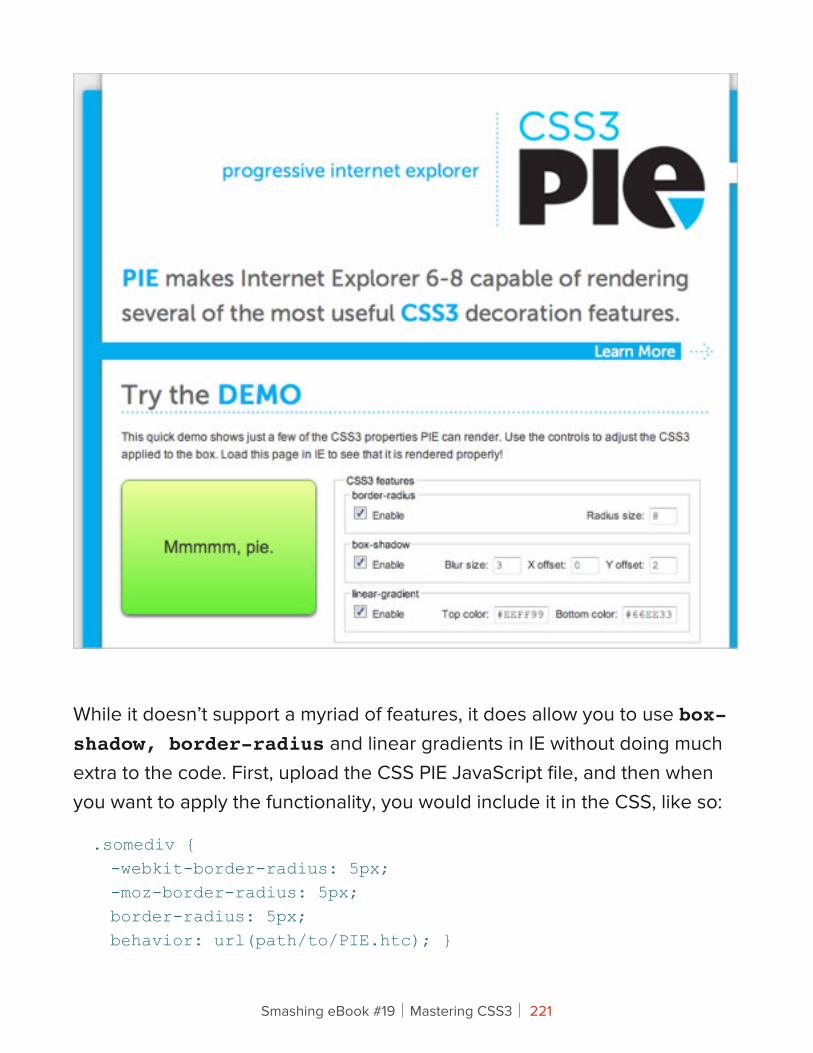
While it doesn’t support a myriad of features, it does allow you to use box-shadow, border-radius and linear gradients in IE without doing much extra to the code. First, upload the CSS PIE JavaScript file, and then when you want to apply the functionality, you would include it in the CSS, like so:
.somediv { -webkit-border-radius: 5px; -moz-border-radius: 5px; border-radius: 5px; behavior: url(path/to/PIE.htc); }
Smashing eBook #19│Mastering CSS3│ 221

Fairly straightforward, and it can save you the hassle of having to use JavaScript hacks to achieve certain effects in IE.
SELECTIVZR
CSS3 has expanded its repertoire beyond advanced selectors such as [rel="selector"] and pseudo-selectors such as :focus, to include selectors such as :nth-of-type, which give you much more control and focus and allow you to dispense with a lot of presentational classes and IDs. Support for selectors varies greatly, especially with the wide variety of additional selectors being introduced.
Smashing eBook #19│Mastering CSS3│ 222
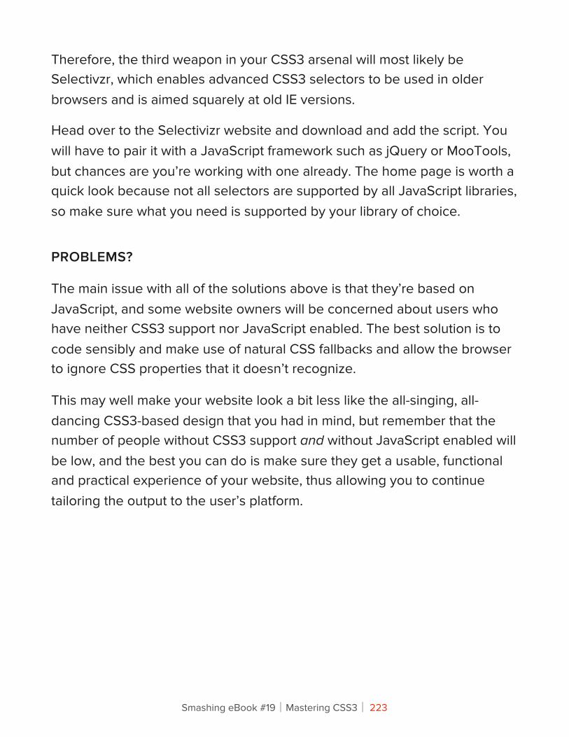
Therefore, the third weapon in your CSS3 arsenal will most likely be Selectivzr, which enables advanced CSS3 selectors to be used in older browsers and is aimed squarely at old IE versions.
Head over to the Selectivizr website and download and add the script. You will have to pair it with a JavaScript framework such as jQuery or MooTools, but chances are you’re working with one already. The home page is worth a quick look because not all selectors are supported by all JavaScript libraries, so make sure what you need is supported by your library of choice.
PROBLEMS?
The main issue with all of the solutions above is that they’re based on JavaScript, and some website owners will be concerned about users who have neither CSS3 support nor JavaScript enabled. The best solution is to code sensibly and make use of natural CSS fallbacks and allow the browser to ignore CSS properties that it doesn’t recognize.
This may well make your website look a bit less like the all-singing, all-dancing CSS3-based design that you had in mind, but remember that the number of people without CSS3 support and without JavaScript enabled will be low, and the best you can do is make sure they get a usable, functional and practical experience of your website, thus allowing you to continue tailoring the output to the user’s platform.
Smashing eBook #19│Mastering CSS3│ 223
Some CSS3 Properties: Considerations And FallbacksMany CSS3 properties are being used, and by now we have gotten used to the quirks and pitfalls of each iteration of the CSS protocol. To give you a quick start on some of the more popular CSS3 properties, we’ll look at some of the issues you may run into and some sensible ways to fall back in older browsers.
All of the information in this article about browser support is correct as of May 2011. You can keep up to date and check out further information about support by visiting findmebyIP. Support has not been checked in browser versions older than Chrome 7.0, Firefox 2.0, Opera 9, Safari 2 and Internet Explorer 6.
BORDER RADIUS
Support: Google Chrome 7.0+, Firefox (2.0+ for standard corners, 3.5+ for elliptical corners), Opera 10.5+, Safari 3.0+, IE 9
Property: border-radiusVendor prefixes: -webkit-border-radius, -moz-border-radiusExample usage (even corners with a radius of 5 pixels):.somediv { -moz-border-radius: 5px; -webkit-border-radius: 5px; border-radius: 5px; }
Smashing eBook #19│Mastering CSS3│ 224
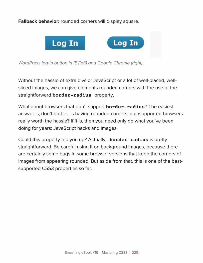
Fallback behavior: rounded corners will display square.
WordPress log-in button in IE (left) and Google Chrome (right).
Without the hassle of extra divs or JavaScript or a lot of well-placed, well-sliced images, we can give elements rounded corners with the use of the straightforward border-radius property.
What about browsers that don’t support border-radius? The easiest answer is, don’t bother. Is having rounded corners in unsupported browsers really worth the hassle? If it is, then you need only do what you’ve been doing for years: JavaScript hacks and images.
Could this property trip you up? Actually, border-radius is pretty straightforward. Be careful using it on background images, because there are certainly some bugs in some browser versions that keep the corners of images from appearing rounded. But aside from that, this is one of the best-supported CSS3 properties so far.
Smashing eBook #19│Mastering CSS3│ 225
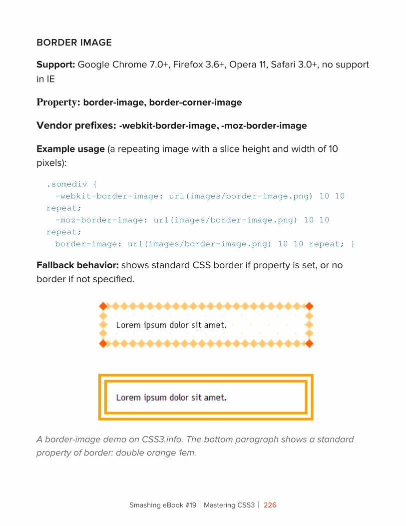
BORDER IMAGE
Support: Google Chrome 7.0+, Firefox 3.6+, Opera 11, Safari 3.0+, no support in IE
Property: border-image, border-corner-image
Vendor prefixes: -webkit-border-image, -moz-border-image
Example usage (a repeating image with a slice height and width of 10 pixels):
.somediv { -webkit-border-image: url(images/border-image.png) 10 10 repeat; -moz-border-image: url(images/border-image.png) 10 10 repeat; border-image: url(images/border-image.png) 10 10 repeat; }
Fallback behavior: shows standard CSS border if property is set, or no border if not specified.
A border-image demo on CSS3.info. The bottom paragraph shows a standard property of border: double orange 1em.
Smashing eBook #19│Mastering CSS3│ 226
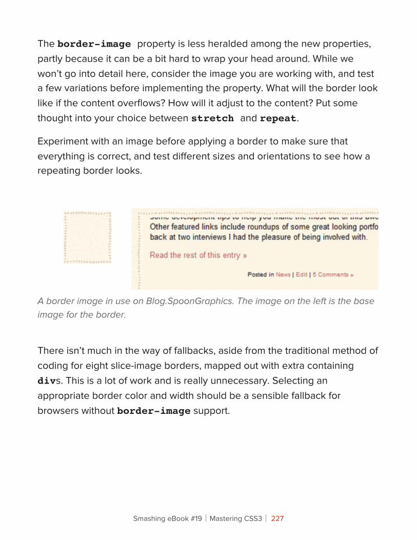
The border-image property is less heralded among the new properties, partly because it can be a bit hard to wrap your head around. While we won’t go into detail here, consider the image you are working with, and test a few variations before implementing the property. What will the border look like if the content overflows? How will it adjust to the content? Put some thought into your choice between stretch and repeat.
Experiment with an image before applying a border to make sure that everything is correct, and test different sizes and orientations to see how a repeating border looks.
A border image in use on Blog.SpoonGraphics. The image on the left is the base image for the border.
There isn’t much in the way of fallbacks, aside from the traditional method of coding for eight slice-image borders, mapped out with extra containing divs. This is a lot of work and is really unnecessary. Selecting an appropriate border color and width should be a sensible fallback for browsers without border-image support.
Smashing eBook #19│Mastering CSS3│ 227
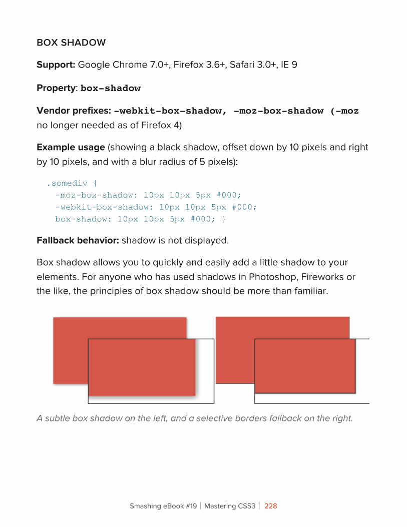
BOX SHADOW
Support: Google Chrome 7.0+, Firefox 3.6+, Safari 3.0+, IE 9
Property: box-shadow
Vendor prefixes: -webkit-box-shadow, -moz-box-shadow (-moz no longer needed as of Firefox 4)
Example usage (showing a black shadow, offset down by 10 pixels and right by 10 pixels, and with a blur radius of 5 pixels):
.somediv { -moz-box-shadow: 10px 10px 5px #000; -webkit-box-shadow: 10px 10px 5px #000; box-shadow: 10px 10px 5px #000; }
Fallback behavior: shadow is not displayed.
Box shadow allows you to quickly and easily add a little shadow to your elements. For anyone who has used shadows in Photoshop, Fireworks or the like, the principles of box shadow should be more than familiar.
A subtle box shadow on the left, and a selective borders fallback on the right.
Smashing eBook #19│Mastering CSS3│ 228
In its absence? You could use selective borders (i.e. a left and bottom border to imitate a thin box shadow).
.somediv { -moz-box-shadow: 1px 1px 5px #888; -webkit-box-shadow: 1px 1px 5px #888; box-shadow: 1px 1px 5px #888; }
.no-boxshadow .somediv { border-right: 1px solid #525252; border-bottom: 1px solid #525252; }
RGBA AND HSLA
RGBa support: Google Chrome 7.0+, Firefox 3.0+, Opera 10+, Safari 3.0+, IE 9
HSLA support: Google Chrome 7.0+, Firefox 3.0+, Opera 10+, Safari 3.0+
Property: rgba, hsla
Fallback behavior: the color declaration is ignored, and the browser falls back to the previously specified color, the default color or no color.
.somediv { background: #f00; background: rgba(255,0,0,0.5); }
Smashing eBook #19│Mastering CSS3│ 229
In the example above, both background declarations specify the color red. Where RGBa is supported, it will be shown at 50% (0.5), and in other cases the fallback will be to the solid red (#f00).
24 Ways makes great creative use of RGBa.
While there is broad support for opacity, its downside is that everything associated with an element becomes transparent. But now we have two new ways to define color: RGBa (red, green, blue, alpha) and HSLa (hue, saturation, light, alpha).
Both offer new ways to define colors, with the added benefit of allowing you to specify the alpha channel value.
The obvious fallback for RGBa and HSLa is a solid color; not a problem, but the main thing to watch out for is legibility. A semi-transparent color can have quite a different tone to the original. An RGB value shown as a solid color and the same value at .75 opacity can vary massively depending on the background shade, so be sure to check how your text looks against the background.
Smashing eBook #19│Mastering CSS3│ 230
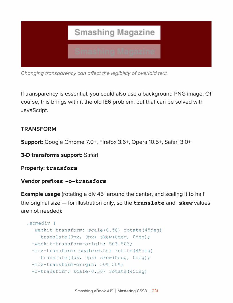
Changing transparency can affect the legibility of overlaid text.
If transparency is essential, you could also use a background PNG image. Of course, this brings with it the old IE6 problem, but that can be solved with JavaScript.
TRANSFORM
Support: Google Chrome 7.0+, Firefox 3.6+, Opera 10.5+, Safari 3.0+
3-D transforms support: Safari
Property: transform
Vendor prefixes: -o-transform
Example usage (rotating a div 45° around the center, and scaling it to half the original size — for illustration only, so the translate and skew values are not needed):
.somediv { -webkit-transform: scale(0.50) rotate(45deg) translate(0px, 0px) skew(0deg, 0deg); -webkit-transform-origin: 50% 50%; -moz-transform: scale(0.50) rotate(45deg) translate(0px, 0px) skew(0deg, 0deg); -moz-transform-origin: 50% 50%; -o-transform: scale(0.50) rotate(45deg)
Smashing eBook #19│Mastering CSS3│ 231
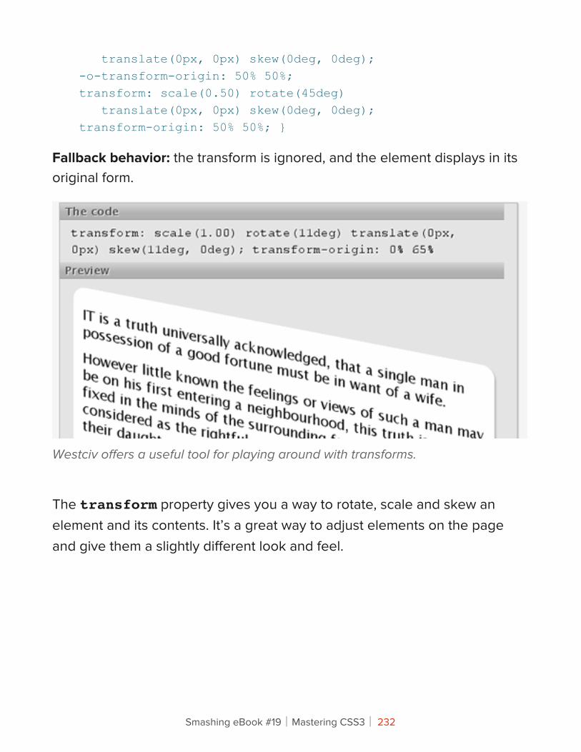
translate(0px, 0px) skew(0deg, 0deg); -o-transform-origin: 50% 50%; transform: scale(0.50) rotate(45deg) translate(0px, 0px) skew(0deg, 0deg); transform-origin: 50% 50%; }
Fallback behavior: the transform is ignored, and the element displays in its original form.
Westciv offers a useful tool for playing around with transforms.
The transform property gives you a way to rotate, scale and skew an element and its contents. It’s a great way to adjust elements on the page and give them a slightly different look and feel.
Smashing eBook #19│Mastering CSS3│ 232
A simple fallback in the absence of an image-based transform is to use an alternative image that is already rotated. And if you want to rotate content? Well, you can always use JavaScript to rotate the element. Another simple alternative is to rotate the background element in an image editor beforehand and keep the content level.
We’ve gotten by with level elements for so many years, there’s no reason why people on old browsers can’t continue to put up with them.
ANIMATIONS AND TRANSITIONS
Transitions support: Google Chrome 7.0+, Firefox 4.02, Opera 10.5+, Safari 3.0+
Animations support: Google Chrome 7.0+, Safari 3.0+
Property: transition
Vendor prefixes: -webkit-transition, -moz-transition, -o-transition
Example usage (a basic linear transition of text color, triggered on hover):
.somediv:hover { color: #000; -webkit-transition: color 1s linear; -moz-transition: color 1s linear; -o-transition: color 1s linear; transition: color 1s linear; }
A basic animation that rotates an element on hover:
@-webkit-keyframes spin { from { -webkit-transform: rotate(0deg); } to { -webkit-transform: rotate(360deg); } }
Smashing eBook #19│Mastering CSS3│ 233
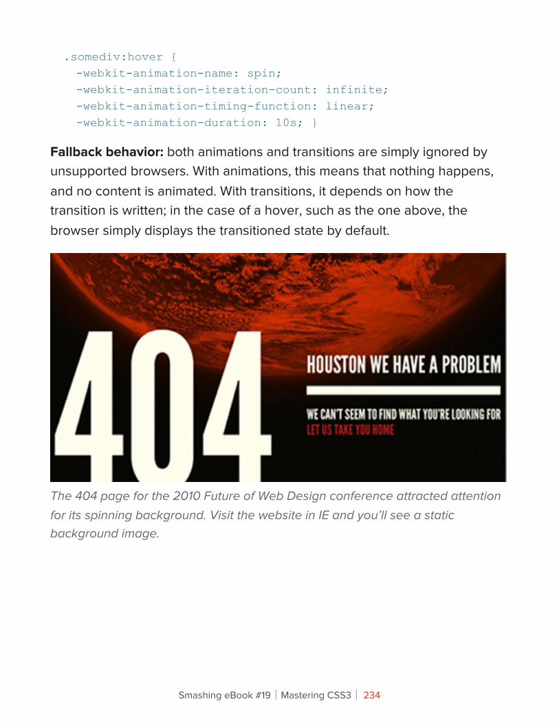
.somediv:hover { -webkit-animation-name: spin; -webkit-animation-iteration-count: infinite; -webkit-animation-timing-function: linear; -webkit-animation-duration: 10s; }
Fallback behavior: both animations and transitions are simply ignored by unsupported browsers. With animations, this means that nothing happens, and no content is animated. With transitions, it depends on how the transition is written; in the case of a hover, such as the one above, the browser simply displays the transitioned state by default.
The 404 page for the 2010 Future of Web Design conference attracted attention for its spinning background. Visit the website in IE and you’ll see a static background image.
Smashing eBook #19│Mastering CSS3│ 234
Animations and transitions in CSS3 are slowly seeing more use, from subtle hover effects to more elaborate shifting and rotating of elements across the page. Most effects either start right at page load or (more frequently) are used to enhance a hover effect. Once you get down and dirty with animations, there’s great fun to be had, and they’re much more accessible to designers now than before.
Starting off small with the CSS3 transition property is best, subtly transitioning things such as link hovers before moving on to bigger things.
Once you’re comfortable with basic transitions and transforms, you can get into the more involved animation property. To use it, you declare keyframes of an animation with @-webkit-keyframes and then call this keyframe animation in other elements, declaring its timing, iterations, etc. Note that animations work better with CSS3 transforms than with other properties, so stick to transform and translate rather than shifting margins or absolute positioning.
Of course, people have been animating with JavaScript for years. But if you want to do something as simple as animating a hover state, then it hardly seems worth the extra coding. The simplest thing to do for unsupported browsers is to specify a state for hover, without any transition to it.
FONT FACE (NOT NEW IN CSS3)
Support for different font formats: Google Chrome 7.0+, Firefox 3.1+, Opera 10+, Safari 3.1+, IE 6+
Property: @font-face
Example usage (a @font-face declaration for Chunk Five, an OTF font, and calling it for h1 headings):
Smashing eBook #19│Mastering CSS3│ 235
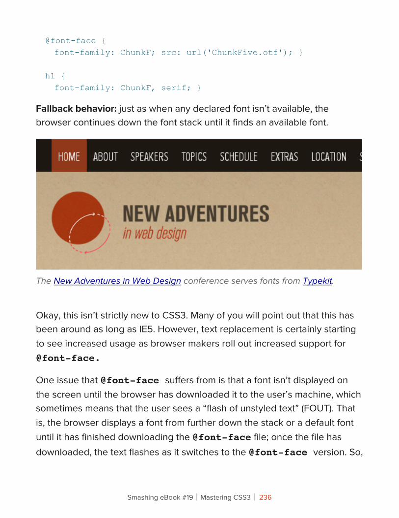
@font-face { font-family: ChunkF; src: url('ChunkFive.otf'); }
h1 { font-family: ChunkF, serif; }
Fallback behavior: just as when any declared font isn’t available, the browser continues down the font stack until it finds an available font.
The New Adventures in Web Design conference serves fonts from Typekit.
Okay, this isn’t strictly new to CSS3. Many of you will point out that this has been around as long as IE5. However, text replacement is certainly starting to see increased usage as browser makers roll out increased support for @font-face.
One issue that @font-face suffers from is that a font isn’t displayed on the screen until the browser has downloaded it to the user’s machine, which sometimes means that the user sees a “flash of unstyled text” (FOUT). That is, the browser displays a font from further down the stack or a default font until it has finished downloading the @font-face file; once the file has downloaded, the text flashes as it switches to the @font-face version. So,
Smashing eBook #19│Mastering CSS3│ 236
minimizing the flash by stacking fonts of a similar size and weight is important. If the stack is poorly compiled, then not only could the text be resized, but so could containing elements, which will confuse users who have started reading the page before the proper font has loaded.
The good news is that Firefox 4 doesn’t has a FOUT any longer, IE9, however, does have a FOUT but WebInk has written a script FOUT-B-GONE which takes these facts into account and helps you hide the FOUT from your users in FF3.5-3.6 and IE.
On his blog, Web designer Florian Schroiff uses @font-face to serve the Prater font (bottom), falling back to Constina, Georgia (top) and Times New Roman.
Many font delivery services, including TypeKit and Google Web Fonts, deliver their fonts via JavaScript, which gives you control over what is displayed while the font is being downloaded as well as what happens when the font actually loads.
Because browsers wait until the full file of a font kit has loaded before displaying it, plenty of services allow you to strip out unnecessary parts of the kit to cut down on size. For example, if you’re not going to be using
Smashing eBook #19│Mastering CSS3│ 237
small caps, then you can strip it out of the file so that the font renders more quickly.
ADVANCED SELECTORS
Support (varies depending on the selector used): Google Chrome 7.0+, Firefox 3.6+, Opera 9.0+, Safari 2.0+, IE 6+
Property: many, including :nth-of-type, :first-child, :last-child, [attr="…"]
Example usage (coloring only links that point to Smashing Magazine, and coloring odd-numbered rows in tables):
a[href*=smashingmagazine.com] { color:#f00; }
tr:nth-of-type(odd) { background: #ddd; }
Fallback behavior: In the absence of support for advanced selectors, the browser does not apply the targeted style to the element and simply treats it as any other element of its type. In the two examples above, the link would take on the standard link properties but not the specified color, and the odd-numbered table rows would be colored the same as other table rows.
Advanced selectors are a great tool for reducing the code on a website. You will be able to get rid of many presentational classes and gain more control of the selections in your style sheet.
Smashing eBook #19│Mastering CSS3│ 238
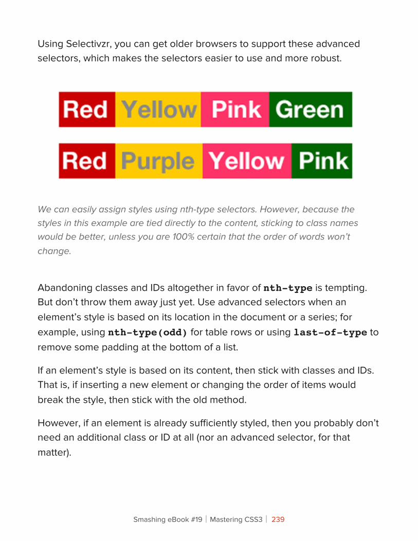
Using Selectivzr, you can get older browsers to support these advanced selectors, which makes the selectors easier to use and more robust.
We can easily assign styles using nth-type selectors. However, because the styles in this example are tied directly to the content, sticking to class names would be better, unless you are 100% certain that the order of words won’t change.
Abandoning classes and IDs altogether in favor of nth-type is tempting. But don’t throw them away just yet. Use advanced selectors when an element’s style is based on its location in the document or a series; for example, using nth-type(odd) for table rows or using last-of-type to remove some padding at the bottom of a list.
If an element’s style is based on its content, then stick with classes and IDs. That is, if inserting a new element or changing the order of items would break the style, then stick with the old method.
However, if an element is already sufficiently styled, then you probably don’t need an additional class or ID at all (nor an advanced selector, for that matter).
Smashing eBook #19│Mastering CSS3│ 239
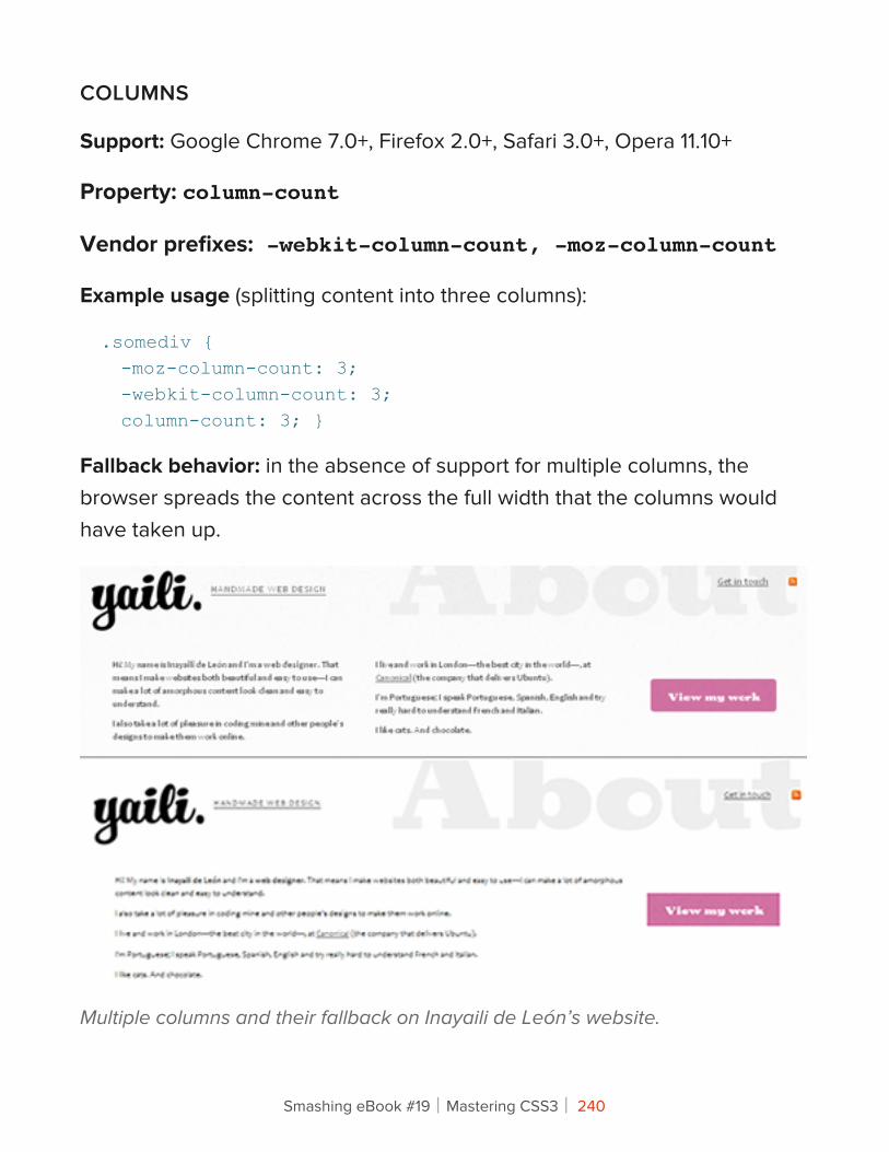
COLUMNS
Support: Google Chrome 7.0+, Firefox 2.0+, Safari 3.0+, Opera 11.10+
Property: column-count
Vendor prefixes: -webkit-column-count, -moz-column-count
Example usage (splitting content into three columns):
.somediv { -moz-column-count: 3; -webkit-column-count: 3; column-count: 3; }
Fallback behavior: in the absence of support for multiple columns, the browser spreads the content across the full width that the columns would have taken up.
Multiple columns and their fallback on Inayaili de León’s website.
Smashing eBook #19│Mastering CSS3│ 240
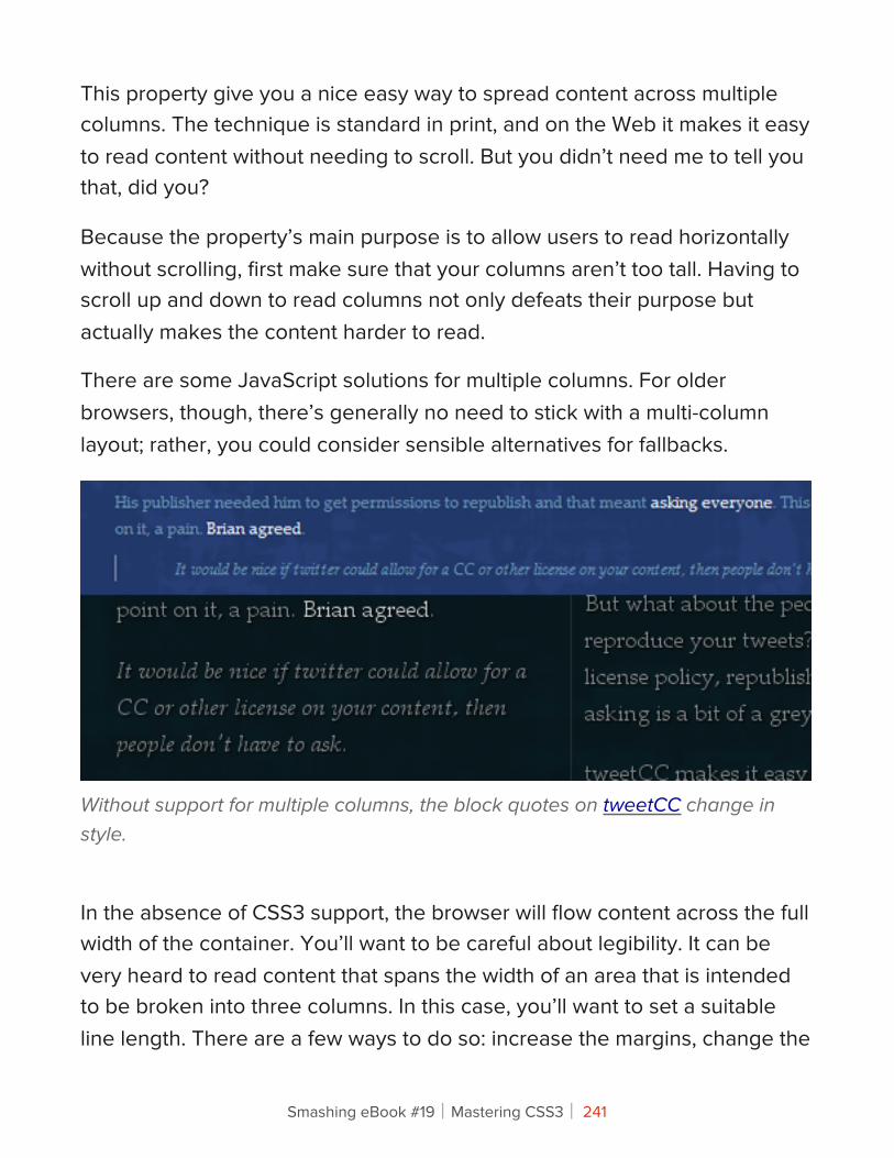
This property give you a nice easy way to spread content across multiple columns. The technique is standard in print, and on the Web it makes it easy to read content without needing to scroll. But you didn’t need me to tell you that, did you?
Because the property’s main purpose is to allow users to read horizontally without scrolling, first make sure that your columns aren’t too tall. Having to scroll up and down to read columns not only defeats their purpose but actually makes the content harder to read.
There are some JavaScript solutions for multiple columns. For older browsers, though, there’s generally no need to stick with a multi-column layout; rather, you could consider sensible alternatives for fallbacks.
Without support for multiple columns, the block quotes on tweetCC change in style.
In the absence of CSS3 support, the browser will flow content across the full width of the container. You’ll want to be careful about legibility. It can be very heard to read content that spans the width of an area that is intended to be broken into three columns. In this case, you’ll want to set a suitable line length. There are a few ways to do so: increase the margins, change the
Smashing eBook #19│Mastering CSS3│ 241
font size or decrease the element’s width. Floating elements such as images and block quotes out of the flow of text can help to fill up any leftover space in the single column.
GRADIENTS
Support: Google Chrome 7.0+ for -webkit-gradient, Google 10+ for -webkit-linear-gradient and -webkit-radial-gradient, Firefox 3.6+, Safari
Property: linear-gradient, radial-gradient
Vendor prefixes: -webkit-gradient, -webkit-linear-gradient, -webkit-radial-gradient, -moz-linear-gradient, moz-radial-gradient
Example usage (a linear white-to-black gradient running from top to bottom — notice the lack of -linear- in the Webkit declaration):
.somediv { background-image: -webkit-gradient(linear, 0% 0%, 0% 100%, from(#ffffff), to(#000000)); background-image: -webkit-linear-gradient(0% 0%, 0% 100%, from(#ffffff), to(#000000)); background-image: -moz-linear-gradient(0% 0% 270deg, #ffffff, #000000); background-image: linear-gradient(0% 0% 270deg, #ffffff, #000000); }
A radial gradient running from white in the center to black on the outside:
.somediv { background-image: -moz-radial-gradient(50% 50%, farthest-side, #ffffff, #000000);
Smashing eBook #19│Mastering CSS3│ 242
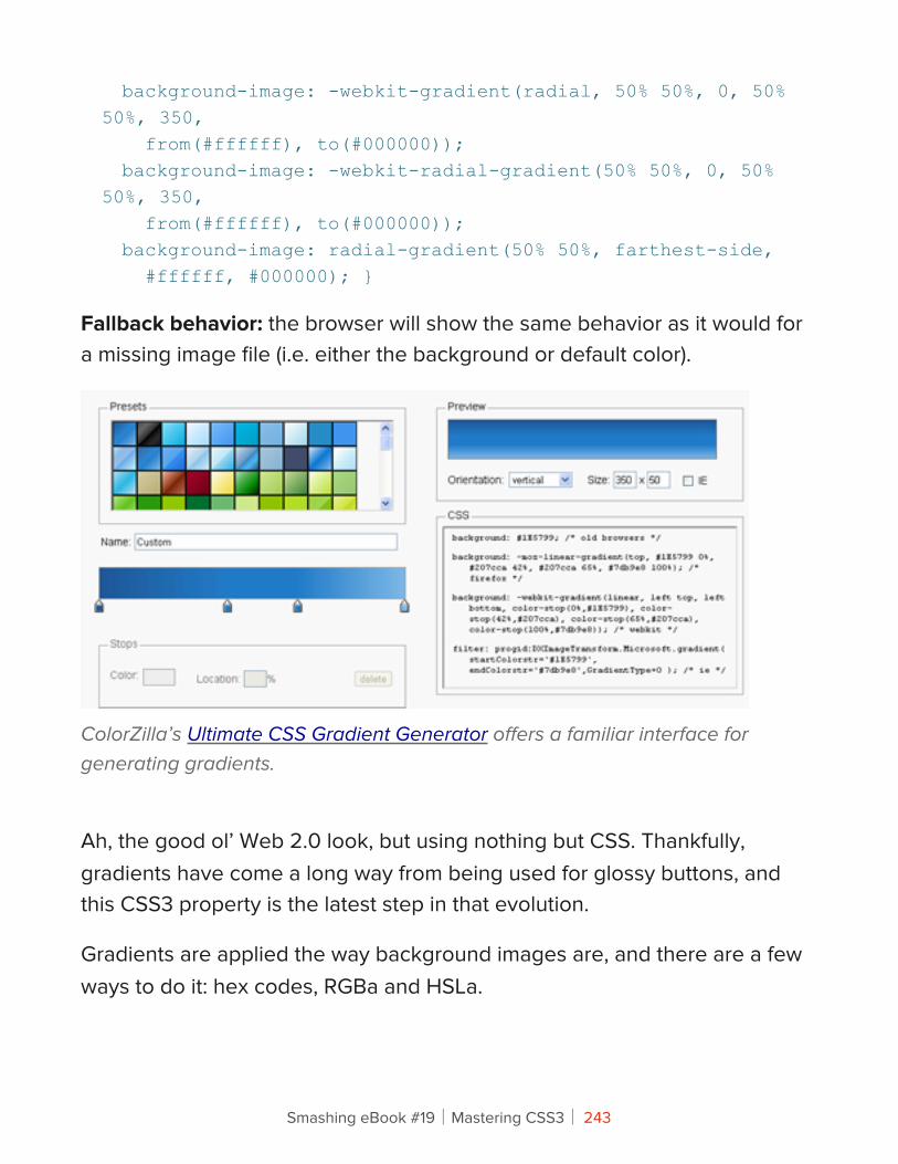
background-image: -webkit-gradient(radial, 50% 50%, 0, 50% 50%, 350, from(#ffffff), to(#000000)); background-image: -webkit-radial-gradient(50% 50%, 0, 50% 50%, 350, from(#ffffff), to(#000000)); background-image: radial-gradient(50% 50%, farthest-side, #ffffff, #000000); }
Fallback behavior: the browser will show the same behavior as it would for a missing image file (i.e. either the background or default color).
ColorZilla’s Ultimate CSS Gradient Generator offers a familiar interface for generating gradients.
Ah, the good ol’ Web 2.0 look, but using nothing but CSS. Thankfully, gradients have come a long way from being used for glossy buttons, and this CSS3 property is the latest step in that evolution.
Gradients are applied the way background images are, and there are a few ways to do it: hex codes, RGBa and HSLa.
Smashing eBook #19│Mastering CSS3│ 243
Be careful when applying a background with a height of 100% to an element such as the body. In some browsers, this will limit the gradient to the edge of the visible page, and so you’ll lose the gradient as you scroll down (and if you haven’t specified a color, then the background will be white). You can get around this by setting the background-position to fixed, which ensures that the background doesn’t move as you scroll.
Specifying a background color not only is a good fallback practice but can prevent unforeseen problems. As a general rule, set it either to one end of the gradient or to a color in the middle of the range.
Legibility is also a consideration. Making text readable against a solid background color is easy. But if a gradient is dramatic (for example, from very light to very dark), then choose a text color that will work over the range of the gradient.
Radial gradients are a bit different, and getting used to the origins and spreads can take a bit of playing around. But the same principles apply. Note that Webkit browsers are switching from the -webkit-gradient property to -webkit-linear-gradient and -webkit-radial-gradient. To be safe, include both properties, but (as we have learned) put the old property before the new one.
These issues aren’t new; we’ve been using gradients for ages. If you really need one, then the obvious fallback is simply to use an image. While it won’t adapt to the dimensions of the container, you will be able to set its exact dimensions as you see fit.
Smashing eBook #19│Mastering CSS3│ 244
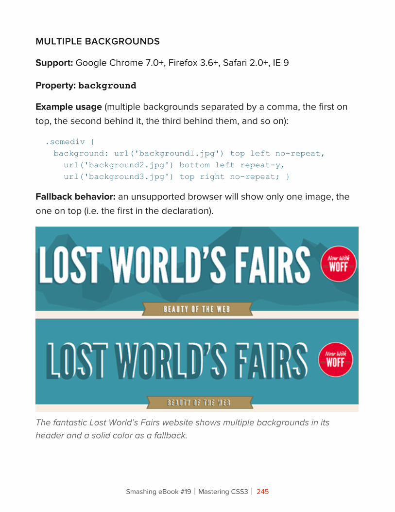
MULTIPLE BACKGROUNDS
Support: Google Chrome 7.0+, Firefox 3.6+, Safari 2.0+, IE 9
Property: background
Example usage (multiple backgrounds separated by a comma, the first on top, the second behind it, the third behind them, and so on):
.somediv { background: url('background1.jpg') top left no-repeat, url('background2.jpg') bottom left repeat-y, url('background3.jpg') top right no-repeat; }
Fallback behavior: an unsupported browser will show only one image, the one on top (i.e. the first in the declaration).
The fantastic Lost World’s Fairs website shows multiple backgrounds in its header and a solid color as a fallback.
Smashing eBook #19│Mastering CSS3│ 245
Being able to set multiple background images is very useful. You can layer images on top of one another. And because CSS gradients can be applied as backgrounds, you can layer multiple images and gradients with ease.
You can also position background elements within dynamically sized containers. For example, you could have an image appear 25% down the container and then another at 75%, both of which move with any dynamic content.
If multiple backgrounds are essential to your website, you could insert additional elements and images into the DOM using JavaScript. But again, is this worth doing? A single well-chosen background image might work best. It could be a matter of picking the most important image or blending the images into a composite (even if this makes for a less dynamic background).
Use Only Where NeededIt’s worth repeating that CSS3 is not a necessity. Just because you can use CSS3 properties, doesn’t mean your website would be any worse off without them. Applying these effects is now so simple, and so getting carried away becomes all too easy. Do you really need to round every corner or use multiple backgrounds everywhere? Just as a film can work without 3-D, so should your design be able to work without CSS3 splashed everywhere indiscriminately. The technology is simply a tool to make our lives easier and help us create better designs.
It is a testament to those who are already using CSS3 that there are very few instances of its misuse at the moment. The websites that do seem to misuse it suggest that their designers either used CSS3 for its own sake or didn’t consider its implications on certain platforms.
Smashing eBook #19│Mastering CSS3│ 246
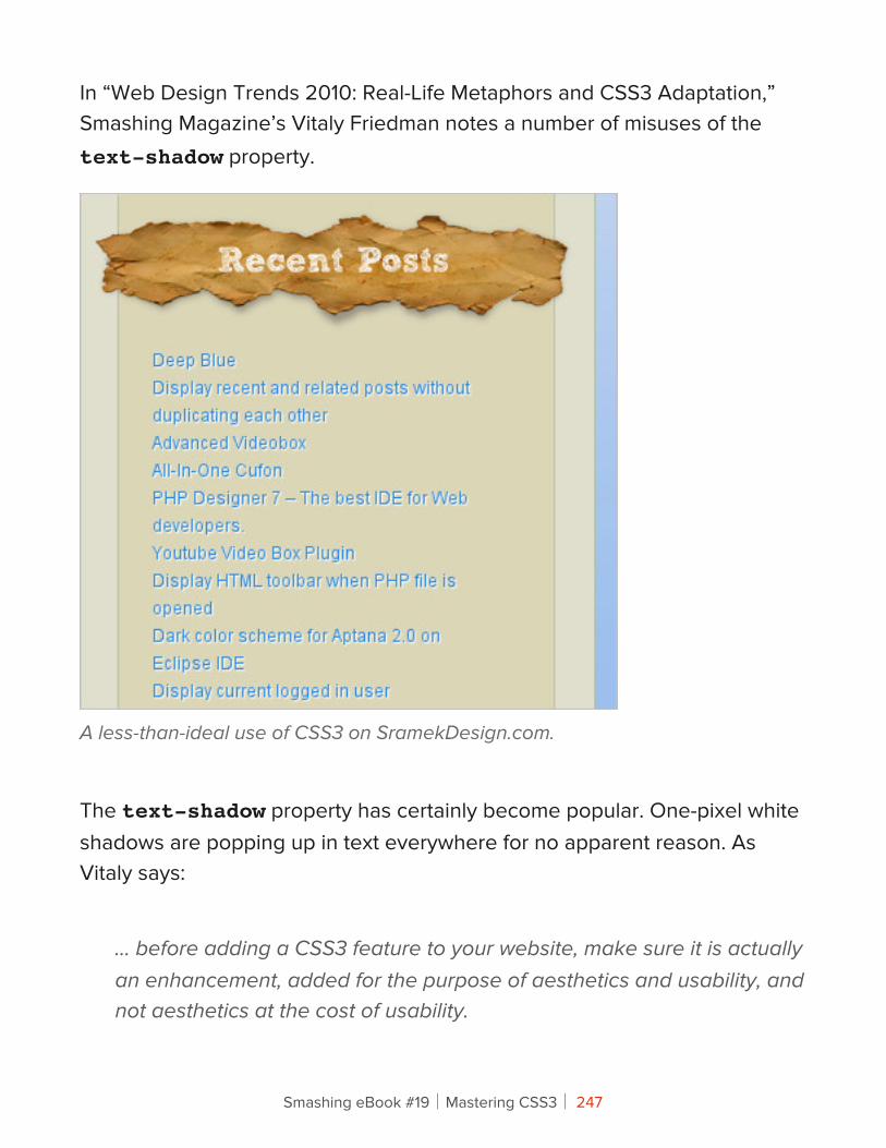
In “Web Design Trends 2010: Real-Life Metaphors and CSS3 Adaptation,” Smashing Magazine’s Vitaly Friedman notes a number of misuses of the text-shadow property.
A less-than-ideal use of CSS3 on SramekDesign.com.
The text-shadow property has certainly become popular. One-pixel white shadows are popping up in text everywhere for no apparent reason. As Vitaly says:
… before adding a CSS3 feature to your website, make sure it is actually an enhancement, added for the purpose of aesthetics and usability, and not aesthetics at the cost of usability.
Smashing eBook #19│Mastering CSS3│ 247
As you become familiar with CSS3’s new properties, you will learn to recognize when and where problems occur and where the properties aren’t really necessary.
Using CSS3CSS3 is the future of the Web, no argument about that. So, versing yourself right now in the language of the future makes sense. While IE is still the single most popular browser, it now has less than half of the market share, meaning that the majority of people no longer use it and it can no longer be used as an excuse not to explore new possibilities and opportunities.
To use CSS3 means to embrace the principle that websites need not look the same in every browser, but rather should be tailored to the user’s browsing preferences via sensible fallbacks. It isn’t daunting or inaccessible, and the best way to learn is by diving in.
Smashing eBook #19│Mastering CSS3│ 248
About !e Authors
Dave SparksDave Sparks is a web designer and developer who has dabbled on the web for over 10 years with more than six years of commercial experience. He is a part-timer who freelances and does work for Armitage Online. He can be found writing about various topics at Kamikazemusic.com and tweeting as @dsparks83. He also runs long distances, drinks lots of tea and spends time flying planes in his day job.
Louis LazarisLouis Lazaris is a freelance web developer based in Toronto, Canada. He blogs about front-end code on Impressive Webs and is a coauthor of HTML5 and CSS3 for the Real World, published by SitePoint. You can follow Louis on Twitter or contact him through his website.
Peter GasstonPeter is a web developer, writer, public speaker, and author of The Book of CSS3. He blogs at Broken Links and tweets as @stopsatgreen. He lives in London, England.
Smashing eBook #19│Mastering CSS3│ 249
Richard ShepherdRichard (@richardshepherd) is a UK based web designer and front-end developer. He loves to play with HTML5, CSS3, jQuery and WordPress, and currently works full-time bringing VoucherCodes.co.uk to life. He has an awesomeness factor of 8, and you can also find him at richardshepherd.com.
Tom Gianna#asioTom Giannattasio happily makes things at nclud. He works as an Editor for Smashing Magazine and teaches at Boston University Center for Digital Imaging Arts. He loves to experiment and share his work on his personal site: attasi.
Tom WaterhousePixel pusher by day, illustrator by night. Tom is a lead designer and when he isn't ruining his eyes in front of the computer, he'll be ruining them in front of a games console.
Trent WaltonTrent Walton is founder and 1/3 of Paravel Inc., a custom web design and development shop based out of the Texas Hill Country. When he’s not working on client projects, he’s probably writing & designing articles for his blog, or contributing ideas for the next edition of TheManyFacesOf.com.
Smashing eBook #19│Mastering CSS3│ 250
Vitaly FriedmanVitaly Friedman loves beautiful content and doesn’t like to give in easily. Vitaly is writer, speaker, author and editor-in-chief of Smashing Magazine, an online magazine dedicated to designers and developers.
ZURBZURB is a close-knit team of interaction designers and strategists that help companies design better products & services through consulting, products, education, books, training and events. Since 1998 ZURB has helped over 75+ clients including: Facebook, eBay, NYSE, Yahoo, Zazzle, Playlist, Britney Spears, among others.
Smashing eBook #19│Mastering CSS3│ 251