
Marketing Portfolio Artwork_web
5
Special Event Posters . C Branding Materials . Small Business Flyers . Non Profit B Illustraons . Special Event Corporate Branding Materia Non Profit Branding Materials . Graphi Illustraons . Special Event Posters . Corporate Branding Materia Business Flyers . Non Profit Branding Materials . Logos . Illus Special Event Posters . Corporate Branding Materials . Small Flyers . Non Profit Branding Materials . Graphic Design . Illu . Logos . Special Event Posters . Corporate Branding Materia Business Flyers . Non Profit Branding Materials . Graphic P o r t f o l i o 2 0 1 4
-
Upload
lael-clark -
Category
Documents
-
view
118 -
download
2
Transcript of Marketing Portfolio Artwork_web

Special Event Posters . Corporate Branding Materials . Small Business Flyers . Non Profit Branding Materials . Graphic Design . Illustrations . Special Event Posters . Corporate Branding Materials . Corporate Branding Materials . Small Business Flyers . Logos . Non Profit Branding Materials . Graphic Design .Illustrations . Special Event Posters . Corporate Branding Materials . Small Business Flyers . Non Profit Branding Materials . Logos . Illustrations . Special Event Posters . Corporate Branding Materials . Small Business Flyers . Non Profit Branding Materials . Graphic Design . Illustrations . Logos . Special Event Posters . Corporate Branding Materials . Small Business Flyers . Non Profit Branding Materials . Graphic Design .
P o r t f o l i o 2 0 1 4

P o r t f o l i o 2 0 1 4a. Mind The Gap is a program concept for elementary aged children during after-school hours or the summer months. In 2010, I pitched an idea to my hometown recreation center that would incorporate the arts into its only summer camp program for sports. The facility director agreed, and I became the director of the arts curriculum for that camp. I came up with this Mind The Gap concept to expand my own creative and resourceful ability to operate a curriculum on a shoestring budget with only my curious mind and B.A. degree in Liberal Arts. As an inner city kid, now with a college degree, i knew that what my community had to uproot was deeper than a skills gap or economical gap, I saw it was a mental-subconsious gap that needed a bridge and I focused on exposing these 6-9years wise young men and women (yes, we identified these 6 and 7 year olds as young men and womne) and they rose to the occassion. This validated what I already knew about my community. I knew that our mind was being abandoned at an early age and unhelpful habits were being rooted earlier and earlier in
its place. As someone who remembers vividly what it feels like to be 6, 7, 8 & 9, I was able to understand their silent questions or lack thereof. The projects the students engaged in always radiated around self-respect, peer-respect, self-expression and unity. Projects like memory books, why I love myself mural and Character Building Mondays and local field trips to name a few. The fact that the facility director had noticed the best behavior he has EVER seen, is validation to me that I found what my community needed and rose to the occasion along with the kids in it. It wasn’t a calculated research study, it wasn’t a hand-out of dependency to them but simply pride, self-respect and exposure to the knowledge of self and knowledge of their surrondings. As a self-taught designer, I stood out among my peers a lot simply because I was in search of myself and I took the liberty to explore that and the world around me. Many thriving communities know this, I found it as well and know that my community could use it too. Pictured is a contact sheet with logo variations for the program.
b. This civil engineering firm requested a logo to illustrate several elements of an important project. First the color green symbolized the nature of the project. Next, I crafted the R to resemble the main intersection which was the most important part of the project. Finally, if you look closely, the R is paired with a hidden 1, which reads R141, the official name of the project. Pictured is how the logo was used.
c. Logo samples and a variation using one color tone and Photoshop, Taylor Children’s Network.
f. R: Design sample using tempra paint on handmade press for cotton t-shirt. Design from photograph L: Design sample for local fraternal organization with colorway options.
d. Logo sample using one color tone and Illustrator, Reichestabaucher Germanprint company.
e. One color business card. Front & back with custom hair-dryer imprint on front of card.
a.
e.
f.
c.
d.
b.

P o r t f o l i o 2 0 1 4
k. This is what goes on inside my brain! This is my sci-fi creative expres-sion of an underwater landscape complete with flying jelly fish and under-water campers.
l. This composition highlights my favorite poem, Still I Rise by Maya Angelou. This composiition is made entirely out of text fonts. The Female in the center is the feminine form. In American culture, women may wear their hair in ways to speak implicitly about beliefs, cultural belonging and inner expression. The scrip inside this feminine form shows how beauty rises from within and radiats through her hair. Beauty is within and once risen from within, it will rise in things around us as various forms. This is why the text and numbers are surrounding her form. Because not only has beauty risen inside her, it has manifested outside of her, both as darkness and as lightness.
Below:
g. This composition exeplifies skill to merge severalphotos into one cohesive project. There are fourautonomous photos and each photo has been adjusted for unified lighting, perspective & color with added special effect.
h. Hand drawn illustration of flower bouquetcomplete with shadowing, gradient effect and leaves.
i. 3D box rendering that demonstrates placement of stickers used to market a promotional campaign for the company. The stickers were brand specific for the corporation and also included a matching insert that would go inside the box.
j. This is my idea of a character illustration for a children’s book. The thick hair is a reflection of healthy african-american tresses and the upward looking eyes represent cu-riosity that can be found in all children.
g.h.
l.k.
i. j.
P o r t f o l i o 2 0 1 4
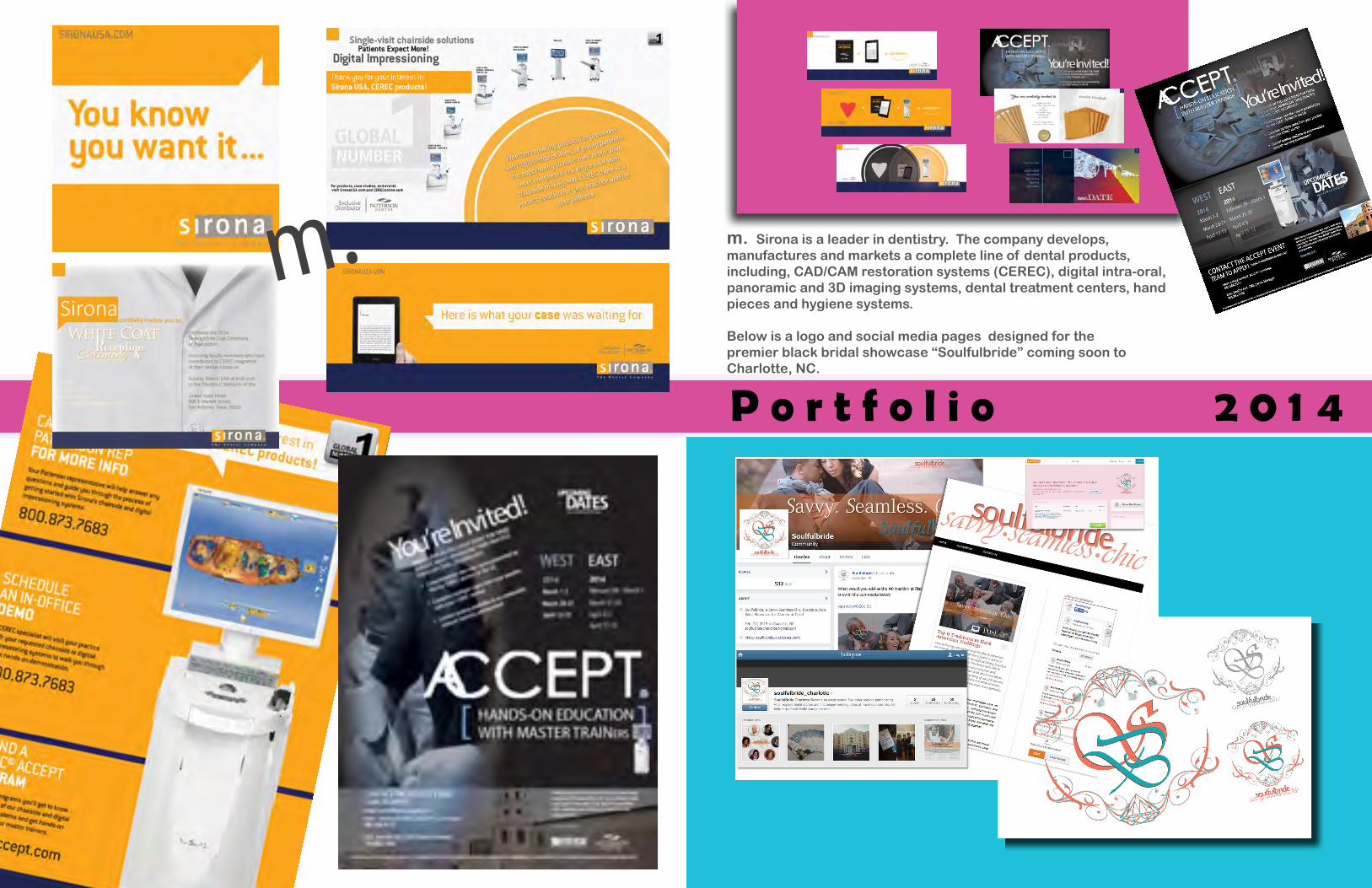
m. m. Sirona is a leader in dentistry. The company develops,manufactures and markets a complete line of dental products, including, CAD/CAM restoration systems (CEREC), digital intra-oral, panoramic and 3D imaging systems, dental treatment centers, hand pieces and hygiene systems.
Below is a logo and social media pages designed for the premier black bridal showcase “Soulfulbride” coming soon to Charlotte, NC.

Special Event Posters . Corporate Branding Materials . Small Business Flyers . Non Profit Branding Materials . Graphic Design . Illustrations . Special Event Posters . Corporate Branding Materials . Corporate Branding Materials . Small Business Flyers . Logos . Non Profit Branding Materials . Graphic Design . Illustrations . Special Event Posters . Corporate Branding Materials . Small Business Flyers . Non Profit Branding Materials . Logos . Illustrations . Special Event Posters . Corporate Branding Materials . Small Business Flyers . Non Profit Branding Materials . Graphic Design . Illustrations . Logos . Special Event Posters . Corporate Branding Materials . Small Business Flyers . Non Profit Branding Materials . Graphic Design . Illustrations . Special Event Posters . Corporate Branding Materials . Corporate Branding Materials . Small Business Flyers . Logos . Non Profit Branding Materials . Graphic Design . Illustrations . Special Event Posters . Corporate Branding Materials . Small Business Flyers . Non Profit Branding Materials . Logos . Illustrations . Special Event Posters . Corporate Branding Materials . Small Business Flyers . Non Profit Branding Materials . Graphic Design . Illustrations . Logos . Special Event Posters
Lael Clark . Freelance Marketing Professional . [email protected] . 314-546-2536 . Charlotte, NC
Lael Clark is stellar. “I am an inquisitive person and I love to learn. I am adventurous and enjoy teaching myself the way it goes.” Ever since she can remember, Lael has been passionate for creative art. As she grew older, she loved business too. Lael studied global affairs as an undergraduate at a private institution in the Queen City. There, she interned internationally for the United States government in Great Britain. She was also a product development intern for the largest privately owned department store chain in the U.S. Currently Lael is advancing her knowledge in commerce as a freelance marketing professional and design studies. She is business minded with an artist’s heart, and with it all - crafting the big picture!


