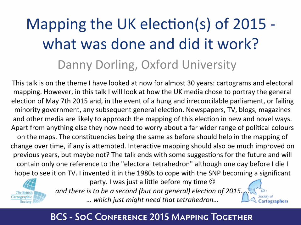
Mapping the UK election(s) of 2015 - what was done and did it work?
24
BCS - SoC Conference 2015 Mapping T ogether Mapping the UK elec/on(s) of 2015 what was done and did it work? Danny Dorling, Oxford University This talk is on the theme I have looked at now for almost 30 years: cartograms and electoral mapping. However, in this talk I will look at how the UK media chose to portray the general elec/on of May 7th 2015 and, in the event of a hung and irreconcilable parliament, or failing minority government, any subsequent general elec/on. Newspapers, TV, blogs, magazines and other media are likely to approach the mapping of this elec/on in new and novel ways. Apart from anything else they now need to worry about a far wider range of poli/cal colours on the maps. The cons/tuencies being the same as before should help in the mapping of change over /me, if any is aTempted. Interac/ve mapping should also be much improved on previous years, but maybe not? The talk ends with some sugges/ons for the future and will contain only one reference to the "electoral tetrahedron" although one day before I die I hope to see it on TV. I invented it in the 1980s to cope with the SNP becoming a significant party. I was just a liTle before my /me and there is to be a second (but not general) elec3on of 2015….. … which just might need that tetrahedron…
-
Upload
danny-dorling -
Category
Education
-
view
728 -
download
0
Transcript of Mapping the UK election(s) of 2015 - what was done and did it work?
BCS - SoC Conference 2015 Mapping Together
Mapping the UK elec/on(s) of 2015 -‐ what was done and did it work?
Danny Dorling, Oxford University This talk is on the theme I have looked at now for almost 30 years: cartograms and electoral mapping. However, in this talk I will look at how the UK media chose to portray the general elec/on of May 7th 2015 and, in the event of a hung and irreconcilable parliament, or failing minority government, any subsequent general elec/on. Newspapers, TV, blogs, magazines and other media are likely to approach the mapping of this elec/on in new and novel ways. Apart from anything else they now need to worry about a far wider range of poli/cal colours on the maps. The cons/tuencies being the same as before should help in the mapping of
change over /me, if any is aTempted. Interac/ve mapping should also be much improved on previous years, but maybe not? The talk ends with some sugges/ons for the future and will contain only one reference to the "electoral tetrahedron" although one day before I die I hope to see it on TV. I invented it in the 1980s to cope with the SNP becoming a significant
party. I was just a liTle before my /me J and there is to be a second (but not general) elec3on of 2015…..
… which just might need that tetrahedron…
BCS - SoC Conference 2015 Mapping Together
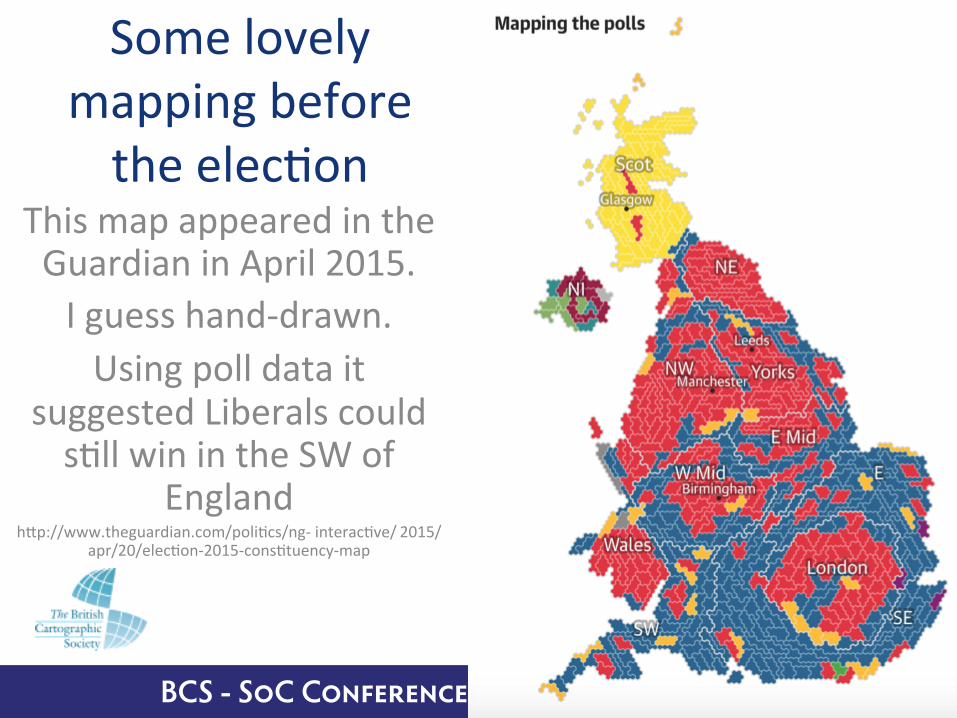
Some lovely mapping before the elec/on
This map appeared in the Guardian in April 2015. I guess hand-‐drawn. Using poll data it
suggested Liberals could s/ll win in the SW of
England hTp://www.theguardian.com/poli/cs/ng-‐ interac/ve/ 2015/
apr/20/elec/on-‐2015-‐cons/tuency-‐map
BCS - SoC Conference 2015 Mapping Together
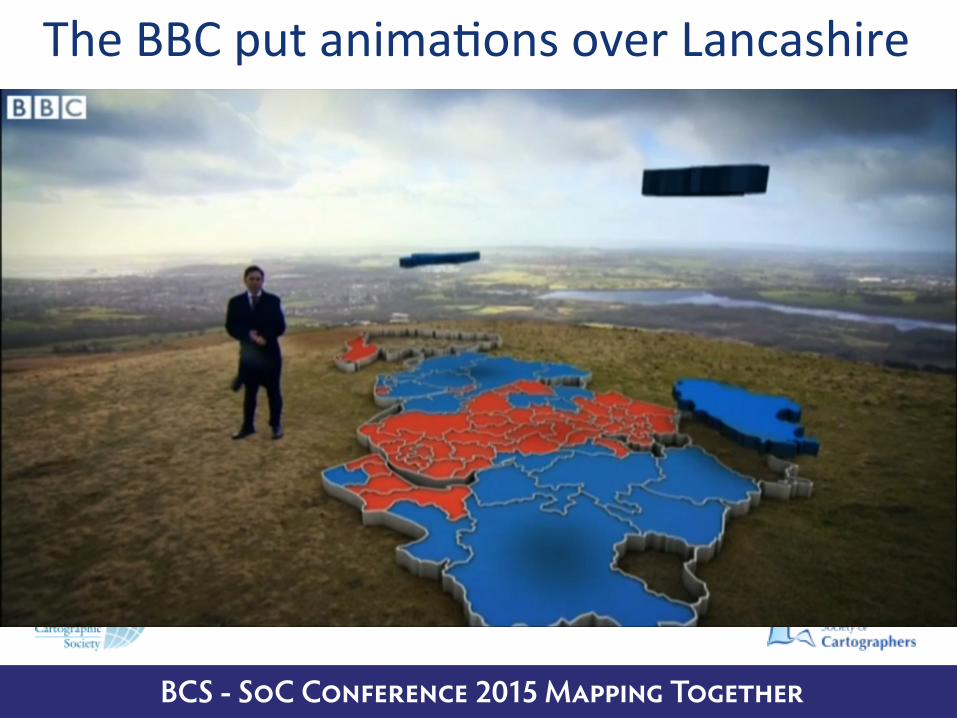
The BBC put anima/ons over Lancashire

BCS - SoC Conference 2015 Mapping Together
Popula/on propor/onal to volume?

BCS - SoC Conference 2015 Mapping Together
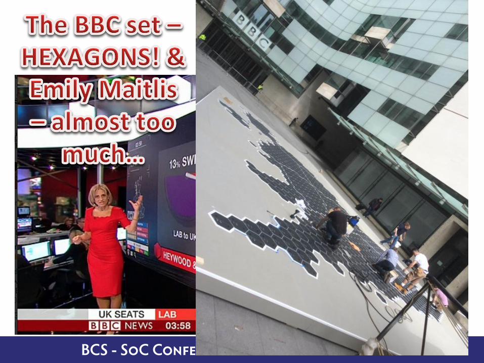
Sadly the flying graphics fell out of favour
BCS - SoC Conference 2015 Mapping Together
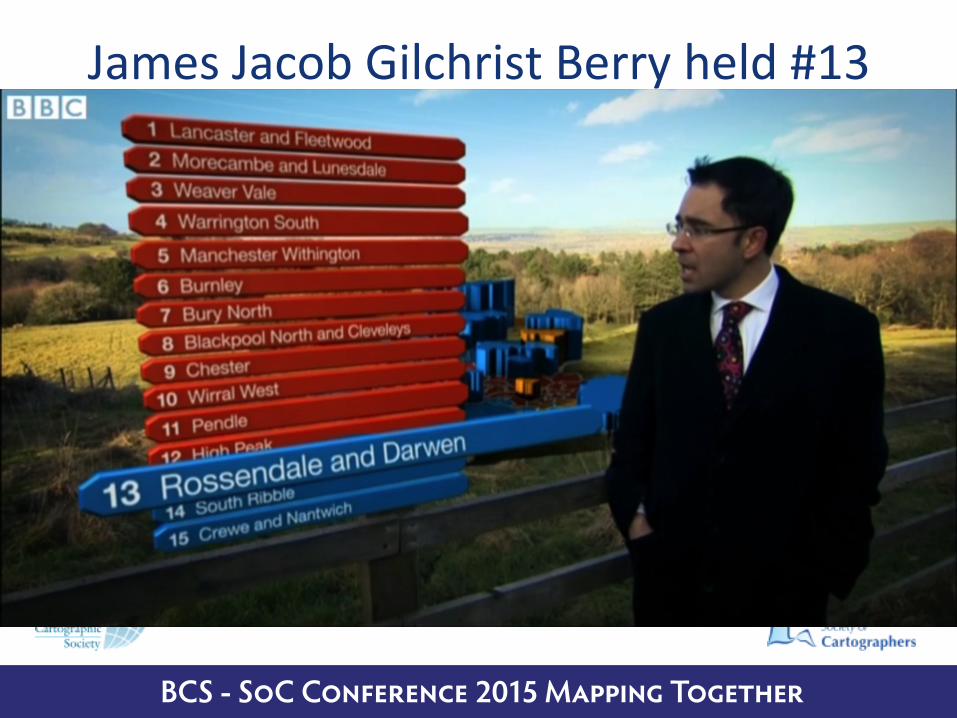
James Jacob Gilchrist Berry held #13
BCS - SoC Conference 2015 Mapping Together
BCS - SoC Conference 2015 Mapping Together
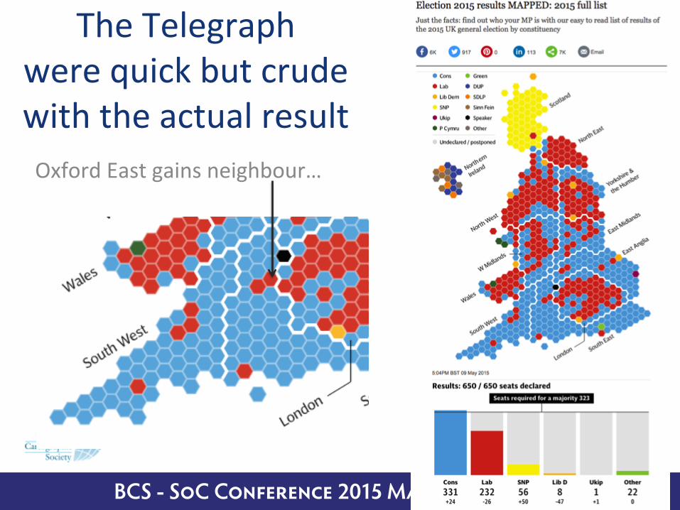
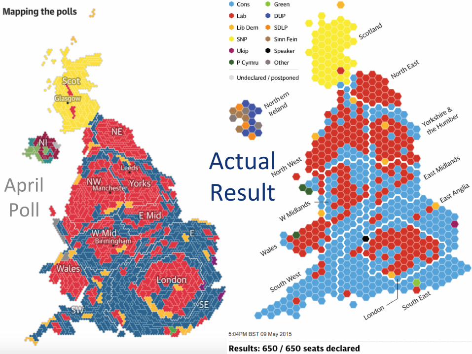
The Telegraph were quick but crude with the actual result Oxford East gains neighbour…
BCS - SoC Conference 2015 Mapping Together
Actual Result April
Poll

BCS - SoC Conference 2015 Mapping Together
The Observer was garish
But the polls were not
that far out when it
came to the map
BCS - SoC Conference 2015 Mapping Together
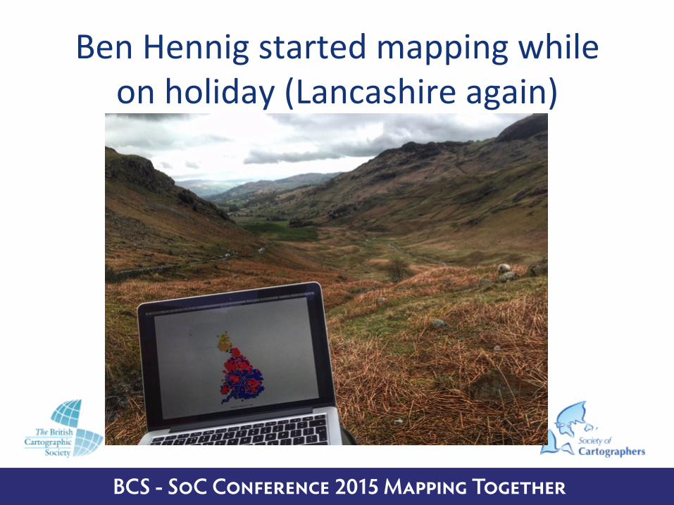
Ben Hennig started mapping while on holiday (Lancashire again)
BCS - SoC Conference 2015 Mapping Together
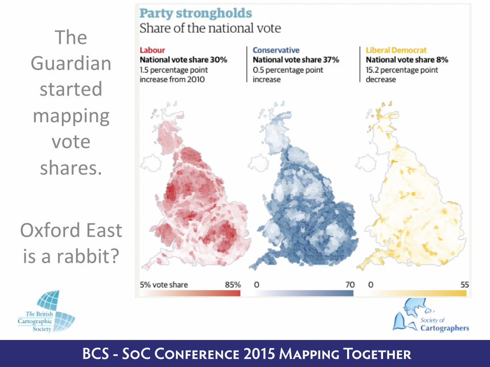
The Guardian started mapping vote
shares.
Oxford East is a rabbit?

BCS - SoC Conference 2015 Mapping Together
Ben mapping from the air
Using an algorithm first generated to show US elec/on maps and used by Mark Newman and
colleagues

BCS - SoC Conference 2015 Mapping Together

BCS - SoC Conference 2015 Mapping Together
US elec/on winners (democrat = blue, republican = red)
BCS - SoC Conference 2015 Mapping Together
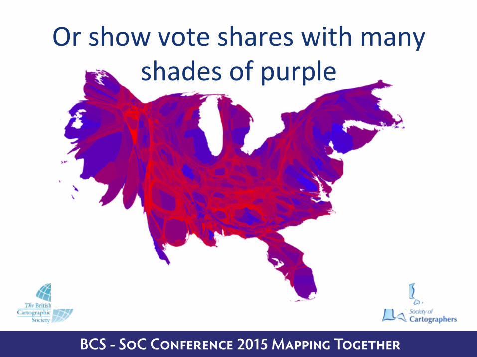
Or show vote shares with many shades of purple

BCS - SoC Conference 2015 Mapping Together
To end with… Ben’s
maps: to begin – who came
2nd?
A quick key map…
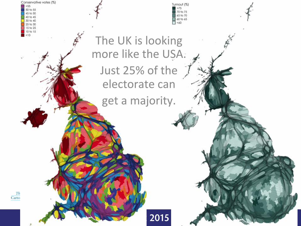
BCS - SoC Conference 2015 Mapping Together
The UK is looking more like the USA. Just 25% of the electorate can get a majority.

BCS - SoC Conference 2015 Mapping Together
But unlike the US we no longer have two major par/es even though the third was decimated

BCS - SoC Conference 2015 Mapping Together
Compare the Liberals To UKIP.
Libs do well near to where UKIP poll low

BCS - SoC Conference 2015 Mapping Together
The SNP have most support in ci/es.
Plaid is more rural
BCS - SoC Conference 2015 Mapping Together
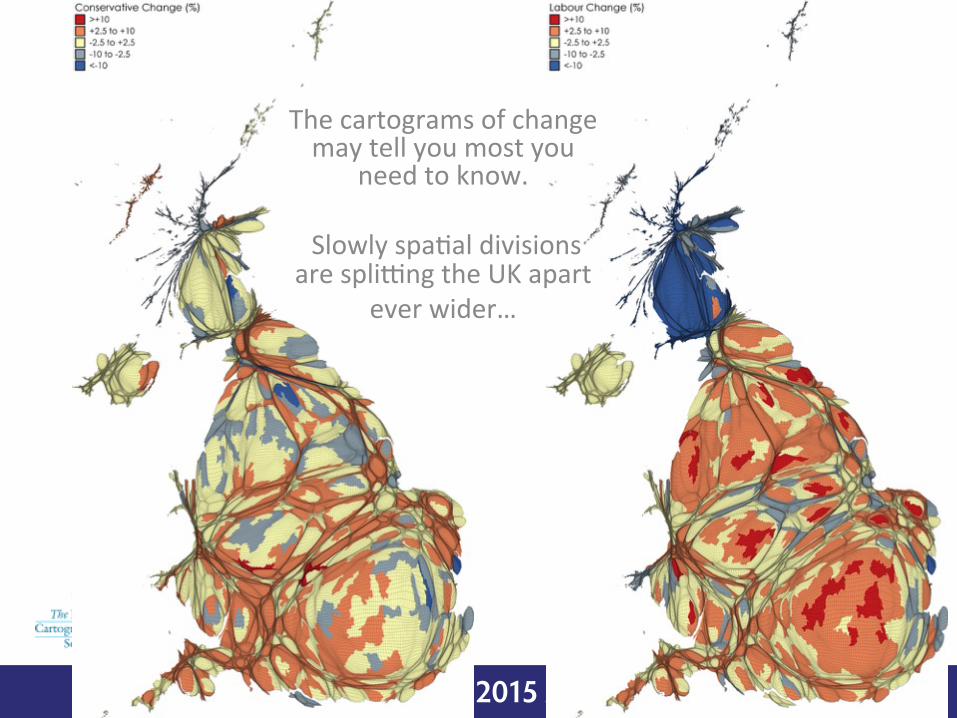
The cartograms of change may tell you most you
need to know.
Slowly spa/al divisions are splilng the UK apart
ever wider…

BCS - SoC Conference 2015 Mapping Together
Poverty and wealth remain
the best predictors of who wins where…

BCS - SoC Conference 2015 Mapping Together
The Segregation Index of Conservative voters in Britain*, 1885–2015
Election Concentration
1885 7.11%1886 5.53%1892 5.81%1895 4.70%1900 4.39%1906 6.67%
1910 Dec 6.24%1910 Jan 7.91%1918 19.30%1922 14.44%1923 11.57%1924 10.62%1929 9.24%1931 9.23%1935 9.65%1945 7.21%1950 6.74%
1951 6.77%1955 6.93%1959 6.24%1964 6.51%1966 7.69%1970 8.04%1974 Feb 8.01%1974 Oct 10.72%1979 9.17%1983 10.59%1987 11.84%1992 11.88%1997 13.94%2001 15.05%2005 15.69%20102015
16.40%19.89%
Election Concentration
*Northern Irish seats are not included.
0%
6%
8%
12%
18%
20%
4%
2%
10%
16%
14%
1920 1930 1940 1950 1960 1970 1980 1990 2000 2010
Source: Drawn initially in Dorling, D. (2006) ’Class alignment renewal’: The Journal of Labour Politics, vol 41, no 1, p 849, showing the spatial segregation index. Updated in Dorling, D. (2013) Crises and turning points: the pivots of history, Renewal, 21, 4, pp11-20.
Note: The statistic being measured is the segregation index of Conservative votes across all British seats at each general election. The proportion is the minimum number of voters who would have to be moved across constituency boundaries to ensure that within each parliamentary constituency the Conservatives received exactly the same share of the vote.
Figure 13: Concentration of Conservative votes, British general elections, 1918–2015Conclusion
With the first elec/on of 2015 one simple graph might tell us more -‐à
The second elec/on result is on September
12th
It needs a tetrahedron!
Thank you!