MAKING MAPS WITH GOOGLE FUSION · PDF fileMAKING MAPS WITH GOOGLE FUSION TABLES (Data for...
21
MAKING MAPS WITH GOOGLE FUSION TABLES (Data for this tutorial at www.peteraldhous.com/Data ) Thanks to Google Fusion Tables, creating maps from data and embedding them on a web page is now easy. We’re going to make this map , illustrating the number of globally threatened amphibian species by freshwater ecoregion, superimposed with the location of sites deemed important for amphibians, designated under the international Ramsar Convention on wetlands conservation. First we need to be logged in at Google Drive (https://drive.google.com/ ) with a Google account. Make the thematic map of threatened species by ecoregion When mapping to commonly-used boundaries, such as US states, Fusion Tables will recognize the names and match them to the correct area. But in other cases, such as this, you first need a map defining the boundaries. Geographical data exists in two common formats: Shapefiles and KML . Shapefiles are a format used in Geographic Information Systems (GIS) software. They consist of a series of files, one of which (with the extension .dbf) is a table of data. Shapefiles can be obtained from various sources; here’s a good general library: http://www.naturalearthdata.com/downloads/ . They are usually available online as compressed (zipped) folders. KML is the data format used by Google Earth . TIP! When searching for shapefiles, try adding “shapefile” or “GIS data” to your search terms. To find KML, use Google’s Advanced Search , and select .kmz (the compressed form of KML) or .kml (try both). If you need to upload a shapefile to Fusion Tables, go to http://shpescape.com/ and upload the zipped folder. KML will upload to
Transcript of MAKING MAPS WITH GOOGLE FUSION · PDF fileMAKING MAPS WITH GOOGLE FUSION TABLES (Data for...

MAKING MAPS WITH GOOGLE FUSION TABLES
(Data for this tutorial at www.peteraldhous.com/Data)
Thanks to Google Fusion Tables, creating maps from data and embedding them on a web page is now easy.
We’re going to make this map, illustrating the number of globally threatened amphibian species by freshwater ecoregion, superimposed with the location of sites deemed important for amphibians, designated under the internationalRamsar Convention on wetlands conservation.
First we need to be logged in at Google Drive (https://drive.google.com/) with a Google account.
Make the thematic map of threatened species by ecoregion
When mapping to commonly-used boundaries, such as US states, Fusion Tables will recognize the names and match them to the correct area. But in other cases, such as this, you first need a map defining the boundaries.
Geographical data exists in two common formats: Shapefiles and KML.
Shapefiles are a format used in Geographic Information Systems (GIS) software. They consist of a series of files, one of which (with the extension .dbf) is a table of data. Shapefiles can be obtained from various sources; here’s a good general library: http://www.naturalearthdata.com/downloads/. They are usually available online as compressed (zipped) folders.
KML is the data format used by Google Earth.
TIP! When searching for shapefiles, try adding “shapefile” or “GIS data” to your search terms. To find KML, use Google’s Advanced Search, and select .kmz (the compressed form of KML) or .kml (try both).
If you need to upload a shapefile to Fusion Tables, go to http://shpescape.com/ and upload the zipped folder. KML will upload to

Fusion Tables directly. If your download was a KMZ file, first open it in Google Earth, right click on the file in Places, and save as KML.
We don’t need to upload boundary data, however, because that’s already been done by The Nature Conservancy, when it used Fusion Tables to create this series of maps. In fact, a version of the map we’re going to make is already at this site – but we’re going to go through the steps needed to join data on threatened amphibians to the boundaries.
Open the freshwater ecoregion boundary data (at https://www.google.com/fusiontables/data?docid=1gjGiTQAH2gFwQmbL2SfXMSKNXx_wVYImodurLg). You should see a screen like this:
You can click on the arrows on the blue circles above the table at top left to scroll across to see the other columns in the table, most of which we don’t need.
Notice the columns ECOREGION, which gives the name of each, MHT_TXT, which is a description of the ecoregion type, geometry, which is the column the map will be drawn from, and eco_id, which is an identifying number for each region. We’ll use these later.
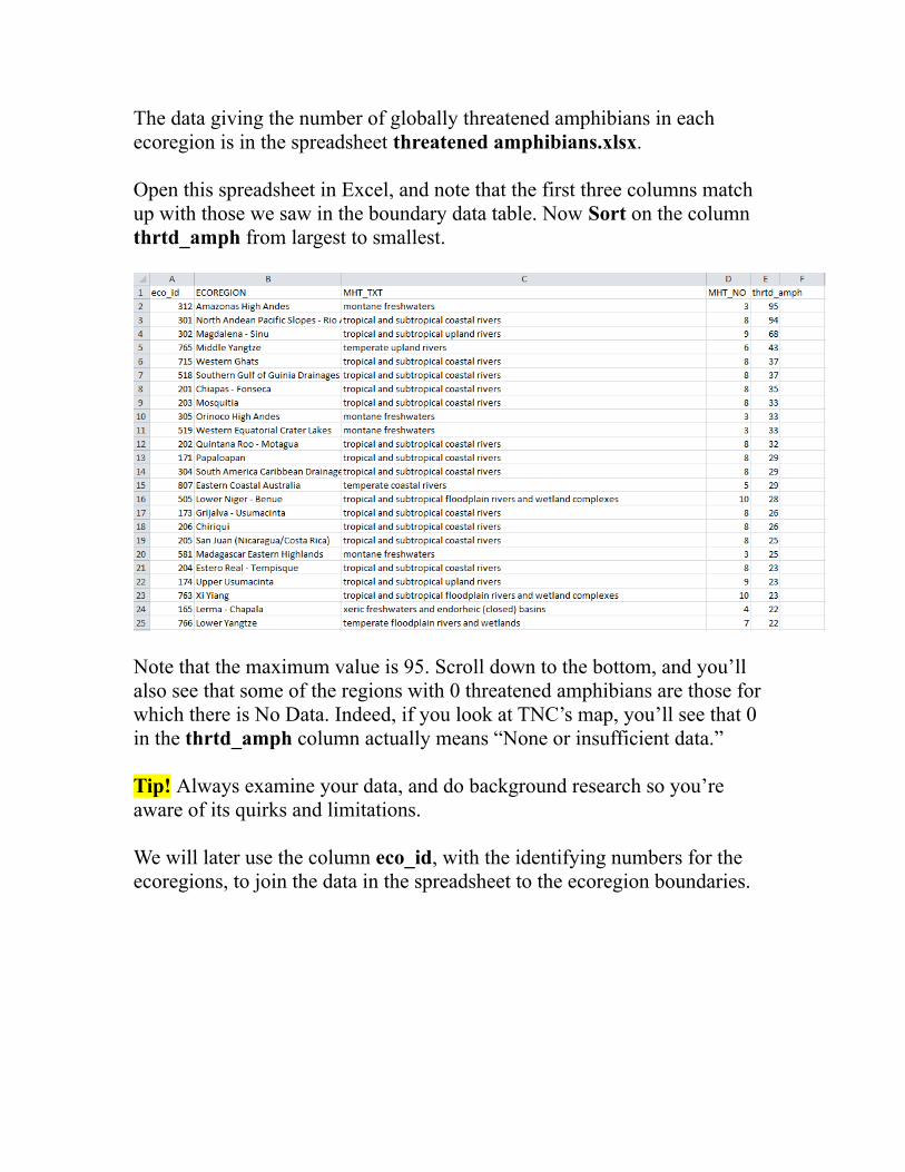
The data giving the number of globally threatened amphibians in each ecoregion is in the spreadsheet threatened amphibians.xlsx. Open this spreadsheet in Excel, and note that the first three columns match up with those we saw in the boundary data table. Now Sort on the column thrtd_amph from largest to smallest.
Note that the maximum value is 95. Scroll down to the bottom, and you’ll also see that some of the regions with 0 threatened amphibians are those for which there is No Data. Indeed, if you look at TNC’s map, you’ll see that 0 in the thrtd_amph column actually means “None or insufficient data.”
Tip! Always examine your data, and do background research so you’re aware of its quirks and limitations.
We will later use the column eco_id, with the identifying numbers for the ecoregions, to join the data in the spreadsheet to the ecoregion boundaries.

Back in your Google Drive account, import the spreadsheet by selecting Create>Fusion Table (experimental).
At the first dialog box, select From this computer, and hit Choose File:

Select the spreadsheet, click Next, and again at the second dialog box:
If you wish, you can edit the table name and add more information at the third dialog box, then click Finish and it should load.

Now we will join our spreadsheet to the ecoregion boundaries. Still in the uploaded spreadsheet, select File>Merge from the top menu. In the Merge: Select a Table dialog box, paste the url for the freshwater ecoregion boundaries table into the box labeled Or paste a web address here and hit the Next button.
Fusion Tables may recognize that we want to join using the eco_id columns, but you can change the columns selected if necessary:
Click Next.

We don’t need all of the data across the two tables, so at the next dialog box we’ll select the columns we need. First click on none to remove all the check marks, and then recheck just the columns we need, shown below. In this view columns from the threatened amphibians spreadsheet are on a white background, while those from the freshwater ecoregions boundary data are shaded yellow:
Click Merge and at the next dialog box then click View table.
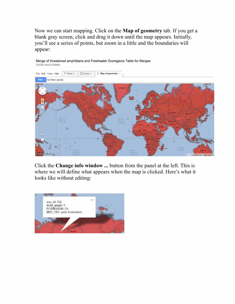
Now we can start mapping. Click on the Map of geometry tab. If you get a blank gray screen, click and drag it down until the map appears. Initially, you’ll see a series of points, but zoom in a little and the boundaries will appear:
Click the Change info window ... button from the panel at the left. This is where we will define what appears when the map is clicked. Here’s what it looks like without editing:

In the Automatic tab, uncheck eco_id, as we don’t want this field to appear.Then select the Custom tab and edit the html code. For example, here we’ve changed the order of the entries, tidied up the field names, and added some line breaks using html <br> tags:
Hit the Save button.

Now we’ll color the regions according to the number of threatened species. Click the Change feature styles ... button, select Polygons>Fill color, and select the Buckets tab.
In this tab, Divide into 6 buckets and select thrtd_amph as the Column to map. It’s worth experimenting with the number of buckets and the splits between them to give the best display for your data. In this case we’ll follow TNC’s example, and edit the dialog box as follows:

Then we can select a color scheme. In this case, we’ll select a neutral gray for the first bucket, because zero can also mean “insufficient data,” then use one of Google’s suggested color schemes for the other buckets. Select 75% for opacity so the colors stand out nicely from the Google map.

Hit the Save button, and here is the thematic map:
Before we can embed the map on a website, we need to make it visible to the wider world by clicking the Share button at top right. At the dialog box click on the Change link, select Public on the web and click Save and then Done.
Next select File>About this table and cut and paste the table’s Id into a word processing document or text file – we’ll consider the significance of this later.
Make the map of points showing Ramsar Convention sites
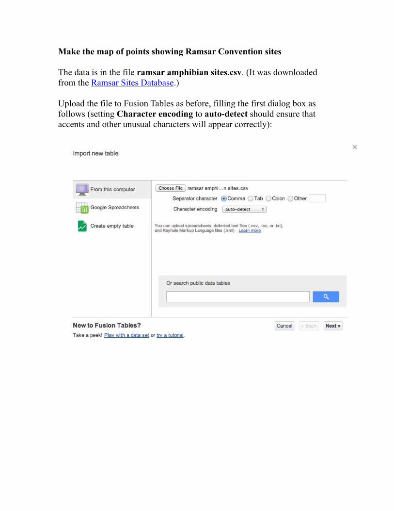
The data is in the file ramsar amphibian sites.csv. (It was downloaded from the Ramsar Sites Database.)
Upload the file to Fusion Tables as before, filling the first dialog box as follows (setting Character encoding to auto-detect should ensure that accents and other unusual characters will appear correctly):

The uploaded table should look like this:
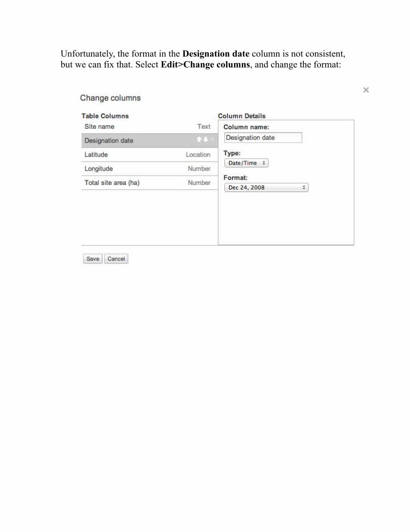
Unfortunately, the format in the Designation date column is not consistent, but we can fix that. Select Edit>Change columns, and change the format:

The points will be mapped by their Latitude and Longitude, so we’ll also check that Fusion Tables has recognized that location is specified by these columns. If not, change to the following:
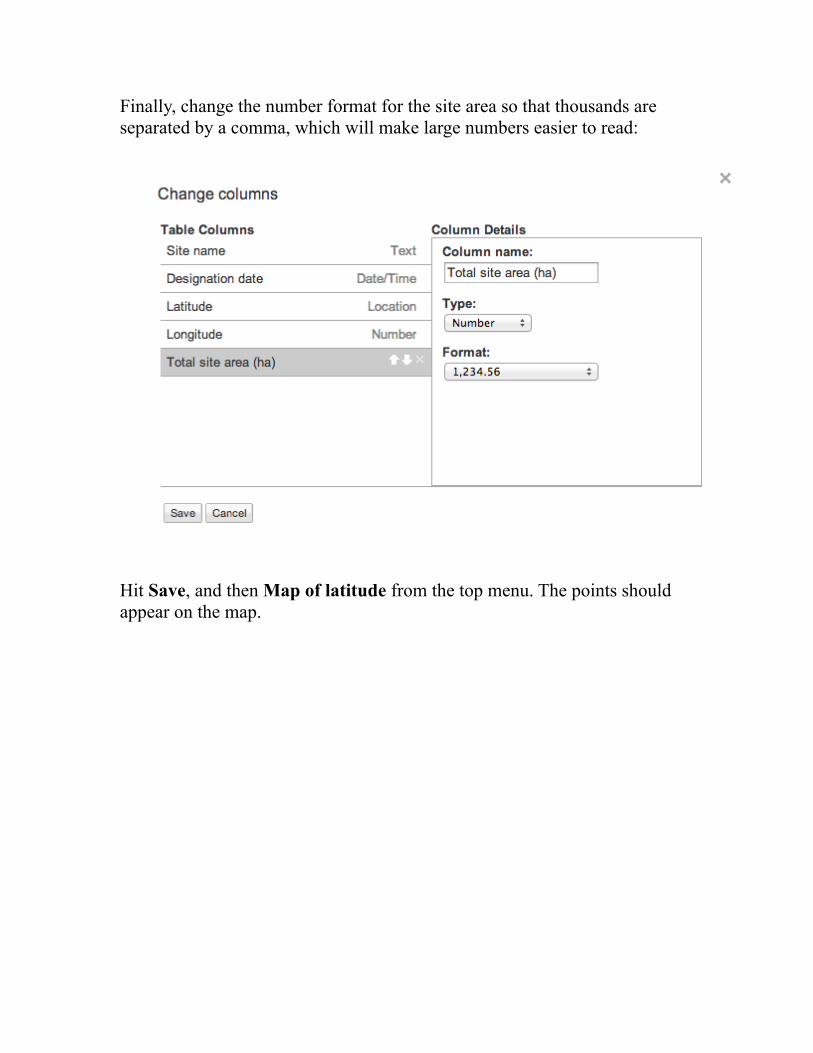
Finally, change the number format for the site area so that thousands are separated by a comma, which will make large numbers easier to read:
Hit Save, and then Map of latitude from the top menu. The points should appear on the map.

Click Change info window … Under the Automatic tab, uncheck Latitude and Longitude, then under the Custom tab we can again edit the html as desired:
Hit the Save button.
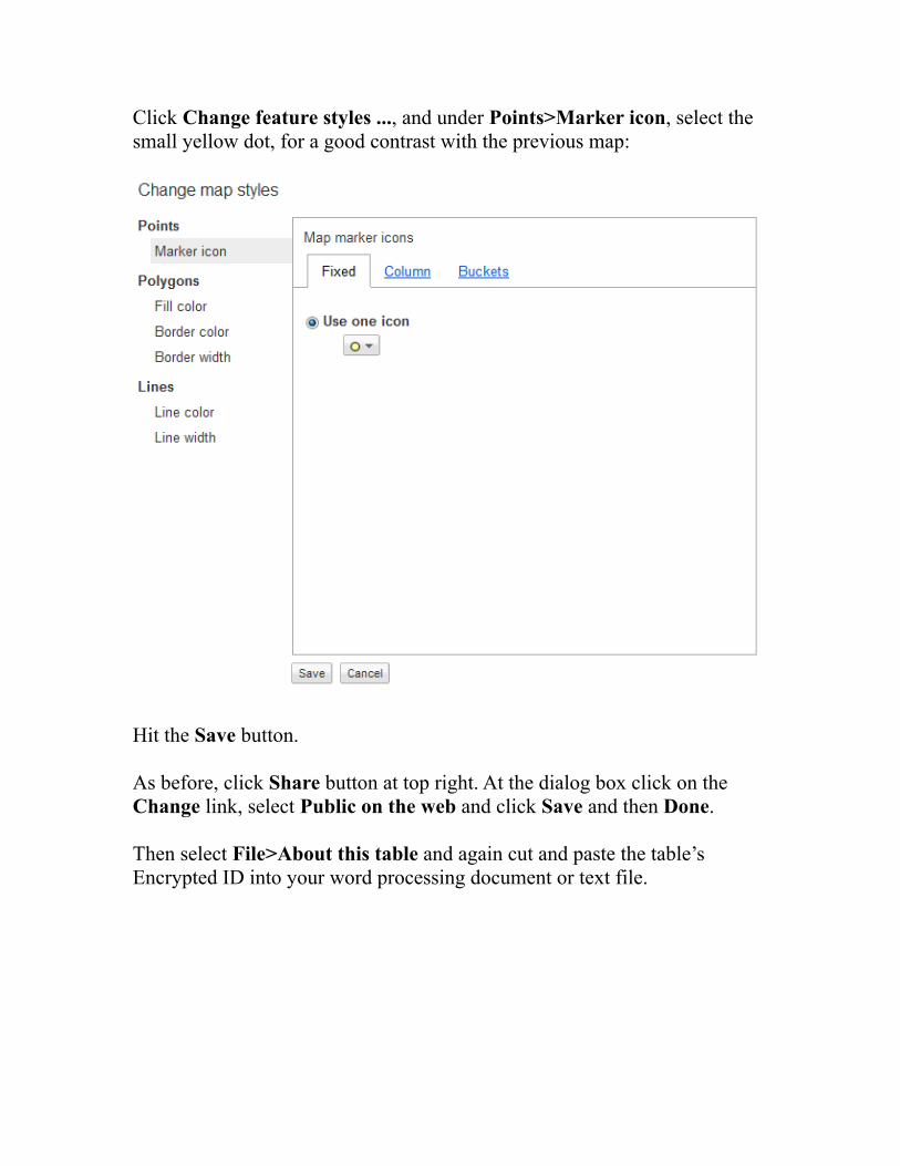
Click Change feature styles ..., and under Points>Marker icon, select the small yellow dot, for a good contrast with the previous map:
Hit the Save button.
As before, click Share button at top right. At the dialog box click on the Change link, select Public on the web and click Save and then Done.
Then select File>About this table and again cut and paste the table’s Encrypted ID into your word processing document or text file.

Make a web page with both maps
To do this, we will use the Fusion Tables Layer Wizard.
Go back to the finished map of the ecoregions, select Tools>Publish and copy the first of the two links that appears. Then paste that link into the Embed link box in the Wizard and click the Put layer on Map button. The map should appear in the Preview:
Then click the Add Layer button and repeat the process for the map of Ramsar Convention sites.
Under Set map size and zoom, change the Dimensions to fit your website, then click the Update Map button. Use the controls on the map to adjust the position and zoom of the map to the appearance you want:
Under Style base map, you can remove unwanted features from the Google Map.

When you are finished, you can copy the code in the box at the bottom of the wizard into the html for your webpage. To see how this works, click in the Your HTML box and Ctrl-A, Ctrl-C to select and copy the code. Open the Notepad text editor and Ctrl-V to paste in the code.
Save the file as type All Files, with the extension .html and UTF-8 encoding.
Now open the file in a web browser to view the map.
Ready for more?
The Layer Builder can only add two layers, but you can make Fusion Table maps with up to five. To do this, you’ll need to study the code and work out how to add more layers yourself – it’s not so difficult.)
Tip! This is where the maps' Ids come in. Notice that they appear in the html code written by the Layer Wizard. If you are adding layers by writing the code yourself, you will need the tables’ Ids.
You can also write code to include a legend. Study the html code for the finished map to see how this can be done.
More examples of Fusion Table maps:
For inspiration, see the gallery at: https://sites.google.com/site/fusiontablestalks/stories