![Classification: Decision TreesLearning of Decision Trees [ID3, C4.5 by Quinlan] node= root of decision tree Main loop: 1. Aßthe “best” decision attribute for the next node. 2.](https://static.fdocuments.in/doc/165x107/5f3f636240070f7f584c43da/classification-decision-trees-learning-of-decision-trees-id3-c45-by-quinlan.jpg)
Main Article Images: Enhancement and Decision
24
Planning my cover page: Decision and enhancement of my images.
-
Upload
fred-radley -
Category
Documents
-
view
224 -
download
0
description
AS Media Music Magazine
Transcript of Main Article Images: Enhancement and Decision

Planning my cover page:
Decision and enhancement of my images.

Taking inspiration from the covers and adverts shown in my moodboard, I set an idea for what my main article images would look like. I took direct influence from the NME cover with the June Brides sitting in a park and decided that my main feature would involve an electronic duo act in a city park. I wanted to portray the urban music scene that my magazine focused on as much as possible.

I took two of my friends to a park in London and took around 100 photos of them doing different things on a Nikon d900 camera, experimenting with the elements of the park. I then imported them into a computer and opened them in Adobe Photoshop.


I began editing this image by adding a high contrast layer.

I then experimented with the levels of the image by adding a levels layer and changing the input and output of red and
blue.


I then added a Hue/Saturation layer, changing the lightness to create the vintage effect seen in the June Brides NME cover.

I then used the blur tool to change the depth of focus and to make my friend standing in the front a more central element
of the image. This also gave the image a more slick feel.

I then copied these effect layers into all the best images I had taken
and tweaked them slightly on each one so
there was consistency in the colouring and
contrast.


I asked 15 people aged 17, their views on using these photos in my magazine.
Here’s what they told me…
1 2 3 4
5 6 7 8


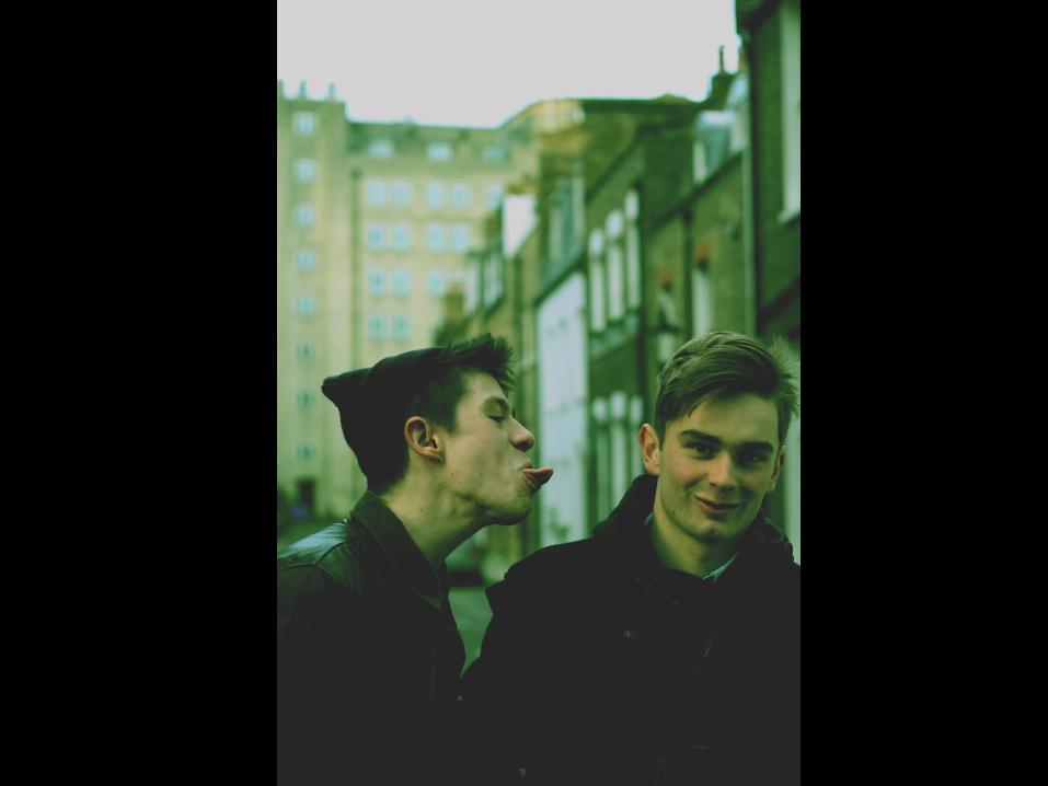
Photo 1 was voted as the most ideal for a cover image in my questionaire. Here is some of the feedback I received:
“I like this photo. I think it might be because both boys show some sort of character in the way they are standing.”
“The close up of the boy in the foreground really draws your eyes” “This is the strongest of them all. They seem really cool. I like the hat.”
“This would definitely be the best for a cover it lets you think about the two band members and makes you want to know more. I like the colours as well”
“I like the way both guys are disinterested in the photographer. A good cover I think.”

I then asked the group which photos they would least likely use in the double page spread for this article.

“This would only work if the magazine was about cars.”
“It’s definitely not for the cover. All you see is a car. And you get no impression of the artist involved or the issue itself.”
“My least favourite. I’ve only just noticed a guy between the cars. Not that interesting.”
“This one isn’t as in focus and gets kind of ruined by the car that’s moving and the one that’s parked behind the boy”

“This one’s a nice photo but in terms of the spread, it doesn’t show enough of the artist. I think the photos in the spread would need to give more of an idea of who the person is”
“This wouldn’t work for the spread because its only one of the members of the group and you can’t even see his face.”
“It’s too mysterious for the double page spread or the cover but this could work in your contents page. It’s quite mysterious. It could draw readers in to find out more”3


![Classification: Decision Trees · Basic Algorithm for Top-Down Learning of Decision Trees [ID3, C4.5 by Quinlan] node= root of decision tree Main loop: 1. Aßthe “best” decision](https://static.fdocuments.in/doc/165x107/5ec67d03ae6d2609843381e5/classification-decision-trees-basic-algorithm-for-top-down-learning-of-decision.jpg)


