Magazines
5
Magazine Covers
Transcript of Magazines

Magazine Covers
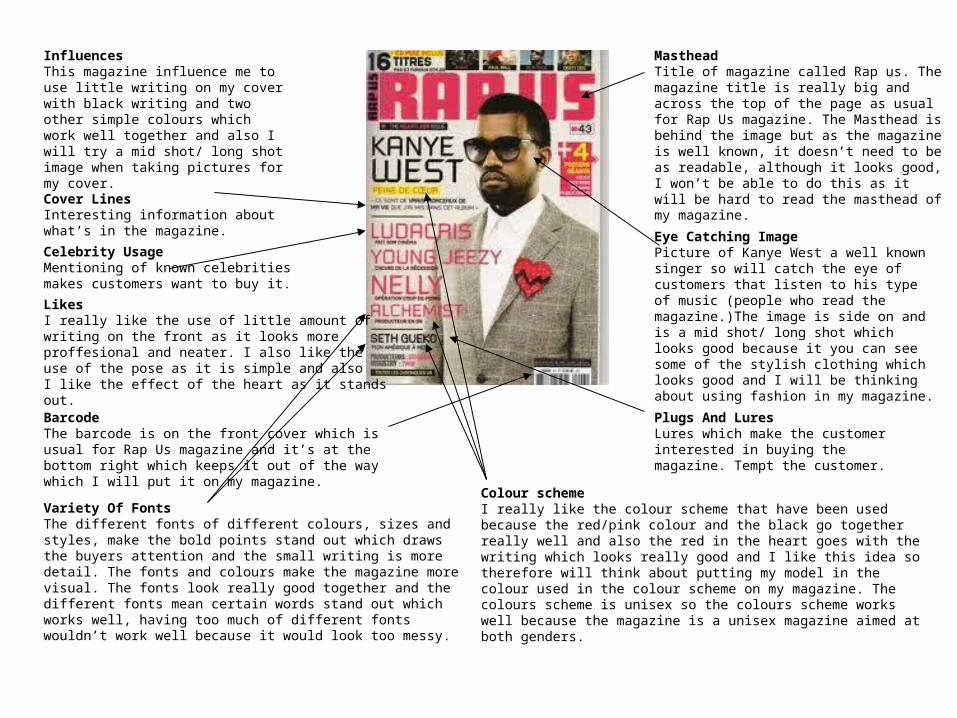
Masthead Title of magazine called Rap us. The magazine title is really big and across the top of the page as usual for Rap Us magazine. The Masthead is behind the image but as the magazine is well known, it doesn’t need to be as readable, although it looks good, I won’t be able to do this as it will be hard to read the masthead of my magazine.
Cover LinesInteresting information about what’s in the magazine. Eye Catching Image
Picture of Kanye West a well known singer so will catch the eye of customers that listen to his type of music (people who read the magazine.)The image is side on and is a mid shot/ long shot which looks good because it you can see some of the stylish clothing which looks good and I will be thinking about using fashion in my magazine.
Variety Of FontsThe different fonts of different colours, sizes and styles, make the bold points stand out which draws the buyers attention and the small writing is more detail. The fonts and colours make the magazine more visual. The fonts look really good together and the different fonts mean certain words stand out which works well, having too much of different fonts wouldn’t work well because it would look too messy.
Celebrity UsageMentioning of known celebrities makes customers want to buy it.
Plugs And LuresLures which make the customer interested in buying the magazine. Tempt the customer.
Colour schemeI really like the colour scheme that have been used because the red/pink colour and the black go together really well and also the red in the heart goes with the writing which looks really good and I like this idea so therefore will think about putting my model in the colour used in the colour scheme on my magazine. The colours scheme is unisex so the colours scheme works well because the magazine is a unisex magazine aimed at both genders.
BarcodeThe barcode is on the front cover which is usual for Rap Us magazine and it’s at the bottom right which keeps it out of the way which I will put it on my magazine.
LikesI really like the use of little amount of writing on the front as it looks more proffesional and neater. I also like the use of the pose as it is simple and also I like the effect of the heart as it stands out.
InfluencesThis magazine influence me to use little writing on my cover with black writing and two other simple colours which work well together and also I will try a mid shot/ long shot image when taking pictures for my cover.

Masthead Title of magazine called Vibe. The title is behind the picture which makes the picture stand out more. I really like the colour of the masthead and is really big at the top of the page as Vibe magazines all have.
Cover LinesInteresting information about what’s in the magazine. The use of having famous names makes people want to find out about the singer that is said in the lures.
Eye Catching ImagePicture of Janet Jackson a well known singer so will catch the eye of customers that listen to her type of music (people who read the magazine.)Standing in a seductive way, will catch the readers attention.
Variety Of FontsThe different fonts of different colours, sizes and styles, make the bold points stand out which draws the buyers attention and the small writing is more detail. The fonts and colours make the magazine more visual.
Celebrity UsageMentioning of known celebrities makes customers want to buy it.
Plugs And LuresLures which make the customer interested in buying the magazine. Tempt the customer.
DetailsDate of magazine ’April 2008’ I like that it is really small as it would ruin the magazine if it was bigger.
Colour schemeI really like the colour scheme that have been used because the blue is a really bright colour and the pink is a nice pastel like colour and they work well together as they are both different, one is pale and the other is bright. I think the use of having black and white involved as well works well as the black and white bits stand out. I also like how the blue and pink are paired up and the black and white pair up. I also like that the colour scheme is incorporated in her clothing as the white is involved.
BarcodeThe barcode is on the front cover which is usual for Vibe magazine and it’s at the bottom left which keeps it out of the way which works well.
LikesI really like the use of the colours, although it looks as if it is just aimed at girls which may promote false advertisement as it is aimed at boys as well as girls. I really like the unusual pose that is used because it uses a camera as a prop which is ironic as she is the one being photographed. I love the title as it’s really simple but I don’t like the writing which is between the B and E as I think it ruins the masthead.
InfluencesThis magazine influence me to have a unique pose on my cover that is individual. The magazine also influences me to pair up colours as they have done on this magazine which looks really effective and is very simple to do. It also inlfuences me to use a body shot where you can see most of the model as it looks really good as you can see her style.

Cover LinesInteresting information about what’s in the magazine. The use of having famous peoples names makes the reader want to read the magazine to find out about the singer.
Eye Catching ImagePicture of Lil Jon a well known rapper so will catch the eye of customers that listen to his type of music (people who read the magazine.) The image is a mid shot/ long shot which looks good because it you can see some of the stylish clothing which looks good and I will be using fashion in my magazine.
Variety Of FontsThe different fonts of different colours, sizes and styles, make the bold points stand out which draws the buyers attention and the small writing is more detail. The fonts and colours make the magazine more visual. The fonts work really well together as the bigger fonts make things stand out more which are the points that the reader will want to read more.
Celebrity UsageMentioning of known celebrities makes customers want to buy it.
Plugs And LuresLures which make the customer interested in buying the magazine. Tempt the customer.
DetailsDate of magazine ’March/April’ normally next to barcode.
Masthead Title of magazine is called Scratch which is a name which you can remember and I like that it is a sound, onomatopoeia which means it really stands out. The magazine title is really big and across the top of the magazine. The masthead is behind the image a little bit which makes the image look as if it stands out more. I really like that the writing has an outline to it.
BarcodeThe barcode is on the front cover which is usual for Vibe magazine and it’s at the bottom left which keeps it out of the way which works well.
Colour schemeI really like the colour scheme that have been used because the yellow stands out from the white and the dark grey/green colour for the background and the yellow stands out from the background. The white contrasts with the dark background. The little bit of the red makes it stand out but it looks a little odd, but the red from the font is incorporated into the writing on the top which works well. The colour scheme is very boisterous.
LikesI really like the use of the dark background as normally the backgrounds are quite pale. The colours used are quite boisterous colours and you can tell by the use of colours. I really like the comedy used ‘Sorry Kanye’ which makes the magazine individual.
InfluencesThis magazine influences me to use a simple amount of colours as this only uses 2/3 colours which makes it more professional and less messy.

Masthead Title of magazine called Complex. I really like the name of the magazine as it is very simple and it’s one syllable which means it’s easy to say. I like that is really bold and it is a different colour to the rest which makes it stand out more.
Eye Catching ImagePicture of Keri Hilson a very stunning woman, standing in a seductive way. She is a well known singer so will catch the eye of people that listen to her type of music (people who read the magazine.) The long shot image looks good but it makes it look as if it isn’t a cover, more like a contents page image.
Plugs And LuresLures which make the customer interested in buying the magazine. Tempt the customer.
Cover LinesInteresting information about what’s in the magazine.
Celebrity UsageMentioning of known celebrities makes customers want to buy it.
Direct Address PronounsUse of direct words ‘Your’ to make the reader feel involved. interesting information about what’s in the magazine.
Details Web address is used.
BarcodeThe barcode is on the front cover which is usual for Rap Us magazine and it’s at the bottom right which keeps it out of the way which I will put it on my magazine.
Colour schemeI really like the colour scheme of yellow, blue and black because the yellow and blue clash with each other which makes it stand out. The red involved with the magazine works well because the it is a bold colour. The use of having all the primary colours work well because they are all bold. Having the vibrant colours and the white background works well but if having a coloured background wouldn’t look as effective. I like that the yellow is incorporated in the clothing.
Variety Of FontsThe different fonts of different colours, sizes and styles, make the bold points stand out which draws the buyers attention and the small writing is more detail. The fonts and colours make the magazine more visual. The fonts work really well together as the bigger fonts make things stand out more which are the points that the reader will want to read more. The fonts and colours make the magazine more visual. The colours make you want to read the magazine. The different bubble writing works well as it looks like a comic. The different fonts looks very good aesthetically
LikesI really like the use of the fonts and colours because they are really bold and unique and stand out. I also like the pose pulled as it is a long shot so you can see the clothing and shoes.
InfluencesThis magazine influence me to use bold fonts that stand out and that are individual. I like the use of the white background and the colours being bold to stand out.