Magazine Evaluation draft 2
34
CHANTELLE SWAIN Media AS Magazine Evaluation
-
Upload
chantelleswainmedia -
Category
Education
-
view
152 -
download
0
Transcript of Magazine Evaluation draft 2

CHANTELLE SWAIN
Media AS Magazine Evaluation

1. IN WHAT WAYS DOES YOUR MEDIA PRODUCT USE, DEVELOP OR CHALLENGE FORMS AND CONVENTIONS OF REAL MEDIA PRODUCTS?
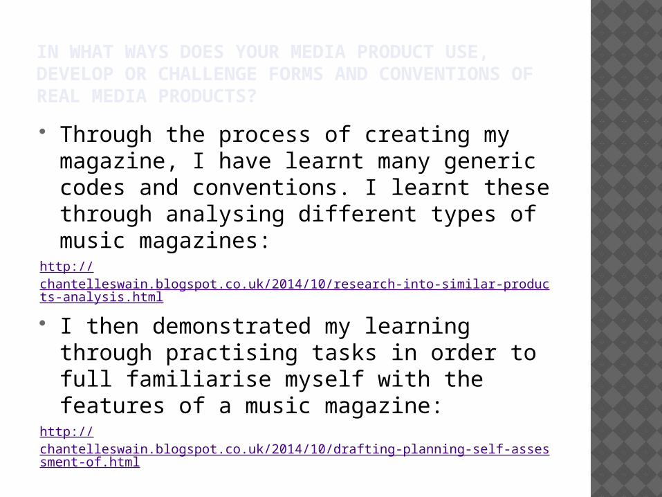
IN WHAT WAYS DOES YOUR MEDIA PRODUCT USE, DEVELOP OR CHALLENGE FORMS AND CONVENTIONS OF REAL MEDIA PRODUCTS?
Through the process of creating my magazine, I have learnt many generic codes and conventions. I learnt these through analysing different types of music magazines:
http://chantelleswain.blogspot.co.uk/2014/10/research-into-similar-products-analysis.html
I then demonstrated my learning through practising tasks in order to full familiarise myself with the features of a music magazine:
http://chantelleswain.blogspot.co.uk/2014/10/drafting-planning-self-assessment-of.html

Barcode
Dateline & Price
Web link
Consistent house style
Skyline
The bright pink colour makes is a flash
Main cover line and Anchorage text
Secondary images
Puff
Second Puff
Secondary cover lines
Pugs
White on black
Direct mode of address
I included a large amount of codes and conventions on my cover in order to conform to the ideals of magazine covers.

IN WHAT WAYS DOES YOUR MEDIA PRODUCT USE, DEVELOP OR CHALLENGE FORMS AND CONVENTIONS OF REAL MEDIA PRODUCTS?
My front cover uses nearly all of the codes and conventions of magazines. The only ways in which my magazine has challenged to conventions is that I haven’t used any pull quotes on the front cover, and my masthead is more central than left third. In addition to this, I haven’t added a selling line. The reason for this is because I felt it would crowd the cover too much. Another reason I did not include a selling line is because although Rocksound does have used some (“New music first” & “Music with attitude), it rarely uses it on the front covers in recent years:
February 2015 issue
(latest issue)
Issue from 2007

However, unlike most indie or rock magazines, I decided to keep my cover quite plain compared to most issues of Rocksound, so in this way, it could challenge some of the codes and conventions of music magazines.
This was to give my magazine its own identity, as I would want it to be noticeably different from other similar music magazines.
In addition to this, I kept my cover lines neat because I want my target audience’s attention to be on the main cover line. This is because although my artist is rather well-established, it would still benefit the artist to gain more recognition.
As well as this, I feel as though the main cover line is the most interesting cover line, so bringing potential readers attentions to this would persuade them to boy the magazine more than some of the other cover lines could.
Compared to:

INFLUENCES ON MY COVER My magazine was largely
influenced by Kerrang! And Rocksound, although I did research other music magazines such as Metal Hammer and NME.
This was helpful for me because it partly helped me to make a decision about my masthead. All of the mastheads from the magazines I researched were thick and bold, and colour inter-changable, so I knew my masthead also had to be like this. In addition to this, in my opinion the centred mastheads have a bigger impact that the left-third mastheads such as the ones in NME, so I adopted this style for my magazine cover.http://
chantelleswain.blogspot.co.uk/2014/10/drafting-planning-masthead-research.html

Links to social networking sites
Secondary Image
In-keeping with the house style
Page numbers

INFLUENCES ON MY CONTENTS PAGE Although I did look at some Rocksound contents
pages, I was most influenced the Kerrang contents pages. This is because the numbers seem much more clear and the stories are laid out much clearer than in Rocksound. I also really liked the arrow on the large image directing the reader to interesting articles. The secondary images meant my interest was held well and all in all made for a more attractive contents page.
Although I chose to keep my house style the same (reds, whites, blacks and greys), I chose to use an image that was not of the cover star, so in this way it could be suggested that my contents page challenged the codes and conventions of magazines.
http://chantelleswain.blogspot.co.uk/2014/09/analysis-of-contents-pages.html

Pull quote
White on black
Second pull quote to lead readers towards an interesting question in the article
Direct mode of address
Odd number on the correct side of the spread
INFLUENCES ON MY DOUBLE PAGE SPREAD Some of my first influences for double page
spreads were from Kerrang and Rocksound. http://
chantelleswain.blogspot.co.uk/2014/10/research-analysis-of-similar-double.html
Although I did really like the look of the second piece I analysed, I found the first piece (from Kerrang!) much more effective in keeping my attention as the font was bigger, and the questions were more focused rather than having it in paragraphs. For this reason, I decided to incorporate this into my piece rather than having an image that stretches over both pages.

2. HOW DOES YOUR MEDIA PRODUCT REPRESENT PARTICULAR SOCIAL GROUPS?

HOW DOES YOUR MEDIA PRODUCT REPRESENT PARTICULAR SOCIAL GROUPS?
The reason I chose the first one is because I wanted my cover star to be hardcore and impressive. I didn’t pick the second picture because I believe it represented women in the rock scene as too passive, due to the apathetic nature of the image.
The first picture was chosen because it goes against the stereotype that women can’t be aggressive and tough. The cover star needed to look aggressive but still be dressed in an attractive manner in order to give female readers a confident role model to look up to, and to raise the profile of female leads on the rock and metal scene.
I chose to use myself (female) instead of a male model to be the cover star because I wanted to conform to the rules of advertising, referring to Gillian Dyer’s Lines Of Appeal. In general, when a company wants someone to buy something, they use a female model to sell it. Males will want the product because they want to be with the woman, and females will buy the product because they aspire to be like the woman.
My magazine is aimed at both genders between the ages of 15-24. I have attempted to make my magazine gender neutral in order to attract the biggest audience I can. However, some distinct representations can be taken from my magazine.

A second way my magazine represents social groups is the representation of age. In my magazine, all of the pictures featured are of 16-17 year olds, which fits into my target audience range.
The pull quote from the double page spread “I’m damn sick of hearing that drugs are fun” represents young people as sensible and responsible, which inverts the stereotype that young people are reckless and irresponsible.
In contrast to this, parts of my magazine can also represent young people in a negative light. One of the secondary cover lines is “Reckless and young in NYC”. This can represent young people as immature and excitable.
Although this may be a negative representation of young people, it will attract my target audience because the audience will be drawn to the ‘rebel’ attitude of my magazine.http://
chantelleswain.blogspot.co.uk/2015/02/drafting-planning-further-improvements.html

3. WHAT KIND OF MEDIA INSTITUTION MIGHT DISTRIBUTE YOUR MEDIA PRODUCT AND WHY?

WHAT KIND OF MEDIA INSTITUTION MIGHT DISTRIBUTE YOUR MEDIA PRODUCT AND WHY?
Originally, I planned for my magazine to be published and distributed my Freeway Press Inc. It would be part of a niche market as Freeway Press produces products leaning towards ‘indie’. Another reason I thought Freeway Press would be best is because it specialises in monthly magazines, which is how often my magazine would be distributed.
In contrast to this, as Rocksound and Kerrang! have a similar fan base, I could also have my magazine distributed through Bauer Media, which produces popular magazines such as Kerrang! and Q.
This may be a better choice for a distributor because Bauer Media is a dominant force in magazine sale. The reason for this could be that it is connected to 4music, coolFM and absolute radio, so my magazine could be advertised on there radio stations.
I also found that my magazine aesthetically fits in more with magazines published by Bauer than some issues of Rocksound produced by Freeway Press concerning layout.
For this reason, I changed my publisher & distributer to Bauer Media instead of Freeway Press Inc as I feel Bauer will be able to distribute and market my magazine more effectively to its target audience, due to the similar, already existing audience of Kerrang! Magazine.
http://www.bauermedia.co.uk/brands
http://chantelleswain.blogspot.co.uk/2015/02/empty.html

WHAT KIND OF MEDIA INSTITUTION MIGHT DISTRIBUTE YOUR MEDIA PRODUCT AND WHY?
In choosing the correct producer/distributor I also considered IPC Media which is now knows as Time Inc, and Axel Springer
who own Metal Hammer. IPC Media groups its current products under Connect, Southbank and
Inspire. I decided not to use IPC media because the produce magazines that target women such as Tveasy, Marie Claire, Woman’s Weekly, and Teen now, therefore I think they would be ineffective in properly marketing and distributing a music magazine with a different demographic such as Stone Cold. IPC media target men also, but their men’s magazines are about leisure such as Golf Monthly and Rugby World, and none are about music, which gives me more reason to believe it would be bad idea to choose IPC Media to distribute Stone Cold.
Axel Springer SE is one of the largest digital publishing houses in Europe, with numerous multimedia news brands, such as BILD, WELT, and FAKT. It also produces a Geman version of Rolling Stone magazine. I chose not to use Axel Springer to distribute Stone Cold because, down to its popularity, I believe it to be too large a company to distribute a niche magazine such as Stone Cold to my target audience.

4. WHO WOULD BE THE AUDIENCE FOR YOUR MEDIA PRODUCT?

4. WHO WOULD BE THE AUDIENCE FOR YOUR MEDIA PRODUCT? My magazine is for people aged 15 to 24, and
is aimed at both genders. I chose this age range because it is similar to the target audience of Rocksound magazine. The ideal audience is someone who loves rock and metal music, is interested in concerts and festivals, and who wants to be interactive with their favourite musicians.
The audience would also be people who reject societal norms and therefore embrace the ‘rebel’ attitude of my magazine, especially the front cover.
I would say that my magazine is very similar to and Rocksound magazine because of the attitudes of the magazine and the content featured.

5. HOW DID YOU ATTRACT/ADDRESS YOUR AUDIENCE?

Firstly, I researched what Rocksound and Kerrang!’s main target audience were in order to help me focus my target audience questionnaires.
Using my research about target audiences, I created a questionnaire on SurveyMonkey in order to focus more on my particular target audience.
https://www.surveymonkey.com/s/BSGTSGY
On survey monkey I found that most people thought black and red wold be the best house style for a rock magazine, so I used these colours on my final piece in order to attract my target audience.
While looking through issues of Rockound and Kerrang! it was clear that the readers were attracted to stories about bands on tour and concerts, both mainstream and indie rock bands, and interviews so I made sure I had similar cover lines such as ‘A chance to win 4 download festival tickets’ and ‘Behind the scenes on the US tour’. In addition to this, I have tried to use persuasive cover lines, emphasising exclusivity. This attracts my audience because it is offering content that other magazines cannot.
http://chantelleswain.blogspot.co.uk/2014/11/target-audience-survey-monkey.html

HOW DID YOU ATTRACT/ADDRESS YOUR AUDIENCE?
I chose to use emotive language such as ‘Broken Heart’ to address my target audience because it makes them and empathise with the cover star, as much of the music that my target audience listens to is about sadness and the breakdown of relationships.
I have also used persuasive phrases such as ‘exclusive download’ to emphasise exclusivity. This helps to attract my target audience because the idea of exclusivity is enticing to fans of similar magazines such as Rocksound and Kerrang!.
I chose these particular images because they have a moody feel to them. This is because the facial expressions are rather blank rather than happy, and the colours are quite dim and dark. This addresses my target audience as it helps them connect with the feelings and emotions of the stars in the secondary images, as my target audience is not very attracted to stereotypically ‘happy’ music or musicians.
In addition to this, I have chosen to use a secondary image featuring an electric guitar to attract and address my target audience as it is clearly established that my target audience are big music fans. As using real instruments is getting rarer in mainstream music, it helps to make my magazine more attractive to a niche market such as the target audience of Stone Cold.
A second reason I have chosen this image is to appeal to the male readers in my target audience who may be disinterested in the gossip from tours, or put off my the pink within the house style. Using a male with a classic rock instrument could persuade them to buy Stone Cold.

HOW DID YOU ATTRACT/ADDRESS YOUR AUDIENCE?
At first I chose ‘Clash’ as a masthead name because it was onomatopoeic (clash of cymbals in a drum kit), similar to Kerrang! magazine which is the noise an electric guitar makes. However, I found out that Clash is already an established magazine so I left it to my target audience to decide on the name of the magazine that would suit them.
I asked ‘What would be a good name for a magazine similar to Rocksound?’ and got the reply ‘Stone’ as it is a similar material to rock. Although I think this was meant to be a joke, it actually gave my the inspiration for Stone Cold.
Stone Cold addresses my target audience well because some fans of Rocksound and Kerrang! consider themselves cold and unfeeling, as demonstrated in the music they listen to.
HOW DID YOU ATTRACT/ADDRESS YOUR AUDIENCE?
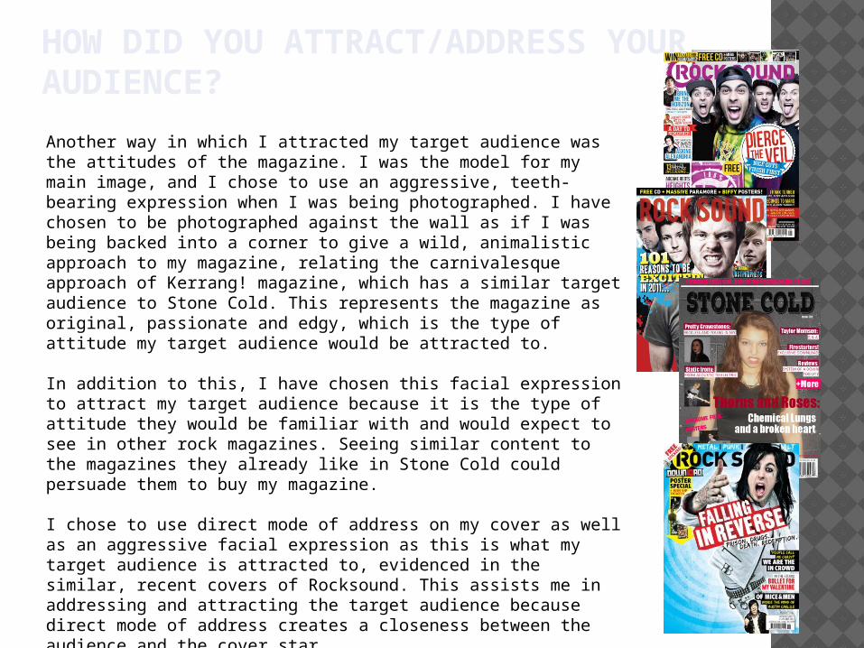
Another way in which I attracted my target audience was the attitudes of the magazine. I was the model for my main image, and I chose to use an aggressive, teeth-bearing expression when I was being photographed. I have chosen to be photographed against the wall as if I was being backed into a corner to give a wild, animalistic approach to my magazine, relating the carnivalesque approach of Kerrang! magazine, which has a similar target audience to Stone Cold. This represents the magazine as original, passionate and edgy, which is the type of attitude my target audience would be attracted to.
In addition to this, I have chosen this facial expression to attract my target audience because it is the type of attitude they would be familiar with and would expect to see in other rock magazines. Seeing similar content to the magazines they already like in Stone Cold could persuade them to buy my magazine.
I chose to use direct mode of address on my cover as well as an aggressive facial expression as this is what my target audience is attracted to, evidenced in the similar, recent covers of Rocksound. This assists me in addressing and attracting the target audience because direct mode of address creates a closeness between the audience and the cover star.

6. WHAT HAVE YOU LEARNT ABOUT TECHNOLOGIES FROM THE PROCESS OF CONSTRUCTING THE PRODUCT?

WHAT HAVE YOU LEARNT ABOUT TECHNOLOGIES FROM THE PROCESS OF CONSTRUCTING THE PRODUCT?
When I first began creating magazine cover such as in my preliminary task I only used Microsoft Publisher, even for resizing photos and recoloring them. I also used it to do magazine analysis, which was uploaded to blogger. This was acceptable for the preliminary task but as I moved on to drafting Stone Cold it gave out poor quality images once the publications were exported. At this point I decided to start using paint.net and page plus instead as they allowed more precision in photo editing and a better quality piece.
After merging the masthead and main image I transferred this over to pageplus. This application is where the rest of the construction of my magazine was done. I found this an easy piece of software to use, and allowed me to lay out text much more efficiently and effectively than paint.net allows. I also added my secondary images and coverlines using page plus because once exported as pdf the text and images were much clearer and much less pixelated than when I attempted to use publisher to add cover lines.
In the construction of my product, there was minimal use of Microsoft Word. I used it to type out my double page spread content but little else as the software is too restrictive to do professional editing and layout work for my magazine.
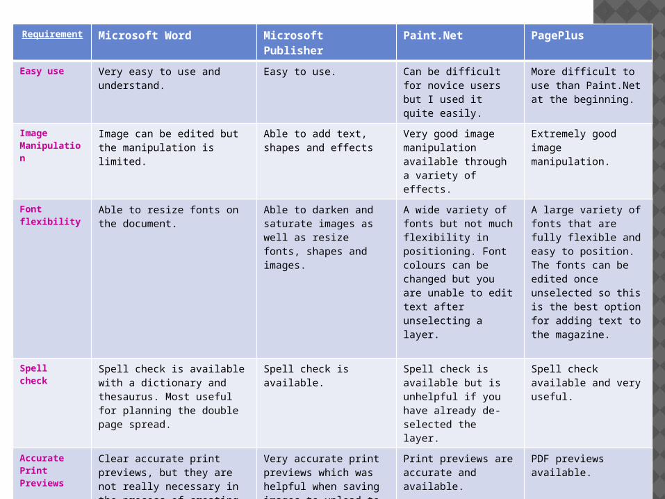
Requirement
Microsoft Word Microsoft Publisher Paint.Net PagePlus
Easy use Very easy to use and understand.
Easy to use. Can be difficult for novice users but I used it quite easily.
More difficult to use than Paint.Net at the beginning.
Image Manipulation
Image can be edited but the manipulation is limited.
Able to add text, shapes and effects
Very good image manipulation available through a variety of effects.
Extremely good image manipulation.
Font flexibility
Able to resize fonts on the document.
Able to darken and saturate images as well as resize fonts, shapes and images.
A wide variety of fonts but not much flexibility in positioning. Font colours can be changed but you are unable to edit text after unselecting a layer.
A large variety of fonts that are fully flexible and easy to position. The fonts can be edited once unselected so this is the best option for adding text to the magazine.
Spell check
Spell check is available with a dictionary and thesaurus. Most useful for planning the double page spread.
Spell check is available. Spell check is available but is unhelpful if you have already de-selected the layer.
Spell check available and very useful.
Accurate Print Previews
Clear accurate print previews, but they are not really necessary in the process of creating magazines.
Very accurate print previews which was helpful when saving images to upload to blogger.
Print previews are accurate and available.
PDF previews available.
Image Saving
Unable to save documents in image formats so this should not be used to create magazines.
PNG, JPEG and GIF formats available. Easy to group images and text.
BMP, JPEG, GIF, TIFF, TGA, and PNG available.
PNG and JPEG are available and give the best quality image.
Text and Image Placement
Difficult to change image and text placement.
Layers of image and text can be swapped and it is easy to change image placement.
Image placement and layer use is good but text placement is not as easy.
Very good image and text placement. More efficient than publisher and easier to use than Paint.Net.

WHAT HAVE YOU LEARNT ABOUT TECHNOLOGIES FROM THE PROCESS OF CONSTRUCTING THE PRODUCT?
In this project I have used blogger to record my research, planning, drafting, organisation and target audience research and feedback.
Although this website has saved me time, through typing instead of writing, it has made it more difficult for me to organise my time and researching methods, as I discovered new pieces of information about magazines at different times throughout the project, and adding them into blogger makes my work look unorganised.
In future projects, I would still use blogger despite the time management constraints as I now know how to use blogger much better than at the start of the project.

7. LOOKING BACK TO YOUR PRELIMINARY TASK, WHAT DO YOU FEEL THAT YOU HAVE LEARNT IN THE PROGRESSION FROM IT TO THE FULL PRODUCT?
LOOKING BACK TO YOUR PRELIMINARY TASK, WHAT DO YOU FEEL THAT YOU HAVE LEARNT IN THE PROGRESSION FROM IT TO THE FULL PRODUCT?
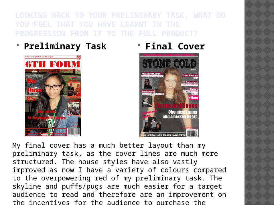
Preliminary Task Final Cover
My final cover has a much better layout than my preliminary task, as the cover lines are much more structured. The house styles have also vastly improved as now I have a variety of colours compared to the overpowering red of my preliminary task. The skyline and puffs/pugs are much easier for a target audience to read and therefore are an improvement on the incentives for the audience to purchase the magazine.

LOOKING BACK TO YOUR PRELIMINARY TASK, WHAT DO YOU FEEL THAT YOU HAVE LEARNT IN THE PROGRESSION FROM IT TO THE FULL PRODUCT?
Preliminary Task Final Contents page
In the progression of creating a magazine, I have learnt how to create appropriate layouts. For example, my preliminary task was very chunky and the area for the image was too large. As well as this, the text layout was boring. To improve upon this for my final product I have used colums on my contents page and a more confined space for an image, leaving more room for stories and page numbers.

I have learnt the codes and conventions of magazines, how to create an appropriate house style, how to organise my text and images, and how to take appropriate photos.
My preliminary task wasn’t too bad because I still used some of the codes and conventions, but I am much prouder of my final piece. My final piece is much more professional because the articles and secondary images are arranged better. In addition to this, my cover lines are in a much better colour.
LOOKING BACK TO YOUR PRELIMINARY TASK, WHAT DO YOU FEEL THAT YOU HAVE LEARNT IN THE PROGRESSION FROM IT TO THE FULL PRODUCT?

8. HOW SUCCESSFUL DO YOU FEEL YOUR END PRODUCT IS IN FULFILLING THE TASK? HOW WELL DOES IT FIT THE BRIEF?

HOW SUCCESSFUL DO YOU FEEL YOUR END PRODUCT IS IN FULFILLING THE TASK? HOW WELL DOES IT FIT THE BRIEF? In my opinion my end product fulfils the
brief successfully because it conforms to the vast majority of the codes and conventions of music magazines, appears professional, has the correct attitude for a rock music magazine.