Magazine evaluation 2 FINISHED
62
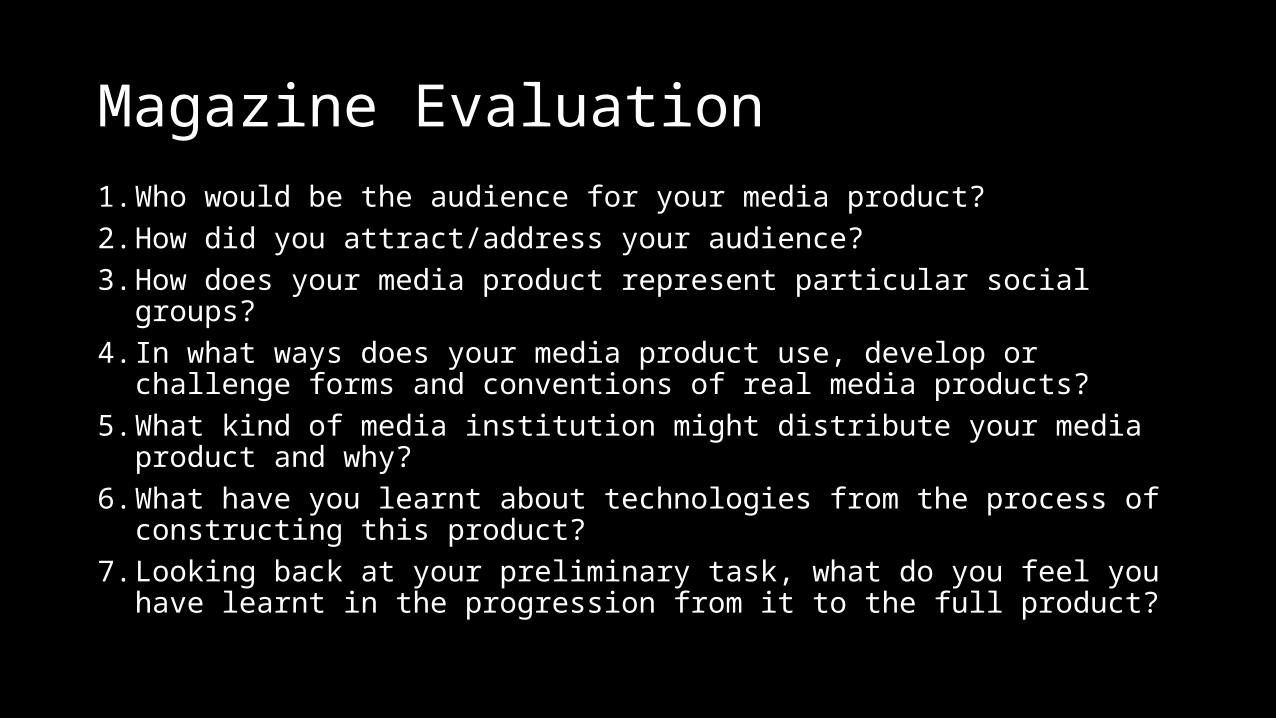
Magazine Evaluation 1.Who would be the audience for your media product? 2.How did you attract/address your audience? 3.How does your media product represent particular social groups? 4.In what ways does your media product use, develop or challenge forms and conventions of real media products? 5.What kind of media institution might distribute your media product and why? 6.What have you learnt about technologies from the process of constructing this product? 7.Looking back at your preliminary task, what do you feel you have learnt in the progression from it to the full product?
-
Upload
tom-jenkins -
Category
Social Media
-
view
23 -
download
0
Transcript of Magazine evaluation 2 FINISHED
Magazine Evaluation1. Who would be the audience for your media product? 2. How did you attract/address your audience? 3. How does your media product represent particular social groups? 4. In what ways does your media product use, develop or challenge forms and
conventions of real media products? 5. What kind of media institution might distribute your media product and
why? 6. What have you learnt about technologies from the process of constructing
this product? 7. Looking back at your preliminary task, what do you feel you have learnt in
the progression from it to the full product?
Q1.Who would be the audience for your media product?
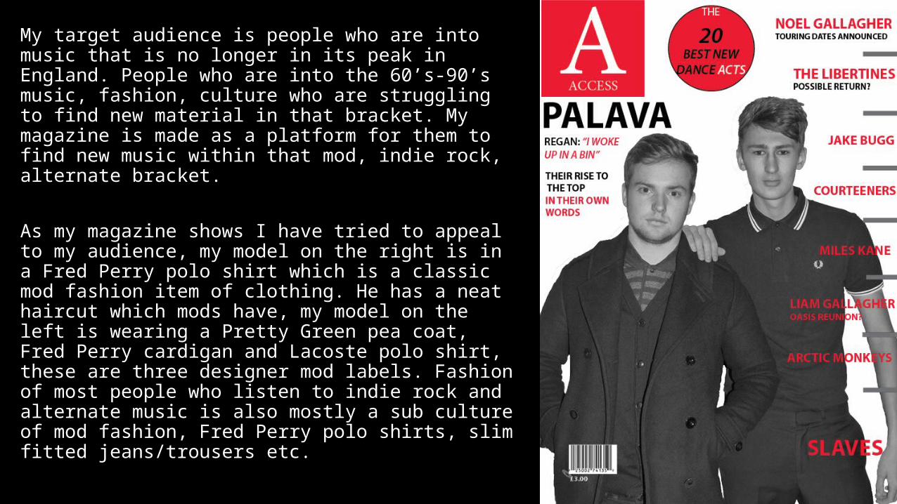
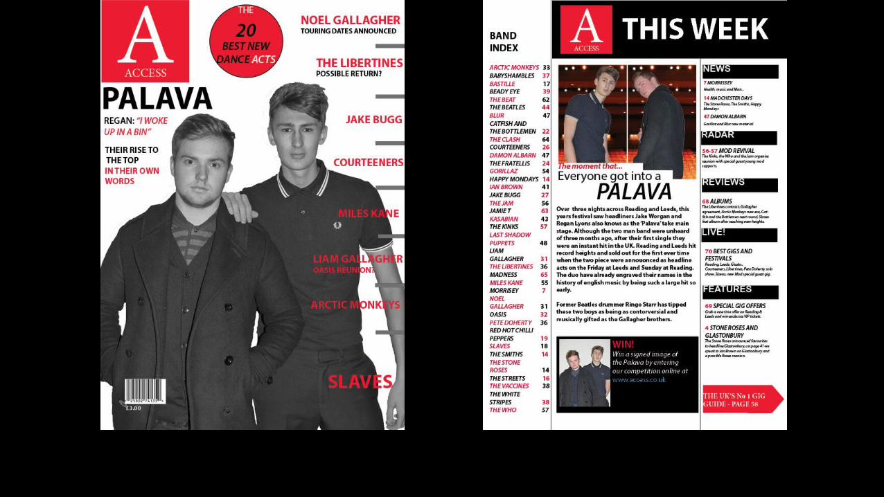
My target audience is people who are into music that is no longer in its peak in England. People who are into the 60’s-90’s music, fashion, culture who are struggling to find new material in that bracket. My magazine is made as a platform for them to find new music within that mod, indie rock, alternate bracket.
As my magazine shows I have tried to appeal to my audience, my model on the right is in a Fred Perry polo shirt which is a classic mod fashion item of clothing. He has a neat haircut which mods have, my model on the left is wearing a Pretty Green pea coat, Fred Perry cardigan and Lacoste polo shirt, these are three designer mod labels. Fashion of most people who listen to indie rock and alternate music is also mostly a sub culture of mod fashion, Fred Perry polo shirts, slim fitted jeans/trousers etc.
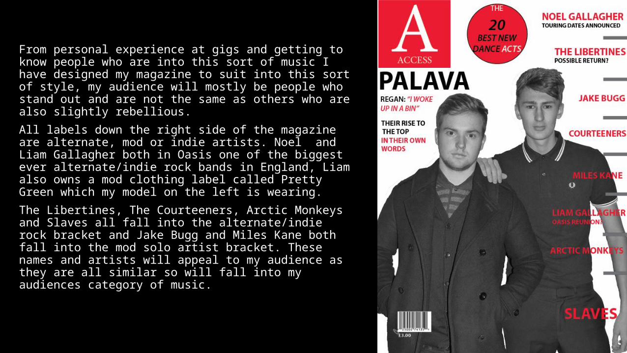
From personal experience at gigs and getting to know people who are into this sort of music I have designed my magazine to suit into this sort of style, my audience will mostly be people who stand out and are not the same as others who are also slightly rebellious.
All labels down the right side of the magazine are alternate, mod or indie artists. Noel and Liam Gallagher both in Oasis one of the biggest ever alternate/indie rock bands in England, Liam also owns a mod clothing label called Pretty Green which my model on the left is wearing.
The Libertines, The Courteeners, Arctic Monkeys and Slaves all fall into the alternate/indie rock bracket and Jake Bugg and Miles Kane both fall into the mod solo artist bracket. These names and artists will appeal to my audience as they are all similar so will fall into my audiences category of music.
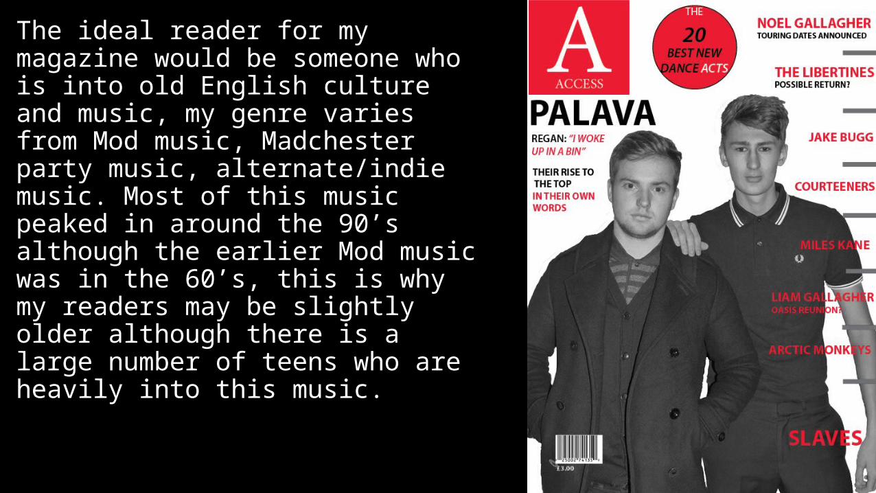
The ideal reader for my magazine would be someone who is into old English culture and music, my genre varies from Mod music, Madchester party music, alternate/indie music. Most of this music peaked in around the 90’s although the earlier Mod music was in the 60’s, this is why my readers may be slightly older although there is a large number of teens who are heavily into this music.
Age Range
Age – 15-45The reason I believe it will be these ages is because at 15 you begin to mature and your head gets stronger so you can engage in music that means something to you, I believe my selected genre is full of all different kinds of music that is meaningful. The reason I believe older people will be into it is because it will be a sense of nostalgia and memories from their days of youth which my magazine will bring back to them.
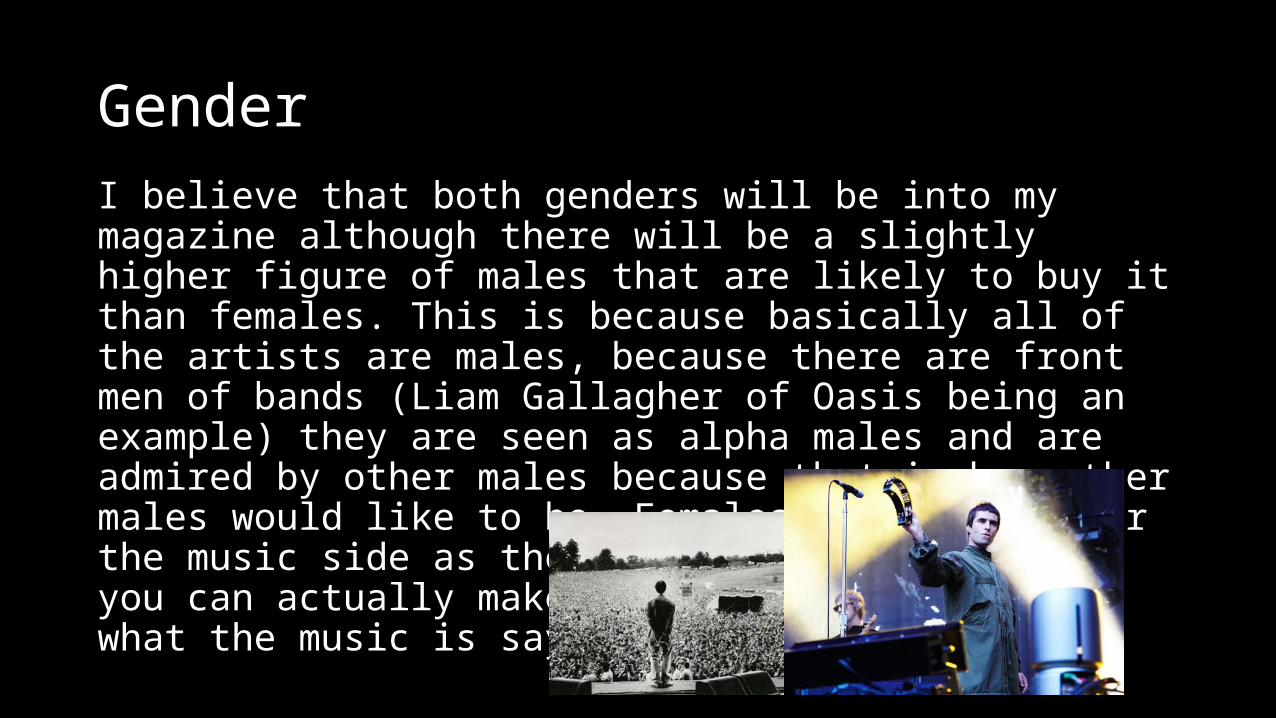
GenderI believe that both genders will be into my magazine although there will be a slightly higher figure of males that are likely to buy it than females. This is because basically all of the artists are males, because there are front men of bands (Liam Gallagher of Oasis being an example) they are seen as alpha males and are admired by other males because that is how other males would like to be. Females are into it for the music side as the music is meaningful and you can actually make sense and relate as to what the music is saying.
Social class
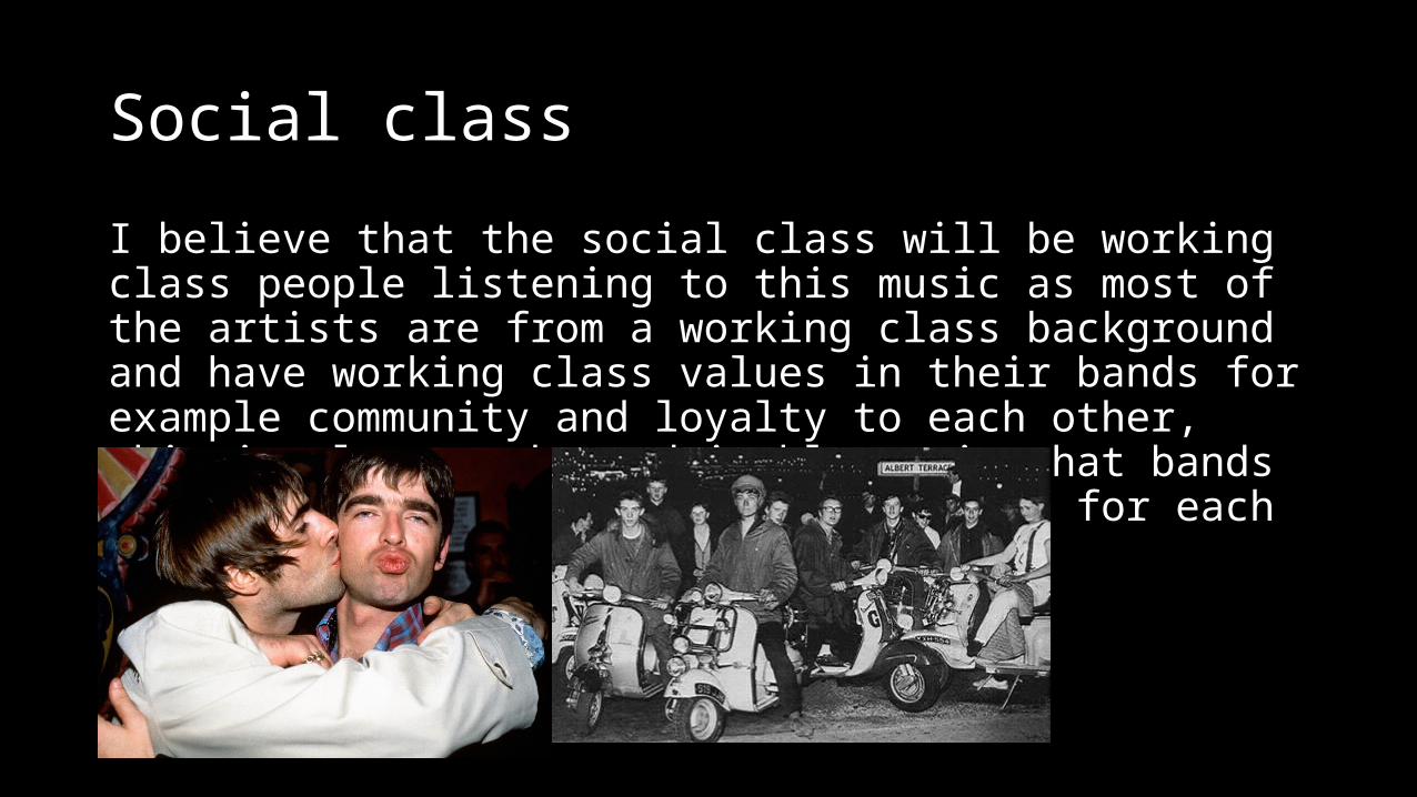
I believe that the social class will be working class people listening to this music as most of the artists are from a working class background and have working class values in their bands for example community and loyalty to each other, this is also another admirable trait that bands have that they are willing to stick up for each other.
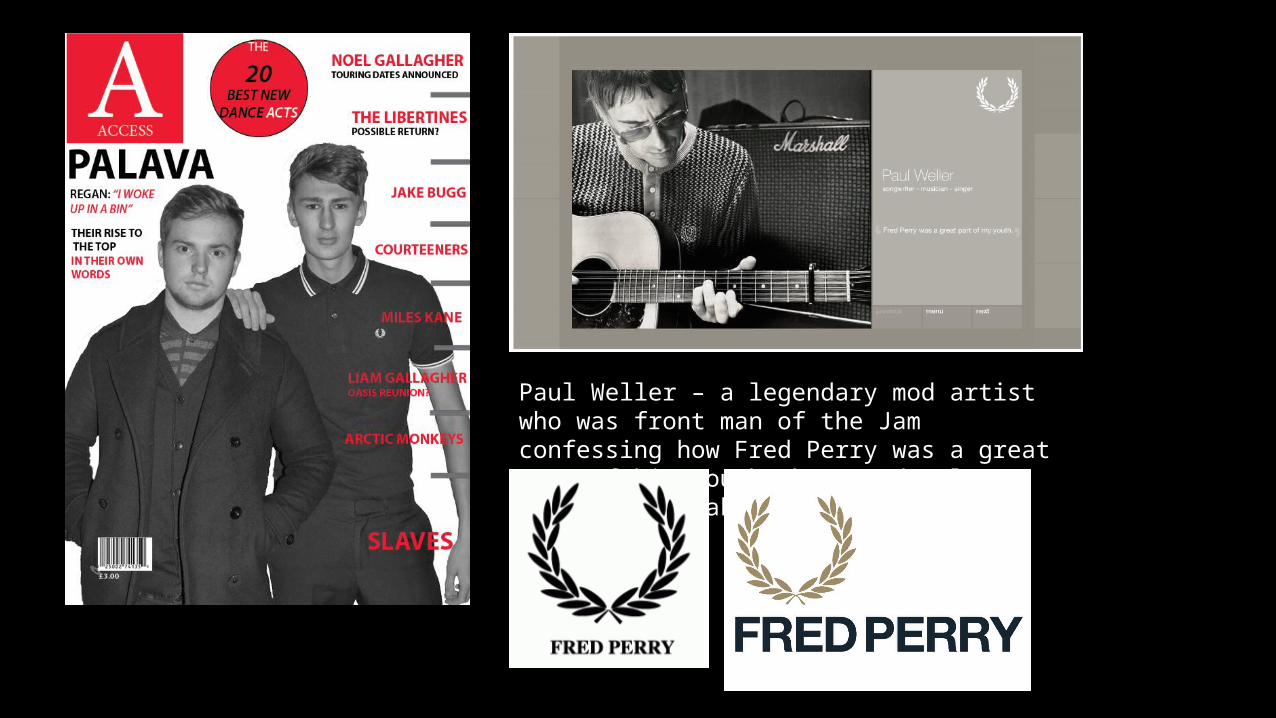
Paul Weller – a legendary mod artist who was front man of the Jam confessing how Fred Perry was a great part of his youth where mod culture was at its peak.
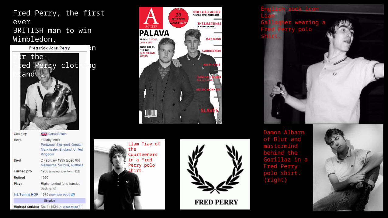
Fred Perry, the first ever BRITISH man to win Wimbledon, was the inspiration for the Fred Perry clothing brand.
English rock icon LiamGallagher wearing aFred Perry polo shirt.
Damon Albarn of Blur and mastermind behind the Gorillaz in a Fred Perry polo shirt. (right)
Liam Fray of the Courteeners in a Fred Perry polo shirt.
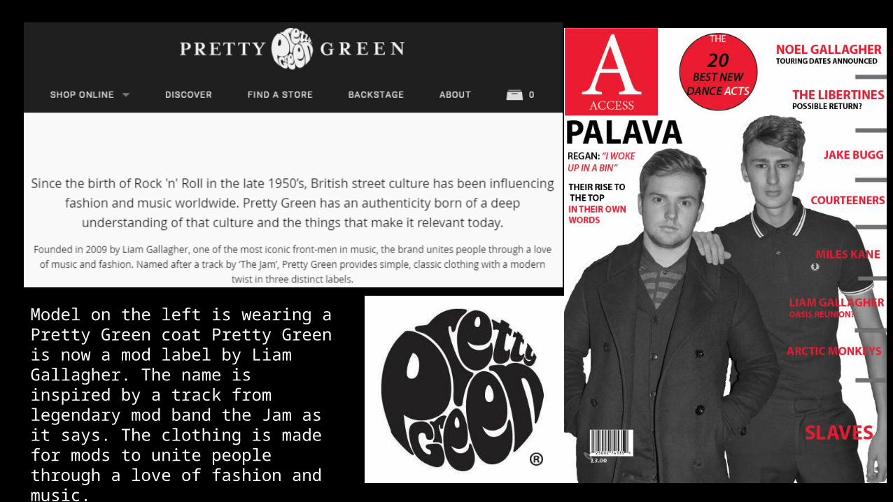
Model on the left is wearing a Pretty Green coat Pretty Green is now a mod label by Liam Gallagher. The name is inspired by a track from legendary mod band the Jam as it says. The clothing is made for mods to unite people through a love of fashion and music.
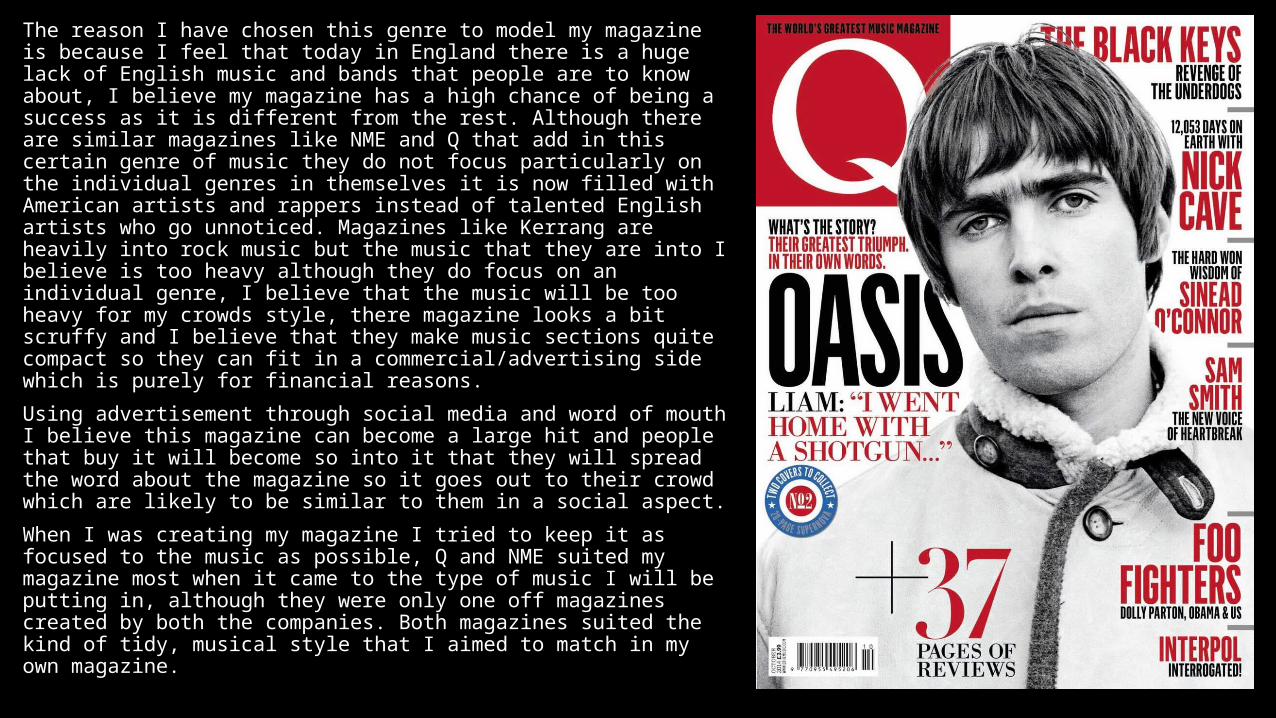
The reason I have chosen this genre to model my magazine is because I feel that today in England there is a huge lack of English music and bands that people are to know about, I believe my magazine has a high chance of being a success as it is different from the rest. Although there are similar magazines like NME and Q that add in this certain genre of music they do not focus particularly on the individual genres in themselves it is now filled with American artists and rappers instead of talented English artists who go unnoticed. Magazines like Kerrang are heavily into rock music but the music that they are into I believe is too heavy although they do focus on an individual genre, I believe that the music will be too heavy for my crowds style, there magazine looks a bit scruffy and I believe that they make music sections quite compact so they can fit in a commercial/advertising side which is purely for financial reasons.
Using advertisement through social media and word of mouth I believe this magazine can become a large hit and people that buy it will become so into it that they will spread the word about the magazine so it goes out to their crowd which are likely to be similar to them in a social aspect.
When I was creating my magazine I tried to keep it as focused to the music as possible, Q and NME suited my magazine most when it came to the type of music I will be putting in, although they were only one off magazines created by both the companies. Both magazines suited the kind of tidy, musical style that I aimed to match in my own magazine.
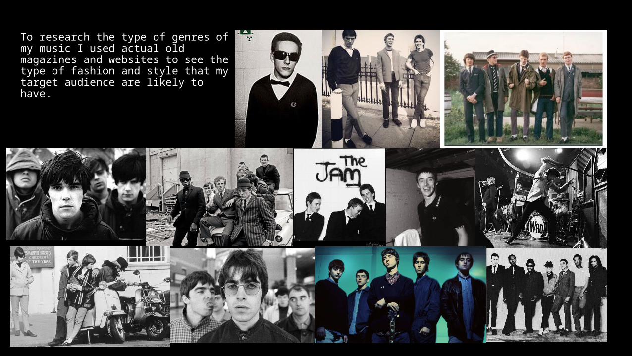
To research the type of genres of my music I used actual old magazines and websites to see the type of fashion and style that my target audience are likely to have.
Q2 How did you attract/address your audience?
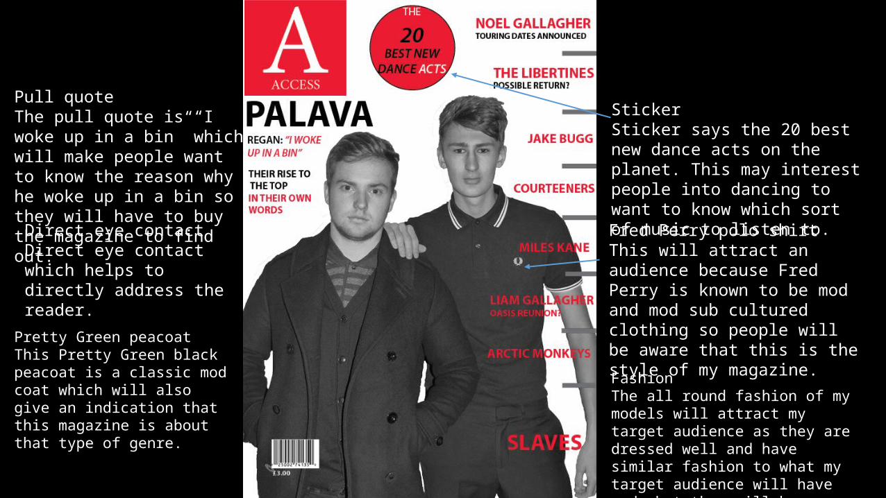
Fred Perry polo shirtThis will attract an audience because Fred Perry is known to be mod and mod sub cultured clothing so people will be aware that this is the style of my magazine.
Direct eye contactDirect eye contact which helps to directly address the reader.
Pretty Green peacoatThis Pretty Green black peacoat is a classic mod coat which will also give an indication that this magazine is about that type of genre.
Pull quoteThe pull quote is “I woke up in a bin” which will make people want to know the reason why he woke up in a bin so they will have to buy the magazine to find out.
StickerSticker says the 20 best new dance acts on the planet. This may interest people into dancing to want to know which sort of music to listen to.
FashionThe all round fashion of my models will attract my target audience as they are dressed well and have similar fashion to what my target audience will have and what they will be interested in.
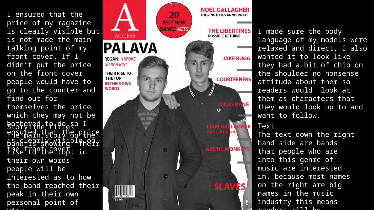
TextThe text down the right hand side are bands that people who are into this genre of music are interested in, because most names on the right are big names in the music industry this means readers will be interested as to what they want to say which is a reason they will buy the magazine.
I ensured that the price of my magazine is clearly visible but is not made the main talking point of my front cover. If I didn’t put the price on the front cover people would have to go to the counter and find out for themselves the price which they may not be bothered to do so I ensured that the price is clearly visible on the front cover.
Storyline titlesThe main story on the band is showing ‘Their rise to the top, in their own words’ people will be interested as to how the band reached their peak in their own personal point of view.
I made sure the body language of my models were relaxed and direct, I also wanted it to look like they had a bit of chip on the shoulder no nonsense attitude about them so readers would look at them as characters that they would look up to and want to follow.
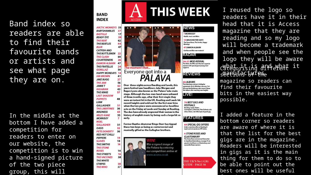
Categorising different sections of the magazine so readers can find their favourite bits in the easiest way possible.
Band index so readers are able to find their favourite bands or artists and see what page they are on.
I added a feature in the bottom corner so readers are aware of where it is that the list for the best gigs are in the magazine. Readers will be interested in gigs as it is the main thing for them to do so to be able to point out the best ones will be useful for themselves to know which gigs are worth going to and which aren’t.
I reused the logo so readers have it in their head that it is Access magazine that they are reading and so my logo will become a trademark and when people see the logo they will be aware what it is and what it manufactures.
In the middle at the bottom I have added a competition for readers to enter on our website, the competition is to win a hand-signed picture of the two piece group, this will interest readers as it is a rare piece of memorabilia that they can keep.
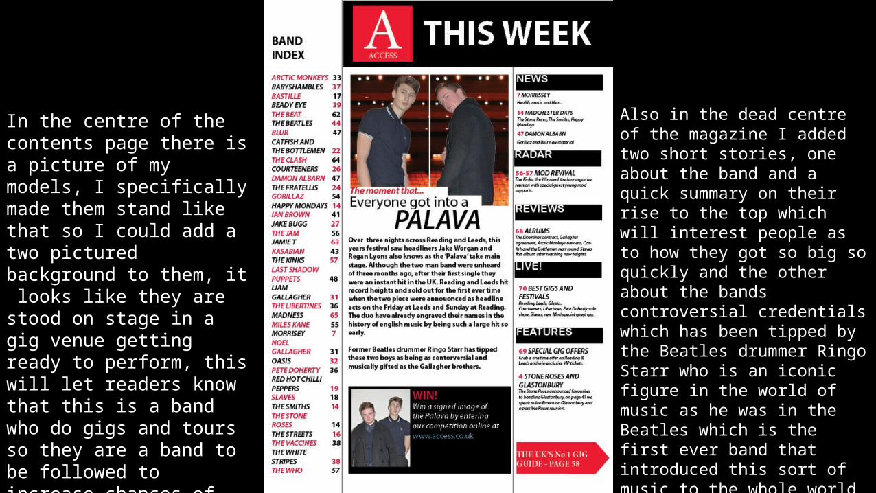
In the centre of the contents page there is a picture of my models, I specifically made them stand like that so I could add a two pictured background to them, it looks like they are stood on stage in a gig venue getting ready to perform, this will let readers know that this is a band who do gigs and tours so they are a band to be followed to increase chances of any recent or upcoming gigs.
Also in the dead centre of the magazine I added two short stories, one about the band and a quick summary on their rise to the top which will interest people as to how they got so big so quickly and the other about the bands controversial credentials which has been tipped by the Beatles drummer Ringo Starr who is an iconic figure in the world of music as he was in the Beatles which is the first ever band that introduced this sort of music to the whole world and were the biggest ever thing to happen in the history of English music.
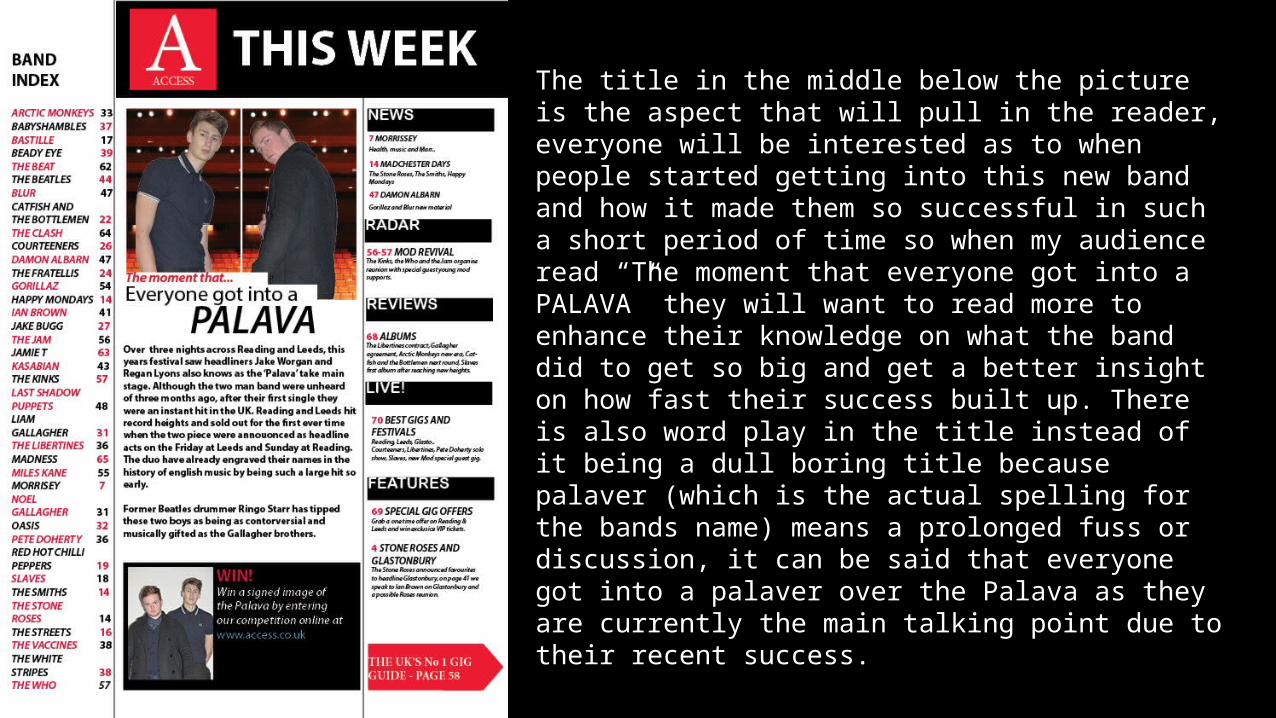
The title in the middle below the picture is the aspect that will pull in the reader, everyone will be interested as to when people started getting into this new band and how it made them so successful in such a short period of time so when my audience read “The moment that everyone got into a PALAVA” they will want to read more to enhance their knowledge on what the band did to get so big and get a better insight on how fast their success built up. There is also word play in the title instead of it being a dull boring title because palaver (which is the actual spelling for the bands name) means a prolonged fuss or discussion, it can be said that everyone got into a palaver over the Palava as they are currently the main talking point due to their recent success.
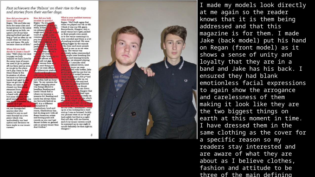
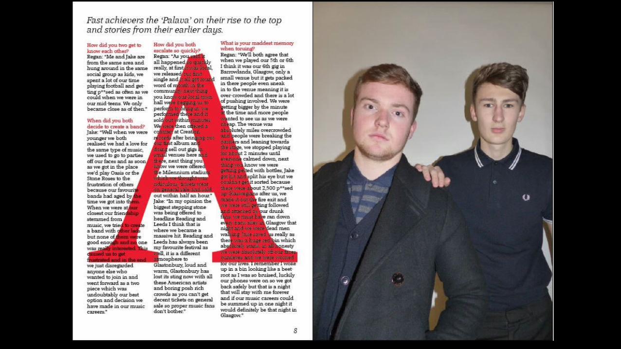
I made my models look directly at me again so the reader knows that it is them being addressed and that this magazine is for them. I made Jake (back model) put his hand on Regan (front model) as it shows a sense of unity and loyalty that they are in a band and Jake has his back. I ensured they had blank emotionless facial expressions to again show the arrogance and carelessness of them making it look like they are the two biggest things on earth at this moment in time. I have dressed them in the same clothing as the cover for a specific reason so my readers stay interested and are aware of what they are about as I believe clothes, fashion and attitude to be three of the main defining things for members of any band. I have put Regan at the front to show that he is the front man of the two piece and Jake is his right hand man.
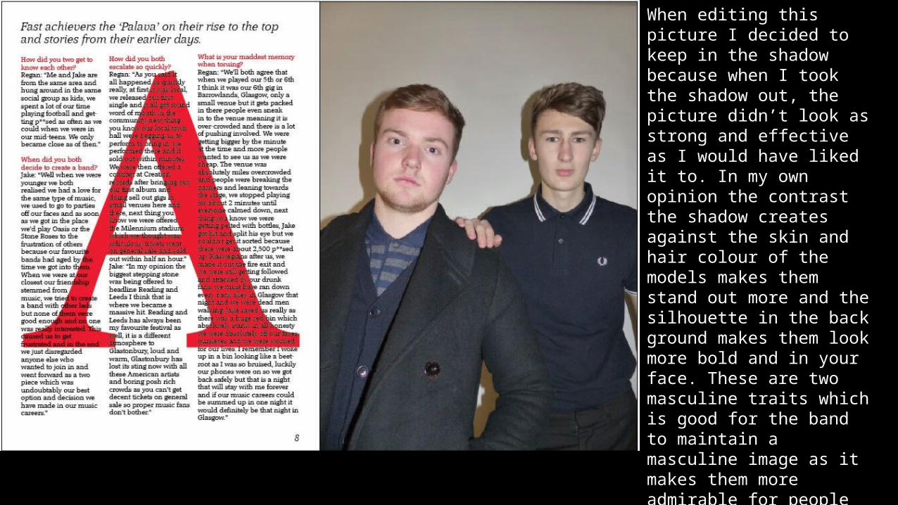
When editing this picture I decided to keep in the shadow because when I took the shadow out, the picture didn’t look as strong and effective as I would have liked it to. In my own opinion the contrast the shadow creates against the skin and hair colour of the models makes them stand out more and the silhouette in the back ground makes them look more bold and in your face. These are two masculine traits which is good for the band to maintain a masculine image as it makes them more admirable for people reading the magazine and will influence the reader to engage more in the text for them to get an extra insight on who the band are, where they’re from and what they are all about.
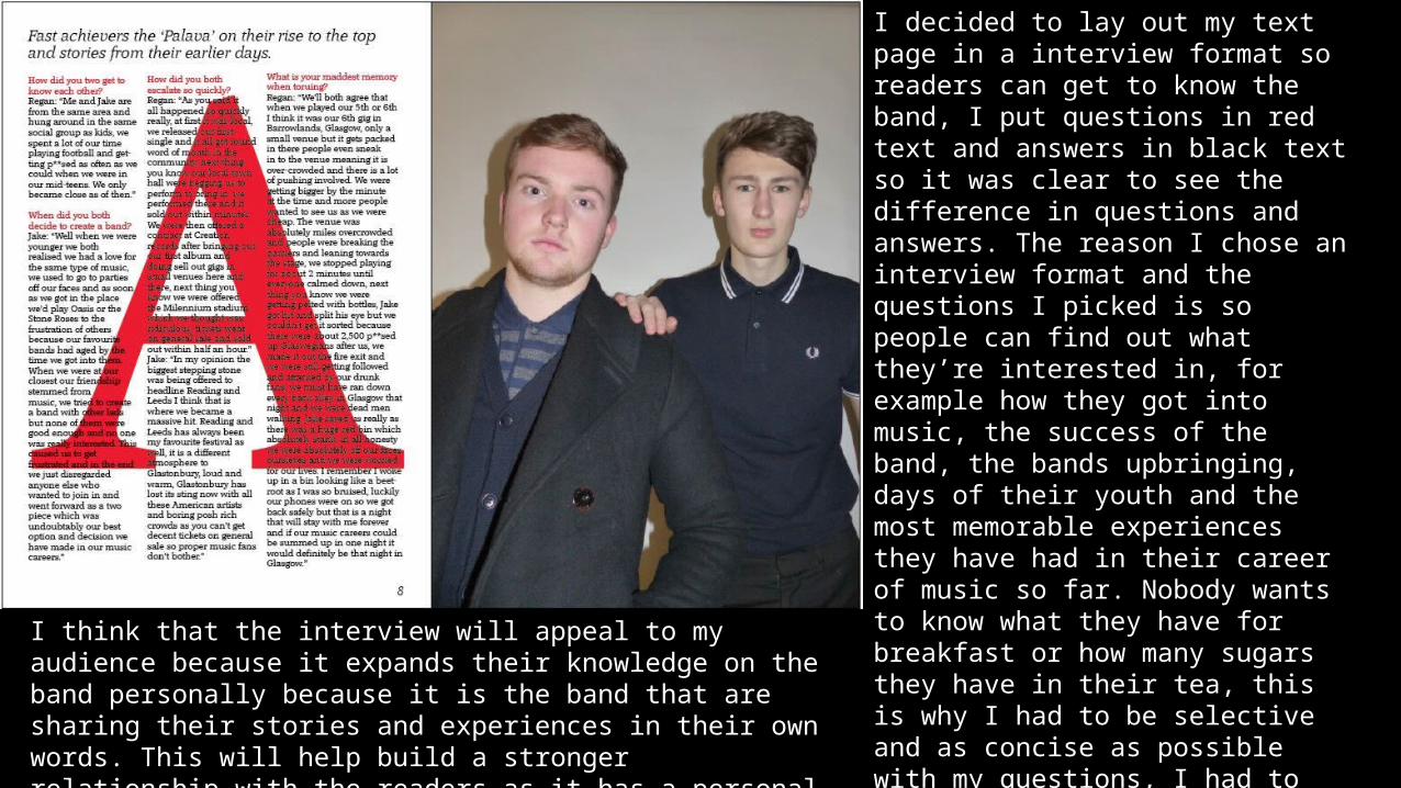
I decided to lay out my text page in a interview format so readers can get to know the band, I put questions in red text and answers in black text so it was clear to see the difference in questions and answers. The reason I chose an interview format and the questions I picked is so people can find out what they’re interested in, for example how they got into music, the success of the band, the bands upbringing, days of their youth and the most memorable experiences they have had in their career of music so far. Nobody wants to know what they have for breakfast or how many sugars they have in their tea, this is why I had to be selective and as concise as possible with my questions, I had to get as straight to the point as I could on the bands career in music and a little bit on their upbringings and what they got up to when they were youngerI think that the interview will appeal to my audience because it expands
their knowledge on the band personally because it is the band that are sharing their stories and experiences in their own words. This will help build a stronger relationship with the readers as it has a personal sense to it.
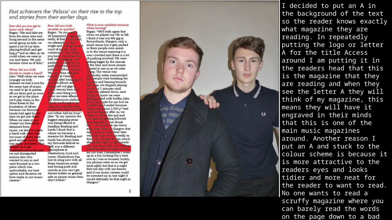
I decided to put an A in the background of the text so the reader knows exactly what magazine they are reading. In repeatedly putting the logo or letter A for the title Access around I am putting it in the readers head that this is the magazine that they are reading and when they see the letter A they will think of my magazine, this means they will have it engraved in their minds that this is one of the main music magazines around. Another reason I put an A and stuck to the colour scheme is because it is more attractive to the readers eyes and looks tidier and more neat for the reader to want to read. No one wants to read a scruffy magazine where you can barely read the words on the page down to a bad colour scheme so I made it a priority that I got that correct on my double page spread.
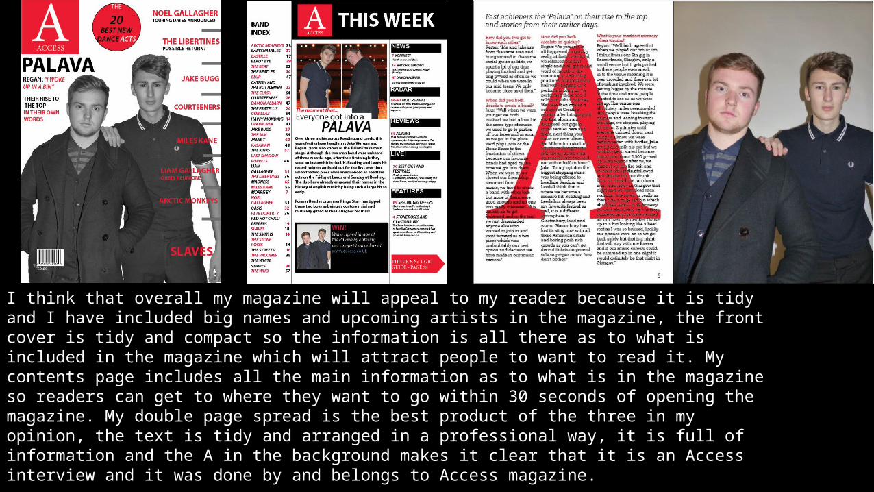
I think that overall my magazine will appeal to my reader because it is tidy and I have included big names and upcoming artists in the magazine, the front cover is tidy and compact so the information is all there as to what is included in the magazine which will attract people to want to read it. My contents page includes all the main information as to what is in the magazine so readers can get to where they want to go within 30 seconds of opening the magazine. My double page spread is the best product of the three in my opinion, the text is tidy and arranged in a professional way, it is full of information and the A in the background makes it clear that it is an Access interview and it was done by and belongs to Access magazine.
Q3: How does your media product represent particular social groups?
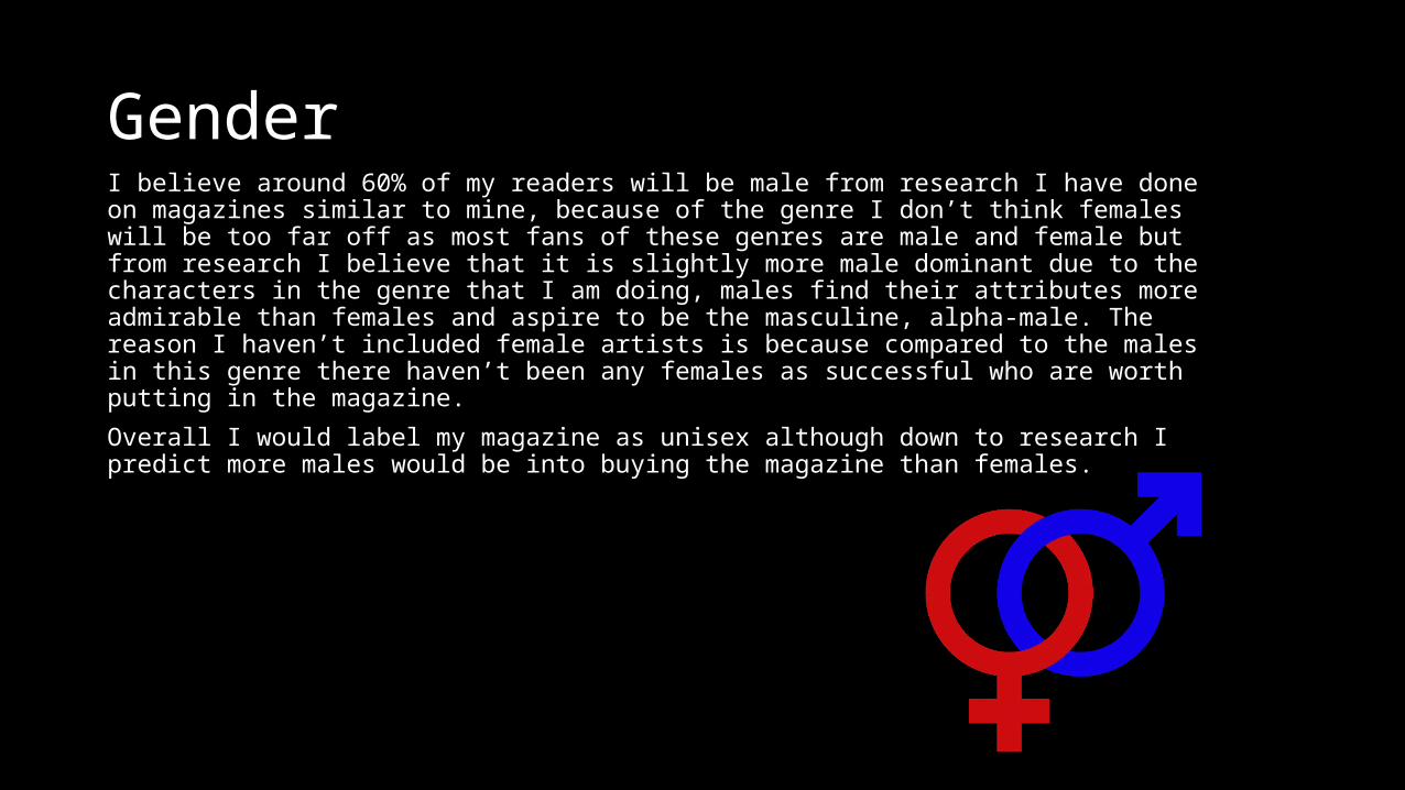
GenderI believe around 60% of my readers will be male from research I have done on magazines similar to mine, because of the genre I don’t think females will be too far off as most fans of these genres are male and female but from research I believe that it is slightly more male dominant due to the characters in the genre that I am doing, males find their attributes more admirable than females and aspire to be the masculine, alpha-male. The reason I haven’t included female artists is because compared to the males in this genre there haven’t been any females as successful who are worth putting in the magazine.
Overall I would label my magazine as unisex although down to research I predict more males would be into buying the magazine than females.
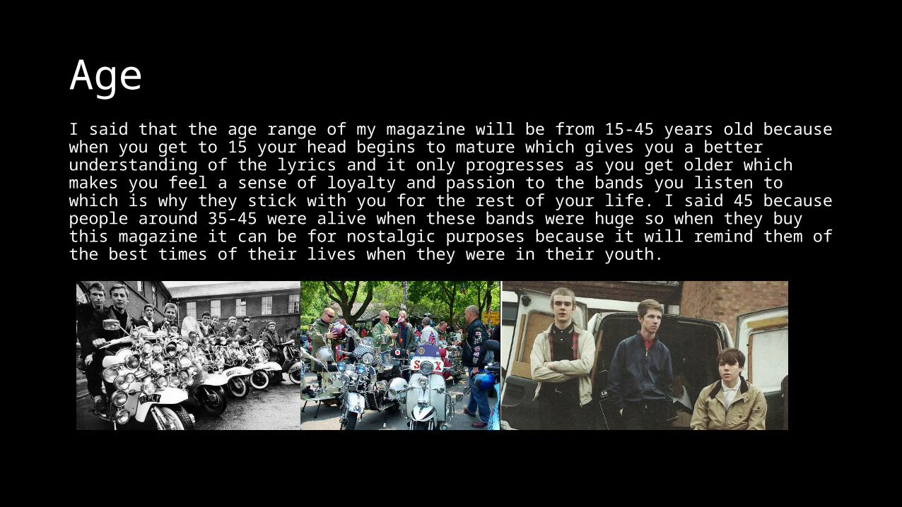
AgeI said that the age range of my magazine will be from 15-45 years old because when you get to 15 your head begins to mature which gives you a better understanding of the lyrics and it only progresses as you get older which makes you feel a sense of loyalty and passion to the bands you listen to which is why they stick with you for the rest of your life. I said 45 because people around 35-45 were alive when these bands were huge so when they buy this magazine it can be for nostalgic purposes because it will remind them of the best times of their lives when they were in their youth.
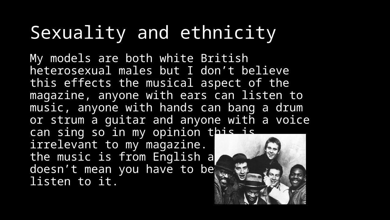
Sexuality and ethnicityMy models are both white British heterosexual males but I don’t believe this effects the musical aspect of the magazine, anyone with ears can listen to music, anyone with hands can bang a drum or strum a guitar and anyone with a voice can sing so in my opinion this is irrelevant to my magazine. Although most the music is from English artists that doesn’t mean you have to be English to listen to it.
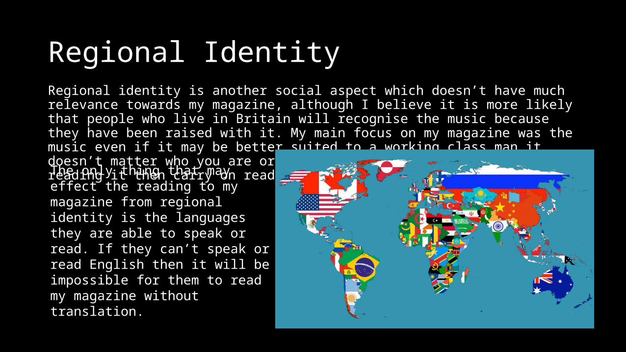
Regional IdentityRegional identity is another social aspect which doesn’t have much relevance towards my magazine, although I believe it is more likely that people who live in Britain will recognise the music because they have been raised with it. My main focus on my magazine was the music even if it may be better suited to a working class man it doesn’t matter who you are or where you’re from if you enjoy reading it then carry on reading.
The only thing that may effect the reading to my magazine from regional identity is the languages they are able to speak or read. If they can’t speak or read English then it will be impossible for them to read my magazine without translation.
Physical ability/disability
This is another social group that holds no relevance to the musical aspect of my magazine. The magazine is open for absolutely anyone to buy and read.
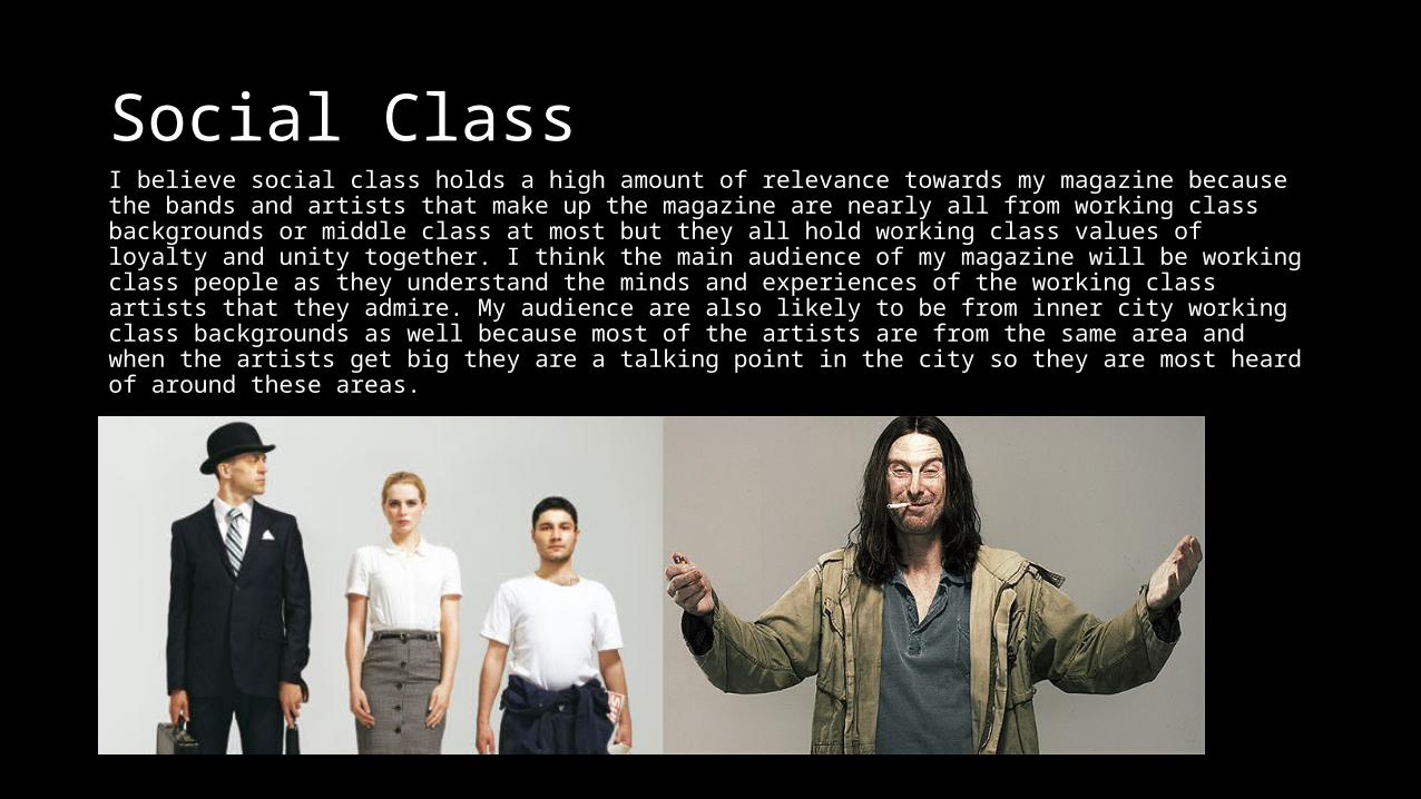
Social ClassI believe social class holds a high amount of relevance towards my magazine because the bands and artists that make up the magazine are nearly all from working class backgrounds or middle class at most but they all hold working class values of loyalty and unity together. I think the main audience of my magazine will be working class people as they understand the minds and experiences of the working class artists that they admire. My audience are also likely to be from inner city working class backgrounds as well because most of the artists are from the same area and when the artists get big they are a talking point in the city so they are most heard of around these areas.
Q4 In what ways does your media product use, develop or challenge forms and conventions of real media products?
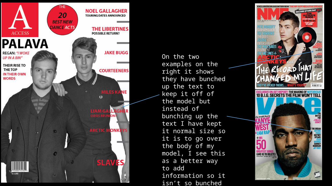
On the two examples on the right it shows they have bunched up the text to keep it off of the model but instead of bunching up the text I have kept it normal size so it is to go over the body of my model, I see this as a better way to add information so it isn’t so bunched up and compact and you can see and read it clearly.
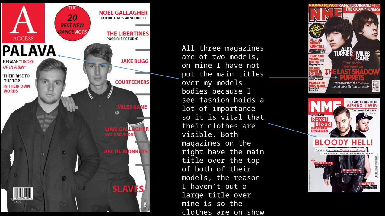
All three magazines are of two models, on mine I have not put the main titles over my models bodies because I see fashion holds a lot of importance so it is vital that their clothes are visible. Both magazines on the right have the main title over the top of both of their models, the reason I haven’t put a large title over mine is so the clothes are on show for potential audiences.
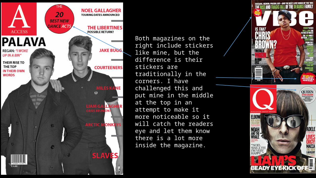
Both magazines on the right include stickers like mine, but the difference is their stickers are traditionally in the corners. I have challenged this and put mine in the middle at the top in an attempt to make it more noticeable so it will catch the readers eye and let them know there is a lot more inside the magazine.
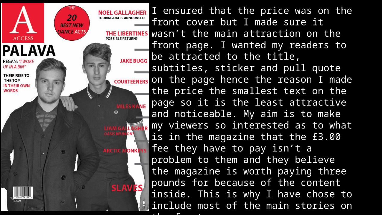
I ensured that the price was on the front cover but I made sure it wasn’t the main attraction on the front page. I wanted my readers to be attracted to the title, subtitles, sticker and pull quote on the page hence the reason I made the price the smallest text on the page so it is the least attractive and noticeable. My aim is to make my viewers so interested as to what is in the magazine that the £3.00 fee they have to pay isn’t a problem to them and they believe the magazine is worth paying three pounds for because of the content inside. This is why I have chose to include most of the main stories on the front cover.
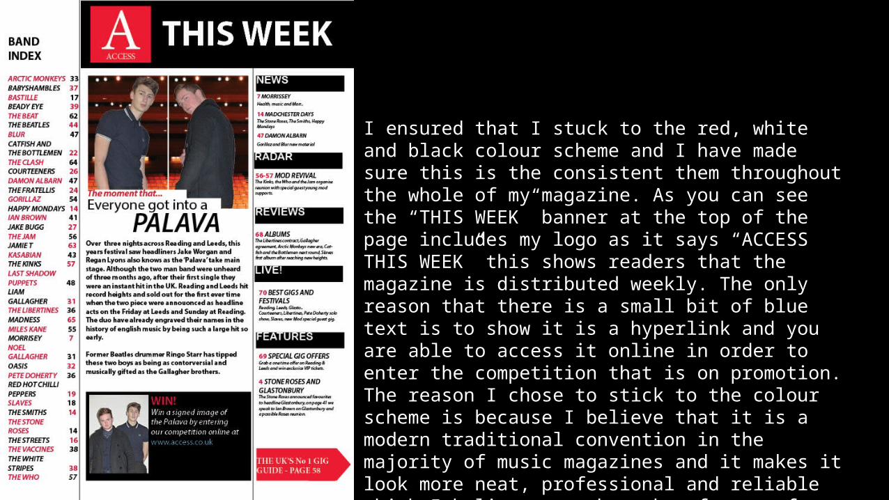
I ensured that I stuck to the red, white and black colour scheme and I have made sure this is the consistent them throughout the whole of my magazine. As you can see the “THIS WEEK” banner at the top of the page includes my logo as it says “ACCESS THIS WEEK” this shows readers that the magazine is distributed weekly. The only reason that there is a small bit of blue text is to show it is a hyperlink and you are able to access it online in order to enter the competition that is on promotion. The reason I chose to stick to the colour scheme is because I believe that it is a modern traditional convention in the majority of music magazines and it makes it look more neat, professional and reliable which I believe are three key factors for a good magazine.
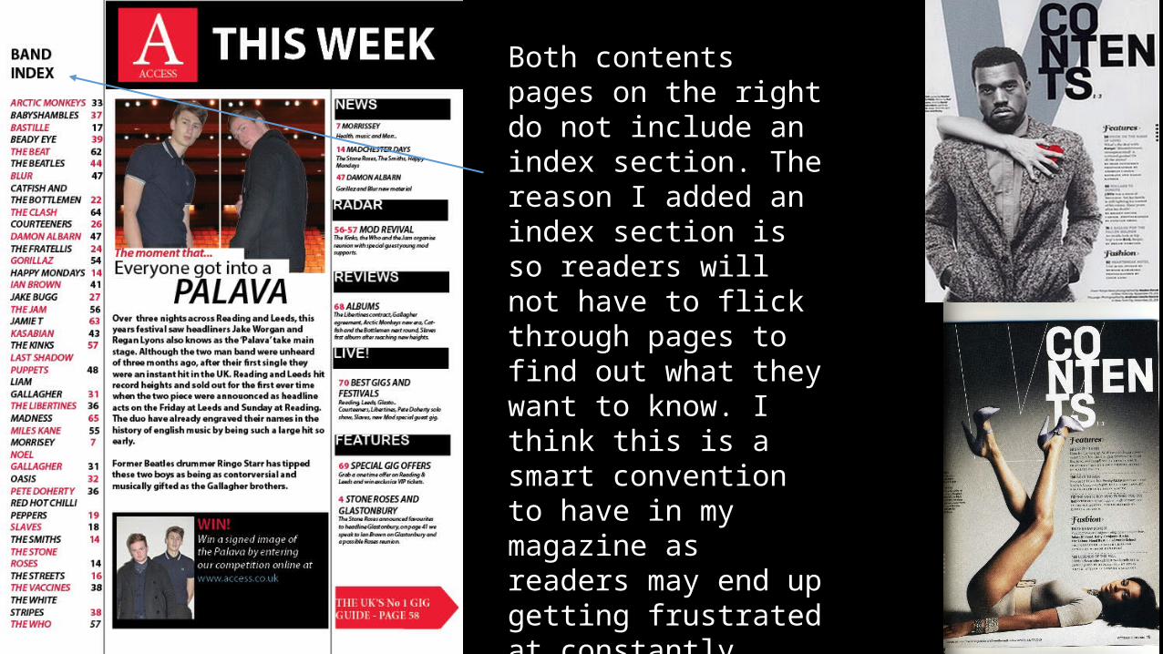
Both contents pages on the right do not include an index section. The reason I added an index section is so readers will not have to flick through pages to find out what they want to know. I think this is a smart convention to have in my magazine as readers may end up getting frustrated at constantly flicking through pages to find out information about their favourite artists.
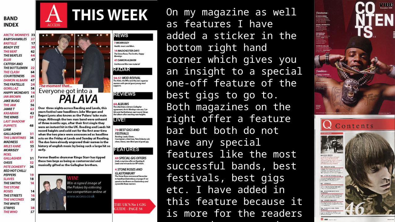
On my magazine as well as features I have added a sticker in the bottom right hand corner which gives you an insight to a special one-off feature of the best gigs to go to. Both magazines on the right offer a feature bar but both do not have any special features like the most successful bands, best festivals, best gigs etc. I have added in this feature because it is more for the readers eyes and as my reader is likely to be a person who goes to gigs they will be interested as to which are the best gigs to go to.
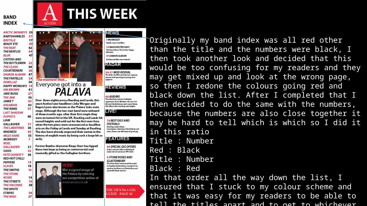
Originally my band index was all red other than the title and the numbers were black, I then took another look and decided that this would be too confusing for my readers and they may get mixed up and look at the wrong page, so then I redone the colours going red and black down the list. After I completed that I then decided to do the same with the numbers, because the numbers are also close together it may be hard to tell which is which so I did it in this ratioTitle : NumberRed : BlackTitle : NumberBlack : RedIn that order all the way down the list, I ensured that I stuck to my colour scheme and that it was easy for my readers to be able to tell the titles apart and to get to whichever page they wish as quickly as possible and finding that page number without any hassle.
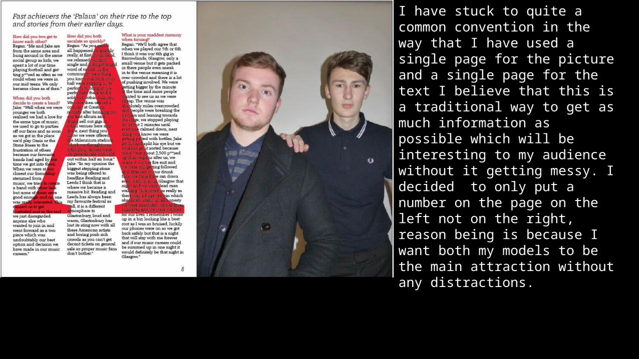
I have stuck to quite a common convention in the way that I have used a single page for the picture and a single page for the text I believe that this is a traditional way to get as much information as possible which will be interesting to my audience without it getting messy. I decided to only put a number on the page on the left not on the right, reason being is because I want both my models to be the main attraction without any distractions.
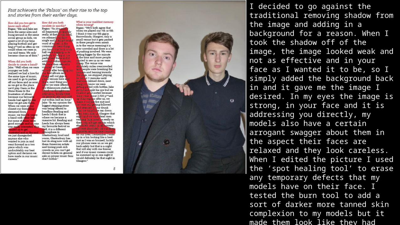
I decided to go against the traditional removing shadow from the image and adding in a background for a reason. When I took the shadow off of the image, the image looked weak and not as effective and in your face as I wanted it to be, so I simply added the background back in and it gave me the image I desired. In my eyes the image is strong, in your face and it is addressing you directly, my models also have a certain arrogant swagger about them in the aspect their faces are relaxed and they look careless. When I edited the picture I used the ‘spot healing tool’ to erase any temporary defects that my models have on their face. I tested the burn tool to add a sort of darker more tanned skin complexion to my models but it made them look like they had fake tanned and that is not a masculine thing to do. My main goal for this picture was to make my models look as bold and masculine as possible and with the silhouette of the shadow in the background I believe that this has been achieved.
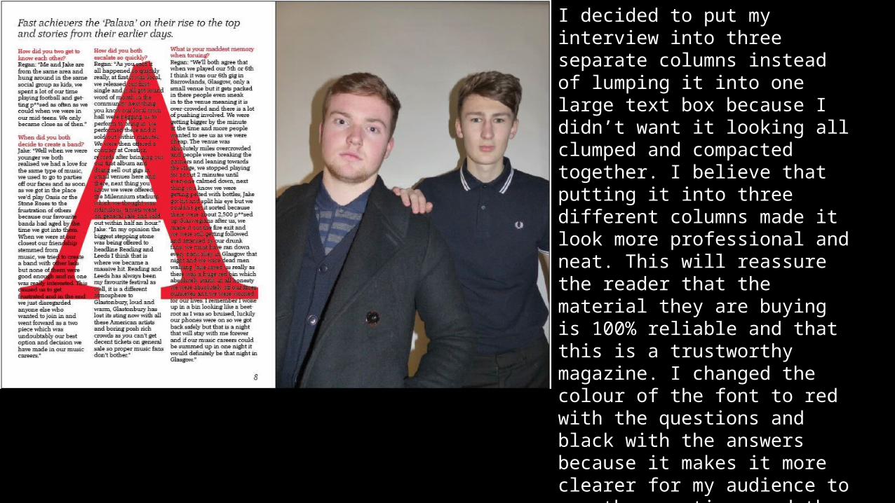
I decided to put my interview into three separate columns instead of lumping it into one large text box because I didn’t want it looking all clumped and compacted together. I believe that putting it into three different columns made it look more professional and neat. This will reassure the reader that the material they are buying is 100% reliable and that this is a trustworthy magazine. I changed the colour of the font to red with the questions and black with the answers because it makes it more clearer for my audience to see the questions and the answers and will give them a better understanding as to who said what.
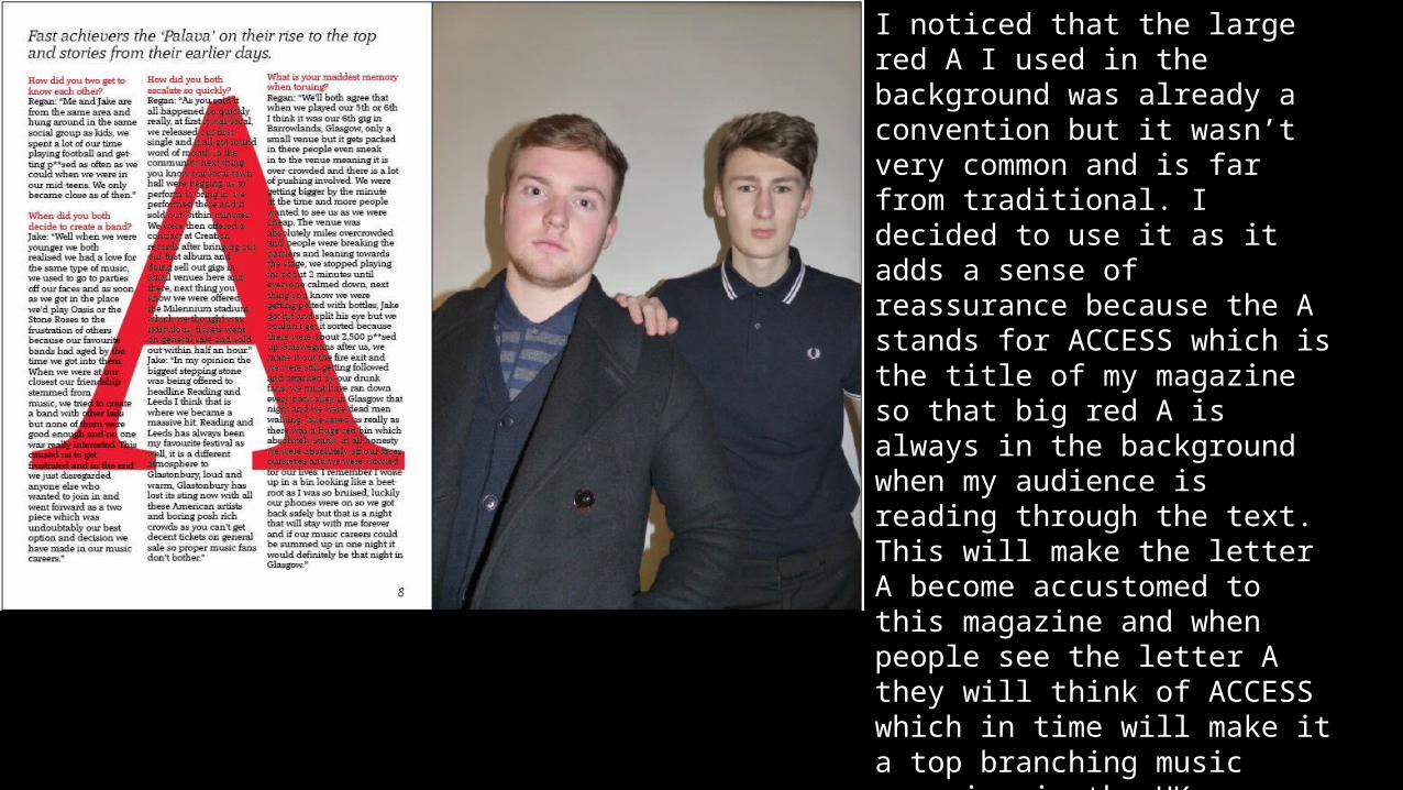
I noticed that the large red A I used in the background was already a convention but it wasn’t very common and is far from traditional. I decided to use it as it adds a sense of reassurance because the A stands for ACCESS which is the title of my magazine so that big red A is always in the background when my audience is reading through the text. This will make the letter A become accustomed to this magazine and when people see the letter A they will think of ACCESS which in time will make it a top branching music magazine in the UK.
Q5 What kind of media institution might distribute your media product and why?
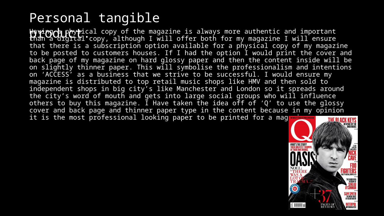
Having a physical copy of the magazine is always more authentic and important than a digital copy, although I will offer both for my magazine I will ensure that there is a subscription option available for a physical copy of my magazine to be posted to customers houses. If I had the option I would print the cover and back page of my magazine on hard glossy paper and then the content inside will be on slightly thinner paper. This will symbolise the professionalism and intentions on ‘ACCESS’ as a business that we strive to be successful. I would ensure my magazine is distributed to top retail music shops like HMV and then sold to independent shops in big city’s like Manchester and London so it spreads around the city’s word of mouth and gets into large social groups who will influence others to buy this magazine. I Have taken the idea off of ‘Q’ to use the glossy cover and back page and thinner paper type in the content because in my opinion it is the most professional looking paper to be printed for a magazine.
Personal tangible product.
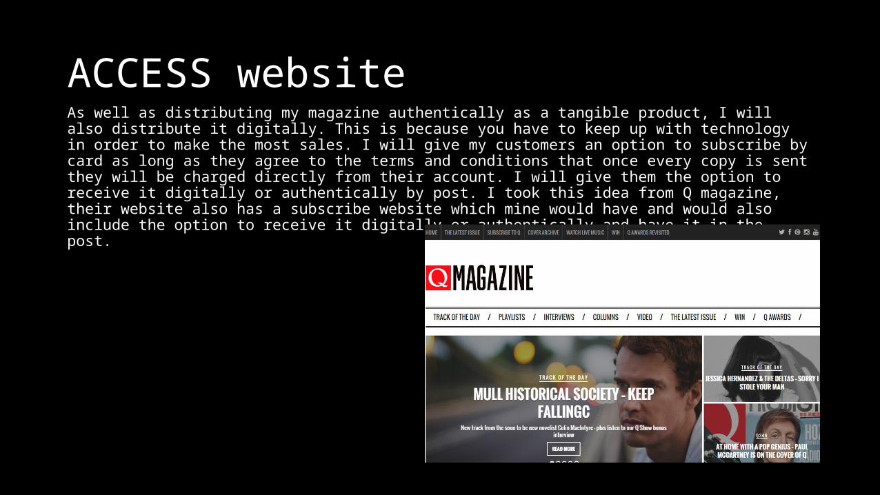
ACCESS websiteAs well as distributing my magazine authentically as a tangible product, I will also distribute it digitally. This is because you have to keep up with technology in order to make the most sales. I will give my customers an option to subscribe by card as long as they agree to the terms and conditions that once every copy is sent they will be charged directly from their account. I will give them the option to receive it digitally or authentically by post. I took this idea from Q magazine, their website also has a subscribe website which mine would have and would also include the option to receive it digitally or authentically and have it in the post.
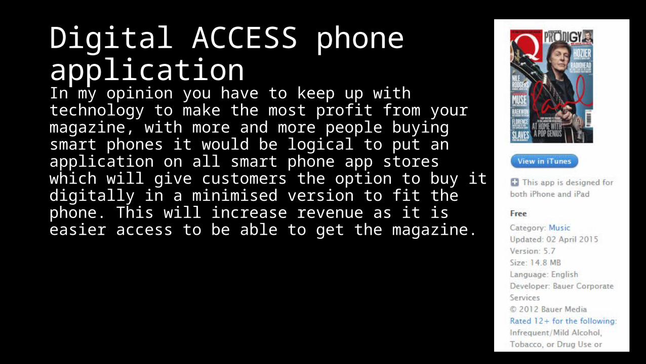
Digital ACCESS phone applicationIn my opinion you have to keep up with technology to make the most profit from your magazine, with more and more people buying smart phones it would be logical to put an application on all smart phone app stores which will give customers the option to buy it digitally in a minimised version to fit the phone. This will increase revenue as it is easier access to be able to get the magazine.
Social media
Using social media by setting up a verified Twitter and Instagram account for the magazine would boost the sales of magazines because the word is getting round to more people through the internet who will hopefully be interested in the magazine.
Q6 What have you learnt about technologies from the process of constructing this product?
Photoshop
I attempted with InDesign to edit my pictures but that was out of naivety as I soon figured it was too difficult using a software that isn’t created for editing pictures so I then used Photoshop to edit my pictures. Using this I quickly learnt to remove backgrounds and get rid of any unwanted temporary marks on the faces of my models.
InDesignI used InDesign to make all the pages of my magazine because it made my magazine look professional with all different font styles and text attributes, I could easily place edited pictures into my document at a high quality and get them to fit the size of my magazine. It also helped my colour scheme very specifically by giving you exact figures on the CMYK colour option which you could retype and put on your font.
Q7 Looking back at your preliminary task, what do you feel you have learnt in the progression from it to the full product?
My preliminary task is miles behind my finished product, this time around I took more time on the name and title of my magazine, I even changed it a few times, I used the most effective compact logo, I took more time and was more careful when taking my pictures in case of any reflection, I ensured my title wasn’t as long as my preliminary tasks title and I also spent more time on the colour scheme, font choice and consistency of the front cover of my magazine.
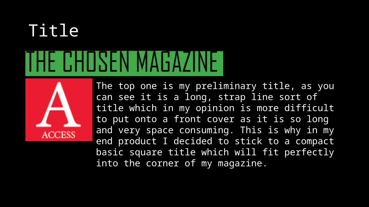
Title
The top one is my preliminary title, as you can see it is a long, strap line sort of title which in my opinion is more difficult to put onto a front cover as it is so long and very space consuming. This is why in my end product I decided to stick to a compact basic square title which will fit perfectly into the corner of my magazine.
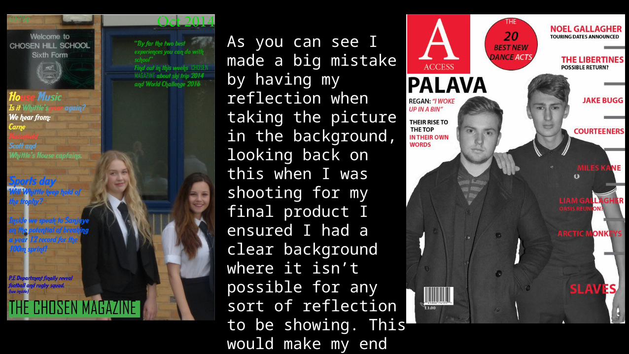
As you can see I made a big mistake by having my reflection when taking the picture in the background, looking back on this when I was shooting for my final product I ensured I had a clear background where it isn’t possible for any sort of reflection to be showing. This would make my end product look massively unprofessional if I did have another reflection in the background.
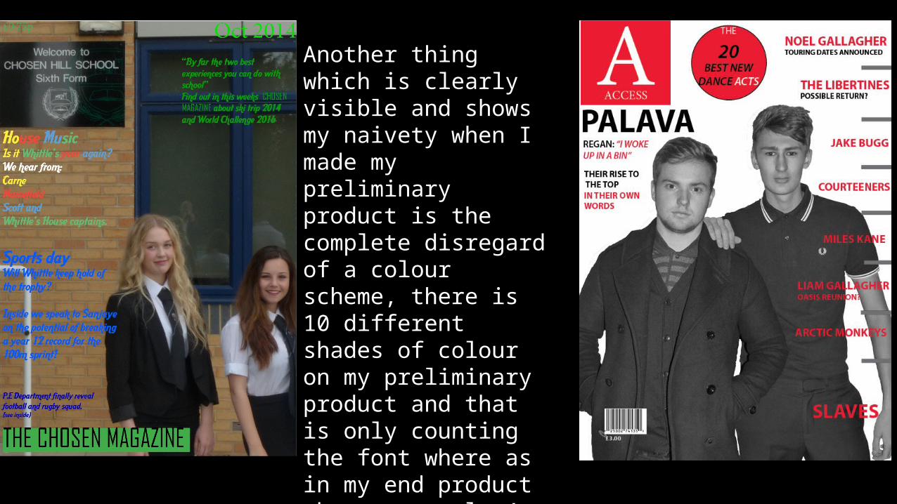
Another thing which is clearly visible and shows my naivety when I made my preliminary product is the complete disregard of a colour scheme, there is 10 different shades of colour on my preliminary product and that is only counting the font where as in my end product there are only 4 different shades of colour. I chose a strict colour scheme as it looks far more professional as you can tell.
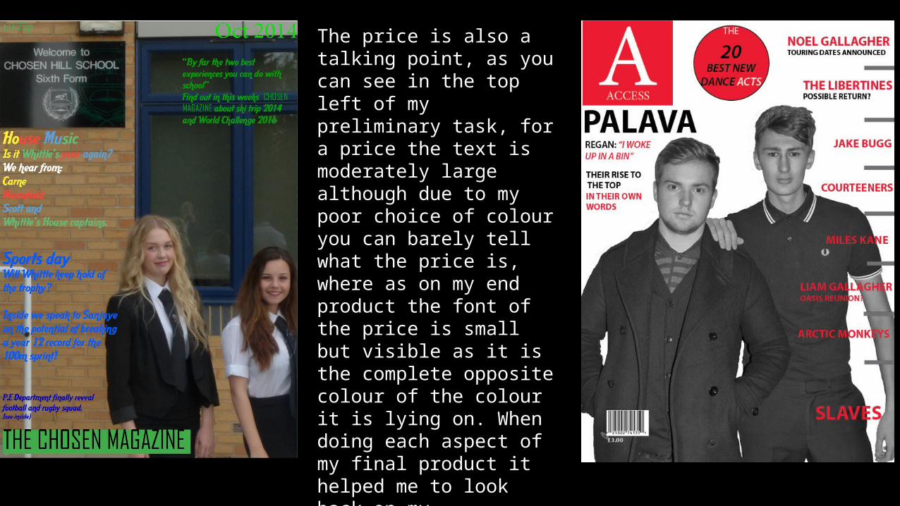
The price is also a talking point, as you can see in the top left of my preliminary task, for a price the text is moderately large although due to my poor choice of colour you can barely tell what the price is, where as on my end product the font of the price is small but visible as it is the complete opposite colour of the colour it is lying on. When doing each aspect of my final product it helped me to look back on my preliminary product and decide the best options for my end product and how I could do it differently.
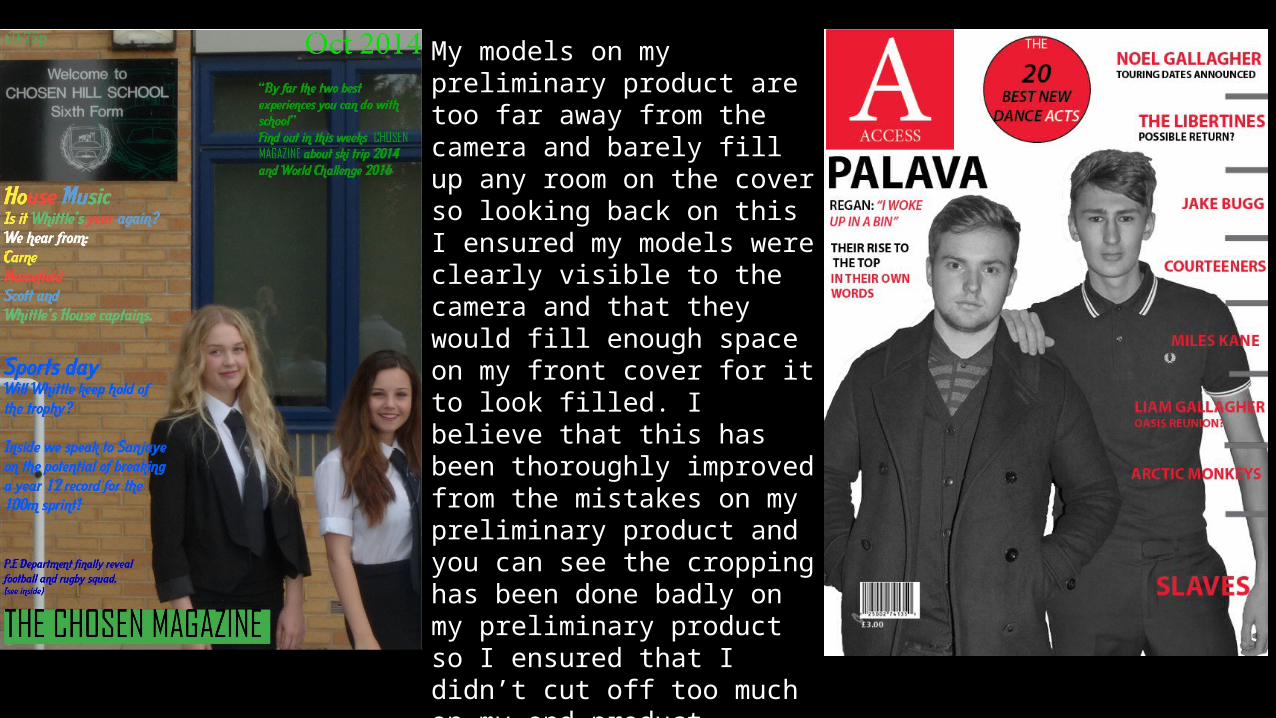
My models on my preliminary product are too far away from the camera and barely fill up any room on the cover so looking back on this I ensured my models were clearly visible to the camera and that they would fill enough space on my front cover for it to look filled. I believe that this has been thoroughly improved from the mistakes on my preliminary product and you can see the cropping has been done badly on my preliminary product so I ensured that I didn’t cut off too much on my end product.
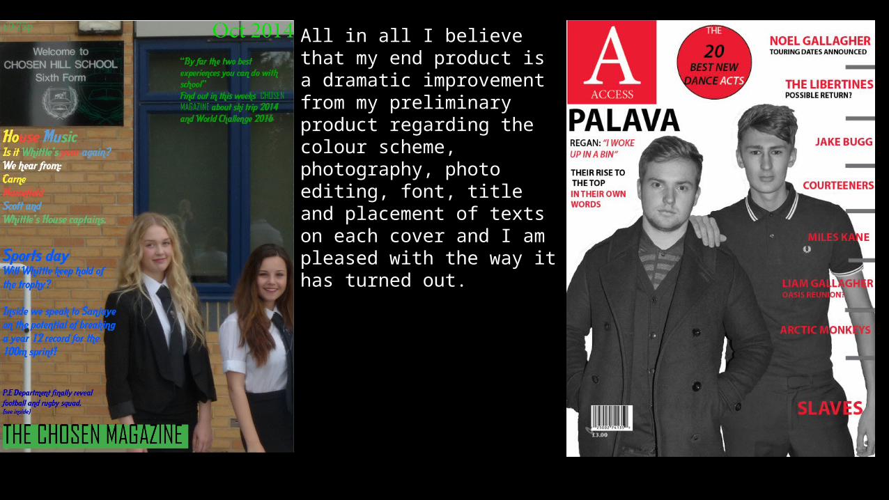
All in all I believe that my end product is a dramatic improvement from my preliminary product regarding the colour scheme, photography, photo editing, font, title and placement of texts on each cover and I am pleased with the way it has turned out.