![1 General Principles of Drafting & Relevant Substantive Rules · [Chapter 1] General Principles of Drafting &... O 8.3 3. Drafting v/s Conveyancing Drafting Conveyancing Preparation](https://static.fdocuments.in/doc/165x107/5fc0b1a36d087d0ac8539e2c/1-general-principles-of-drafting-relevant-substantive-rules-chapter-1-general.jpg)
Magazine drafting
4
James Murray MAGAZINE DRAFTING
-
Upload
jamesmurray11 -
Category
Documents
-
view
185 -
download
1
Transcript of Magazine drafting

James Murray
MAGAZINE DRAFTING
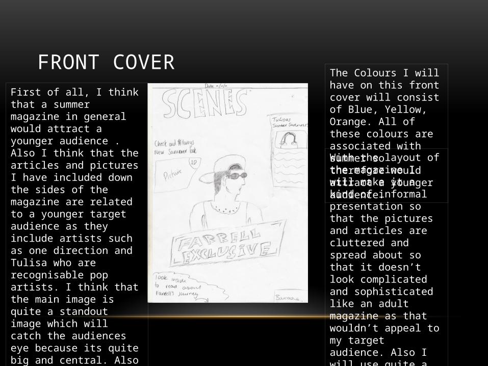
FRONT COVERFirst of all, I think that a summer magazine in general would attract a younger audience . Also I think that the articles and pictures I have included down the sides of the magazine are related to a younger target audience as they include artists such as one direction and Tulisa who are recognisable pop artists. I think that the main image is quite a standout image which will catch the audiences eye because its quite big and central. Also I think the layout of the magazine is quite simple and would appeal to the audience.
The Colours I will have on this front cover will consist of Blue, Yellow, Orange. All of these colours are associated with summer so therefore would attract a younger audience.
With the layout of the magazine I will make it a kind of informal presentation so that the pictures and articles are cluttered and spread about so that it doesn’t look complicated and sophisticated like an adult magazine as that wouldn’t appeal to my target audience. Also I will use quite a qwerky and funky font so that it appeals to the younger audience.
CONTENTS PAGE
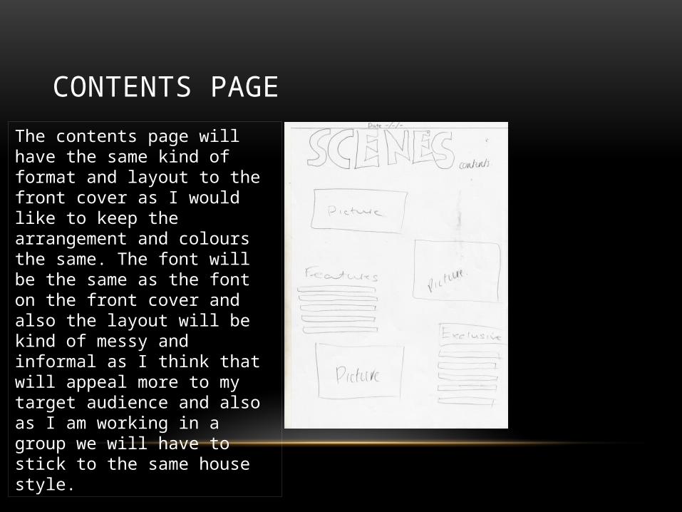
The contents page will have the same kind of format and layout to the front cover as I would like to keep the arrangement and colours the same. The font will be the same as the font on the front cover and also the layout will be kind of messy and informal as I think that will appeal more to my target audience and also as I am working in a group we will have to stick to the same house style.
DOUBLE PAGE SPREAD
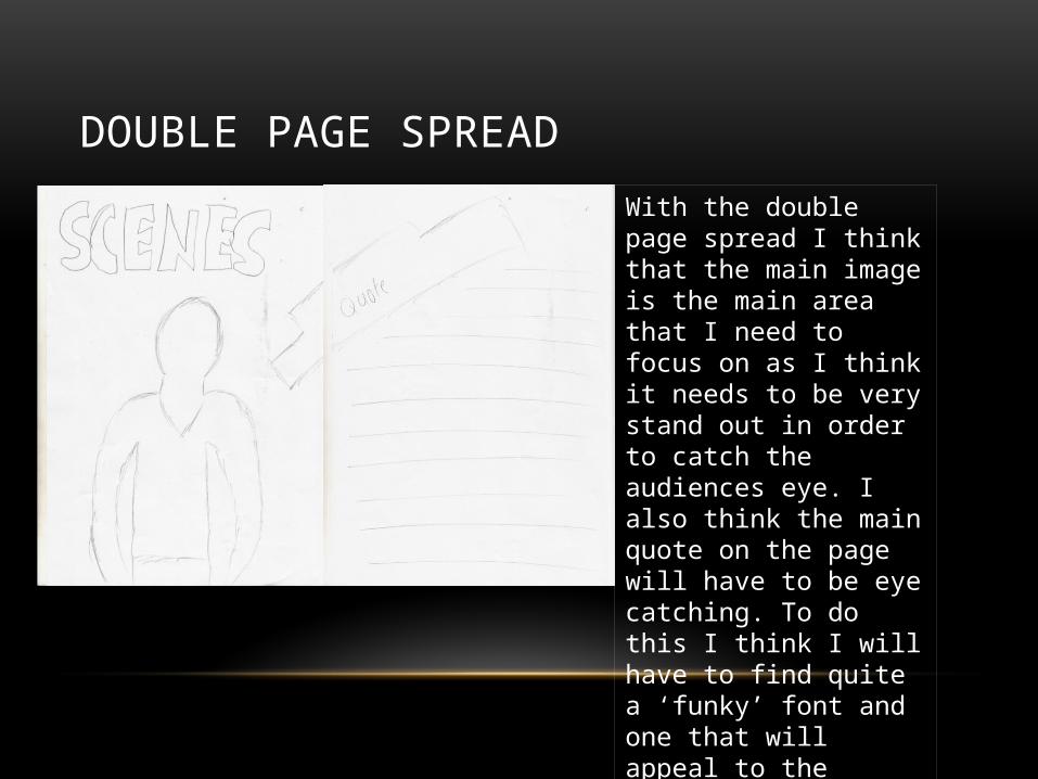
With the double page spread I think that the main image is the main area that I need to focus on as I think it needs to be very stand out in order to catch the audiences eye. I also think the main quote on the page will have to be eye catching. To do this I think I will have to find quite a ‘funky’ font and one that will appeal to the target audience.