Magazine Double Page Spread Research
13
Magazine DPS By Lynley Sykes
-
Upload
lynley-sykes -
Category
Data & Analytics
-
view
33 -
download
0
Transcript of Magazine Double Page Spread Research
Magazine DPSBy Lynley Sykes

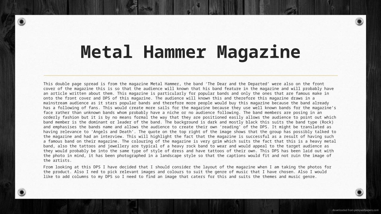
Metal Hammer Magazine
This double page spread is from the magazine Metal Hammer, the band ‘The Dear and the Departed’ were also on the front cover of the magazine this is so that the audience will known that his band feature in the magazine and will probably have an article written about them. This magazine is particularly for popular bands and only the ones that are famous make in onto the front cover and DPS of this magazine. The audience will known this and therefore this magazine draws in a mainstream audience as it stars popular bands and therefore more people would buy this magazine because the band already has a following of fans. This would create more sails for the magazine because they use well known bands for the magazine’s face rather than unknown bands whom probably have a niche or no audience following. The band members are posing in an orderly fashion but it is by no means formal the way that they are positioned easily allows the audience to point out which band member is the dominant or leader of the band. The background is dark and mostly black this suits the band type (Rock) and emphasises the bands name and allows the audience to create their own ‘reading’ of the DPS. It might be translated as having relevance to ‘Angels and Death’. The quote on the top right of the image shows that the group has possibly talked to the magazine and had an interview. This will highlight the fact that the magazine is successful as a result of having such a famous band on their magazine. The colouring of the magazine is very grim which suits the fact that this is a heavy metal band, also the tattoos and jewellery are typical of a heavy rock band to wear and would appeal to the target audience as they would probably be into the same type of style of dress and have tattoos of their own. This DPS has been laid out with the photo in mind, it has been photographed in a landscape style so that the captions would fit and not ruin the image of the artists.
From looking at this DPS I have decided that I should consider the layout of the magazine when I am taking the photos for the product. Also I ned to pick relevant images and colours to suit the genre of music that I have chosen. Also I would like to add columns to my DPS so I need to find an image that caters for this and suits the themes and music genre.

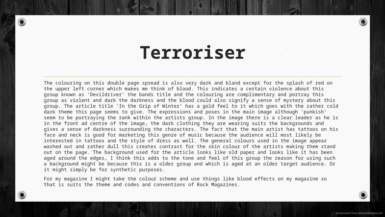
Terroriser
The colouring on this double page spread is also very dark and bland except for the splash of red on the upper left corner which makes me think of blood. This indicates a certain violence about this group known as ‘Devildriver’ the bands title and the colouring are complimentary and portray this group as violent and dark the darkness and the blood could also signify a sense of mystery about this group. The article title ‘In the Grip of Winter’ has a gold feel to it which goes with the rather cold dark theme this page seems to give. The expressions and poses in the main image although ‘punkish’ seem to be portraying the rank within the artists group. In the image there is a clear leader as he is in the front ad centre of the image, the dark clothing they are wearing suits the backgrounds and gives a sense of darkness surrounding the characters. The fact that the main artist has tattoos on his face and neck is good for marketing this genre of music because the audience will most likely be interested in tattoos and the style of dress as well. The general colours used in the image appear washed out and rather dull this creates contrast for the skin colour of the artists making them stand out on the page. The background used for the article looks like old paper and looks like it has been aged around the edges, I think this adds to the tone and feel of this group the reason for using such a background might be because this is a older group and which is aged at an older target audience. Or it might simply be for synthetic purposes.
For my magazine I might take the colour scheme and use things like blood effects on my magazine so that is suits the theme and codes and conventions of Rock Magazines.


Kerrang DPS
This double page spread is a good example of the type of music Kerrang mainly advertises, namely rock music. The picture in particular draws in the audience, the masked men give the page a sense of mysteriousness and the axes on the other two men’s neck gives the page a sense of fear and violence. The facial expressions however (That which you can actually see) tell a different story they appear to be trying to fit into the socially accepted stereotype that is associated with rock music, this tends to be defiance, rebellion and violence in general this is a common theme associated with rock bands. This idea of rebellion and defiance is supported by the American flag with a ‘STOP’ sign painted over it , this helps add to the idea that they don’t care about what people think it also gives the impression that they what the public thinks will not stop them doing what they want. This relates to the target audience as the producers and artists think this is how their target audience feels or have similar ideologies. By using a band that that is easily recognised they draw in an audience through synthetic personalisation. This means that the magazine makes people feel like the magazine knows how they feel and makes them feel good through reading the contents and this rises sales of the magazine. The font is in the same style and colour as the image this creates synergy through the page. The subheadings are in a different colour which allows the reader to easily skim through the contents and see if it is something they would like t read. The title draws the attention of the audience as they mention a band that is globally recognised and liked by many people who listen to this particular genre of music. Also by saying that this group are the ‘anti-My Chemical Romance’ might intrigue the audience into reading the article and in the long run purchasing the magazine.
For my double page spread I will try to make an interesting catchphrase so that the article stands out this will make my magazine more appealing and eye catching to the audience. I should also try to use stereotypes for rock magazines in my magazine as this will make the genre more apparent to the audience and will hopefully synthetic personalisation will apply to my magazine and make it more popular toward my target audience.


Kerrang Double Page Spread
This article features Fall Out Boy this is a rock band and the article appears to be about their future as the quote states. The main image this is a long shot photograph this covers over half of the double page. The placement of the artists is very important in the configuration if the image as it points out to the audience which of the band members is the leader or most important . Also all the members appear to be wearing different styles of clothing this is important and portrays some information about they type of person they are. For example the one with long hair a T-shirt , and tattoos could tell me that this person might have a stereotypical rock personality this might mean that he agrees with the idea of anarchy and nonconformity of rules. Also all the members with one exception are wearing clothing that suites the chosen colour theme of black, blue and white this shows a sense of synergy throughout the page. The fact that one member is not wearing these colours might be to portray him as being different almost the black sheep of the flock. This might fit in with the idea of nonconformity that is a common ideology among rock bands. The main title is ‘We Don’t Know the Future of Fall Out Boy!’ the colours used are black and blue this is a good mix as the blue might represent the clod nature of a rock and and black is a stereotypical colour often associated with rock bands. The fact that the title uses capitals on all the words might be to draw in the audiences eye and to point out what the article is about this is good because the audience can easily skim through the pages and find out if the article is something that they would be interested in reading. The background is a plain white this is for contrasts sake and makes the text and image stand out on the page easily this might attract a readers eye more efficiently and therefore cause more sales for this magazine in particular. The target audience is equally male and female the neutral colours like white and black are suitable to appeal to both genders and thus maximising the popularity of this article and magazine. The top right corner are small letters saying the bands names, underneath this threes words from the bands latest song.


Rock Sound Double Page Spread
The feature band for this magazine is Green Day which is a punk, rock band. The main image takes up about two thirds of the page and dominates the DPS. The background in the main image is green this is an ironic colour as the band name is ‘Green Day’ this is mean to emphasise and support the band giving the audience more clues (Other than the huge title) that this band is Green Day. Also the colour and the bands name creates synergy throughout the pages, this particular green is a similar shade to the lead artists eyes this also makes the pages look like is has been though about and the colours used thought about before the p[age was put together. Basically the page was made to suit the image not the other way around. Also the configuration of the band members once again shows the important person in the middle highlighting to the audience that this person is the leader of the group. The smaller image on the right hand page though black ad white shows the leader it is a dark image and gives a sense of mystery and the image has buts that are blacked out ad hidden from view. There is a small quote on the left page about politics which relates to the album it is obviously the lead singers opinion on the matter of politics, this makes the article seem more personal and gives the magazine a serious feel to it. This colour of this quote have been co-ordinated with the bands logo (The grenade and the heart) the red from the logo is splashed around the page which creates synergy and makes I look like the page has been thoughtfully laid out. The bands title (Green Day) are also green which suits the name of the band, the background, and the leaders eye colour. In general this magazine has been well thought out and has a lot of synergy throughout the pages when creating my magazine I will be aware that I should create synergy on the pages to make it appear professional to the audience.
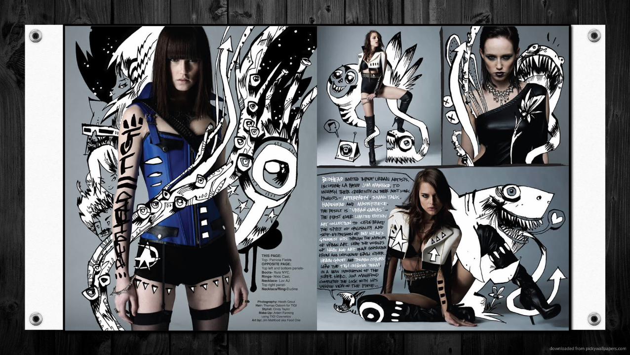

DPS Creative Ideas
One thing I like about this double page spread is the graphics used. I think it is cleaver and an effective way to make a simple photograph into something interesting and eye catching. May use this idea for my double page spread or contents page. The contrast of the white and the dark or bright colours used in the photography I think is a good idea and a definite option for the magazine pages will be producing in the future.