Magazine analysis
36
OCR Media Studies – AS Level Unit G321: Foundation Portfolio in Media Log Book Name: Yunus Kasim Candidate Number: 6570 Center Name: St. Paul’s Catholic College Center Number: 64770 Set Brief - Print Music Magazine – Production Preliminary Task, Log Book and Evaluation
Transcript of Magazine analysis
OCR Media Studies – AS Level
Unit G321: Foundation Portfolio in
Media
Log Book
Name: Yunus Kasim
Candidate Number: 6570
Center Name: St. Paul’s Catholic
College
Center Number: 64770
Set Brief - Print
Music Magazine – Production
Preliminary Task, Log Book and
Evaluation

Preliminary Task- Evidence
Front Cover

Step 1 Step 2 Step 3
Front Cover Step-by-step
To begin with, I covered my
background into a plain and stark
colour. Once this was done I added
the colour blue and maroon at the
top of the page, this allowed me to
have a suitable colour scheme
throughout. Moreover, the
guidelines allowed me to keep the
front page organised and in place.
Then I added my masthead
‘SwizzStar’ on top of my blue and
maroon layers, the colours worked
really well amongst each other. Also,
I added the St Paul’s logo besides
my masthead. Once I completed this
task I decided to include a
convergent (my website), and the
blue guidelines allowed me to put the
website and masthead in order.
Furthermore, I added a cover line
to ensure the reader understands
the main purpose of the school
magazine. Plus the cover line
reflects on the genre of the
magazine and what its going to be
about throughout. I have also
included appealing language such
as “exclusive”.

Step 5Step 4 Step 6
Within this stage I added more
conventions such as a barcode,
number of the magazine as well as
social networks that are known as
convergence. I decided to keep the
same colourway within both my
cover lines and social networking
link.
At this point I added two more conventions:
cover line and a strap line. The cover line
‘steps to…St Pauls’ was in more depth
compared to other cover lines as it gave more
information of what is needed to succeed in
school. I also decided to deviate from the
colour scheme of this convention into blue and
black, rather than the colour pink.
Finally, I added my main image of my
friend with two As level books. I had to
make sure he looked directly at the
camera, so it made the front cover have
a sense of realism. I added the price of
the magazine but made it a small, so that
the audience concentrate more on the
magazine itself, rather than the price.

Preliminary Task- Evidence
Contents Page

Contents Page step-by-step
With my contents page I started of
with a brownish peach colour, of
which will link with the background
colour of my front page. I have
added guidelines to initially help me
with the layout of my contents page.
Once I completed step 2 I added a
strapline ‘Welcome To St Pauls’
underneath ‘contents’. Likewise, I
went straight into creating a puff
(competition) to attract the audience.
Next, I added the colours of blue and
maroon at the top of the page, to
keep the continuation of my colour
scheme. Furthermore, I added the
contents in front of the blue and
maroon layout in a central position.
Step 1 Step 3Step 2
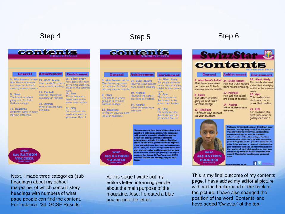
Next, I made three categories (sub
headings) about my school
magazine, of which contain story
headings with numbers of what
page people can find the content.
For instance, ‘24. GCSE Results’.
At this stage I wrote out my
editors letter, informing people
about the main purpose of the
magazine. Also, I created a blue
box around the letter.
Step 5Step 4
This is my final outcome of my contents
page, I have added my editorial picture
with a blue background at the back of
the picture. I have also changed the
position of the word ‘Contents’ and
have added ‘Swizstar’ at the top.
Step 6

LOG BOOK

Music Magazine-Genre Research
The chosen sub genre I have chosen for my music magazine is R&B. This is mostly
targeted at ages 16-19.Rap magazines are stereotypically listened to the male gender
rather than females. The reason for this is because R&B mostly include words that are
vicious and inappropriate as well as themes that are disturbing for females to listen to.
Within the 21st century people now understand the contrast between male and female
music. Males usually listen to rap music, whereas females listen to pop. Hence why I
have decided to pick rap music as young men in the modern society mostly enjoy
listening to rap music and feel attached to artists such as Eminem and Kanye West.
However, rap music does withhold negative factors as well as influences towards the
younger population, for example American statistics illustrate that “ 47% of mothers with
children in public schools believe… music contribute to school violence”. This therefore
shows that artists such as Eminem have contributed to many bad things within rap such
as: drugs, sex and alcohol. This initially make young people believe that imitating the
actions of the artists is right. Therefore, my music magazine looks to change this view
for young men and give rap music a more positive vibe.

Why Vibe Magazine?I have researched Vibe magazine because they are a very successful, established and dominant magazine. These factors will allow me to structure my magazine appropriately and understand how to represent my conventions throughout, for example my double page spread. I personally believe that Vibe magazine include two of the most dominant genres of this century: Hip-Hop and R&B. “The new Vibe is the premier destination for urban music, entertainment, culture and lifestyle for the aspirational 18-34 year old.” This quote illustrates how far ‘VIBE’ have come to reach the top, and also how they are determined to do whatever it takes to become the best magazine of all time. The magazine features well known stars such as Eminem and Rihanna.
The star appeal demonstrates “The idea that icons and celebrities constructed by institutions for financial gain and target one specific audience.” This connotes that by the use of these musical idols the magazine gain more consumers. Therefore by focusing on these aspects it will will allow me to find out about both genres and decide which one will suit my own magazine.
As a whole, I personally believe Vibe magazine have the right conventions to guide me to create the most: unique, amazing as well as eye catching music magazine. This therefore is the main reason why I’ve decided to pick this music magazine.

In April 2013 Vibe magazine
was bought by SpinMedia.
It is a digital publisher in
the US that owns Vibe.
Steve Hansen
became chief
executive.
“After shutting down
the print version of
the magazine,
reducing its staff to
about 200, and
focusing on
advertising, it
rebranded itself as
SpinMedia in March
2013.”
Publisher Research-VIBE
Magazine
Spinmedia is
known as being
“the worlds
largest collective
of pop culture
and music digital
brands…”
“Vibe.com becomes
Spinmedia’s 46th consumer
title.”
“SPIN has grown 131% since
joining SpinMedia in July
2012.”

The firm was founded
in 2005 by an investor
known as Leo
Hindery.
Vibe magazine was
published by
Intermedia Vibe
Holdings who bought
BlackBook in 2012 Webstie:
http://www.intermediaadvisor
s.com/
‘InterMedia Partners, LP is a private equity
investment fund focusing on the
media industry across all platforms - television,
radio, publishing, internet
and marketing. The current fund, InterMedia
Partners VII, LP is focused on content assets
which target underserved markets.’
‘InterMedia Partners, in
partnership with its portfolio
company Uptown Media
Group along with Blackrock
Digital purchased the assets
of Vibe and Vibe.com, the
preeminent brands for hip-hop &
R&B lifestyle and
culture.’

Publisher Page
www.vibe.com
Intermedia advisors
Vibe is a music as well as an entertainment magazine of which was founded by producer Quincy Jones. The publication mostly features R&B and hip-hop music artists, actors and other entertainers within the industry.
However, the production was shut down in 2009. Vibe was then purchased by the private equity investment fund InterMedia Partners and is now issued every-other month with double covers, with a larger online presence. The magazine's target audience is predominantly young, urban followers of hip-hop culture. In 2014, the magazine moved online-only.
Vibe‘s influence and impact on the worlds of hip-hop and R&B has been both immense and enduring.

Vibe Magazine
Analysis

Main Image-
Usually denotes
some ‘star
appeal’. Katz
theory
Cover lines
(Secondary
stories)
Convergence-
Web address
Star appeal- To attract
people who aspire to be
like Jay-Z.
Strapline- This Vibe
magazine does not
include a strapline,
because it’s a
common magazine
that appeals to many
people, and therefore
does not necessarily
need the extra feature
to increase the
audience population.
Masthead-Katz theory-
the masthead is
stretched out to cover
the front page and keep
the audiences attention
of what the magazine is

Front Cover Analysis
The masthead
has a gradient
going from the
colour black to
red, also the
distinct font keep
the audience
active whilst
looking at the
front page in
general.
ConvergenceMain
image
The main
cover line is
parallel to the
main image. It
talks about
how “Eminem
comes clean”
This quote
therefore
reflects the
main image.
Vibe magazine is
primarily focused
on Rap and R&B.
Cover line used
here, is a
rhetorical
question, that get
the audience to
understand how
Eminem is the
best rapper.
Convergence-
To give the
audience
access to more
content.

Contents Page Analysis
Main image-
Kanye West is a
well known music
artist (star
appeal). The use
of a celebrity
increases the
popularity of the
R&B magazine.
The colour grey is
parallel to the
serious facial
expression he has
within the main
image.
The layout of
‘contents’ is
unique and it
differentiates
from other
music
magazines.
Different
categories
allow the
audience to
find out more
about what’s
included within
the magazine.

Double Page Spread AnalysisThe heading ‘when
Mars Attacks’ is
located at the top left
corner. It includes two
dark colours: dark
green as well as black.
Also its written in big
bold writing so it
attracts the target
audience.
The main image illustrated
on the double page spread is
unique as it gives the
audience another aspect to
look at, rather than just
looking at texts.
The double
page
spread has
an
interview, to
keep the
audience
entertained
as well as
aware of
what Bruno
Mars has
been up to.
The background of
the image on the
left has a well
edited gradient of
the colour green,
white, blue and
black. This lighting
effect integrates
really well with
Bruno’s dark
brown suit.
Front Cover Analysis(Vibe
magazine)
To begin with, I personally believe that the front page of this magazine is
very powerful when it comes to representing rap as a music industry.
Within the magazine it contains a range of conventions such as
convergence, and also it has a very consistent colour scheme
throughout the magazine that denotes how it attracts the male gender
(Hartley). On the other hand there are conventions within the front page
that are missing, but I will make sure that I include all these missing
aspects within my own music magazine. For instance, the issue does
not include the bar code and price. This can be a major issue as the
price allows the audience to buy the magazine straight away.

Genre ResearchVibe Magazine
Vibe is a music as well as an entertainment
magazine that was originally founded and
produced by Quincy Jones. The publication
features R&B and hip-hop music. Although,
Vibe was later purchased by InterMedia
Partners and had a large online presence. The
main audience within ‘Vibe’ are mostly young
adults, as they are fans of R&B and hip-hop.
The magazine itself include many aspects such
as: gossip column, new artists plus designer
clothes (Versace), these aspects keep the
audience satisfied and wanting to read more.
Moreover, ‘Vibe’ magazine tend to distribute
their magazine every two months. Whilst music
magazines such as ‘Q’ distribute an issue
every month. Furthermore, ‘Vibe’ have a wide
range of audience (international readership)
because the magazine is available in many
countries around the world. Vibes circulation
recent statistics illustrate that in 2007 it was
approximately 800,000, however decreased by
2011 to about 301,408.
Target Audience and USP pageThe target audience of Vibe magazine can be denoted as males aged 15-19, of which was established through the publish research that I have completed. This is mainly because young adults are interested in the music this magazine covers as well as the famous hip hop stars such as Jay-Z. This type of music is generally listened to by young adults. Hence, why they are the target audience. Katz use of gratification would strongly suggest that this magazine educates the reader about their preferred star through the front cover of the magazine. Furthermore they would be able to build up their relationship with the star, because they can relate to the interviews and background stories of the idol they enjoy to read about and thus aspire to be just like them.
Moreover the Maslow’s hierarchy of needs would state that young people are ‘social climbers’, who read magazines to improve their status by copying the image of an artist. For instance, if someone is a fan of Jay-z, they would buy the magazine just to be like him.
From the research completed into this media product and established music magazine publication, I personally believe the USP is the use of imagery and the obvious and attached ‘Star Appeal’(T.I.) on the front cover. This is because some of the most famous artists are featured in this magazine. The magazine also have competitions to get the reader excited about possibly winning a ticket to see their favorite star.

Other music magazines
I decided to include different
music magazines, before I
decided on a final genre for my
own magazine.

Genre: Popular Music and Rock
Celebrity
endorsement-
Eddie Murphy
is a well
known actor.
Main Image- Usually
denotes some ‘star
appeal’. Katz theory
Masthead
Cover lines
Founded in San
Francisco in
1967
Total
circulation
(2012):
1,464,943
One major
criticism of Rolling
Stone involves its
generational bias
towards the 1960s
and 1970s.
Colour scheme:
Red, Black and
White
‘In the 1990s, the
magazine changed
its format to appeal
to a younger
readership
interested in youth-
oriented television
shows, film actors,
and popular music’.
Main Image-
Usually denotes
some ‘star appeal’.
Katz theory
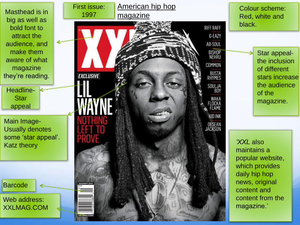
Masthead is in
big as well as
bold font to
attract the
audience, and
make them
aware of what
magazine
they’re reading.
First issue:
1997
American hip hop
magazine
Barcode
Star appeal-
the inclusion
of different
stars increase
the audience
of the
magazine.
‘XXL also
maintains a
popular website,
which provides
daily hip hop
news, original
content and
content from the
magazine.’Web address:
XXLMAG.COM
Colour scheme:
Red, white and
black.
Headline-
Star
appeal
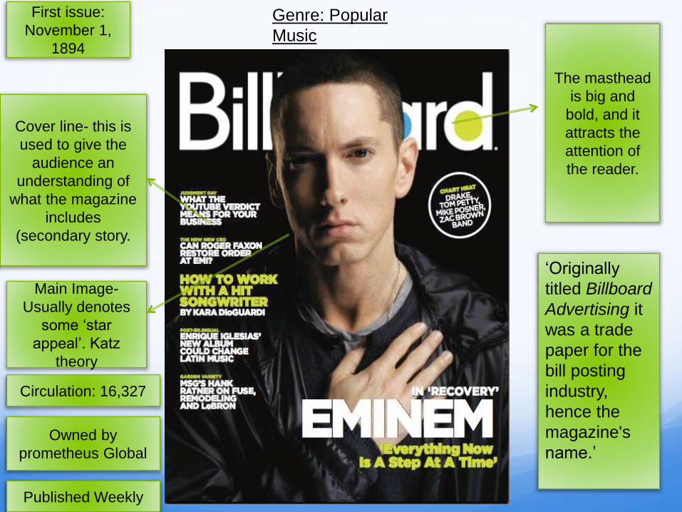
Genre: Popular
Music
Published Weekly
Owned by
prometheus Global
Circulation: 16,327
First issue:
November 1,
1894
Main Image-
Usually denotes
some ‘star
appeal’. Katz
theory
The masthead
is big and
bold, and it
attracts the
attention of
the reader.
‘Originally
titled Billboard
Advertising it
was a trade
paper for the
bill posting
industry,
hence the
magazine's
name.’
Cover line- this is
used to give the
audience an
understanding of
what the magazine
includes
(secondary story.

Questionnaire for my music
magazine

What is your gender?
Male
Female
1.)
16/20-Males4/20-Females
For my questionnaire, I
used stratified sampling
to pick the amount of
females (4/20) and
males (16/20) I wanted
to include. I did this as I
wanted my music
magazine to appeal to
more males rather than
females, hence why I
made sure the amount
was uneven. Also, as
my target audience
were young men, it was
essential that there are
more males (Hartley’s
theory).

How old are you?
15-18
19-22
23-24
25 or over
2.)
6/20-15 to 18
3/20-23 to 24
11/20-19 to 22
To begin with, from my pie
chart it illustrates that the
majority of people were
between the ages of 19-22
as well as 15-18. This was
beneficial as my age
(Hartley) target audience are
from the two groups and
therefore it will allow me to
attract my audience in a
more influential way.

Do you purchase music magazines on a regular basis?
Yes
No
3.)
14/20- Yes 6/20- No
By asking this question it
allowed me to recognise
the amount of people
who buy music
magazines, and
therefore collect
quantitative data that will
enable me to bring in
attributes within my
magazine, of which will
increase the amount of
magazines bought on a
regular basis.

What music genre suits you?
Rap
Hip-Hop
Folk
Jaz
4.)
11/20- Rap5/20- Hip Hop
2/20- Folk 2/20- Jazz
As you can see, 11 out
of 20 picked Rap as a
music genre and this
was closely followed
by Hip-Hop. This was
expected as young
people at this modern
time tend to listen to
rap music and like
following music artists
such as Eminem or
Kanye West. However,
Folk music as well as
Jazz received the
lowest response due
to the fact that older
people tend to listen to
these genres.
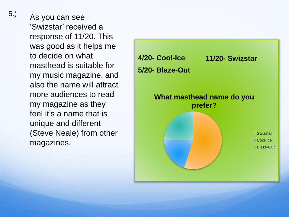
What masthead name do you prefer?
Swizstar
Cool-Ice
Blaze-Out
5.)
11/20- Swizstar4/20- Cool-Ice
5/20- Blaze-Out
As you can see
‘Swizstar’ received a
response of 11/20. This
was good as it helps me
to decide on what
masthead is suitable for
my music magazine, and
also the name will attract
more audiences to read
my magazine as they
feel it’s a name that is
unique and different
(Steve Neale) from other
magazines.

What do you think are the main attributes within a music
magazine?
Editorial
Colour scheme
Bold Masthead
Images
6.)
4/20-Editorial
6/20- Colour Scheme2/20- Bold masthead
8/20-Images
The results denote that,
the images within a music
magazine is a major
factor when creating a
music magazine. As 8/20
people believe that it is
essential for making the
best possible music
magazine. Furthermore,
this enabled me to realise
what I need to include
frequently as well as what
is less frequently needed
across the four pages.
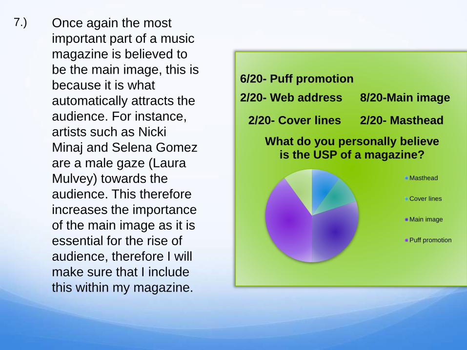
What do you personally believe is the USP of a magazine?
Masthead
Cover lines
Main image
Puff promotion
7.)
2/20- Web address
6/20- Puff promotion
8/20-Main image
2/20- Masthead2/20- Cover lines
Once again the most
important part of a music
magazine is believed to
be the main image, this is
because it is what
automatically attracts the
audience. For instance,
artists such as Nicki
Minaj and Selena Gomez
are a male gaze (Laura
Mulvey) towards the
audience. This therefore
increases the importance
of the main image as it is
essential for the rise of
audience, therefore I will
make sure that I include
this within my magazine.

Music Magazine Names
SwizStar
My own creation
Unique
R&B genre
WarmIce
Contrast of
temperature
Unique twist
WaveStorm
Creative
Different name for
a masthead
Rock and Roll
genre
SSL-Similar idea with ‘XXL’
three letters.
Short and simplistic
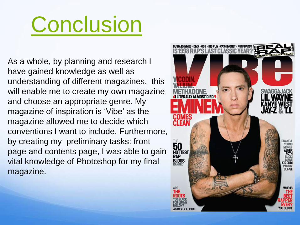
Conclusion
As a whole, by planning and research I
have gained knowledge as well as
understanding of different magazines, this
will enable me to create my own magazine
and choose an appropriate genre. My
magazine of inspiration is ‘Vibe’ as the
magazine allowed me to decide which
conventions I want to include. Furthermore,
by creating my preliminary tasks: front
page and contents page, I was able to gain
vital knowledge of Photoshop for my final
magazine.