Magazine Advertisement Deconstructions
3
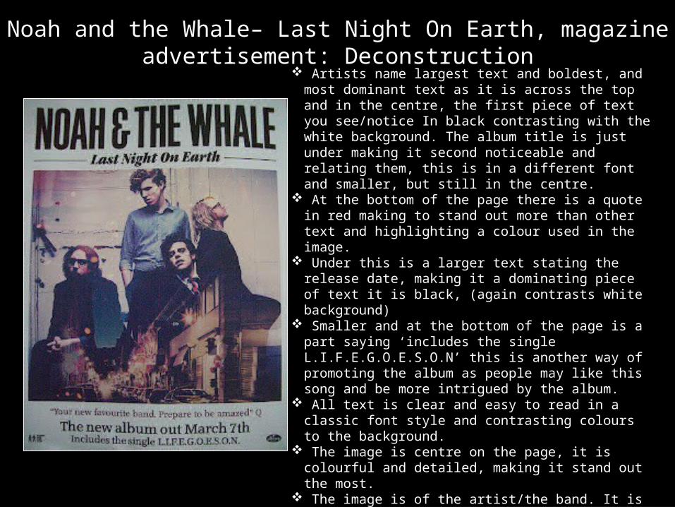
Noah and the Whale– Last Night On Earth, magazine advertisement: Deconstruction Artists name largest text and boldest, and most dominant text as it is across the top and in the centre, the first piece of text you see/notice In black contrasting with the white background. The album title is just under making it second noticeable and relating them, this is in a different font and smaller, but still in the centre. At the bottom of the page there is a quote in red making to stand out more than other text and highlighting a colour used in the image. Under this is a larger text stating the release date, making it a dominating piece of text it is black, (again contrasts white background) Smaller and at the bottom of the page is a part saying ‘includes the single L.I.F.E.G.O.E.S.O.N’ this is another way of promoting the album as people may like this song and be more intrigued by the album. All text is clear and easy to read in a classic font style and contrasting colours to the background. The image is centre on the page, it is colourful and detailed, making it stand out the most. The image is of the artist/the band. It is a long shot as it includes all of them and
-
Upload
fionaa2media -
Category
Education
-
view
112 -
download
0
Transcript of Magazine Advertisement Deconstructions
Noah and the Whale– Last Night On Earth, magazine advertisement: Deconstruction
Artists name largest text and boldest, and most dominant text as it is across the top and in the centre, the first piece of text you see/notice In black contrasting with the white background. The album title is just under making it second noticeable and relating them, this is in a different font and smaller, but still in the centre.
At the bottom of the page there is a quote in red making to stand out more than other text and highlighting a colour used in the image.
Under this is a larger text stating the release date, making it a dominating piece of text it is black, (again contrasts white background)
Smaller and at the bottom of the page is a part saying ‘includes the single L.I.F.E.G.O.E.S.O.N’ this is another way of promoting the album as people may like this song and be more intrigued by the album.
All text is clear and easy to read in a classic font style and contrasting colours to the background.
The image is centre on the page, it is colourful and detailed, making it stand out the most.
The image is of the artist/the band. It is a long shot as it includes all of them and they’re whole bodies.
I like the colours used in the image, contrasts between blue and purple colours with red/orange/yellow colours. I like how bright and busy it is without being overpowering.
The whole set up is like a classic magazine/newspaper set up, hinting at their unique style.
Another thing I find interesting is how two images are combined to create this.
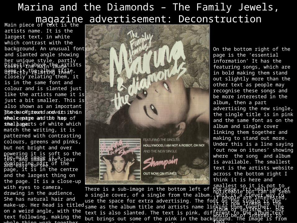
Marina and the Diamonds – The Family Jewels, magazine advertisement: Deconstruction
Main piece of text is the artists name. It is the largest text, in white which contrast with the background. An unusual font and slanted angle showing her unique style. partly covers the main image directly relating them. Directly above the artists name is the album title, closely relating them, it is in the same font and colour and is slanted just like the artists name it is just a bit smaller. This is also shown as an important piece of text and it is in the centre at the top of the page. The background covers the whole page and it has small parts of white which match the writing, it is patterned with contrasting colours, greens and pinks, but not bright and over powering it is soft so the text and image are clear and easy to see. The main image is a dominating part of the page, it is in the centre and the largest thing on the page. It is a close-up with eyes to camera, drawing in the audience. She has natural hair and make-up. Her head is titled on a weird angle, with the text following, making the whole thing work together in looking quirky. Her face is well lit, looks as thought artificial lighting has been used.
There is a sub-image in the bottom left of the page, its small and of a single cover, of a single from the album. This is a clever way to use the space for extra advertising. The font on the single is the same as the album title and artists name linking them together, the text is also slanted. The text is pink, different to the album text but brings out some of the pink in the background. The image is from the same photo shoot as the album, you can tell by hair and make-up. Mid –close up eyes to camera. More diverse because of the pose, and hands being shown, framing her face. Keeps to the same style.
On the bottom right of the page is the ‘essential information’ It has the featuring songs, which are in bold making them stand out slightly more than the other text as people may recognise these songs and be more interested in the album, then a part advertising the new single, the single title is in pink and the same font as on the album and single cover linking them together and making to stand out more. Under this is a line saying ‘out now on itunes’ showing where the song and album is available. The smallest text is the artists website across the bottom right I think it is here and smallest so it is not to noticeable but can be seen if people are interested, it is now linked to the album or selling it, but would be of interest to fans.
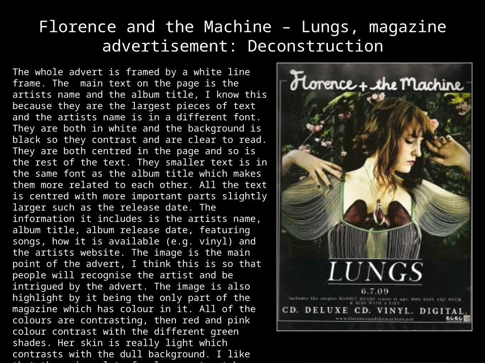
Florence and the Machine – Lungs, magazine advertisement: Deconstruction
The whole advert is framed by a white line frame. The main text on the page is the artists name and the album title, I know this because they are the largest pieces of text and the artists name is in a different font. They are both in white and the background is black so they contrast and are clear to read. They are both centred in the page and so is the rest of the text. They smaller text is in the same font as the album title which makes them more related to each other. All the text is centred with more important parts slightly larger such as the release date. The information it includes is the artists name, album title, album release date, featuring songs, how it is available (e.g. vinyl) and the artists website. The image is the main point of the advert, I think this is so that people will recognise the artist and be intrigued by the advert. The image is also highlight by it being the only part of the magazine which has colour in it. All of the colours are contrasting, then red and pink colour contrast with the different green shades. Her skin is really light which contrasts with the dull background. I like that there is a lot of colour contrast here but nothing too bright or over powering. This is a mid close-up, her eyes are not to camera and her pose is relaxed. Her arms and hands are included in the image, makes it look more interesting. I like the patterned flowery background makes the image have more depth. The image relates to the album title ‘Lungs’ as she is wearing artificial lungs under her top.