Magazine Advert Analysis
3
Magazine Advert Analysis Hayley McCarthy
-
Upload
hayleymccarthy -
Category
Education
-
view
95 -
download
1
Transcript of Magazine Advert Analysis

Magazine Advert AnalysisHayley McCarthy
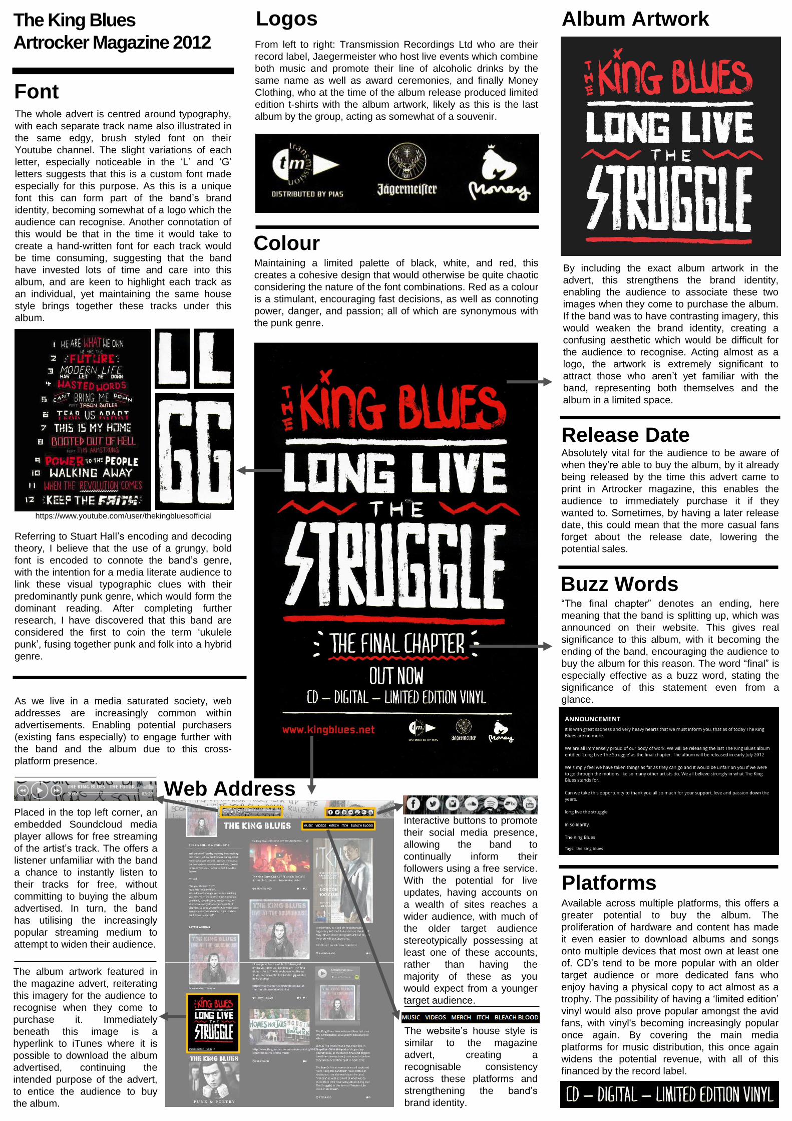
Maintaining a limited palette of black, white, and red, this
creates a cohesive design that would otherwise be quite chaotic
considering the nature of the font combinations. Red as a colour
is a stimulant, encouraging fast decisions, as well as connoting
power, danger, and passion; all of which are synonymous with
the punk genre.
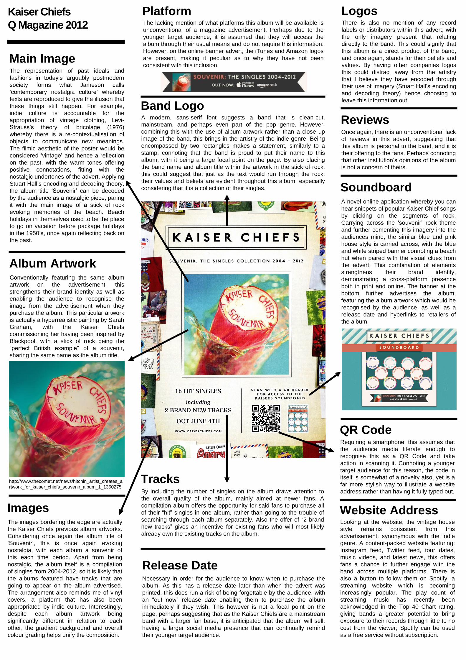
The whole advert is centred around typography,
with each separate track name also illustrated in
the same edgy, brush styled font on their
Youtube channel. The slight variations of each
letter, especially noticeable in the ‘L’ and ‘G’
letters suggests that this is a custom font made
especially for this purpose. As this is a unique
font this can form part of the band’s brand
identity, becoming somewhat of a logo which the
audience can recognise. Another connotation of
this would be that in the time it would take to
create a hand-written font for each track would
be time consuming, suggesting that the band
have invested lots of time and care into this
album, and are keen to highlight each track as
an individual, yet maintaining the same house
style brings together these tracks under this
album.
As we live in a media saturated society, web
addresses are increasingly common within
advertisements. Enabling potential purchasers
(existing fans especially) to engage further with
the band and the album due to this cross-
platform presence.
Interactive buttons to promote
their social media presence,
allowing the band to
continually inform their
followers using a free service.
With the potential for live
updates, having accounts on
a wealth of sites reaches a
wider audience, with much of
the older target audience
stereotypically possessing at
least one of these accounts,
rather than having the
majority of these as you
would expect from a younger
target audience.
Placed in the top left corner, an
embedded Soundcloud media
player allows for free streaming
of the artist’s track. The offers a
listener unfamiliar with the band
a chance to instantly listen to
their tracks for free, without
committing to buying the album
advertised. In turn, the band
has utilising the increasingly
popular streaming medium to
attempt to widen their audience.
The website’s house style is
similar to the magazine
advert, creating a
recognisable consistency
across these platforms and
strengthening the band’s
brand identity.
The album artwork featured in
the magazine advert, reiterating
this imagery for the audience to
recognise when they come to
purchase it. Immediately
beneath this image is a
hyperlink to iTunes where it is
possible to download the album
advertised, continuing the
intended purpose of the advert,
to entice the audience to buy
the album.
Web Address
Album Artwork
By including the exact album artwork in the
advert, this strengthens the brand identity,
enabling the audience to associate these two
images when they come to purchase the album.
If the band was to have contrasting imagery, this
would weaken the brand identity, creating a
confusing aesthetic which would be difficult for
the audience to recognise. Acting almost as a
logo, the artwork is extremely significant to
attract those who aren’t yet familiar with the
band, representing both themselves and the
album in a limited space.
Font
https://www.youtube.com/user/thekingbluesofficial
Referring to Stuart Hall’s encoding and decoding
theory, I believe that the use of a grungy, bold
font is encoded to connote the band’s genre,
with the intention for a media literate audience to
link these visual typographic clues with their
predominantly punk genre, which would form the
dominant reading. After completing further
research, I have discovered that this band are
considered the first to coin the term ‘ukulele
punk’, fusing together punk and folk into a hybrid
genre.
Colour
LogosFrom left to right: Transmission Recordings Ltd who are their
record label, Jaegermeister who host live events which combine
both music and promote their line of alcoholic drinks by the
same name as well as award ceremonies, and finally Money
Clothing, who at the time of the album release produced limited
edition t-shirts with the album artwork, likely as this is the last
album by the group, acting as somewhat of a souvenir.
Buzz Words“The final chapter” denotes an ending, here
meaning that the band is splitting up, which was
announced on their website. This gives real
significance to this album, with it becoming the
ending of the band, encouraging the audience to
buy the album for this reason. The word “final” is
especially effective as a buzz word, stating the
significance of this statement even from a
glance.
PlatformsAvailable across multiple platforms, this offers a
greater potential to buy the album. The
proliferation of hardware and content has made
it even easier to download albums and songs
onto multiple devices that most own at least one
of. CD’s tend to be more popular with an older
target audience or more dedicated fans who
enjoy having a physical copy to act almost as a
trophy. The possibility of having a ‘limited edition’
vinyl would also prove popular amongst the avid
fans, with vinyl's becoming increasingly popular
once again. By covering the main media
platforms for music distribution, this once again
widens the potential revenue, with all of this
financed by the record label.
Release DateAbsolutely vital for the audience to be aware of
when they’re able to buy the album, by it already
being released by the time this advert came to
print in Artrocker magazine, this enables the
audience to immediately purchase it if they
wanted to. Sometimes, by having a later release
date, this could mean that the more casual fans
forget about the release date, lowering the
potential sales.
The King Blues
Artrocker Magazine 2012
The representation of past ideals and
fashions in today’s arguably postmodern
society forms what Jameson calls
‘contemporary nostalgia culture’ whereby
texts are reproduced to give the illusion that
these things still happen. For example,
indie culture is accountable for the
appropriation of vintage clothing, Levi-
Strauss’s theory of bricolage (1976)
whereby there is a re-contextualisation of
objects to communicate new meanings.
The filmic aesthetic of the poster would be
considered ‘vintage’ and hence a reflection
on the past, with the warm tones offering
positive connotations, fitting with the
nostalgic undertones of the advert. Applying
Stuart Hall’s encoding and decoding theory,
the album title ‘Souvenir’ can be decoded
by the audience as a nostalgic piece, paring
it with the main image of a stick of rock
evoking memories of the beach. Beach
holidays in themselves used to be the place
to go on vacation before package holidays
in the 1950’s, once again reflecting back on
the past.
Main Image
Album ArtworkConventionally featuring the same album
artwork on the advertisement, this
strengthens their brand identity as well as
enabling the audience to recognise the
image from the advertisement when they
purchase the album. This particular artwork
is actually a hyperrealistic painting by Sarah
Graham, with the Kaiser Chiefs
commissioning her having been inspired by
Blackpool, with a stick of rock being the
“perfect British example” of a souvenir,
sharing the same name as the album title.
http://www.thecomet.net/news/hitchin_artist_creates_a
rtwork_for_kaiser_chiefs_souvenir_album_1_1350275
Kaiser Chiefs
Q Magazine 2012
ImagesThe images bordering the edge are actually
the Kaiser Chiefs previous album artworks.
Considering once again the album title of
‘Souvenir’, this is once again evoking
nostalgia, with each album a souvenir of
this each time period. Apart from being
nostalgic, the album itself is a compilation
of singles from 2004-2012, so it is likely that
the albums featured have tracks that are
going to appear on the album advertised.
The arrangement also reminds me of vinyl
covers, a platform that has also been
appropriated by indie culture. Interestingly,
despite each album artwork being
significantly different in relation to each
other, the gradient background and overall
colour grading helps unify the composition.
TracksBy including the number of singles on the album draws attention to
the overall quality of the album, mainly aimed at newer fans. A
compilation album offers the opportunity for said fans to purchase all
of their “hit” singles in one album, rather than going to the trouble of
searching through each album separately. Also the offer of “2 brand
new tracks” gives an incentive for existing fans who will most likely
already own the existing tracks on the album.
Release DateNecessary in order for the audience to know when to purchase the
album. As this has a release date later than when the advert was
printed, this does run a risk of being forgettable by the audience, with
an “out now” release date enabling them to purchase the album
immediately if they wish. This however is not a focal point on the
page, perhaps suggesting that as the Kaiser Chiefs are a mainstream
band with a larger fan base, it is anticipated that the album will sell,
having a larger social media presence that can continually remind
their younger target audience.
Website AddressLooking at the website, the vintage house
style remains consistent from this
advertisement, synonymous with the indie
genre. A content-packed website featuring:
Instagram feed, Twitter feed, tour dates,
music videos, and latest news, this offers
fans a chance to further engage with the
band across multiple platforms. There is
also a button to follow them on Spotify, a
streaming website which is becoming
increasingly popular. The play count of
streaming music has recently been
acknowledged in the Top 40 Chart rating,
giving bands a greater potential to bring
exposure to their records through little to no
cost from the viewer; Spotify can be used
as a free service without subscription.
SoundboardA novel online application whereby you can
hear snippets of popular Kaiser Chief songs
by clicking on the segments of rock.
Carrying across the ‘souvenir’ rock theme
and further cementing this imagery into the
audiences mind, the similar blue and pink
house style is carried across, with the blue
and white striped banner connoting a beach
hut when paired with the visual clues from
the advert. This combination of elements
strengthens their brand identity,
demonstrating a cross-platform presence
both in print and online. The banner at the
bottom further advertises the album,
featuring the album artwork which would be
recognised by the audience, as well as a
release date and hyperlinks to retailers of
the album.
QR CodeRequiring a smartphone, this assumes that
the audience media literate enough to
recognise this as a QR Code and take
action in scanning it. Connoting a younger
target audience for this reason, the code in
itself is somewhat of a novelty also, yet is a
far more stylish way to illustrate a website
address rather than having it fully typed out.
Band LogoA modern, sans-serif font suggests a band that is clean-cut,
mainstream, and perhaps even part of the pop genre. However,
combining this with the use of album artwork rather than a close up
image of the band, this brings in the artistry of the indie genre. Being
encompassed by two rectangles makes a statement, similarly to a
stamp, connoting that the band is proud to put their name to this
album, with it being a large focal point on the page. By also placing
the band name and album title within the artwork in the stick of rock,
this could suggest that just as the text would run through the rock,
their values and beliefs are evident throughout this album, especially
considering that it is a collection of their singles.
PlatformThe lacking mention of what platforms this album will be available is
unconventional of a magazine advertisement. Perhaps due to the
younger target audience, it is assumed that they will access the
album through their usual means and do not require this information.
However, on the online banner advert, the iTunes and Amazon logos
are present, making it peculiar as to why they have not been
consistent with this inclusion.
LogosThere is also no mention of any record
labels or distributors within this advert, with
the only imagery present that relating
directly to the band. This could signify that
this album is a direct product of the band,
and once again, stands for their beliefs and
values. By having other companies logos
this could distract away from the artistry
that I believe they have encoded through
their use of imagery (Stuart Hall’s encoding
and decoding theory) hence choosing to
leave this information out.
ReviewsOnce again, there is an unconventional lack
of reviews in this advert, suggesting that
this album is personal to the band, and it is
their offering to the fans. Perhaps connoting
that other institution’s opinions of the album
is not a concern of theirs.


![Magazine advert analysis[1]](https://static.fdocuments.in/doc/165x107/58f0f1011a28ab86238b46c5/magazine-advert-analysis1.jpg)