Logo & Slogan - Aramex · PDF fileBuilding Block A: Logo & Slogan Think of the Aramex logo as...
7
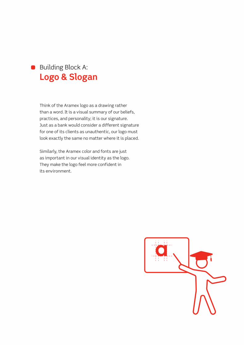
Building Block A: Logo & Slogan
Transcript of Logo & Slogan - Aramex · PDF fileBuilding Block A: Logo & Slogan Think of the Aramex logo as...

Building Block A:
Logo & Slogan
Building Block A:
Logo & Slogan
Think of the Aramex logo as a drawing rather
than a word. It is a visual summary of our beliefs,
practices, and personality; it is our signature.
Just as a bank would consider a different signature
for one of its clients as unauthentic, our logo must
look exactly the same no matter where it is placed.
Similarly, the Aramex color and fonts are just
as important in our visual identity as the logo.
They make the logo feel more confident in
its environment.
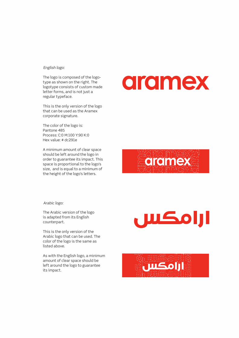
English logo:
Arabic logo:
The logo is composed of the logo- type as shown on the right. The logotype consists of custom made letter forms, and is not just a regular typeface.
This is the only version of the logo that can be used as the Aramex corporate signature.
The color of the logo is: Pantone 485 Process: C:0 M:100 Y:90 K:0 Hex value: # dc291e
A minimum amount of clear space should be left around the logo in order to guarantee its impact. This space is proportional to the logo’s size, and is equal to a minimum of the height of the logo’s letters.
The Arabic version of the logo is adapted from its English counterpart.
This is the only version of the Arabic logo that can be used. The color of the logo is the same as listed above.
As with the English logo, a minimum amount of clear space should be left around the logo to guarantee its impact.
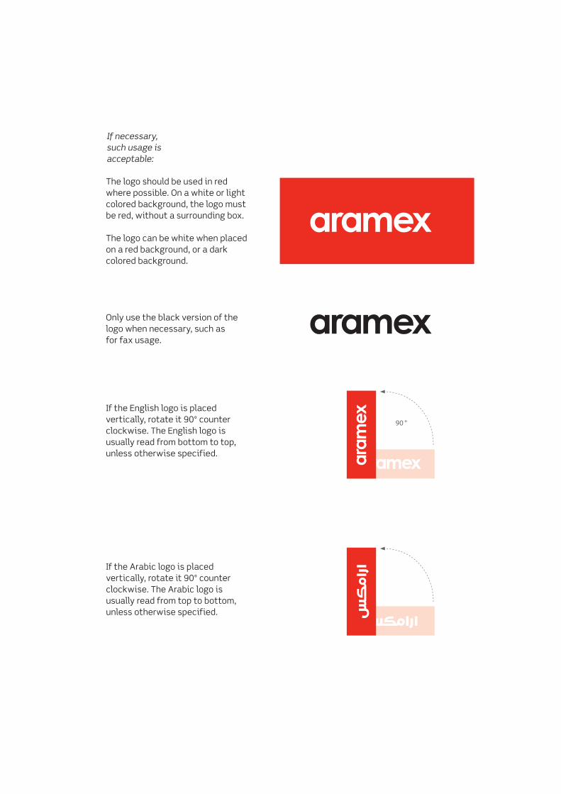
If necessary,such usage is acceptable:
The logo should be used in red where possible. On a white or light colored background, the logo must be red, without a surrounding box.
The logo can be white when placed on a red background, or a dark colored background.
Only use the black version of the logo when necessary, such asfor fax usage.
If the English logo is placed vertically, rotate it 90º counter clockwise. The English logo is usually read from bottom to top, unless otherwise specified.
If the Arabic logo is placed vertically, rotate it 90º counter clockwise. The Arabic logo is usually read from top to bottom, unless otherwise specified.
90 °

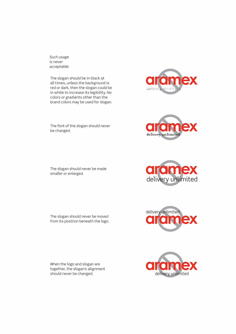
Such usageis neveracceptable:
The logo’s color should never be anything other than red, white, or when necessary, black. On a white background, the logo must be red.
The logo should never be imitated using a font, as no font exactly matches the logo, even if it looks close in shape to the logo.
The logo should never be skewed or stretched, and its proportions should never be changed in any way.
The logo should never be rotated diagonally, or slanted. The only permissible rotation is in a 90º angle, when necessary.
The logo should never be filled with a gradient, but should always be a solid color, and it should never be used in any color other than the brand colors.
The spaces between the distinct shapes of the logo should never be altered or changed.
white page
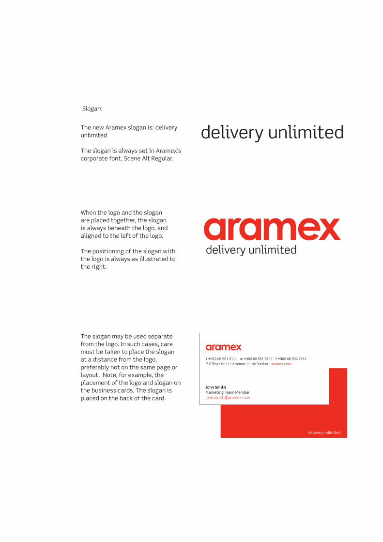
Slogan:
The new Aramex slogan is: delivery unlimited
The slogan is always set in Aramex’s corporate font, Scene Alt Regular.
When the logo and the slogan are placed together, the slogan is always beneath the logo, and aligned to the left of the logo.
The positioning of the slogan with the logo is always as illustrated to the right.
The slogan may be used separate from the logo. In such cases, care must be taken to place the slogan at a distance from the logo, preferably not on the same page or layout. Note, for example, the placement of the logo and slogan on the business cards. The slogan is placed on the back of the card.
Such usageis neveracceptable:
The slogan should be in black at all times, unless the background isred or dark, then the slogan could be in white to increase its legibility. No colors or gradients other than the brand colors may be used for slogan.
The font of the slogan should never be changed.
The slogan should never be made smaller or enlarged.
The slogan should never be movedfrom its position beneath the logo.
When the logo and slogan are together, the slogan’s alignment should never be changed.