Level 3 media
20
Level 3 Media Portfolio Stephanie Holden
-
Upload
steff-chan96 -
Category
Education
-
view
54 -
download
1
Transcript of Level 3 media

Level 3 Media Portfolio
Stephanie Holden

Topic 1 – Creating a Horror poster
In this exercise I was told to go out and do a photo-shoot to fit the movie genre ‘horror’. The title of the film would be ‘Truth’ and the sub title would be ‘It’s out there’. I was then told to pick the best picture and then edit it on Photoshop. Image 1 is the original picture I shot and it was taken under a bridge next to St. Gregory’s High School. I changed the aperture setting on the SLR digital camera to get the darkness within the picture. When editing the photo on Photoshop, I cropped the image the focus more on the model, I changed the hue and saturation but I also altered the levels of black and white. I used a smoky brush tool to create a black mist around the model. However I used a billing block from online so the horror poster looked effect (and by adding the colour red to the texts, the colour has connotations of blood and fear).

Topic 1 – Horror poster 2
This is my other idea of the horror poster. Again I did a photo-shoot with the same model but different location (Sankey Valley). In Photoshop I edited the brightness and contrast of the whole image, then with the paintbrush tool I coloured her pupils red and added blood splats on her waterline and across her face to add a devilish look to her. Again I used a billing block for the image to be a convincing film poster.

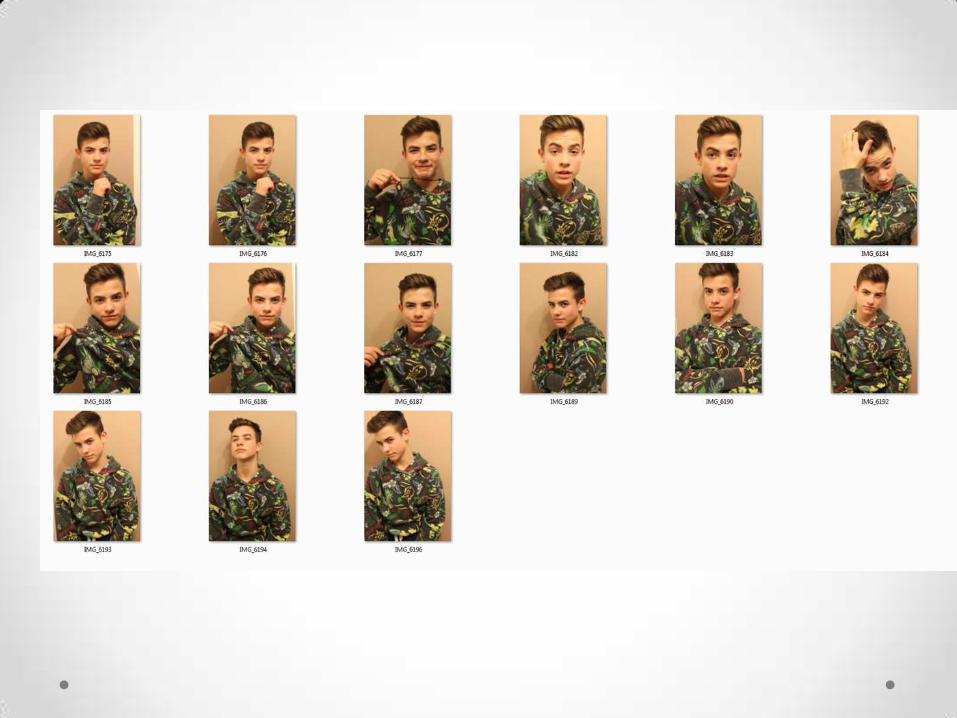
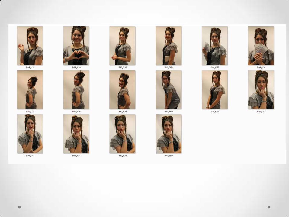
Topic 1 – Magazine coversOur main topic in this unit was to create four different lifestyle magazine covers for a teenage audience ages 13-19. However the magazine covers were to be of the same title but different themes e.g. summer, love etc. For each cover we were told to do a photo-shoot and then narrow it down to a ‘top 5’. The title of my magazines were called ‘Urban’ The following pictures are what I took for the photo-shoot


These are the finalized magazine covers. Taglines and barcodes were included to make it more like a magazine cover.For the first cover I erased the background then added a gradient fill.Cover 2 was done in a class room that can be used for photo-shoots as there are blank sheets of paper on the walls (cover 3 was done in the same room).Cover 4 was done in the town centre behind the stores where deliveries are done. All the models costume and make-up were planned beforehand.The editing was done on Photoshop.
Cover 1 Cover 2
Cover 3 Cover 4

Topic 2 – Energy drink design
In this topic we were to create 3 different energy drinks designs; 3 can designs and 3 shirt designs. Once we finished these designs we had to present them to group and they were to choose the best design.My three brands were called:• Kawaii Energy (Kawaii – Cute in Japanese)• Raptured• Zen EnergyWhen we finished designing the cans and t-shirts we then started to design a rough webpage for each brand; this was done PowerPoint.After I presented the designs to the group, the brand that was most popular was Zen Energy. When that was decided we had to create a webpage for the popular brand which included a homepage, products page and events page. When creating it we could not use images taken from the internet as that would go against the Copyright Law, so we had to use pictures that we took ourselves.
All designing processes were done on Photoshop.

These are my 3 can design brands. Firstly we had to find an image of a can to act as a template for the designs. Can1: I used a background image online and warped the image to fit around the can smoothly. Next I added the brand name, and by doing so I downloaded an oriental font and had the colour of the font made pink to fit a female audience.Can2: For the background and tyre mark, again I downloaded a paintbrush tool and made it the colour black to add a gritty effect. The lightning strikes were already installed shapes.Can3: Lastly, I added a colour overlay and cut around it to fit the can. For the Asian symbol (which means ‘Zen’ in Chinese) I recreated it on Adobe Illustrator. I also found a plant image that has a ‘Zen’ aspect to and warped it to look as if it’s growing around the can.
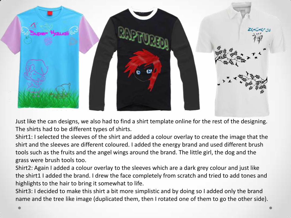
Just like the can designs, we also had to find a shirt template online for the rest of the designing. The shirts had to be different types of shirts.Shirt1: I selected the sleeves of the shirt and added a colour overlay to create the image that the shirt and the sleeves are different coloured. I added the energy brand and used different brush tools such as the fruits and the angel wings around the brand. The little girl, the dog and the grass were brush tools too.Shirt2: Again I added a colour overlay to the sleeves which are a dark grey colour and just like the shirt1 I added the brand. I drew the face completely from scratch and tried to add tones and highlights to the hair to bring it somewhat to life.Shirt3: I decided to make this shirt a bit more simplistic and by doing so I added only the brand name and the tree like image (duplicated them, then I rotated one of them to go the other side).

The following three slides are my webpage concepts for each brand.

Home | Store | Product Range | Events | Competitions | Info
COMPETITION!Spot all 5 Doge’s to get a chance to win 2 tickets to KpopCentral! Click here now for details!
Amazing T-shirts on SALE 25% off.
EXO K’s first concert in Malaysia: To discover more on their debut click here!

HomeStore Events The
Drinks
Our new range of T-
shirts are now
available to order
online, able to pick
up at your local
sports store. For
more details click
here.
Get a chance to win 2
tickets to Warped Tour
2014! Also includes a 6
month supply of
Raptured Energy
Drinks. Full details here.
Ricky
Carmichael
Home
Store
Events
Facts/Info
Contact Us
Introducing our new range of T-shirts available now!
The ways of the Buddha!
Tickets on sale for a Tai Chi lesson!

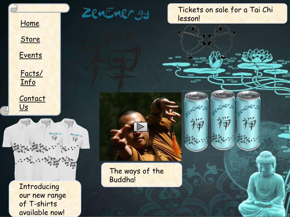
This is the first webpage for Zen Energy.For me to create the background, I traced an image on Adobe Illustrator, however the only way I could use it without breaking the copyright law was for me to add colour to it as the original image hadn’t. The background, navigation bar, search bar, contacting and policies were kept the same for rest of the webpages.All the images on the page were taken by myself included the trees, and I also had someone model for me in order to create my brand’s t-shirt. The circle’s on the model’s hand was again done on Illustrator and the symbol represents ‘Zen’.I decided to have the colour scheme that consists of beige, creams and greens to add a calm feeling.We were told to add apps that are relevant to our products however we were told that including them isn’t copyright but it is cross-promoting that product.

This is the products page of the website.I sectioned each type of merchandise: shirts, can, accessories and an upcoming product.For the shirts , I found 2 different types of shirts and had them in a different colour, however, for this to look like an accurate products page I included little coloured squares as if to give the customer different colour options.I used the same types of cans but changed the colour of them to create the image that they are different flavours.Again, for the accessories I used blank images and added the Zen symbol on each one.The same goes for the shoe promotion, however I was told by my teacher that it would be a greater idea if I had someone model the shoes then add the brand on.

Lastly, this is the events and last page of the website.I wanted to add an image of a Zen garden on this page however I couldn’t do so as I don’t have a garden that could be recreated as one, so instead I decided to make one using the shapes on the programme.All the images here were taken by me from my trip to London Comic Con and I knew it would be suitable as the products are from Asian places.These are the tickets for the events. I simply created a rectangular shape and had the colour changed to blue, I then drew a black line near the end and erased parts to make it look like the tearing section of a real ticket. The background of the ticket was done by a cloud brush tool.

For Topic 1, my ideas and inspirations came from the codes and conventions on what an actual horror poster and magazine covers are to be presented. I wanted my horror to be as sinister as it an be rather than it being gory and disturbing. My magazine covers were based on what my models dressed liked on a day-to-day basis which gave me the idea of the title ‘Urban’.For Topic 2 all my inspiration came from my passion for the Asian culture and I wanted to portray that throughout the project. My ideas were unique as I was the only person in the class to have a cultural brand.The processing of both topics were very long but required a lot of hard work and effort. In order to complete the topics I’d use as much as my free time in college to finish them off.

I chose FdA Media Production as I felt that it would give me a broader outlook of the media industry and help me to choose a definite career path. However whilst in the midst of choosing my courses I was a little unsure on what to do and so my Media teacher showed me this course and felt it would be a great option for me.After University, I would like to see myself working in the media but I’m still unsure on what job role to take on and I have yet to continue researching into it, however my dream/aspiration would be to work in Japan as I’m very compassionate about the culture.