Lettering Made Simple: Efficient Methods for Custom Type
9
Lettering Made Simple: Efficient Methods for Custom Type Brandon Rike Sketching The Possibilities 1. Write the word simply: By simply writing out the word, you will be able to find the center of the word, and address any letters that may cause problems with kerning. Topheavy Ts, and bottom heavy Ls will stand out. 2. Experiment with letterforms: Allow yourself to freely write the word out in creative ways. You are free to add as many embellishments and swashes as you'd like. On paper, you'll be able to find which of these features could work well in your composition. It's very easy to do too much, but on paper is the area is to explore. 3. Choose your favorite concept: You don't need to sketch forever. If you are convinced that one concept is your best, then feel free to move onto the next step. You can save a lot of time by sketching, but you can waste a lot of time by getting carried away. Selecting The Right Font Visit font websites: We will visit popular font websites to find a font that will work well with our concept. We are looking for fonts that should have simple anchor points, and can easily be manipulated. ● Lost Type CoOp: http://www.losttype.com ● MyFonts: http://www.myfonts.com ● DaFont: http://www.dafont.com
Transcript of Lettering Made Simple: Efficient Methods for Custom Type
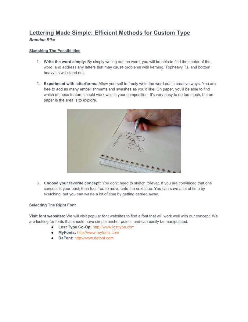
Lettering Made Simple: Efficient Methods for Custom Type Brandon Rike Sketching The Possibilities
1. Write the word simply: By simply writing out the word, you will be able to find the center of the word, and address any letters that may cause problems with kerning. Topheavy Ts, and bottom heavy Ls will stand out.
2. Experiment with letterforms: Allow yourself to freely write the word out in creative ways. You are
free to add as many embellishments and swashes as you'd like. On paper, you'll be able to find which of these features could work well in your composition. It's very easy to do too much, but on paper is the area is to explore.
3. Choose your favorite concept: You don't need to sketch forever. If you are convinced that one concept is your best, then feel free to move onto the next step. You can save a lot of time by sketching, but you can waste a lot of time by getting carried away.
Selecting The Right Font Visit font websites: We will visit popular font websites to find a font that will work well with our concept. We are looking for fonts that should have simple anchor points, and can easily be manipulated.
● Lost Type CoOp: http://www.losttype.com ● MyFonts: http://www.myfonts.com ● DaFont: http://www.dafont.com

Building The Word
1. Type out word or phrase: After installing and activating the font, simply type out the word in the font that you've chosen. Explore the features of the font, including glyphs, for any extras that may expedite your process. Type out the characters | l L or any other character that may be a useful piece later. Create outlines of the word or phrase. You can now treat the letters like shapes to begin construction.
2. Direct select anchor points: Inside Illustrator, use the Direct Selection Tool (White Arrow) to select portions of each character. You will begin to understand the Direct Selection Tool's use, and how you can use it to push and pull parts of each character. Pulling out a capital letter to make it larger than the others is an easy starting point. Once you get the hang of the tool's capabilities, you can start thinking of ways to pull the other letters around.

3. Adjust spacing between letters: With the word typed out, and outlines created. You can begin to
move the shapes (letters) around. You shouldn't rely solely on the default spacing between the letters, or Kerning, but instead trust your eye to move the letters right to left in order to have visually equal spacing between letters.
There is no measurement tool to get this perfect, you must be able to eyeball what looks best. While the software is amazing, it's not better than your own judgement on how the letters should be kerned. Keep in mind that letters like T L A and V will introduce open spaces into the piece. Letters beside these characters will be spaced slightly tigher. Also W and M are much wider letters, and will affect the overall composition.
4. Copy certain letters for other uses: Letters like I and L and characters like the hyphen can be used as extra pieces. Reusing these pieces will keep the whole piece consistent, instead of drawing new pieces from scratch.

While constructing your piece, allow shapes to overlap. Once the piece is constructed you can allow these pieces to intersect and divide into each other, using the Pathfinder Pallette, and specifically the Divide button.
5. Align individual anchor points: Using the Direct Selection Tool, you can drag a group of anchor
points that should all be aligned. In the Align Pallete, choosing Align to Selection, you can choose which alignment works for those points. The first six options are used most often.

This combination of tools and features will allow you to get every anchor point aligned correctly. It's good to be meticulous at this step, knowing that all the elements are set perfectly. Once ready, you can Unite the whole piece, making it one shape. This function is the first icon on the Pathfinder palette.
6. Review and edit composition: Step back and look at your arrangement. You may begin to notice
open spaces that could be filled, or busy areas that may need more negative space. You can also clean up the piece by deleting unnecessary anchor points, as well as making sure certain elements are aligned with other parts of the piece. If you'd like to skew or warp the piece, you can do those effects to the final straight piece. This way, everything is effected evenly. In this particular piece, the transformation is done with the Free Transform Tool.
Finishing Touches
1. Add dimension to letters: There are small and easy tricks that you can do to add a little dimension to your letters. One example is putting little "cuts" in corners of your letters. This can be achieved by drawing small triangles with the Pen Tool. The cuts can suggest a bit of motion in the piece.

2. Create a drop effect: A drop effect can be achieved by using the Offset Path feature. A "padding"
can be drawn around a shape.
Once the Padding is in place, you can duplicate the main word, drag it diagonal, and place it behind the white pad. This allows a "drop effect" to peak out under the pad.

You can then select the pad and the drop, and choose Minus Front from the Pathfinder Pallette.
3. Create grit and age: I tend to add a little grit and age to a lot of my lettering pieces. After pasting
the graphic in Photoshop, I merge the logo with a white layer. I then add a Gaussian Blur. After blurring the graphic, I'll take a dirt texture, and place it over the graphic. I'll also add a blur to the dirt.
After all the layers get merged together, I crank the Contrast.

4. I'm now left with a piece with crisp edges, that I can select areas of with the Magic Wand tool.
5. Separate elements for coloring: Once the graphic is separated, you can color the elements differently. For a drop effect, I tend to set the main type as one color, and the background outlines as another color.
6. Placing logotype into composition: After you've created your versatile lettering piece, it's fun to place it into various settings. A good lettering piece will be versatile, and able to work in different applications. Have fun with these pieces, and create lettering that is engaging and fun to use. I can't wait to see what you all can come up with.
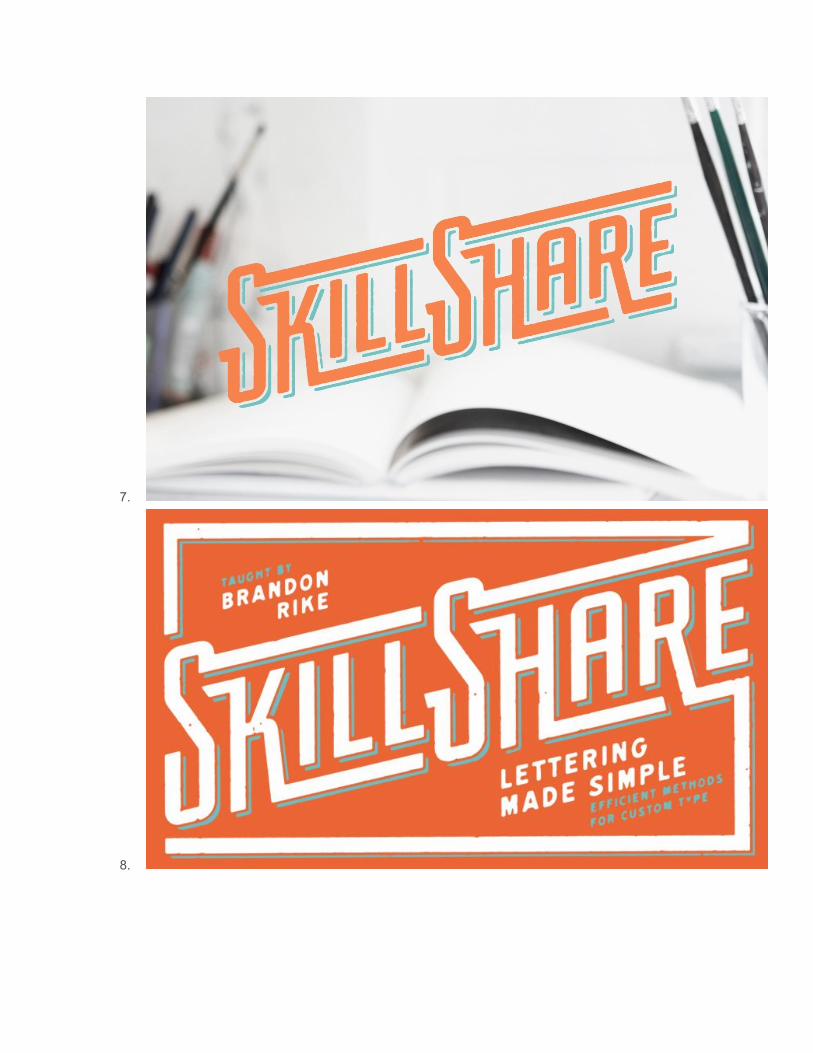
7.
8.