Let's zoom in on one corner of the coordinate plane. (This corner is called the first...
31
the coordinate plane. (This corner is called the first quadrant .) The point where the two axes cross has a special name: it is called the origin. The blue lines will help us find points. When you make your own graphs, you can use the lines on your graph paper to help you. (0,0)
-
Upload
sophia-walters -
Category
Documents
-
view
220 -
download
3
Transcript of Let's zoom in on one corner of the coordinate plane. (This corner is called the first...

Let's zoom in on one corner of the coordinate plane. (This corner is called the first quadrant.) The point where the two
axes cross has a special name: it is called the origin.
The blue lines will help us find points. When you make your own graphs, you can use the lines on your graph paper to help you.
(0,0)

Finding Points in the Plane
We can find every point in the plane using two numbers. These numbers are called coordinates. We write a point's coordinates inside parentheses, separated by a comma, like this: (5, 6). Sometimes coordinates written this way are called an ordered pair.
The first number in an ordered pair is called the x-coordinate. The x-coordinate tells us how far the point is along the x-axis.
The second number is called the y-coordinate. The y-coordinate tells us how far the point is along the y-axis.

Estimating Points Sometimes, the point you
want to graph is in between points that are marked on the axes. When this happens, you must estimate where to put your point.
For example, graph
(5, 13) using these axes:
(5,13)

Some Rules for All Graphs
All of your graphs should have… A title
At the top of the graph and underlined It should represent what you are
graphing (use your variables)

Some Rules for All Graphs con’t Labeled Axis
Use a straight-edge to draw all lines Use the blue lines that are provided
for you on the graph paper. Axes should be drawn a few lines in
and up from the edge of the paper You must state what is represented
on the x-axis and what is represented on the y-axis; include units when necessary

Some Rules for All Graphs con’tThe appropriate scale
We need the graph to fill up the most paper. To find the right scale, we divide the range of the values by the number of tick marks on that axis. (Range is the highest value – the lowest value).
Then we round to a number that is easy to count by.

How to Graph Hold the graph paper
the tall way. Title it using the
variables. Label the axes; don’t
forget to include units. Draw axes a couple of
lines up and over Count the number of
lines going across the x-axis starting at the zero mark
20 lines
Distance vs. Time
Dis
tanc
e (m
)
Time (min)

Scale the x-axis Find your range for the x-axis
(in science it’s the highest data point because we always start from zero)
Time: 10-0=10 so range is 10 Divide the range of the x-axis
by the # of lines on the x-axis: 10/20=0.5
0.5 is an easy-to-count by number so count EVERY blue
line as 0.5
Time (min)
Distance (m)
0
1
2
3
4
5
6
7
8
9
10

Scale the x-axis:Distance vs. Time
Dis
tanc
e (m
)
Time (min)
0 1 2 3 4 5 6 7 8 9 10

Scale the y-axis
Repeat for the y-axis: tic marks = 30 lines
Range = 110/30=3.6667 so round to 5; Count the y-axis by 5s Could also count by 4s
Time (min)
Distance (m)
0 0
1 10
2 40
3 35
4 50
5 65
6 70
7 90
8 85
9 100
10 110

Nice Counting Numbers
Decimals:0.1
0.2
0.25
0.5
Whole Numbers:1251015202550100Etc.
Once in a while you might have to count by a different not so nice number!

Make Ordered Pairs (0,0) (1,10) (2,40) (3,35) (4,50) (5,65) (6,70) (7,90) (8,85) (9,100) (10,110)
0 1 2 3 4 5 6 7 8 9 10
1401301201101009080706050403020100
Time (min)
Dis
tanc
e (m
)
Distance vs. Time
Plot data
Relationship: The average distanced traveled is fairly constant for each time period.

Review:All Graphs need:
A title At the top and
underlined
Labeled Axes Axes scaled
appropriately (every tick mark increases by the same amount; each axes can be scaled differently)

Some Graphs need: A Key (when necessary) If you are
putting more than one line on a graph, it must have a key to distinguish the difference

Different Types of Graphs
Tables, charts and graphs are convenient ways to clearly show your data.
Circle (or Pie) Graph
There are three basic graph forms.
Notice on the next few slides how each of the following examples are used to illustrate the data.
Choose the best graph form to express your results.
Bar Graph Line Graph

Bar Graph A bar graph is used to show relationships
between groups. The two items being compared do not needto affect each other. It's a fast way to show big differences.Notice how easy it is to read a bar graph.
Chocolate Milk Sold
53
72
112
33
76
0
20
40
60
80
100
120
Monday Tuesday Wednesday Thursday Friday
Day
Amou
nt S
old
Monday TuesdayWednesday ThursdayFriday

Circle Graph or Pie Graph A circle graph is
used to show how a part of something relates to the whole.
This kind of graph is needed to show percentages effectively.
Chocolate Milk Sold
Monday
Tuesday
Wednesday
Thursday
Friday
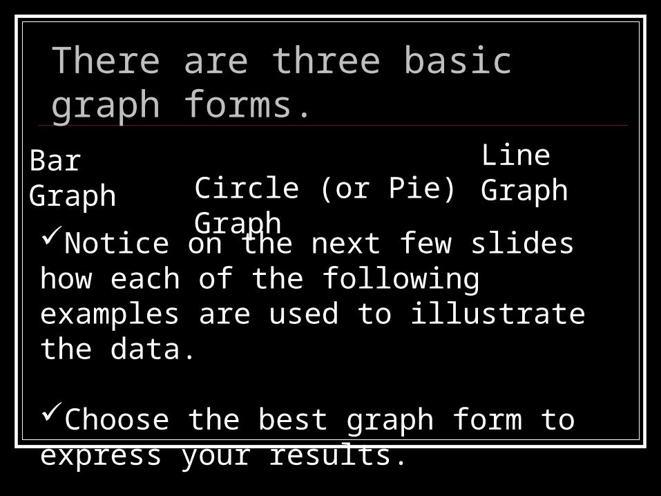
Line Graph A line graph is
used to show continuing data; how one thing is affected by another.
It's clear to see how things are going by the rises and falls a line graph shows.
Chocolate MI lk Sold
0
20
40
60
80
100
120
Monday Tuesday Wednesday Thursday Friday
Day
Am
ount
Sol
d
Chocolate

Chocolate MI lk Sold
0
20
40
60
80
100
120
Monday Tuesday Wednesday Thursday Friday
Day
Am
ount
Sol
d
Chocolate
Chocolate Milk Sold
Monday
Tuesday
Wednesday
Thursday
Friday
Line Graph
Circle (Pie) Graph
The same data displayed in 3 different types of graphs.
Chocolate Milk Sold
53
72
112
33
76
0
20
40
60
80
100
120
Monday Tuesday Wednesday Thursday Friday
Day
Am
ount
Sol
d
Monday TuesdayWednesday ThursdayFriday
Bar Graph

Choosing the Right Graph
Use a bar graph if you are not looking for trends (or patterns) over time; and the items (or categories) are not parts of a whole.
Use a pie chart if you need to compare different parts of a whole, there is no time involved and there are not too many items (or categories).
Use a line graph if you need to see how a Use a line graph if you need to see how a quantity has changed over time. Line graphs quantity has changed over time. Line graphs enable us to find trends (or patterns) over time.enable us to find trends (or patterns) over time.

More Examples of Different Graphs

Circle Graph
Used to show how the parts relate to the whole
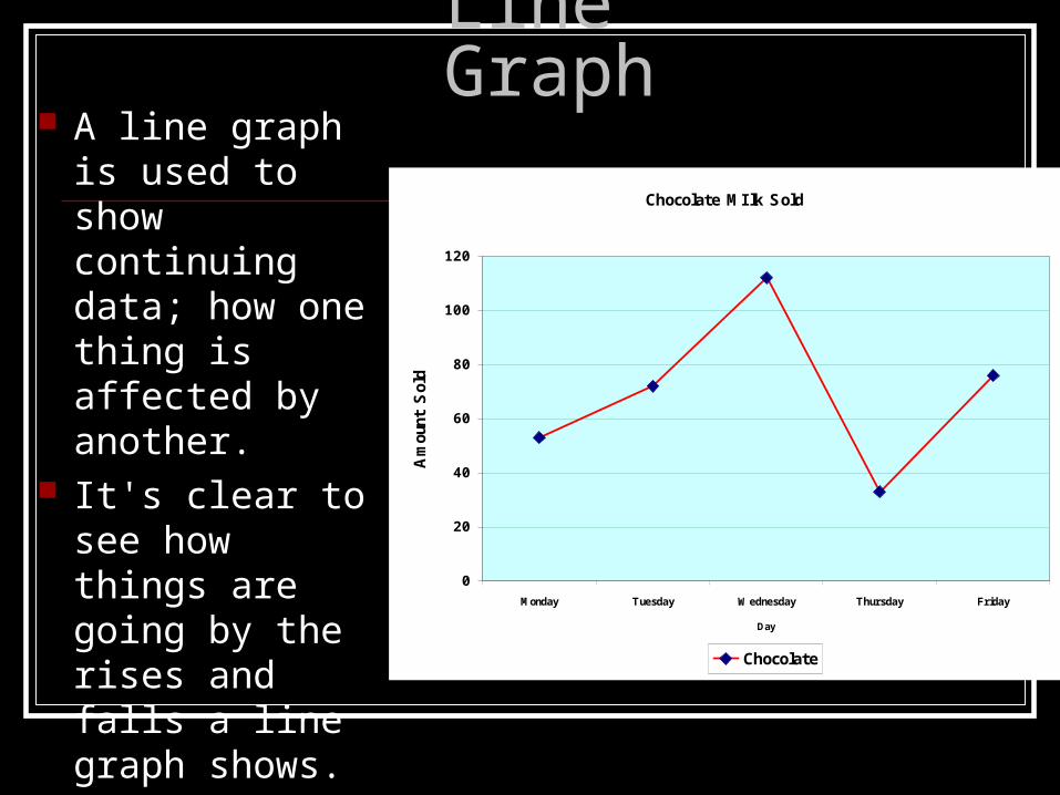
Bar Graph
A bar graph contains horizontal or vertical bars.
A good way to compare data that can be grouped into a category.
The bars do not touch.
Memberships in after-school clubs
0
10
20
30
40
50
60
70
Compute
r
Studen
t Counci
l
Dram
a
Mat
h Counts
Clubs after school
Nu
mb
er
of
Stu
de
nts
Column 1

HistogramsHistograms
Special type of bar graph
Compares different intervals of data rather than categories
The ranges used for the intervals must be the same size
Bars should touch

Line Graphs
Drawn dot-to-dot Shows trends To compare trends
between two or more things, you plot different lines for each and include a key

Scatter Plot
A scatter plot is a graph made by plotting ordered pairs in a coordinate plane to show the correlation between two sets of data.
x-variable
y-va
riabl
e
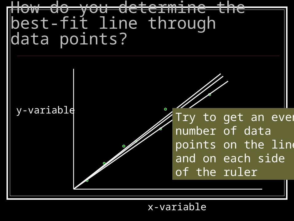
How do you determine the best-fit line through data points?
x-variable
y-variableTry to get an even number of data points on the line and on each side of the ruler

Positive Correlation
A scatter plot describes a positive trend if, as one set of values increases, the other set tends to increase.

Negative Correlation
A scatter plot describes a negative trend if, as one set of values increases, the other set tends to decrease.

No Trend
A scatter plot shows no trend if the ordered pairs show no correlation