
LAYOUT CONTROLS - wiseowl.co.uk layou… · Web viewTabControl controls are badly named (why do...
9
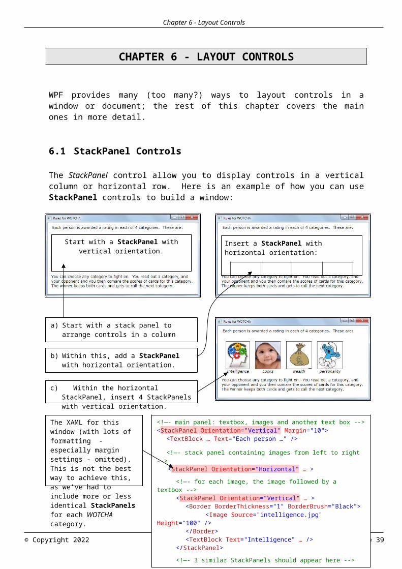
Chapter 6 - Layout Controls CHAPTER 6 - LAYOUT CONTROLS WPF provides many (too many?) ways to layout controls in a window or document; the rest of this chapter covers the main ones in more detail. 6.1 StackPanel Controls The StackPanel control allow you to display controls in a vertical column or horizontal row. Here is an example of how you can use StackPanel controls to build a window: © Copyright 2022 Page 39 Start with a StackPanel with vertical orientation. Insert a StackPanel with horizontal orientation: <!—- main panel: textbox, images and another text box --> < StackPanel Orientation ="Vertical" Margin="10"> <TextBlock … Text="Each person …" /> <!—- stack panel containing images from left to right --> < StackPanel Orientation ="Horizontal" … > <!—- for each image, the image followed by a textbox --> < StackPanel Orientation ="Vertical" … > <Border BorderThickness="1" BorderBrush="Black"> <Image Source="intelligence.jpg" Height="100" /> </Border> <TextBlock Text="Intelligence" … /> </StackPanel> <!—- 3 similar StackPanels should appear here --> a) Start with a stack panel to arrange controls in a column b) Within this, add a StackPanel with horizontal orientation. c) Within the horizontal StackPanel, insert 4 StackPanels with vertical orientation. The XAML for this window (with lots of formatting - especially margin settings - omitted). This is not the best way to achieve this, as we’ve had to include more or less identical StackPanels for each WOTCHA category.
Transcript of LAYOUT CONTROLS - wiseowl.co.uk layou… · Web viewTabControl controls are badly named (why do...
Chapter 6 - Layout Controls
CHAPTER 6 - LAYOUT CONTROLS
WPF provides many (too many?) ways to layout controls in a window or document; the rest of this chapter covers the main ones in more detail.
6.1 StackPanel Controls
The StackPanel control allow you to display controls in a vertical column or horizontal row. Here is an example of how you can use StackPanel controls to build a window:
© Copyright 2023 Page 39
Start with a StackPanel with vertical orientation.
Insert a StackPanel with horizontal orientation:
<!—- main panel: textbox, images and another text box --><StackPanel Orientation="Vertical" Margin="10">
<TextBlock … Text="Each person …" /> <!—- stack panel containing images from left to right
--> <StackPanel Orientation="Horizontal" … >
<!—- for each image, the image followed by a textbox -->
<StackPanel Orientation="Vertical" … ><Border BorderThickness="1" BorderBrush="Black">
<Image Source="intelligence.jpg" Height="100" />
</Border><TextBlock Text="Intelligence" … />
</StackPanel>
<!—- 3 similar StackPanels should appear here --><…>
</StackPanel>
a) Start with a stack panel to arrange controls in a column (the orientation will be vertical).
b) Within this, add a StackPanel with horizontal orientation.
c) Within the horizontal StackPanel, insert 4 StackPanels with vertical orientation.
The XAML for this window (with lots of formatting - especially margin settings - omitted). This is not the best way to achieve this, as we’ve had to include more or less identical StackPanels for each WOTCHA category.
Chapter 6 - Layout Controls
6.2 WrapPanel and UniformGrid Controls
WrapPanel Controls
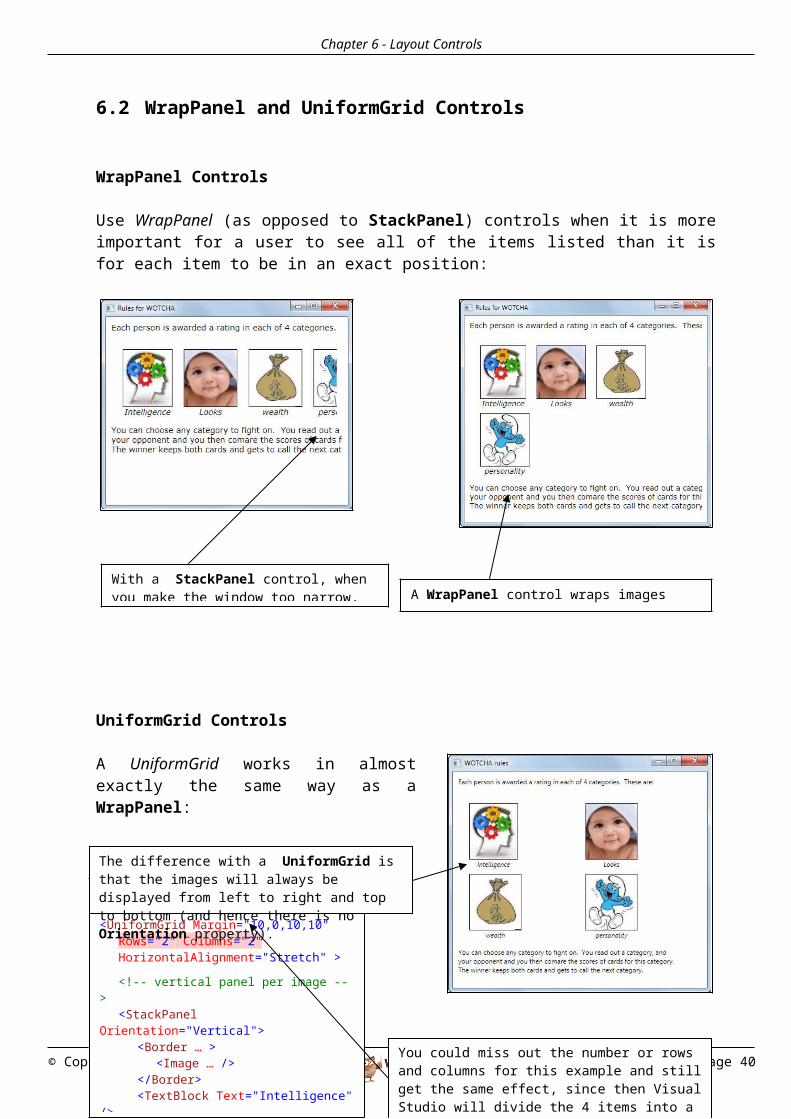
Use WrapPanel (as opposed to StackPanel) controls when it is more important for a user to see all of the items listed than it is for each item to be in an exact position:
UniformGrid Controls
A UniformGrid works in almost exactly the same way as a WrapPanel:
© Copyright 2023 Page 40
With a StackPanel control, when you make the window too narrow, you lose some of the images. A WrapPanel control wraps images inside the panel.
<!-- the 2x2 grid for the images --><UniformGrid Margin="10,0,10,10"
Rows="2" Columns="2"HorizontalAlignment="Stretch" >
<!-- vertical panel per image -->
<StackPanel Orientation="Vertical">
<Border … ><Image … />
</Border><TextBlock Text="Intelligence"
/></StackPanel><!— other 3 images follow here
The difference with a UniformGrid is that the images will always be displayed from left to right and top to bottom (and hence there is no Orientation property).
You could miss out the number or rows and columns for this example and still get the same effect, since then Visual Studio will divide the 4 items into a sensible 2x2 rectangle.
Chapter 6 - Layout Controls
6.3 Single-Cell Grid and Canvas Controls
Single Cell Grids
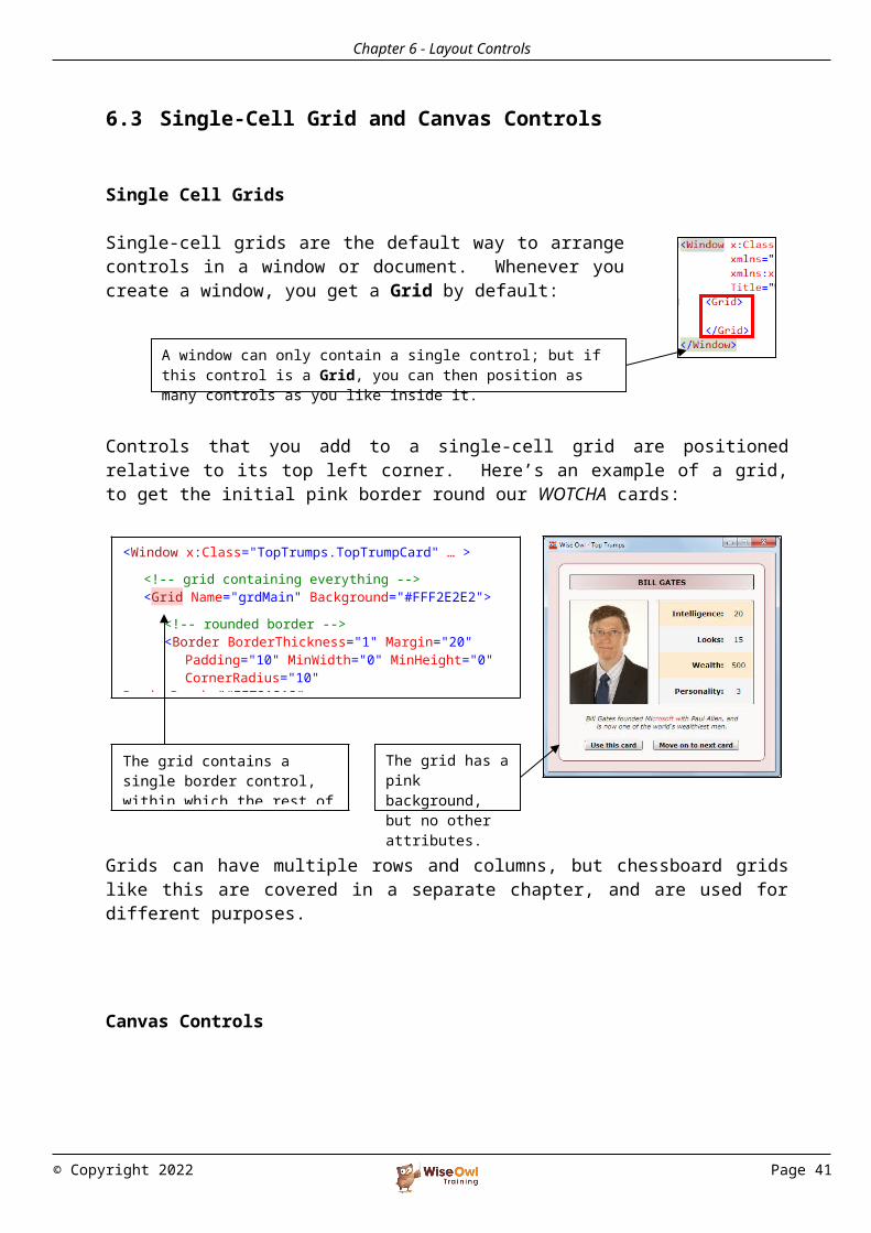
Single-cell grids are the default way to arrange controls in a window or document. Whenever you create a window, you get a Grid by default:
Controls that you add to a single-cell grid are positioned relative to its top left corner. Here’s an example of a grid, to get the initial pink border round our WOTCHA cards:
Grids can have multiple rows and columns, but chessboard grids like this are covered in a separate chapter, and are used for different purposes.
Canvas Controls
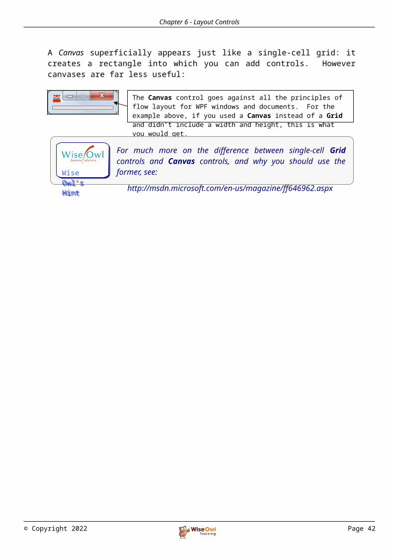
A Canvas superficially appears just like a single-cell grid: it creates a rectangle into which you can add controls. However canvases are far less useful:
© Copyright 2023 Page 41
A window can only contain a single control; but if this control is a Grid, you can then position as many controls as you like inside it.
<Window x:Class="TopTrumps.TopTrumpCard" … ><!-- grid containing everything --><Grid Name="grdMain" Background="#FFF2E2E2">
<!-- rounded border --><Border BorderThickness="1" Margin="20"
Padding="10" MinWidth="0" MinHeight="0"CornerRadius="10"
BorderBrush="#FF721212" Background="#FFFCF9F9">
The grid contains a single border control, within which the rest of the window fits.
The grid has a pink background, but no other attributes.
The Canvas control goes against all the principles of flow layout for WPF windows and documents. For the example above, if you used a Canvas instead of a Grid and didn’t include a width and height, this is what you would get.
Wise Owl’s Hint
For much more on the difference between single-cell Grid controls and Canvas controls, and why you should use the former, see:
http://msdn.microsoft.com/en-us/magazine/ff646962.aspx
Chapter 6 - Layout Controls
6.4 DockPanel Controls
A DockPanel control attaches the controls it contains (its “children”) to the edge specified by their respective DockPanel.Dock properties:
The LastChildFill Property
When all but the last child element of a DockPanel has been accounted for, what should happen to the rest of the space? The answer is determined by the LastChildFill property:
© Copyright 2023 Page 42
<!—- show rectangle filled with image on left --><DockPanel Margin="0,20,0,20" Height="200">
<!-- put border round rectangle with image -->
<Border DockPanel.Dock="Left" BorderThickness="1" BorderBrush="Black" Width="150"><Rectangle>
<Rectangle.Fill><ImageBrush
ImageSource="BillGates.jpg" Stretch="UniformToFill" />
</Rectangle.Fill></Rectangle>
</Border><!-- now put a border round grid of scores
--><Border BorderThickness="1"
BorderBrush="Black" Margin="20,0,0,0"> <Grid>
The picture is docked to the left edge of the DockPanel control; the table fills the rest of it.
The DockPanel to achieve this effect contains 2 Border controls. The one on the left is docked to the left edge of the dock panel, and contains a picture; the one on the right contains the table of ratings by category.
If set to False, there will sometimes be a space beside/above/below the last child.
If set to True, the last child will expand to fill any remaining gap.

Chapter 6 - Layout Controls
6.5 Controls to Conserve Space
To avoid creating huge windows (which might not fit onto a screen) you can use ScrollViewer, TabControl, ViewBox or Expander controls, as shown below.
ScrollViewer Controls
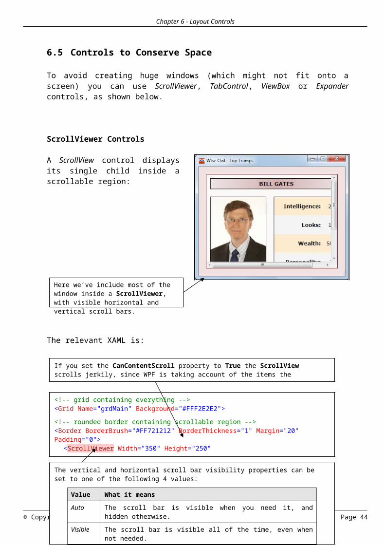
A ScrollView control displays its single child inside a scrollable region:
The relevant XAML is:
© Copyright 2023 Page 43
Here we’ve include most of the window inside a ScrollViewer, with visible horizontal and vertical scroll bars.
<!-- grid containing everything --><Grid Name="grdMain" Background="#FFF2E2E2"><!-- rounded border containing scrollable region --><Border BorderBrush="#FF721212" BorderThickness="1" Margin="20" Padding="0">
<ScrollViewer Width="350" Height="250" VerticalScrollBarVisibility="Auto"
Background="#FFFCF9F9" CanContentScroll="False"
The vertical and horizontal scroll bar visibility properties can be set to one of the following 4 values:
Value What it means
Auto The scroll bar is visible when you need it, and hidden otherwise.
Visible The scroll bar is visible all of the time, even when not needed.
Disabled The scroll bar does not appear even when needed. There are subtle differences between these two properties which are only ever likely to be of interest if you’re using ListBox controls.Hidden
If you set the CanContentScroll property to True the ScrollView scrolls jerkily, since WPF is taking account of the items the ScrollView contains. The default False setting gives much smoother scrolling.
Chapter 6 - Layout Controls
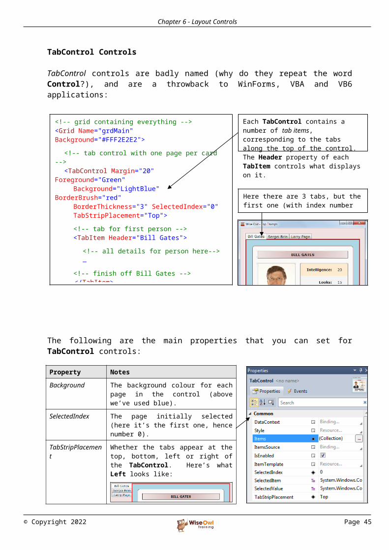
TabControl Controls
TabControl controls are badly named (why do they repeat the word Control?), and are a throwback to WinForms, VBA and VB6 applications:
The following are the main properties that you can set for TabControl controls:
© Copyright 2023 Page 44
<!-- grid containing everything --><Grid Name="grdMain" Background="#FFF2E2E2">
<!-- tab control with one page per card -->
<TabControl Margin="20" Foreground="Green"
Background="LightBlue" BorderBrush="red"
BorderThickness="3" SelectedIndex="0"TabStripPlacement="Top">
<!-- tab for first person --><TabItem Header="Bill Gates">
<!-- all details for person here-->…
<!-- finish off Bill Gates --> </TabItem>
<!-- empty tabs for other 2 cards for now -->
Here there are 3 tabs, but the first one (with index number 0) is selected.
Each TabControl contains a number of tab items, corresponding to the tabs along the top of the control. The Header property of each TabItem controls what displays on it.
Property Notes
Background The background colour for each page in the control (above we’ve used blue).
SelectedIndex The page initially selected (here it’s the first one, hence number 0).
TabStripPlacement Whether the tabs appear at the top, bottom, left or right of the TabControl. Here’s what Left looks like:
Items The different pages or tabs in the control (you can type these in, or use the build button to create them).
Chapter 6 - Layout Controls
ViewBox Controls
ViewBox controls shrink or expand contents to fit a given width and height:
A ViewBox’s main properties are as follows:
© Copyright 2023 Page 45
Here the ViewBox has a fixed width and height. Because the Stretch method is Fill (see below), the contents have been distorted:
<!-- view box with given dimensions --><Viewbox Margin="20" Stretch="Fill"
Width="300" Height="200">
Property Notes
Stretch How you can stretch the contents of the ViewBox to fill it. The possible values are None – you can’t stretch contents at all Fill – the contents will fill the ViewBox exactly, but
may be distorted Uniform – the contents will fill the ViewBox in one
dimension, but the aspect ratio (the ratio between width and height) will be preserved to prevent distortion
UniformToFill – as for Uniform, but part of the contents may not be visible (in effect, the contents are stretched too far in one dimension).
Stretch-Direction
Whether you can shrink or expand the contents (UpOnly means you can expand but not shrink them; DownOnly means you can shrink but not expand).

Chapter 6 - Layout Controls
Expander Controls
An Expander control is similar to a TabControl:
Here are the main properties for the Expander:
© Copyright 2023 Page 46
<!-- rounded border containing StackPanel --><Border … >
<!-- stack panel containing 3 expanders -->
<StackPanel Name="grdMain" Margin="10">
<!-- Expander for Bill Gates --><Expander Header="Bill Gates"
Background="LightBlue"><!-- details for Bill -->
<StackPanel … > … </StackPanel></Expander><!—- empty expanders for other 2 -->
<Expander Header="Sergei Brin" Background="LightBlue"></Expander>
<Expander Header="Larry Page" Background="LightBlue"></Expander>
</StackPanel>
When you click on the icon in an Expander …
… it reveals its contents!
The first Expander is for Bill Gates, and contains a StackPanel giving all of his card details.
Property Notes
IsExpanded Whether the Expander is currently expanded!
Expand-Direction
The direction in which the Expander will grow (expansion to the left, for example, looks odd).
Header The text which appears next to the icon (if any).