Lab report watson
29
Reporting Tool: IBM® Watson Analytics Data Set: HrData.csv Number of records: 766 Number of fields: 21 Each record corresponds to an employee. Task 1: Import your Dataset. 1. Using the Add (+) tab, we can add new dataset or create something new with existing dataset. 2. Using Drop your file here , navigate to browser window. Purpose: Build a report that studies voluntary attrition among higher-performing employees so that actions can be taken to keep them. The focus of the study is higher-performing employees, but information about lower-performing employees is also analyzed for comparative purposes. Workshop 1: Build a basic report on Employee Attrition
-
Upload
shaily-dubey -
Category
Data & Analytics
-
view
104 -
download
0
Transcript of Lab report watson

Reporting Tool: IBM® Watson Analytics
Data Set: HrData.csv
Number of records: 766
Number of fields: 21
Each record corresponds to an employee.
Task 1: Import your Dataset.
1. Using the Add (+) tab, we can add new dataset or create something new with existing
dataset.
2. Using Drop your file here, navigate to browser window.
Purpose:
Build a report that studies voluntary attrition among higher-performing employees so that actions can be taken to keep
them. The focus of the study is higher-performing employees, but information about lower-performing employees is
also analyzed for comparative purposes.
Workshop 1: Build a basic report on Employee Attrition
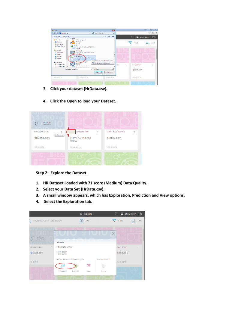
3. Click your dataset (HrData.csv).
4. Click the Open to load your Dataset.
Step 2: Explore the Dataset.
1. HR Dataset Loaded with 71 score (Medium) Data Quality.
2. Select your Data Set (HrData.csv).
3. A small window appears, which has Exploration, Prediction and View options.
4. Select the Exploration tab.
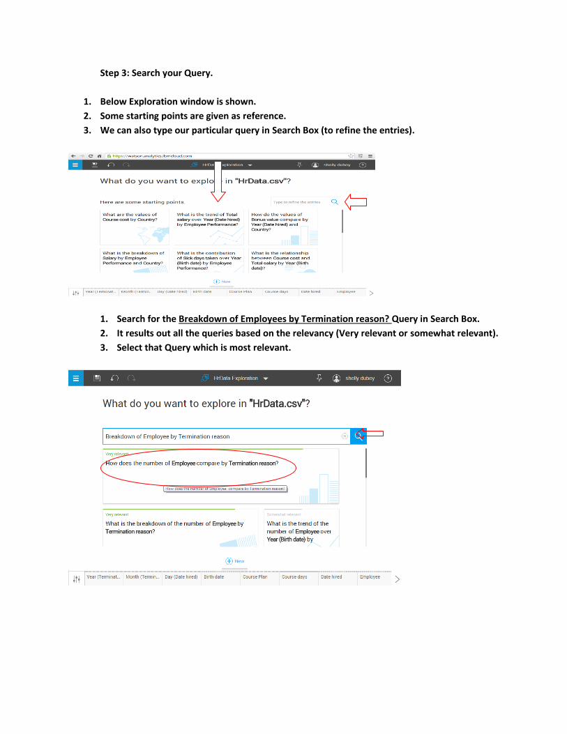
Step 3: Search your Query.
1. Below Exploration window is shown.
2. Some starting points are given as reference.
3. We can also type our particular query in Search Box (to refine the entries).
1. Search for the Breakdown of Employees by Termination reason? Query in Search Box.
2. It results out all the queries based on the relevancy (Very relevant or somewhat relevant).
3. Select that Query which is most relevant.
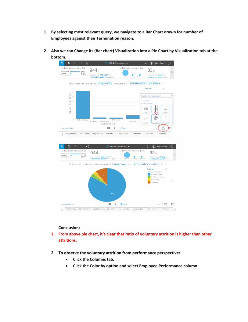
1. By selecting most relevant query, we navigate to a Bar Chart drawn for number of
Employees against their Termination reason.
2. Also we can Change its (Bar chart) Visualization into a Pie Chart by Visualization tab at the
bottom.
Conclusion:
1. From above pie chart, it’s clear that ratio of voluntary attrition is higher than other
attritions.
2. To observe the voluntary attrition from performance perspective:
Click the Columns tab.
Click the Color by option and select Employee Performance column.
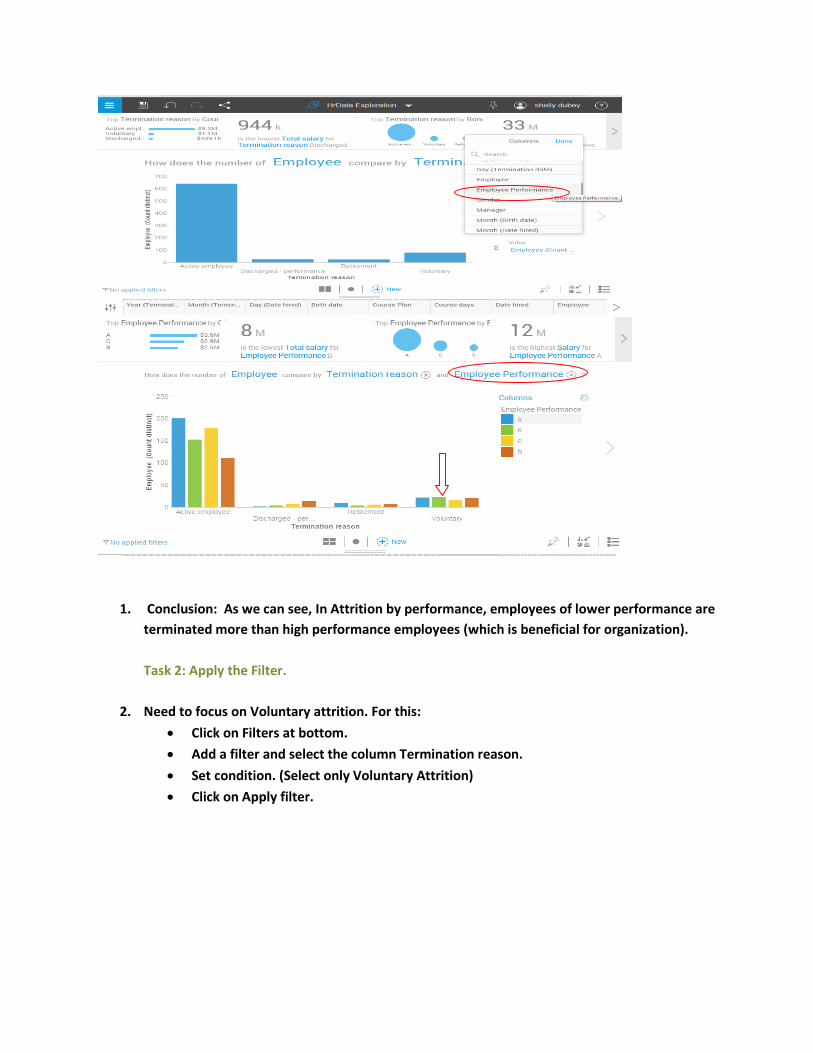
1. Conclusion: As we can see, In Attrition by performance, employees of lower performance are
terminated more than high performance employees (which is beneficial for organization).
Task 2: Apply the Filter.
2. Need to focus on Voluntary attrition. For this:
Click on Filters at bottom.
Add a filter and select the column Termination reason.
Set condition. (Select only Voluntary Attrition)
Click on Apply filter.

1. Now to observe the behavior of high performance (High and Moderate)
employees:
Click the (+) New Exploration.
Type the query for Breakdown of Employees by their Satisfaction level.
Select most relevant query.

1. Bar chart for Employees against their satisfaction level appears.
2. Click the Color by option.
3. Add the column Termination reason.
4. Change its Visualization type to highlight the Voluntary attrition.
5. Click the Voluntary, listed at the right hand side in columns.
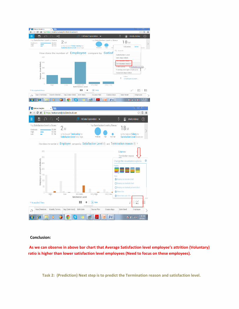
Conclusion:
As we can observe in above bar chart that Average Satisfaction level employee’s attrition (Voluntary)
ratio is higher than lower satisfaction level employees (Need to focus on these employees).
Task 2: (Prediction) Next step is to predict the Termination reason and satisfaction level.

Click on Predict option available on welcome page.
Create a Prediction Window appears.
Select your data set (HrData.csv).
Navigate to Workbook window (Create a prediction).
Name your workbook.
Select the targets.
Click the Create prediction.
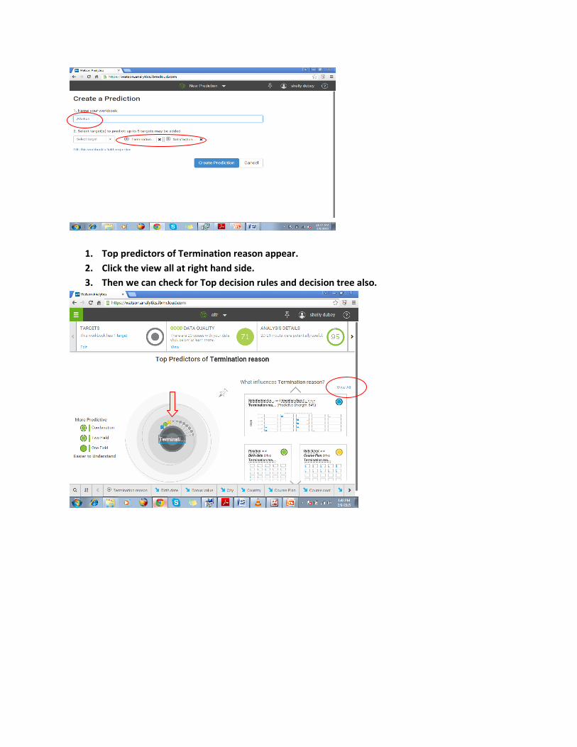
1. Top predictors of Termination reason appear.
2. Click the view all at right hand side.
3. Then we can check for Top decision rules and decision tree also.

Decision
Tree
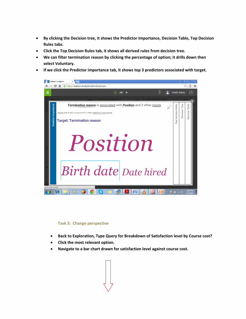
By clicking the Decision tree, it shows the Predictor Importance, Decision Table, Top Decision
Rules tabs.
Click the Top Decision Rules tab, it shows all derived rules from decision tree.
We can filter termination reason by clicking the percentage of option; it drills down then
select Voluntary.
If we click the Predictor importance tab, it shows top 3 predictors associated with target.
Task 3: Change perspective
Back to Exploration, Type Query for Breakdown of Satisfaction level by Course cost?
Click the most relevant option.
Navigate to a bar chart drawn for satisfaction level against course cost.

In above Tree map (Visualization changed from Bar to Tree map), the highest course cost is
shown for Moderate satisfaction level employees.
Click the Add Row.
Select Column Position.
Change visualization type from Tree map into Line chart.
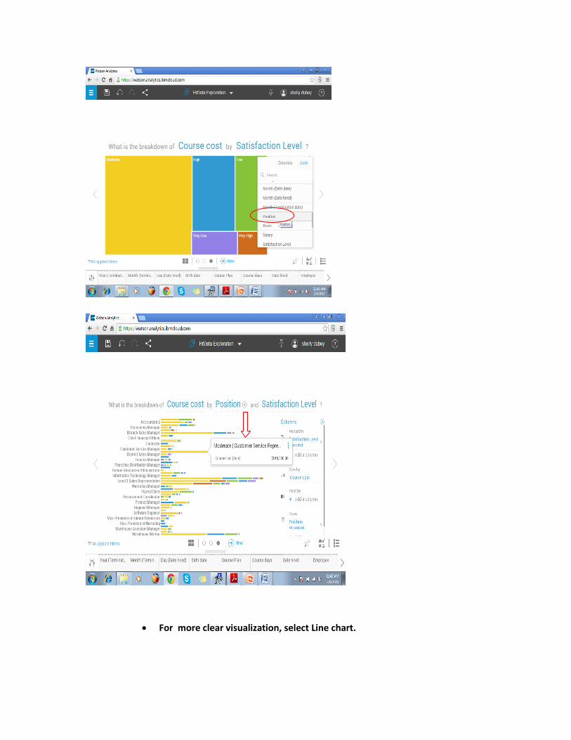
For more clear visualization, select Line chart.

Conclusion:
As we can see in above Line chart, highest course cost is for Moderate
satisfaction level employees and Level 1 Sales representative position (because
as we know from prediction , position influence Termination).
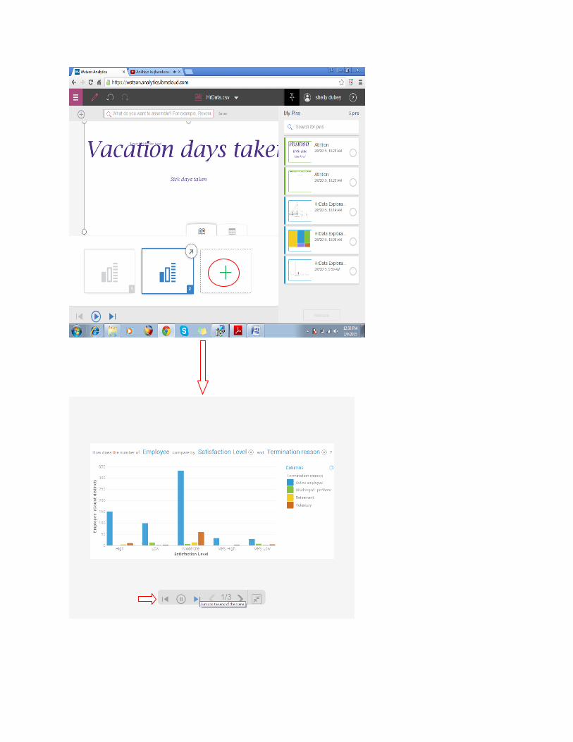
Task 4: Assemble (Create the Slide show)
Click the Assemble option at Welcome Page.

Name your View.
Select Story (Slide show), Choose one of the slide show Layout then click Create.
Drag (Exploration, chart, prediction etc) from the saved pins to Layout by cursor.
Click next scene (+) to add more pins.
After completing adding pins, Click Full screen mode at top.
Play the Slide Show.

Reporting Tool: IBM® Watson Analytics
Data Set: HrData.csv
Number of records: 766
Number of fields: 21
Each record corresponds to an employee.
Task 1: Explore your Query.
Breakdown of the Employee and their performances?
Workshop 1: Build a report on Employee Performance
Purpose:
Build a report that studies employee’s performances so the actions can be taken to improve their performance. The
focus of the study is higher-performing employees, their course plan and level of satisfaction (if employees are satisfied,
they perform well). But information about lower-performing employees is also analyzed for comparative purposes.
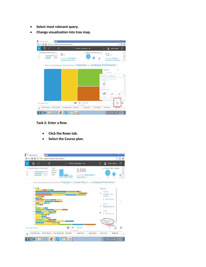
Select most relevant query.
Change visualization into tree map.
Task 2: Enter a Row.
Click the Rows tab.
Select the Course plan.
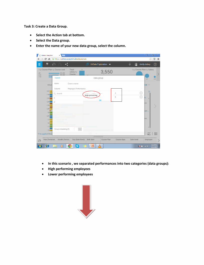
Task 3: Create a Data Group.
Select the Action tab at bottom.
Select the Data group.
Enter the name of your new data group, select the column.
In this scenario , we separated performances into two categories (data groups):
High performing employees
Lower performing employees


Task 4: Make a prediction

Course plan and position are main influences of Employee performance.
Click the View All.
Select the Decision Tree.
Click the Top decision rules tab.

Conclusion: As we can see from above decision rule that course plan L10 is most benefiticial
for high performance of employees.

Task 1: Explore the query.
Conclusion: Organization is offering more Bonus value to the lower performance employees
than average one.
Task 2: Explore Breakdown of Training cost by Performance.
Workshop 3: Build a report on Return on Investment analysis
Purpose:
Build a report that studies Investments done by organization over their employees, so that performance of employees can
be improved. The focus of the study is analysis of Employment cost, training cost and benefits that effect organization
revenue and profits.

Task 3: Find the trend of Training cost over course cost.
Task 4: Make a prediction:
Here, we can see the Course cost is
very high, but training cost is less
comparatively (so organization is
getting most out of the no large
investment)
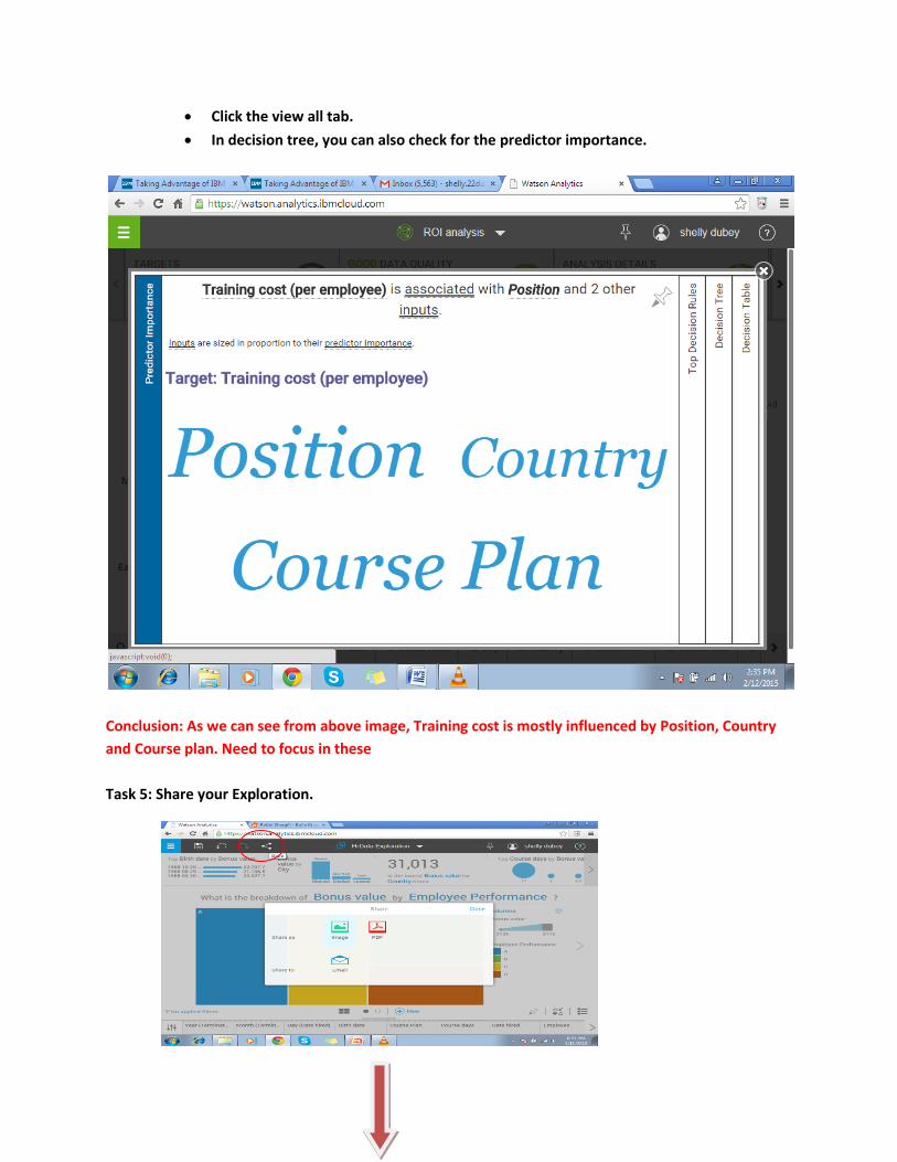
Click the view all tab.
In decision tree, you can also check for the predictor importance.
Conclusion: As we can see from above image, Training cost is mostly influenced by Position, Country
and Course plan. Need to focus in these
Task 5: Share your Exploration.
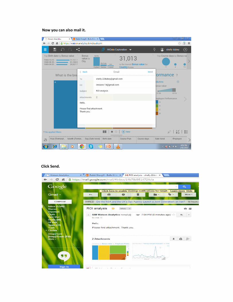
Now you can also mail it.
Click Send.