KYRGYZ REPUBLIC POVERTY P 2013 - All...
54
Report No 99772-KG KYRGYZ REPUBLIC: POVERTY PROFILE FOR 2013 May 21, 2015 Poverty Global Practice Europe and Central Asia Region Document of the World Bank Public Disclosure Authorized Public Disclosure Authorized Public Disclosure Authorized Public Disclosure Authorized
-
Upload
truongdang -
Category
Documents
-
view
214 -
download
1
Transcript of KYRGYZ REPUBLIC POVERTY P 2013 - All...

Report No 99772-KG
KYRGYZ REPUBLIC: POVERTY PROFILE FOR 2013
May 21, 2015
Poverty Global Practice
Europe and Central Asia Region
Document of the World Bank
Pub
lic D
iscl
osur
e A
utho
rized
Pub
lic D
iscl
osur
e A
utho
rized
Pub
lic D
iscl
osur
e A
utho
rized
Pub
lic D
iscl
osur
e A
utho
rized

ii
CURRENCY AND EQUIVALENT UNITS
Exchange Rate Effective as of April 13, 2015
Currency Unit = Som (KGS)
US$1 = 63.9 Som
FISCAL YEAR
January 1 – December 31
ABBREVIATIONS
GNI Gross National Income GDP Gross Domestic Product ECA Europe and Central Asia region KIHS Kyrgyzstan’s Integrated Household Survey LFS Labor Force Survey LSMS Living Standards Measurement Survey NBKR National Bank of the Kyrgyz Republic NSC National Statistics Committee pp Percentage points PPP Purchasing Power Parity WDI World Development Indicators WDR World Development Report UN United Nations US$ United States’ Dollar
Vice President : Laura Tuck
Country Director : Saroj Kumar Jha
Country Manager : Jean-Michel Happi
Practice Director : Ana Revenga
Practice Manager : Carolina Sanchez-Paramo
Task Leaders :
Sarosh Sattar (GPVDR)

ACKNOWLEDGEMENTS
This report was prepared by a team led by Sarosh Sattar (Sr. Economist, GPVDR). The team was
comprised of Aibek Baibagysh Uulu, Consultant, GPVDR (Poverty and employment trends and
drivers), Paola Ballon, Aziz Atamanov (Multidimensional poverty estimates) and Saida
Ismailakhunova (Local Economist, GPVDR). This work would not be possible without close
cooperation between the World Bank and the National Statistics Committee of the Kyrgyz Republic
(NSC). We are especially grateful to Mr. Osmonaliev, Chairman of the NSC; Mrs. Samohleb,
Head of Household Survey Department; Mrs. Praslova, Former Deputy Head of Household Survey
Department; and Mrs. Djailobaeva, Head of Labor Force Survey Department.
The report was prepared under the guidance of Carolina Sanchez-Paramo (Practice Manager) and
Jean-Michel Happi (Country Manager). The team is grateful for comments and technical advice
provided by Aziz Atamanov (Economist, GPVDR). Excellent administrative support was provided
by Helena Makarenko and Nargiza Tynybekova (Program Assistants).

4
TABLE OF CONTENTS
EXECUTIVE SUMMARY .......................................................................................................................................... 6
1. INTRODUCTION ............................................................................................................... 10
MACRO CONTEXT ..................................................................................................................................................... 10
DEMOGRAPHIC AND MDG RELATED SOCIAL INDICATORS ................................................................................. 13
2. POVERTY TRENDS AND DRIVERS OF CHANGES .................................................. 16
AGGREGATE TRENDS, 2003-2013 ........................................................................................................................ 16
REGIONAL/OBLAST TRENDS ........................................................................................................................................ 19
TRENDS BY QUINTILES ........................................................................................................................................ 22
GROWTH DECOMPOSITION .................................................................................................................................. 23
INCOME SOURCE DECOMPOSITION ...................................................................................................................... 24
POVERTY MOBILITY ............................................................................................................................................ 26
POVERTY AND DEMOGRAPHIC CHARACTERISTICS OF HOUSEHOLDS .................................................................. 28
DIFFERENCES BETWEEN POOR AND NON-POOR IN THE STRUCTURE OF INCOME AND EXPENDITURES ................. 31
3. ESTIMATES OF MULTIDIMENSIONAL POVERTY ................................................. 35
4. EMPLOYMENT TRENDS: ANALYSIS OF THE LABOR FORCE SURVEY .......... 39
List of Tables
Table 1.1: Selected Social Indicators for the Kyrgyz Republic .................................................................... 15
Table 2.1: Demographic Characteristics of Poor and Non-poor Households ............................................. 29
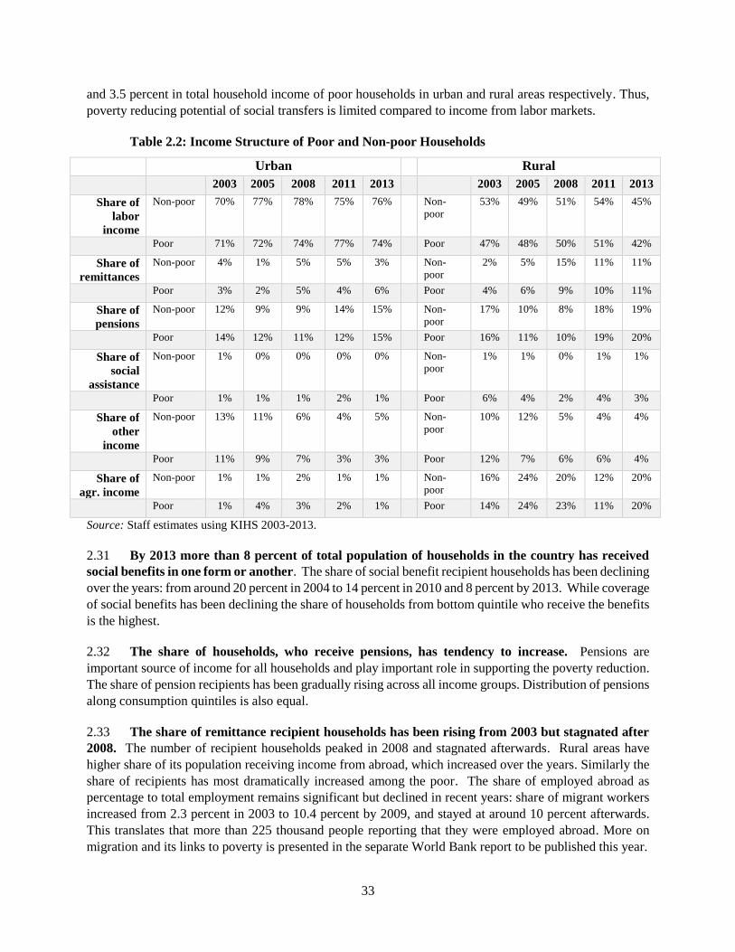
Table 2.2: Income Structure of Poor and Non-poor Households ............................................................... 33
Table 2.3: Coverage of Households in Terms of Receipts of Various Transfers ......................................... 34
Table 3.1: Normative Considerations – Dimensions, Indicators and Values .............................................. 35
Table 3.2: Multidimensional Poverty Index (k=>2) by regions ................................................................... 37

5
List of Figures
Figure 1.1: Cross Country Comparison of GDP and Poverty Rates in Selected ECA Countries ................... 11
Figure 1.2: Sector Structure of GDP and Employment ............................................................................... 11
Figure 1.3: Sector Contribution to GDP and Migration .............................................................................. 12
Figure 1.4: Structure and Contribution to GDP Growth by Components of Final Use ............................... 13
Figure 1.5: Population Changes .................................................................................................................. 14
Figure 2.1: Trends in National Poverty Rates (adjusted for time series comparison) ................................ 17
Figure 2.2: Trends in Poverty Gap Index and International Poverty .......................................................... 17
Figure 2.3: Changes in Physical Consumption of Selected Food Items....................................................... 18
Figure 2.4: Poverty Elasticity and Gini index ............................................................................................... 19
Figure 2.5: Poverty Changes by Urban-Rural .............................................................................................. 19
Figure 2.6: Poverty and Mean Consumption Expenditures Across Oblasts................................................ 20
Figure 2.7: Oblast Level Decomposition of Poverty Changes, 2003-13 ...................................................... 21
Figure 2.8: Distribution of Poor by Oblasts, 2003-13.................................................................................. 21
Figure 2.9: Elasticity of Poverty and Changes in Consumption Expenditures by Quintiles ........................ 22
Figure 2.10: Growth-Incidence Curves by Periods: ..................................................................................... 24
Figure 2.11: Income Source Decomposition of Poverty Changes, 2003-13 ................................................ 25
Figure 2.12: Income Source Decomposition of Poverty Changes, by periods ............................................ 26
Figure 2.13: Poverty Mobility by Periods (upper bounds reported) ........................................................... 27
Figure 2.14: Correlates of Poverty Mobility ................................................................................................ 28
Figure 2.15: Household Demographic Composition and Poverty ............................................................... 30
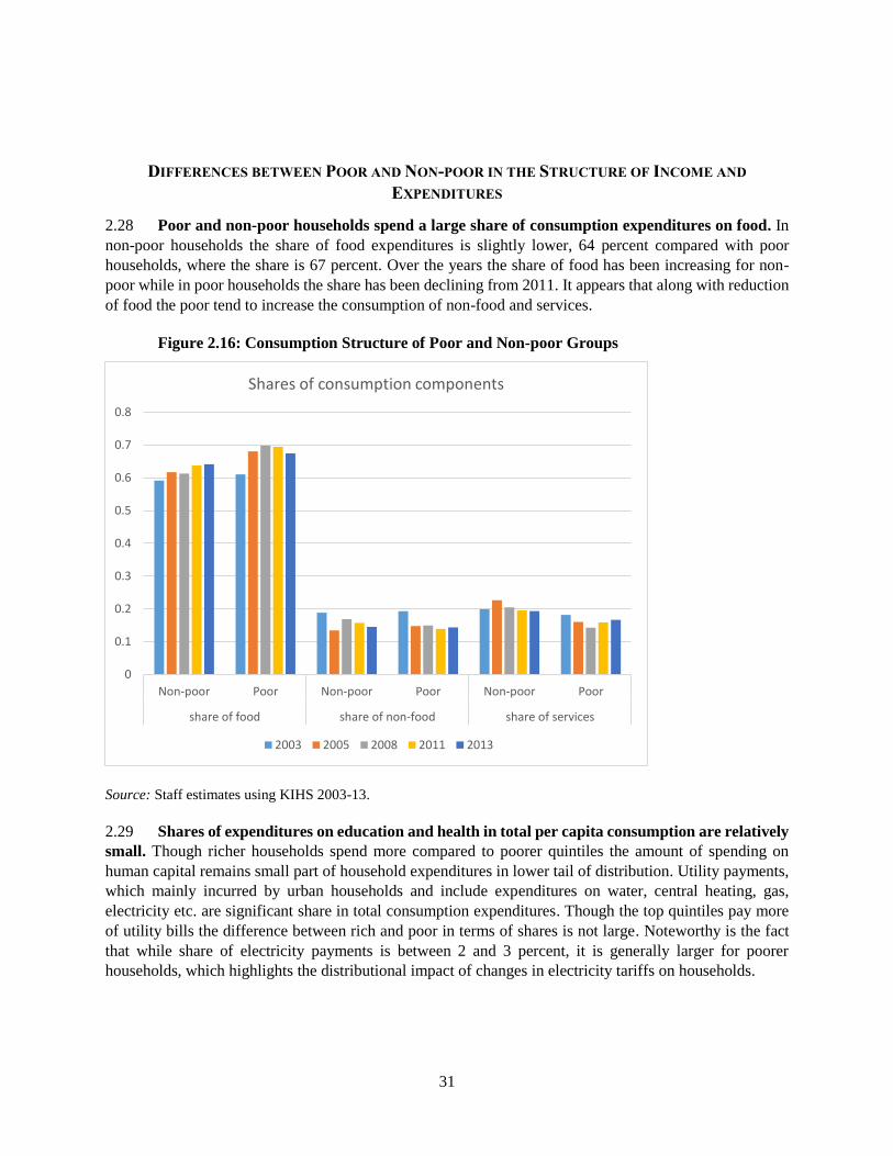
Figure 2.16: Consumption Structure of Poor and Non-poor Groups .......................................................... 31
Figure 2.17: Structure of Non-food Expenditures of Poor and Non-poor Households .............................. 32
Figure 3.1: Percentage of People Deprived by Indicator (raw headcount ratios) ..................................... 36
Figure 3.2: Raw Head Count Ratios by Income Poverty Status................................................................... 36
Figure 3.3: Contribution of Indicators to MPI ............................................................................................. 38
Figure 4.1: Trends in Labor Force ............................................................................................................... 39
Figure 4.2: Trends in Labor Market Status of Adult Population ................................................................. 40
Figure 4.3: Employment Trends by Urban-rural and Oblasts .................................................................... 41
Figure 4.4: Employment Trends by Economic Sector ................................................................................. 41
Figure 4.5: Demographic Structure of Employment ................................................................................... 42
Figure 4.6: Returns to Education ................................................................................................................ 43
Figure 4.7: Structure of Employment by Type and Informality .................................................................. 44
Figure 4.8: Poverty Among Employed ........................................................................................................ 44
Figure 4.9: Employment decomposition of poverty changes ..................................................................... 45

6
EXECUTIVE SUMMARY
1. Over the last decade, the Kyrgyz Republic experienced volatile but positive economic growth. Compared to other countries in the Europe and Central Asia (ECA) region, the Kyrgyz Republic has
underperformed and had the lowest average annual GDP growth rate—just 4 percent over the period of
2003-2013. Episodes of growth were driven by growth in private consumption, which in turn was likely
fueled by the significant inflow of remittances from workers abroad. In terms of sectoral growth, the
services sector was the fastest growing segment of the economy. Though it is not uncommon to observe
the remittance led economic growth, whether this can lead to sustainable poverty reduction in the Kyrgyz
Republic remains an open question.
2. Since the early 2000s, the share of working age population has been growing robustly and
foreign labor markets have been an important source of employment. Data indicates that potential
labor market pressures from a growing adult population were largely alleviated by increased out-migration.
The two host countries, the Russian Federation and Kazakhstan, experienced high rates of economic growth
resulting in an increasing demand for labor that was filled by migrants from CIS countries including the
Kyrgyz Republic. Not only did migration lead to an outlet for “surplus” labor, but remittances also raised
welfare such that there appears to have a small decline in labor force participation. However, migration
has decelerated and the share of households receiving remittances has declined since 2011 calling into
question the sustainability of this employment model.
3. The Kyrgyz Republic has achieved large reductions in poverty over the past decade, but in
recent years progress has diminished. Aided by growth in remittances and employment abroad, poverty
declined from 68 percent in 2003 to 37 percent of population by 2013. However, simply looking at two
end points mask great variation in the pattern of poverty changes. Analysis of annual poverty trends shows
that poverty dramatically fell during 2003 and 2008, but has since stagnated at around 37 percent. Though
changes in poverty remain responsive to overall economic growth, it appears that the Kyrgyz Republic may
have entered a new phase with regard to poverty reduction. The elasticity of poverty to growth may be
contracting, especially during periods of positive growth, but the data points are too few to make this
statement conclusively.
Figure 1: Poverty Trends
4. During 2003-2012, the Kyrgyz Republic saw significant convergence between urban and
rural poverty rates such that by 2012, the gap had shrunk to 4 percentage points (35 percent vs 39 percent
for urban and rural respectively). Out of total reduction in poverty in the 2003-2013 period, more than 60
percent of decline was attributed to reduction in poverty in rural areas—which suffered the most
0%
20%
40%
60%
80%
20
03
20
04
20
05
20
06
20
07
20
08
20
09
20
10
20
11
20
12
20
13
in p
erce
nt
of
to
tal p
op
ula
tio
n
Absolute poverty rates using national poverty lines, 2003-2013
Total Urban Rural
0
20
40
60
80
2003 2004 2005 2006 2008 2009 2010 2011 2012
in p
erce
nt
of
tota
l po
pu
lati
on
Poverty rates using international poverty lines
(US$ 1.25 and US$ 2.50) and harmonized welfare aggregate
US$ 1.25 US$ 2.50

7
deprivation. However, in the 2003-2008 period, rural poverty fell faster than urban poverty whereas, during
2009-2012, the convergence resulted from growing urban poverty and stagnating rural poverty rates.
However, in 2013, rural and urban poverty rates sharply diverged such that gap reached more than 11
percentage points.
5. At a disaggregated level, poverty trends vary greatly by oblasts with little stability in observed
patterns. Though poverty rates have also fallen at the oblast level, the progress has not been consistent
across all parts of the country and frequently varies greatly year to year. However, changes in oblast poverty
rates are worth understanding, especially since there could be implications for equity across regions. For
example, in the oblasts of Issyk-Kul, Naryn and Talas, the overall poverty trend was downward. In the
other oblasts, poverty declined up until 2008 and then stagnating (e.g., in Jalal-Abad and Osh) or increased
(Batken and the capital Bishkek and the surrounding oblast of Chui). Oblast level changes appear to be
heterogeneous, pointing to oblast specific factors of poverty reduction that may reflect the smallness of
local markets and/or a clustering of the population around the poverty line such that small changes income
move a significant number of people into and out of poverty.
6. The Kyrgyz Republic has a relatively young population compared to other countries in ECA.
An estimated 30 percent of the population is 14 years or younger—comparable to the ratio seen in lower
middle income countries. However, since poor families tend to be larger and with more children, the
majority of the poor are young but educated with complete secondary education. The share of the poor
who are under 15 years of age represents around 40 percent of all poor and this share stays stable across
years. The correlation between the poverty status and household size is strong in the Kyrgyz Republic –
similar to other countries. Though there is indeed poverty among the elderly, the incidence of poverty is
lower due to the pension system—which though not generous, does provide support to a significant
proportion of the population.
7. Poverty reduction during 2003-2013 was driven mostly by growth rather than redistribution. Poverty changes can be decomposed into a growth component (changes in the overall size of the pie) versus
a redistribution component (resizing the individual pie pieces). For the Kyrgyz Republic, growth
decomposition analysis indicates that for the period of 2003-2013 poverty reduction was mainly due to the
growth component, that is, growth in consumption across all percentiles. In the period of rapid poverty
reduction, 2003-2009, the effect of growth in mean consumption was supplemented by improvements in
the redistribution component—leading to a fast and dramatic reduction of poverty by 19 percentage points.
In the last sub-period, 2009-2013 (which was characterized by stagnation of poverty), the improvements in
redistribution component offset the reduction in the mean consumption resulting in slight (2 percentage
points) increase in poverty overall.
Figure 2: Growth Incidence Curves
0
1
2
3
4
5
6
7
8
9
0 3 6 9 12151821242730333639424548515457606366697275788184 879093 9699
An
nu
al
gro
wth
ra
te, %
Expenditure percentiles
2003-2013
-6
-4
-2
0
2
4
6
8
0 3 6 9 121518212427303336394245485154576063666972757881848790939699
An
nu
al
gro
wth
ra
te, %
Expenditure percentiles
2009-2013

8
8. An income decomposition of poverty changes shows that for the period between 2003 and
2013 the reduction of poverty was mainly due to the strong growth in wages. In order to understand
the drivers of poverty reduction, an understanding of the contribution of various sources of income to
welfare improvements is helpful. In the Kyrgyz Republic, the income decomposition focusses on wages,
employment, pensions, remittances, and social assistance. The majority of the poverty decline can be
attributed to the growth in wage income (per employed person). Growth in real value of pensions was
second important factor, while remittances played a smaller role. Other non-labor income, specifically
social transfers seemed to be much less important for poverty reduction—which is consistent with the
limited reach of the program and the conservative transfer amounts.
Figure 3: Income Source Decomposition of Poverty Changes
9. Though the sources of income differ between rural and urban households, within urban and
rural areas, the income structure between poor and non-poor does not vary significantly. Both poor
and non-poor alike are highly dependent on income from work: in urban areas the share of labor income in
total income reaches 76 and 74 percent for non-poor and poor respectively, while in rural areas, the share
is much lower at 45 and 42 percent respectively. This is compensated by higher share of pension income.
Also, in rural areas there are two additional sources of income that substitute for smaller share of wages
compared to urban areas: income from sales of own agricultural production and remittances.
10. Progress on non-income dimensions of poverty reduction has been mixed. Out of five selected
indicators of non-monetary poverty only three demonstrated a progress in recent years: access to
communication (telephones), to working heating system and frequencies of electricity outages all have
improved, leading to reduction in multidimensional poverty from 2008 to 2012. However infrastructure
related dimensions: access to sewage and safe water had negative impact and constitutes the large share of
non-income poverty. Not-surprisingly the non-income poverty is higher in rural areas where the investment
in infrastructure is lowest. Also it appears that trend in consumption and non-consumption poverty have
been only weakly correlated, pointing to the need to monitor both to access and guide policy making.
11. The break-down by indicator shows that access to sewage and safe water contributed the
most to multidimensional poverty. In 2008 those deprivations contributed 48 percent to overall non-
monetary poverty, this share increased to 84 percent by 2012. This may signal continued infrastructural
problems faced by population. Deprivation related to uninterrupted electricity (i.e. with no outages)
-40
-30
-20
-10
0
10
Total Urban Rural
per
cen
tage
po
ints
Income source decomposition of income poverty (2003-13)
share of adults share of employed adults wage per employed
pension per adult remittances per adult social benefit per adult
other income per adult agric. income per adult

9
continue to be a problem as well. Contribution of other indicators of non-income deprivations
(communication and heating) declined or remained low.
12. The decline in (domestic) labor force participation in the last decade has been due to the
falling share of the employed in the population. This was largely the result of a sharp fall in the rural
sector’s employment ratio between 2006 and 2008. Employment in the agricultural sector declined by a
third over the period 2003-2012, before increasing again in 2013. Apart from the spike in 2013, the
employment in agriculture has been declining rapidly while the service and construction sectors created
jobs and increased their share in total employment. This is also indicative of a structural shift that has
occurred. The earlier exodus of workers from the agriculture sector appeared to put upward pressure on
rural wages including those obtained by the poor.
13. Labor market developments have played a central role in poverty dynamics in the Kyrgyz
Republic. Employment patterns have followed structural shifts in sector as well as productivity changes
over time. A better understanding of not only the labor market, but also of the enterprise sector is essential
for gaining insights into the drivers of poverty reduction in the past as well as into the future. In recent
years, the economy and labor market appear to have encountered hurdles that will need to be tackled in
order to prevent the reversal in the progress achieved in poverty reduction.
Figure 4: Trends in LFPR and Employment
0.54
0.55
0.56
0.57
0.58
0.59
0.6
0.61
0.62
0.63
0.64
2003 2004 2005 2006 2007 2008 2009 2010 2011 2012 2013
rati
o
Domestic LF to adult population ratio
0%
10%
20%
30%
40%
50%
2003 2004 2005 2006 2007 2008 2009 2010 2011 2012 2013
Share of sectors in total employment
Agriculture Manufacturing Construction
Services Finace and other Public admin
Education/health

10
1. INTRODUCTION
1.1 Last decade was volatile for the Kyrgyz Republic in terms of political and economic development.
In response to those changes the welfare and employment of the population have also been dramatically
evolving. In this context it is critical to take a stock and assess the implication of economic growth on
welfare of population. While growth is important it is not only factor in ensuring sustained improvements
in welfare of whole population. Progress in shared prosperity could be achieved only in the context of
inclusive growth when all groups of population and more so the bottom quintiles benefit from income
growth. This takes place in the environment of favorable macro conditions and facilitated by utilization of
population’s human capital. Thus, changes in the welfare of population is both a result of growth and an
indirect measure of how (equally) country’s human capital is utilized.
1.2 Overall objective of this report is to provide an overview of how poverty (in monetary and non-
monetary terms) and employment in the Kyrgyz Republic have been changing over the last decade and
describe the living conditions of poor and non-poor groups of population. The practical goal is to inform
policy thinking and contribute to development dialogue in the country particularly focusing on how historic
development in economic growth impacted poverty, employment and groups of population.
1.3 The note mainly employs descriptive approach, analytically scrutinizing household survey data and
decomposing trend to its components. The main data source for this report is household budget and labor
force surveys from 2003 to 2013 which were collected and made available by the National Statistics
Committee of the Kyrgyz Republic and which contain labor market questions and detailed consumption
expenditure module allowing the computation of consistent monetary-based poverty lines as well as other
non-monetary human development indicators on household and individual levels. It builds on on-going
collaborative efforts to improve monitoring and analysis of poverty in the country jointly with the National
Statistics Committee of the Kyrgyz Republic.
1.4 The report is structured into 3 main sections: the following section briefly outlines the context of
the country in terms of macro-economic and human development indicators. Next section describes trends
in poverty over 2003-13 period, tests the factors associated with observed poverty dynamics and describes
poverty profile in terms of differences between poor and non-poor groups. Next the report looks at poverty
from multidimensional and non-monetary perspectives and assesses the extent and dynamics of
multidimensional poverty in the Kyrgyz Republic in the period 2008-12. This is followed by overview and
decomposition of employment trends, given importance of labor market income for poverty changes.
MACRO CONTEXT
1.5 The Kyrgyz Republic is a small, rural and land-locked country in the heart of Central Asia
which has just recently joined the group of a lower middle income countries, but the poverty levels is
rather high. GDP per capita (in PPP current dollar terms) was around $ 3213 USD in 2013, however the
levels of poverty as compared to other countries of the region is very high, reaching 41 percent of
population- one of the highest in the ECA region. The annual growth rate of GDP per capita (in constant
2005 international dollar terms) have been unstable in the last decade. Periods of high economic growth
have been followed by steep contractions, reflecting economy’s vulnerability to shocks. Throughout the

11
last decade the country has experienced several exogenous and endogenous events that affected its
trajectory of development and poverty levels. Notably, political instabilities of 2005 and 2010 led to
substantial disruptions in GDP growth; global financial and food price crises of 2009 and 2011 negatively
affected income of population. Compared to other countries in the ECA region, Kyrgyzstan has
underperformed and had the lowest average annual GDP growth of 4 percent over the period of 2003-13.
Figure 1.1: Cross Country Comparison of GDP and Poverty Rates in Selected ECA Countries
Source: WDI and ECAPOV 2015.
Figure 1.2: Sector Structure of GDP and Employment
Source: www.nbkr.kg and LFS 2003-13.
0%1%2%3%4%5%6%7%8%9%10%11%12%
0
2000
4000
6000
8000
10000
TJK
KG
Z
UZB
MD
A
UK
R
GEO
AR
M
AZE
TKM
BLR
KA
Z
RU
S
LVA
Ave
rage
an
nu
al G
DP
per
cap
ita
(co
nst
ant
20
05
US$
) gr
ow
th r
ate,
20
03
-20
13
GD
P p
er c
apit
a (c
on
stan
t 2
00
5 U
S$)
Level and changes in GDP per capita (constant 2005 USD)
GDP per capita (constant 2005 US$) in 2013
Average annual GDP per capita (constant 2005 US$) growth rate,2003-2013
0
5
10
15
20
25
30
35
40
45
in p
erce
nt
to t
ota
l po
pu
lati
on
Poverty rates across selected ECA countries (US$ 2.50 poverty line),
2012-13
0%
20%
40%
60%
80%
100%
2001 2002 2003 2004 2005 2006 2007 2008 2009 2010 2011 2012 2013
Economic sector structure of GDP
Agriculture Manufacturing incl. gold
Construction Industry (mining, gas, water, electr.)
Services
0%
20%
40%
60%
80%
100%
2003 2004 2005 2006 2007 2008 2009 2010 2011 2012 2013
Economic sector structure of domestic employment
Agriculture Manufacturing incl. goldConstruction Industry (mining, gas, water, electr.)Services

12
1.6 After more than 20 years of political and economic independence the Kyrgyz Republic is still
undergoing structural transformation. While the Government’s reporting tends to emphasize the role of gold
production, particularly given its export importance, the manufacturing sector is responsible for only small share
of total employment (less than 15 percent) and mostly represents enclave sector with limited job creation abilities.
Looking through employment prism, the economy is characterized by shrinking labor in agriculture- once dominant
sector, and growing share of employment in service. Apart from manufacturing and public sectors in urban areas
the rest of the economy is predominantly informal. It is estimated that 70 percent of total employment are of
informal type with low skilled workforce and low quality of jobs.
1.7 From the macroeconomic perspectives the country’s economy is dependent on gold mine
production, trade and flow of remittances. Tax revenues from largest gold mine company provide
important support for state budget revenues, while remittances from workers abroad continue to support
growth of aggregate private consumption. Consequently, the main drivers of GDP dynamics were private
and government spending, which ensued growth of import and appreciation of the local currency in last
decade. Mining products dominate merchandise exports, but while the country relied heavily on export of
gold, in the last 5 years agricultural and textile exports increased in importance. Still the growth model of
the country is neither based on export expansion nor on growth in total factor productivity.
1.8 The low level of economic diversification together with undeveloped private sector,
infrastructure and political instability is behind the volatility in GDP growth during last decade.
Sector contributions to GDP growth shows that GDP dynamic is anchored in the growth of service sector,
which is dominated by informal small and medium enterprises. Agriculture is a declining sector - its
contribution is limited due to low productivity and constrained export potential, while industry led growth
has not emerged due to limited manufacturing base. Overall, the growth volatility was observed mainly in
manufacturing sector (gold production), while a service/commerce sectors were the largest and consistent
contributors to GDP growth in last decade. Owing to continued inflow of remittances the non-tradable
sectors (service and construction sectors) boomed and dynamics of GNI per capita was less volatile
compared to aggregate GDP growth rates.
Figure 1.3: Sector Contribution to GDP and Migration
Source: www.nbkr.kg and LFS 2003-13.
-10%
0%
10%
20%2001 2002 2003 2004 2005 2006 2007 2008 2009 2010 2011 2012 2013
Contribution of ec. sectors to GDP growth
Services Industry (mining, gas, water, electr.)
Construction Manufacturing incl. gold
Agriculture
0
500
1000
1500
2000
2500
3000
0
50
100
150
200
250
20
03
20
04
20
05
20
06
20
07
20
08
20
09
20
10
20
11
20
12
20
13
(mln
. USD
)
tho
us.
pp
l.
Migration and remittances
# of migrants (est. from LFS, thous ppl)
Remittances, mln. USD

13
1.9 High inflow of private remittances (which largely represent remittances from workers
abroad) affected the structure of GDP by components of final use. Episodes of economic growth were
fueled by growth in consumption by households, which expanded to account for 95 percent of GDP. Real
exchange rate had prolonged times of appreciation which led to growth of import and widening current
account deficit. This highlights the risks and vulnerability of the economy, as growth in migrant hosting
economies are slowing down (e.g., mainly in Russia) the domestic employment and growth will be
eventually impacted. It appears that growth engine that country relied in last decade might run out the fuel
in the medium run.
Figure 1.4: Structure and Contribution to GDP Growth by Components of Final Use
Source: www.nbkr.kg.
DEMOGRAPHIC AND MDG RELATED SOCIAL INDICATORS
1.10 While population has been growing at 1.2 percent per annum and reached the level of 5.7
million in 2014 the majority, 66 percent, still reside in rural areas. Long range demographic data
indicates that the Kyrgyz Republic is in process of demographic transition: both fertility and infant mortality
rates have been declining over the years and projected to continue downward trend in the near future.
Population growth rate has slowed down in recent years and expected to decline going forward. Life
expectancy for both sexes is increasing, albeit at a slower pace. These are classical signs of early stages of
demographic transition.
1.11 Demographic changes have direct effect on labor market and economic growth. The share of
working age population (i.e. 16-62 for male and 16-57 for females) due to favorable demographic trends
have been increasing from early 2000s. This trend is expected to continue in the near future. Though there
is large number of population under 16 and growing share of elderly (62+) the dependency ratio have been
declining, but expected to slightly rise in coming years. From macroeconomic point of view the
demographic situation in last decade could have been regarded as advantageous since large share of working
age population could have supported economic growth. However, it appears that economy might have
constraints in absorbing growing number of labor market entrants, especially of younger age.
-1.00
-0.50
0.00
0.50
1.00
2003 2004 2005 2006 2007 2008 2009 2010 2011 2012 2013
shar
e
Structure of GDP by components of final use
Household consumption Non-household consumptionInvestment Asset accumulationNet export
-0.35
-0.15
0.05
0.25
0.45
2004 2005 2006 2007 2008 2009 2010 2011 2012 2013
GDP final use components contribution to GDP growth, %
Household consumption Non-household consumption
Investment Asset accumulationNet export

14
Figure 1.5: Population Changes
Source: www.stat.kg and WDI 2015.
1.12 Over the last decade the basic indicators in the educational and health sectors have shown
slight improvements in access, participation and quality indicators. Indicator of life expectancy at birth
has been increasing and international poverty levels have declined. Investment in health and education, as
reflected in shares of government expenditures in GDP were large and stable. Net school enrollment rates
are high and there are no significant gender differences in the schooling rates at the national level: ratio of
girls to boys is above 99 percent. However, one of the continued problems in the education sector is its
quality. The Kyrgyz Republic was ranked lowest in math, science and reading skills among nations that
participated in the 2006 and 2009 rounds of the Program for International Student Assessment.
1.13 While infant and under-5 mortality rates in the country tend to decline over time the absolute
level is very high by ECA standards. Similarly, the maternal mortality rates are very high compared to
other countries of the region. Despite possible improvements in the area of mother and child health care,
there has been limited progress in underlying social factors like low access to health services in remote
areas and large share of population with limited access to improved water sources. Stagnation of progress
in preventing and treating HIV and tuberculosis is not being fully resolved and, thus, the diseases pose
continued risks to the population.
1.14 Overall, the progress of the country in terms of social development and achieving MDG has
been mixed. Country is still undergoing the period of economic transition and implementing range of
reforms in health, education and social protection sectors. While the country is in better position than other
low-income countries, it lags behind some developing countries in the Europe and Central Asia region.
While MDGs related to extreme poverty, education and gender equality are achievable, the lack of
considerable progress in indicators related to maternal and child health and combating HIV/AIDS and other
diseases continues to be of concern. The persistence of relatively low social indicators reflects continued
economic problems in the country related to high absolute poverty, prolonged period of political instability,
underdeveloped institutions, volatile growth and lack of substantial progress in developing human capital.
0
10
20
30
40
50
60
70
Population ages 0-14 (% oftotal)
Population ages 15-64 (% oftotal)
Population shares by age groups
1990 1995 2000 2005 2010 2013
0
0.1
0.2
0.3
0.4
0.5
0.6
0.7
0.8
0.9
1
19
90
19
92
19
94
19
96
19
98
20
00
20
02
20
04
20
06
20
08
20
10
20
12
20
14
Total dependency ratio

15
Table 1.1: Selected Social Indicators for the Kyrgyz Republic
2003 2008 2012
Demography Population growth (annual %) 1.05 0.95 1.98 Rural population (% of total population) 65 65 65 Death rate, crude (per 1,000 people) 7 7 7
Birth rate, crude (per 1,000 people) 21 24 28 Fertility rate, total (births per woman) 3 3 3 Life expectancy at birth, total (years) 68 68 70
Health Health expenditure, public (% of government expenditure) 10 13 12 Mortality rate, adult, female (per 1,000 female adults) 148 138 133
Mortality rate, adult, male (per 1,000 male adults) 299 300 291 Mortality rate, infant (per 1,000 live births) 37 30 22 Mortality rate, under-5 (per 1,000 live births) 43 35 24 Maternal mortality ratio (modeled estimate, per 100,000 live births) 92 79 75 Incidence of tuberculosis (per 100,000 people) 235 165 141
Education
Public spending on education, total (% of government expenditure) … 19 19 School enrollment, primary (% net) 86 87 91 School enrollment, secondary (% net) 82 81 80 School enrollment, tertiary (% gross) 41 47 41
Other Improved sanitation facilities (% of population with access) 92 92 92
Improved water source (% of population with access) 82 88 88 Electric power consumption (kWh per capita) 1644 1413 1642 Poverty headcount ratio at $1.25 a day (PPP) (% of population) 25 6 5 Poverty headcount ratio at $2 a day (PPP) (% of population) 61 19 21
Source: WDI 2015.

16
2. POVERTY TRENDS AND DRIVERS OF CHANGES
AGGREGATE TRENDS, 2003-2013
2.1 In order to compare the time series of poverty levels the national consumption aggregates
have been adjusted. To make consistent comparison of poverty rates across years the poverty line should
be anchored at one point in time and welfare aggregate should be either inflated or deflated using national
price index (e.g. CPI). This section and rest of the analysis is based on Kyrgyzstan’s Integrated Household
Survey (KIHS) data, collected and made available by National Statistics Committee of the Kyrgyz
Republic, from 2003 to most recent 20131. In the remaining part of this report the poverty level and status
of households is based on poverty line of 2013, while consumption aggregate has been inflated using
national CPI data.
2.2 During last decade the absolute poverty rate (upper level) has declined from 68 percent in
2003 to 37 percent in 2013. Similar declining trend was observed for extreme (food) poverty rates.
However the dynamics of poverty reduction was not uniform across years. It is possible to distinguish two
periods of poverty development in the Kyrgyz Republic: i) between 2003 and 2008-09, when poverty rates
have been declining initially at a slow and then at a rapid rate; and ii) from 2009 onward the poverty
essentially has been rising or stagnating around 37 percent level. Similarly to poverty headcount dynamics,
the indictors of depth or intensity of poverty have also been falling up until 2008-09 and stagnating
afterwards.
2.3 International measures of poverty displayed similar developments. Based on national data the
World Bank harmonizes the welfare aggregate to make it internationally consistent and applies PPP
adjusted constant poverty lines (US$ 1.25 and US$ 2.50) to estimate the internationally comparable poverty
rates. The trends in international indicators for the Kyrgyz Republic exhibit similar pattern: declining from
2003 to 2008 and then stagnating and rising. However, in contrast to (adjusted) national estimates the
international estimates clearly show the poverty reversal –increase in poverty from 2009 is more evident.
2.4 The trends in national absolute (upper) poverty rates show sharp decline in poverty rates
between 2007 and 2008: from 57 to 34 percent. While this is partially attributed to high inflation factor
applied to consumption aggregate in 2008 in order to make it comparable across years, the real factors, like
growth of real income and consumption, seemed to play important role. For example households have been
observed to have had increase in physical consumption of meat, wheat, egg, sugar products between 2007
and 2009. These are main food items in household budget and growth in consumption of these products
support the view that consumption in real terms significantly increased during 2005 and 2009.
1 Note that while KIHS 2003-12 is based on sampling frame of 1999 census, NSC has resampled KIHS 2013 based
on 2009 census, i.e., household sample was completely renewed for 2013 survey, which might have some
implications on comparability of survey indicators between the years.
17
Figure 2.1: Trends in National Poverty Rates (adjusted for time series comparison)
Source: Staff estimates using KIHS 2003-13.
Figure 2.2: Trends in Poverty Gap Index and International Poverty
Source: Staff estimates using KIHS 2003-13 and ECAPOV.
0%
20%
40%
60%
80%
2003 2004 2005 2006 2007 2008 2009 2010 2011 2012 2013
in p
erce
nt
of
to
tal p
op
ula
tio
n
Absolute poverty rates by residence, 2003-2013
Total Urban Rural
0%
10%
20%
30%
40%
50%
in p
erce
nt
of
tota
l po
pu
lati
on
Extreme (food) poverty rates by residence, 2003-13
Total Urban Rural
0
5
10
15
20
25
30
35
in p
erce
nt
Poverty gaps index by residence
Total Urban Rural
0
20
40
60
80
2003 2004 2005 2006 2008 2009 2010 2011 2012
in p
erce
nt
of
tota
l po
pu
lati
on
Poverty rates using international poverty lines
(US$ 1.25 and US$ 2.50) and harmonized welfare aggregate
US$ 1.25 US$ 2.50
18
Figure 2.3: Changes in Physical Consumption of Selected Food Items
Source: Staff estimates using KIHS 2003-13.
2.5 Changes in poverty are cyclical i.e. they have been largely responsive to changes in per capita
GDP growth rate. In other words, changes in poverty levels are closely associated with dynamics of
economic growth and to changes in per capita GDP. This is true both for, episodes of increases and declines
in economic growth. GDP growth elasticity was higher in the period between 2003 and 2008 and equaled
– 4 (average of annual elasticity), while in subsequent period, 2009 and 2013 it declined to -2.
0.0
1.0
2.0
3.0
4.0
5.0
6.0
Eggs (pcs) Potato (kg)
Consumption of eggs and potatos, per capita per month
2005 2006 2007 2008 2009
2010 2011 2012 2013
0.0
0.5
1.0
1.5
2.0
Oil and fats Sugar (kg) Meat (kg)
Consumption of oil, sugar and meat, per capita per month
2005 2006 2007 2008 2009
2010 2011 2012 2013
0.0
2.0
4.0
6.0
8.0
10.0
12.0
Wheat products (kg) Milk (l)
Consumption wheat products and milk, per capita per month
2005 2006 2007 2008 2009
2010 2011 2012 2013

19
Figure 2.4: Poverty Elasticity and Gini index
Source: Staff estimates using KIHS 2003-13.
2.6 Based on distribution of consumption expenditures, the Gini index shows gradual reduction
in coefficient indicating a slow improvement in equality among households over the last ten years.
The improvement were more visible in rural areas, while in urban areas the coefficient in recent 3 years
have slightly increased pointing to increased urban welfare differentiation.
REGIONAL/OBLAST TRENDS
2.7 Poverty dynamics have rich regional dimension. Between 2003 and 2012, the rural poverty, in
contrast to urban, have been declining at a somewhat faster rate- as a result the urban- rural gap has been
slowly closing, but widened again in 2013. Out of total reduction in poverty more than 60 percent of
decline was attributed to reduction in rural areas. Migration of the poor out of rural areas and upward trend
in food prices observed during 2008-12 resulted in real income stagnation of urban residents, which then
has been reflected in gradual increase in urban poverty rates. As a result the share of poor in rural areas
have been declining up until 2013.
Figure 2.5: Poverty Changes by Urban-Rural
Source: Staff estimates using KIHS 2003-13.
-25.0
-20.0
-15.0
-10.0
-5.0
0.0
5.0
10.0
2004 2005 2006 2007 2008 2009 2010 2011 2012 2013
GDP pc growth rates and changes in poverty
Annual change in poverty (in percentage points)
Annual GDP pc growth rate (in percent)
0
5
10
15
20
25
30
35
40
20032004200520062007200820092010201120122013
Trends in Gini index (consumption)
Total Urban Rural
29 24 30 29 26 25 25 24 32 34 27
71 76 70 71 74 75 75 76 68 66 73
2003 2004 2005 2006 2007 2008 2009 2010 2011 2012 2013
Distribution of the poor
Urban Rural -25 -20 -15 -10 -5 0 5
Population-shift effect
Interaction effect
Urban
Rural
Urban -rural poverty decomposition, 2003-13

20
2.8 Country level trends in poverty has also been observed in poverty rates at oblast level.
However not in all oblasts the dynamics of poverty incidence has been the same: in Issyk-Kul, Naryn and
Talas, the overall trend was downward sloping; in the rest of the oblasts the rates have been declining up
until 2008 and then stagnating (e.g., in Jalal-Abad and Osh) or increasing (Batken, Chui, Bishkek) - pointing
to raising poverty trends in predominantly urban areas (except Batken). Oblast level changes seem to be
heterogeneous with downward trends observed for all oblasts. Bishkek remains a region with the lowest
poverty rate, where every fifth person is poor, while in Batken, Osh and Jajal-Abad the poverty rates are
highest, - every second person is poor. As expected, mean consumption at each oblast mimic the pattern of
poverty trends. Mean consumption is highest in Bishkek, Chui and Talas, while Batken has the lowest level
of per capita consumption.
Figure 2.6: Poverty and Mean Consumption Expenditures Across Oblasts
Source: Staff estimates using KIHS 2003-13.
0
10
20
30
40
50
60
70
80
90
100
Issyk-Kul Jalal-Abad Naryn Batken Osh Talas Chui Bishkek Osh city
Absolute poverty rates across oblasts, 2003-13
0
20
40
60
80
100
120
140
160
Issyk-kul Jalal-Abad Naryn Batken Osh Talas Chui Bishkek Osh city
KG
S p
er c
apit
a p
er d
ay
Mean real daily pc consumption expenditure by oblasts, 2003-13
21
2.9 To measure the impact of each oblast on total poverty, the oblast decomposition analysis was
carried out which shows that most of the change in poverty was due to intra sectoral (intra oblast) effects.
Changes in Osh most populous oblast dominated the overall trend, but each oblast contributed to reduction
in poverty between 2003 and 2013 in some/equal way. However some degree of poverty changes is also
attributed to population shift effect, i.e. as people move from one oblast to another-relocation helped to
improve the welfare of households.
Figure 2.7: Oblast Level Decomposition of Poverty Changes, 2003-13
Source: Staff estimates using KIHS 2003-13.
2.10 In terms of distribution of poor population across the oblasts, the two most populous oblasts,
Jalal-Abad and Osh account for about half of all poor in the country, 24 percent and 30 percent on
average respectively. On the other end, in Talas and Naryn the share of poor in total poor population is the
smallest, around 5-6 percent. This has implication for regional targeting of development policies.
Figure 2.8: Distribution of Poor by Oblasts, 2003-13
Source: Staff estimates using KIHS 2003-13.
-10 -8 -6 -4 -2 0
Population-shift effect
Issyk-kul
Naryn
Osh
Chui
Osh city
Change in poverty in pp
Oblast level poverty decomposition
0
5
10
15
20
25
30
35
40
in p
erce
nt
to a
ll p
oo
r
Dynamics in the share of the poor by oblasts, 2003-13

22
TRENDS BY QUINTILES
2.11 The poor seem to concentrate around poverty line as poverty gap is declining and elasticity
of poverty with respect to consumption expenditure is increasing over time. Thus any small changes
in either poverty line or /and consumption expenditure of households, due for example to changes in (food)
prices, lead to considerable changes in poverty levels. This might point to the limited consumption
smoothing and saving potential of households in the country. Mean levels of consumption expenditures
changed dynamically across all quintiles but were more dramatic for population in 4th and 5th quintiles.
While, the households in the first and second quintiles observed increase in consumption and then
stagnation after 2008, the population in the fourth and fifth quintiles the consumption levels have slight
tendency to decline after 2008- indicating that richer households were more affected by slowdown in
consumption growth.
2.12 In terms of shared prosperity indicators the bottom 40 percent were generally able to benefit
from episodes of growth in consumption. Looking at annual growth rate of top 60 and bottom 40 it
appears that growth rate in consumption per capita has been quite volatile. Growth rate was high and mostly
in two digits before 2008 and slowed down afterwards. For most of the years and for aggregated period
between 2003 and 2013 the growth rate of consumption for bottom 40 percent was higher compared to
growth rate for total population. However this was not always true: in few years the growth of bottom 40
percent lagged behind the average. This points to the fact that growth is not always pro-poor and it would
be important to track and inform polices regarding changes in the shared prosperity indicator.
Figure 2.9: Elasticity of Poverty and Changes in Consumption Expenditures by Quintiles
-3.0
-2.5
-2.0
-1.5
-1.0
-0.5
0.0
Elasticity of Poverty with Respect to the Consumption
0
20
40
60
80
100
120
140
160
180
200
Lowestquintile
2 3 4 Highestquintile
Total
KG
S p
er d
ay
Changes in consumption pc expenditure by quintiles, 2003-13

23
Source: Staff estimates using KIHS 2003-13.
GROWTH DECOMPOSITION
2.13 Three distinctive periods in poverty development have been decomposed into growth and
redistribution components to highlight the underlying forces. The growth decomposition analysis
simulates the impact of one factor (growth or inequality) while keeping changes in other factors constant.
Between 2003 and 2013 poverty rate has declined by half- i.e. by 31 percentage points. For this period the
reduction was mainly due to the growth component, i.e. growth in consumption across all percentiles. But
when one differentiates periods of poverty changes into separate episodes the pattern of decomposition
slightly changes. In the period of fast reduction in poverty, 2006-09 the effect of growth in mean
consumption was assisted by improvements in redistribution component leading to fast and drastic
reduction of poverty by 19 percentage points. In the last sub-period, 2009-13, characterized by stagnation
of poverty, the improvements in redistribution component was offsetting deteriorating growth factor in
mean consumption resulting in 2 percentage point increase in poverty.
2.14 Figures on growth incidence curves show how consumption level at different percentiles grew
over time. Looking at end points of 2003 and 2013 the consumption expenditure grew faster for bottom
percentiles, while the growth rate of consumption was much smaller for households in top percentiles. Thus
growth in consumption expenditure has benefited poor groups of population more. In the Kyrgyz Republic
the growth rate of consumption of bottom percentiles of population has been higher than for the total
population. This is another way to look at shared prosperity indicator, which shows that in period 2003-
13, despite volatility in GDP growth rates, the consumption expenditure of population has increased and
more so for poor population in the bottom percentiles. However in the last period, 2009-13, the growth rates
for all groups declined considerably, more so for wealthier groups in upper tail of distribution, which led
to poverty rise.
-20%
-10%
0%
10%
20%
30%
Annual growth of consumption expenditure by groups (growth in periods annualized)
Top 60 Bottom 40 Total

24
Figure 2.10: Growth-Incidence Curves by Periods:
The pattern of growth was different for fast poverty reduction period, 2006-2009 and in stagnating period
of 2009 and 2013.
Source: Staff estimates using KIHS 2003-13.
INCOME SOURCE DECOMPOSITION
2.15 While growth and inequality decomposition of poverty changes is useful it lacks details of the
income sources of poverty changes. Similar to growth decomposition one can conduct income source
0
1
2
3
4
5
6
7
8
9
0 3 6 9 12 15 18 21 24 27 30 33 36 39 42 45 48 51 54 57 60 63 66 69 72 75 78 81 84 87 90 93 96 99
An
nu
al
gro
wth
ra
te, %
Expenditure percentiles
2003-2013
-20
-15
-10
-5
0
5
10
15
20
25
0 3 6 9 12 15 18 21 24 27 30 33 36 39 42 45 48 51 54 57 60 63 66 69 72 75 78 81 84 87 90 93 96 99
An
nu
al
gro
wth
ra
te, %
Expenditure percentiles
2006-2009
-6
-4
-2
0
2
4
6
8
0 3 6 9 12 15 18 21 24 27 30 33 36 39 42 45 48 51 54 57 60 63 66 69 72 75 78 81 84 87 90 93 96 99
An
nu
al
gro
wth
ra
te, %
Expenditure percentiles
2009-2013
-100%
-80%
-60%
-40%
-20%
0%
20%
40%
60%
2003-06 2006-09 2009-13 2003-13
Growth and redictribution decomposition of poverty changes
Growth Redistribution Interaction

25
decomposition of poverty changes, which applies simulating technique that breaks down the changes in
poverty to factors related to demographics, employment, labor wages, social transfers, remittances and
relate those to changes in welfare. Decomposing the changes in consumption per capita to underlying
factors could shed more light on sources associated with observed poverty dynamics over the years (Azvedo
et al, 2013).
2.16 Income source decomposition of poverty shows that for the period between 2003 and 2013
the reduction of poverty was mainly associated with strong growth in wages and improvements in
labor market opportunities. Bulk of poverty rate decline was attributed to growth in per employed wage
income. Growth in real value of pensions was second important factor, while remittances played a smaller
role. Other non-labor income, specifically social transfers seemed to be less important for poverty
reduction. These findings are similar for rural and urban areas, but in rural areas there is higher impact of
improvements in pension and especially growth in agricultural income.
Figure 2.11: Income Source Decomposition of Poverty Changes, 2003-13
Source: Staff estimates using KIHS 2003-13.
2.17 Analysis by different time periods shows that pattern of change varied between periods, in
other words the poverty dynamics have different sources across the years. In fast poverty declining
period -between 2003 and 2008, the importance of labor market was prominent, along with favorable
demographic conditions (i.e. higher share of adults) both in urban and rural areas. During that time the
pensions played smaller role while remittances grew in importance, reflecting growing work outmigration.
Improvements in remittances and agricultural income was more evident in rural areas and proved to be pro-
poor.
2.18 However, when poverty stagnated and increased (2008-2013), the role of pension increased,
but this was not sufficient to continue with poverty reduction. Growth in pensions balanced negative
impact of worsening in number of employed and adults (i.e. demographic changes). In last period in urban
areas the poverty increase was higher compared to rural areas, despite raising wages. While smaller increase
-40
-30
-20
-10
0
10
Total Urban Rural
Income source decomposition of income poverty (2003-13)
share of adults share of employed adults wage per employed
pension per adult remittances per adult social benefit per adult
other income per adult agric. income per adult

26
in poverty in rural areas was associated with growth in real value of pensions while stagnation in agricultural
income in the context of worsening in number of employed in the households.
2.19 Overall, income decomposition analysis revealed that factors affecting welfare of households
are quite fluid. Changes in the demographic factors and in labor market indicators directly affect welfare
of households both in the short and longer run. In early 2000s larger share of working age population entered
the labor market. Out-migration allowed the growing labor force to be gainfully employed in sectors other
than low-productive agriculture. Both employment and real wages (remittances) grew, this also pulled the
growth of domestic service sector. This likely played a large role in poverty reduction between 2003 and
2009. After financial crises the growth of remittances and outmigration has slowed down, as did domestic
employment. This jointly with political and price instabilities after 2010 impacted stagnation of poverty.
The findings have implications for poverty development going forward. Monitoring trends in demographic,
migration and domestic labor market areas could help in understanding the links and mechanisms of poverty
changes.
Figure 2.12: Income Source Decomposition of Poverty Changes, by periods
Source: Staff estimates using KIHS 2003-13.
POVERTY MOBILITY
2.20 The analysis above looks at poverty trends using cross sectional data. One of the main
limitations of cross sectional data is that it hides the movement in and out of poverty. In other words,
the observed stagnation in poverty might be only aggregate phenomena, while at the micro-level households
could have changed poverty status in a dynamic way. There is possibility that some households stay in
poverty most of time (chronically poor), while other households fall into poverty (transient poor) due to
unfavorable but temporary conditions related to economic downturns. Policy implications of chronic and
transient poverty are different: former would require strong measures in enhancing human capital of
-30
-20
-10
0
10
Total Urban Rural
Income source decomposition of income poverty (2003-08)
share of adults share of employed adults
wage per employed pension per adult
remittances per adult social benefit per adult
other income per adult agric. income per adult-15
-10
-5
0
5
Total Urban Rural
Income source decomposition of income poverty (2008-13)
share of adults share of employed adults
wage per employed pension per adult
remittances per adult social benefit per adult
other income per adult agric. income per adult

27
population while for transient poverty the policy response need to focus on vulnerability mitigation
measures e.g. improving targeting and coverage of social or unemployment benefits.
2.21 One emerging approach to overcome the problem of cross section data is to apply synthetic
panel method to study movements in and out of poverty. Using synthetic panel approach (for details see
Appendix) one can predict consumption of households using data from two surveys. This allows estimating
the poverty for a pseudo-panel and thus mobility across years. Similar to income decomposition analysis it
is useful to break down mobility analysis into separate periods: i) covering long period of 2003 and 2013
and ii) shorter period of 2008 and 2013.
2.22 It appears that there is significant degree of poverty mobility both upward and downward.
When looking at the longer time period 2003-13, both persistent poverty and upward mobility are high. In
particular, between 2003 and 2013, when poverty declined by more than 30 percentage points, while
estimated 10 percent of population remained poor, 58 percent was able to lift themselves out of poverty.
Third of population persistently stayed out of poverty and only 2 percent fell into poverty. Movement out
of poverty was relatively higher in rural areas, but the share of persistently not poor was lower, indicating
high upward mobility and low persistency at the same time in rural areas.
2.23 Between 2008 and 2013, when poverty stagnated, while the share of persistently poor
remained at the level of 10 percent the share of those who well into poverty increased. Still the degree
of upward mobility was higher in rural areas despite higher share of persistently poor. In urban areas the
share of persistently not-poor dominates, while percent of those who fell into poverty is higher compared
to similar indicator in rural areas.
Figure 2.13: Poverty Mobility by Periods (upper bounds reported)
Source: Staff estimates using KIHS 2003-13.
2.24 The share of employed is higher for persistently non-poor and lower for chronically poor-
indicating a link between employment and chronic poverty. Data also indicate that the share of labor
income is lower in the chronically poor households, while there is no much differences in shares of pensions
and remittances. The group of chronically poor has the highest share of employment (of household head)
0
20
40
60
80
Total Urban Rural
2003-13
Poor in 2003 and 2013 (Persistently poor)
Not poor in 2003 and Not poor in 2013 (Persistently Not poor)
Not poor in 2003 and poor in 2013 (Falling into poverty)
Poor in 2003 and Not poor in 2013 (Moving up out of poverty)
0
10
20
30
40
50
60
70
Total Urban Rural
2008-2013
Poor in 2003 and 2013 (Persistently poor)
Not poor in 2003 and Not poor in 2013 (Persistently Not poor)
Not poor in 2003 and poor in 2013 (Falling into poverty)
Poor in 2003 and Not poor in 2013 (Moving up out of poverty)

28
at farm while persistently non-poor have high share of employment at enterprise-establishments, which
points to the link between informality and persistence of poverty.
2.25 Persistency of poverty has strong educational dimension. Educational breakdown of mobility
shows that the share of population with professional and higher education is smaller in the group of
persistently poor households, while higher education was more important for persistently non-poor
households. At the same time, there is no specific pattern for groups moving in and out of poverty, it appears
that transitory movements affect all educational groups.
Figure 2.14: Correlates of Poverty Mobility
Share of
employed
Share of
labor
income
Poor in 2003
and 2013
30.6% 57.9%
Not poor in
2003 and Not
poor in 2013
44.3% 72.9%
Not poor in
2003 and poor
in 2013
36.1% 67.7%
Poor in 2003
and Not poor
in 2013
33.5% 61.9%
Source: Staff estimates using KIHS 2003-13.
POVERTY AND DEMOGRAPHIC CHARACTERISTICS OF HOUSEHOLDS
2.26 Bulk of poor are of younger age, with complete secondary education and are equally male or
female. The share of poor who are under 15 years of age represents around 40 percent of all poor and this
share stays stable across years. This is concerning fact as young age poverty is associated with poverty
traps. Comparison across years shows that age structure of poor remains relatively stable with slight
increase in the share of younger age poor and small reduction of poor of working age. Similar to age
structure the gender structure is relatively stable over the years. The share of female who are poor stayed at
51 percent over the years. Poor as compared to non-poor represented more in the category with complete
secondary and primary education.
0%10%20%30%40%50%60%70%80%90%
100%
Poor in 2003and 2013
Not poor in2003 and
Not poor in2013
Not poor in2003 and
poor in 2013
Poor in 2003and Not
poor in 2013
HH head's education and mobility status
Higher Prof techn Secondary Basic

29
Table 2.1: Demographic Characteristics of Poor and Non-poor Households
2003 2008 2013
Non-poor Poor Non-poor Poor Non-poor Poor
Age structure
under 5 7% 12% 9% 14% 12% 18%
6 to 15 18% 26% 20% 27% 17% 24%
16 to 25 20% 20% 19% 16% 17% 16%
26 to 35 15% 14% 12% 14% 13% 14%
36 to 45 14% 13% 13% 12% 12% 12%
46 to 55 12% 8% 14% 9% 14% 8%
56 to 65 7% 3% 7% 4% 8% 5%
above 66 9% 5% 6% 5% 6% 3%
Gender structure
Male 47% 49% 46% 48% 48% 49%
Female 53% 51% 54% 52% 52% 51%
Education (25+)
Tertiary 25% 12% 21% 8% 20% 11%
Sec prof 16% 11% 14% 10% 12% 7%
Secondary 37% 53% 39% 49% 48% 60%
Prim prof 7% 6% 8% 9% 5% 5%
Primary 14% 19% 18% 24% 15% 18%
Source: Staff estimates using KIHS 2003-2013.
2.27 Relationship between poverty status and household size is strong. While the mean household
size in the country is 4 persons (2013), the poverty rate is highest among households with large number of
family members. While poverty rates for all categories of household size has fallen over the years the
positive association between household size and poverty remained strong. This is to some extent a
mechanical relationship- as limited amount of household income/resources is divided among many
dependents. While household composition has an effect on food and total expenditure, indicating the
presence of economies of scales, when adjustment for equivalence scales was applied the ranking of poverty
incidence, however, did not change. It appears that over the years, for families with 4 members and above
the function got steeper, indicating increasing vulnerabilities of households with above average size. The
higher probability of large households to fall into poverty could be explained by demographic structure of
households. Larger households tend to have more children including of preschool age. Mean young age
dependency ratio among poor households has been higher and growing.
30
Figure 2.15: Household Demographic Composition and Poverty
Source: Staff estimates using KIHS 2003-13.
0%
10%
20%
30%
40%
50%
60%
70%
80%
90%
100%
1 2 3 4 5 6 7 8 9
Poverty and hsize
2003 2008 2013
0%
20%
40%
60%
80%
100%
120%
0 1 2 3 4 5 6 7
Poverty and number of children
2003 2008 2013
0.00
0.20
0.40
0.60
0.80
1.00
1.20
1.40
Non poor Poor
Mean dependency ratio
2003 2008 2013
31
DIFFERENCES BETWEEN POOR AND NON-POOR IN THE STRUCTURE OF INCOME AND
EXPENDITURES
2.28 Poor and non-poor households spend a large share of consumption expenditures on food. In
non-poor households the share of food expenditures is slightly lower, 64 percent compared with poor
households, where the share is 67 percent. Over the years the share of food has been increasing for non-
poor while in poor households the share has been declining from 2011. It appears that along with reduction
of food the poor tend to increase the consumption of non-food and services.
Figure 2.16: Consumption Structure of Poor and Non-poor Groups
Source: Staff estimates using KIHS 2003-13.
2.29 Shares of expenditures on education and health in total per capita consumption are relatively
small. Though richer households spend more compared to poorer quintiles the amount of spending on
human capital remains small part of household expenditures in lower tail of distribution. Utility payments,
which mainly incurred by urban households and include expenditures on water, central heating, gas,
electricity etc. are significant share in total consumption expenditures. Though the top quintiles pay more
of utility bills the difference between rich and poor in terms of shares is not large. Noteworthy is the fact
that while share of electricity payments is between 2 and 3 percent, it is generally larger for poorer
households, which highlights the distributional impact of changes in electricity tariffs on households.
0
0.1
0.2
0.3
0.4
0.5
0.6
0.7
0.8
Non-poor Poor Non-poor Poor Non-poor Poor
share of food share of non-food share of services
Shares of consumption components
2003 2005 2008 2011 2013

32
Figure 2.17: Structure of Non-food Expenditures of Poor and Non-poor Households
Source: Staff estimates using KIHS 2003-13.
2.30 Income structure between rural and urban households differ. However within the region the
income structure between poor and non-poor does not vary significantly. Both poor and non-poor highly
depend on income from work: the share of labor income in total income reaches 76 and 74 percent for non-
poor and poor respectively in urban areas, while in rural areas the share is lower, 45 and 42 percent
respectively. This is compensated by higher share of pension income. Also, in rural areas there are two
additional sources of income that substitute for lesser share of wages: income from sales of own agricultural
production and remittances. For poor and non-poor groups of households, labor market income and
pensions grew in importance, between 2003 and 2012, while share of social transfers have declined. Various
social benefits remain a small part of total income: in aggregate the social transfers account for just 1 percent
0%
1%
1%
2%
2%
3%
3%
lowestquint
2 3 4 highestquint
Share of health expenditures
2003 2005 2008 2011 2013
0%
1%
1%
2%
2%
3%
3%
4%
4%
lowestquint
2 3 4 highestquint
Share of education expenditures
2003 2005 2008 2011 2013
0%
1%
2%
3%
4%
5%
6%
7%
8%
lowestquint
2 3 4 highestquint
Share of utility expenditures in urban areas
2005 2008 2011 2013
0.0%
0.3%
0.6%
0.9%
1.2%
1.5%
1.8%
2.1%
2.4%
2.7%
3.0%
lowestquint
2 3 4 highestquint
Share of elcetricity expenditures
2003 2005 2008 2011 2013
33
and 3.5 percent in total household income of poor households in urban and rural areas respectively. Thus,
poverty reducing potential of social transfers is limited compared to income from labor markets.
Table 2.2: Income Structure of Poor and Non-poor Households
Urban Rural
2003 2005 2008 2011 2013 2003 2005 2008 2011 2013
Share of
labor
income
Non-poor 70% 77% 78% 75% 76% Non-
poor
53% 49% 51% 54% 45%
Poor 71% 72% 74% 77% 74% Poor 47% 48% 50% 51% 42%
Share of
remittances
Non-poor 4% 1% 5% 5% 3% Non-
poor
2% 5% 15% 11% 11%
Poor 3% 2% 5% 4% 6% Poor 4% 6% 9% 10% 11%
Share of
pensions
Non-poor 12% 9% 9% 14% 15% Non-
poor
17% 10% 8% 18% 19%
Poor 14% 12% 11% 12% 15% Poor 16% 11% 10% 19% 20%
Share of
social
assistance
Non-poor 1% 0% 0% 0% 0% Non-
poor
1% 1% 0% 1% 1%
Poor 1% 1% 1% 2% 1% Poor 6% 4% 2% 4% 3%
Share of
other
income
Non-poor 13% 11% 6% 4% 5% Non-
poor
10% 12% 5% 4% 4%
Poor 11% 9% 7% 3% 3% Poor 12% 7% 6% 6% 4%
Share of
agr. income
Non-poor 1% 1% 2% 1% 1% Non-
poor
16% 24% 20% 12% 20%
Poor 1% 4% 3% 2% 1% Poor 14% 24% 23% 11% 20%
Source: Staff estimates using KIHS 2003-2013.
2.31 By 2013 more than 8 percent of total population of households in the country has received
social benefits in one form or another. The share of social benefit recipient households has been declining
over the years: from around 20 percent in 2004 to 14 percent in 2010 and 8 percent by 2013. While coverage
of social benefits has been declining the share of households from bottom quintile who receive the benefits
is the highest.
2.32 The share of households, who receive pensions, has tendency to increase. Pensions are
important source of income for all households and play important role in supporting the poverty reduction.
The share of pension recipients has been gradually rising across all income groups. Distribution of pensions
along consumption quintiles is also equal.
2.33 The share of remittance recipient households has been rising from 2003 but stagnated after
2008. The number of recipient households peaked in 2008 and stagnated afterwards. Rural areas have
higher share of its population receiving income from abroad, which increased over the years. Similarly the
share of recipients has most dramatically increased among the poor. The share of employed abroad as
percentage to total employment remains significant but declined in recent years: share of migrant workers
increased from 2.3 percent in 2003 to 10.4 percent by 2009, and stayed at around 10 percent afterwards.
This translates that more than 225 thousand people reporting that they were employed abroad. More on
migration and its links to poverty is presented in the separate World Bank report to be published this year.
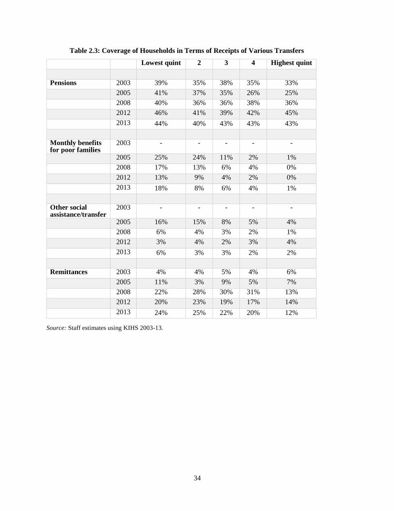
34
Table 2.3: Coverage of Households in Terms of Receipts of Various Transfers
Source: Staff estimates using KIHS 2003-13.
Lowest quint 2 3 4 Highest quint
Pensions 2003 39% 35% 38% 35% 33%
2005 41% 37% 35% 26% 25%
2008 40% 36% 36% 38% 36%
2012 46% 41% 39% 42% 45%
2013 44% 40% 43% 43% 43%
Monthly benefits for poor families
2003 - - - - -
2005 25% 24% 11% 2% 1%
2008 17% 13% 6% 4% 0%
2012 13% 9% 4% 2% 0%
2013 18% 8% 6% 4% 1%
Other social assistance/transfer
2003 - - - - -
2005 16% 15% 8% 5% 4%
2008 6% 4% 3% 2% 1%
2012 3% 4% 2% 3% 4%
2013 6% 3% 3% 2% 2%
Remittances 2003 4% 4% 5% 4% 6%
2005 11% 3% 9% 5% 7%
2008 22% 28% 30% 31% 13%
2012 20% 23% 19% 17% 14%
2013 24% 25% 22% 20% 12%

35
3. ESTIMATES OF MULTIDIMENSIONAL POVERTY
3.1 In addition to monetary poverty, disadvantaged groups of population may face the lack of
access to basic infrastructure services. Non income dimension of poverty might be more pervasive and
is a key policy aspect, and thus should be included when measuring poverty and progress in reduction of
poverty in the Kyrgyz Republic. In the last decade the country has witnessed a growing pace of unorganized
urbanization requiring further efforts to expand public utility coverage to these informal per-urban
settlements. As most of the poor reside in peri-urban and rural areas there is a clear policy message emerging
from this context.
3.2 This section assesses multidimensional poverty in the Kyrgyz Republic. KIHS data allow us
to measure non-income poverty with regards to basic infrastructure services (utilities). This is measured
through indicators denoting access to and quality of five utilities: sanitation, safe water, electricity, heating
and communication (telephone) (please see Table # 5 below). The Alkire-Foster (2011) method is applied
to assess multidimensional poverty at the household level. The AF method, for short, is quite appealing as
it proposes a family of measures that can reflect the incidence, depth and severity of multidimensional
poverty in a society. The AF method uses a two-step approach that first identifies the poor, by comparing
the range of deprivations a person suffers with a poverty threshold, and secondly aggregates the status of
the poor into an overall measure. The index is flexible and allows for sub-group decompositions (by oblast
and area of residence) and indicator break-downs (more detailed presentation of AF method is provided in
Box #3 in the appendix to the report).
Table 3.1: Normative Considerations – Dimensions, Indicators and Values
Dimension Indicator* Weight Deprivation Cut-off (z) - Deprived if:
Access to and quality of
infrastructure services
Sewage 1/5 The household does not have access to a working sewage system.
Access to safe drinking water
1/5 The household does not have access to pipe water (pipeline or pump private) or has access to public pipe water but with a distance longer than 100 meters.
Electricity 1/5 The household got disconnected from power network more than once in a week.
Communication 1/5 The household does not have access to a telephone or mobile phone.
Heating 1/5
The household does not have access to central or individual working heating systems.
3.3 Progress of non-income poverty has been mixed. Figure below depicts the percentage of people
deprived by each of the five indicators considered in our measure. A comparison between 2008 and 2012
indicates an improvement in three out of five indicators. Deprivations in indicators related to disconnection
from electricity and access to communication (mobile or landline telephone) have declined considerably.
Deprivation in access to working heating in the house has only slightly declined and there were almost no
change in deprivation levels of access to sewage and safe water system for the population. More than third
of population in the country has no access to safe water while more than two thirds has no access to adequate
sewage system.

36
Figure 3.1: Percentage of People Deprived by Indicator (raw headcount ratios)
Source: Staff estimates using KIHS 2008-12.
3.4 For all indicators we observe that non-income deprived people is not necessarily monetary
poor. The share of income non poor who lacks access to adequate sewage and water is higher compared to
share of monetary poor population. These findings support a definition of poverty in a multidimensional
space where income poverty is not sufficient to capture multiple or overlapping deprivations. The message
we retain from these figures is that despite a remarkable progress in reducing consumption poverty the
population in the Kyrgyz Republic from different income groups still faces challenges towards improving
the basic services and access to utilities.
Figure 3.2: Raw Head Count Ratios by Income Poverty Status
Source: Staff estimates using KIHS 2008-12.
0%
20%
40%
60%
80%Sewage
Water
HeatingElectricity
Telephone
2008
2012
49%
20%
3%
48%
29%
28%
13%
1%
24%
23%
0% 20% 40% 60% 80% 100%
Sewage
Water
Heating
Electricity
Telephone
2008
Non-income poor Income poor
41%
18%
1%
3%
8%
33%
14%
1%
1%
7%
0% 20% 40% 60% 80%
Sewage
Water
Heating
Electricity
Telephone
2012
Non income poor Income poor
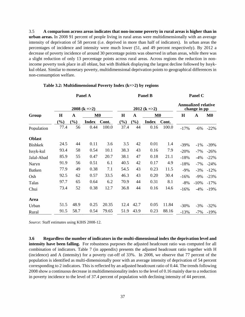
37
3.5 A comparison across areas indicates that non-income poverty in rural areas is higher than in
urban areas. In 2008 91 percent of people living in rural areas were multidimensionally with an average
intensity of deprivation of 58 percent (i.e. deprived in more than half of indicators). In urban areas the
percentages of incidence and intensity were much lower (51, and 49 percent respectively). By 2012 a
decrease of poverty incidence of around 30 percentage points was observed in urban areas, while there was
a slight reduction of only 13 percentage points across rural areas. Across regions the reduction in non-
income poverty took place in all oblast, but with Bishkek displaying the largest decline followed by Issyk-
kul oblast. Similar to monetary poverty, multidimensional deprivation points to geographical differences in
non-consumption welfare.
Table 3.2: Multidimensional Poverty Index (k=>2) by regions
Panel A Panel B Panel C
2008 (k =>2) 2012 (k =>2) Annualized relative
change in pp
Group H A M0 H A M0 H A M0
(%) (%) Index Cont. (%) (%) Index Cont.
Population 77.4 56 0.44 100.0 37.4 44 0.16 100.0 -17% -6% -22%
Oblast
Bishkek 24.5 44 0.11 3.6 3.5 42 0.01 1.4 -39% -1% -39%
Issyk-kul 93.4 58 0.54 10.1 38.3 43 0.16 7.9 -20% -7% -26%
Jalal-Abad 85.9 55 0.47 20.7 38.1 47 0.18 21.1 -18% -4% -22%
Naryn 91.9 56 0.51 6.1 40.5 42 0.17 4.9 -18% -7% -24%
Batken 77.9 49 0.38 7.1 54.5 43 0.23 11.5 -9% -3% -12%
Osh 92.5 62 0.57 33.5 46.3 43 0.20 30.4 -16% -9% -23%
Talas 97.7 65 0.64 6.2 70.9 44 0.31 8.1 -8% -10% -17%
Chui 73.4 52 0.38 12.7 36.8 44 0.16 14.6 -16% -4% -19%
Area
Urban 51.5 48.9 0.25 20.35 12.4 42.7 0.05 11.84 -30% -3% -32%
Rural 91.5 58.7 0.54 79.65 51.9 43.9 0.23 88.16 -13% -7% -19%
Source: Staff estimates using KIHS 2008-12.
3.6 Regardless the number of indicators in the multi-dimensional index the deprivation level and
intensity have been falling. For robustness purposes the adjusted headcount ratio was computed for all
combination of indicators. Table 7 (in appendix) presents the adjusted headcount ratio together with H
(incidence) and A (intensity) for a poverty cut-off of 33%. In 2008, we observe that 77 percent of the
population is identified as multi-dimensionally poor with an average intensity of deprivation of 54 percent
corresponding to 2 indicators. This is reflected by an adjusted headcount ratio of 0.44. The trends following
2008 show a continuous decrease in multidimensionality index to the level of 0.16 mainly due to a reduction
in poverty incidence to the level of 37.4 percent of population with declining intensity of 44 percent.

38
3.7 The break-down by indicator shows that access to sewage and safe water contribute the most
to multidimensional poverty. In 2008 those deprivations contributed 48 percent to overall non-monetary
poverty, this percentage increased to 84 percent by 2012. This may signal a severe infrastructural problem
faced by population. Deprivation related to uninterrupted electricity (i.e. with no outages) continue to be a
problem as well. Contribution of other indicators declined or remained low. This indicates that poverty
profile in the Kyrgyz Republic has been slowly changing, pointing to importance of utility and residential
aspects for welfare of population.
Figure 3.3: Contribution of Indicators to MPI
33%45%
39%
15%
39%
27%1%
1%
1%30%
3%
16%
21%13% 17%
0%
10%
20%
30%
40%
50%
60%
70%
80%
90%
100%
2008 2012 2008-2012
Sewage Water Heating Electricity Telephone

39
4. EMPLOYMENT TRENDS: ANALYSIS OF THE LABOR
FORCE SURVEY2
4.1 Annual growth of domestic labor supply (employed and unemployed), while positive was
highly volatile. Between 2003 and 2013 the growth rate of total labor force averaged at 0.8 percent per
annum. However, during mass out-migration period in 2006-07-08, the growth and level of labor supply
have declined and only started to recover after 2010. Migration and lower level of participation in domestic
market are reflected in decline in domestic labor force ratio to adult population (15+). The sharpest decline
in ratio occurred between 2006 and 2008, but after period of slow decline between 2008 and 2010, it
stabilized at the level around 59 percent.
Figure 4.1: Trends in Labor Force
Source: Staff estimates using LFS 2003-13.
4.2 Similar to aggregated labor force dynamics, the changes in its components have been highly
unstable. While the average annual growth rate of employment over the subject years equaled 0.8 percent
per annum, the growth indicator for unemployment averaged at 1 percent and for not active population at
1.9 percent per annum. Overall, the growth rates of unemployed and not active have outpaced the
employment growth rate. As a result the share of employed in total adult population has gradually declined
from 58-57 percent a decade ago to 55 percent by 2013. While ratio of unemployed remained stable the
share of not active had tendency to slowly increase.
2 This section is based on analysis of LFS data collected and made available by National Statistical Committee of the
Kyrgyz Republic. Since the sampling design of LFS is the same as of the KIHS the calibrated KIHS individual weights
were utilized in the current analysis. In addition, to focus on domestic labor market the LFS respondents who
reported working abroad were excluded from analysis.
-5%
-4%
-3%
-2%
-1%
0%
1%
2%
3%
4%
2,000,000
2,050,000
2,100,000
2,150,000
2,200,000
2,250,000
2,300,000
20
03
20
04
20
05
20
06
20
07
20
08
20
09
20
10
20
11
20
12
20
13
ann
ual
gro
wth
rat
e
# p
erso
ns
Domestic Labor Force supply
LF supply (# persons) LF supply annual growth
0.54
0.55
0.56
0.57
0.58
0.59
0.6
0.61
0.62
0.63
0.64
2003 2004 2005 2006 2007 2008 2009 2010 2011 2012 2013
rati
o
Domestic LF to adult population ratio

40
Figure 4.2: Trends in Labor Market Status of Adult Population
Source: Staff estimates using LFS 2003-13.
4.3 It appears that the ratio of labor force over adult population has declined due to decline in
ratio of employed. This in turn was largely related to sharp decline in rural ratio between 2006 and 2008.
While rural employment is different in nature as compared to urban labor market due to underemployment,
opportunity of being self-employed on family land plot and high seasonal variations in labor demand, this
and weak increase in urban employment would not explain the large drop of employed in rural areas. It
appears that out-migration, both internal and international accounted for missing employed in rural areas.
This provides support to observations that large number of rural labor force rapidly migrated in 2006-08 to
urban areas, but mainly abroad.
4.4 Decomposing employment changes in terms of oblast shows that pattern of changes differs
by regions. Between 2006 and 2008 the number of employed declined by 2, 4 and 5 percent on average
annually in Jalal-Abad, Batken and Osh oblasts respectively, while all other oblast and Bishkek witnessed
an increase of 3-5 percent on average during the same time period. It is difficult to exactly estimate but it
appears that reduction in employment in southern oblasts was absorbed in half by rise in employment in
northern oblasts, especially in Bishkek. But it is likely that remaining labor moved abroad.
4.5 Osh and Jalal-Abad are the oblasts with largest number of employed, jointly these two oblast
make up 40 percent of total employed in the country. Also these oblasts have one of the highest
employment to adult population ratio, 57 and 60 percent respectively, which only is lower than in Talas
where ratio is close to 64 percent.
4.6 Similarly, the shifts in the labor market in 2007-08 affected the sectorial structure of
employment. There appears to be a link between reduction in employment ratio (on aggregate and in rural
areas) and reduction of the labor in agricultural sector, which declined by third over the period 2003-12,
0
500000
1000000
1500000
2000000
2500000
Employed Unemployed Not active
Dynamics of LM components
2003 2004 2005 2006 2007 2008
2009 2010 2011 2012 2013
57% 58% 58% 58% 56% 56% 56% 55% 56% 56% 55%
6% 6% 6% 6% 6% 6% 5% 6% 7% 6% 6%
36% 37% 37% 36% 38% 38% 39% 38% 38% 38% 39%
0%
20%
40%
60%
80%
100%
20032004200520062007200820092010201120122013
Ratio of LM components to total adult population
Ratio to adult population Not active
Ratio to adult population Unemployed
Ratio to adult population Employed
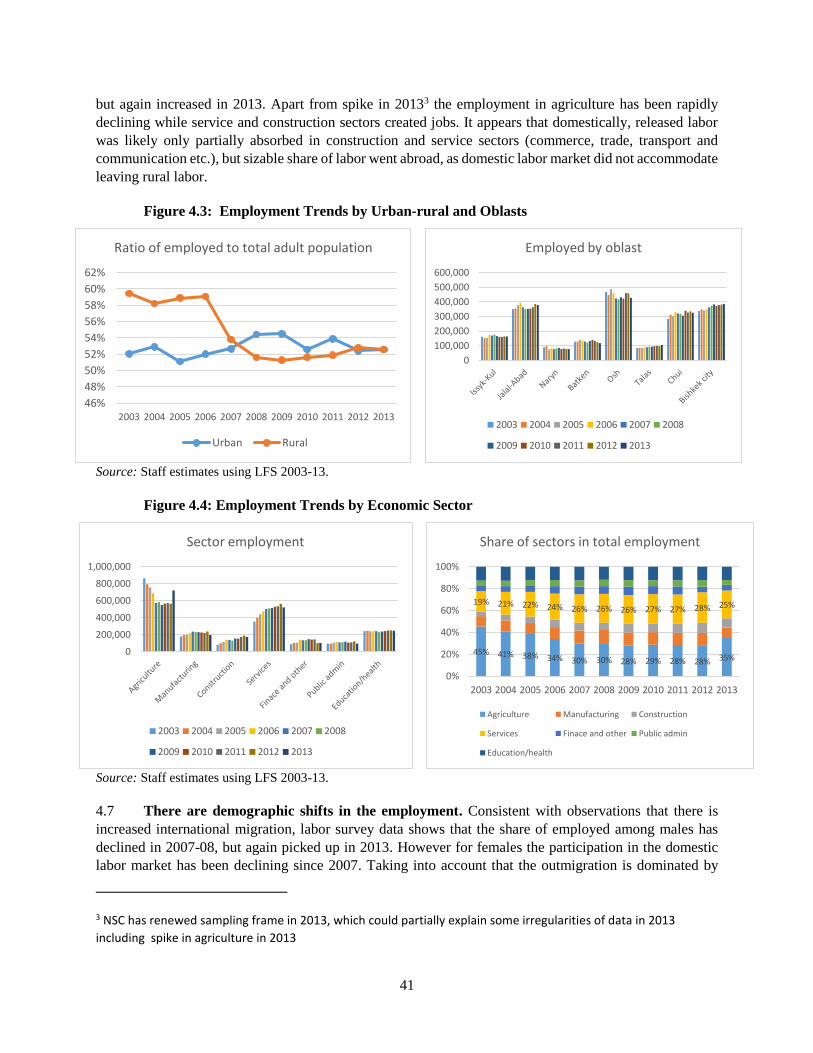
41
but again increased in 2013. Apart from spike in 20133 the employment in agriculture has been rapidly
declining while service and construction sectors created jobs. It appears that domestically, released labor
was likely only partially absorbed in construction and service sectors (commerce, trade, transport and
communication etc.), but sizable share of labor went abroad, as domestic labor market did not accommodate
leaving rural labor.
Figure 4.3: Employment Trends by Urban-rural and Oblasts
Source: Staff estimates using LFS 2003-13.
Figure 4.4: Employment Trends by Economic Sector
Source: Staff estimates using LFS 2003-13.
4.7 There are demographic shifts in the employment. Consistent with observations that there is
increased international migration, labor survey data shows that the share of employed among males has
declined in 2007-08, but again picked up in 2013. However for females the participation in the domestic
labor market has been declining since 2007. Taking into account that the outmigration is dominated by
3 NSC has renewed sampling frame in 2013, which could partially explain some irregularities of data in 2013
including spike in agriculture in 2013
46%
48%
50%
52%
54%
56%
58%
60%
62%
2003 2004 2005 2006 2007 2008 2009 2010 2011 2012 2013
Ratio of employed to total adult population
Urban Rural
0
100,000
200,000
300,000
400,000
500,000
600,000
Employed by oblast
2003 2004 2005 2006 2007 2008
2009 2010 2011 2012 2013
0
200,000
400,000
600,000
800,000
1,000,000
Sector employment
2003 2004 2005 2006 2007 2008
2009 2010 2011 2012 2013
45% 41% 38% 34% 30% 30% 28% 29% 28% 28% 35%
19% 21% 22% 24% 26% 26% 26% 27% 27% 28% 25%
0%
20%
40%
60%
80%
100%
2003 2004 2005 2006 2007 2008 2009 2010 2011 2012 2013
Share of sectors in total employment
Agriculture Manufacturing Construction
Services Finace and other Public admin
Education/health

42
men, lower female employment points to possible constraints faced by women in domestic labor market,
both from demand and supply side.
4.8 Age structure of employment have not changed a lot, except there is growing share of
employed of older generation workers (50-59), while the younger group of 30-39 yo, despite inflow of
new generation into labor market, had some declining tendency in share of employed. It is likely that
younger labor market entrants, given its flexibility, lower skill and facing constraint in domestic labor
market leave abroad while older generation find increasing domestic demand for labor.
4.9 Employed with complete secondary education is the largest group of working, more than 50
percent of employed hold complete secondary degree. The trend in the share of employed with secondary
education over the years followed U shape- declining by 2007-08 and then picking up again. This took
place in context of slight reduction in shares of employed with professional and primary education- perhaps
pointing to changing preferences toward general and not specialized education.
4.10 Returns to education has been relatively flat for higher education category, but tended to
increase for all other groups (except incomplete secondary). As expected the highest return to education
is for those with higher education, but the trends for this category has stagnated over the subject period. In
the largest category of complete secondary the growth in returns was highest. But the dynamics was
different between rural and urban. While in urban the returns to education is higher they were declining
over the years. In contrast in rural areas returns to education has been stable and slightly increasing for
complete secondary education category- perhaps indicating scarcity of labor as a result of out-migration.
4.11 Regression results confirm importance of human capital (proxied by education) and
demographic factors in determining probability of being employed. Urban location and being a female
is associated with lower probability of employment. Also having a spouse and larger family size relate to
lower probability of employment. This has not changed over the years. Having more education and being
older are, as expected, related to higher probability of employment.
Figure 4.5: Demographic Structure of Employment
0%
10%
20%
30%
40%
50%
60%
70%
Ratio of employed to total adult population, by gender
Male Female
0%
5%
10%
15%
20%
25%
30%
35%
2003 2004 2005 2006 2007 2008 2009 2010 2011 2012 2013
Age structure of employment
15-19 20-29 30-39
40-49 50-59 60+
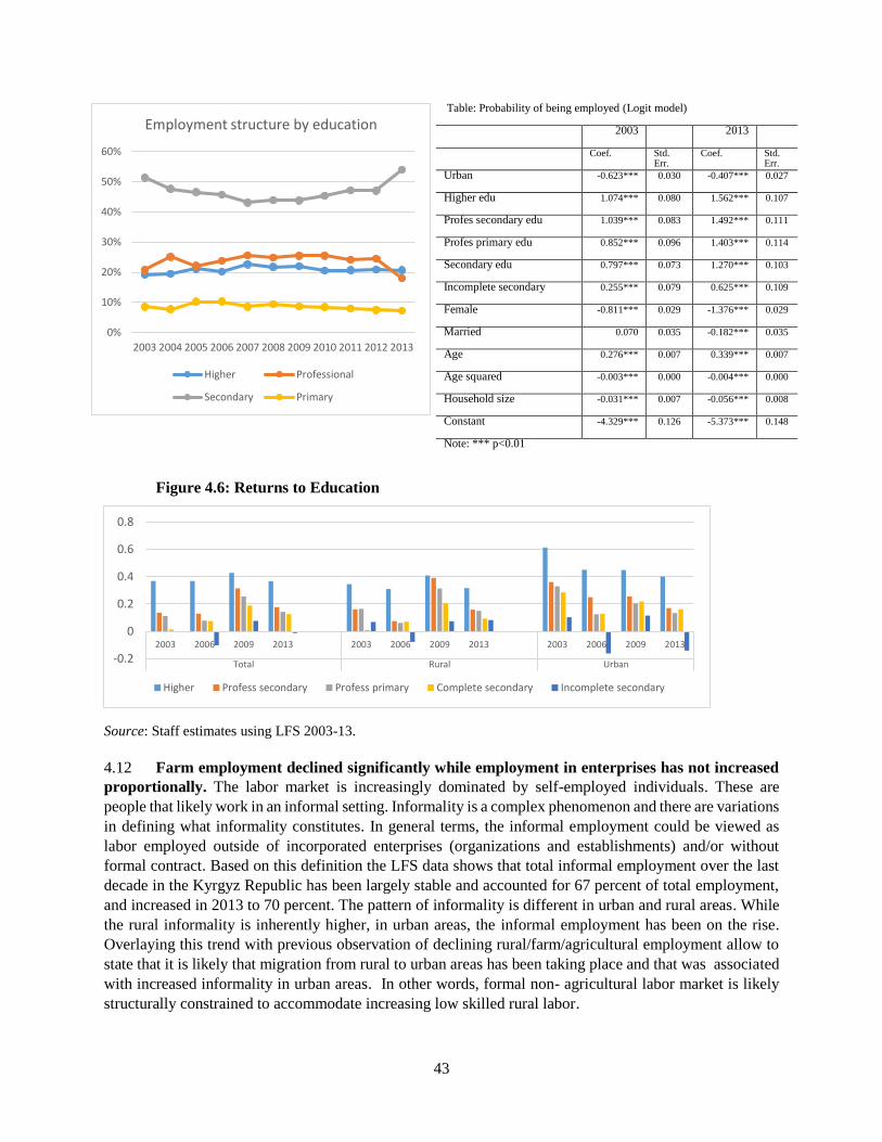
43
Table: Probability of being employed (Logit model) 2003 2013
Coef. Std. Err.
Coef. Std. Err.
Urban -0.623*** 0.030 -0.407*** 0.027
Higher edu 1.074*** 0.080 1.562*** 0.107
Profes secondary edu 1.039*** 0.083 1.492*** 0.111
Profes primary edu 0.852*** 0.096 1.403*** 0.114
Secondary edu 0.797*** 0.073 1.270*** 0.103
Incomplete secondary 0.255*** 0.079 0.625*** 0.109
Female -0.811*** 0.029 -1.376*** 0.029
Married 0.070 0.035 -0.182*** 0.035
Age 0.276*** 0.007 0.339*** 0.007
Age squared -0.003*** 0.000 -0.004*** 0.000
Household size -0.031*** 0.007 -0.056*** 0.008
Constant -4.329*** 0.126 -5.373*** 0.148
Note: *** p<0.01
Figure 4.6: Returns to Education
Source: Staff estimates using LFS 2003-13.
4.12 Farm employment declined significantly while employment in enterprises has not increased
proportionally. The labor market is increasingly dominated by self-employed individuals. These are
people that likely work in an informal setting. Informality is a complex phenomenon and there are variations
in defining what informality constitutes. In general terms, the informal employment could be viewed as
labor employed outside of incorporated enterprises (organizations and establishments) and/or without
formal contract. Based on this definition the LFS data shows that total informal employment over the last
decade in the Kyrgyz Republic has been largely stable and accounted for 67 percent of total employment,
and increased in 2013 to 70 percent. The pattern of informality is different in urban and rural areas. While
the rural informality is inherently higher, in urban areas, the informal employment has been on the rise.
Overlaying this trend with previous observation of declining rural/farm/agricultural employment allow to
state that it is likely that migration from rural to urban areas has been taking place and that was associated
with increased informality in urban areas. In other words, formal non- agricultural labor market is likely
structurally constrained to accommodate increasing low skilled rural labor.
0%
10%
20%
30%
40%
50%
60%
2003 2004 2005 2006 2007 2008 2009 2010 2011 2012 2013
Employment structure by education
Higher Professional
Secondary Primary
-0.2
0
0.2
0.4
0.6
0.8
2003 2006 2009 2013 2003 2006 2009 2013 2003 2006 2009 2013
Total Rural Urban
Higher Profess secondary Profess primary Complete secondary Incomplete secondary

44
Figure 4.7: Structure of Employment by Type and Informality
Source: Staff estimates using LFS 2003-13.
4.13 Overlaying poverty and labor market trends shows that period of decline in poverty coincides
with declining labor supply from rural/agricultural areas. In the context of slowly rising domestic
employment and declining in poverty rates the number of employed who are poor has also declined.
However the recent trend in poverty and number of employed who are poor is not encouraging- since 2009
the poverty and number of working poor stagnated at around 30 percent of all employed. Looking at the
long period, it appears that domestic labor market trends were related to poverty reduction, however the
link weakened in later years. This also reflected in difference in poverty rates among employed and not
employed (unemployed and not active). While poverty among employed and not employed is high and
more so for unemployed the difference in rates varies across years.
Figure 4.8: Poverty Among Employed
Source: Staff estimates using LFS 2003-13.
0%
10%
20%
30%
40%
50%
60%
70%
80%
90%
100%
2003 2004 2005 2006 2007 2008 2009 2010 2011 2012 2013
Structure of employment by type
At organization At farm As individual
0
0.1
0.2
0.3
0.4
0.5
0.6
0.7
0.8
0.9
20032004200520062007200820092010201120122013
Share of informal employment by area
Urban Rural Total
0%
10%
20%
30%
40%
50%
60%
70%
-
200,000
400,000
600,000
800,000
1,000,000
1,200,000
1,400,000
20032004200520062007200820092010201120122013
Number and share of the working poor
# of poor Share of poor in total employed
0.36
0.37
0.38
0.39
0.4
0.41
0.42
0.43
0.44
0.45
2010 2011 2012 2013
Poverty rate among employed and not employed (LFS)
Not employed Employed

45
4.14 Sectorial and labor market status decomposition of poverty changes shows that most of
reduction and changes in poverty took place within the category. The poverty among and between of
employment has been changing within each group and labor relocation to another sector or from non-
employed to employed has contributed little to overall changes. This does not necessarily indicate that labor
have not moved between the sectors and labor market status, but that poverty changes occurred across
sectors and employment statuses. Still, poverty among employed in agricultural sector declined the most
and has driven the overall changes.
Figure 4.9: Employment decomposition of poverty changes
Source: Staff estimates using LFS 2003-13.
4.15 Overall, labor market conditions play central role for poverty dynamics. Structural changes in
labor market in different time periods affected welfare of the population. Growth in labor income and
transformation in structure of employment (in turn likely driven by outward migration and remittances)
helped to reduce poverty in previous decade. However, in recent years the economy and labor market seem
to encounter constraints to growth and changes. Employment abroad and remittances seemed to create
numerous links with domestic economy and unless the outmigration continues the pressures in labor market
will quickly accumulate. Will labor continue to move: from rural to urban and from rural to abroad? Will
remittances support service sector growth? Can urban areas provide for increased number of domestic
working age population? These are the central questions that policy-makers are faced today and which will
impact the welfare of population in the near future.
-20
-15
-10
-5
0
5
2003-2013 2003-2008 2008-2013
Sector decomposition of poverty (among employed)
Agriculture IndustryConstruction ServicePublic admin; health; educ. Labor-shift effect -25
-20
-15
-10
-5
0
5
2003-13 2003-08 2008-13
Labor market status decomposition of poverty changes
Employed
Unemployed
Not active
Labor-shift effect
Interaction effect

46
APPENDIX A:
BOX A1: Data
The note utilized two main data sources: 1) Kyrgyzstan’s Integrated Household Survey (KIHS) and 2)
KIHS’s labor module, which represents standard labor force survey of adult population (LFS). KIHS is
nationally and oblast (at urban-rural) level representative household survey covering around 5000
households. The survey is conducted annually by National Statistics Committee of the Kyrgyz Republic
and serves as invaluable source of information on living conditions of households. Survey covers wide
range of questions like those needed to calculate MDG indicators and including questions related to diary
of consumption of food and non- food products, which is used for calculation of welfare of households.
LFS module of KIHS covers around 19000 individuals of 15 year age and older and conducted quarterly
covering all oblasts. LFS contains standard questions related to demography and labor market status and
efforts by individuals. Unlike official reporting in this note the distinction was made between those who
employed within the country (domestic) and those who reported working abroad. In addition the LFS’s
individual weights were re-calibrated to make them consistent with household weights in KIHS, given that
LFS sample design follows the sampling of KIHS.

47
BOX A2: Synthetic panel methodology
The issue of economic mobility has gained relevance in academic and wider policy discussion over the last
years. Data requirements to analyze this issue are not trivial, though. A proper study requires household-level
information for at least two periods, not only for income or consumption, but also for other variables that can
affect changes in income or consumption. Unfortunately, the availability of panel surveys that contain this
type of information is quite limited, and even when existent, many times they suffer from high attrition rates
and relatively short survey periods.
The synthetic panel methodology overcomes these shortcomings and builds on an imputation methodology to
predict consumption in the second period using two different rounds of data. It relies on time-invariant
individual and household characteristics. Consumption in each period is modeled as the sum of two
components: a first one associated with time-invariant characteristics (F(X)), and a second one capturing non-
observable factors (e). To create the predicted consumption in the first round for the households from the
second round, we generate a new component based on how their time-invariant characteristics are associated
with consumption, but in the first round. Adding up this new component to the non-observable factors we
obtain the predicted consumption in round one. With these two welfare aggregates we construct transition
matrices to analyze economic mobility between rounds.
Figure : Synthetic panel approach
Round one Round two
Observed consumption Predicted consumption Observed consumption
X1
C1=F1(X1)+e1
C – consumption
Ĉ – predicted consumption
X – time invariant household and individual characteristics
Depending on the assumptions made about the non-observable characteristics, the method generates a high
and a low mobility scenario. For the low mobility scenario, non-observable characteristics do not change in
time, whereas for the high mobility scenario they change between rounds. In intuitive terms, low mobility
implies that if a shock affects consumption in the first period, it continues to do so in the second one, and in
the same direction. High mobility implies that there is no relationship between shocks in time. True mobility
should be found within these two boundaries.
The quality of the imputation improves as time-invariant characteristics capture more variation in
consumption. Notwithstanding this limitation, synthetic panels allow the use of existing data in a novel way
to better understand economic mobility and its determinants.
Source: Adopted by Atamanov, Aziz, Cancho, Cesar and Meyer, Moritz from Lanjouw, Louto and McKenzie
(2011)
C1
C1
C1
C1
C1
Ĉ2
Ĉ2
Ĉ2
Ĉ2
Ĉ2
C2
C2
C2
C2
C2

48
BOX A3: The Alkire and Foster counting method to multidimensional poverty measurement
Alkire and Foster (2011) proposed a family of measures that reflect incidence, breadth, depth and severity
of multidimensional poverty. Their methodology has proven to be simple and intuitive when assessing
multidimensional poverty in policy applications in Mexico (Coneval, 2008; 2010) Colombia (2011), Bhutan
(Gross National Index, 2012) and internationally (UNDP, 2010) for example.
The AF method identifies the poor using two forms of cutoff: one within a dimension, and a second across
dimensions. Then, to aggregate it employs the Foster, Greer and Thorbecke (1984) measures appropriately
adjusted to account for multidimensionality4. The dimensional cutoff is a traditional dimension-specific
(indicator) deprivation cutoff that identifies a person as deprived if she falls below the (dimensional)
poverty line (cut-off). The cross dimensional cutoff (k), defines how widely deprived a person must be in
order to be considered poor, by counting the dimensions in which she is deprived. It is worth noting that
when k equals one the AF identification method is equivalent to the union approach, and when k equals d
(the total number of domains) the AF identification method is similar to the intersection approach. With the
union approach a person is identified as poor if she is deprived in at least one dimension. With the
intersection approach a person is identified as poor if she is deprived in all dimensions. Clearly, the appraisal
of poverty is sensitive to the k value. To account for this our assessment of multidimensional poverty
considers all possible values of k, although we report results only for k equal to 40%.
The multidimensional poverty indicator or adjusted headcount ratio 𝑀0 is defined as
𝑀0 =1
𝑛∑ 𝐼(𝑐𝑖 ≥ 𝑘)𝑐𝑖
𝑛
𝑖=1
= 𝐻 × 𝐴 (1)
where 𝑐𝑖 is the number of weighed deprivations of person 𝑖 in a sample of individuals of size n. 𝑀0 is
computed as the average of weighed deprivations among the poor. The adjusted headcount ratio can be
expressed as the product of two indices (𝐻) and (𝐴). The former is the multidimensional head count ratio
or the percentage of people identified as poor using the dual cutoff approach. The latter is the average
deprivation share across the poor. Hence, the adjusted head count ratio M0 combines information on the
prevalence of poverty (H) and the average extent of a poor person’s deprivation (A). M0 is sensitive to the
frequency and the breadth of multidimensional poverty. As with the FGT unidimensional measures M0 can
be decomposed by population subgroups, and can also be broken down by indicator. These properties are
keen for policy decisions. They allow us to understand the characteristics of multidimensional poverty for
each group, as well as, the dimensional deprivations that contribute the most to poverty for any given
subgroup.
Measurement
The assessment of poverty in the Kyrgyz Republic uses the Kyrgyzstan Integrated household surveys
(KIHS) of 2008 and 2012. We assess poverty with regards to basic infrastructure services (utilities). This
is measured through indicators denoting access to and quality of five utilities: sanitation, safe water,
electricity, heating and communication (telephone). A counting approach to poverty measurement entails
three normative decisions. First, one needs to choose dimensional cut-offs or deprivation thresholds for
each indicator. These thresholds are needed to identify those households whose access to or quality of basic
services is below an “acceptable” level. Table 1 describes these dimensional thresholds. Second, one shall
4

49
decide on the ethical importance of each indicator. This is achieved by assigning a ‘weight’ to each
indicator. From our perspective, all five infrastructure services are equally important in public policy aimed
at expanding public utility coverage to the most needed segments of the population. Thus we assign equal
weights to each indicator when constructing the poverty index. Third, one needs to choose the cross
dimensional cutoff (k). The choice of k defines how widely deprived a person must be in order to be
considered poor. In the following section we report the results for a cross-dimensional cutoff of 40%,
equivalent to 2 indicators. A cutoff of 40% means that all people having deprivations in at least 2 out of 5
indicators is identified as multidimensionally poor. For robustness purposes we also report results for all k.
Table A1: Point and interval estimates of absolute poverty rates in the Kyrgyz Republic
(based on constant poverty line and adjusted welfare aggregate)
Point estimate of
poverty rate
[95% Confidence
interval]
2003 68% 66% 70%
2004 65% 64% 67%
2005 66% 63% 70%
2006 64% 61% 67%
2007 57% 53% 60%
2008 34% 31% 38%
2009 35% 31% 38%
2010 39% 36% 42%
2011 35% 32% 38%
2012 38% 35% 40%
2013 36.6% 35% 39%
Source: Staff estimates using KIHS 2003-13.
30%
40%
50%
60%
70%
80%
2003 2004 2005 2006 2007 2008 2009 2010 2011 2012 2013
Point and interavl estimates of poverty rates

50
Figure A1: Demographic and employment dynamics at household level
Source: Staff estimates using KIHS 2003-13.
0
0.1
0.2
0.3
0.4
0.5
0.6
0.7
0.8
0.9
share ofadults in
hh
share ofemployed
adults
share ofdom.
employed
share ofintl.
employed
share ofadults in
hh
share ofemployed
adults
share ofdom.
employed
share ofintl.
employed
Non-poor Poor
per
son
s p
er a
du
lt p
er h
h
Shares of employed adults in household
2003 2004 2005 2006 2007 2008 2009 2010 2011 2012 2013
0
50
100
150
200
Totalincome (per
capita)
wage (peremployed)
pension(per adult)
Totalincome
wage (peremployed)
pension(per adult)
Non-poor Poor
KG
S p
er c
pai
ta/a
du
lt p
er d
ay
Dynamics of income
2003 2004 2005 2006 2007 2008 2009 2010 2011 2012 2013
0
5
10
15
20
25
30
remittances(per adult)
agr. income(per adult)
other income(per adult)
remittances(per adult)
agr. income(per adult)
other income(per adult)
Non-poor Poor
KG
S p
er c
apit
a p
er d
ay
Dynamics of income components (2)
2003 2004 2005 2006 2007 2008 2009 2010 2011 2012 2013

51
Table A2: Multidimensional poverty indices – all k values
Panel A: 2008
Panel B: 2012
Source: Staff estimates using KIHS 2008-12.
Oblast
H A H A H A H A H A
(%) (%) Index Cont.(%) (%) (%) Index Cont.(%) (%) (%) Index Cont.(%) (%) (%) Index Cont.(%) (%) (%) Index Cont.(%)
Bishkek 70.4 28 0.20 6.2 24.5 44 0.11 3.6 4.1 61 0.03 1.2 0.2 80 0.00 0.2 0.0 - 0.00 0.0
Issykul 99.6 55 0.55 9.6 93.4 58 0.54 10.1 63.6 66 0.42 11.0 18.5 80 0.15 9.0 0.0 - 0.00 0.0
Jalal-Abad 98.5 51 0.50 20.2 85.9 55 0.47 20.7 51.8 65 0.34 20.5 12.8 80 0.10 14.5 0.0 100 0.00 17.3
Naryn 99.0 53 0.52 5.8 91.9 56 0.51 6.1 53.1 67 0.36 5.9 18.3 80 0.15 5.6 0.0 - 0.00 0.0
Batken 99.2 43 0.42 7.3 77.9 49 0.38 7.1 31.7 62 0.20 5.1 3.2 80 0.03 1.6 0.0 100 0.00 0.6
Osh 1.0 59 0.58 31.8 92.5 62 0.57 33.5 64.7 71 0.46 37.6 34.8 80 0.28 52.9 0.1 100 0.00 27.9
Talas 1.0 64 0.64 5.8 97.7 65 0.64 6.2 83.5 70 0.58 7.8 40.6 80 0.33 10.1 0.0 - 0.00 0.0
Chui 98.1 44 0.43 13.3 73.4 52 0.38 12.7 36.6 64 0.23 10.9 7.1 81 0.06 6.2 0.2 100 0.00 54.1
Population 94.64 50 0.47 77.43 56 0.44 46.55 67 0.31 16.89 80 0.14 0.05 100 0.001
M0 M0 M0 M0 M0
k>=1 - Union k>=2 k>=3 k>=4 k=5 - Intersection
Oblast
H A H A H A H A H A
(%) (%) Index Cont.(%) (%) (%) Index Cont.(%) (%) (%) Index Cont.(%) (%) (%) Index Cont.(%) (%) (%) Index Cont.(%)
Bishkek 33.9 22 0.08 4.7 3.5 42 0.01 1.4 0.4 60 0.00 0.8 0.0 - 0.00 0.0 0.0 - 0.00 -
Issykul 86.4 30 0.26 8.2 38.3 43 0.16 7.9 5.0 60 0.03 5.8 0.1 80 0.00 3.3 0.0 - 0.00 -
Jalal-Abad 92.7 31 0.29 22.2 38.1 47 0.18 21.1 13.5 60 0.08 37.8 0.1 80 0.00 6.6 0.0 - 0.00 -
Naryn 95.0 29 0.28 5.3 40.5 42 0.17 4.9 2.8 62 0.02 2.0 0.3 80 0.00 9.0 0.0 - 0.00 -
Batken 98.4 33 0.32 10.4 54.5 43 0.23 11.5 7.5 61 0.05 8.9 0.3 80 0.00 17.6 0.0 - 0.00 -
Osh 0.9 31 0.29 29.4 46.3 43 0.20 30.4 6.3 60 0.04 23.1 0.0 80 0.00 2.5 0.0 - 0.00 -
Talas 1.0 37 0.36 6.2 70.9 44 0.31 8.1 12.8 60 0.08 8.0 0.0 - 0.00 0.0 0.0 - 0.00 -
Chui 70.1 32 0.23 13.5 36.8 44 0.16 14.6 6.1 62 0.04 13.7 0.6 80 0.01 61.0 0.0 - 0.00 -
Population 80.73 31 0.25 37.42 44 0.16 6.85 60 0.04 0.15 80 0.00 0.00 - 0.000 -
M0 M0 M0 M0 M0
k>=1 - Union k>=2 k>=3 k>=4 k=5 - Intersection

52
Figure A3: Selected WDI indicators
3.2 61.3 59.2 20.9 20.6 105.8 2.5 3.0 115.2 64.6
21%
60%
47%
35%
74%
85%
28%
7%
66%
78%
0%
25%
50%
75%
100%
0
20
40
60
80
100
120
140
Cost ofbusinessstart-up
procedures(% of GNIper capita)
Employmentto population
ratio, 15+,total (%)(modeled
ILOestimate)
Labor forceparticipationrate, female(% of femalepopulation
ages 15-64)(modeled
ILOestimate)
Internetusers (per
100 people)
Internationaltourism,
receipts (%of total
exports)
Merchandisetrade (% of
GDP)
Logisticsperformance
index:Overall
(1=low to5=high)
Burden ofcustoms
procedure,WEF
(1=extremelyinefficient to7=extremely
efficient)
Mobilecellular
subscriptions(per 100people)
Ruralpopulation(% of totalpopulation)
Kyrgyz Republic's WDI outcomes and percentile comparison to the WorldECA average Kyrgyz Republic (2010-2013)
Lower middle income average Percentile in World (RHS)
Percent
Percentile
Notes: All indicators are annual averages over the time period
Source: Find my Friends tool using WDI data
3.8
8.49.3
3.0
7.99.8
-5.0
3.1
8.4
-1.6
51%
70%
93%
26%
61%
94%
22%
75%
85%
17%
0%
25%
50%
75%
100%
-10
-5
0
5
10
15
20
Real GDP Real Investment Real consumptionexpenditure
Real Exports ofgoods & services
Real Imports ofgoods & services
Real Privateconsumption
Generalgovernment net
lending/borrowing
Exchange rate perU.S. Dollar
Consumer priceindex
Terms of trade,goods & services
Kyrgyz Republic's economic performance and percentile comparison to the World
Kyrgyz Republic (2000-2007) Kyrgyz Republic (2010-2013)
Kyrgyz Republic (2014-2019) Percentile in the World (RHS) (2010-2013)
Percent
Percentile
Notes: All indicators are annual averages of the growth rates or annual averages of the share of nominal GDPSource: Find my Friends tool using IMF WEO

53
4.3 30.2 27.2 69.6 3.1 27.2 77.0 98.3 3.9 2.8
36%
59%
72%
36%
68%
59%53%
85%
56%59%
0%
25%
50%
75%
100%
0
50
100
150
200
250
Populationages 65 andabove (% of
total)
Populationages 00-14 (%
of total)
Birth rate,crude (per
1,000 people)
Lifeexpectancy at
birth, total(years)
Fertility rate,total (birthsper woman)
Mortality rate,under-5 (per
1,000)
Maternalmortality ratio
(modeledestimate, per100,000 live
births)
Immunization,measles (% ofchildren ages12-23 months)
Healthexpenditure,public (% of
GDP)
Healthexpenditure,private (% of
GDP)
Kyrgyz Republic's Health and Population outcomes and percentile comparison to the World
ECA average Kyrgyz Republic (2010-2013)
Lower middle income average Percentile in World (RHS)
Percentile
Unit based on indicator
Notes: All indicators are annual averages over the time period
Source: Find my Friends tool using WDI data

54
REFERENCES:
Alkire, S., Foster, J.E., 2011. “Counting and Multidimensional Poverty Measurement” Journal of Public
Economics
Azevedo, J.P. and Cong Nguyen, Minh & Viviane Sanfelice, 2012. "ADECOMP: Stata module to
estimate Shapley Decomposition by Components of a Welfare Measure," Statistical Software
Components S457562, Boston College Department of Economics.
Azevedo, Joao Pedro; Inchauste, Gabriela; Olivieri, Sergio; Saavedra, Jaime; Winkler, Hernan. 2013. Is
labor income responsible for poverty reduction? a decomposition approach. The World Bank’s Policy
Research Working Paper
Dang, Hai-Anh & Lanjouw, Peter and Luoto, Jill & McKenzie, David, 2014. "Using repeated cross-
sections to explore movements into and out of poverty," Journal of Development Economics, Elsevier,
vol. 107(C)