Kräftig Brandguidelines
11
BRÄND GUIDELINES
-
Upload
krista-perkins -
Category
Documents
-
view
215 -
download
0
description
A collaborative booked enabling Kräftig to build a strong brand which will support the growth and awareness of the organization.
Transcript of Kräftig Brandguidelines

2012
BRäND GuiDeliNes

2012
These guidelines enable KräfTig To build a sTrong brand which will supporT The growTh and awareness of The brand. please follow Them closely, so all communicaTions will be uniform in all visual applicaTions.
2012
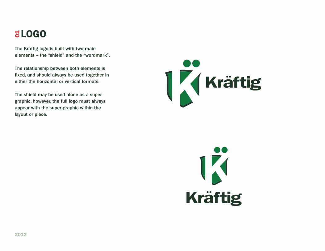
lOGO01
The Kräftig logo is built with two main elements – the “shield” and the “wordmark”.
The relationship between both elements is fixed, and should always be used together in either the horizontal or vertical formats.
The shield may be used alone as a super graphic, however, the full logo must always appear with the super graphic within the layout or piece.

2012
clearspace is the area surrounding the logo that must be kept free of any text or graphical elements. leaving ample space around the logo ensures that it stands out on all communication.
clearspace is measured by the height of the “ä” in the Kräftig logo. The minimum clearspace must always be the height of the “ä” on all sides of the Kräftig logo.
cleaRspace02

2012
clearspace is the area surrounding the logo that must be kept free of any text or graphical elements. leaving ample space around the logo ensures that it stands out on all communication.
clearspace is measured by the height of the “ä” in the Kräftig logo. The minimum clearspace must always be the height of the “ä” on all sides of the Kräftig logo.
This cleaRspace alsO applies TO BOTh KRäfTiG laGeR aND KRäfTiG liGhT BRaND maRKs.
cleaRspace02

2012
maintaining consistent color across all media is a vital part of a strong brand. a set of color values have been developed.
cOlOR03
Kräftig red
pantone
485
Kräftig darK green pantone 5605
Kräftig lighT green pantone 356
c/m/y/K
5/98/100/0
c/m/y/K
89/28/100/16
c/m/y/K
77/53/73/61
c/m/y/K
77/53/73/61
Kräftig darK green pantone 5605
c/m/y/K
89/28/100/16
Kräftig lighT green pantone 356
core paleTTe

2012
2-color spot 1-color spot2-color spot reversed
cOlOR use03

2012
cOlOR use03
2-color spot 1-color spot2-color spot reversed

2012
cOlOR use 03
2-color spot 1-color spot2-color spot reversed

2012
here are some examples of incorrect usage. note, that any alteration of the Kräftig logo is considered misuse. only use the supplied digital artwork.
do noT transpose shield colors between light and lager word marks.
do noT change the colors of the Kräftig logo
do noT change the relationship between the shield and the word mark
do noT use the Kräftig wordmark without the shield or lager & light beer brand.
do noT skew or distort the Kräftig logo.
iNcORRecT uses05

2012
Kräftig fonTs
The primary typeface for Kräftig is iTc franklin gothic
iTc franklin gothic demi is used primarily for headlines.
iTc franklin gothic medium is to be used for all body text.
edwardian script iTc is to be only used in the words lager & light.
for applications where iTc franklin gothic is unable to be used for body text, such as hTml, powerpoint, or word, verdana may be used.
iTc franKlin goThic sTd medium abcdefghiJKlmnopQrsTuvwXyZ abcdefghijklmnopqrstuvwxyz 1234567890
iTc fRaNKliN GOThic sTD Demi aBcDefGhiJKlmNOpQRsTuVWXYZ abcdefghijklmnopqrstuvwxyz 1234567890
Edwardian Script ITC
abcdefghijklmnopqrstuvwxyz
TYpOGRaphY06