Kilve evaluation slide presentation
8
NATURE & LANDSCAPE - KILVE By Bradley Santon 0380
-
Upload
bradsanton01 -
Category
Art & Photos
-
view
29 -
download
1
Transcript of Kilve evaluation slide presentation

NATURE & LANDSCAPE - KILVEBy Bradley Santon 0380

TRIP TO KILVE BEACHFrom the 10th to the 12th of November 2014, we took a residential art and design trip to Kilve, a place in summerset.
Our aim was to study the landscape and its surroundings, weather Kilve court, the woodland Areas or the beaches, we had to advertise and promote an aspect of Kilve to the public.
Photos from the first day at Kilve. We went to the beach, to record what we saw, by experimenting with materials and by doing studies of the surroundings.
We also collected items that we found down there and brought them back with us to use later that day.
Some more photos from Kilve, that I really like, also that I made studies from each capturing a different aspect of the beach.

KILVE OBSERVATIONAL STUDIES
When at Kilve, we did many studies of things seen and found within the environment. The study above, is of a sculpture I made using different rocks, sticks and leaves I found on my trails at Kilve. I used different strengths of fine liner pen, to capture elements of each natural object.
Some studies, experimenting with water colour pen. These are studies of the cliff face and lower rock forms at the base of the cliff, on the beach at Kilve.
I decided to do all the studies in a variety of mixed media, to see if I could achieve the same effects of the textures and surfaces that were present in the landscape at Kilve beach.
The study below, is of rocks that I drew, when at the beach. For this picture I used various water colour pencils and some paints, to capture the rocks textures and the reflection of light onto parts of it. It is my favorite of all my studies, as it incorporates mixed media well and has depth to it.
The rock drawing under it, was done using pencil tones and fine liner over it, creating three dimensional depth, shape and structure.
When opting to colour this study below, I chose to do a opposite of the colour presented in the environment that I was copying. In this case it was the cliff face. This created a unusually striking quality for the study.
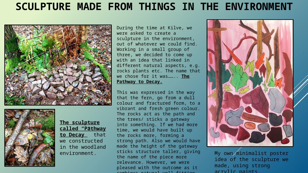
SCULPTURE MADE FROM THINGS IN THE ENVIRONMENT
My own minimalist poster idea of the sculpture we made, using strong acrylic paints.
During the time at Kilve, we were asked to create a sculpture in the environment, out of whatever we could find. Working in a small group of three, we decided to come up with an idea that linked in different natural aspects, e.g. rocks plants etc. The name that we chose for it was…….. The Pathway to Decay.
This was expressed in the way that the fern, go from a dull colour and fractured form, to a vibrant and fresh green colour. The rocks act as the path and the trees/ sticks a gateway into something. If we had more time, we would have built up the rocks more, forming a strong path. Also we would have made the height of the gateway sticks structure taller, giving the name of the piece more relevance. However, we were pleased with the outcome as it combines natural well fitting elements together, and also balances and supports the name given to it.
The sculpture called “Pathway to Decay” that we constructed in the woodland environment.

3 IDEAS FOR POSTERSWhen deciding on how to promote the area of Kilve, I realised that posters were a great conveying the message to the
target market . I wanted to aim my posters at family and also express one in particular item that I found very interesting and unique to its beach side, this was the Fossils that can be found there. I looked at quite a lot of styles but finally decided on
the ones shown below.STYLE 1:From researching Storm Thorgerson’s work I wanted to create something similar. The way a large object is the focus of a piece with a landscape background behind it, drew me in to his style and made me want to do my own versions.
STYLE 2: The second idea was be based on the style of Graphic Designer David Carson’s work using typography to create a structure from, whether person or object. I also found numerous advertisements which did the same thing. Mine included a fossil shaped in typography, the typography would include info on Kilve .
STYLE 3: The third style was inspired by film infographics. Infographics are a more illustrative way of telling a story, without using words and to translate different messages. My poster included an infographics structure for the beach attractions in Kilve, such as fossils, and maybe some history about the area. This approach is also great for tourists who only have to look at the images to understand the attraction.
My poster included a photo of Kilve beach, with a image of an larger than life , amusing and colourful fossil floating above it. This would also attract kids as well as parents due to its ‘quirky’ and abstract style.

POSTER STYLE CONCLUSIONIn order for me to develop my final poster idea, I needed to chose which one was the strongest and had the best
options for development. It also had to be the best received from the interim review. I decided to do a series of 2 posters
STYLE 1 :
I like the overall look of this poster but obviously it needed words to let people know what area it is promoting. I would also include a website. It may be a bit too off the wall for families and kids and would more likely attract older audiences.
STYLE 2 :
I really like the overall look and feel of this poster but the lettering needs to be more uniform so it is easier for people to read. Again, I would also include a website. I think it is attractive to families and kids because of the bright colours but maybe the background of rocks is a bit too washed out.
STYLE 3 :
This style of poster could potentially be my favourite of the three, and therefore one I am most likely to develop further. At the moment it is very basic, as an info graphics poster should be, however I want to refine it further to create a series of posters.
This style of poster was the most popular but the comments were that it needed to be a little more detailed and perhaps incorporate some of the typography from idea no.2

FINAL POSTER DEVELOPMENTSFrom my three posters designs I chose the infographics one. This was the most interesting for me. In order to come up
with a better poser idea that could be developed into a series, I did a lot of drawing experiments showing combinations of images related to the area.
I started off by doing many various drawings of how the fossil would look. This was the shape I felt worked and it was large enough to fill a posters contents as the main point. I experimented with colour and tone, however I found this to be the best rendition of the fossil drawing.
I then looked into how to incorporate the large bold text into the poster. I found the best and most visual way to do so was to slot it into the back, behind the fossil and rocks.
For my second poster, I wanted to have a shot of the landscape where the fossil is found, namely the beach. So I also experimented with different landscape options and how much of it I would show.
I also found for the second poster, that I wanted to add people in, but have them silhouetted and in the background. This led to many experiments with my own body shape as well as images of me as a boy playing in different positions – the two different body types representing a family.
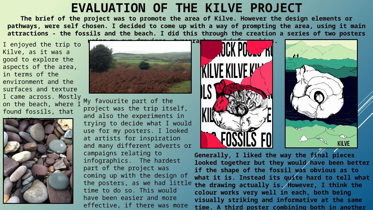
EVALUATION OF THE KILVE PROJECT
Generally, I liked the way the final pieces looked together but they would have been better if the shape of the fossil was obvious as to what it is. Instead its quite hard to tell what the drawing actually is. However, I think the colour works very well in each, both being visually striking and informative at the same time. A third poster combining both in another colour way would complete the set.
The brief of the project was to promote the area of Kilve. However the design elements or pathways, were self chosen. I decided to come up with a way of prompting the area, using it main attractions - the
fossils and the beach. I did this through the creation a series of two posters using my own drawings, typography and infographics. I enjoyed the trip to
Kilve, as it was a good to explore the aspects of the area, in terms of the environment and the surfaces and texture I came across. Mostly on the beach, where I found fossils, that were very interesting.
My favourite part of the project was the trip itself, and also the experiments in trying to decide what I would use for my posters. I looked at artists for inspiration and many different adverts or campaigns relating to infographics. The hardest part of the project was coming up with the design of the posters, as we had little time to do so. This would have been easier and more effective, if there was more time in which to fully produce something amazing.