Key Findings Report March 26, 2009 - Research Excellence
57
Key Findings Report March 26, 2009
Transcript of Key Findings Report March 26, 2009 - Research Excellence

Key Findings Report
March 26, 2009

2
Table of Contents
Page #
The Key Players Involved 7
The Video Consumer Mapping Study 9
The Sample Observed 14
The Analysis 15
Key Findings 20
Summary Of Key Findings 50
Digital Appendices: 52
Glossary 53
Measured-Unmeasured Analysis 57

3
Table of Figures
Page #
Figure1: VCM Study Timeline ........................................................................................................................................................................................ 10 Figure 2: The Observational Method .................................................................................................................................................................................. 10 Figure 3: Dana™ Keyboard .............................................................................................................................................................................................. 111 Figure 4: Example Of Training Slides And Media Collector™ Interface .......................................................................................................................... 122 Figure 5: Examples From Observer Training Software .................................................................................................................................................... 133 Figure 6: Map Of VCM Study DMAs ................................................................................................................................................................................. 144 Figure 7: How To Read The Day In The Life Chart .......................................................................................................................................................... 155 Figure 8: A Day In The Life Of One Of The Accelerated Participants Pre- And Post- Acceleration ................................................................................ 166 Figure 9: VCM Study Deliverables ................................................................................................................................................................................... 177 Figure 10: Four Screen Categorization ............................................................................................................................................................................ 199 Figure 11: Average Daily Minutes Of Screen Media By Age Group ................................................................................................................................ 211 Figure 12: Share Of Average Daily Minutes Of Screen Media By Age Group ................................................................................................................. 233 Figure 13: Ranking of Average Daily Minutes Of Screen Media By Age Group .............................................................................................................. 244 Figure 14: Average Daily Minutes Of Screen Media By Age Group, Primary Media Exposure Only .............................................................................. 266 Figure 15: Nielsen’s Three-Screen And VCM Media Time Share Comparison ............................................................................................................... 277 Figure 16: Nielsen’s Three-Screen And VCM Media Time Share Comparison, By Age Group ...................................................................................... 288 Figure 17: Comparability Of Video Consumer Mapping Data With Nielsen’s People Meter In-Home TV Viewing Data ................................................. 299 Figure 18: How To Read A Reach/Duration Chart ............................................................................................................................................................. 30 Figure 19: Daily Reach And Average Daily Duration For Video Media ............................................................................................................................ 311 Figure 20: Daily Reach And Average Daily Duration For Major Media ............................................................................................................................ 322 Figure 21: Acceleration Purchase Inventory .................................................................................................................................................................... 333 Figure 22: Spring And Fall Changes In Daily Reach And Average Daily Duration .......................................................................................................... 344 Figure 23: Daily Reach And Average Daily Duration For TV Genre ................................................................................................................................ 355
4
Figure 24: Change In Sports TV Minutes By Gender And Day of Week .......................................................................................................................... 355 Figure 25: HDTV Ownership Groups ................................................................................................................................................................................ 366 Figure 26: Changes In TV Screen Media Minutes By HDTV Ownership Group .............................................................................................................. 377 Figure 27: DVR Ownership Groups And Average Daily Minutes Spent With Video Media, Spring vs. Fall ‘08 .............................................................. 388 Figure 28: Understanding Concurrent Media Exposure ................................................................................................................................................... 399 Figure 29: 6 Degrees Of Concurrency ................................................................................................................................................................................ 40 Figure 30: Concurrent Media Exposure............................................................................................................................................................................ 411 Figure 31: Concurrent Media Exposure Indices ............................................................................................................................................................... 422 Figure 32: 6 Degrees of Concurrency For Major Media ................................................................................................................................................... 433 Figure 33: 6 Degrees of Concurrency For Screen Media ................................................................................................................................................. 444 Figure 34: Daily Reach And Average Daily Duration For TV Genre ................................................................................................................................ 455 Figure 35: CME Indices For TV Content Vs. Advertising ................................................................................................................................................. 466 Figure 36: Comparison Of Self-report And Observation Daily Reach And Average Daily Duration Data For Various Media ......................................... 488 Figure 37: Even The Best Two Model Fits (Computer and Live TV) Showed Too Much Variation For Comfort ..…………………………………………..49
5
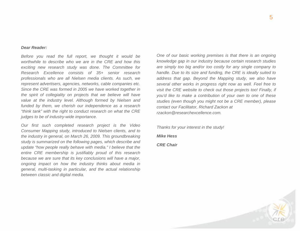
Dear Reader:
Before you read the full report, we thought it would be worthwhile to describe who we are in the CRE and how this exciting new research study was done. The Committee for Research Excellence consists of 35+ senior research professionals who are all Nielsen media clients. As such, we represent advertisers, agencies, networks, cable companies etc. Since the CRE was formed in 2005 we have worked together in the spirit of collegiality on projects that we believe will have value at the industry level. Although formed by Nielsen and funded by them, we cherish our independence as a research “think tank” with the right to conduct research on what the CRE judges to be of industry-wide importance.
Our first such completed research project is the Video Consumer Mapping study, introduced to Nielsen clients, and to the industry in general, on March 26, 2009. This groundbreaking study is summarized on the following pages, which describe and update “how people really behave with media.” I believe that the entire CRE membership is justifiably proud of this research because we are sure that its key conclusions will have a major, ongoing impact on how the industry thinks about media in general, multi-tasking in particular, and the actual relationship between classic and digital media.
One of our basic working premises is that there is an ongoing knowledge gap in our industry because certain research studies are simply too big and/or too costly for any single company to handle. Due to its size and funding, the CRE is ideally suited to address that gap. Beyond the Mapping study, we also have several other works in progress right now as well. Feel free to visit the CRE website to check out those projects too! Finally, if you’d like to make a contribution of your own to one of these studies (even though you might not be a CRE member), please contact our Facilitator, Richard Zackon at [email protected].
Thanks for your interest in the study!
Mike Hess
CRE Chair

6
Dear Reader:
Our reasons for undertaking the Video Consumer Mapping study remain as relevant today as they were nearly four years ago when we first envisioned it. We sought to verify or dispel several popular notions about current video usage behaviors such as:
• The 30 second spot is dead • No one under the age of 30 watches TV, They’re all
streaming video on the internet. • No one watches live TV, Everyone is Recording TV
shows on their DVRS,
The research was intended as consumer-centric and media neutral. While our focus was on TV and Video, we also measured usage of non-screen media such as magazines, newspapers and radio. We believe you will agree that the findings significantly increase our understanding of how consumers access content within the context of their daily lives.
We would like to acknowledge Nielsen for creating the CRE and for providing the financial resources, without which a study of this magnitude could have been possible. Separately, we would like to recognize them for granting us access to a quality sample drawn from their pool of recently retired households as well as for their assistance in their initial recruitment for the VCM.
We also wish to acknowledge Ball State University and Sequent Partners for their exceptional efforts in the design, execution and analysis of this research. I personally wish to thank all the dedicated members of the Media Consumption and Engagement Committee for their tireless, thoughtful and collaborative contributions.
It is a pleasure to share the learning from this important study with the industry and we look forward to getting your feedback.
Shari Anne Brill
Chair, Media Consumption and Engagement Committee

7
This report is designed to summarize key findings from a project that was authorized and funded by the Council for Research Excellence, known as the “Video Consumer Mapping Study.” Extensive appendices are available in digital form to provide additional analyses and detailed documentation. The primary focus of this report, however, is to summarize the study’s key findings. But prior to doing that, it is necessary to briefly address key aspects of the study, including who was involved, what the project was all about, what methods were applied, and what sample was observed. Based on the media consumers observed, the report then overviews the analyses and summarizes the key findings.
The Key Players Involved A study this big and complex was made possible only through the collaboration of a number of different organizations. It became possible after Nielsen created the Council for Research Excellence, and continued to support the work of the Council financially and, in the
case of this particular study, operationally in a number of important ways.
The Council for Research Excellence is a client-led group, and although started by Nielsen, it is a group that very purposefully operates independently. One of the Committees established by the Council is the Media Consumption and Engagement Committee, and it is this group that selected the research proposal for this particular study and then guided the research endeavor that became known as the Video Consumer Mapping Study.
Most of the research activities for this study were led by Ball State University’s Center for Media Design, a consumer-centric insight and R&D facility that has become particularly well known for observational research. The analysis was led by Sequent Partners, a brand and media metrics consultancy.
The Ball State/Sequent team is pleased to report that the size and enthusiasm of the active Committee has grown dramatically over the course of this project’s progress. Our thanks go not only to Nielsen and the entire Council, but with particular appreciation to the Committee members listed on the following page, who devoted substantial time, effort and creativity to the process.

8
*Media Consumption and Engagement Committee Member
Additional Committee members include:
• Tim Brooks, Consultant • Jane Clarke, Time Warner • Horst Stipp, NBC Universal
The Committee would also like to acknowledge former Council members Betsy Frank (MTV networks), Vicky Champlin (Anheuser Busch) and Bruce Goerlich (Zenith) for their dedication to the project while they were members of the CRE.
• Brad Adgate, Horizon Media • Michael Orgera, Warner Brothers* • Shari Anne Brill*, Carat* • Jessica Pantanini, Bromley Communications • Joanne Burns, Fox* • Mike Pardee, Scripps Networks * • Michele Buslik , TargetCast TCM • David Poltrack, CBS Corporation • Alex Corteselli , Telerep • Beth Rockwood, Discovery Communications • Laura Cowan, RJC • Greg Ross, Procter & Gamble • Susan Cuccinello, TVB • Matt Ross, Hearst-Argyle Television • Paul Donato, The Nielsen Company • Lyle Schwartz, GroupM • Colleen Fahey-Rush, MTV Networks • Ceril Shagrin, Univision Communications, Inc. • Nancy Gallagher, NBC Universal • Tina Silvestri, NBC Universal • Mike Hess, Carat • Noreen Simmons, Unilever* • George Ivie, Media Ratings Council • Barbara Singer, Kraft Foods* • Bob Ivins, Comcast Spotlight • Kate Sirkin, Starcom MediaVest Group • Mark Kaline, Kimberly Clark • Steve Sternberg, MAGNA* • Michael Link, The Nielsen Company • Ira Sussman, CAB • Pat Liguori, ABC Owned Television Stations • Beth Uyenco, Microsoft Advertising* • Billy McDowell, Raycom Media* • Jack Wakshlag, Turner Broadcasting* • Dan Murphy, Univision Communications, Inc. * • Richard Zackon, Facilitator • Michael Nathanson, Sanford C. Bernstein and Co.
Council for Research Excellence Current Membership

9
The Video Consumer Mapping Study In describing the genesis of the Video Consumer Mapping Study, it is reasonable to conclude that it came about because of important developments in the media marketplace. This study is indeed focused on media, but in an unusually broad way, to promote understanding of consumer exposure to multiple media.
It is hard not to notice the many kinds of media – and particularly the media that can be seen on a variety of electronic screens – that consumers may encounter in a day. Recognizing the need to capture the magnitude and texture of today's complex multimedia environment, the Nielsen-funded Council for Research Excellence has now completed the Video Consumer Mapping (VCM) Study specifically designed to provide a broad understanding of such media exposure, as well as to identify important video media measurement gaps to be filled.
The simplest way of overviewing the data collection aspect of the VCM Study is by briefly answering key questions:
Who were the subjects of the research? These are American media consumers, primarily former Nielsen TV People Meter panelists, whose recruitment was initiated in early 2008 by Nielsen and then passed to Ball State to put the observation process in place.
What was measured? Two full waking days were observed for each of these consumers, to simultaneously measure their media exposure, their life activities and the locations, where they spent their day.
When? Each consumer in the final sample was observed twice, generally the same day of the week for each person, and spread across the days of the week for the sample. These consumers were observed first in Spring, 2008 (generally April and May) and then again in the Fall, 2008 (generally September and October).
Where? The observation took place in six geographically dispersed DMAs.
How was the research accomplished? The research took place through computer assisted observation built on pioneering methodological research by Ball State University’s Center for Media Design called the Middletown Media Studies.
How many? The final sample included 952 observed days, over ¾ million minutes of observation, at 10 second resolution throughout those days.

10
FIGURE 1: VCM STUDY TIMELINE
The study was approved by the Council in 2006, pending completion of a pilot study. That pilot was successfully completed in early 2007, leading to the implementation of a full study based on observation taking place in Spring and Fall, 2008. In addition, the study included an Acceleration component, for which consumers receptive to the process were observed first, and then accelerated with selected media devices and capabilities in order to offer a pre-post comparison that could lend some insight into the likely impact of some of today’s most exciting new media-related technologies.
The data collected was based largely on an observational method. The following photo depicts a trained observer with a laptop-sized data entry device observing a consumer in her kitchen, who at that time was concurrently exposed to a newspaper and a television.
Precursors: • Study approved in 2006, pending completion of a pilot • Pilot study successfully completed in February-April, 2007
2008
Feb March April May June July Aug Sept Oct Nov
Core Sample Recruitment Core Sample Observation Acceleration Recruitment Acceleration Observation
Accel. Device Purchase
Pre- Post-
FIGURE 2: THE OBSERVATIONAL METHOD
11
One might ask why researchers would pursue something as challenging and as expensive as observation, when other research approaches might warrant consideration. This question was answered clearly about 8 years ago to Ball State’s satisfaction (and later to that of Sequent Partners), based on a three-method comparative analysis using parallel samples. Separately going through an interviewing process, diary recording and observation, the Ball State team learned that particularly when concurrent media exposure is important (as it so often is in today’s complex media environment) observation was found to be superior to both telephone interviews and diaries as a source of high quality information on consumer exposure to multiple media. In other words, the more media consumers have going on in their lives from a media standpoint, the more difficult it is to recall or even record a diary with a sense of completeness that the Ball State team had pursued.
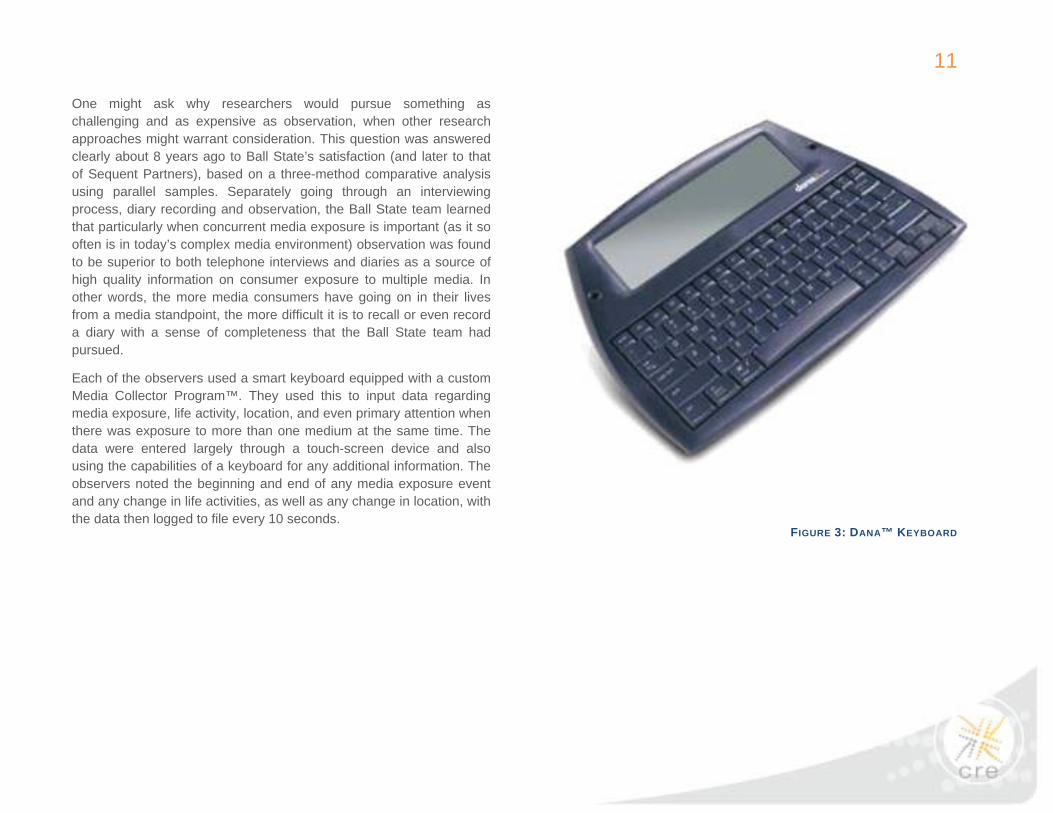
Each of the observers used a smart keyboard equipped with a custom Media Collector Program™. They used this to input data regarding media exposure, life activity, location, and even primary attention when there was exposure to more than one medium at the same time. The data were entered largely through a touch-screen device and also using the capabilities of a keyboard for any additional information. The observers noted the beginning and end of any media exposure event and any change in life activities, as well as any change in location, with the data then logged to file every 10 seconds.
FIGURE 3: DANA™ KEYBOARD
12
FIGURE 4: EXAMPLE OF TRAINING SLIDES AND MEDIA COLLECTOR™ INTERFACE
13
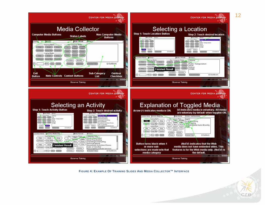
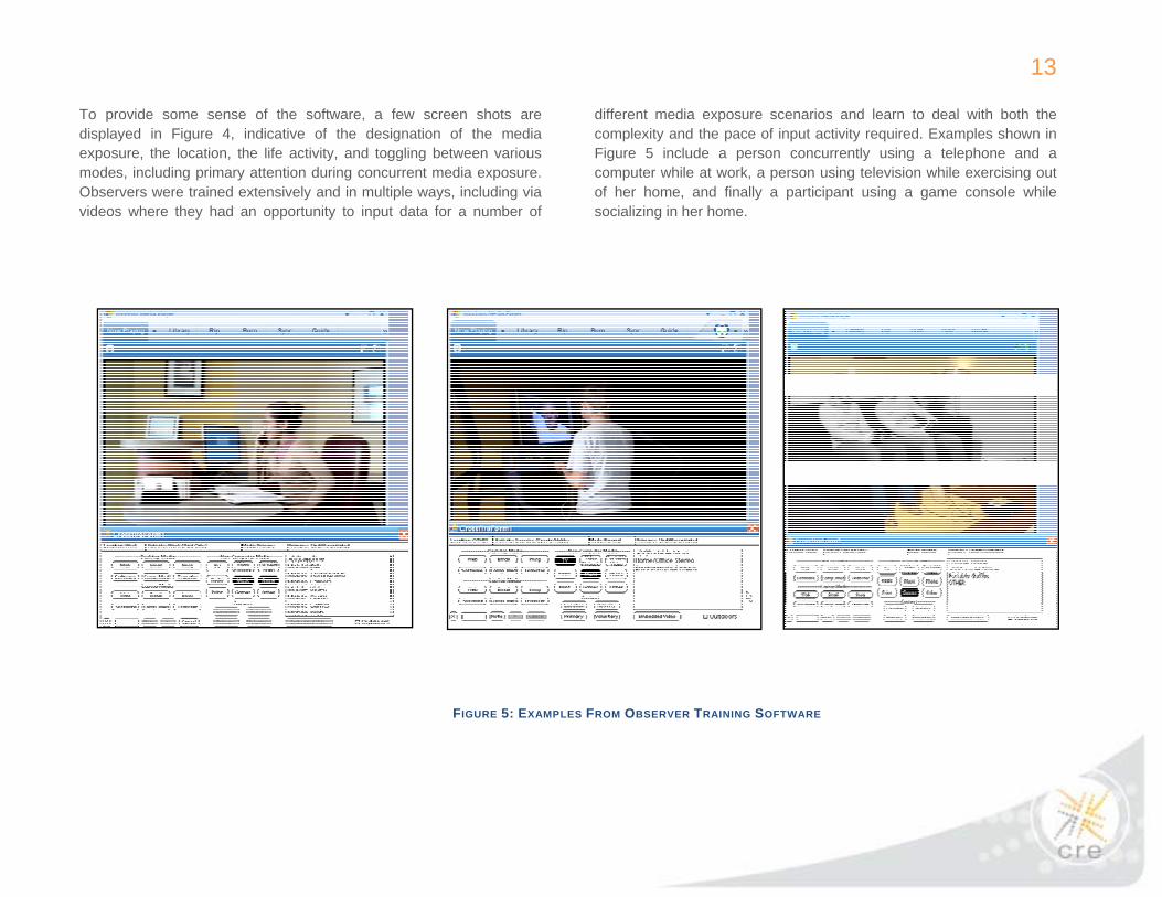
To provide some sense of the software, a few screen shots are displayed in Figure 4, indicative of the designation of the media exposure, the location, the life activity, and toggling between various modes, including primary attention during concurrent media exposure. Observers were trained extensively and in multiple ways, including via videos where they had an opportunity to input data for a number of
different media exposure scenarios and learn to deal with both the complexity and the pace of input activity required. Examples shown in Figure 5 include a person concurrently using a telephone and a computer while at work, a person using television while exercising out of her home, and finally a participant using a game console while socializing in her home.
FIGURE 5: EXAMPLES FROM OBSERVER TRAINING SOFTWARE
14
The Sample Observed
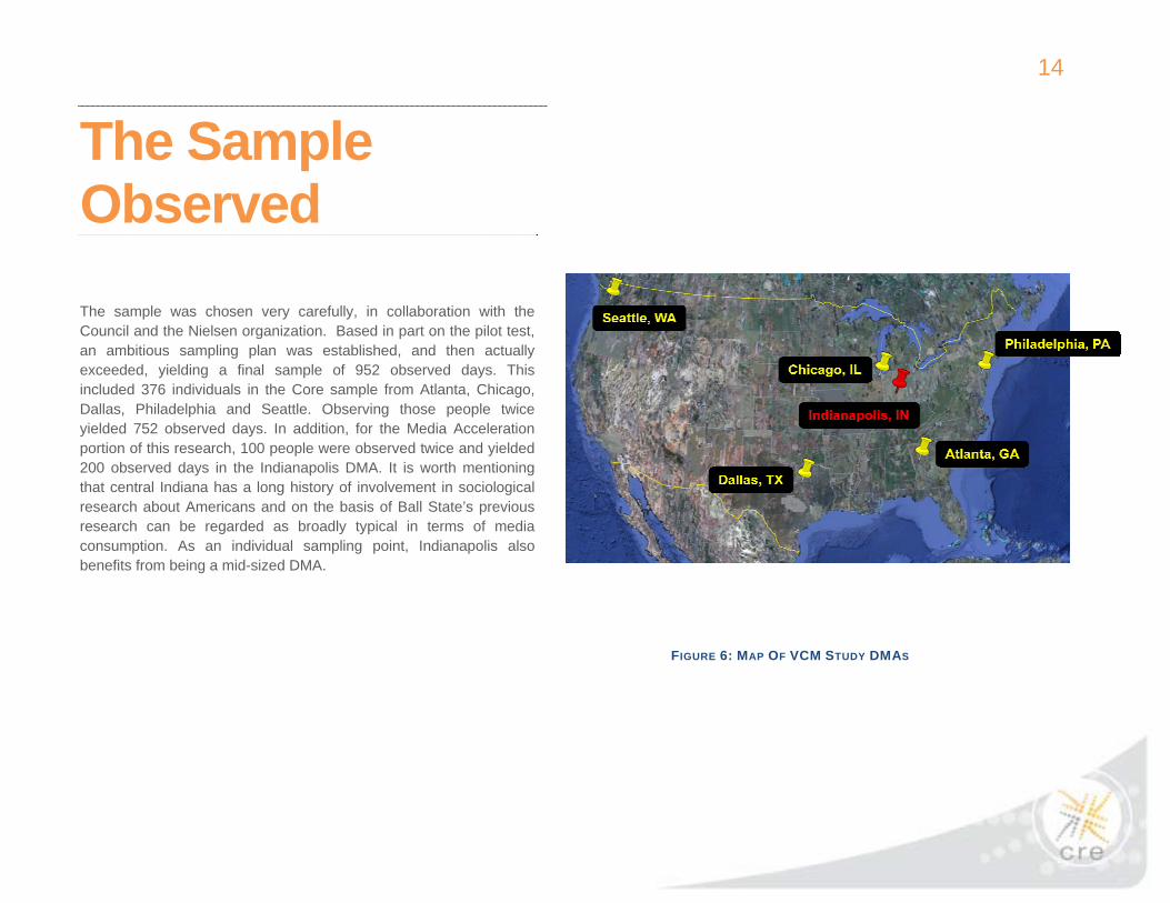
The sample was chosen very carefully, in collaboration with the Council and the Nielsen organization. Based in part on the pilot test, an ambitious sampling plan was established, and then actually exceeded, yielding a final sample of 952 observed days. This included 376 individuals in the Core sample from Atlanta, Chicago, Dallas, Philadelphia and Seattle. Observing those people twice yielded 752 observed days. In addition, for the Media Acceleration portion of this research, 100 people were observed twice and yielded 200 observed days in the Indianapolis DMA. It is worth mentioning that central Indiana has a long history of involvement in sociological research about Americans and on the basis of Ball State’s previous research can be regarded as broadly typical in terms of media consumption. As an individual sampling point, Indianapolis also benefits from being a mid-sized DMA.
FIGURE 6: MAP OF VCM STUDY DMAS

15
The Analysis Before delving into the analysis, it can be helpful to start with an understanding of what just one of these 952 days might look like. The next few figures depict a “Day in the Life” of one person at a time. It starts with a very detailed media legend and then examines the person’s day, starting when they got up in the morning until they went to bed at night.
For those people in the Acceleration sample, such as the example here, it is particularly interesting to compare the pre-post behavior, generally for the same day of the week, as in Figure 8, and with the observed change presumably based in part on the purchases, such as HDTV, listed in the top left corner. The point here is that for every individual there can be a lot of complexity in terms of their day, whether it be their locations, life activities or media exposure, and particularly these things in combination. Measured at 10 second resolution, this yielded a very detailed individual-level database that is interesting one consumer at a time, but even more valuable when combining consumers for overall learning.
FIGURE 7: HOW TO READ THE DAY IN THE LIFE CHART

16
FIGURE 8: A DAY IN THE LIFE OF ONE OF THE ACCELERATED PARTICIPANTS PRE- AND POST- ACCELERATION

17
DeliverablesThere was a range of analytical approaches applied, a number of which are included in this “Key Findings” report specifically to address the agreed upon deliverables, shown here almost verbatim, under a headline of “a map of the consumers’ use of media.” As the information was tabulated, an agreed upon Video Hierarchy was used to generate
extensive details about exposure to various kinds of video media with various categories, such as total TV and video time, total TV time, total video and so on, shown on the following page with combinations (as nets and subnets and even with sub-subnets).
FIGURE 9: VCM STUDY DELIVERABLES
AGREED UPON REPORT DELIVERABLES, PRIMARILY UNDER THE HEADLINE OF “A MAP OF CONSUMERS’ USE OF MEDIA”
ILLUSTRATIVE APPROACHES INCLUDED IN THE ANALYSES
• Media Used • Total minutes by media charts • Daily reach and daily duration • Media exposure event patterns: frequency and duration
• Simultaneous media usage • Multitasking with non-media activities • Media engagement*
• Degrees of engagement including • Concurrent media exposure and media consumption with life
activities • Multi-dimensional day-in-the-life maps
• By high-speed broadband access • By ownership of/access to newer technologies
• Comparison of “ownership groups” on total minutes spring-to-fall changes, and daily reach and duration with particular attention to HDTVs and DVRs
• Comparison of innovation sub-groups
• By time of day* • By season
• Broad day parts • By half hour increments • By weekday vs. weekend comparison • By season: spring vs. fall 2008
• Media satisfaction rationale for using different media • Media uses and gratifications for 8 major TV and video media categories
*Items moved up or down from original list

18
Media Focus: The “Video Hierarchy” • Total TV & Video (Net)
o Total TV (Subnet)
Live TV Playback TV via DVR/TiVo
o Total Video (Subnet) DVD or VCR Video on Demand/PPV Computer Video (Sub-subnet)
• Digital video stored on computer • Digital video streaming to computer • DVD on computer
Mobile Video (Sub-subnet) • Portable DVD • Video on personal (non-phone) devices
(iPods, PSP, etc.) • Video on mobile phone
Environmental/Other video
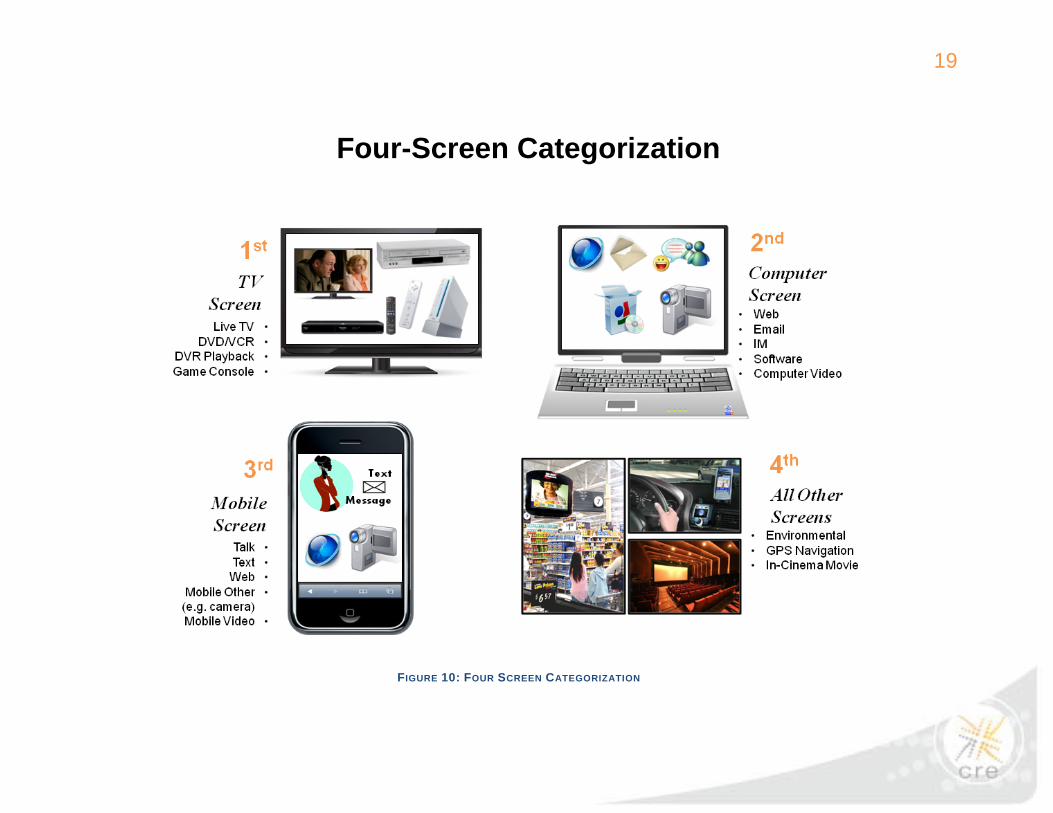
Four Screens
It was found helpful to simplify this potentially complicated video media world in a way that builds on the three-screen orientation that Nielsen has addressed over the last couple of years. What is used here is a purposefully broader Four-Screen categorization. The 1st screen includes any of the major media that tend to be shown on the TV screen, led by live TV, also including DVR playback, DVDs and VCRs and console games. The 2nd screen is all about the computer and the most common computer applications of the web, email, IM, software and computer video, which in turn includes digital video streaming to computer, digital video stored on computer and DVD on computer. The 3rd screen includes any mobile device, but primarily a mobile phone, since the capabilities of a lot of mobile devices (e.g. PDAs) have been converging into mobile phones. Listed under this category are such applications as mobile talking, texting, web, other, and mobile video. The so-called 4th screen was a catch-all category for all other screens, including environmental video, such as video displays one might encounter in shopping environments, GPS navigation screens and movie screens.
19
FIGURE 10: FOUR SCREEN CATEGORIZATION
Four-Screen Categorization

20
Key Findings There are 10 key findings in this report, but it is worth noting that there is much more below the surface and beyond the scope of these key findings that either has been addressed or could be addressed with the powerful database assembled. The first of these was quite a surprise:
1. Although the composition of consumers’ screen media time varied across age groups, their total screen time was strikingly similar, except among those 45-54, whose screen time was highest.
Thinking across these 4 different screens with many individual media components, we found that consumers of different age groups got their screen time in very different ways. The first part of this finding that different age groups got their screen time in different ways may confirm the direction one might expect, particularly for digital media, but also provides new information with substantial additional detail now available in a “Video Consumer Map,” from a media neutral source (Figure 11).

21
FIGURE 11: AVERAGE DAILY MINUTES OF SCREEN MEDIA BY AGE GROUP
How Consumers Accumulated Screen Time Average Daily Minutes, Core Sample, N=752 observed days, Spring and Fall 2008
All participants, including non-users of various media, including concurrent media exposure

22
As this information is built up from the various components of screen time, a number of detailed media-specific findings are particularly noteworthy. For example, it is widely recognized that those 65+ are heavy users of live TV. The left-most portion of the bars on the VCM map shows that the average live TV usage across all participants in that oldest age group was about twice as high as the youngest age group: 421 minutes (about 7 hours) vs. 210 minutes (3 ½ hours). DVR playback time on average was quite appreciable among those under 55 years old. DVD or VCR playback, although not part of a typical definition of TV viewing, was even more substantial overall and the highest among those 18-34. Console games, though a relatively small medium overall, were quite sizeable in the younger age groups.
Going beyond the 1st screen, the biggest component of the 2nd screen is the web, averaging 49 minutes overall and highest for those under 45. Adding email, with a 37 min average, instant messaging (IM) and software, it became clear that among those 55+ time with email declines substantially, and IM virtually disappears. Computer video tended to be quite small with an average time of 2 minutes, and higher among younger age groups.
The biggest 3rd screen application was talking, followed by texting, which was particularly youth-oriented, followed by mobile web and other applications, including mobile video, which was extremely small. Adding environmental video, which was also concentrated among the youngest, and other media, including GPS, accumulated to a total screen time, including concurrent media exposure, that was strikingly similar across 5 of the 6 age groups, in each case within +/- 2% of the 8 ½ hour average.
The only exception was the 45-54 age group or the younger half of the Baby Boomers, which might be called “Digital Boomers” because they used TV much like the next older category, but they used the computer much like the next younger category. As a result, the Digital Boomer group added another hour of screen time a day for a total of 9 ½ hours (with that difference vs. all other age groups statistically significant at the 95% confidence level).
This is almost certainly new information: the VCM study may be the first source documenting what could now be considered a share competition for media consumers’ time across various screen media.
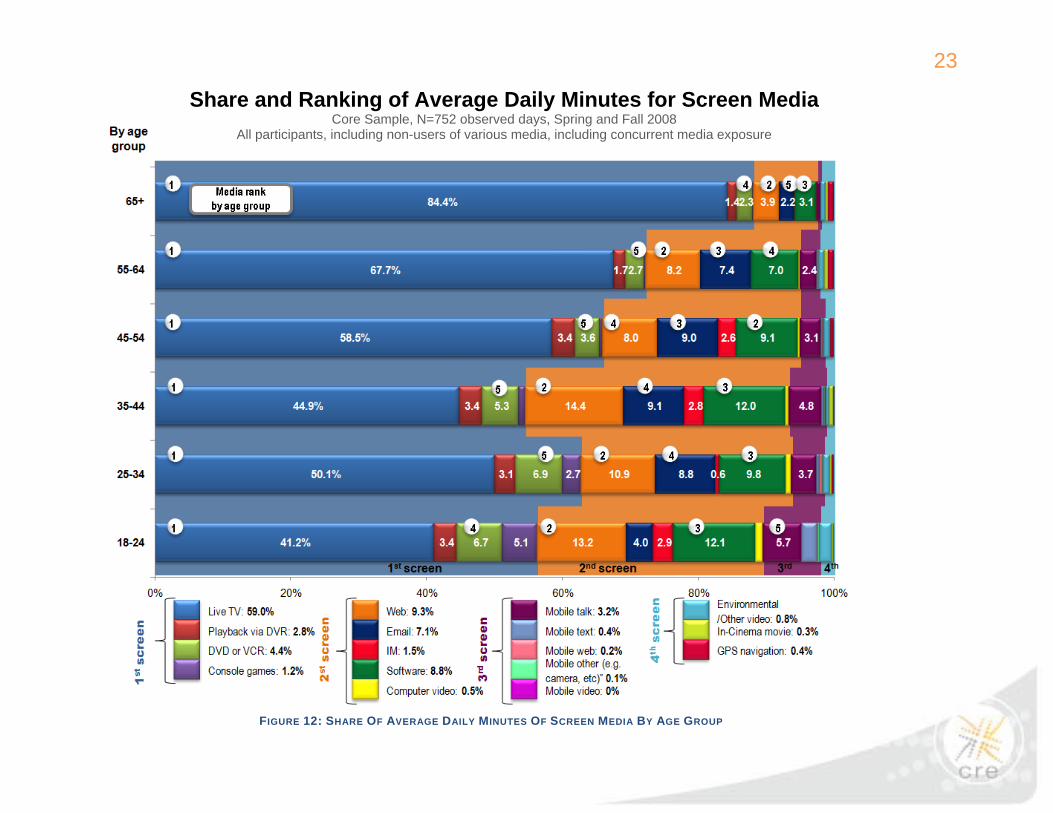
There are numerous ways one could look at this video consumer map (or what might more broadly be called a screen media exposure map) for additional insight. Figure 12 looks at the share (%) of the total screen time rather than minutes and also designates various screen media ranks within each age group. Later an adjustment will be applied to remove the “double counting” effect of concurrent media exposure by including only the medium that garnered the primary attention in the observer’s judgment during concurrent media exposure (Figure 14).
23
FIGURE 12: SHARE OF AVERAGE DAILY MINUTES OF SCREEN MEDIA BY AGE GROUP
Share and Ranking of Average Daily Minutes for Screen Media Core Sample, N=752 observed days, Spring and Fall 2008
All participants, including non-users of various media, including concurrent media exposure
24
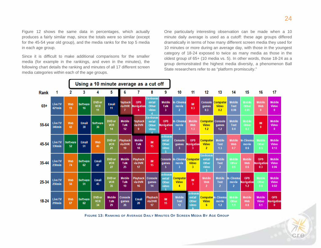
Figure 12 shows the same data in percentages, which actually produces a fairly similar map, since the totals were so similar (except for the 45-54 year old group), and the media ranks for the top 5 media in each age group.
Since it is difficult to make additional comparisons for the smaller media (for example in the rankings, and even in the minutes), the following chart details the ranking and minutes of all 17 different screen media categories within each of the age groups.
One particularly interesting observation can be made when a 10 minute daily average is used as a cutoff: these age groups differed dramatically in terms of how many different screen media they used for 10 minutes or more during an average day, with those in the youngest category of 18-24 exposed to twice as many media as those in the oldest group of 65+ (10 media vs. 5). In other words, those 18-24 as a group demonstrated the highest media diversity, a phenomenon Ball State researchers refer to as “platform promiscuity.”
FIGURE 13: RANKING OF AVERAGE DAILY MINUTES OF SCREEN MEDIA BY AGE GROUP

25
2. The degree of concurrent screen media exposure (also referred to as media multitasking) was equivalent for all age groups under 55.
All of the media exposure minutes in the preceding charts include concurrent media exposure. If one believes that consumers can do more than one thing at a time when it comes to media, this would likely be considered the most relevant measurement of media exposure. On the other hand, if one chooses to assume that consumer can really only do one thing at a time, the appropriate analytical approach would be to subtract any non-primary attention media time that takes place during concurrent media exposure. The following chart (Figure 14) is based on that latter analysis. What is left is unduplicated screen time of a little over 6 hours for the younger three age categories and about 7 hours for the older three categories. How much of the reduction was accomplished by backing out the non-primary portion of concurrent media exposure? That percentage is shown on the right. Once again, one can observe the “Digital Boomer” effect with those 45-54 being very similar to the older groups in terms of total screen time, but very similar to the younger groups in terms of the adjustment necessary to eliminate non-primary concurrent media exposure. It is worth mentioning that the 6-7 hours of sole or primary screen media exposure time covers about 40% of the 16.4 hour average waking day and about 60-65% of the average days’ 10-11 hours of total media exposure (excluding concurrent media exposure).
The boxed detail on the side is almost identical adjustment for all age groups under 55 (-28%). On the one hand, this may confirm other research, including earlier Ball State research, on the substantial magnitude of concurrent media exposure, particularly for digital media and the 2nd screen. But what is new here is that the very similar reduction for concurrent media exposure among all groups under 55 may challenge conventional wisdom that concurrent media use is a behavior concentrated among those in the youngest age groups.

26
FIGURE 14: AVERAGE DAILY MINUTES OF SCREEN MEDIA BY AGE GROUP, PRIMARY MEDIA EXPOSURE ONLY
How Consumers Accumulated Screen Time – Sole Or Primary Media Exposure Only Average Daily Minutes, Core Sample, N=752 observed days, Spring and Fall 2008
All participants, including non-users of various media, Sole + primary media exposure only
27
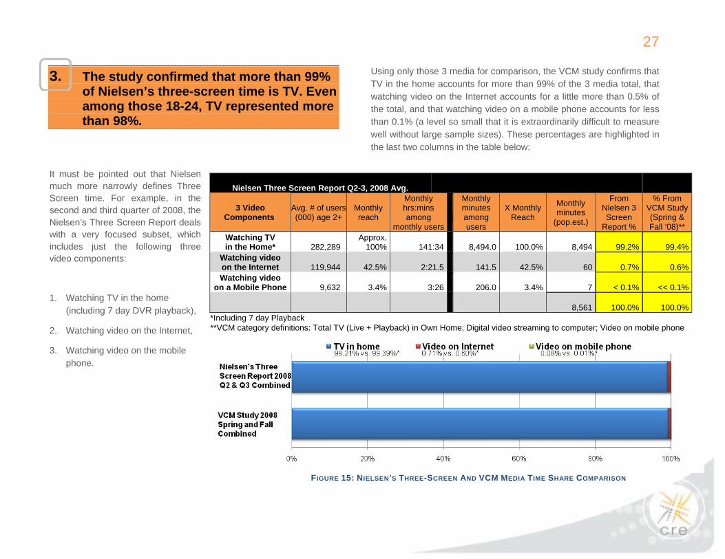
3. The study confirmed that more than 99% of Nielsen’s three-screen time is TV. Even among those 18-24, TV represented more than 98%.
It must be pointed out that Nielsen much more narrowly defines Three Screen time. For example, in the second and third quarter of 2008, the Nielsen’s Three Screen Report deals with a very focused subset, which includes just the following three video components:
1. Watching TV in the home (including 7 day DVR playback),
2. Watching video on the Internet,
3. Watching video on the mobile phone.
Using only those 3 media for comparison, the VCM study confirms that TV in the home accounts for more than 99% of the 3 media total, that watching video on the Internet accounts for a little more than 0.5% of the total, and that watching video on a mobile phone accounts for less than 0.1% (a level so small that it is extraordinarily difficult to measure well without large sample sizes). These percentages are highlighted in the last two columns in the table below:
Nielsen Three Screen Report Q2-3, 2008 Avg.
3 Video Components
Avg. # of users (000) age 2+
Monthly reach
Monthly hrs:mins among
monthly users
Monthly minutes among users
X Monthly Reach
Monthly minutes
(pop.est.)
From Nielsen 3 Screen
Report %
% From VCM Study (Spring & Fall ’08)**
Watching TV in the Home*
282,289
Approx.100% 141:34
8,494.0 100.0%
8,494 99.2% 99.4%
Watching video on the Internet 119,944 42.5% 2:21.5 141.5 42.5%
60 0.7% 0.6%
Watching video on a Mobile Phone
9,632 3.4% 3:26 206.0 3.4%
7 < 0.1% << 0.1%
8,561 100.0% 100.0% *Including 7 day Playback **VCM category definitions: Total TV (Live + Playback) in Own Home; Digital video streaming to computer; Video on mobile phone
FIGURE 15: NIELSEN’S THREE-SCREEN AND VCM MEDIA TIME SHARE COMPARISON

28
As expected, these latter two media tended to show up more often in the younger age groups. However, the fact that even in the youngest two age groups, the 2nd and 3rd screen video was less than 2% of the three-screen total would appear to dispute a belief that Internet video and mobile phone video were sizeable in 2008.
In fact, it is noteworthy that out of home TV minutes (unmeasured, therefore not included in the Nielsen’s three-screen data cited above) were measured in the VCM study to be roughly 10 times as high as video on the Internet and video on the mobile phone combined.
FIGURE 16: NIELSEN’S THREE-SCREEN AND VCM MEDIA TIME SHARE COMPARISON, BY AGE GROUP
29
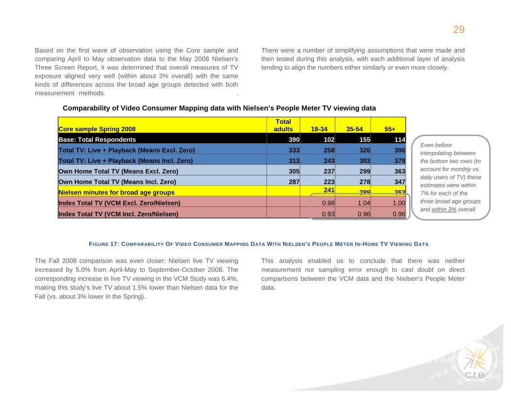
Based on the first wave of observation using the Core sample and comparing April to May observation data to the May 2008 Nielsen’s Three Screen Report, it was determined that overall measures of TV exposure aligned very well (within about 3% overall) with the same kinds of differences across the broad age groups detected with both measurement methods. .
There were a number of simplifying assumptions that were made and then tested during this analysis, with each additional layer of analysis tending to align the numbers either similarly or even more closely.
The Fall 2008 comparison was even closer: Nielsen live TV viewing increased by 5.0% from April-May to September-October 2008. The corresponding increase in live TV viewing in the VCM Study was 6.4%, making this study’s live TV about 1.5% lower than Nielsen data for the Fall (vs. about 3% lower in the Spring).
This analysis enabled us to conclude that there was neither measurement nor sampling error enough to cast doubt on direct comparisons between the VCM data and the Nielsen’s People Meter data.
Comparability of Video Consumer Mapping data with Nielsen’s People Meter TV viewing data
Core sample Spring 2008 Total adults 18-34 35-54 55+
Base: Total Respondents 390 102 155 114Total TV: Live + Playback (Means Excl. Zero) 333 258 326 396Total TV: Live + Playback (Means Incl. Zero) 313 243 303 378Own Home Total TV (Means Excl. Zero) 305 237 299 363Own Home Total TV (Means Incl. Zero) 287 223 278 347Nielsen minutes for broad age groups 241 289 363Index Total TV (VCM Excl. Zero/Nielsen) 0.98 1.04 1.00
Index Total TV (VCM Incl. Zero/Nielsen) 0.93 0.96 0.96
FIGURE 17: COMPARABILITY OF VIDEO CONSUMER MAPPING DATA WITH NIELSEN’S PEOPLE METER IN-HOME TV VIEWING DATA
Even before interpolating between the bottom two rows (to account for monthly vs. daily users of TV) these estimates were within 7% for each of the three broad age groups and within 3% overall
30
4. Live TV led all video time by a large margin, followed by DVDs, with DVRs third.
Live TV continued to dominate other media. This was true not only in total minutes across all adults, but also in daily reach (94%) and average daily duration (5 ½ hrs for users). The number one position for total TV time (live TV + DVR playback) among media held across all age groups (though audio time matched live TV time for those 18-24). This finding may confirm Nielsen’s TV viewership data, but disputes a common perception that TV is not a major medium for those in younger age groups.
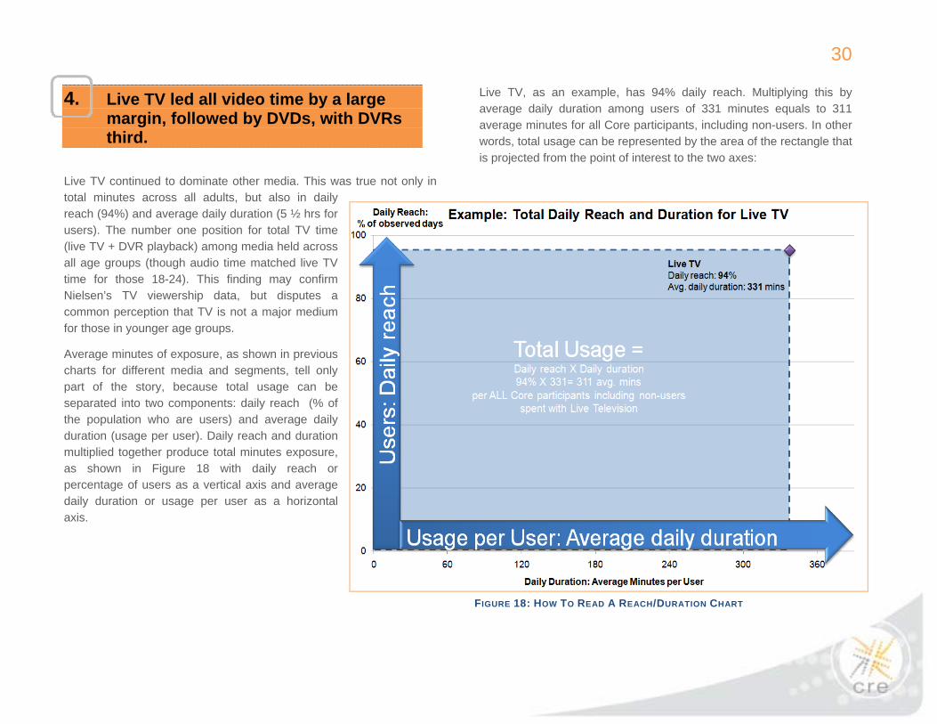
Average minutes of exposure, as shown in previous charts for different media and segments, tell only part of the story, because total usage can be separated into two components: daily reach (% of the population who are users) and average daily duration (usage per user). Daily reach and duration multiplied together produce total minutes exposure, as shown in Figure 18 with daily reach or percentage of users as a vertical axis and average daily duration or usage per user as a horizontal axis.
Live TV, as an example, has 94% daily reach. Multiplying this by average daily duration among users of 331 minutes equals to 311 average minutes for all Core participants, including non-users. In other words, total usage can be represented by the area of the rectangle that is projected from the point of interest to the two axes:
FIGURE 18: HOW TO READ A REACH/DURATION CHART
31
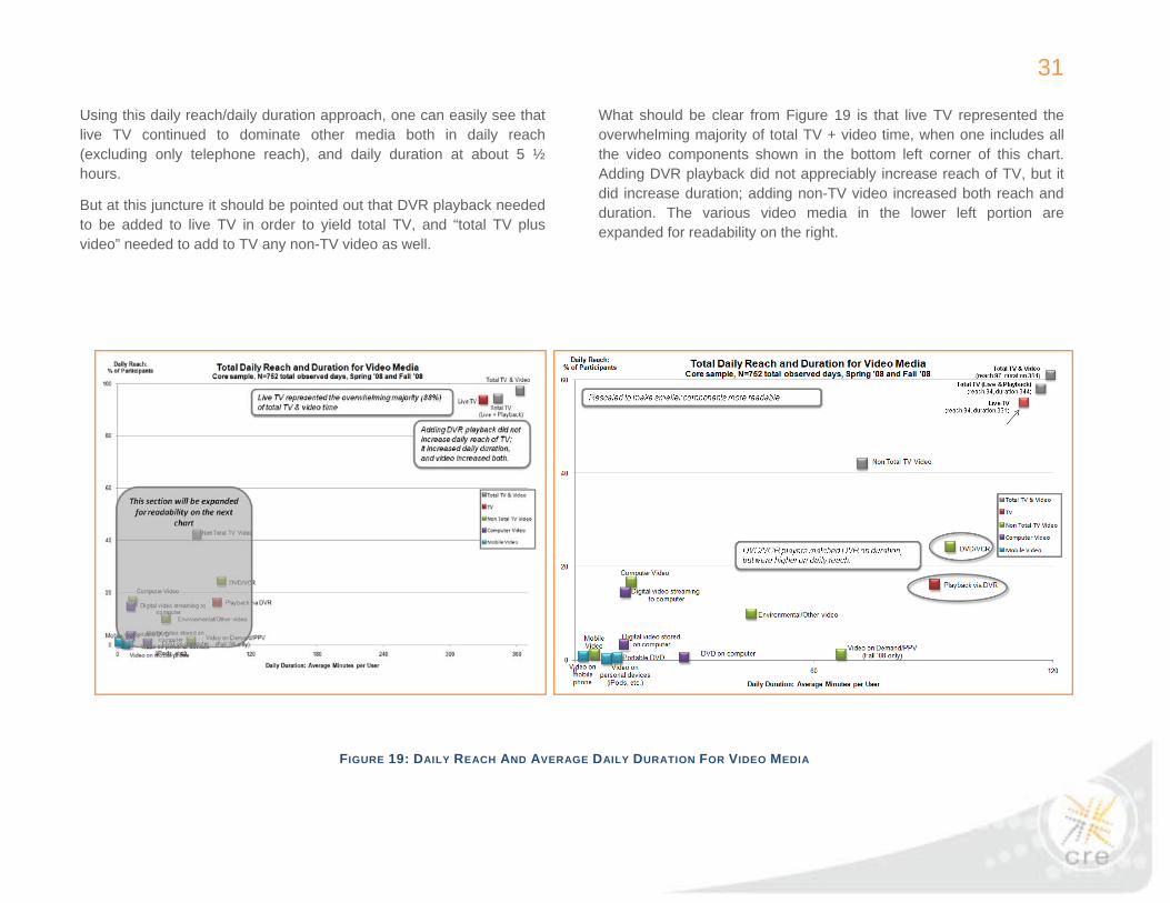
Using this daily reach/daily duration approach, one can easily see that live TV continued to dominate other media both in daily reach (excluding only telephone reach), and daily duration at about 5 ½ hours.
But at this juncture it should be pointed out that DVR playback needed to be added to live TV in order to yield total TV, and “total TV plus video” needed to add to TV any non-TV video as well.
What should be clear from Figure 19 is that live TV represented the overwhelming majority of total TV + video time, when one includes all the video components shown in the bottom left corner of this chart. Adding DVR playback did not appreciably increase reach of TV, but it did increase duration; adding non-TV video increased both reach and duration. The various video media in the lower left portion are expanded for readability on the right.
FIGURE 19: DAILY REACH AND AVERAGE DAILY DURATION FOR VIDEO MEDIA

32
5. The study suggests that computing has displaced radio as the number 2 media activity. Radio is now number 3 and print is number 4.
Media Categories
Any audio: • Broadcast radio • MP3s, CDs, etc.(not shown
separately on Figure 20)
Any computing: • Any Internet
• Web • Email • IM
• Software
Video includes DVDs and DVRs primarily and other video hierarchy media (shown on Figure 19) Any print includes newspapers, magazines, books (not shown separately on Figure 20) Any phone includes landline and mobile.
Shifting to the 2nd screen media, it became clear that computing time is now the number 2 media category. Including web use, email, software and IM, computing time exceeded broadcast radio average duration by 40%, and nearly matched radio’s daily reach (at 75%). Though it is assumed there are various industry information sources indicating the relative strength of such major media, what is new in this study is a common source for such measures for the same group of media consumers at the same point in time across a wide range of media.
FIGURE 20: DAILY REACH AND AVERAGE DAILY DURATION FOR MAJOR MEDIA
33
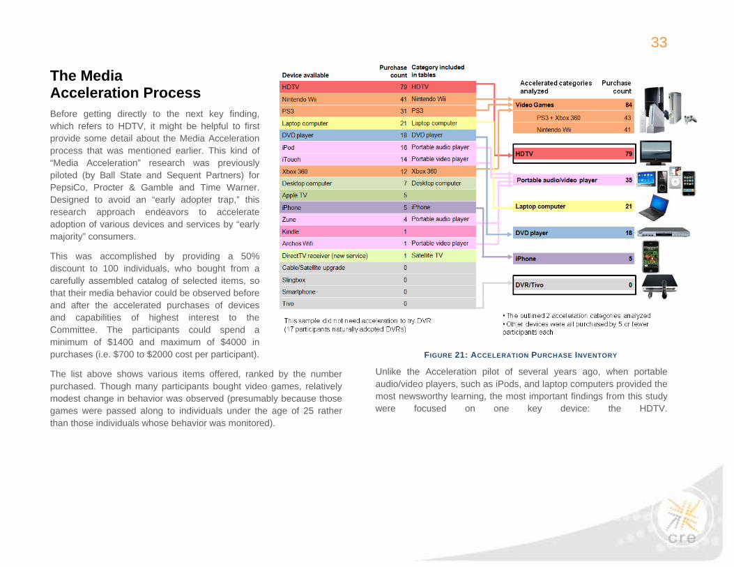
The Media Acceleration Process Before getting directly to the next key finding, which refers to HDTV, it might be helpful to first provide some detail about the Media Acceleration process that was mentioned earlier. This kind of “Media Acceleration” research was previously piloted (by Ball State and Sequent Partners) for PepsiCo, Procter & Gamble and Time Warner. Designed to avoid an “early adopter trap,” this research approach endeavors to accelerate adoption of various devices and services by “early majority” consumers.
This was accomplished by providing a 50% discount to 100 individuals, who bought from a carefully assembled catalog of selected items, so that their media behavior could be observed before and after the accelerated purchases of devices and capabilities of highest interest to the Committee. The participants could spend a minimum of $1400 and maximum of $4000 in purchases (i.e. $700 to $2000 cost per participant).
The list above shows various items offered, ranked by the number purchased. Though many participants bought video games, relatively modest change in behavior was observed (presumably because those games were passed along to individuals under the age of 25 rather than those individuals whose behavior was monitored).
Unlike the Acceleration pilot of several years ago, when portable audio/video players, such as iPods, and laptop computers provided the most newsworthy learning, the most important findings from this study were focused on one key device: the HDTV.
FIGURE 21: ACCELERATION PURCHASE INVENTORY

34
6. New HDTV ownership (1st or 2nd set) led to higher TV exposure, though some of this increase appeared to be temporary.
By far, the most dramatic finding from the Media Acceleration process was regarding the effects of HDTV ownership, something that could also be examined to some extent based on natural purchases that occurred for the Core sample between Spring and Fall of 2008.
In this study, new HDTV ownership clearly led to higher TV exposure, though some of this increase appeared to be temporary. One might want to encourage Nielsen’s TV viewership data to track this phenomenon over time. But the VCM study provides one possible contributor to the current market increase in TV time.
As shown in the reach/duration chart below, Accelerated users (nearly 80% of whom were HDTV-accelerated) were exposed to substantially more TV time after Acceleration, an increase of 18.4% from Spring to Fall 2008 vs. an increase of 7.6% for the Core sample.
FIGURE 22: SPRING AND FALL CHANGES IN DAILY REACH AND AVERAGE DAILY DURATION

35
FIGURE 24: CHANGE IN SPORTS TV MINUTES BY GENDER AND DAY OF WEEK
FIGURE 23: DAILY REACH AND AVERAGE DAILY DURATION FOR TV GENRE
Looking at this study’s consumer media exposure more closely, it was determined that a very substantial part of the HDTV story was related to sports TV. What changed most in time spent with TV was duration with sports, which was up nearly an hour with increases noted particularly on Sundays for men and women, and on Saturdays for men.

36
HDTV ownership groups were key to the analysis of the HDTV effect. Four ownership groups were defined based on HDTV ownership during both Spring and Fall observations (shown in the table below). For instance, only the participants who had no HDTV sets during both observation rounds were considered to be non-owners. If the participants did not previously own an HDTV set, but acquired one between rounds (via Acceleration or natural adoption) they were considered to be new owners. When the participants already had an HDTV in the Spring and kept the same number of HDTVs in the Fall, they were considered to be early owners (no new HDTV).
Finally, due to an initially high penetration of HDTVs among the Accelerated sample and then a high rate of 2nd HDTV adoption, the Accelerated sample allowed definition of an additional group: the early owner (new HDTV) group, which included those participants who owned an HDTV set in the Spring and then acquired a 2nd set between the two rounds. Although some of the groups (highlighted in red in the table below) were too small to include in the analysis, fortunately between the two samples it was possible to define and analyze all four HDTV ownership groups as well as make direct comparison in the case of new owners, where both the Core and the Accelerated samples had large enough groups to be analyzed.
FIGURE 25: HDTV OWNERSHIP GROUPS
Spring vs. Fall Ownership Name of group Core Sample Accelerated Sample 1 HDTV in Spring 2 in Fall
Early Owners
(New HDTV)
No
N=17
(Note: Small sample)
Yes
N=42
1 HDTV in Spring 1 in Fall
Early Owners
(No New HDTV)
Yes
N=58
No
N=6
0 HDTVs in Spring 1 in Fall
New Owners Yes
N=87
Yes
N=43
0 HDTVs in Spring Or Fall
Non Owners Yes
N=205
No
N=6

37
Looking at the changes in average daily duration between Spring and Fall ‘08 for four TV screen media (live TV, playback via DVR, DVD/VCR and console games) by HDTV ownership groups provides evidence that new HDTV increased TV viewership whether it was the first HDTV or the second. It was observed that the early owners still with one HDTV spent less time with live TV (presumably after the earlier HDTV effect), but new HDTV owners spent significantly more live TV time (both in the Core and the Accelerated samples).
Early owners (new HDTV) who added another HDTV showed increased time with all four TV screen media. The increase in live TV minutes for non-owners shows that some of the live TV increase may have been seasonal. However, the decline in TV viewership among early HDTV owners in Core suggests that a substantial portion of the HDTV increased TV viewing could have been temporary.
FIGURE 26: CHANGES IN TV SCREEN MEDIA MINUTES BY HDTV OWNERSHIP GROUP
38
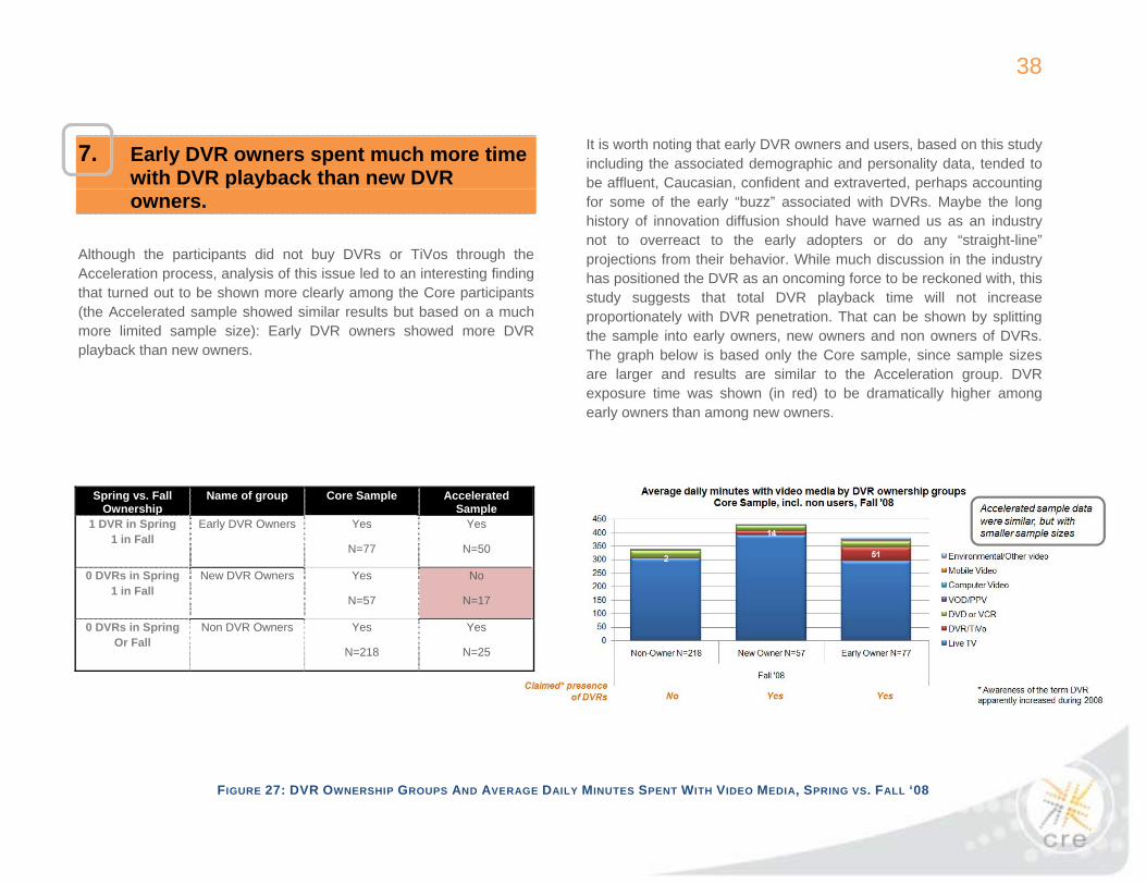
7. Early DVR owners spent much more time with DVR playback than new DVR owners.
Although the participants did not buy DVRs or TiVos through the Acceleration process, analysis of this issue led to an interesting finding that turned out to be shown more clearly among the Core participants (the Accelerated sample showed similar results but based on a much more limited sample size): Early DVR owners showed more DVR playback than new owners.
It is worth noting that early DVR owners and users, based on this study including the associated demographic and personality data, tended to be affluent, Caucasian, confident and extraverted, perhaps accounting for some of the early “buzz” associated with DVRs. Maybe the long history of innovation diffusion should have warned us as an industry not to overreact to the early adopters or do any “straight-line” projections from their behavior. While much discussion in the industry has positioned the DVR as an oncoming force to be reckoned with, this study suggests that total DVR playback time will not increase proportionately with DVR penetration. That can be shown by splitting the sample into early owners, new owners and non owners of DVRs. The graph below is based only the Core sample, since sample sizes are larger and results are similar to the Acceleration group. DVR exposure time was shown (in red) to be dramatically higher among early owners than among new owners.
FIGURE 27: DVR OWNERSHIP GROUPS AND AVERAGE DAILY MINUTES SPENT WITH VIDEO MEDIA, SPRING VS. FALL ‘08
Spring vs. Fall Ownership
Name of group Core Sample Accelerated Sample
1 DVR in Spring 1 in Fall
Early DVR Owners Yes
N=77
Yes
N=50
0 DVRs in Spring 1 in Fall
New DVR Owners Yes
N=57
No
N=17
0 DVRs in Spring Or Fall
Non DVR Owners Yes
N=218
Yes
N=25

39
8. A higher percentage of TV time was spent as sole medium compared to computers, print or audio. DVR playback time was even more likely than live TV to be as sole medium.
Since the Committee leading this project is called the “Media Consumption and Engagement Committee,” it is not surprising that there was interest in adding some media engagement learning to the media consumption information summarized above. Three analytical approaches were used to help address the Council's questions about "media engagement."
Concurrent media exposure: The first of these approaches relates simply to how much of the exposure time for each medium is as a sole medium vs. in combination with other media. If in combination, this "concurrent media exposure" is further split to designate whether the medium of interest was recorded by the observer as the "primary attention" medium or not. For graphical purposes, these are built from the bottom up, starting with the strongest (sole medium) condition.
FIGURE 28: UNDERSTANDING CONCURRENT MEDIA EXPOSURE
40
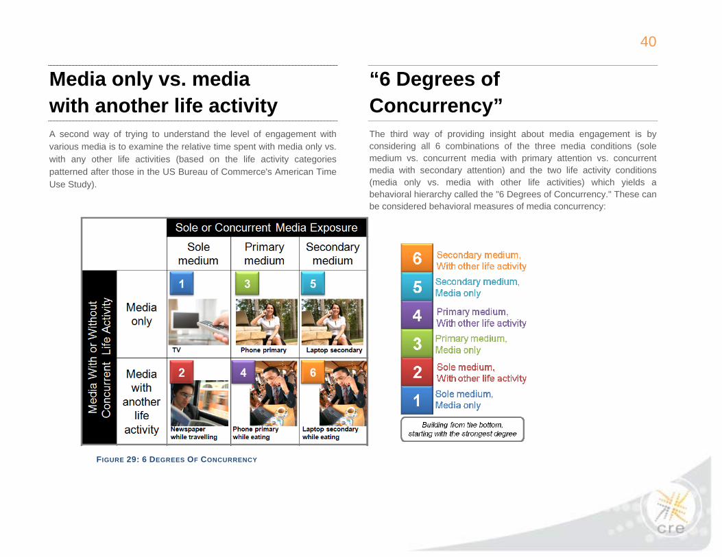
Media only vs. media with another life activity A second way of trying to understand the level of engagement with various media is to examine the relative time spent with media only vs. with any other life activities (based on the life activity categories patterned after those in the US Bureau of Commerce's American Time Use Study).
“6 Degrees of Concurrency” The third way of providing insight about media engagement is by considering all 6 combinations of the three media conditions (sole medium vs. concurrent media with primary attention vs. concurrent media with secondary attention) and the two life activity conditions (media only vs. media with other life activities) which yields a behavioral hierarchy called the "6 Degrees of Concurrency." These can be considered behavioral measures of media concurrency:
FIGURE 29: 6 DEGREES OF CONCURRENCY

41
The analysis on media concurrency in the VCM study showed that about 80% of TV and video time was as sole media. About half of the time occurred with media only and the remaining half with some other life activity.
In comparison to other major media, live TV commanded a particularly high share of time as a sole medium (Figure 30).
FIGURE 30: CONCURRENT MEDIA EXPOSURE
42
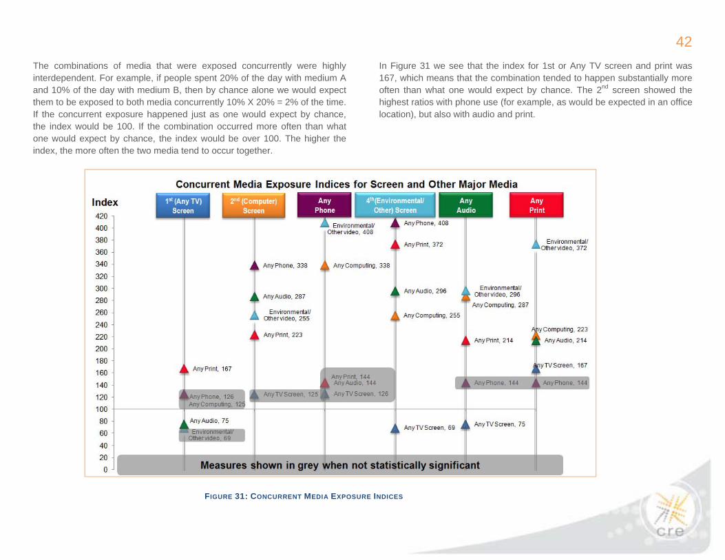
The combinations of media that were exposed concurrently were highly interdependent. For example, if people spent 20% of the day with medium A and 10% of the day with medium B, then by chance alone we would expect them to be exposed to both media concurrently 10% X 20% = 2% of the time. If the concurrent exposure happened just as one would expect by chance, the index would be 100. If the combination occurred more often than what one would expect by chance, the index would be over 100. The higher the index, the more often the two media tend to occur together.
In Figure 31 we see that the index for 1st or Any TV screen and print was 167, which means that the combination tended to happen substantially more often than what one would expect by chance. The 2nd screen showed the highest ratios with phone use (for example, as would be expected in an office location), but also with audio and print.
FIGURE 31: CONCURRENT MEDIA EXPOSURE INDICES
43
FIGURE 32: 6 DEGREES OF CONCURRENCY FOR MAJOR MEDIA

44
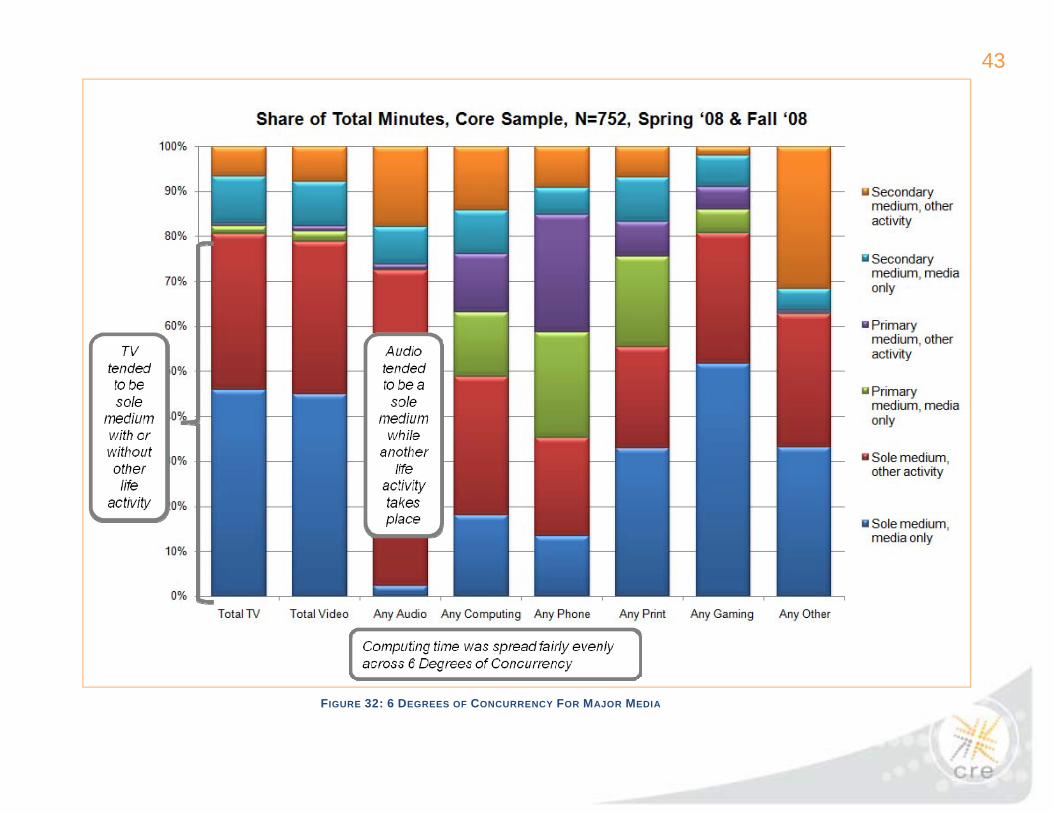
Looking at the combination of concurrent media exposure and media used concurrently with another life activity in the “6 Degrees of Concurrency” it can be seen that total video was pretty similar to total TV, and tended to be sole medium equally spent with or without other life activity.
In comparison, audio tended to be a sole medium while another life activity took place. In contrast, computing time was spread fairly evenly across degrees of concurrency.
FIGURE 33: 6 DEGREES OF CONCURRENCY FOR SCREEN MEDIA

45
9. TV users were exposed to, on average, roughly an hour a day of live TV ads and promos.
Even though Nielsen data analyzed by the Committee appears to be quite consistent with this level of exposure, the VCM study data clearly disputes the belief that consumers are avoiding most of the advertising in programming they view.
FIGURE 34: DAILY REACH AND AVERAGE DAILY DURATION FOR TV GENRE
Note: “Reconstructed data” (generally in the earliest and latest parts of the day) do not include ad/promo exposure.

46
FIGURE 35: CME INDICES FOR TV CONTENT VS. ADVERTISING
What happened during these commercial breaks in terms of observed behavior? These were periods during which concurrent media exposure increased dramatically, as shown in the chart above.
During the commercial breaks people were observed shifting their primary attention, particularly to such media as print, phone and computing.
47
10. Serious caution needs to be applied in interpreting self-report data for media use. TV was substantially under-reported while online video and mobile video usage were over-reported.
The following comparison of next day’s self-report to observed behavior (for the same people and related to the same specific day) demonstrates how dramatically overstated self-reported estimates can be for small media, such as Internet video and mobile phone video. Figure 36 documents a key finding that serious caution needs to be applied in interpreting self-report data of media use. Caveat: though there are numerous self-report/recall methods more sophisticated than applied in this study, the simple day after question about which media were used and how much time for each related to the exact same day that the participants in question knew their behavior was being closely observed. Therefore, this research provides unusual ability to compare observation to self-report data for exactly the same people on exactly the same days.
Though the industry has long known self-report tends to understate certain media, such as TV time, this may be the first study to clearly document dramatic overstatement for online video and mobile video. Starting with the two biggest media, the chart on the next page shows that in this study, TV’s self-report tended to understate the actual observed exposure. Computer duration tended to be a little overstated. Those two media out of seven examined were the only two where models could be fit (where more than 40% of variance in one was explained by variance in the other). Online video and portable video duration tended to be overstated to the extreme.
Moreover the online video and portable video models yielded near zero predictive power. Looking at the individual-level data for self-report (“What they say”) vs. observed exposure (“What they do”) in minutes, the models for computer and live TV exposure are shown in Figure 37. In both cases, even though there is some predictive power, they tended to show too much variation for comfort. Comparisons for the remaining 5 media were even less encouraging with online and mobile media being the worst.

48
FIGURE 36: COMPARISON OF SELF-REPORT AND OBSERVATION DAILY REACH AND AVERAGE DAILY DURATION DATA FOR VARIOUS MEDIA

49
FIGURE 37: EVEN THE BEST TWO MODEL FITS (COMPUTER AND LIVE TV) SHOWED TOO MUCH VARIATION FOR COMFORT

50
Summary Of Key Findings
Key findings Confirmation of earlier research findings and beliefs
New information
1 Although the composition of consumers’ screen media time varied across age groups, their total screen time was strikingly similar, except among those 45-54, whose screen time was highest.
Confirms the direction expected, particularly for digital media…
But with substantial additional detail now available in a “video consumer map” from a media-neutral source. This is the first known information source documenting what could be considered a share competition for media consumers’ time across various screen media.
2 The degree of concurrent screen media exposure (also referred to as media multitasking) was equivalent for all age groups under 55.
Confirms the substantial magnitude of concurrent media exposure, particularly for digital media.
This may challenge conventional wisdom that concurrent media use is a behavior concentrated among those in the youngest age groups.
3 The study confirmed that more than 99% of Nielsen’s three-screen time is TV. Even among those 18-24, TV represented more than 98%.
These data confirm Nielsen’s three-screen data…
Yet at the same time this disputes a belief that internet video and mobile phone video were sizeable in 2008. Comparison of next-day recall to observed behavior demonstrates how dramatically overstated recall estimates can be for internet video and mobile phone video, which may partly explain this common misperception.
4 Live TV led all video time by a large margin, followed by DVDs, with DVRs third.
Confirms that DVR playback is a significant component of total TV time, though much smaller than live TV.
Demonstrates that DVD time (rarely discussed) is larger that DVR playback (often discussed).
5 The study suggests that computing has displaced radio as the number 2 media activity. Radio is now number 3 and print is number 4.
It is assumed there are various industry information sources indicating the relative strength of such major media.
What is new is a common source for such measures, for the same group of media consumers, across various media.

51
Key findings Confirmation of earlier research findings and beliefs
New information
6 New HDTV ownership (1st or 2nd set) led to higher TV exposure, though some of this increase appeared to be temporary.
Nielsen TV viewership data could presumably track this over time.
This provides one possible contributing factor for the current market increase in TV time. The accelerated portion of this study was the only way to observe the effect of the 2nd HDTV set at this point.
7 Early DVR owners spent much more time with DVR playback than new DVR owners.
The long history of innovation diffusion should have warned us not to over-react to the earliest adopters.
While much discussion in the industry has positioned the DVR an oncoming force to be reckoned with, this study suggests that total DVR playback time will not increase proportionately with DVR penetration.
8 A higher percentage of TV time was spent as sole medium compared to computers, print or audio. DVR playback time was even more likely than live TV to be as sole medium.
This is the first geographically distributed research to quantify sole vs. concurrent media and media consumption with or without other life activities.
9 TV users were exposed to, on average, roughly an hour a day of live TV ads and promos.
Nielsen data analyzed by the Committee is quite consistent with this level of exposure.
However, these data clearly dispute the belief that consumers are avoiding most of the advertising in programming they view.
10 Serious caution needs to be applied in interpreting self-report data for media use. TV was substantially under-reported while online video and mobile video usage were over-reported.
This confirms other research showing self-report tends to understate TV time.
This may be the first study to document dramatic overstatement of online video and mobile video.
Finally, while completing and presenting this study we tried to adhere to the core principles of the Council: transparency, inclusiveness, diversity, imagination, collegiality, practicality, and client leadership.
The research team wishes to thank all involved for giving us this opportunity.
The research team was led by:
• Mike Bloxham, Ball State University, Center for Media Design • Michael Holmes, Ball State University, Center for Media Design • Bill Moult, Sequent Partners • Jim Spaeth, Sequent Partners
52
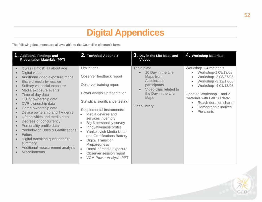
The following documents are all available to the Council in electronic form:
Digital Appendices
1. Additional Findings and Presentation Materials (PPT)
2. Technical Appendix 3. Day in the Life Maps and Videos
4. Workshop Materials
• It was (almost) all about age • Digital video • Additional video exposure maps • Share of media by location • Solitary vs. social exposure • Media exposure events • Time of day data • HDTV ownership data • DVR ownership data • Game ownership data • Device ownership and TV genre • Life activities and media data • Degrees of concurrency • Personality profile data • Yankelovich Uses & Gratifications • Future • Digital transition questionnaire
summary • Additional measurement analysis • Miscellaneous
Limitations Observer feedback report Observer training report Power analysis presentation Statistical significance testing Supplemental instruments: • Media devices and
services inventory • Big 5 personality survey • Innovativeness profile • Yankelovich Media Uses
and Gratifications Battery • Digital Transition
Preparedness • Recall of media exposure • Observer session report • VCM Power Analysis PPT
Triple play: • 10 Day in the Life
Maps from Accelerated participants
• Video clips related to the Day in the Life Maps
Video library
Workshop 1-4 materials • Workshop-1 08/13/08 • Workshop -2 08/27/08 • Workshop -3 12/17/08 • Workshop -4 01/13/08
Updated Workshop 1 and 2 materials with Fall ’08 data:
• Reach duration charts • Demographic indices • Pie charts
53
(Note: terms used in glossary entries and defined elsewhere in the glossary are highlighted in bold)
Acceleration sample: The cohort of VCM study participants exposed to the Media Acceleration treatment. The sample was recruited in the Indianapolis DMA by a national research recruitment firm.
Ball State University Center for Media Design (CMD): A university-based research and development facility focused on the creation, testing, and practical application of digital technologies for business, classroom, home, and community. The Insight and Research unit of the CMD is co-provider, with Sequent Partners, of the VCM study. See www.bsu.edu/cmd.
Composite media variables: Media variables generated by combining a set of related variables into a single measure. Key composite variables discussed in this report include:
Any TV: Live (linear) TV and DVR.
Any Audio: Radio, recorded audio and streaming audio.
Any Computing: Any computer use, whether online or offline.
Any Internet: Any online computer use such as email, Web or instant messaging.
Any Phone: Landline and mobile phone use.
Any Print: Book, magazine, newspaper and other bound print material.
Non-TV video: Recorded video (DVD/VCR), computer video, mobile video and environmental video.
Concurrent media exposure: Participant exposure to more than one medium at a time. It is used instead of "media multitasking" or "simultaneous use" to avoid the purposive connotations of those labels.
Consumer-centric research: Research centered on the consumer in context—across locations, across media platforms, and in the context of non-media activities. As applied here it involves naturalistic (field-based) inquiry using a shadowing approach rather than lab-based methods.
Core sample: The cohort of VCM study participants not exposed to the media acceleration treatment. Composed largely of former Nielsen cooperators with a small number of BSU-recruited participants (younger women) used to balance the sample demographics. Located in Atlanta, Chicago, Dallas, Philadelphia and Seattle.
Council for Research Excellence (CRE): A Nielsen-funded but independently-operating media industry group. Its mission is to advance the knowledge and practice of methodological research on audience measurement. See www.researchexcellence.com
Day In The Life chart: A timeline visualization using parallel color-coded bars to display either 1) the locations, activities and media exposures of a single individual over the course of an observed day or 2) exposure to a single medium over the course of a day by a selected subset of participants (for "side by side" comparison).
Glossary

54
Digital Boomers: The 45- to 54-year old age group; in the VCM study this cohort was found to share digital media exposure patterns of younger participants and traditional media exposure patterns of older participants; they straddle the digital and analog worlds.
Early owners: In the analysis of the acceleration sample, those who already owned, before the onset of the study, a particular device or service offered in the acceleration catalog.
Four-screen categorization: An extension of the Nielsen’s three-screen model of the video world (TV, computer, mobile) to include a fourth category encompassing environmental video, GPS screens and cinema.
Innovation diffusion: The notion that adoption of a new technology or practice proceeds over time according to the size and dominant characteristics of the adopting group in a given time frame, from "early adopters" to "laggards or resisters." The model is most associated with the work of communication scholar Everett Rogers. The traditional adoption curve describes five groups (with assumed approximate normal distribution noted):
Innovators (2.5%): venturesome, "cutting edge" and "first to have"
Early Adopters (13.5%): judicious, influenced by innovators, often are opinion leaders.
Early Majority (34%): first to follow at the "tipping point" towards mass adoption
Late Majority (34%): more cautious; adoption influenced by social or economic pressures
Laggards (16%): may be resistant, traditional, suspicious or isolated from opinion leaders.
Media Acceleration: A subsidized-purchase research treatment used to simulate the adoption of emerging media devices and services as expected in the "early majority" stage of diffusion. Participants are offered emerging media devices and services, from a defined catalog of options, at a 50% discount. The method is designed to avoid the well-known pitfalls of studying innovation diffusion among early adopters and unmotivated adopters.
Media Collector™: CMD's proprietary data collection software. It provides a touch-screen interface on a smart keyboard device running the Palm OS™. Observers log locations, activities and media exposures by selecting items from the Media Collector™ menus and entering comments and clarifications via the keyboard.
Media Consumption and Engagement committee: Committee of the Council for Research Excellence charged with the mission to improve and evolve audience measurement through comprehensive and ongoing study of media consumption. The committee seeks to dimension the current consumption of media and how it is changing (and will change) over time in order to propose the optimal form of media measurement. Responsible for authorizing and overseeing the Video Consumer Mapping study. See http://researchexcellence.com/committees/com_mediasconsumption.html
New owners: In the analysis of the acceleration sample, those who purchased a particular device or service offered in the acceleration catalog.
Primary medium: In concurrent media exposure, the medium which the observer judges as having apparent primary attention or focus of the participant. Interpreted through behavioral and contextual clues (such as direction of gaze, application of media in an ongoing activity such as work, and pairing of active and passive media). Used in the Six Degrees of Concurrency analysis.
Reach/Duration scatterplot: A snapshot visualization of the media ecosystem in which target media are plotted on two dimensions: their daily reach (the percentage of participants exposed to each medium during observation) and
55
daily duration (average minutes per user). Used to identify and differentiate media such as high-reach, high-duration media (e.g., TV); high-reach, low-duration media (e.g., telephone); low-reach, high-duration media (e.g., gaming) and low-reach, low-duration media (e.g., magazines).
Reconstructed data: Data generated not from direct observation but by prompted self-report. Includes the portion of the day between the participant waking and allowing the observer into the home (collected by the observer upon entry) and between observer departure and going to sleep (collected in a follow-up call, typically within one to two days of the observation).
Screen time: Total time spent in exposure to any of the four screens.
Secondary medium: In concurrent media exposure, the medium or media which the observer judges as NOT having apparent primary attention or focus of the participant. Used in the Six Degrees of Concurrency analysis.
Self-report: Research methods which rely on participants to record (e.g., diary studies) or to recall or characterize (e.g., interviews and surveys) their behavior or media exposure.
Sequent Partners: A brand and media metrics consultancy with the mission of helping leading advertisers, leading media companies, and leading research organizations through an accelerating transition in media. Co-provider, with the Ball State University Center for Media Design, of the VCM study. See www.sequentpartners.com.
Shadowing: An observational research technique in which a trained observer remains in proximity to a research participant in order to log that person's behavior over time and across locations. Although it is sometimes referred to as ethnography, the shadowing technique used in the VCM is best described as naturalistic field-based observation. Unlike ethnography, this kind of research does not seek to describe and interpret behavior from the participants' perspectives but instead to characterize behavior using media industry definitions and interests.
Six Degrees of Concurrency: A model of competition for attention among and between media and life activities, ranging from "sole medium, no other life activity" to "concurrent media, secondary medium, with life activity."
Smart keyboard: A portable digital device with a full-sized keyboard but without the computing power or display size of a laptop or netbook computer. The Dana™ smart keyboard with Media Collector™ software was the logging device carried by observers in the VCM study.
Supplemental instruments: Self-report instruments used to gather additional, non-observational data from VCM participants. Includes a device and services inventory, the Big 5 personality profile, an innovativeness scale, media uses and gratifications instruments and a digital transition readiness survey.
56
Three Screen Report: A periodic Nielsen report on exposure to television at home, Web video and mobile phone video. Used as a point of comparison for evaluating VCM results. See http://www.nielsen.com/pdf/3_Screen_Report_May08_FINAL.pdf.
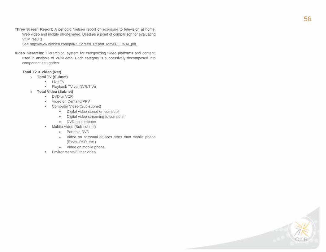
Video hierarchy: Hierarchical system for categorizing video platforms and content; used in analysis of VCM data. Each category is successively decomposed into component categories:
Total TV & Video (Net) o Total TV (Subnet)
Live TV Playback TV via DVR/TiVo
o Total Video (Subnet) DVD or VCR Video on Demand/PPV Computer Video (Sub-subnet)
• Digital video stored on computer • Digital video streaming to computer • DVD on computer
Mobile Video (Sub-subnet) • Portable DVD • Video on personal devices other than mobile phone
(iPods, PSP, etc.) • Video on mobile phone
Environmental/Other video
57
Measured-Unmeasured Analysis
The Objective of the Video Consumer Mapping Study was to "Dimension current consumption of media - focusing on television and video - and how it is changing over time in order to propose optimal forms of video audience measurement." The VCM Study team felt that "proposing optimal forms of video audience measurement" was beyond the scope of this study, but that "guiding video audience measurement" was possible.
The research team has taken a three step approach to this endeavor, so central to the original motivation for the study.
1. First we need to determine if the video consumption data produced by this study is sufficiently comparable to that produced by Nielsen to provide a reasonable estimate of the video consumption levels that Nielsen might have measured in those viewing situations that they do not currently measure. By "viewing situations" we mean consumption of video on a specific device in a specific location. For example, viewing video on a television at home versus at work, or consuming video at home on a computer versus a DVR. The analysis presented earlier in this report (see page 28) exhibits sufficient comparability between the results of this study and the Nielsen’s Three Screen Report for these results to serve as estimates of Nielsen video consumption levels.
2. The second step is to use this study's Share of Total Video Consumption by viewing situation to rank these by size. The Core, representative, sample will provide the estimate of current consumption and the Acceleration sample will provide an indication of future consumption.
3. The third step will be to overlay this ranking with the Council's assessment of the current measurement status of each of these viewing situations to express what percent of current and future video consumption is measured versus unmeasured. This fact-based perspective can serve as a guide to video audience measurement.
For more information please contact [email protected]
The third step of this analysis is awaiting deliberation by the Council, and the analysis will be completed upon their determination.