
KERI JAMES fileFINANCIAL HEALTH DASHBOARD The purpose of the Financial Health Dashboard is to...
19
KERI JAMES Tableau Portfolio https://public.tableau.com/profile/keri.james#!/
Transcript of KERI JAMES fileFINANCIAL HEALTH DASHBOARD The purpose of the Financial Health Dashboard is to...

KERI JAMES
Tableau Portfolio
https://public.tableau.com/profile/keri.james#!/

PORTFOLIO OVERVIEW
DASHBOARD TABLE OF CONTENTS
Financial Health
Vehicle Inventory
Land and Water Interests
Federal EmployeeViewpoint Survey
Condo Association Budget
Popular Accounting Apps

FINANCIAL HEALTH DASHBOARD
The purpose of the Financial Health
Dashboard is to provide executives with a
concise, "at-a-glance“ view of key performance
indicators (KPIs) from the company’s balance
sheet.
The scope of the dashboard is to present the
four KPIs that are of highest importance to
the company and offer the ability to compare
summary level account balances for two
points in time.
Dashboard Link
Dashboard created in its entirety by Keri James.
Data desensitized to allow for public sharing.

FINANCIAL HEALTH DASHBOARD
Key Features
The left side of the dashboard offers a drop down selection to view the balance sheet KPIs
at specific points in time.
Red and green indicators visually attract the executive’s eye to areas that either need
attention or are performing well. The target for the metric is visible when hovering over
the KPI.
The Summary level bar chart provides drill down capability to view account balances at a
slightly more granular level of detail.

FINANCIAL HEALTH DASHBOARD
Key Features
The right side of the dashboard provides the
ability to compare summary level information
from the balance sheet for two points in time.
Red and green directional triangles draw
attention to changes in account balances. The
green triangle highlights accounts where
financial health is improving while the red
triangle draws attention to accounts that are
regressing.

VEHICLE INVENTORY DASHBOARD
The purpose of the Vehicle Inventory
Dashboard is to show the locations of an
organization’s vehicles and draw attention to
the geographic areas with the most vehicles.
The presentation of the inventory size and
location also assists in locating specific types of
equipment during emergency responses.
The scope of the dashboard required
incorporating toggles and filters to present the
most important dimensions of the data. These
filters allow users to find under-utilized and
over-utilized vehicles and aging vehicles in
need of replacement.
Dashboard Link Dashboard created in its entirety by Keri James.
Data desensitized to allow for public sharing.

VEHICLE INVENTORY DASHBOARD
Key Features
Odometer bins allow users to quickly find
vehicle locations with low mileage and high
mileage.

VEHICLE INVENTORY DASHBOARD
Key Features
Separate maps are created and strategically
placed to maximize the use of the canvas.
Dashboard actions and quick filters hide maps
when the data is filtered out of the view.
Maps resize and zoom to locations according
to user selections.

VEHICLE INVENTORY DASHBOARD
Key Features
Parameters provide flexibility to change the
color of the map to reflect an alternate
dimension within the data.
The color legends create interactivity. When a
user clicks on a color, the map is filtered
accordingly.

LAND AND WATER INTERESTS DASHBOARD
The purpose of the Land and Water Interests
Dashboard is to inform the public about the
total acreage maintained by the U.S. Fish and
Wildlife Service within each state.
The scope of the dashboard is to present a
high level overview of the acreage by state and
allow users to explore the individual land
tracts within their state.
Dashboard Link
Dashboard created in its entirety by Keri James.
Data available for public use on data.gov.

LAND AND WATER INTERESTS DASHBOARD
Key Features
A dashboard action generates a map for the
state selected.
By incorporating the ArcGIS shp file, the user
is able to view the land tracts within the
selected state on the map to the right.
The tooltips provide the total acreage for the
state as well as the total acreage for the
specific land tract.

FEDERAL EMPLOYEE VIEWPOINT SURVEY
The purpose of the Federal EmployeeViewpointSurvey (FEVS) results dashboard is to compare
the U.S. Fish and Wildlife Service’s (Service) results with the Department of Interior and government-wide results. The analysis allows leadership to garner valuable insights about
employees’ perceptions of the organization as compared to the broader federal government
workforce.
The scope of the dashboard is to compare the Service’s results to the government-wide results
as the baseline. The percent positive and percent negative averages for each survey question are
important for identifying areas where leadership can drive change and increase employee
engagement.
Dashboard LinkDashboard created in its entirety by Keri James.
Data available for public use on bestplacestowork.org.
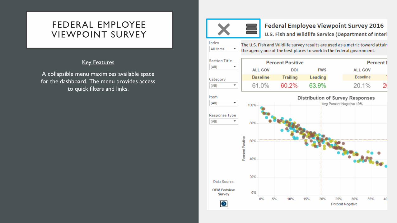
FEDERAL EMPLOYEE VIEWPOINT SURVEY
Key Features
A collapsible menu maximizes available space
for the dashboard. The menu provides access
to quick filters and links.
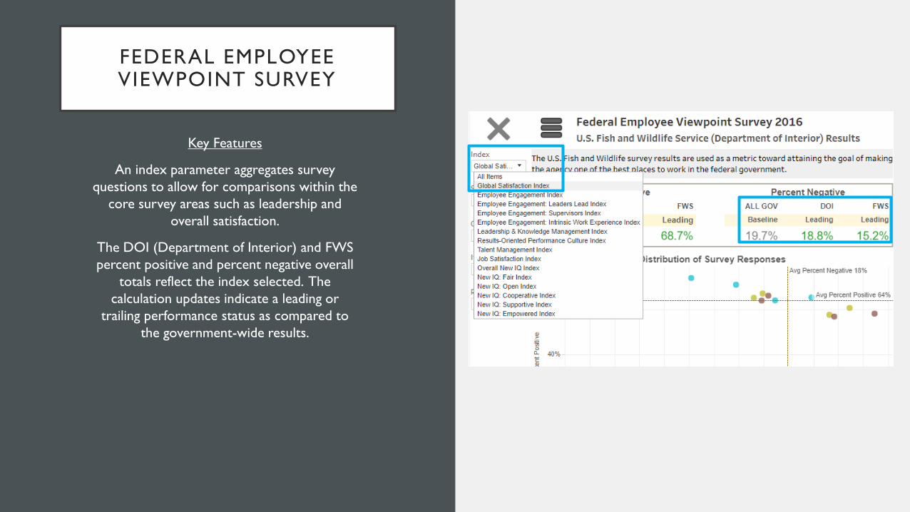
FEDERAL EMPLOYEE VIEWPOINT SURVEY
Key Features
An index parameter aggregates survey
questions to allow for comparisons within the
core survey areas such as leadership and
overall satisfaction.
The DOI (Department of Interior) and FWS
percent positive and percent negative overall
totals reflect the index selected. The
calculation updates indicate a leading or
trailing performance status as compared to
the government-wide results.

CONDO ASSOCIATION BUDGET
The purpose of the Condo Association Budget
dashboard is to help the community members
reach an agreement on how the association
should spend its funds in the upcoming year.
The scope of the dashboard is to highlight the
total assessments for the year and the
percentage which is proposed for spending on
operational activities. The spending is
summarized by four distinct categories.
Dashboard Link
Dashboard created in its entirety by Keri James.
Data desensitized to allow for public sharing.

CONDO ASSOCIATION BUDGET
Key Features
One of the key features of the dashboard is its
simplicity. The story is the focus.

CONDO ASSOCIATION BUDGET
Key Features
The audience is kept at the forefront of the
design. The bar charts are the most familiar
and intuitive to the audience consuming the
data.
Categorical colors for the bars allow the users
to correlate the top row of aggregated data to
the detailed line items in the lower chart.
Dashboard actions filter the detailed line items
based upon the category selected. The
percentage of total calculation updates relative
to the category.

POPULAR ACCOUNTING APPS
The purpose of the Popular Accounting Apps
dashboard is to educate accounting firms and
small business owners about some of the tools
that are automating routine processes within
the accounting function.
The scope of the dashboard is to summarize
the apps by their primary offering. The year of
development is incorporated into the
presentation since consumers generally are
more comfortable with apps that have been
on the market for a longer period of time.
Dashboard Link
Dashboard created in its entirety by Keri James.
Data manually collected using Google search functionality.

POPULAR ACCOUNTING APPS
Key Features
Dashboard actions are thoughtfully applied to
ensure only the relevant apps appear in the
results. For example, the relevant app icons
appear only after the type selection is made.
A short demonstration of the app’s benefits is
available for viewing by clicking on the app
icon and pressing play on the video.