Justification for digipak
5
WWW.BELLARUMORE.COM SAFE AND SOUND BELLA RUMORE
Transcript of Justification for digipak
WWW.BELLARUMORE.COM
SAFE AND SOUND
BELLA RUMORE

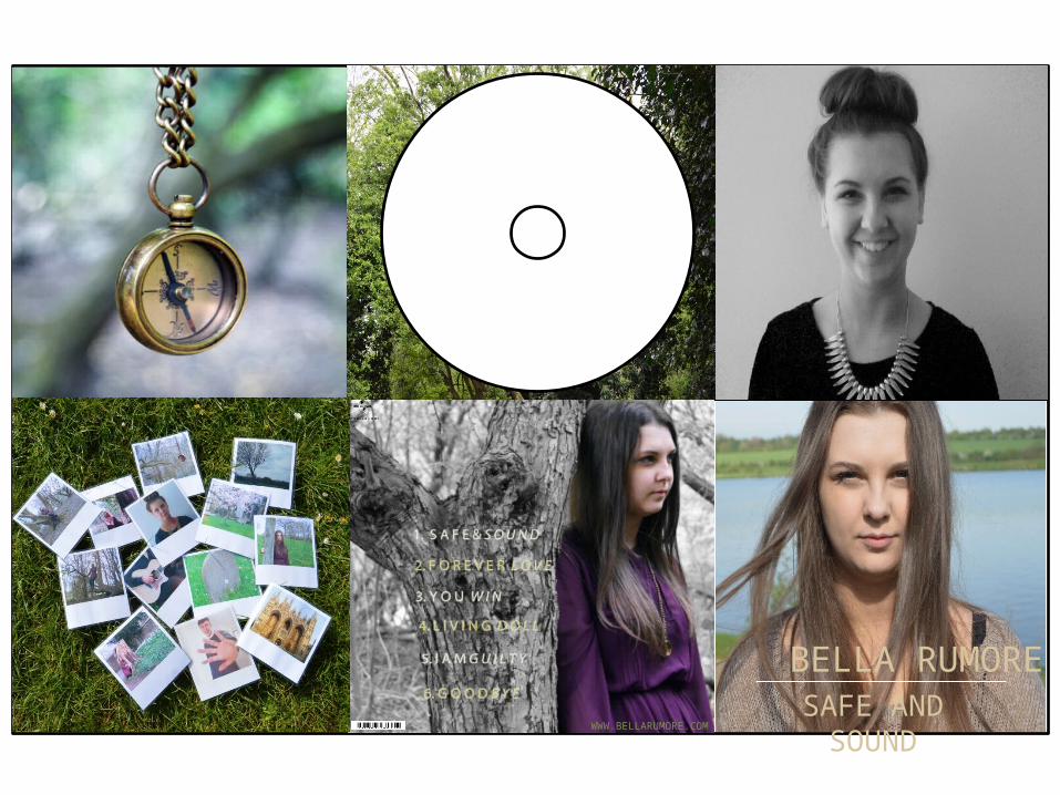
This is the top left image that is used on our digipak, it is of one of the main props used in the music video, this influenced our decision, which resulted in using a close up image of the compass to add to the on-going continuity of the music video. The original image, taken with my Nikon D3200, was edited on Photoshop CS5 to create the final picture of the compass. With the original picture we heightened the contrast, brightness and blurred the background to the compass considerably.
The original image
This is the background to the disc that is featured on the digipak, it displays the continuity that we’ve used, the autumnal theme. When looking from left to right, it becomes apparent that the shade of green goes from left to right, a light green to a dark. This was edited so it can be related back to the music advert, this is because the artists name goes from a dark green to a light green.
Artists name
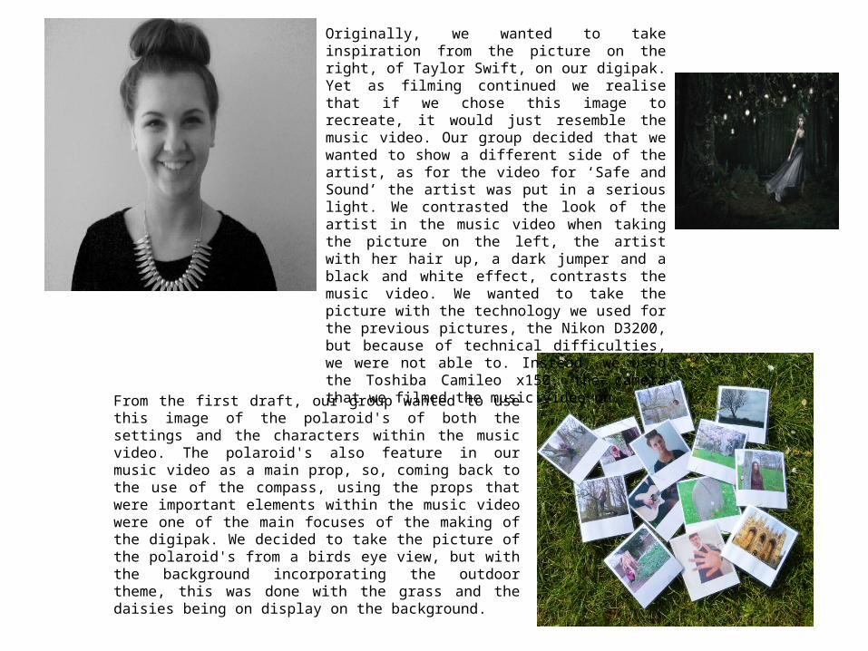
Originally, we wanted to take inspiration from the picture on the right, of Taylor Swift, on our digipak. Yet as filming continued we realise that if we chose this image to recreate, it would just resemble the music video. Our group decided that we wanted to show a different side of the artist, as for the video for ‘Safe and Sound’ the artist was put in a serious light. We contrasted the look of the artist in the music video when taking the picture on the left, the artist with her hair up, a dark jumper and a black and white effect, contrasts the music video. We wanted to take the picture with the technology we used for the previous pictures, the Nikon D3200, but because of technical difficulties, we were not able to. Instead, we used the Toshiba Camileo x150, the camera that we filmed the music video on.
From the first draft, our group wanted to use this image of the polaroid's of both the settings and the characters within the music video. The polaroid's also feature in our music video as a main prop, so, coming back to the use of the compass, using the props that were important elements within the music video were one of the main focuses of the making of the digipak. We decided to take the picture of the polaroid's from a birds eye view, but with the background incorporating the outdoor theme, this was done with the grass and the daisies being on display on the background.

This is the track list featured on the back of our digipak, our original idea was to have an image that resembles the one on the right. Our finished product does recreate the artist, this is by being off centre in the track list image, this was so we could put the list of the songs to the left of the artist. We also used the same conventions of the back of a digipak, such as a barcode. We felt that we did not have to clarify that what the audience are looking at is the playlist, like the one on the right. The font that ‘track list’ is in on the right also isn’t the same as the one we’ve used on the left. This is because the font we’ve used on the left, Myriad Pro, continues with the continuity of the two products, as this is font we have used in the music advert also.
We edited the original picture on Photoshop in order to achieve the look we wanted, we did this by duplicating the layer of the original picture and changing it to black and white. We then had to erase the black and white layer, revealing the full colour layer underneath. The font of the song titles are in two different colours, green and cream. This, again, highlights the continuity shown through our products.

SAFE AND SOUND
BELLA RUMORE
This is the front cover for our artists digipak, we decided that we did not want a long shot featured on the front of the digipak. Instead, we used a close up of the artists face. We decided that this would be a good look for the digipak itself, as having a close up fits with the conventions of a typical pop genre album, as we discovered in our research. The mise-en-scene in this cover is relatively simple, it also keeps in continuity with the music advert, of seeing our artist in a different light. The artist has kept her hair and make up the same as what is seen in the music video, this is to keep the well recognised image so her audience can relate to it. The colour of the font is somewhat different to the green shades we used in our music advert and track list, yet ties in with what the artist is wearing on the front cover and therefore adds to the continuity of the product.
EXAM
PLES OF PO
P GEN
RE ALBUM
S