
jQuery UI 1.10:The User Interface Library for jQuery · jQuery UI 1.10: The User Interface Library...
33
jQuery UI 1.10:The User Interface Library for jQuery Alex Libby Dan Wellman Chapter No. 3 "Using the Tabs Widget"
Transcript of jQuery UI 1.10:The User Interface Library for jQuery · jQuery UI 1.10: The User Interface Library...
jQuery UI 1.10:The User Interface Library for jQuery
Alex Libby
Dan Wellman
Chapter No. 3
"Using the Tabs Widget"
In this package, you will find: A Biography of the authors of the book
A preview chapter from the book, Chapter NO.3 "Using the Tabs Widget"
A synopsis of the book’s content
Information on where to buy this book
About the Authors Alex Libby is from an IT support background. He has been involved in supporting end
users for the last 15 years in a variety of different environments, and currently works as a
Technical Analyst, supporting a medium-sized SharePoint estate for an international parts
distributor, based in the UK. Although Alex gets to play with different technologies in his
day job, his first true love has always been with the Open Source movement, and in
particular experimenting with CSS/CSS3 and HTML5. To date, Alex has written five
books based on jQuery, HTML5 Video, and CSS for Packt Publishing, and has reviewed
several more (including one on Learning jQuery). jQuery UI 1.10: The User Interface
Library for jQuery is Alex's sixth book with Packt Publishing.
I would like to give a huge thanks to Dan Wellman for allowing me
the opportunity to update one of his books; it has been a pleasure and
a privilege. I just hope I've done justice to it! I also thank the reviewers
for their help in reviewing the book, along with their constructive
feedback. Thanks must also go to family and friends for their support
and encouragement; it makes working the long hours all the more
worthwhile.
For More Information: www.packtpub.com/jquery-ui-1-10-user-interface-library/book
Dan Wellman is an author and frontend engineer living on the South Coast of the UK
and working in London. By day he works for Skype and has a blast writing application-
grade JavaScript. By night he writes books and tutorials focused mainly on frontend web
development. He is also a staff writer for the Tuts+ arm of the Envato network, and
occasionally writes for .Net magazine. He's the proud father of four amazing children,
and the grateful husband of a wonderful wife.
For More Information: www.packtpub.com/jquery-ui-1-10-user-interface-library/book

jQuery UI 1.10: The User Interface Library for jQuery Modern web application user interface design requires rapid development and proven
results. jQuery UI, a trusted suite of official plugins for the jQuery JavaScript library,
gives you a solid platform on which you can build rich and engaging interfaces with
maximum compatibility, stability, and minimum time and effort.
jQuery UI has a series of ready-made, great-looking user interface widgets and a
comprehensive set of core interaction helpers designed to be implemented in a consistent
and developer-friendly way. With all this, the amount of code that you need to write
personally to take a project from conception to completion is drastically reduced.
Specially revised for Version 1.10 of jQuery UI, this book has been written to maximize
your experience with the library by breaking down each component and walking you
through examples that progressively build upon your knowledge, taking you from
beginner to advanced usage in a series of easy-to-follow steps.
In this book, you'll learn how each component can be initialized in a basic default
implementation and then see how easy it is to customize its appearance and configure
its behavior to tailor it to the requirements of your application. You'll look at the
configuration options and the methods exposed by each component's API to see how
these can be used to bring out the best in the library.
Events play a key role in any modern web application if it is to meet the expected
minimum requirements of interactivity and responsiveness. Each chapter will show
you the custom events fi red by the component covered and how these events can be
intercepted and acted upon.
What This Book Covers Chapter 1, Introducing jQuery UI, lets you find out exactly what the library is, where
it can be downloaded from, and how the fi les within it are structured. We also look at
ThemeRoller, which browsers support the library, how it is licensed, and how the API
has been simplified to give the components a consistent and easy-to-use
programming model.
Chapter 2, The CSS Framework and Other Utilities, looks in detail at the extensive CSS
framework, which provides a rich environment for integrated theming through
Themeroller and also allows developers to easily supply their own custom themes or
skins. We also cover the new position utility and have a look at all the unique features
and series of configuration options that it provides.
For More Information: www.packtpub.com/jquery-ui-1-10-user-interface-library/book
Chapter 3, Using the Tabs Widget, looks at the first widget, which is the tabs widget,
a simple but effective means of presenting structured content in an engaging and
interactive widget.
Chapter 4, The Accordion Widget, looks at the accordion widget, another component
dedicated to the effective display of content. Highly engaging and interactive, the
accordion makes a valuable addition to any web page and its API is exposed in full to
show exactly how it can be used.
Chapter 5, The Dialog, focuses on the dialog widget. The dialog behaves in the same
way as a standard browser alert, but it does so in a much less intrusive and more visitor-
friendly manner. We look at how it can be configured and controlled to provide
maximum benefit and appeal.
Chapter 6, The Slider and Progressbar Widgets, provides a less commonly used, but no
less valuable user interface tool for collecting input from your visitors, and displaying the
results of an action to them. We look closely at the APIs of both components throughout
this chapter to see the variety of ways in which it can be implemented, and put to good
use in our web applications.
Chapter 7, The Datepicker Widget, looks at the datepicker. This component packs a
huge amount of functionality into an attractive and highly usable tool, allowing your
visitors to effortlessly select dates. We look at the wide range of configurations that its
API makes possible as well as seeing how easy common tasks such as skinning and
localization are made.
Chapter 8, The Button and Autocomplete Widgets, looks at the brand new button, and
recently revived autocomplete. Long-time users of the library will remember the
autocomplete from a previous version of the library. The widget is now back, fully
updated to fit in with the latest version of the library and in this chapter we get to see
how it can be used to great effect.
Chapter 9, Creating Menus, takes us through how to create and add menus to our
websites or application. We'll see how, with minimal code, we can turn a bunch of
ordinary hyperlinks into an interactive system for navigating around your site, which
will help engage your site's visitors and make it easy to find content.
Chapter 10, Working with Tooltips, will show us how, with minimal effort, we can
easily provide a context-based system of support, by displaying important messages or
feedback to the end user. This is particularly important in instances where visitors to
your site may have inadvertently entered incorrect information; we can help get them
back onto the right track!
For More Information: www.packtpub.com/jquery-ui-1-10-user-interface-library/book
Chapter 11, Drag and Drop, begins to look at the low-level interaction helpers,
tackling first the related drag-and-droppable components. We look at how they can
be implemented individually and how they can be used together to enhance your
user interfaces.
Chapter 12, The Resizable Component, looks at the resizing component and how it is
used with the dialog widget seen earlier in the book. We see how it can be applied to
any element on the page to allow it to be resized in a smooth and attractive way.
Chapter 13, Selecting and Sorting with jQuery UI, looks at the final two interaction
helpers in this chapter; the selectable and sortable components. We can use the
components to select and sort elements in a website or application, although the sortable
component really comes into its own when working with lists, as you can reorder them by
dragging items to a new position in the list. Both components can help you add a high
level of professionalism and interactivity to your site, while at the same time blurring the
boundaries between desktop and browser-based applications.
Chapter 14, UI Effects, is dedicated solely to the special effects that are included with the
library. We look at an array of different effects that allow you to show, hide, move, and
jiggle elements in a variety of attractive and appealing animations.
Chapter 15, The Widget Factory, the downloadable chapter of the book provides an
extensive look at the widget factory and how it allows us to quickly and easily create our
very own jQuery UI plugins. The widget factory solves lots of common problems for you
and can greatly improve productivity; it also extensively improves code reuse, making it
a great fi t for jQuery UI as well as many other stateful plugins. You can find this chapter
at
Appendix, Help and Support, covers the basics of downloading the library. It provides
the Getting Help section which helps readers with answers to all their queries throughout
the book.
For More Information: www.packtpub.com/jquery-ui-1-10-user-interface-library/book
Using the Tabs WidgetNow that we've been formally introduced to the jQuery UI library, the CSS framework, and some of the utilities, we can move on to begin looking at the individual components included in the library. Over the next seven chapters, we'll be looking at the widgets. These are a set of visually engaging, highly confi gurable user interface widgets.
The UI tabs widget is used to toggle visibility across a set of different elements, with each element containing content that can be accessed by clicking on its tab heading. Each panel of content has its own tab. The tab headings are usually displayed across the top of the widget, although it is possible to reposition them so that they appear along the bottom of the widget instead.
The tabs are structured so that they line up next to each other horizontally, whereas the content sections are all set to display: none except for the active panel. Clicking a tab will highlight the tab and show its associated content panel, while ensuring all of the other content panels are hidden. Only one content panel can be open at a time. The tabs can be confi gured so that no content panels are open.
In this chapter, we will look at the following topics:
• The default implementation of the widget• How the CSS framework targets tab widgets• How to apply custom styles to a set of tabs• Confi guring tabs using their options• Built-in transition effects for content panel changes• Controlling tabs using their methods• Custom events defi ned by tabs• AJAX tabs
For More Information: www.packtpub.com/jquery-ui-1-10-user-interface-library/book
Using the Tabs Widget
[ 60 ]
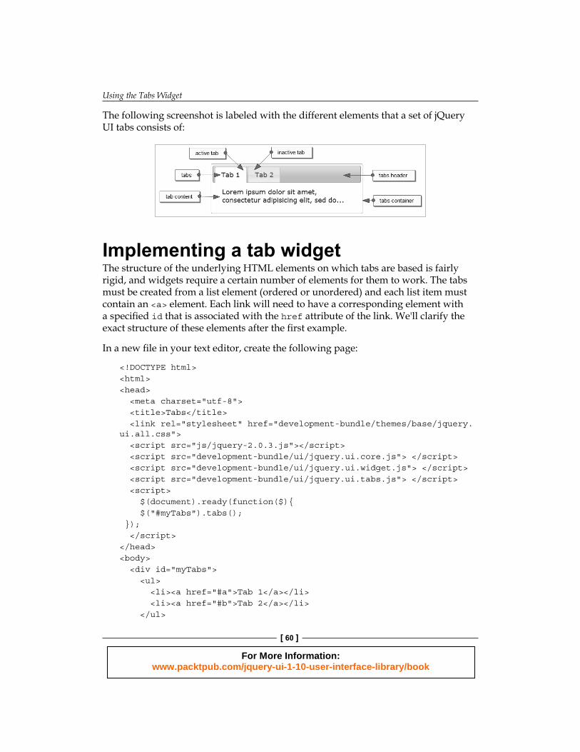
The following screenshot is labeled with the different elements that a set of jQuery UI tabs consists of:
Implementing a tab widgetThe structure of the underlying HTML elements on which tabs are based is fairly rigid, and widgets require a certain number of elements for them to work. The tabs must be created from a list element (ordered or unordered) and each list item must contain an <a> element. Each link will need to have a corresponding element with a specifi ed id that is associated with the href attribute of the link. We'll clarify the exact structure of these elements after the fi rst example.
In a new fi le in your text editor, create the following page:
<!DOCTYPE html><html><head> <meta charset="utf-8"> <title>Tabs</title> <link rel="stylesheet" href="development-bundle/themes/base/jquery.ui.all.css"> <script src="js/jquery-2.0.3.js"></script> <script src="development-bundle/ui/jquery.ui.core.js"> </script> <script src="development-bundle/ui/jquery.ui.widget.js"> </script> <script src="development-bundle/ui/jquery.ui.tabs.js"> </script> <script> $(document).ready(function($){ $("#myTabs").tabs(); }); </script> </head><body> <div id="myTabs"> <ul> <li><a href="#a">Tab 1</a></li> <li><a href="#b">Tab 2</a></li> </ul>
For More Information: www.packtpub.com/jquery-ui-1-10-user-interface-library/book
Chapter 3
[ 61 ]
<div id="a">This is the content panel linked to the first tab, it is shown by default.</div> <div id="b">This content is linked to the second tab and will be shown when its tab is clicked.</div> </div></body></html>
Save the code as tabs1.html in your jqueryui working folder. Let's review what was used. The following script and CSS resources are needed for the default tab widget confi guration:
• jquery.ui.all.css
• jquery-2.0.3.js
• jquery.ui.core.js
• jquery.ui.widget.js
• jquery.ui.tabs.js
A tab widget is usually constructed from several standard HTML elements arranged in a specifi c manner:
• An outer container element, on which the tabs method is called• A list element (<ul> or <ol>)• An <a> element within an <li> element for each tab• An element for the content panel of each tab
These elements can be either hardcoded into the page, added dynamically, or can be a mixture of both, depending upon the requirements.
The list and anchor elements within the outer container make the clickable tab headings, which are used to show the content section that is associated with the tab. The href attribute of the link should be set to a fragment identifi er, prefi xed with #. It should match the id attribute of the element that forms the content section with which it is associated.
The content sections of each tab are created using <div> elements. The id attribute is required and will be targeted by its corresponding <a> element. We've used <div> elements in this example as the content panels for each tab, but other elements can also be used as long as the relevant confi guration is provided and the resulting HTML is valid. The panelTemplate and tabTemplate confi guration options can be used to change the elements used to build the widget (see the Confi guration section, later in this chapter, for more information).
For More Information: www.packtpub.com/jquery-ui-1-10-user-interface-library/book
Using the Tabs Widget
[ 62 ]
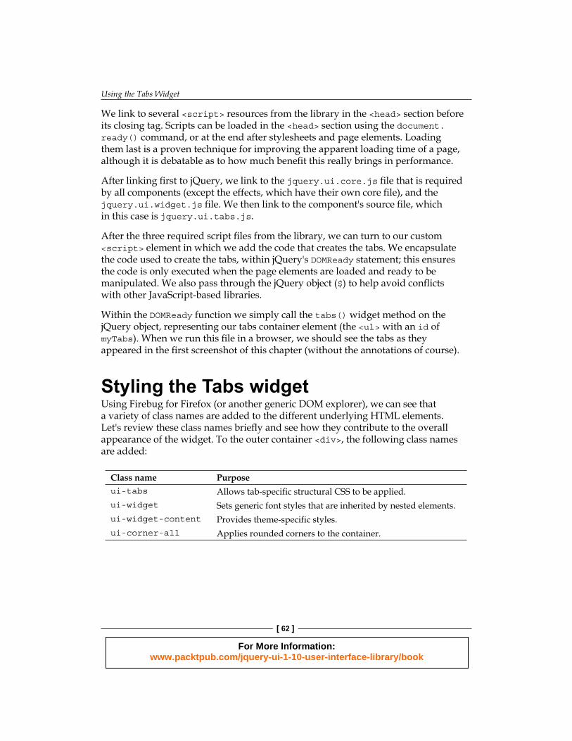
We link to several <script> resources from the library in the <head> section before its closing tag. Scripts can be loaded in the <head> section using the document.ready() command , or at the end after stylesheets and page elements. Loading them last is a proven technique for improving the apparent loading time of a page, although it is debatable as to how much benefi t this really brings in performance.
After linking fi rst to jQuery, we link to the jquery.ui.core.js fi le that is required by all components (except the effects, which have their own core fi le), and the jquery.ui.widget.js fi le. We then link to the component's source fi le, which in this case is jquery.ui.tabs.js.
After the three required script fi les from the library, we can turn to our custom <script> element in which we add the code that creates the tabs. We encapsulate the code used to create the tabs, within jQuery's DOMReady statement; this ensures the code is only executed when the page elements are loaded and ready to be manipulated. We also pass through the jQuery object ($) to help avoid confl icts with other JavaScript-based libraries.
Within the DOMReady function we simply call the tabs() widget method on the jQuery object, representing our tabs container element (the <ul> with an id of myTabs). When we run this fi le in a browser, we should see the tabs as they appeared in the fi rst screenshot of this chapter (without the annotations of course).
Styling the Tabs widgetUsing Firebug for Firefox (or another generic DOM explorer), we can see that a variety of class names are added to the different underlying HTML elements. Let's review these class names briefl y and see how they contribute to the overall appearance of the widget. To the outer container <div>, the following class names are added:
Class name Purposeui-tabs Allows tab-specific structural CSS to be applied.ui-widget Sets generic font styles that are inherited by nested elements.ui-widget-content Provides theme-specific styles.ui-corner-all Applies rounded corners to the container.
For More Information: www.packtpub.com/jquery-ui-1-10-user-interface-library/book
Chapter 3
[ 63 ]
The fi rst element within the container is the <ul> element. This element receives the following class names:
Class name Purposeui-tabs-nav Allows tab-specific structural CSS to be applied.ui-helper-reset Neutralizes browser-specific styles applied to <ul> elements.ui-helper-clearfi Applies the clear-fix, as this element has children that are
floated.ui-widget-header Provides theme-specific styles.ui-corner-all Applies rounded corners.
The individual <li> elements that form a part of the tab headings are given the following class names:
Class name Purposeui-state-default Applies the standard, non-active, non-selected, non-hovered
state to the tab headings.ui-corner-top Applies rounded corners to the top edges of the elements.ui-tabs-selected This is only applied to the active tab. On page-load of the
default implementation, this will be the first tab. Selecting another tab will remove this class from the currently selected tab and apply it to the newly selected tab.
ui-state-active Applies theme-specific styles to the currently selected tab. This class name will be added to the tab that is currently selected, just like the previous class name. The reason there are two class names is that ui-tabs-selected provides the functional CSS, while ui-state-active provides the visual, decorative styles.
The <a> elements within each <li> are not given any class names, but they still have both structural and theme-specifi c styles applied to them by the framework.
Finally, the panel elements that hold each tab's content are given the following class names:
Class name Purposeui-tabs-panel Applies structural CSS to the content panels.ui-widget-content Applies theme-specifi c styles.ui-corner-bottom Applies rounded corners to the bottom edges of
the content panels.
For More Information: www.packtpub.com/jquery-ui-1-10-user-interface-library/book
Using the Tabs Widget
[ 64 ]
All of these classes are added to the underlying HTML elements automatically by the library. We don't need to manually add them when coding the page or adding the base markup.
Applying a custom theme to the tabsIn the next example, we can see how to change the tabs' basic appearance. We can override any rules used purely for display purposes with our own style rules for quick and easy customization, without changing the rules related to the tab functionality or structure.
In a new fi le in your text editor, create the following very small stylesheet:
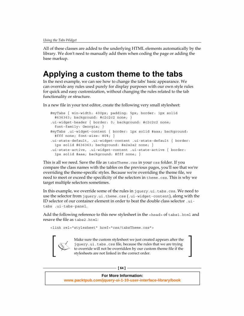
#myTabs { min-width: 400px; padding: 5px; border: 1px solid #636363; background: #c2c2c2 none; }.ui-widget-header { border: 0; background: #c2c2c2 none; font-family: Georgia; }#myTabs .ui-widget-content { border: 1px solid #aaa; background: #fff none; font-size: 80%; }.ui-state-default, .ui-widget-content .ui-state-default { border: 1px solid #636363; background: #a2a2a2 none; }.ui-state-active, .ui-widget-content .ui-state-active { border: 1px solid #aaa; background: #fff none; }
This is all we need. Save the fi le as tabsTheme.css in your css folder. If you compare the class names with the tables on the previous pages, you'll see that we're overriding the theme-specifi c styles. Because we're overriding the theme fi le, we need to meet or exceed the specifi city of the selectors in theme.css. This is why we target multiple selectors sometimes.
In this example, we override some of the rules in jquery.ui.tabs.css. We need to use the selector from jquery.ui.theme.css (.ui-widget-content), along with the ID selector of our container element in order to beat the double class selector .ui-tabs .ui-tabs-panel.
Add the following reference to this new stylesheet in the <head> of tabs1.html and resave the fi le as tabs2.html:
<link rel="stylesheet" href="css/tabsTheme.css">
Make sure the custom stylesheet we just created appears after the jquery.ui.tabs.css fi le, because the rules that we are trying to override will not be overridden by our custom theme fi le if the stylesheets are not linked in the correct order.
For More Information: www.packtpub.com/jquery-ui-1-10-user-interface-library/book
Chapter 3
[ 65 ]
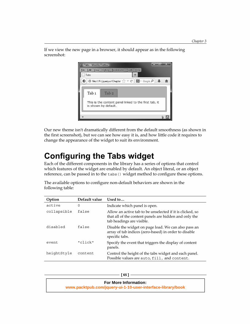
If we view the new page in a browser, it should appear as in the following screenshot:
Our new theme isn't dramatically different from the default smoothness (as shown in the fi rst screenshot), but we can see how easy it is, and how little code it requires to change the appearance of the widget to suit its environment.
Confi guring the Tabs widgetEach of the different components in the library has a series of options that control which features of the widget are enabled by default. An object literal, or an object reference, can be passed in to the tabs() widget method to confi gure these options.
The available options to confi gure non-default behaviors are shown in the following table:
Option Default value Used to…active 0 Indicate which panel is open.collapsible false Allow an active tab to be unselected if it is clicked, so
that all of the content panels are hidden and only the tab headings are visible.
disabled false Disable the widget on page load. We can also pass an array of tab indices (zero-based) in order to disable specific tabs.
event "click" Specify the event that triggers the display of content panels.
heightStyle content Control the height of the tabs widget and each panel. Possible values are auto, fill, and content.
For More Information: www.packtpub.com/jquery-ui-1-10-user-interface-library/book
Using the Tabs Widget
[ 66 ]
Option Default value Used to…hide null Control if or how to animate the hiding of the panel.show null Control if or how to animate the showing of the panel.
Working with tabsThe Tabs widget provides a number of options we can use to perform actions, such as selecting or disabling tabs, or adding transition effects. Over the next few examples, we will take a look at some of these options, beginning with selecting tabs.
Selecting a tabLet's look at how these confi gurable properties can be used. For example, let's confi gure the widget so that the second tab is displayed when the page loads. Remove the link for tabsTheme.css in the <head> of tabs2.html and change the fi nal <script> element so that it appears as follows:
<script> $(document).ready(function($){ var tabOpts = { active: 1 }; $("#myTabs").tabs(tabOpts); })</script>
Save this as tabs3.html. The different tabs and their associated content panels are represented by a numerical index starting at zero. Specifying a different tab to open by default is as easy as supplying its index number as the value for the active property. When the page loads now, the second tab should be selected by default.
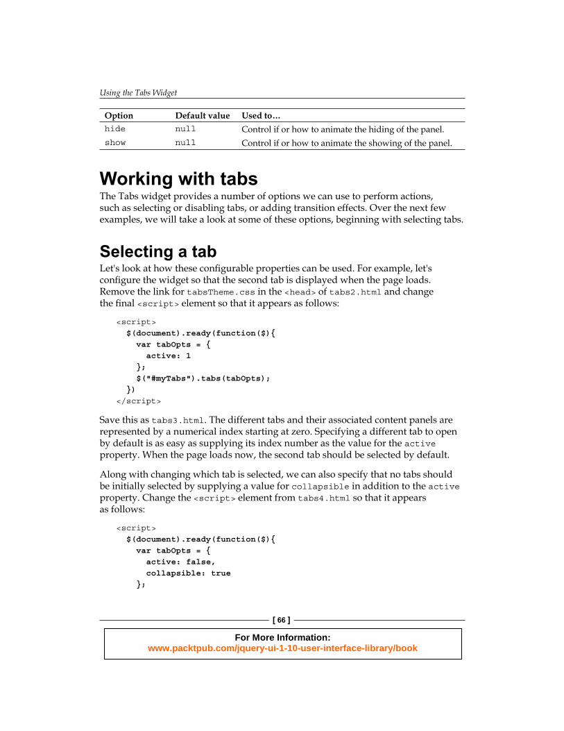
Along with changing which tab is selected, we can also specify that no tabs should be initially selected by supplying a value for collapsible in addition to the active property. Change the <script> element from tabs4.html so that it appears as follows:
<script> $(document).ready(function($){ var tabOpts = { active: false, collapsible: true };
For More Information: www.packtpub.com/jquery-ui-1-10-user-interface-library/book
Chapter 3
[ 67 ]
$("#myTabs").tabs(tabOpts); })</script>
This will cause the widget to appear as follows on page load:
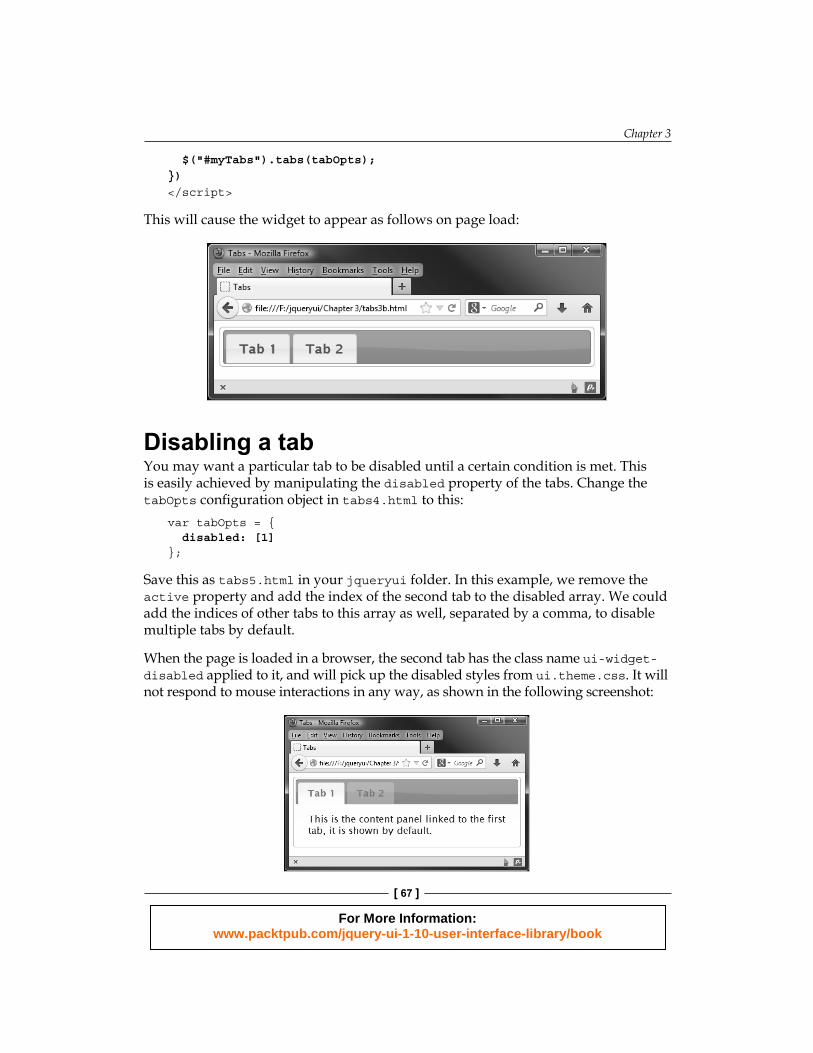
Disabling a tabYou may want a particular tab to be disabled until a certain condition is met. This is easily achieved by manipulating the disabled property of the tabs. Change the tabOpts confi guration object in tabs4.html to this:
var tabOpts = { disabled: [1]};
Save this as tabs5.html in your jqueryui folder. In this example, we remove the active property and add the index of the second tab to the disabled array. We could add the indices of other tabs to this array as well, separated by a comma, to disable multiple tabs by default.
When the page is loaded in a browser, the second tab has the class name ui-widget-disabled applied to it, and will pick up the disabled styles from ui.theme.css. It will not respond to mouse interactions in any way, as shown in the following screenshot:
For More Information: www.packtpub.com/jquery-ui-1-10-user-interface-library/book
Using the Tabs Widget
[ 68 ]
Adding transition effectsWe can easily add attractive transition effects using the show property. These are displayed when tabs are opened or closed. This option is confi gured using another object literal (or an array) inside our confi guration object, which enables one or more effects. We can enable fading effects, for example, using the following confi guration object:
var tabOpts = { show: { effect: "toggle", duration: "slow" }};
Save this fi le as tabs6.html in your jqueryui folder. The show object that we created has two properties. The fi rst property is the animation to use when changing tabs. To use fading animations we specify effect, as this is what is adjusted. Toggling the effect simply reverses its current setting. If it is currently visible, it is made invisible and vice versa. You can use any one of the effects options, such as toggle, fadeIn, or slideDown; we will look at effects in more detail in Chapter 14, UI Effects.
The second property, duration, specifi es the speed at which the animation occurs. The values for this property are slow or fast, which correspond to 200 and 600 milliseconds, respectively. Any other string will result in the default duration of 400 milliseconds. We can also supply an integer representing the number of milliseconds the animation should run for.
When we run the fi le we can see that the tab content slowly fades-out as a tab closes and fades-in when a new tab opens. Both animations occur during a single tab interaction. To only show the animation once, when a tab closes, for example, we would need to nest the show object within an array. Change the confi guration object in tabs6.html so that it appears as follows:
var tabOpts = { show: [{ opacity: "toggle", duration: "slow" }, null]};
The closing effect of the currently open content panel is contained within an object in the fi rst item of the array, and the opening animation of the new tab is the second. By specifying null as the second item in the array, we disable the opening animations when a new tab is selected. Save this as tabs7.html and view the results in a browser.
We can also specify different animations and speeds for opening and closing animations, by adding another object as the second array item instead of null.
For More Information: www.packtpub.com/jquery-ui-1-10-user-interface-library/book

Chapter 3
[ 69 ]
Collapsing a tabBy default when the currently active tab is clicked, nothing happens. But we can change this so that the currently open content panel closes when its tab heading is selected. Change the confi guration object in tabs7.html so that it appears as follows:
var tabOpts = { collapsible: true};
Save this version as tabs8.html. This option allows all of the content panels to be closed, much like when we supplied null to the selected property earlier on. Clicking a deactivated tab will select the tab and show its associated content panel. Clicking the same tab again will close it, shrinking the widget down so that only tab headings are visible.
Working with the Tab eventsThe Tabs widget defi nes a series of useful options that allow you to add callback functions to perform different actions, when certain events exposed by the widget are detected. The following table lists the confi guration options that are able to accept executable functions on an event:
Event Fired when...add A new tab is added.disable A tab is disabled.enable A tab is enabled.load A tab's remote data has loaded.remove A tab is removed.select A tab is selected.show A tab is shown.
Each component of the library has callback options (such as those in the previous table), which are tuned to look for key moments in any visitor interactions. Any functions we use within these callbacks are usually executed before the change happens. Therefore, you can return false from your callback and prevent the action from occurring.
For More Information: www.packtpub.com/jquery-ui-1-10-user-interface-library/book
Using the Tabs Widget
[ 70 ]
In our next example, we will look at how easy it is to react to a particular tab being selected, using the standard non-bind technique. Change the fi nal <script> element in tabs8.html so that it appears as follows:
$(document).ready(function($){ var handleSelect = function(e, tab) { $("<p></p>", { text: "Tab at index " + tab.newTab.index() + " selected", "class": "status-message ui-corner-all" }).appendTo(".ui-tabs-nav", "#myTabs").fadeOut(5000, function() { $(this).remove(); }); }, tabOpts = { beforeActivate: handleSelect } $("#myTabs").tabs(tabOpts);});
Save this fi le as tabs9.html. We also need a little CSS to complete this example. In the <head> of the page we just created, add the following <link> element:
<link rel="stylesheet" href="css/tabSelect.css">
Then in a new page in your text editor, add the following code:
.status-message { padding:11px 8px 10px; margin:0; border:1px solid #aaa; position: absolute; right: 10px; top: 9px; font-size: 11px; background-color: #fff; }.ui-widget-header { color: #2e6e9e; font-weight: bold; }
Save this fi le as tabSelect.css in the css folder. In this example, we've linked to multiple CSS fi les in a production environment; you may want to consider combining CSS into one fi le, to minimize CSS HTTP requests. Although this will help with performance on larger sites, it does come at the expense of not being able to drop in replacement jQuery UI CSS fi les, as you will lose any customizations you have added.
We made use of the beforeActivate callback in this example to create a new element in jQuery using the <p> tag, although the principle is the same for any of the other custom events fi red by tabs. The name of our callback function is provided as the value of the beforeActivate property in our confi guration object.
Two arguments will be passed automatically by the widget to the callback function we defi ne, when it is executed. These are the original event object and custom object containing useful properties from the tab that was selected.
For More Information: www.packtpub.com/jquery-ui-1-10-user-interface-library/book
Chapter 3
[ 71 ]
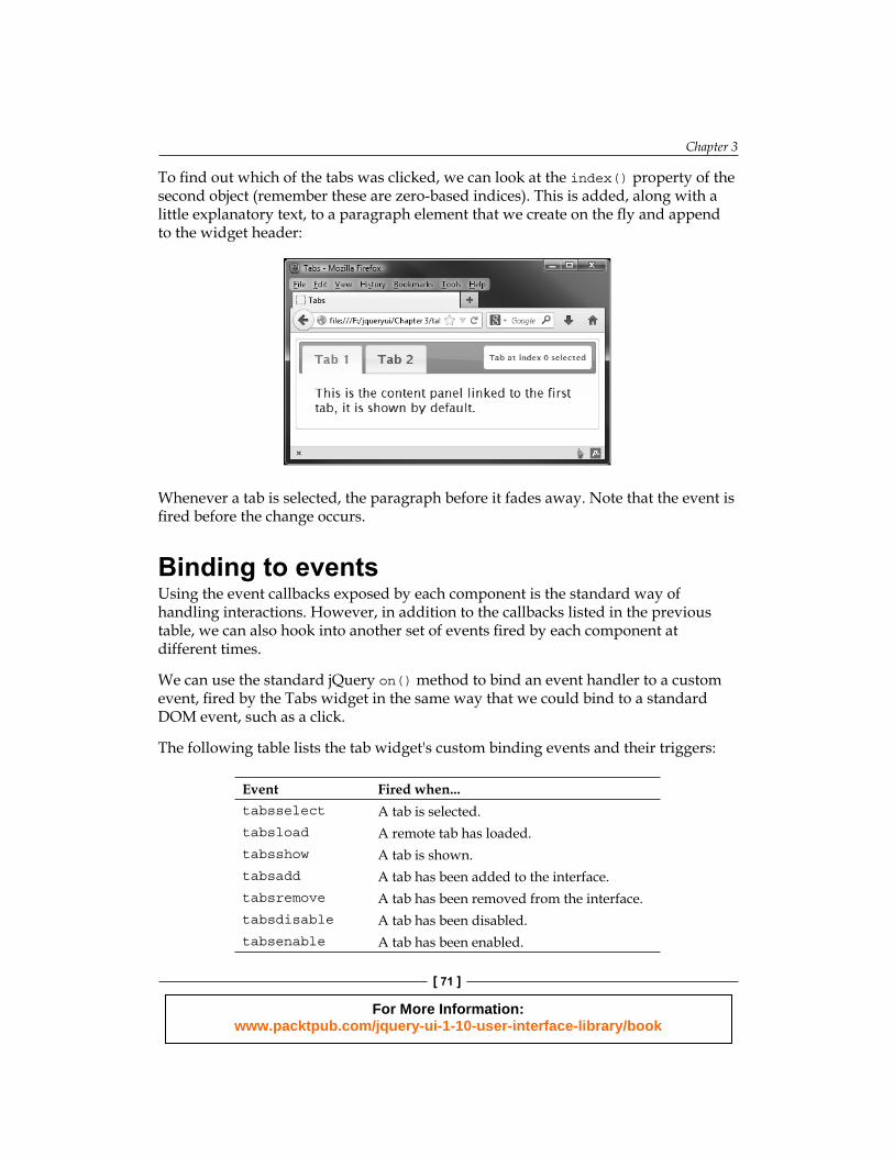
To fi nd out which of the tabs was clicked, we can look at the index() property of the second object (remember these are zero-based indices). This is added, along with a little explanatory text, to a paragraph element that we create on the fl y and append to the widget header:
Whenever a tab is selected, the paragraph before it fades away. Note that the event is fi red before the change occurs.
Binding to eventsUsing the event callbacks exposed by each component is the standard way of handling interactions. However, in addition to the callbacks listed in the previous table, we can also hook into another set of events fi red by each component at different times.
We can use the standard jQuery on() method to bind an event handler to a custom event, fi red by the Tabs widget in the same way that we could bind to a standard DOM event, such as a click.
The following table lists the tab widget's custom binding events and their triggers:
Event Fired when...tabsselect A tab is selected.tabsload A remote tab has loaded.tabsshow A tab is shown.tabsadd A tab has been added to the interface.tabsremove A tab has been removed from the interface.tabsdisable A tab has been disabled.tabsenable A tab has been enabled.
For More Information: www.packtpub.com/jquery-ui-1-10-user-interface-library/book
Using the Tabs Widget
[ 72 ]
The fi rst three events are fi red in succession, in the order of events in which they appear in the table. If no tabs are remote, then tabsbeforeactivate and tabsactivate are fi red in that order. These events can be fi red before or after the action has occurred, depending on which event is used.
Let's see this type of event usage in action; change the fi nal <script> element in tabs8.html to the following:
<script> $(document).ready(function($){ $("#myTabs").tabs(); $("#myTabs").on("tabsbeforeactivate", function(e, tab) { alert("The tab at index " + tab.newTab.index() + " was selected"); }); });</script>
Save this change as tabs10.html. Binding to the tabsbeforeactivate in this way produces the same result as the previous example, using the select callback function. Like last time, the alert should appear before the new tab is activated.
All the events exposed by all the widgets can be used with the on() method, by simply prefi xing the name of the widget to the name of the event.
Although each callback name is spelled using camelCase format, each event name must be written in lowercase.
Using tab methodsThe Tabs widget contains many different methods, which means it has a rich set of behaviors. It also supports the implementation of advanced functionality that allows us to work with it programmatically. Let's take a look at the methods, which are listed in the following table:
Method Used to...destroy Completely remove the tabs widget.disable Disable all tabs.enable Enable all tabs.load Reload an AJAX tab's content, specifying the index number of the tab.option Get or set any property after the widget has been initialized.widget Return the element that the tabs() widget method is called on.
For More Information: www.packtpub.com/jquery-ui-1-10-user-interface-library/book
Chapter 3
[ 73 ]
Enabling and disabling tabsWe can make use of the enable or disable methods to programmatically enable or disable specifi c tabs. This will effectively switch on any tabs that were initially disabled or disable those that are currently active.
Let's use the enable method to switch on a tab, which we disabled by default in an earlier example. Add the following new <button> elements directly after the existing markup for the tabs widget in tabs5.html:
<button type="button" id="enable">Enable</button><button type="button" id="disable">Disable</button>
Next, change the fi nal <script> element so that it appears as follows:
<script>$(document).ready(function($){ $("#myTabs").tabs({ disabled: [1] }); $("#enable").click(function() { $("#myTabs").tabs("enable", 1); }); $("#disable").click(function() { $("#myTabs").tabs("disable", 1); });});</script>
Save the changed fi le as tabs11.html. On the page, we've added two new <button> elements—one will be used to enable the disabled tab and the other is used to disable it again.
In the JavaScript, we use the click event of the Enable button to call the tabs() widget method. To do this, we pass the string enable to the tabs() method as the fi rst argument. Additionally, we pass the index number of the tab we want to enable as a second argument. All methods in jQuery UI are called in this way. We specify the name of the method we wish to call as the fi rst argument to the widget method. The disable method is used in the same way. Don't forget that we can use both of these methods without additional arguments, in order to enable or disable the entire widget.
For More Information: www.packtpub.com/jquery-ui-1-10-user-interface-library/book
Using the Tabs Widget
[ 74 ]
Adding and removing tabsAlong with enabling and disabling tabs programmatically, we can also remove them or add completely new tabs on the fl y. In tabs11.html, remove the existing <button> elements and add the following:
<label>Enter a tab to remove:</label><input for="indexNum" id="indexNum"><button type="button" id="remove">Remove!</button><button type="button" id="add">Add a new tab!</button>
Then change the fi nal <script> element as follows:
<script> $(document).ready(function($){ $("#myTabs").tabs(); $("#remove").click(function() { var indexTab = parseInt($("#indexNum").val(), 10); var tab = $("#myTabs").find(".ui-tabs-nav li:eq(" + indexTab + ")").remove(); $("#myTabs").tabs("refresh"); }); $("#add").click(function() { $("<li><a href='remoteTab.txt'>New Tab</a></li>") .appendTo("#myTabs .ui-tabs-nav"); $("#myTabs").tabs("refresh"); }); });</script>
We also need to provide some content that will be loaded into the tab remotely—in a new fi le, add Remote tab content!, and save it as remoteTab.txt.
Save this as tabs12.html—to preview this example, you will need to view it using a local webserver such as WAMP (for Windows), or MAMP (Apple Macs). The demo will not work if accessed using the fi lesystem.
On the page we've added a new instructional <label>, an <input>, and a <button> that are used to specify a tab to remove. We've also added a second <button>, which is used to add a new tab.
In <script>, the fi rst of our new functions handle removing a tab, using the remove method. This method uses jQuery's :eq() function to fi nd the index of the tab to be removed. We get the value entered into the textbox and use the index to identify which tab to remove, before using the refresh method to update the instance of Tabs.
For More Information: www.packtpub.com/jquery-ui-1-10-user-interface-library/book
Chapter 3
[ 75 ]
The data returned by jQuery's val() method is in string format, so we wrap the call in the JavaScript parseInt function to convert it.
The add method, which adds a new tab to the widget, works using a similar process. Here, we create an instance of a list item, before using jQuery's appendTo() method to add it to the existing Tabs and updating them. In this example, we've specifi ed that the content found in the remoteTab.txt fi le should be added as the content of the new tab. Optionally, we can also specify the index number of where the new tab should be inserted as a fourth argument. If the index is not supplied, the new tab will be added as the last tab.
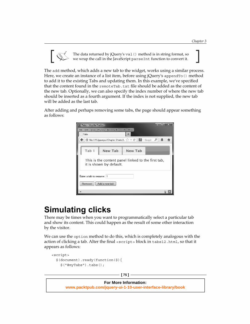
After adding and perhaps removing some tabs, the page should appear something as follows:
Simulating clicksThere may be times when you want to programmatically select a particular tab and show its content. This could happen as the result of some other interaction by the visitor.
We can use the option method to do this, which is completely analogous with the action of clicking a tab. Alter the fi nal <script> block in tabs12.html, so that it appears as follows:
<script> $(document).ready(function($){ $("#myTabs").tabs();
For More Information: www.packtpub.com/jquery-ui-1-10-user-interface-library/book
Using the Tabs Widget
[ 76 ]
$("#remove").click(function() { var indexTab = parseInt($("#indexNum").val(), 10); var tab = $( "#myTabs" ).find(".ui-tabs-nav li:eq(" + indexTab + ")").remove(); $("#myTabs").tabs("refresh"); }); $("#add").click(function() { $("<li><a href='remoteTab.txt'>New Tab</a></li>").appendTo("#myTabs .ui-tabs-nav"); $("#myTabs").tabs("refresh"); var tabCount = $("#myTabs ul li").length; $("#myTabs").tabs("option", "active", tabCount - 1); }); });</script>
Save this as tabs13.html in your jqueryui folder. Now when the new tab is added, it is automatically selected. The option method requires two additional arguments: the fi rst is the name of the option to use, and the second is the ID of the tab to set as active.
As any tab that we add will, by default (although this can be changed), be the last tab in the interface, and as the tab indices are zero based, all we have to do is use the length method to return the number of tabs, and then subtract 1 from this fi gure to get the index. The result is passed to the option method.
Interestingly, selecting the newly added tab straight away fi xes, or at least hides, the extra space issue from the last example.
Destroying tabsAs shown earlier, we can easily add tabs but there may be occasions when you need to completely destroy a set of tabs. This is possible using the destroy method , which is common to all the widgets found in jQuery UI. Let's see how it works. In tabs13.html, remove the existing markup immediately after the existing <br>, and add a new <button> as follows:
<br><button type="button" id="destroy">Destroy the tabs</button>
Next, change the fi nal <script> element to this:
<script> $(document).ready(function($){ $("#myTabs").tabs();
For More Information: www.packtpub.com/jquery-ui-1-10-user-interface-library/book
Chapter 3
[ 77 ]
$("#destroy").click(function() { $("#myTabs").tabs("destroy"); });
});</script>
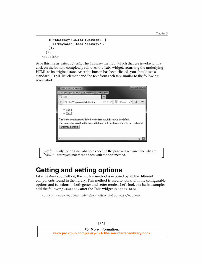
Save this fi le as tabs14.html. The destroy method, which that we invoke with a click on the button, completely removes the Tabs widget, returning the underlying HTML to its original state. After the button has been clicked, you should see a standard HTML list element and the text from each tab, similar to the following screenshot:
Only the original tabs hard coded in the page will remain if the tabs are destroyed, not those added with the add method.
Getting and setting optionsLike the destroy method, the option method is exposed by all the different components found in the library. This method is used to work with the confi gurable options and functions in both getter and setter modes. Let's look at a basic example; add the following <button> after the Tabs widget in tabs9.html:
<button type="button" id="show">Show Selected!</button>
For More Information: www.packtpub.com/jquery-ui-1-10-user-interface-library/book
Using the Tabs Widget
[ 78 ]
Then change the fi nal <script> element so that it is as follows:
<script>$(document).ready(function($){ $("#myTabs").tabs(); $("#show").click(function() { $("<p></p>", { text: "Tab at index " + $("#myTabs").tabs("option", "active") + " is active" }).appendTo(".ui-tabs-nav").fadeOut(5000); });});</script>
We also need to tweak the positioning of the text shown, so remove the link to tabSelect.css in the existing code, and add the following in the <head> section:
<style type="text/css"> ul.ui-tabs-nav p { margin-top: 2px; margin-left: 210px;} </style>
Save this fi le as tabs15.html. The <button> on the page has been changed, so that it shows the currently active tab. All we do is add the index of the selected tab to a status bar message, as we did in the earlier example. We get the active option by passing the string active as the second argument. Any value of any option can be accessed in this way.
Chaining UI methodsChaining widget methods (either with other UI methods, or core jQuery ones) is possible because like the methods found in the underlying jQuery library, they almost always return the jQuery ($) object. Note that this is not possible when using getter methods that return data, such as the length method.
To trigger setter mode instead, we can supply a third argument containing the new value of the option that we'd like to set. Therefore, to change the value of the active option, in order to change the tab being displayed, we could use the following HTML instead,for this, alter the HTML as shown, at the bottom of tabs15.html:
<br><label for="newIndex">Enter a tab index to activate</label><input id="newIndex" type="text"><button type="button2" id="set">Change Selected</button>
For More Information: www.packtpub.com/jquery-ui-1-10-user-interface-library/book
Chapter 3
[ 79 ]
Next, append the click-handler as shown:
<script> $(document).ready(function($){ $("#myTabs").tabs(); $("#set").click(function() { $("#myTabs").tabs("option", "active", parseInt($("#newIndex").val())); }); });</script>
Save this as tabs16.html. The new page contains a <label>, an <input>, as well as a <button> that is used to harvest the index number that the active option should be set to. When the button is clicked, our code will retrieve the value of the <input> and use it to change the selected index. By supplying the new value we put the method in setter mode.
When we run this page in our browser, we should see that we can switch to the second tab by entering its index number as 1 and clicking on the Change Selected button.
Working with AJAX tabsWe saw how we can use the add method to add an AJAX tab to the widget dynamically, but we can also add remote content to tabs using the underlying HTML. In this example, we want the tab that will display the remote content to be available all the time, not just after clicking on the button. This example will also only work correctly using a full web server with PHP installed and confi gured, such as WAMP (PC) or MAMP (Macs).
Add the following new <a> element to the underlying HTML for the widget in tabs16.html:
<li><a href="remoteTab.txt">AJAX Tab</a></li>
We should also remove the <button> from the last example.
The fi nal <script> element can be used to call the tabs method; no additional confi guration is required:
$("#myTabs").tabs();
For More Information: www.packtpub.com/jquery-ui-1-10-user-interface-library/book
Using the Tabs Widget
[ 80 ]
Save this as tabs17.html. All we're doing is specifying the path to the remote fi le (the same one we used in the earlier example) using the href attribute of an <a> element in the underlying markup, from which the tabs are created.
Unlike static tabs, we don't need a corresponding <div> element with an id that matches the href of the link. The additional elements required for the tab content will be generated automatically by the widget.
If you use a DOM explorer, you can see that the fi le path that we added to link to the remote tab has been removed. Instead, a new fragment identifi er has been generated and set as href. The new fragment is also added as the id of the new tab (minus the # symbol of course), so that the tab heading still shows the tab.
Along with loading data from external fi les, it can also be loaded from URLs. This is great when retrieving content from a database using query strings or a web service. Methods related to AJAX tabs include the load and url methods. The load method is used to load and reload the contents of an AJAX tab, which could come in handy for refreshing content that changes very frequently.
There is no inherent cross-domain support built into the AJAX functionality of tabs widget. Therefore, unless additional PHP or some other server-scripting language is employed as a proxy, you may wish to make use of JavaScript Object Notation (JSON) structured data and jQuery's JSONP functionality. Files and URLs should be under the same domain as the page running the widget.
Changing the URL of a remote tab's contentThe url method is used to change the URL that the AJAX tab retrieves its content from. Let's look at a brief example of these two methods in action. There are also a number of properties related to AJAX functionality.
Add the following new <select> element after the Tabs widget in tabs17.html:
<select id="fileChooser"> <option value="remoteTab1.txt">remoteTab1</option> <option value="remoteTab2.txt">remoteTab2</option></select>
For More Information: www.packtpub.com/jquery-ui-1-10-user-interface-library/book
Chapter 3
[ 81 ]
Then change the fi nal <script> element to the following:
<script> $(document).ready(function($){ $("#myTabs").tabs(); $("#fileChooser").change(function() { $("#myTabs").tabs("option", "active", "2"); $("#myTabs").find("ul>li a").attr("href", $(this).val()); $("#myTabs").tabs("load", "active"); }); });</script>
Save the new fi le as tabs18.html. We've added a simple <select> element to the page that lets you choose the content to display in the AJAX tab. In the JavaScript, we set a change handler for <select> and specifi ed an anonymous function to be executed each time the event is detected.
This function fi rst sets the active tab; in this instance, AJAX Tab, which has an ID of 2 – then uses jQuery's find() method to set the href attribute for the tab's panel, before using the load() method to insert the contents into the tab.
We'll also need a second local content fi le. Change the text in the remoteTab1.txt fi le and resave it as remoteTab2.txt.
Run the new fi le in a browser and use the <select> dropdown to choose the second remote fi le then switch to the remote tab. The contents of the second text fi le should be displayed.
Displaying data obtained via JSONPFor our fi nal example, let's pull in some external content for our fi nal tabs example. If we use the Tabs widget, in conjunction with the standard jQuery library getJSON method, we can bypass the cross-domain exclusion policy and pull-in a feed from another domain, to display in a tab. In tabs19.html, change the Tabs widget so that it appears as follows:
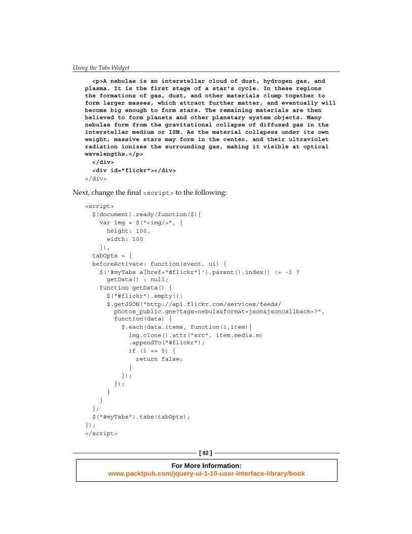
<div id="myTabs"> <ul> <li><a href="#a"><span>Nebula Information</span></a></li> <li><a href="#flickr"><span>Images</span></a></li> </ul> <div id="a">
For More Information: www.packtpub.com/jquery-ui-1-10-user-interface-library/book
Using the Tabs Widget
[ 82 ]
<p>A nebulae is an interstellar cloud of dust, hydrogen gas, and plasma. It is the first stage of a star's cycle. In these regions the formations of gas, dust, and other materials clump together to form larger masses, which attract further matter, and eventually will become big enough to form stars. The remaining materials are then believed to form planets and other planetary system objects. Many nebulae form from the gravitational collapse of diffused gas in the interstellar medium or ISM. As the material collapses under its own weight, massive stars may form in the center, and their ultraviolet radiation ionizes the surrounding gas, making it visible at optical wavelengths.</p> </div> <div id="flickr"></div></div>
Next, change the fi nal <script> to the following:
<script> $(document).ready(function($){ var img = $("<img/>", { height: 100, width: 100 }), tabOpts = { beforeActivate: function(event, ui) { $('#myTabs a[href="#flickr"]').parent().index() != -1 ? getData() : null; function getData() { $("#flickr").empty(); $.getJSON("http://api.flickr.com/services/feeds/ photos_public.gne?tags=nebula&format=json&jsoncallback=?", function(data) { $.each(data.items, function(i,item){ img.clone().attr("src", item.media.m) .appendTo("#flickr"); if (i == 5) { return false; } }); }); } } }; $("#myTabs").tabs(tabOpts);});</script>
For More Information: www.packtpub.com/jquery-ui-1-10-user-interface-library/book

Chapter 3
[ 83 ]
Save the fi le as tabs19.html in your jqueryui folder. We fi rst create a new <img> element and store it in a variable. We also create a confi guration object and add the select event option to it. Every time a tab is selected, the function we set as the value of this option will check to see if it was the tab with an id of flickr that was selected. If it was, the jQuery getJSON method is used to retrieve an image feed from http://www.flickr.com.
Once the data is returned, fi rst empty the contents of the Flickr tab to prevent a build-up of images, then use jQuery's each() utility method to iterate over each object within the returned JSON, and create a clone of our stored image.
Each new copy of the image has its src attribute set using the information from the current feed object, and is then added to the empty Flickr tab. Once iteration over six of the objects in the feed has occurred, we exit jQuery's each method. It's that simple.
When we view the page and select the Images tab, after a short delay we should see six new images, as seen in the following screenshot:
SummaryThe Tabs widget is an excellent way of saving space on your page by organizing related (or even completely unrelated) sections of content that can be shown or hidden, with simple click-input from your visitors. It also lends an air of interactivity to your site that can help improve the overall functionality and appeal of the page on which it is used.
Let's review what was covered in this chapter. We fi rst looked at how, with just a little underlying HTML and a single line of jQuery-fl avored JavaScript, we can implement the default Tabs widget.
For More Information: www.packtpub.com/jquery-ui-1-10-user-interface-library/book
Using the Tabs Widget
[ 84 ]
We then saw how easy it is to add our own basic styling for the Tabs widget so that its appearance, but not its behavior, is altered. We already know that in addition to this, we can use a predesigned theme or create a completely new theme using ThemeRoller.
We then moved on, to look at the set of confi gurable options exposed by the tabs' API. With these, we can enable or disable different options that the widget supports, such as whether tabs are selected by clicks or another event and whether certain tabs are disabled when the widget is rendered.
We took some time to look at how we can use a range of predefi ned callback options that allow us to execute arbitrary code, when different events are detected. We also saw that the jQuery on() method can listen for the same events if necessary.
Following the confi gurable options, we covered the range of methods that we can use to programmatically make the tabs perform different actions, such as simulating a click on a tab, enabling or disabling a tab, and adding or removing tabs.
We briefl y looked at some of the more advanced functionalities supported by the Tabs widget such as AJAX tabs, and obtaining information using JSONP. Both these techniques are easy to use and can add value to any implementation.
In the next chapter, we'll move on to look at the accordion widget, which like the Tabs widget, is used to group content into related sections that are shown one at a time.
For More Information: www.packtpub.com/jquery-ui-1-10-user-interface-library/book
Where to buy this book You can buy jQuery UI 1.10: The User Interface Library for jQuery from the Packt
Publishing website:
Free shipping to the US, UK, Europe and selected Asian countries. For more information, please
read our shipping policy.
Alternatively, you can buy the book from Amazon, BN.com, Computer Manuals and
most internet book retailers.
www.PacktPub.com
For More Information: www.packtpub.com/jquery-ui-1-10-user-interface-library/book


![jQuery Fundamentals · jQuery Fundamentals Rebecca Murphey [] jQuery Fundamentals Rebecca Murphey [] Copyright © 2010](https://static.fdocuments.in/doc/165x107/5eb897bf41e49d450f44be28/jquery-fundamentals-jquery-fundamentals-rebecca-murphey-jquery-fundamentals.jpg)


![OWA310010 WCDMA Radio Interface Physical Layer ISSUE 1.10 [Compatibility Mode]](https://static.fdocuments.in/doc/165x107/55cf98ec550346d0339a7b53/owa310010-wcdma-radio-interface-physical-layer-issue-110-compatibility-mode.jpg)