JMP Visual Analytics - Pharmasug · Display 7. Correlation comparisons EXAMPLE: NONLINEAR FIT MODEL...
7
1 PharmaSUG 2014 - Paper DG05 JMP ® Visual Analytics ® Charles Edwin Shipp, Consider Consulting Corp, Los Angeles, CA ABSTRACT For beginners, we review the continuing merging of statistics and graphics. Statistical graphics is the forte of JMP software and the JMP team pioneered the way for SAS Visual Analytics ® . Moving forward into Version 11, JMP has easy navigation, a graph builder, advanced algorithms in 85 platforms, and robust statistics you can trust. For olde-timers, we celebrate JMP success and discuss evolving and emerging developments, which we saw at the JMP Discovery Summit 2013 with the new Design of Experiments additions and other additions to JMP Version 11. New also is the entry of the 12 th platform for experimental design, the Definitive Screening Design, adding selected midpoints. Many of the views will be shown in the presentation, and a lively discussion will continue in the hallway! INTRODUCTION The importance of JMP has been established in the marketplace. What is the reason that JMP is the leader in visual analytics? The driving philosophy has been to provide trusted robust statistics with a graphical display and a table for each view the user explores. In the background, a script is created that can be stored and run to show the identical results. This allows for change of data or later customization of code as requirements for discovery change. VISUALIZATION There are many reasons that visualization is important, not just for discovering the extent and shape of your data. It also helps you communicate to those within your organization and your customers. What the mind sees may not be obvious from a table of statistics. You see the nuances that may even be subconscious to you at the time. In addition, with JMP, each visualization is accompanied by a table of important statistics, sometimes annotated with the important p-value to notice or other points of high interest. JMP also can animate the points of a graph, such as population expansion or change of demographics over time. You will find sample tables storing their scripts to run as part of the JMP package, such as the march of Napoleon to JMP Statistical Graphics = Visual Analytics Graphical/Statistical Analysis & Reports Describe Design Collect Fit Predict Statistical Discovery Version 9 Version 5 …
Transcript of JMP Visual Analytics - Pharmasug · Display 7. Correlation comparisons EXAMPLE: NONLINEAR FIT MODEL...
1
PharmaSUG 2014 - Paper DG05
JMP® Visual Analytics®
Charles Edwin Shipp, Consider Consulting Corp, Los Angeles, CA
ABSTRACT
For beginners, we review the continuing merging of statistics and graphics. Statistical graphics is the forte of JMP software and the JMP team pioneered the way for SAS Visual Analytics
®. Moving forward into Version 11, JMP has
easy navigation, a graph builder, advanced algorithms in 85 platforms, and robust statistics you can trust.
For olde-timers, we celebrate JMP success and discuss evolving and emerging developments, which we saw at the JMP Discovery Summit 2013 with the new Design of Experiments additions and other additions to JMP Version 11.
New also is the entry of the 12th platform for experimental design, the Definitive Screening Design, adding selected
midpoints. Many of the views will be shown in the presentation, and a lively discussion will continue in the hallway!
INTRODUCTION
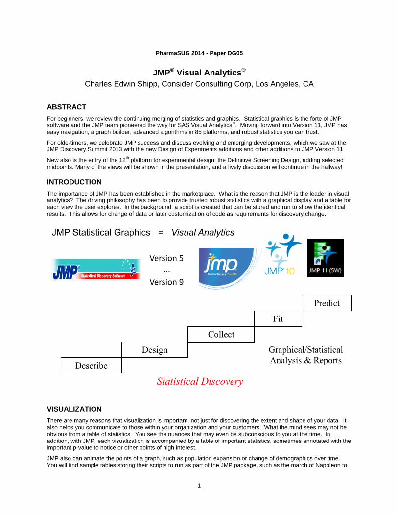
The importance of JMP has been established in the marketplace. What is the reason that JMP is the leader in visual analytics? The driving philosophy has been to provide trusted robust statistics with a graphical display and a table for each view the user explores. In the background, a script is created that can be stored and run to show the identical results. This allows for change of data or later customization of code as requirements for discovery change.
VISUALIZATION
There are many reasons that visualization is important, not just for discovering the extent and shape of your data. It also helps you communicate to those within your organization and your customers. What the mind sees may not be obvious from a table of statistics. You see the nuances that may even be subconscious to you at the time. In addition, with JMP, each visualization is accompanied by a table of important statistics, sometimes annotated with the important p-value to notice or other points of high interest.
JMP also can animate the points of a graph, such as population expansion or change of demographics over time. You will find sample tables storing their scripts to run as part of the JMP package, such as the march of Napoleon to
JMP Statistical Graphics = Visual Analytics
Graphical/Statistical
Analysis & Reports Describe
Design
Collect
Fit
Predict
Statistical Discovery
Version 9
Version 5
…
JMP® Visual Analytics®, continued
2
Russia and back, with diminishing troops. New examples you can use are being added, as well as to the JMP blog and user exchange.
We like to think of your exploration and discovery as consisting of two phases: First, you visualize; and then you analyze. As it turns out, there is overlap and you are discovering as you visualize and visualize as you analyze!
There are many examples of features in JMP visualization, and we select just a few to illustrate:
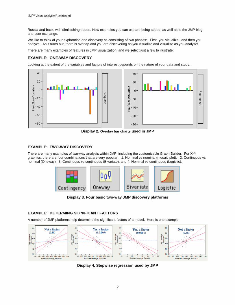
EXAMPLE: ONE-WAY DISCOVERY
Looking at the extent of the variables and factors of interest depends on the nature of your data and study.
Display 2. Overlay bar charts used in JMP
EXAMPLE: TWO-WAY DISCOVERY
There are many examples of two-way analysis within JMP, including the customizable Graph Builder. For X-Y graphics, there are four combinations that are very popular: 1. Nominal vs nominal (mosaic plot); 2. Continuous vs nominal (Oneway); 3. Continuous vs continuous (Bivariate); and 4. Nominal vs continuous (Logistic).
Display 3. Four basic two-way JMP discovery platforms
EXAMPLE: DETERMING SIGNIFICANT FACTORS
A number of JMP platforms help determine the significant factors of a model. Here is one example:
Display 4. Stepwise regression used by JMP
JMP® Visual Analytics®, continued
3
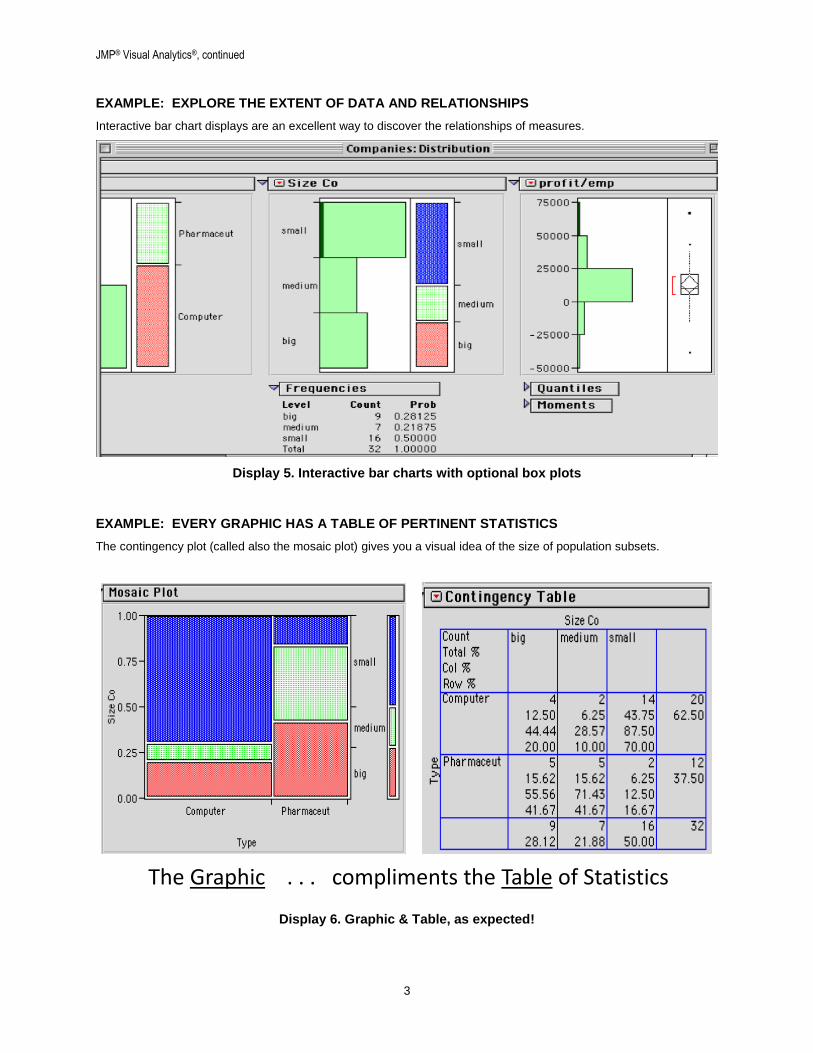
EXAMPLE: EXPLORE THE EXTENT OF DATA AND RELATIONSHIPS
Interactive bar chart displays are an excellent way to discover the relationships of measures.
Display 5. Interactive bar charts with optional box plots
EXAMPLE: EVERY GRAPHIC HAS A TABLE OF PERTINENT STATISTICS
The contingency plot (called also the mosaic plot) gives you a visual idea of the size of population subsets.
Display 6. Graphic & Table, as expected!
The Graphic . . . compliments the Table of Statistics

JMP® Visual Analytics®, continued
4
ANALYSIS
With a visual grasp of your data you are ready for next steps of in-depth analysis: further discovery and reports.
Example: correlation comparisons using density ellipses showing positive correlation vs no correlation:
Display 7. Correlation comparisons
EXAMPLE: NONLINEAR FIT MODEL
Display 8. Model fitting by JMP
EXAMPLE: BOX-COX MODEL FIT — WITH PARAMETER ESTIMATES
Display 9. Model fitting with factor estimates

JMP® Visual Analytics®, continued
5
DOE, DESIGN OF EXPERIMENTS
In a culture of excellence and competitiveness, your enterprise striving for the best is expected in services/products!
EXAMPLE: DETERMING SIGNIFICANT FACTORS
A number of JMP DOE platforms help determine the significant factors of a model. Here is one example:
Results facilitated by using JMP.
Display 10. Factor-setting Predictor Profiler used by JMP
REAL-TIME INSTRAMENTATION AND QUALITY CONTROL
There are many reasons that JMP scripts for quality control are important. You can customize the scripts.
EXAMPLE: SEWHART QUALITY CONTROL CHART
UCL is the upper-control limit and LCL is the lower-control limit, with expectations to remain in between.
Display 11. Shewhart QC

JMP® Visual Analytics®, continued
6
EXAMPLE: ANALYZING SIGNIFICANT FACTORS WITH EXPERIMENTATION
A number of JMP platforms help determine the significant factors of a model. Here is one example:
Display 12. Progressive use of Pareto Charts zeroing in on best solutions
THE IMPORTANCE OF EASE
Ease of use cannot be overemphasized when it comes to discovery software. Here, JMP excels. Like driving a sports car, you are not encumbered with clumsiness. Consistently, JMP guides within the bounds of acceptable practice.
THE IMPORTANCE AND POWER OF MODELING
Beyond visualization, comes modeling and other analysis. Perhaps design of experiments is the direction for your enterprise. Remember that DOE can apply to services provided and management, as well as manufacturing.
JOURNALING AND OUTPUT
There are many ways to create output from JMP. First, there is ‘journaling’ from within JMP. We can also use the Output Delivery System (ODS) of SAS to easily move resulting graphics to Powerpoint slides or Word reports.
THE MANY OTHER ASPECTS OF JMP
As professionals and those using JMP to the fullest (who can use but part of the vast JMP capabilities) will tell you, we have given you but a brief glimpse of the very top of JMP. Did you know there are five major JMP products?

JMP® Visual Analytics®, continued
7
SUMMARY AND CONCLUSION
We have shown the ease with which modern JMP software performs for you with visualization and statistics, yet we have only shown the top of the Alps, so to speak. You will discover capabilities with using JMP to the fullest.
Our accompanying powerpoint presentation for this paper will use JMP for design of experiments. We will then apply the information in further modeling and display. The results will then be displayed with JMP output capabilities.
REFERENCES
Peter Goos and Bradley Jones, Optimal Design of Experiments: A Case Study Approach. 2012, Wiley Press.
ACKNOWLEDGMENTS
The author thanks his mentor and coach, Kirk Paul Lafler; and brilliant PharmaSUG leadership: Jacques Lanoue, Susan F. Coulson, Amie Bissonett, S. Gopal Rajagopal, and all who make the PharmaSUG team a joy and a delight.
RECOMMENDED READING
Curt Hinrichs and Chuck Boiler, JMP Essentials: An Illustrated Step-by-Step Guide for New Users, 2010.
Peter Goos and Bradley Jones, Optimal Design of Experiments: A Case Study Approach. 2012, SAS Press;
(also available via Amazon.)
Discovering JMP (You read JMP books included in the JMP package on your screen as JMP is running!)
CONTACT INFORMATION
Your comments and questions are valued and encouraged. Contact the author at:
Name: Charles Edwin Shipp Enterprise: Consider Consulting Corp. Address: 1650 Barrywood Av. San Pedro, CA 90731-1254 Work Phone: 310-753-4513 Fax: (Call ahead): 310-833-1950 E-mail: [email protected] http://ShippAhoy.blogspot.com LinkedIn: JMP data Visualization and Analytics LinkedIn: JMP Design of Experiments (DOE)
SAS and all other SAS Institute Inc. product or service names are registered trademarks or trademarks of SAS Institute Inc. in the USA and other countries. ® indicates USA registration.
Other brand and product names are trademarks of their respective companies.
LinkedIn: Join the discussion — learn and contribute!