IMD and Newborn Screening Specialist Portfolio Tutorial Jenna Waldron 17th March 2014.
Upload
jenna-scarnecchiaCategory
view
223download
1
1
Portfolio
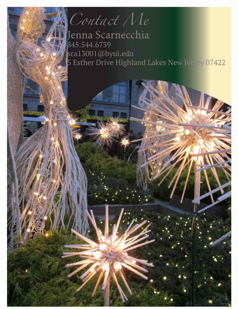
Contact MeJenna [email protected] Esther Drive Highland Lakes New Jersey 07422

1
Table Of ContentsBrochureMontageBusiness Card & LetterheadLogosWeb PagePhotodesignEvent AdFlier
1
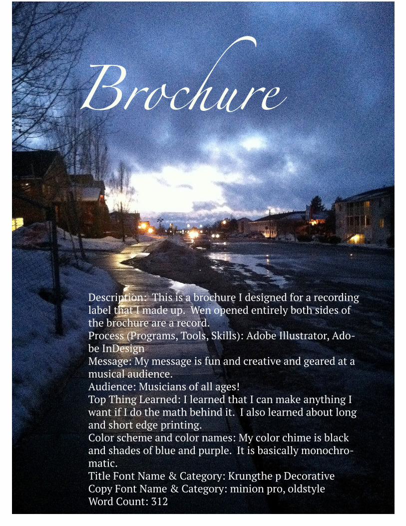
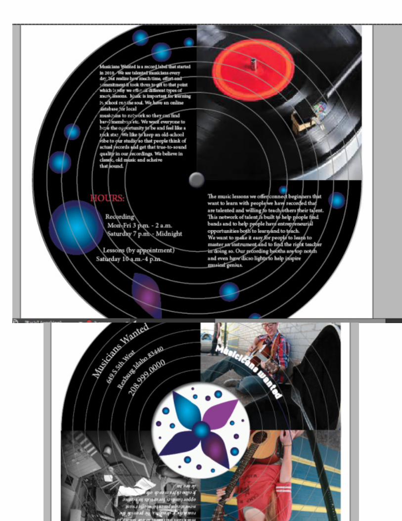
Brochure
Description: This is a brochure I designed for a recording label that I made up. Wen opened entirely both sides of the brochure are a record.Process (Programs, Tools, Skills): Adobe Illustrator, Ado-be InDesignMessage: My message is fun and creative and geared at a musical audience.Audience: Musicians of all ages!Top Thing Learned: I learned that I can make anything I want if I do the math behind it. I also learned about long and short edge printing.Color scheme and color names: My color chime is black and shades of blue and purple. It is basically monochro-matic.Title Font Name & Category: Krungthe p DecorativeCopy Font Name & Category: minion pro, oldstyleWord Count: 312

Description: This is a montage piece with a vintage love feel. The colors are made to suck in the viewer since the couple is in color on the grey side of the house and the yellow flower is alone in a dead field which creates repeti-tion between the flower and the couple.Process (Programs, Tools, Skills): Photoshop, masks, opac-ity, text, morgue files (photos)Message: My message is love. Love that lasts longer than even a house. The old couple is reflecting on their time together in this house and know that it is falling apart but know that their love isn’t. They don’t have money, but they have heart, what truly matters.Audience: My words are from and indie song and the col-ors are subdued so my audience is young indie teens-mid 20s. The could also appeal to older couples that have been through a lot together. Top Thing Learned: This project taught me about masking in photoshop with multiple pictures and with colors and gradients. I learned a lot more about the photoshop pro-gram and how to properly use opacities and shortcuts.Filter / Colorization used and where it was applied: gray gradient mask over half of pictureColor scheme and color names: teal, monochromaticTitle Font Name & Category: monotype corsiva- scriptCopy Font Name & Category: chaparal pro- oldstyle
Montage

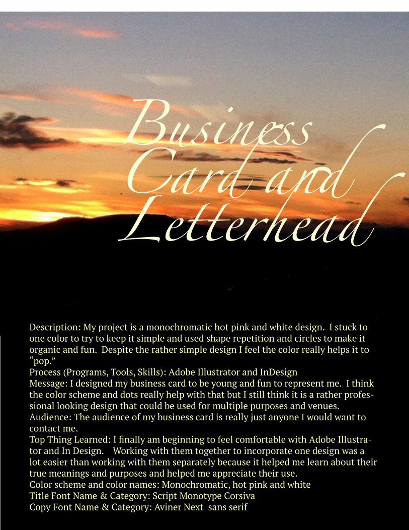
Business Card and Letterhead
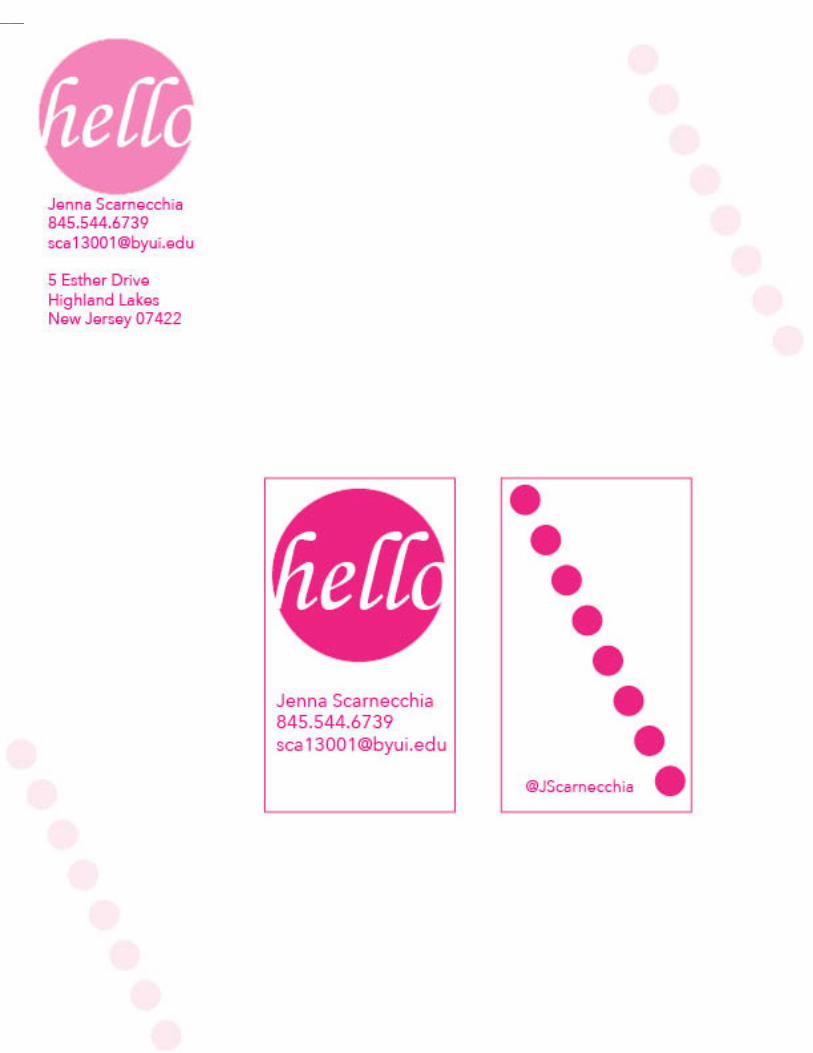
Description: My project is a monochromatic hot pink and white design. I stuck to one color to try to keep it simple and used shape repetition and circles to make it organic and fun. Despite the rather simple design I feel the color really helps it to “pop.”Process (Programs, Tools, Skills): Adobe Illustrator and InDesignMessage: I designed my business card to be young and fun to represent me. I think the color scheme and dots really help with that but I still think it is a rather profes-sional looking design that could be used for multiple purposes and venues.Audience: The audience of my business card is really just anyone I would want to contact me.Top Thing Learned: I finally am beginning to feel comfortable with Adobe Illustra-tor and In Design. Working with them together to incorporate one design was a lot easier than working with them separately because it helped me learn about their true meanings and purposes and helped me appreciate their use.Color scheme and color names: Monochromatic, hot pink and whiteTitle Font Name & Category: Script Monotype CorsivaCopy Font Name & Category: Aviner Next sans serif

LogosDescription: Construction company logo designs us-ing construction elementsProcess (Programs, Tools, Skills): Adobe IllustratorMessage: Construction Company Audience: People looking to have construction work done on their houseTop Thing Learned: I learned a lot about Adobe Illus-trator, I had never used the program before so I really learned a lot about creating vectorsThree Color Scheme and Color Names: Monochro-matic Blue, Wood and brown, Red-Blue gradientThree sets of Title / Body Font Names & Categories: Andale Body, Mistral, Marker FeltVotes on favorite logo: 12Top Logo = _12_; Middle Logo = _0_; Bottom Logo = _0_;My favorite logo is _the top one


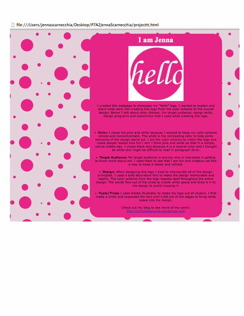
Web PageDescription: This is a web page I made using html and css. I wanted to keep a very fun, upbeat vibe to it in order to make it fit the logo and my personality.Process (Programs, Tools, Skills): To make the logo I used Adobe Illustrator and to create the html code and css document I used Tex-tWrangler. To test my work I pulled the code into a Chrome web browser.Message: I want this website to represent me and my fun personality through it’s shapes and colors.Audience:The audience for this web page is anyone looking to get to know me better.Top Thing Learned: From this project the most important thing I learned is that “I can.” Never before would I have ever thought that I could create a webpage and do code!Color scheme and color hex: I used a monochromatic color scheme of pink and white and black with a pink-grey tone as well to keep the color scheme basic since the pattern is bold.Title Font Families & Category: Verdana, Sans-serifCopy Font Families & Category: Times, serif
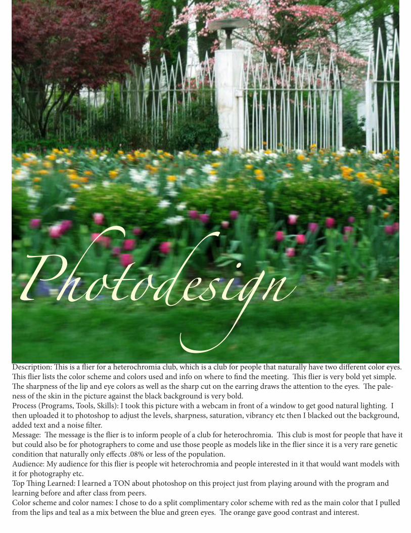
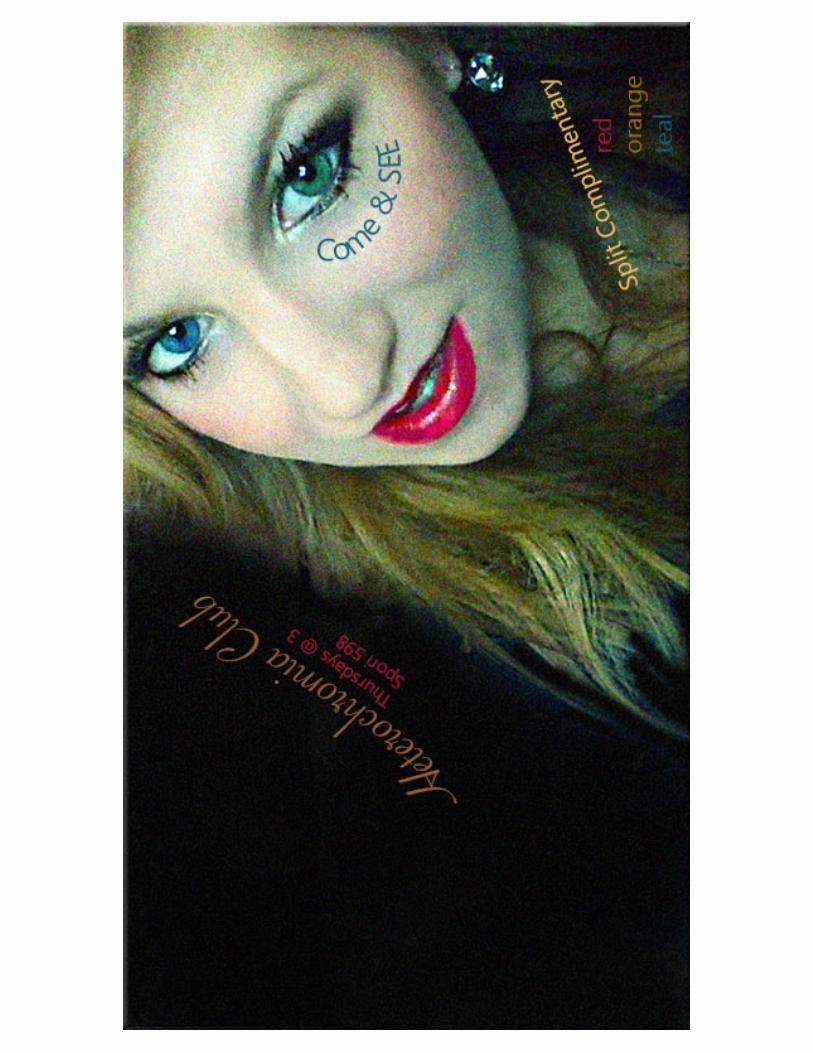
PhotodesignDescription: This is a flier for a heterochromia club, which is a club for people that naturally have two different color eyes. This flier lists the color scheme and colors used and info on where to find the meeting. This flier is very bold yet simple. The sharpness of the lip and eye colors as well as the sharp cut on the earring draws the attention to the eyes. The pale-ness of the skin in the picture against the black background is very bold. Process (Programs, Tools, Skills): I took this picture with a webcam in front of a window to get good natural lighting. I then uploaded it to photoshop to adjust the levels, sharpness, saturation, vibrancy etc then I blacked out the background, added text and a noise filter.Message: The message is the flier is to inform people of a club for heterochromia. This club is most for people that have it but could also be for photographers to come and use those people as models like in the flier since it is a very rare genetic condition that naturally only effects .08% or less of the population.Audience: My audience for this flier is people wit heterochromia and people interested in it that would want models with it for photography etc.Top Thing Learned: I learned a TON about photoshop on this project just from playing around with the program and learning before and after class from peers.Color scheme and color names: I chose to do a split complimentary color scheme with red as the main color that I pulled from the lips and teal as a mix between the blue and green eyes. The orange gave good contrast and interest.

Event AdDescription: This is an event ad flier for a beach party barbecue to fund-raise for an animal shelter in New Jersey. The party will be down the shore at Point Pleasant beach. The location will be good because in New Jersey people really like animals, and the Jersey shore, also, $5 is a discount to get onto Point Pleasant beach and the food will attract people already on the beach.Process (Programs, Tools, Skills): I used a scanner and Microsoft Word.Message: The message is for a barbecue beach party to help fund-raise for an animal shelter. The message is displayed as fun to attract a younger audience to bring to the beach to party.Audience: The audience for this flier are beach loving, animal-loving, hippies. The message is to attract a younger (mid-20′s) crowd that wants to come and party and have a fun time on the beach. Color scheme and color names: The color scheme was pulled from the image and the text is brick and a tint of navy. Top Thing Learned: I learned a lot about scanning images and chang-ing resolution and pixel sizes in order to have the image look right. I learned about the importance of a color scheme to help pull togeth-er the colors and make the flier have better flow and repetition. I learned a lot about colors and patterns on a picture to give it a vintage vibe.

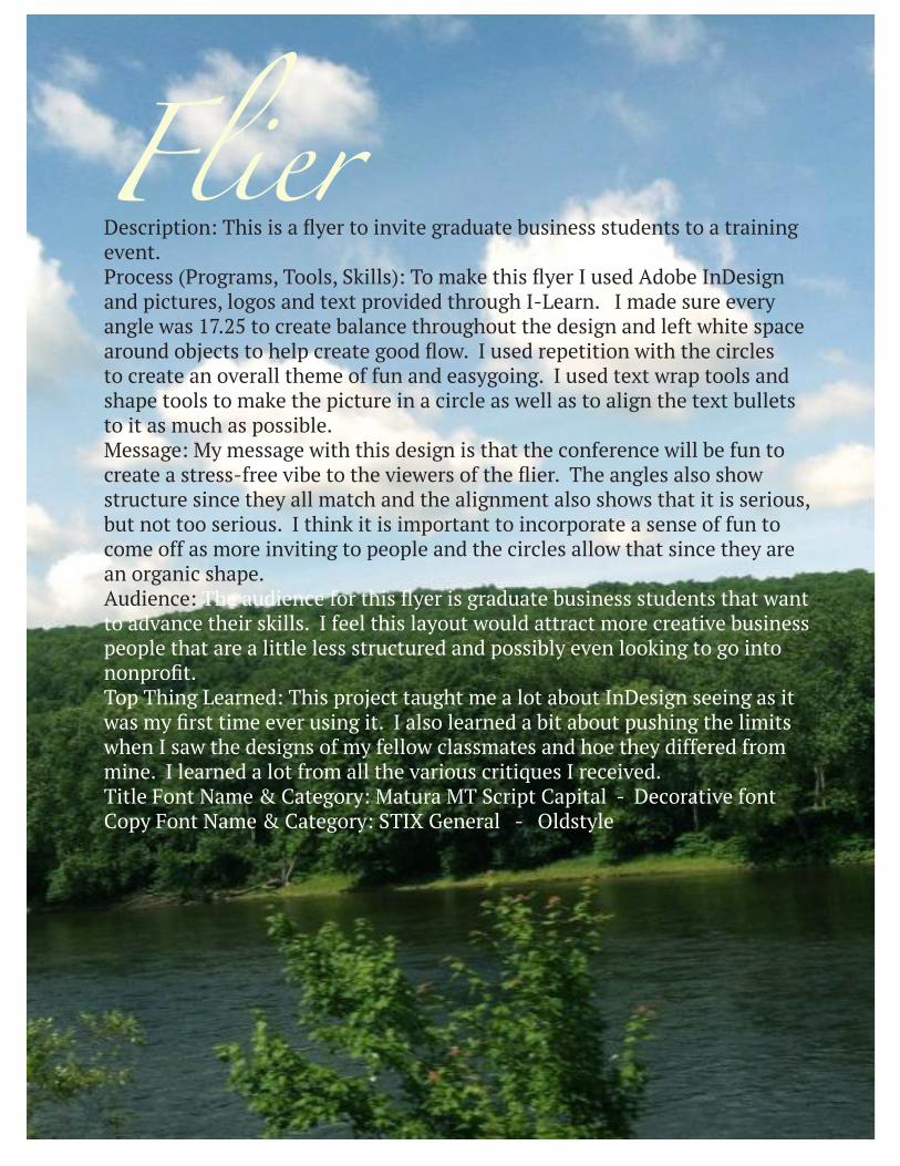
FlierDescription: This is a flyer to invite graduate business students to a training event.Process (Programs, Tools, Skills): To make this flyer I used Adobe InDesign and pictures, logos and text provided through I-Learn. I made sure every angle was 17.25 to create balance throughout the design and left white space around objects to help create good flow. I used repetition with the circles to create an overall theme of fun and easygoing. I used text wrap tools and shape tools to make the picture in a circle as well as to align the text bullets to it as much as possible.Message: My message with this design is that the conference will be fun to create a stress-free vibe to the viewers of the flier. The angles also show structure since they all match and the alignment also shows that it is serious, but not too serious. I think it is important to incorporate a sense of fun to come off as more inviting to people and the circles allow that since they are an organic shape.Audience: The audience for this flyer is graduate business students that want to advance their skills. I feel this layout would attract more creative business people that are a little less structured and possibly even looking to go into nonprofit.Top Thing Learned: This project taught me a lot about InDesign seeing as it was my first time ever using it. I also learned a bit about pushing the limits when I saw the designs of my fellow classmates and hoe they differed from mine. I learned a lot from all the various critiques I received.Title Font Name & Category: Matura MT Script Capital - Decorative fontCopy Font Name & Category: STIX General - Oldstyle