ITEC 715 The Design of Multimedia Learning Week 4.
34
ITEC 715 The Design of Multimedia Learning Week 4
-
Upload
hubert-york -
Category
Documents
-
view
214 -
download
3
Transcript of ITEC 715 The Design of Multimedia Learning Week 4.
ITEC 715
The Design of Multimedia Learning
Week 4
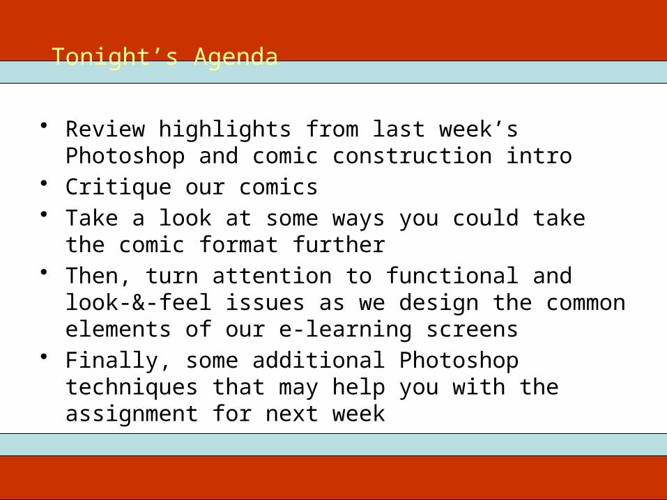
• Review highlights from last week’s Photoshop and comic construction intro
• Critique our comics• Take a look at some ways you could take the comic
format further• Then, turn attention to functional and look-&-feel issues
as we design the common elements of our e-learning screens
• Finally, some additional Photoshop techniques that may help you with the assignment for next week
ITEC 715Tonight’s Agenda

ITEC 715From Last Week: Making a Comic Strip

• Image Mode RGB• Resolution for screen 72 dpi• Image formats:
– PSD for your layered, editable source– 24-bit PNG for delivery in your course
• Photoshop tool palettes: – Marquee tool select, move (with arrows), fill, stroke– Layers new layer, select layer, delete layer, merge layers, layer
effects
ITEC 715Photoshop Image Setup

Etiquette of In-class Critiques
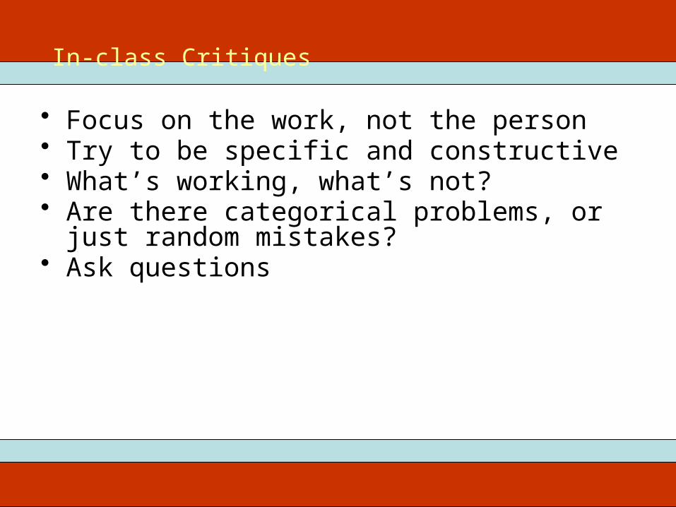
• Focus on the work, not the person• Try to be specific and constructive• What’s working, what’s not?• Are there categorical problems, or just random
mistakes?• Ask questions
ITEC 715In-class Critiques
Review/Critique of Student Comics
ITEC 715
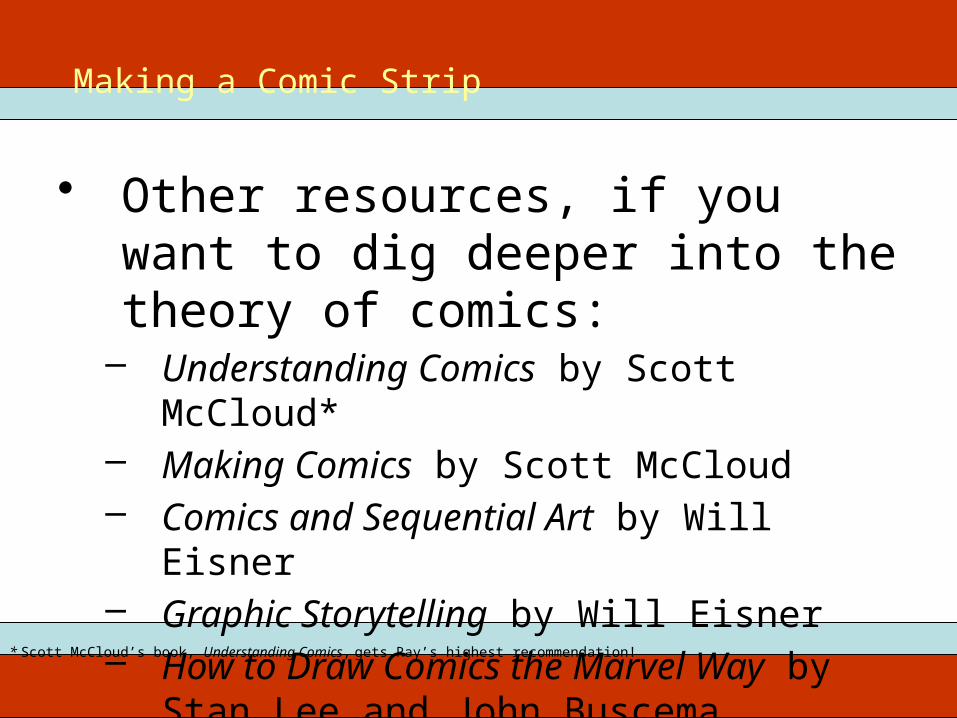
• Other resources, if you want to dig deeper into the theory of comics:
– Understanding Comics by Scott McCloud*– Making Comics by Scott McCloud– Comics and Sequential Art by Will Eisner– Graphic Storytelling by Will Eisner– How to Draw Comics the Marvel Way by
Stan Lee and John Buscema
* Scott McCloud’s book, Understanding Comics, gets Ray’s highest recommendation!
Making a Comic Strip

ITEC 715
Comic-centric e-learning examples:• Broken Coworker (Workplace Harassment)• Connect with Haji Kamal (Cultural Communication)
Taking the Idea Further

Elements ofGood Screen Design

What’s Wrong With This Screen?
Bad Screen Design #1
Source: http://www.ecfapa.com/
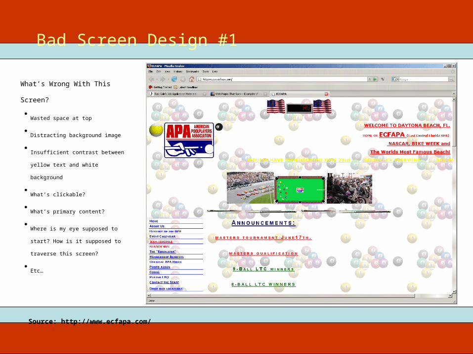
What’s Wrong With This Screen?
Bad Screen Design #1
•Wasted space at top
•Distracting background image
•Insufficient contrast between yellow text
and white background
•What’s clickable?
•What’s primary content?
•Where is my eye supposed to start? How
is it supposed to traverse this screen?
•Etc…
Source: http://www.ecfapa.com/

What’s Wrong With This Screen?
Bad Screen Design #2
Source: http://www.myspace.com/redbloodclub

What’s Wrong With This Screen?
Bad Screen Design #2
•Busy—too many links
•Text-heavy—poor use of images/lack of
images
•Insufficient contrast between red text and
black background
•What’s primary content?
•Etc…
Source: http://www.myspace.com/redbloodclub

Is This Design Good or Bad? Why?
Multimedia Design Example
Source: http://www.clarktraining.com/mtest

Is This Design Good or Bad? Why?
Multimedia Design Example
•Music and voice compete for attention
•The “Did You Know?” box and the yellow
text box compete for attention with the
main spreadsheet screen and the voice
and music!
•With so many things to focus on
simultaneously, the learner is likely to
retain none of it due to cognitive overload
Source: http://www.clarktraining.com/mtest

What’s Working Here?
Better Screen Design #1
Source: http://www.geneed.com/g2/individual/demo.php

What’s Working Here?
Better Screen Design #1
•Navigation (“Lessons”) links listed clearly
in left column
•Primary content is clear
•Forward/Back buttons grouped together
•Current location listed at top
•Additional, less-often-used controls at the
lower left
•Clean look with good contrast between
text and background
Source: http://www.geneed.com/g2/individual/demo.php
•Repeated elements such as rounded rectangles tabs, and circular buttons

What’s Working Here?
Better Screen Design #2

What’s Working Here?
Better Screen Design #2
•Navigation recallable from “Menu” button
at top; leaves more screen area available
for content
•Reasonable eye-path: Start at upper left.
Read directions, then move to lower left
to perform actions, then look to upper
right for results
•Forward/Back buttons grouped together
•Current location listed at top
•Repeated elements
What’s Working Here?
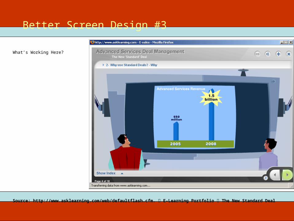
Better Screen Design #3
Source: http://www.asklearning.com/web/defaultflash.cfm. E-Learning Portfolio The New Standard Deal

What’s Working Here?
Better Screen Design #3
•Navigation recallable from “Show Index”
button at lower left; leaves more screen
area available for content
•Eye is drawn directly to primary content
•Forward/Back buttons grouped together
•Current location listed at top
•Progress indicator at lower left
•Graphics support “story” context
Source: http://www.asklearning.com/web/defaultflash.cfm. E-Learning Portfolio The New Standard Deal

What’s Working Here?
Better Screen Design #4

What’s Working Here?
Better Screen Design #4
•Navigation recallable from “Menu” button
at lower center; leaves more screen area
available for content
•Primary content is clear
•Buttons grouped together
•Current location listed at top
•Syringe is progress indicator
•Control graphics are thematically
appropriate (a syringe and pills)
What’s Working Here?
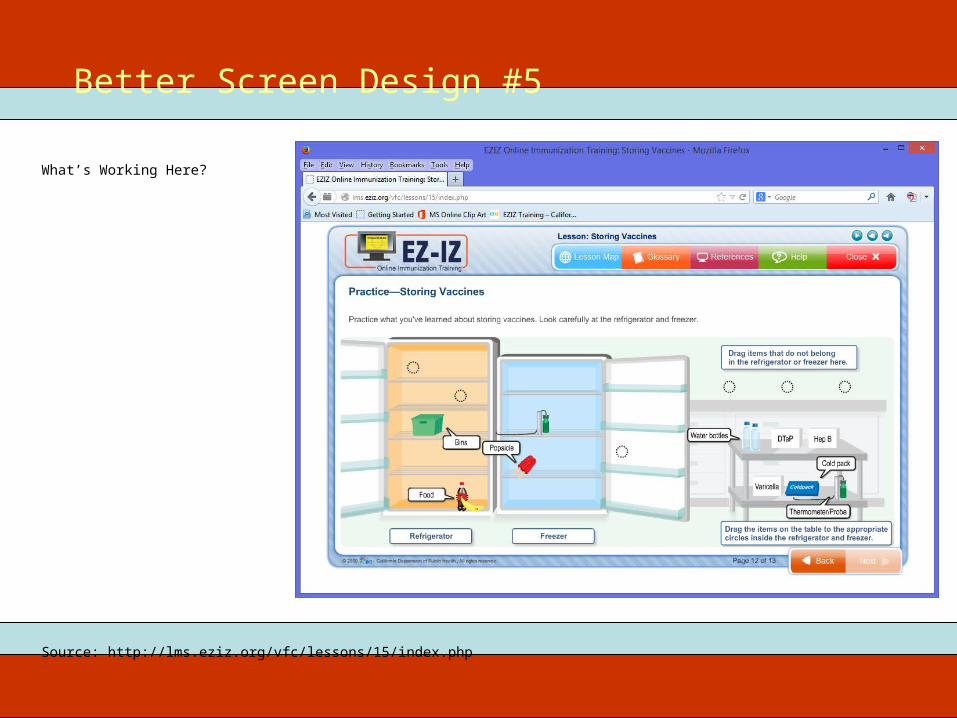
Better Screen Design #5
Source: http://lms.eziz.org/vfc/lessons/15/index.php

What’s Working Here?
Better Screen Design #5
•Contrast: dark font on light background;
objects the learner must manipulate are
darker than background to draw the
learner’s eye
•Repetition of design elements such as
button shapes, label boxes, callout
shapes, and target circles
•Clean alignment of elements
•Elements with similar functions are in
close proximity to each other
Source: http://lms.eziz.org/vfc/lessons/15/index.php

General PrinciplesLayout

Screen Design: General Layout Principles
General Principles: Layout
•Placement
•Along the edges of the screen:
•Navigation
•Titling
•Progress indicator
•On-screen directions
•Middle of screen:
•Reserved for course content
•Allocation of Space
•Try to maximize the area reserved for course content
•Make edges as thin as practical without making the elements contained there unreadably small
Source: http://lms.eziz.org/vfc/lessons/15/index.php
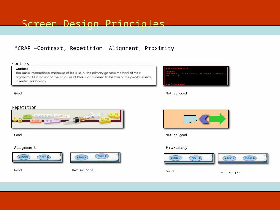
Screen Design Principles
“CRAP”—Contrast, Repetition, Alignment, Proximity
Good Not as good
Contrast
Repetition
Good Not as good
Alignment
Good Not as good
Proximity
Good Not as good
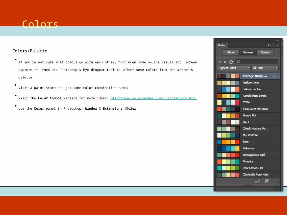
Colors/Palette
Colors
•If you’re not sure what colors go with each other, hunt down some online visual art, screen capture it, then use Photoshop’s Eye-
dropper tool to select some colors from the artist’s palette
•Visit a paint store and get some color combination cards
•Visit the Color Combos website for more ideas: http://www.colorcombos.com/combolibrary.html
•Use the Kuler panel in Photoshop: Window Extensions Kuler
General PrinciplesNavigation

Navigation Principles
•Learner should have a good idea of what will happen when clicking any button
•Learner should be able to easily move around in the course—at least forward/back one page and to the start of any topic.
•Group like controls together.
•Place navigation controls in the same place on every screen; don’t let forward/back or other navigation buttons “jump” around
from screen to screen
•Avoid hub-and-spoke navigation schemes
•Resist the urge to remove navigation controls in order to force the learner through one particular path; when you must make a
button or control unavailable, grey it out rather than removing it from the screen
Screen Design Principles

More Photoshop: Magic Wand, Eye Dropper, Select Inverse, Crop, Cut, Bevel, Shapes, Gradient Effects,
Layer Effects, and Layer Opacity

• Mock up three variations of the frame and navigation layout you will use for your final e-learning project. Content (in the center) is not required for this assignment. You can leave the center blank.
• Use a canvas size of 1440 x 1080 for your screen designs.
• Download and read the Screen Designs assignment sheet for the full list of required elements to include in your designs. Available on the class website.
• Next week: Effective use of graphics!
ITEC 715For Next Week