ISSUE 12 - Kristin Hjellegjerde · ISSUE 12. 2 3 ON THE COVER Rebecca Chaperon Deep Ice Crystal 15...
48
1 ISSUE 12
-
Upload
truongnguyet -
Category
Documents
-
view
217 -
download
4
Transcript of ISSUE 12 - Kristin Hjellegjerde · ISSUE 12. 2 3 ON THE COVER Rebecca Chaperon Deep Ice Crystal 15...

1
I S S U E 1 2

2 3
O N T H E COV E RRebecca Chaperon Deep Ice Crystal 15
CO N T R I B U TO R SPublishers, editors-in-chief Ekaterina PopovaMaria Zemtsova
Associate EditorAmanda Shrawder
Editorial AssistantJanet Ashworth
Guest CuratorAndrew Salgado
S U B M I TBoth emerging and established
artists are welcome to apply with works in any medium:
painting, sculpture, textile, collage, drawing, photography,
mixed media.
June 2016 issue guest juror — Chief Curator at Saatchi Art
Rebecca Wilson.
Please visit our website for more details: www.freshpaintmagazine.
com/for-artists
C O N T R I B U T EFreshPaintMagazine invites a panel
of artists, critics and curators to select up-and-coming artists
for each issue.
We are grateful for the contribution that art specialists/curators/
critics have made by suggesting emerging talent.
Please contact us via [email protected]
G A L L E R I E S A N D M U S E U M S
We welcome announcements and reviews of your current and
upcoming exhibitions.
Please send installation views and existing photos of the artist’s work as well as other relevant images,
via [email protected] to be featured on our website and
promoted through our social media.
G E T Y O U R C O P YPlease visit our online store at
www.freshpaintmagazine.com/purchase
Image courtesy of Pippa Young Self-protection
oil on panel37 x 47 inches
10
17
22
28
18
5
9
10
17
18
22
25
26
27
28
32
33
93
FreshPaintMagazine
L I S T O F F E A T U R E D A R T I S T SCurated se lect ion of a r tworks by in ternat ional ly acc la imed ar t i s t Andrew Salgado
T O P P I C K F R O M T H E B L O G — J U L I A F A B E R A R T O F R E B E C C A C H A P E R O NLandscapes meet f la t geometry a nd emot ive undercurrents in ar t i s t ’s pa int ings
A D A M L E EBibl ica l nar rat ives, natura l h is tory, h is tor ica l and colonia l documenta r y photography and more
N I C K A R C H E RDiscover the cyc l ica l nature of th e ar t i s t ’s work processes which re f le ct the themes of h is pa int ings
W A N D A B E R N A R D I N OFind out why the ar t i s t i s b lank ing ou t her subjects ’ faces
R y a n S t a n i e r, t h e Fo u n d e r a n d D i re c to r o f T h e O t h e r A r t Fa i r ,g ives a g l impse of Fa i r ’s progress a nd features and shares h is advice wi t h young col lectors and ar t i s ts
S Ø R E N S E J RDist inct ive composi t ions in the w or k of Danish pa inter Søren Sej r
D A L E A D C O C KHistor ica l nar rat ives, imagined monuments, and ancient s t ructure s in the works of the ar t i s t
A N D R E W S A L G A D OArt is t g ives an int imate v iew into h is s tory and enl ivens h is advice wi th humor and fun T I P S A N D I N S P I R A T I O NFrom prev ious ly publ ished ar t i s ts
C U R A T E D S E L E C T I O N O F A R T W O R K S by Andrew Salga do
C A L L F O R A R TJune 2016: Guest juror — Rebecca Wi lson, Chief Curator a t Saatchi Ar t
C O N T E N T S

5
F E A T U R E D A R T I S T S
C U R A T E D
S E L E C T I O N
B Y
A N D R E W
S A L G A D O
34
44
52
64
76
85 86 87 90 9288
77 78 80 82 84
66 68 70 71 72 74
53 54 56 58 60 62
45 46 47 48 49 50
36 38 41 4237 40
T A T I A N A A R O C H A 3 4
K E N N E D Y B A I L E Y 3 6
J O H N B R E N N A N 3 7
T I N K A B E C H E R T 3 8
B J B R O E K H U I Z E N 4 0
L I N G C H U N 4 1
M A T T H E W C A R V E R 4 2
T H O M A S D U A N E 4 4
M A R K F A R R E L L 4 5
G R E G H A R R I S 4 6
T O N Y H A V R I L L A 4 7
L I S A F I C A R E L L I - H A L P E R N 4 8
F U K U K O H A R R I S 4 9
G I N A H E R R E R A 5 0
S O P H I E H O D A R A 5 2
I A N L A R S O N 5 3
J O S E P H H O L S A P P L E 5 4
J O A N N E H U M M E L - N E W E L L 5 6
H E N R Y H U S S E Y 5 8
R A C H E L J E N N I N G S 6 0
R I C H A R D K E E N 6 2
K A T E K O S E K 6 4
M A T T H I E U L E G E R 6 6
J O H N O L I V E R L E W I S 6 8
J U L I E T T E M A H I E U X B A R T O L I 7 0
R U S S E L L M A S O N 7 1
G R A H A M M A R T I N 7 2
R Y O T A M A T S U M O T O 7 4
M A T T E O N U T I 7 6
J A N E R A I N E Y 7 7
A Y A O G A S A W A R A 7 8
J O E L D A N I E L P H I L L I P S 8 0
M I C H A E L R E E D Y 8 2
R U S S E L L R I T E L L 8 4
S U S A N R O C H E S T E R 8 5
T Y L E R S C H E I D T 8 6
D A N I E L L E S I E G E L B A U M 8 7
J O E Y S L A U G H T E R 8 8
P I P P A Y O U N G 9 0
X I A O W A N G 9 2
FreshPaintMagazine

E D I TO R I A L
We are delighted to present the 12th issue of FreshPaintMagazine!
Spring is in the air and we are pleased to introduce you to a beautiful new selection of artworks. This time, we invited internationally acclaimed artist Andrew Salgado to select works from the submissions for inclusion in this issue. His preferences feature some of the most diverse, thoughtful and engaging images from today’s artworld.
In our interview with Andrew we discuss his role as an artist and his interest and background in curating. He gives us an intimate view into his story and enlivens his advice with humor and fun. Andrew also discusses his upcoming show in New York ‘A Fool Makes a Joke at Midnight’.
In our interview section we have selected several artists, whose work we find exceptional, in order to share with our readers more about their background, process and inspiration.
FreshPaintMagazine continues to focus on promoting and creating opportunities for emerging and underrepresented artists, while offering insight and connections to the contemporary art world. We partner with galleries, participate in community events in both the US and UK and expand our online presence in order to continue promoting the work of talented artists. In so doing, our publication enlivens and stimulates what is already a dynamic and vibrant art scene.
Ekaterina Popova and Maria Zemtsova, editors-in-chief
GENERAL ENQUIRIES:[email protected]
SUBMISSIONS FOR PRINT PUBLICATIONS:[email protected]
SUBMISSIONS FOR BLOG PUBLICATIONS:[email protected]
CO N TAC T
F I N D U S O N L I N E
www.freshpaintmagazine.comfacebook.com/freshpaintmagazineinstagram.com/freshpaintmagtwitter.com/freshpaintmagpinterest.com/freshpaintmag
Image courtesy of Anne Canfield Sing Your Love Child Graphite and oil on panel 12 x 12 inches

9FreshPaintMagazine
8FreshPaintMagazine
M E E T J U L I A F A B E R
T O P P I C K F R O M T H E B L O G
Human nature and human evolution are my sources of inspiration. It fascinates me how man managed to influence his own physical development by technical means. Man has stepped into the footsteps of a creator, making new life forms, or manipulating the physical properties of his unborn children. Traces of these technologies can be found throughout history and western myths, man tried to do this for a very long time, it is only now that he is starting to succeed. I believe that subconsciously humans strive to imitate their idea of a divine, immortal and omnipotent ideal.
My way of working reflects this ambition for perfection and improvement. The hyperrealistic oil paintings counteract with hard ink drawings made with an architecture pen; this underlines the scientific and technical aspect of the topic of my works.
Living in Vienna, Austria, history and culture are a big part of the city and life here. They surround the inhabitants completely, and so it is no wonder I like to embed my contemporary works often in a deep cultural historical context.
Julia Faber Cryogenics Afterlifeoil, acrylics and ink on cotton120 x 160 cm
Julia Faber Prometheus/Evaoil, acrylics and ink on cotton120 x 160 cm
10 11
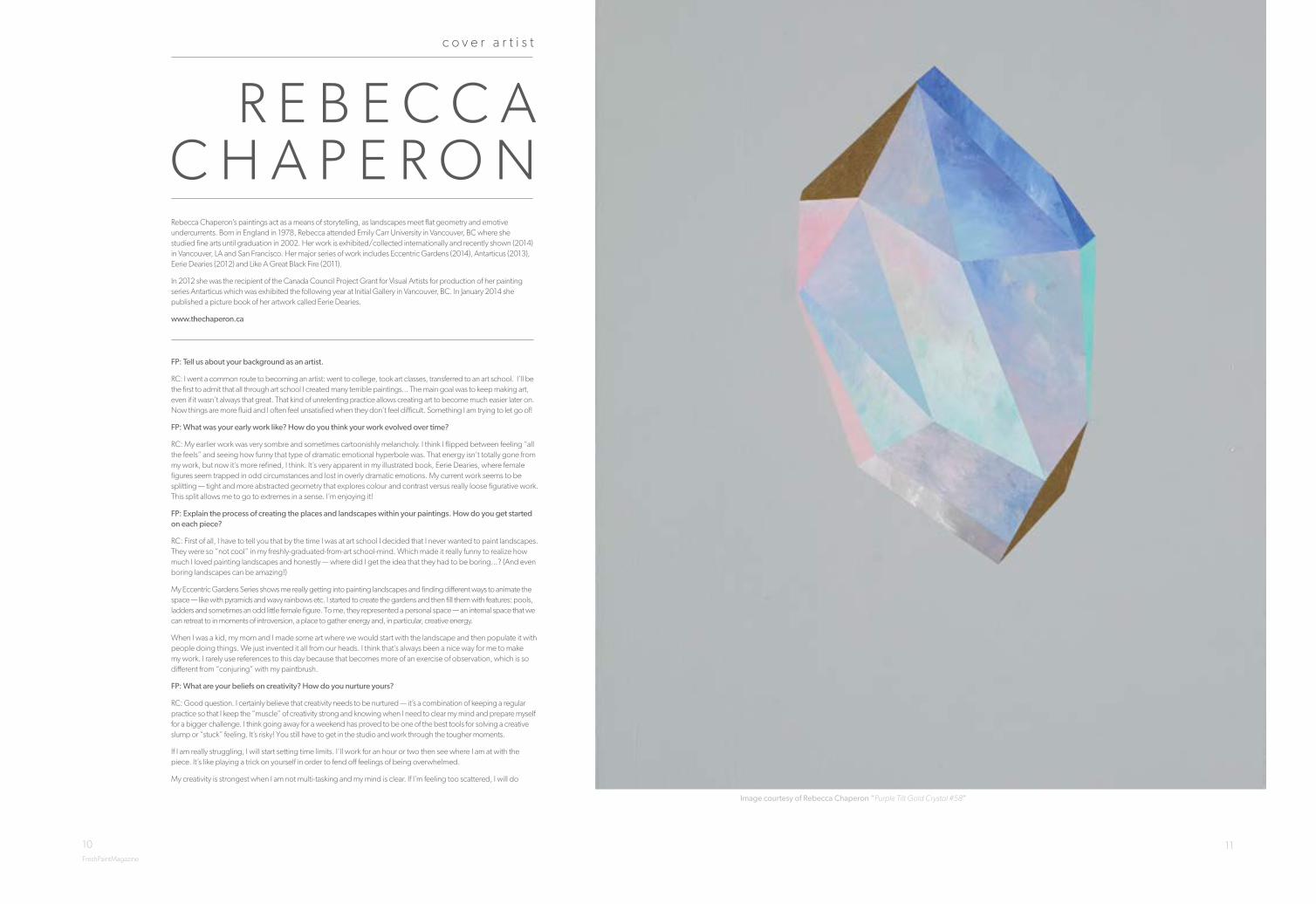
R E B E C C A C H A P E R O N
FP: Tell us about your background as an artist.
RC: I went a common route to becoming an artist: went to college, took art classes, transferred to an art school. I’ll be the first to admit that all through art school I created many terrible paintings... The main goal was to keep making art, even if it wasn’t always that great. That kind of unrelenting practice allows creating art to become much easier later on. Now things are more fluid and I often feel unsatisfied when they don’t feel difficult. Something I am trying to let go of!
FP: What was your early work like? How do you think your work evolved over time?
RC: My earlier work was very sombre and sometimes cartoonishly melancholy. I think I flipped between feeling “all the feels” and seeing how funny that type of dramatic emotional hyperbole was. That energy isn’t totally gone from my work, but now it’s more refined, I think. It’s very apparent in my illustrated book, Eerie Dearies, where female figures seem trapped in odd circumstances and lost in overly dramatic emotions. My current work seems to be splitting — tight and more abstracted geometry that explores colour and contrast versus really loose figurative work. This split allows me to go to extremes in a sense. I’m enjoying it!
FP: Explain the process of creating the places and landscapes within your paintings. How do you get started on each piece?
RC: First of all, I have to tell you that by the time I was at art school I decided that I never wanted to paint landscapes. They were so “not cool” in my freshly-graduated-from-art school-mind. Which made it really funny to realize how much I loved painting landscapes and honestly — where did I get the idea that they had to be boring...? (And even boring landscapes can be amazing!)
My Eccentric Gardens Series shows me really getting into painting landscapes and finding different ways to animate the space — like with pyramids and wavy rainbows etc. I started to create the gardens and then fill them with features: pools, ladders and sometimes an odd little female figure. To me, they represented a personal space — an internal space that we can retreat to in moments of introversion, a place to gather energy and, in particular, creative energy.
When I was a kid, my mom and I made some art where we would start with the landscape and then populate it with people doing things. We just invented it all from our heads. I think that’s always been a nice way for me to make my work. I rarely use references to this day because that becomes more of an exercise of observation, which is so different from “conjuring” with my paintbrush.
FP: What are your beliefs on creativity? How do you nurture yours?
RC: Good question. I certainly believe that creativity needs to be nurtured — it’s a combination of keeping a regular practice so that I keep the “muscle” of creativity strong and knowing when I need to clear my mind and prepare myself for a bigger challenge. I think going away for a weekend has proved to be one of the best tools for solving a creative slump or “stuck” feeling. It’s risky! You still have to get in the studio and work through the tougher moments.
If I am really struggling, I will start setting time limits. I’ll work for an hour or two then see where I am at with the piece. It’s like playing a trick on yourself in order to fend off feelings of being overwhelmed.
My creativity is strongest when I am not multi-tasking and my mind is clear. If I’m feeling too scattered, I will do
Rebecca Chaperon’s paintings act as a means of storytelling, as landscapes meet flat geometry and emotive undercurrents. Born in England in 1978, Rebecca attended Emily Carr University in Vancouver, BC where she studied fine arts until graduation in 2002. Her work is exhibited/collected internationally and recently shown (2014) in Vancouver, LA and San Francisco. Her major series of work includes Eccentric Gardens (2014), Antarticus (2013), Eerie Dearies (2012) and Like A Great Black Fire (2011).
In 2012 she was the recipient of the Canada Council Project Grant for Visual Artists for production of her painting series Antarticus which was exhibited the following year at Initial Gallery in Vancouver, BC. In January 2014 she published a picture book of her artwork called Eerie Dearies.
www.thechaperon.ca
FreshPaintMagazine
c o v e r a r t i s t
Image courtesy of Rebecca Chaperon “Purple Tilt Gold Crystal #58”

13FreshPaintMagazine
something less important like prep canvases or clean the studio — that often helps my mind empty itself a little then I can get to work.
FP: Is there a place you traveled to or something you experienced that left a strong impression on you?
RC: I think getting a super generous Canada Council grant had a big impact on me. Apart from needing the money (almost 20K) I didn’t realize how much of an impact that kind of acknowledgement would have. I felt singled-out, seen and supported in a sea of artists. It crushed my self-doubt... a lot. It also showed me that rejection doesn’t matter. In fact, rejection shows me that I tried to do something that I wasn’t certain about; it’s proof of your effort and bravery in a way. I love encouraging other artists to submit their work.
FP: Do you listen to music when you are painting? If so, who are some of your favorite artists?
RC: I do listen to music, podcasts, etc, but only if I am in a stage of painting where I feel like I have already established where I’m going with a piece. If I hit a problem within the painting process, I usually turn off any audio.
I like a broad range of audio. A few oddities that are on heavy rotation in the studio are John Carpenter soundtracks like from “The Fog” to Salem, Survive, and lots of old 80’s synth stuff. My preference is for something a little stranger or moodier. For podcasts, right now I am OBSESSED with The Black Tapes and Tanis. They are on the side of paranormal/darker story telling. And, of course, The Jealous Curator’s podcast Art For Your Ear where she chats with artists she likes. She’s wonderful!
FP: What visual artists inspire you?
RC: I am loving so much current work that it’s hard to narrow it down. A few artists whose work has really stood out to me are Camilla Engaman, I love the muddiness of her palette, stylized approach and odd subject matter; and Sofia Arnold, who is just unbelievably good. When I look at her work I am always blown away and inspired. There is just something about how she plays with things that are somewhat hideous and still makes it all work — with very complex composition and colour and varied applications of the paint itself. I’d happily own any one of her paintings and stare at it every day. Also, Wanda Koop. I fell in love with her work and really just look up to her as a Canadian female artist. I could live eternally in her melting landscapes with geometric characters... probably listening to Jean Michel Jarre on loop.
“My creativity is strongest when I am not multi-tasking and my mind is clear. If I’m feeling too scattered, I will do something less important...”
- Rebecca Chaperon
Rebecca Chaperon, Lady of the Pink Lake
Image courtesy of Rebecca Chaperon “Gold Crystal 56”
Image courtesy of Rebecca Chaperon “Escape to Grey Lake II”

Image courtesy of Adam Lee “These Days Foretold”

16 17FreshPaintMagazine FreshPaintMagazineFreshPaintMagazine FreshPaintMagazine
A D A M L E EWorking from his country studio at the foothills of the Macedon Ranges just outside of Melbourne, Australia, Adam Lee’s practice focuses on a re-interpretation of painting and drawing traditions. His work references a wide range of sources, incorporating biblical narratives, natural history, historical and colonial documentary photography, contemporary music and film, and varying literary sources. Employing new evaluations of landscape painting and old world portraiture Lee investigates humanity’s interface with the environment of the natural world and its relationship to ideas of a timeless zone of the divine.
Born in 1979, Lee holds a PhD from the Royal Melbourne Institute of Technology. His solo exhibitions include: A Long Obedience at BEERS London (2015); Eden. Exile. Babel at STATION Melbourne (2015); Into the Heart of the Sea and to the Roots of the Mountains at Kalimanrawlins Melbourne (2013) and The World Travailing at Kalimanrawlins Melbourne (2012).
Lee has also been curated into numerous group exhibitions, including: The Fantasy of Representation at BEERS London (2015); I Heart Painting 2 at Angell Gallery Toronto (2015); Ready Player One at STATION Melbourne (2014) and Contemporary Australian Drawing 2: Drawing as notation, Text and Discovery at The University of the Arts, London. His work has also been selected for a range of awards in Australia, including The Arthur Guy Memorial Painting Prize, The Geelong Contemporary Art Prize, National Works on Paper Prize, The Sir John Sulman Prize at Art Gallery of New South Wales, The Rick Amor Drawing Prize, The Royal Bank of Scotland Emerging Artist Award and The Churchie National Emerging Artist Award.
Lee is represented by STATION, Melbourne, Angell Gallery in Toronto and BEERS London. His forthcoming solo exhibition, Of A Great and Mighty Shadow, will open at Angell Gallery in Toronto on June 4th.
www.adamlee.com.au
Image courtesy of Adam Lee “Babel”Image courtesy of Adam Lee

18 19
N I C K A R C H E R
FP: Why do you make art?
NA: From a young age drawing has always been important to me. I remember always taking a sketch book with me on holiday as a child. As an adult the reasons are more complex. At times painting can be an incredibly frustrating practice, but when things go well it can be a magical experience and deeply rewarding.
FP: What is your artistic background? When did you decide to dedicate your life to painting?
NA: My BA was at Leeds Polytechnic. I graduated in 1985 in Printmaking. The work I graduated with had little to do with print. The works were large assembled pieces made from found objects, which focused on texture and form. These were informed by artists such as Antonio Tapies and Anselm Kiefer. I felt I had a good solid concept to the work at the time but I regretted I had had no formal training in drawing. I moved to London in 1986, and attended regular life drawing classes in an attempt to address this. I had a studio in East London and earned money by painting furniture. This period of my life lasted 10 years and although I made no income from painting, my life was already dedicated to the art form. It was a tough period but it changed dramatically when in 1996 I was offered a place at the Royal Academy Schools having been rejected on several previous occasions. The three years at the RA changed my life. Since that point I have made a living from painting, backed up by a small amount of teaching.
FP: How has your practice changed over time?
NA: Whilst at the RA I worked mainly from observation, but since then I have used photographic reference. The emergence of digital media has played a major role in the development of my practice. The starting point for any painting now is through the eye of my camera. I then manipulate imagery with Photoshop and have a library of images before I start work on canvas. The content of my work changes quite often. For several years the figure dominated the compositions. I also worked on a series based on old film footage, historic imagery and found imagery including postcards. In the last three or four years the paintings have been primarily landscapes from photos I take myself, but at the heart of each landscape there is a point of interest such as a caravan or abandoned vehicle. Recently I have also been working with the moving image using the animation process of ‘paint on glass’ where layers of painted imagery are revealed on film, layers which would traditionally be obscured when painting on opaque canvas.
FP: What themes seem to occur/reoccur in your work?
NA: The power of nature and its sublime qualities are a central theme behind my work and this links back to the work I made 30 years ago in Leeds. Since having children the paintings have had a sense of fairy-tale about them where menace is implicit in a seemingly enchanted landscape. The paintings attempt to explore one’s place in the world. Recently the figure in the shape of my daughter has returned to the compositions. This serves to enhance the sense of vulnerability and isolation of the human condition.
FP: The colour in your work is incredible. Where do you find inspiration for the palette in each painting?
NA: Colour is central to the paintings. I studied colour theory whilst at the RA and found the knowledge invaluable. I work largely with complementary colour. There is usually a dominant colour within any composition and then a colour which reacts to this dominant colour. I think of colour as having musical qualities, and I am looking for a balance between harmony and discord and for the colour to create an atmosphere of beauty and yet menace.
FP: What influenced your recent body of work? Where do the objects in your paintings come from and what do they represent?
NA: The subject matter currently comes from things I have seen on walks where I live in East Sussex or in France where I spend a lot of time. Photographs taken on these walks are digitally manipulated and altered in order to create a landscape which is of nowhere in particular but has universal qualities to how we believe the natural world to be. The figure had dominated the landscape for years. But I found the figure was getting smaller as landscape became more dominant. The inanimate objects found in the new works, whether an abandoned van, caravan or cottage, are things I have seen, but when superimposed into the landscape, take on a metaphysical quality that alludes to a world out of kilter and a more disturbed state of being. In recent paintings the figure has returned, but small in scale as if overwhelmed by the scale of the painted canvas.
FP: How does each painting come to life, what materials and processes do you use?
NA: The paintings are started by pouring diluted oil paint onto canvas on the floor of my studio. This creates an abstract ground of spills and pools of rich colour. When nearly dry the canvas is
Nick Archer lives and works in East Sussex in England. He studied at the Royal Academy Schools in London (1996-1999). He won several awards after leaving the Royal Academy, including first prize at the Hunting Art Prize, commended at the BP Portrait Award and the Figure
Painting Award at the Discerning Eye. He has exhibited extensively in the UK and Europe.
www.nicholasarcher.co.uk
FreshPaintMagazine Image courtesy of Nick Archer “Stranded”

20 21
hung vertically on the wall at which point I start drawing into the oily surface the chosen imagery. Various tools and materials are used as the image evolves and as the surface builds. The surface (what it reveals and what it obscures) is increasingly important to the quality of the works. The imagery can change several times before the painting is finished. As things are painted and overpainted the layering process and the cyclical nature of the process seems to reflect the themes of the work itself.
FP: What are your biggest challenges to creating art and how do you deal with them?
NA: That’s a tricky question as there are so many challenges. I often overwork paintings and paint over things that maybe should be left alone, but you have to take risks with painting, so that’s how I deal with that challenge in the knowledge that striving for something more meaningful is a risk worth taking.
FP: How do you find balancing your time between being a lecturer and an artist?
NA: It’s no problem finding a balance simply because I do a very limited amount of teaching. I initially took some teaching on in London as we moved to East Sussex and I wanted to keep a link with London, but I only do a few weeks a year. I really enjoy the teaching and now run classes in my studio block. Painting can be a solitary practice so the teaching helps make connections with other creative people. It is also very rewarding especially when working with young people and seeing how they can develop as creative people.
FP: As a lecturer, what important literature and films do you feel that artists should be aware of?
NA: I can only refer to literature and films I have been influenced by. I have to confess to not being an avid reader of literature. My paintings are influenced by fairy tales and children’s literature (Alice in Wonderland springs to mind) simply because I found myself reading them to my children at various ages. Film has influenced my work greatly, but I am influenced by popular classics as much as the obscure ‘art movie’. Disney classics such as Snow White as well as recent dark fairy tales such as Del Toro’s Pan’s Labyrinth and Burton’s Edward Scissorhands are films that probably filtered through.
FP: What would be your best advice for emerging artists?
NA: I would advise them to never give up. The 10 years I spent in complete obscurity taught me that perseverance can pay off. It always helps to have an alternative income to fall back on. Finally - listen to your own voice. You will never be short on people giving advice but in the end, your own voice will have the answers.
FP: Where can we see your work?
NA: My work is currently on show at 10, Gresham Street, London EC2V 7JD until late May 2016.
FreshPaintMagazineImage courtesy of Nick Archer “Stag”
Image courtesy of Nick Archer “Eyespy”
Image courtesy of Nick Archer “Ice Cream Van”

22 23
W A N D A B E R N A R D I N O
FreshPaintMagazine FreshPaintMagazine
Following a year’s residency at the Florence Trust in 1999 -2000, Wanda Bernardino participated in national and international competitions and was short-listed and participated in the Celeste and Hunting Art Prizes. Born in Portugal she now lives in London where she is a keen member
and participant of the Salon, a forum for current contemporary discussions between international artists, critics, art dealers and collectors.
www.wandabernardino.com
FP: When did you know you wanted to be an artist? What is your background as an artist?
WB: In my teenage years I was very absorbed with literature but I quickly realised nothing moved me or motivated me as entirely and as freely as making, as painting — it was liberating, exciting and challenging!
FP: What was your first work like, and how did you find your artistic voice?
WB: During a residency at the Florence Trust, housed in a beautiful yet suggestive space- a neo-gothic church, something changed. First I started losing colour and using instead a range of whites. Later I started getting rid of things. Instead of building up, of adding, I was removing and covering. My main concern was to do with depth, the multitude of surfaces (and relationships), the layering everything accumulates and later discards. Working in an environment with such a long history also made me acutely aware of time. So if I think of my first significant work, I would place it there… when I worked on a series of landscapes, of spaces. They were abstracts, predominantly white that reflected my desire to search and know more, the unresolved and the many realities that surround us.
FP: You mentioned that you ‘deliberately copy, rework, and recreate individuals from historical paintings’. Where does this passion for old masters’ paintings come from?
WB: Cultural processes integrate the past into the present but beyond that it is the pure craftsmanship that captivates me, moves me. Ideas and uses of colour, light, depth and space that are phenomenal and in many cases so sensitive and so moving. I rediscovered this passion for old masters during my post-graduate. I particularly remember two lectures, one about Bernini and his handling of marble and the other about the veil in the Baroque period.
FP: Your art seems, in part, to be a way for you to understand your own history — would you say your work reveals your personal story?
WB: Yes, because ultimately it is about the need for self-expression. My works are portraits of relationships and feelings which impact and influence the interaction with other people but also with our bodies, our gestures and in the end our very own history.
FP: Your artworks are very mesmerising. What does the final white brush stroke blanking the face of your subjects bring to the painting?
WB: I believe we change according to what we explore and choose to experience. We constantly look at ourselves and rethink ourselves. Body language is revealing as our emotions affect our body. My subjects remain beneath the surface of the painting and through concealing them we are confronted by the body language. I feel we bring them back to living through a more intimate and instinctive
Image courtesy of Wanda Bernardino“La Charmeuse”
Imag
e co
urte
sy o
f Wan
da
Ber
nard
ino“
A S
erio
us T
houg
ht”
24 25FreshPaintMagazine FreshPaintMagazine
connection (found in the gesture or the pose) and in the process we can get closer.
FP: How do the blank faces of subjects and the theme of human relations speak in your paintings?
WB: Blanking the faces can bring out a stronger physicality and connection — past and present, as we are no longer looking at an unknown face. Instead we are presented with a limitless range of emotions and experience we share or have shared, regardless of the boundaries of time. This notion of a grand narrative of human relations becomes more immediate and intimate when isolating the subjects from cultural attitudes and by blanking their faces, partly depriving perception and in this process challenging the predominance of history.
FP: Is there a specific event that triggered your interest in the subject of human relations?
WB: To express yourself you have to be loose and remain receptive because feelings affect the way you live. After years in different studio spaces I felt I needed a break, a change! So I enrolled in a MA in History of Art and Architecture and spent a year ingesting knowledge through a great complexity of questions about art, buildings, makers and viewers. This drove me to explore the multifaceted interrelationships that surround us, past and present, all driven by our desires, our fears, our needs and curiosity. In the end it is about the need for self-expression.
FP: How do you hope your viewers respond to the work and what is the most important thing they should take away?
WB: There is so much more to a painting than what is depicted such as context and intent. We also have the expectations of so many, the sitter, the painter, the patron and finally the viewer. By abstracting the background and concealing the faces, I change the dynamics of the originals and hope the viewers intellectually engage with this process and emotionally recognise the wide range of emotions.
FP: What advice helped you the most in your art career?
WB: It is not advice as such but more a philosophy of life as a painter. It was about choosing a subject matter you love because you might be doing it for the rest of your life.
FP: Name a few of your favourite artists and makers.
WB: Vieira da Silva has always been a favourite, the way in which she addresses space, evoking such a strong sense of discontinuity yet order captivates me! Louise Bourgeois relates a personal history and creates work that submerses you… Francesca Woodman’s work has a sensitivity and fragility that is beautiful and ephemeral and yet it is very raw and I love this juxtaposition. Peter Doig’s landscapes and the people that populate them in between shadows and reflections are so evocative yet so silent. Lucien Freud’s paintings, his technique… it’s a lifetime of handling paint and the drama and tension in his portraits are very powerful. There are so many others but I will stop here!
FP: Are you involved in any upcoming shows or events? Where and when?
WB: I just had a show in HK with Bo.lee Gallery for which I have been working for the past year. I am working on a few commissions, one of which is for the Alzheimer’s Society for a group show this summer (details to be confirmed). I also currently have two paintings on show at the House of Saint Barnabas in Soho which will be up for another year. And now I desperately need a holiday after which I will start new work!
“B lank ing the faces c an br ing out a
s t ro nger phys ica l i ty and connect ion — p ast and present,
as we are no longer looking at an
unknown face. ”- Wanda Bernardino
Image courtesy of Wanda Bernardino“Day Dreamers”
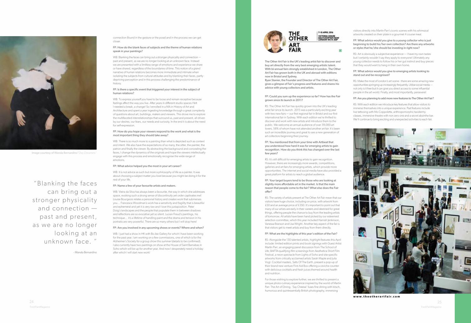
FP: Could you sum up the experience so far? How has the Fair grown since its launch in 2011?
RS: The Other Art Fair has quickly grown into the UK’s leading artist fair since its launch. 2015 was a particularly exciting year with two new fairs — our first regional fair in Bristol and our first international fair in Sydney. With each edition we’re thrilled to discover and work with new artists and introduce them to the public. We welcome an annual audience of over 39,000 art lovers, 58% of whom have not attended another art fair. It’s been such an incredible journey and great to see a new generation of art collectors beginning their journey.
FP: You mentioned that from your time with Artbeat that you understood how hard it was for emerging artists to gain recognition. How do you think this has changed over the last few years?
RS: It’s still difficult for emerging artists to gain recognition. However, there are increasingly more awards, competitions, galleries and art fairs for emerging artists, which provide more opportunities. The internet and social media have also provided a great platform for artists to reach a global audience.
FP: Your target buyers tend to be those who are looking at slightly more affordable art in the market. Is that the main reason that people come to the fair? What else does the Fair offer?
RS: The variety of artists present at The Other Art Fair mean that our visitors have huge choice, including on price, with artwork from £50 and an average price of £350. It’s important to point out that many of our artists are early in their careers and destined for great things, offering people the chance to buy from the leading artists of tomorrow. All artists have been hand picked by our esteemed selection committee, which this year included Hamish Jenkinson, Vanessa Branson and Lisa Wright. Another key aspect of the fair is that visitors get to meet artists and buy from them directly.
FP: What are the highlights of this year’s edition of the Fair?
RS: Alongside the 130 talented artists, highlight features this April include: limited edition prints and book signings with Guest Artist Martin Parr; an engaging panel discussion from The School of Life; BAFTA-qualifying film screenings from Aesthetica Short Film Festival, a neon spectacle from Lights of Soho and site-specific artworks from critically acclaimed artists Sarah Maple and Julia Vogl. Cocktail masters, Salts Of The Earth, present a pop-up of their brand new venture First Aid Box offering a ceviche counter with delicious cocktails and fresh juices themed around health and nutrition.
For those wishing to explore further, we are thrilled to present a unique photo-culinary experience inspired by the world of Martin Parr. The Art of Dining, ‘Say Cheese’ fuses fine dining with kitsch, humorous and quintessentially British photography, immersing
visitors directly into Martin Parr’s iconic scenes with his whimsical artworks created on their plate in a gourmet 4 course meal.
FP: What advice would you give to a young collector who is just beginning to build his/her own collection? Are there any artworks or styles that he/she should be investing in right now?
RS: Art is obviously a subjective experience — I have my own tastes but I certainly wouldn’t say they apply to everyone! Ultimately any young collector needs to follow his or her gut instinct and buy pieces that they would want to hang in their own home.
FP: What advice would you give to emerging artists looking to stand out and be recognised?
RS: Make the most of London’s art scene - there are some amazing new opportunities springing up increasingly frequently. Utilise social media — not only is it free but it can give you direct access to some influential people in the art world. Finally, and most importantly, persevere!
FP: Are you planning to add more new features to The Other Art Fair?
RS: With each edition we introduce key features that allow visitors to immerse themselves into a unique experience. Past features include live tattooing with Mo Coppoletta, anthropomorphic taxidermy classes, immersive theatre with non zero one and a secret absinthe bar. We’ll continue to bring exciting and unexpected activities to each fair.
The Other Art Fair is the UK’s leading artist fair to discover and buy art directly from the very best emerging artistic talent. With bi-annual fairs strongly established in London, The Other Art Fair has grown both in the UK and abroad with editions now in Bristol and Sydney. Ryan Stanier, the Founder and Director of The Other Art Fair, gives a glimpse of Fair’s progress and features and shares his advice with young collectors and artists.
w w w . t h e o t h e r a r t f a i r . c o m

26 27FreshPaintMagazine FreshPaintMagazineFreshPaintMagazine FreshPaintMagazine
Image courtesy of Dale Adcock “Stack of Heads”
D A L E A D C O C K
image courtesy of Soren Sejr “Sekvens 3”
w w w . s o r e n s e j r . c o m
w w w . d a l e a d c o c k . c o m
S Ø R E N S E J RSØREN SEJR (b. 1981, Denmark) graduated with a BFA from Aarhus Art Akademi, Denmark. Sejr has exhibited in a number of solo exhibitions including exhibitions with Galleri Jacob Bjørn (2015), Lunchmoney Gallery (2013), and Talentudstilling janusbygningen (2013). He has also participated in several group exhibitions in Denmark from 2014 to 2009. Additionally, Sejr was awarded the Artist Prize from KS11 and had numerous residencies in cities such as Berlin, Germany to Nairobi, Kenya to New York, USA, from 2013 to 2010. Sejr lives and works in Aarhus, Denmark.
Soren Sejr’s stark, confident compositions are chaotic and at times extremely compact, but maintain an effortlessness and distinctive style which nods to Modernist sculpture and architecture. It is at once a rather brutalist, quite masculine style which maintains a constant desire for a perfect composition similar to those ideals favoured by Kandinsky; yet as a contemporary artist, Sejr’s work also exhibits a tendency toward freneticism, and a playful incorporation of color and negative space. It is a recognizable unadorned aesthetic, almost lackadaisical or folkloric, of balance and harmony, housing an asymmetry and tension that allows the work to reverberate from within its frames. His pieces are known to follow a picturesque tradition with subtle twists as well as a strong sense of spaciousness and presence but with a clear sense of urgency in color as well as composition. Sejr’s paintings invite the viewer into a critical state of conflict between control and impulse, aesthetics and pragmatics.
DALE ADCOCK (B. 1980, United Kingdom) received his MA in Fine Art from the Chelsea College of Art & Design, where he graduated in 2005. Solo shows include Ratio at TJ Boulting (London, 2013) and Chloe, Be My Minotaur at Coleman Projects (London, 2008). Adcock has also exhibited extensively in group shows internationally including The Future Can Wait at Victoria House (London, 2014), Perfectionism at Griffin Gallery (London, 2014), The Fine Line at Identity Gallery (Hong Kong, 2013), Alter at Vegas Gallery (London, 2012), The Perfect Nude at Charlie Smith Gallery (London 2012) and the Future Can Wait presents Polemically Small at the Torrance Art Museum (Los Angeles, 2011). His work has belonged to the John Jones Collection as well as the Artists First Management Collection. Further, Adcock is featured in 100 Painters of Tomorrow, authored by Kurt Beers and published by Thames & Hudson (2014), as well as 100 London Artists authored by Zavier Ellis & Edward Lucie-Smith and published by Elizabeth Beecher Publishing (2014). Adcock lives and works in London.
Adcock’s paintings are oddly subversive reinterpretations of historical narratives, imagined monuments, and ancient structures. Based on both the artist’s own sketches, and accurate historical documentation, Adcock’s subject matter includes elements such as upside-down sphinxes, tribal-masks, and off-kilter portraits based on origami maquettes. The works, both massive in scale and housing an astonishing level of intricate detail, are executed in a hyper-realistic illusion of reality, wherein three-dimensional monuments are represented on the two-dimensional picture plane, where the artist relishes tweaking and skewing the proportions to cause slight and almost imperceptible unease for the viewer. To further elevate this sense of the sublime and uncanny, Adcock’s hypperealist style is emphasized by the painfully articulated detail he executes within each piece. While many of his peers chose to celebrate the fluidity, crudeness, or texture of their medium, Adcock’s brushwork is so meticulous, labour-intensive, and refined, that the surface of each painting appears flattened and textureless (like a photographic reproduction) that the artist’s mark making is indecipherable. Adcock’s labour-intensive approach means that he carefully plans and completes 4-5 paintings per year. The painted works are paired with a more fluid and Romantic series of drawings which the artist completes with an almost hypnotic approach that is comparable to automatic-writing.

28 29
Andrew Salgado (b.1982, Canada) is one of the most promising young figurative painters at work today. Saatchi Art calls him “one to invest in today”; critic Edward Lucie-Smith states he is a “dazzlingly skillful advocate [for painting]”; Tony Godfrey (author of Phaidon’s Painting Today) calls him an “exciting artist with a particular vision”; and even London’s Evening Standard has labeled him a “rising star”.
Solo exhibitions in 2016 include The Fool Makes a Joke at Midnight, Thierry Goldberg Gallery (with Beers London), New York, NY, (May); and a much anticipated 4th solo at Beers London (October).
In 2015 Salgado curated The Fantasy of Representation at Beers London, including work by Francis Bacon, Gary Hume, and Hurvin Anderson, accompanied by Salgado’s own impassioned manifesto for representational painting.
Andrew lives and works in London.
FP: Tell us a little bit about your background. When did you know you wanted to become an artist?
AS: I’m Canadian; half Mexican. I grew up in Saskatchewan, Canada, and eventually moved to London at 21 to pursue a Masters at Chelsea College of Art in 2008, and I’ve been there ever since. I have a studio in Shoreditch, in East London.
I think I always knew I would be in the creative industries. Originally, I thought perhaps architecture, because that seemed more ‘concrete’, but ultimately I still think that is quite restrictive. I love the freedom in what I do. As a youngster, it was a teacher in high-school who asked me to realise my potential. Throughout the course of two years I spent under her tutelage, she took me and said, “You need to do this as more than just a hobby — this is what you’re meant to do.” I’m still great friends with her; she often travels to my exhibitions. We have a mutual love and respect for one another.
FP: How did moving to London affect your work?
AS: For me, London was a very overwhelming experience at first. It really shook my foundation, and in retrospect — being asked to critically re-examine all that we assume — it was a really positive thing. The art in London is really different from what I see in North America. It was then, and it still is, although those lines are bleeding. My reaction to moving to London was to adopt, absorb, and glean as much as I could. It made me a stronger artist. Every day is a new curve on the greater trajectory.
FP: Who are the figures in your paintings? Do you work from life? Explain your creative process.
AS: Usually I paint strangers. I try to avoid painting friends or people I know too well because then I find myself handling the subject matter in a manner that is too straightforward… That is to say, I’m painting a ‘portrait’, when really, I’m not interested in accurately capturing my subject’s likeness. I’m interested in fantasy, narrative, and the purely physical properties of paint.
I always paint from photo. I sort of… go in, tinker about, and hope something good happens. I try not to set too many rules or limitations because I find that just prohibits the art from reaching its full potential. It’s funny, because I talk about the paintings as though they themselves are living entities… but I suppose they are, in a way. I’m just the conduit that gets them out.
FP: What’s on your playlist when you’re in the studio?
AS: I work alone, always 5 but often 6 days a week. At least 8 hours a day. So my only friend while I’m working is music, and as a result the work has a very profound, inextricable link to music. I have a sensory, almost Romantic link to the music, as well, because it plays such a formative role during the creative process. I’m an album guy, and lately I’ve been listening to a lot of Arcade Fire and Radiohead. Some days I will go back and listen to each album, song by song. I love Sharon Van Etten. My good friend is Jenn Grant, and she has the most beautiful voice. I’m always listening to something. I mean we could have had an entire interview just on what’s going in my ears. I’ll make FPM a playlist. (Please visit http://freshpaintmagazine.com/andrew-salgados-playlist-for-freshpaintmagazine/ to listen to the playlist!)
A N D R E W S A L G A D Owww.andrewsalgado.com
FreshPaintMagazine FreshPaintMagazine
Image courtesy of Andrew Salgado “Caribbean”

30 31
FP: How do you feel the contemporary art world is changing? What is the role of painting in your opinion?
AS: This is a huge question. I’ll be brief. I think artists need to navigate the social media terrain. A lot is moving to the art fairs. Painting will never go out of fashion. Kurt Beers authored the book 100 Painters of Tomorrow after I convinced him that there wasn’t enough attention on emerging international painters. But realistically, the ones that are being contested are the photographers. It’s not ‘The Death of Painting’ but ‘The Death of Photography’ when everyone with a smart-phone fancies themselves a photographer. Not everyone has access to paint and brushes. I digress…
FP: Tell us about what your upcoming exhibition in New York City.
AS: The show is called ‘The Fool Makes a Joke at Midnight’ and it’s sort of a culmination of a few different ideas that ultimately became one show. I was playing around with how different words or phrases could articulate what I was thinking, like a word-map, and eventually we agreed on this. I like how the title itself is sort of like the set-up to a really bad joke. The show is about human
folly, the tragicomic realities of life. There are no real answers, only questions, only long-winded set-ups to situations that play out like bad Greek tragedies. Sometimes we win; sometimes we lose. And then there’s this experience I had in Cape Town where we went to Cape Point — where the Indian Ocean meets the Pacific Ocean… and we were covered in fog. So there’s this idea of obfuscation. Of vagueness, opacity… masks and personas — kind of opulent ideas that are whittled down into their silliest form. I guess a few ideas that make sense in my head. And I was bothered by the death of Bowie, so that’s in there too. Anyway, the show opens May 6 at Thierry Goldberg in the Lower East Side. It will run until May 28. It’s curated by my lead representative gallery Beers London. [Following this, my next London show will open October 7 at Beers. It’s tentatively called From the Gilded Gutter but that will probably change again.]
FP: Tell us about your first curating experience. What was the project and how did you find it?
AS: A lot of what I do comes about from contention. A discussion about something leads to something else that manifests in studio or otherwise. I was talking to Kurt Beers (my good friend and the Director of Beers London) about how, as representational painters,
we are expected to ‘get’ really hard, really conceptually and technically abstract art. But these abstract artists are not expected to ‘get’ us. And that’s a real piss off. I wrote this big manifesto about it and convinced him to let me curate a show. I don’t think I’m done with this idea just yet… but the show was wonderful — I got a number of really extraordinary artists to contribute, including Sverre Bjertnes, Gary Hume, Hurvin Anderson… we even had a Francis Bacon. (http://beerslondon.com/exhibitions/fantasy-of-representation)
FP: What advice would you give emerging artists looking to take their work to the next level and get into galleries?
AS: Work twice as hard and worry half as much. Read ART/WORK, and never, ever, ever approach a gallery at an art fair or opening.
FP: If you weren’t an artist who would you be?
AS: A clown.
FP: What do you admire most in people?
AS: Honesty.
FP: Who are your favorite living artists?
AS: Daniel Richter. Peter Doig. I also love Tal R, because he reminds me that crudeness and ugliness is a good thing, and he’s transformed my own practice. Sverre Bjertnes is extraordinary. Dale Adcock is a friend of mine and he is spectacularly talented. I made him become my friend after seeing his work. And then I purchased one. It’s immense. 3x2.6 metres. I always say that in 10 or 20 years Dale will be recognized as one of the most important painters of my generation. Adam Lee. Tom Anholt. Scott Anderson. I mean, there’s loads…
FP: What are you presently inspired by — are there particular things you are reading, listening to or looking at to fuel your work?
AS: I met one of my heroes when I was younger and her advice stuck with me. Collect things; let them intermingle in your cognitive palette. I think the problem sometimes is, as younger artists, we are waiting for that Great Idea — that Inspiration with capital ‘I’ — when in reality, it’s little, often insignificant things that steer the ship. The new show is partly inspired by Camus’ ‘The Outsider’. A painting from the last show was inspired by a children’s party hat. A conversation with a friend. I opened my Caravaggio book to his painting of St John and took it as a sign that I needed to paint my version of that piece. These things are what motivate me.
FP: What are your favorite places to visit in London when you are not painting?
AS: Trick question — when I’m in London I am painting.
FP: Where would you like to travel next?
AS: It changes. I travel quite a bit — usually I take at least one month off after finishing a body of work to recharge. Lately Iceland, India, or Brazil have been high on the wish-list. I’ve not been back to Mexico in over 10 years, so this May my partner and I will go down there with my father and experience Mexico City for a few days before heading to Playa del Carmen. I’m excited to reconnect with my family there and share that part of my culture with my partner. The thought of eating tacos al pastor on the beach is enough of a pay-off to keep me hard at work for the time being.
FP: Do you have a motto, inspirational phrase?
AS: I used to say ‘you’re only young and gorgeous once’ but frankly I’m not that young anymore, and I’ve never been that gorgeous, so I think it should be ‘you’re only in your mid-30s and average looking once!’
“I’m not interested in accurately capturing my subject’s likeness. I’m interested in fantasy, narrative, and the purely physical properties of paint.“
- Andrew Salgado
FreshPaintMagazineFreshPaintMagazine
Image courtesy of Andrew Salgado “Peace Signs”

32
C U R A T E D S E L E C T I O N
B Y A N D R E W S A L G A D O
What practices and resources have helped you in terms of selling your work? Tell us briefly about your experience making sales to clients in galleries or online. What worked for you and what piece of advice would you give an artist looking to sell their work?
T I P S A N D I N S P I R A T I O N F R O M P R E V I O U S L Y P U B L I S H E D A R T I S T S
“I have found Instagram to be a fantastic place to advertise and gain fans. By utilizing hashtags to help people find you, you can build a following really quickly. I have gained sales, commissions and promotional opportunities all through just regularly posting images of my artwork.”
- Clair Bremner, Issue 10
“There are so many great resources online for gaining an audience for your work and for selling. To sell on social media, it is very important to keep things up to date, discuss your work/studio practice and engage with those who show interest in the work. I love that I can post a painting and it is seen, commented on, and possibly sold, before the paint can dry.”
Elyce Abrams, Issue 8
“Keeping an up to date and professional social media presence has been very important. An Instagram account or Facebook page can be the first impression you give so I am always aware of what I am posting. Additionally, keep your social media account active, post clean images when you can and stay connected with other artists and curators.”
Benjamin Cook, Issue 8
“The artist should focus on developing a relationship with only a few galleries and websites that sell work in a similar vein to their own body of work. Many galleries tend to show a narrow focus of work. Don’t spam a hundred galleries- its not a good use of your time. Don’t propose your figure paintings to a gallery that only shows abstract painting. Study the gallery’s program first, and only propose your work if it seems like a natural fit.”
Lauren Matsumoto, Issue 5
“I’ve found that high quality, limited edition prints of my paintings have helped my sales. People that enjoy the prints will occasionally buy a painting. I also do small batch fine art t-shirts to keep the money rolling.”
Jane Ryder, Issue 3
“A variety of resources, beyond the gallery, are crucial in the sale of my work, including designers, developers, art consultants and social media. Make sure to have your work well documented, so the images you share with the world do it justice.”
Liz Tran, Issue 8
“Keep in contact with people. Being in the arts is completely awesome and daunting and we are all in it together. Surround yourself with artists, curators and writers who are positive and genuinely love what they do. Those are the people who will think of your work and include it in a show, publication etc. Also don’t be stingy with opportunities. If you want others to support you, you need to support them.”
Erika Hess, Issue 5
“In my experience, I have found that focusing energy towards taking an active role in creating your own scene and building a supportive network of peers, including being a supportive peer, rather than focusing on “selling” has served me well on many levels as an artist. A valued piece of advice I received in my M.F.A. program was to “focus on the work and that the rest would follow”. I have to agree with that, but would add that being a lover and champion of art other than your own is important. As an artist, everything seems to work so much better when we create opportunities for and shine lights upon each other. When you do this, you may be surprised to learn who is watching. I would offer that the best resource is yourself and your community of fellow artists.”
Jessica McCambly, Issue 4
“Getting the price right for your work is such an important element of trying to sell it. When a client sees your work in a gallery, first of all they have to like it enough they would consider buying it. Artists at different stages in their careers have to price their work accordingly. Have a fair price that reflects this. An art piece on display in someone’s home or work place is a great calling card for your art. This exposure often leads to other interest and sales of your work.”
Tom Climent, Issue 11
Image courtesy of Andrew Salgado

34 35FreshPaintMagazine FreshPaintMagazine
Tatiana Arocha Diversidad digital print on galvanized metal and wood with acrylic gold paint12 x 24 feet
I am a visual artist from Bogotá, Colombia based in Brooklyn, NY. A graphic designer by training, I work in disciplines including illustration, motion graphics, live action production, curating, education design, site-specific art, product design, and publishing. My work combines passion for storytelling with attention to detail, a fearless work ethic, and a refined style developed over years working in design.
Today my focus is Sanctuaries, a series of rainforest landscapes constructed from hundreds of layered images, textures and distortions. My latest iteration is for the Sinfonía Trópico biodiversity initiative, and consists of an outdoor rainforest mural at the Goethe-Institut Kolumbien in Bogotá, Colombia. I am also developing Spanish language early childhood educational materials, most recently “Kuli Kuli,” a line of educational art prints, posters, textiles, cards and decorations for young children.
My work emerges from a personal history enmeshed in the bio-political landscape of Colombia, which I spent my childhood exploring on expeditions with my father, an anthropologist and environmentalist. Both a refuge and warning, Sanctuaries uses a combination of natural specimens, human artifacts and modern technologies to evoke a rainforest that is as lush as it is imperiled.
My work interrogates boundaries between preservation and imagination. I both continue and bend the arc of life and decay, evolving specimens beyond their moment of capture and recasting natural forms in possibilities of my own devising, presenting a rainforest at once realistically lush and built of components beyond reality.
w w w . t a t i a n a a r o c h a . c o m
Tatiana Arocha Jaguarpigment print on german etching paper with acrylic gold paint 18 x 24 feet
T A T I A N A A R O C H A

36 37FreshPaintMagazine FreshPaintMagazineFreshPaintMagazine
John BrennanExperiments in Movement: Part 1oil on canvas39 x 39 inches
John BrennanThe War Roomoil on canvas35 x 51 inches
w w w . j o h n b r e n n a n . c o . u k
J O H N B R E N N A N
Kennedy Bailey, born in Atlanta, Georgia, now resides in Tampa, Florida. First trained in realism, she went on to study contemporary art at the University of South Florida, and now combines realism and abstraction in her paintings. Kennedy has always loved the process of painting, more than the paintings themselves. She is flooded with ideas and images that she impulsively must paint before she forgets due to a short-term memory deficit.
My process of painting involves taking recognizable imagery and moving it into abstraction. Borrowed from the Nouveau Rèalisme group of artists, the manifesto of my work is the idea of seeing the world as an image, allowing me to take parts of it to use and manipulate into my
own work. Each piece extracted from the world is interwoven to create a visual statement of movement, through the use of colors and shapes that push and pull, drawing the viewer in.
I am not attached to the end result of a painting. I live in the moment and I grab my ideas, thrusting them into my paintings. As the ideas morph into an image, I move on to the next series of ideas, catching them quickly before they disappear and are forgotten. These thoughts and images create multiple layers of visual information, each layer equally important to the work’s composition. My favorite painting is always the one I am working on.
Kennedy Bailey Delightful oil on canvas36 x 48 inches
w w w . k e n n e d y b a i l e y . c o m
K E N N E D Y B A I L E Y

38 39FreshPaintMagazine FreshPaintMagazine
Tinka BechertApparition acrylic on canvas31 x 39 inches
Tinka Bechert’s work continuously shows a keen historic interest which she combines with process-oriented painting. The artist reinvents and reinvigorates historic sources in order to assemble current visual metaphors. A slightly askew or absurd realism emerges that describes the slippages in human perception.
Alongside her painting practice, Tinka Bechert has worked on ambitious collaborations with scientific institutions such as the Berlin-Brandenburg Academy of Sciences and Humanities (BBAW) and the Institute for Advanced Study (Hanse-Wissenschaftskolleg). In exploring difference and commonalities in artistic and scientific methodologies, the artist explores the deep human need for reason as a common driving force- both in the arts and sciences.
Tinka Bechert was born and raised in Berlin, Germany but divides her time between Ireland and her native Berlin, having shown her work extensively across Europe, the UK and Ireland. Tinka Bechert’s work is represented in many private and public collections such as the Office of Public Works, Ireland, the Central Art Archives / National Library, Berlin, Germany and Tate Britain, London. Her work will be on view in Galerie Gerken, in Berlin Mitte, Germany.
“The distinction between past, present and future is only a stubbornly persistent illusion.“
Albert Einstein
w w w . t i n k a b e c h e r t . c o m
T I N K A B E C H E R T
Tinka BechertHerr Piepmatz acrylic on canvas25 x 29 inches
38

40FreshPaintMagazine FreshPaintMagazine
41FreshPaintMagazine
Ling ChunFunceramics, glazes, underglaze, hair, concrete, wood 17 x 11 x 37 inches
Ling Chun earned her BFA at the School of the Art Institute of Chicago. The focus of her study was visual communication design and ceramics. She has been engrossed with the relationship between authentic American Chinese foods and making art to explore how the interplay affected her life as a Chinese in the States. She followed her passion and began a year long artist residency at Seward Park Clay Studio in Seattle, WA and then became a program instructor at Starlit Art Space, Hong Kong.
Finally, her passions in ceramic art brought her to the MFA program at Rhode Island School of Design.
w w w . w h o i s h e r r y. c o m
L I N G C H U N
Bj studied menswear fashion design at Cape Peninsula University of Technology, Cape Town, South Africa (BTech Fashion). He was Head Visual Merchandiser Menswear at Harvey Nichols, London for 8 years but in 2009 he decided to devote himself completely in his art. At present he is a professional artist and his artwork has been sold to many collectors worldwide in Dubai, South Africa, Australia and Europe.
Broekhuizen’s signature is his bold use of colour, inspired by his African background. He works mostly in oil on canvas and indian ink on paper. His most usual suspects are mysterious and intriguing portraits with a mixture of abstraction. Also his art is often provocative and suggests visceral emotions related with identity, beauty, masculinity and cultures.
Previous exhibitions include his solo show MAN, Dalston Superstore, London (2015); group shows ,Century Private Members Club, London (2015); Gallery On The Corner, London (2014); Espacio Gallery, London (2012); Art in Mind, Brick Lane Gallery, London (2011).
He has been featured in Sang Bleu magazine (2012); Mascular magazine (2012, 2015) and Flaunt magazine (2015).
Broekhuizen has lived and worked in London since 2001.
“I like taking the image to a breaking point.”
Bj BroekhuizenConnectionmixed media on canvas11 x 15 inches
40
w w w . b j b r o e k h u i z e n . c o m
B J B R O E K H U I Z E N

43FreshPaintMagazine
42FreshPaintMagazine
M A T T H E W C A R V E R
Matthew CarverA Pale Gray Heavy Fuzz oil on canvas50 x 96 inches
Matthew Carver received his Master’s with ‘Distinction’ from The Chelsea College of Art at the University of the Arts, London and his BFA Honours degree from York University in Canada. He is a Canadian artist with considerable international experience and has been given solo exhibitions in Berlin, Singapore, Kuala Lumpur and Canada. He has also participated in many prestigious international group exhibitions from London to Berlin, Dubai and throughout Asia. Notably, his work was presented in the 12th Cairo Biennale. Other group exhibitions have included ‘Anticipation’ in London curated by Kay Saatchi, Flora Fairbairn and Catriona Warren; ‘Museum Presents: The New Empire’, curated by Victoria Lu at Scope Basel, and recently, ‘In/Outsource, Nei Xiao/ Wei Bao’ at The Art Museum of Nanjing University of the Arts.
He is a winner of The Canadian Emerging Artist Prize (now known as The RBC Painting Prize) and his work is in many notable international collections.
In recent years, Matthew returned to Canada after 9 years based in locations such as Berlin, London and various parts of Asia. His last solo exhibition, ‘Night of the World’ was at the Christopher Cutts Gallery in October of 2015. Here, imagery from paintings slipped back and forth, playfully, as if crisscrossing time. A shaped anamorphic painting on wood, reflected in a common, everyday metal cup, reveals a room. This work, itself, pops up in the foreground of another painting. Visual recursions appeared throughout the exhibition, offering hints of narrative and suggestions of darkness beneath the slick surfaces.
w w w . m a t t h e w c a r v e r . n e t
Matthew CarverBryce observed a pattern forming around Room 22acrylic on canvas 50 x 50 inches

44FreshPaintMagazine FreshPaintMagazine
45
Self Portrait in Hospital Bed 1 and G Tube 3 are both paintings that I did for my thesis show. Before I graduated in 2015, I was in a hospital in the summer of 2014, and those two large scale paintings are based on pictures of me in the hospital and after various surgeries. Recently my work has moved away from large figure based paintings and paintings based on that experience. I’ve currently done paintings of some death metal album covers, and after a stint at the League Residency at Vyt, have done more work with landscape as the subject.
w w w . m a r k f a r r e l l a r t . c o m
M A R K F A R R E L L
A childhood love for drawing and comics, plus eight years as a graphic designer, became a late-blooming desire to devote my energies to painting.
Pop art with a slice.
Thomas Duaneintotheholdhewentwithahatchet oil on canvas mounted on canvas 36 x 36 inches
Mark FarrellTongue Colored Rockland Cemeteryoil on canvas8 x 10 inches
w w w . t h o m a s d u a n e . c o m
T H O M A S D U A N E

46FreshPaintMagazine FreshPaintMagazine
47
Tony HavrillaTarget with Andrea, oil on canvas30 x 40 inches
w w w . t o n y h a v r i l l a . c o m
T O N Y H A V R I L L A
Tony Havrilla is a graduate of Indiana University of Pennsylvania where he received a B.A. in Studio Art with a focus in painting. His work has been shown regionally within the tristate area as well as online. He currently lives and works in Pittsburgh, Pa.
w w w . g r e g - a r t i s t . c o m
G R E G H A R R I S
Greg HarrisHand Study IIoil on board6 x 5 inches
Greg Harris (b.1984) is a portrait, figurative and landscape painter currently residing in Bristol. He exhibits across the country and shows through Signet Contemporary Art Gallery in Chelsea, London.
Major events include The Other Art Fair in Bristol and London 2015, and he’ll be showing at both locations again in 2016. Aside from exhibiting his work, Greg tutors workshops and performs painting demonstrations all over the UK. He also accepts commissions from individuals and organisations alike.
Greg has been featured in FreshPaintMagazine’s blog as well as The Other Art Fair’s blog.
In my paintings, I want you to reconnect with the familiar by bringing together both a literal and non-literal interpretation of the people and environment around you. Strokes and smears
start off large before I feel forced to reduce to smaller tools, maintaining and displaying some (if not all) of the marks used to create a piece.
My source material comes from photos I take at sittings or places I’ve travelled to. The painting takes place in the studio alone where I recall a sense of an individual or location, and decide the colour scheme that befits the quality I’m trying to extract and communicate to the viewer. Once I begin, I adapt the palette and trust my instincts to constantly reassess the work as it gains body.
An energetic and lively portrayal is achieved through this careful consideration of colours and a painterly style that doesn’t condemn what’s being depicted. Rather, through the execution and minimised mark-making, my paintings are brought to life with a clean and freshly finished feel.

49FreshPaintMagazine
Fukuko HarrisLines Interruptedacrylic on canvas24 x 20 inches
Lisa Ficarelli-Halpern Dutch Floral with Draperyoil on canvas 50 x 38 inches
Lisa Ficarelli-Halpern Dutch Bouquet oil on canvas 48 x 34 inches
In my painting, awkward relationships are intended to reflect our time. I am developing a personal language that, for me, resonates with my perceptions. Through my painting, I negotiate an interior dialogue with my experience of the world. Objects and spaces in my daily life are manipulated abstractly in the paintings.
I keep working on my painting until all the marks, lines, and forms allow themselves to unite a singular world and start their own dialogue to create a special moment.
w w w . l i s a f i c a r e l l i - h a l p e r n . c o m
w w w . f u k u k o h a r r i s . c o m
L I S A F I C A R E L L I - H A L P E R N
F U K U K O H A R R I S

50 51FreshPaintMagazine FreshPaintMagazine
Gina HerreraSubliminal Moment assorted found materials50 x 42 x 11 inches
Born in 1969, Gina Herrera was raised in Chicago and currently resides in California. She has a Bachelor of Fine Arts in Art Education from the School of the Art Institute of Chicago. In the course of her studies, she was deployed overseas in support of several war contingencies with the United States Army. Once her final tour was complete, she obtained her Master of Fine Arts from the University of the Arts in Philadelphia, where she received a Provost Fellowship and an MFA Scholarship. She currently teaches art at Bakersfield Community College and Arvin High School as well as serving as an Army Reserve Officer. 2016 accomplishments include a Faculty Fellowship at Ox-bow; a United States Veteran Fellowship at Hambidge Center; Invoking the Unseen: a solo temporary public art exhibition at the Valencia Town Center in Santa Clarita, and a solo show at Gallery 825 in Los Angeles.
While my heritage incorporates the Tesuque Pueblo and Costa Rica, my strongest affinity is to nature. While serving in Iraq, mountainous trash heaps catalyzed my desire to awaken environmental consciousness. I create assemblages using discarded and natural objects, an aesthetic and spiritual ritual to channel and honor Mother Earth.
I constantly gather materials, finding inspiration in my surroundings. Like a scavenger, I play an interventional role in removing garbage from the landscape. My process is meditative and intuitive. Figures emerge, haunting presences energetically posing on the brink of movement, asking us to question our choices, our connection to our world.
w w w . g i n a h e r r e r a . c o m
G I N A H E R R E R A
Gina HerreraA Nostalgic Flashassorted found materials68 x 38 x 25 inches

52 53FreshPaintMagazine FreshPaintMagazineFreshPaintMagazine FreshPaintMagazine
Ian LarsonWhen the Sun Shines Over All the Feral Rot oil paint, beeswax and human hair on linen 60 x 60 inches
Born: 1980 Oceanside, CA
MFA-2007 Slade School of Fine Art, London, UK
BFA-2004 University of Central Florida, Orlando, FL USA
Painted presentations of visceral bacchanalia, hillbilly witchcraft and degenerate portraiture.
The works are glimpses into narratives, with a focus on the human figure, centered around characters belonging to their own social contexts, where fictitious chaos meets blatant references, satirical violence and humor while acting upon their animal (often maniacal and sexual) nature with exploited and often tragic exiguity.
Hodara is a Graphic Design professor at Emmanuel College and the Museum School, both in Boston, MA. She is a member of the Bromfield Gallery and co-founder of the International Institute of Contemporary Art and Theory, an artist residency in Mangalia, Romania.
This body of work is a series of monochromatic prints and drawings in which Hodara transforms the visual language of patent drawings for algorithmic systems into evocative images. These images re-envision the iconography of patents — the infrastructures responsible for codifying the
abstract processes of new technologies into legal systems and applications.
The intricate and ornate patterns Hodara creates are from forms found in the patents themselves. On one hand, the intimacy of the final pieces subverts the opaque quality of patent nomenclature and iconography. On the other hand, the tedium of her designs highlights the meticulous and monotonous nature of the very systems which allow this protectable, intellectual property to exist.
w w w . i d l s t u d i o . c o m
I A N L A R S O N
Sofie HodaraDrone toner transfer, watercolor, on gessoed panel12 x 12 inches
w w w . s o f i e . s p a c e . c o m
S O P H I E H O D A R A

54 55FreshPaintMagazineFreshPaintMagazine
Joseph Holsapple Lost Worlds oil on panel 36 x 48 inches
Joseph Holsapple received his BFA from Memphis College of Art in 2003 and his MFA from Indiana University in 2009. He has exhibited regionally and nationally, including juried shows at First Street Gallery in New York and the Ogden Museum of Southern Art in New Orleans. Holsapple’s work has been featured in Manifest Gallery’s International Painting Annual and on the cover of Fresh Paint Magazine. He has taught at Indiana University, the Herron School of Art in Indianapolis, and Vincennes University. He is currently an Assistant Professor of Painting & Drawing at Nicholls State University.
My current work explores the subject of still life painting as a convergence of memory, imagination, and perception. I paint toys and common household items that together evoke the domesticity of childhood. The objects are painted both from memory and observation. They accumulate as I paint, resulting in an anxious clutter of discarded items — some described in detail, others left as half-formed thoughts or faded memories.
The play of light and shadow weaves a dreamlike space that lends the objects a poetic weight. I want the paintings to unfold before the viewer as the initial clutter and chaos give way to an emergent, rhythmic order. As the viewer explores the space, the act of looking becomes one of discovery and delight. Childhood anxieties and the losses that accompany the passage of time are interwoven with a renewed joy and liveliness. The objects, suspended between these contrasting experiences, become players in a drama that speaks to the mystery and complexity of living.
w w w . j o s e p h h o l s a p p l e . c o m
J O S E P H H O L S A P P L E
Joseph Holsapple Worlds Within Worlds oil on panel 36 x 48 inches

56 57FreshPaintMagazine FreshPaintMagazine
Joanne Hummel-NewellGravity beginners watercolour, ink and collage on watercolour paper 22 x 29 inches
Joanne was born in Farnborough in 1982 and now lives and works in the Isle of Wight UK.
Joanne trained at the Royal College of Art London, and Kingston University Surrey. Recent selected exhibitions and short lists include WW Gallery collateral exhibition at the 53rd Venice Biennale, Jerwood Drawing Prize, RA Summer Exhibition, Royal Watercolour Society Contemporary Competition and the Shoosmiths Art Prize. Her curated and commissioned exhibitions include Nomas Foundation, Rome; Kunstraum Kreuzberg, Berlin, and Aspex Gallery, Portsmouth. Awards include Arts Council England, Quay Arts Purchase Prize and RWS Contemporary Prize, Bankside Gallery. Her work has been featured in the Times and Observer newspapers, and is included in public and private collections in the UK, USA, Hong Kong and Australia.
Joanne is currently preparing for a collaborative exhibition ‘Porcelain and Paper’ to be shown at the CAA gallery in London, April 2016.
I seek out the neglected and overlooked. Outdated bus tickets, kids’ drawings and handwritten lists are some of the everyday ephemera that influence the imagery which meet scissors and random acts of chance. The work plays out innovative acts of ordering and reactivating of the anonymous and ubiquitous things we meet and part company with on a daily basis.
The instantaneous, forever changing and obsolete are held momentarily in a creative balancing act that wrestles clarification and creative destruction.
New sensations ebb and flow, both in and outside the physical space that is the canvas; shape to colour, form to pattern, combining a bold sensitivity to raw ephemera in which to revisit our world. The viewer takes part in a handcrafted spree, a heavy contrast to today’s slick visual culture.
w w w . j o a n n e h u m m e l n e w e l l . c o m
J O A N N E H U M M E L - N E W E L L
Joanne Hummel-NewellMultiversebeginners watercolour, ink and collage on watercolour paper 22 x 22 inches

58 59FreshPaintMagazine FreshPaintMagazine
Henry HusseyBetrayal dyed damask, dip-dyed cotton, dyed linen, digitally printed cotton, digitally printed linen, embroidered damask, embroidered cotton and chainstitch embroidery170 x 155 cm
58
The artworks I create are informed by my own experiences and depict the significant moments in my life. I make these works in order to battle and rectify the wrongs that I have been dealt so thereby changing the events in a manner I see fit. I came to art through it being a way in which to alleviate turmoil so I therefore see art to be a cathartic force, as it has empowered me to confront my issues head on. Art gives you the opportunity to convey your thoughts with conviction and purpose. Collaborating with actors to capture genuine emotion and pathos has reinforced this.
I choose to create artworks in textiles as the exchange between working with digital processes and a variety of fabric techniques such as embroidery, dyeing and screen-printing gives the works a tangible quality, as the textures contribute to form a visual that is arresting and refuses to fall back into monotony. Digitally printing onto fabric has hugely informed my artistic practice and allowed me to work on a scale unfathomable, purely by only using manual processes it has given me the ability to build scope into my work with urgency and a sense of intensity.
w w w . h e n r y h u s s e y . c o . u k
H E N R Y H U S S E Y
Henry HusseyEclipsedyed damask, dyed linen, digitally printed linen, digitally printed cotton, embroidered damask, embroidered linen, embroidered cotton, beadwork and draped threads 195 x145 cm

60 61FreshPaintMagazine FreshPaintMagazine
Rachel JenningsMount Sinai multi-media installation
With a front yard of rolling cornfields and a back yard of dark timber, there is an ongoing presence of seclusion. I come from a rural landscape, and my work is reflective of my upbringing. A sense of place acts as the central theme in my work, whether it is the subject matter or the creation of a physical environment. My fascination with objects and a corporeal presence is embodied through my material choices, the manipulations of them, and the spaces they occupy.
I make physical manifestations of my fleeting past. In the initial stages, I work intuitively and respond to impulses, often creating the actual work on site, instead of in the studio. The work grows upon itself through this process, as I direct the narrative that emerges. I pull from memory and nostalgia to recall an existence where everything past, which was beautiful to me, marries current experience and culture. My process pulls toward collage and installation because
of the expressive, unconfined nature of my work and the corresponding impermanent, transitioning subject matter. Through folklore, religion and morality, place, possessions and nature I am able to visually translate my world, curating my memories into culturally reflective narratives.
Rachel Jennings is an active installation and multimedia artist based in Minneapolis, Minnesota. She is currently pursuing an MFA in Visual Studies at the Minneapolis College of Art and Design, having previously received a BFA in Painting from the University of Illinois at Urbana-Champaign in 2012. Rachel is originally from the midwestern town of Dawson, Illinois, a tiny, rural community, which is often a common influence in her current practice. She is attracted to the intersections of her experience with rural living, religion, and physical collections, and the impact they have on her memory process. Rachel loves drawing peaches, and her favorite color is crimson.
w w w . r a c h e l - l e i g h - j e n n i n g s . c o m
R A C H E L J E N N I N G S
Rachel JenningsGluttonmulti-media installation

62 63FreshPaintMagazineFreshPaintMagazine
Richard KeenForm Singularity No.79polyester resin, oil, and spray enamel on canvas on panel 24 x 20 inches
Richard Keen earned his Bachelor of Fine Arts degree from Millikin University and his Master of Arts degree from the State University of New York, Albany. His artwork has been shown throughout the United States, most recently at the Simon Gallery in Morristown, New Jersey; Leonard R. Craig Gallery in Unity, Maine; Bowery Gallery in New York City, the University of Rhode Island and Elizabeth Moss Galleries in Falmouth, Maine. He has received grants from the Maine Arts Commission, University of Rhode Island Visual Art Sea Grant, and the Berkshire Taconic Community Foundation. His work was included in the United States “Art in Embassies Program” and he has been a visiting artist at various educational institutions. Curators and critics who have selected his work include: Tracey Bashkoff, Associate Curator of Collections and Exhibitions at the Guggenheim Museum, selected his work for the “Encaustic Works 2003 Biennial” at Marist College in Poughkeepsie, NY; Lisa
Dennison, Director and Chief Curator at the Guggenheim Museum chose his work for the 2002 Cambridge Art Association’s “National Prize Show” in Cambridge, MA. Other prominent jurors who have selected his artwork include: Phyllis Braff, Critic for the New York Times; Anne Rocheleau, Director of the Rhode Island Foundation Gallery; Moira Kelly, prior Director of Air Gallery in London, and Bruce Brown, Curator Emeritus of the Center for Maine Contemporary Art.
Interactions with my natural surroundings combined with my reactions to man-made objects form the basis of my geometric abstract paintings. Removing layers of unnecessary instruction and detail, my work is simplified into color and shape, leaving the viewers room to construct their own meaning.
w w w . r i c h a r d k e e n s t u d i o . c o m
R I C H A R D K E E N
Richard KeenForm Singularity No.72oil and spray enamel on shaped panel 46 x 42 inches
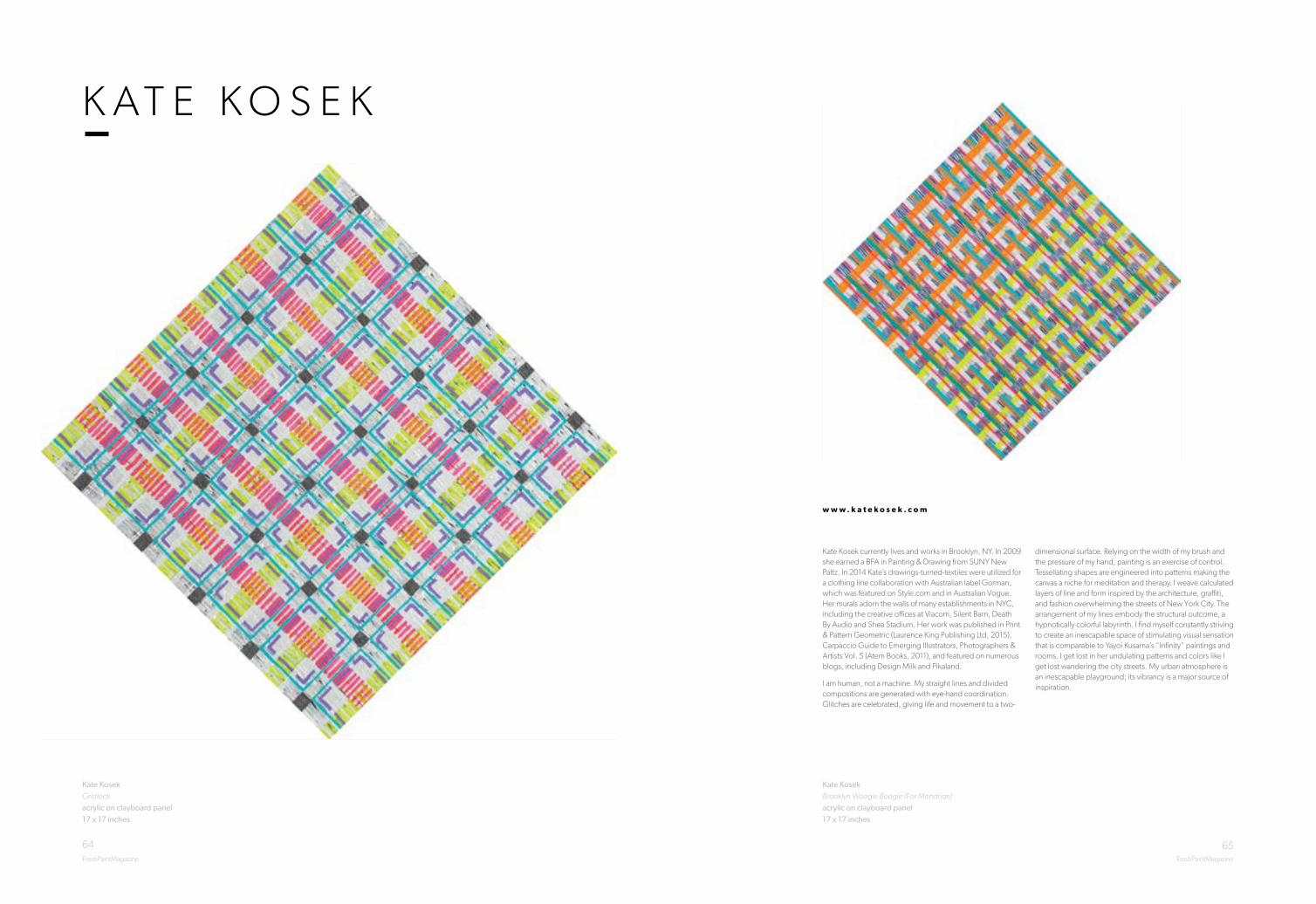
64 65FreshPaintMagazine FreshPaintMagazine
Kate KosekBrooklyn Woogie Boogie (For Mondrian)acrylic on clayboard panel 17 x 17 inches
Kate Kosek currently lives and works in Brooklyn, NY. In 2009 she earned a BFA in Painting & Drawing from SUNY New Paltz. In 2014 Kate’s drawings-turned-textiles were utilized for a clothing line collaboration with Australian label Gorman, which was featured on Style.com and in Australian Vogue. Her murals adorn the walls of many establishments in NYC, including the creative offices at Viacom, Silent Barn, Death By Audio and Shea Stadium. Her work was published in Print & Pattern Geometric (Laurence King Publishing Ltd, 2015), Carpaccio Guide to Emerging Illustrators, Photographers & Artists Vol. 5 (Atem Books, 2011), and featured on numerous blogs, including Design Milk and Pikaland.
I am human, not a machine. My straight lines and divided compositions are generated with eye-hand coordination. Glitches are celebrated, giving life and movement to a two-
dimensional surface. Relying on the width of my brush and the pressure of my hand, painting is an exercise of control. Tessellating shapes are engineered into patterns making the canvas a niche for meditation and therapy. I weave calculated layers of line and form inspired by the architecture, graffiti, and fashion overwhelming the streets of New York City. The arrangement of my lines embody the structural outcome, a hypnotically colorful labyrinth. I find myself constantly striving to create an inescapable space of stimulating visual sensation that is comparable to Yayoi Kusama’s “Infinity” paintings and rooms. I get lost in her undulating patterns and colors like I get lost wandering the city streets. My urban atmosphere is an inescapable playground; its vibrancy is a major source of inspiration.
w w w . k a t e k o s e k . c o m
K A T E K O S E K
Kate KosekGridlock acrylic on clayboard panel 17 x 17 inches

67FreshPaintMagazine
66FreshPaintMagazine
M A T T H I E UL E G E R
Matthieu LegerThe Way You Were the Thing I Wasoil on linen over board11 x 15 inches
Born 1987 London, Ontario, Canada. Since graduating from University College Falmouth, UK in 2009 with First Class Honours, Matthieu has gone on to have successful exhibitions across the UK. For his work at university he was awarded the Sir Richard Ford Award, a scholarship to study from the collection at the Prado Museum in Madrid. In 2014 he was selected for the Derwent Art Prize Exhibition and he has also been the recipient of various prizes: The Trevor Thomas Prize at the Leicester Open 26 exhibition, and most recently at the Nottingham Castle Open Exhibition 2015, where he was awarded both the Nottingham Society of Artists Prize and the John E. Wright Prize.
Matthieu Leger’s work investigates ideas around construction and deconstruction. His paintings explore space, material and form, drawing on his interests in the natural, mathematic, digital and scientific understanding of the world. His fabricated and re-interpreted vision invites the viewer to question our reality.
w w w . M a t t h i e u L e g e r . c o m
Matthieu LegerTwo Treesoil on canvas over board35 x 47 inches

68 69FreshPaintMagazine FreshPaintMagazine
John Oliver LewisHell No Noceramic, acrylic18 x 13 x 7 inches
Originally from Wisconsin, John Oliver Lewis currently lives and works in San Diego, CA. He earned a BFA from the University of Wisconsin- Eau Claire, Department of Art and Design, and an MFA from the University of North Texas, School of Visual Arts.
Lewis’ work was selected for inclusion in the Museum of Contemporary Art San Diego’s exhibition Here Not There: San Diego Art Now and the exhibition Uberyummy at the Robert and Frances Fullerton Museum of Art at Cal State San Bernardino. Lewis’ sculptures, drawings and installations have also been exhibited nationally at venues such as the American Museum of Ceramic Art, as well as the Amarillo Museum of Art. His ceramic sculpture is featured in 500 Ceramic Sculptures by Lark Books.
The focus of my work is the exploration of the disciplines of painting, ceramics, sculpture, and installation. The importance of whimsy and playfulness in the work is present in the process. Each form is hand built through an intuitive assemblage of various shapes, textures and components. Once the forms are fired, the tradition of both ceramics and painting is confronted and challenged by replacing the customary glazes with acrylic paint on the surfaces. The application of brightly colored acrylic paint on fired clay serves to maintain the illusion of the malleability and softness of the material in its original state. When working in installation these concepts are further investigated through an expansion of scale.
J O H N O L I V E R L E W I S
John Oliver LewisTangy Tangoceramic, acrylic15 x 11 x 7 inches

70FreshPaintMagazine FreshPaintMagazine
71
Russell MasonIt Happened for a Reason oil, acrylic and photographic giclee print on wood panel 46 x 50 inches
After graduating high school, I moved to New York City where I studied the work of contemporary artists and old masters first hand. This cultural exposure taught me the goal is not to be impressive but to be honest. I strive now to use my body as an instrument to create art from the purest area of my soul.
As an eternal student of art, I am continuously learning through experimentation both conceptually and technically. The latter was imbedded in me from the first time I picked up a paintbrush in my small town of Waterville, NY. To be an impressive artist in Waterville meant painting things exactly as they appear, not interpreting their expression, an apple should look like an apple. With this standard, I became good at making apples look like apples. I achieved success in my small town, winning art shows and displaying work in local public libraries.
w w w . r u s s e l l m a s o n a r t . c o m
R U S S E L L M A S O N
Juliette Mahieux Bartoli’s work splices aspects of classical figurative painting with geometric abstraction to produce an aesthetic true to her investigation of hybrid identity and culture.
“My characters are synthesized creatures of my European heritage. Their movements are informed by the aesthetic history that shaped me, and born out of the muscle memory of children’s games. These are games of make-believe whereby we channel what we know of the world and combine it with archetypal knowledge of human interactions to produce a narrative.
I am concerned with questions of identity and culture, and how, as multi-cultured individuals, we coax the various aspects of our
identity into cohesion. My paintings externalize a female universe in which missing, repeated, or reconstructed fragments of self are norm, and existence retains a dream-like quality.”
Juliette is a French-Italian artist based in London. After reading History of Art at Cambridge University she completed a Master’s in Fine Art at the City and Guilds Art School in London. Her work has been shown at the Kristin Hjellegjerde Gallery and Art Bermondsey Gallery, and she will have her next solo exhibition at Kristin Hjellegjerde Gallery this Autumn.
w w w . j u l i e t t e m a h i e u x b a r t o l i . c o m
J U L I E T T E M A H I E U XB A R T O L I
Juliette Mahieux BartoliMercury Blue oil on canvas70 x 47 inches

72 73FreshPaintMagazine FreshPaintMagazine
Graham Martin Red Road 1966acrylic, ink and graphite on canvas49 x 59 inches
Graham is a Scottish artist who trained at Edinburgh College of Art and is now based in London. This year his work was selected for the Columbia Threadneedle Prize exhibition at the Mall Galleries in London and will also be shown at the Palazzo Strozzi in Florence. He has also been shortlisted for the John Ruskin Prize and his work is being shown along with the other shortlisted works at the New Art Gallery Walsall and at Trinity Buoy Wharf in London. In recent years his work has been included in the Lynn Painter Stainers Prize, the ING Discerning Eye exhibition, and the annual exhibitions of the Royal Society of British Artists and the New English Art Club.
Graham is interested in architecture and the urban environment, in particular the iconic tower blocks which
were built throughout the UK in the ‘60s and ‘70s. His focus for the last few years has been the rapidly changing landscape of East London and more recently he has been working on a series of paintings, drawings and prints of Glasgow’s Red Road estate documenting the rise and fall of the iconic development from the construction of the flats in the 1960s to their inevitable demolition 50 years later. His paintings are informed by source photographs and detailed drawings allowing him to accurately represent his subject whilst incorporating looser chance based methods of working in response to the deterioration, erosion and decay of the architecture and surrounding environment.
w w w . g r a h a m - m a r t i n . c o . u k
G R A H A M M A R T I N
Graham MartinRed Road 2015acrylic, ink, graphite and spray paint on canvas59 x 49 inches

74 75FreshPaintMagazine FreshPaintMagazine
Ryota MatsumotoHollow Ghosts for Those Restless Spirits mixed media 30 x 47 inches
Ryota Matsumoto is a principal of an award-winning design office, Ryota Matsumoto Studio based in Tokyo. He is an artist, designer and urban planner. Born in Tokyo, Ryota was raised in Hong Kong and Japan. He received a Master of Architecture from University of Pennsylvania in 2007 after studying at the Architectural Association in London and Mackintosh School of Architecture, Glasgow School of Art in the early ’90s. His art and design work are featured in numerous publications and exhibitions internationally.
The artworks of Ryota Matsumoto develop and demonstrate the spatio-temporal conditions of our ever-evolving urban and ecological environments, which could be attributed to multitudes of spatial practices constructed by different
societies. They are created to act as the catalyst for defining speculative changes in notions of cities, societies and cultures. Essentially, the work facilitates a reciprocal dialogue among those multifaceted realms in the morphological nature of constantly shifting topography and geology.
The drawings explore the hybrid technique combining both traditional media (ink, acrylic, and graphite) and digital media (algorithmic processing, scripting and image compositing with custom software). The varying scale, juxtaposition of different forms, intertwined textures/tones and visual metamorphoses are employed as the multi-layered drawing methodologies to question the nature of representation in the context of non-Euclidean morphological configuration.
w w w . r y o t a m a t s u m o t o s t u d i o . b l o g s p o t . c o m
R Y O T A M A T S U M O T O
Ryota MatsumotoRapid Gaze Polynomials Embedded in Infinite Variables mixed media27 x 29 inches

76FreshPaintMagazine FreshPaintMagazine
77
w w w . j a n e r a i n e y a r t . c o m
J A N E R A I N E Y
Top: Jane RaineyLost Beneath The Pastel Skyoil on canvas47 x 35 inches
Top: Matteo Nuti On Demand - David Kelly portraitmixed media on photograph paper on panel10 x 11 inches
Bottom:Jane RaineyThey Didn’t See It Comingoil on canvas55 x 39 inches
Bottom: Matteo NutiPlay – no titlemixed media on photograph paper on panel 12 x 15 inches
w w w . m a t t e o n u t i . c o m
M A T T E O N U T I

78 79FreshPaintMagazine FreshPaintMagazine
Aya OgasawaraHer Metaphoroil on canvas12 x 18 inches
Aya OgasawaraHer Catching oil on canvas 20 x 12 inches
Since Aya began her career and found her passion for oil painting, she has tried to depict the sublime and delicate beauty of girls, which every woman must keep in them as a scent of girlhood.
Aya was born and raised in Tokyo, Japan, and moved to New York in 2007 to have more educational experiences after learning the foundation of fine art at an art high school in her country. After studying at Parsons School of Design and The Art Students League of New York, Aya started exhibiting her works and worked with Art Bastion for a year as an exclusive artist of the agency. In 2012, having been awarded a study scholarship at the Paris American Academy by Fantasy Fountain Fund, Inc., Aya spent a summer in Paris and found herself strongly influenced by European art culture, especially religious paintings.
Aya currently lives and works in New York.
In the scenes I depicted, the embodiment of my subconscious is shown by the image of young girls, frequently appearing in many of my works, and I believe their enigmatic rituals are the process of maturing and accepting the real world. They admire animals and plants, learn while wounded, being observed, pray for each other, and live young forever in their entrapped but sacred world. Painting those scenes for me is like an analytical work to understand the reason why I see them behind my eyelids and what they are trying to convey.
w w w . a y a o g a s a w a r a . c o m
A Y A O G A S A W A R A

80 81FreshPaintMagazine FreshPaintMagazine
Joel Daniel Phillips Jack L. charcoal & graphite on paper 94 x 42 inches
Joel Daniel Phillips lives and works in the San Francisco Bay Area. His artwork focuses on classical draftsmanship employed in monumental formats. Inspired by the depth and breadth of human experience, he strives to tell the stories etched in the faces of those around him.
Born in 1989 in Kirkland, Washington, Phillips received his BA from Westmont College in 2011 where he graduated with honors. Phillips has exhibited across the United States and Europe and is represented by Hashimoto Contemporary in San Francisco, California. In 2016 he was selected for the Smithsonian National Portrait Gallery’s prestigious Outwin Boochever Portrait Competition and is on the shortlist for first prize.
“The only way to truly understand something is to draw it.”
– Jean Le Corbusier
This is the center of my work — an attempt to sincerely grasp what I see around me through the tip of a pencil. At its root, the act of drawing necessitates a concentrated study of not only the physical attributes of the subject, but the emotional as well. Every line and crease in a face tells a story, and rendering these requires the artist to touch and explore each facet of the subject’s existence.
My work focuses primarily on portraiture at a monumental scale. I am fascinated by the intricacies and commonalities that we share as humans, and search for moments when our projected senses of self are transparent, allowing deeper, more truthful emotions to become visible. A true portrait is far more than a rendering of physical form — it is the capturing of the vulnerable, un-invented narratives that make us human.
w w w . j o e l d a n i e l p h i l l i p s . c o m
J O E L D A N I E L P H I L L I P S
Joel Daniel Phillips Eugene #4 charcoal & graphite on paper 72 x 52 inches

82 8382FreshPaintMagazine FreshPaintMagazine
M I C H A E L R E E D Y
Michael ReedyBut Prettier Than Ever mixed media on paper39 x 48 inches
Michael Reedy received his MFA in painting from Northern Illinois University in 2000. His work has been included in over 150 national and international exhibitions and can be viewed in numerous private and institutional collections. Notable recent creative activities include solo exhibitions at The International Museum of Surgical Science in Chicago and the Manifest Creative Research Gallery and Drawing Center in Cincinnati - as well as participation in two major small group invitational exhibitions at Arch Enemy Arts in Philadelphia and 111 Minna Gallery in San Francisco.
The history of medical illustration can largely be written as a negotiation between different styles of clinical and figural reduction. From an encyclopedia of arcane forms (anatomical) to an excised mesh of tissues (dermatological), each of these modes of representation is motivated by the principle desire to escape the body’s harsh reality through a set of prescribed pictorial conventions. However, I believe that when these two distinct styles of medical imaging are removed from their traditional contexts, and are placed together within the arena of an emotionally and psychologically charged portrait or figural motif, the unsettling presence of the opened body and inflicted skin is capable of presenting complex questions of gender, pain, and interpretation, resulting in images infused with a sense of scientific aura, moral lesson, and morbid entertainment.
w w w . m i c h a e l r e e d y. g a l l e r y
Michael ReedyThe Kissmixed media on paper 47 x 28 inches

84 85FreshPaintMagazine FreshPaintMagazineFreshPaintMagazine FreshPaintMagazine
Susan RochesterBroken mends bestarchival digital print8 x 10 inches
I collect fungus, moss, pebbles and twigs to combine with preserved animal and insect specimens. I mediate between what I’ve found by chance and chosen by intention from science supply catalogs and natural history collections, arranging these objects into set pieces I construct in my studio. Using natural light, I photograph these tableaux, usually from above to simplify the composition and create a sense of intimacy and discovery for the viewer.
Born in Los Angeles and raised in Oregon, Rochester has been a photographer for most of her life, and worked commercially before turning exclusively to fine art pursuits fifteen years ago.
She received both her Bachelor and Master of Art degrees (Art History) from the University of Oregon. These studies helped refine her vision, and are an integral part of her studio practice today. Rochester works in photography, including historic and alternative processes, as well as mixed media and book arts.
Rochester is an Associate Professor of Art, Gallery Director and Chair of Fine and Performing Arts at Umpqua Community College in Roseburg, Oregon. She teaches photography, art history, and painting, and is active in local and regional art communities. Rochester is the recipient of several grants and fellowships. She was named a National Endowment for the Humanities Summer Scholar in 2012. In 2013, Rochester was granted a sabbatical during which she traveled to Ukraine and Eastern Europe to concentrate on personal photography projects. In 2014 she was a Biophilia Artist in Residence in Wolfville, Nova Scotia. Her most recent body of work, Trespasses, has been exhibited regionally and in New York City, Colorado, and San Francisco.
Rochester lives in the small community of Sutherlin, located in southwestern Oregon.
w w w . s u s a n r o c h e s t e r . c o m
S U S A N R O C H E S T E R
A graduate from the School of Visual Arts in Manhattan, Russell has been working professionally in traditional and digital media for over twenty years, often collaborating with clients to resolve challenging assignments. Presently, and for the past sixteen years, Russell has been employed as a designer/animator. This profession has allowed Russ to grow by expanding his artistic abilities to include animation, video and technical knowledge into current projects. In expanding his artistic range, through fine art and conceptual projects, Russell has been successful in creating installations and artwork dealing with social, political, economic and emotional themes. He has exhibited his work in Manhattan, Brooklyn, Harlem, New Jersey and the Hudson Valley.
While growing up and navigating around my creative abilities, I was initially attracted to high contrast, figurative works. NC Wyeth & Howard Pyle’s (among many other) illustrations of classic tales captivated me with their use of shapes, contrast and composition. When I discovered Frank Frazetta’s work his images pulled me into reading fantasy novels. The illustrations, like the stories themselves, were compelling. I found that these images were powerful
in their use of contrast to create a mood. Over time I experimented with these parameters. However, when I was exposed to Caravaggio I felt a real connection. There is an atmosphere and realism that he captured which took all the aforementioned characteristics to a new level for me. That was the moment I realized that I wanted to emulate the mood and atmosphere I felt while viewing a master work. It is with this in mind that I have created these pieces and will continue to create subsequent pieces in this style.
My submission, ‘Gorgon’ is directly influenced by the artwork of Caravaggio. In some cases I have intentionally emulated the artist’s composition and lighting by referencing and ‘contemporizing’ the subject matter from his paintings. In Gorgon, the tattooist is actually branding the subject with a Caravaggio image. The Medusa head, or Gorgon, on his shoulder gives homage to the artist and acts as an ‘inside joke’ or a direct clue referencing the original painting.
Russell RitellGorgonoil on canvas 42 x 50 inches
w w w . r u s s r i t e l l . c o m
R U S S E L L R I T E L L

87FreshPaintMagazineFreshPaintMagazine
Danielle SiegelbaumManhattanacrylic on canvas36 x 36 inches
For twenty years, internationally recognized artist Danielle Siegelbaum has been celebrated as a masterful and progressive artist. In 2007, Danielle brought her brilliant contemporary paintings and sculptural works of art to New York. Having made an impact in Paris, and with a successful career that spanned twelve years, she is now creating buzz in the New York City art world. She has quickly gained critical acclaim with exhibitions in the New York art gallery scene and commissions from New Yorker Magazine, as well as the design of Sony Madison Avenue store windows.
Danielle was born and raised in Paris. A wildly creative artist, she has been passionately painting from adolescence to the present. Working in textiles, paint, sculpture, mixed media and more, she creates visionary works of art. In Paris, her powerful art works garnered commissions from such high end fashion industry clients as: Ercea, Le Garage,
Texunion, Daniel Hechter, Naf Naf, Boa and Couleur France. In the magazine arena: Elle, Marie-Claire, Jeune et Jolie and Cosmopolitan among others, including the advertising and publishing industries: Hachette, Albin Michel, Mila, Lito, Hatier, and Hazan.
Ignited by ancient symbolism and fueled by contemporary constructs comes the multidimensional imagery that is the art of Danielle Siegelbaum. Danielle has an extensive body of artworks where spectacular visions emerge from each painting; sculptures utilizing figurative elements with iconic references from a multitude of cultures bring the viewer a feeling of a shared connective experience that excites. Her art is to deviate with irony and cynicism the incoherences of our society, mixing figurative elements and culturally diverse symbolism.
w w w . d a n i e l l e s i e g e l b a u m . 3 0 a r t . c o m
D A N I E L L E S I E G E L B A U M
Top: Tyler Scheidt Eclipsedoil, acrylic, collage and spray paint on canvas 52 x 64 inches
Bottom:Tyler Scheidt Bleachedoil, acrylic and collage on canvas 38 x 30 inches
w w w . t y l e r s c h e i d t . c o m
T Y L E R S C H E I D T

89FreshPaintMagazine
88FreshPaintMagazine
J O E Y S L A U G H T E R
Joey Slaughter Spectrum Burst #10acrylic on MDF24 x 24 inches
Joey Slaughter earned his BFA from Memphis College of Art in 1997. He received his MFA from Cranbrook Academy of Art in 2000. After graduating from Cranbrook, Slaughter was awarded the prestigious Joan Mitchell Foundation Grant and in 2006 was nominated for the Louis Comfort Tiffany Grant. In 2012 he received the Louisiana Division of the Arts, Career Enhancement Grant. He is currently living in Ruston, LA, and is Associate Professor of Art at Louisiana Tech University.
His highlighted exhibitions include: Louisiana Biennial at the Contemporary Art Center in New Orleans; Cue Gallery in Chelsea, NYC; Dirty South in Miami; Flotsam Sanctus at Capsule Gallery in Chelsea, NYC; ADA Gallery in Richmond, VA; SECCA’s Homegrown in Winston-Salem, NC; a site specific installation titled Sympathetic Distraction Reaction at the Masur Museum of Art in
Monroe, LA, as part of the Outside In exhibition. His work has been published twice in New American Paintings.
My paintings and constructions investigate the ‘look’ of digital information as it is transmitted around us, providing an overabundance of stimuli and therefore, distractions. I create abstract works that reference conversations, usually a direct communication between two people. I wonder how a simple conversation is absorbed between people, how they’re connected and what the conversational wavelengths would look like. The main idea is to create abstractions from conversations if you could see sound waves from analogue and digital devices passing through and around people. I imagine it to be very chaotic, yet beautiful.
w w w . j o e y s l a u g h t e r . c o m
Joey Slaughter Spectrum Burst #26acrylic on MDF15 x 15.5 x 5 inches

90 91FreshPaintMagazine FreshPaintMagazine
Pippa Young Self-defence oil on panel27 x 39 inches
Contemporary experience is fragmented, truth is shadowy and reality subjective.
In a world where much of our experience is received second-hand, through photographic imagery, my practice explores the nature of the reality we construct around ourselves; the way images change when translated into paint; and the alchemy which occurs when context is altered and fragments of image are combined.
Through the development of a personal lexicon of visual language I aim to reflect contemporary concerns, as well as the memory and history which underpin where we are now. I want to express something of the transience of the human condition as well as the fragmented nature of the world around us.
w w w . p i p p a y o u n g . c o . u k
P I P P A Y O U N GPippa Young Georgia on my Mind oil on panel23 x 31 inches

92FreshPaintMagazineFreshPaintMagazine
Xiao Wang Untitledoil on canvas72 x 50 inches
w w w . x i a o w a n g . c o . u k
X I A O W A N G
Xiao Wang is a Chinese painter who lives and works in the US. He studied at Glasgow School of Art in Scotland where he received the BFA degree in Painting and Printmaking. He continued his study at San Francisco Art Institute and earned his MFA degree in Painting. Wang currently lives and works in San Francisco, CA.
Wang’s work has been exhibited in Glasgow, London and California at spaces such as Candid Art Trust, Studio 41, Fort Mason Center, Diego Rivera Gallery, Arc Gallery, Chico Art Center and SOMArts Cultural Center. In 2014 he received the Murphy and Cadogan Contemporary Art Award from the San Francisco Foundation. Recently, he was awarded 1st place for the Anne Bremer Memorial Prize, 1st place for ‘Mind, Spirit & Emotion II’ at Art-Competition and silver award for Art Forward Contests.
My practice focuses on realism painting. By taking advantage of oil paint’s great capability of rendering alternative realities, I use mellow colors and thin glaze to create realistic figures, objects and spaces that evoke a sense of sinister. While I am interested in creating cinematic drama and tension, I want the narratives to stay incomprehensible.
The uncanny plays a significant part in my practice. In my paintings, the uncanny-ness is usually presented as an in between: the frozen moment in between one second and the next, the locations between the known and the unknown, the objects that are lifeless yet seem human, the fetishized interiors that are realistic yet feel alien. The in between turns familiarity into something that is unsettling and unfamiliar.

Image courtesy of Adam Lee