
Introduction to Izenda Reportswiki.izenda.us/.../ReportDesignGuide6-9A.docx · Web viewFormat...
161
REPORT DESIGN GUIDE
Transcript of Introduction to Izenda Reportswiki.izenda.us/.../ReportDesignGuide6-9A.docx · Web viewFormat...

REPORT DESIGN GUIDE
Version
6.9

Izenda Reports Report Design Guide for Izenda 6.9
Copyright © Izenda Inc. All rights reserved.
Information in this document, including URL and other Internet Web site references, is subject to change without notice. Izenda LLC MAKES NO WARRANTIES, EXPRESS, IMPLIED OR STATUTORY, AS TO THE INFORMATION IN THIS DOCUMENT. Unless otherwise noted, the companies, organizations, products, domain names, e-mail addresses, logos, people, places, and events depicted in examples herein are fictitious. No association with any real company, organization, product, domain name, e-mail address, logo, person, place, or event is intended or should be inferred. Complying with all applicable copyright laws is the responsibility of the user.
Without limiting the rights under copyright, no part of this document may be reproduced, stored in or introduced into a retrieval system, or transmitted in any form or by any means (electronic, mechanical, photocopying, recording, or otherwise), or for any purpose, without the express written permission of Izenda LLC.
Izenda LLC may have patents, patent applications, trademarks, copyrights, or other intellectual property rights covering subject matter in this document. Except as expressly provided in any written license agreement from Izenda LLC, the furnishing of this document does not give you any license to these patents, trademarks, copyrights, or other intellectual property.
Izenda, Izenda Reports, Agile Reporting are either registered trademarks or trademarks of Izenda LLC in the United States and/or other countries.
Firefox is a trademark of Mozilla. Internet Explorer, Excel, and Word are trademarks of Microsoft. All other trademarks are property of their respective owners.
Preface
Izenda is a reporting and business intelligence platform that connects directly to relational and non-relational data sources. Through its .NET API, it loosely couples with Microsoft-based applications to integrate with your current security, branding, and navigation.
Izenda Reports enables you to easily access your databases directly and quickly transform raw data into useful and readily understood information.
With Izenda, you can:
Extract the information you need from one or more related tables. Format data into tables, reports, charts, pivots, and gauges. View the resulting report in your Web-browser and then print it. Export reports in several formats, including Microsoft Word, Microsoft Excel, and
Adobe PDF. Automate many processes through scheduling, sharing, alerting, batch processing, and
caching Implement custom layout reports through Izenda Forms Develop user-defined or custom Dashboards and Maps
Izenda’s point-and-click interface is designed for the standard business user, with Advanced options available for those with greater access and skill. Many users will never design reports, but simply make modifications to current core reports, or use drill-downs to start at a high level overview and click through to get to the required information.
This user manual will step you through each simple process in using Izenda, and provide you with what you need to know to create your queries and reports. Any data that your application developer has included in the database can be accessible to you in creating ad hoc reports.

Contents1.0 Introduction to Izenda Reports................................................................................................
1.1 Report List.......................................................................................................................5
1.2 Report Designer..............................................................................................................6
1.3 Report Viewer................................................................................................................. 7
1.4 Dashboard Viewer...........................................................................................................9
1.5 Settings..........................................................................................................................11
1.6 Instant Reports..............................................................................................................12
2.0 Report List and Dashboards...................................................................................................2.1 Report Tiles................................................................................................................... 16
2.2 Categories..................................................................................................................... 17
2.3 Dashboards................................................................................................................... 18
2.3.1 View an Existing Dashboard...................................................................................19
2.3.2 Create a New Dashboard.......................................................................................20
2.3.3 Adding Report Parts to the Dashboard Tile............................................................22
2.3.4 Moving & Resizing Dashboard Tiles.......................................................................25
2.3.5 Tile Customizations................................................................................................26
2.3.6 Main Dashboard Menu..........................................................................................29
3.0 Data Sources Tab...................................................................................................................3.1 Simple Mode.................................................................................................................32
3.1.1 Admin Tip – Setting Visible Data Sources...............................................................33
3.1.2 Admin Tip – Using Constraints...............................................................................34
3.2 Advanced Mode............................................................................................................35
3.2.2 Understanding the Data Model..............................................................................38
3.2.3 Join Types...............................................................................................................39
3.2.4 Function Buttons of Data Sources Tab...................................................................42
3.3 Custom Data Source Selection Page..............................................................................43
4.0 Fields Tab..............................................................................................................................4.1 Field Dropdown Menu...................................................................................................46
4.2 Description....................................................................................................................47
4.3 Sort, VG, & Arithmetic Check Boxes..............................................................................48
4.4 Analysis Grid..................................................................................................................49
4.5 Field Order and Advanced Field Controls......................................................................52
4.6 Functions Drop-Down................................................................................................... 53
4.7 Format Dropdown Menu...............................................................................................55
4.7.1 Numeric Formats Available....................................................................................56
4.7.2 Date/Time Formats Available.................................................................................57
4.8 Advanced Field Settings Button.....................................................................................58
4.9 Expressions....................................................................................................................60
4.9.1 Three Ways to Apply an Expression to a Field........................................................61
4.9.2 Text Concatenation................................................................................................62
4.9.3 Using [brackets] to call [table].[field].....................................................................63
4.9.4 Ratios..................................................................................................................... 64
4.9.5 Caution: The Limits of Expressions.........................................................................65
4.9.6 Functions................................................................................................................66
4.9.7 sum(OrderID) produces the sum of all OrderID values..........................................67
4.10 Quick Add......................................................................................................................68
4.11 Add Pivot.......................................................................................................................70
4.12 Izenda Forms.................................................................................................................71
4.12.1 Introduction...........................................................................................................72
4.12.2 Starting a Forms Report.........................................................................................73
4.12.3 Building Reports.....................................................................................................74
4.12.4 Adding Fields..........................................................................................................76
4.12.5 Nesting Reports and Forms....................................................................................77
4.12.6 Repeater Tag..........................................................................................................78
5.0 Summary Tab........................................................................................................................5.1 Deltas............................................................................................................................ 81
6.0 Chart Tab...............................................................................................................................6.1.1 None Selection.......................................................................................................83
6.2 Trend Selection............................................................................................................. 84
6.2.1 Creating a Trend Chart showing Orders by Month.................................................85
6.2.2 Creating an Advanced Trend Chart Report.............................................................87
6.3 Pie Chart........................................................................................................................88
6.3.1 Creating a Pie Chart showing the percentage of orders from each country..........89
6.3.2 Creating an Advanced Pie Chart Report.................................................................91
6.3.3 Plot Selection.........................................................................................................93
6.4 Bar Charts......................................................................................................................94
6.4.1 Example Bar Chart..................................................................................................95
6.4.2 Create a Bar Chart Showing the Top 15 Countries.................................................96
6.4.3 Create a Bar Chart with a Separator......................................................................99
6.4.4 Other Bar Chart Options......................................................................................101
6.5 Funnel Chart................................................................................................................105
6.6 Visualizations...............................................................................................................106
6.6.1 Visualization Styles:..............................................................................................109
6.6.2 Arc Map................................................................................................................110
6.6.3 Auto Chart............................................................................................................111
6.6.4 Bubble Grid..........................................................................................................112
6.6.5 Combo..................................................................................................................113
6.6.6 Crossfilter.............................................................................................................114
6.6.7 Heat Map............................................................................................................. 115
6.6.8 Matrix...................................................................................................................116
6.6.9 Projected Map......................................................................................................117
6.6.10 Sunburst...............................................................................................................118
6.6.11 Time Bubble.........................................................................................................119
6.6.12 Timeline............................................................................................................... 120
6.6.13 Transitions............................................................................................................121
6.6.14 Waterfall..............................................................................................................122
6.6.15 World Tour...........................................................................................................123
7.0 Gauge Tab...........................................................................................................................7.1 Create First Four Gauges Alphabetically Counting Orders by Country........................126
7.2 Creating the Top 4 Orders by Country Gauges............................................................127
7.3 Changing Color Ranges................................................................................................128
7.3.1 KPI’s and auto-updating data with Animated Gauges..........................................130
7.4 Gauges with Drill-Down Effects...................................................................................132
8.0 Izenda Maps....................................................................................................................................................................................................................................................................... 134
9.0 Misc Tab..............................................................................................................................9.1 Share With & Rights....................................................................................................140
9.1.1 Setting Sharing Permissions.................................................................................143
9.2 Drill-Downs and Subreporting.....................................................................................146
9.2.1 Passing Filters from Master Report to Sub-Report...............................................149
9.3 Scheduler.....................................................................................................................152
9.3.1 How to Set Up the Izenda Scheduler....................................................................154
9.3.2 Report Owner: Setting the User and Admin States.............................................157
10.0 Style Tab..............................................................................................................................10.1 Style Properties...........................................................................................................161
10.2 Changing Colors Through CSS......................................................................................163
10.2.1 Setting the Report List page (ReportList.aspx) CSS..........................164
10.2.2 Customer Integration Example.................................................................165
11.0 Admin Tips..........................................................................................................................11.1.1 Aliasing.................................................................................................................168
11.1.2 Hidden Filters.......................................................................................................169
1.0 INTRODUCTION TO IZENDA REPORTS

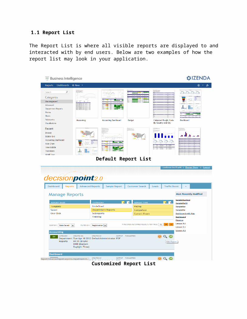
1.1 Report List
The Report List is where all visible reports are displayed to and interacted with by end users. Below are two examples of how the report list may look in your application.
Default Report List
Customized Report List

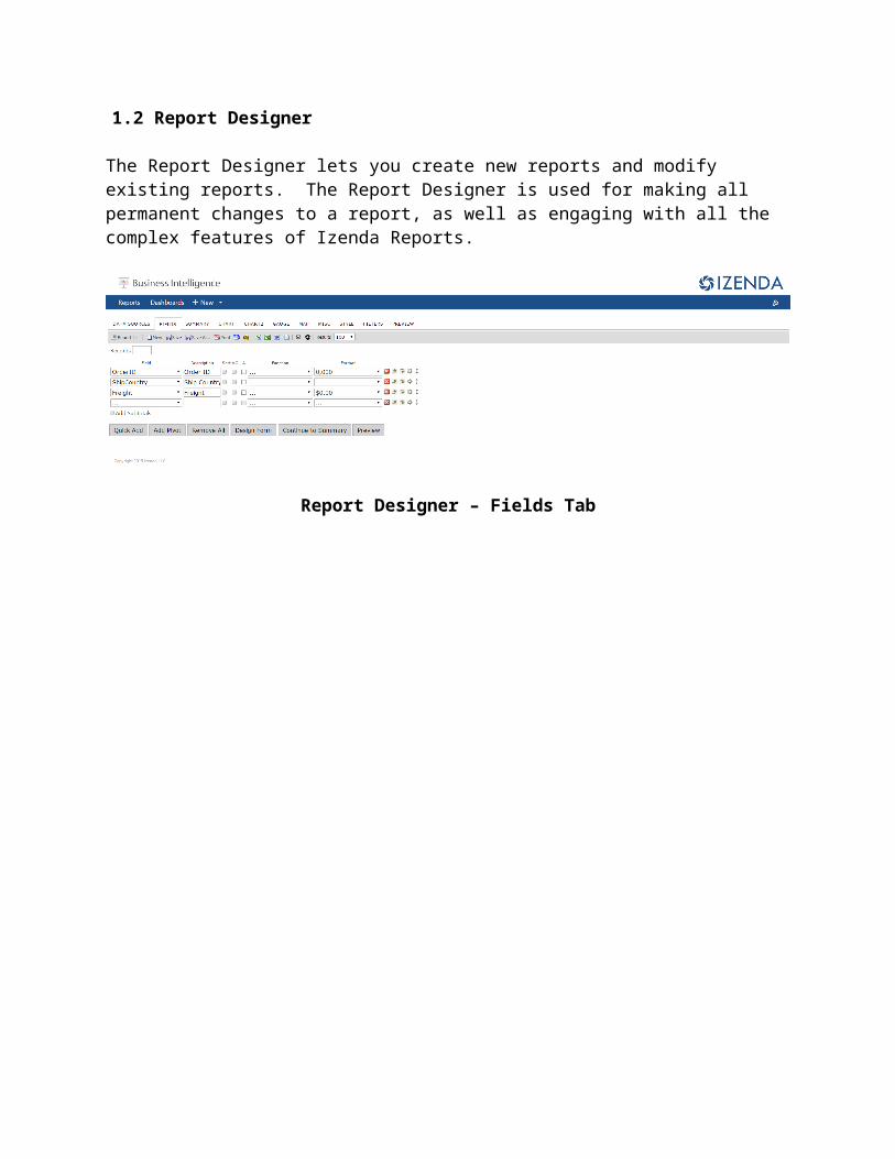
1.2 Report Designer
The Report Designer lets you create new reports and modify existing reports. The Report Designer is used for making all permanent changes to a report, as well as engaging with all the complex features of Izenda Reports.
Report Designer – Fields Tab
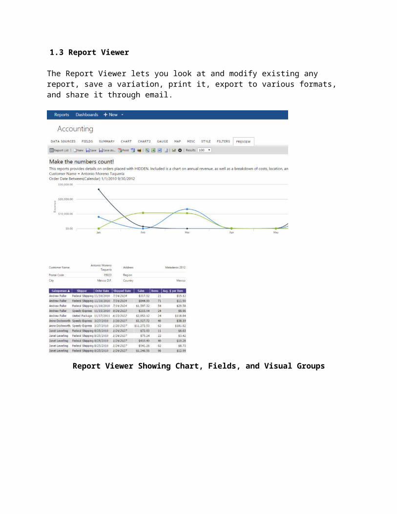
1.3 Report Viewer
The Report Viewer lets you look at and modify existing any report, save a variation, print it, export to various formats, and share it through email.
Report Viewer Showing Chart, Fields, and Visual Groups
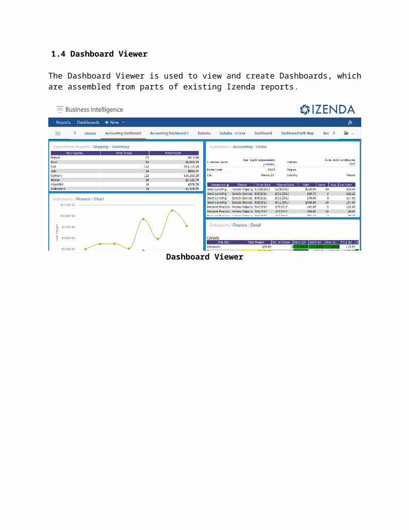
1.4 Dashboard Viewer
The Dashboard Viewer is used to view and create Dashboards, which are assembled from parts of existing Izenda reports.
Dashboard Viewer
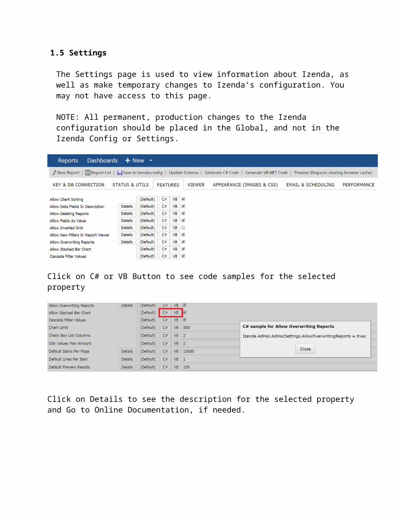
1.5 Settings
The Settings page is used to view information about Izenda, as well as make temporary changes to Izenda’s configuration. You may not have access to this page.
NOTE: All permanent, production changes to the Izenda configuration should be placed in the Global, and not in the Izenda Config or Settings.
Click on C# or VB Button to see code samples for the selected property
Click on Details to see the description for the selected property and Go to Online Documentation, if needed.
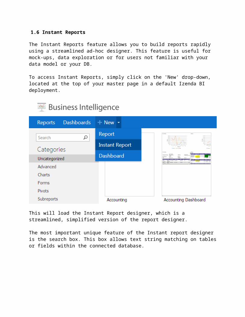
1.6 Instant Reports
The Instant Reports feature allows you to build reports rapidly using a streamlined ad-hoc designer. This feature is useful for mock-ups, data exploration or for users not familiar with your data model or your DB.
To access Instant Reports, simply click on the 'New' drop-down, located at the top of your master page in a default Izenda BI deployment.
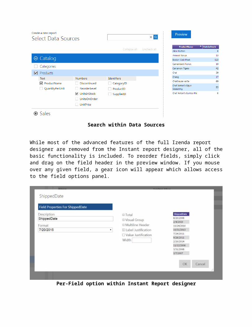
This will load the Instant Report designer, which is a streamlined, simplified version of the report designer. The most important unique feature of the Instant report designer is the search box. This box allows text string matching on tables or fields within the connected database.
Search within Data Sources
While most of the advanced features of the full Izenda report designer are removed from the Instant report designer, all of the basic functionality is included. To reorder fields, simply click and drag on the field header in the preview window. If you mouse over any given field, a gear icon will appear which allows access to the field options panel.
Per-Field option within Instant Report designer

The options accessible here are as follows:
Description – Changes the text label applied to the column header for this field.
Format – Allows different ways to display the same value from a field, as with the standard Izenda designer. For example, the value 2.1 can be displayed as 2, 2.1, 2.10, or 210%.
Total – Applies the SUM() aggregate to this field. This field also applies a subtotal at the bottom of the field display.
Visual Group – Applies a simple visual group format to the report. Values in this field will create their own subheaders, against which subordinate data is displayed.
Label Justification – Changes the justification of the column header between Left, Right, and Middle.
Value Justification – Changes the justification of the cell value between Left, Right, and Middle.
At the bottom of the Instant report designer, the user can access the full report designer by clicking Design Report or the report viewer by clicking View Report. If the user clicks Design Report, the entire instant report as currently built will be transferred over into the full report designer. This step is necessary if one wishes to save the report, as there is no way to save a report from within the Instant report designer.
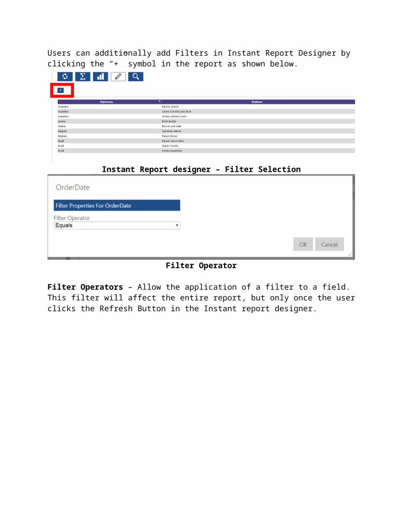
Users can additionally add Filters in Instant Report Designer by clicking the “+” symbol in the report as shown below.
Instant Report designer – Filter Selection
Filter Operator
Filter Operators – Allow the application of a filter to a field. This filter will affect the entire report, but only once the user clicks the Refresh Button in the Instant report designer.
2.0 REPORT LIST AND DASHBOARDS
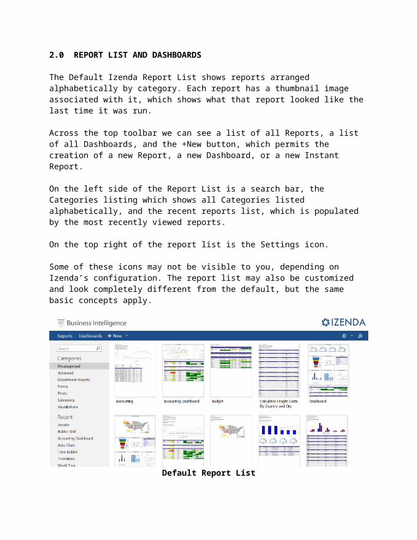
The Default Izenda Report List shows reports arranged alphabetically by category. Each report has a thumbnail image associated with it, which shows what that report looked like the last time it was run.
Across the top toolbar we can see a list of all Reports, a list of all Dashboards, and the +New button, which permits the creation of a new Report, a new Dashboard, or a new Instant Report.
On the left side of the Report List is a search bar, the Categories listing which shows all Categories listed alphabetically, and the recent reports list, which is populated by the most recently viewed reports.
On the top right of the report list is the Settings icon.
Some of these icons may not be visible to you, depending on Izenda’s configuration. The report list may also be customized and look completely different from the default, but the same basic concepts apply.
Default Report List
2.1 Report Tiles
Mousing over an individual report tile makes certain buttons appear. Clicking anywhere on the report tile other than these icons loads this report in the Report Viewer.
The top right X icon deletes a report, assuming you have permission to do so. If not, this button may not appear.
The bottom right pencil icon takes you directly to the Report Designer, assuming you have permission to access it. If not, this button may not appear.
The bottom printer icon prints the report directly, as it was the last time it was refreshed.
Report Tile and Icons
2.2 Categories
Categories are internal organizational structures which Izenda uses to help you keep track of your reports. When a report is saved, you will have the option to create a new category or to save a report in an existing category. Categories do not exist objectively, they only exist in relation to an object stored within them – in other words, if there are no reports or dashboards within a category, that category will be culled. If reports are not visible to you because of security or permissions settings, then those categories will also not be visible.
In File System storage mode, categories will create appropriate folders in the Reports location. In Database storage mode, categories are stored in the report name - for example “My Category/My Report” would be the full name of a report.
2.3 Dashboards
Dashboards are collections of report parts. You can pull one or more parts of one or more Izenda reports into a dashboard and arrange them in a custom manner.
2.3.1 View an Existing DashboardClick on ‘Dashboards’ on the Navigation Bar. Dashboards will be displayed as tabs in the window with the active Dashboard tab highlighted.
Navigation Bar
Dashboards will also appear in the default Report List alongside reports. You can save Dashboards in their own categories in order to keep them distinct from reports.
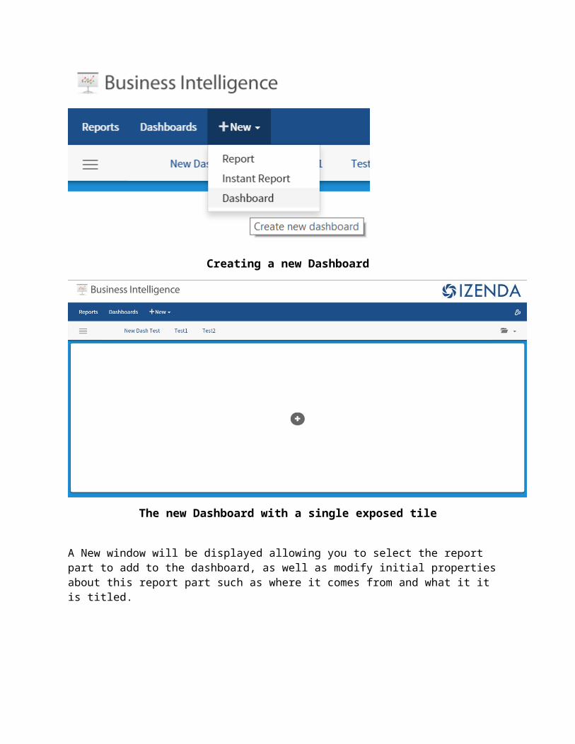
2.3.2 Create a New DashboardClick on the arrow to expose the drop down menu under ‘New’, then select Dashboard from the Menu drop down, or click on the three horizontal line icon and click the plus sign for New Dashboard.
A New Blank Dashboard will be exposed with a single blank tile. Click on the + sign to add a Report Part to the initial tile.

Creating a new Dashboard
The new Dashboard with a single exposed tile
A New window will be displayed allowing you to select the report part to add to the dashboard, as well as modify initial properties about this report part such as where it comes from and what it it is titled.

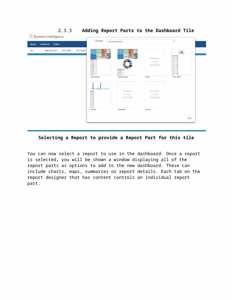
2.3.3 Adding Report Parts to the Dashboard Tile
Selecting a Report to provide a Report Part for this tile
You can now select a report to use in the dashboard. Once a report is selected, you will be shown a window displaying all of the report parts as options to add to the new dashboard. These can include charts, maps, summaries or report details. Each tab on the report designer that has content controls an individual report part.
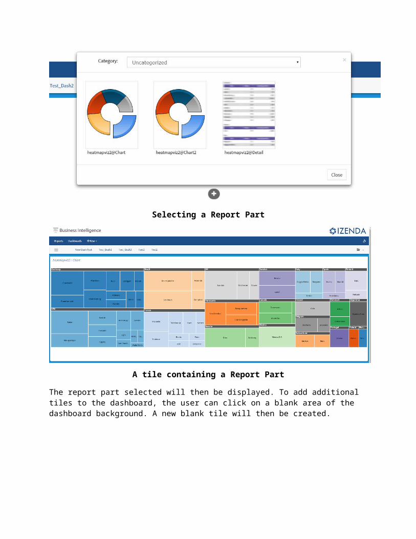
Selecting a Report Part
A tile containing a Report Part
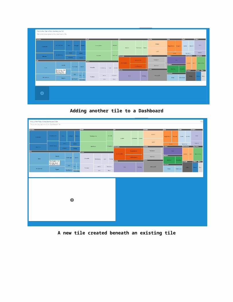
The report part selected will then be displayed. To add additional tiles to the dashboard, the user can click on a blank area of the dashboard background. A new blank tile will then be created.
Adding another tile to a Dashboard

A new tile created beneath an existing tile
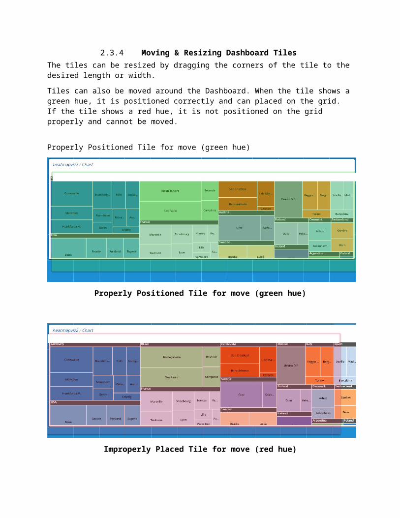
2.3.4 Moving & Resizing Dashboard TilesThe tiles can be resized by dragging the corners of the tile to the desired length or width.
Tiles can also be moved around the Dashboard. When the tile shows a green hue, it is positioned correctly and can placed on the grid. If the tile shows a red hue, it is not positioned on the grid properly and cannot be moved.
Properly Positioned Tile for move (green hue)
Properly Positioned Tile for move (green hue)
Improperly Placed Tile for move (red hue)
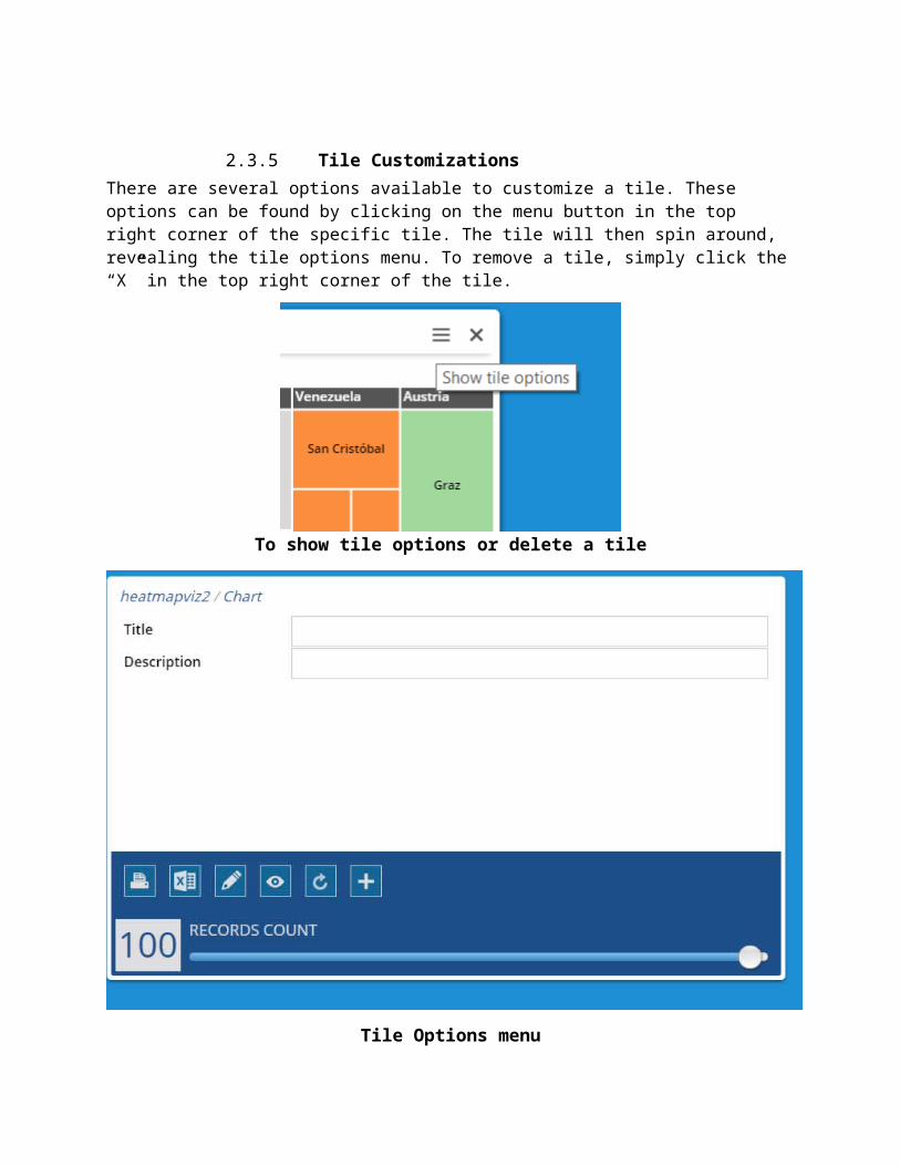
2.3.5 Tile CustomizationsThere are several options available to customize a tile. These options can be found by clicking on the menu button in the top right corner of the specific tile. The tile will then spin around, revealing the tile options menu. To remove a tile, simply click the “X” in the top right corner of the tile.
To show tile options or delete a tile
Tile Options menu
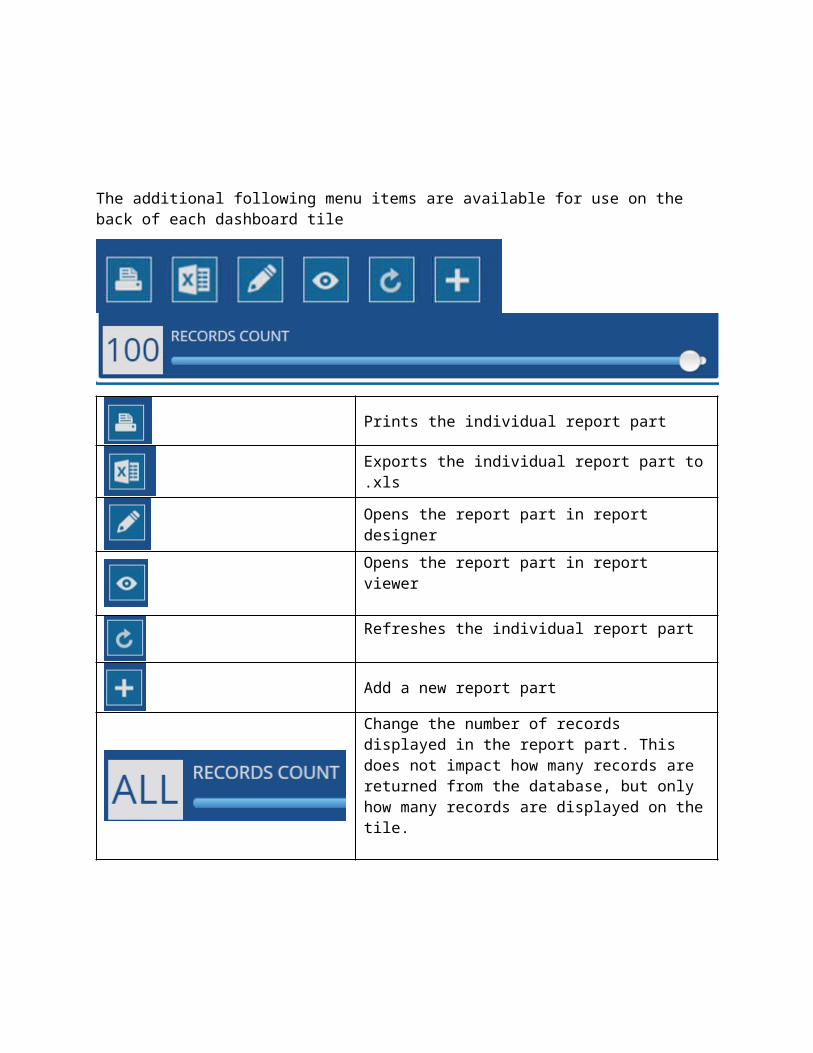
The additional following menu items are available for use on the back of each dashboard tile
Prints the individual report part
Exports the individual report part to .xls
Opens the report part in report designer
Opens the report part in report viewer
Refreshes the individual report part
Add a new report part
Change the number of records displayed in the report part. This does not impact how many records are returned from the database, but only how many records are displayed on the tile.
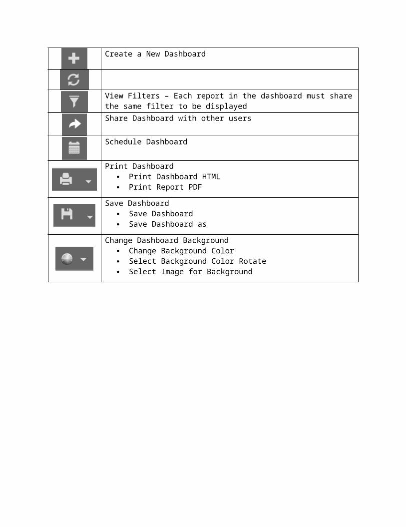
2.3.6 Main Dashboard MenuThis menu offers the following menu options are available from the menu button in the top left navigation bar when expanded
Collapse Menu
Presentation Mode – Allows the user to scroll through the Dashboard tiles in a carousel
Create a New Dashboard
View Filters – Each report in the dashboard must share the same filter to be displayed
Share Dashboard with other users
Schedule Dashboard
Print Dashboard Print Dashboard HTML Print Report PDF
Save Dashboard Save Dashboard
Save Dashboard as
Change Dashboard Background Change Background Color Select Background Color Rotate Select Image for Background
3.0 DATA SOURCES TAB
The Data Sources tab shows you which Tables or Views you have access to from the database. Your system administrator can set up the interface to simplify the data selection process, so you do not have to know the underlying data model.
Izenda treats all tables, views, and stored procedures as data sources. The list of data sources visible to you may not be all the data sources in the database – sources can be made visible or invisible on a per-user basis. Stored procedures are marked with an (SP), because they must be passed parameters by the user via one or more filters.
Any data source(s) selected for a report will make all columns within those sources accessible in the report designer. A report does not need to use all of these columns, they are simply made available for use.
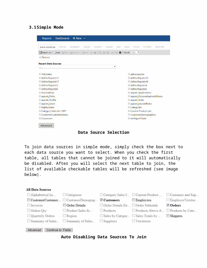
3.1 Simple Mode
Data Source Selection
To join data sources in simple mode, simply check the box next to each data source you want to select. When you check the first table, all tables that cannot be joined to it will automatically be disabled. After you will select the next table to join, the list of available checkable tables will be refreshed (see image below).
Auto Disabling Data Sources To Join

3.2 Advanced Mode
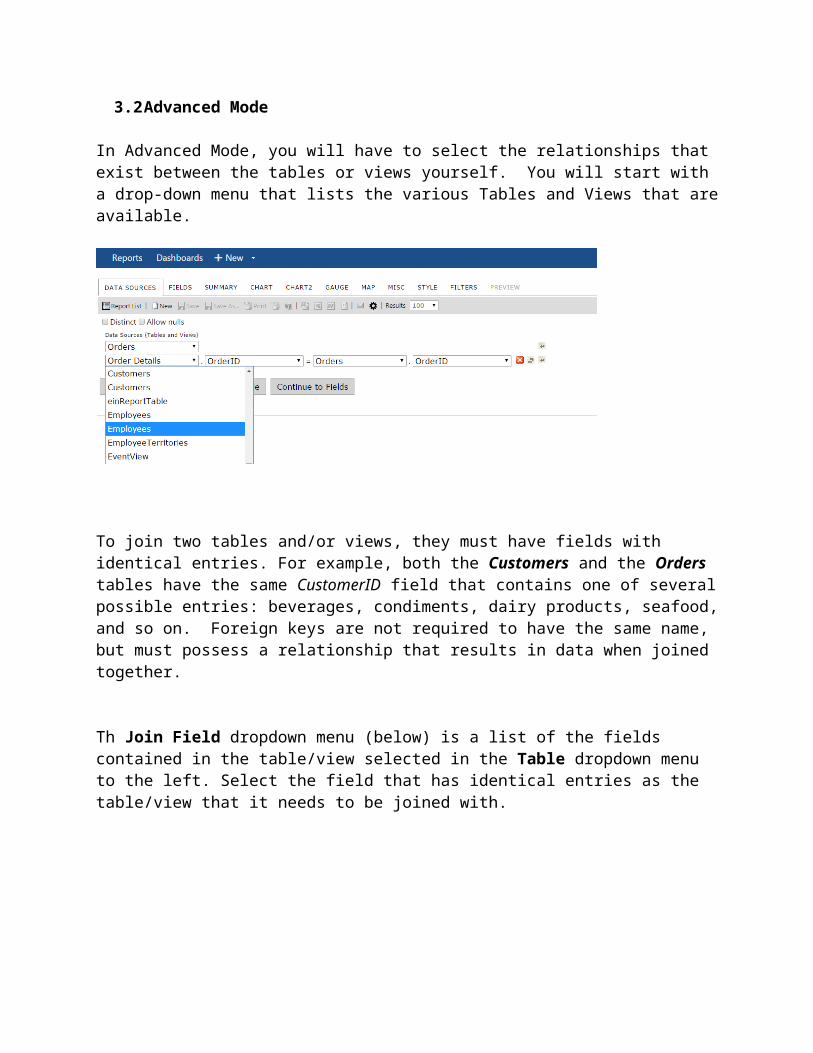
In Advanced Mode, you will have to select the relationships that exist between the tables or views yourself. You will start with a drop-down menu that lists the various Tables and Views that are available.
To join two tables and/or views, they must have fields with identical entries. For example, both the Customers and the Orders tables have the same CustomerID field that contains one of several possible entries: beverages, condiments, dairy products, seafood, and so on. Foreign keys are not required to have the same name, but must possess a relationship that results in data when joined together.
Th Join Field dropdown menu (below) is a list of the fields contained in the table/view selected in the Table dropdown menu to the left. Select the field that has identical entries as the table/view that it needs to be joined with.
Join Field Dropdown Menu
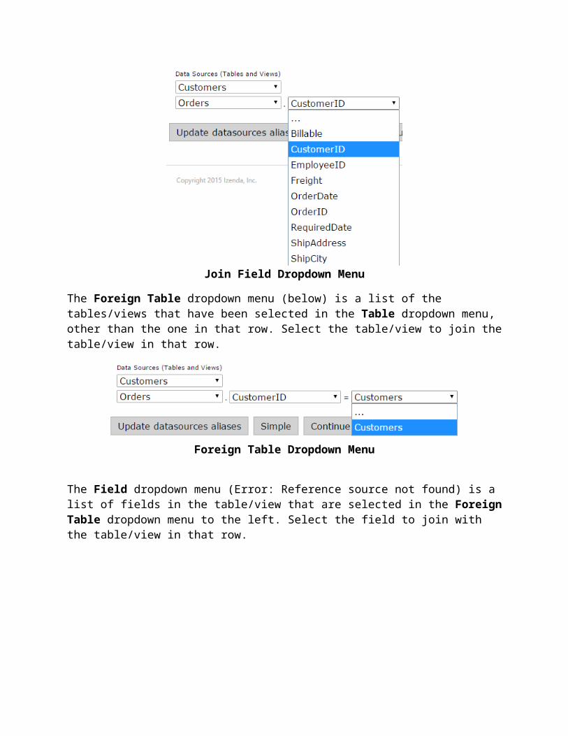
The Foreign Table dropdown menu (below) is a list of the tables/views that have been selected in the Table dropdown menu, other than the one in that row. Select the table/view to join the table/view in that row.
Foreign Table Dropdown Menu
The Field dropdown menu (Error: Reference source not found) is a list of fields in the table/view that are selected in the Foreign Table dropdown menu to the left. Select the field to join with the table/view in that row.

Field Dropdown Menu
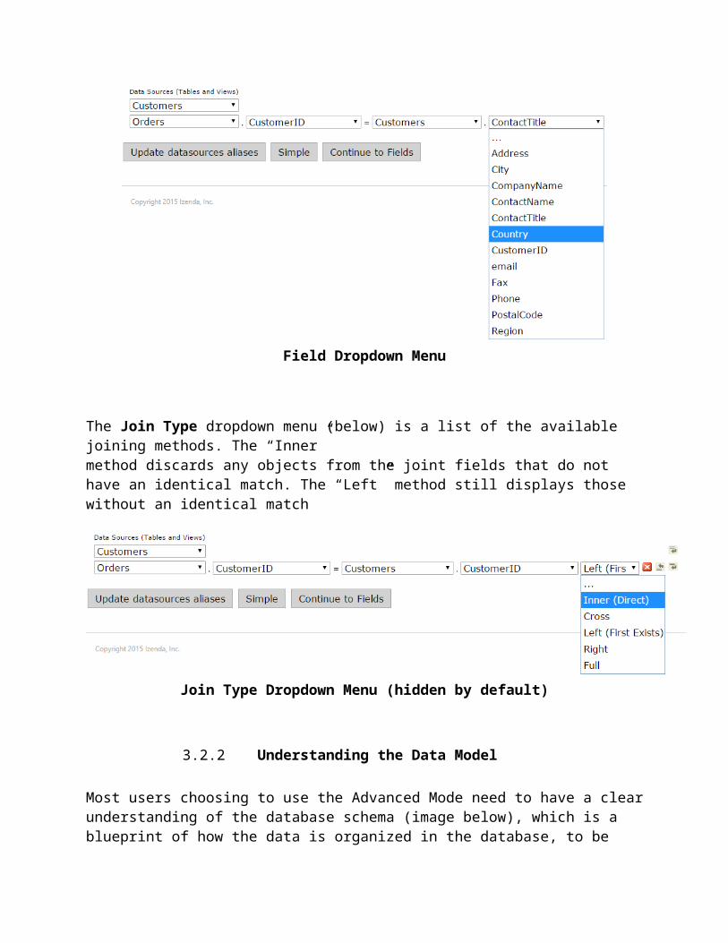
The Join Type dropdown menu (below) is a list of the available joining methods. The “Inner” method discards any objects from the joint fields that do not have an identical match. The “Left” method still displays those without an identical match
Join Type Dropdown Menu (hidden by default)
3.2.2 Understanding the Data Model
Most users choosing to use the Advanced Mode need to have a clear understanding of the database schema (image below), which is a blueprint of how the data is organized in the database, to be able to quickly join tables together. This mode does allow for greater flexibility in selecting the types of joins that can be performed, but is not recommended for most users.
Database Schema Diagram
3.2.3 Join Types
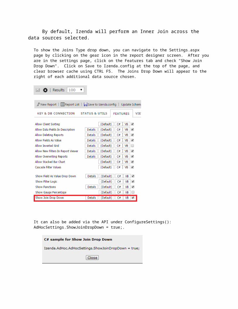
By default, Izenda will perform an Inner Join across the data sources selected.
To show the Joins Type drop down, you can navigate to the Settings.aspx page by clicking on the gear icon in the report designer screen. After you are in the settings page, click on the Features tab and check "Show Join Drop Down". Click on Save to Izenda.config at the top of the page, and clear browser cache using CTRL F5. The Joins Drop Down will appear to the right of each additional data source chosen.

It can also be added via the API under ConfigureSettings(): AdHocSettings.ShowJoinDropDown = true;.
SQL Code of chosen Join Types:
Inner (Direct) Join: Selects rows from two tables such that the value in one column of the first table also appears in a column of the second table.
SELECT DISTINCT [dbo].[Invoices].[CustomerName] AS 'Customer Name'FROM [dbo].[Orders]INNER JOIN [dbo].[Invoices] ON [dbo].[Invoices].[CustomerID]=[dbo].[Orders].[CustomerID];
Cross Join: A cross join will return a result table where each row from the first table is combined with each row from the second table.
SELECT DISTINCT [dbo].[Invoices].[CustomerName] AS 'Customer Name'FROM [dbo].[Orders]CROSS JOIN [dbo].[Invoices];
Left(First Exists) Join: The Left Outer Join known also as Left Join returns all rows from the left table in the Left Outer Join clause, no matter if the joined columns match. A field in a result row will be null if the corresponding input table did not contain a matching row.
SELECT DISTINCT [dbo].[Invoices].[CustomerName] AS 'Customer Name'
FROM [dbo].[Orders]LEFT OUTER JOIN [dbo].[Invoices] ON [dbo].[Invoices].[CustomerID]=[dbo].[Orders].[CustomerID];
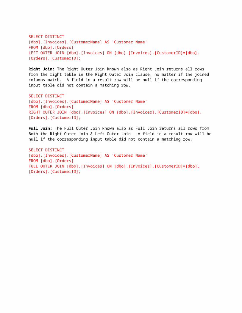
Right Join: The Right Outer Join known also as Right Join returns all rows from the right table in the Right Outer Join clause, no matter if the joined columns match. A field in a result row will be null if the corresponding input table did not contain a matching row.
SELECT DISTINCT [dbo].[Invoices].[CustomerName] AS 'Customer Name'FROM [dbo].[Orders]RIGHT OUTER JOIN [dbo].[Invoices] ON [dbo].[Invoices].[CustomerID]=[dbo].[Orders].[CustomerID];
Full Join: The Full Outer Join known also as Full Join returns all rows from Both the Right Outer Join & Left Outer Join. A field in a result row will be null if the corresponding input table did not contain a matching row.
SELECT DISTINCT [dbo].[Invoices].[CustomerName] AS 'Customer Name'FROM [dbo].[Orders]FULL OUTER JOIN [dbo].[Invoices] ON [dbo].[Invoices].[CustomerID]=[dbo].[Orders].[CustomerID];
3.2.4 Function Buttons of Data Sources Tab
Function Buttons
The , , , and function buttons are defined in Table 2 below.
Icons Control Name DescriptionDelete button Click this button to delete the row the
button is on.Insert Row button (above)
Click this button to insert a row above the row the button is on.
Insert Row button(below)
Click this button to insert a row below the row the button is on.
Insert Additional Join Condition
Click this button to insert a new row below the row to define an additional join condition between the two tables (example. CustomerID = CustomerID AND/OR OrderID=OrderID)
Function Buttons of Data Sources Tab

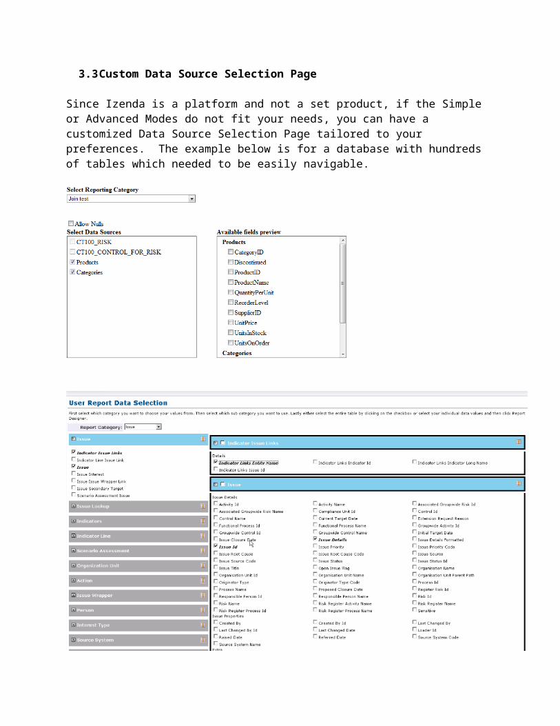
3.3 Custom Data Source Selection Page
Since Izenda is a platform and not a set product, if the Simple or Advanced Modes do not fit your needs, you can have a customized Data Source Selection Page tailored to your preferences. The example below is for a database with hundreds of tables which needed to be easily navigable.
4.0 FIELDS TAB
Fields Tab
After selecting the data sources you want to display, as in the previous step, continue to the Fields tab. In the Fields tab, you will choose which fields you want to display and be able to apply various formatting options.
Listed below is a brief description of the properties available in the main Fields tab screen.
Feature DescriptionField Selection Select fields from the drop-down menu or use the Quick Add buttonDescription Displays a new title for the FieldSort Sorts A - ZVG Visually Groups the FieldA Arithmetic – Performs basic calculations (+, -, x, %) and concatenation of text. Function Displays functions available based on the type of data being accessed. Format Displays the formats available to be displayed based on the data type.Other buttons On the far right you can delete, insert, move, or set advanced properties.

Records Sets the number of records to display, which is used many times to add a Top to the query result, such as Top 10 Customers by Revenue
Add Sub-total Adds a sub-total to the report under each numeric columnAdd Side-total Adds a side-total to the report beside each numeric rowQuick Add Lets you quickly add multiple fields to the report at one time Add Pivot Displays the pivot inputs to add to the reportContinue to Summary Continues to the next tab in the report design process, the Summary tab.
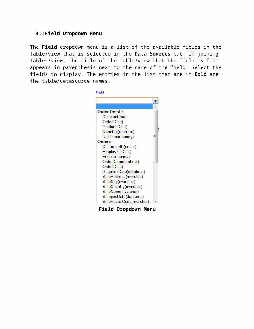
4.1 Field Dropdown Menu
The Field dropdown menu is a list of the available fields in the table/view that is selected in the Data Sources tab. If joining tables/view, the title of the table/view that the field is from appears in parenthesis next to the name of the field. Select the fields to display. The entries in the list that are in Bold are the table/datasource names.
Field Dropdown Menu

4.2 Description
Automatically Inputs the name of the associated Field. You have the option to change the description and it will appear as the new title when displayed.
Description
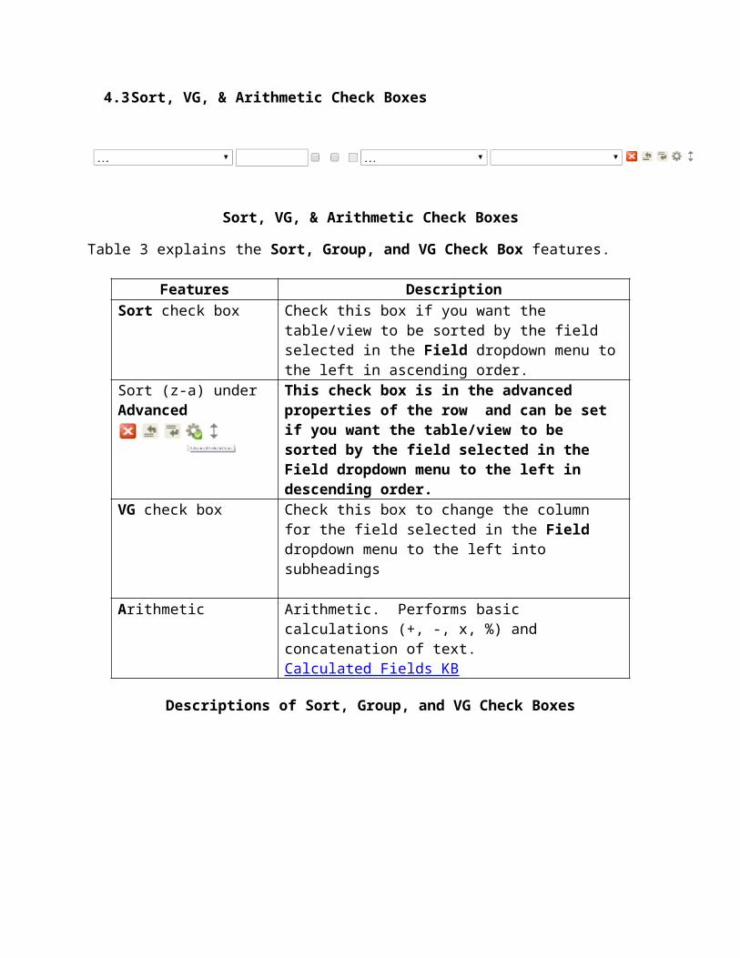
4.3 Sort, VG, & Arithmetic Check Boxes
Sort, VG, & Arithmetic Check Boxes
Table 3 explains the Sort, Group, and VG Check Box features.
Features DescriptionSort check box Check this box if you want the table/view to be sorted by
the field selected in the Field dropdown menu to the left in ascending order.
Sort (z-a) under Advanced
This check box is in the advanced properties of the row and can be set if you want the table/view to be sorted by the field selected in the Field dropdown menu to the left in descending order.
VG check box Check this box to change the column for the field selected in the Field dropdown menu to the left into subheadings
Arithmetic Arithmetic. Performs basic calculations (+, -, x, %) and concatenation of text.Calculated Fields KB
Descriptions of Sort, Group, and VG Check Boxes

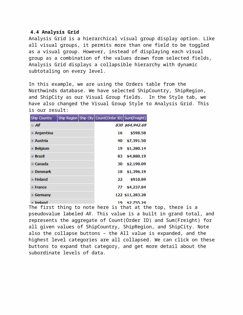
4.4 Analysis GridAnalysis Grid is a hierarchical visual group display option. Like all visual groups, it permits more than one field to be toggled as a visual group. However, instead of displaying each visual group as a combination of the values drawn from selected fields, Analysis Grid displays a collapsible hierarchy with dynamic subtotaling on every level.
In this example, we are using the Orders table from the Northwinds database. We have selected ShipCountry, ShipRegion, and ShipCity as our Visual Group fields. In the Style tab, we have also changed the Visual Group Style to Analysis Grid. This is our result:
The first thing to note here is that at the top, there is a pseudovalue labeled All. This value is a built in grand total, and represents the aggregate of Count(Order ID) and Sum(Freight) for all given values of ShipCountry, ShipRegion, and ShipCity. Note also the collapse buttons – the All value is expanded, and the highest level categories are all collapsed. We can click on these buttons to expand that category, and get more detail about the subordinate levels of data.

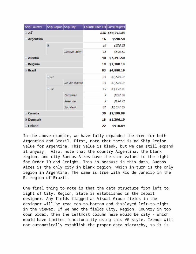
In the above example, we have fully expanded the tree for both Argentina and Brazil. First, note that there is no Ship Region value for Argentina. This value is blank, but we can still expand it anyway. Also, note that the country Argentina, the blank region, and city Buenos Aires have the same values to the right for Order ID and Freight. This is because in this data, Buenos Aires is the only city in blank region, which in turn is the only region in Argentina. The same is true with Rio de Janeiro in the RJ region of Brazil.
One final thing to note is that the data structure from left to right of City, Region, State is established in the report designer. Any fields flagged as Visual Group fields in the designer will be read top-to-bottom and displayed left-to-right in the viewer. If we had the fields City, Region, Country in top down order, then the leftmost column here would be city – which would have limited functionality using this VG style. Izenda will not automatically establish the proper data hierarchy, so it is important for the user to understand the data and how fields relate to one another to prevent top-down information from being displayed bottom-up.

4.5 Field Order and Advanced Field Controls
Table 4 describes the function buttons of the Fields tab.
Icons Control Name DescriptionDelete button Click this button to delete the row the button is on.
Insert Row button (above)
Click this button to insert a row above the row the button is on.
Insert Row button (below)
Click this button to insert a row below the row the button is on.
Move Allows user to move a row up or down in the list
Advanced Properties
Advanced properties for that row.
Table 4 Function Buttons of Fields Tab

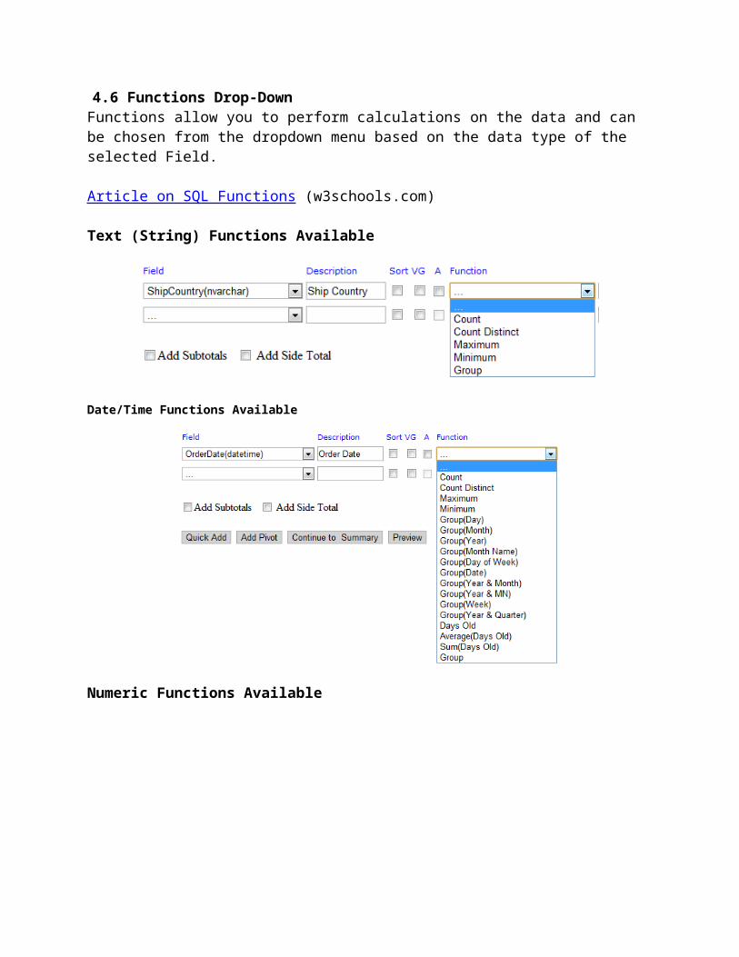
4.6 Functions Drop-Down Functions allow you to perform calculations on the data and can be chosen from the dropdown menu based on the data type of the selected Field. Article on SQL Functions (w3schools.com)
Text (String) Functions Available
Date/Time Functions Available
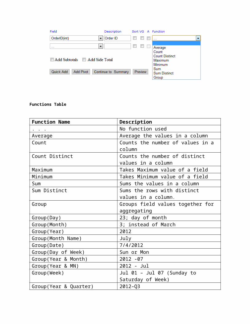
Numeric Functions Available
Functions Table
Function Name Description. . . No function usedAverage Average the values in a columnCount Counts the number of values in a columnCount Distinct Counts the number of distinct values in a columnMaximum Takes Maximum value of a fieldMinimum Takes Minimum value of a fieldSum Sums the values in a column Sum Distinct Sums the rows with distinct values in a column. Group Groups field values together for aggregatingGroup(Day) 23; day of monthGroup(Month) 3; instead of MarchGroup(Year) 2012Group(Month Name) JulyGroup(Date) 7/4/2012Group(Day of Week) Sun or MonGroup(Year & Month) 2012 -07Group(Year & MN) 2012 - JulGroup(Week) Jul 01 – Jul 07 (Sunday to Saturday of Week)Group(Year & Quarter) 2012–Q3Days Old 342 (Number of Days from Today’s Date)Sum(Days Old) 782 (Sums the Number of Days from Todays
Date)
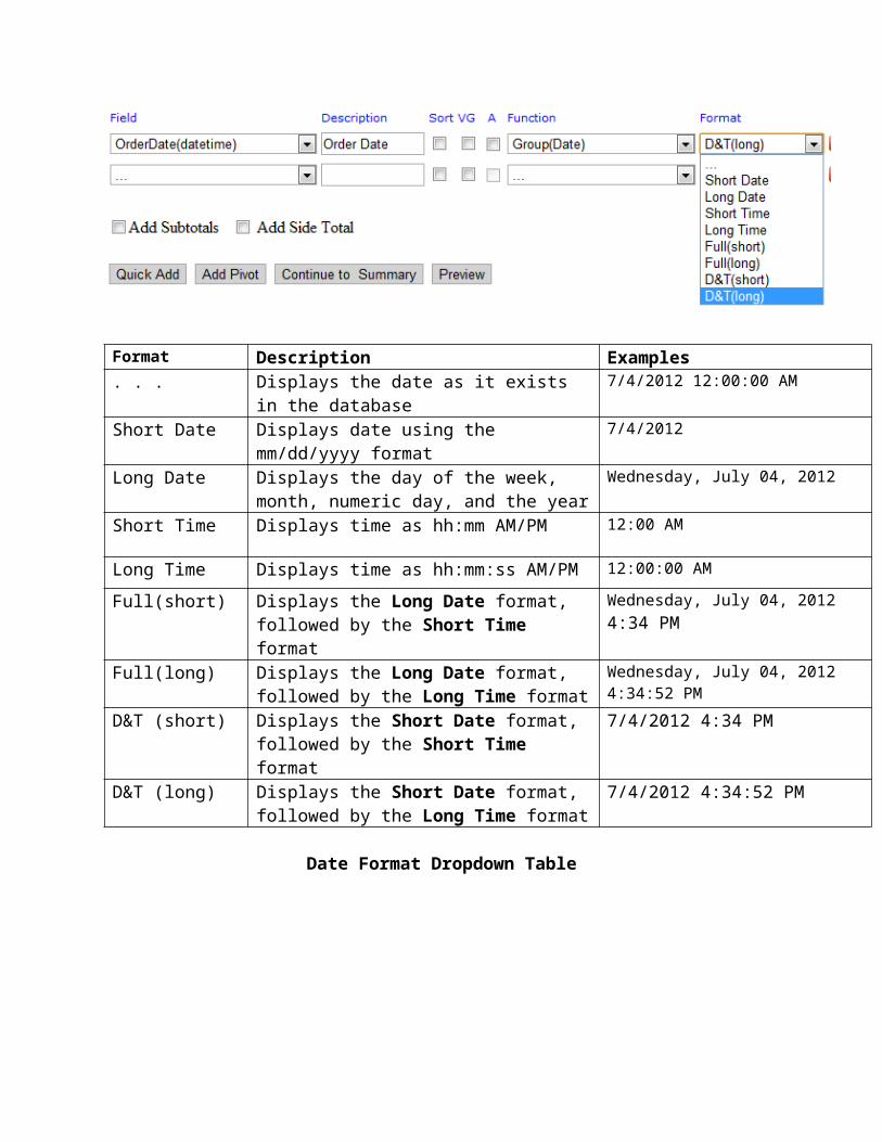
4.7 Format Dropdown Menu
The Format dropdown menu is a list of formats for the entries of the field selected in the Field dropdown menu directly to the left to appear in. Depending on the Field data type and the function, you will have differing options for formatting. The main two formats used will be available for all numbers and dates.
Format Dropdown Menu
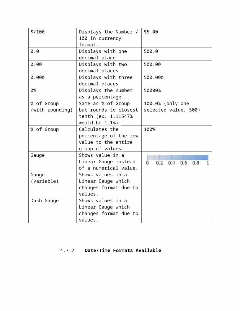
4.7.1 Numeric Formats Available
Format Description Examples. . . Displays the number as it is
stored in the database500
0,000 Displays as a whole number 500 0,000.00 Displays with two decimal
places500.00
$0.00 Displays as currency with two decimal places
$500.00
$/100 Displays the Number / 100 In currency format.
$5.00
0.0 Displays with one decimal place
500.0
0.00 Displays with two decimal places
500.00
0.000 Displays with three decimal places
500.000
0% Displays the number as a percentage
50000%
% of Group (with rounding)
Same as % of Group but rounds to closest tenth (ex. 1.11547% would be 1.1%).
100.0% (only one selected value, 500)
% of Group Calculates the percentage of the row value to the entire group of values.
100%
Gauge Shows value in a Linear Gauge instead of a numerical value.
Gauge (variable) Shows values in a Linear Gauge which changes format due to values.
Dash Gauge Shows values in a Linear Gauge which changes format due to values.
4.7.2 Date/Time Formats Available
Format Description Examples. . . Displays the date as it exists in the database 7/4/2012 12:00:00 AM
Short Date Displays date using the mm/dd/yyyy format 7/4/2012
Long Date Displays the day of the week, month, numeric day, and the year
Wednesday, July 04, 2012
Short Time Displays time as hh:mm AM/PM 12:00 AM
Long Time Displays time as hh:mm:ss AM/PM 12:00:00 AM

Full(short) Displays the Long Date format, followed by the Short Time format
Wednesday, July 04, 2012 4:34 PM
Full(long) Displays the Long Date format, followed by the Long Time format
Wednesday, July 04, 2012 4:34:52 PM
D&T (short) Displays the Short Date format, followed by the Short Time format
7/4/2012 4:34 PM
D&T (long) Displays the Short Date format, followed by the Long Time format
7/4/2012 4:34:52 PM
Date Format Dropdown Table

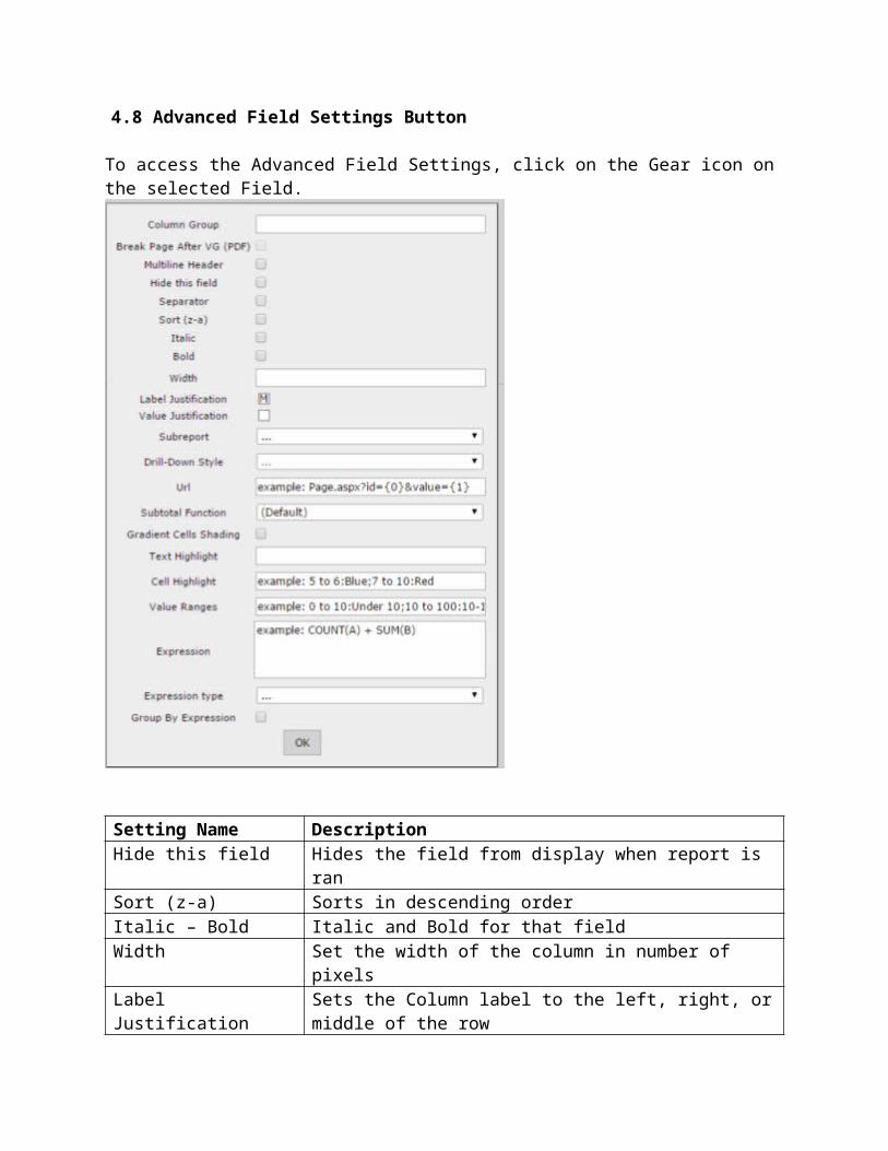
4.8 Advanced Field Settings Button
To access the Advanced Field Settings, click on the Gear icon on the selected Field.
Setting Name DescriptionHide this field Hides the field from display when report is ranSort (z-a) Sorts in descending orderItalic – Bold Italic and Bold for that fieldWidth Set the width of the column in number of pixelsLabel Justification Sets the Column label to the left, right, or middle of the row
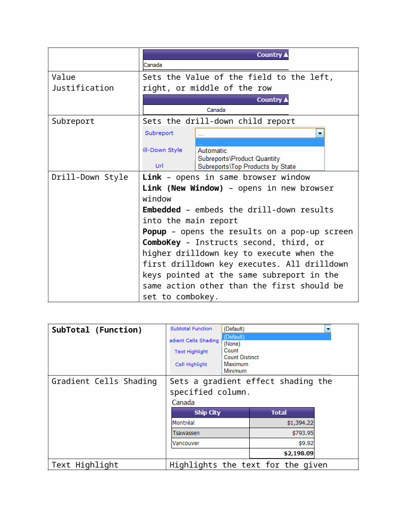
Value Justification Sets the Value of the field to the left, right, or middle of the row
Subreport Sets the drill-down child report
Drill-Down Style Link – opens in same browser windowLink (New Window) – opens in new browser windowEmbedded – embeds the drill-down results into the main reportPopup – opens the results on a pop-up screenComboKey – Instructs second, third, or higher drilldown key to execute when the first drilldown key executes. All drilldown keys pointed at the same subreport in the same action other than the first should be set to combokey.
SubTotal (Function)
Gradient Cells Shading Sets a gradient effect shading the specified column.
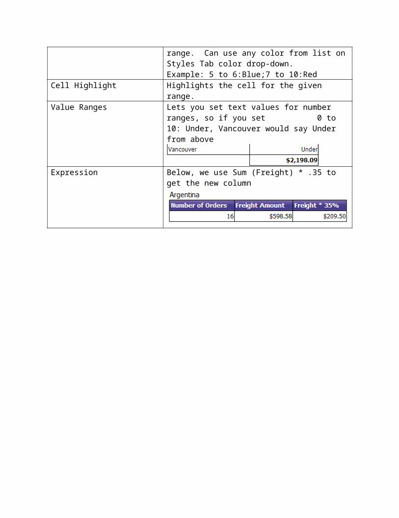
Text Highlight Highlights the text for the given range. Can use any color from list on Styles Tab color drop-down. Example: 5 to 6:Blue;7 to 10:Red
Cell Highlight Highlights the cell for the given range. Value Ranges Lets you set text values for number ranges, so if you set
0 to 10: Under, Vancouver would say Under from above
Expression Below, we use Sum (Freight) * .35 to get the new column
4.9 ExpressionsIn the Advanced Settings popup menu (accessed by clicking the gear icon on the right hand side of each field dialog in the Fields tab) we can see a text box called Expressions.
This box accepts simple code which allows us to perform calculations on fields provided by the connection string or view.
An expression cannot be run on another expression. Since there can only be one layer of expressions, to process complex multipart equations some amount of calculation must be done by using a computed column from within a view.
Expressions can:
Add, multiply, subtract, or divide two or more existing fields Convert integers into ratios based on other numerator/denominator fields Concatenate or add text to field output Apply conditional logic using case/when
Expressions cannot:
Create new ad-hoc fields Accept the input of another expression

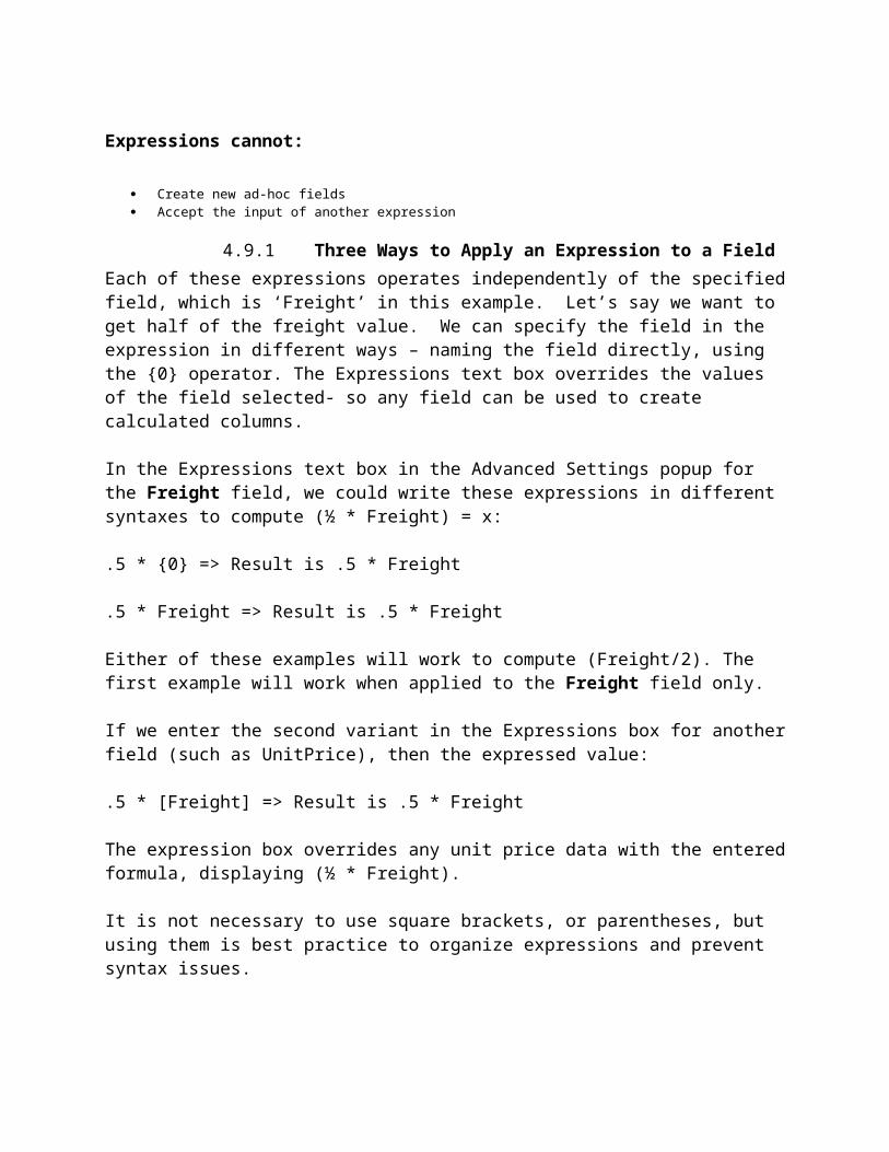
4.9.1 Three Ways to Apply an Expression to a FieldEach of these expressions operates independently of the specified field, which is ‘Freight’ in this example. Let’s say we want to get half of the freight value. We can specify the field in the expression in different ways – naming the field directly, using the {0} operator. The Expressions text box overrides the values of the field selected- so any field can be used to create calculated columns.
In the Expressions text box in the Advanced Settings popup for the Freight field, we could write these expressions in different syntaxes to compute (½ * Freight) = x:
.5 * {0} => Result is .5 * Freight
.5 * Freight => Result is .5 * Freight
Either of these examples will work to compute (Freight/2). The first example will work when applied to the Freight field only.
If we enter the second variant in the Expressions box for another field (such as UnitPrice), then the expressed value:
.5 * [Freight] => Result is .5 * Freight
The expression box overrides any unit price data with the entered formula, displaying (½ * Freight).
It is not necessary to use square brackets, or parentheses, but using them is best practice to organize expressions and prevent syntax issues.
4.9.2 Text ConcatenationWe can also use expressions to manipulate text. Let’s say that we have ShipCity, i.e. Berlin, as well as ShipCountry i.e. Germany. Using the following expression:
[ShipCity] + ‘, ‘ + [ShipCountry]

This would combine ‘Berlin’ and ‘Germany’ to ‘Berlin, Germany’. Note that in order to add text, we use single quotes. Anything between single quotes will appear exactly as typed, in this case a comma and single space.
In the same as in the example, we can add a static text denomination to a numerical value.
[Freight] + ‘USD’ -> xxxxUSD
We could also write:
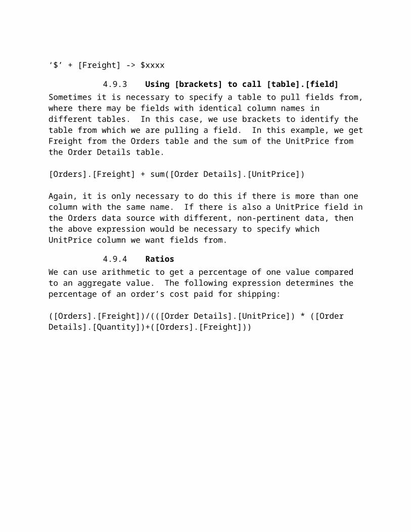
‘$’ + [Freight] -> $xxxx
4.9.3 Using [brackets] to call [table].[field]Sometimes it is necessary to specify a table to pull fields from, where there may be fields with identical column names in different tables. In this case, we use brackets to identify the table from which we are pulling a field. In this example, we get Freight from the Orders table and the sum of the UnitPrice from the Order Details table.
[Orders].[Freight] + sum([Order Details].[UnitPrice])
Again, it is only necessary to do this if there is more than one column with the same name. If there is also a UnitPrice field in the Orders data source with different, non-pertinent data, then
the above expression would be necessary to specify which UnitPrice column we want fields from.
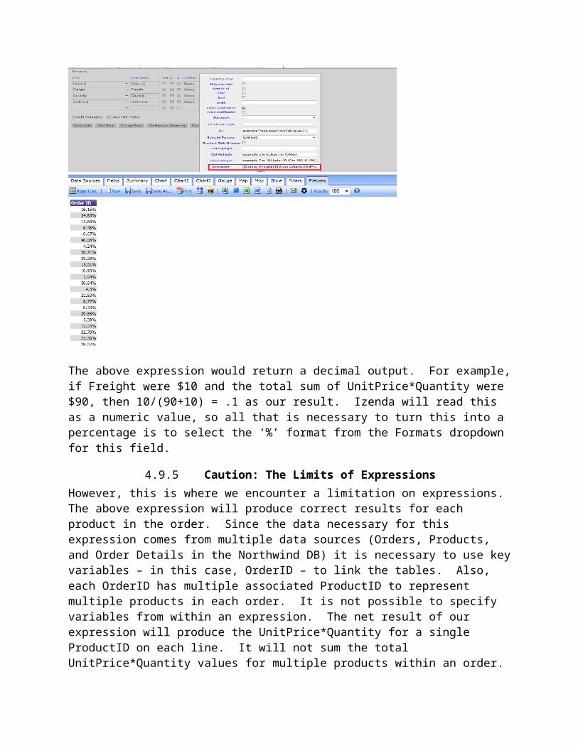
4.9.4 RatiosWe can use arithmetic to get a percentage of one value compared to an aggregate value. The following expression determines the percentage of an order’s cost paid for shipping:
([Orders].[Freight])/(([Order Details].[UnitPrice]) * ([Order Details].[Quantity])+([Orders].[Freight]))
The above expression would return a decimal output. For example, if Freight were $10 and the total sum of UnitPrice*Quantity were $90, then 10/(90+10) = .1 as our result. Izenda will read this as a numeric value, so all that is necessary to turn this into a percentage is to select the ‘%’ format from the Formats dropdown for this field.
4.9.5 Caution: The Limits of ExpressionsHowever, this is where we encounter a limitation on expressions. The above expression will produce correct results for each product in the order. Since the data necessary for this expression comes from multiple data sources (Orders, Products, and Order Details in the Northwind DB) it is necessary to use key variables – in this case, OrderID – to link the tables. Also, each OrderID has multiple associated ProductID to represent multiple products in each order. It is not possible to specify variables from within an expression. The net result of our expression will produce the UnitPrice*Quantity for a single ProductID on each line. It will not
sum the total UnitPrice*Quantity values for multiple products within an order.
If we break the total equation into steps, the problem becomes clearer:
Step 1: Calculate UnitPrice*Quantity for each ProductID within an OrderID.
Step 2: Sum these calculated values into a hypothetical TotalUnitPrice for the OrderID.
Step 3: Add Freight to TotalUnitPrice and divide Freight by this value to get a percentage freight cost of total order cost.
Since expressions cannot create fields, but only display calculations based on fields, expressions cannot execute step 2. Steps 1 and 2 should be calculated in a view, which would create a computed column that can be used in an expression for step 3.
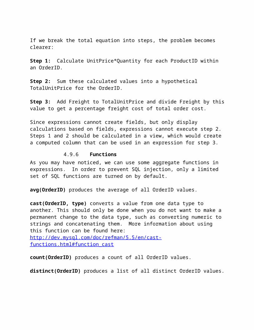
4.9.6 FunctionsAs you may have noticed, we can use some aggregate functions in expressions. In order to prevent SQL injection, only a limited set of SQL functions are turned on by default.
avg(OrderID) produces the average of all OrderID values.
cast(OrderID, type) converts a value from one data type to another. This should only be done when you do not want to make a permanent change to the data type, such as converting numeric to strings and concatenating them. More information about using this function can be found here:http://dev.mysql.com/doc/refman/5.5/en/cast-functions.html#function_cast
count(OrderID) produces a count of all OrderID values.
distinct(OrderID) produces a list of all distinct OrderID values.
isnull(OrderID, x) checks to see if there is a null value in OrderID and replaces it with ‘x’.
length(OrderID) returns the length of a string. Length is used with an Oracle db. If you’re using SQL, see len(OrderID).
len(OrderID) returns the length of a string. Len is used with a SQL db. If you’re using Oracle, see length(OrderID).
max(OrderID) produces the maximum OrderID value within a given range.
min(OrderID) produces the minimum OrderID value within a given range.
round(OrderID, x) takes a decimal value and rounds it to x digits.
sum(OrderID) produces the sum of all OrderID values.
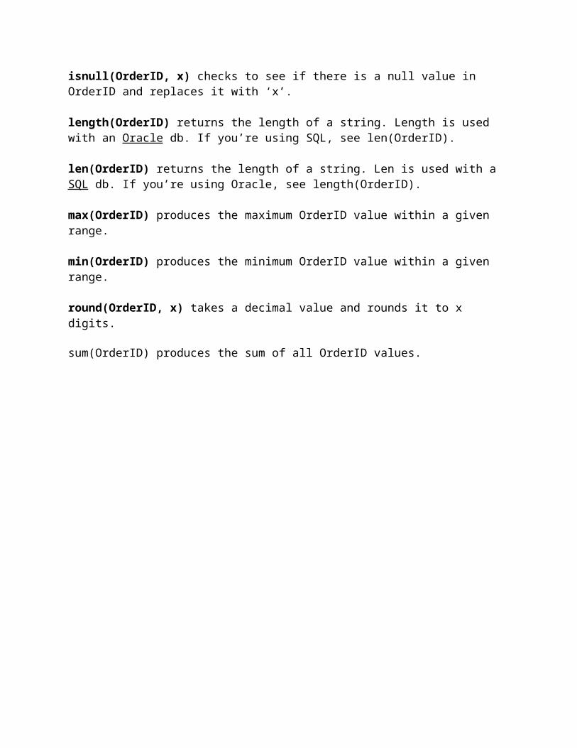
4.10 Quick Add
Quick Add lets you add multiple fields to the report at one time by selecting from a list.
Fields Quick Add
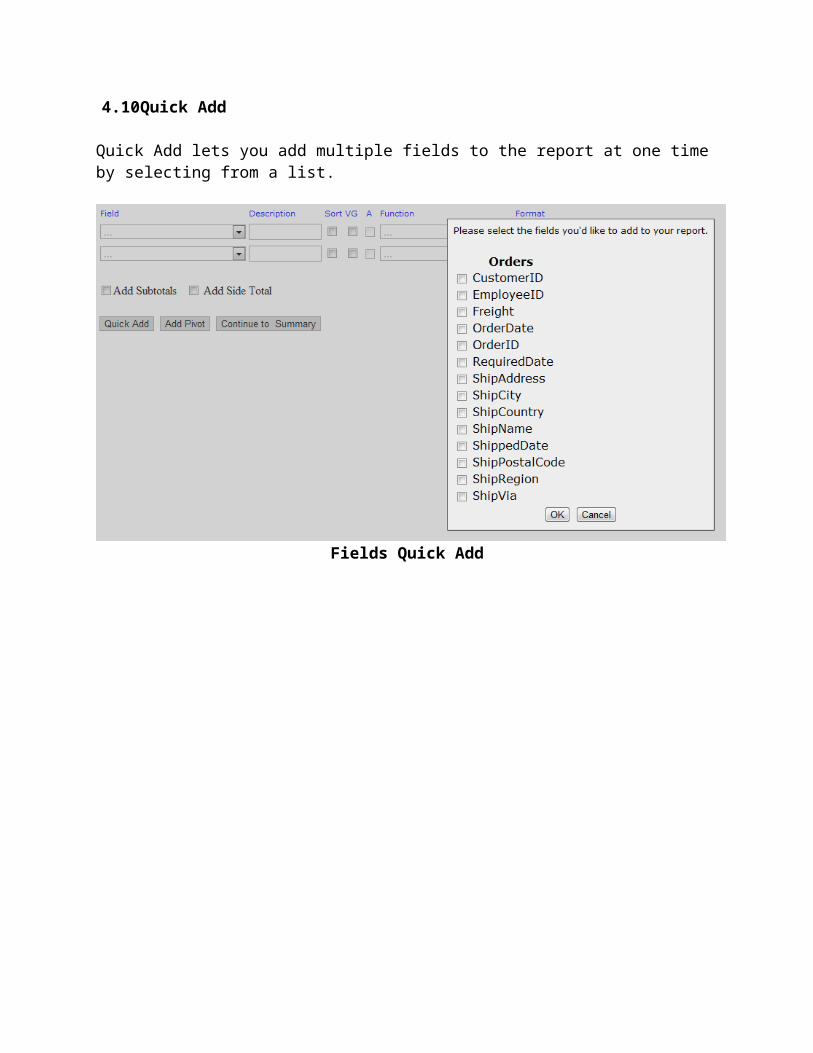
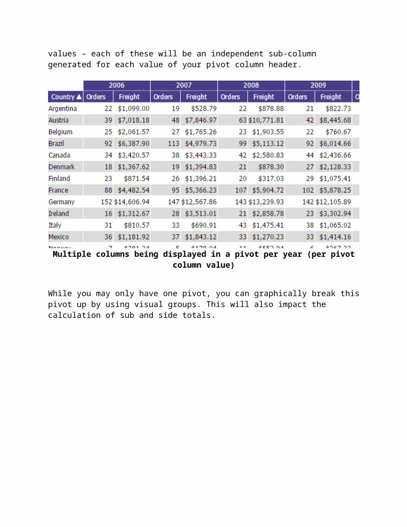
4.11 Add Pivot
Add Pivot lets you generate a pivot attached to the right side of the tabular report. This pivot is always on the right side of the fields tab – nothing is further to the right of the pivot. You may add one and only one pivot on the fields tab, meaning that you may have one and only one pivot per report.
The first thing you must do is select the pivot columns. Values in this field will be used to generate the main columns in your pivot. You can thing of this as rotating an entire field 90 degrees, from vertical to horizontal.
Left: Unpivoted tabular data by country by year. Right: Data by country, pivoted by year
You must then select at least one column to calculate cell values. These are the values which will be displayed inside of the pivot. You may select more than one column to calculate cell values – each of these will be an independent sub-column generated for each value of your pivot column header.

Multiple columns being displayed in a pivot per year (per pivot column value)
While you may only have one pivot, you can graphically break this pivot up by using visual groups. This will also impact the calculation of sub and side totals.
A pivot being divided by visual grouping
4.12 Izenda FormsIzenda FORMS is an add-on to Izenda REPORTS, Izenda’s core reporting and business intelligence platform. Izenda connects directly to relational and non-relational data sources. Through its .NET API, it loosely couples with Microsoft-based applications to integrate with the current security, branding, and navigation of your .NET applications.
Izenda FORMS allows the user to input HTML5 into a browser-based HTML designer and then use that code to build an Izenda form report. Izenda’s point-and-click interface is designed for the standard business user, with advanced options available for those with greater access and skill. Izenda FORMS is one of these advanced options. Though a basic user can easily make changes to existing forms, designing new forms does require a user who is comfortable with HTML5. Many users will never design forms, but simply make modifications to current core forms.
It is important to note: Izenda FORMS will override the normal reporting behavior within Izenda when a form is attached to a report; the form is what the engine renders. To use a standard Izenda report in tandem with a form, you must call the report into the HTML form itself.
4.12.1 Introduction This user manual will walk you through the basic usage of the Izenda FORMS tool. Any data that your application developer has included in the database can be accessible to you in creating ad hoc forms.
A form is an HTML document which you populate with data from a database. As an example, let’s think of a form letter sent to every customer. The letter has fixed copy, but also dynamic portions such as recipient name, address, etc. If you have a database which contains those dynamic elements, then you can insert them directly into the fixed portion in order to produce publishable output.
The default behavior of forms is to generate one entry per ‘row’ of data until all rows are generated or a user-defined limit is reached.
4.12.2 Starting a Forms ReportTo create a form-based report using Izenda FORMS, simply click ‘Design Report’ as you would to create any report using Izenda. Once you are in the ‘Data Sources’ tab, choose the relevant data sources.
Continue to the ‘Fields’ tab. Choose any relevant fields. You can use the ‘Format’ drop-down menu to execute data formats within the form you create. Izenda FORMS will allow you to choose fields to call into the form from any available inside the selected data-source without actually choosing them in the ‘Fields’ tab; when the form and report are saved and reloaded, FORMS will automatically populate the ‘Fields’ tab with the fields called in the form. FORMS will recognize aliases changed in the ‘Fields’ tab under ‘Description.’ For instance, a field named

‘OrderID’ and aliased as ‘Order#’ in the ‘Description’ column would be called within Izenda FORMS as [Order#]. Using the ‘Advanced’ button for each field, expressions or concatenations can be implemented into the fields called by FORMS.
Examples: [dbo].[Employees].[Address] + ', ' + [dbo].[Employees].
[City] => 111 Grand Ave, Atlanta
[Quantity] * [Price] => 5 * 10.50 => $52.50
After choosing relevant fields and adjusting formats in the ‘Fields’ tab, click ‘Design Form’ at the bottom of the ‘Fields’ list.
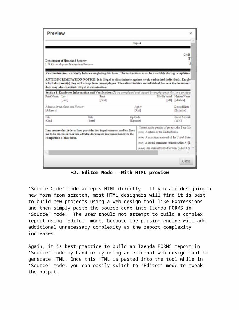
4.12.3 Building ReportsThe form designer has two modes: ‘Editor’ and ‘Source.’ Izenda’s form designer functions in the same manner as any browser based text editor when in ‘Editor’ mode. In this interface you can see a preview of rendered HTML and any user can make a quick customization or change. Changes made in ‘Editor’ mode are automatically parsed into HTML.
F1. ‘Editor’ Mode- Empty
F2. Editor Mode – With HTML preview
‘Source Code’ mode accepts HTML directly. If you are designing a new form from scratch, most HTML designers will find it is best to build new projects using a web design tool like Expressions and then simply paste the source code into Izenda FORMS in ‘Source’ mode. The user should not attempt to build a complex report using ‘Editor’ mode, because the parsing engine will add additional unnecessary complexity as the report complexity increases.
Again, it is best practice to build an Izenda FORMS report in ‘Source’ mode by hand or by using an external web design tool to generate HTML. Once this HTML is pasted into the tool while in ‘Source’ mode, you can easily switch to ‘Editor’ mode to tweak the output.
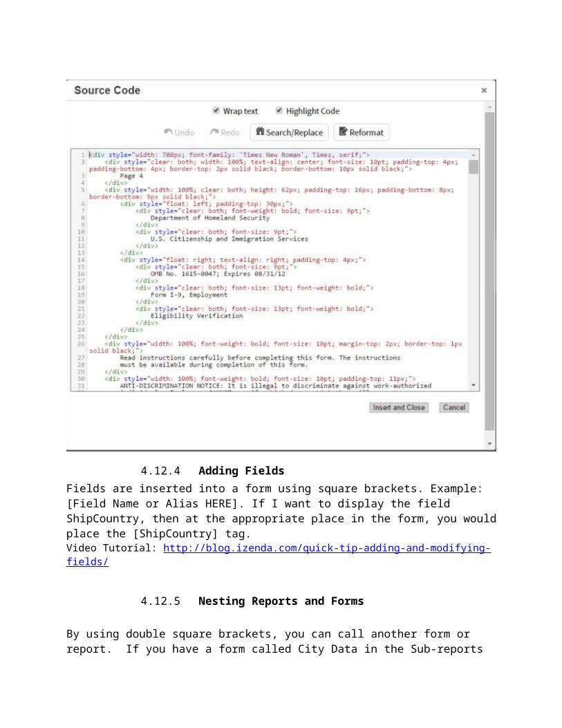
4.12.4 Adding FieldsFields are inserted into a form using square brackets. Example: [Field Name or Alias HERE]. If I want to display the field ShipCountry, then at the appropriate place in the form, you would place the [ShipCountry] tag.Video Tutorial: http://blog.izenda.com/quick-tip-adding-and-modifying-fields/
4.12.5 Nesting Reports and Forms
By using double square brackets, you can call another form or report. If you have a form called City Data in the Sub-reports folder, you would type [[Subreports/City Data]] in order to drop that form into the form you are building. This works whether the called report is a form or a non-form report.
Caution is recommended when designing nested sub-reports and forms. When you call a
report from inside of a master report, you are essentially using a query to run another query (and by result, all queries that might be contained within that nested query). It is thus possible to build a chain of nested reports that can cause severe performance issues. The flexibility of nesting reports and forms is most desirable for many small cases, in which sub-reports only exhibit a very small performance hit. Complex or multi-level nested reports may experience significant performance issues; in these cases it is best to find a way to achieve your goal without using sub-reports.
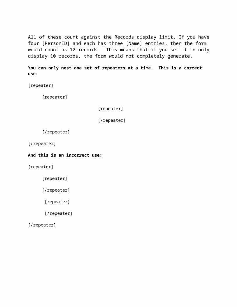
4.12.6 Repeater TagIf you have content that you want to repeat within a form, you don’t need to use a nested sub-form. By enclosing this content with the [repeater] tag, the forms engine will repeat that content until it is exhausted.
In this example, we would generate a table with 1+n rows. The first row is static and displays text in two cells. The second row is within a repeater, which means that it will generate n times where n is the number of valid [PersonID] entries. This repeater has a nested repeater in the second cell, which will populate all valid [Name] for each [PersonID].
<table> <tr> <td>Person</td> <td>Certs</td> </tr>[repeater] <tr> <td>[PersonID]</td> <td>[repeater][Name], [/repeater]</td> </tr>[/repeater]</table>
All of these count against the Records display limit. If you have four [PersonID] and each has three [Name] entries, then the form would count as 12 records. This means that if you set it to only display 10 records, the form would not completely generate.
You can only nest one set of repeaters at a time. This is a correct use:
[repeater]
[repeater]
[repeater]
[/repeater]
[/repeater]
[/repeater]
And this is an incorrect use:
[repeater]
[repeater]
[/repeater]
[repeater]
[/repeater]
[/repeater]
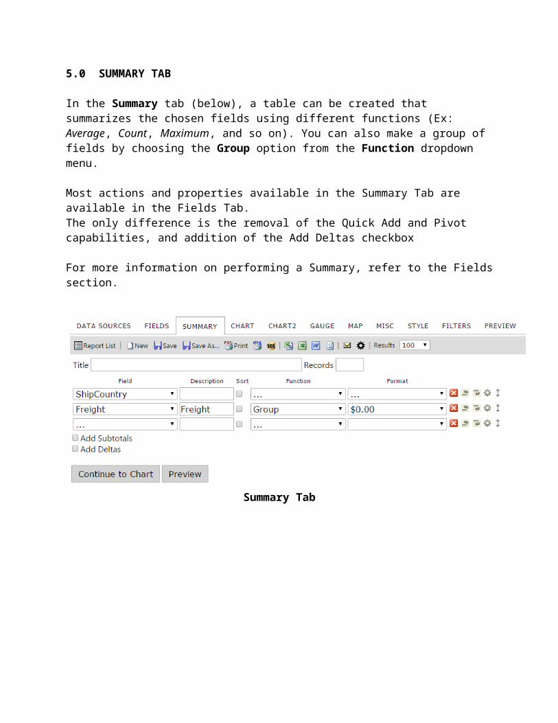
5.0 SUMMARY TAB
In the Summary tab (below), a table can be created that summarizes the chosen fields using different functions (Ex: Average, Count, Maximum, and so on). You can also make a group of fields by choosing the Group option from the Function dropdown menu.
Most actions and properties available in the Summary Tab are available in the Fields Tab. The only difference is the removal of the Quick Add and Pivot capabilities, and addition of the Add Deltas checkbox
For more information on performing a Summary, refer to the Fields section.
Summary Tab
Summary Results
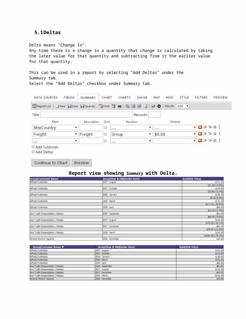
5.1 Deltas
Delta means "Change In". Any time there is a change in a quantity that change is calculated by taking the later value for that quantity and subtracting from it the earlier value for that quantity.
This can be used in a report by selecting "Add Deltas" under the Summary tab. Select the "Add Deltas" checkbox under Summary tab.
Report view showing Summary with Delta.
Result: The Deltas() show the change in the Unit Price over the period of time.
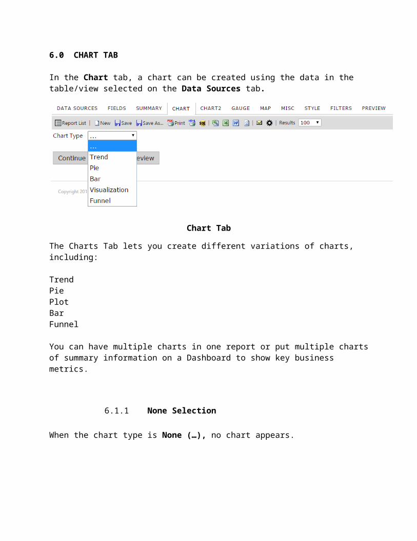
6.0 CHART TAB
In the Chart tab, a chart can be created using the data in the table/view selected on the Data Sources tab.
Chart Tab
The Charts Tab lets you create different variations of charts, including:
TrendPiePlotBarFunnel
You can have multiple charts in one report or put multiple charts of summary information on a Dashboard to show key business metrics.
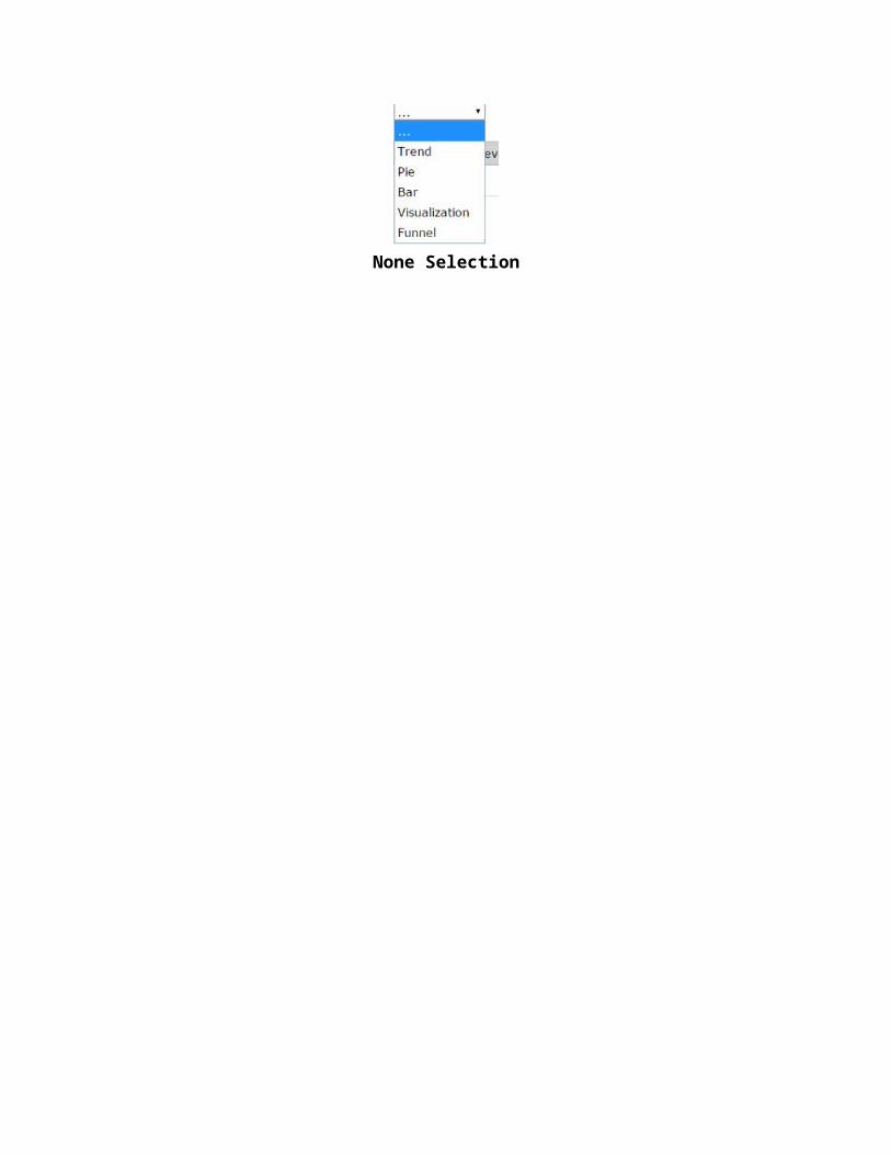
6.1.1 None Selection
When the chart type is None (…), no chart appears.
None Selection

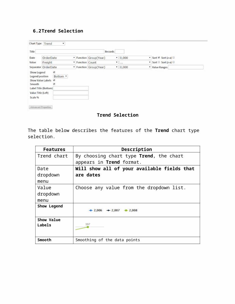
6.2 Trend Selection
Trend Selection
The table below describes the features of the Trend chart type selection.
Features DescriptionTrend chart By choosing chart type Trend, the chart appears in Trend format. Date dropdown menu
Will show all of your available fields that are dates
Value dropdown menu
Choose any value from the dropdown list.
Show Legend
Show Value Labels
Smooth Smoothing of the data points

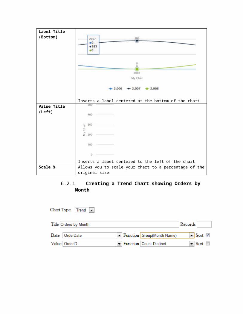
Label Title (Bottom)
Inserts a label centered at the bottom of the chartValue Title (Left)
Inserts a label centered to the left of the chartScale % Allows you to scale your chart to a percentage of the original size
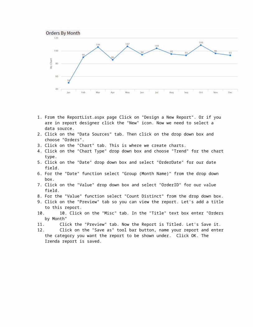
6.2.1 Creating a Trend Chart showing Orders by Month

1. From the ReportList.aspx page Click on "Design a New Report". Or if you are in report designer click the "New" icon. Now we need to select a data source.
2. Click on the "Data Sources" tab. Then click on the drop down box and choose "Orders".
3. Click on the "Chart" tab. This is where we create charts.4. Click on the "Chart Type" drop down box and choose "Trend" for the chart type.5. Click on the "Date" drop down box and select "OrderDate" for our date field.6. For the "Date" function select "Group (Month Name)" from the drop down box.7. Click on the "Value" drop down box and select "OrderID" for our value field.8. For the "Value" function select "Count Distinct" from the drop down box.9. Click on the "Preview" tab so you can view the report. Let's add a title to this report.10. 10. Click on the "Misc" tab. In the "Title" text box enter "Orders by Month"11. Click the "Preview" tab. Now the Report is Titled. Let's Save it.12. Click on the "Save as" tool bar button, name your report and enter the category you
want the report to be shown under. Click OK. The Izenda report is saved.

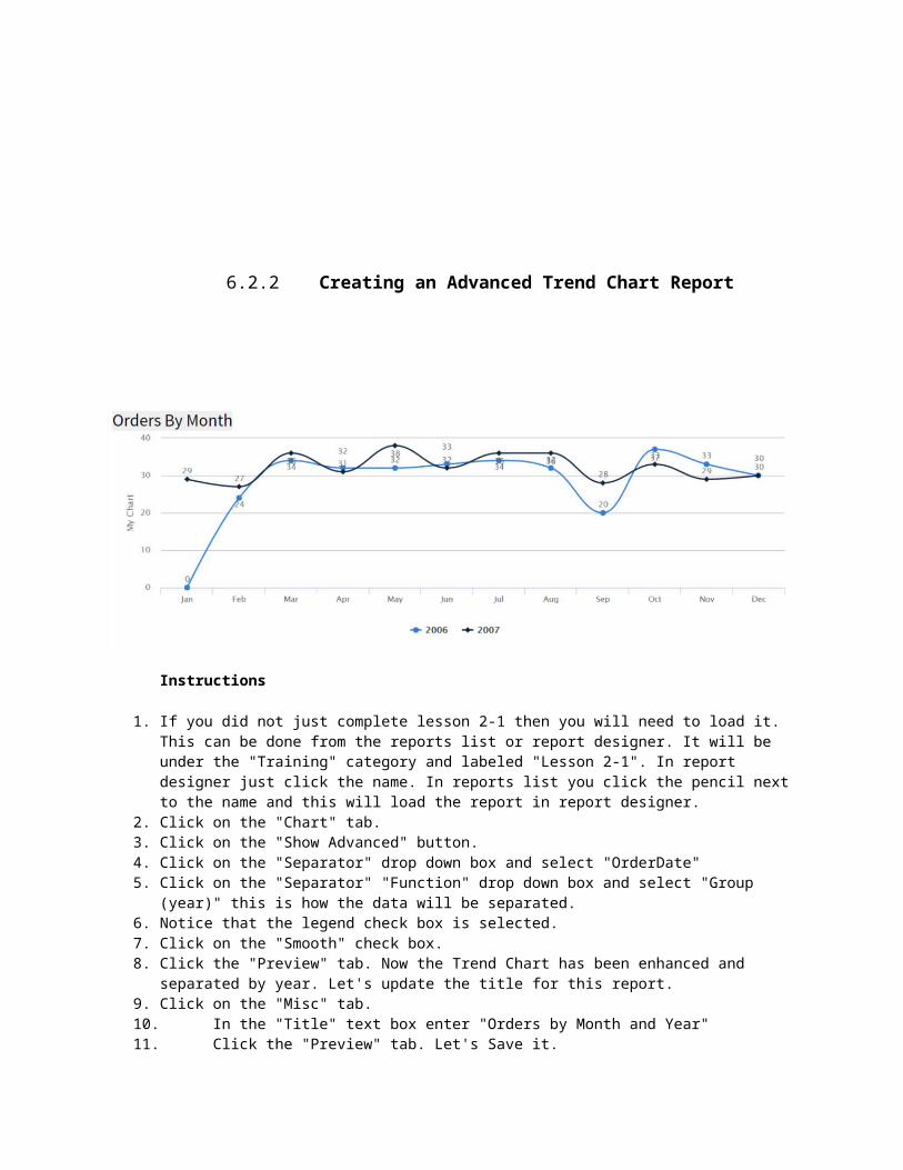
6.2.2 Creating an Advanced Trend Chart Report
Instructions
1. If you did not just complete lesson 2-1 then you will need to load it. This can be done from the reports list or report designer. It will be under the "Training" category and labeled "Lesson 2-1". In report designer just click the name. In reports list you click the pencil next to the name and this will load the report in report designer.
2. Click on the "Chart" tab.3. Click on the "Show Advanced" button.4. Click on the "Separator" drop down box and select "OrderDate"5. Click on the "Separator" "Function" drop down box and select "Group (year)" this is
how the data will be separated.6. Notice that the legend check box is selected.7. Click on the "Smooth" check box.8. Click the "Preview" tab. Now the Trend Chart has been enhanced and separated by
year. Let's update the title for this report.9. Click on the "Misc" tab.10. In the "Title" text box enter "Orders by Month and Year"11. Click the "Preview" tab. Let's Save it.12. Click on the "Save as" tool bar button, name your report, for example "Lesson 2-2",
and enter the category you want the report to be shown under, for example "Training", click ok. The Izenda report is saved.
6.3 Pie Chart
The images below show the Pie (chart) selection menu of the Chart tab.
Pie (Chart) Selection
The table below describes the Pie chart selection.
Features DescriptionPie chart By choosing chart type Pie, the chart appears in
Pie format. Label dropdown menu Choose any label from the dropdown list.Value dropdown menu Choose any value from the dropdown list.
Description of Pie (Chart) Selection
6.3.1 Creating a Pie Chart showing the percentage of orders from each country
Instructions
1. From the ReportList.aspx page Click on "Design a New Report". Or if you are in report designer click the "New" icon. Now we need to select a data source.
2. Click on the "Data Sources" tab. Then click on the drop down box and choose "Orders".
3. Click on the "Chart" tab. This is where we create charts.4. Click on the "Chart Type" drop down box and choose "Pie" for the chart type.5. Click on the "Label" drop down box and select "ShipCountry" for our label field.6. For the "Label" function select "Group" from the drop down box.7. Click on the "Value" drop down box and select "OrderID" for our value field.

8. For the "Value" function select "Count Distinct" from the drop down box. Let's sort the values so the countries with the most orders will be together.
9. Click on the sort checkbox for the value field.10. Click on the "Preview" tab so you can view the report. Let's add a title to this report.11. Click on the "Misc" tab.12. In the "Title" text box enter "Orders By Country"13. Click the "Preview" tab. Now the Report is Titled. Let's Save it.14. Click on the "Save as" tool bar button, name your report, for example "Lesson 4-1",
and enter the category you want the report to be shown under, for example "Training", click ok. The Izenda report is saved.
6.3.2 Creating an Advanced Pie Chart Report
In this lesson, we will modify the pie chart created in the pie chart above in Figure x-x by separating the data by year so we can see which countries had the most orders each year.
Instructions
1. If you did not just complete lesson 4-1 then you will need to load it. This can be done from the reports list or report designer. It will be under the "Training" category and labeled "Lesson 4-1". In report designer just click the name. In reports list you click the pencil next to the name and this will load the report in report designer.
2. Click on the "Chart" tab.3. Click on the "Show Advanced" button.4. Click on the "Separator" drop down box and select "OrderDate"5. Click on the "Separator" "Function" drop down box and select "Group(Year)" this is
how the data will be separated. Let's limit the number of records shown to 10.6. Click on the Show records textbox. Enter 10. 7. Click on the "Show Percentage" check box. Let's also change the type of pie chart.8. Click on the "Chart Type" drop down box and select "Doughnut."9. Click the "Preview" tab. Now the Pie Chart has been enhanced to show the countries
with the most orders separated by year. Let's update the title for this report.10. Click on the "Misc" tab.11. In the "Title" text box enter "Orders By Country and Year"12. Click the "Preview" tab. Let's Save it.

13. Click on the "Save as" tool bar button, name your report, for example "Lesson 4-2", and enter the category you want the report to be shown under, for example "Training", click ok. The Izenda report is saved.
6.4 Bar Charts
The images bellow show the user selection parameters for a simple Bar Chart which counts the number of distinct orders by country.
The table below describes the Bar (chart) selection entries.
Features DescriptionBar chart By choosing chart type Bar, the chart appears in
Bar format. Label dropdown menu Choose any label from the dropdown list.Value dropdown menu Choose any value from the dropdown list.
Description of Bar (Chart) Selection
6.4.1 Example Bar Chart

6.4.2 Create a Bar Chart Showing the Top 15 Countries
Instructions
1. From the ReportList.aspx page Click on "Design a New Report". Or if you are in report designer click the "New" icon. Now we need to select a data source.
2. Click on the "Data Sources" tab. Then click on the drop down box and choose "Orders".
3. Click on the "Chart" tab. This is where we create charts.4. Click on the "Chart Type" drop down box and choose "Bar" for the chart type.5. Click on the "Label" drop down box and select "ShipCountry" for our label field.6. For the "Label" function select "Group" from the drop down box.7. Click on the "Value" drop down box and select "CustomerID" for our value field.8. For the "Value" function select "Count Distinct" from the drop down box. Let's limit
the number of Countries listed on the graph to 15.9. Click on the Show records textbox. Enter "15". Let's sort the data so we get the Top
15 countries sorted by number of customers.10. Click on the sort checkbox for the value field.11. Click on the "Preview" tab so you can view the report. Let's add a title to this report.12. Click on the "Misc" tab.13. In the "Title" text box enter "Top 15 Countries"14. Click the "Preview" tab. Now the Report is Titled. Let's Save it.15. Click on the "Save as" tool bar button, name your report, for example "Lesson 3-1",
and enter the category you want the report to be shown under, for example "Training", click ok. The Izenda report is saved.

6.4.3 Create a Bar Chart with a Separator
Instructions
In this example, the goal is to modify the bar chart created in the preceding example by separating the data by year so we can see who the top customers were each year.
1. If you did not just complete lesson 3-1 then you will need to load it. This can be done from the reports list or report designer. It will be under the "Training" category and labeled "Lesson 3-1". In report designer just click the name. In reports list you click the pencil next to the name and this will load the report in report designer.
2. Click on the "Chart" tab.3. Click on the "Show Advanced" button.4. Click on the "Separator" drop down box and select "OrderDate"5. Click on the "Separator" "Function" drop down box and select "Group (Year)" this is
how the data will be separated.6. Notice that the legend check box is selected.7. Click the "Preview" tab. Now the Bar Chart has been enhanced to show the countries
with the most customers separated by year. Let's update the title for this report.8. Click on the "Misc" tab.9. In the "Title" text box enter "Top 15 Countries by Year"
10. Click the "Preview" tab. Let's Save it.11. Click on the "Save as" tool bar button, name your report, for example "Lesson 3-2",
and enter the category you want the report to be shown under, for example "Training", click ok. The Izenda report is saved.
6.4.4 Other Bar Chart Options
Show Pareto
In a Pareto chart, lines are implemented to show the trend.
Stacked
Stacked bar graph is a graph that is used to compare the parts to the whole. The bars in a stacked bar graph are divided into categories. Each bar represents a total.
If the Stacked bar graph feature is not turned on, please contact your system administrator and ask them to validate this setting, AdhocSettings.AllowStackedBarChart = true;
*Report filtered by selected countries to simplify
Horizontal
The selected bar chart will display the Label horizontally.
6.5 Funnel Chart
The images below show the Funnel chart selection of the Chart tab.
6.6 VisualizationsIzenda Visualizations are a D3-based visual supplement to Izenda’s core charting engine. Visualizations are rendered in a chart report part, but are built on the columnar data in your summary or fields tab. These columns must be arranged in a specific order to provide valid data for certain visualizations. This document lists which column arrangement works with each visualization style.
Given that visualizations rely on the teamwork between the chart itself and the column data which supports it, this means that visualizations may not be easy to include in a complex report. Currently, any data in the Summary tab will be read, and if this tab is empty, the Fields tab will be used instead.
In Izenda terms, a field and a column are the same thing. This documentation will refer to fields and columns interchangeably. To be precise, fields are listed from top to bottom on the Fields tab, and displayed as columns from left to right.
Field Order
When creating a visualization, you must pay specific attention to the field order. This is the idea that fields, from top to bottom, can be numbered - the first field in the list is 1, the second field is 2, and so on. Likewise, the leftmost column is column 1, the column immediately to the right is column 2, and so on. This field order is critical, as visualizations demand a specific order to fields which dictates not only if they will be used, but how they will be used.
Field Order and Group Hierarchy
Some visualizations permit multiple group fields. Group field hierarchy must be placed in proper field order! This means highest category first, and lowest category last. Here are some examples:
Country, State/Region, City, Neighborhood
Company, Department, Office, Desk
Tera, Giga, Mega, Kilo
Expressions read the exact field order as you define it. If I place Neighborhood before Country, my visualization will not make any sense by definition! Double check that fields are in the correct order if the visualization does not appear to be correct.
Field Sorting

Visualizations sort in an order defined by the columns in the Summary or Fields tab. This order does not change if you select a different metric, which means that you can be viewing Metric B as sorted by Metric A. Currently, the only way to change the sort order is to change the sorting behavior defined by the arrangement of fields. If you are experiencing undesired or confusing sort behavior, check to make sure that the field sort order is correct.
Drilldowns and Dynamic Filtering
Some visualizations support dynamic filtering and drilldown-like behavior. Currently, a full drilldown - connecting through a visualization to another Izenda report - is not possible. A visualization can exist on a child report, and can exist on a parent report, but no part of the visualization is clickable to activate a drilldown. The drilldown terminology in this case means that some visualizations, like heatmap and sunburst, can drilldown within themselves. This is more accurately described as dynamic filtering. Dynamic filtering the visualization will also filter the linked summary or detail view.
Fields labeled with a plus (+) sign
Some visualizations can accept an indefinite number of fields as metrics. These fields are noted with a + after the field number order. That is to say, if a visualization requires 3 and only 3 fields, its fields will be listed as 1, 2, 3. However, if a visualization can have multiple fields after the first two fields which define its boundaries, its fields would be listed as 1, 2, 3+. In other words, after the mandatory fields 1 and 2, we could have fields 3, 4, 5, 6 which all serve as additional selectable metrics. Generally only one of these fields will be displayed at a time, but with the option of selecting between them.
Fields labeled with ellipsis (...)
Some visualizations can accept a large number of fields as groups. These fields are noted with a … after the field order number. This means that if a visualization accepts multiple levels of hierarchical data, I could have 5 group fields representing hierarchy in fields 1 through 5, and begin my metrics at field 6. In this documentation, this will be noted as Field 1…, Field 2. This does not mean that the metric needs to be in the actual second field. This means that the metric field(s) must be placed after all of the group fields in fields 1 through X.
Fields labeled with a question mark (?)
Some visualizations do not care where a field is, so long as it exists. These fields are noted with a ? after the field order number. This means that you don’t necessarily have to place that field in the noted order, if you have some reason not to follow the recommended best practice.
Terms
These terms refer to the types of columns that each visualization reads.
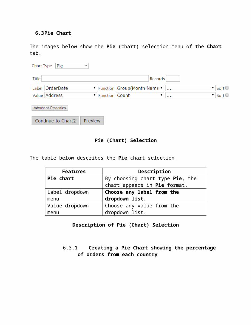
Group - This column can be any data type, aggregated or not aggregated. These columns are used to group data in other columns, and often serve as the axis or scale of a particular visualization.Time - This column must be a Datetime data type.Metric - This column can be any data type. It is generally an aggregate, and most commonly a numeric, but does not have to be. These columns are the elements that are being charted, mapped, or displayed on your visualization.Geographic Field - This column is a special case. It is used in map-style visualizations. It must be a list of geographic entities, such as a list of countries, regions, or states.
6.6.1 Visualization Styles:
NOTE: NOT ALL OF THESE VISUALIZATIONS MAY BE AVAILABLE IN YOUR DEPLOYMENT
6.6.2 Arc Map
Arc Map draws a map of the US by county. It shows two primary graphical elements - A line drawn from one city to another and a circle whose area represents the metric.
Field 1 - Geographic Field - This field will represent the source city on the map. A line will be drawn from it to the destination city.
Field 2 - Geographic Field - This field will represent the destination city on the map. A line will be drawn to the destination city from the source city.
Field 3+ - Metric - This field will represent the value selectable from a dropdown. Notes
o Metric fields will not graphically display if they are negative.o Arc Map currently only supports the continental United States.
6.6.3 Auto Chart
Auto Chart permits the generation of many simple chart types. Some of these charts display a single metric at a time, others display multiple metrics at one time.
Field 1 - Group - This field will represent the categories along the X axis, the Y axis, or the slices or items displayed on a proportional chart.
Field 2+ - Metric - This field will represent the value on the chart. The metric currently being displayed is selectable from a dropdown.
6.6.4 Bubble Grid
Bubble Grid displays a circle with the area representing the metric field by the group field and the time field.
Field 1 - Group - This field will represent the categories along the Y axis.
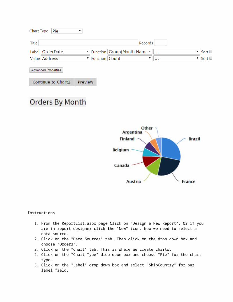
Field 2 - Time - This field will represent the categories along the X axis. This field must have the function set to Group(Year & Month).
Field 3 - Metric - This field will represent the value of each bubble.
6.6.5 Combo
Combo displays metrics with a series of bars and lines on the same graph. Each metric gets its own Y axis, with the X axis determined by the single group field. The first half of the metric fields will be displayed with bars, the second half with lines.
Field 1 - Group - This field will represent the categories along the X axis. Field 2+ - Metric - This field will represent the values of each bar or line.
Each bar or line will receive its own scale on the Y axis. Notes:
o Metric fields will be split between bar and line graphs. The first half of your metric fields will be bars, the second half will be lines.
6.6.6 Crossfilter
Crossfilter displays multiple charts, one for the datetime grouping field and one for each metric. Clicking and dragging on any chart will establish a range, which acts as a filter on all other charts. You can also drag the range itself to move it without changing its size. This chart is useful for finding clusters of data within other data, for example we have less orders in June vs. August but they are worth more money.
Field 1? - Datetime - This field will represent the time factor by which other metrics can be filtered. Range of values is displayed on the X axis and count of values is displayed on the Y axis.
Field 2+ - Metric - This field will represent the value. Range of values is displayed on the X axis and count of values is displayed on the Y axis.
Notes:o Some group categories for Datetime will produce too many or
invalid results. If your chart does not work, try a different grouping on the datetime or filtering the dataset from the Filter tab.
6.6.7 Heat Map
Heat Map displays a tree-like hierarchy of squares, each of which proportionally represents the aggregate metric at each level of the hierarchy.
Field 1... - Group - This field represents the hierarchical levels which structure the heat map.
Field 2+ - Metric - This field will represent the value on the chart. The metric currently being displayed is selectable from a dropdown.
6.6.8 Matrix
Matrix displays a series of squares, arranged by group and time, in the style of a pivot. The squares are shaded according to each metric value.
Field 1 - Group - This field will represent the categories along the Y axis. Field 2 - Time - This field will represent the categories along the X axis. This field
must have the function set to Group(Year & Month). Field 3 - Metric - This field will represent the value of each square. Notes:
o Matrix can only render so many squares. If you aren’t getting enough data on the time based X axis, try filtering out some items from the group based Y axis.
6.6.9 Projected Map
Projected Map displays a scalable, zoomable map which ties metrics to single geographic entities.
Field 1 - Geographic Field - This field will represent lists of countries, cities, or other entities.
Field 2… - Metric - This field will represent the value selectable from a dropdown.
Notes:o Currently only the United States is supported.
6.6.10 Sunburst
Sunburst displays a tree-like hierarchy of items layered in a circular arrengement, each of which proportionally represents the aggregate metric at each level of the hierarchy. The layers from inner to outer represent each level of the hierarchy. Larger groups are displayed from the 12 o’clock position clockwise.
Field 1... - Group - This field represents the hierarchical levels which structure the heat map.
Field 2+ - Metric - This field will represent the value on the chart. The metric currently being displayed is selectable from a dropdown.
6.6.11 Time Bubble
Time Bubble is a multidimensional graph which displays circles which change in size and position over time. Mousing over the time label at the bottom right of the chart will move forward and backward in time.
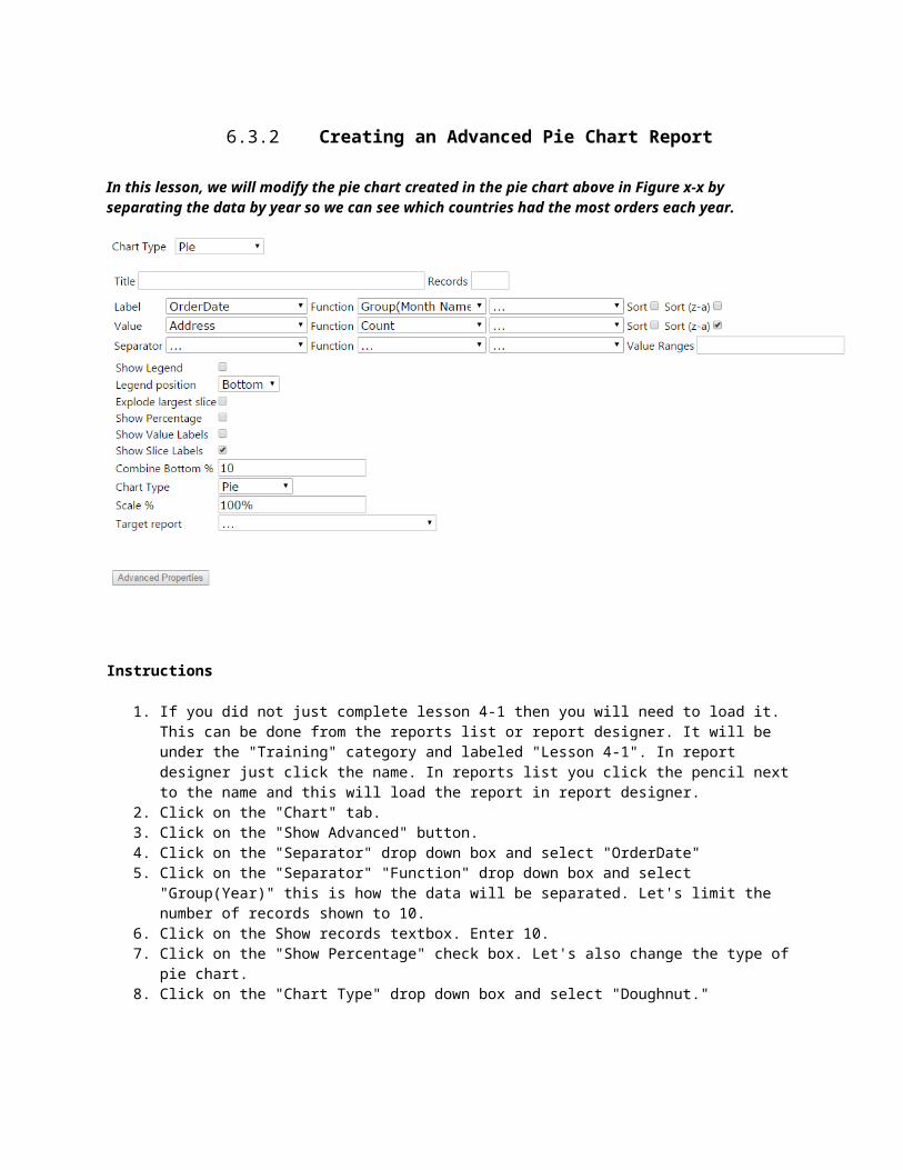
Field 1 - Group - This field will represent each circle. Field 2 - Datetime - This field will determine the scale at which circles
move and change size. This field must be set to Group(Year & Month). Field 3 - Metric - This field will represent the Y axis. Field 4 - Metric - This field will represent the X axis. Field 5 - Metric - This field will represent the Z axis, represented by the
area of the circle.
6.6.12 Timeline
Timeline displays a single metric between two points in time. The length of each item represents the distance between your start and end times.
Field 1 - Group - This field represents the Y axis. Field 2 - Metric - This field represents the item charted. Field 3 - Datetime - This field represents the beginning point from which
the metric will be drawn. Field 4 - Datetime - This field represents the end point to which the
metric will be drawn. Notes:
o Timeline can only display up to a fixed amount of data. If you are not seeing all the data you expect to see, try filtering down your report set - particularly the time dimension.
6.6.13 Transitions
Transitions displays multiple common graph styles in a fixed cycle. Field 1 - Group - This field represents categories on the Y axis or slices of
proportional charts. Field 2 - Datetime - This field represents the X axis when applicable. It must be set
to Group(Year & Month) Field 3 - Metric - This field represents the value. Notes:
o You must sort Fields 1 and 2 to make coherent charts. If your charts look odd, make sure that the sorting behavior is correct.
6.6.14 Waterfall
Waterfall displays a bar chart with a built in pareto function - that is, the bottom of each bar begins at the top of the previous bar.
Field 1 - Group - This field represents each bar along the X axis. Field 2 - Metric - This field represents the value of each bar.
6.6.15 World Tour
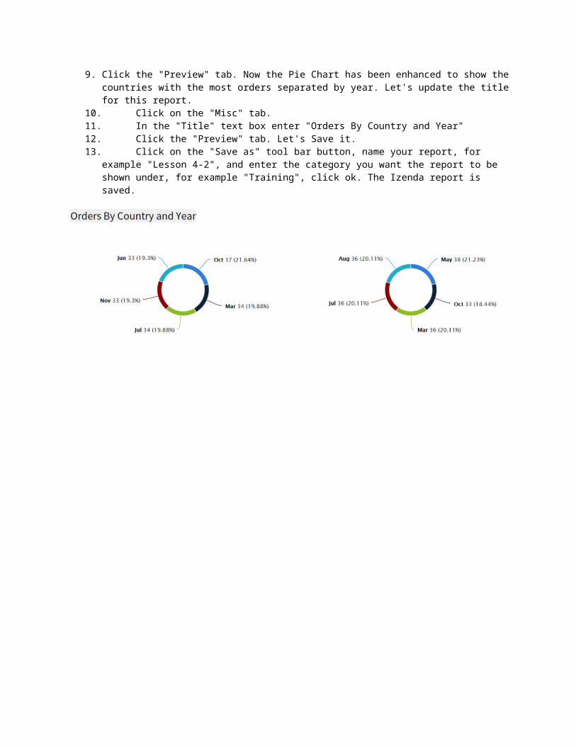
World Tour displays countries and a single metric associated with that country. Field 1 - Geographical Field - This field represents the country. Field 2 - Metric - This field represents the value associated with each country.
6.6.1 Auto Gauge
Auto Gauge can be used to display 3 different type of gaugeso Simple large number KPI metric o Thermometer type gauge (can be positioned either vertically or horizontally)o Percentage KPI Gauge with filled circle value – circle size and width can be
altered Field 1 - Group - This field represents each bar along the X axis. Field 2 - Metric - This field represents the value of each gauge
6.6.2 Calendar Calendar displays a month/week/day view. Field 1 - Group - This field represents the event title. Field 2 - Metric - This field represents the event value. Field 3 - Time - This field represents the beginning point from which the metric will be
drawn. Field 4 - Time - This field represents the end point to which the metric will be drawn.
6.6.3 Flow Chart / Data Tree Flow Chart / Data Tree displays a tree-like hierarchy of nodes and connecting lines.
Nodes are established from left to right in field order. Lines and the size of nodes are determined by the selected metric.
Field 1... - Group - This field represents the hierarchical levels which structure the data tree.
Field 2+ - Metric - This field will represent the value on the chart. The metric currently being displayed is selectable from a dropdown.

7.0 GAUGE TAB
In the Gauge tab, you can add a panel of gauges to a report.
There are four different types of gauges you can create:
Type Description ImageRadial This gauge displays a static
needle that goes from 90° (straight up) to 0° (pointing right).
Radial 2 This gauge is the same as the radial gauge but has a different graphical appearance.
Animated Half Circle This gauge starts from 180° (pointing left) and animates to 0° (pointing right). You can also set KPI indicators.
Linear This gauge is a simple bar that fills from left to right.

The gauges also have a number of options that can be selected. They are described below:
Feature Appearance Description
Title []() Sets a title for the Gauge section of the report.
Results []()Sets how many gauges should be displayed (one gauge per
grouped result).
Name []() The name of the field to use as the Gauge's grouping field.
Value []()The name of the field to use as the Gauge's data points. This
must be numeric.
Sort []()The name of the field to sort the data by. To sort
alphabetically, use Maximum or Minimum.
Minimum []() Sets the lower bound for the gauge's display values.
Maximum []() Sets the upper bound for the gauge's display values.
Color []()Allows you to set specific colors or color ranges for the gauge's value bar. Applies to the Radial, Radial2, and Linear gauges.
Gauge Style
[]() Allows you to choose which type of gauge you want to display.
KPI Low []()Only available by selecting "Animated Half Circle". If set, this will set a lower bound for a "target zone" within the gauge.
KPI High []()Like KPI Low, but this will set the value for the upper bound on
the "target zone" within the gauage.
Update []()Allows you to set the update frequency for the gauges. This is
good for tracking dynamic data that is updated frequently.
Red Values
[]() Specifies which side of the target zone should be denoted with red. Good for indicating whether small or large values cause
concern. This has three values.Hide:This is the default. Neither large nor small zones will be
considered hazard zones.Low: Low values (Anything to the left of your target zone) will
be considered hazard values and will get a red stripe.
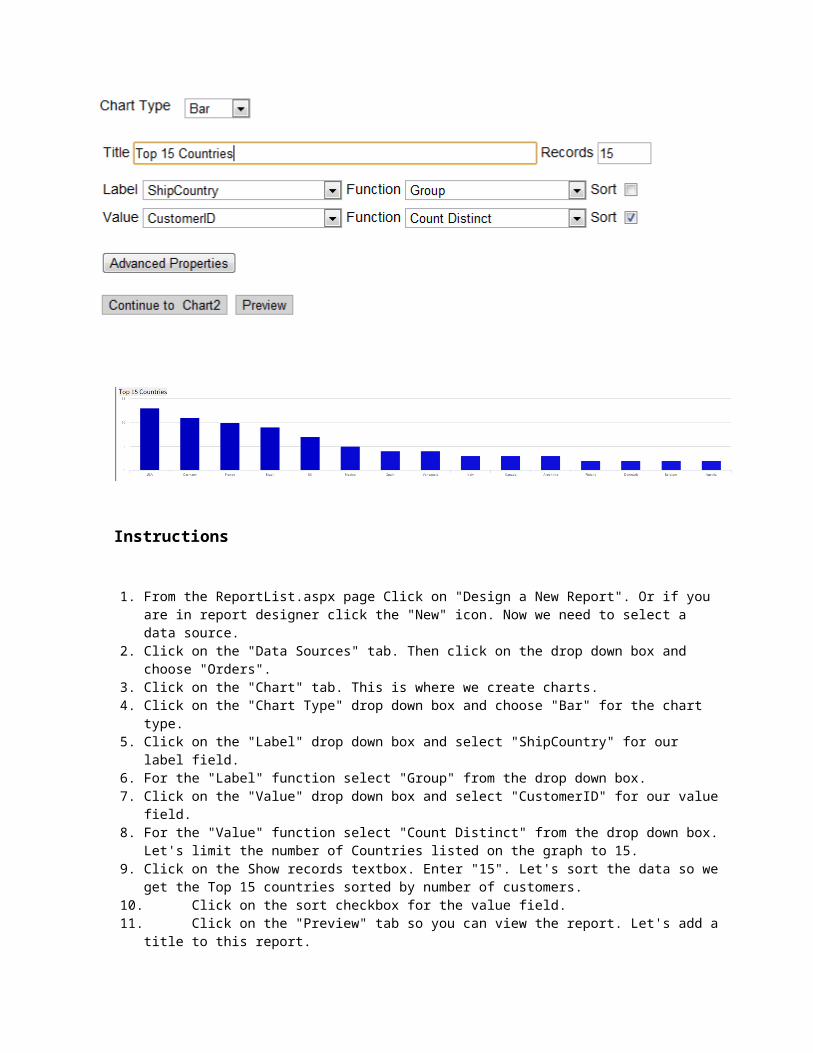
Feature Appearance Description
High: High values (Anything to the right of your target zone) will be considered hazard values and will get a red stripe.
Target Report
[]()Allows you to specify a sub-report to be used with the drilldown
key of the Name field. The target report will appear upon hovering your mouse over the gauge.
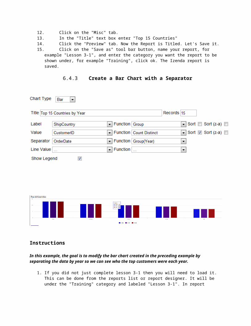
7.1 Create First Four Gauges Alphabetically Counting Orders by Country
The Report below is showing the first 4 gauges based on the alphabetical order of the selected countries.
Gauge tab contents
7.2 Creating the Top 4 Orders by Country Gauges
In the following example, you will see the gauges of the four countries with the greatest number of orders.
You can add four different types of gauges

7.3 Changing Color Ranges
To change color ranges for the gauge, enter in a percentage range for each color, or enter a range of specific values.
OR
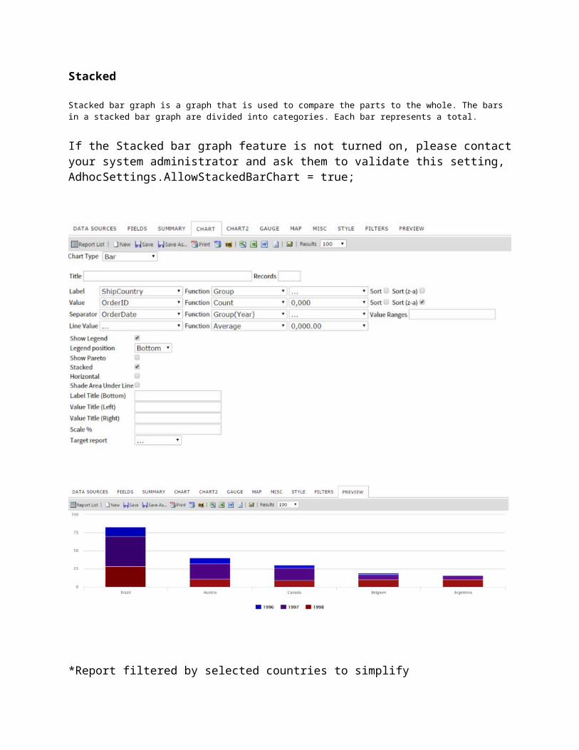
OR

7.3.1 KPI’s and auto-updating data with Animated Gauges
The Animated Half Circle opens up a few more options under the Gauge Style row. With these new options, you can select the KPI Low and High, and select whether the Red values will be hidden, on the low side, or on the high side. You can also select how update the date updates.
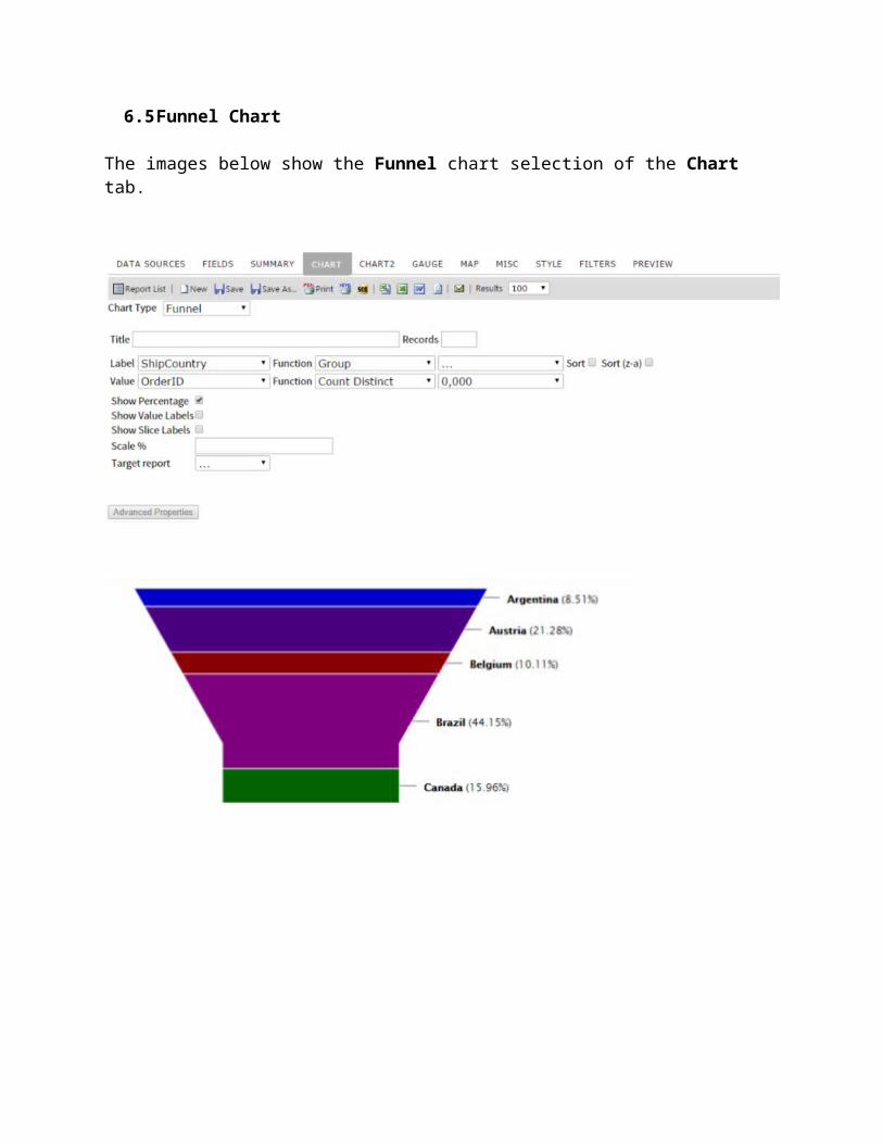
7.4 Gauges with Drill-Down Effects

8.0 IZENDA MAPS
The Izenda Maps add-on provides interactive geographical visualization to the reporting experience.
In the report below, we are shading the colors of the states based on the sum of the freight, applying a hover over that shows the top products by state, and displaying an indicator bar on the location of the postal code while showing the number of orders vertically in the bar.
Feature Description
Map Type
Zoom to Data Zooms to the region or state the data is in
State Select the field where state data is located
Shading Selects the field and function you will use for shading
Fill Color From - To Fills the color of the shading from a selected color to a selected color
Label (1st one displayed) Sets the text displayed for the Legend
Postal Code Select the field where postal code data is located
Latitude / Longitude Select the field where GIS data is located for lat/long
Value Sets the field and function you will use in the indicator bar
Label (2nd one displayed)
9.0 MISC TAB
In the Miscellaneous Tab (Misc Tab), you can add a title, description, header and footer to the report, all with left, middle, or right justification. Sharing and Scheduling are the two most popular features under this tab.
Misc tab contents
Feature DescriptionReport Header Image Justification Allows you to move the Report Header to
the left, middle or right. Title Enter the title of the report.
Examples below use “INSERT TEXT” as input.
Description Enter a description for the report.
Header Allows a user to set a report header.
Footer Allows a user to set a report footer.
Limit Outputs to CSV If checked, disables all forms of export other than CSV
Expose as datasource(must be enabled by admin, may not be visible to you)
This allows the report to be published as a datasource. The report name will show on the datasource tab and other reports can be created from this report set. This is similar to creating a view in the database without database access. This can also be used to create calculations off of calculations. Turning on this feature also alters the way the datasource page appears. All datasources will reports created from them will display as a hyperlink. Clicking on the link will display a list of the reports created with that datasource.
9.1 Share With & Rights
Share With allows you to share reports with:
Everyone Other roles like Marketing or Sales Other users like Bob or Lisa
Your system administrator will likely determine the list of who you can share with that populates in your drop-down menu. Select who you would like to Share With and determine the level of access you will give them to this report. The table below describes the characteristics of each option for selecting the appropriate rights.
Rights Description…
None Do not share this report with anyoneFull Access Can share with every user and groupRead only Can make changes to Save As but cannot
modify the originalView Only Cannot make any changes to the report
Locked Locks the report down so no one else has access to it

9.1.1Setting Sharing Permissions
The Share With and Roles properties allow reports to be easily shared amongst users and group of users. The values SharedWithValues populate the "Share With" drop-down found on the “Misc” tab in the Izenda Reports application. The "Rights" drop-down which is next to the "Share With" drop-down allow the user to assign Full Access, Read Only, View Only, or None permissions to the selected choice in the "Share With" drop-down.
Roles on a per-user basis are specified by the CurrentUserRoles properities. If a user is given a role, then he will have access to the reports which are shared with that role.
AdHocSettings.CurrentUserRoles and AdHocSettings.SharedWithValues are per-user properties.
AdHocSettings.CurrentUserIsAdmin = false;AdHocSettings.CurrentUserName = "Bob";AdHocSettings.CurrentUserRoles = new string[] { "Sales" };AdHocSettings.SharedWithValues = new string[] { "Bob", "Sales", "Bob Smith", "Admins", "Sam Jones" };
In the example above, Bob is a non-admin user who is assigned to the Sales role, therefore, any reports which are "Shared With" the "Sales" role will be accessible by Bob. Bob will only be able to share reports with the shared with values shown in the sample.
9.1.2
9.2 Drilldowns and Subreporting
To create a drilldown report, you can start by designing the main report, but in order to be able to select a drilldown report, that subreport must first have a drill-down key to show up in the selection list. This means it often makes more sense to work from the ‘bottom up’, from the lowest subreport to the highest parent report.
A subreport will not appear in the list of available subreports until it has a drilldown key defined. Once this has been set and the report saved, any other report will be able to access the subreport in the list of available subreports. At this point you can define a drilldown style to control how the subreport is accessed.
Example
Design Sub-Report
Set the Drill-Down Key under the MISC tab
Design main report
Click on Advanced Field Settings in Main Report
Select the Subreport
Select the Drill-Down Type
Option Description. . . Disables the drilldown without removing the
link between this field and a subreportLink Opens subreport in the same browser
windowLink(New Window) Opens subreport in a new browser windowEmbedded Embeds subreport in the table cell or directly
into a form
*NOTE* Please see section Popup Displays subreport in a pop-up window. You
must click on the popup to clear it from the screen.

Hover Shows the sub-report on the same screen as an overlay when you hover over the current field, chart, or gauge.
NOTE: This option is not available on the Fields Tab!
ComboKey Indicates that this drilldown key is a second, third, or other key that is not the first key. The first key controls the drilldown style, and every other field with a target subreport and the ComboKey behavior defined will pass their value along with that first value, in field order.
9.2.1 Passing Filters from Master Report to Sub-Report
There is a property that your system administrator can set to allow the filters applied in the parent report to automatically pass through to the child report (master report to sub-report). It is called InheritFiltersinSubreports, and gets or sets the value indicating whether filters will be inherited in sub-reports.
Listed below is an example of where you would set this in the code.
public class CustomAdHocConfig : Izenda.AdHoc.DatabaseAdHocConfig { // Configure settings // Add Custom Setting below license key and connection string setting public override void ConfigureSettings() { AdHocSettings.SqlServerConnectionString = "INSERT_CONNECTION_STRING_HERE"; //AdHocSettings.VisibleTables = new string[] { "VIEW1", "TABLE2" }; AdHocSettings.InheritFiltersInSubreports = true;
}

9.3 Scheduler
The scheduling controls may not be available to all users.If you do not see them, please speak with your system administrator.
Schedule: Set the schedule date and time.Repeat Type: Set the repeat frequency.Send Email As: Set the format in which the email is sent.Recipients: Enter a comma separated list of recipients.
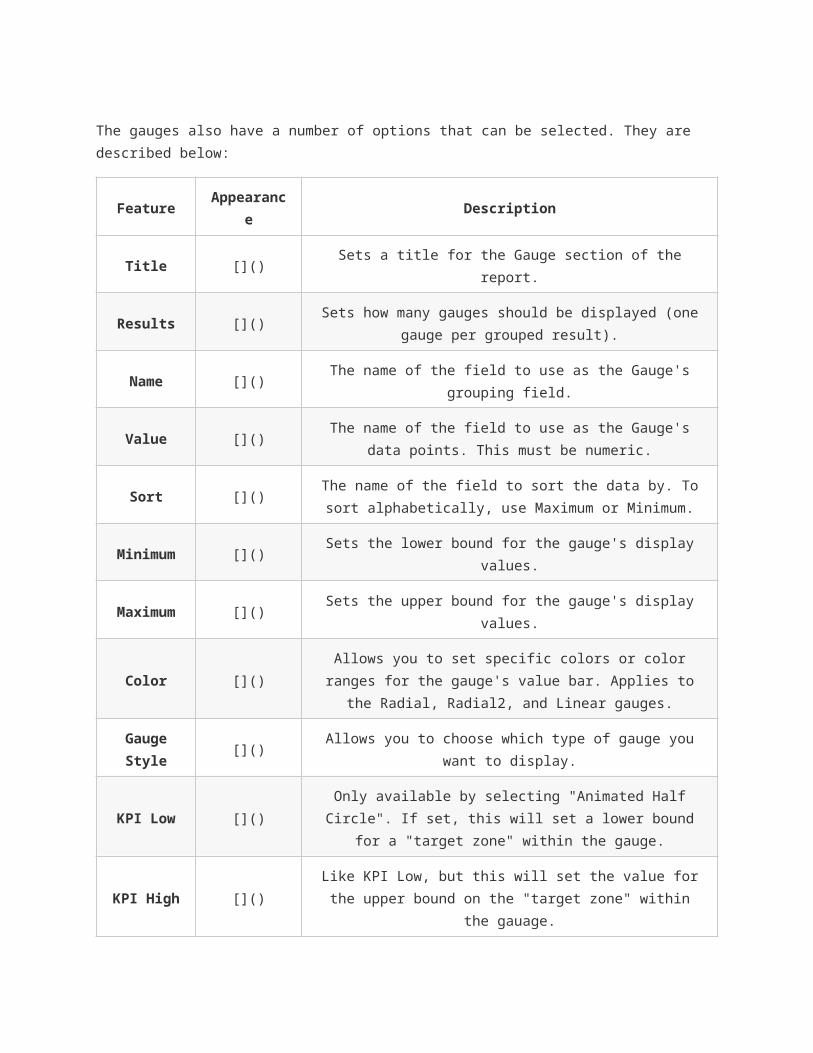
9.3.1 How to Set Up the Izenda Scheduler
The scheduler requires the use of the IzendaScheduler.exe file, which is found in the root of the directory to which you installed Izenda Reports. You then need to add a scheduled task to your system which runs every minute. The task uses the IzendaScheduler.exe to access a page in our application which determines if any reports need to go out (run_scheduled_reports= on rs.aspx page). The IzendaScheduler.exe file does not actually send out the files or access anything else except for the specific page in our application which you give the exe file as a parameter.
To turn on the scheduler controls for certain users, use the show scheduler controls property. Izenda.Adhoc.AdHocSettings.ShowScheduleControls = true;.
Repeat Type
Select a time frame like Every Month. Or select an Alert, which will send an email if filter parameters are not met. You can also enter in custom time spans, for example, in cases of Fiscal vs. Yearly Quarters.Send Email as
You can send the email as a number of attachments, like PDF, Word, & Excel, as a Link, which shows a link to click on in the email, or as Embedded, which embeds the report in the body of the email.
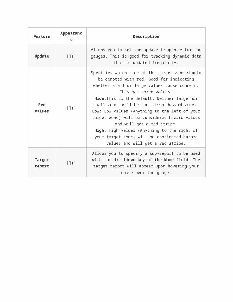
9.3.2 Report Owner: Setting the User and Admin States
You can select the owner of the report. By default, it is set as the DefaultAdministrator. DefaultAdministrator has admin priveleges and will be able to see and change all other users’ reports. In most cases, your system administrator will set this property for you and might even hide it from the scheduler screen.
Setting the user and their access rights
By default, Izenda Reports includes a user account called "defaultadministrator". The setting "CurrentUserIsAdmin" is used to set whether or not the current user is an Administrator user. If set to true, then Ad Hoc allows the current user to have Administrator privileges. These privileges are the ability to see all reports both shared and private, change the owner of a report, and over write the Read only reports. If set to false, then the user can only see shared reports. In this case, we must also set the "CurrentUserName" property to the user's name, which for example, can come from the session variable.
After setting the user name and whether or not the user is an Administrator, one can set the database, table, view, or field level access.
Setting an Administrator user
C# or VB.NET
Izenda.AdHoc.AdHocSettings.CurrentUserIsAdmin = true;
Setting the user name
C# or VB.NET
Izenda.AdHoc.AdHocSettings.CurrentUserName = "Bob";
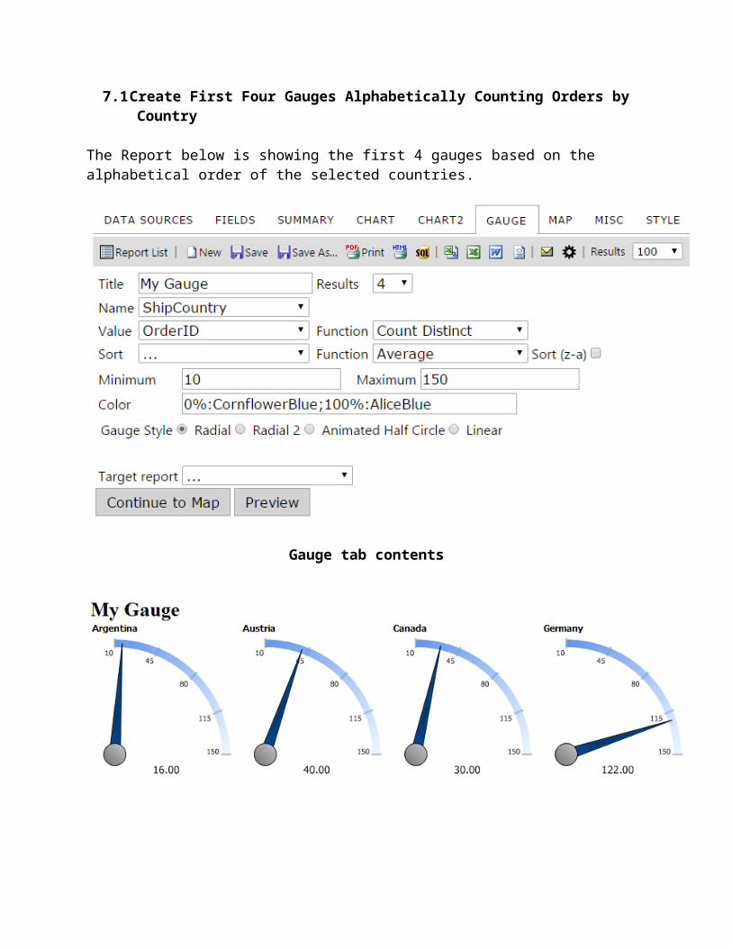
10.0 STYLE TAB
In the Style tab, you can customize the look and feel of the report that will be displayed. You can change the color of the border, header, and rows, as well as the order the report items.
Style tab contents

10.1 Style Properties
When you change the properties of the various colors within the report, the sample grid below can be used to see the differences.
The colors which can be changed are: Border color, Header color, Header foreground color, Item color, Item foreground color, and Alternating item color.
Explanations of other properties found on tab are given below.Feature Description
Border color
Header color
Header foreground color
Item color
Item foreground color

Alternating item color
Landscape printing Determines whether the report prints in landscape mode. (It can also be set using print properties in the printer dialogue box)
Show page number Sets whether the page numbers are shown in PDF report exports.
Show date and time Sets whether the date and time are shown in PDF report exports.
Use pagination in web view Sets whether pagination is used in the report viewer.Add bookmark for each visual group Sets whether bookmarks are used in adobe PDF
exports.Page Break After Visual Groups Sets whether each Visual Group will receive its own
pageMinimize Grid Width Adjusts the margins to the smallest width for each
columnVisual Group Style (explained in more
detail below)
Items per page (In Viewer) Allows a user to set the number of items shown per page in a grid.
Pivot Columns per exported Page Sets limit on how many pivot columns are shown – creates multiple instances of the grid when printed
to limit the number of pivoted columns on each grid instance.
Report Order Allows the user to set the order of the Summary, Chart, Gauges, Map, and Detail (Field) grids
Field|Value column pairs Allows a user to set the field value style for multiple columns displaying on one row.
Show main report in Field | Value style
Allows a user to set whether the main detail grid uses Show summary report in Field | Value style Field-Value style
Show summary report in Field | Value style
Allows a user to set whether the summary grid uses Field-Value style

10.2 Changing Colors Through CSS
Izenda Reports fully integrates with your application both at the program level and visually. All visual aspects of Izenda Reports are user customizable and can be made to match your existing application's visual look and feel. Listed below are some of the quickest ways to change the look and feel of our application in order to blend seamlessly with your product or application.
You can download the CSS Zip and set the appearance of the report input screens, the toolbar and tabs, as well as the reports output appearance.
The steps are:
download the CSS file edit the CSS files, but do not change the selector names or the filenames save the edited files to your server where they can be access via absolute urls navigate to the settings.aspx page navigate to the "Images & CSS" tab
enter the new absolute URLs of the CSS files fully clear your cache and restart the application
After resetting and clearing the cache, the CSS changes should reflect in Izenda Reports.
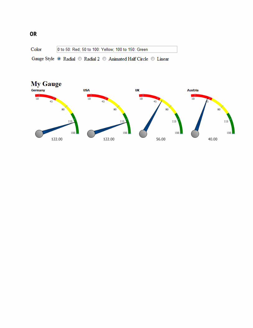
10.2.1 Setting the Report List page (ReportList.aspx) CSS
Although the html element styles are hard coded into the application, you can override the CSS in the Reportlist.aspx page by simply placing a style tag into the page right after the end of the form.
Here is a code sample.
<uc1:Header ID="Header1" runat="server" /><form id="Form1" method="post" runat="server"><cc1:ReportList runat="server" id="reportList"></cc1:ReportList></form><style type='text/css'>
A:link {font-family: Verdana, Geneva, Arial, Helvetica;}A:visited {font-family: Verdana, Geneva, Arial, Helvetica;}A:active {font-family: Verdana, Geneva, Arial, Helvetica;}A:hover {font-family: Verdana, Geneva, Arial, Helvetica;}
table.ReportsListTable{ border-color:white; border-style:solid; border-width:2px; font-family: Verdana, Geneva, Arial, Helvetica;}table.ReportsListTable tr{ background-color:red;}tr.ReportsListHeader td{ border-width:1px; border-style:solid; border-color:white; background-color:silver;}</style>
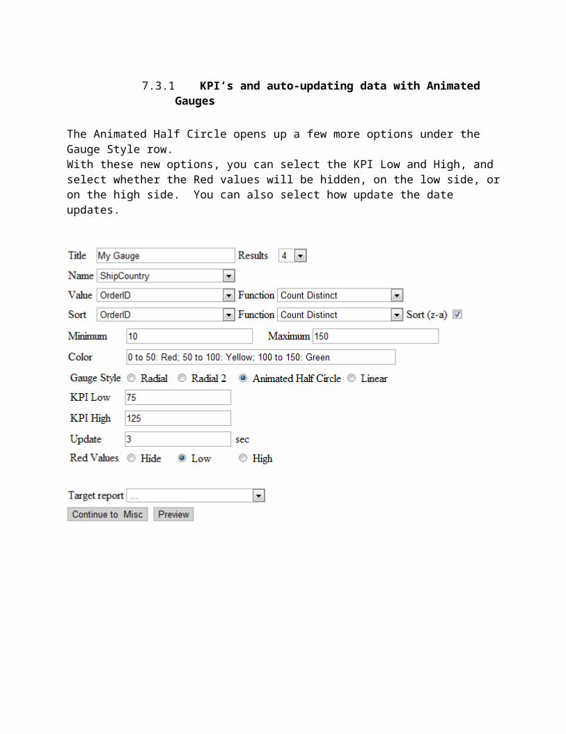
10.2.2 Customer Integration Example
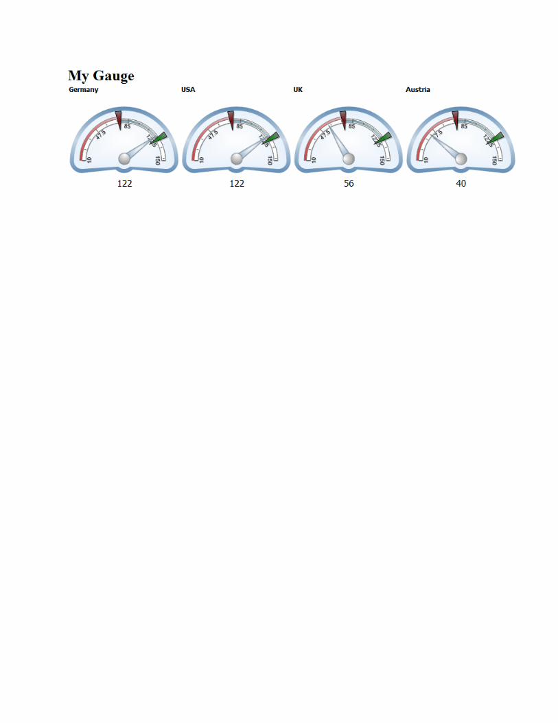
11.0 ADMIN TIPS
This section contains general tips for power users and people with code access to the application.
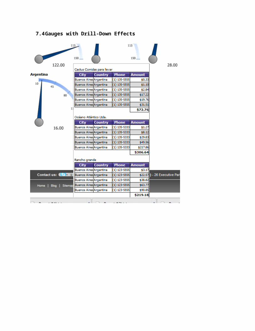
11.1 Data Sources
11.1.1 Aliasing
Field can be aliased or hidden from the menu through the Izenda API.
Dynamic Fields lets you dynamically alter the field names in the drop down that the user sees on a per-user basis. This is useful for localization and when custom fields are used in your application.
public override void ConfigureSettings(){
AdHocSettings.FieldAliases["ShipCity"] = "DepartureCity";}
11.1.2 Hidden Filters
Hidden Filters let you enforce row-level security on any field in the database on a per user / per role basis.
US Manager – Can only see U.S. data
ALIAS
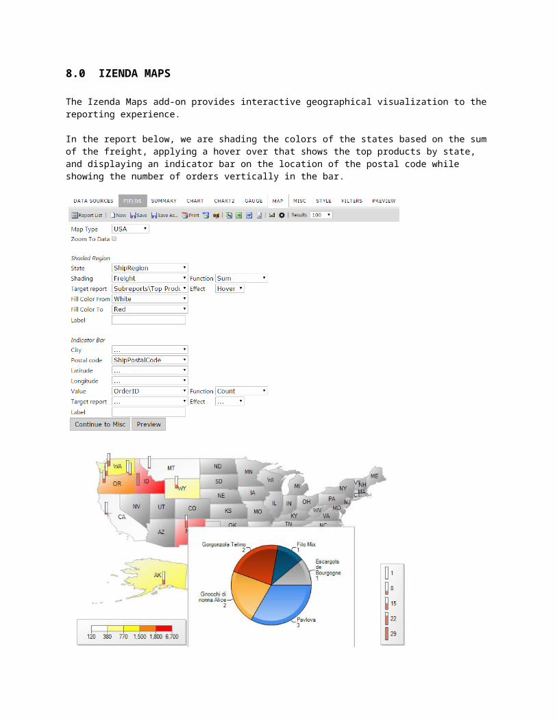
Administrator – Can see all data
Izenda.AdHoc.AdHocSettings.HiddenFilters["ShipCountry"]= GetUserCountry();
The example above only lets you see data from your country value in the database. You can set hidden filters to be a specific value or a range of values.
11.1.3 Setting Visible Data SourcesYou can set up which data sources are available on a per user/per role basis by setting the Visible Data Sources property in the Global.asax file.
//Pass User CredentialsAdHocSettings.CurrentUserName =
HttpContext.Current.Session["UserName"] as string;AdHocSettings.CurrentUserIsAdmin = true;AdHocSettings.VisibleDataSources = new string[] { "Orders",
"Employees", "AdminData" };
11.1.4 Using Constraints
Virtual constraints are easy to add in Izenda Reports. Complicated schemas no longer require extensive user education or the changing of database schemas. Virtual constraints allow Izenda Reports to know about all connections between tables.
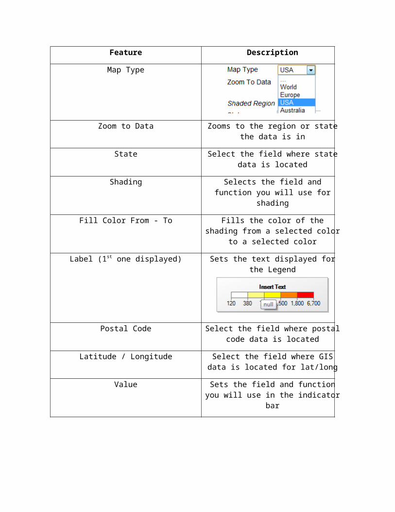
If there are already constraints in the database, this will work automatically. If there are no constraints in the DB schema, you could add virtual constraints manually through the Izenda API using AdHocSettings.ShowDataSourcesAsCheckBoxes = true.
Note that constraints are required to use data sources auto-join.
You could use wildcards to add rules for all tables instead of adding constraints for each pair of tables.
Here is a simple example of how to use virtual constraints:
AdHocContext.Driver.AddConstraint("Account.Id", "*.AccountID");AdHocContext.Driver.AddConstraint("User.Id", "*.OwnerId");AdHocContext.Driver.AddConstraint("User.Id", "Account.OwnerId");
You will not able to manually specify the joined fields in this mode. If you need this capability, you will need to manually specify the Foreign Key relationships by clicking the Advanced button from the Data Sources tab.