Introduction to Descriptive Statistics 17.871 Spring 2006.
45
Introduction to Descriptive Statistics 17.871 Spring 2006
-
date post
20-Dec-2015 -
Category
Documents
-
view
225 -
download
1
Transcript of Introduction to Descriptive Statistics 17.871 Spring 2006.

Introduction to Descriptive Statistics
17.871
Spring 2006
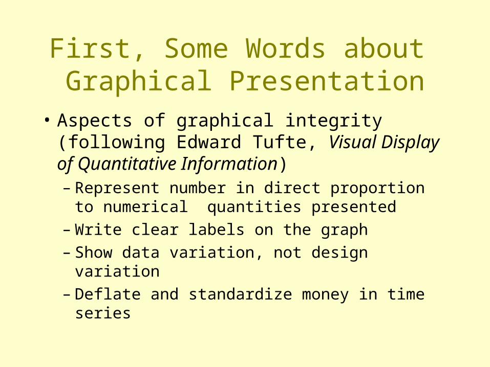
First, Some Words about Graphical Presentation
• Aspects of graphical integrity (following Edward Tufte, Visual Display of Quantitative Information)– Represent number in direct proportion to
numerical quantities presented– Write clear labels on the graph– Show data variation, not design variation– Deflate and standardize money in time series

Population vs. Sample Notation
Population Vs Sample
Greeks Romans
, , s, b

Types of Variables
Nominal(Qualitative)U&H: “categorical”
~Nominal(Quantitative)
Ordinal Interval orratio

Describing data
Moment Non-mean based measure
Center Mean Mode, median
Spread Variance (standard deviation)
Range,
Interquartile range
Skew Skewness --
Peaked Kurtosis --

Mean
Xn
xn
ii
1

Variance, Standard Deviation
n
i
i
n
i
i
n
x
n
x
1
2
2
1
2
)(
,)(

Variance, S.D. of a Sample
sn
x
sn
x
n
i
i
n
i
i
1
2
2
1
2
1
)(
,1
)(
Degrees of freedom

The z-scoreor the
“standardized score”
z x xx

SkewnessSymmetrical distribution
• IQ• SAT
• “No skew”• “Zero skew”• Symmetrical
Value
Frequency

SkewnessAsymmetrical distribution
• GPA of MIT students
• “Negative skew”• “Left skew”
Value
Frequency
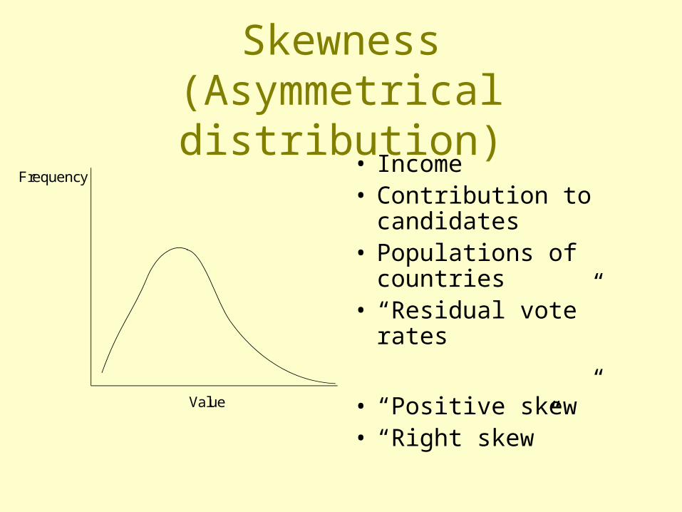
Skewness(Asymmetrical distribution)
• Income• Contribution to
candidates• Populations of
countries• “Residual vote” rates
• “Positive skew”• “Right skew”
Value
Frequency
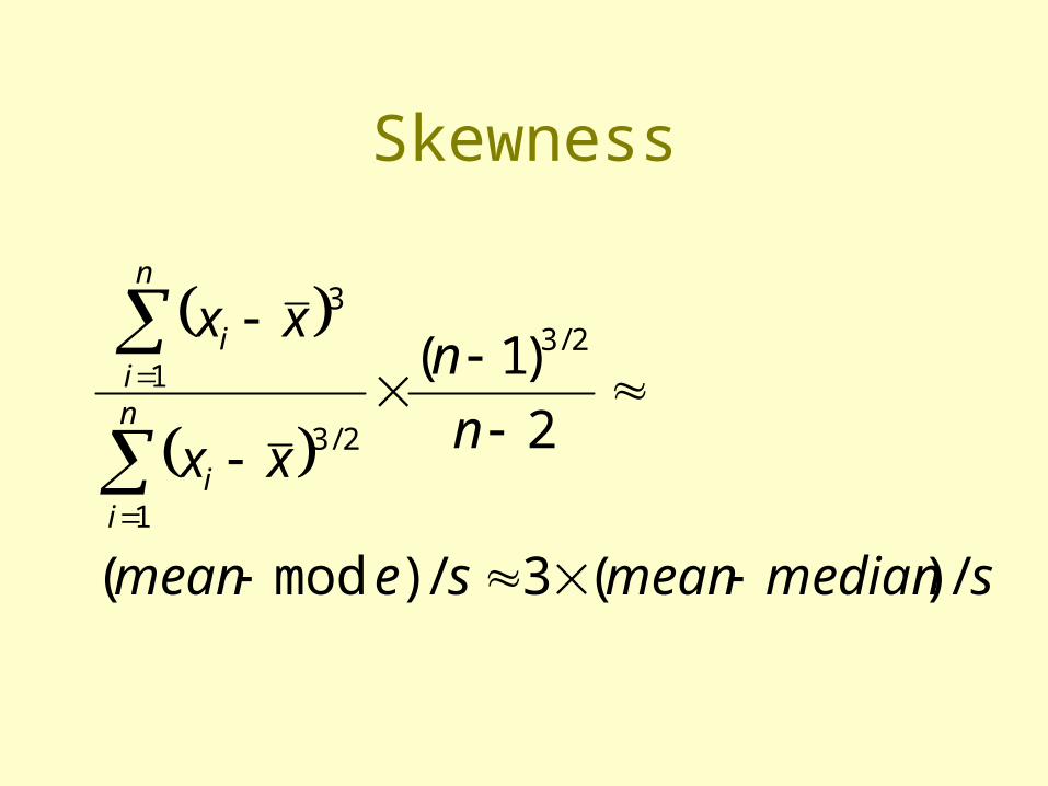
Skewness
smedianmeansemean
n
n
xx
xx
n
ii
n
ii
/)(3/)mod(
2
)1( 2/3
1
2/3
1
3

Skewness
Value
Frequency

Kurtosis
Value
Frequencyk > 3
k = 3
k < 3
leptokurtic
platykurtic
mesokurtic
Beware the “coefficient of excess”

A few words about the normal curve
• Skewness = 0• Kurtosis = 3
22/)(
2
1)(
xexf

More words about the normal curve
34% 34%
47% 47%
49% 49%

“Empirical rule”
sR a n g e
6

SEG exampleThe instructor and/or section leader:
Mean s.d. Skew Kurt Graph
Gives well-prepared, relevant presentations
6.0 0.69 -1.7 8.5
Explains clearly and answers questions well
5.9 0.68 -1.0 4.8
Uses visual aids well 5.6 0.85 -1.8 8.9
Uses information technology effectively 5.5 0.91 -1.1 5.0
Speaks well 6.1 0.69 -1.5 6.8
Encourages questions & class participation 6.1 0.66 -0.88 3.7
Stimulates interest in the subject 5.9 0.76 -1.1 4.7
Is available outside of class for questions 5.9 0.68 -1.3 6.3
Overall rating of teaching 5.9 0.67 -1.2 5.5
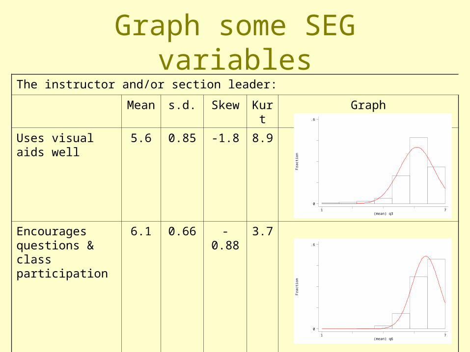
Graph some SEG variablesThe instructor and/or section leader:
Mean s.d. Skew Kurt Graph
Uses visual aids well 5.6 0.85 -1.8 8.9
Encourages questions & class participation
6.1 0.66 -0.88 3.7
Fra
ctio
n
(mean) q31 7
0
.6
Fra
ctio
n
(mean) q61 7
0
.6

Binary data
)1()1(
1 timeof proportion1)(2 xxsxxs
xXprobX
xx
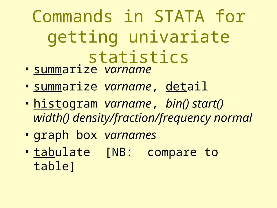
Commands in STATA for getting univariate statistics
• summarize varname
• summarize varname, detail
• histogram varname, bin() start() width() density/fraction/frequency normal
• graph box varnames
• tabulate [NB: compare to table]

Example of Sophomore Test Scores
• High School and Beyond, 1980: A Longitudinal Survey of Students in the United States (ICPSR Study 7896)
• totalscore = % of questions answered correctly on a battery of questions
• recodedtype = (1=public school, 2=religious private private, 3 = non-sectarian private)

Explore totalscore some more
. table recodedtype,c(mean totalscore)
--------------------------recodedty |pe | mean(totals~e)----------+--------------- 1 | .3729735 2 | .4475548 3 | .589883--------------------------

Graph totalscore
. hist totalscore
0.5
11.
52
Den
sity
-.5 0 .5 1totalscore

Divide into “bins” so that each bar represents 1% correct
• hist totalscore,width(.01)
• (bin=124, start=-.24209334, width=.01)
0.5
11.
52
Den
sity
-.5 0 .5 1totalscore

Add ticks at each 10% mark
histogram totalscore, width(.01) xlabel(-.2 (.1) 1)(bin=124, start=-.24209334, width=.01)
0.5
11.
52
Den
sity
-.2 -.1 0 .1 .2 .3 .4 .5 .6 .7 .8 .9 1totalscore

Superimpose the normal curve (with the same mean and s.d. as the
empirical distribution). histogram totalscore, width(.01) xlabel(-.2 (.1) 1) normal(bin=124, start=-.24209334, width=.01)
0.5
11.
52
Den
sity
-.2 -.1 0 .1 .2 .3 .4 .5 .6 .7 .8 .9 1totalscore

Do the previous graph by school types
.histogram totalscore, width(.01) xlabel(-.2 (.1)1) by(recodedtype)(bin=124, start=-.24209334, width=.01)
01
23
01
23
-.2 -.1 0 .1 .2 .3 .4 .5 .6 .7 .8 .9 1
-.2 -.1 0 .1 .2 .3 .4 .5 .6 .7 .8 .9 1
1 2
3Den
sity
totalscoreGraphs by recodedtype

Main issues with histograms
• Proper level of aggregation
• Non-regular data categories (see next)

A note about histograms with unnatural categories (start here)
From the Current Population Survey (2000), Voter and Registration Survey
How long (have you/has name) lived at this address?
-9 No Response-3 Refused-2 Don't know-1 Not in universe1 Less than 1 month2 1-6 months3 7-11 months4 1-2 years5 3-4 years6 5 years or longer

Simple graphF
ract
ion
PES81 6
0
.557134
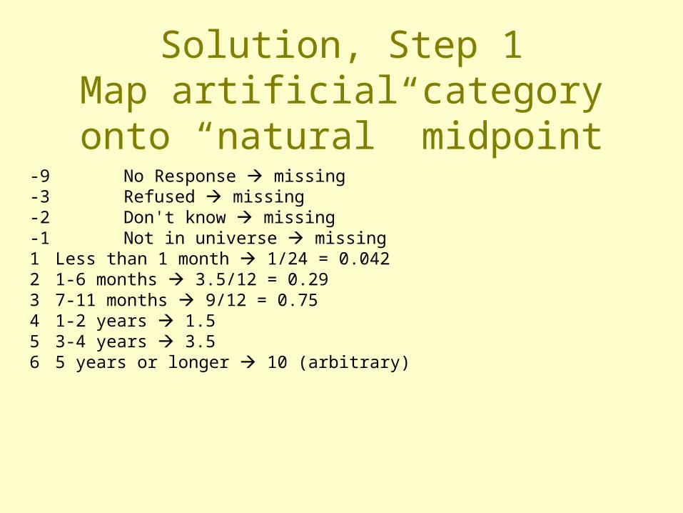
Solution, Step 1Map artificial category onto
“natural” midpoint-9 No Response missing-3 Refused missing-2 Don't know missing-1 Not in universe missing1 Less than 1 month 1/24 = 0.0422 1-6 months 3.5/12 = 0.293 7-11 months 9/12 = 0.754 1-2 years 1.55 3-4 years 3.56 5 years or longer 10 (arbitrary)
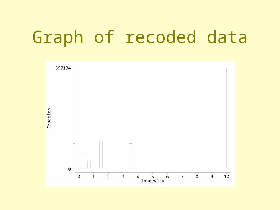
Graph of recoded dataF
ract
ion
longevity0 1 2 3 4 5 6 7 8 9 10
0
.557134

longevity0 1 2 3 4 5 6 7 8 9 10
0
15
Density plot of dataTotal area of last bar = .557Width of bar = 11 (arbitrary)Solve for: a = w h (or) .557 = 11h => h = .051

Density plot template
Category F X-min X-max X-lengthHeight
(density)
< 1 mo. .0156 0 1/12 .082 .19*
1-6 mo. .0909 1/12 ½ .417 .22
7-11 mo. .0430 ½ 1 .500 .09
1-2 yr. .1529 1 2 1 .15
3-4 yr. .1404 2 4 2 .07
5+ yr. .5571 4 15 11 .05
* = .0156/.082

Draw the previous graph with a box plot
. graph box totalscore-.
50
.51
Upper quartileMedianLower quartile
} Inter-quartilerange
} 1.5 x IQR

Draw the box plots for the different types of schools
. graph box totalscore,by(recodedtype)-.
50
.51
-.5
0.5
1
1 2
3
Graphs by recodedtype

Draw the box plots for the different types of schools using “over” option
-.5
0.5
1
1 2 3
graph box totalscore,over(recodedtype)

Issue with box plots
• Sometimes overly highly stylized

Three words about pie charts: don’t use them

So, what’s wrong with them
• For non-time series data, hard to get a comparison among groups; the eye is very bad in judging relative size of circle slices
• For time series, data, hard to grasp cross-time comparisons

Time series example

An exception to the no pie chart rule
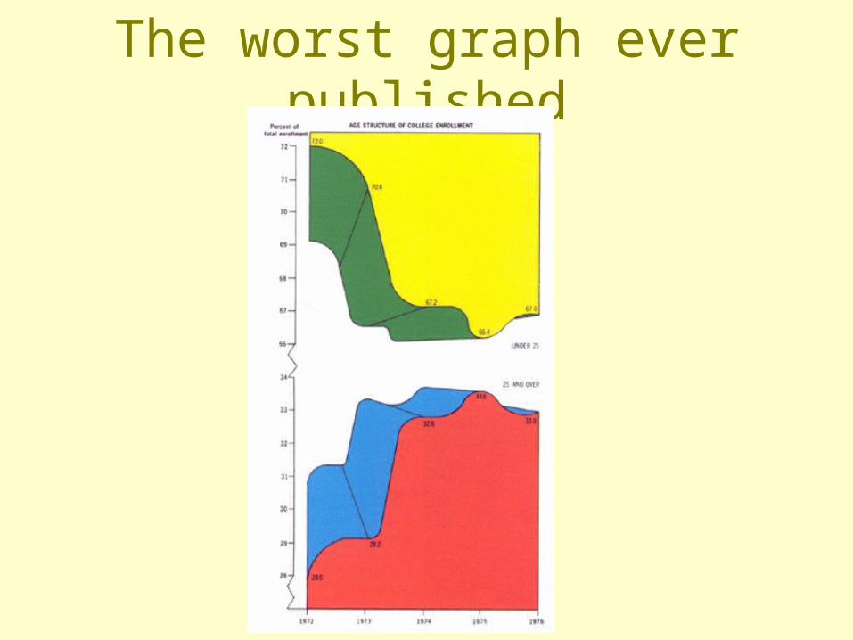
The worst graph ever published