Introduction to Data Visualization -...
28
Introduction to Data Visualization Alark Joshi
Transcript of Introduction to Data Visualization -...

Introduction to Data Visualization
Alark Joshi
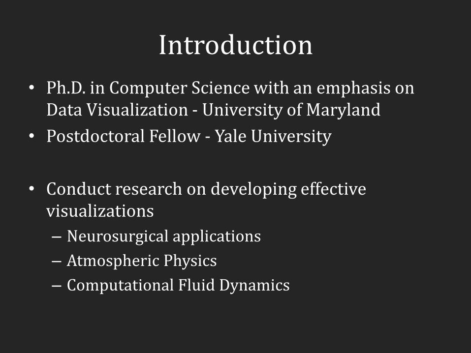
Introduction
• Ph.D. in Computer Science with an emphasis on Data Visualization - University of Maryland
• Postdoctoral Fellow - Yale University
• Conduct research on developing effective visualizations
– Neurosurgical applications
– Atmospheric Physics
– Computational Fluid Dynamics

Why are we here?
Image Credits: NYTimes, Infosthetics, FlowingData
Large Hadron Collider - European Organization for Nuclear Research
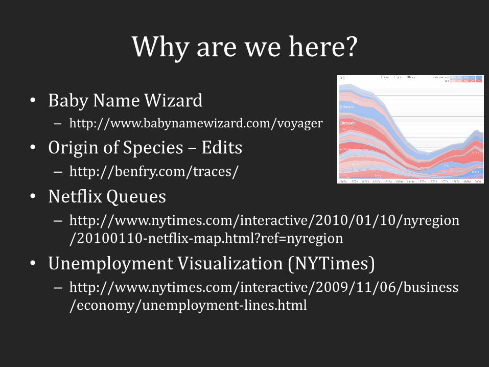
Why are we here?
• Baby Name Wizard – http://www.babynamewizard.com/voyager
• Origin of Species – Edits – http://benfry.com/traces/
• Netflix Queues – http://www.nytimes.com/interactive/2010/01/10/nyregion
/20100110-netflix-map.html?ref=nyregion
• Unemployment Visualization (NYTimes) – http://www.nytimes.com/interactive/2009/11/06/business
/economy/unemployment-lines.html

Goals
• Understand what makes a visualization effective through the study of core principles
• Critically evaluate a visual representation of data by looking at various examples in media (newspapers, television and so on)
• Gain hands-on experience with visualization tools (Tableau, Many Eyes, Prefuse, Parallel Sets)
• Incorporate visualization principles to build an interactive visualization of your own data

Data Scientist
• Professionals responsible for filtering out the noise and analyzing essential information
• Integral part of competitive intelligence, a newly emerging field that encompasses data analysis to help businesses gain a competitive edge
• A shortfall of about 140,000 to 190,000 individuals with analytical expertise is projected by 2018
• Glassdoor.com shows average data scientist salaries ranging from $60,000 to $115,000
Slide credits: Data Scientist: The Hottest Job You Haven't Heard Of – AOL Jobs

What is Data Visualization?
• Visual Representation of Data
• For exploration, discovery, insight, ..
• Interactive component provides more insight as compared to a static image
Image credits: Yahoo Finance, IBM
In-class Reading
• Seven things you need to know about Data Visualization (5 mins)
• What did you find out that you about data visualization did not know?

Types of Data Visualization
• Scientific Visualization –
– Structural Data – Seismic, Medical, ..
• Information Visualization
– No inherent structure – News, stock market, top grossing movies, facebook connections
• Visual Analytics
– Use visualization to understand and synthesize large amounts of multimodal data – audio, video, text, images, networks of people ..

Scientific Visualization

Information Visualization

Visual Analytics
• Integration of interactive visualization with analysis techniques to answer a growing range of questions in science, business, and analysis.
• Making sense of multimodal data -audio clips, video, photographs, transcripts, …

Al Gore – An Inconvenient Truth

Visualization of Napoleon’s Army
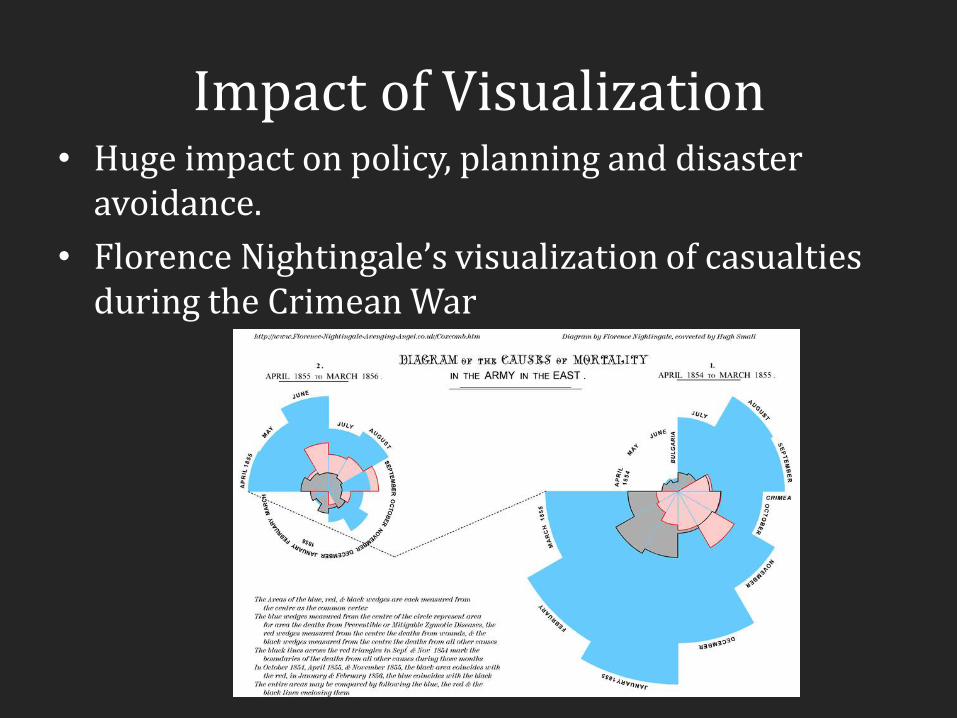
Impact of Visualization • Huge impact on policy, planning and disaster
avoidance.
• Florence Nightingale’s visualization of casualties during the Crimean War

Impact of Visualization
• Hurricane Visualization for the common man
Demo:
http://www.msnbc.msn.com/id/26295161?preferredName=Gustav
Image Credits: Stamen Design

Impact of Visualization
• John Snow’s Cholera Map
• Snow used a spot map to illustrate how cases of cholera clustered around the pump

Truth about Crime - BBC
• http://www.bbc.co.uk/truthaboutcrime/crimemap/

Ushahidi
• “testimony” in Swahili
• Developed to map user reported violence in Kenya after the post-election fallout at the beginning of 2008
• Adapted and used by
– votereport.in and
– swineflu.ushahidi.com.
Good data representation principles
• Breakout into groups of two and identify five good data visualization principles
– 5 minutes

List of principles
• Integrate and distill the principles
• “Everything should be made as simple as possible, but not simpler.” ~Albert Einstein

Contact Information
• Email: [email protected]
• Office location: MEC 302A
• Weekly office hours: Tue/Thu 2:30-3:30pm or by appointment

Resources
• Research Papers
• Websites/Blogs
• Relevant book chapters that will be provided well in advance

Course Details
• Weekly Reading Response (blog posts) - 10%
• Two In-class paper presentations -10%
• Assignments - 30%
• Final Project - 50% – Client interview + Project Proposal – 10%
– Annotated bibliography – 5%
– Alpha release – 5%
– Beta release – 5%
– Final Project Presentation, Report (8-pages), Source Code and Client Testimonial – 25%

Assignments
• Use of tools such as IBM Many Eyes and Tableau Software to visualize interesting patterns in data
• Familiarize yourself with the Visualization Toolkit and its inherent features/techniques
• Use the Processing programming language to implement a visualization technique

Activities for next class
• Create a blog (wordpress.com or any hosting service
of your choice that allows comments) and email me the link
• Create an account on IBM Many Eyes
• Look through some of the popular media (websites/newspapers etc.) and post an image of a good and a bad visualization on your blog before next class
• Watch Hans Rosling’s TED talk and post your reaction on your blog by next week

Next class
• Design Principles
• Graphical Integrity
• Graph IQ Test – Bring your laptops

Reading for next week
• Links to papers will be regularly posted on the class website
1. How not to lie with visualization, B. Rogowitz, L. Treinish and S. Bryson, 1996.
2. 14 Ways to Say Nothing with Scientific Visualization by A. Globus and E. Raible.