Introduction to Data Science - prod-edxapp.edx-cdn.org · Introduction to Data Science Lab 4 –...
32
Introduction to Data Science Lab 4 – Introduction to Machine Learning Overview In the previous labs, you explored a dataset containing details of lemonade sales. In this lab, you will use machine learning to train a predictive model that predicts daily lemonade sales based on variables such as the weather and the number of flyers distributed. You will then publish the model as a web service and use it from Excel. What You’ll Need To complete the labs, you will need the following: • A Windows, Linux, or Mac OS X computer with a web browser. • A Microsoft account (for example a hotmail.com, live.com. or outlook.com account). If you do not already have a Microsoft account, sign up for one at https://signup.live.com. • The lab files for this course. Download these from https://aka.ms/edx-dat101x-labfiles, and extract them to a folder on your computer. Exercise 1: Creating a Machine Learning Model Machine Learning is a term used to describe the development of predictive models based on historic data. There are a variety of tools, languages, and frameworks you can use to create machine learning models; including R, the Sci-kit Learn package in Python, Apache Spark, and Azure Machine Learning. In this lab, you will use Azure Machine Learning Studio, which provides an easy to use web-based interface for creating machine learning models. The principles used to develop the model in this tool apply to most other machine learning development platforms, but the graphical nature of the Azure Machine Learning Studio environment makes it easier to focus on learning these principles without getting distracted by the code required to manipulate data and train the model. Create an Azure Machine Learning Studio Workspace Note: If you already have an Azure Machine Learning workspace, you can skip this procedure and sign into Azure Machine Learning Studio at https://studio.azureml.net. 1. In your web browser, navigate to https://studio.azureml.net, and if you don’t already have a free Azure Machine Learning Studio workspace, click the option to sign up and choose the Free Workspace option and sign in using your Microsoft account.
Transcript of Introduction to Data Science - prod-edxapp.edx-cdn.org · Introduction to Data Science Lab 4 –...
Introduction to Data Science Lab 4 – Introduction to Machine Learning
Overview In the previous labs, you explored a dataset containing details of lemonade sales.
In this lab, you will use machine learning to train a predictive model that predicts daily lemonade sales
based on variables such as the weather and the number of flyers distributed. You will then publish the
model as a web service and use it from Excel.
What You’ll Need To complete the labs, you will need the following:
• A Windows, Linux, or Mac OS X computer with a web browser.
• A Microsoft account (for example a hotmail.com, live.com. or outlook.com account). If you do not
already have a Microsoft account, sign up for one at https://signup.live.com.
• The lab files for this course. Download these from https://aka.ms/edx-dat101x-labfiles, and extract
them to a folder on your computer.
Exercise 1: Creating a Machine Learning Model Machine Learning is a term used to describe the development of predictive models based on historic
data. There are a variety of tools, languages, and frameworks you can use to create machine learning
models; including R, the Sci-kit Learn package in Python, Apache Spark, and Azure Machine Learning.
In this lab, you will use Azure Machine Learning Studio, which provides an easy to use web-based
interface for creating machine learning models. The principles used to develop the model in this tool
apply to most other machine learning development platforms, but the graphical nature of the Azure
Machine Learning Studio environment makes it easier to focus on learning these principles without
getting distracted by the code required to manipulate data and train the model.
Create an Azure Machine Learning Studio Workspace Note: If you already have an Azure Machine Learning workspace, you can skip this procedure and sign
into Azure Machine Learning Studio at https://studio.azureml.net.
1. In your web browser, navigate to https://studio.azureml.net, and if you don’t already have a
free Azure Machine Learning Studio workspace, click the option to sign up and choose the Free
Workspace option and sign in using your Microsoft account.

2. After signing up, view the EXPERIMENTS tab in Azure Machine Learning Studio, which should
look like this:
Upload the Lemonade Dataset 1. In Azure Machine Learning Studio, click DATASETS. You should have no datasets of your own
(clicking Samples will display some built-in sample datasets).
2. At the bottom left, click + NEW, and ensure that the DATASET tab is selected.
3. Click FROM LOCAL FILE. Then in the Upload a new dataset dialog box, browse to select
the Lemonade.csv file in the folder where you extracted the lab files on your local computer and
enter the following details as shown in the image below, and then click the (✓) icon.
• This is a new version of an existing dataset: Unselected • Enter a name for the new dataset: Lemonade.csv • Select a type for the new dataset: Generic CSV file with a header (.csv) • Provide an optional description: Lemonade sales data.
4. Wait for the upload of the dataset to be completed, then verify that it is listed under MY
DATASETS and click the OK (✓) button to hide the notification.
The Lemonade.csv file contains the original lemonade sales data in comma-delimited format.
Create an Experiment and Explore the Data 1. In Azure Machine Learning Studio, click EXPERIMENTS. You should have no experiments in your
workspace yet.
2. At the bottom left, click + NEW, and ensure that the EXPERIMENT tab is selected. Then click the
Blank Experiment tile to create a new blank experiment.
3. At the top of the experiment canvas, change the experiment name to Lemonade Training as
shown here:

The experiment interface consists of a pane on the left containing the various items you can add
to an experiment, a canvas area where you can define the experiment workflow, and a
Properties pane where you can view and edit the properties of the currently selected item. You
can hide the experiment items pane and the Properties pane by clicking the < or > button to
create more working space in the experiment canvas.
4. In the experiment items pane, expand Saved Datasets and My Datasets, and then drag the
Lemonade.csv dataset onto the experiment canvas, as shown here:

5. Right-click the dataset output of the Lemonade.csv dataset and click Visualize as shown here:
1. In the data visualization, note that the dataset includes a record, often referred to as an
observation or case, for each day, and each case has mulitple characteristics, or features – in this
example, the date, day of the week, temperature, rainfall, number of flyers distributed, and the
price Rosie charged per lemonade that day. The dataset also includes the number of sales Rosie
made that day – this is the label that ultimately you must train a machine learning model to
predict based on the features.
2. Note the number of rows and columns in the dataset (which is very small – real-world datasets
for machine learning are typically much larger), and then select the column heading for the
Temperature column and note the statistics about that column that are displayed, as shown
here:

3. In the data visualization, scroll down if necessary to see the histogram for Temperature. This
shows the distribution of different temperatures in the dataset:
4. Click the x icon in the top right of the visualization window to close it and return to the
experiment canvas.
Explore Data in a Jupyter Notebook Jupyter Notebooks are often used by data scientists to explore data. They consist of an interactive
browser-based environment in which you can add notes and run code to manipulate and visualize data.
Azure Machine Learning Studio supports notebooks for two languages that are commonly used by data
scientists: R and Python. Each language has its particular strengths, and both are prevalent among data
scientists. In this lab, you can use either (or both).
To Explore Data using Python: 1. Right-click the Lemonade.csv dataset output, and in the Open in a new Notebook sub-menu,
click Python 3. This opens a new browser tab containing a Jupyter notebook with two cells, each
containing some code. The first cell contains code that loads the CSV dataset into a data frame
named frame, similar to this:
from azureml import Workspace
ws = Workspace()
ds = ws.datasets['Lemonade.csv']
frame = ds.to_dataframe()
The second cell contains the following code, which displays a summary of the data frame:
frame
2. On the Cell menu, click Run All to run all of the cells in the workbook. As the code runs, the O
symbol next to Python 3 at the top right of the page changes to a ⚫ symbol, and then returns to
O when the code has finished running.
3. Observe the output from the second cell, which shows some rows of data from the dataset, as
shown here:

1. Click cell 2 (which contains the code frame), and then on the Insert menu, click Insert Cell
Below. This adds a new cell to the notebook, under the output generated by cell 2.
2. Add the following code to the new empty cell (you can copy and paste this code from Python.txt
in the folder where you extracted the lab files for this course):
%matplotlib inline
from matplotlib import pyplot as plt
# Print statistics for Temperature and Sales
print(frame[['Temperature','Sales']].describe())
# Print correlation for temperature vs Sales
print('\nCorrelation:')
print(frame['Temperature'].corr(frame['Sales']))
# Plot Temperature vs Sales
plt.xlabel('Temperature')
plt.ylabel('Sales')
plt.grid()
plt.scatter(frame['Temperature'],frame['Sales'])
plt.show()
3. With the cell containing the new code selected, on the Cell menu, click Run Cells and Select
Below (or click the | button on the toolbar) to run the cell, creating a new cell beneath.
Note: You can ignore any warnings that are generated.
4. View the output from the code, which consists of descriptive statistics for the Temperature and
Sales columns, the correlation value for Temperature and Sales, and a scatterplot chart of
Temperature vs Sales as shown here:

5. On the File menu, click Close and Halt to close the notebook and return to the experiment in
Azure Machine Learning Studio.
To Explore Data using R: 1. Right-click the Lemonade.csv dataset output, and in the Open in a new Notebook sub-menu,
click R. This opens a new browser tab containing a Jupyter notebook with two cells, each
containing some code. The first cell contains code that loads the CSV dataset into a data frame
named dat, similar to this:
library("AzureML")
ws <- workspace()
dat <- download.datasets(ws, "Lemonade.csv")
The second cell contains the following code, which displays a summary of the data frame:
head(dat)
2. On the Cell menu, click Run All to run all of the cells in the workbook. As the code runs, the O
symbol next to R at the top right of the page changes to a ⚫ symbol, and then returns to O when
the code has finished running.
3. Observe the output from the second cell, which shows some rows of data from the dataset, as
shown here:

6. Click cell 2 (which contains the code head(dat)), and then on the Insert menu, click Insert Cell
Below. This adds a new cell to the notebook, under the output generated by cell 2.
7. Add the following code to the new empty cell (you can copy and paste this code from R.txt in
the folder where you extracted the lab files for this course):
# Print statistics for Temperature and Sales
summary(dat[c('Temperature', 'Sales')])
print('Standard Deviations:')
apply(dat[c('Temperature', 'Sales')],2,sd)
# Print correlation for temperature vs Sales
print('Correlation:')
cor(dat[c('Temperature', 'Sales')])
# Plot Temperature vs Sales
plot(dat$Temperature, dat$Sales, xlab="Temperature", ylab="Sales")
8. With the cell containing the new code selected, on the Cell menu, click Run Cells and Select
Below (or click the | button on the toolbar) to run the cell, creating a new cell beneath.
9. View the output from the code, which consists of descriptive statistics for the Temperature and
Sales columns, the correlation matrix for Temperature and Sales, and a scatterplot chart of
Temperature vs Sales as shown here:

10. On the File menu, click Close and Halt to close the notebook and return to the experiment in
Azure Machine Learning Studio.
Prepare Data for Model Training 1. In the Lemonade Training experiment, visualize the output of the Lemonade.csv dataset and
select the Rainfall column.
2. Under the statistics for this column, view the histogram and note that it is right-skewed:

3. In the compare to drop-down list, select Sales and view the resulting scatterplot:
4. Note the curved nature of the relationship, and then select the Rainfall log scale checkbox and
view the updated scatterplot:
5. Note that this partially “straightens” the relationship to make it more linear; so converting
Rainfall to its natural log may make it easier to define a linear function that relates these
columns. Using the log scale for Sales would straighten it even more, but since Sales already has
a linear relationship with other columns (as we saw with Temperature in the notebook
visualizations), it may be best to leave that column as it is.
6. Close the visualization.

7. In the Search experiment items box, enter Math. Then drag the Apply Math Operation module
onto the canvas, under the Lemonade.csv dataset, and connect the output of the Lemonade.csv
dataset to the Apply Math Operation module as shown here:
8. With the Apply Math Operation module selected, in the Properties pane, select the Basic
category and the Ln basic function as shown here:
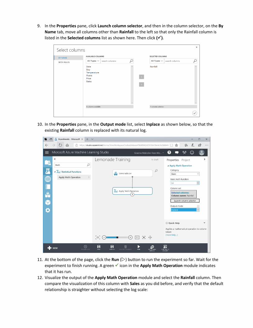
9. In the Properties pane, click Launch column selector, and then in the column selector, on the By
Name tab, move all columns other than Rainfall to the left so that only the Rainfall column is
listed in the Selected columns list as shown here. Then click (✓).
10. In the Properties pane, in the Output mode list, select Inplace as shown below, so that the
existing Rainfall column is replaced with its natural log.
11. At the bottom of the page, click the Run () button to run the experiment so far. Wait for the
experiment to finish running. A green ✓ icon in the Apply Math Operation module indicates
that it has run.
12. Visualize the output of the Apply Math Operation module and select the Rainfall column. Then
compare the visualization of this column with Sales as you did before, and verify that the default
relationship is straighter without selecting the log scale:

13. In the compare to drop-down list, select Temperature, and view the relationship between
rainfall and temperature:
Take a close look at the scale on each axis. Temperatures range from 0 to over 100, while the log
of rainfall is fractional between 0 and 0.8. If you were to compare all of the features in the
dataset, you’d find that there is some disparity between the scales of values – for example, the
number of flyers distributed ranges from 9 to 80, but the price of a lemonade ranges from 0.3 to
0.5. When training a machine learning model, features with larger scales of value can dominate
features on smaller scales; so it’s generally useful to normalize the numeric features so that they
are on a similar scale while maintaining the correct proportional distances between values for
any given feature. We’ll do this next.
14. Close the visualization and return to the experiment canvas.

15. In the Search experiment items box, type Normalize, and then drag a Normalize Data module
to the canvas and connect it to the output from the Apply Math Operation module as shown
here:
16. Configure the Normalize Data module properties as follows:
• Transformation method: ZScore
• Use 0 for constant columns when checked: Checked
• Selected columns: Temperature and Flyers
ZScore normalization works well for numeric features that have an approximately normal
distribution.
17. Select the Normalize Data module and on the Run menu, click Run Selected to run the data
flow.
18. After the experiment has been run, add a second Normalize Data module to the experiment, and
connect the Transformed dataset (left) output of the first Normalize Data module to its input as
shown here:
19. Configure the new Normalize Data module as follows
• Transformation method: MinMax
• Use 0 for constant columns when checked: Checked
• Selected columns: Rainfall and Price

MinMax normalization works well for features that are not normally distributed.
20. Run the experiment.
21. Visualize the Transformed Dataset (left) output of the last Normalize Data module and view the
Temperature, Rainfall, Flyers, and Price columns. These have all been normalized so that the
values are of a similar scale, while maintaining the proportional distributions within each feature:
22. Close the visualization and return to the experiment canvas.
Train a Regression Model 1. Search for the Edit Metadata module, add one to the experiment, and connect the Transformed
dataset (left) output of the second Normalize Data module to its input as shown here:
2. Configure the properties of the Edit Metadata module as follows:
• Selected columns: Date, Day, and Sales
• Data type: Unchanged
• Categorical: Unchanged
• Fields: Clear feature
• New column names: leave blank
The Date and Day columns aren’t likely to help predict sales volumes, and Sales column is the
label the model will predict; so these fields should not be used as features to train the model.

3. Search for the Split Data module, add one to the canvas, and connect the Results dataset
output of the Edit Metadata module to its input as shown here:
4. Configure the Split Data module properties as follows:
• Splitting mode: Split Rows
• Fraction of rows in the first output dataset: 0.7
• Randomized split: Checked
• Random seed: 0
• Stratified split: False
You are going to train a regression model, which is a form of supervised learning that predicts
numeric values. When training a supervised learning model, it is standard practice to split the
data into a training dataset and a test dataset, so that you can validate the trained model using
test data that contains the actual label values the model is being trained to predict. In this case,
you are going to use 70% of the data to train the model while withholding 30% of the data with
which to test it.
5. Select the Split Data module, and on the Run menu, click Run selected.
6. In the Search experiment items box, type Linear Regression, and then drag a Linear Regression
module to the canvas, to the left of the Split Data module.
7. In the Search experiment items box, type Train Model, and then drag a Train Model module to
the canvas, under the Linear Regression and Split Data modules.
8. Connect the Untrained Model output of the Linear Regression module to the Untrained Model
(left) input of the Train Model module. Then connect the Result dataset1 (left) output of the
Split Data module to the Dataset (right) input of the Train Model module as shown here:

9. Select the Linear Regression module and review its default properties. These parameters are
used to regularize the training of the model – that is, minimize bias so that the model
generalizes well when used with new data.
10. Select the Train Model module and use the column selector to select the Sales column – this is
the label that the model will be trained to predict.
11. In the Search experiment items box, type Score Model, and then drag a Score Model module to
the canvas, under the Train Model module.
12. Connect the Trained model output of the Train Model module to the Trained model (left) input
of the Score Model module. Then connect the Results dataset2 (right) output of the Split Data
module to the Dataset (right) input of the Score Model module as shown here:
The Score Model module applies the trained model to the withheld test dataset, predicting a
scored label (in this case, the number of sales).
13. In the Search experiment items box, type Evaluate Model, and then drag an Evaluate Model
module to the canvas, under the Score Model module. Then connect the Scored dataset output
of the Score Model module to its Scored dataset (left) input as shown here:
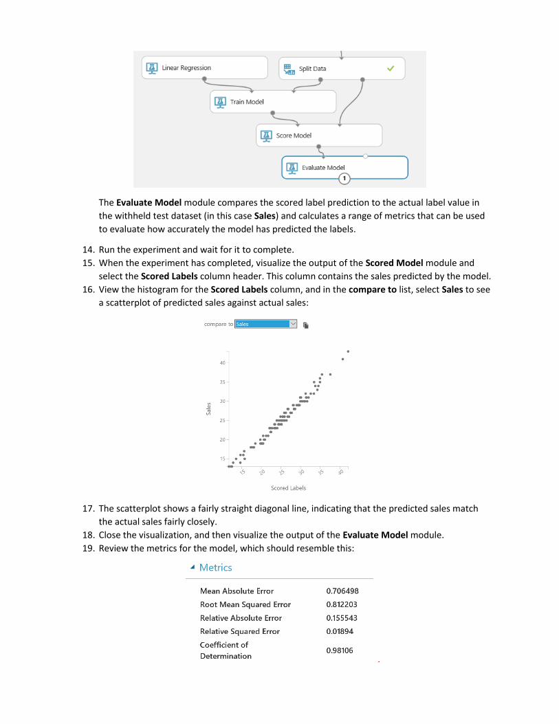
The Evaluate Model module compares the scored label prediction to the actual label value in
the withheld test dataset (in this case Sales) and calculates a range of metrics that can be used
to evaluate how accurately the model has predicted the labels.
14. Run the experiment and wait for it to complete.
15. When the experiment has completed, visualize the output of the Scored Model module and
select the Scored Labels column header. This column contains the sales predicted by the model.
16. View the histogram for the Scored Labels column, and in the compare to list, select Sales to see
a scatterplot of predicted sales against actual sales:
17. The scatterplot shows a fairly straight diagonal line, indicating that the predicted sales match
the actual sales fairly closely.
18. Close the visualization, and then visualize the output of the Evaluate Model module.
19. Review the metrics for the model, which should resemble this:

Mean Absolute Error (MAE) and Root Mean Square Error (RMSE) are metrics that measure the
residuals (the variance between predicted and actual values) in the same units as the label itself
– in this case the number of sales. Both of these metrics indicate that on average, the model is
accurate within one sale.
Relative Absolute Error (RAE) and Relative Squared Error (RSE) are relative measures of error.
The closer these values are to zero, the more accurately the model is predicting.
Coefficient of Determination, sometimes known as R-Squared, is another relative measure of
accuracy; but this time, the closer it is to 1, the better the model is performing.
Overall, it looks like the model is performing well.
Note: In reality, most models are not immediately this accurate – it usually takes several
iterations to determine the best features to use in the model. Additionally, just because the
model performs well with the test data, that doesn’t mean it will generalize well with new data
– it may be overfitted to the training dataset. There are techniques that data scientists use to
validate models and avoid overfitting, which we don’t have time to cover in this introductory
course.
20. Close the visualization and return to the experiment canvas.
Exercise 2: Publishing and Using a Machine Learning Model Now that you have trained a machine learning model, you can publish it as a web service and use it to
predict labels from new feature data. In Azure Machine Learning Studio, you do this by creating a
predictive experiment that encapsulates your model and the data preparation steps you have defined,
and which defines the input and output interfaces through which features are passed into the model
and predicted labels are returned. You then publish this predictive experiment as a web service in Azure.
Create a Predictive Experiment 1. In the Lemonade Training experiment, on the toolbar under the experiment canvas, click the Set
Up Web Service icon and click Predictive Web Service [Recommended]. Then wait for the
predictive experiment to be created and click Close to close the notification.
2. In the Predictive Experiment tab, change the experiment name from Lemonade Training
[Predictive Exp.] to Predict Lemonade Sales. Then rearrange the modules in the predictive
experiment like this:

The experiment consists of:
• A web service input with a schema defined by the original Lemonade.csv training
dataset.
• The Apply Math operation to replace Rainfall with its natural log.
• An Apply Transformation module that normalizes the Temperature and Flyers features
using the ZScore statistics from the training data.
• An Apply Transformation module that normalizes the Rainfall and Price features using
the MinMax statistics from the training data.
• An Edit Metadata module that clears the Day, Date, and Sales features.
• A Score Model module that predicts the scored label from the input data by applying
the rained model.
• A web service output that returns the results to the calling application.
3. Delete the Lemonade.csv dataset, then search for an Enter Data Manually module, add it to the
top of the experiment, and connect its output to the input of the Apply Math Operation like
this:

The Lemonade.csv dataset included the Sales field, which is what the model predicts. It therefore
makes sense to redefine the input schema for the web service so that the Sales field is not
submitted.
4. Select the Enter Data Manually module, and in the Properties pane, ensure DataFormat is set
to CSV and HasHeader is selected, and then enter the following test data (which you can copy
and paste from Input.txt in the folder where you extracted the lab files):
Date,Day,Temperature,Rainfall,Flyers,Price
01/01/2017,Sunday,27,2.00,15,0.3
02/01/2017,Monday,28.9,1.33,15,0.3
03/01/2017,Tuesday,34.5,1.33,27,0.3
04/01/2017,Wednesday,44.1,1.05,28,0.3
5. Select the Edit Metadata module and edit its properties to launch the column selector and
remove the Sales field – this field no longer exists in the input dataset, so referencing it here will
cause a runtime error when the web service is called.
6. Run the experiment.
7. Visualize the output from the Score Model module, and note that it includes all of the fields
from the input data you entered manually along with the scored labels.
Client applications calling the web service only require the scored labels, so you can modify the
output schema to remove the other fields.
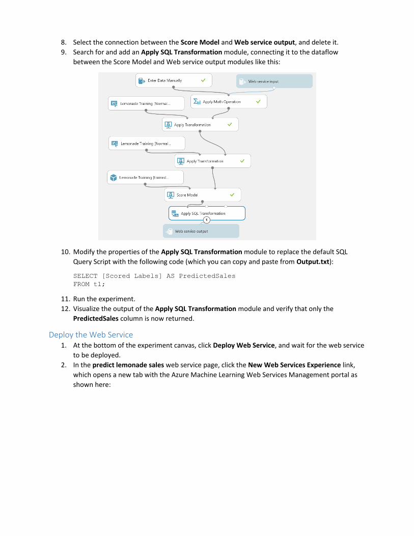
8. Select the connection between the Score Model and Web service output, and delete it.
9. Search for and add an Apply SQL Transformation module, connecting it to the dataflow
between the Score Model and Web service output modules like this:
10. Modify the properties of the Apply SQL Transformation module to replace the default SQL
Query Script with the following code (which you can copy and paste from Output.txt):
SELECT [Scored Labels] AS PredictedSales
FROM t1;
11. Run the experiment.
12. Visualize the output of the Apply SQL Transformation module and verify that only the
PredictedSales column is now returned.
Deploy the Web Service 1. At the bottom of the experiment canvas, click Deploy Web Service, and wait for the web service
to be deployed.
2. In the predict lemonade sales web service page, click the New Web Services Experience link,
which opens a new tab with the Azure Machine Learning Web Services Management portal as
shown here:
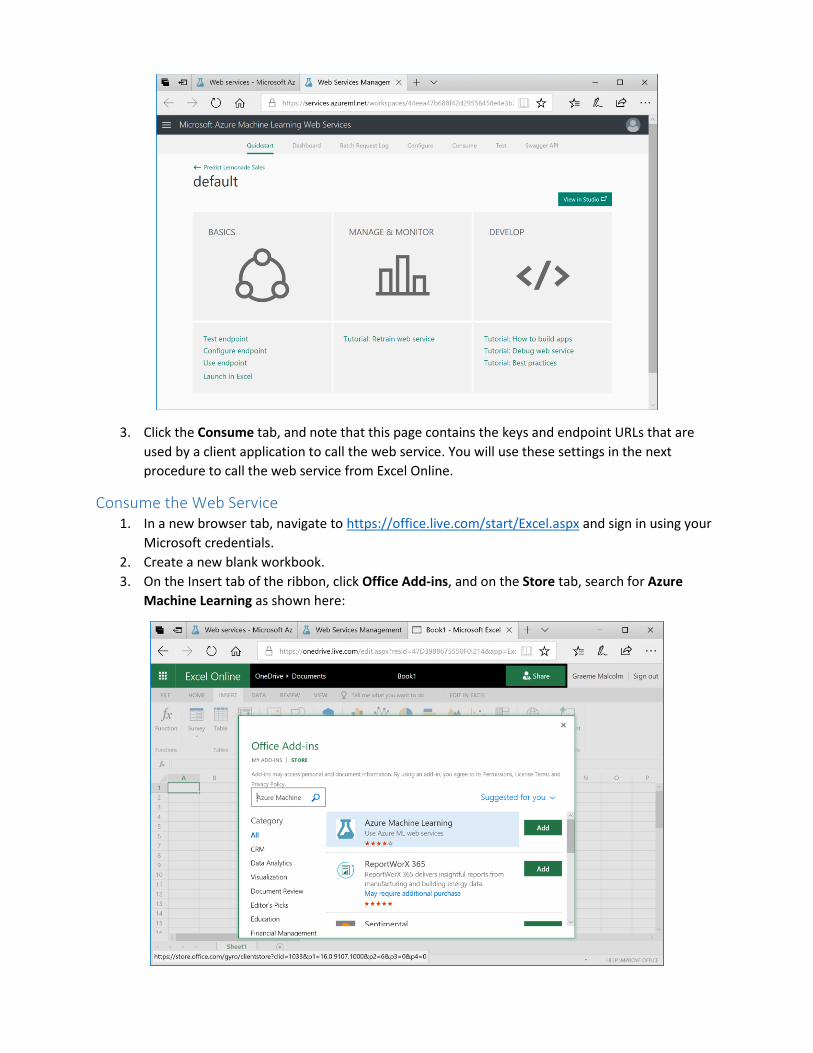
3. Click the Consume tab, and note that this page contains the keys and endpoint URLs that are
used by a client application to call the web service. You will use these settings in the next
procedure to call the web service from Excel Online.
Consume the Web Service 1. In a new browser tab, navigate to https://office.live.com/start/Excel.aspx and sign in using your
Microsoft credentials.
2. Create a new blank workbook.
3. On the Insert tab of the ribbon, click Office Add-ins, and on the Store tab, search for Azure
Machine Learning as shown here:

4. Add the Azure Machine Learning add-in. This opens the Azure Machine Learning tab in Excel
like this:
The add-in includes links for some built-in sample web services, but you will add your own web
service.
5. Click Add Web Service.
6. Switch back to the Web Services Management tab in your browser, and copy the Request-
Response URL to the clipboard. Then return to the Excel Online tab and paste the copied URL
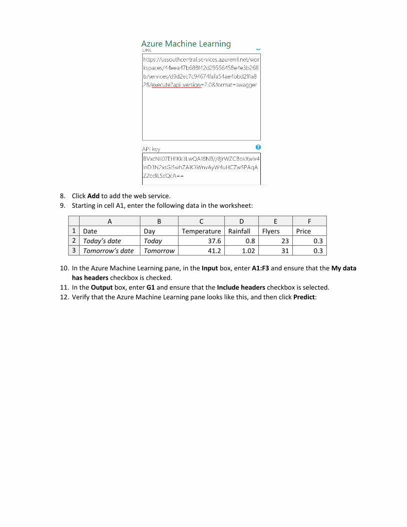
into the URL textbox of the Azure Machine Learning pane as shown here:
7. Switch back to the Web Services Management tab in your browser, and copy the Primary Key to
the clipboard. Then return to the Excel Online tab and paste the copied key into the API key
textbox of the Azure Machine Learning pane as shown here:
8. Click Add to add the web service.
9. Starting in cell A1, enter the following data in the worksheet:
A B C D E F
1 Date Day Temperature Rainfall Flyers Price
2 Today’s date Today 37.6 0.8 23 0.3
3 Tomorrow’s date Tomorrow 41.2 1.02 31 0.3
10. In the Azure Machine Learning pane, in the Input box, enter A1:F3 and ensure that the My data
has headers checkbox is checked.
11. In the Output box, enter G1 and ensure that the Include headers checkbox is selected.
12. Verify that the Azure Machine Learning pane looks like this, and then click Predict:

13. Wait for the web service to be called, and then view the PredictedSales values that are
returned, which should be similar to this:
Challenge
Try predicting sales for today and tomorrow if Rosie increases the number of flyers to 100.
Exercise 3: Training a Classification Model The model you have built to predict daily sales is an example of a regression model. Classification is
another kind of supervised learning in which instead of predicting a numeric value, the model is trained
to predict the category or class of an observation. In this exercise, you will copy an existing training
experiment from the Azure AI Gallery and run it to train a classification model that predicts whether or
not Rosie will make a profit on a given day.
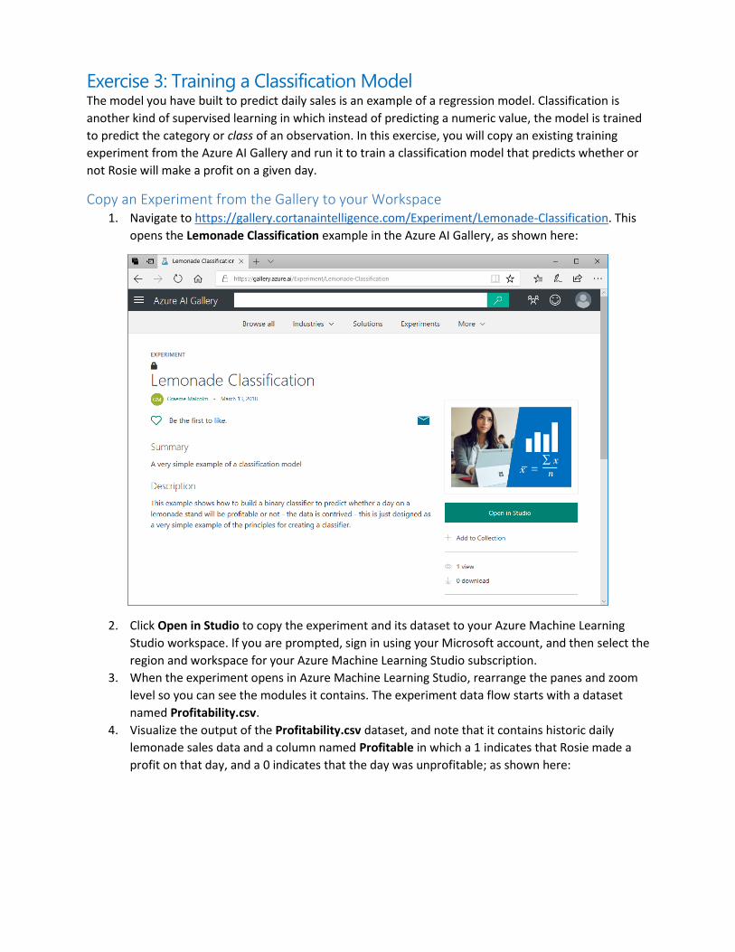
Copy an Experiment from the Gallery to your Workspace 1. Navigate to https://gallery.cortanaintelligence.com/Experiment/Lemonade-Classification. This
opens the Lemonade Classification example in the Azure AI Gallery, as shown here:
2. Click Open in Studio to copy the experiment and its dataset to your Azure Machine Learning
Studio workspace. If you are prompted, sign in using your Microsoft account, and then select the
region and workspace for your Azure Machine Learning Studio subscription.
3. When the experiment opens in Azure Machine Learning Studio, rearrange the panes and zoom
level so you can see the modules it contains. The experiment data flow starts with a dataset
named Profitability.csv.
4. Visualize the output of the Profitability.csv dataset, and note that it contains historic daily
lemonade sales data and a column named Profitable in which a 1 indicates that Rosie made a
profit on that day, and a 0 indicates that the day was unprofitable; as shown here:

5. Review the rest of the experiment, noting that it contains modules to perform the following
tasks:
• Create a new feature containing the normal log of Rainfall.
• Scale the numeric features using Z-Score or MinMax normalization depending on the
distribution of the numeric column data.
• Mark Day as a categorical field.
• Clear the Date and Rainfall features.
• Split the dataset into two subsets for training (70%) and testing (30%).
• Use the two-class logistic regression algorithm to train a classification model that
predicts Profitable (in spite of being called “logistic regression”, this algorithm is used to
predict classes rather than numeric values).
• Score the trained model using the test data.
• Evaluate the model based on the test results.
Run the Experiment and View the Results 1. Run the Lemonade Classification experiment and wait for it to complete.
2. When the experiment has finished running, view the output of the Score Model module, and
note that it contains new fields named Scored Labels and Scored Probabilities as shown here:

Compare some of the values in the Scored Labels field to the Profitable field. In most cases, the
predicted value in the Scored Labels field should be the same as the Profitable field.
Compare the Scored Labels field to the Scored Probabilities field. The scored probability is the
numeric value between 0 and 1 calculated by classification algorithm. When this value is closer
to 0 than 1, the Scored Labels field is 0; and when its closer to 1 than to 0, the Scored Labels
field is 1.
3. Visualize the output of the Evaluate Model module to open the Evaluation results window, and
view the Received Operator Characteristic (ROC) chart, which should look like this:
The larger the area under the curve in this chart, the better the model is performing. In this
case, the line goes almost all the way up the left side before going across the top, resulting in an
area under the curve that includes almost all of the chart.
4. In the Evaluation results window, scroll down to view the evaluation metrics, which includes the
confusion matrix formed by true positive, false negative, false positive, and true negative
predictions; the accuracy, recall, precision, and F1 score; the threshold, and the area under the
curve (AUC) – as shown here:
These results indicate that, based on the test data, the trained model does a good job of
predicting whether or not a particular day will be profitable.
Challenge
Adjust the threshold by dragging the slider, and observe the effect on the model metrics.

Exercise 4: Training a Clustering Model So far you have trained two supervised machine learning models: one for regression, and one for
classification. Clustering is an example of unsupervised learning; in other words, training a predictive
model with no known labels. In this exercise, you will copy an existing training experiment from the
Azure AI Gallery and run it to train a K-Means clustering model that segments Rosie’s customers into
clusters based on similarities in their features.
Copy an Experiment from the Gallery to your Workspace 6. Navigate to https://gallery.cortanaintelligence.com/Experiment/Lemonade-Clustering-
Customers. This opens the Lemonade - Clustering Customers example in the Azure AI Gallery, as
shown here:
7. Click Open in Studio to copy the experiment and its dataset to your Azure Machine Learning
Studio workspace. If you are prompted, sign in using your Microsoft account, and then select the
region and workspace for your Azure Machine Learning Studio subscription.
8. When the experiment opens in Azure Machine Learning Studio, rearrange the panes and zoom
level so you can see the modules it contains. The experiment data flow starts with a dataset
named Customers.csv.
9. Visualize the output of the Customers.csv dataset, and note that it contains observations for
109 customers, including the following features:
• CustomerID: A unique identifier for each customer.
• Name: The customer’s full name.
• Age: The age of the customer.
• AvgWeeklySales. The average number of sales to this customer per week.
• AvgDrinks: The average number of drinks purchased by this customer per sale.

10. Review the rest of the experiment, noting that unlike the supervised learning experiments you
have conducted previously, there is no step to split the data and withhold a set for testing. This
is because in an unsupervised learning model, there is no known label with which to test the
predictions.
11. Select the K-Means Clustering module and view its settings in the Properties pane as shown
here:
Note that the K-Means clustering algorithm is configured to initialize 3 random centroids, and
then perform 200 iterations of assigning observations to their nearest centroid and then moving
the centroid to the middle of its cluster of observations.
Run the Experiment and View the Results 1. Run the Lemonade – Clustering Customers experiment and wait for it to complete.
2. When the experiment has finished running, visualize the Results dataset (right) output of the
Train Clustering Model module to view the Principle Component Analysis (PCA) visualization for
the results, which should look like this:

The PCA ellipses for the clusters are all oriented in different directions, indicating that there is
some separation between them – though clusters 0 and 1 are not as well separated as clusters 1
and 2.
3. Visualize the output of the Apply SQL Transformation module at the end of the experiment, and
note that it contains the following new fields:
• Assignments: The cluster to which this observation has been assigned (0, 1, or 2).
• DistancesToClusterCenterno.0: The distance from this observation to the center of
cluster 0.
• DistancesToClusterCenterno.1: The distance from this observation to the center of
cluster 1.
• DistancesToClusterCenterno.2: The distance from this observation to the center of
cluster 2.
Each observation has been assigned to the cluster to which it is closest.
Challenge
Note the Assignments value indicating the cluster to which customer 1 (Marva Cardenas) is
assigned.


![OBAT POLICY AND - prod-edxapp.edx-cdn.org · [Type text] Page 0 ©2016 Boston Medical Center Updated: December 19, 2016 POLICIES AND PROCEDURE MANUAL OF THE OFFICE BASED ADDICTION](https://static.fdocuments.in/doc/165x107/5d60aa1f88c993d45f8ba389/obat-policy-and-prod-type-text-page-0-2016-boston-medical-center-updated.jpg)