Introduction
44
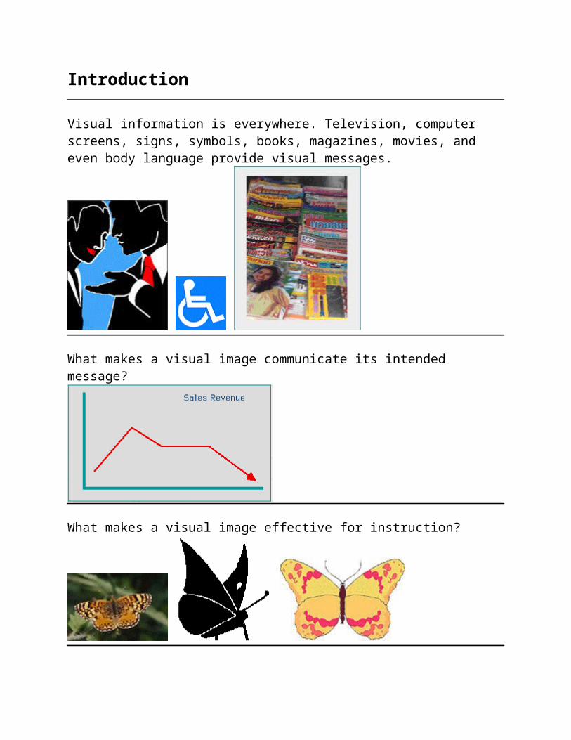
Introduction Visual information is everywhere. Television, computer screens, signs, symbols, books, magazines, movies, and even body language provide visual messages. What makes a visual image communicate its intended message? What makes a visual image effective for instruction?
description
introduction to photography
Transcript of Introduction
Introduction
Visual information is everywhere. Television, computer screens, signs, symbols, books, magazines, movies, and even body language provide visual messages.
What makes a visual image communicate its intended message?
What makes a visual image effective for instruction?
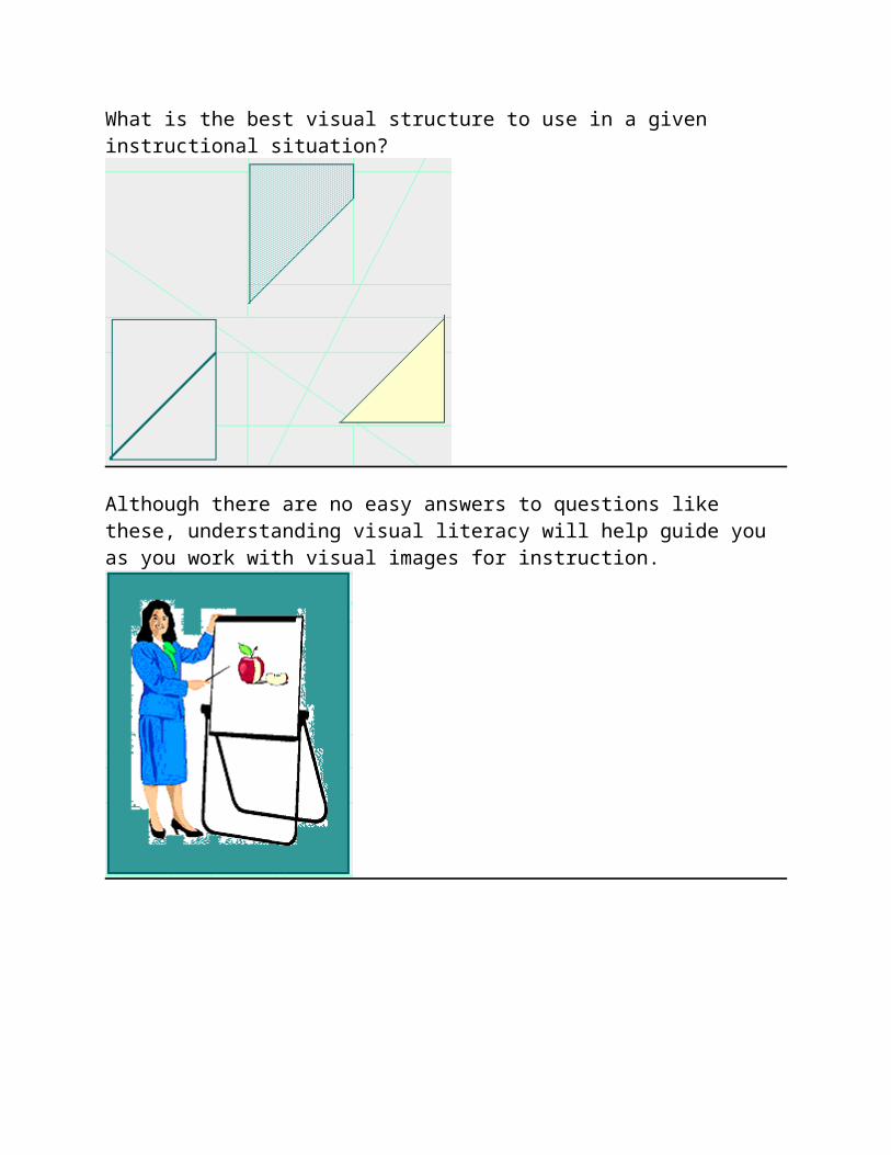
What is the best visual structure to use in a given instructional situation?
Although there are no easy answers to questions like these, understanding visual literacy will help guide you as you work with visual images for instruction.
Skill in representing ideas visually is one that evolves over time.
This module will present essential information about visual literacy, visual images, and the relationship between visual images and instruction. This module presents information about visual literacy including:
The definition of visual literacy; A description of visual literacy;
Perception of visual images;
Design elements and principles
Practical guidelines in creating visual images.
Links to other visual literacy WWW sites
Objectives
Your goal in viewing this module is two-fold. First, as a teacher, you will need to understand visual literacy principles as they apply to the creation and interpretation of instructional visuals and media. A quiz will be given in class at a later date.
Secondly, you will need to apply these visual literacy principles to the design and production of two pieces of educational media, a poster and an overhead transparency, that you could use in the teaching of our instructional design assignment. You will be required to use at least one of these pieces of media in your mini-lesson teaching presentation.
Visual Literacy
Upon completing this lesson segment, you will be able to write a definition of visual literacy and match the three components of visual literacy to their respective
meanings.
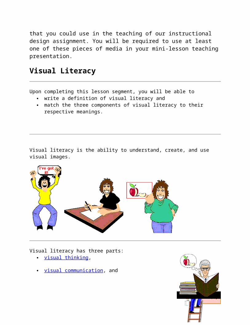
Visual literacy is the ability to understand, create, and use visual images.
Visual literacy has three parts: visual thinking ,

visual communication , and
For visual communication to be effective, the receiver must be able to construct meaning from seeing the visual image.
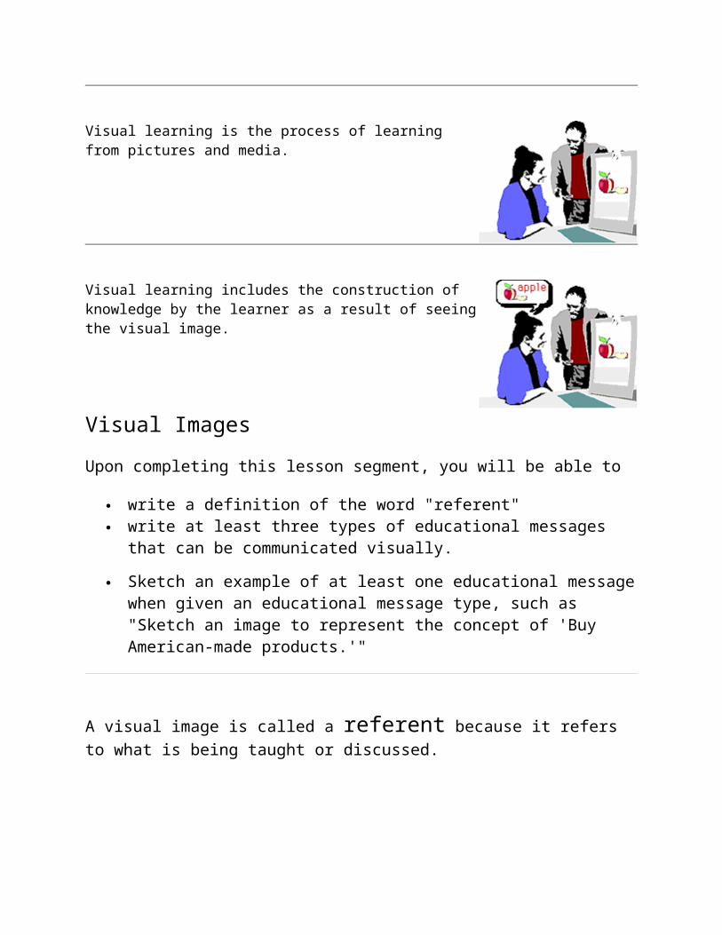
Visual learning is the process of learning from pictures and media.
Visual learning includes the construction of knowledge by the learner as a result of seeing the visual image.
Visual Images
Upon completing this lesson segment, you will be able to
write a definition of the word "referent" write at least three types of educational messages that can be
communicated visually.

Sketch an example of at least one educational message when given an educational message type, such as "Sketch an image to represent the concept of 'Buy American-made products.'"
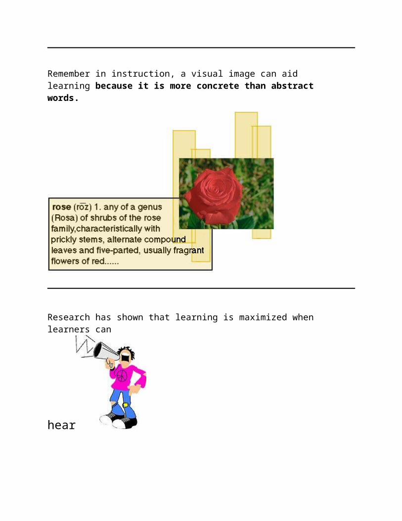
A visual image is called a referent because it refers to what is being taught or discussed.
A visual image can represent a word,
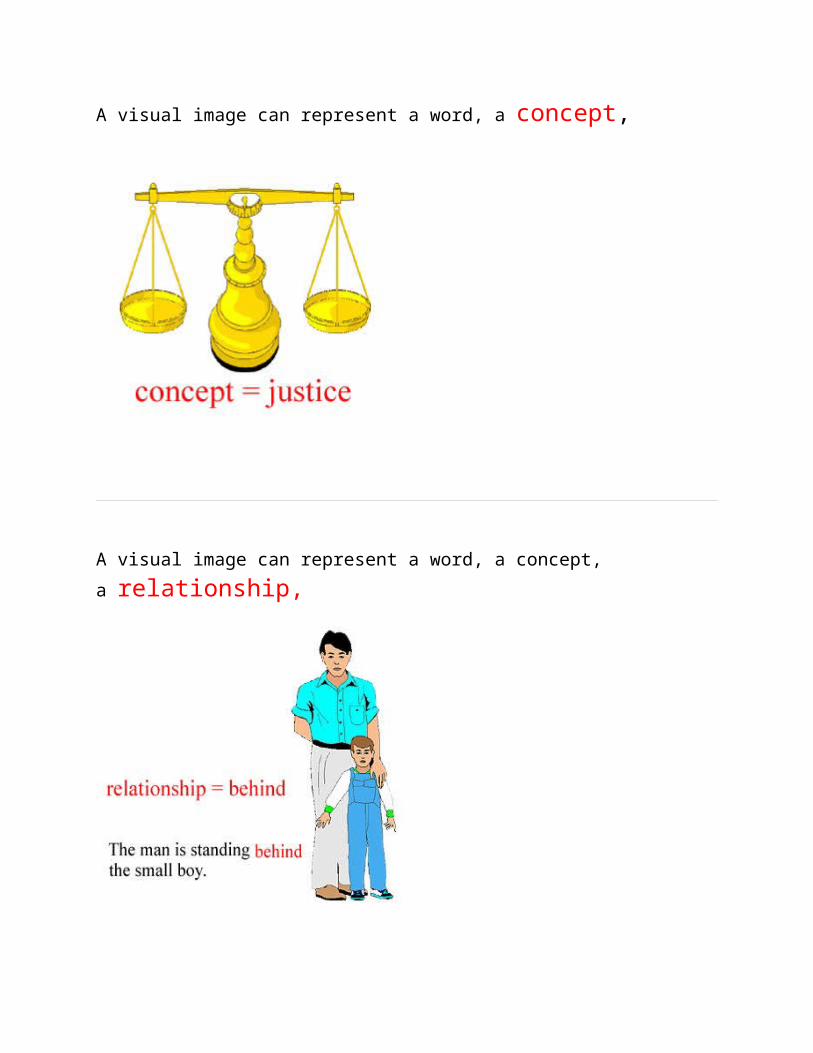
A visual image can represent a word, a concept,
A visual image can represent a word, a concept,
a relationship,
A visual image can represent a word, a concept, a relationship,
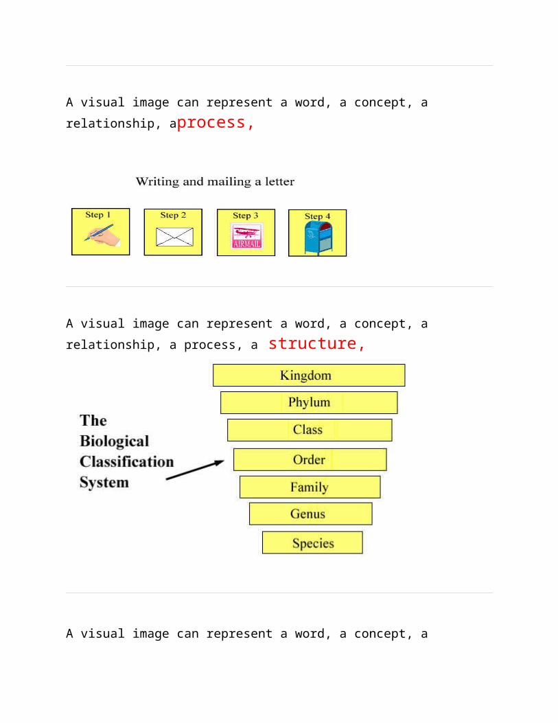
aprocess,
A visual image can represent a word, a concept, a relationship,
a process, a structure,
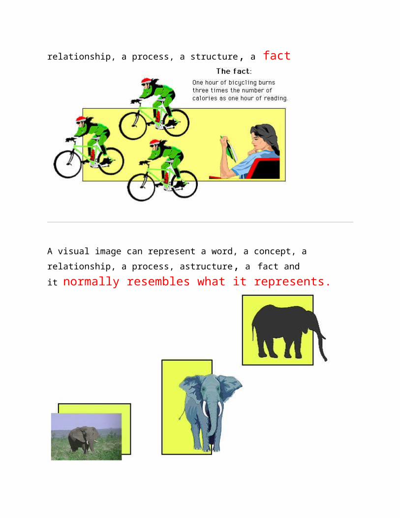
A visual image can represent a word, a concept, a relationship,
a process, a structure, a fact
A visual image can represent a word, a concept, a relationship,
a process, astructure, a fact and it normally resembles what it represents.
Remember in instruction, a visual image can aid learning because it is more concrete than abstract words.
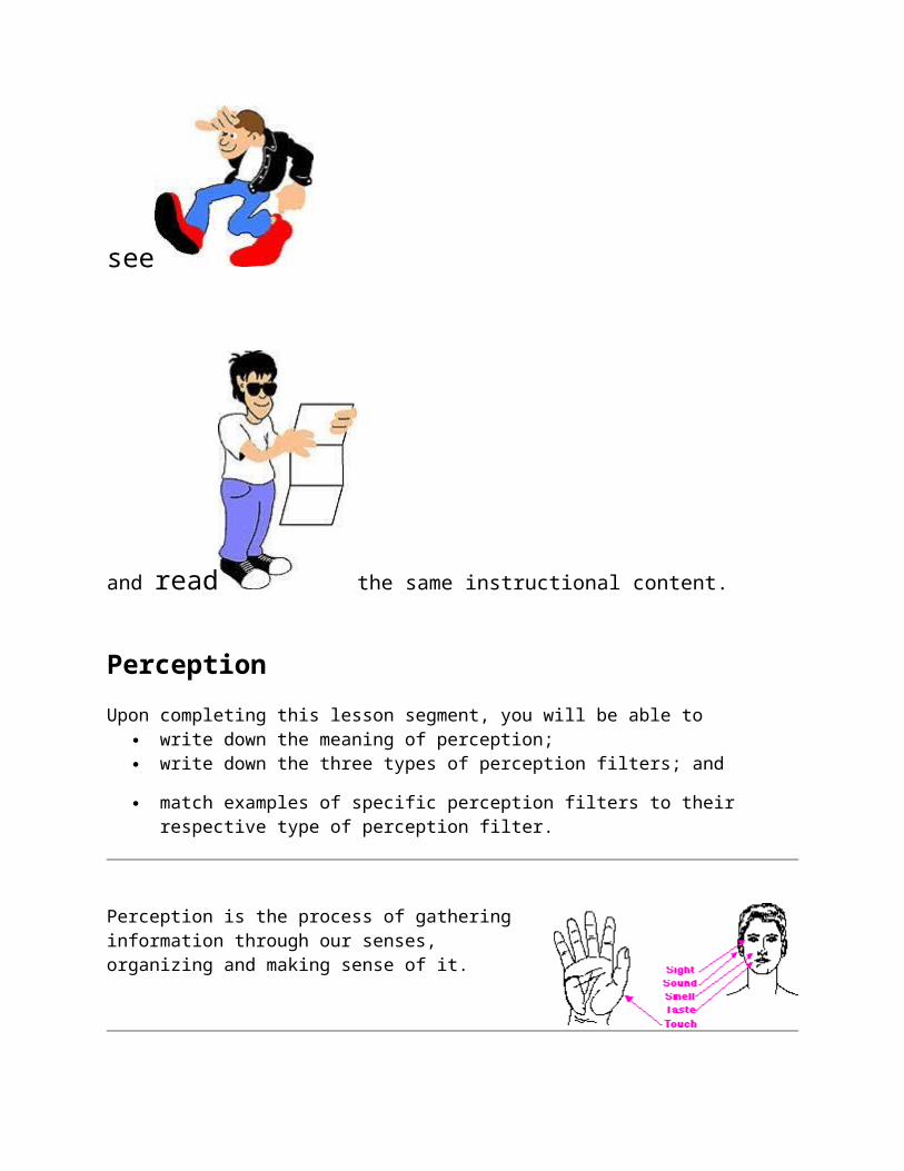
Research has shown that learning is maximized when learners can
hear
see
and read the same instructional content.
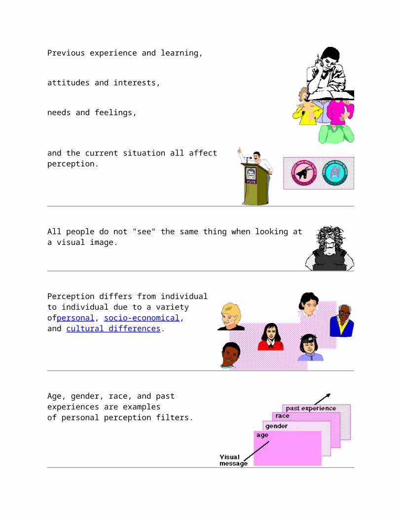
Perception
Upon completing this lesson segment, you will be able to write down the meaning of perception; write down the three types of perception filters; and
match examples of specific perception filters to their respective type of perception filter.
Perception is the process of gathering information through our senses, organizing and making sense of it.
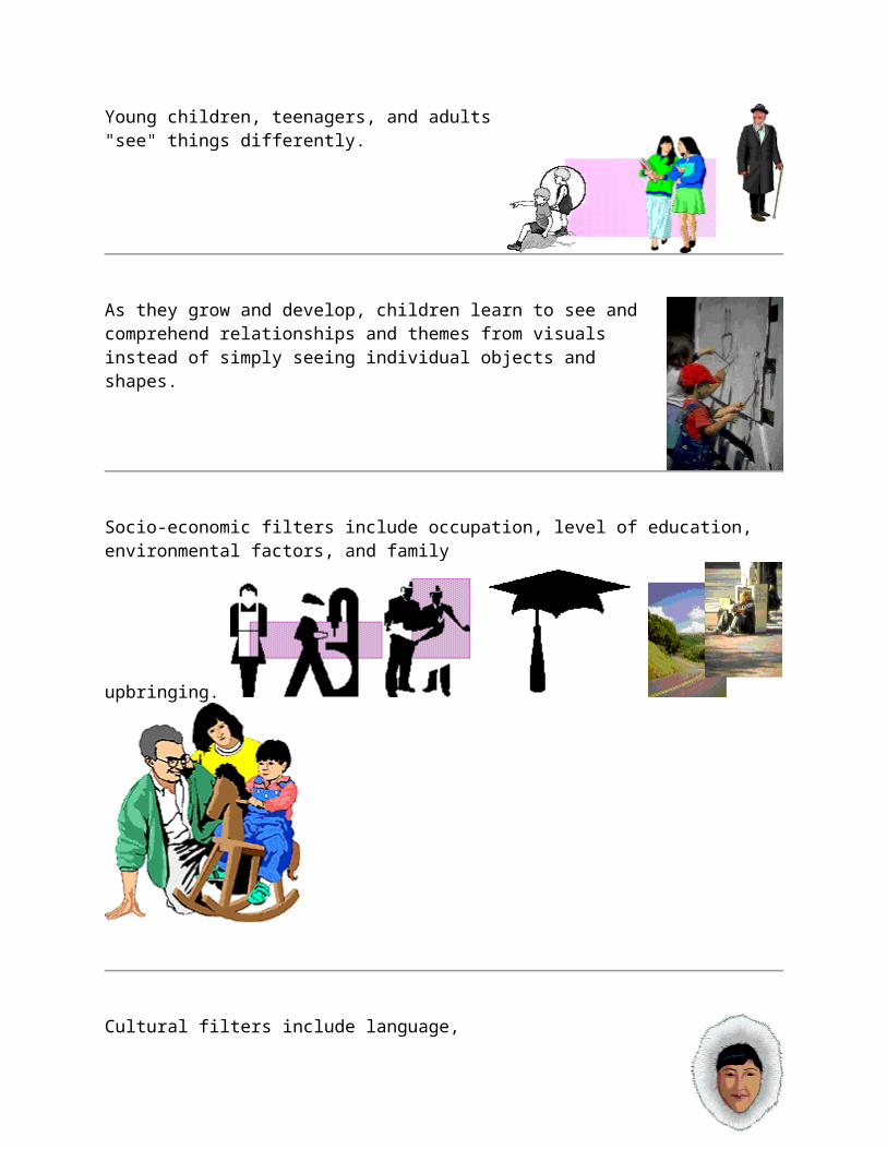
Previous experience and learning,
attitudes and interests,
needs and feelings,
and the current situation all affect
All people do not "see" the same thing when looking at a visual image.
Perception differs from individual to individual due to a variety ofpersonal, socio-economical, and cultural

differences.
Age, gender, race, and past experiences are examples of personal perception filters.
Young children, teenagers, and adults "see" things differently.
As they grow and develop, children learn to see and comprehend relationships and themes from visuals instead of simply seeing individual objects and shapes.

Socio-economic filters include occupation, level of education, environmental
factors, and family upbringing.
Cultural filters include language,
For example, Eskimos have many unique words describing different kinds of snow. Not just adjectives that go in front of a standard word for snow, but totally different words.
customs,

belief systems,
and historical perspective.
Every characteristic of an individual influences what that individual chooses to see, hear, taste, touch, and smell.
How information is interpreted to create meaning for an individual is also influenced by his/her unique make-up and background.
Perception is part of the process of understanding visual images
Creating effective visual images depends on the appropriate use of design elements and design principles.
Try this exercise. Look at each umbrella image. Is the message of each image different? If so, what makes the message different?
Here are three more umbrella images. How do these images compare to each other? How do these images compare with the three previous ones?
What happens when the image of the umbrella includes a person? What changes about the visual message? Are there differences between these two images? If so, what are they?
Design Elements and Principles
The right combination of design elements used according to design principles can effectively communicate your visual instructional message. Learning about design elements and principles will help you create and evaluate visual images for instruction.
Design Elements Design Principles
Design Elements
Design elements are the building blocks or basic units in the construction of a visual image. Design elements include:
Point
Line
Shape
Value
Texture
Color
Upon completing this lesson segment, you will be able to:
Write down at least three design elements, Write down at least two characteristics of a given design
element, and
Sketch a visual image dependent upon a given situation, such as, 'Sketch a visual image using at least three design elements that conveys the idea of strength or power.'
Design Elements - Point
The point is the first and simplest element of visual
The point serves as the focus of a visual, highlighting or drawing attention to important information.
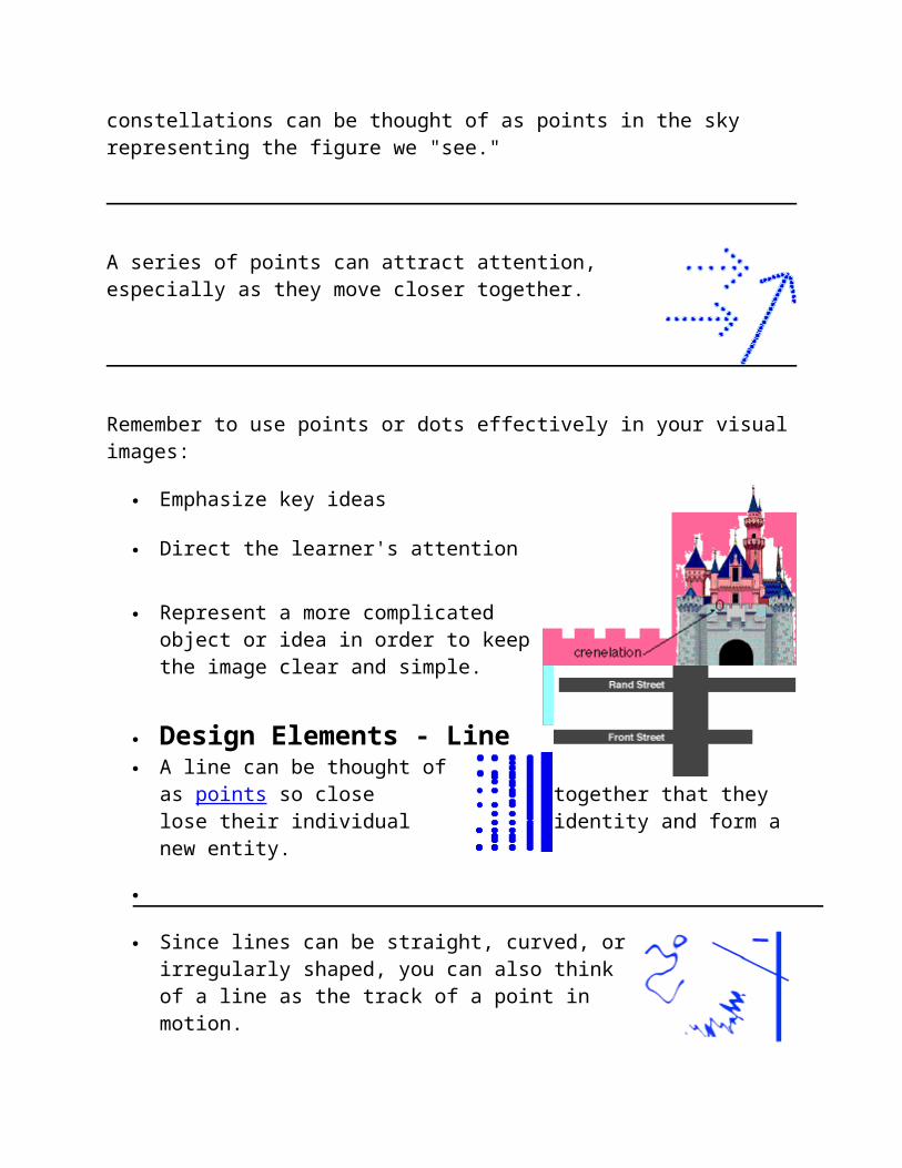
Several points in combination may represent a more complicated object or idea. For example, constellations can be thought of as points in the sky representing the
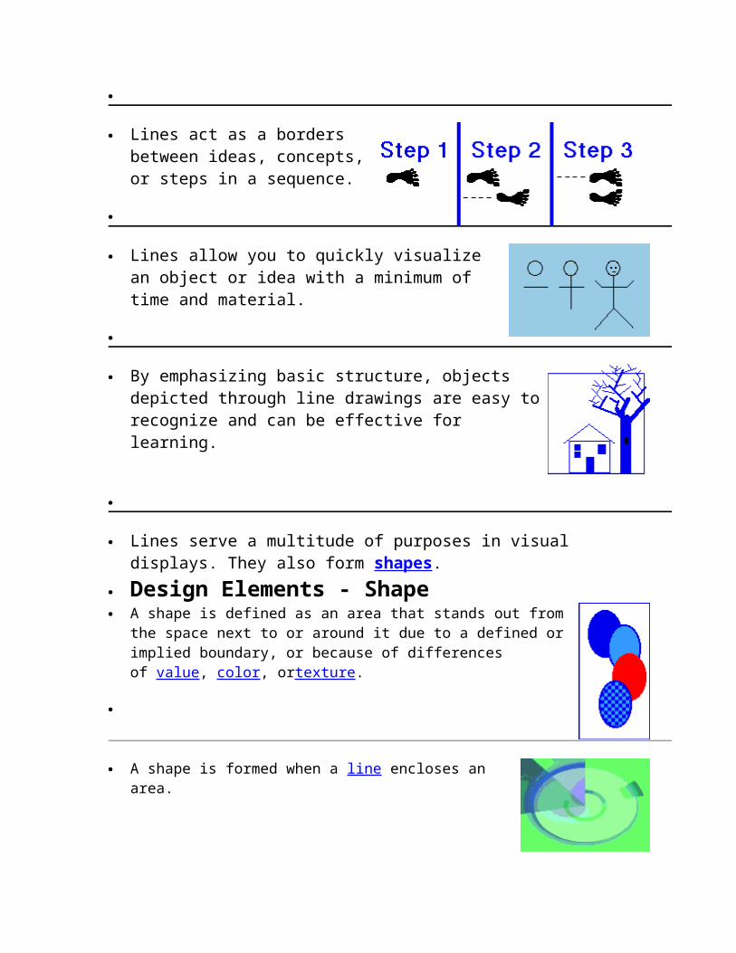
figure we "see."
A series of points can attract attention, especially as they move closer together.
Remember to use points or dots effectively in your visual images:
Emphasize key ideas
Direct the learner's attention
Represent a more complicated object or idea in order to keep the image
clear and simple.
Design Elements - Line A line can be thought of as points so close together
that they lose their individual identity and form a new entity.
Since lines can be straight, curved, or irregularly shaped, you can also think of a line as the track of a point in motion.
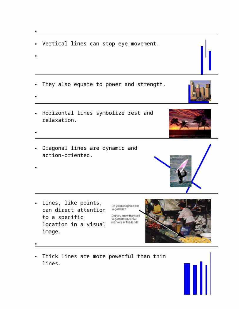
Vertical lines can stop eye movement.
They also equate to power and strength.
Horizontal lines symbolize rest and relaxation.
Diagonal lines are dynamic and action-oriented.
Lines, like points, can direct attention to a specific location in a visual image.
Thick lines are more
Lines act as a borders between ideas, concepts, or steps in a sequence.
Lines allow you to quickly visualize an object or idea with a minimum of time and
material.
By emphasizing basic structure, objects depicted through line drawings are easy to recognize and can be effective for learning.
Lines serve a multitude of purposes in visual displays. They also form shapes.
Design Elements - Shape A shape is defined as an area that stands out from the space
next to or around it due to a defined or implied boundary, or because of differences of value, color, ortexture.
A shape is formed when a line encloses an area.
Shapes can vary endlessly and can suggest physical form and direct eye movement.

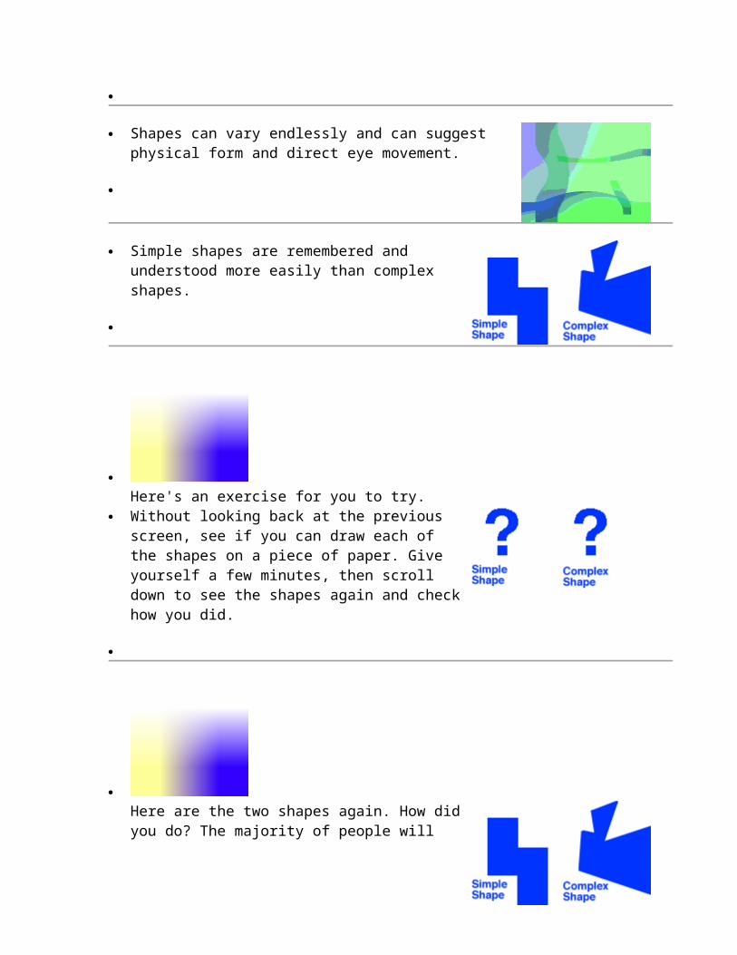
Simple shapes are remembered and understood more easily than complex shapes.
Without looking back at the previous screen, see if you can draw each of the shapes on a piece of paper. Give yourself a few minutes, then
scroll down to see the shapes again and
Here are the two shapes again. How did you do? The majority of people will say it was easier to remember the simple shape than the complex one.

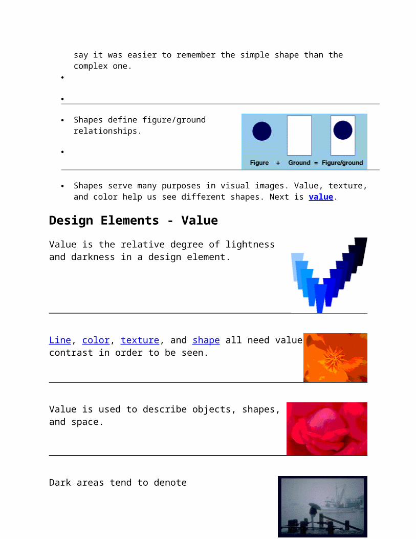
Shapes define figure/ground relationships.
Shapes serve many purposes in visual images. Value, texture, and color help us see different shapes. Next is value.
Design Elements - Value
Value is the relative degree of lightness and darkness in a design element.
Line, color, texture, and shape all need value contrast in order to be seen.
Value is used to describe objects, shapes, and space.
Dark areas tend to denote
gloom mystery
drama
menace
Light areas tend to denote
happiness fun
gaiety
warmth
closeness
The next design element is texture.
Design Elements - Texture
Texture is defined as the surface characteristics of a material that can be experienced through the sense of touch or the illusion of touch.
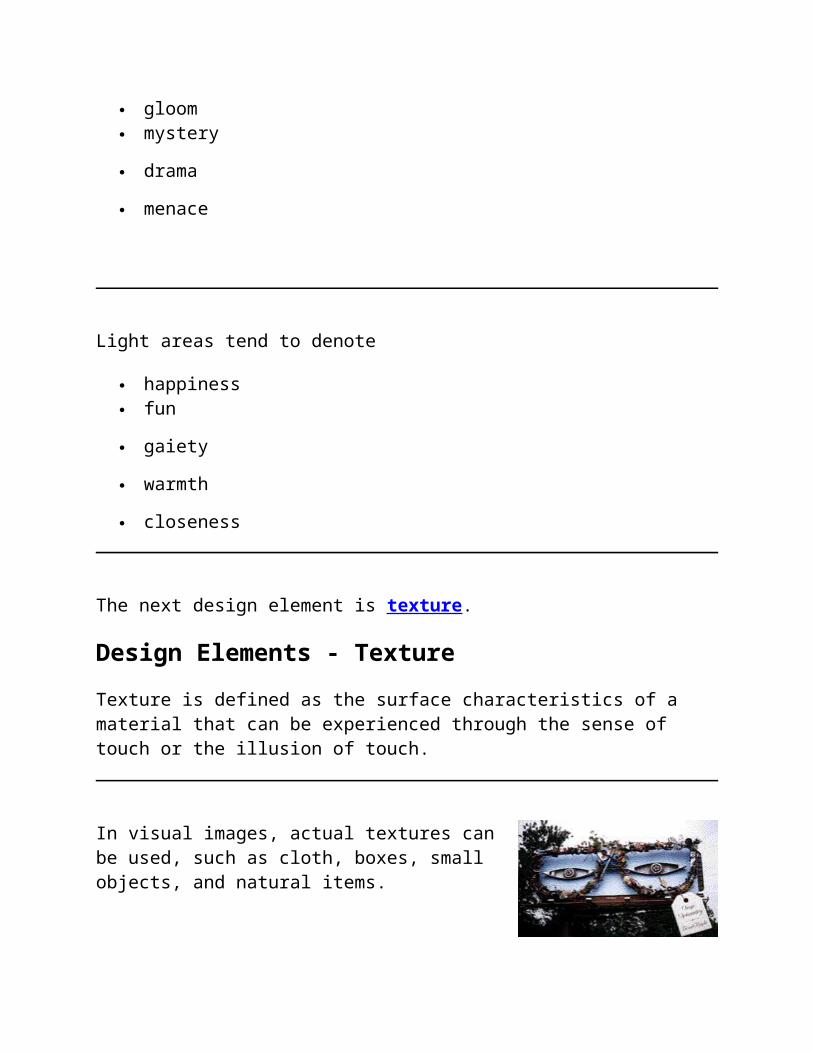
In visual images, actual textures can be used, such as cloth, boxes, small objects, and natural items.
This billboard in Indianapolis, Indiana, is made of discarded materials normally found
in a junkyard.
Texture can be used to accent an area so that it becomes more dominant than another.
Which box is more dominant? What makes one box stand out from the others?
The last design element is color.
Design Elements - Color
Color is the part of light that is reflected by the object we see.
Color appeals to children as well as adults.
The primary colors are red, yellow, and blue. They are called primary because they are not mixtures of other colors.
Mixing any two primary colors results in a secondary color.
The color wheel is created when the primary and secondary colors are placed in a circle.
Colors directly across from each other on the color wheel are called complementary colors.
Orange and blue are complementary colors
Yellow and violet are complementary colors
Red and green are complementary colors
Complementary colors used together provide extreme contrast.
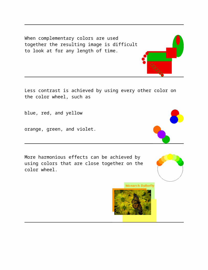
When complementary colors are used together the resulting image is difficult to look at for any length of time.
Less contrast is achieved by using every other color on the color wheel, such as
blue, red, and yellow
orange, green, and violet.
More harmonious effects can be achieved by using
colors that are close together on the color
Another way to organize color is by color "temperature." Colors are either "warm" or "cool."
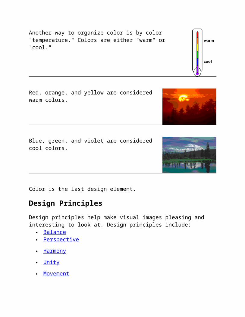
Red, orange, and yellow are considered warm colors.
Blue, green, and violet are considered cool colors.
Color is the last design element.
Design Principles
Design principles help make visual images pleasing and interesting to look at. Design principles include:
Balance Perspective
Harmony
Unity
Movement
Variety
Upon completing this lesson segment, you will be able to
Write down at least three design principles, Write the definition of each design principle.
Write down at least two characteristics of three or more design principles.
Identify the design principles used in a given visual image.
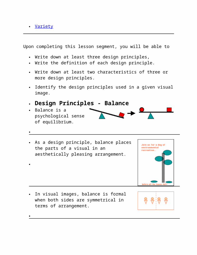
Design Principles - Balance Balance is a
psychological sense of equilibrium.
As a design principle, balance places the parts of a visual in an aesthetically pleasing arrangement.
In visual images, balance is formal when both sides are symmetrical in terms of arrangement.
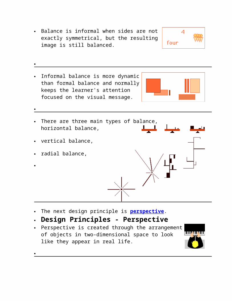
Balance is informal when sides are not exactly symmetrical, but the resulting image is still balanced.
Informal balance is more dynamic than formal balance and normally keeps the learner's attention focused
on the visual message.
There are three main types of balance, horizontal balance,
vertical balance,
radial balance,
The next design principle is perspective.
Design Principles - Perspective Perspective is created through the arrangement of
objects in two-dimensional space to look like they appear in real life.
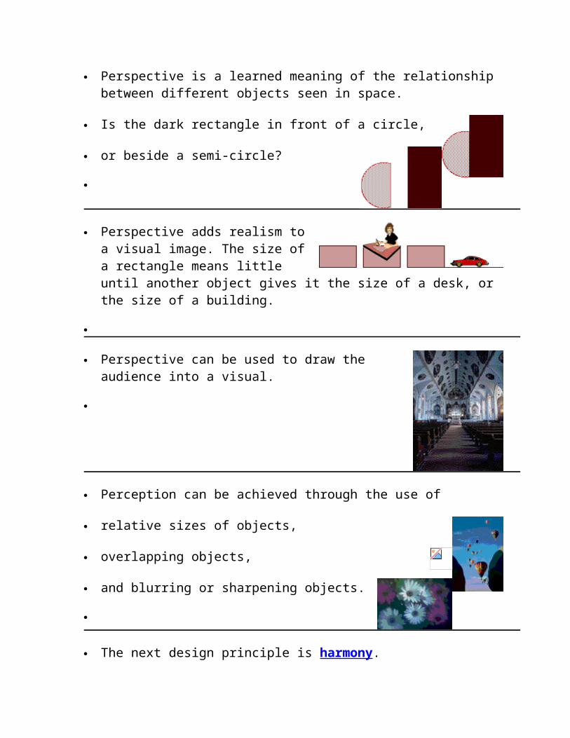
Perspective is a learned meaning of the relationship between different objects seen in space.
Is the dark rectangle in front of a
or beside a semi-circle?
Perspective adds realism to a visual image. The size of a rectangle means little until another object gives it the size of a desk, or the size of a building.
Perspective can be used to draw the audience into a visual.
Perception can be achieved through the use of
relative sizes of objects,
overlapping objects,
and blurring or sharpening objects.
The next design principle is harmony.
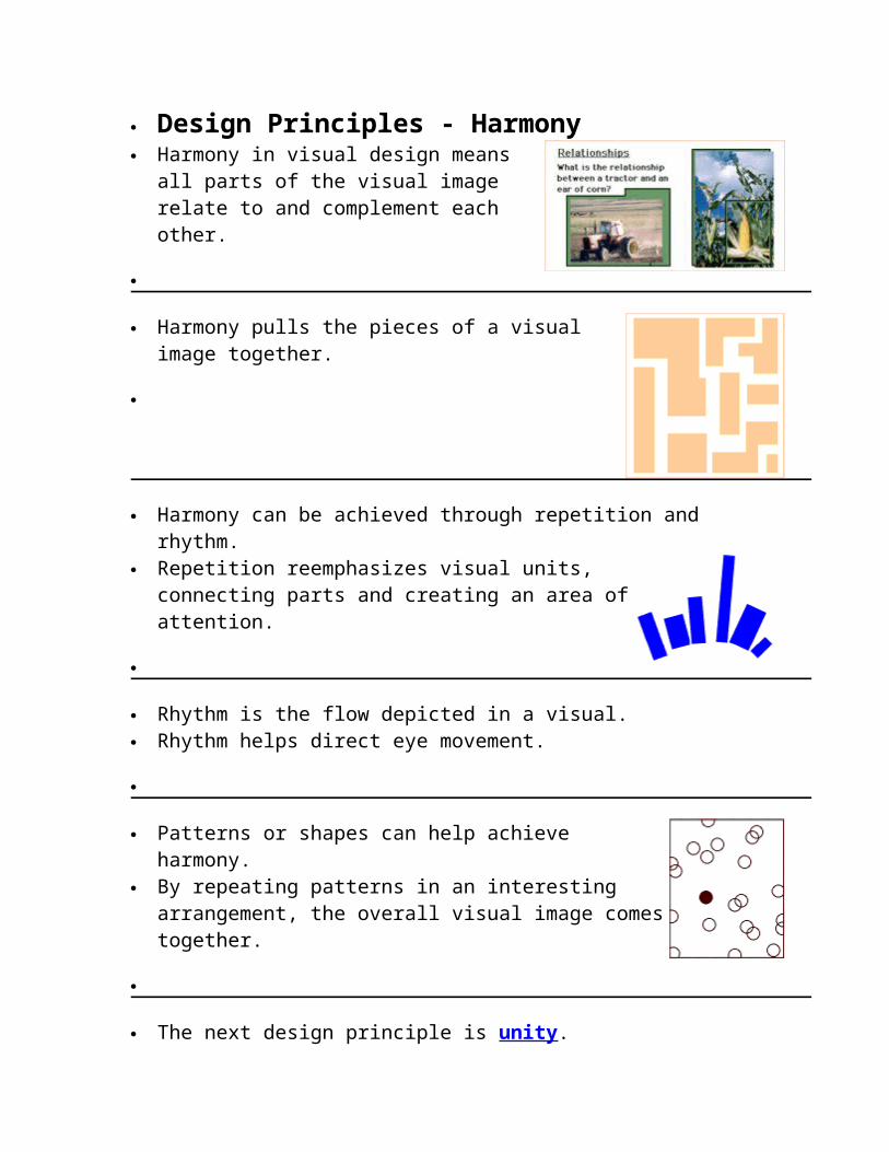
Design Principles - Harmony Harmony in visual design means all
parts of the visual image relate to and complement each other.
Harmony pulls the pieces of a visual image together.
Harmony can be achieved through repetition and rhythm. Repetition reemphasizes visual units,
connecting parts and creating an area of attention.
Rhythm is the flow depicted in a visual. Rhythm helps direct eye movement.
Patterns or shapes can help achieve harmony. By repeating patterns in an interesting
arrangement, the overall visual image comes together.
The next design principle is unity.
Design Principles - Unity Unity is the relationship among the elements of a visual that
helps all the elements function together. Unity gives a sense of oneness to a visual image. In other words, the words and the images work together to create meaning.
Unity helps organize a visual image, facilitating interpretation and understanding.
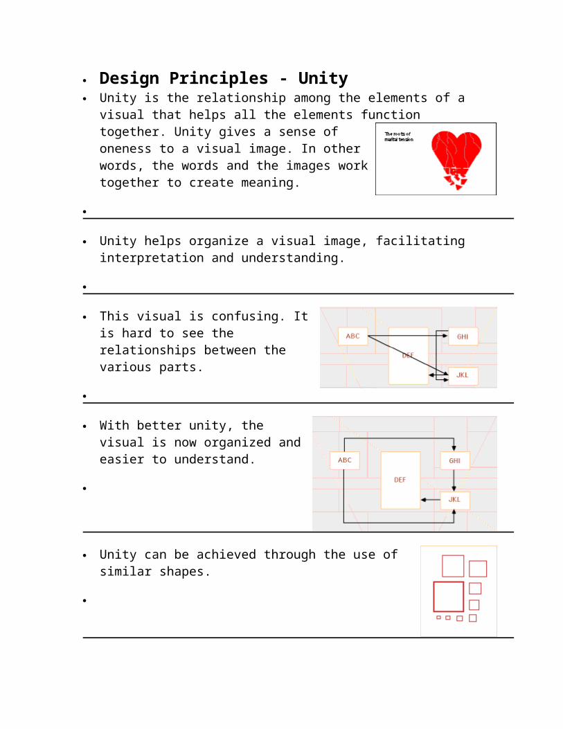
This visual is confusing. It is hard to see the relationships between the various parts.
With better unity, the visual is now organized and easier to

understand.
Unity can be achieved through the use of similar shapes.
Unity can be achieved through the use of a common pattern.
Unity can be achieved through the use of space.
Unity can be achieved through the use of a common background.
The next design principle is movement.
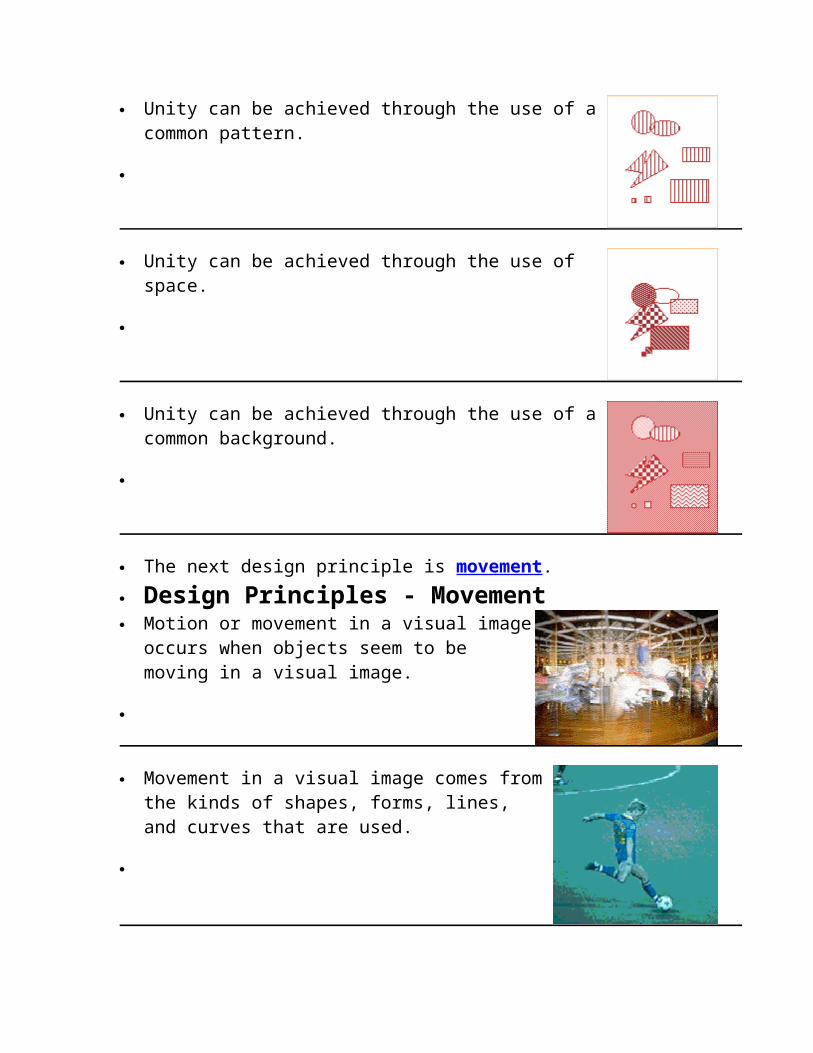
Design Principles - Movement Motion or movement in a visual image
occurs when objects seem to be moving in a visual image.
Movement in a visual image comes from the kinds of shapes, forms, lines, and curves that are used.
Diagonal lines tend to create the illusion of movement or motion.
Changes in direction, or change in the darkness or lightness of
an image can also create a sense of
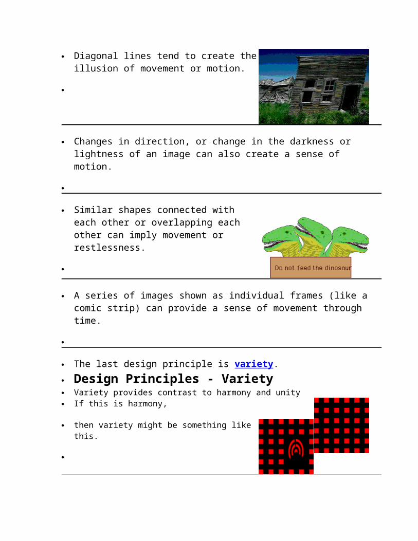
Similar shapes connected with each other or overlapping each other can
imply movement or restlessness.
A series of images shown as individual frames (like a comic
strip) can provide a sense of movement through
The last design principle is variety.
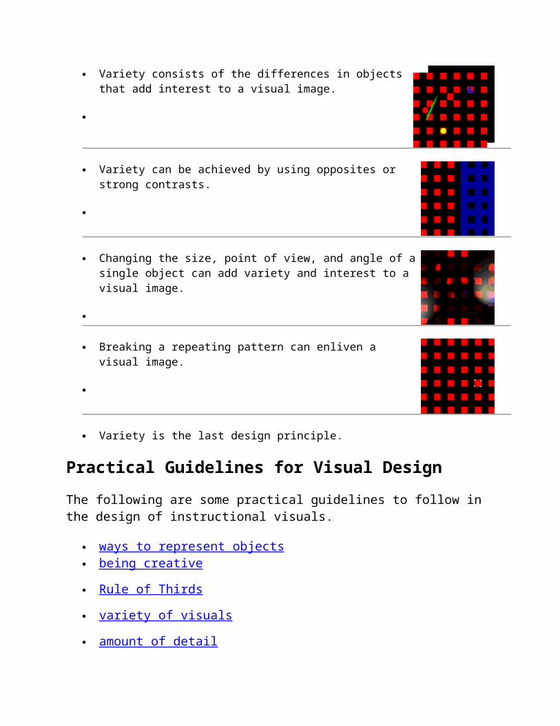
Design Principles - Variety Variety provides contrast to harmony and unity If this is harmony,
then variety might be something like this.
Variety consists of the differences in objects that add interest to a visual image.
Variety can be achieved by using opposites or strong contrasts.
Changing the size, point of view, and angle of a single object can add variety and interest to a visual image.
Breaking a repeating pattern can enliven a visual image.
Variety is the last design principle.
Practical Guidelines for Visual Design
The following are some practical guidelines to follow in the design of instructional visuals.
ways to represent objects being creative
Rule of Thirds
variety of visuals
amount of detail
layout
labels
visualization
typography

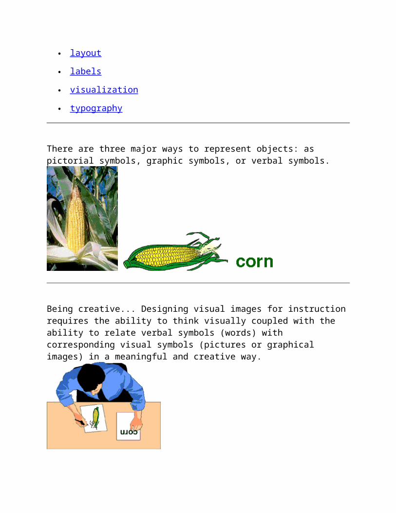
There are three major ways to represent objects: as pictorial symbols, graphic symbols, or verbal symbols.
Being creative... Designing visual images for instruction requires the ability to think visually coupled with the ability to relate verbal symbols (words) with corresponding visual symbols (pictures or graphical images) in a meaningful and creative way.
Research on eye movement states that people from Western cultures tend to look at the upper left-hand area of a visual first. Eye movement then tends to move to the right and then to the bottom. The 'rule-of-thirds' is a principle of photographic and graphic composition in which an area is divided into thirds both vertically and horizontally and the centers of interest are located near the intersections of the lines. The numbers at the intersections that divide the image into thirds indicate the percentage of people
that look at that intersection first when reading a visual.
Keeping these two principles in mind it is important to place important information near the dividing lines and place the start of the main message where the eye first strikes the area. If the nature of the design puts important information in the lower left portion, then the design elements or objects need to lead the eye to where information is located.
Changes in a visual image help keep attention directed on the visual.
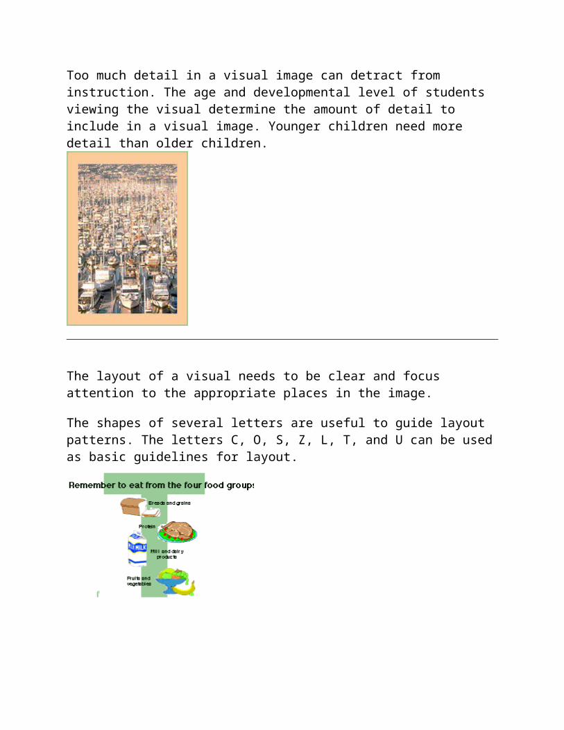
Too much detail in a visual image can detract from instruction. The age and developmental level of students viewing the visual determine the amount of detail to include in a visual image.
Younger children need more detail than older children.
The layout of a visual needs to be clear and focus attention to the appropriate places in the image.
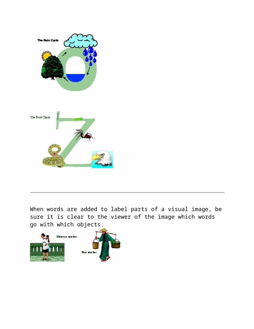
The shapes of several letters are useful to guide layout patterns. The letters C, O, S, Z, L, T, and U can be used as basic guidelines for layout.
When words are added to label parts of a visual image, be sure it is clear to the viewer of the image which words go with which objects.

Move labels close to the objects they refer to.
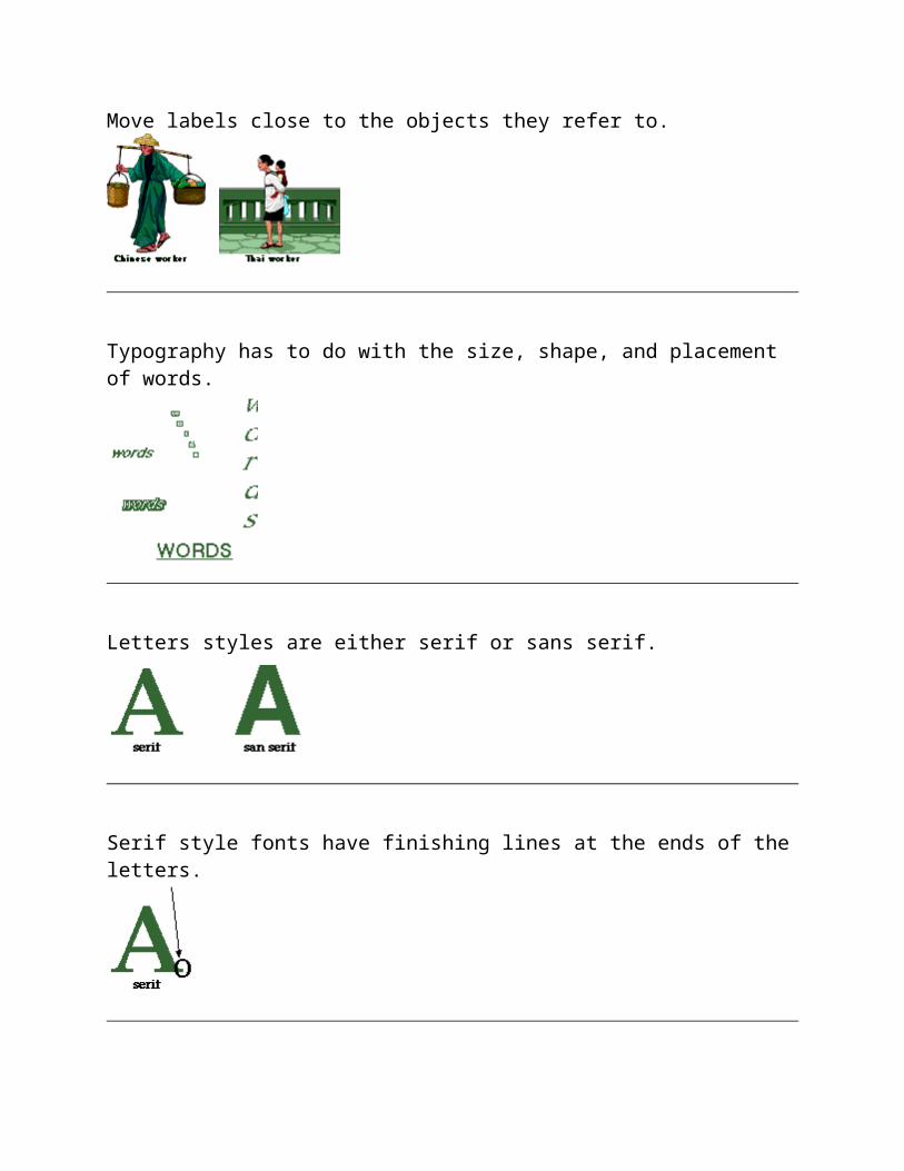
Typography has to do with the size, shape, and placement of words.
Letters styles are either serif or sans serif.
Serif style fonts have finishing lines at the ends of the letters.

Sans serif fonts are more block-like.
Text should be in lower case. Use capitals only where normally required. ALL CAPITAL LETTERS ARE HARD TO READ, ESPECIALLY FOR MORE THAN ONE LINE.
The arrangement of words in a visual image should help clarify the message or information to be conveyed.
To make your visuals easy to read, be sure to have a good amount of contrast between the color of the letters and the color of the background.
These examples do not have good contrast between the color of the letters and the color of the background making them difficult to read.
These examples have good contrast between the color of the letters and the color of the background making them easy to read.

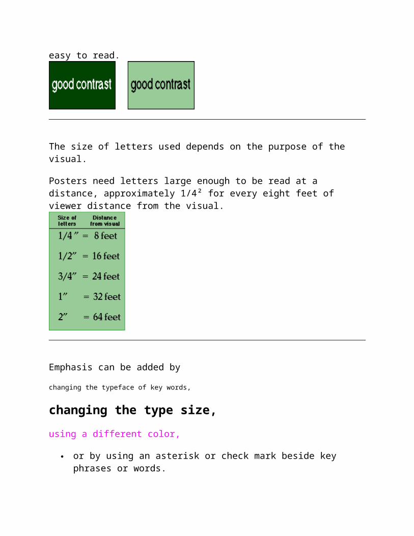
The size of letters used depends on the purpose of the visual.
Posters need letters large enough to be read at a distance, approximately 1/4² for every eight feet of viewer distance from the visual.
Emphasis can be added by
changing the typeface of key words,
changing the type size,
using a different color,
or by using an asterisk or check mark beside key phrases or words.
Trying to visualize numerical data, facts, directions, processes, maps, theories, emotions, and the like will help you develop your visual thinking abilities.
As a teacher, you will need to understand and create visual messages. This section provides a number of activities that encourage practice with instructional visuals. As you progress through these activities, practical design tips as well as design elements will be identified.

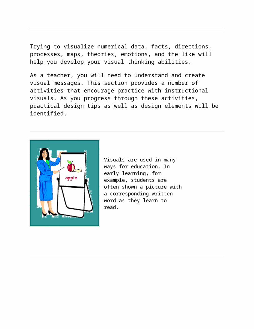
Visuals are used in many ways for education. In early learning, for example, students are often shown a picture with a corresponding written word as they learn to read.
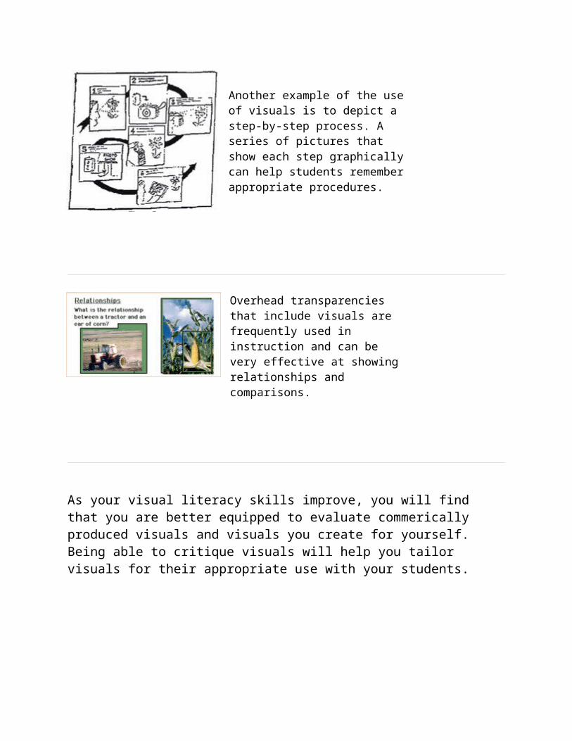
Another example of the use of visuals is to depict a step-by-step process. A series of pictures that show each step graphically can help students remember appropriate procedures.
Overhead transparencies that include visuals are frequently used in instruction and can be very effective at showing relationships and comparisons.

As your visual literacy skills improve, you will find that you are better equipped to evaluate commerically produced visuals and visuals you create for yourself. Being able to critique visuals will help you tailor visuals for their appropriate use with your students.