Introdcution to Scientific Visualization in Python · Introdcution to Scientific Visualization in...
87
Introdcution to Scientific Visualization in Python Alice Invernizzi– [email protected] SuperComputing Applications and Innovation Department
-
Upload
nguyenliem -
Category
Documents
-
view
235 -
download
0
Transcript of Introdcution to Scientific Visualization in Python · Introdcution to Scientific Visualization in...

Introdcution to Scientific Visualization in Python
Alice Invernizzi– [email protected] SuperComputing Applications and Innovation Department

INDEX
• Introduction
• Speeding Up Python: Numpy array data
structures
• IPython for interactive computation
• Visualizing 2D Data with matplotlib
• Brief introduction to 3D Visualization with
Mayavi

INTRODUCTION
Python is a powerful, flexible, open-source language that is easy to learn, easy to use and has powerful libraries for data manipulation.
Python has been used in scientific computing and highly quantitative domains such as finance, oil and gas, physics and signal processing…
http://www.python.org/about/success/#scientific
What are the key elements that ensure usability of this language in science?
Python provides easy-to-use tools for data structuring, manipulation, query, analysis and visualization

INTRODUCTION
“The purpose of computation is insight, not numbers”
Richard Hamming, Numerical Analysis for Scientists and Engineer
From Scientific Data To Scientific Visualization
To understand the meaning of the numbers we compute, we often need
postprocessing, statistical analysis and graphical visualization of our data.

INTRODUCTION
The scientist’s needs
• Get data (simulation, experiment control) • Manipulate and process data. • Visualize results... to understand what we are
doing! • Communicate results: produce figures for reports or
publications, write presentations. • Python has all desirable tools for satisfying
Scientific Computing users… • IPython, an advanced Python shell for interactive
computing • Numpy : provides powerful numerical arrays
objects, and routines to manipulate them • Scipy : high-level data processing routines.
Optimization, regression, interpolation • Matplotlib : 2-D visualization, “publication-ready”
plot • Mayavi : 3-D visualization
GET DATA
PARSE IT
PROCESS
VISUALIZE
PUBLISH
csv,
beautifulsoup
numpy, scipy
matplotlib,
chaco,
mayavi2
LaTeX cherrypy
urllib2

Numpy
an efficient multi-dimensional container for
generic data
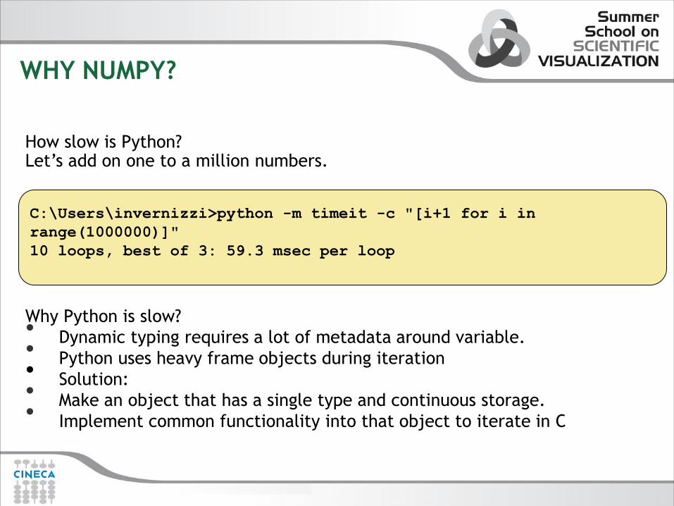
WHY NUMPY?
C:\Users\invernizzi>python -m timeit -c "[i+1 for i in
range(1000000)]"
10 loops, best of 3: 59.3 msec per loop
How slow is Python? Let’s add on one to a million numbers.
Why Python is slow? • Dynamic typing requires a lot of metadata around variable. • Python uses heavy frame objects during iteration • Solution: • Make an object that has a single type and continuous storage. • Implement common functionality into that object to iterate in C

WHY NUMPY
Speeding Up Python: Let’s add on one to a million numbers, using numpy library
Why Python is fast?
• Homogenous data type object: every item takes up the same size
block of memory . • Function that operates on ndarray in an element by element
fashion • Vectorize wrapper for a function • Build-in function are implemented in compiled C code.
C:\Users\invernizzi>python -m timeit -s "import numpy" -c
"numpy.arange(1000000)+1"
100 loops, best of 3: 2.91 msec per loop

NUMPY
“Life is too short to write C++ code“ David Beazley - EuroScipy 2012 Bruxelles

NUMPY
Features:
- A powerful N-dimensional array object
- Broadcasting function
-Tools for integrating C/C++ and Fortran code
- Useful linear algebra, Fourier transform and random number capabilities.
- Ufuncs, function that operates on ndarrays in an element-by-element fashion
History:
-Based originally on Numeric by Jim Hugunin
-Also based on NumArray by Perry Greenfield
- Written both by Trevis Oliphant to bring both features set together.

NUMPY

NUMERIC ARRAY
Array Creation
>>> import numpy as np
>>> a = np.array([0,1,2,3])
>>> a
array([0, 1, 2, 3])
>>a=array([0,1,2],dtype=float)
array([ 0., 1., 2.])
>>> a=np.arange(10)
>>> a
array([0, 1, 2, 3, 4, 5, 6, 7, 8, 9])
>>> a=np.linspace(0,10,10)
>>> a
array([ 0. , 1.11111111, 2.22222222, 3.33333333,
4.44444444, 5.55555556, 6.66666667, 7.77777778,
8.88888889, 10. ])
>>> a=array([[1,2,3],[4,5,6]])
>>> a
array([[1, 2, 3],
[4, 5, 6]])

NUMERIC ARRAY
Array Creation
array(object, dtype=None, copy=1,order=None, subok=0,ndmin=0)
arange([start,]stop[,step=1],dtype=None)
ones(shape,dtype=None,order='C')
zeros(shape,dtype=float,order='C')
identity(n,dtype=‘l’)
linspace(start, stop, num=50, endpoint=True, retstep=False)
empty( shape, dtype=None, order =‘C’ )
eye( N, M=None, k=0, dtype=float )

NUMERIC ARRAY Array Shape
>>>a=array([[1,2,3],[4,5,6]])
>>> a.itemsize
4
>>> a.shape
(2, 3)
>>>a.reshape(6)
array([1,2,3,4,5,6])
>>> a.resize((3,4))
>>> a
array([[1, 2, 3, 4],
[5, 6, 0, 0],
[0, 0, 0, 0]])
>>> a.size
12
>>> a.mean()
1.75
>>> a.max()
6
>>> a.min()
0
4
1 2 3
0 0 0 0
5
1
6 0
2 3 4
1 2 3 4 5 6
a.reshape(6)
a.reshape((3,4))
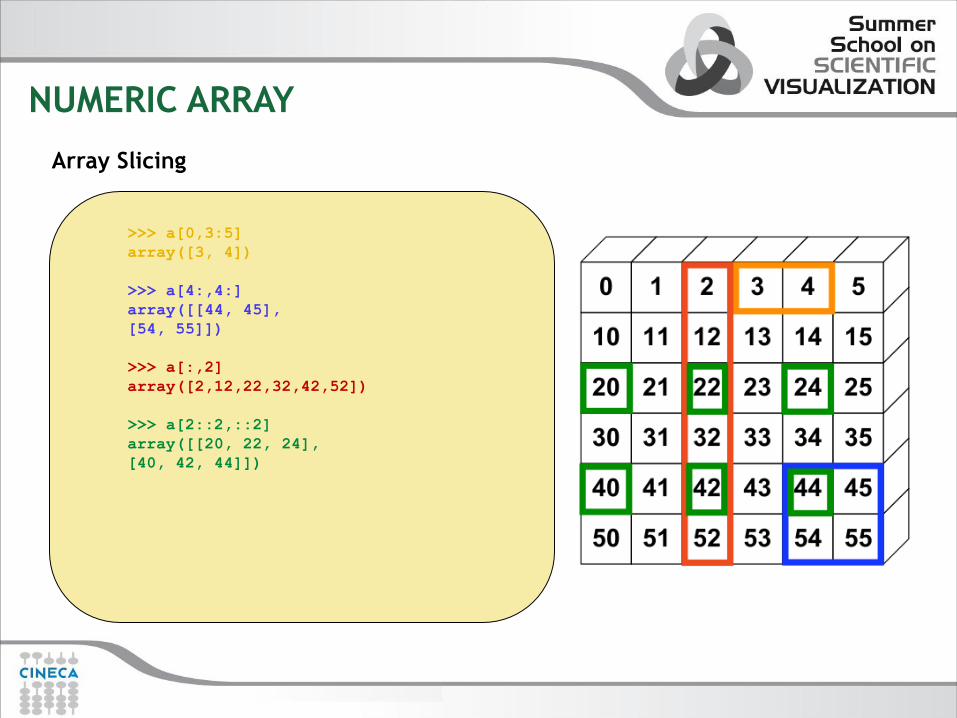
NUMERIC ARRAY
Array Slicing
>>> a[0,3:5]
array([3, 4])
>>> a[4:,4:]
array([[44, 45],
[54, 55]])
>>> a[:,2]
array([2,12,22,32,42,52])
>>> a[2::2,::2]
array([[20, 22, 24],
[40, 42, 44]])

NUMERIC ARRAY
Unary/Binary Operation
>>> a=array((1,2,3,4))
>>> a
array([1, 2, 3, 4])
>>> a+=1
>>> a
array([2, 3, 4, 5])
>>> a*3
array([ 6, 9, 12, 15])
>>> b=array([[1,2,3,4],[5,6,7,8]])
>>> b
array([[1, 2, 3, 4],
[5, 6, 7, 8]])
>>> b+a
array([[ 7, 11, 15, 19],
[11, 15, 19, 23]])

NUMERIC ARRAY
Ufunc: is a function that performs elementwise operations on data in ndarrays
>>> a
array([2, 3, 4, 5])
>>> pow(a,2)
array([ 4, 9, 16, 25])

SPEEDING UP PYTHON USING NUMPY
class Grid:
"""A simple grid class that stores the details and solution of the computational
grid."""
def __init__(self, nx=10, ny=10, xmin=0.0, xmax=1.0,
ymin=0.0, ymax=1.0):
…
…
class LaplaceSolver:
"""A simple Laplacian solver that can use different schemes to solve the
problem.""“
def numericTimeStep(self, dt=0.01):
…
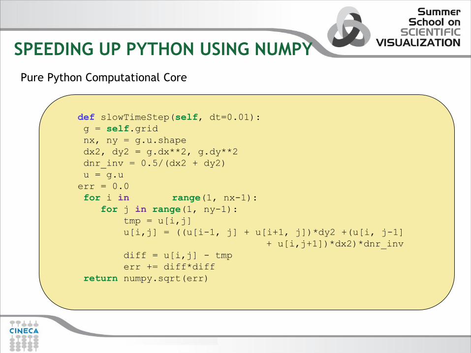
def slowTimeStep(self, dt=0.01):
Full code: laplace_benchmark.py
SPEEDING UP PYTHON USING NUMPY
def slowTimeStep(self, dt=0.01):
g = self.grid
nx, ny = g.u.shape
dx2, dy2 = g.dx**2, g.dy**2
dnr_inv = 0.5/(dx2 + dy2)
u = g.u
err = 0.0
for i in range(1, nx-1):
for j in range(1, ny-1):
tmp = u[i,j]
u[i,j] = ((u[i-1, j] + u[i+1, j])*dy2 +(u[i, j-1]
+ u[i,j+1])*dx2)*dnr_inv
diff = u[i,j] - tmp
err += diff*diff
return numpy.sqrt(err)
Pure Python Computational Core

SPEEDING UP PYTHON USING NUMPY
def numericTimeStep(self, dt=0.0):
"""Takes a time step using a NumPy expression."""
g = self.grid
dx2, dy2 = g.dx**2, g.dy**2
dnr_inv = 0.5/(dx2 + dy2)
u = g.u
g.old_u = u.copy() # needed to compute the error.
# The actual iteration
u[1:-1, 1:-1] = ((u[0:-2, 1:-1] + u[2:, 1:-1])*dy2 +
(u[1:-1,0:-2] + u[1:-1, 2:])*dx2)*dnr_inv
return g.computeError()
Numpy Python Computational Core
SPEEDING UP PYTHON USING NUMPY
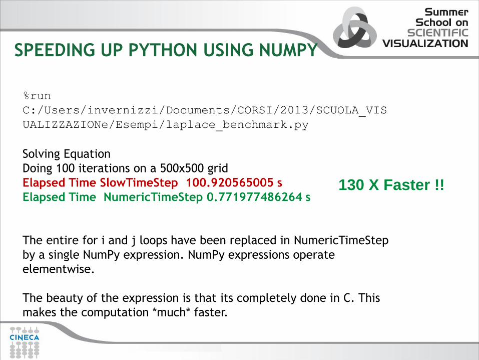
%run
C:/Users/invernizzi/Documents/CORSI/2013/SCUOLA_VIS
UALIZZAZIONe/Esempi/laplace_benchmark.py
Solving Equation
Doing 100 iterations on a 500x500 grid
Elapsed Time SlowTimeStep 100.920565005 s
Elapsed Time NumericTimeStep 0.771977486264 s
The entire for i and j loops have been replaced in NumericTimeStep
by a single NumPy expression. NumPy expressions operate
elementwise.
The beauty of the expression is that its completely done in C. This
makes the computation *much* faster.
130 X Faster !!

IPython
A System for Interactive
Scientific Computing
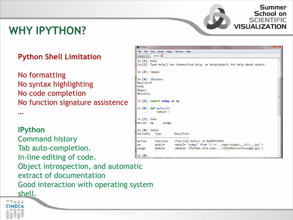
WHY IPYTHON?
Python Shell Limitation
No formatting
No syntax highlighting
No code completion
No function signature assistence
…
IPython
Command history
Tab auto-completion.
In-line editing of code.
Object introspection, and automatic
extract of documentation
Good interaction with operating system
shell.

IPYTHON MAGIC
•IPython will treat any line whose first character is a % as a special call to a
‘magic’ function. These allow you to control the behavior of IPython itself,
plus a lot of system-type features.
%autocall: Insert parentheses in calls automatically, e.g. range 3 5
%debug: Debug the current environment
%edit: Run a text editor and execute its output
%gui: Specify a GUI toolkit to allow interaction while its event loop is running
%history: Print all or part of the input history
%loadpy: Load a Python file from a filename or URL (!)
%logon and %logoff: Turn logging on and off
%macro: Names a series of lines from history for easy repetition
%pylab: Loads numpy and matplotlib for interactive use
%quickref: Load a quick-reference guide
%recall: Bring a line back for editing
%rerun: Re-run a line or lines
%run: Run a file, with fine control of its parameters, arguments, and more
%save: Save a line, lines, or macro to a file
%timeit: Use Python’s timeit to time execution of a statement, expression, or block

MORE ON IPYTHON
IPython NoteBook
The IPython Notebook is a web-based
interactive computational environment where
you can combine code execution, text,
mathematics, plots and rich media into a single
document.
Embedding IPython
It is possible to start an IPython instance inside
your own Python programs. This allows you to
evaluate dynamically the state of your code,
operate with your variables, analyze them

Matplotlib
Plotting and Graphing tool
in Python

MATPLOTLIB
Matplotlib is a powerful Python module to creating 2D figures. Matplotlib was modeled on
MATLAB, because graphing is something that MATLAB do very well.
What are the points that built the success of Matplotlib?
It uses Python: MATLAB lacks many of the features of general purpose languages
It is opensource
It is cross-platform: can run on Linux,Windows, Mac OS and Sun Solaris
It is very customizable and extensible
Plots should look great - publication quality.
Postscript output for inclusion with TeX documents
Embeddable in a graphical user interface for application development
Code should be easy enough that I can understand it and extend it
Making plots should be easy
“Matplotlib tries to make easy things easy and hard things possible” John Hunting

MATPLOTLIB
The Matplotlib code is conceptually divided into three parts:
•the pylab interface: the set of functions provided by matplotlib.pylab
which allow the user to create plots with code quite similar to MATLAB
figure generating code
•The matplotlib frontend or matplotlib API : the set of classes that do
the heavy lifting, creating and managing figures, text, lines, plots.
•The backends are device dependent drawing devices that transform the
frontend representation to hardcopy or a display device. Example
backends: PS hardcopy, SVG hardcopy, PNG output, GTK GTKAgg, PDF,
WxWidgets, Tkinter etc

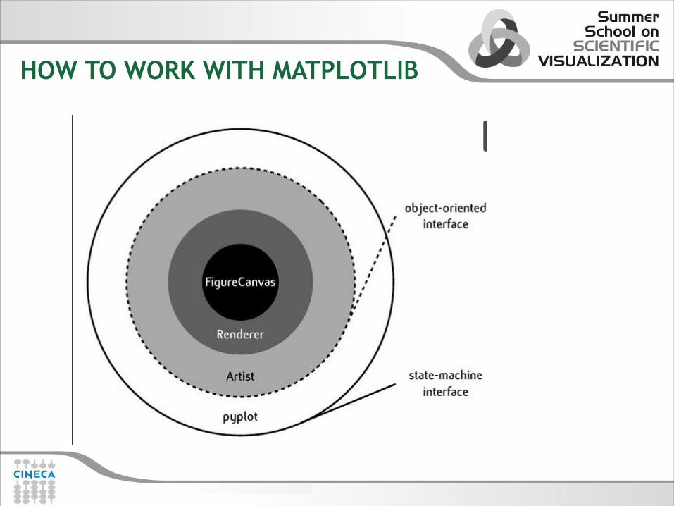
HOW TO WORK WITH MATPLOTLIB
Matplotlib is designed for object oriented programming. This allows to define objects such as colours, lines, axes, etc. Plots can also be designed using functions, in a Matlab-like interface.
There are three ways to use Matplotlib:
pyplot: provides an interface to the underlying plotting library in matplotlib. This means that figures and axes are implicitly and automatically created to achieve the desired plot.
pylab: A module to merge Matplotlib and NumPy together in an
environment closer to MATLAB = pyplot+numpy
Object-oriented way: The Pythonic way to interface with Matplotlib
NOTE: The object-oriented is generally preferred for non-interactive plotting (i.e., scripting). The pylab interface is convenient for interactive calculations and plotting.
HOW TO WORK WITH MATPLOTLIB

HOW TO WORK WITH MATPLOTLIB
Figure Canvas encapsulates the concept of a surface to draw onto
Renderer does the drawing
Artists is the object that take the Renderer and know how to put it on
the canvas. There are two types of artists:
- Primitives: line2D, Text, Rectangle
- Container: Figure, Axes, Axis, Tick

pylab and pyplot
>>>from pylab import * >>>t=arange(0,5,0.05) >>>f=2*pi*sin(2*pi*t) >>>plot(t,f) >>>grid() >>>xlabel(‘x’) >>>ylabel(‘y’) >>>title(‘First Plot’) >>>show()
import numpy as np import matplotlib.pyplot as plt t=np.arange(0,5,0.05) f=2*np.pi*np.sin(2*np.pi*t) plt.plot(t,f) plt.grid() plt.xlabel(‘x’) plt.ylabel(‘y’) plt.title(‘First Plot’) plt.show()
Pyplot + Numpy pylab
pyplot mode: is generally preferred
for non-interactive plotting,provides
a MATLAB – style state machine
interface to the underlying OO
interface in matplotlib
pylab mode: merge together pyplot and
numpy in a common namespace. It is
convenient for interactive
calculations and plotting. It makes the
environment more MATLAB-like.

OO IN MATPLOTLIB
The Zen of Python: explicit is better than implicit
import numpy as np import matplotlib.pyplot as plt t=np.arange(0,5,0.05) f=2*np.pi*np.sin(2*np.pi*t) fig=plt.figure() ax=fig.add_subplot(111) ax.plot(t,f) ax.set_xlabel("x") ax.set_ylabel("y") ax.set_title("First Plot") fig.show()

MATPLOTLIB MAIN OBJECT
TITLE
Text Objects
2D Line Object Axes Objects
Figure Objects
Figures: The plot itself,
include dimensions and
resolution
Axes: A figure can have
multiple axes, from which
can be defined plots and text
2D lines: 2D lines have
properties such as color,
thickness, etc
Texts: Objects which can be
used from figures or axes.
Properties include font,
colour, etc.

SIMPLE EXAMPLE
>>>from pylab import * >>>t=arange(0,5,0.05) >>>f=2*pi*sin(2*pi*t) >>>plot(t,f) >>>grid() >>>xlabel(‘x’) >>>ylabel(‘y’) >>>title(‘Primo grafico’) >>>show()
The function show() opens up an interactive window with the plot.
The function show() starts a TK mainloop that blocks the mainloop of the
program.
You need to close the new window to continue the execution of the script.

INTERACTIVE MODE
IPython is the designed Python shell for interactive script. If we are in interactive mode, then the figure
is redrawn on every plot command. If we are not in interactive mode, a figure state is updated on every
plot command, but the figure is actually drawn only when an explicit call to draw() or show() is made.
In order to use IPython for interactive plotting, start it in pylab mode.
>>>ipython pylab
Or from the IPython shell using magic word %pylab
IPython 0.13.1 -- An enhanced Interactive Python.
? -> Introduction and overview of IPython's features.
%quickref -> Quick reference.
help -> Python's own help system.
object? -> Details about 'object', use 'object??' for extra details.
%guiref -> A brief reference about the graphical user interface.
%pylab
NOTE: interactive property is available in rcParams dictionary
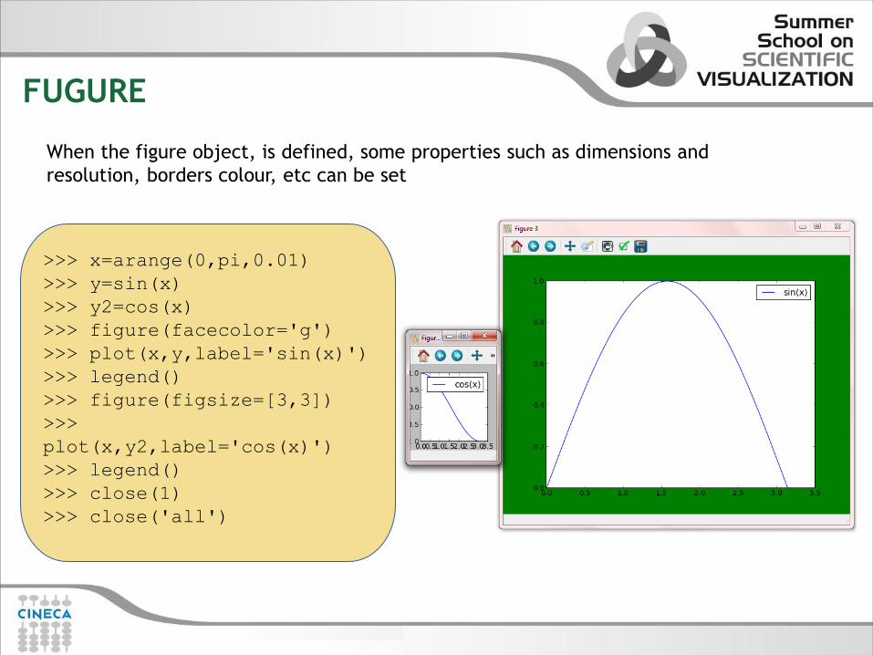
FUGURE
>>> x=arange(0,pi,0.01)
>>> y=sin(x)
>>> y2=cos(x)
>>> figure(facecolor='g')
>>> plot(x,y,label='sin(x)')
>>> legend()
>>> figure(figsize=[3,3])
>>>
plot(x,y2,label='cos(x)')
>>> legend()
>>> close(1)
>>> close('all')
When the figure object, is defined, some properties such as dimensions and
resolution, borders colour, etc can be set

CREATING A 2D PLOT
• The function plot() is highly customizable, accommodating various options, including
plotting lines and/or markers, line widths, marker types and sizes, colors, and legend to
associate with each plot.
plot(line2d , [properties line2d])

CREATING A 2D PLOT
>>>x=arange(0,pi,0.1)
>>>plot(x,sin(x),marker='o',color='r',
markerfacecolor='b',label='sin(x)')
>>>legend()
Setting line2D property – pylab style
import numpy as np
from matplotlib import pyplot as plt
x=np.arange(0,100,10)
y=2.0*np.sqrt(x)
f=plt.figure()
ax=f.add_subplot(111)
line,=ax.plot(x,y)
line.set_color('r')
line.set_linestyle('--')
line.set_marker('s')
plt.setp(line,markeredgecolor='green',markerface
color='b',markeredgewidth=3)
line.set_markersize(15)
plt.show()
Setting line2D property – OO style

CREATING A 2D PLOT
>>> t=arange(0,5,0.05)
>>> f=2*pi*sin(2*pi*t)
>>> f2=sin(2*pi*t)*exp(-2*t)
>>> plot(t,f,'g--o',t,f2,'r:s‘)
>>> hold(True)
>>> f3=2*pi*sin(2*pi*t)*cos(2*pi*t)
>>> plot(t,f3,'c-.D',label='f3')
>>> legend(('f1','f2‘,’f3’))
import numpy as np
from matplotlib import pyplot as plt
x=np.arange(0,100,10)
y1=2.0*np.sqrt(x);
y2=3.0*x**(1.0/3.0)
y3=4.0*x+3.0*x**2
y4=5.0*x-2.0*x**2
f=plt.figure()
ax=f.add_subplot(111)
line1,=ax.plot(x,y1,'r--')
line2,=ax.plot(x,y2,'b-.')
line3,line4=ax.plot(x,y3,x,y4)
line3.set_color('g')
line4.set_color('y')
ax.legend([line2,line3,line4],['line2','line3','line4‘]
)
plt.show()
Creating Multi-line plot --OO
Creating Multi-line plot -- pylab

CREATING A 2D PLOT
import numpy as np
from matplotlib import pyplot as plt
x=np.linspace(0,1,10)
y=x*(x+1)*(x+1)
xerr=np.random.normal(size=10,scale=0.1)
yerr=np.random.normal(size=10,scale=0.5)
f=plt.figure()
ax=f.add_subplot(111)
ax.loglog(x,x**2,label=r'$x^2$')
ax.loglog(x,x**3,label=r'$x^3$')
ax.legend(loc='upper left')
f2=plt.figure()
ax2=f2.add_subplot(111)
ax2.errorbar(x,y,xerr=xerr,yerr=yerr,ecolor='g')
plt.show()
Logarithmic plot and errorplot are derived from simple plot and
can be used in a similar way.
- semilogx() creates a logarithmic x axis.
– semilogy() creates a logarithmic y axis.
– loglog() creates both x and y logarithmic axe
- errorbar creates error bar in x/y direction
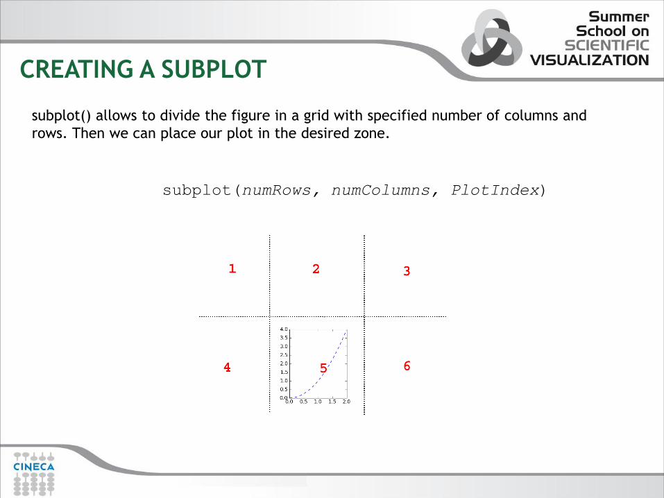
CREATING A SUBPLOT
subplot(numRows, numColumns, PlotIndex)
subplot() allows to divide the figure in a grid with specified number of columns and
rows. Then we can place our plot in the desired zone.

CREATING A SUBPLOT
x = arange (0, 2.0, 0.01)
subplot(2, 1, 1)
plot(x,x**2,‘b')
subplot(2, 1, 2)
plot(x, cos(2*pi*x), 'r.')
subplots_adjust(hspace = 0.5)
show()
import numpy as np
import matplotlib.pyplot as plt
x = np.linspace(0, 8*np.pi, num=40)
f=plt.figure()
ax=f.add_subplot(2,1,1)
ax.plot(x, np.sin(x))
ax2=f.add_subplot(2,1,2)
ax2.plot(x, np.arctan(x))
f.subplots_adjust(
left=0.13, right=0.97,
top=0.97, bottom=0.10,
wspace=0.2, hspace=0.4)
plt.show()
Creating subplot-- pylab
Creating subplot-- OO

AXES
It is possible to modify axes with:
axis([xmin,xmax,ymin,ymax])
grid()
xticks(location,label)
legend()
When you create a subplot, an axis instance is automatically created. The axes can be
defined as follows: ax = subplot(111)
To create an axis: axes([bottom_left_corner_x, bottom_left_corner_y, width,
height])

x = numpy.random.randn(1000) y = numpy.random.randn(1000) axscatter = axes([0.1,0.1,0.65,0.65]) axhistx = axes([0.1,0.77,0.65,0.2]) axhisty = axes([0.77,0.1,0.2,0.65]) axscatter.scatter(x, y) draw() binwidth = 0.25 xymax = max( [max(fabs(x)), max(fabs(y))] ) lim = ( int(xymax/binwidth) + 1) * binwidth bins = arange(-lim, lim + binwidth, binwidth) axhistx.hist(x, bins=bins) draw() axhisty.hist(y, bins=bins, orientation='horizontal') draw()
AXES: LIMITS AND TICKS
How to control axis limits?
pyplot functions –xlim(mn, mx)
–ylim(mn, mx)
axes methods –set_xlim(mn, mx)
–set_ylim(mn, mx)
mn and mx are the lower and upper limits of the axis range.
How to control axis ticks?
pyplot functions –xticks(loc, lab)
–yticks(loc, lab)
axes methods –set_xticks(loc) and set_xticklabels(lab)
–set_yticks(loc) and yticklabels(lab)
In these functions/methods the arguments are:
–loc is a list or tuple containing the tick locations
–lab an optional list or tuple containing the labels for the tick marks. These may be numbers or
strings.
–loc and lab must have the same dimensions

AXES
import numpy as np
from matplotlib import pyplot as plt
x=[1,2,3,4,5,6,7]
y=[10,20,40,50,10,7,10]
y2=[4,10,3,4,3,10,10]
f=plt.figure()
ax=f.add_axes([0.1,0.55,0.7,0.4])
l1,=ax.plot(x,y,'r--',marker='o')
l2,=ax.plot(x,y2,marker='s',color='green',linestyle='-.')
ax.set_xticks(x)
ax.set_xticklabels(['Jan','Feb','Mar','Apr','May','Jun',
'Jul'])
ax.legend([l1,l2],['sun','rain'])
bx=ax.twiny()
bx.set_xticks(x)
ax2=f.add_axes([0.1,0.1,0.7,0.4])
ax2.plot(np.arange(10),np.arange(10),label='small')
ax2.legend(loc=2)
by=ax2.twinx()
by.plot(np.arange(10),np.exp(np.arange(10)),'r',label='big')
by.legend()
plt.show()

TEXT
xlabel (s, *args, **kwargs)
ylabel (s, *args, **kwargs)
title (s, *args, **kwargs)
annotate(s, xy, xytext=None,
textcoords='data',arrowprops=None,**props)
text(x, y, s, fontdict=None,**kwargs)
There are several option to annotate a graph with text.
Is is possible to create text
object with several options

TEXT
>>> x=[9,10,13,12,11,10,9,8,45,11,12,10,9,
11,10,13,9]
>>> plot(x,label='myfunc')
>>> legend()
>>> title('Mytitle')
>>> ylabel('y',fontsize='medium',color='r')
>>> xlabel('x',fontsize='x-
large',color='b',position=(0.3,1))
>>> text(4,20,'mytext',
color='g',fontsize='medium')
>>>
annotate('annotate',xy=(8,45),xytext=(10,
35),arrowprops=dict(facecolor='black',shrink
=0.05))
IMAGES FILES
There are several ways you can use matplotlib:
- Run it interactively with the Python shell
- Automatically process data and generate output in a variety of file format
- Embed it in a graphical user interface, allowing the user to interact with an
application to visualize data.
Displaying a plot can be time consuming, especially for multiple and complex
plots. Plots can be saved without being displayed using the savefig() function:
x = arange(0,10,0.1)
plot(x, x ** 2)
savefig(‘C:/myplot.png’)

PLOT TYPES

BAR PLOT
bar(left, height)
Esempio: from pylab import *
n_day1=[7,10,15,17,17,10,5,3,6,15,18,8]
n_day2=[5,6,6,12,13,15,15,18,16,13,10,6]
m=['Jan','Feb','Mar','Apr','May','Jun‘
,'Jul','Aug','Sept','Oct','Nov','Dec']
width=0.2
i=arange(len(n_day1))
r1=bar(i, n_day1,width, color='r',linewidth=1)
r2=bar(i+width,n_day2,width,color='b',linewidth=1)
xticks(i+width/2,m)
xlabel('Month'); ylabel('Rain Days'); title('Comparison')
legend((r1[0],r2[0]),('City1','City2'),loc=0,labelsep=0.06)

PIE PLOT
pie(x)
subplot(211)
pie(n_day1,labels=m,
explode=[0,0,0,0.1,0.1,0,0,0,0,0,0.
1,0],
shadow=True)
title('City1')
subplot(212)
pie(n_day2,labels=m,
explode=[0,0,0,0,0,0,0,0.1,0.1,0,0,
0],
shadow=True)
title('City2')

MESHGRID
• Common mistake • Given a grid (xi,yi) compute f(xi,yi)
import numpy as np
from matplotlib import pyplot as plt
import matplotlib
x=np.arange(4)
y=np.arange(4)
def f(x,y):
return
matplotlib.mlab.bivariate_normal(X,Y,1.0,1.0,0.0,0.0)
f(x,y)
array([ 0, 2, 6, 12]) WRONG!!

MESHGRID
0
1
2
3
1 2 3
imshow contourf
OK!!
plt.imshow(Z,origin='lower')
plt.show()
plt.contourf(Z)
plt.show()
xx,yy=np.meshgrid(x,y)
>>> f(xx,yy)
array([[ 0, 1, 4, 9],
[ 1, 2, 5, 10],
[ 2, 3, 6, 11],
[ 3, 4, 7, 12]])

MATPLOTLIB GALLERY
•http://matplotlib.sourceforge.net/gallery.html

Exercise 1
Plot a regular step function and its Fourier Transform
Hints:
Use np.fft.fft() and np.fft.fftshift(), np.fft.fftfreq()
Use F.real() and F.imag()
spectra = np.fft.fftshift(
np.fft.fft(np.fft.fftshift(step)))
freq = np.fft.fftfreq(len(step), d=t[1] - t[0])
freq = np.fft.fftshift(freq)

mplot3d
• The mplot3d toolkit adds simple 3D plotting capabilities to
matplotlib by supplying an axes object that can create a 2D
projection of a 3D scene. The resulting graph will have the same look
and feel as regular 2D plots. • Matplotlib offers a rudimentary 3D plotting :
• Curves • Wireframe • Surface

mplot3d :3D curves
import numpy as np import matplotlib.pyplot as plt
from mpl_toolkits.mplot3d import Axes3D
def lorenz(x, y, z, s=10, r=28, b=2.667) :
x_dot = s*(y - x)
y_dot = r*x - y - x*z
z_dot = x*y - b*z
return x_dot, y_dot, z_dot
dt = 0.01
stepCnt = 10000
# Need one more for the initial values
xs = np.empty((stepCnt + 1,))
ys = np.empty((stepCnt + 1,))
zs = np.empty((stepCnt + 1,))
# Setting initial values
xs[0], ys[0], zs[0] = (0., 1., 1.05)
Lorentz attractor

mplot3d :3D curves
# Stepping through "time".
for i in (stepCnt) :
# Derivatives of the X, Y, Z state
x_dot, y_dot, z_dot = lorenz(xs[i], ys[i], zs[i])
xs[i + 1] = xs[i] + (x_dot * dt)
ys[i + 1] = ys[i] + (y_dot * dt)
zs[i + 1] = zs[i] + (z_dot * dt)
fig = plt.figure()
ax = fig.add_subplot(1,1,1,projection='3d')
ax.plot(xs, ys, zs)
ax.set_xlabel("X Axis")
ax.set_ylabel("Y Axis")
ax.set_zlabel("Z Axis")
ax.set_title("Lorenz Attractor")
plt.show()

mplot3d :3D wireframe
import numpy as np
from mpl_toolkits.mplot3d import Axes3D
import matplotlib.pyplot as plt
from matplotlib import cm
x = np.linspace(-4*np.pi, 4*np.pi, num=20)
X, Y = np.meshgrid(x, x)
R = np.sqrt(X**2 + Y**2)
Z = np.sin(R) / R
f=plt.figure(figsize=(2.25,2.25))
ax = f.add_subplot(1,1,1, projection='3d')
ax.plot_wireframe(X, Y, Z)
ax.legend();
f.subplots_adjust(
left=-.05, right=1., top=1., bottom=.05)
plt.show()

mplot3d :3D surface
import numpy as np
from mpl_toolkits.mplot3d import Axes3D
import matplotlib.pyplot as plt
from matplotlib import cm
x = np.linspace(-4*np.pi, 4*np.pi, num=20)
X, Y = np.meshgrid(x, x)
R = np.sqrt(X**2 + Y**2)
Z = np.sin(R) / R
f=plt.figure(figsize=(2.25,2.25))
ax = f.add_subplot(1,1,1, projection='3d')
ax.plot_surface(X, Y,
Z,cmap=cm.spectral,rstride=1,cstride=1,
alpha=.5,linewidth=0)
ax.legend();
ax.contour(X,Y,Z,zdir='y',offset=15)
ax.contour(X,Y,Z,zdir='x',offset=-15)
plt.show()

MORE ON MATPLOTLIB
Matplotlib doesn’t only offer an interface to make plots.
The GUI that pops up when calling plt.show() is actually interactive: matplotlib offers you objects
and functions to interact with the user.
You can get the coordinates of a mouse click, perform actions on keyboard input, let the user select
objects etc...
Matplotlib allows the programmer to make simple GUIs which are basically OS independent:
matplotlib supports six graphical user interface toolkits (GTK, Qt...) and one uniform API.
To manage events :
- Catch the event with connect function
- Define a function (action) to be executed when a particular event occurs
There are several predefined events:
- 'button_press_event‘ ,'button_release_event','draw_event‘,'key_press_event', 'key_release_event',
'motion_notify_event','pick_event’,'resize_event','scroll_event'‘,
figure_enter_event','figure_leave_event',
'axes_enter_event','axes_leave_event‘,'close_event‘
EXAMPLES:
mouse_event.py
picker_example.py

MORE ON MATPLOTLIB
It is possible to customize the plot with new widgets. Widgets are objects built-in to
Matplotlib : button,sliders,check button,radio button.
A button in matplotlib is exactly what you think it is: a clickable region, in which
clicking returns a callback that can be linked to any action.
Examples:
matplotlib_radiobutton.py
matplotlib_checkbutton.py

MORE ON MATPLOTLIB
It is possible to create animated graph in matplotlib.
Creating a basic animation is a matter of initializing the plot, creating functions to update
the frames, and passing these functions to an animation object.
• The purpose of the init() function is to set the background of the animation: it should
essentially hide any plot elements that you don't want to be shown in every frame. • The purpose of the animate() function is to update the plot elements for each frame. • Creating the animation now is a matter of passing these initialization and frame-step
functions to the animator
anim = animation.FuncAnimation(fig, animate, init_func=init,
frames=200, interval=20, blit=True)
EXAMPLE:
simple_animation.py
EMBEDDING MATPLOTLIB IN A GUI
Matplotlib + IPython is very handy for interactive plotting, experimenting
with datasets,trying different visualization of the same data, and so on.
There will be cases where we want an application to acquire, parse, and
then,
display our data.
We will present an example of how to embed Matplotlib in applications
that use Qt4 as the graphical interface library.
We will see:
• How to embed a Matplotlib Figure into a Qt window
• How to embed both, Matplotlib Figure and a navigation toolbar into a Qt window

EXAMPLE
import sys
from PyQt4 import QtGui
from matplotlib.backends.backend_qt4agg import
FigureCanvasQTAgg as FigureCanvas
from matplotlib.backends.backend_qt4agg import
NavigationToolbar2QTAgg as NavigationToolbar
import matplotlib.pyplot as plt
import random
if __name__ == '__main__':
app = QtGui.QApplication(sys.argv)
main = Window()
main.show()
sys.exit(app.exec_())

EXAMPLE
class Window(QtGui.QDialog):
def __init__(self, parent=None):
QtGui.QDialog__init__(parent)
self.figure = plt.figure()
# this is the Canvas Widget that displays the
`figure`
self.canvas = FigureCanvas(self.figure)
# this is the Navigation widget
self.toolbar = NavigationToolbar(self.canvas, self)
# Just some button connected to `plot` method
self.button = QtGui.QPushButton('Plot')
self.button.clicked.connect(self.plot)
# set the layout
layout = QtGui.QVBoxLayout()
layout.addWidget(self.toolbar)
layout.addWidget(self.canvas)
layout.addWidget(self.button)
self.setLayout(layout)
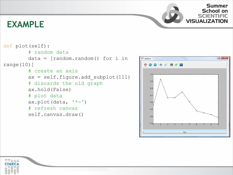
EXAMPLE
def plot(self):
# random data
data = [random.random() for i in
range(10)]
# create an axis
ax = self.figure.add_subplot(111)
# discards the old graph
ax.hold(False)
# plot data
ax.plot(data, '*-')
# refresh canvas
self.canvas.draw()

MORE ON MATPLOTLIB
http://wiki.python.org/moin/NumericAndScientific/Plott ing

A BRIEF INTRODUCTION TO MAYAVI
Mayavi2 seeks to provide easy and interactive visualization of 3D data, or 3D
plotting. It does this by the following:
• an (optional) rich user interface with dialogs to interact with all data
and objects in the visualization.
• a simple and clean scripting interface in Python, including ready to use
3D visualization functionality similar to matlab or matplotlib or an
object-oriented programming interface.
• use the power of VTK without forcing you to learn it.

A BRIEF INTRODUCTION TO MAYAVI
So the user can choose three different ways to use Mayavi:
• Use the mayavi2 application completely graphically.
• Use Mayavi as a plotting engine from simple Python scripts, for example
from Ipython, in combination with numpy.
• (Advanced) Script the Mayavi application from Python. The Mayavi
application itself features a powerful and general purpose scripting API
that can be used to adapt it to your needs.

MAYAVI INTERFACE
• The interactive
application, mayavi2,
is an end-user tool
that can be used
without any
programming
knowledge • Mayavi presents a
simplified pipeline
view of the
visualization. • The application
displays an interactive
Python shell, where
Python commands can
be entered for
immediate execution.

MAYAVI ENGINE
The Engine manages a
collection of Scene.
In each Scene, a user may
have created any number
of Source
A Source object can further
contain any number of Filter
or ModuleManager objects

MAYAVI ENGINE
Mayavi uses pipeline architecture:
• Data sources: objects to be displayed • Modules: how to visualize your data • Filters: how to transform your data
Many different ways to look at the same “data source”
SIMPLE SCRIPT
• Mayavi can also be used through a simple and yet powerful scripting API,
providing a workflow similar to that of MATLAB or Mathematica.
• Mayavi’s mlab scripting interface is a set of Python functions that work
with numpy arrays and draw some inspiration from the MATLAB and
matplotlib plotting functions. It can be used interactively in IPython, or
inside any Python script or application.
• There are a lot of parallels between matplotlib and mayavi:
-there exists huge object-oriented library, allowing you to control even
the smallest detail in a plot.
-there exists a module around that library called mlab, similar (and in
fact inspired by) pylab.

2D
3D
mlab 0D 1D

mlab
Simple problems should have simple solutions
import numpy as np
from mayavi import mlab
t = np.linspace(0, 4*np.pi, 20)
x, y, z = np.sin(2*t), np.cos(t),
np.cos(2*t)
s = 2+np.sin(t)
f=mlab.figure(size=(200,200),bgcolor=
(1,1,1))
mlab.points3d(x, y, z,s)
mlab.savefig(’test_Points3D.pdf’)
mlab.show()
points3d : points cloud with coloring

mlab
plot3d : points connected by a line with a coloring
import numpy as np
from mayavi import mlab
n_mer, n_long = 6, 11
pi = np.pi
dphi = pi/1000.0
phi = np.arange(0.0, 2*pi + 0.5*dphi, dphi)
mu = phi*n_mer
F = mlab.figure(bgcolor=(1,1,1))
x = np.cos(mu)*(1+np.cos(n_long*mu/n_mer)*0.5)
y = np.sin(mu)*(1+np.cos(n_long*mu/n_mer)*0.5)
z = np.sin(n_long*mu/n_mer)*0.5
l = mlab.plot3d(x, y, z, np.sin(mu),
tube_radius=0.025, colormap="Spectral")
mlab.view(distance=4.75);
mlab.pitch(-2.0)
mlab.show()

mlab
It is possible to customize the visualization with labels and colorbars.
It is possible to control the camera changing rotation, elevation etc etc.
CAMERA mlab.view(azimuth=None,
elevation=None,
distance=None,
focalpoint=(x,y,z)),
mlab.pitch(degrees)
mlab.roll(degrees)
mlab.yaw(degrees)
mlab.move(forward=None,right=None, up=None)
Label and Colorbar
title(), axes(), orientation_axes()
colorbar(), scalarbar(), vectorbar()

mlab
surf (x,y,f): plot function f(x,y)
import numpy as np
from mayavi import mlab
def f(x, y):
return np.sin(x+y) + \
np.sin(2*x - y) + \
np.cos(3*x+4*y)
x, y = np.mgrid[-7.:7.05:0.1, -
5.:5.05:0.05]
mlab.surf(x, y, f)
mlab.show()

mlab
A scalar field takes a value in every point in
space, f (x; y; z)
Visualisation approaches:
- Iso-Surfaces, 2D planes for constant values
f (x; y; z) = Cn
- Volymetric plotting (voxels), Transparent
color coded boxes
- Cut-planes, 2D plane � : ax + by + cz = m
with colorcoded values of f

mlab
Vector field
f(r) = (fx (r); fy (r); fz (r))
where r = (x; y; z)
Visualisation approaches:
-Quiver, set of vectors (arrows)
-Stream lines, how particles in the
field flows
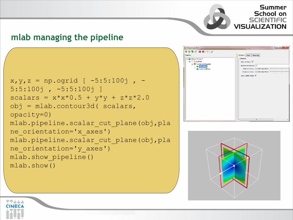
x,y,z = np.ogrid [ -5:5:100j , -
5:5:100j , -5:5:100j ]
scalars = x*x*0.5 + y*y + z*z*2.0
obj = mlab.contour3d( scalars,
opacity=0)
mlab.pipeline.scalar_cut_plane(obj,pla
ne_orientation='x_axes')
mlab.pipeline.scalar_cut_plane(obj,pla
ne_orientation='y_axes')
mlab.show_pipeline()
mlab.show()
mlab managing the pipeline

EXERCISE MATPLOTLIB
In this exercise we'll plot some weather data read from a .csv file.
Each row rapresents one day, and there are columns for min/mean/max
temperature, dew point, wind speed, etc. We'll plot
temperature and weather event data.
- read .csv file with numpy loadtxt function populating a numpy array only with
min/max/mean temperature and weather event data.
- plot on the same figure using subplot function, max,min and mean
temperature, add axis labels and title
- plot on the same figure using subplot function a trend line for mean/max/min
temperature. Use numpy's polyfit function to add a trend line.
- plot on a new figure an event histogram counting occurred events per month
as display in figure 2

Figure 1
Figure 2
EXERCISE MATPLOTLIB

In this exercise we display the H2O molecule, and use volume rendering to display the electron
localization function.
The atoms and the bounds are displayed using mlab.points3d and mlab.plot3d,
with scalar information to control the color.
Read electron localization function from h2o-elf.cube files.
Position of atoms are given by numpy arrays
atoms_x = np.array([2.9, 2.9, 3.8]) * 40 / 5.5
atoms_y = np.array([3.0, 3.0, 3.0]) * 40 / 5.5
atoms_z = np.array([3.8, 2.9, 2.7]) * 40 / 5.5
H1 is in position 0
O is in position 1
H2 is in position 2
EXERCISE MLAB