Intro to Data Journalism
21
Intro to Data Journalism Damian Radcliffe 16 th November 2015 Damian Radcliffe / Reporting II / 11 th November 2015
-
Upload
damian-radcliffe -
Category
Data & Analytics
-
view
1.266 -
download
0
Transcript of Intro to Data Journalism

Intro to Data JournalismDamian Radcliffe
16th November 2015
Damian Radcliffe / Reporting II /
11th November 2015

Greater consciousness of the power of data

In journalism, it’s nothing new
How often does a map change the world? In 1854, one produced by Doctor John Snow, altered it forever.In the world of the 1850s, cholera was believed to be spread by miasma in the air, germs were not yet understood and the sudden and serious outbreak of cholera in London's Soho was a mystery.So Snow did something data journalists often do now: he mapped the cases. The map essentially represented each death as a bar, and you can see them in the smaller image above.http://www.theguardian.com/news/datablog/2013/mar/15/john-‐snow-‐cholera-‐map

Data journalism at the Guardian: what is it and how do we do it?
http://www.theguardian.com/news/datablog/2011/jul/28/data-‐journalism

5 x Examples

Battling Infectious Diseases in the 20th Century: The Impact of Vaccines
The Wall Street Journal: http://graphics.wsj.com/infectious-‐diseases-‐and-‐vaccines/


Rents in Berlin
Source:https://twitter.com/juliustroeger/status/562639674322464769/photo/1
Story: http://www.morgenpost.de/interaktiv/mieten/article136875377/So-‐stark-‐steigen-‐die-‐Mieten-‐in-‐Berlins-‐Kiezen.html?config=interactive
Use Google Translate to look at this story if you don’t read German!

How to Choose Where to Get Treatment? The Ranking of Swiss Hospitals
Story: (in French)
http://www.rts.ch/info/suisse/7083876-‐comment-‐choisir-‐ou-‐se-‐faire-‐soigner-‐le-‐classement-‐des-‐hopitaux-‐suisses.html

Graphic: Key data behind Sir Alex Ferguson’s 25 years at Old Trafford
http://www.telegraph.co.uk/news/interactive-‐graphics/graphic-‐of-‐the-‐day/8865692/Graphic-‐Key-‐data-‐behind-‐Sir-‐Alex-‐Fergusons-‐25-‐years-‐at-‐Old-‐Trafford.html

World’s Fastest Lifts Race to the Top of the Tallest BuildingsFinancial Times: http://on.ft.com/1LXn2Pv #ddjpic.twitter.com/80Az8FGOO6
Via: https://twitter.com/martinstabe/status/641626619157815298/photo/1

Sources, Inspirations and Tools

4 x great info sources
Open Prism: search data portals from around the world by typing in one keyword: http://openprism.thomaslevine.com/
US Local Data Portals: lists dozens of data portals: https://github.com/sunlightpolicy/opendata/blob/master/USlocalopendataportals.csv
DataPortals.org lists 400+ data portals from around the world.
US Census data: http://quickfacts.census.gov/qfd/index.html

See how the pros do it
Los Angeles Times: http://www.latimes.com/local/datadesk/
Guardian: http://www.theguardian.com/data
ProPublica: https://www.propublica.org/data/
Quartz: https://atlas.qz.com/

https://www.pinterest.com/journalismtools/data-‐analysis-‐scraping-‐resources/

https://www.pinterest.com/journalismtools/infographics-‐dataviz/

Top Tips re potential approachhttp://mediashift.org/2015/06/exploring-‐the-‐7-‐different-‐types-‐of-‐data-‐stories/
1. NARRATE CHANGE OVER TIME
2. START BIG AND DRILL DOWN
3. START SMALL AND ZOOM OUT
4. HIGHLIGHT CONTRASTS
5. PROFILE THE OUTLIERS

Find out more
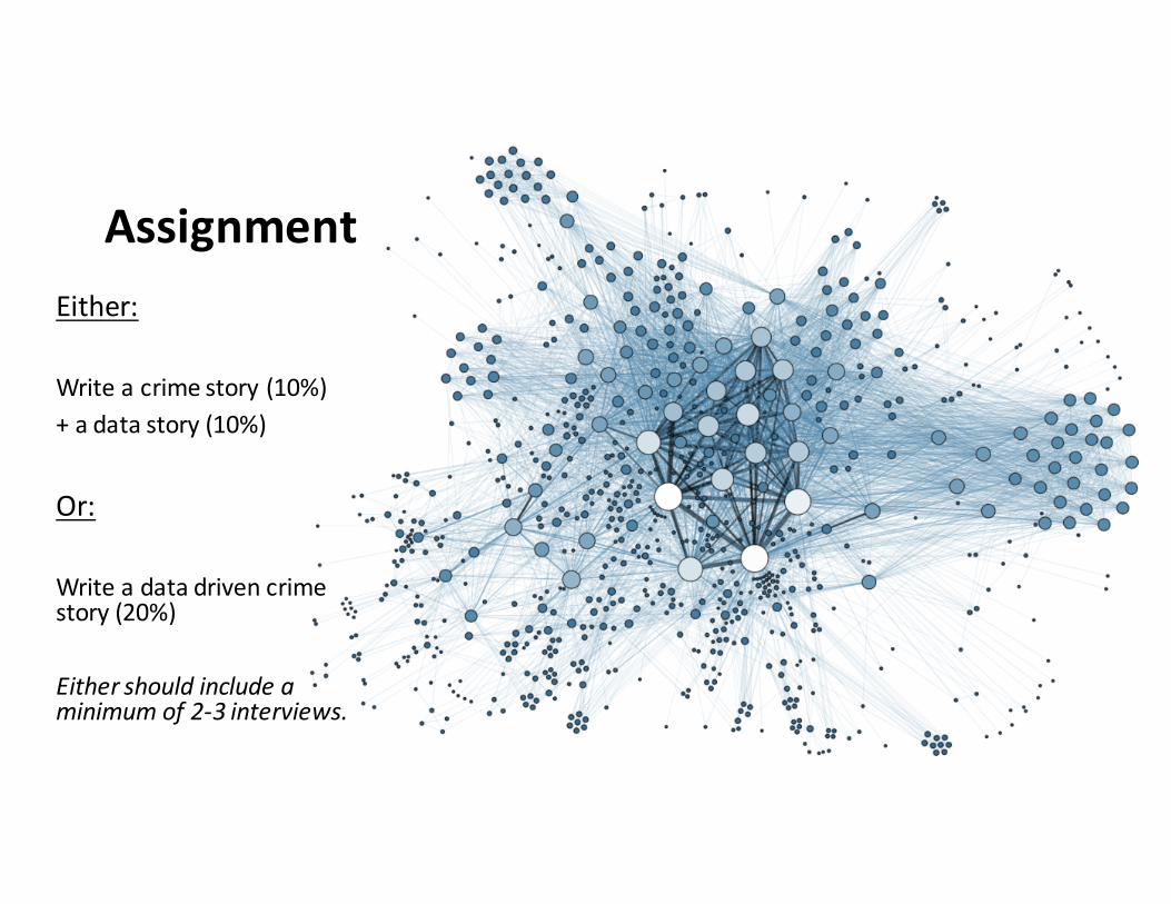
AssignmentEither:
Write a crime story (10%) + a data story (10%)
Or:
Write a data driven crime story (20%)
Either should include a minimum of 2-‐3 interviews.

Timeline
• 1 minute pitch to class on Weds (What, why, how)
• 2 minutes if you’re doing 2 assignments
• Police assignment: Due 23:59 23rd Nov.• Data feature: Due 23:59 30th Nov.• Crime data story: Due 23:59 30th Nov.

Need more inspiration?This exercise will help• Watch this recent clip from Last Week Tonight with John Oliver on Prisoner Re-‐entry: https://www.youtube.com/watch?v=gJtYRxH5G2k
• It will make you laugh.• It should make you angry.
• How many story ideas do you get from it?