INTERVARSITY Design STYLE GUIDE2100.intervarsity.org/sites/2100/files/Design Style Guide.pdf ·...
35
Updated 08/30/2010 STYLE GUIDE Design INTERVARSITY
-
Upload
nguyenthuan -
Category
Documents
-
view
221 -
download
2
Transcript of INTERVARSITY Design STYLE GUIDE2100.intervarsity.org/sites/2100/files/Design Style Guide.pdf ·...
INTERVARSITY DESIGN STYLE GUIDE
1
Updated 08/30/2010
S T Y L EGU I D E
DesignINTERVARSITY

INTERVARSITY DESIGN STYLE GUIDE
2
Design Objective & Philosophy 3
History 4
Thinking Behind Logo & Look 5
OveraLL Design sTanDarDsLogo specifications 6
Logo applications 7
identification Marks for subministries 8-9
Color Palette 10
Fonts 11
Photography guidelines (in progress) 12-15
PrinT MaTeriaLsstationery 16
Paper Prayer Letters 17
Business Cards 18
notecards 19
Handbook/Manual 20-21
Brochure (Tri-fold) 22-23
Brochure (small) 24-25
Banners - vertical & Horizontal 26
WeB, eMaiL & sCreenWeb Brand standards 27
Web grid 2010 28
Color Palette - Web & email 29
Base Theme Defaults 30
national Theme Defaults 31
Web grid 2000-2007 32
email 624 grid & email Headers 33
email Templates 34
PowerPoint specifications 35
Contents
More resources can be found at the staff communication website: intervarsity.org/staff/communication
INTERVARSITY DESIGN STYLE GUIDE
3
Design OBjeCTive anD PHiLOsOPHy
The purpose of the design style guide is to define a consistent and appropriate visual presentation of InterVarsity Christian Fellowship/USA.
Careful brand management extends far beyond the logo and graphic look described on the following pages. In the eyes of the public, everything InterVarsity staff do is part of our identity. But, consistency in design is an important piece of organizational identity. It helps InterVarsity and the ministry for which it stands be recognized both in and outside the organization.
The logo with accompanying graphic design elements have been chosen to reflects the ethos and character of the or-ganization. While the logo does not literally state our purpose, its sharp, defining quality communicates that InterVar-sity is bold, solid, contemporary and youthful. The logo alone implies that InterVarsity has something to do with the university and that words are important to us.
The graphic look should be reflected in everything InterVarsity produces. The look is carried by a design system intend-ed to appropriately communicate InterVarsity relationships. In some situations InterVarsity Christian Fellowship/USA is the subject of the communication tool (i.e. national stationery, a brochure about the ministry, official business forms.) In these situations the logo and name are the graphic priority. The use of color, contrast and other design elements help direct attention to the organization.
Other communication pieces feature a specific program or target an audience with a specific ethos. Design needs to reflect the purpose of the communication. The application of the logo in these situations is intended to position Inter-Varsity as the background or parent organization. The logo and design quietly say graphically, “a ministry of InterVar-sity Christian Fellowship/USA.” The InterVarsity name, in these situations, is not the most important information on the page, but should consistently be present.
The consistent use of the logo helps all of InterVarsity. Specific regions and programs benefit from increased name recognition with out the loss of individual identity. The whole organization becomes better recognized as communica-tion pieces include the InterVarsity identity. And as InterVarsity continues to change with the evolving culture, future ministries will benefit from association with the quality ministry of the present.
Design Objectives

INTERVARSITY DESIGN STYLE GUIDE
4
a sHOrT HisTOry OF inTervarsiTy iDenTiTy
During the past 60 years, a variety of names and graphic forms have been used to represent InterVarsity. A number of those designs are shown below.
There has not been consistent, LONG-term identity management. In 1986 a new logo was developed. (The word ‘In-terVarsity’ was letter spaced in the font New Baskerville with a thick bar under the word.) Kathy Burrows at InterVar-sity Press was instrumental in choosing the font and design. At that time, the decision was made to drop the hyphen (Inter-Varsity) and refer to the organization as InterVarsity, not IV or IVCF.
Between 1986 and 1996, the logo had no planned way to include the whole name. In 1996, the logo was updated (INTERVARSITY in Futura Book Bold stretched to 150%). In response to criticism we began to include Christian Fel-lowship in Garamond spaced to fit under InterVarsity. The philosophy statement that accompanied the 96 design described two logos for use in different applications. Both the one word and the three word options were called the logo. The diversity of InterVarsity’s ministry and the visual complexity of “InterVarsity Christian Fellowship” argued for a simple form to identify the organization. The larger InterVarsity Christian Fellowship 96 logo was a marginal graphic solution to the problem of presenting the full name. In 2002 a new solution that droped the Christian Fellowship in Garamond, but included the the full name was developed and implemented. (see page 6)
In both 1986 and 1996, a style guide with standards for business forms and consistent application was prepared but not published or fully implemented. This style guide has been published and maintained since 2002.
History

INTERVARSITY DESIGN STYLE GUIDE
5
THinking BeHinD THe inTervarsiTy LOgO anD LOOk
“Look” is subjective and concerned with characteristics. Shape is most recognizable (followed by color and text) aspect of visual identity. The InterVarsity logo consists of the letters “INTERVARSITY” in the font Futura Book Bold and then stretched to a wide and stable rectangle. Both the font and the treatment were carefully chosen to repre-sent the organization.
“Futura is a geometric sans-serif typeface designed between 1924 and 1926 by Paul Renner. It is based on geometric shapes that became representative visual elements of the Bauhaus design style of 1919–1933. Commissioned by the Bauer type foundry, Futura was commercially released in 1927. ...Futura has an appearance of efficiency and forward-ness. The typeface is derived from simple geometric forms (near-perfect circles, triangles and squares) and is based on strokes of near-even weight, which are low in contrast. (This is most visible in the almost perfectly round stroke of the o, but the shape is actually slightly ovoid.) In designing Futura, Renner avoided the decorative, eliminating non-essential elements. The lowercase has tall ascenders, which rise above the cap line. The uppercase characters present proportions similar to those of classical roman capitals.” (Wikipedia)
So... Futura is an established, classical font that is simple, clean and forward looking. We stretched it to create a wide, stable mark to emphasize InterVarsity’s stable theology. InterVarsity has remained orthodox and we want to commu-nicate to our constituencies a historic, stable, unchanging theological foundation. At the same time the width speaks of InterVarsity’s comprehensive, all encompassing view of Christian discipleship. We believe all of life falls under the Lordship of Christ. The InterVarsity logo and the bar stretching across the top of the page allude to that conviction.
But InterVarsity is also a college ministry that seeks to be dynamic and relevant to contemporary cultural trends. We believe in diversity. The logo and basic elements of the identity system are designed to be simple so that they can be combined with fresh, exciting, visual symbols and images as described on pages 8-9.
Mark Or nOT
Navigators uses a sail. Nike has its swoosh. Several factors have influenced InterVarsity’s current decision not to create an abstract mark for our logo.
> ‘Marks’ require long-term commitment and repeated exposure before they begin to stand for an organization. If we designed a symbol, it would be some time before our audience would see the symbol and think InterVarsity. By using the letters INTERVARSITY we have an immediate association between logo and organization.
> We market specific programs and products that need graphic identity. A mark with another mark is a difficult graphic problem. (e.g. an InterVarsity mark with an Urbana mark) We have chosen to use INTERVARSITY because it is easier to use consistently than an abstract mark.
> Marks are usually abstract. Past discussions about an InterVarsity mark have been filled with ideas of crosses, students, books, campus and the four loves. It seems like there is still work to do before our identity can be distilled to a simple graphic form.
Thinking Behind the InterVarsity Logo & Look

INTERVARSITY DESIGN STYLE GUIDE
6
THe inTervarsiTy LOgO
The logo consists of the letters “INTERVARSITY” in the font Futura Book Bold stretched 145%. The exact specifica-tions must always be used to recreate the “logo”. The logo will be combined with other graphic elements that repre-sent specific programs or more complex ideas. The logo is intentionally explicit (it literally says InterVarsity). It is simple so that it can be applied in “every” situation.
To use only “InterVarsity” as the logo does not change our name, drop “Christian Fellowship,” or hide our identifi-cation with Christ. The logo does provide a simple and clean graphic form for broad application. In the application guidelines that follow, there are several treatments suggested to include the full name of the organization with the logo.
The logo is available in a variety of file formats at the staff communication website.
INTERVARSITY
INTERVARSITYINTERVARSITY CHRISTIAN FELLOWSHIP/USA
Logo: at 15 pt type size; Futura book bold; stretched to 148% along the x-axis with 5pt extra kerning between the “T” and the “Y”
As of May 2010 - Registered Trademark: The registered trademark is not to be used with the logo.
Logo: at 18 pt type size; Futura book bold; stretched to 148% along the x-axis with 5pt extra kerning between the “T” and the “Y”
Name: at 8.3pt; Futura book bold; all caps
Minimum size: at 10.3pt; Futura book bold; name at 4.5pt font size; all-caps; 20% kerning
Logo for Use in Banners: When using the name underneath the logo in a banner or other large format, the type is smaller and more spaced out. Use the file named “for large use.”
Alignment with the Y: Any text or object underneath the logo should align with the point exactly in the between the right ‘branch’ of the Y, and the right edge of the ‘trunk’.
INTERVARSITYINTERVARSITY CHRISTIAN FELLOWSHIP/USA
Logo Specifications
®

INTERVARSITY DESIGN STYLE GUIDE
7
iDenTiTy in THe graPHiC sysTeM
The InterVarsity graphic identity system is intended to present the organization and its mission in a consistent way and reflect the organization with integrity. InterVarsity’s doctrine and values place an emphasis on the dignity and diversity of all people. In InterVarsity’s history, indigenous ministry is an important idea. InterVarsity relates to broad variety or people with a wide diversity of programs. The graphic identity system seeks to organize and present ministries in the context of InterVarsity.
Communication tools most focus on audience and message. Often communication is targeted for segment of the In-terVarsity audience. Frequently, the main message is not “InterVarsity,” but a unique location or program. HOWEVER, all that we do is “a ministry of” or “under the auspices of” InterVarsity. The placement of the InterVarsity logo, the use of the bar, and the logo itself are designed to help communicate this relationship.
Three principles guide this part of the identity system:1. Ask, “What is most important to communicate in this piece?”2. Always create ministry and location identifier designed to be used with InterVarsity.3. Avoid using more than two identifiers in any one message. E.g. from InterVarsity for Greek students in the Red River Region at The University of Texas
By combining the logo with regional names, every field area, region, and school has a logo solution. Contact [email protected] for help with creating a regional identity logo.
Logo Applications
GREATER LOS ANGELES
SURF&TURF
SAN DIEGO

INTERVARSITY DESIGN STYLE GUIDE
8
Identification Marks for Subministries
Ministry specific and event graphic marks are always presented in relationship to InterVarsity. Exact solutions vary, but the InterVarsity logo must always appear as the parent to other marks. (Examples of solutions coming soon.) These logos can be downloaded at the staff communication website.
sTraTegiC MinisTries MuLTieTHniC MinisTries
aDvanCeMenT MisCeLLaneOus
(arts ministry logo coming soon)
(Evangelism)
student soulBETA

INTERVARSITY DESIGN STYLE GUIDE
9
global
Our LOgO is OFTen seen WiTH THese OTHer LOgOs.
nsC & Training
reTreaT & Training CenTers
MissiOns
gFM

INTERVARSITY DESIGN STYLE GUIDE
10
Color Guide
Pantone 383 (ISM, Greek)C20 M0 Y100 K19 R158 G171 B5 hex 9EAB05
tint brighterC24 M5 Y87 K0
The center colors (with pantones listed) are used to compliment 655 in our national branded materials. They are usu-ally used at full intensity, but shades or tints may be used along with the main colors as indicated.
BranD COLOr
Our logo should always appear 655, white, or a tint thereof. tint brighter
C20 M11 Y0 K0
Updated 7.7.2010
tint at 40% C0 M12 Y43 K0
shade warmerC0 M37 Y100 K9
shade grayerC100 M84 Y31 K17
tint brighterC100 M56 Y0 K0
Pantone 655 (ISM, Greek, NCF)C100 M56 Y0 K50 R10 G33 B79 HEX 0A214F
Pantone 647C100 M56 Y0 K23 R38 G87 B135 hex 265787
aLL inTervarsiTy PaLeTTe
Pantone 159 C0 M66 Y100 K7 R194 G94 B3 hex C25E03
exTra suBMinisrTy COLOrs
Pantone 187 (BCM, LaFe, AAM)C0 M91 Y72 K23 R175 G16 B45 hex AF1E2D
Pantone 1815 (GFM)C45 M100 Y100 K15 R138 G37 B40 hex 8A2528
Pantone 130 (NCF, GFM, BCM, LaFe, AAM)C0 M30 Y100 K0 R253 G185 B19 hex EFB432
C6 M4 Y0 K0
Pantone 2935C100 M46 Y0 K0 R0 G92 B255 hex 005CFF
These colors are only used as brand colors for the ministries listed.

INTERVARSITY DESIGN STYLE GUIDE
11
FOnTs useD in inTervarsiTy PuBLiCaTiOns
Over the last 10 years, two fonts have played a large role in InterVarsity’s visual identity. Futura Book, used for the InterVarsity logo, has a crisp clean feel that interjects relevance into most documents. Bodoni Twelve has also been influential and use specifically to communicate a level of education typical of the university. Today we have expanded our list of fonts to include two fresh and contemporary fonts. Frutiger light, chosen for its soft curves which suggest friendliness while still maintaining a clean and to the point feel, is currently used for all body text in InterVarsity printed materials. Franklin Gothic Extra Compressed is a wonderfully bold font which is well used in headlines. Franklin Gothic Extra Compressed is designed to be used in all capital letters as well as sentence case depending on the situation. CombiNumerals was added for use as bullets or a clean numbering system.
Fonts
PreFerreD FOnTs aLTernaTive FOnTs
BoDY TExT Frutiger LT 45 Light Trebuchet (used on national website)Frutiger LT 45 Light Bold Trebuchet bold(Frutiger is available for download on the staff communication website)
SaNS SErIf foNTS
Futura Light Century GothicFutura Book Century Gothic bold
Futura Book Bold
Avenir
SErIf foNTS
Adobe Garamond Georgia
Arno Pro Georgia bold
Bodoni Seventytwo ITCBodoni Twelve ITC Bodoni Six ITC
CoNDENSED foNTS
Franklin Gothic Extra Compressed - regular Tw Cen MT Condensed Franklin Gothic Extra Compressed - demi Myriad Pro Condensed
(for banners and large format)
oThEr
CombiNumerals (. > x ? b c d e) (open and solid)
INTERVARSITY DESIGN STYLE GUIDE
12
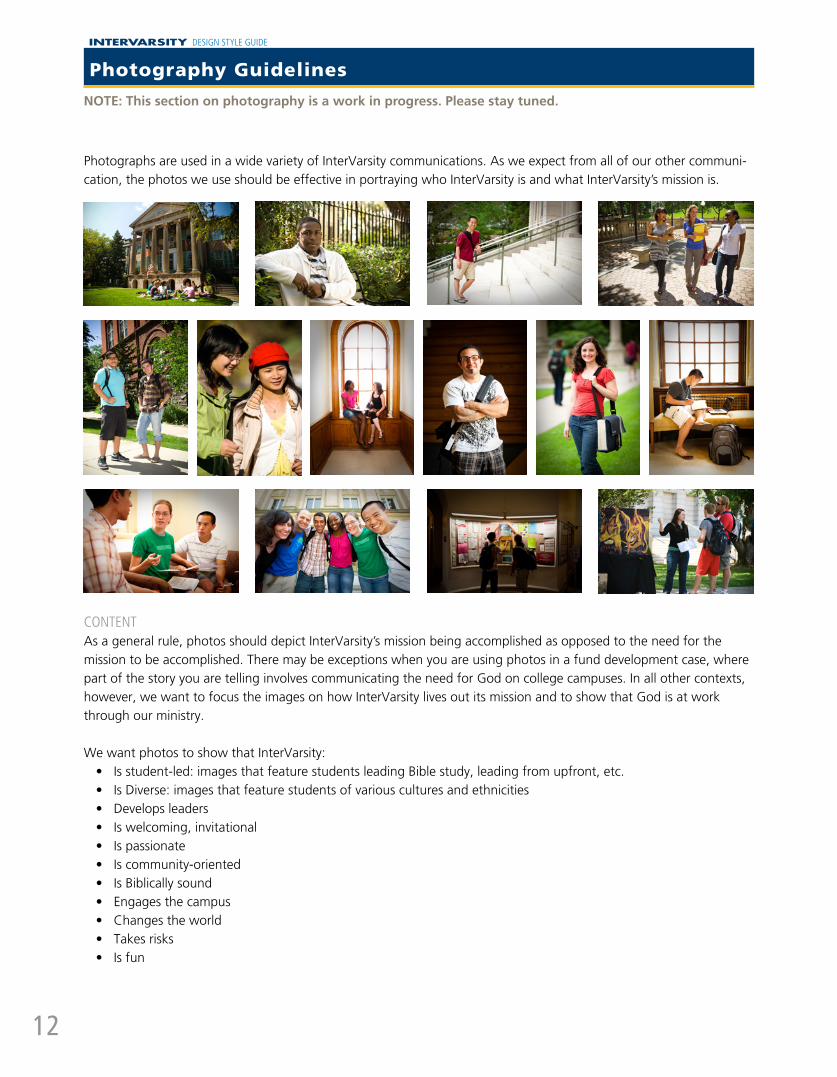
Photographs are used in a wide variety of InterVarsity communications. As we expect from all of our other communi-cation, the photos we use should be effective in portraying who InterVarsity is and what InterVarsity’s mission is.
CoNTENTAs a general rule, photos should depict InterVarsity’s mission being accomplished as opposed to the need for the mission to be accomplished. There may be exceptions when you are using photos in a fund development case, where part of the story you are telling involves communicating the need for God on college campuses. In all other contexts, however, we want to focus the images on how InterVarsity lives out its mission and to show that God is at work through our ministry.
We want photos to show that InterVarsity:• Is student-led: images that feature students leading Bible study, leading from upfront, etc.• Is Diverse: images that feature students of various cultures and ethnicities• Develops leaders• Is welcoming, invitational• Is passionate• Is community-oriented• Is Biblically sound• Engages the campus• Changes the world• Takes risks• Is fun
NOTE: This section on photography is a work in progress. Please stay tuned.
Photography Guidelines

INTERVARSITY DESIGN STYLE GUIDE
13
Photography Guidelines
Up-To-DaTE ImaGESPhotos which feature students’ clothing and style should be from the past three years. Other photos, such as those of buildings, can be older.
approprIaTE aTTIrEOnly use photos where students are dressed modestly. If there’s a great photo but one person in the photo is not modestly dressed, do your best to crop him or her out of the photo.
When possible, do not use photos that show names or logos of other brands.
pErmISSIoNS aND prIvaCYWe strive to only use photos of people who have given us permission to do so. This means that typically we do not use photos of strangers or people who would not identify themselves as connected to InterVarsity. For example, in a photo showing evangelism on campus, the face of the non-Christian should not be visible.
Additionally, when using pictures of international students, it is very important that we do not include pictures of students from China or other countries where their identification with InterVarsity could put them at risk with the government. With all other international students, they should sign a waiver giving permission to use their photo.
CopYrIGhT Do not pull images off the web for your InterVarsity publications. This is a copyright violation! If you need some generic photos, a good place to go for royalty free stock photo is: Stock Exhange - http://sxc.huFor general InterVarsity photos, you can go to: (COMING SOON)
Do not use old photos where students’ clothing are clearly
outdated.
Do not use photos if students are not dressed modestly.
Non-InterVarsity subjects should be anonymous
International students from China should never be photographed. WIth other int’l students, make
sure they sign a waiver.

INTERVARSITY DESIGN STYLE GUIDE
14
NOTE: This section on photography is a work in progress. Please stay tuned.
a fEw morE DoS & DoN’TSWhether you are taking photographs or choosing photographs, here are some things to look out for.
Do• Take environmental shots - showing the surroundings such as campus, architecture, sky, trees and grass,
classroom, etc. • Be aware that photos are often cropped to irregular aspect ratios when used in publications (for example, a very
wide banner image on a website).• Take photos that are both landscape and portrait, so that you can have the option of using the shot in a variety
of places. Many InterVarsity brochures are set up to have vertically-oriented photos.• Be patient - a good photo captures a good moment.• Pay attention to the light. Good lighting is a key element in taking good photos.
DoN’T• Take tightly cropped shots. You can always crop a photo, but you can never zoom out from a photo that is
taken tightly. (If you do want to take a portrait photo, also take the same shot at a wider angle so that there are options later on.)
• Crowd your images with too many elements. Keeping things simple will communicate much more clearly.• Skew/angle the shot - this type of shot is popular in wedding photography but is not useful for InterVarsity
publications.
TIpS & hINTS oN USING GooD QUaLITY phoToS IN YoUr praYEr LETTErS & oThEr prINT maTErIaLS
To ensure that your photos are clear and crisp, anything printed should have a minimum resolution of 300dpi. Photographers: the longest side of your images should be a minimum of 3000 pixels at 300 dpi.
How to check the resolution of a photo if you do not have Photoshop (on a PC):• Open up the folder where your photo is stored.• Right click on the file’s thumbnail and click Properties.• Under the Summary tab, click Advanced.• The resolution should be listed in this window.
Never try to enlarge a photo. This reduces its resolution and will cause it to come out blurry.If you need to shrink a photo, remember to hold the shift key down while you are changing the size (this should work in any program you are using). This will maintain the photo’s original proportions and therefore will not be ‘skinny’ or ‘stretched’. If you must change the photo’s dimensions, make sure you crop instead of resize.
Photography Guidelines

INTERVARSITY DESIGN STYLE GUIDE
15
Environmental shots provide context and detail
Take a variety of shots of the same subject
Lighting makes a big difference
Keeping your composition simple adds to an image’s impact
Waiting for a good moment is worth it!
Skewed photos are not useful
Landscape & Portrait orientation shots give designers more options
GooDNoT GooD
Photography Guidelines

INTERVARSITY DESIGN STYLE GUIDE
16
National Identity: appearing at top left hand corner in white 1/4” below top edge at 2 3/16” in length. Name appears diectly underneath logo in 4.951 pt futura book bold (225 pt kerning). Blue bar is 7/16” thick while yellow bar is 1/8”.
Personalized name (if shown): appearing at top left hand corner in Pantone 647 (blue) 15/16” below top edge and 3/8” from left side. Name appears in Franklin Gothic Extra Compressed at 14 pt and title appears in Frutiger 45 light 7pt type. Leading is 11 pt.
Identity and address block for envelope: appear-ing at top left hand corner with 1/4” margin at left and 3/16” at top. Address block begins 1/8” beneath iden-tity in frutiger light 7pt type with 10.2pt leading. Blue bar is 2” in length, 1/4” in height. Yellow bar is 1/8” high. Logo is 1 7/8” in length and name is in futura book bold 4.579 pt type (125 pt kerning).
Address block: appearing at bottom center 1/4” from bottom edge. Font is 7 pt Frutiger 45 Light with bold titles for “email,” “website,” etc.
Personalized envelope: appearing at top left hand corner in Pantone 647 (blue) 1/8” below bar. Name is 1” in length, address 1/8” below name and title.
GENEraL CorporaTE STaTIoNErY & pErSoNaLIzED GENEraL STaTIoNErY
Stationery
National Identity: InterVarsity logo appearing at top right hand corner in white. Logo is 1.75” in length included registered trademark located 3/8” from the right edge on a 3/8” blue bar (655) with bleeds. The logo sits 1/16” above the bottom of the blue bar.
BLUE Bar STaTIoNErY - LETTEr aND haLf LETTEr

INTERVARSITY DESIGN STYLE GUIDE
17
Margin: 1/2 inch around all sides.
Header: InterVarsity logo in white on a blue 655 bar on top, followed with a 1-inch high header which includes your newsletter title, name, school/chapter name, subministry logos, etc.
All headers (more than shown here) are available for download and are interchangable with each template. The headers also come with a matching ‘box’ which can be used as a prayer request sec-tion, or other call out box.
Instructions about using the Word templates which includes font and color recommendations, can be downloaded at the staff communication website.
More templates will also be available for down-load at the staff communication website soon.
GENEraL INTErvarSITY ThEmE
TEmpLaTE 1 wITh GENEraL ThEmE TEmpLaTE 2 wITh aam ThEmE TEmpLaTE 3 wITh fLoUrISh ThEmE
aSIaN amErICaN mINISTrIES ThEmE
fLoUrISh ThEmE
Paper (or PDF) Prayer Letters

INTERVARSITY DESIGN STYLE GUIDE
18
Personal - General:Bar in Pantones 655, national identity in white at 10.3 pt
Name in Pantone 655, Futura Bold 4.5 pt, kerning expanded at 20pt.
Information in black. Name in Frutiger Bold at 8 pt. Title and address information in Frutiger at 7 pt.
Personal - with Ministry logo:
Ministry name in black, Franklin Gothic Extra Compressed, 12.65 pt, kerning expanded at 20pt.
Logo in top right corner - placement varies de-pending on shape of logo, but should remain in designated box 0.9 inches by 0.9 inches. Distance from right edge and top edge = 0.1 inches.
Logo should overlap blue bar unless an outer edge of the logo is white or has a transparent back-ground, as shown here.
Business Cards
INTERVARSITYINTERVARSITY CHRISTIAN FELLOWSHIP/USA
Scott WilsonDirector of CommunicationsDirector of Twentyonehundred Productions
6400 Schroeder Road, P.O. Box 7895Madison, WI 53707-7895phone 608.443.3763fax [email protected] www.intervarsity.org
INTERVARSITY
Phil Bowling-DyerNational Director of Black Campus Ministries
3138 Market St., Unit AOakland, CA 94608-4334tel 510.595.4397 [email protected]
Black Campus Ministries
INTERVARSITY
Shane SabicerGuest Services Manager
#1 Gallaghers CoveP.O Box 466 Avalon, CA 90704tel 310.510.0015 [email protected]
Campus by the Sea
INTERVARSITY
James ChoungNational Director of Asian American Ministries
10201 Woodbine St Apt 207Los Angeles, CA 90034tel 858.344.0682 [email protected] 858.344.0682 jameschoung.net
Asian American Ministry
3.5 in.
2 in
.

INTERVARSITY DESIGN STYLE GUIDE
19
Placement of Logo: on back 1.75 inches from each side use full name with logo. bottom should align with 2 inches from edge
1.75 in.
5.5 in.
2 in
.4.
25 in
.
on frontTOP - .25 in from right, .25 inches from top ORBOTTOM - .25 in from right, . 25 inches from bottomORincorporated in design (see samples)
Color of Logo:white, or blue (655), depending on the design - but should be consistent on front and back.
white background: logo blue, name in gold
gold background:logo blue, name in white
blue backgroundlogo white, name in gold
BACK
FRONT
Size of Logo: 2 in wide, .1468 in high (should be same front and back)
Notecards

INTERVARSITY DESIGN STYLE GUIDE
20
8.5x11 Report/Handbook-Content Page
1.625”
.75”
.5”
2.125”

INTERVARSITY DESIGN STYLE GUIDE
21
Fonts used: Frutiger 45 Light (for body text), Tw Cen MT Condensed (for titles and subtitles).
8.5x11 Report/Handbook - Template in Microsoft Word
INTERVARSITY DESIGN STYLE GUIDE
22
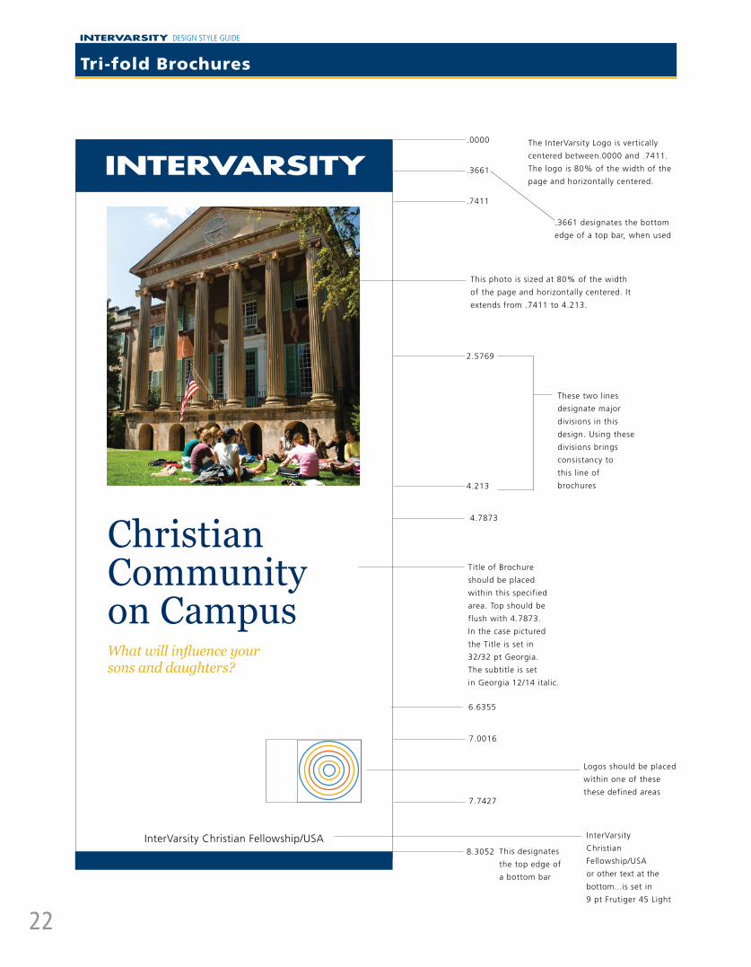
Tri-fold Brochures
7.0016
7.7427
The InterVarsity Logo is vertically
centered between.0000 and .7411.
The logo is 80% of the width of the
page and horizontally centered.
This designates
the top edge of
a bottom bar
InterVarsity
Christian
Fellowship/USA
or other text at the
bottom...is set in
9 pt Frutiger 45 Light
.0000
.3661
.7411
2.5769
4.213
4.7873
8.3052
Title of Brochure
should be placed
within this specified
area. Top should be
flush with 4.7873.
In the case pictured
the Title is set in
32/32 pt Georgia.
The subtitle is set
in Georgia 12/14 italic.
These two lines
designate major
divisions in this
design. Using these
divisions brings
consistancy to
this line of
brochures
.3661 designates the bottom
edge of a top bar, when used
This photo is sized at 80% of the width
of the page and horizontally centered. It
extends from .7411 to 4.213.
Logos should be placed
within one of these
these defined areas
6.6355
InterVarsity Christian Fellowship/USA
Christian Community on Campus What will influence your sons and daughters?

INTERVARSITY DESIGN STYLE GUIDE
23
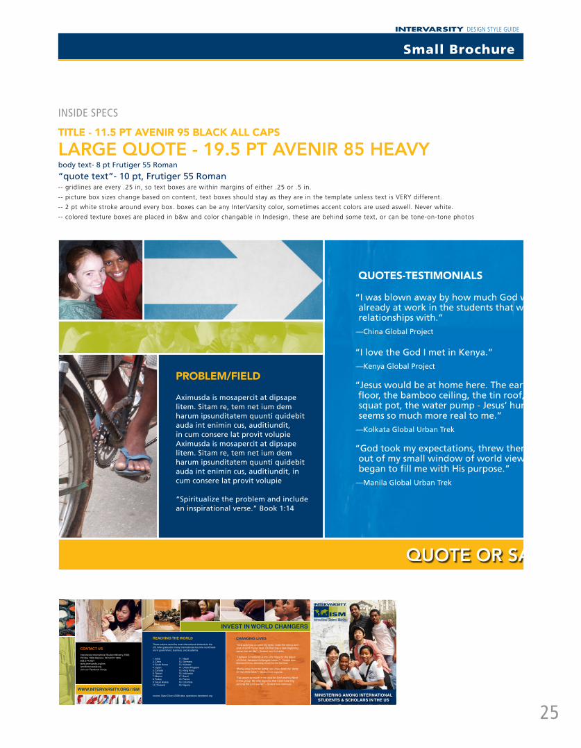
Sample Brochures

INTERVARSITY DESIGN STYLE GUIDE
24
design studio
communicating the good news well
Small Brochure
text at the bottom matches inside titles:
11.5 pt Avenir 95 black, centered in bar
.3 end of the 655 bar, 2 pt white stroke
.2672
4.56 start 655 bar, 2 pt white stroke
The logo and/or title of brochure can be
placed where it looks best with the photo.
Any text should be either flush right or left,
aligned with the subtitle (if there is one).
With the small brochures we try to embed
the ministry name or title of the brochure
in with the photo as much as possible. The
photo must be simple and have a dark and/
or clear area to highlight the logo and title.
Environmental photos with depth or those
with one portrait that draws the viewer in
(like Gary here) work best.
.14
PLease use sMaLL BrOCHure TeMPLaTe On THe graPHiCs Drive
Size: 16 in x 5 in full, 4 in x 5 in accordion folded to 4 panels
The template not only has all the right fonts, colors, styles, and grid, but also guides content placement
and length for clients ordering and developing a new brochure. It helps them come up with good text
to include and in what order, and helps the designer place accordingly.
ContaCt Us
InterVarsity Urban Projects in the U.S.264 N. Van Ness AveFresno, CA 93701-1628tel 559.497.8739 fax 559.497.8940email [email protected]
For parents and donor info www.urbanprojects.org/go/info
EMaIL: [email protected]
tRansFoRM tHE CItY WHILE BEInG tRansFoRMED
“But seek the well-being of the city … and pray to the Lord on its behalf, for in it’s well-being you will find your well-being.” (Jeremiah 29:7)
CItIEs WHERE YoU CoULD sERVE:
> New York City> Chicago> Los Angeles> St. Louis> Philadelphia> AND NEARLY TWENTY OTHERS!
Go to WWW.URBanPRojECts.oRG for complete list
MakE a DIFFEREnCE In an URBan nEIGHBoRHooD
GOD’S KINGDOM TO STUDENTS
WORLDWIDE
CONTaCT US
InterVarsity LinkP.O. Box 7895Madison, WI 53707-7895tel 608.274 .9001fax 608.274.7882web www.ivlink.org
EMaIL: [email protected]
IT MaTTERS WHaT YOU DO WITH YOUR LIFE. WHaT WILL YOU DO?
REaL LIFE WITH LINK
“Just one year out of college, I was able to make strategic decisions on my own that influenced the people with whom I worked . . . Some of my peers wait for years to be able to have that kind of voice and influence in their work.” - Carrie Moorhead, formerly Link staff to South Africa
“As a 25-year-old I was presented with an opportunity for real creative leadership, real responsibility, and key strategic decision making. The fact that this happened in a cross-cultural environment stretched my understanding of the gospel, of culture, and of global concerns. I can’t over- emphasize the impact that this opportunity had on me as an emerging leader. There is no other context that would be quite as broad-reaching.“- Jason Gaboury, formerly Link staff to European Evangelism team
WHERE TO?
Link staff can go virtually anywhere in the world. Because we belong to an International Fellowship, we only go where invitations from nationals or an IFES national movement are extended. Link staff have served in 42 countries over the past 20 years, with 44 more currently inviting InterVarsity Link to send qualified staff.
EMAIL: [email protected]
TREK SITES
BANGKOK, ThAILANd
CAIRO, EGYpT
dhAKA, BANGLAdESh
KOLKATA, INdIA
LIMA, pERu
MANILA, phILIppINES
MExICO CITY, MExICO
phNOM-pENh, CAMBOdIA
ThE ShEER NuMBER Of ThE uRBAN pOOR CAN OBSCuRE ThEIR INdIVIduAL huMANITY.
CONTACT uS
InterVarsityGlobal Urban Trektel 608.274.9001email [email protected] www.globalurbantrek.org
For parents and donor infowww.intervarsity.org/gp/parentsanddonors.html
Incarnate the GOSpEL to
the urban poor wORLdwIdE.
VOICES Of ThE TREK
“Jesus would be at home here. The earthen floor, the bamboo ceiling, the tin roof, the squat pot, the water pump – Jesus’ humanity seems so much more real to me.” - Kolkata
“We spent a month with orphans, street children, prosti-tutes, and lepers. And in doing so, we learned to find joy in the tiniest things. I’ve really never seen such genuine joy.” - Manila
“Scripture says hope deferred makes the heart sick. My refugee brothers and sisters from Southern Sudan have sick hearts. My heart grows sick knowing that I am leaving my Sudanese friends when hope seems so far for them.” - Cairo
ContaCt Us
InterVarsity Global ProjectsP.O. Box 7895Madison, WI 53707-7895tel 608.274 .9001fax 608.274.7882email [email protected] www.ivglobalprojects.org
For parents and donor infowww.intervarsity.org/gp/parentsanddonors.html
EMaIL: [email protected]
GLoBaL stUDEnt tRansFoRMatIon
Who WE aRE
InterVarsity Global Projects started in 1970 when a group of students traveled to Costa Rica in response to God’s call to love the nations. Today we are sending over 700 students each year on InterVarsity staff-led trips to more than 40 locations from Mexico to China to Ghana.
WhERE to?
africa:KenyaEgyptGhanaSouth AfricaEthiopiaMalawi
asia:ChinaIndiaBangladeshPhilippinesThailandCambodia
Europe:RussiaRomaniaTurkeyBulgariaBosniaTajikistan
the americas:GuatemalaPeruBoliviaMexicoDominican RepublicPine Ridge Reservation
thE WoRLD In nEED oF tRansFoRMatIonGo to WWW.IVGLoBaLPRojECts.oRG for complete list
saMPLes
INTERVARSITY DESIGN STYLE GUIDE
25
quote or saying
Problem/field
Aximusda is mosapercit at dipsape litem. Sitam re, tem net ium dem harum ipsunditatem quunti quidebit auda int enimin cus, auditiundit, in cum consere lat provit volupie Aximusda is mosapercit at dipsape litem. Sitam re, tem net ium dem harum ipsunditatem quunti quidebit auda int enimin cus, auditiundit, in cum consere lat provit volupie
“Spiritualize the problem and include an inspirational verse.” Book 1:14
quotes-testimonials
“I was blown away by how much God was already at work in the students that we built relationships with.”
—China Global Project
“I love the God I met in Kenya.” —Kenya Global Project
“Jesus would be at home here. The earthen floor, the bamboo ceiling, the tin roof, the squat pot, the water pump - Jesus’ humanity seems so much more real to me.”
—Kolkata Global Urban Trek
“God took my expectations, threw them out of my small window of world view, and began to fill me with His purpose.”
—Manila Global Urban Trek
insiDe sPeCs
title - 11.5 Pt avenir 95 black all caPs
large quote - 19.5 pt avenir 85 heavy body text- 8 pt Frutiger 55 Roman
“quote text”- 10 pt, Frutiger 55 Roman-- gridlines are every .25 in, so text boxes are within margins of either .25 or .5 in.
-- picture box sizes change based on content, text boxes should stay as they are in the template unless text is VERY different.
-- 2 pt white stroke around every box. boxes can be any InterVarsity color, sometimes accent colors are used aswell. Never white.
-- colored texture boxes are placed in b&w and color changable in Indesign, these are behind some text, or can be tone-on-tone photos
invest in world changers
www.intervarsitY.org / isM
contact Us InterVarsity International Student Ministry (ISM)PO Box 7895 Madison, WI 53707-7895608.274.9001www.intervarsity.org/[email protected] our Facebook Group
reaching the world
These nations send the most international students to the US. After graduation many internationals become world lead-ers in government, business, and academia.
changing lives “God used you to open my eyes. I saw the mercy and love of God in your face. On that day a new beginning came into my life.” – Student from Sri Lanka
“I believe Christianity is the only hope for the future of China, because it changes hearts.” – Student from Mainland China, attending church for the first time
“Being away from my family, you have been my family for me while here.” – Student from Uganda
“I’ve grown so much in my love for God and his Word in this group. My only regret is that I didn’t starting serving the Lord earlier.” – Student from Indonesia
1. India2. China3. South Korea4. Japan5. Canada6. Taiwan7. Mexico8. Turkey9. Saudi Arabia10. Thailand
11. Nepal12. Germany13. Vietnam14. United Kingdom15. Hong Kong16. Indonesia17. Brazil18. France19. Colombia20. Nigeria
source: Open Doors 2008 data, opendoors.iienetwork.org Ministering aMong international stUdents & scholars in the Us
Small Brochure

INTERVARSITY DESIGN STYLE GUIDE
26
verTiCaL Banner - 34x722 inch margin on the top and on the bottom to al-low for the loops. Small fold lines show where the banner should fold for the loop. There also should be a center line designating the center of banner. The InterVarsity logo most often resides in a blue bar at the top of the banner. The width of the In-terVarsity Logo is 80% of the width of the banner and it is centered. The 655 blue field extends one e-width* above and below the InterVarsity Logo (not including 2-inch margin). Other type elements below the InterVarsity Logo should be flush left, flush right, or both in relation to the InterVarsity Logo. Font is Franklin Gothic Extra Compressed, the same height as the Inter-Varsity text and if possible letterspaced to be the same width or just flush left. The top of the text should begin one-half e-width below the InterVar-sity bar.
Banners - Vertical & Horizontal
HOrizOnTaL Banner - 72x32 There should be a three inch margin on top with no text since horizontal banners are often hung in front of a table.
InterVarsity logo in a blue bar at top: length is 1/3 of the total space of the horizontal area-two e-widths. The area above and below the logo in the bar is also 1 e-width. If the InterVarsity logo stretches to each end of the banner, it should still remain 1 e-width from both edges. This example Shows 170 pt. Uppercase Frutiger below the large InterVarsity Logo, and 170 pt Up-per and Lower Case Frutiger below the small logo at the top of the page.
Custom banners can be ordered at the staff com-munication website (purchased at staff store).
1/3 = 24 in.
80% = 27.2 in.
*“e-width” = the width of the E in InterVarsity logo

INTERVARSITY DESIGN STYLE GUIDE
27
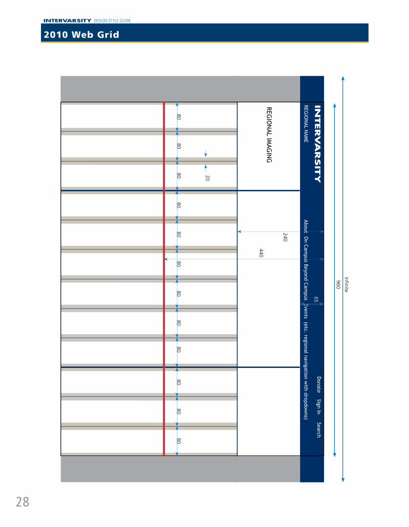
Web Brand Standards
Two InterVarsity values that seem to be in tension are foundational to the web branding standards. On the one hand, some things that InterVarsity stands for are universal and rigid - for example, our purpose or doctrine. The brand standards need to clearly reflect that stability and uniformity. But on the other hand, we have believed in indigenous, contextualized ministry since our inception. Our purpose statement speaks about loving people of “every ethnicity and culture.” Our web audience is probably our largest and most diverse audience. Therefore, our web standards need to create space for creativity and for a wide variety of audiences and purposes. Both of these values must be maintained in our websites.
Our audiences do not usually think of InterVarsity in separate regions or departments, although many may experience InterVarsity from one specific touch point. We need to cooperate with each other (as a model of Christian commu-nity) to provide web experiences that truthfully represent InterVarsity and its mission. It is to everybody’s advantage for our audiences to learn about a bigger, broader InterVarsity than the one dimension with which they are familiar. This makes designing our websites a complex, interdependent process that can be overwhelming; some of us do not embrace the process enthusiastically.
This InterVarsity Design Style Guide describes our brand standards. The color palette, standard fonts, InterVarsity logo, and a grid structure are reoccurring elements in ALL InterVarsity branding standards and apply to websites. For websites, a 960 pixel grid has been chosen and areas in the grid defined at three levels: (1) non-negotiable, (2) highly recommended and supported, (3) suggested, but variations not necessarily supported. For the sake of our audiences, navigation is one of the web functions that we seek to make most common across the InterVarsity web experience.
A 65 pixel high space (bar) in 0A214F at the top of the page is universal and non-negotiable. It will contain the InterVarsity logo in white, universal navigation (donate, search, sign in), and area name with area navigation as appropriate.
A 170-370 pixel high space just below the top 65 pixel space is reserved for regional graphic identity and message. This section should be unique and contextualized for the audience most often using this section of the website. This space describes both the unique message of this focus website and helps related the website to InterVarsity appropriately.
The web brand standards specify five possible types of navigation.1. Top of the page - every page will have a 65 pixel blue bar described above. National pages will use drop-down
boxes with further options.
2. The bottom of every page will have the standard footer and an area navigation map.
3. An optional response bar immediately below the identity space with a suggested height of 40 pixels.
4. Side-bar navigation, when chosen, will go in the 240 pixels down the left side of the page. The placement is specified, but a wide variety of styles will be completely acceptable. Many national pages will also use this navigation.
5. The main content of some InterVarsity pages is information about where to find specific web content. Improvements in search tools and habits have reduced the need for this kind of page, but they will still be important in some sites. In the past we have called these “index pages.” Other than recommending the center of the page for main content and the right three columns for special feature, no specification are set for navigation of this type.
The 960 grid will be centered in the browser window. The treatment for the screen area outside the 960 grid can be contextualized, but should always use the InterVarsity color palette. The blue bar should continue infinitely and in general the expansive breadth of InterVarsity represented in the treatment.
A two tier footer is part of the brand standard for all pages. The very bottom of the page will have copyright, privacy, contact, relationship, and other legal items. Above that will be area site map. Both content items will be on a blue field.
INTERVARSITY DESIGN STYLE GUIDE
28
2010 Web Grid
960
8080
About On Cam
pus Beyond Campus Events (etc. regional navigation w
ith dropdowns)
REGIO
NAL IM
AGIN
G
REGIO
NAL N
AME
INTERVA
RSIT
Y80 20
65
Infinite
440
8080
8080
8080
8080
80
240
Donate Sign In Search

INTERVARSITY DESIGN STYLE GUIDE
29
Color Palette - Web & Email
#102878 Headers (text)
#0A214F (655) Top bar, footer, and title backgrounds
#546484 Default text color
#9DA6B9 Menu item hover background, body footer bkgrd
#DDE5EC Forms background, flourish bkgrd, footer text
#E8EDF2 Body background
#F2F5F8 Table row striping
#FFFFFF Content bkgrd, page title, borders, sidebar block bkgrd
#9EAB05 (383) Links, selected items, sidebar block header bkgrd, menu item hover
#F9C451 Header background
#EFB432 (130) Top bar menu item hover, footer link hover
#E8AE30 Trees silhouette
#D7A22D Header shadows
#4A3A17 Header text
#424446 Forms text
Tints and shades of our pallete colors and where they are used on the Intervarsity homepage.
#D62436 Validation error test
#DC9DA3 Validation error borders, error message borders
#EBC7CB Validation error bkgrds, error message bkgrds
#D5DA92 Validation success borders, success message borders
#D5DA92 Validation success bkgrds, success message bkgrds
These tints of 383 and 187 are currently only used for validation in forms and transactions, not design elements.
inTervarsiTy WeB PaLeTTe

INTERVARSITY DESIGN STYLE GUIDE
30
foNT • Default is 13px Trebuchet, with 20px line height
(leading)
• Sidebars is 12px Trebuchet with 20px line height
• Sidebar headers are 14px Trebuchet (bold)
• Top Bar (Menu) is 16px Trebuchet with 32px line height
• Footer is 10px Verdana, still with 20px line height
• Footer headers are Trebuchet, with the same ratios as in default text, but computed from 10px rather than 13px.
hEaDErS• Header sizes for h6-h1 are 15px, 16px, 18px, 21px,
24px, 30px respectively
• Each header has line height and top and bottom margins set so that the total height of the line is some multiple of 10px – so for h6-h1 the total heights are 40px, 50px, 60px, 70px, 70px, 80px
• Each header has a larger top margin than bottom margin, but the top margin is not applied if it is the first item within its container
mISC TaGS• <strong> - bold by default
• <em> - italics by default
• <blockquote> - italics by default, with 10px of padding on the sides to indent it
• <p> - same as default text, but each has 20px margin after it, for spacing (1 line of height)
LISTS• Have a 20px left margin for indenting
• Use the disc dot by default, sub lists use unfilled circle
• List items have 10px margin below them, and 20px margin to the left
• Lists have 20px margin below them, to space the next item
SIDEBarS• The two sidebars span 3 columns by default, giving
them a width of 220px
• Each block in a sidebar has 20px margin above it, except the first
• The content area for sidebars has a 3px padding around the outside, including the title
CoNTENT• Defaults the background of the center content to white
– used to create faux columns, in case the sidebar is longer than the content.
mISC CLaSSES• first – removes top margin
• last – removes bottom margin
• center – Centers text
• margin_bottom_small – 20px bottom margin
• margin_bottom_medium – 40px bottom margin
• margin_bottom_large – 60px bottom margin
• small_thumb – for small thumbnails, forces the width to 60px
• large_thumb – for large thumbnails, forces the width to 150px
• left_float – floats an item to the left, and gives it 20px right and bottom padding
• right_float – floats an item to the right, and gives it 20px left and bottom padding
• reset – used on lists (ul, ol) to remove bullets and margins
Base Theme defaults
These are the default styles as they are currently set in the base theme (which means they will apply to every sub theme, unless they are overridden):

INTERVARSITY DESIGN STYLE GUIDE
31
foNTS (BoDY)• Default color is a slight bluish gray (#546484)
• Header colors are a slightly lighter version of intervarsity blue (#102878)
• Links are green (#9eab05), without underline, but which gain underline on hover
• Links inside headers are the same as the header color
foNTS (Top Bar)• Default color is white
• Color over an active tab is intervarsity dark blue (#0a214f)
• Color of text in drop downs is same slight bluish gray (#546484)
• On hover, the color of top level links is intervarsity yellow (#efb432)
• On hover, the color of menu links is white over intervarsity green (#9eab05)
foNTS (hEaDEr – NoT Top Bar)• Default font is bold 16px Trebuchet, with 24px line
height, and a dark brown (#4a3a17)
• Headers and <strong> color are white
• <h2> are special – they are 40px Futura Book Bold – with a drop shadow, replaced using Cufon
SIDEBarS• Sidebar links are the default text color, rather than
green, and have underlines
• On hover, sidebar links get slightly darker.
• Images in the sidebar have a 3px white border around them, meaning the images themselves are forced to a width of 214px
• Block titles are white text, over intervarsity green (#9eab05)
CoNTENT• The page title is a white, bold 24px Trebuchet, with
intervarsity blue background. The total height of the header is 40px.
• Every item that is a direct child of the content area (the white section) has a 20px margin all around it (which makes it appear the content has 20px padding). This can be overridden on individual items to 10px, 5px, or 0px.
• The body footer (where the contact us link is) is 13px white bold text, centered. It’s background is a lighter version of the text color (#9da6b9)
ImaGES• Most images, if wrapped in an element with the class
img_wrapper, are given a drop shadow that’s light blue, to the bottom right of the image.
BLoCkQUoTES• Have 50px of padding on either side, with a large
quotation mark image in the background
SIDE mENUS• Each menu item is white, and has a height of 22px
• There is a 3px gap between menu items
• On hover, background color of a menu item is the same as the body footer (#9da6b9)
• The selected menu item is white text, over a green background (#9eab05)
TaBLES (that span the full width of the content area – see contact or chapters)
• The side margins for the table are reduced to 5px
• The font of the header cells is 16px bold Trebuchet, set to Intervarsity blue (same as headers)
• Each table cell has 5px padding, meaning each row has a height of 30px
• The table is double zebra striped , the colored versions having a background color of light blue
formS• Forms are given a light blue background, with a 3px
white border.
• Forms also have 15px of padding
• If in the header, the form will have a drop shadow
• The label text is a darker bluish gray (#424446), 16px, bold, with 24px line height.
• Text boxes are flattened, and given a 2px light blue border.
• Submit buttons are intervarsity green
National Theme defaults
These are the styles applied to the national theme in addition to the ones above. Any of these styles, if deemed to be consistent on most sites, could be moved from the national theme into the base theme. Except in a few cases, there are many default settings for margins / padding.
INTERVARSITY DESIGN STYLE GUIDE
32
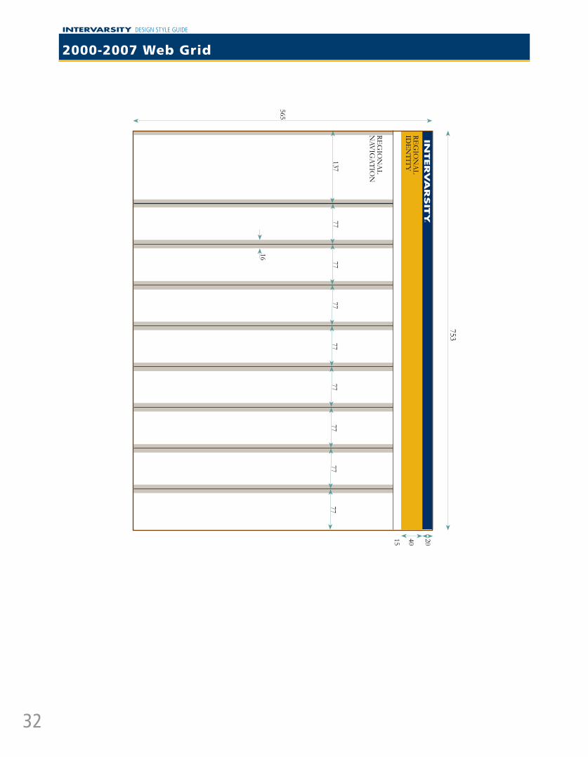
753
565
REG
ION
AL
IDE
NTITY
13777
REG
ION
AL
NAV
IGA
TION
16
40 2015
7777
7777
7777
77
INTERVA
RSIT
Y®
2000-2007 Web Grid
INTERVARSITY DESIGN STYLE GUIDE
33
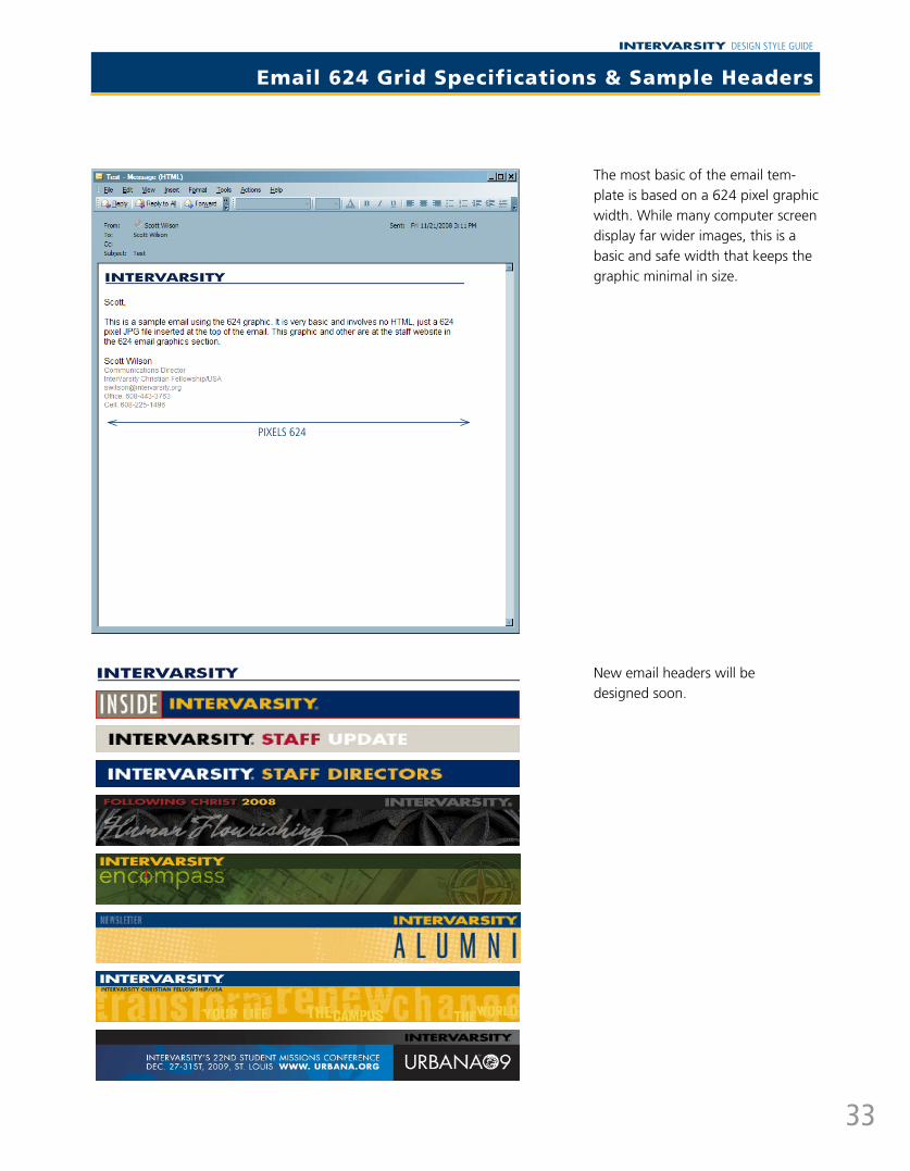
Email 624 Grid Specifications & Sample Headers
The most basic of the email tem-plate is based on a 624 pixel graphic width. While many computer screen display far wider images, this is a basic and safe width that keeps the graphic minimal in size.
New email headers will be designed soon.
pIxELS 624
INTERVARSITY DESIGN STYLE GUIDE
34
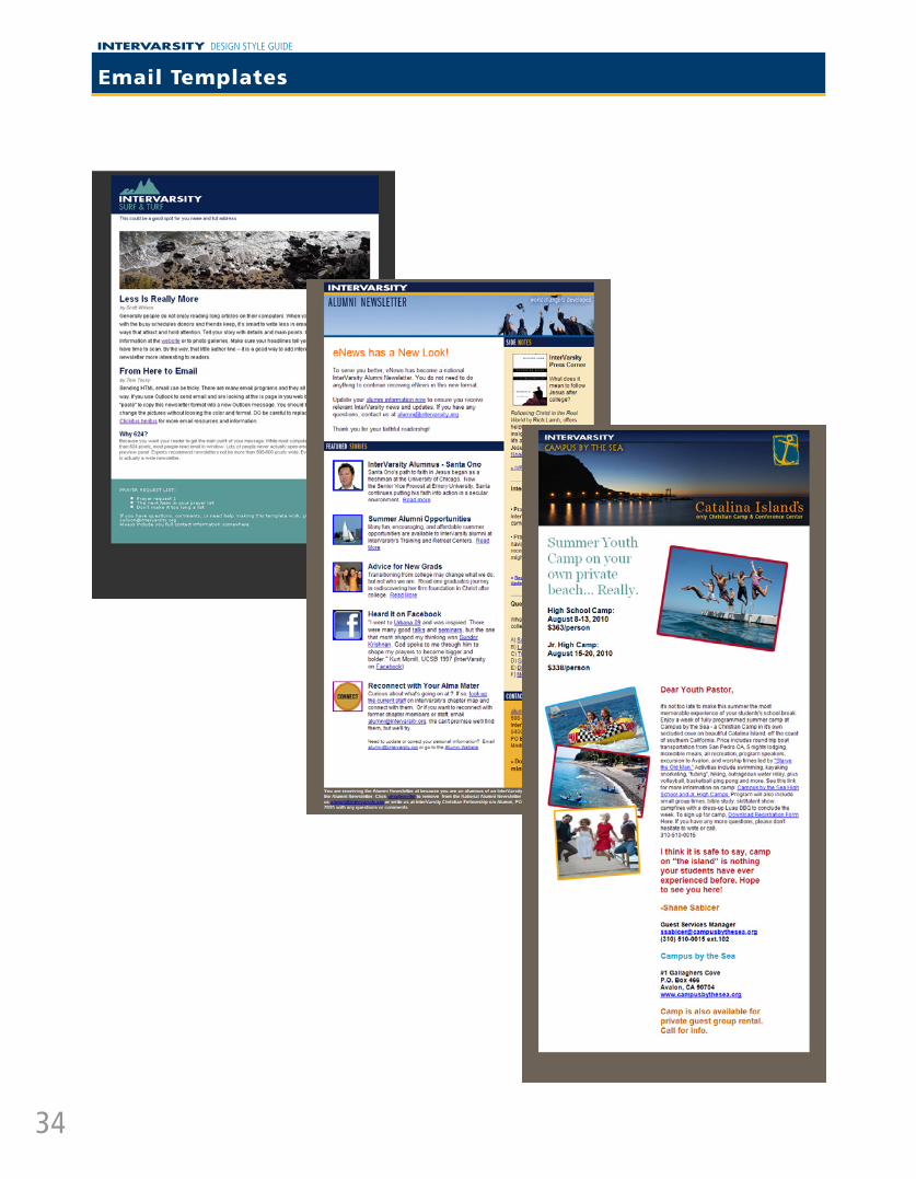
Email Templates
INTERVARSITY DESIGN STYLE GUIDE
35
PowerPoint
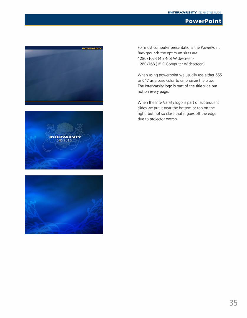
For most computer presentations the PowerPoint Backgrounds the optimum sizes are:1280x1024 (4:3-Not Widescreen)1280x768 (15:9-Computer Widescreen)
When using powerpoint we usually use either 655 or 647 as a base color to emphasize the blue. The InterVarsity logo is part of the title slide but not on every page.
When the InterVarsity logo is part of subsequent slides we put it near the bottom or top on the right, but not so close that it goes off the edge due to projector overspill.