
Interface components is a term for all the supporting elements of a page’s content. Lists Menus...
16
Chapter 6: Designing Interface Components
-
Upload
norman-floyd -
Category
Documents
-
view
212 -
download
0
Transcript of Interface components is a term for all the supporting elements of a page’s content. Lists Menus...

Chapter 6:Designing Interface
Components

Interface Components• Interface components is a term for all the supporting elements
of a page’s content.
• Lists
• Menus
• Forms
• Tables
• This chapter focuses on using proper, valid XHTML to create
these components and how to properly design them to
integrate well into a webpage.

Tables• Tables had a designated purpose when they were first
developed– laying out grids of data in rows and columns à la
Microsoft Excel.<table border=“1”> <tr> <td> </td> <td>Stylin’</td> <td>Codin’</td> </tr>
<tr> <td>Languages</td> <td>XHTML & CSS</td> <td>PHP & SQL</td> </tr>
<tr> <td>Focus</td> <td>Interface Design</td> <td>Back-end Code</td> </tr></table>

Tables• Make it more accessible for the visually impaired by adding
scope definitions to each table header (whether the header
relates to a row or a column). <table class=“basic_lines” summary=“My Books”><caption> <strong>My Books</strong></caption>
<tr> <th scope=“col”> </th> <th scope=“col”>Stylin’</th> <th scope=“col”>Codin’</th> </tr>
<tr> <th scope=“row”>Languages</th> <td>XHTML & CSS</td> <td>PHP & SQL</td> </tr>
<tr> <th scope=“row”>Focus</th> <td>Interface Design</td> <td>Back-end Code</td> </tr></table>
table.basic_lines { width:300px; border-top:3px solid #069;}
Link to example

Tables• Further define the style of the table by adding lines around
the rows.body { font: .8em verdana, sans-serif;}
table.basic_lines { width:300px; border-collapse:collapse; /* Removes space between the cells */
border-top:3px solid #069;}
table.basic_lines th { border-bottom:2px solid #069;}
table.basic_lines td { border-bottom:1px solid #069;}
table.basic_lines caption { margin-bottom:6px;}
table.basic_lines td, table.basic_lines th { padding:5px 3px;}
Link to example

Tables• Add some background color, and we have a nicely styled way
to display rows of data.body {font: .8em verdana, sans-serif;}
table.basic_lines { width:300px; border-collapse:collapse; border-top:3px solid #069;}
table.basic_lines th { border-bottom:2px solid #069; background-color:#CCFFCC;}
table.basic_lines td { border-bottom:1px solid #069; background-color:#FFFFCC;}
table.basic_lines th[scope=“col”] { background-color:#99CCCC;}
table.basic_lines td, table.basic_lines th { padding:5px 3px; border-bottom:1px solid #069;}
Link to example
Remember pseudo-classes?

Forms• A vital part of nearly every website is some type of form–
login page, e-commerce checkouts, etc.
• In XHTML, it’s useful to use “label” to define what each input
type does.
• Input Box Simple text box. <label for=“user_name”>User Name</label> <input type=“text” name=“user_name” id=“user_name”/>
• Password Box Text box, but will encrypt your type on the
screen. <label for=“password”>Password</label> <input type=“password” name=“password” id=“password” />
• Text Area Large text box. <label for=“desc”>Description</label> <textarea id=“desc” name=“desc” rows=“3” cols=“14”>Enter description</textarea>

• Radio Buttons Allow one choice to be made. <input type=“radio” id=“radio1” name=“radioset” value=“choice1” checked=“checked” /> <input type=“radio” id=“radio2” name=“radioset” value=“choice2” />
• Check Boxes Allow multiple choices to be made.<input type=“checkbox” id=“check1” name=“checkset” value=“1” /><input type=“checkbox” id=“check2” name=“checkset” value=“2” /><input type=“checkbox” id=“check3” name=“checkset” value=“3” />
• Select Box Drop-down box with multiple selections.<select id=“choices” name=“choice”><option value=“0”>Choose something</option><option value=“1”>Option One</option><option value=“2”>Option Two</option></select>
• Submit / Reset Button Submits / Resets the form.<input type=“submit” value=“Submit This Form” /><input type=“reset” value=“Reset This Form” />
Forms
Link to example* In the example I added div’s and labels. Consider doing this for styling purposes.
You can see a stylized version of my example
here.

Forms•A handy tool for any modern site is the tiny login.
• Lets put it in our two-column page on the left side navigation
bar.
Link to exampleLink to style sheet.

Lists and Menus• A list is a group of related text items.
• Ordered / unordered / definition.
• A menu is a list that offers navigation choices.
Lists
• Unordered Bulleted by default. Can change to hollow circle,
etc.
• Ordered Numbered by default. Can change to Roman
Numerals, etc.
• Definition Nested list that contains sub items.
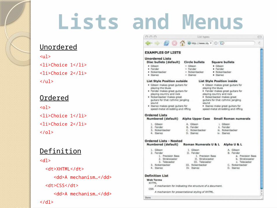
Lists and MenusUnordered<ul>
<li>Choice 1</li>
<li>Choice 2</li>
</ul>
Ordered<ol>
<li>Choice 1</li>
<li>Choice 2</li>
</ol>
Definition<dl>
<dt>XHTML</dt>
<dd>A mechanism…</dd>
<dt>CSS</dt>
<dd>A mechanism…</dd>
</dl>

Lists and Menus• A menu, ultimately, is a list of choices. All menus are lists and should be styled as such for greatest compatibility within different browsers.
• Let’s start with a simple list and turn it into a menu.
<div class=“listcontainer”> <ul> <li>Gibson</li> <li>Fedner</li> <li>Rickenbacker</li> <li>Ibanez</li> </ul></div>
body {font:1.0em verdana, arial, sans-serif;}
div#listcontainer {border:1px solid #000; width:160px; font-size:.75em; margin:20px;}
Link to example

Lists and Menus• We’ll turn the borders on and the bullets off to make it more like a menu.
body {font:1.0em verdana, arial, sans-serif;}
ul {border:0; margin:10px 30px 10px 1.25em; padding:0; list-style-type:none;}
li {border-bottom:2px solid #069; margin:0; padding:.3em 0; text-indent:.5em}
div#listcontainer {border:1px solid #000; width:160px; font-size:.75em; margin:20px;}
Link to example

Lists and Menus• Enclose the list, convert it into a menu (add links).
body {font:1.0em verdana, arial, sans-serif;}
ul {border:0; margin:10px 30px 10px 1.25em; padding:0; list-style-type:none;}
li {border-bottom:2px solid #069; margin:0; padding:.3em 0; text-indent:.5em;}
li:first-child {border-top:2px solid #069;}
div#listcontainer a {text-decoration:none; color:#069;}
div#listcontainer a:hover {color:#00;}
div#listcontainer {border:1px solid #000; width:160px; font-size:.75em; margin:20px;}
Link to example

CSS Menus• CSS menus are one of the highly sought-after code snippets in CSS.<div id=“multi_drop_menus”> <ul> <li><a href=“#”>Item 1</a></li> <li><a href=“#”>Item 2</a></li> <li><a href=“#”>Item 3</a></li></ul></div>
• The CSS is rather long and complex and won’t fit on the PowerPoint, but we can outline a bit about how we want this to work.• First set the list elements side-by-side.• Style the list elements so they have a nice background color
and a border.• Upon hovering the mouse over the list elements, have more
elements be displayed under the one you’re hovering over.• When the mouse is not hovering over the original list
elements or the displayed list elements, hide the displayed elements.
Link to example
More Information• http://www.w3schools.com/css/ Tutorials, reference guides, advanced scripting.
• http://safari.oreilly.com Many good online books on CSS and other web design techniques.
• Wyke-Smith, Charles. Stylin' with CSS : A Designer's Guide. Grand Rapids: New Riders, 2007.