Interactive Visualization of Scheduler Usage Data Visualization of Scheduler Usage Data or ... the...
12
Interactive Visualization of Scheduler Usage Data or Showing Users the Haystack Daniel Gall Engility Corporation Princeton, NJ [email protected] Abstract This paper describes the use of contemporary web client-based interactive visualization software to explore HPC job scheduler usage data for a large system. Particularly, we offer a visualization web application to NOAA users that enables them to compare their experiences with their earlier experiences and those of other users. The application draws from a 30 day history of job data aggregated hourly by user, machine, QoS, and other factors. This transparency enables users to draw more informed conclusions about the behavior of the system. The technologies used are dc.js, d3.js, crossfilter, and bootstrap. This application differs from most visualizations of job data in that we largely eschewed the absolute time domain to focus on developing relevant charts in other domains, like relative time, job size, priority boost, and queue wait time. This enables us to more easily see repetitive trends in the data like diurnal and weekly cycles of job submissions. Keywords Data Analytics, Visualization & Storage, State of the Practice I. INTRODUCTION HPC metrics and historical usage monitoring and comparison have become organizational priorities for HPC centers for many different reasons. Among these are relevance in the information technology service management (ITSM) environment, customer relations, and user efficiency. Prior work has more than adequately covered the progression of metrics from a system monitoring tool (OSI layers 1-6), to application (layer 7).[1] We will momentarily examine some of these as well as tools more recently developed to address the workflow (meta-application, layer 7.5), and user (layer 8), user organizations (layer 9), and government regulations and stakeholders (layer 10).[2] This progression has been neither coordinated nor unified in style or design goals, especially with respect to the scope of information provided. Organizational policies and perceived equities balances typically drive requirements for metrics and monitoring visualization tools at these levels of abstraction (layers 8-10). Currently ITSM is trending towards tools like HyperV / Puppet / Nagios / ManageEngine / ServiceDesk to achieve dynamic resource provisioning. The resulting technology looks a lot like scheduling of interactive jobs in HPC, but with added flexibility and system management features. This is relevant because these cloud / virtualization tools got their start in the metrics, performance management, and ITSM accounting space which HPC tools, especially ones like XD Metrics on Demand (XDMoD) are trying to reach for from the other side of the gulf: systems information. This dynamic in ITSM and cloud computing acts as a pressure on HPC metrics to be better, more responsive to user and management, and more mobile device friendly.[3] At the workflow and user levels of abstraction many visualization tools are domain specific, especially those made by users for their own efficiencies. Frequently these tools consist of scientific visualizations that reveal the progress made to date inherently in their content while simultaneously providing the scientist with evidence of whether the science is progressing as expected or has become unstable. This allows maximum throughput with the agility to identify failed experiments early and correct them and/or reallocate their resources before those resources are wasted on failed experiments. These efforts are wasting user time because they are duplicative. If HPC metrics and monitoring were serving users well they would get 60% of their monitoring needs met with no effort and 90% met with minimal effort spent to add their domain-specific information via a plugin module. Right now there is no product satisfying this need. Users prioritize getting their work accomplished quickly with a minimum of user intervention. Many users also care about silent failures and data integrity. These goals can result in the tailoring of workflows that are burdensome on HPC resources. This trend clearly informed provenance-centric workflow tools like iRODS.[4] One common metric is queue wait time as a variable tax on their HPC resource-bound critical path. User managers and principal investigators care about tracking HPC usage across their users and being able to retask allocation in response to shifts in research priorities. Stakeholders care about research cost effectiveness. The public and investors and by proxy HPC allocation boards
Transcript of Interactive Visualization of Scheduler Usage Data Visualization of Scheduler Usage Data or ... the...
Interactive Visualization of Scheduler Usage Data or
Showing Users the Haystack
Daniel Gall Engility Corporation
Princeton, NJ [email protected]
Abstract
This paper describes the use of contemporary web client-based interactive visualization software to explore HPC job scheduler usage data for a large system. Particularly, we offer a visualization web application to NOAA users that enables them to compare their experiences with their earlier experiences and those of other users. The application draws from a 30 day history of job data aggregated hourly by user, machine, QoS, and other factors. This transparency enables users to draw more informed conclusions about the behavior of the system. The technologies used are dc.js, d3.js, crossfilter, and bootstrap. This application differs from most visualizations of job data in that we largely eschewed the absolute time domain to focus on developing relevant charts in other domains, like relative time, job size, priority boost, and queue wait time. This enables us to more easily see repetitive trends in the data like diurnal and weekly cycles of job submissions.
Keywords Data Analytics, Visualization & Storage, State of
the Practice
I. INTRODUCTION
HPC metrics and historical usage monitoring and comparison have become organizational priorities for HPC centers for many different reasons. Among these are relevance in the information technology service management (ITSM) environment, customer relations, and user efficiency. Prior work has more than adequately covered the progression of metrics from a system monitoring tool (OSI layers 1-6), to application (layer 7).[1] We will momentarily examine some of these as well as tools more recently developed to address the workflow (meta-application, layer 7.5), and user (layer 8), user organizations (layer 9), and government regulations and stakeholders (layer 10).[2] This progression has been neither coordinated nor unified in style or design goals, especially with respect to the scope of information provided. Organizational policies and perceived equities balances typically drive requirements for metrics and monitoring visualization tools at these levels of abstraction (layers 8-10).
Currently ITSM is trending towards tools like HyperV / Puppet / Nagios / ManageEngine / ServiceDesk to achieve dynamic resource provisioning. The resulting technology looks a lot like scheduling of interactive jobs in HPC, but with added flexibility and system management features. This is relevant because these cloud / virtualization tools got their start in the metrics, performance management, and ITSM accounting space which HPC tools, especially ones like XD Metrics on Demand (XDMoD) are trying to reach for from the other side of the gulf: systems information. This dynamic in ITSM and cloud computing acts as a pressure on HPC metrics to be better, more responsive to user and management, and more mobile device friendly.[3]
At the workflow and user levels of abstraction many
visualization tools are domain specific, especially those made by users for their own efficiencies. Frequently these tools consist of scientific visualizations that reveal the progress made to date inherently in their content while simultaneously providing the scientist with evidence of whether the science is progressing as expected or has become unstable. This allows maximum throughput with the agility to identify failed experiments early and correct them and/or reallocate their resources before those resources are wasted on failed experiments. These efforts are wasting user time because they are duplicative. If HPC metrics and monitoring were serving users well they would get 60% of their monitoring needs met with no effort and 90% met with minimal effort spent to add their domain-specific information via a plugin module. Right now there is no product satisfying this need.
Users prioritize getting their work accomplished quickly
with a minimum of user intervention. Many users also care about silent failures and data integrity. These goals can result in the tailoring of workflows that are burdensome on HPC resources. This trend clearly informed provenance-centric workflow tools like iRODS.[4] One common metric is queue wait time as a variable tax on their HPC resource-bound critical path. User managers and principal investigators care about tracking HPC usage across their users and being able to retask allocation in response to shifts in research priorities. Stakeholders care about research cost effectiveness. The public and investors and by proxy HPC allocation boards
care about resource usage maximization and its alignment with organizational priorities.
Other user-driven workflows like Cylc have built-in
status monitoring almost as a byproduct of building and evaluating the directed acyclic graph of the work to be accomplished during runtime.[5] Cylc only contemplates the experiment it is running, and lacks unified support for even the next level of abstraction: monitoring a single user’s workflows. It also does not provide passthrough for resource-level monitoring and accounting: you still need other tools to look at how much allocation you have left. This makes coordinating science versus resources difficult for one user, let alone whole labs. Finally, contemporary workflow and application developers have powerful continuous integration tools like Jenkins.
Workflow manager developers prioritize empowering
users to run more work with less input effort. Workflows exist to satisfy users, but there are practical limits on the complexity workflow software can achieve before the added complexity inhibits reliability goals. Moreover maintainability is a perennial challenge for workflow developers and one which competes for resources with reliability and self-healing. Also, traditionally workflow complexity has been attended by tighter coupling to the HPC resources the users run it on as well as a loss of flexibility.
Oak Ridge National Laboratory’s Leadership Computing
Facility MyOLCF web app centralizes access to account, allocation, and systems management notices for all HPC resources at ORNL that the user has access to. It performs admirably as a one-stop structured information dissemination management system focused on getting users only the status and notice information they are entitled to.
XDMoD presents all manner of aggregated data to the
user from several levels of abstraction. It presupposes that all users are entitled to the systemic perspective that is only possible when all other users’ usage metadata are available for comparison. Current solutions for HPC metrics present a vast amount of data, but it is disjoint and hard to view in context when it isn’t compartmentalized away from the user. Filtering is a challenge in today’s tools. XDMoD, for example allows each chart to be filtered by deselecting data series. However, the filter applied to one chart does not filter the data in other charts. Moreover, they do not work well on mobile devices.
Most importantly, HPC metrics developers spend a great
deal of time and development effort producing web applications that look like either client-server desktop applications or a generic dashboard. In so doing they spent time away from their core competencies in HPC while missing the opportunity to leverage the vast amount of development effort being spent in the mainstream of web development.
Prior efforts must trade off between wasting compute resources to rerun unproductive benchmarks and achieving resource coverage in a timely manner to refresh confidence in the resources. This in itself is fraught because only some subset of failure modes are related to individual compute resources. Many others are related to globally shared infrastructure like parallel file systems, networking, power, etc. Additionally the well-funded web and cloud community have products that provide this functionality with just a bit of customization. It is a type of tool used mostly for development called continuous integration (CI).[6] CI tools like Hudson/Jenkins can easily be adapted for systems testing purposes without encumbering maintenance of all of that framework code or presentation layer. Doing so would also present our user communities with an industry standard interface for automating the testing of their applications their HPC resources and give them yet more frictionless value-add.
Few tools are designed to give insight on whether and
how other users may be exploiting the scheduler policies to gain unfair advantage. Such advantages may include getting their work through the queue faster than other allocated work and in extremis getting their windfall jobs to run rather than other users’ allocated work.
This matters to users because HPC time is money and
represents whose research progresses and whose does not. Moreover, many users have lengthy critical paths of chains of model jobs. Delays in these critical paths can cause scientists to miss important scientific and collaborative deadlines. Our toolset provides a step towards workflow-aware allocation planning.
Finally, no metrics tools integrate with other instances to
cover the grids of resources users employ to get their work done. It may not be practical to get to such a state, but if it is it will be through standardized interfaces like syslog.
Of the available HPC metrics solutions our efforts are
closest to XDMoD, but much more tightly focused for the time being. XDMoD has a lot of charts, but while individual charts can have series deselected, doing so does not crossfilter the datasets in other charts. dc.js, and thus our tool can and is thus very like Tableau, but is open source and far more customizable than Tableau. It also features transition animations that Tableau lacks. This may seem trivial, but it is of great use in quickly evaluating the effect of changing the filter set. This feature alone makes our tool exemplary for finding iniquity in job queue wait times in a way that XDMoD could never do and Tableau would struggle with. Finally our security model is a lot simpler than Tableau's which must interact with a backend database directly. We could move to this model with dc.js but we don't need to. We will first present our design goals:
II. DESIGN GOALS AND ARCHITECTURE FOR NOAA RESEARCH AND DEVELOPMENT HPC METRICS
A. Design Goals: 1. Aggregate data from many job-level sources to enable
validation of scheduler and accounting correctness. This goal and its primacy came from the original motivating impetus we had when starting down this path: that the vendor-provided accounting reporting was inaccurate and unusable. One example of this was that we consistently experienced allocations going negative in value and the scheduler still charging work against them. Our tools must skeptically observe the scheduler and accounting system from as many vantage points as possible in order to both provide all relevant information for reporting and to allow us to analyze which parts of the scheduler are the source of truth for each piece of information – and whether this is a variable thing.
2. Produce a variety of credible reporting products from
the gathered and organized data. Reporting and monitoring products should be made to service a variety of needs: user, PI, HPC management, operations technicians, etc.
3. Be extensible to at least the workflow level of
abstraction (and preferably higher). Provide the interface and opportunity for workflow developers to integrate with our solution, enabling workflows to identify resource trouble based on prior runs’ metrics.
4. Allow users and their management to interactively
explore HPC usage data to promote transparency to our clients.
5. Produce a visualization web app with a single
codebase that works on mobile and desktop browsers. 6. Leverage the open source contributions of the
innumerable, deep-pocketed startup web companies whose focus is on making their web site/app easy to consume and interact with. Use off-the-shelf libraries with large user bases and active communities whenever possible. Code only domain-specific things, glue code, or core competencies.
7. Add value and differentiate early, backfill more
common features. Focus on non-time and periodic time related dimensions at first. There are plenty of tools that show absolute time histograms of data. Splunk and Kibana being but two.
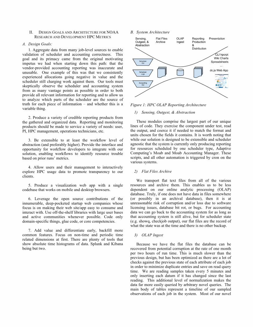
B. System Architecture
Figure 1: HPC OLAP Reporting Architecture
1) Sensing, Outgest, & Abstraction These modules comprise the largest part of our unique
lines of code. They exercise the component under test, read the output, and coerce it if needed to match the format and units chosen for the fields it contains. It is worth noting that while our solution is designed to be extensible and scheduler agnostic that the system is currently only producing reporting for resources scheduled by one scheduler type, Adaptive Computing’s Moab and Moab Accounting Manager. These scripts, and all other automation is triggered by cron on the various systems.
2) Flat Files Archive
We transport flat text files from all of the various
resources and archive them. This enables us to be less dependent on our online analytic processing (OLAP) database. Truly, if one does not have data in files somewhere (or possibly in an archival database), then it is at unreasonable risk of corruption and/or loss due to software licensing issues, database bit rot, or bugs. For accounting data we can go back to the accounting system for as long as that accounting system is still alive, but for scheduler state (e.g. showq, checkjob output), our flat files are the record of what the state was at the time and there is no other backup.
3) OLAP Ingest
Because we have the flat files the database can be
recovered from potential corruption at the rate of one month per two hours of run time. This is much slower than the previous design, but has been optimized as there are a lot of checks against the previous state of each attribute of each job in order to minimize duplicate entries and save on read query time. We are reading samples taken every 5 minutes and only inserting each datum if it has changed since the last reading. This additional level of normalization makes the data far more easily queried by arbitrary novel queries. The main body of tables represent a timeline of our sampled observations of each job in the system. Most of our novel
queries look for inconsistency in the records of our different sources or for discrepancies in how one job may be treated by the scheduler versus other similar jobs (i.e. skepticism of the scheduler and accounting systems).
The job database module is revised from a simpler initial
design that worked 90% of the time but was inaccurate during specific times when the system received scrutiny. Specifically it had a single table for jobs with one row per job. Jobs that run more than once reflected the correct amount charged, but it was impossible to keep the different start and stop times for each run. This causes reporting issues when the system is requeued for a planned maintenance near an allocation refresh. This happens several times a year. Our first design was also unable to find many of the scheduler/accounting system inconsistencies we have identified using the new design.
Our new design has a static table for job attributes that
are not expected to change and for which we would like an alert if they do change. It then has one table per attribute that changes over time. Different data sources can and do have duplicate attribute data. We have a temporary measure in place that chooses a source of truth for each attribute. This structure is how we represent job data. We still keep simple tables for allocation, account, user, and several other objects common in schedulers that represent controlling access to allocation by user, resource, and time. We also create materialized views of our job data to enable certain reports to complete their queries more quickly. One of these looks rather like our old job table, but is really a job run instance view, providing aggregated status of all needed job attributes at each accounting_completiontime of each job.
4) Reporting Production & Distribution
Right now all of our reporting product is written to files
which are handed to whatever presentation layer consumes them. These products are .xls spreadsheets, sqlite3 database files for CLI presentation, .png and .svg graphics for static user-facing web site charts, and JSON for our dc.js-based interactive charting web application. We could support RESTful access to this database, but we have not yet found a need for it and do not want the load variability on the database caused by users choosing to view a product site at the same time. Finally, this is a big and complicated enough subsystem that we have implemented Nagios reporting of the state of our reporting production and distribution.
5) Presentation Tools
CLI hpcrpt We export a materialized view of our job
run instance materialized view that aggregates data grouped by accounting server, machine, account, queue, qos, and user along with our smaller tables. We have a python script that ingests that into an in-memory database and generates the desired report at the asked-for level of abstraction. This includes reports for past months.
Wiki Charts and Spreadsheets We also provide a number of reporting products to the users via a wiki and several other constituent groups. The system has python xlwt and xlsxwriter modules that produce reports for management. It also produces text tables and PNG charts for the HPC queue policy committee. These charts in particular attempt to provide that committee with metrics that fit their attempts to measure the fairness of queue policies and the system that implements those policies. In these charts we show average queue wait times for jobs binned by job size in cores, one chart per priority level.
sqrpt One reporting product we have that is dynamic
enough to need database access is sqrpt. This is a CLI tool that provides drilldown reporting on HPC resource usage and queue wait times in a tabular format. In order to provision database access, we dump a snapshot of our materialized view to a file as a reporting product file and distribute that to systems that have the tool. We could have opened up a RESTful interface but that would have introduced a lot of infrastructure design and networking change for relatively minimal gains given the low frequency with which we gather data from in particular the vendor online transaction processing (OLTP) accounting system.
The dc.js Web App As part of our organization’s efforts
to be as transparent as possible to our user community about what the scheduler is doing and how users are using the system we decided to make an interactive charting web application. Because it is of interest to our users we focus on providing the ability for our users to explore the same parameter space their existing reports come from, but far more freely and interactively. There are a lot of commercial resources being spent figuring out how to present and interact with data on the web in a usable (and beautiful) manner. It makes sense to leverage that and spend our efforts on our areas of expertise and glueing it all together into a production tool. For this project we used the open source Dimensional Charting Javascript (dc.js) library together with Twitter Bootstrap and jQuery.[7][8] dc.js is used for interactive data analytic web apps in a wide variety of application domains, from budget analysis and disaster relief aid gap analysis to criminal justice demographics analysis.[10][11][12]
dc.js depends upon d3.js, a drawing library. We found
that the d3.js library’s default JSON parser uses recursion and is halted by the user’s browser on JSON files with more than about 500 thousand key-value pairs. We altered the copy of d3.js we distribute to use json-sans-eval instead to mitigate this issue because 30 days of hourly aggregated job data for this web application is about 12MB.[9] It seems that neither the dc.js nor the d3.js developers tried using their tools on datasets as big as ours without connecting to a backing database. This is reasonable given that their design space was for mobile devices a few years ago and the lax security model of web development. They may have prioritized the validation provided by the default JSON parser. While we may move to CSV to reduce size further
we have not yet done so. The data file is a JSON file with the following fields per record.
charge (core-seconds), charge_hour (date-time group), charge_time (unix time), gold (accounting manager), machine (compute partition), num_jobs (count), processors (number of cores), project (allocated group), qos (windfall, norm, or debug), queue (batch, persistent, urgent, inter*, debug), quote_time (unix timestamp), start_time (unix timestamp), user (First.Last), wc_limit (seconds), wf_charge (core-seconds) Here is an example record: { "charge": 1385952, "charge_hour": "2014120402", "charge_time": 1417658841, "gold": "gaea", "machine": "c1", "num_jobs": 1, "processors": 32, "project": "some_account", "qos": "debug", "queue": "inter72", "quote_time": 1417615457, "start_time": 1417615483, "user": "Jane.Doe", "wc_limit": 43200, "wf_charge": 0 }, The resulting product uses a single codebase for all
browsers including mobile devices and looks like the snapshot below. Clicking on the charts filters the data by the dimension displayed in the chart clicked, using the value(s) clicked in the filter. After each interaction all charts and the URL are updated. The latter allows filter state to be shared and acts RESTful even though the web application is not actually making dynamic “calls” to a web server. The model of pushing reporting files out to presentation layers also reduces complexity of our web app’s deployment footprint and thus reduces security risks to NOAA HPC networks. NOAA users get a contemporary web app with client-side interactive responsiveness with just a few (SSL) HTML GETs.
The currently deployed version of the web application
(webapp) does not have the bottom chart of cores used versus absolute time. That chart was at the edge of dc.js capabilities because it requires a set of aggregations not able to be placed into the same table of data as the rest. The
increment in the table being visualized is an hourly aggregation of a user's jobs of each size and account. The absolute time chart needs to know which jobs were active at any given hour.
III. RESULTS
A. Using The Interactive Web Application Users interact with the charts by clicking them or
touching them on a mobile device. These acts filter the data in all charts accordingly. Most users care about whether their work experienced undue queue wait time. They also want to be able to easily tell which priority level to ask for and if they are likely to be able to pick up any windfall time. We'll take a look at the former via a series of consecutively applied filters in figures 2-11.
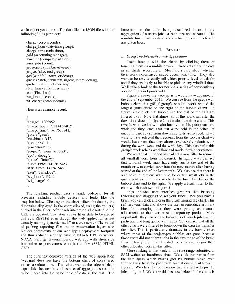
Figure 2 shows the webapp as it would have appeared at the end of September 2015. We can see from the queue wait bubble chart that gfdl_f group's windfall work waited the longest (blue circle on the right of the bubble chart). In figure 3 we click that bubble and the rest of the data are filtered by it. Note that almost all of this work ran after the downtime shown in figure 2 in the absolute time chart. This reveals what we know institutionally that this group runs test work and they leave that test work held in the scheduler queue in case return from downtime tests are needed. If we were to have selected their account from the top bar chart we would have seen that they almost exclusively submit work during the work week and the work day. This also befits this group's work role as workflow and model developers/testers.
We reset that filter and instead set a new filter to remove all windfall work from the dataset. In figure 4 we can see that windfall work must have only run at the end of the month or was carried over into the new month after having started at the end of the last month. We also see that there is a spike of long queue wait time for certain small jobs in the queue wait vs job core size chart (the line chart below the bubble chart and to the right. We apply a brush filter to that chart which is shown in figure 5.
dc.js includes user interface gestures like brushing (clicking and dragging) to set your filter. Once you have a brush you can click and drag the brush around the chart. This refilters your data and allows the user to reproduce arbitrary bins for averaging that they were getting as manual adjustments to their earlier static reporting product. More importantly they can see the breakouts of which job sizes in particular had long queue wait times. You can see that all the other charts were filtered to break down the data that satisfies the filter. This is particularly dramatic in the bubble chart where most of the project:qos bubbles are gone because those users did not submit jobs in the size range of the brush filter. Clearly gfdl_b’s allocated work waited longer than other allocated work in this filter.
More striking is that work in this size range submitted at 8AM waited an inordinate time. We click that bar to filter the data again which makes gfdl_b's bubble move even further away from the pack with normal queue wait times in figure 6. We click that bubble now and are left with just 10 jobs in figure 7. We know this because below all the charts is
a table of users grouped by account whose work is in the current filter set. We brush the absolute time chart of running job count below the absolute time chart of cores in use chart until we find the job(s) that make the gfdl_b bubble show an even longer wait. This is shown in figure 8. The job waited over 1000 hours to run and is certainly worth investigating. If a user sent us the URL from their exploration of this data we would get their filter set too and be able to get to exactly which job was in question. This takes vague unspecific complaints of unfairness and the system not liking a user to a job which might have experienced a real problem. It is possible that this job was held for an extended time and that is the first thing we would ask our backend database. An obvious improvement would be to remove time jobs are ineligible to run from consideration in these charts. We hope to make that improvement as it would further reduce false alarms.
In short dc.js is so powerful because it gives you easy
status via averages, but allows you to easily dig through the data for outliers. This is even more true because the finer-grained data is shown within the filter brush, letting us see that only some job sizes within the bin experienced high queue wait times. This has been a key insight for helping our users understand the nonlinear nature of queue wait vs job size as a fairness metric. We have an internal version that uses unaggregated data that allows us to dig all the way to job ids. We do not publish that for general consumption for performance and mobile device frendliness reasons: the unaggregated data file for 30 days is about 50-75MB. Once we have the jobids we can easily go get the stdout locations for the jobs of concern, as well as node information.
B. Getting the Most From the Reporting Database The process of developing, testing our database design,
and porting our reporting scripts revealed many bugs in the scheduler and accounting system that resulted in about 13 vendor tickets. The most interesting of these issues was a case where the scheduler had record of jobs that the accounting system did not have. This turned out to be a load issue on the vendor OLTP accounting system combined with a lack of retry logic in the scheduler.
However, most were rough edges that did little more than
increase our LoC count with handling code. For example, users can specify their stdout paths to the scheduler with environment variables. The scheduler sometimes substitutes these variables in the checkjob output and sometimes does not. We are interested in each job's finalized stdout path, so we now have logic that does what the scheduler ought to be able to do on its own for us.
Another accounting system issue that arose was that
some jobs' start times were truncated due to the accounting system not checking whether the data it was storing about a job would fit in the database field assigned to it. This made it impossible to verify that the amount charged was correct from just accounting system data for jobs effected by the issue.
We also became aware through this process that the
scheduler/accounting system could not provide a uniform charging policy. Work that spanned the month boundary could either charge against the allocation from the month it started in or the month it ended in. It is imperative that the accounting system behave predictably or else users will rightly determine the system is capricious and untrustworthy at the very point they most care about: how much compute time they have left.
Since the deployment of the new reporting database we
have also used it to construct novel queries to verify the coherence of the scheduler and accounting data. Some of these have led to other vendor tickets. Here follows an example of the query we used to identify an issue where two copies of a job were running at the same time. In it we ask for jobs with an unequal number of accounting completions versus scheduler completions.
select u.*, max(queued_job_dynamic_procs.procs) from (select t.*, count(queued_job_dynamic_accounting_completiontime.gjid) as mam_count, queued_job_dynamic_accounting_completiontime.gjid as mam_gjid from ( select distinct ss.*, queued_job_dynamic_account.account from (select s.*, max(queued_job_dynamic_account.sample_time) as sample_time from (select count(gjid) as moab_count, gjid as moab_gjid, mam from queued_job_dynamic_completiontime where mam='theia' and sample_time<1448928000 and sample_time>1447545600 group by mam, gjid) as s left join queued_job_dynamic_account on queued_job_dynamic_account.mam=s.mam and queued_job_dynamic_account.gjid=s.moab_gjid and queued_job_dynamic_account.sample_time<1448928000 and queued_job_dynamic_account.sample_time>1447545600 group by queued_job_dynamic_account.gjid) as ss left join queued_job_dynamic_account on queued_job_dynamic_account.mam=ss.mam and queued_job_dynamic_account.gjid=ss.moab_gjid and queued_job_dynamic_account.sample_time=ss.sample_time) as t left join queued_job_dynamic_accounting_completiontime on t.mam=queued_job_dynamic_accounting_completiontime.mam and t.moab_gjid=queued_job_dynamic_accounting_completiontime.gjid where queued_job_dynamic_accounting_completiontime.sample_time<1448928000 and queued_job_dynamic_accounting_completiontime.sample_time>1447545600 group by mam, moab_gjid having moab_count != mam_count) as u left join queued_job_dynamic_procs on queued_job_dynamic_procs.mam=u.mam and queued_job_dynamic_procs.gjid=u.moab_gjid group by u.moab_gjid; -------------------------------------------- | moab_count | moab_gjid | mam | sample_time | account | mam_count | mam_gjid | max(queued_job_dynamic_procs.procs) | -------------------------------------------- ... |1 | 5077529 | theia | 1447952594 | drt | 2 | 5077529 | 120 | |1 | 5077530 | theia | 1447952594 | drt | 2 | 5077530 | 120 | |1 | 5077531 | theia | 1447952594 | drt | 2 | 5077531 | 120 |
We also discovered that while MariaDB (forked from MySQL) is fine for now that we actually have some motivation to migrate to PostgreSQL. Namely the fact that we use complicated UNION queries to build the materialized views our reporting needs and Postgres is able to push WHERE predicates into child queries where MariaDB is not.
This makes maintaining these queries more difficult than they should be.
IV. FUTURE WORK We are currently automating an analysis that scans job
stdout files from jobs that have run in past to provide a baseline expected absolute and normalized initialization and run times so that we can monitor running work for unexpected filesystem or network problems causing jobs to hang which is unfortunately a common problem and is one that wastes a lot of user compute allocation. Whether and how a given workflow is a good candidate for runtime normalization is obviously workflow dependent and varies. Current weather and climate model workflows make good candidates due to those workflows running in relatively constant increments (model months/years). We also control normalization by user, experiment name, and core count. Figure 9 has a single user's workflows' normalized runtime history. Figure 10 for an example plot of user workflow normalized runtimes and figure 11 for that data applied to find nodes with the highest median normalized runtime. Today we can give cogent answers about job failure liability. Tomorrow we will be able to monitor each running workflow on our system against those histories.
We already recognize the need to refine and extend the
OLAP database schema to for instance use hash keys and partitioned tables for speed. We would also like to keep all samples from every source for a given attribute and be able to query those in a manner that accounts for update lag in the different sampled tools rather than returning a time series for that attribute that is full of clock drift induced hysteresis. We also want to leverage the additional data sources better to subtract time jobs are held from their queue wait time to remove false alarm outliers.
We absolutely agree with Furlani that metrics and
monitoring need to be available to be active participants in the users’ workflows. Likewise, workflows need to be able to be participants in HPC metrics and monitoring. Establishing grid-wide application logging for our transfer tool was so effective at helping us increase that tool’s reliability that such logging is a hard requirement for the next generation of NOAA GFDL’s workflow software. This sort of integration is a given once one accepts the impact that contemporary ITSM and cloud computing support software will have on HPC. People develop abstractions for a reason. Workflows abstract machine failures just as papers abstract the work done to run scientific experiments. One good chart would be to show a choropleth chart of normalized runtime by node, but to do that we really need workflow-level data. This may be a good reason to break (or at least expand the interface of) the abstraction between system and workflow.
It remains to be seen which aspects of HPC management
are most crucial, and in what measures to promoting the optimal progression of users’ science. Conventional wisdom seems to focus on the largest installations and the latest
processors and interconnects. But our organizations know that some modicum of system reliability must exist or users will flee for more predictable resources. One of the central struggles in contemporary HPC is precisely how to extract reliability in scaled systems comprised of massive counts of commodity components.
Beyond one center justifying its labor spend via
monitoring transparency, this is the sort of question that can be tested if many HPC centers run transparent metrics: how much stability/reliability is enough? A very interesting future study would compare HPC center performance, reliability, administrative communication timeliness, and other statistics looking for correlations to the number and quality of user science papers or other product that emerges.
V. CONCLUSIONS We have just deployed the interactive charting web app
to a NOAA research and development HPC user community and like the other reporting product we derive from our OLAP database it has been met with approval. Our existing reporting output has become indispensable to our users and its accuracy has increased our users’ confidence in HPC management. Our experiences indicate that there is a gap between previous reporting tools and user/management needs. We have uncovered over 30 bugs in our scheduler and accounting systems ranging from the trivial to duplicate copies of jobs running concurrently as a result of moving our reporting to an OLAP database. Skeptical third party reporting also aligns incentives properly for reporting developers versus scheduler and accounting system vendors and reduces reporting burden on the vendor OLTP accounting database. Providing good reporting also reduces users' duplicative monitoring scripts and their attendant load on the scheduler. We expect that we will continue extracting value from this architecture as our HPC life cycle progresses and we are able to quickly bring accurate reporting online for new resources. In the long term we expect dividends from a workflow ingest plugin module that will allow users to visualize future consumption over the lives of their experiments and make better allocation and research management decisions from it.
VI. REFERENCES
[1] Furlani, et al Performance Metrics and Auditing Framework Using
Application Kernels for High-performance Computer Systems In Concurrency and Computation: Practice and Experience, vol. 25, issue 7, pages 918-931, May 2013 http://dx.doi.org/10.1002/cpe.2871
[2] Ian Farquhar Engineering Security Solutions at Layer 8 and Above RSA, Inc. Blog, December 2010 https://web.archive.org/web/20101216002907/http://blogs.rsa.com/curry/engineering-security-solutions-at-layer-8-and-above/
[3] Jonathan Dursi HPC is dying, and MPI is killing it In R&D computing at scale, April 2015 http://www.dursi.ca/hpc-is-dying-and-mpi-is-killing-it/
[4] Chien-Yi Hou, et al A Scientific Workflow Solution to the Archiving of Digital Media In HPDC workshop on Scientific Workflow Systems, M ay 2006 https://wiki.irods.org/pubs/DICE_HPDC-DigArch.pdf
[5] Hilary Oliver The Cylc Suite Engine: Scheduling Distributed Suites Of Cycling Tasks In NZ eResearch Symposium, July 2012 http://www.eresearch.org.nz/sites/www.eresearch.org.nz/files/nzers2012-oliver-cylc_suite_engine.pdf
[6] Kohsuke Kawaguchi, Jesse Glick Continuous Integration in the Cloud with Hudson In JavaOne, June 2009 http://wiki.jenkins-ci.org/download/attachments/37323793/Hudson+J1+2009.ppt?version=1&modificationDate=1244127211000
[7] Nick Zhu, et al Dimensional Charting Javascript Library In Github, July 2012 http://dc-js.github.io/dc.js/
[8] Mark Otto, et al Bootstrap In Github, July 2011 http://getbootstrap.com/
[9] Mike Samuel json-sans-eval In Google Code, September 2009 https://code.google.com/p/json-sans-eval/
[10] Franck Albinet 2014 Refugee Response Plan in Jordan In Github, May 2014 http://edouard-legoupil.github.io/3W-Dashboard/
[11] Ted Strauss Public Accounts of Canada 2009-2012 In Github, July 2013 http://tedstrauss.github.io/expenditures/
[12] Anonymous New Zealand Youth Court Data In Meteor, August 2014 http://nzyouthcourt.meteor.com/
Figure 2: dc..js webapp
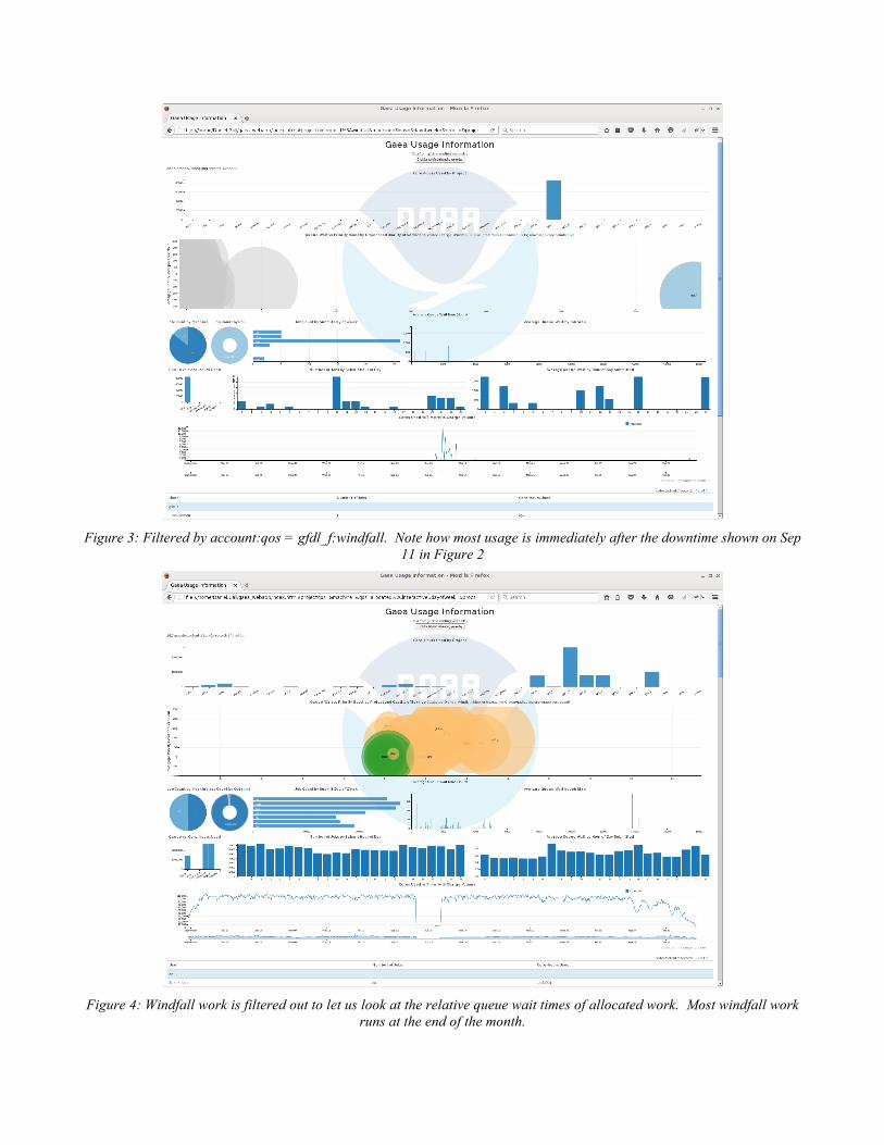
Figure 3: Filtered by account:qos = gfdl_f:windfall. Note how most usage is immediately after the downtime shown on Sep
11 in Figure 2
Figure 4: Windfall work is filtered out to let us look at the relative queue wait times of allocated work. Most windfall work
runs at the end of the month.
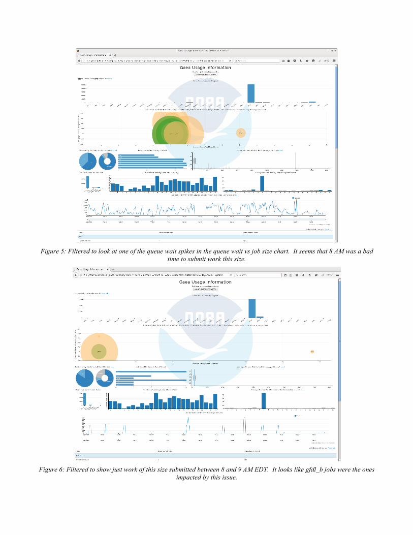
Figure 5: Filtered to look at one of the queue wait spikes in the queue wait vs job size chart. It seems that 8 AM was a bad
time to submit work this size.
Figure 6: Filtered to show just work of this size submitted between 8 and 9 AM EDT. It looks like gfdl_b jobs were the ones
impacted by this issue.
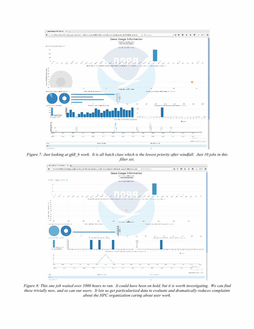
Figure 7: Just looking at gfdl_b work. It is all batch class which is the lowest priority after windfall. Just 10 jobs in this
filter set.
Figure 8: This one job waited over 1000 hours to run. It could have been on hold, but it is worth investigating. We can find these trivially now, and so can our users. It lets us get particularized data to evaluate and dramatically reduces complaints
about the HPC organization caring about user work.
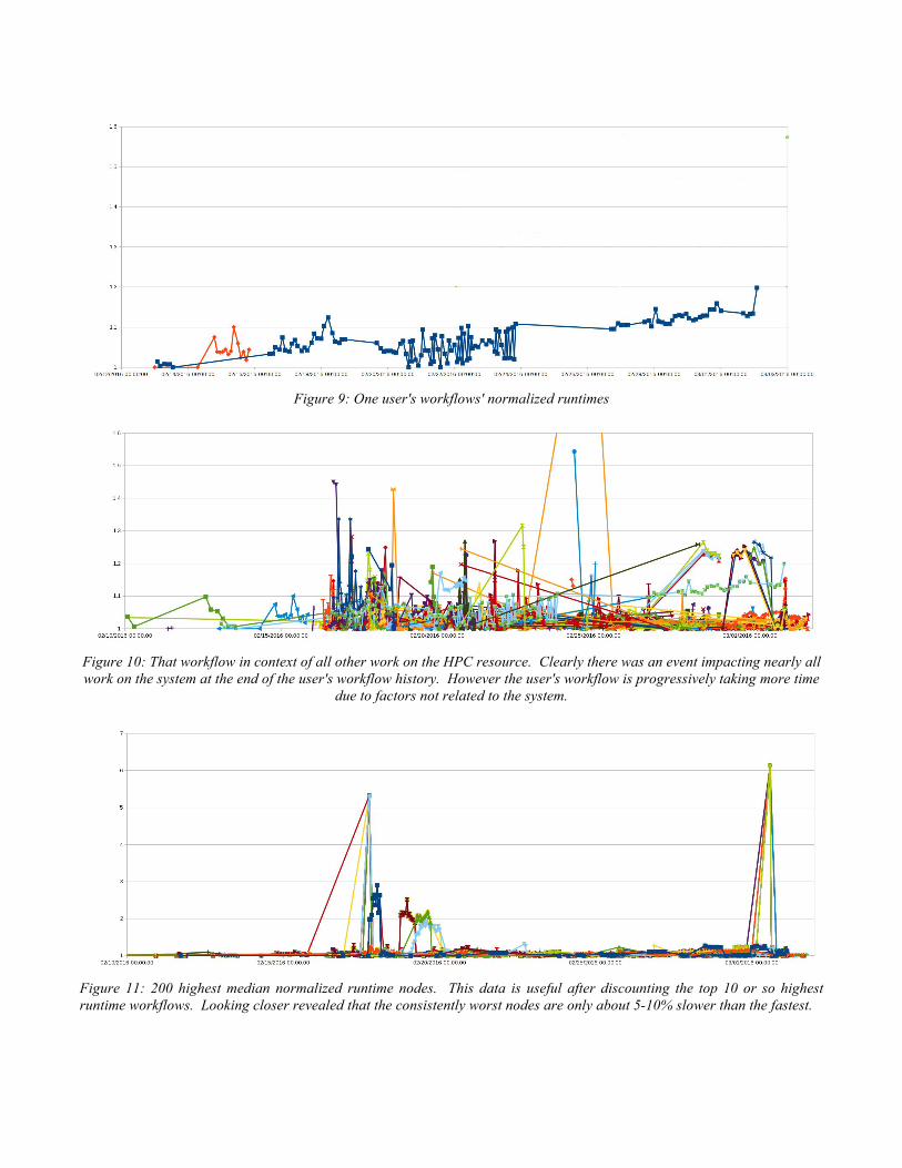
Figure 9: One user's workflows' normalized runtimes
Figure 10: That workflow in context of all other work on the HPC resource. Clearly there was an event impacting nearly all work on the system at the end of the user's workflow history. However the user's workflow is progressively taking more time
due to factors not related to the system.
Figure 11: 200 highest median normalized runtime nodes. This data is useful after discounting the top 10 or so highest runtime workflows. Looking closer revealed that the consistently worst nodes are only about 5-10% slower than the fastest.