Interactive Balanced Scorecard...
65
Department of Computer Science and Engineering CHALMERS UNIVERSITY OF TECHNOLOGY UNIVERSITY OF GOTHENBURG Göteborg, Sweden, June 2009 Interactive Balanced Scorecard Visualization Master of Science Thesis in the Programme Interaction Design Johan Wallin
Transcript of Interactive Balanced Scorecard...
Department of Computer Science and Engineering CHALMERS UNIVERSITY OF TECHNOLOGY UNIVERSITY OF GOTHENBURG Göteborg, Sweden, June 2009
Interactive Balanced Scorecard Visualization Master of Science Thesis in the Programme Interaction Design
Johan Wallin
The Author grants to Chalmers University of Technology and University of Gothenburg the non-exclusive right to publish the Work electronically and in a non-commercial purpose make it accessible on the Internet.
The Author warrants that he/she is the author to the Work, and warrants that the Work does not contain text, pictures or other material that violates copyright law.
The Author shall, when transferring the rights of the Work to a third party (for example a publisher or a company), acknowledge the third party about this agreement. If the Author has signed a copyright agreement with a third party regarding the Work, the Author warrants hereby that he/she has obtained any necessary permission from this third party to let Chalmers University of Technology and University of Gothenburg store the Work electronically and make it accessible on the Internet. Interactive Balanced Scorecard Visualization
Johan Wallin
© Johan Wallin, June 2009. Examiner: Olof Torgersson Department of Computer Science and Engineering Chalmers University of Technology SE-412 96 Göteborg Sweden Telephone + 46 (0)31-772 1000
Department of Computer Science and Engineering Göteborg, Sweden June 2009
Abstract The Balanced Scorecard is a framework for strategic planning and performance management, which has the ability to provide executives and others in an organization a fast but comprehensive view of the business. Due to the complex relations and great amount of information, the most effective way to communicate this scorecard is visually.
This study aims to develop an interactive scorecard visualization which is ideal for the user, mutually based on practical user research and theoretical guidelines and principles of interaction design and usability. The scorecard visualization is based on, and can be seen as an improvement of, the existing web application RunYourCompany which is developed by Stratsys AB.
This report describes the design of this visualization by utilizing a three-staged design process, where the first stage corresponds to user research and analysis of that. A few different types of field studies were performed in the beginning of the design process in order to elicit user data and information regarding the usage of RunYourCompany. The data was analyzed, sorted and used as a foundation for the next stage of the process, where the design framework was defined and a design concept was developed based on the user data. In the last stage of the process this design concept was evaluated and validated.
Sammanfattning Balanserade Styrkort kan ses som ett ramverk för strategisk planering och verksamhetsstyrning, som kan användas för att kommunicera ut en övergripande uppfattning av en organisation och dess affärsverksamheter. Eftersom ett styrkort innehåller komplexa relationer och stora mängder information är en visuell kommunikation av styrkortet den mest effektiva.
Den här studien syftar till att utveckla en interaktiv styrkortsvisualisering som är idealisk för den tänkta användaren, delvis baserad på praktiska användarundersökningar och delvis på teoretiska principer för interaktionsdesign och användbarhet. Styrkortsvisualiseringen bygger på, och kan ses som en förbättring av, den existerande webbapplikationen RunYourCompany som är utvecklad av Stratsys AB.
Den här rapporten beskriver arbetet med visualiseringen, som använder sig av en trestegsprocess, där det första steget innebär användarstudie och analys av denna. Ett antal olika typer av användarundersökningar utfördes i början av designprocessen för att erhålla användardata och information kring användandet av RunYourCompany. Den erhållna datan analyserades, sorterades och användes därefter som ett fundament för nästa steg i processen där designramverket definierades och ett designkoncept utvecklades baserat på användardatan. I designprocessens sista steg utvärderades och validerades designkonceptet.

Preface This report is a Master of Science Thesis conducted at the Interaction Design program of Chalmers University of Technology. It was written and developed in cooperation with Stratsys AB in the spring of 2009, and aims to improve one of their products from a user perspective.
I am very thankful to everyone who has helped me out throughout the process, everyone at Stratsys AB who all have been helpful and supportive, and my supervisor Carl Arnesten in particular.
Olof Torgersson was my supervisor and examiner at the Department of Computer Science and Engineering of Chalmers University of Technology. Thank you for keeping me on track and supporting me with input and new ideas and perspectives.
Additional thanks to all the people and organizations throughout Sweden that have given me invaluable information and knowledge during my field studies: The Municipality of Vänersborg, Uddevalla Municipality, Skövde Municipality, Halland County Council, City of Stockholm, and Swedish Ministry of Education and Research.
Johan Wallin
June 2009
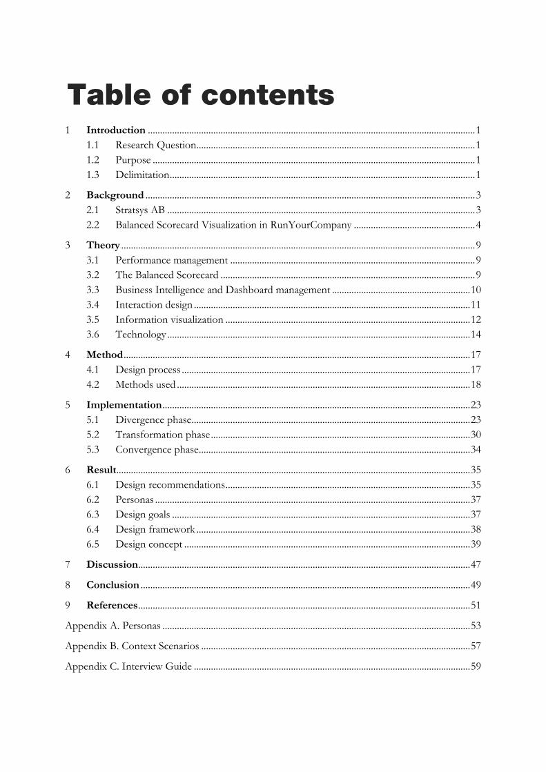
Table of contents
1 Introduction ....................................................................................................................................... 11.1 Research Question ................................................................................................................... 11.2 Purpose ..................................................................................................................................... 11.3 Delimitation .............................................................................................................................. 1
2 Background ........................................................................................................................................ 32.1 Stratsys AB ............................................................................................................................... 32.2 Balanced Scorecard Visualization in RunYourCompany .................................................. 4
3 Theory .................................................................................................................................................. 93.1 Performance management ..................................................................................................... 93.2 The Balanced Scorecard ......................................................................................................... 93.3 Business Intelligence and Dashboard management ......................................................... 103.4 Interaction design .................................................................................................................. 113.5 Information visualization ..................................................................................................... 123.6 Technology ............................................................................................................................. 14
4 Method ............................................................................................................................................... 174.1 Design process ....................................................................................................................... 174.2 Methods used ......................................................................................................................... 18
5 Implementation ............................................................................................................................... 235.1 Divergence phase ................................................................................................................... 235.2 Transformation phase ........................................................................................................... 305.3 Convergence phase ................................................................................................................ 34
6 Result .................................................................................................................................................. 356.1 Design recommendations ..................................................................................................... 356.2 Personas .................................................................................................................................. 376.3 Design goals ........................................................................................................................... 376.4 Design framework ................................................................................................................. 386.5 Design concept ...................................................................................................................... 39
7 Discussion ......................................................................................................................................... 47
8 Conclusion ........................................................................................................................................ 49
9 References ......................................................................................................................................... 51
Appendix A. Personas ............................................................................................................................... 53
Appendix B. Context Scenarios ............................................................................................................... 57
Appendix C. Interview Guide .................................................................................................................. 59

1
1 Introduction This section provides a brief introduction to the problem that this study aims to find a solution for, along with the research question, purpose, and delimitation of this study.
A key success factor within companies and other organizations is to ensure that the strategic objectives are followed and communicated throughout the whole organization. The small operations performed on departments further down in the organization hierarchy should be in line with the overall business objectives and strategies.
One way of achieving this is to make use of the Balanced Scorecard, which is a set of tools developed for this specific matter. And by focusing on other perspectives of a business than the solely financial, a more comprehensive view of the business can be obtained and used for strategic decisions.
A scorecard needs to be represented visually in order for a human to be able to perceive the complete view of the business. That is the topic that this study focuses on.
Since the study has its focus in the field of interaction design, this report has the same. It is not technically centered even though the study contains technical limitations and requirements.
1.1 Research Question
The research question that this study aims to answer and satisfy is formulated as follows:
How can the scorecard visualization of RunYourCompany be improved in order to support the users’ needs and goals, visualize the scorecard data, and support a natural interaction with the objects of the scorecard?
1.2 Purpose
This study has a purpose to develop a conceptual design consisting of a new graphical user interface for scorecard visualization and manipulation, in order to accommodate the needs and goals of its target users.
1.3 Delimitation
The result of this study will take the form of an interactive prototype, which is not to be seen as a full-scale system. Due to the complexity of the system, a complete implementation will not be possible within the timeframe of this study. Although, one requirement from Stratsys AB stated that the implementation of the prototype should be performed in such way that it can be extended and reused for future development.
A scorecard can be represented in a few different ways, but this study focuses on the tree structure representation of a scorecard, but parts of the concept developed should be applicable and implementable on other scorecard types as well.

2
3
2 Background The background section describes the context of the problem, explaining the fundamental parts that need to be known in order to understand the problem.
2.1 Stratsys AB
Stratsys AB, founded in 1999, is a company that provides software and service within performance management. This thesis report will focus on their product RunYourCompany, which is an application for operational performance management.
2.1.1 Stratsys RunYourCompany RunYourCompany is a web-based software application with ability to keep track of scorecards within an organization, and by doing so keeping track of the organization’s strategy, goals, and other types of objectives. It can be used for planning, documenting, follow-up and reporting, all in order to support the strategy and goal setting process of the organization.
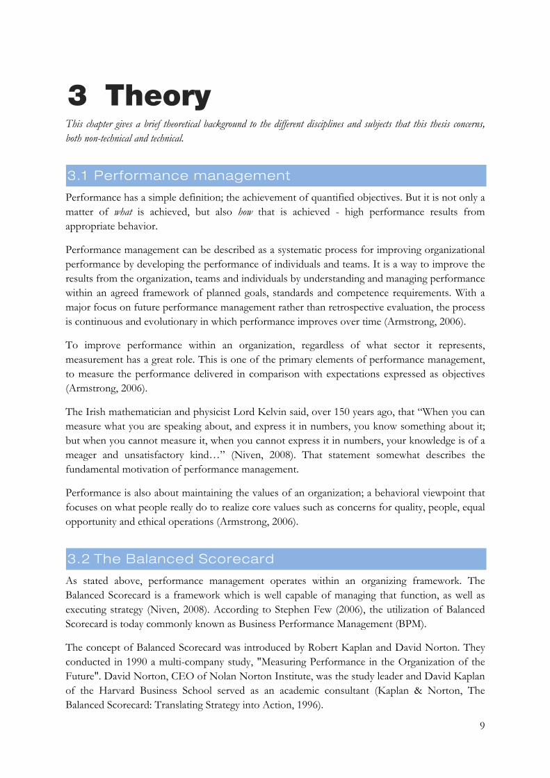
Out of an organization’s vision or its strategic objectives, different sets of sub-visions, activities, and measures (Key Performance Indicators) are derived with focus on a number of different perspectives. This set of entities - or nodes as they are called internally – is organized into a tree structure and linked to each other, forming a tree with the vision on top and more concretized nodes further down. Figure 1 illustrates how a set of nodes can be linked and ordered into a tree structure.
Figure 1. A set of nodes organized into a tree structure with the vision or overall strategy to the left.
RunYourCompany is an operational tool, in the sense that co-workers throughout the organization participate in the process. While the overall goals and strategies of an organization are communicated globally, measures and activities are often locally developed for specific departments. Those can still be linked to the global goals and strategies, but the respective

4
department has the complete responsibility for setting objectives, reporting results, analyzing data, etc.
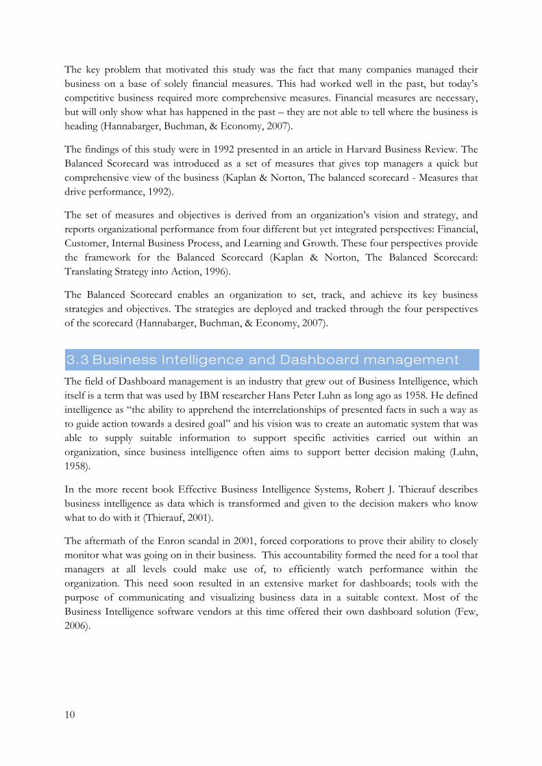
Based on the data reported and analyzed within the organization, reports that enlighten the status of the business can easily be generated on the fly. Those reports, together with visual presentations of the scorecards, support active analysis of prevailing status, which is a foundation for new strategies goals and operational activities. Figure 2 illustrates the workflow model of RunYourCompany, along with activities and their respective roles.
Figure 2. The process and workflow of RunYourCompany, with activities linked to different occupational roles.
2.2 Balanced Scorecard Visualization in
RunYourCompany
The scorecard can be seen as the foundation of RunYourCompany. It is basically a set of nodes ordered in a set of columns, and regulations of those. The set of nodes is organized into a tree structure, where the columns represent the depth levels of the tree. The top node is located in the leftmost column and has its children expanded in the columns to the right. The further right, the more concrete is the goal/activity/measurement. The regulations of nodes and columns control what type of node that can be added to the respective column, and how the columns are allowed to relate to each other. Figure 3 shows how a typical scorecard is visualized in the current version of RunYourCompany.

5
Figure 3. Visualization of a balanced scorecard in RunYourCompany.
A scorecard can be seen as a model representing business strategy, where the columns represent different levels of abstraction of the strategy. Within Balanced Scorecard, as it was developed, the leftmost column is called Perspective and should contain four entities; Customer, Internal Processes, Employee Learning and Growth, and Financial (Niven, 2008). Although, in the real world this is often modified to provide an ability of creating the most corresponding and real model of the current business strategy as possible. RunYourCompany has been built to support models and methods and frameworks other than Balanced Scorecard as well.
As a generalization, it is common that the level of abstraction of strategy data is higher in the leftmost columns. As the vision of the organization is to be seen as the top node of the tree structure, goals and objectives are more concretized and broken down the further right one looks.
A scorecard can be different for different departments in an organization, and it is quite common that the columns to the left in the scorecard remain throughout the whole organization but the rightmost columns differ among different departments since they commonly represent more concrete strategy data.
But to be able to work with the data in the scorecard, a view has to be set up as well. A scorecard can have an unlimited number of views, which are configured to show a subset of the information in the scorecard. A view is a specification of which columns of the scorecard to

6
show, as well as what properties to show from the nodes from the respective column. As different columns in the scorecard can contain different node types, the properties and attributes that can be shown for each column varies. These properties and attributes are referred to as node properties.
A scorecard view can be visualized in a few different ways, but this thesis will concentrate on the tree view visualization.
2.2.1 Nodes If the foundation of RunYourCompany is the scorecard, the nodes can be seen as its content. The term node is a generalization of an object of any type within the scorecard tree structure. Each node has a name, which is its main distinguisher, and in most cases a set of properties to display in a view. It has a person, or a set of persons, who is responsible for it, and can contain some meta data fields such as description, as well as other keywords used to distinguish it from other nodes. All these fields and descriptors can be dynamically set up per scorecard column, and differ among different implementations of the system.
Nodes can also be connected over different scorecards, saying that one specific node can co-exist in a number of scorecards at the same time.
RunYourCompany differentiates nodes into three different types: Text nodes, Key Performance Indicators, and Activities.
2.2.1.1 Text nodes This is the simplest type of node, and contains the information recently mentioned only, with no extra features. This is common to use for the more general strategy, to the left in the scorecard. As it cannot keep any information about current performance, it is often used to represent columns such as perspective, comprehensive target, success factors, etc. Those columns inform in more general and abstract ways what is to be done, without any concrete doable ideas of what actions to take. Therefore no measure or performance monitor is needed for these nodes either.
2.2.1.2 Key Performance Indicators Key Performance Indicators, or KPIs, are the measures of the system. This is what the performance monitoring of the organization is based on. It contains all the properties earlier mentioned about nodes in general, but have some extra mathematical features. These measures are configurable regarding formulas and variables, but a common implementation of a measure is to have one result field and one target field for data input. Out of this information, the system is able to determine how well the organization is performing in a specific field.
The mathematical calculation that is to be done for a measure can be set up for each KPI via an administrative interface. Those calculations can vary to some extent, depending on what is to be measured.
As KPIs are monitoring something real, the measure they represent must be substantial enough too. Another feature of KPIs is that they are separated into several periods, measuring data over time.
7
2.2.1.3 Activities The last type of node is the activity, which represents a concrete action or task that has to be performed in order to fulfill the goal it is linked to. When a goal has been more and more concretized, eventually the level of abstraction is going to take the form of a doable action. This is what the activities represent. An activity can have, on top of the basic node properties mentioned above, a status telling if the activity has started, ended, is paused, is delayed, or is currently ongoing. It can also have a field indicating priority, number of hours spent as well as a number of hours budgeted, and the current progress of the activity in percent. An activity can be scheduled over time by having a start date and an end date as well.
2.2.2 Node colors Key Performance Indicators and activities in RunYourCompany are the two node types that contain information regarding the current level of performance. KPIs have their own formula for calculating this, and activity performance is based on the current status and possible delay of the activity.
In order to enhance perception of these nodes in the scorecard, the performance level can be (and is in most implementations) rendered as a color that is attached to the node. This color switches between green, yellow and red, and different hues of these colors. A green color indicates a good performance level, red represents a bad performance, and yellow somewhere in between.
2.2.3 Periodicity As data and measures change over time, RunYourCompany needs to support that as well. The value of a specific measurement has a certain value at one point in time, but that value is subject to change as time elapses. Historical data values are very useful, in some cases even required, to make the data meaningful.
Say for example, that you one day would start measuring how long time your bike ride to work takes. That information is not very useful on its own, but if you start logging your daily measures you will soon be able to tell your level of performance and improvement.
Data over time can also be used to identify and explain exceptions and irregularity in the measurements. If the data is plottered onto a graph, irregularities can easily be seen by the eye of the viewer. Those irregularities can hopefully be explained by adding another measure onto the same graph. If the harvest of a farmer gave a result significantly lower in 2005 compared to other years, she could try adding a measure of rainfall in her region onto the same graph and see if that gives any explanation - perhaps that year was much dryer than the others?
Currently, historical data is saved for two entities in RunYourCompany - KPIs and comments.
In RunYourCompany, periodicity is implemented by splitting the year into a number of periods. The length of those periods is called periodicity, and varies for different entities. Some KPIs might be measured monthly, or even weekly, while some are updated yearly. The periodicity is dependent on what the measure represents, and at what frequency it changes.
8
2.2.4 Dimensionality RunYourCompany is a multi-dimensional application in the sense that its variables are shifting in different dimensions. The above mentioned periodicity is one of these variables, department, organization, and planning version are others.
Entities in RunYourCompany are changing over (and are in some cases unique for) these variables. The state and value of an object and its attributes are influenced by these dimensions, and can be different for each unique combination of those. These multidimensional entities form an example of so called hypervariate data (Spence, 2001).
According to Robert Spence (2001), the number of variables and attributes involved in a problem directly affects the complexity of a visualization tool of a problem. Developing a tool for visualizing data in one dimension is relatively straightforward, but the complexity of the visualization will increase as the number of variables involved increases.
9
3 Theory This chapter gives a brief theoretical background to the different disciplines and subjects that this thesis concerns, both non-technical and technical.
3.1 Performance management
Performance has a simple definition; the achievement of quantified objectives. But it is not only a matter of what is achieved, but also how that is achieved - high performance results from appropriate behavior.
Performance management can be described as a systematic process for improving organizational performance by developing the performance of individuals and teams. It is a way to improve the results from the organization, teams and individuals by understanding and managing performance within an agreed framework of planned goals, standards and competence requirements. With a major focus on future performance management rather than retrospective evaluation, the process is continuous and evolutionary in which performance improves over time (Armstrong, 2006).
To improve performance within an organization, regardless of what sector it represents, measurement has a great role. This is one of the primary elements of performance management, to measure the performance delivered in comparison with expectations expressed as objectives (Armstrong, 2006).
The Irish mathematician and physicist Lord Kelvin said, over 150 years ago, that “When you can measure what you are speaking about, and express it in numbers, you know something about it; but when you cannot measure it, when you cannot express it in numbers, your knowledge is of a meager and unsatisfactory kind…” (Niven, 2008). That statement somewhat describes the fundamental motivation of performance management.
Performance is also about maintaining the values of an organization; a behavioral viewpoint that focuses on what people really do to realize core values such as concerns for quality, people, equal opportunity and ethical operations (Armstrong, 2006).
3.2 The Balanced Scorecard
As stated above, performance management operates within an organizing framework. The Balanced Scorecard is a framework which is well capable of managing that function, as well as executing strategy (Niven, 2008). According to Stephen Few (2006), the utilization of Balanced Scorecard is today commonly known as Business Performance Management (BPM).
The concept of Balanced Scorecard was introduced by Robert Kaplan and David Norton. They conducted in 1990 a multi-company study, "Measuring Performance in the Organization of the Future". David Norton, CEO of Nolan Norton Institute, was the study leader and David Kaplan of the Harvard Business School served as an academic consultant (Kaplan & Norton, The Balanced Scorecard: Translating Strategy into Action, 1996).
10
The key problem that motivated this study was the fact that many companies managed their business on a base of solely financial measures. This had worked well in the past, but today’s competitive business required more comprehensive measures. Financial measures are necessary, but will only show what has happened in the past – they are not able to tell where the business is heading (Hannabarger, Buchman, & Economy, 2007).
The findings of this study were in 1992 presented in an article in Harvard Business Review. The Balanced Scorecard was introduced as a set of measures that gives top managers a quick but comprehensive view of the business (Kaplan & Norton, The balanced scorecard - Measures that drive performance, 1992).
The set of measures and objectives is derived from an organization’s vision and strategy, and reports organizational performance from four different but yet integrated perspectives: Financial, Customer, Internal Business Process, and Learning and Growth. These four perspectives provide the framework for the Balanced Scorecard (Kaplan & Norton, The Balanced Scorecard: Translating Strategy into Action, 1996).
The Balanced Scorecard enables an organization to set, track, and achieve its key business strategies and objectives. The strategies are deployed and tracked through the four perspectives of the scorecard (Hannabarger, Buchman, & Economy, 2007).
3.3 Business Intell igence and Dashboard management
The field of Dashboard management is an industry that grew out of Business Intelligence, which itself is a term that was used by IBM researcher Hans Peter Luhn as long ago as 1958. He defined intelligence as “the ability to apprehend the interrelationships of presented facts in such a way as to guide action towards a desired goal” and his vision was to create an automatic system that was able to supply suitable information to support specific activities carried out within an organization, since business intelligence often aims to support better decision making (Luhn, 1958).
In the more recent book Effective Business Intelligence Systems, Robert J. Thierauf describes business intelligence as data which is transformed and given to the decision makers who know what to do with it (Thierauf, 2001).
The aftermath of the Enron scandal in 2001, forced corporations to prove their ability to closely monitor what was going on in their business. This accountability formed the need for a tool that managers at all levels could make use of, to efficiently watch performance within the organization. This need soon resulted in an extensive market for dashboards; tools with the purpose of communicating and visualizing business data in a suitable context. Most of the Business Intelligence software vendors at this time offered their own dashboard solution (Few, 2006).
11
3.4 Interaction Design
Interaction design is the practice of designing and defining the behavior of products, services and systems. It serves a purpose to develop usable products by involving users in the design process. Interaction design borrows theory and technique from other interdisciplinary, academic, and design fields such as HCI, ergonomics, cognitive psychology, information systems, product design, usability and engineering, but does not become the summary of these parts as it has developed its own processes and methods (Preece, Rogers, & Sharp, 2007).
Typical products that interaction design deals with consist of, but are not limited to, software, interactive digital artifacts, systems, environments, and services (Cooper, Reimann, & Cronin, 2007).
3.4.1 Human Computer Interaction Human-Computer Interaction, HCI in short, is a major ingredient in the field of interaction design. HCI can be said to be the discipline of interaction between humans and computers. Humans have excellent capabilities of communicating with other humans, computers have developed superior protocols for communicating with other computers at extreme speed, but humans and computers still don’t communicate very well.
The definition of HCI given by ACM Special Interest Group – one of the world’s most influent HCI organizations – states the following: “Human-computer interaction is a discipline concerned with the design, evaluation and implementation of interactive computing systems for human use and with the study of major phenomena surrounding them.” (ACM Special Interest Group on Computer-Human Interaction (SIGCHI), 1992,1996).
3.4.2 Usability The term usability refers to the practice of making products, systems and services easy to use in order to fulfill a goal. The International Standards Organization, ISO, provides the following definition of usability: “The extent to which a product can be used by specified users to achieve specified goals with effectiveness, efficiency and satisfaction in a specified context of use” (ISO 9241-11, 1998).
According to Preece et al. (2007) the ISO definition of usability is a formal way to declare that a usable product is easy to learn, effective to use, and provides an enjoyable experience.
3.4.3 Principles of Interaction Design This section lists a set of principles, guidelines and ideas that are in any way tied to interaction design of any of its subfields.
Affordance The concept of affordance was invented by perceptual psychologist J.J. Gibson in 1977, as a term describing actionable relations, or action possibilities, between the world and an actor. Ten years later Donald Norman introduced the concept to the HCI community, as a design aspect of an object suggesting how the object can be used (Norman D. A., 1999).
12
According to Norman, affordance refers to the perceived and actual properties of a thing that determine just how the thing could possibly be used. He gives an example that a chair affords sitting (Norman D. A., 1988).
Idiomatic design An idiom is never metaphorically linked to something non-abstract in order for its explanation. It is rather based on a figurative principle which needs to be learned. And that stands true for idiomatic interfaces as well; they have to be learned, but if they are good they only have to me learned once.
Graphical interfaces and their intuitive elements are idiomatic to a great extent, but as for most well-developed idioms, they are fast learned and mastered (Cooper, Reimann, & Cronin, 2007).
Direct manipulation The term direct manipulation was introduced by Ben Shneiderman in 1974. He used it to describe a new interface design strategy containing visual representation of objects, which could be acted upon by gestural mechanisms, and immediate visible results of these actions.
In 1974, graphical user interfaces were still rare, and today direct manipulation could be defined (and yet understood) as clicking and dragging things. Important here is that those “things” must of course be visible (and of decent size) to the user to be clickable and draggable.
Common characteristics of direct manipulation idioms are simplicity, straightforwardness, ease of use and ease of remembering. However, these idioms are not always intuitive to the user the first time she is exposed to them. They must often be taught, but with ease, and will seldom be forgotten – typical idiomatic design.
Common types of direct manipulation idioms include pointing, selection, drag and drop, control manipulation, palette tools, object manipulation (positioning, shaping, resizing, etc), object connection (Cooper, Reimann, & Cronin, 2007).
3.5 Information visualization
Information visualization can be defined as the use of interactive visual representations of abstract data, in order to amplify human cognition. The words understanding and seeing are synonymous, which is due to a close interrelation between perception and cognition of the human body.
The human visual system is an enormously powerful pattern seeker, with the eye and the brain’s visual cortex working as a parallel processor generating high-speed output to the cognition center of the human (Ware, 2004).
Excellent visualizations of data are complex ideas communicated with clarity, precision and efficiency. A good graphical visualization should rationalize large data set, encourage comparison of data, as well as reveal the data at several levels of detail ranging from broad overview to fine structure (Tufte, 2001).
13
3.5.1 Interactive visualization Thanks to the computer, visualizations of today can be made dynamic and interactive. And today’s advanced computer graphics allows rapid graphical explanations of information-intensive and complex problems (Ware, 2004).
A good visualization is something that allows the user to drill down and find further details about anything that she finds important. Ben Schneiderman has invented a “mantra” for visual information-seeking behavior and its supporting interfaces: “Overview first, zoom and filter, then details on demand” (Ware, 2004).
This is a good foundation for the basic functionality of an interactive visualization but it does not cover all usage scenarios. In reality, a user is just as likely to see a detail of interest, zoom out to get an overview, find related information in another item, and then zoom in the original item once more to continue watching the detail - or to perform a completely different scenario; the important point is that a good interactive visualization supports all those scenarios and activities (Ware, 2004).
In software applications containing interactive visualizations, the graphical objects must not only function as graphical output to the user, but can also work as program input, a way to drill down to details and find out more about the data.
3.5.2 Gestalt psychology Gestalt, which is the German translation of the term “pattern”, is a field within cognitive psychology. Gestalt psychologists state that psychological phenomena are best understood by humans when they are viewed as organized and structured wholes. That implies that we are unable to fully understand a problem when it is broken down to smaller parts – the whole differs from the sum of its parts (Sternberg, 2008).
In the early 20th century, a group of gestalt psychologists founded the Gestalt approach to form perception, an influential theory describing how we perceive patterns, form, and organization in what we see. It states that we tend to organize any perceived visual array into a coherent and stable form, in an effort to make sense of it (Few, 2006).
This research resulted in the Gestalt principles of perception, a set of principles telling us why we have a propensity to group and organize objects. These principles can be used in order to enhance the visual perception of a user.
For this study, the following principles are of great importance.
The principle of Similarity Our perception tells us that objects with similar color, size, shape or orientation belong to the same group. This principle can help us to create subgroups of objects in visualization, simply by making the objects similar in any of these ways.

14
The principle of Enclosure The principle of enclosure states that objects that are enclosed by some kind of visual border are perceived as they belong together. The enclosing could for instance be a line or a shared background color.
The principle of Connection Objects that are connected in any way are strongly perceived as part of the same group. This principle is particularly useful for creating groups of non-quantitative information such as relations among different entities.
This principle is strong in the sense that within a set of objects that are visually organized by some of the gestalt principles, the principle of connection (together with the principle of enclosure) is the most obvious and clearest perception.
3.6 Technology
RunYourCompany is a web-based system running in an ASP.NET environment, a runtime platform developed by Microsoft. The data is saved on a SQL Server database, which is linked to the web application using NHibernate object-relational mapper.
3.6.1 ASP.NET When ASP.NET was first announced in July, 2000, it was an effort to close the gap between the object-oriented development of Windows Forms programming and the stateless HTML-oriented web development (Sandersson, 2009).
The .NET framework was a new multilingual managed code platform providing a new application programming interface to the services and APIs of classic Windows development, together with support for XML and by the time new web service protocols such as SOAP and WSDL (Liberty & Hurwitz, 2003).
In the ASP.NET platform for web development, Microsoft tried to simplify the development process by hiding both the stateless HTTP protocol and the HTML since it was unfamiliar to many developers at the time. Instead, they modeled a user interface called WebForms with a hierarchy of web controls running on the server-side.
The controls in WebForms automatically rendered themselves as HTML when needed, and could map client-side events such as button clicks to server-side handler code.
To overcome the statelessness of the HTTP protocol, every web control was responsible for its own state across page requests by facilitating a global object called ViewState, which rendered itself as a hidden field with its content serialized.
The result of this was a classic event-driven GUI available for development, which made work a lot easier (at least more rapid) for developers who no longer had to think about HTTP request headers, HTML markup or state handling.
15
Problems with traditional WebForms Although the introduction of WebForms was an excellent initiative from Microsoft, reality would show itself to be more complicated. WebForms would soon expose a large number of disadvantages.
As the ViewState object serializes and transfers the current state of all controls on a web page, it often transfers excessively large blocks of data between client and server, resulting in slow page loads and annoyed users.
As the controls on a web page render themselves as HTML, the developer has a limited control of how this rendering is carried out. To be able to preserve a design or to comply with current web standards, a developer often wants to be able to control which HTML tags that are rendered by a web control.
Today, automated testing is a huge part of software development with popular development techniques based on it. This was not the state of software development when the .NET platform was developed, and the developers could not by any chance have anticipated this. Thus, the WebForms architecture completely lacks the ability of unit testing.
The WebForms architecture introduced something they called code-behind, which closely tied the markup of a web page to a single code-behind class containing the application code for that specific page. This was an attempt to separate business logic and presentation code, but the result of this separation was completely the opposite – the code-behind classes often mixes presentation code to modify the page’s web controls with business logic for the application (Sandersson, 2009).
3.6.2 ASP.NET MVC The new ASP.NET MVC framework recently released by Microsoft is giving developers the possibility to develop web application in a new way.
MVC is an abbreviation of Model-View-Controller, which was developed with the Smalltalk project in the late 1970s and has since then been a well-established architectural pattern within software development. It aims to isolate business logic (the model) from presentation (the view). The communication between the model and view, along with the business ruled view data manipulation, is managed by the controller component. The result of this separation is a much more expandable application, where either one of its parts is a lot easier to change without interfering with the other part (Fowler, 2004).
By applying the MVC pattern to web application frameworks, the rules of web development were tweaked. This was a non-technical innovation that simply mixed two success innovations. As more people discovered the possibilities of this, small unknown open source projects had suddenly become famous and popular application frameworks.
The MVC pattern would show itself to be an excellent pattern for web development as well. As the user interaction in MVC is cyclical – the user takes an action, the application changes its data
16
model accordingly, and sends an updated view to the user – it suits the HTTP protocol perfectly fine with its series of requests and responses (Sandersson, 2009).
Microsoft released the first stable version of ASP.NET MVC framework in March, 2009, but preview and beta versions of the framework had been available for a year by then.
This new framework solves all the earlier mentioned problems with WebForms. There is no such thing as a ViewState to slow down your page loads, the developer gets full control of the HTML generation, and the application gets totally testable and maintainable.
3.6.3 NHibernate Among almost all software applications, data persistence is a fundamental requirement. If a system was unable to save the data entered by a user when it was switched off, it wouldn’t be of much practical use.
To support persistence in an object-oriented application, the state of its object has to be stored on disk. Many organizations choose a relational database for this purpose, and to keep a relational database compatible with an object-oriented programming language, an object-relational can be used. It maps the object-oriented domain model to a traditional relational database, resulting in lots of automated development when it comes to data persistence (Bauer & King, 2004).
NHibernate is an object relational mapping solution for the Microsoft .NET platform.
3.6.4 jQuery JQuery is an open source JavaScript library for DOM element selections, traversal and modification. By separation of events and other behavior from the HTML structure, jQuery makes both the HTML and the JavaScript much more readable and understandable. On top of that, jQuery includes good support for Ajax callbacks, CSS manipulation and extensibility.
jQuery UI JQuery UI is the interface library of jQuery that includes core interaction behaviors, widgets and visual effects that can be easily applied to almost any existing interface.
3.6.5 Ajax Ajax is shorthand for Asynchronous JavaScript and XML, and is an umbrella term for web development techniques which enable web pages to render partially, and load asynchronous data on demand.

17
4 Method This chapter describes the overall design process used in this study together with the methodological framework.
4.1 Design process
During the implementation of this study, a set of methods were carried out in order to complete a design. Some of them were implemented in series, and some of them in parallel. This usage and execution of methods, or actions, in a specified order is what Jones (1992) defines a design process. A design process, and the structure of it, can never be regulated or established in advance – it has to be designed.
Although there is no such thing as the universal design process, a common observation among practicing designers is the three essential stages of analysis, synthesis and evaluation. Those stages can be explained as breaking down the problem into pieces, rearrange the pieces and put them back together in a new way, and try out this new assembly of pieces in practice, respectively. This sequence is often cycled through a number of times and the level of detail increases with every iteration.
Jones identifies this model as a disintegrated design process and in order to associate that with system design rather than traditional procedures, Jones uses the terms divergence, transformation and convergence when referring to those three stages and its respective design elements (Jones, 1992).
Divergence is the earliest stage of the design process, where the problem boundary is expanded in order to have a large design space to explore for solutions. The level of uncertainty is high, and the design objectives are not yet defined.
The next stage is Transformation, which is where the all the fun and creativity take place. The problem objectives and boundaries are now to be fixed, based on the result from the previous stage, and transformed into new proposed design solutions. Accordingly, this is also where serious mistakes most easily can be made.
Convergence is the last stage in the process, and this is where the designer is supposed to reduce the remaining uncertainties from the previous stage, until only one possible design is left as the final solution.
The design process in this study follows a variant of Jones’ disintegrated model, with additions and inspiration from other process descriptions as well. The boundaries between the stages are not very distinct but rather fading, where each method in the sequence leads towards a more convergent design space.
The methods used in this study were chosen based on existing input and wanted output, in collaboration with other constrains such as resources and amount of time needed.
18
4.2 Methods used
Here follows a catalog of the methods I have used in the study. There is no internal order applied here, as all of them were not implemented sequentially. Information regarding performance of these can be found in detail in the Implementation chapter of this report.
4.2.1 User observation The simple action of visiting users to observe them work is an incredibly important method within usability studies even though it’s probably the simplest one to perform, as it consists of visiting one or more users and do as little as possible in order not to interfere with their work (Nielsen, 1994).
An observer can take notes, but should stay quiet most of the time and ask questions only if clarification is needed (Maguire, 2001), but even questions of this type should be kept to a minimum level as the same strange action might occur again later in the session and the observer might be able to interpret it this time. If it doesn’t, such questions can always be asked and clarified afterwards (Nielsen, 1994).
According to experimental psychologist and cognitive scientist Steven Pinker, most people lack the ability of assessing their own behaviors (Pinker, 1999), in particular when they don’t operate in their normal context. If they then are observed instead of questioned, the observer might be able to grasp those behaviors.
In contradiction to user interviews, people do not fear being dumb, impolite, or incompetent when using a product. When conducting interviews, people might avoid talking about problems and other issues out of that reason (Cooper, Reimann, & Cronin, About Face 3 - The Essentials of Interaction Design, 2007).
User observation is quick way to obtain an objective view of a product although other methods can generate far more elaborate data (Gomoll & Nicol, 1990).
4.2.2 Ethnographic interviews Out of many years of experience, Cooper, Reimann & Cronin (2007) states that a combination of one-to-one interviews and observation is the most effective technique for gathering qualitative user data. This method allows the designers to ask clarifying questions about behaviors they observe, in real time.
One excellent ethnographic interviewing technique developed by Hugh Beyer and Karen Holtzblatt is called Contextual Inquiry. This technique is based on the master-apprentice model, which is an effective model for collecting data. Like the apprentice learns a skill from a master, a designer wants to learn about the work of a customer from the customer. The interviewer takes the role of an apprentice and asks questions to the user as if she was her master craftsman.
Apart from the master-apprentice model, contextual inquiry consists of four other principles. The first and foremost of them is the principle of context, which emphasizes the importance of conducting the interviews in a, for the user, proper physical context. The objective is to get as
19
close as possible to the ideal situation of being physically present. If we can stay in the context the user can often give a more detailed and concrete response, which is exactly what we wish for, rather than a summarized and abstract one.
The next principle of contextual inquiry is called partnership. It aims to make the interviewer and the user collaborate to understand the user’s work. Unlike traditional interviews, the control of the discussion should not only be in the hands of the interviewer. A more natural form of discussion, in a collaborative tone and level, will generate much more qualitative results.
The third principle of contextual inquiry is interpretation, and deals with the fact that it is not enough for a designer to observe. Those observations have to be interpreted as well – that is what gives the observation any meaning, how the observation will implicate the design idea. But interviewers must be careful not to make assumptions based on their own interpretation of the observations – those interpretations must be validated with the user.
The last principle is called focus and states that an interview session should neither consist of a fixed set of static questions, nor an interview that wanders around aimlessly. The interviewer needs to keep the conversation on topics that are useful for her, by directing the user into the part of her work that is relevant to the design – all without taking control back from the user (Beyer & Holtzblatt, 1998).
In my version of this method, I implemented one process improvement suggested by Cooper, Reimann & Cronin, that the interview process where shortened from full-day suggested by Beyer & Holtzblatt, to 2-hour sessions.
4.2.3 Personas A persona is a precise description of the user, her characteristics and what she wishes to accomplish, presented in the form of a fictive person. This is a very simple concept, but needs to be applied with some sophistication – how the user description is determined and used. (Cooper, 2003).
Personas are user models represented as single specific individual humans, to help designers focus on specific individuals rather than design one universal product for all (Chang, Lim, & Stolterman, 2008). Even though logic might tell us that when designing a product for a diverse set of users its functionality should be made as broad as possible to accommodate most people, this is completely wrong. To accommodate this set of diverse users, the best way is to design for specific types with specific needs among those people (Cooper, Reimann, & Cronin, 2007).
This approach requires that the designers are able to identify the specific users whose needs represent the needs of a larger set of users, and prioritize those individual users according to the importance of their needs. Personas provide a powerful tool for communicating user types, and their specific needs and importance. Since a persona takes the form of a hypothetic user archetype, design decisions can be based on it – the product should be designed for the persona.
Cooper states that the construction of a persona can note be based on guesswork. It has to be founded on real-world data from field studies, no matter whether the data comes from a single

20
user or a group of people. For a well-developed persona, almost every aspect of it can be traced back to a user statement or behavior (Cooper, Reimann, & Cronin, 2007).
The use of abstract representation of users originated from the field of marketing (Grudin & Pruitt, 2003), but the use of personas as a way of modeling users, their goals, and activity scenarios is focused on design and was originally introduced by Alan Cooper, as a method in his design process Goal-Directed Design (Cooper, 2003).
4.2.4 Scenarios Although a scenario can be seen as a simple story about people and their activities, this is a very effective method for producing creative ideas. Storytelling is one of the oldest activities of humanity with proven abilities to communicate ideas (Cooper, Reimann, & Cronin, 2007), but it can also be used to generate new ideas and possibilities. Storytelling encourages thinking about alternative events and their possibilities.
Within interaction design, scenarios can be used to describe in detail how a user, or a number of users, performs tasks. Since it is presented in the form of a narrative, the context of the user is available which might, if it is needed for understanding the purpose of task, contain useful information such as planning and evaluation of a task. This information can be used to extract user desires and expectations, which is of high importance for a designer (Rosson & Carroll, 2002).
Persona-based scenarios Cooper suggests an addition to the scenario design method described in the previous section - the involvement of personas. The usage of personas in scenarios enables the designer to explore how user motivations will influence future tasks. Since the scenario method described above relates to user tasks, the method can be expanded to focus on user goals, which is what the persona represents (Cooper, Reimann, & Cronin, 2007).
While the scenario described in the previous section describes how users perform tasks, a persona-based scenario describes how one or more personas are using a presumably imaginary product to achieve their goals specifically. These scenarios let a designer start out from an ideal user experience seen from the persona’s perspective rather than business goals or technical solutions.
In his design process Goal-Directed Design, Cooper differentiates between three types of persona-based scenarios where each of them focuses on a less divergent and more convergent design, in analogy with Jones’ three-staged disintegrated design process (1992).
The first scenario type is called Context Scenario, which can be used to explore how a product can fulfill the needs of a persona – this is where design begins. In order to map out the big picture, context scenarios should be made with a low-detail scope, focusing on high-level actions rather than interaction detail. A context scenario should never represent current system behaviors, but the ideal goal-directed product.

21
Cooper labels the next type of scenario Key Path Scenario. That is a context scenario that gets revised at a later stage in the design process, when the design framework and its elements have been defined. A key path scenario describes the most significant user interactions with focus on how a persona uses the product to achieve its goals. This type of scenario is developed iteratively, with more detail for every cycle.
The last scenario type is called Validation Scenario, and these scenarios are used throughout the whole process to test and validate the proposed design solutions. They are less detailed and typically contain a number of “What if…” questions, to ensure a valid design (Cooper, Reimann, & Cronin, 2007).
4.2.5 SME Interviews According to Cooper (2007), SMEs, or Subject Matter Experts, are people with extensive knowledge on the domain where the product operates. They have long experience with the type of product or its domain, and can often provide the designers with valuable perspectives. But due to this extensive experience, SMEs can also represent a fairly skewed perspective. They might have got accustomed to the products current interactions to such extent that any other will feel odd to them. Also, they may be experts in a system that is to be designed for intermediate users.
Cooper states that SMEs are necessary in complex or specialized domains. If a product is to be designed for such a domain, guidance from SME is needed throughout the whole process unless the designer herself possesses a high level of knowledge from the specific domain.
Even though SMEs have great knowledge within this domain, and may have ideas how to improve a specific product, they should never be treated as designers. They may propose solutions to problems with a product, but the most worthy information are the problems that lead to that specific solution.
4.2.6 Product and competitive audits For a designer, it is often very valuable to examine an existing version of the product, and its competitors. Those examinations give the designer a foundation to start from, an insight in the current state of the product its users, which can be a useful base for user interviews (Cooper, Reimann, & Cronin, 2007).
The audits can also be made with a heuristic judgment, forming an informal heuristic evaluation of both the current and the competitive interfaces, giving the designer an opinion of what is good and bad about the respective interface. These evaluations would ideally be conducted according to a certain set of rules, or guidelines, but often they are performed on the basis of the designer’s intuition, experience and common sense (Nielsen, 1994).
4.2.7 Sketching and drawing In the late medieval period both sketching and design emerged (Buxton, 2007). From now on, earlier methods of craft evolution could separate trial-and-error from production when scale drawings acted as the medium for experiment and change. When the thinking was separated from
22
making, important changes took place. One of them was the ability to split up the production work among different people which was now possible since the dimensions were specified in advance. This is where design as a profession comes into being (Jones, 1992).
A sketch is an incomplete low-fidelity representation of a design, where the level of fidelity needs to match the purpose of the sketch. It has a clear vocabulary and communicates a design much better than a textual representation. They are quick, inexpensive and disposable – you can afford throwing it away.
A sketch differentiates itself from a prototype since it encourages suggestion and exploration rather than confirmation of a design (Buxton, 2007).
4.2.8 Interactive prototype Nielsen (1994) argues that one should never build a full-scale product based on early interface designs, but rather evaluate the product interaction against a prototype of the final system. A prototype is much faster and cheaper to develop, and can be changed many times until the design is validated.
A prototype, in comparison to a full-scale system, is reduced either horizontally or vertically. A horizontal prototype has all the features implemented, but they only seem to work without actually doing anything. A vertical prototype, on the other hand, has only a few features, but these features have full functionality (Nielsen, 1994).
23
5 Implementation This section describes how the study was carried out, on a general level and how the methods from the previous section were implemented.
The implementation of this study followed a casual version of Jones’ model of the disintegrated design process, which contains the three stages of divergence, transformation, and convergence (Jones, 1992).
5.1 Divergence phase
The first implementation phase of the study was operating in a divergent design space with the purpose to explore and gain knowledge and deeper understanding of the target users and the tasks and goals of these. This phase started out with a pre-study, in order to understand the domain of the problem. Subsequently, field studies were performed from which the boundaries and objectives of the problem could be defined.
When the field studies had been performed and analyzed, a user model consisting of personas and context scenarios was created. This model was used as the foundation of the design issue, for the rest of the design process.
5.1.1 Pre-study Since the field of this problem is of such type that a great amount of domain knowledge is needed to assess the problem correctly, a pre-study was conducted as an initial method. The purpose for this study was to gain comprehensive knowledge about performance management, Balanced Scorecard, and the usage of the RunYourCompany product.
In order to get a more complete picture of the business domain of performance management, both in theory and practice, Stratsys has supported me with education and training within the subject. I have also studied the theoretical motivation for performance management and the Balanced Scorecard.
In addition to the basic theoretical introduction considering the purpose of the system and the context it is used within, I have investigated several customers’ implementations of the product and their respective scorecards.
5.1.2 User observation When the pre-study had been conducted and my level of domain knowledge had been improved, observing real-world users of RunYourCompany was the evident method to continue with. Two observation sessions were carried out with entirely different structure and characteristics.
The purpose of this method was to gain knowledge regarding how RunYourCompany is used in the real world. The pre-study had given me a theoretical foundation in the field of performance management, but no information about how the product is used. I was hoping to obtain

24
knowledge regarding how tasks were carried out, what the triggers of different tasks were, how well the interface supports the processes and goals in the current version of the product, etc.
Based on the article “User Observation: Guidelines for Apple Developers” (Gomoll & Nicol, 1990), both observation sessions started out with me explaining the purpose of the study and observation, along with a clarification that it is okay to stop anytime. If it would feel odd or uncomfortable for the user to be observed while working, she was encouraged to let me know about it and the observation would have been cancelled. Fortunately, this never occurred.
In order to get more qualitative results, both observation sessions had an objective and a limited scope. As the scope was narrowed to the part of the product that this thesis focuses on, the scorecard visualization, the outcome of the study should consist of more accurate data than if the scope of the observation would have included the whole product.
The first observation took place in a user’s own workplace, where she was using RunYourCompany to complete her specific activities of the day. This observation lasted for a whole day and had a comprehensive setting, in order to get a grip of the different processes and actors.
The second observation had another structure than the first one as this was not an observation of a single user, but rather a set of users. During an educational course for beginner users, I had the possibility to observe users working with the product for one of the first times. These users were performing tasks, with guidance from a tutor, that were in direct relation with my focus on scorecard visualization.
5.1.3 Ethnographic interviews The next step in the design process was to perform ethnographic interviews with some candidate users. Cooper argues that “Perhaps the most effective technique for gathering qualitative user data combines interviewing and observation” (Cooper, Reimann, & Cronin, 2007), and this was a natural continuation of the user observation sessions.
Identifying candidates In meetings with Stratsys, possible candidates were identified as interview subjects for this study. Those candidates were selected on the basis of their role, domain knowledge, organizational structure and size, and internal operations. The aim of the identification was to create a sample set of users that was as accurate as possible.
This set of subjects and their organizations were contacted and queried regarding whether they were interested in participating in this study, and in total six interviews in four different organizations were conducted.
Interview structure When conducting the interviews, I attempted to follow the master-apprentice model (Beyer & Holtzblatt, 1998) where the interviewer takes the role of the apprentice who learns a skill from her master, which is the role of the user. This became a natural separation of roles, since most of the users had a high or very high level of domain knowledge, while mine was fairly low. That

25
naturally caused that users often felt they had to give detailed explanation embedded in a context for me to understand them correctly, which was very worthy information.
The interviews were supported by an interview guide (see appendix C), which was followed in a dynamic way with some questions left out and a lot of questions attached for each respective interview. This had to be done in order to keep the conversation level of a collaborative discussion as suggested by Beyer and Holtzblatt (1998). A fixed set of questions would probably have taken focus away from the conversation, transforming it into a traditional interview where the interviewer has total control.
The questions in the interview guide were broad, open ended, and non-detailed, as they should be in early interviews, and I tried to keep focus on the user’s goal – what motivates and triggers the different tasks of the users?’
During the interviews, I did not make use of any video or audio recording equipment, just a notebook and a pen. The motivation for this was that people do not like being recorded in general, and it was already difficult enough to find interview subjects. The pros and cons regarding the user of recording equipment were weighted against each other, and I took the decision not to use this type of equipment.
All interviews took between two and three hours and were conducted in the interviewees own workplace where the usage of the product usually takes place. This gives access to the environment of the interaction, which itself can provide valuable hints about the product usage. Another benefit of this is that it promotes usage of the product during the interview, which is something to aim for as well. (Cooper, Reimann, & Cronin, 2007).
During the interviews, I tried to keep focus on the user’s goal – what motivates and triggers the different tasks of the users?
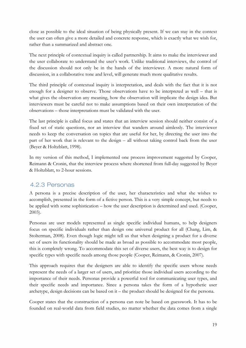
5.1.4 Personas When all interviews were done, the outcome of those, the result of the observations, and the SME interviews, were analyzed in order to identify the behavioral variables of the different users. The outcome of that was the following set of behavioral variables:
• Frequency of o Application sign in o Reporting of data o Analysis writing o Edit/creation of scorecard
• Domain knowledge • Technical knowledge • Enthusiasm • Detail vs. Comprehensive vs. Efficiency • Goals • Roles
26
• Pain points and frustrations
When those had been generated each interviewee subject was mapped to the behavioral variable. Behavioral variables were in most cases representing a continuous range, such as the variable of domain knowledge which can be said to be continuous between low and high. But some represented discrete choices, such as job role, where options could be manager, controller, and plumber, for instance.
When the behavioral variables had been identified, they were plotted, along with their scales, onto a large whiteboard. Now post-it notes in different colors represented different users, and every user was mapped onto each variable. It was not possible to map users to precise points in each scale, but that is not as important as placing the users in relation to each other (Cooper, Reimann, & Cronin, 2007).
When all users had been mapped to all variables, the whiteboard was completely filled with post-it notes in different colors as seen in Figure 4. Now the task was to find clusters of users that were present in multiple variables, as the set of users in each those clusters would constitute a significant behavior pattern.
Each of the behavior patterns was extended with important details from the data of the previous studies such as usage environment, relevant context details, frustrations, needs and other characteristics.
The behavior patterns were supplied with a first and last name, along with a short description, all fictional, and had suddenly become personas. The name somewhat represented demographic behavior variables observed for the respective persona and the description was used to make the persona feel more alive.
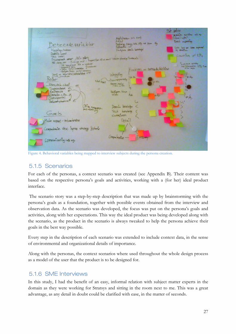
27
Figure 4. Behavioral variables being mapped to interview subjects during the persona creation.
5.1.5 Scenarios For each of the personas, a context scenario was created (see Appendix B). Their content was based on the respective persona’s goals and activities, working with a (for her) ideal product interface.
The scenario story was a step-by-step description that was made up by brainstorming with the persona’s goals as a foundation, together with possible events obtained from the interview and observation data. As the scenario was developed, the focus was put on the persona’s goals and activities, along with her expectations. This way the ideal product was being developed along with the scenario, as the product in the scenario is always tweaked to help the persona achieve their goals in the best way possible.
Every step in the description of each scenario was extended to include context data, in the sense of environmental and organizational details of importance.
Along with the personas, the context scenarios where used throughout the whole design process as a model of the user that the product is to be designed for.
5.1.6 SME Interviews In this study, I had the benefit of an easy, informal relation with subject matter experts in the domain as they were working for Stratsys and sitting in the room next to me. This was a great advantage, as any detail in doubt could be clarified with ease, in the matter of seconds.

28
Hence the method of SME Interviews was used frequently but rather informal throughout the whole design process.
5.1.7 Product and competitive audits Based on the context scenarios and previously created personas, the current version of RunYourCompany and some of its main competitors were examined. This was done in order gain understanding of how capable these products were of fulfilling the goals and expectations of the personas, according to their scenarios.
The competitive products tested were IBM Cognos, Corporater Express, Direction Software, and 4GHI Cockpit Communicator.
It was somewhat intricate to get access to some of the products, and even more difficult to conduct an objective and unbiased evaluation of their ability of supporting the context scenarios of the personas. As the process and way of working shifted rigorously among the different products, the context scenarios were in a few cases totally non-applicable – even though the product might fulfill the goals of the personas.
As a result of this, some of the audits did not follow the context scenarios but rather the goals of the personas, with focus on their expectations and needs such as speed, efficiency, ease, etc.
For each of these products notes were taken regarding their advantages, disadvantages, and interesting design choices. Those notes formed a good foundation of what to think about, what to avoid, and alternative design solutions for the new design concept. Figure 5 - Figure 7 shows typical screens from some of the different competitors.

29
Figure 5. The main view of Cockpit Communicator.
Figure 6. A scorecard representation in Corporater Express.
30
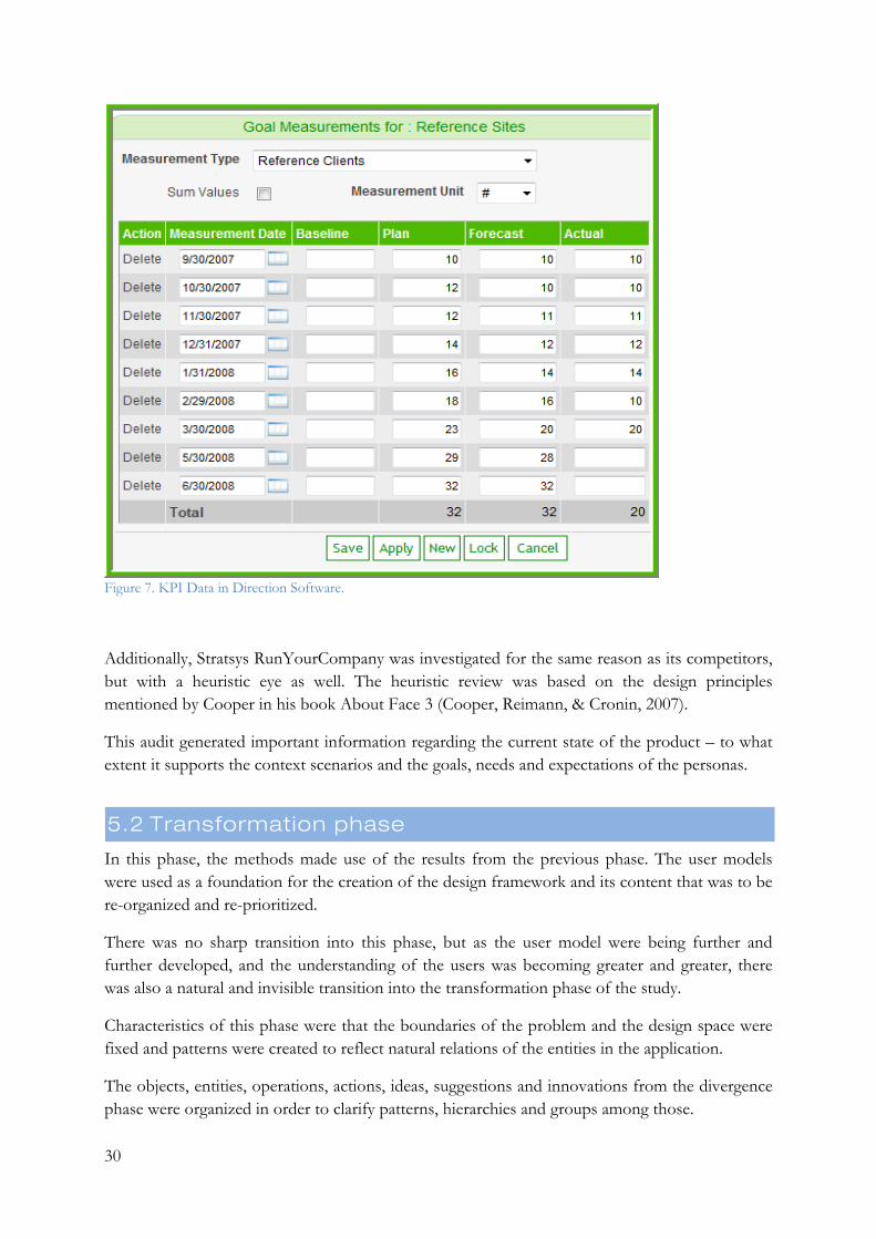
Figure 7. KPI Data in Direction Software.
Additionally, Stratsys RunYourCompany was investigated for the same reason as its competitors, but with a heuristic eye as well. The heuristic review was based on the design principles mentioned by Cooper in his book About Face 3 (Cooper, Reimann, & Cronin, 2007).
This audit generated important information regarding the current state of the product – to what extent it supports the context scenarios and the goals, needs and expectations of the personas.
5.2 Transformation phase
In this phase, the methods made use of the results from the previous phase. The user models were used as a foundation for the creation of the design framework and its content that was to be re-organized and re-prioritized.
There was no sharp transition into this phase, but as the user model were being further and further developed, and the understanding of the users was becoming greater and greater, there was also a natural and invisible transition into the transformation phase of the study.
Characteristics of this phase were that the boundaries of the problem and the design space were fixed and patterns were created to reflect natural relations of the entities in the application.
The objects, entities, operations, actions, ideas, suggestions and innovations from the divergence phase were organized in order to clarify patterns, hierarchies and groups among those.

31
5.2.1 Design framework As more and more patterns were created, identified and discovered, the foundation of a design framework was developed. This framework defined the overall structure of the product, from the user’s perspective.
Cooper gives an example that if we were to design a house, the design framework would be dealing with concerns such what rooms the house should have, how many, and where they would be positioned with respect to each other. Perhaps the framework would describe a roughly estimation of the size of each room, but never go into details such as doorknobs, wallpapers or faucets (Cooper, Reimann, & Cronin, 2007).
For this application, the design framework defines, and distinguishes between, objects and entities, and their actions and operations. The different actions and operations of RunYourCompany can operate either on a single object, between objects, on relations between objects, and on a specific type of data elements encapsulated in another object.
The practical implementation of the design framework consisted of a multiple sessions where I spatially grouped a large number of post-it notes with names of objects, entities, actions and operations written on them. The symbolic meaning of the placement of a specific note differentiated throughout the sessions. It could represent a relation to other notes, from a specific perspective, as well as the usage frequency or the weighted importance of information - when is this information needed?
5.2.1.1 Data elements identification As RunYourCompany was a real product that already existed, the identification of data elements was done with ease. From a user perspective, these are the metaphorical subjects one is operating on while using the application. Typical data elements could be photos, e-mail messages, or orders.
These elements, and their attributes, represent the foundation that the product’s functionality is based on. And even though these elements were identified with ease, it does not imply that they were all available with the same ease in the current version of the system. Within previous versions of the system, these elements had probably never been identified as data elements specifically, but rather been developed organically.
When the data elements had been identified together with their internal relations and attributes, the functional elements were identified and mapped to the applicable data elements.
5.2.1.2 Functional elements identification The functional elements of a product are the operations that one does to data elements. For a new product, this would have consisted of translating functional requirements to functional elements. But as this is an existing product, the functional elements concerning the scope of the study existed as well. Those represented existing functions of the system.
The task was instead to organize, arrange and prioritize these functional elements, with focus on the personas and scenarios, and their needs and expectations.
32
I tried to differentiate among the different functional elements with respect to what they operate on. It could be operating on a data element, on a set of data elements, on a relation between data elements, on a specific attribute of a data element, or on a combination of those alternatives.
For the identification of both functional and data elements, the personas and context scenarios were used to validate the correctness and appropriateness of the solutions. This was done by comparing the proposed solutions with the goals and needs of the personas to ensure they were all covered suitably, as well as walking through the context scenarios step by step with focus on the proposed solution.
5.2.1.3 Interaction framework The interaction framework defines the high-level structure of the user interface, with its flow, behavior and organization.
When all data and functional elements had been defined, they were again printed on post-it notes and posted in two sections on a large whiteboard. The next step was to sort and arrange the elements the way they would be represented in the interface.
5.2.1.4 Sketching the framework From here, the first sketches of the new visualization were drawn. A new set of ideas, in collaboration with other constraints and requirements became a number of rough paper sketches.
Sketching the ideas onto paper was a great way to explore the design proposals before any further prototyping was to be performed, as it was really easy and rapid but could still communicate effects of the design that I had not been able to notice before.
5.2.2 Interactive prototype In his book “The inmates are running the asylum”, Alan Cooper (2003) writes about “the cost of prototyping”. He states that prototyping is programming, and is just as expensive as programming, but lacks the adaptability of real software when it comes to expandability and maintainability. While real code can be seen as a something as stable as a stone wall, prototypes are only scaffoldings.
Prototypes can be written much faster than a real program, which makes it attractive due to the inexpensiveness. But as real code generates a reliable program, a prototype traditionally generates a shaky foundation. They are created with the purpose of being thrown out, something they seldom are – suddenly the inexpensive prototype has turned into months of wasted work.
To avoid this, one requirement from Stratsys stated that the prototype should be developed in such a way that expandability and compatibility with the current system was ensured. By developing the prototype in ASP.NET MVC the expandability was ensured and to guarantee compatibility with the current system, the prototype was built to present real data.
A prototype is a reduction of a full-scale system either in the sense of the number of features (a vertical prototype), or in the sense of feature functionality (a horizontal prototype). The prototype in this study can be said to be horizontal, as it presented the features to the users. But
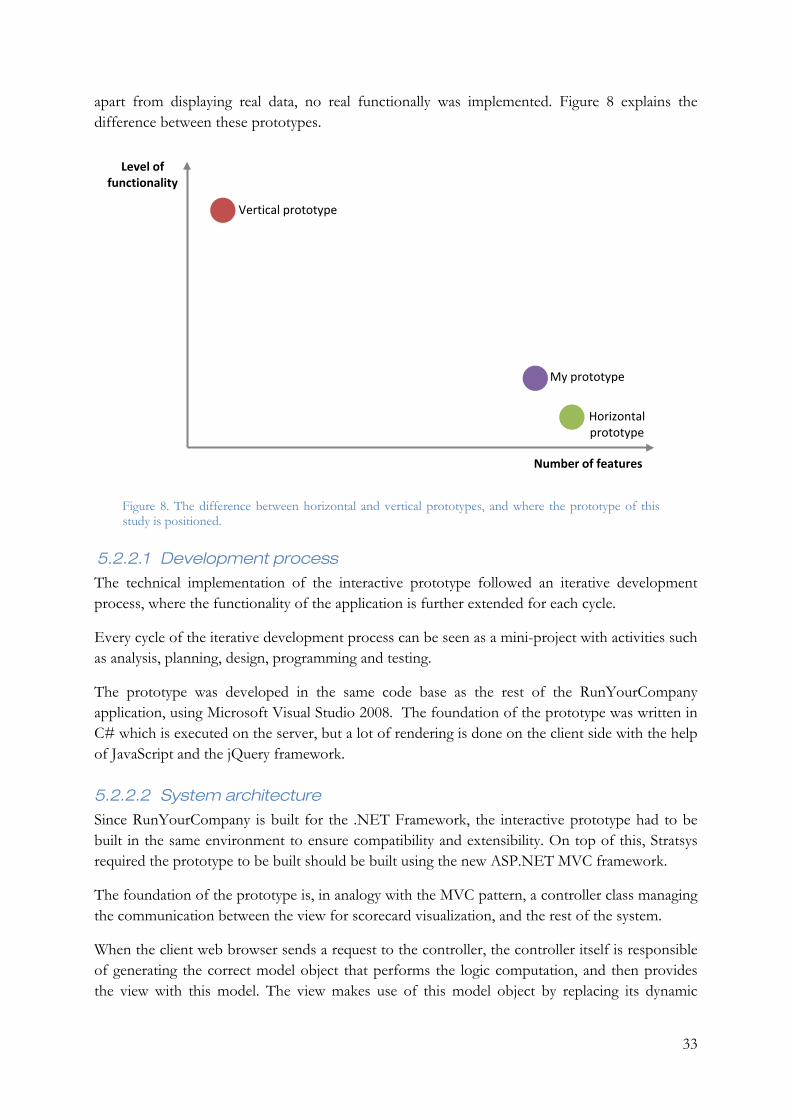
33
apart from displaying real data, no real functionally was implemented. Figure 8 explains the difference between these prototypes.
Figure 8. The difference between horizontal and vertical prototypes, and where the prototype of this study is positioned.
5.2.2.1 Development process The technical implementation of the interactive prototype followed an iterative development process, where the functionality of the application is further extended for each cycle.
Every cycle of the iterative development process can be seen as a mini-project with activities such as analysis, planning, design, programming and testing.
The prototype was developed in the same code base as the rest of the RunYourCompany application, using Microsoft Visual Studio 2008. The foundation of the prototype was written in C# which is executed on the server, but a lot of rendering is done on the client side with the help of JavaScript and the jQuery framework.
5.2.2.2 System architecture Since RunYourCompany is built for the .NET Framework, the interactive prototype had to be built in the same environment to ensure compatibility and extensibility. On top of this, Stratsys required the prototype to be built should be built using the new ASP.NET MVC framework.
The foundation of the prototype is, in analogy with the MVC pattern, a controller class managing the communication between the view for scorecard visualization, and the rest of the system.
When the client web browser sends a request to the controller, the controller itself is responsible of generating the correct model object that performs the logic computation, and then provides the view with this model. The view makes use of this model object by replacing its dynamic
Horizontal prototype
Vertical prototype
My prototype
Level of functionality
Number of features
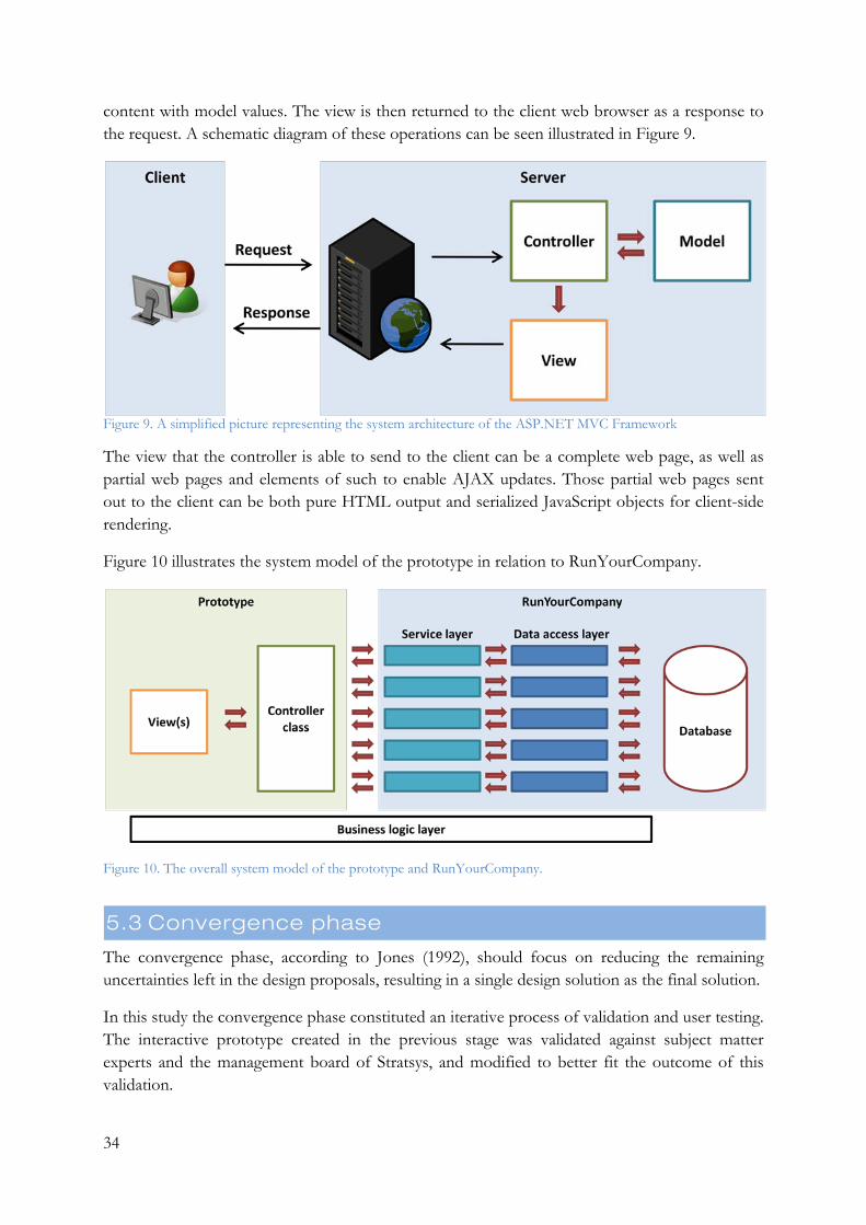
34
content with model values. The view is then returned to the client web browser as a response to the request. A schematic diagram of these operations can be seen illustrated in Figure 9.
Figure 9. A simplified picture representing the system architecture of the ASP.NET MVC Framework
The view that the controller is able to send to the client can be a complete web page, as well as partial web pages and elements of such to enable AJAX updates. Those partial web pages sent out to the client can be both pure HTML output and serialized JavaScript objects for client-side rendering.
Figure 10 illustrates the system model of the prototype in relation to RunYourCompany.
Figure 10. The overall system model of the prototype and RunYourCompany.
5.3 Convergence phase
The convergence phase, according to Jones (1992), should focus on reducing the remaining uncertainties left in the design proposals, resulting in a single design solution as the final solution.
In this study the convergence phase constituted an iterative process of validation and user testing. The interactive prototype created in the previous stage was validated against subject matter experts and the management board of Stratsys, and modified to better fit the outcome of this validation.
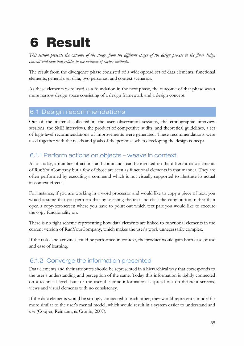
35
6 Result This section presents the outcome of the study, from the different stages of the design process to the final design concept and how that relates to the outcome of earlier methods.
The result from the divergence phase consisted of a wide-spread set of data elements, functional elements, general user data, two personas, and context scenarios.
As these elements were used as a foundation in the next phase, the outcome of that phase was a more narrow design space consisting of a design framework and a design concept.
6.1 Design recommendations
Out of the material collected in the user observation sessions, the ethnographic interview sessions, the SME interviews, the product of competitive audits, and theoretical guidelines, a set of high-level recommendations of improvements were generated. These recommendations were used together with the needs and goals of the personas when developing the design concept.
6.1.1 Perform actions on objects – weave in context As of today, a number of actions and commands can be invoked on the different data elements of RunYourCompany but a few of those are seen as functional elements in that manner. They are often performed by executing a command which is not visually supported to illustrate its actual in-context effects.
For instance, if you are working in a word processor and would like to copy a piece of text, you would assume that you perform that by selecting the text and click the copy button, rather than open a copy-text-screen where you have to point out which text part you would like to execute the copy functionality on.
There is no tight scheme representing how data elements are linked to functional elements in the current version of RunYourCompany, which makes the user’s work unnecessarily complex.
If the tasks and activities could be performed in context, the product would gain both ease of use and ease of learning.
6.1.2 Converge the information presented Data elements and their attributes should be represented in a hierarchical way that corresponds to the user’s understanding and perception of the same. Today this information is tightly connected on a technical level, but for the user the same information is spread out on different screens, views and visual elements with no consistency.
If the data elements would be strongly connected to each other, they would represent a model far more similar to the user’s mental model, which would result in a system easier to understand and use (Cooper, Reimann, & Cronin, 2007).
36
6.1.3 Differentiate between data elements, commands and configuration
Today a node is represented as a line of text in the scorecard view, which in the event of a click opens up a pop-up window which displays a well blended mix of metadata and attributes of the data element, together with commands and configuration options.
This is confusing for a user, whose intention was either to watch detailed data of a node or to execute a command on it.
6.1.4 Affordance RunYourCompany contains a lot of powerful commands and functions, although the functionality and abilities are not always perceived by the user. In order to make the product more intuitive and easy to use, all commands should consistently be well emphasized and affordable.
6.1.5 Clarify and elucidate the tree view structure Users were having troubles understanding that the scorecard is represented as tree structure, as the lines explaining the hierarchy had to be explained as well. If the structure of the scorecard would become more visually understandable, the user’s general understanding of the scorecard concept would probably increase as well.
A more clear hierarchy explains and improves understandability of its underlying concept, that every node in the scorecard is a small step towards an achievement of the overlying goal.
6.1.6 Spatial grouping of nodes and their attributes In RunYourCompany a node is a central concept. A node can keep a large set of attributes and data elements. If these attributes and elements were visualized as attributes and elements of a node instead of their current somewhat floating appearance with no characteristics indicating interrelations at all, the result would be a scorecard visualization far more easy to understand and interpret.
6.1.7 Consistent visual framework The importance of keeping a clear and consistent visual and aesthetical framework for a product is grounded in the same ideas as usability. In order to make a product easy to learn, the user needs to be able to recognize the environment of the product. If closely related screens in the application have an entirely different visual form and behavior, users are prone to become confused and slowed down in their work process.
Cooper et al. (2007) exemplifies this type of problem with a story of the Motorola Razr phone. Its industrial design and form was an award-winning success story, whilst the software inside the phone was a possible story of awful communication between development teams. For instance, the text-entry interfaces used for its calendar application and phone book are entirely different. Utilizing one shared interface would have saved development resources and end-user confusion.
37
6.2 Personas
The usage of field study data as a foundation for persona creation was an excellent choice. It provided the positive effect that for each upcoming design decision to be made, it was not necessary to browse through the whole pile of notes from the field studies – all the essential information was encoded in my two personas.
From the persona implementation, three behavioral patterns were identified. But out of these three, two of them were very similar. That resulted in the disposal of one of these. The two resulting behavioral were transformed into the two personas Christina and Ulf.
The primary persona, Christina, is the stakeholder that the design in this study attempts to accommodate. With Ulf acting as the secondary persona, he is mostly satisfied with Christina’s design concept but has some specific needs that can be complied with as long as they don’t interfere with Christina’s design.
The two Personas developed and used in this study can be found in Appendix A. Personas
6.3 Design goals
In order to accommodate the two personas, the following goals and needs were identified as the most important to fulfill.
6.3.1 A clear and comprehensive picture of a scorecard As the personas wants to be able to get a comprehensive view of a scorecard, in order to obtain a better understanding of the organization and its current level of performance, this must be supported by the design concept.
6.3.2 Easy and efficient manipulation of a scorecard As this is a common activity for most users, although on different levels, the design concept must support efficiency for the users doing this frequently, as well as simplicity for the occasional users. This applies to actions performed on the structure of the scorecard, or the scorecard itself, as well as detailed operations on the elements of the scorecards and their attributes.
6.3.3 A clear process presented to the user As a user opens up a scorecard view, she should immediately perceive information about what actions needs to be taken on what objects – if any of those are applicable. Delayed measures that she is responsible of should indicate a need for updated data and non-update activities with an expired end date should do the same.

38
6.4 Design framework
The design framework defines all the entities that the design concept consists of. In this case it was fairly easy to generate those, since the current version of the product had already a defined design framework although it didn’t correspond to the user’s mental model in some occurrences.
6.4.1 Data elements Among the main data elements that were identified, nodes were the central concept. A scorecard consists of nodes grouped and ordered in a hierarchical structure. These nodes can be of three different types, and have other data elements connected to themselves.
The most apparent data element connected to a node is the meta data element, the properties of a node such as name, description, who is responsible, which department in the organization does it belong to, etc.
Comments can be seen as another data element. Every node can have an unlimited (theoretically) number of comments connected to it, and every user with sufficient access is able to write a comment for each node.
Documents can be uploaded and connected to a node, and can therefore be said to be a data element connected to a node.
Different types of nodes have some differences in what data elements they can have. A Key Performance Indicator keeps measured data over time as a data element. The data is presented in a table with one axis representing time periods and the other showing the data columns of the measure.
An activity has an extended meta data element containing activity-specific information such as priority, status, start date and end date, hours spent on it, etc.
6.4.2 Functional elements The functional elements are the operations or actions that can be performed on the different data elements. Different data elements have evidently different functional elements as they can have different actions invoked on themselves. Functional elements identified were of three different types, depending whether they were performed on a single object, on a set of objects, or a relation between objects.
6.4.3 Consistency One of the design recommendations above states that the visual framework of a product should be consistent. The interface of a product is a lot easier to learn if the user recognizes the environment of different screens and parts of the product.
Therefore, the interactive prototype developed in this study had to adapt to the rest of the application. In practice, this became a restriction of interaction details such as data savings. One of the earlier design ideas was to improve efficiency of updating node properties by entering new
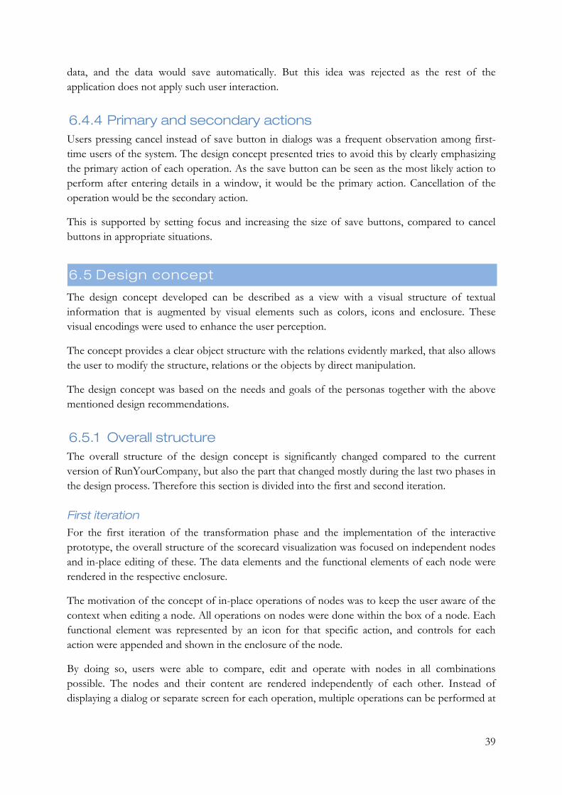
39
data, and the data would save automatically. But this idea was rejected as the rest of the application does not apply such user interaction.
6.4.4 Primary and secondary actions Users pressing cancel instead of save button in dialogs was a frequent observation among first-time users of the system. The design concept presented tries to avoid this by clearly emphasizing the primary action of each operation. As the save button can be seen as the most likely action to perform after entering details in a window, it would be the primary action. Cancellation of the operation would be the secondary action.
This is supported by setting focus and increasing the size of save buttons, compared to cancel buttons in appropriate situations.
6.5 Design concept
The design concept developed can be described as a view with a visual structure of textual information that is augmented by visual elements such as colors, icons and enclosure. These visual encodings were used to enhance the user perception.
The concept provides a clear object structure with the relations evidently marked, that also allows the user to modify the structure, relations or the objects by direct manipulation.
The design concept was based on the needs and goals of the personas together with the above mentioned design recommendations.
6.5.1 Overall structure The overall structure of the design concept is significantly changed compared to the current version of RunYourCompany, but also the part that changed mostly during the last two phases in the design process. Therefore this section is divided into the first and second iteration.
First iteration For the first iteration of the transformation phase and the implementation of the interactive prototype, the overall structure of the scorecard visualization was focused on independent nodes and in-place editing of these. The data elements and the functional elements of each node were rendered in the respective enclosure.
The motivation of the concept of in-place operations of nodes was to keep the user aware of the context when editing a node. All operations on nodes were done within the box of a node. Each functional element was represented by an icon for that specific action, and controls for each action were appended and shown in the enclosure of the node.
By doing so, users were able to compare, edit and operate with nodes in all combinations possible. The nodes and their content are rendered independently of each other. Instead of displaying a dialog or separate screen for each operation, multiple operations can be performed at
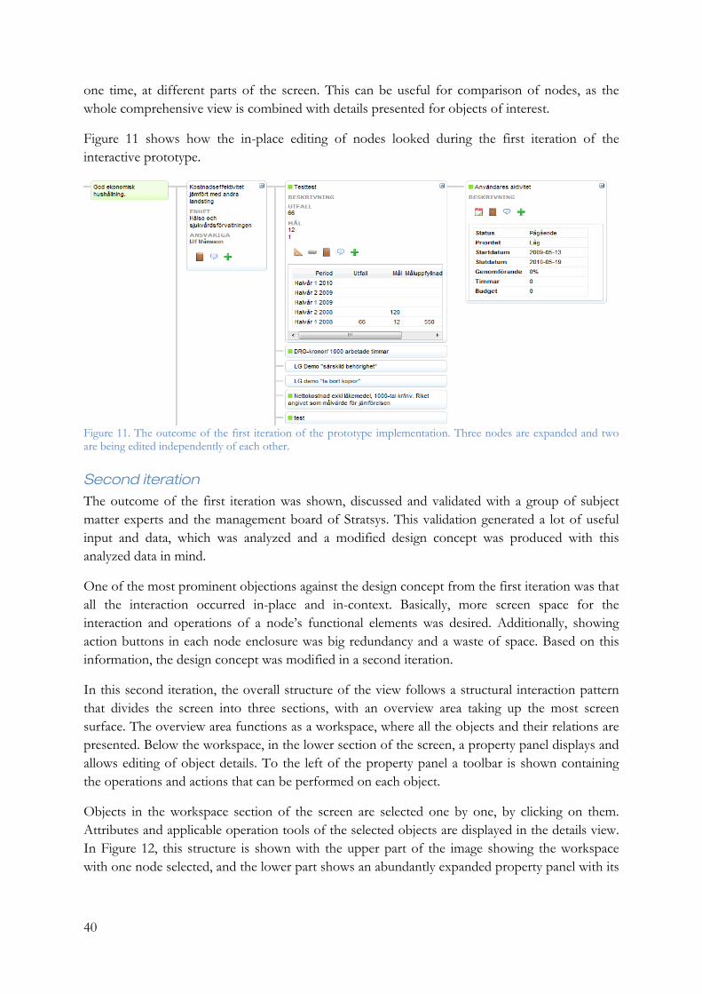
40
one time, at different parts of the screen. This can be useful for comparison of nodes, as the whole comprehensive view is combined with details presented for objects of interest.
Figure 11 shows how the in-place editing of nodes looked during the first iteration of the interactive prototype.
Figure 11. The outcome of the first iteration of the prototype implementation. Three nodes are expanded and two are being edited independently of each other.
Second iteration The outcome of the first iteration was shown, discussed and validated with a group of subject matter experts and the management board of Stratsys. This validation generated a lot of useful input and data, which was analyzed and a modified design concept was produced with this analyzed data in mind.
One of the most prominent objections against the design concept from the first iteration was that all the interaction occurred in-place and in-context. Basically, more screen space for the interaction and operations of a node’s functional elements was desired. Additionally, showing action buttons in each node enclosure was big redundancy and a waste of space. Based on this information, the design concept was modified in a second iteration.
In this second iteration, the overall structure of the view follows a structural interaction pattern that divides the screen into three sections, with an overview area taking up the most screen surface. The overview area functions as a workspace, where all the objects and their relations are presented. Below the workspace, in the lower section of the screen, a property panel displays and allows editing of object details. To the left of the property panel a toolbar is shown containing the operations and actions that can be performed on each object.
Objects in the workspace section of the screen are selected one by one, by clicking on them. Attributes and applicable operation tools of the selected objects are displayed in the details view. In Figure 12, this structure is shown with the upper part of the image showing the workspace with one node selected, and the lower part shows an abundantly expanded property panel with its
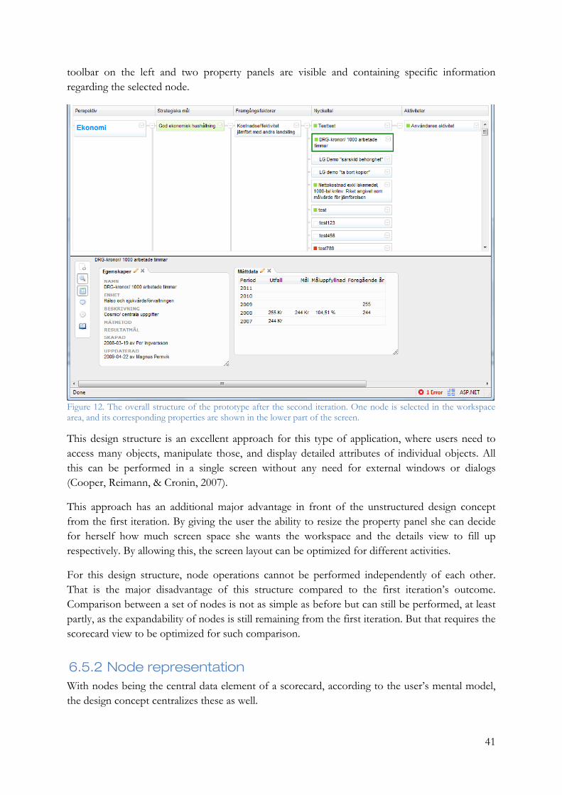
41
toolbar on the left and two property panels are visible and containing specific information regarding the selected node.
Figure 12. The overall structure of the prototype after the second iteration. One node is selected in the workspace area, and its corresponding properties are shown in the lower part of the screen.
This design structure is an excellent approach for this type of application, where users need to access many objects, manipulate those, and display detailed attributes of individual objects. All this can be performed in a single screen without any need for external windows or dialogs (Cooper, Reimann, & Cronin, 2007).
This approach has an additional major advantage in front of the unstructured design concept from the first iteration. By giving the user the ability to resize the property panel she can decide for herself how much screen space she wants the workspace and the details view to fill up respectively. By allowing this, the screen layout can be optimized for different activities.
For this design structure, node operations cannot be performed independently of each other. That is the major disadvantage of this structure compared to the first iteration’s outcome. Comparison between a set of nodes is not as simple as before but can still be performed, at least partly, as the expandability of nodes is still remaining from the first iteration. But that requires the scorecard view to be optimized for such comparison.
6.5.2 Node representation With nodes being the central data element of a scorecard, according to the user’s mental model, the design concept centralizes these as well.

42
The overall visualization of this design concept consists of nodes ordered per column in a horizontally arranged tree structure, with their relations clearly illustrated.
Enclosure Nodes in a scorecard are presented as boxes containing their attributes and properties. The boxing, or enclosure, of nodes is motivated by the fact that these attributes and properties are tightly connected to a specific node and not to the scorecard in general. In the existing version of RunYourCompany, these attributes and properties are presented without any visual connection to the node containing this information. This causes the data to lose its context which consequently will make it meaningless. For instance, if the value of a measure is presented without any visual link telling what measure the data belongs to, that information is in most cases useless. Figure 13 illustrates a set of nodes in a tree structure, where relations between nodes are shown with grey lines. All nodes are enclosed by a thin grey line, but it is only the nodes in the two rightmost columns that contain more than one node property.
Figure 13. A set of nodes in a tree structure which is ordered into columns.
Primary and secondary node properties The attributes and properties presented in each node are divided into two groups, one shown by default and the second shown on demand from the user, simply by clicking a button in order to expand the box and show the remaining properties. This is illustrated in Figure 14, where three nodes are expanded to show the secondary properties of those.
This allows users to keep the scorecard fairly small, while they are still able to expand nodes to be able to drill into details of nodes that they might want to compare and associate.

43
The types of properties that are shown either primary or secondary are set up for each column in each scorecard. The text formatting for each node property can also be defined here.
Figure 14. A set of nodes where three have been expanded to display their secondary node properties.
Emphasizing nodes of interest One of the context scenarios included a step where a user is about to update the status of his activities and KPIs. When he opens up the scorecard view, he gets immediate feedback of which nodes he is responsible for and which ones that are delayed. This is a frequent scenario for many users, who are responsible for a set of nodes.
The second design goal mentioned above deals with the same issue, to clarify the work process, users should immediately obtain feedback of what nodes to take action with.
Therefore nodes in a scorecard are visually indicating this information. In sketches and the interactive prototype, this was indicated by different background colors. Normal nodes had a bright blue tone as background, whilst the nodes oneself is responsible for had a green background unless they were delayed - in that case the background color was red. In Figure 14 the leftmost node is emphasized with a green background, stating that the logged on user is responsible for that one and it has not been delayed.
6.5.3 Enhanced tree visualization In the existing version of RunYourCompany, a scorecard is visualized as a tree as well, but with a layout not very obvious to the user. In the best case it only needs to be explained and clarified, in the worst case the general understanding of the concept is reduced.
In this design concept, the tree structure of the scorecard has been in focus. In order to support a comprehensive perception of a scorecard, a lot of effort has been put to explain the relation between nodes. The result of this can be seen in Figure 13 and Figure 14.
6.5.4 Concentration on sub-trees As a user is likely to focus her work on a single node or a smaller set of nodes, the design concept provides support for this in a few different ways.

44
Collapse and expand sub trees In some implementations of the product, the scorecard tree view is likely to become fairly big and might not fit into the size of a single screen. The outcome of this will be a vertical scrollbar on the right side of the screen.
If a user is working with a set of nodes that are spread out vertically on the screen, constantly scrolling up and down on the page is prone to become a tedious operation.
To avoid this situation, the scorecard tree supports collapsing and expanding of sub trees. A small button is placed to the right of each node that can be seen as a sub tree. By clicking that, the respective sub tree is toggling between collapsed and expanded mode. In Figure 15, parts of the tree are collapsed, which is indicated by the small plus-buttons to the right of the respective parent nodes.
Figure 15. A partially collapsed tree.
Resizable columns As the tree can be collapsed and expandable, focus can be set on a specific set of nodes vertically. To set focus on these horizontally as well, the user is able to resize the different columns of the scorecard. All nodes in each column are of equal width, and to give more space to a set of nodes of interest, the width of their columns can be increased by dragging the corresponding handle in the column header bar. Similarly, columns of no or little interest can be reduced in size.
6.5.5 Direct manipulation For this design concept, one of the design goals stated that manipulation of a scorecard should be both simple and efficient. A good and simple way of achieving this is to allow direct manipulation of objects in the user interface. This will also go along with the first design recommendation above, that actions should be performed on objects.
One of the most evident situations where direct manipulation is an excellent way of working with the scorecard, is when moving and reconnecting nodes. In the current version of RunYourCompany nodes are moved by opening a dialog window in which a new tree is rendered, and by selecting a node in that tree a node can be connected.
In this design concept, a node can easily be moved or reconnected to another node, by the drag and drop technique. Together with good visual feedback while performing the drag and drop, this activity is improved for both simplicity and efficiency.
45
6.5.6 Performance In order to avoid long waiting times for the user, which is a common case for web-based applications as well as a pain points for one of the personas, the majority of data is loaded from the server on demand.
When a user opens up the scorecard view, the tree structure, its nodes and their primary and secondary node properties are loaded immediately, but all information apart from that is loaded on demand. If the user wants to see any other attribute of a node, that attribute is loaded as the user requests to see it. That approach generates a tiny waiting time when an operation is to be performed on a node, but gives instant access to the comprehensive view.
Another factor of importance is the fact a lot of rendering is performed on the client side. In contrast to the classic web site, where all the generation and rendering was conducted on the server and then transferred to the client who was all passive and just showing the result to the user, this prototype utilizes the abilities of a client to perform partial processing of the result.
For many actions and operations, the only thing transformed to the client from the server is a data structure containing the information needed about the previous operation. Based on this data, the client web browser generates and appends the appropriate HTML output on the web page directly
As a result of this method, the amount of information transferred between the client and the server is significantly lower.

46
47
7 Discussion This section provides an analyzing description of the methods, implementation of those, along with the result and its limitations.
The choice of methods in this study has worked out well generally, even though a few more user centered iterations in the development process would have improved the result further. Some of the methods used were created for teams of designers and developers as well, not for a single designer as in this study. A larger design team would probably have fully utilized the methods’ capabilities, now some of them had to be modified.
Another issue that emerged during the implementation was the difficulty of documenting user studies. A significant amount of the information gathered in these sessions was the one that was interpreted, or read between the lines. The intuitive feelings that occurred here were taken into account as well, even if no user had literally mentioned the specific matter. Those intuitive feelings are always difficult to explain, but the personas helped to convey those impressions.
Also, one type of user that wasn’t included in the user studies, and certainly would have been a useful resource, was the one who has a lot of knowledge within this domain, but has never used a product of this type. That would probably have generated a lot of useful ideas, since this user would not have been as accommodated to the product as some of the users were. But this user is very rare, perhaps even non-existing as the complexity of a product of this type requires a high level of abstraction.
The fact that users are accommodated to a product and have learnt how it works, leads to another issue as well - the difficulty of making major changes in an existing system. As many organizations and customers have a lot of occasional users of this product, big changes of this type in a complex system like this is expensive. Even though the changes streamlines the usage of the product and reduces the amount of time spent on this task, the users might need education and training which has a cost as well.
Since this study was an improvement of an existing product rather than an implementation of a new one, no requirement specification was made. The functional requirements were already defined by the existing version of this product, and the non-functional were better represented as design goals and recommendations from a user perspective.
The result of the study also demonstrates how the implementations and processes used in RunYourCompany diverge among different customers and organizations. Here a visionary decision should preferably be taken whether to support this wide spread usage technically, or to tighten the usage of the product. A more spread usage will let the product influence other disciplines as well such as Business Intelligence and Dashboards. On the other hand, a tighter usage will simplify the product domain with a neater process which is easier to understand. Currently the product somehow floats in between these two worlds.
The design concept was limited in some ways, as realization of these parts would have been too time-consuming for this study. One major function is the filter functionality, where a subset of

48
the scorecard can be retrieved based on criteria. Some other more advanced features have been left out for the same reason.
Also, if this prototype is going to replace the current visualization, other views and parts of the system have to be replaced as well in order to keep consistency.
49
8 Conclusion The conclusion section compares the result of the study with the research question in order to ensure it has been properly answered.
The result of this study contains information regarding users and their perception of RunYourCompany, as well as concrete suggestions of improvement and goals that are founded in that information. Based on these suggestions and goals, a design concept has been developed and implemented as an interactive prototype.
Since the research question of this study was formulated in such a way that it can be divided into three parts, this was the expected structure of the result. In order to improve the product to support the needs and goals of the users, those had to be identified. This outcome corresponds to the design goals in the result chapter.
The same goes for the latter part of the research question, that the product should support a natural interaction with the objects of the scorecard. This requires definition of natural interaction, which was mostly theoretically based and can be found in the design recommendations section in the result chapter.
When these two different parts have been merged together with the last part of the research question, that the product should visualize scorecard data, a design concept has been created that aims give a practical answer to the research question.
The interactive prototype aims to preserve the functionality of the previous version of the scorecard visualization, but is enhanced in terms of clarity and efficiency.

50
51
9 References ACM Special Interest Group on Computer-Human Interaction (SIGCHI). (1992,1996). Curricula for Human-Computer Interaction. Retrieved Maj 19, 2009, from http://sigchi.org/cdg/cdg2.html#2_1
Armstrong, M. (2006). Performance Management: Key Strategies and Practical Guidelines. London: Kogan Page.
Bauer, C., & King, G. (2004). Hibernate in Action. Greenwich: Manning Publications Co.
Beyer, H., & Holtzblatt, K. (1998). Contextual Design. San Diego: Academic Press.
Buxton, B. (2007). Sketching User Experiences: Getting the design right and the right design. San Francisco: Morgan Kaufmann Publishers.
Chang, Y.-n., Lim, Y.-k., & Stolterman, E. (2008). Personas: from theory to practices. Proceedings of the 5th Nordic conference on Human-computer interaction: building bridges (pp. 439-442). Lund: NordiCHI.
Cooper, A. (2003). The inmates are running the asylum. Canda: Sams Publishing.
Cooper, A., Reimann, R., & Cronin, D. (2007). About Face 3 - The Essentials of Interaction Design. Indianapolis: Wiley Publishing Inc.
Few, S. (2006). Information Dashboard Design. Seastopol, CA: O'Reilly Media, Inc.
Fowler, M. (2004). Patterns of Enterprise Application Architecture. Addison-Wesley.
Gomoll, K., & Nicol, A. (1990, January). User Observation: Guidelines for Apple Developers. Apple Human Interface Notes #1 .
Grudin, J., & Pruitt, J. (2003). Personas: practice and theory. Proceedings of the 2003 conference on Designing for user experiences (pp. 1-15). San Francisco: DUX.
Hannabarger, C., Buchman, R., & Economy, P. (2007). Balanced Scorecard Strategy for Dummies. Hoboken, NJ: John Wiley & Sons.
ISO 9241-11. (1998). Ergonomic requirements for office work with visual display terminals (VDTs) Part 11: Guidance on Usability. ISO.
Jones, J. C. (1992). Design Methods. Canada: John Wiley & Sons.
Kaplan, R. S., & Norton, D. (1992). The balanced scorecard - Measures that drive performance. Harvard Business Review , 70, 71-91.
Kaplan, R. S., & Norton, D. (1996). The Balanced Scorecard: Translating Strategy into Action. Boston: Harvard Business School Publishing.
Liberty, J., & Hurwitz, D. (2003). Programming ASP.NET. Sebastopol: O'Reilly Media, Inc.
52
Luhn, H. P. (1958). A Business Intelligence System. IBM Journal of Research and Development , 2 (4), 314-319.
Maguire, M. (2001). Methods to support human-centred design. International Journal of Human-Computer Studies , 55, 587-634.
Nielsen, J. (1994). Usability Engineering. Morgan Kaufmann.
Niven, P. R. (2008). Balanced Scorecard: Step-By-Step for Government and Nonprofit Agenciess, Second Edition. John Wiley & Sons.
Norman, D. A. (1999, May). Affordance, Conventions and Design. Interactions , 38-43.
Norman, D. A. (1988). The Psychology of Everyday Things. New York: Basic Books.
Pinker, S. (1999). How the Mind Works. New York: W.W. Norton.
Preece, J., Rogers, Y., & Sharp, H. (2007). Interaction Design: beyond human-computer interaction. Chichester: John Wiley & Sons Ltd.
Rosson, M. B., & Carroll, J. M. (2002). Usability Engineering: Scenario-Based Development of Human-Computer Interaction. San Francisco: Morgan Kaufmann Publishers.
Sandersson, S. (2009). ASP.NET MVC Framework Preview. Apress.
Spence, R. (2001). Information Visualization. Essex: Pearson Education Limited.
Sternberg, R. (2008). Cognitive Psychology. Cengage Learning.
Thierauf, R. J. (2001). Effective business intelligence systems. Greenwood Publishing Group, Incorporated.
Tufte, E. R. (2001). The Visual Display of Quantitative Information. Cheshire: Graphic Press.
Ware, C. (2004). Information Visualization: Perception for Design. San Francisco: Morgan Kaufmann.
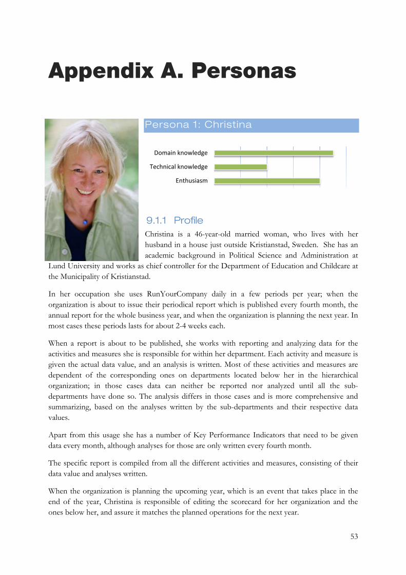
53
Appendix A. Personas
Persona 1: Christina
9.1.1 Profile Christina is a 46-year-old married woman, who lives with her husband in a house just outside Kristianstad, Sweden. She has an academic background in Political Science and Administration at
Lund University and works as chief controller for the Department of Education and Childcare at the Municipality of Kristianstad.
In her occupation she uses RunYourCompany daily in a few periods per year; when the organization is about to issue their periodical report which is published every fourth month, the annual report for the whole business year, and when the organization is planning the next year. In most cases these periods lasts for about 2-4 weeks each.
When a report is about to be published, she works with reporting and analyzing data for the activities and measures she is responsible for within her department. Each activity and measure is given the actual data value, and an analysis is written. Most of these activities and measures are dependent of the corresponding ones on departments located below her in the hierarchical organization; in those cases data can neither be reported nor analyzed until all the sub-departments have done so. The analysis differs in those cases and is more comprehensive and summarizing, based on the analyses written by the sub-departments and their respective data values.
Apart from this usage she has a number of Key Performance Indicators that need to be given data every month, although analyses for those are only written every fourth month.
The specific report is compiled from all the different activities and measures, consisting of their data value and analyses written.
When the organization is planning the upcoming year, which is an event that takes place in the end of the year, Christina is responsible of editing the scorecard for her organization and the ones below her, and assure it matches the planned operations for the next year.
Domain knowledge
Technical knowledge
Enthusiasm
54
Goals
• Create reports throughout the year • Get a comprehensive picture of the organization’s current performance level • Improve strategy and planning • Report data and write analyses as efficient as possible
Needs
• A comprehensive view to be able to see how the data is related to its context, as well as a detailed view
• Simplicity – a clear process and workflow. She uses the system a few times per year, hence she will need simplicity and easiness as well as help and guidance.
• Efficiency – she wants to minimize the number of hours put on data reporting for her and her colleagues
Pain points
• It is difficult to create new Key Performance Indicators • Data analyses are unnecessarily time-consuming to write • Badly described measures and activities from departments above generate confusion • Long waiting times, often during stress • System errors
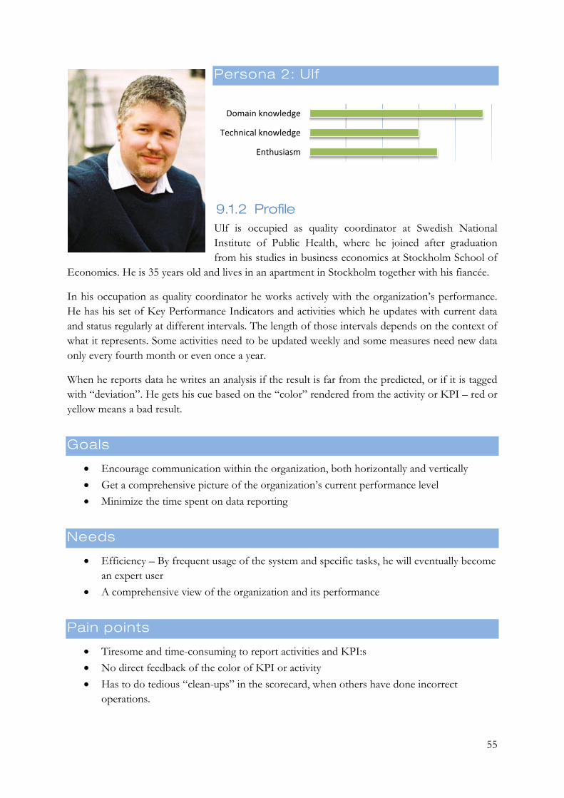
55
Persona 2: Ulf
9.1.2 Profile Ulf is occupied as quality coordinator at Swedish National Institute of Public Health, where he joined after graduation from his studies in business economics at Stockholm School of
Economics. He is 35 years old and lives in an apartment in Stockholm together with his fiancée.
In his occupation as quality coordinator he works actively with the organization’s performance. He has his set of Key Performance Indicators and activities which he updates with current data and status regularly at different intervals. The length of those intervals depends on the context of what it represents. Some activities need to be updated weekly and some measures need new data only every fourth month or even once a year.
When he reports data he writes an analysis if the result is far from the predicted, or if it is tagged with “deviation”. He gets his cue based on the “color” rendered from the activity or KPI – red or yellow means a bad result.
Goals
• Encourage communication within the organization, both horizontally and vertically • Get a comprehensive picture of the organization’s current performance level • Minimize the time spent on data reporting
Needs
• Efficiency – By frequent usage of the system and specific tasks, he will eventually become an expert user
• A comprehensive view of the organization and its performance
Pain points
• Tiresome and time-consuming to report activities and KPI:s • No direct feedback of the color of KPI or activity • Has to do tedious “clean-ups” in the scorecard, when others have done incorrect
operations.
Domain knowledge
Technical knowledge
Enthusiasm

56
57
Appendix B. Context Scenarios Christina
1. When Christina arrives at work in the morning, she starts up her computer and email client where she receives an email from RunYourCompany telling her that it is time to update the status and data for a couple of nodes in the system.
2. Christina logs on to RunYourCompany and opens the scorecard view, where she immediately gets visual feedback regarding which nodes she is responsible for and, out of those nodes, which ones that are to be reported soon.
3. Christina selects one of the nodes she is due to report, a KPI, and enters the result for the current period. The node itself gives her a brief description of the KPI and how the measure should be performed. In this case Christina finds it pretty straightforward and can just fill in the data.
4. When the data has been entered, Christina is obliged to write an analysis for the result of this measure. To be able to analyze this correctly, she has to see the data in its proper context. The tree structure of the scorecard view tells her where the node is located in this tree, which node is the “parent” node, and what siblings has it got. Other important information given by the system is data result and analyses from previous time periods, general instructions for writing analyses, which department the KPI comes from, etc.
5. Christina saves the data and can continue with the same procedure for the other nodes that are close to deadline.
6. In the afternoon, Christina receives an email from her superior containing the record of a meeting they had yesterday, regarding the organizational planning of next year. The record contains a set of nodes that she is supposed to insert into next year’s scorecard.
7. Christina enters planning mode in RunYourCompany and opens up the specific scorecard view where she is supposed to insert the new nodes, and adds them one by one. Some of the nodes are either to be visible or copied to departments below.
Ulf
1. Ulf logs on to RunYourCompany, as he does at least once a week, to update status and data of his activities and KPIs.
2. When he opens the scorecard view he obtains clear visual feedback of what nodes he should take action with. In this case, two activities and one KPI are accentuated to draw attention to them.
3. Ulf starts out one of the activities, where he updates the fields representing current progress and number of hours worked. Out of this he gets immediate feedback of the
58
activity’s new color, which acts as a cue for the decision whether to write a comment or not. If the color, which is rendered by the values of the activity, is yellow or red Ulf is obliged to write a comment regarding the activity. In this case the color is green, which tells Ulf that he doesn’t have to write a comment if there isn’t anything particular he wants to mention.
4. Ulf reports the next activity in the same way, although this one is delayed and consequently it gets a red color. Ulf has to comment the current status of the activity, preferably explaining the delay.
5. The KPI is to be reported as well, which in this case is consolidated downwards. This means that Ulf is supposed to write a comprehensive analysis, based on result and analyses of the respective sub departments where the KPI is present. The system will provide Ulf with the information needed to write such an analysis.
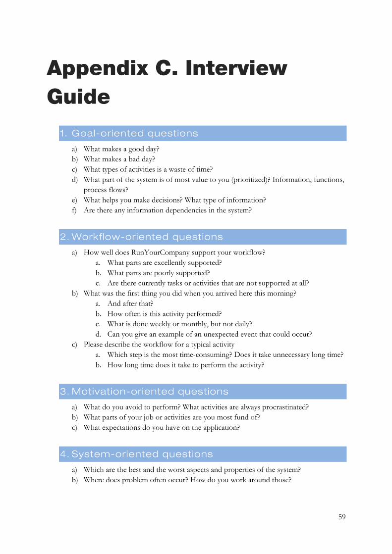
59
Appendix C. Interview Guide
1. Goal-oriented questions
a) What makes a good day? b) What makes a bad day? c) What types of activities is a waste of time? d) What part of the system is of most value to you (prioritized)? Information, functions,
process flows? e) What helps you make decisions? What type of information? f) Are there any information dependencies in the system?
2. Workflow-oriented questions
a) How well does RunYourCompany support your workflow? a. What parts are excellently supported? b. What parts are poorly supported? c. Are there currently tasks or activities that are not supported at all?
b) What was the first thing you did when you arrived here this morning? a. And after that? b. How often is this activity performed? c. What is done weekly or monthly, but not daily? d. Can you give an example of an unexpected event that could occur?
c) Please describe the workflow for a typical activity a. Which step is the most time-consuming? Does it take unnecessary long time? b. How long time does it take to perform the activity?
3. Motivation-oriented questions
a) What do you avoid to perform? What activities are always procrastinated? b) What parts of your job or activities are you most fund of? c) What expectations do you have on the application?
4. System-oriented questions
a) Which are the best and the worst aspects and properties of the system? b) Where does problem often occur? How do you work around those?