Integrated Time and Distance Line Cartogram: a Schematic...
10
© by the author(s). This work is licensed under the Creative Commons Attribution-NonCommercial-NoDerivatives 4.0 International License. To view a copy of this license, visit http://creativecommons.org/licenses/by-nc-nd/4.0/ . Cartographic Perspectives, Number 77, 2014 DOI: 10.14714/CP77.1234 Integrated Time and Distance Line Cartogram – Kraak et al. | 7 Menno-Jan Kraak University of Twente [email protected] Barend Köbben University of Twente [email protected] Yanlin Tong University of Twente [email protected] Integrated Time and Distance Line Cartogram: a Schematic Approach to Understand the Narrative of Movements To understand the nature of movement data, we introduce an alternative visual representation looking at paths from different perspectives. e movements and their stops are schematized into lines. ese are distorted based on time or dis- tance by applying line cartogram principles to answer specific location- or time-based questions. A prototype consisting of multiple linked views, including the line cartograms and a map, is implemented in a web environment using D3.js. It allows one to explore the nature of single or multiple movements. e option to compare multiple movements gives the solution its unique character. A preliminary evaluation of the product shows it is able the answer questions related to time and space accordingly. KEYWORDS: movement data; timeline cartogram; distance line cartogram; schematized map; flow map; D3 INTRODUCTION The availability of movement data is overwhelming, and sophisticated analytical and visualization tools are re- quired to understand the nature of the movements and to discover, understand, and explain patterns in space and time (Andrienko et al. 2013). Extensive study programs that look at data from multiple perspectives have been ex- ecuted ( move-cost.info), and many different visual repre- sentations are available for displaying movements (www. visualcomplexity.com). e nature of the movement data will determine which representation is most suitable. Most visual representations contain the path of movement and its direction, as well as qualitative and/or quantita- tive information. Examples are the flow map, the network map, and the space-time cube. Each of these examples has characteristics which support particular questions. The flow map is useful for showing attribute values in space (Tobler 1987), while the space-time cube, as the name implies, can deal with questions related to time and space (Hägerstrand 1970; Andrienko & Andrienko 2010). No single map is suitable to answer all questions related to space, time, and attributes. In addition, all can suffer from clutter and overplotting. The former occurs when there is an uneven spatial and temporal data distribution, and the latter in situations where the amount of data to display is large. ese problems can only (partly) be solved if one combines analytical methods such as clustering and filtering with highly interactive visualizations (Keim et al. 2010). e use of multiple and different visual representations in an interactive linked view environment can reveal patterns otherwise missed (Dykes, MacEachren, & Kraak 2005; Roberts 2005). In this paper, we suggest combining sev- eral cartographic representations—the timeline, the car- togram, the schematic map, and the flow map—to allow a better understanding of movement data. e result is an integrated linear time and distance cartogram. It does not solve the problem of large data sets, but it does solve some of the clutter and overplotting problems found in other graphic representations, like the space-time cube, and it PEER-REVIEWED ARTICLE
Transcript of Integrated Time and Distance Line Cartogram: a Schematic...

© by the author(s). This work is licensed under the Creative Commons Attribution-NonCommercial-NoDerivatives 4.0 International License. To view a copy of this license, visit http://creativecommons.org/licenses/by-nc-nd/4.0/.
Cartographic Perspectives, Number 77, 2014
DOI: 10.14714/CP77.1234
Integrated Time and Distance Line Cartogram – Kraak et al. | 7
Menno-Jan KraakUniversity of Twente
Barend KöbbenUniversity of Twente
Yanlin TongUniversity of Twente
Integrated Time and Distance Line Cartogram: a Schematic Approach to Understand
the Narrative of Movements
To understand the nature of movement data, we introduce an alternative visual representation looking at paths from different perspectives. The movements and their stops are schematized into lines. These are distorted based on time or dis-tance by applying line cartogram principles to answer specific location- or time-based questions. A prototype consisting of multiple linked views, including the line cartograms and a map, is implemented in a web environment using D3.js. It allows one to explore the nature of single or multiple movements. The option to compare multiple movements gives the solution its unique character. A preliminary evaluation of the product shows it is able the answer questions related to time and space accordingly.
K E Y W O R D S : movement data; timeline cartogram; distance line cartogram; schematized map; flow map; D3
I N T R O D U C T I O N
The availability of movement data is overwhelming, and sophisticated analytical and visualization tools are re-quired to understand the nature of the movements and to discover, understand, and explain patterns in space and time (Andrienko et al. 2013). Extensive study programs that look at data from multiple perspectives have been ex-ecuted (move-cost.info), and many different visual repre-sentations are available for displaying movements (www.visualcomplexity.com). The nature of the movement data will determine which representation is most suitable.
Most visual representations contain the path of movement and its direction, as well as qualitative and/or quantita-tive information. Examples are the flow map, the network map, and the space-time cube. Each of these examples has characteristics which support particular questions. The flow map is useful for showing attribute values in space (Tobler 1987), while the space-time cube, as the name implies, can deal with questions related to time and space (Hägerstrand 1970; Andrienko & Andrienko 2010).
No single map is suitable to answer all questions related to space, time, and attributes. In addition, all can suffer from clutter and overplotting. The former occurs when there is an uneven spatial and temporal data distribution, and the latter in situations where the amount of data to display is large. These problems can only (partly) be solved if one combines analytical methods such as clustering and filtering with highly interactive visualizations (Keim et al. 2010).
The use of multiple and different visual representations in an interactive linked view environment can reveal patterns otherwise missed (Dykes, MacEachren, & Kraak 2005; Roberts 2005). In this paper, we suggest combining sev-eral cartographic representations—the timeline, the car-togram, the schematic map, and the flow map—to allow a better understanding of movement data. The result is an integrated linear time and distance cartogram. It does not solve the problem of large data sets, but it does solve some of the clutter and overplotting problems found in other graphic representations, like the space-time cube, and it
PEER -REV IEWED ART ICLE
Cartographic Perspectives, Number 77, 20148 | Integrated Time and Distance Line Cartogram – Kraak et al.
does provide an alternative and insightful way of looking at movement data. Figure 1 shows examples of the four graphic representations that we will combine for a better understanding of movement data.
The timeline example in Figure 1a displays three reorgani-zations of the municipalities in the province of Overijssel, in the Netherlands. Timelines place events in a chronolog-ical order. They are mostly used for linear time, but varia-tions exist for cyclic events, such as the seasons. Timelines can be used to answer temporal questions easily: when (in-stant), how long (interval), etc. The history of timelines in graphics can be found in Rosenberg and Grafton (2010). Kraak (2005) describes the timelines from a cartographic perspective, while Silva and Catarci (2002) do so from an information visualization viewpoint.
In a cartogram, geographic space is replaced by attribute or time space. The size of a geographic unit no longer represents square kilometers, but instead, for instance, shows the number of inhabitants or the production of corn
(Tobler 2004). Alternatively, geographic distances are re-placed by travel time (Shimizu & Inoue 2009). Figure 1b shows an example of such a cartogram depicting travel time by train from the Dutch city of Gramsbergen (Ullah & Kraak 2014). Cartograms answer questions in rela-tion to the attribute or temporal distribution of the topic. However, this only works if the user can mentally link the image to the real geography.
Schematic maps simplify reality to emphasize selected as-pects of geography via an extreme application of gener-alization and a fixed design style (Avelar & Hurni 2006; Cabello, de Berg, & van Kreveld 2005). For example, a schematic map might use only vertical, diagonal, and horizontal lines while following a particular set of col-ors and fonts. Figure 1c shows a detail of one of the most well-known examples of a schematic map, the London Underground map based on an original design by Harry Beck (Garland 1994). An “extreme” kind of schematic map is the so-called chorem, proposed by Brunet (1980) and described by Reimer (2010). Schematic maps give a
Figure 1: Graphic representations that we will combine include a) a timeline, b) a cartogram, c) a schematic map, and d) a flow map.

Cartographic Perspectives, Number 77, 2014 Integrated Time and Distance Line Cartogram – Kraak et al. | 9
quick insight into the selected topic, and depending on the design, can answer generic questions about location, attri-bute, and time.
A f low map shows the path and volume of movement, such as the number of people or amount of goods trans-ported. Location and attribute information can be clearly deduced from these maps. However, even though time is
inherently incorporated, it is not always explicit (Johnson & Nelson 1998). Figure 1d shows a detail of Charles Joseph Minard’s map of Napoleon’s invasion of Russia, where the width of the line symbols represents the number of troops in Napoleon’s army (Kraak 2014). A flow map can answer questions related to the where, the what, and often the when of movement.
T H E I N T E G R AT E D T I M E A N D D I S TA N C E L I N E C A R TO G R A M
Figure 2 explains the integration of these different cartographic representations. Basic data are paths (x, y, and time), such as a GPS-track, and stops located along those paths (Figure 2a). Stops are an essential element of the linked time and distance line cartogram. The distor-tions on the timeline or the distance line are defined in between stops. In some situations, these stops are given: for example, towns along the roads, bus stops, or control points during an orienteering race. In other situations, stops have to be derived from the path. In that case, GPS-tracks describing the path are the data source, and stops can be determined based on a spatial and temporal thresh-old (a defined range and minimum duration). Algorithmic solutions to this problem have been proposed by Palma et al. (2008) and Spaccapietra et al. (2008), among others.
In the schematization process, the track is transformed into a straight line, representing the total distance trav-eled. The stops are then added to their proper location on the line. In the next step (Figure 2b), a timeline—of the same length as the distance line—is plotted parallel to this distance line. The units on the timeline are in proportion to the total time traveled. In the Figure 2b example, the unit is one minute. On the timeline, the stop durations are separately coded and linked to the stop on the distance line. This figure gives a generic overview of the relation between time and distance, and shows that neither is equally distributed.
In Figures 2c and 2d, the relation between time and dis-tance (i.e., geography) is further explored by distorting each individually. This is where the cartogram principle is applied, manipulating the distance line based on time and the timeline based on distance. In Figure 2c, the stops on the distance line are expanded based on the units they occupy on the timeline, such that the connecting lines are vertical. It now clearly shows the different stop durations.
Figure 2: The principles of the integrated time and distance line cartogram include a) the schematization of the movement; b) the direct relation between the geography (distance line) and time (timeline); c) from time to geography—cartogram principles applied on the distance line; and d) from geography to time—cartogram principles applied on the timeline. On the distance line, the location of the stops are represented by the (deformed) orange circles. On the timeline, the orange boxes refer to the moments stopped.

Cartographic Perspectives, Number 77, 201410 | Integrated Time and Distance Line Cartogram – Kraak et al.
In Figure 2d, the reverse happens. The stops are projected on the timeline and the stop-duration units are removed. The remaining time units are compressed or stretched be-tween the stops. In the figure, this stretching is clearly vis-ible between the last stop and the end. This graph gives an indication of the speed traveled on the separate section between stops. Note that between-stop speed is consid-ered constant, even though this might not always be the case in reality. Wherever the time units are stretched out, the person moved faster, compared to segments with com-pressed units. To keep a notion of the stop duration, there are indicators below the timeline at the stop location. The example uses stacked squares, but one can imagine that when a stop is considerably long, another design is more appropriate, such as numeral text (see Figure 5c) or pro-portional symbols.
In Figure 2, only location and time are used. Our pro-posed solution also allows the integration of quantita-tive or qualitative attribute information. Figure 3 gives an example of this. Minard’s map of Napoleon’s Russian Campaign, displaying the path and amount of troops, has
been partly schematized. Since the army moved mostly east to west and back again, the part of the path that re-turns west from Moskva (Moscow) has been flipped over to get a more or less horizontal distance line. To keep a vi-sual link to Minard’s original map, the path has not been fully straightened. The width of the path represents the amount of troops. The timeline has been cartogram-ized, resulting in a very compressed four weeks at the end of September and beginning of October when Napoleon stayed in Moskva (Figure 3a).
In Figure 3b, the distance line has been further schema-tized, resulting in a straight line. It has also been carto-gram-ized, with the locations of the towns (in gray) moved to link with the dates on the timeline that the army actual-ly visited those locations (in black). For instance, compare how far apart Moskva and Malojaroslavetz are in Figure 3a versus Figure 3b. In comparing these two figures, the attribute data have been swapped from the distance line to the timeline. The height of each time unit (here a sin-gle day) corresponds to the number of troops still partic-ipating in the campaign at that particular time. It would
Figure 3: The time and distance lines extended with attribute information, converting a) from geography to time—the distance line is encoded with attribute information; and b) from time to geography—the timeline is encoded with attribute information (based on Kraak 2014).

Cartographic Perspectives, Number 77, 2014 Integrated Time and Distance Line Cartogram – Kraak et al. | 11
be possible to add qualitative data too, by segmenting and coloring the bars based on the participating army corps.
Visualizing a single path, as in Figures 2 and 3, can be revealing, but in many situations the option to compare multiple paths will be more informative. As Figure 4 demonstrates, several combinations are possible. In the first four situa-tions shown, the paths are all the same, but the location or order of the stops are different. Trains that stop everywhere, or buses that stop on request only, are typical exam-ples. In the last four situations, the paths are not equal, and also the locations or order of the stops are different. Figures 5 and 6 provide more detailed examples of some of these situations.
Figure 5 explains the basic options when comparing two movements along the same path. In the ex-ample, a bus line in Minneapolis-St. Paul, USA is used. As the map shows, the l ine starts at Apple Valley and, via three po-tential stops, it ends at the Mall of America. Figure 5b has a timeline and two distorted distance lines of the green and red bus. The green bus leaves at 06:55 and makes a pair of two-minute stops, arriving at the Mall at 07:24. The red bus leaves Apple Valley at 07:02, makes three stops, two of two minutes and one of a single minute, and arrives at its destination at 7:35. In the lower diagram shown in Figure 5b, the timeline information has been normalized, with all trips starting at 00:00. This allows a better com-parison of the red and green bus
Figure 4: Comparing movements in time and space. Examples of eight different situations where path, stops, and stop order are varied.
Figure 5: Comparing two bus trips, according to a) the route; b) the timeline and distorted distance lines as default and normalized; and c) the distance line and normalized distorted timelines.

Cartographic Perspectives, Number 77, 201412 | Integrated Time and Distance Line Cartogram – Kraak et al.
when interested in the total trip length. The extra stop of one minute results in a longer trip duration. Other reasons could be involved, such as the bus encountering more traf-fic because it started later. For this kind of reasoning, the upper diagram is needed as well. In Figure 5c, the same information is displayed via a distance line and two dis-torted timelines. In the timelines, the time units (minutes) are distorted between the stops. The stops are indicated by vertical lines, and a text label indicates the stop times relative to the start of the trip. Compare this with the vi-sualization of stops by stacked squares in Figure 2d. An online, interactive version of this kind of visualization compares three bus lines in the city of Dublin (see kar-toweb.itc.nl/kobben/D3tests/tracksViewer/busses.html).
Figure 6 shows a snapshot of an interactive web applica-tion using integrated time and distance line cartograms. Background information on its development and imple-mentation is given below. This example represents the fifth situation from Figure 4. The map shows part of the city of Dresden, Germany, with the paths of two runners who participated in the International Cartographic Conference 2013 Orienteering Race. Runners had to follow given con-trol points in a fixed order, but due the different accuracies
and settings of runners’ GPS devices, it looks as if the control points are not always on the exact same positions.
The blue runner (Laszlo) is an experienced runner, but the red runner (Menno-Jan) was only competing in his third orienteering race ever. The map shows that the paths and strategies employed to reach the control points differ. The lines in the “time to geography” box present a timeline and two distorted distance lines. The third stop of the red run-ner is selected because it looks like a relatively long stop, and the pop-up menu in the map reveals it took just over a minute before the runner located the control point. It also gives the distance covered so far. The selected con-trol point on the map is simultaneously highlighted on the line diagrams (by increasing the size of the symbols). The diagram also shows that, despite the delays, the red run-ner was faster. In contrast to Figure 5c, the “geography to time” box has been split into two diagrams. The distort-ed timelines show only a minimal distortion (compare the time units between the start and control point 2). The stop length is not shown below the timelines. Comparing these two diagrams shows that the red runner covers quite a bit more (unnecessary) distance. The blue runner was more ef-ficient. The red runner also missed a control point (6) and therefore was disqualified.
Figure 6: The web based implementation of the integrated timeline and distance line cartogram. The example shows the comparison of two paths in an orienteering race.

Cartographic Perspectives, Number 77, 2014 Integrated Time and Distance Line Cartogram – Kraak et al. | 13
I M P L E M E N TAT I O N
To implement the visualization functionality of the integrated time and distance line cartogram described above, we looked for a solution that would offer an easy implementation of high-quality graphics in an interactive web environment. The selection was guided by the need to have viewer components based on the modern Open Web Platform, the range of advanced, open Web standards en-abling the creation of standards-compliant web applica-tions (www.w3.org/wiki/Open_Web_Platform). In prac-tice, this boils down to an updated standard (HTML5) for encoding web pages, combined with standards for styling and layout (CSS3), and for vector graphics (SVG), as well as a scripting environment (JavaScript) to enable interactivity and business logic.
There are several JavaScript frameworks and libraries that support the Open Web Platform, and simplify the build-ing of interactive web graphics using HTML5 in mod-ern browsers. The D3 library (Bostock et al. 2011; d3js.org) was chosen because of earlier favorable experiences in using it in experiments with a client for thematic mapping of service-based data (Köbben 2013).
D3.js is a JavaScript library for manipulating web pages programmatically through their Document Object Model (DOM). It allows one to bind arbitrary data to the DOM and then apply data-driven transformations to it, using the full capabilities of modern web standards. D3 was found to be fast and efficient, even when using large datasets. Its code structure, based on the popular JavaScript framework jQuery, allows for dynamic behaviors of the objects, thus enabling maps with interaction and animation.
The resulting TracksViewer experiments are available on-line at kartoweb.itc.nl/kobben/D3tests/tracksViewer. Here, you can find the orienteering race example from Figure 6 as well as a version of the buses experiment from Figure 5, both of which show multiple events. Apart from these, versions with single events are also included; these show the possible timeline and distance line cartogram variations that were identified in Figure 2. To enable a better understanding of the relation between the various
cartograms and the map, all the views in each of the visu-alizations are interlinked: whenever one moves the mouse over a stop event in any of the diagrams, the correspond-ing stop event is highlighted (by a change of the symbol size) in the other diagrams, and some key attributes of the data instance are shown.
All these visualizations use the same D3 code base (made available on the GitHub open source code-sharing plat-form: github.com/kobben/D3tests/tree/master/tracks-Viewer; also available at cartographicperspectives.org/index.php/journal/issue/view/cp77). The individual ver-sions are created from a set-up file in which one defines the types of cartograms and maps to be shown, and the data attributes to use for the interlinking of the views and in the info panel. It also sets the map scale and center, as well as the time and distance scales for the line carto-grams. These can vary substantially, as one can observe by the difference between the GPS walk visualization, cov-ering 1500m in some 25 minutes, and that of Napoleon’s Russian Campaign, which spans almost all of Europe’s width over the period of half a year.
The data for the visualizations are stored as a GeoJSON, the spatially enabled version of the JavaScript Object Notation format. In principle, any GeoJSON file that stores a sequence of positions can be used. In the exper-iments, the data were originally GPS tracks, except the Napoleon data. The only pre-processing needed is to either identify the existing stops, or alternatively calculate or de-rive them from the tracks, as explained earlier.
We observed that in the examples with multiple events, the distinction between the individual tracks in the map could become quite difficult, most obviously in the buses visualization. Therefore we added the possibility to briefly separate the tracks when clicking and holding down the mouse button. Functionality for adding a background map was added, too, shown in the example in Figure 6. For now, one can only use a local raster file. But as the D3 library has full map projection capabilities, we plan to add the possibility of using Web Map Services.
P R E L I M I N A RY E VA L UAT I O N
To get an idea of the usability of the integrated time and distance line cartograms, we conducted a small and preliminary test. Further testing is required, but some
interesting insights were retrieved from this first evalua-tion. Table 1 shows the questions we formulated, related to time, distance, and space (map). The objective of the
Cartographic Perspectives, Number 77, 201414 | Integrated Time and Distance Line Cartogram – Kraak et al.
evaluation was to get an indication of the typical questions for which the proposed solution is suitable. The line car-tograms were also compared with another visual solution able to show paths and stops, the space-time cube.
For the evaluation, two groups of eight Geoinformatics MSc students (n=16) were recruited. The first group had to answer the questions listed in Table 1 using the space-time cube, and the second group worked with the line cartograms to answer the same questions. A pilot test was conducted before the actual evaluation to improve the test set-up. The participants were first introduced to the pur-pose of the test, and given time to familiarize themselves with the testing environment. During the test, measures on effectiveness and efficiency were collected, by hav-ing participants fill out answer sheets, and think aloud. An eye-tracker registered their eye-movements. The test ended with an interview to measure the participant’s satis-faction and to gather other comments.
The answers of the participants dealing with the space-time cube differed little from those dealing with the line cartograms. However, with the space-time cube, partici-pants took on average more than twice as long to answer. This can be explained if one realizes that the space-time cube only shows the “raw” tracks while the line carto-grams show interpreted data.
The objective of using the eye-tracker was only to get an impression of which views would attract attention depend-ing on the type of questions asked. Because of this, the gaze data have not been analyzed further, as suggested by
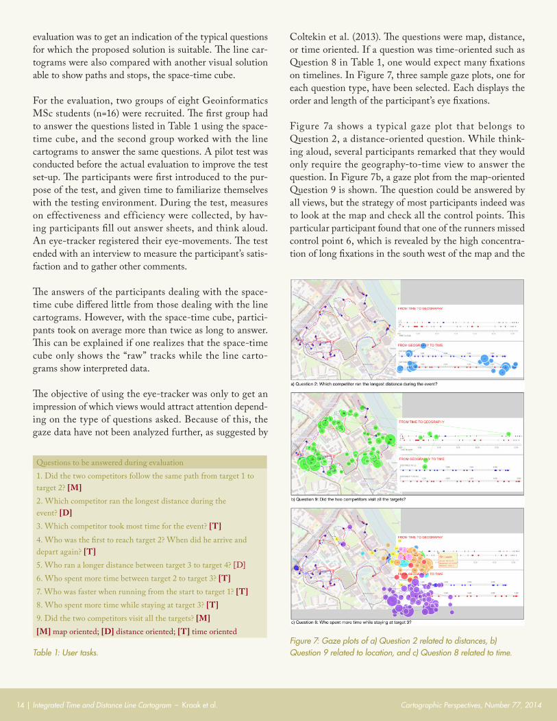
Coltekin et al. (2013). The questions were map, distance, or time oriented. If a question was time-oriented such as Question 8 in Table 1, one would expect many fixations on timelines. In Figure 7, three sample gaze plots, one for each question type, have been selected. Each displays the order and length of the participant’s eye fixations.
Figure 7a shows a typical gaze plot that belongs to Question 2, a distance-oriented question. While think-ing aloud, several participants remarked that they would only require the geography-to-time view to answer the question. In Figure 7b, a gaze plot from the map-oriented Question 9 is shown. The question could be answered by all views, but the strategy of most participants indeed was to look at the map and check all the control points. This particular participant found that one of the runners missed control point 6, which is revealed by the high concentra-tion of long fixations in the south west of the map and the
Table 1: User tasks.Figure 7: Gaze plots of a) Question 2 related to distances, b) Question 9 related to location, and c) Question 8 related to time.
Questions to be answered during evaluation1. Did the two competitors follow the same path from target 1 to target 2? [M]2. Which competitor ran the longest distance during the event? [D]3. Which competitor took most time for the event? [T]4. Who was the first to reach target 2? When did he arrive and depart again? [T]5. Who ran a longer distance between target 3 to target 4? [D]6. Who spent more time between target 2 to target 3? [T]7. Who was faster when running from the start to target 1? [T]8. Who spent more time while staying at target 3? [T]9. Did the two competitors visit all the targets? [M][M] map oriented; [D] distance oriented; [T] time oriented

Cartographic Perspectives, Number 77, 2014 Integrated Time and Distance Line Cartogram – Kraak et al. | 15
fixations on both distance and timelines near control point 6 as well. The participant probably used these to confirm his findings in the map. In Figure 7c, the gaze plots of all eight participants for the time-oriented Question 8 are shown. All but one participant used the time-to-ge-ography view to answer the question. This participant
mentioned in the think-aloud session that he did not un-derstand the line diagram very well. In all gaze plots of this participant, the gaze paths are extensive and mostly not in the relevant view. Of all participants, this one spent the most time looking at the screen before answering all of the questions.
CO N C L U S I O N
This paper introduced an alternative for looking at movement data from different perspectives. The move-ments are schematized into lines and distorted based on time or distance in order to answer specific location- or time-based questions. We implemented our alternative in a web environment using D3, with different linked views that allow a user to explore the nature of the movements. Its strength is the ability to compare multiple movements. A simple preliminary evaluation of the product showed it does perform as expected, and that it is able to answer time and space related questions.
The method is expected to lose its advantage with high vi-sual complexity. This is not necessarily due to the fact that
there are many movement trajectories to represent and/or many stops involved. Rather, the spatial and temporal distribution of both the trajectories and/or stops will ulti-mately decide on the complexity. However, some interac-tion technique to visually unclutter the trajectories while exploring the data, as used in the online bus example, can be helpful.
Dealing with both qualitative and quantitative attribute data on the time and distance lines (the integration of the flow map) will be one of the first follow-up steps in this project, as well as experimenting with many more tracks, which will require specific “comparison” functionality.
R E FE R E N C ES
Andrienko, G., N. Andrienko, P. Bak, D. Keim, and S. Wrobel. 2013. Visual Analytics of Movement. Berlin: Springer. doi:10.1007/978-3-642-37583-5.
Andrienko, N., and G. Andrienko. 2010. “Dynamic Time Transformation for Interpreting Clusters of Trajectories with Space-Time Cube.” Proceedings of the IEEE Conference on Visual Analytics Science and Technology 213–214. doi:10.1109/VAST.2010.5653580.
Avelar, S., and L. Hurni. 2006. “On the Design of Schematic Transport Maps.” Cartographica 41 (3): 217–228. doi:10.3138/A477-3202-7876-N514.
Bostock, M., V. Ogievetsky, and J. Heer. 2011. D3: Data-Driven Documents.” IEEE Transactions in Visualization & Computer Graphics 17 (12): 2301–2309. doi:10.1109/TVCG.2011.185.
Brunet, R. 1980. “La composition des modèles dans l’analyse spatiale.” L’Espace Géographique 8 (4): 253–265. doi:10.3406/spgeo.1980.3572.
Cabello, S., M. de Berg, and M. van Kreveld. 2005. “Schematization of Networks.” Computer Geometry: Theory & Applications 30 (3): 223–238. doi:10.1016/j.comgeo.2004.11.002.
Çöltekin, A., B. Heil, S. Garlandini, and S. I. Fabrikant. 2013. “Evaluating the Effectiveness of Interactive Map Interface Designs: A Case Study Integrating Usability Metrics with Eye-Movement Analysis.” Cartography and Geographic Information Science 36: 37–41. doi: 10.1559/152304009787340197.
Dykes, J., A. M. MacEachren, and M.-J. Kraak. eds. 2005. Exploring Geovisualization. Amsterdam: Elsevier.
Garland, K. 1994. Mr Beck’s Underground Map. London: Capital Transport.
Hägerstrand, T. 1970. “What about People in Regional Science?” Papers in Regional Science 24 (1): 7–24. doi:10.1111/j.1435-5597.1970.tb01464.x.

Cartographic Perspectives, Number 77, 201416 | Integrated Time and Distance Line Cartogram – Kraak et al.
Johnson, H., and E. S. Nelson. 1998. “Using Flow Maps to Visualize Time-Series Data: Comparing the Effectiveness of a Paper Map Series, a Computer Map Series, and Animation.” Cartographic Perspectives 30: 47–64. doi:10.14714/CP30.663.
Keim, D., J. Kohlhammer, G. Ellis, and F. Mansmann, eds. 2010. Mastering the Information Age: Solving Problems with Visual Analytics. Goslar: Eurographics Association.
Köbben, B. J. 2013. “Towards a National Atlas of the Netherlands as part of the National Spatial Data Infrastructure.” Cartographic Journal 50 (3): 225–231. doi:10.1179/1743277413Y.0000000056.
Kraak, M.-J. 2005. “Timelines, Temporal Resolution, Temporal Zoom and Time Geography.” Proceedings of the 22nd International Cartographic Conference, A Coruña Spain.
———. 2014. Mapping Time: Illustrated by Minard’s Map of Napoleon’s Russian Campaign of 1812. Redlands: Esri Press.
Palma, A. T., V. Bogorny, B. Kuijpers, and L. O. Alvares. 2008. “A Clustering-Based Approach for Discovering Interesting Places in Trajectories.” Proceedings of the 2008 ACM Symposium on Applied Computing 863–868. doi:10.1145/1363686.1363886.
Reimer, A. W. 2010. “Understanding Chorematic Diagrams: Towards a Taxonomy.” Cartographic Journal 47 (4): 330–350. doi:10.1179/000870410X12825500202896.
Roberts, J. C. 2005. “Exploratory Visualization with Multiple Linked Views.” In Exploring Geovisualization, edited by J. Dykes, A. M. MacEachren, and M.-J. Kraak, 159–180. Amsterdam: Elsevier. doi:10.1016/B978-008044531-1/50426-7.
Rosenberg, D., and A. Grafton. 2010. Cartographies of Time: a History of the Timeline. New York: Princeton Architectural Press.
Shimizu, E., and R. Inoue. 2009. “A New Algorithm for Distance Cartogram Construction.” International Journal of Geographical Information Science 23 (11): 1453–1470. doi:10.1080/13658810802186882.
Silva, S. F., and T. Catarci. 2002. “Visualization of Linear Time-Oriented Data: a Survey.” Journal of Applied Systems Studies 3: 454–478.
Spaccapietra, S., C. Parent, M. L. Damiani, J. A. de Macedo, F. Porto, and C. Vangenot. 2008. “A Conceptual View on Trajectories.” Data & Knowledge Engineering 65 (1): 126–146. doi:10.1016/j.datak.2007.10.008.
Tobler, W. 1987. “Experiments in Migration Mapping by Computer.” American Cartographer 14 (2): 155–163. doi:10.1559/152304087783875273.
———. 2004. “Thirty Five Years of Computer Cartograms.” Annals of the Association of American Geographers 94 (1): 58–73. doi:10.1111/j.1467-8306.2004.09401004.x.
Ullah, R., and M.-J. Kraak. 2014. “An Alternative Method to Constructing Time Cartograms for the Visual Representation of Scheduled Movement Data.” Journal of Maps, forthcomng. doi:10.1080/17445647.2014.935502.


![MCOM-05 Research Techique What is cartograms? ्नवयत्र क् ् ह् 26 Define Histogram. आिवृत आ^त वयत्र स] ... Pictogram & Cartogram .](https://static.fdocuments.in/doc/165x107/5acf45f97f8b9ac1478c9bbf/mcom-05-research-techique-what-is-cartograms-.jpg)


![Creating a Cartogram from Census data in QGIS · Cartogram plugin to create a Cartogram from census data. [Insert title here] | 3 | 1. This exercise requires the use of a set of training](https://static.fdocuments.in/doc/165x107/5f06ac3b7e708231d41929e7/creating-a-cartogram-from-census-data-in-qgis-cartogram-plugin-to-create-a-cartogram.jpg)


