09 141120064834-conversion-gate02-150305031153-conversion-gate01
Upload
lukeforster1801Category
view
47download
0
Initial Ideas
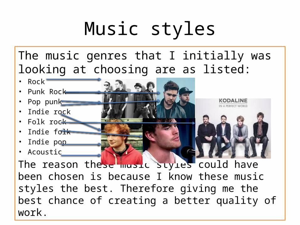
Music stylesThe music genres that I initially was looking at choosing are as listed:• Rock• Punk Rock• Pop punk • Indie rock• Folk rock• Indie folk • Indie pop• Acoustic
The reason these music styles could have been chosen is because I know these music styles the best. Therefore giving me the best chance of creating a better quality of work.

Potential publication title fonts
Rock genre: Indie fonts:
The reason all these fonts look similar is because they fit a theme they stand out they are different. This means they are perfect potential candidates for the font that I will use on my magazine.
The reason I have chosen these three fonts is because indie music is fairly refined and contemporary compared to rock. So I thought a clean and refined look would reflect the style of music if it used on my magazine.
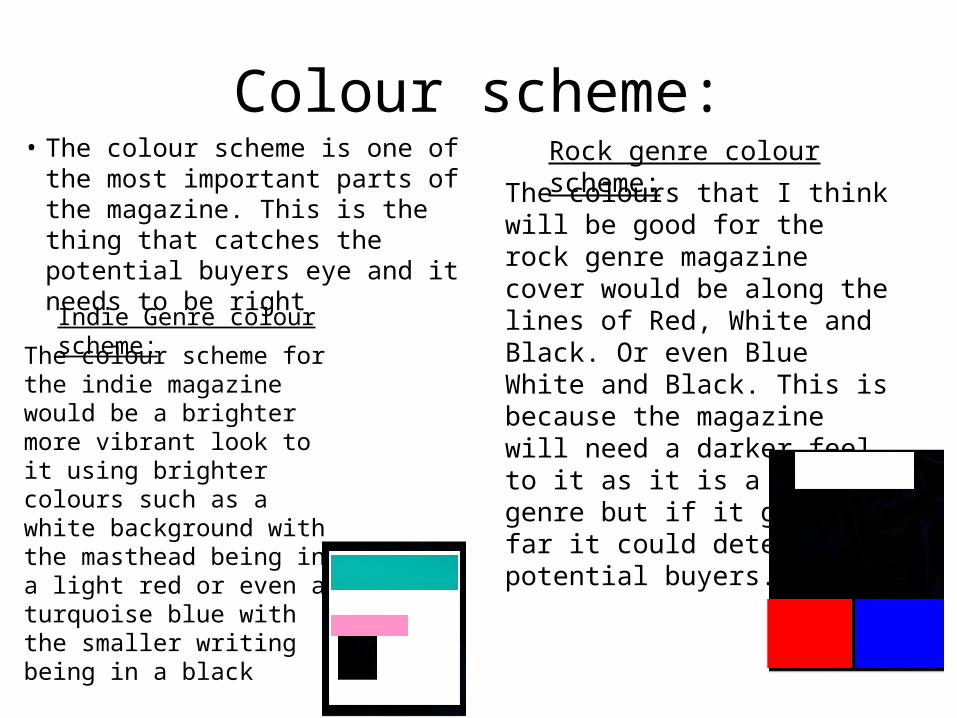
Colour scheme:• The colour scheme is one of the
most important parts of the magazine. This is the thing that catches the potential buyers eye and it needs to be right
Rock genre colour scheme:
The colours that I think will be good for the rock genre magazine cover would be along the lines of Red, White and Black. Or even Blue White and Black. This is because the magazine will need a darker feel to it as it is a harder genre but if it goes too far it could deter potential buyers.
Indie Genre colour scheme:
The colour scheme for the indie magazine would be a brighter more vibrant look to it using brighter colours such as a white background with the masthead being in a light red or even a turquoise blue with the smaller writing being in a black
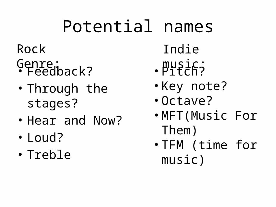
Potential names
• Feedback?• Through the stages?• Hear and Now?• Loud?• Treble
Rock Genre: Indie music:
• Pitch?• Key note?• Octave?• MFT(Music For
Them)• TFM (time for
music)

Favourite choices: Names
• FeedbackThe name feedback I think is the
perfect name if I was going to choose to do a rock magazine. This is due to it being a music term but also it represents that the consumer is getting feedback of this magazine. This double meaning made me choose this as my rock magazines Masthead. The colour I would use would most likely be a deep red with the handful of nothing font.
•Time for musicThe title time for music is the best choice for my indie genre type masthead. This is because it shows that the magazine is a music one from the start. The expression time for music could mean that its time to read this magazine or there is always time for music. The colour i think id use for this would be white or turquoise with the opposite filling the background.

Feature photos ideas
Rock genre: Indie genre:
The rock magazines feature images that we see all have the band in center stage. But the important part we are looking at is the costume and overall feel to the cover. It usually has a darker look to the cover with them wearing rougher looking clothes. E.G. leather jackets, jeans and so on.
On the other hand we see that the indie/ folk music artists like the two above are more refined and civilised look. The masthead usually has a cleaner look to it with the text also being nice and organised. There seems to be less chaos in a sense. The colour scheme is also well planned out making it look even better.