
Information gaps in multiple needs assessments in disaster ... · Information gaps in multiple...
54
Aldo Benini Patrice Chataigner Nadia Noumri Leonie Tax Michael Wilkins A note for ACAPS Information gaps in multiple needs assessments in disaster and conflict areas With guidelines for their measurement, using the Nepal 2015 earthquake assessment registry 16 February 2016
Transcript of Information gaps in multiple needs assessments in disaster ... · Information gaps in multiple...
Aldo BeniniPatrice ChataignerNadia NoumriLeonie TaxMichael Wilkins
A note for ACAPS
Information gaps in multiple needsassessments in disaster and conflict areas
With guidelines for their measurement,using the Nepal 2015 earthquake assessment registry
16 February 2016
2
Table of Contents
Abbreviations and acronyms ........................................................................................... 4
Summary ......................................................................................................................... 5
[Sidebar:] What constitutes gaps, and how do we measure them? ............................ 7
Introduction ................................................................................................................... 11
[Sidebar:] Information value and information gaps ................................................ 14
Precedents ..................................................................................................................... 18
Syria Needs Assessment Project (SNAP), 2014 ......................................................... 19
Ebola viral disease (EVD) in West Africa, 2014-15 ................................................... 22
Nigeria, 2014-15........................................................................................................ 24
Nepal, 2015 ............................................................................................................... 29
[Sidebar:] Information value and survey cost ......................................................... 36
The practicalities of measuring information gaps ........................................................... 38
Objective ................................................................................................................... 38
[Sidebar:] A scale of how usable the information is ............................................... 38
Building blocks ......................................................................................................... 40
Look-up results ...................................................................................................... 42
Overview results .................................................................................................... 44
Lists of units with large information gaps .............................................................. 46
Key technical elements .............................................................................................. 46
Outlook ......................................................................................................................... 47
[Sidebar:] Weighted information gaps and the idea of updating ............................. 49
Recommendation: Experiment and adapt ....................................................................... 51
References ..................................................................................................................... 52
3
Tables and Figures
Table 1: Obsolescence and redundancy in gap and value analysis .................................. 18
Table 2: Combinations of impact knowledge and priorities ............................................ 22
Table 3: Levels of information by sector, Sierra Leone, March 2015 ............................. 23
Table 4: Nepal - Steps in transforming the SoS to a timeline of sectoral information gaps
...................................................................................................................................... 32
Table 5: Nepal - Fraction of districts without recent assessment reports, by sector and date
...................................................................................................................................... 33
Table 6: The five levels of the information usability scale ............................................. 38
Figure 1: Visualization of the information gap dynamic ................................................... 7
Figure 2: A five-level scale to rate the "ability to prioritize" .......................................... 20
Figure 3: Severity, information and gap scores for the governorates of Syria ................. 21
Figure 4: Nigeria - Number of assessments, by sector, in affected LGAs, 2015.............. 25
Figure 5: Population, by IDP proportion and IPC phase, Nigeria ................................... 26
Figure 6: Relative assessment density, by IDP proportion and IPC phase, in Nigeria ..... 28
Figure 7: Granularity of assessment reports over time ................................................... 30
Figure 8: Needs assessment by 25 May 2015 - Districts and VDCs ............................... 31
Figure 9: Nepal - Information gaps over time ................................................................ 34
Figure 10: Co-incidence pattern of sectoral concerns (for the entire monitoring period) . 35
Figure 11: Nepal - Assessment gaps among seriously affected VDCs, July 2015 ........... 36
Figure 12: Value and cost of information over time, Iraq 2003 ...................................... 37
Figure 13: Information gap template – Conceptual diagram ........................................... 41
Figure 14: Parameters that the user sets ......................................................................... 42
Figure 15: Quick look-up whether a report meeting the criteria exists ............................ 43
Figure 16: Look-up whether any report covers a given sector, and how well .................. 44
Figure 17: Visualization of the information gap dynamic ............................................... 45
Figure 18: Lists of units with large information gaps ..................................................... 46
Figure 19: Belief updating and weighted information gaps ............................................ 50

4
Abbreviations and acronyms
ACAPS Assessment Capacity Project
DFID United Kingdom Department for International Development
EMAS Emergency Mine Action Survey
EVD Ebola Viral Disease
GIS Geographic Information System
IDP Internally displaced person
IPC Integrated Food Security Phase Classification
JRC European Union Joint Research Center
LGA Local Government Area
MIRA Multi-Sector Initial Rapid Assessment
MSNA Syria Multi-Sectoral Needs Assessment
NATF Needs Assessment Task Force
NFI Non-food items
NGO Non-governmental organization
OCHA United Nation Office for the Coordination of Humanitarian Affairs
OSOCC On-Site Operations Coordination Center
SNAP Syria Needs Analysis Project
UNDAC United Nations Disaster Assessment and Coordination
UNOCHA United Nations Office for Coordination of Humanitarian Affairs
VBA Visual Basic for Applications
VDC Village Development Committee
WASH The water, sanitation and hygiene sector
5
SummaryMonitoring information gaps
Assessment registries, formerly known as “surveys of surveys”, are databases about theflow of needs assessments in a crisis or disaster zone. Their purpose is twofold:
1. The registries are archives of shared humanitarian intelligence.2. They help monitor the distribution of the assessment effort, revealing coverage by
areas, social groups and sectors, as well as open and emerging gaps.
This note addresses the second function. It discusses concepts of information value andinformation gaps as well as key lessons from analyzing collections of assessment reportsin four recent crisis contexts. It presents a database template for future registries, suppliedin a companion Excel workbook. For greater authenticity, the template is filled withregistry data from the response to the Nepal earthquakes in 2015. The note is a continuationof an earlier technical note (Tatham 2011) and comes shortly after a 10-year review ofassessment reporting trends and methods (Tax and Noumri 2016).
Assessment resources are in short supply vis-à-vis urgent or difficult information demands.To the extent that agencies share their reports, a coordination body such as UNOCHA canmap the progress and quality of the combined effort. Plausibly, only one or two informationmanagement or assessment experts will be tasked to read and record the flow of reports ona daily basis. The experts will rarely be able to evaluate the reliability of the underlyingdata or the validity of the measures that the assessment teams pursued. But they can followcoverage as well as timeliness and shelf-life. They can also form a summary judgmentabout the degree of detail and the implied ability to prioritize.
PrecedentsIt is along these modest lines that we investigate the definition and dynamics of informationgaps. Also we review past efforts of tracking assessments in four crisis contexts andenumerate lessons learned from each of them:
· Syria: ACAPS’ involvement in the “Syria Needs Assessment Project (SNAP)” ledto the conclusion that the “ability to support solid judgments on the priority needsand to quantify needs on a sectoral level” was a reasonable and necessary standardin evaluating the usability and value of assessments. Moreover, in situations offrequent lack of access and patchy indicators, both the severity of situations and thequality of the assessment information were best measured on simple ordinal scales.Assessment gaps and priorities could be established by comparing the values ofgovernorates, districts, etc. on these scales.
· Ebola: ACAPS monitored the progress of sectoral assessments during the Ebolaviral disease (EVD) in West Africa, particularly in Sierra Leone and Liberia. Oneof the lessons was that assessment performance varied considerably across the sub-sectors within a given sector. For example, paradoxically, within the health sectorin Sierra Leone, the ability to prioritize was better in assessments that addressed theavailability of health care services than in those primarily concerned with disease
6
surveillance. Then and now the humanitarian community did not have astandardized list of sub-sectors; nevertheless, the ability to elucidate differences inseverity and priority between sub-sectors make assessments more valuable.
· Nigeria: ACAPS reviewed a year’s worth of assessment reports about the regionembroiled in the conflict with Boko Haram. In a novel database format, the analystscreated a record for each combination of report and covered Local GovernmentArea. They rated the quality of the information for each of 15 sectors and functionalareas. This enabled a simple form of information value estimate. Our secondaryanalysis shows that the humanitarian community effectively concentratedassessment efforts on the most severely affected accessible areas – a gratifyingconclusion.
· Nepal: During four months following the April 25, 2015 earthquake, a designatedassessment cell in Kathmandu recorded incoming assessment reports by the levelof administrative units. Already by the second week did the vast majority of reportsdetail their findings at the lowest gazetteered level – the Village DevelopmentCommittee -, a measure of rapid penetration of the affected terrain. Yet, over thecourse of the observation period, almost a fifth of all assessments were not thatspecific. This echoes the “multi-resolution problem” known from remote sensing;it makes it difficult to evaluate information gaps at the lower level. A secondchallenge arose from the obsolescence of information in the rapidly changingrecovery situation. Although the assessment effort achieved good coverage withinthe first month, two months later much of the information was outdated. Thehumanitarian community ramped assessments up again, in tune with preparationsfor the next funding cycle. Multi-resolution in space and decay over time thus arefactors that have to be modeled in information gap estimates.
PracticalitiesAfter the review of lessons learned, we turn to the practicalities of information gapmanagement in future humanitarian actions. We provide an Excel workbook template thattranslates the assessment registry information into a quick look-up facility, into usefulestimates of the gaps across the entire theater as well as into lists of units of interest byweighted assessment gaps:
· The quick look-up facility answers whether a unit of interest – a combinationof administrative area and sector, for example – has been covered by any recentassessment. It screens out those that have exceeded their shelf-life or fall shorton a scale of useful information on which the registry team rates every report.
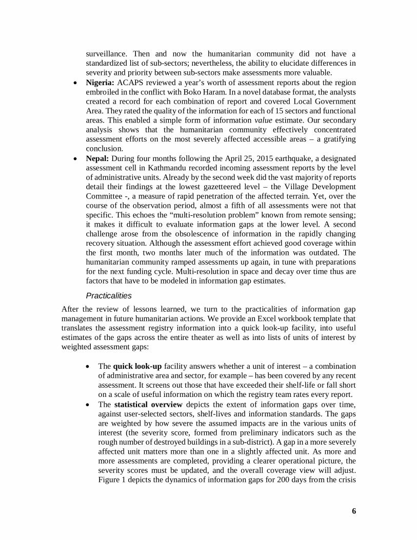
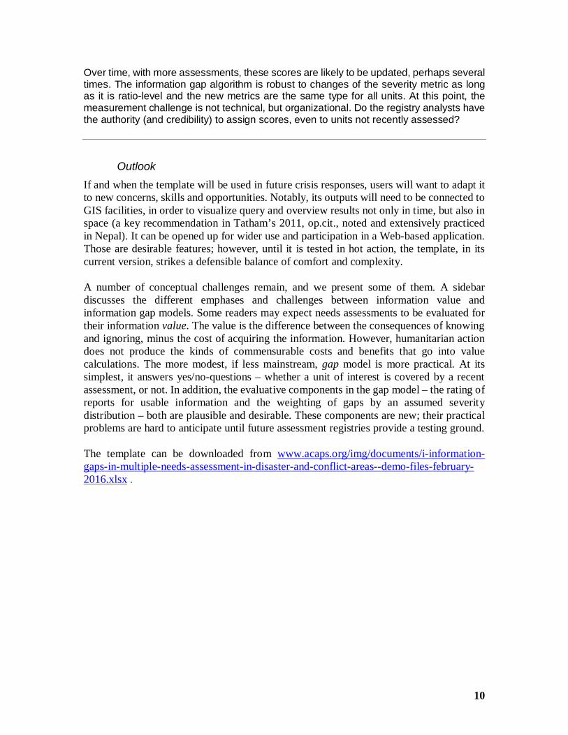
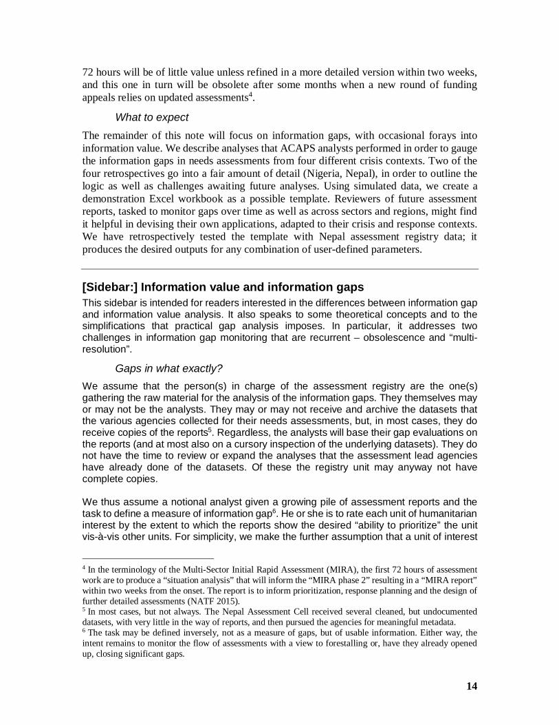
· The statistical overview depicts the extent of information gaps over time,against user-selected sectors, shelf-lives and information standards. The gapsare weighted by how severe the assumed impacts are in the various units ofinterest (the severity score, formed from preliminary indicators such as therough number of destroyed buildings in a sub-district). A gap in a more severelyaffected unit matters more than one in a slightly affected unit. As more andmore assessments are completed, providing a clearer operational picture, theseverity scores must be updated, and the overall coverage view will adjust.Figure 1 depicts the dynamics of information gaps for 200 days from the crisis
7
onset, calculated at three levels of resolution, in a simulated scenario withseverity beliefs about each local area and an information usability rating foreach area-sector combination in the assessment reports.
Figure 1: Visualization of the information gap dynamic
· The workbook produces shortlists of the regions, district, sub-districts with themost highly weighted information gaps. The lists update automatically when theuser changes a parameter.
The template has not been tested in the field, but it has been run with the registry databasefrom the response to the earthquakes in Nepal in 2015. It consistently produced the threeoutputs when we changed the parameters in its user interface. We have confidence that thetemplate can provide assessment registry teams with the core mechanisms that willfacilitate the rapid creation of an appropriate database in their specific circumstances. It isbuilt deliberately from basic Excel features, without resorting to macros or user-definedfunctions, thus lessening the need for outside expert support.
[Sidebar:] What constitutes gaps, and how do we measure them?We present the nutshell of a process model as well as a measurement model forinformation gaps. Describing the detailed transformations from registry entries to valueson the gap measure defies brief summary; they can be inspected in the Excel template.
Process modelInformation gaps are perceived shortfalls of received information against expectedinformation. Gaps can arise for any of the units of interest that are the object of needsassessments, such as for households, villages, sub-districts, etc. Our template works with
8
three hierarchical administrative levels, but this can be generalized to more or fewer levels,or to units other than administrative ones, such as IDP groups in camps, in hosthouseholds, etc. In multi-sectoral contexts, selecting the sectors in which assessmentsare expected to measure unmet humanitarian needs is necessary in order to define“expected information”; the template lets users make selections of sectors of concern.
Subscripting expected values with the letter E, the information gap G in unit of interest i attime t (in days since the crisis onset) arrives from
Git = 1 – { ∑sector [I(Ui ≥ UminE) * I(t – tpublished ≤ tmaxE)] / [count(sectorsE) * (1 + F)] }
where
U is the observed sector-wise usability of the information, and UminE the expectedminimum usabilitytpublished = the publication (or end of data collection) datetmaxE = the shelf life in daysI is the indicator function, which takes the value 1 if the condition is true, else 0∑sector is the sum over all sectors of the bracketed expression [..] before /count(sectorsE) is the number of sectors on which recent and usable informationwas expected, andF is a function of friction (due to incomparable categories, disparate samplesacross reports, or other sources of ambiguity in synthesizing, as well as due to theimpact of having to collect and evaluate multiple reports), across all sectors andreports concerning unit i in the interval [t-tmaxE, t].
In other words, we consider the user-defined set of sectors of interest. In it, we count thenumber of sectors for which the assessment information on unit of interest i at time tis both usable (by the set standard) and recent (not obsolete; shelf life not yet expired).We compare that to (= divide by) the number of sectors of interest. We further adjust thisvalue for the level of friction and subtract it from one.
Further, information gaps in more seriously impacted units of interest are considered moreserious, in proportion to severity.
Measurement modelThe usability ratings are assigned by registry analysts (on criteria detailed in the mainsection); the user can set the minimum expected level globally, i.e., gaps can be evaluatedfor different minimum levels, but only one at the time.
The shelf life, tmaxE , is also set globally. This is fine for comparisons at a given point intime. It is unrealistic in longitudinal views; assessment information perishes early in theearly phase, and afterwards tends to remain useful for progressively longer times. Atpresent, the user can visualize the gap timeline graph only for a given shelf life throughout.
Those measurement components are easy to handle, if somewhat inconvenient. The moreserious challenges are posed by the friction and by aggregation.
9
Friction: We make two stringent assumptions:
1. We have zero friction if, for the given unit of interest, there is at least one recentreport that covers all sectors of interest with usable information. As a result, theinformation gap is zero.
2. Conversely, if no recent report covers all sectors in that way, the friction isinsurmountable (tends to infinity), and the gap value is one (= 100%). This isregardless of whether all sectors might be covered by contributions from amongseveral recent usable reports, or not.
The second assumption implies that the coordination center is not able to synthesizereports to the point that enables prioritization, either because of reporting overload or dataincompatibility. This is unrealistic and causes gaps to be exaggerated. Practically the biashappens only if the unit of interest was the object of several recent assessments, such asby specialized agencies who reported separately.
The alternative – no friction ever; it doesn’t matter from how many different assessmentsthe information is gathered – produces fewer gaps. For completeness, the template doescompute this measure, but it is similarly unrealistic; in real-life knowledge managementthere is friction. A compromise (“Assume some friction”) is impractical for lack of aplausible evidence fusion mechanism when usability ratings differ across sectors.
To mitigate the lack of realism, the user interface provides a table displaying for a givenunit of interest which sectors are covered by any recent report(s). The table reports foreach sector the highest usability rating the all the reports relevant for this unit. This permitsa quick, holistic overview although not one condensed into one figure.
Aggregation: We posit that for a unit of interest at a higher level (e.g. a region) theinformation gap is zero if
1. it is zero due to the information collected about itself, or2. at least one of the elemental members (e.g., a district or sub-district) has a zero gap.
One has to pause and realize how unrealistic this measurement rule is. Thus a region canappear with a zero gap if only one village in it has been satisfactorily assessed. Its beauty,however, is dynamic – if in each of four regions one village has been visited, neverthelessthe four regions can be minimally differentiated by crisis impact or needs. Plus, while thealgorithm shows the regions covered, it also shows all their districts, sub-districts, villagesoutside the four visited ones as uncovered – and to these the attention will now turn – until,iteratively, assessment saturation is reached.
The gap value for all units of interest at a given hierarchical level (e.g., for all districts) isthe severity-weighted mean of the units’ gap values. The gap timeline graph is drawn onthis basis.
This presumes that all units at the lowest level have been assigned a severity score, asthe result of remote sensing, recent assessment visits, or imputation of contextual values(e.g., the median severity scores of the assessed villages in the district).
10
Over time, with more assessments, these scores are likely to be updated, perhaps severaltimes. The information gap algorithm is robust to changes of the severity metric as longas it is ratio-level and the new metrics are the same type for all units. At this point, themeasurement challenge is not technical, but organizational. Do the registry analysts havethe authority (and credibility) to assign scores, even to units not recently assessed?
OutlookIf and when the template will be used in future crisis responses, users will want to adapt itto new concerns, skills and opportunities. Notably, its outputs will need to be connected toGIS facilities, in order to visualize query and overview results not only in time, but also inspace (a key recommendation in Tatham’s 2011, op.cit., noted and extensively practicedin Nepal). It can be opened up for wider use and participation in a Web-based application.Those are desirable features; however, until it is tested in hot action, the template, in itscurrent version, strikes a defensible balance of comfort and complexity.
A number of conceptual challenges remain, and we present some of them. A sidebardiscusses the different emphases and challenges between information value andinformation gap models. Some readers may expect needs assessments to be evaluated fortheir information value. The value is the difference between the consequences of knowingand ignoring, minus the cost of acquiring the information. However, humanitarian actiondoes not produce the kinds of commensurable costs and benefits that go into valuecalculations. The more modest, if less mainstream, gap model is more practical. At itssimplest, it answers yes/no-questions – whether a unit of interest is covered by a recentassessment, or not. In addition, the evaluative components in the gap model – the rating ofreports for usable information and the weighting of gaps by an assumed severitydistribution – both are plausible and desirable. These components are new; their practicalproblems are hard to anticipate until future assessment registries provide a testing ground.
The template can be downloaded from www.acaps.org/img/documents/i-information-gaps-in-multiple-needs-assessment-in-disaster-and-conflict-areas--demo-files-february-2016.xlsx .
11
IntroductionMonitoring and measuring information gaps
This note is an extension of the earlier technical note “Survey of Surveys” (Tatham 2011).Surveys of surveys in the humanitarian world are registries of needs assessments and ofother data collections that were carried out in order to better know the situation of affectedpopulations as well as the actual distribution, use and effect of relief and protection efforts.Historically, the term “survey of surveys” goes back at least to the HumanitarianInformation Center that the United Nations operated in Kosovo in 1999, and may be evenolder. Such surveys became habitual through the work of subsequent HumanitarianInformation Centers. By 2002, UNOCHA put them on the same footing with “Who’s doingWhat Where (‘3W’)” and vulnerability mapping exercises “essential to improvecoordination of assistance” (Darcy and Hofmann 2003:54).
While the practice of these “surveys of surveys” has been sustained over the years, the termitself has become somewhat ancient; perhaps because of the very success and permanence,current lingo prefers “assessment registry”. This term is imbued with bureaucratic self-importance, but we shall not second-guess it and will use it in the remainder of this note.
The humanitarian community strives to form a picture of crisis conditions and essentialneeds as complete, accurate and rapid as possible. Increasingly it monitors its owninformation collection and analysis activities through coordination bodies such asUNOCHA 1 . Coordination improves the needs assessment flow by finding criticalinformation gaps early on. In this spirit, the objective of this note is to highlight conceptualchallenges that beset the measurement of such gaps. Universal solutions may not beavailable for all challenges, and pragmatic ones will vary from situation to situation. Anaccompanying Excel template demonstrates the mechanics of computing gap measures.These, as always, depend on assumptions – assumptions that may be plausible, if unproven.Moreover, templates have to be adapted to contexts, information needs and new skills.
The value of humanitarian informationHumanitarian agencies conduct needs assessments in a decision-making perspective. Theassessments help us understand what has happened and what is happening – and not onlythat. They are meant also to inform what likely will happen (in terms of the evolvinghumanitarian situation) as well as what should happen (in terms of an appropriate response).The needs profiles that they provide are expected to support decisions to allocate assistanceand protection resources.
Theoretically, therefore, the value of assessments can be conceptualized in the same wayas any other information used in decision making. In simplified terms, the value ofinformation is based on three quantities:
1. The expected utility of the outcome from a decision made using this information,
1 See the global registry at https://www.humanitarianresponse.info/en/assessments/map, listing 1,820assessments (as of 8 January 2016).
12
2. the utility of the outcome from a decision taken when information is absent(Wikipedia 2015b, Wikipedia 2015a), and finally
3. the cost of the information.
Utility and cost are comparable when their metrics can be mutually translated. This is mostobviously the case when both can be expressed in monetary terms. In this case, theinformation value equals utility-with-info minus (utility-without-info plus cost).
Such commensurability is absent from the outcomes of humanitarian action. Lives saved,persons protected and households assisted all have value, but these are not accessible to aunified metric. This would be true even if their production functions – e.g. the cost ofsaving a life – were perfectly known. Practically, this does not lower the value ofinformation from needs assessments. It is even plausible that in the last ten years it hasgone up because decisions have been made on growing resources. Between the UNhumanitarian appeals for 2006 and 2016 the number of persons targeted has tripled (from31 million to 90 million) while the total aid requested increased more than fourfold (fromUS$ 4.7 billion to 20.1 billion in 2015) (Banning-Lover 2015).
However, incommensurability has methodological consequences. It obliges us to lowerstandards for measuring information value. Resource allocations are not expected to befully determined by needs assessments (because the maximum utility across differenthumanitarian activities cannot be computed algorithmically). Instead, the assessmentsproduce a measure of severity, such as of unmet needs. The resources allocated aresupposed to be monotonously increasing in the severity measure. In simple language wewould say that the communities most severely impacted will be given priority for assistanceand protection.
The ability to prioritizeThe value of the assessment information then is in the “ability to prioritize”. This impliesthat the analyst can evaluate the information for its suitability to aid the ponderation ofpossible courses of action, and that there are criteria for this evaluation. The criteria can beborrowed from social research in general, but their applicability to needs assessments isless than straightforward:
We expect a needs assessment to deliver a valid measure of severity – the measure mustbe proportionate to an objective unmet need2. The validity of such a measure may beintuitively clear in sudden-onset disasters, such as when we express the severity of anearthquake by the number of destroyed buildings. In complex emergencies and persistentcrises, validity may be harder to establish. In a similar logic, we may at first stipulate thatthe assessment must be reliable – if different observers could look at the same situation,their evaluations would be identical. On second thought we realize that we cannot knowthe reliability until repeated measurements have been made and have been compared. Thismay happen for certain areas and sectors, but not always for all. Some are assessed onlyonce – or never.
2 If proportionality is too stringent a requirement, then at least the measure must be increasing with theunderlying need. This milder requirement is appropriate for ordinal severity scales.
13
These difficulties motivate us to make validity and reliability optional criteria for themeasurement of the information value of needs assessments (but, of course, not for thedesign of assessments). We may be able to approximately judge these qualities in someassessments. This may be done notably under in a systematic assessment registry formatwhen a supporting body such as ACAPS catalogues every published assessment report andrates them for their usefulness in decision-making. Usefulness, of course, is in the eye ofthe beholder; the evaluations by a distant registry may be miles apart from those of theinterested assessment teams or of the agencies commissioning the need assessments. Thepoint is that validity and reliability are hard to establish, but there are other aspects of needsassessments that are easier to learn from the reports – notably coverage, analytic value andspeed. Which areas did the assessment cover? What level of detail did it provide? Countingfrom the sudden onset date, when was the report made available, was it updated later, andwhen?
The presumption thus is changed. We now presume that if an assessment
· covers the areas affected (and the affected social groups living there),· speaks to key concerns of preserving life and dignity,· enables comparisons by areas, social groups or sectors,· and is available within useful time,
then its information is sufficient. If it meets these conditions, we presume adequate “abilityto prioritize”3. If this definition is acceptable, it holds also for multiple assessments – thosethat different agencies conduct and make mutually available. This, of course, is theprevailing situation in most of the larger crises and disasters. There is not one grand, all-encompassing needs assessment, but a stream of partial assessments, each with a differentcombination of coverage, scope and publication time.
A modest standardThis new standard, modest because it does not evaluate validity and reliability, isconsequential. It changes our optics. They shift from a preoccupation with informationvalue to the identification of information gaps. Gaps occur when assessments leave outaffected areas or groups, do not speak to needs critical for the preservation of life anddignity, or have not been updated for so long as to become obsolete.
These conditions are not self-explanatory. “Coverage” depends on the degree of resolution(“granularity”, administrative and household levels). Is it sufficient for an assessment toreport needs and resources at the district level? Or are situations within given districts sofundamentally divergent that only sub-district measures have practical value? Criticalneeds - and consequently in the response planning -, critical sectors are situational.Obsolescence is dynamic – in rapid-onset disasters the assessment produced within the first
3 One may debate whether analysts recording assessment reports in a central registry can meaningfullyevaluate the methodologies used. If one desires a rating for methodological adequacy, then one needs therelevant information from each report, the time and consistency to convert it to ratings, and a rule to penalizereports short on methodological notes – or to give them the benefit of the doubt.
14
72 hours will be of little value unless refined in a more detailed version within two weeks,and this one in turn will be obsolete after some months when a new round of fundingappeals relies on updated assessments4.
What to expectThe remainder of this note will focus on information gaps, with occasional forays intoinformation value. We describe analyses that ACAPS analysts performed in order to gaugethe information gaps in needs assessments from four different crisis contexts. Two of thefour retrospectives go into a fair amount of detail (Nigeria, Nepal), in order to outline thelogic as well as challenges awaiting future analyses. Using simulated data, we create ademonstration Excel workbook as a possible template. Reviewers of future assessmentreports, tasked to monitor gaps over time as well as across sectors and regions, might findit helpful in devising their own applications, adapted to their crisis and response contexts.We have retrospectively tested the template with Nepal assessment registry data; itproduces the desired outputs for any combination of user-defined parameters.
[Sidebar:] Information value and information gapsThis sidebar is intended for readers interested in the differences between information gapand information value analysis. It also speaks to some theoretical concepts and to thesimplifications that practical gap analysis imposes. In particular, it addresses twochallenges in information gap monitoring that are recurrent – obsolescence and “multi-resolution”.
Gaps in what exactly?We assume that the person(s) in charge of the assessment registry are the one(s)gathering the raw material for the analysis of the information gaps. They themselves mayor may not be the analysts. They may or may not receive and archive the datasets thatthe various agencies collected for their needs assessments, but, in most cases, they doreceive copies of the reports5. Regardless, the analysts will base their gap evaluations onthe reports (and at most also on a cursory inspection of the underlying datasets). They donot have the time to review or expand the analyses that the assessment lead agencieshave already done of the datasets. Of these the registry unit may anyway not havecomplete copies.
We thus assume a notional analyst given a growing pile of assessment reports and thetask to define a measure of information gap6. He or she is to rate each unit of humanitarianinterest by the extent to which the reports show the desired “ability to prioritize” the unitvis-à-vis other units. For simplicity, we make the further assumption that a unit of interest
4 In the terminology of the Multi-Sector Initial Rapid Assessment (MIRA), the first 72 hours of assessmentwork are to produce a “situation analysis” that will inform the “MIRA phase 2” resulting in a “MIRA report”within two weeks from the onset. The report is to inform prioritization, response planning and the design offurther detailed assessments (NATF 2015).5 In most cases, but not always. The Nepal Assessment Cell received several cleaned, but undocumenteddatasets, with very little in the way of reports, and then pursued the agencies for meaningful metadata.6 The task may be defined inversely, not as a measure of gaps, but of usable information. Either way, theintent remains to monitor the flow of assessments with a view to forestalling or, have they already openedup, closing significant gaps.
15
can be defined as the combination of a sector, region and point in time. Food security indistrict XYZ two weeks after an earthquake exemplifies the combination. Social groupsmay be added as a fourth dimension, but the logic of the argument will not be altered.Remembering what we said above about reliability and validity, the analyst may want torate the reports – and the units of interest that they cover – on these qualities, but in manycases this is unlikely to succeed.
The analyst must map the reports to the units of interest. This requires that the sectoral,geographic, administrative and temporal categories used in the reports can be mapped tothe analyst’s category system. For sectoral categories, usage may agree to a high degree.Problems arise only later when summary gap measures are to be defined, and the analystmust make a selection of those that he considers relevant for the immediate preservationof life and dignity (which may, for example, exclude “early recovery” as a sector). Let usassume that the analyst has a free hand in defining the set of relevant sectors for the gapanalysis.
The multi-resolution problemGeographic and administrative categories are more problematic, not by their definitions,but due to different levels and mixtures across reports. Let us again simplify by assumingthat the definitions are exhaustive, clear and completely respected by all assessmentteams. This is the case when both the normal national administration and the teamsconducting assessments in the crisis-affected region use the same reference system,such as the famed p-codes for administrative units. For example, in Nepal, it would appearthat both pre-earthquake practice and the needs assessment unit mastered this discipline,not least as the fruit of long preparations by national authorities and UN agencies. Someorganizations kept using different sets of p-codes, but there were reconciliation tables tomake their data compliant.
The problem arises from the different mixtures of data points between assessments and,in some cases, also from their imprecise reporting. Let us assume, for the sake ofillustration, that the disaster affects a province that encompasses five districts, each ofwhich is sub-divided into five sub-districts. For all three levels administrative definitionsand codes are complete. If every assessment report listed the sub-districts visited by itsteam, gaps could be neatly defined as sub-districts not visited by any teams (during therelevant period of time).
This is usually not the case across reports. Some of the reports may specify the exactsub-districts visited and thus allow for a record to be created in the registry database keyedby the unique tuple “lead agency x sub-district x publication date”7. For every such record,the attributes observed can be expanded, notably on the sectors covered or, if feasible,with ratings on validity and/or reliability.
Other reports, however, will be vague about the lowest-level units covered. They may saysomething like “the team visited two of the five sub-districts” or “visited the district head-quarters and several outlying towns and villages”. This reduces the granularity to “leadagency x district x publication date”. The reduction at first affects only the records basedon the particular report, but eventually, in the analysis of the full report set, the analyst willbe forced to settle for the district as the lowest level at which he can describe theinformation gaps. This is so because probabilistic statements on sub-districts not covered
7 Or equivalently written as (lead agency, sub-district, publication date)-tuple.
16
(of the kind “from what we know from this report, there is a 60 percent chance that sub-district XYZ was not visited”) are not practical in the analysis8.
In sum, we must expect that needs assessments are heterogeneous in the granularity ofthe administrative-geographic units that they report on. This forces compromises as to thelevel at which to conduct the analysis, with attendant loss of the higher resolution thatsome of the reports do provide. We get a map of gaps at the district level even if it is knownthat in some districts shown as “covered” particular sub-districts were never assessed.
Modeling obsolescenceA challenge arises also in the handling of the temporal dimension. The publication dateseems a useful measure of when the assessment information becomes available to theinterested consumers. But it is not always the best. It is less relevant in cases where keyfindings have been communicated prior to the formal release. And, in some contexts, oron some assessments, reports may never be formally published. The publication date issimilarly misleading where a formally released report gains attention slowly and partially,depending on consumers’ access and pre-existing perceptions. In terms of obsolescencethe date when the data collection was completed may be more meaningful if most of theassessment partners report it.
But these uncertainties are less serious in comparison to the question of how long thereleased information stays relevant, and from which point in time onwards it should bedismissed as obsolete. Intuitively, assessments become obsolete more slowly the moretime has elapsed, and greater stability has been regained, since the onset of the disaster.
Practical considerations will prevail in solving also this challenge. One can modelobsolescence in various ways. Ideally, we could arrange increasing shelf-life periods, i.e.increasingly delayed obsolescence cut-offs. Technically, a look-up table that defines cut-off times as a function of time since the crisis onset can take care of this. It would be morerealistic, but would likely tax the skills of some analysts and confuse the audience of theinformation gap findings. Thus a simple, constant rule is more appropriate. The rule maysay that
A unit X – e.g. a district x sector combination – at date Y is in gap condition if noassessment published less than Z days earlier covers it.
This Z value, e.g. three weeks, less than 22 days, is to be applied throughout theobservation period.
More and less important gapsAn omitted or poorly executed assessment creates a larger gap when it concerns a moreseverely affected unit of interest. Gaps should therefore be weighted by a severityindicator. The weights may warrant updating as the severity distribution becomes betterknown. We deal with this towards the end of this note. Weights are built into the template.
8 This does not mean that in other domains such probabilistic aggregation could not be modeled. In fact, suchalgorithms have been developed for the analysis of what is known as “multi-resolution” data, such as insatellite image fine-scale analysis. A Google Scholar search for “multi-resolution” AND “humanitarian”returns 292 references. Most of these concern applications with big data and physical measures.
17
Value vs. gap analysisThis is a good juncture to set the difference between information value and informationgap analysis into sharper relief. As the above gap rule implies, after a set number of daysthe value of a needs assessment instantly drops to zero. It is only by using such anassumption that a simple and persuasive gap model can be calculated. This starkrequirement does not apply to information value models. The information value does notevaporate instantly. Rather it decays over time, without ever being reduced to zero. Anexponential decay with a defined half-life is easy to model in a spreadsheet. The idea thatinformation gradually loses its value is more intuitive than abrupt obsolescence. Moreover,information remains valuable if it serves as a baseline or midline in later comparisons andfor the context that it provides for the interpretation of newer information.
Conversely, the information gap model, with a simple fixed shelf-life, is undisturbed by themultiplicity of assessments that are conducted, some of them in the same region andsector and with almost the same publication dates. The model is indifferent to the extentof overlap; the sole definitional requirement for a gap is that the unit of interest not becovered by any recent assessment.
In the information value perspective, this very overlap is a problem. Intuitively, twoassessments of the same unit of interest produce more information than just one. But howmuch more? To gauge the value of redundancy, ultimately the analyst must assume atransfer function of the kind that X overlapping assessments produce Y times the amountof the useful knowledge expected of a single assessment. One might adduce a far-fetchedanalogy with sampling theory – in order to double precision, the sample size has to growfour-fold. Analogously, the information value of overlapping assessments would be thesquare root of the sum of the values of the individual assessments. Such an intuition islegitimate, but the choice of aggregation function remains arbitrary9.
This table summarizes the challenges that gap and value analysis face with obsolescenceand redundancy.
9 Statistically minded readers may find the analogy with meta-analysis tempting (Wikipedia 2015c). Meta-analysis searches for a common truth in several pieces of research that speak to the same object, an ambitionthat can be assumed also for overlapping needs assessments. In fact, some meta-analytic approaches grapplewith similar multi-resolution challenges as they obtain in the world of needs assessments with incompletelower-level data (discussed further above in terms of districts and sub-districts), see e.g. Riley et al. (2008).However, the analogy is of limited value. Meta-analyses require that the contributing studies strictly estimatethe same kind of effect using the same metric. Overlapping needs assessments may not always use the sameeffect variables and may not define the experimental and control groups essential for effect size (or onlyindirectly, e.g. by stating locations so that some key baseline difference can be observed via other datasets,e.g. the local Modified Mercalli Scale values in an earthquake setting). The value of overlap results ratherfrom the concurrent assessments highlighting slightly different aspects and needs measures; thus theirredundancy can be evaluated in the triangulation perspective of qualitative research.
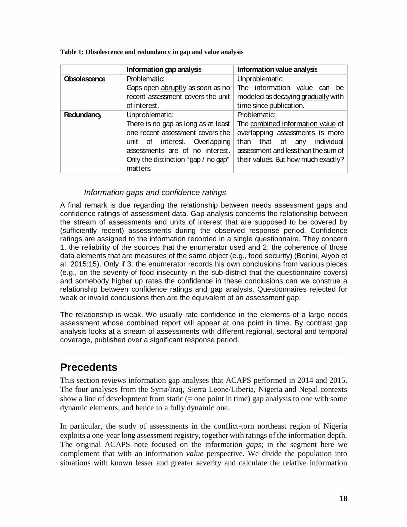
18
Table 1: Obsolescence and redundancy in gap and value analysis
Information gap analysis Information value analysisObsolescence Problematic:
Gaps open abruptly as soon as norecent assessment covers the unitof interest.
Unproblematic:The information value can bemodeled as decaying gradually withtime since publication.
Redundancy Unproblematic:There is no gap as long as at leastone recent assessment covers theunit of interest. Overlappingassessments are of no interest.Only the distinction “gap / no gap”matters.
Problematic:The combined information value ofoverlapping assessments is morethan that of any individualassessment and less than the sum oftheir values. But how much exactly?
Information gaps and confidence ratingsA final remark is due regarding the relationship between needs assessment gaps andconfidence ratings of assessment data. Gap analysis concerns the relationship betweenthe stream of assessments and units of interest that are supposed to be covered by(sufficiently recent) assessments during the observed response period. Confidenceratings are assigned to the information recorded in a single questionnaire. They concern1. the reliability of the sources that the enumerator used and 2. the coherence of thosedata elements that are measures of the same object (e.g., food security) (Benini, Aiyob etal. 2015:15). Only if 3. the enumerator records his own conclusions from various pieces(e.g., on the severity of food insecurity in the sub-district that the questionnaire covers)and somebody higher up rates the confidence in these conclusions can we construe arelationship between confidence ratings and gap analysis. Questionnaires rejected forweak or invalid conclusions then are the equivalent of an assessment gap.
The relationship is weak. We usually rate confidence in the elements of a large needsassessment whose combined report will appear at one point in time. By contrast gapanalysis looks at a stream of assessments with different regional, sectoral and temporalcoverage, published over a significant response period.
PrecedentsThis section reviews information gap analyses that ACAPS performed in 2014 and 2015.The four analyses from the Syria/Iraq, Sierra Leone/Liberia, Nigeria and Nepal contextsshow a line of development from static (= one point in time) gap analysis to one with somedynamic elements, and hence to a fully dynamic one.
In particular, the study of assessments in the conflict-torn northeast region of Nigeriaexploits a one-year long assessment registry, together with ratings of the information depth.The original ACAPS note focused on the information gaps; in the segment here wecomplement that with an information value perspective. We divide the population intosituations with known lesser and greater severity and calculate the relative information
19
value per group. While this analysis is retrospective, it has potential for ongoing monitoringof the allocation of assessment effort to more severely vs. less severely impacted groups.
The fourth study addresses the identification of information gaps in the assessment streamthat the Nepal earthquakes in 2015 set in motion. The Nepal assessment registry illustratesthe multi-resolution problem. A minority, but nevertheless substantial, proportion of theassessment reports stopped at the district level, not observing differences among sub-districts (“Village Development Committee” [VDC] areas in Nepal). We calculate thecoverage scores aggregated to the districts, giving away the VDC information. Thisproduces a gap measure for all affected districts, good enough for a modelling exercise inthis note, but not for practical monitoring of an assessment effort. In practice, meaningfulgap monitoring need also a weighting system based on severity – gaps in the assessmentsof more severely impacted areas and social groups ought to carry greater weight. In Nepalthis was well understood within a week or so after the first quake. Afterwards less affectedunits needed comparatively fewer assessment resources, and information gaps there wereconsidered less serious. We do not have weights in the Nepal dataset, but we will simulatethem in the demonstration template.
Finally, for conceptual reasons, in a sidebar we summarize also an older study – the onlyavailable one in the humanitarian realm that incorporates the cost of information.
Syria Needs Assessment Project (SNAP), 2014The assessment challenge in Syria
Gathering and sharing information on the humanitarian situation in Syria is politicallysensitive. Access to the field is severely restricted. These factors have been impeding theaccurate monitoring of needs in this country. At the time of the set-up of the “Syria NeedsAnalysis Project” (“SNAP”) in 2012, these challenges were compounded by the fact thatthree cross-border operations from Turkey, Lebanon and Jordan were de facto independentfrom each other, with limited coordination. While the ‘Whole of Syria’ approach,introduced in 2014, has addressed some of these challenges, the picture of the humanitariansituation remains incoherent and fragmented.
Until mid-2015, there is no centralized, publicly available assessment registry. But whileACAPS and MapAction operated the SNAP between 2013 and 2015, it served as asurrogate repository, albeit primarily for internal use.
ACAPS’ analysisIn ACAPS, the first conceptual developments on information gaps after the 2011 note(Tatham, op.cit.) emerged from the information landscape in Iraq and Syria. Leonie Tax,reviewing information available to the SNAP, devised an information gap scheme that wasforward-looking and closely tied to humanitarian decision-makers’ needs (Tax 2014). Herpoint of departure was the intuition that information needs increased apace with the severityof the humanitarian crisis. Information gathering efforts therefore needed to beconcentrated on the worst affected groups or areas. The effort needed to effectively closethe information gaps that prevented adequate decision making at every level of severity.
20
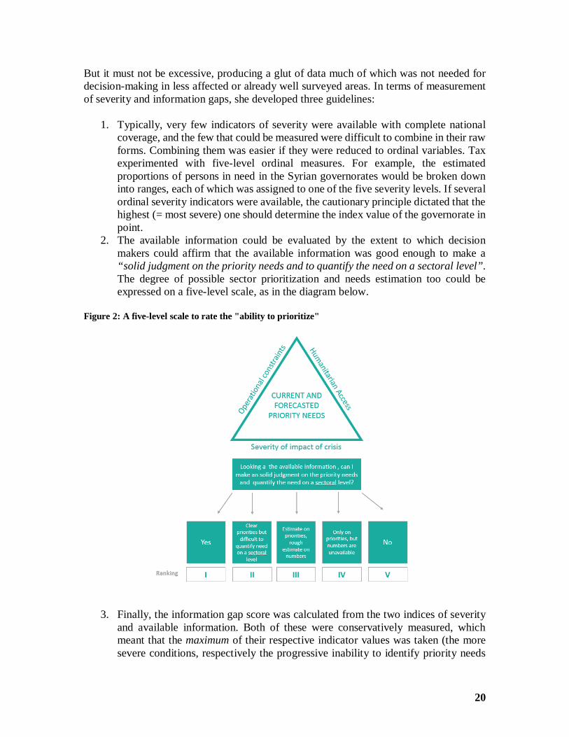
But it must not be excessive, producing a glut of data much of which was not needed fordecision-making in less affected or already well surveyed areas. In terms of measurementof severity and information gaps, she developed three guidelines:
1. Typically, very few indicators of severity were available with complete nationalcoverage, and the few that could be measured were difficult to combine in their rawforms. Combining them was easier if they were reduced to ordinal variables. Taxexperimented with five-level ordinal measures. For example, the estimatedproportions of persons in need in the Syrian governorates would be broken downinto ranges, each of which was assigned to one of the five severity levels. If severalordinal severity indicators were available, the cautionary principle dictated that thehighest (= most severe) one should determine the index value of the governorate inpoint.
2. The available information could be evaluated by the extent to which decisionmakers could affirm that the available information was good enough to make a“solid judgment on the priority needs and to quantify the need on a sectoral level”.The degree of possible sector prioritization and needs estimation too could beexpressed on a five-level scale, as in the diagram below.
Figure 2: A five-level scale to rate the "ability to prioritize"
3. Finally, the information gap score was calculated from the two indices of severityand available information. Both of these were conservatively measured, whichmeant that the maximum of their respective indicator values was taken (the moresevere conditions, respectively the progressive inability to identify priority needs
21
and to quantify them are assigned higher levels). The gap score, then, is theminimum of these two index values.
This minmax formula appears counterintuitive at first sight. However, it is based on thecorrect insight that the marginal value of additional information is higher when lessinformation is available to begin with, but this is moderated by the severity level.Conversely, the marginal value is higher when the crisis is more severe, but this in turn ismoderated by the information already collected.
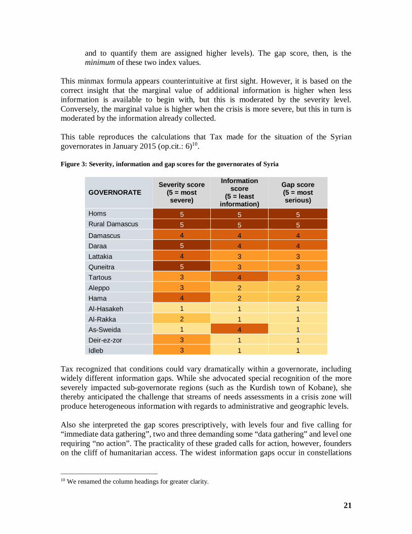
This table reproduces the calculations that Tax made for the situation of the Syriangovernorates in January 2015 (op.cit.: 6)10.
Figure 3: Severity, information and gap scores for the governorates of Syria
GOVERNORATESeverity score
(5 = mostsevere)
Informationscore
(5 = leastinformation)
Gap score(5 = mostserious)
Homs 5 5 5Rural Damascus 5 5 5Damascus 4 4 4Daraa 5 4 4Lattakia 4 3 3Quneitra 5 3 3Tartous 3 4 3Aleppo 3 2 2Hama 4 2 2Al-Hasakeh 1 1 1Al-Rakka 2 1 1As-Sweida 1 4 1Deir-ez-zor 3 1 1Idleb 3 1 1
Tax recognized that conditions could vary dramatically within a governorate, includingwidely different information gaps. While she advocated special recognition of the moreseverely impacted sub-governorate regions (such as the Kurdish town of Kobane), shethereby anticipated the challenge that streams of needs assessments in a crisis zone willproduce heterogeneous information with regards to administrative and geographic levels.
Also she interpreted the gap scores prescriptively, with levels four and five calling for“immediate data gathering”, two and three demanding some “data gathering” and level onerequiring “no action”. The practicality of these graded calls for action, however, founderson the cliff of humanitarian access. The widest information gaps occur in constellations
10 We renamed the column headings for greater clarity.
22
where severe conditions interdict access, resulting in far-reaching information black-outsin the first place.
The lasting value of Tax’s information gap concept is that it pioneered the “ability toprioritize” as the key criterion, rating gaps by the marginal value of additional informationgathering. This value depends on how much we already know, and how much we need toknow in response of situations that are more or less severe. The ratings, particularly of theinformation scores, may admit of a measure of subjectivity, but they are not arbitrary, giventhe sharp differences among units of interest.
Ebola viral disease (EVD) in West Africa, 2014-15The humanitarian challenge
The West African Ebola Virus epidemic was centered in Liberia, Guinea and Sierra Leone,starting in December 2013 and ongoing as recently as January 2016 (with a flare-up inSierra Leone) (Wikipedia 2016c). A massive international response focused on containingand extinguishing the epidemic. Much less attention was paid on the associatedhumanitarian needs in other sectors until the foreseeable end of the epidemic opened aspace for recovery concerns (Tax and Noumri 2015b). Various UN Clusters conducted orsupported assessments, on which they kept simple registries. A centralized inter-sectoralassessment registry did not exist.
ACAPS’ analysisACAPS followed the evolution of needs assessments in the Ebola-affected countries inWest Africa closely (besides being directly involved in the design and evaluation ofsurveys in Sierra Leone and Liberia). Its analysts kept a daily needs update, based on avariety of document types. Besides that, ACAPS evaluated formal assessment reports. Itpublished an gap analysis on the basis of reports released between December 2014 andmid-March 2015 (Tax and Noumri 2015a). The analysis was based on 67 reports fromSierra Leone and 48 from Liberia. As a general rule, coverage and quality of the completedassessments were highly variable.
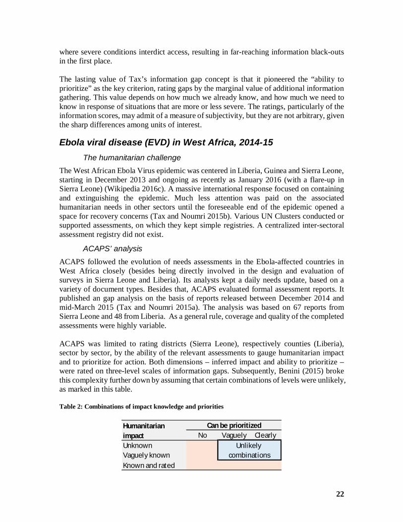
ACAPS was limited to rating districts (Sierra Leone), respectively counties (Liberia),sector by sector, by the ability of the relevant assessments to gauge humanitarian impactand to prioritize for action. Both dimensions – inferred impact and ability to prioritize –were rated on three-level scales of information gaps. Subsequently, Benini (2015) brokethis complexity further down by assuming that certain combinations of levels were unlikely,as marked in this table.
Table 2: Combinations of impact knowledge and priorities
No Vaguely ClearlyUnknownVaguely knownKnown and rated
Humanitarianimpact
Can be prioritized
Unlikelycombinations
23
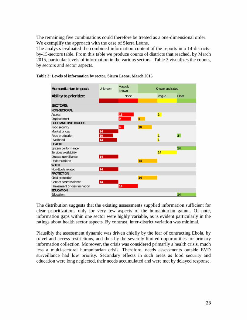
The remaining five combinations could therefore be treated as a one-dimensional order.We exemplify the approach with the case of Sierra Leone.The analysts evaluated the combined information content of the reports in a 14-districts-by-15-sectors table. From this table we produce counts of districts that reached, by March2015, particular levels of information in the various sectors. Table 3 visualizes the counts,by sectors and sector aspects.
Table 3: Levels of information by sector, Sierra Leone, March 2015
The distribution suggests that the existing assessments supplied information sufficient forclear prioritizations only for very few aspects of the humanitarian gamut. Of note,information gaps within one sector were highly variable, as is evident particularly in theratings about health sector aspects. By contrast, inter-district variation was minimal.
Plausibly the assessment dynamic was driven chiefly by the fear of contracting Ebola, bytravel and access restrictions, and thus by the severely limited opportunities for primaryinformation collection. Moreover, the crisis was considered primarily a health crisis, muchless a multi-sectoral humanitarian crisis. Therefore, needs assessments outside EVDsurveillance had low priority. Secondary effects in such areas as food security andeducation were long neglected, their needs accumulated and were met by delayed response.
Humanitarian impact: UnknownVaguelyknown
Ability to prioritize: Vague Clear
SECTORS:NON-SECTORALAccess 11 3Displacement 9 5FOOD AND LIVELIHOODSFood security 4 10Market prices 14Food production 10 1 3Livelihood 13 1HEALTHSystem performance 14Services availability 14Disease surveillance 14Undernutrition 14WASHNon-Ebola related 14PROTECTIONChild protection 14Gender based violence 14Harassment or discrimination 14EDUCATIONEducation 14
None
Known and rated
24
Nigeria, 2014-15The humanitarian situation
The war between the Nigerian authorities and the opposition movement “Boko Haram” hassince 2012 created an increasingly serious humanitarian situation in the northeastern statesof the country. The humanitarian response has concentrated on the food security, livelihoodsupport, health care and protection sectors. A number of needs assessments were carriedout, but have mostly remained incomplete due to security concerns and restricted access.
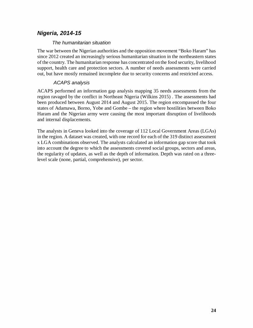
ACAPS analysisACAPS performed an information gap analysis mapping 35 needs assessments from theregion ravaged by the conflict in Northeast Nigeria (Wilkins 2015) . The assessments hadbeen produced between August 2014 and August 2015. The region encompassed the fourstates of Adamawa, Borno, Yobe and Gombe – the region where hostilities between BokoHaram and the Nigerian army were causing the most important disruption of livelihoodsand internal displacements.
The analysts in Geneva looked into the coverage of 112 Local Government Areas (LGAs)in the region. A dataset was created, with one record for each of the 319 distinct assessmentx LGA combinations observed. The analysts calculated an information gap score that tookinto account the degree to which the assessments covered social groups, sectors and areas,the regularity of updates, as well as the depth of information. Depth was rated on a three-level scale (none, partial, comprehensive), per sector.
25
Figure 4: Nigeria - Number of assessments, by sector, in affected LGAs, 2015
Source: Wilkins, op.cit.: 3
This case is of special interest for two reasons. First, the LGAs were characterized on twoindicators of humanitarian severity – the proportion of internally displaced persons (IDPs)in the total population, and then also by the Integrated Food Security Phase Classification(IPC) level (Wikipedia 2013). Second, a number of LGAs, particularly north and east ofthe city of Maiduguri in Borno State, had been inaccessible most of the time (assessmentsmay in part have been done by way of interviewing IDPs). While an IPC rating had been
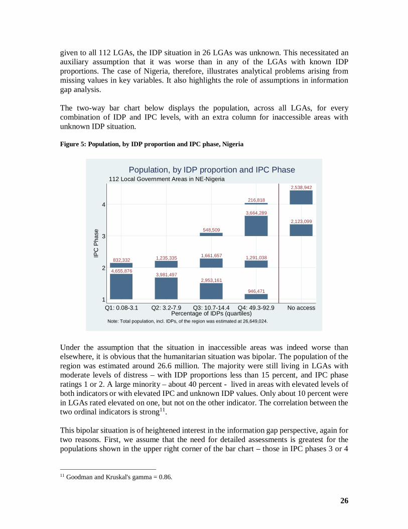
26
given to all 112 LGAs, the IDP situation in 26 LGAs was unknown. This necessitated anauxiliary assumption that it was worse than in any of the LGAs with known IDPproportions. The case of Nigeria, therefore, illustrates analytical problems arising frommissing values in key variables. It also highlights the role of assumptions in informationgap analysis.
The two-way bar chart below displays the population, across all LGAs, for everycombination of IDP and IPC levels, with an extra column for inaccessible areas withunknown IDP situation.
Figure 5: Population, by IDP proportion and IPC phase, Nigeria
Under the assumption that the situation in inaccessible areas was indeed worse thanelsewhere, it is obvious that the humanitarian situation was bipolar. The population of theregion was estimated around 26.6 million. The majority were still living in LGAs withmoderate levels of distress – with IDP proportions less than 15 percent, and IPC phaseratings 1 or 2. A large minority – about 40 percent - lived in areas with elevated levels ofboth indicators or with elevated IPC and unknown IDP values. Only about 10 percent werein LGAs rated elevated on one, but not on the other indicator. The correlation between thetwo ordinal indicators is strong11.
This bipolar situation is of heightened interest in the information gap perspective, again fortwo reasons. First, we assume that the need for detailed assessments is greatest for thepopulations shown in the upper right corner of the bar chart – those in IPC phases 3 or 4
11 Goodman and Kruskal's gamma = 0.86.
4,655,8763,981,497
2,953,161
946,471
832,332 1,235,335 1,661,657 1,291,038
548,509
3,664,289
2,123,099
216,818
2,538,942
4
3
2
1
IPC
Phas
e
Q1: 0.08-3.1 Q2: 3.2-7.9 Q3: 10.7-14.4 Q4: 49.3-92.9 No accessPercentage of IDPs (quartiles)
Note: Total population, incl. IDPs, of the region was estimated at 26,649,024.
112 Local Government Areas in NE-NigeriaPopulation, by IDP proportion and IPC Phase
27
and in the 4th IDP proportion quartile or with no access. At the same time, we expect thatthe density of assessments will be particularly low for inaccessible populations.
Second, because the analysts were able to rate the information depth, an information valueanalysis is feasible, at least of a rudimentary kind. This can complement the published gapanalysis. It is especially tempting because ACAPS observed the assessment flow during afull year. This allows us to model obsolescence – a feature that we will repeat later whenproposing elements for a generic gap analysis template.
For space reasons, we limit the presentation here to the description of the essential analysissteps and to answering the question whether indeed the assessment density (frequency andquality) was higher in the worse affected populations, and how dense it was for theinaccessible ones. We evaluate the information values of the assessments as of 15 August2015, the date when the observation period ended. The Excel workbook in which theanalysis was performed is available upon request.
The analysis proceeds through these steps:
· The raw material arrived as a table with 319 records, one for each observedcombination of assessment and LGA. The substantive variables of interest are thepublication date plus the aforementioned information depth ratings. ACAPSanalysts assigned 15 separate ratings to the different sectors, access and logistics aswell as social groups (displaced, residents, all)12. This makes for a theoreticalmaximum score sum of 15 * 2 = 30 over all 15 aspects. In each of the 319 records,we compute an information value as a function of the depth ratings and the timethat passed between publication and cut-off date. The information value comes intwo flavors. In the binary obsolescence model, the value is a function of the depthratings only if the assessment is younger that the expiry period; beyond that, theinformation value is zero. The discount factor model avoids abrupt decreases; in itthe information value decays exponentially by a half-life parameter. The first flavoris easier to understand, the second more realistic.
· In the next step, the 319 records, defined by assessment x LGA combinations, arecollapsed into 112 LGAs records, summing the information values from theprevious table. In the discount factor model, the sum of information values over allassessments in a given LGA is straightforward (the underlying idea is cumulativeknowledge over time). In the binary-obsolescence model, that sum is compared toa normative standard – the sum that would result if we had a recent assessmentproviding comprehensive information on every aspect. Given the vast differencesin the total population size across LGAs, the sums are multiplied with the respectivetotal LGA populations. This anticipates the population weighting in the next step.
12 It is easy to create, in a parameter sheet, switches that activate/deactivate any sub-set of the 15 informationdepth aspects and accordingly re-calculated information values throughout the workbook. For simplicity, forthis summary we leave all 15 active. The depth scale is ordinal by nature, and summing scores over theaspects is questionable. However, one might consider each variable as reflecting an item in a primitive Likertscale (Wikipedia 2011b) with three levels only and justify sums and means on this bold assumption.
28
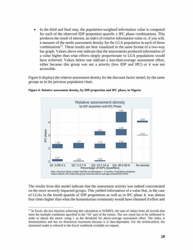
· In the third and final step, the population-weighted information value is computedfor each of the observed IDP proportion quartile x IPC phase combinations. Thisproduces the result of interest, an index of relative information value or, if you will,a measure of the needs assessment density for the LGA population in each of thosecombinations13. These results are best visualized in the same format of a two-waybar graph. Values above one indicate that the assessments produced information ofa value higher than what efforts simply proportionate to LGA populations wouldhave achieved. Values below one indicate a less-than-average assessment effort,either because this group was not a priority (low IDP and IPC) or it was notaccessible.
Figure 6 displays the relative assessment density for the discount factor model, by the samegroups as in the previous population chart.
Figure 6: Relative assessment density, by IDP proportion and IPC phase, in Nigeria
The results from this model indicate that the assessment activity was indeed concentratedon the more severely impacted groups. This yielded information of a value that, in the caseof LGAs in the fourth quartile of IDP proportions as well as in IPC phase 4, was almostfour times higher than what the humanitarian community would have obtained if effort and
13 In Excel, the key function achieving this calculation is SUMIFS, the sum of values from all records thatmeet the multiple conditions specified in the “ifs” part of the syntax. The raw result has to be calibrated inorder to obtain the metric using 1 as the threshold for above-average assessment effort. The index isdimensionless and has no theoretical maximum because it is data-dependent. For the technicalities, theinterested reader is referred to the Excel workbook available on request.
0.77 0.20 0.35
1.58 1.97 1.70 2.10
1.512.28
0.15
3.85
0.584
3
2
1
IPC
phas
e
Q1: 0.08-3.1 Q2: 3.2-7.9 Q3: 10.7-14.4 Q4: 49.3-92.9 No accessPercentage of IDPs (Quartiles)
Note: Discount factor model: Half-life of information = 3 months. Population-weighted.Values above one imply that group received above-average assessment effort.
by IDP proportion and IPC PhaseRelative assessment density
29
quality were uniformly distributed. Overall it seems the allocation of assessment resourceswas more responsive to difference in IPC phases than to those in IDP burdens. Whereassessment teams had access, they concentrated their efforts to a significant degree onpopulations more severely impacted. Trivially, the relative information values for the twogroups in the “no access” column are low.
The values from the binary-obsolescence model are similar, if more muted – e.g. 2.20instead of 3.85 for the IDP-Q4 x IPC 4 group singled out above.
The value of the Nigeria survey-of-surveys analysis lies in its ability to assess the “abilityto prioritize”, expressed by the depth of the sector information, in terms of humanitarianseverity. The information value measure developed for this purpose may not beimmediately intuitive for the readers. However, the premises on which it is built –information ages (obsolescence), and multiple assessments of the same groups are worthmore than just one assessment (redundancy) – should be philosophically acceptable. Thisanalysis weighted the information value by the local population size, a feature that may beappropriate in some situations, and less so in others.
Nepal, 2015The earthquake and the humanitarian response
In short succession, two earthquakes shook Nepal in spring 2015, on April 25 and May 12,killing more than 9,000 people (Wikipedia 2016a, Wikipedia 2016b). In the wake of thefirst quake, UNDAC established an On-Site Operations Coordination Center (OSOCC)14
in charge of doing situation analysis and reporting on the humanitarian impact of theearthquake. Later on, the cell was institutionalized within the UNOCHA office as theOCHA Assessment Cell, funded by DFID and in collaboration with UNOCHA15.
Assessment reports recordedA designated UNDAC/UNOCHA information officer in Kathmandu collected assessment-relevant documents. Eventually the collection grew to 230 documents published betweenApril 27 and August 19, 2015. The word “assessment” occurs in 137 of the document titles;other reports are called “situation report”, “update”, “summary of findings”, “cluster report”as well as a few other designations. For simplicity, we will henceforth refer to all as“assessment reports”. The officer logged the reports in a database with one or multiplerecords for a given record, depending on the number of distinctly assessed administrativeunits. This procedure expanded the table to 1,482 records. The combination of assessmentID and area ID becomes the primary record key.
For information gap purposes the attributes of interest consist of a set of binary indicatorsof whether the report covered certain sectors and of its publication date. The list of twelvesectors included “humanitarian access” and “logistics”, which one usually considersfunctions rather than substantive sectors.
14 http://www.unocha.org/what-we-do/coordination-tools/osocc-rdc/overview .15 Its work is still accessible at http://nepalassessments.github.io/ .
30
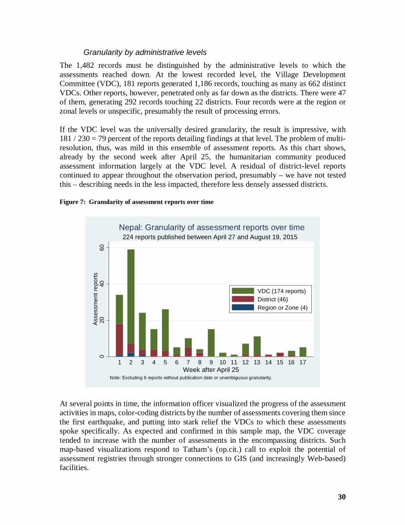
Granularity by administrative levelsThe 1,482 records must be distinguished by the administrative levels to which theassessments reached down. At the lowest recorded level, the Village DevelopmentCommittee (VDC), 181 reports generated 1,186 records, touching as many as 662 distinctVDCs. Other reports, however, penetrated only as far down as the districts. There were 47of them, generating 292 records touching 22 districts. Four records were at the region orzonal levels or unspecific, presumably the result of processing errors.
If the VDC level was the universally desired granularity, the result is impressive, with181 / 230 = 79 percent of the reports detailing findings at that level. The problem of multi-resolution, thus, was mild in this ensemble of assessment reports. As this chart shows,already by the second week after April 25, the humanitarian community producedassessment information largely at the VDC level. A residual of district-level reportscontinued to appear throughout the observation period, presumably – we have not testedthis – describing needs in the less impacted, therefore less densely assessed districts.
Figure 7: Granularity of assessment reports over time
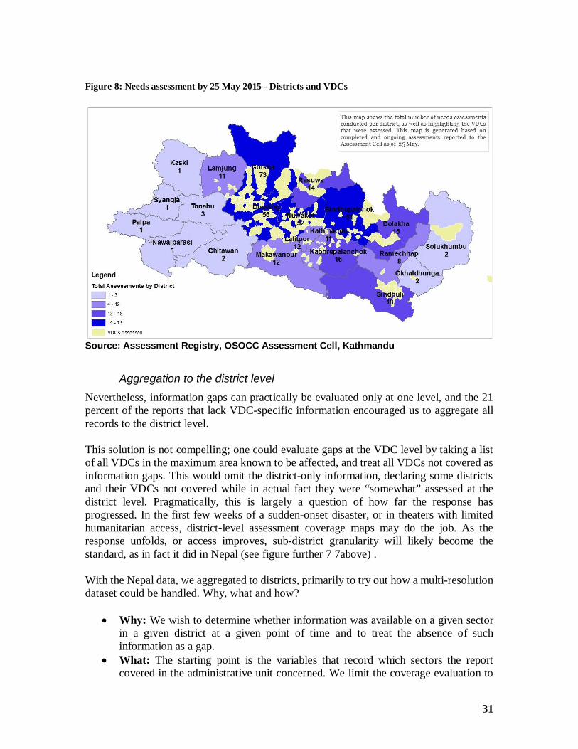
At several points in time, the information officer visualized the progress of the assessmentactivities in maps, color-coding districts by the number of assessments covering them sincethe first earthquake, and putting into stark relief the VDCs to which these assessmentsspoke specifically. As expected and confirmed in this sample map, the VDC coveragetended to increase with the number of assessments in the encompassing districts. Suchmap-based visualizations respond to Tatham’s (op.cit.) call to exploit the potential ofassessment registries through stronger connections to GIS (and increasingly Web-based)facilities.
020
4060
Asse
ssm
entr
epor
ts
1 2 3 4 5 6 7 8 9 10 11 12 13 14 15 16 17Week after April 25
Note: Excluding 6 reports without publication date or unambiguous granularity.
224 reports published between April 27 and August 19, 2015Nepal: Granularity of assessment reports over time
VDC (174 reports)District (46)Region or Zone (4)
31
Figure 8: Needs assessment by 25 May 2015 - Districts and VDCs
Source: Assessment Registry, OSOCC Assessment Cell, Kathmandu
Aggregation to the district levelNevertheless, information gaps can practically be evaluated only at one level, and the 21percent of the reports that lack VDC-specific information encouraged us to aggregate allrecords to the district level.
This solution is not compelling; one could evaluate gaps at the VDC level by taking a listof all VDCs in the maximum area known to be affected, and treat all VDCs not covered asinformation gaps. This would omit the district-only information, declaring some districtsand their VDCs not covered while in actual fact they were “somewhat” assessed at thedistrict level. Pragmatically, this is largely a question of how far the response hasprogressed. In the first few weeks of a sudden-onset disaster, or in theaters with limitedhumanitarian access, district-level assessment coverage maps may do the job. As theresponse unfolds, or access improves, sub-district granularity will likely become thestandard, as in fact it did in Nepal (see figure further 7 7above) .
With the Nepal data, we aggregated to districts, primarily to try out how a multi-resolutiondataset could be handled. Why, what and how?
· Why: We wish to determine whether information was available on a given sectorin a given district at a given point of time and to treat the absence of suchinformation as a gap.
· What: The starting point is the variables that record which sectors the reportcovered in the administrative unit concerned. We limit the coverage evaluation to
32
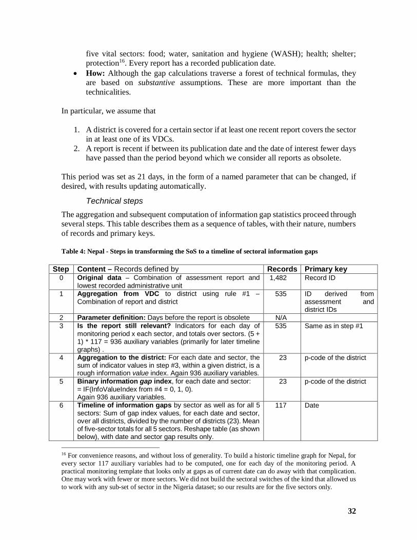
five vital sectors: food; water, sanitation and hygiene (WASH); health; shelter;protection16. Every report has a recorded publication date.
· How: Although the gap calculations traverse a forest of technical formulas, theyare based on substantive assumptions. These are more important than thetechnicalities.
In particular, we assume that
1. A district is covered for a certain sector if at least one recent report covers the sectorin at least one of its VDCs.
2. A report is recent if between its publication date and the date of interest fewer dayshave passed than the period beyond which we consider all reports as obsolete.
This period was set as 21 days, in the form of a named parameter that can be changed, ifdesired, with results updating automatically.
Technical stepsThe aggregation and subsequent computation of information gap statistics proceed throughseveral steps. This table describes them as a sequence of tables, with their nature, numbersof records and primary keys.
Table 4: Nepal - Steps in transforming the SoS to a timeline of sectoral information gaps
Step Content – Records defined by Records Primary key0 Original data – Combination of assessment report and
lowest recorded administrative unit1,482 Record ID
1 Aggregation from VDC to district using rule #1 –Combination of report and district
535 ID derived fromassessment anddistrict IDs
2 Parameter definition: Days before the report is obsolete N/A3 Is the report still relevant? Indicators for each day of
monitoring period x each sector, and totals over sectors. (5 +1) * 117 = 936 auxiliary variables (primarily for later timelinegraphs) .
535 Same as in step #1
4 Aggregation to the district: For each date and sector, thesum of indicator values in step #3, within a given district, is arough information value index. Again 936 auxiliary variables.
23 p-code of the district
5 Binary information gap index, for each date and sector:= IF(InfoValueIndex from #4 = 0, 1, 0).Again 936 auxiliary variables.
23 p-code of the district
6 Timeline of information gaps by sector as well as for all 5sectors: Sum of gap index values, for each date and sector,over all districts, divided by the number of districts (23). Meanof five-sector totals for all 5 sectors. Reshape table (as shownbelow), with date and sector gap results only.
117 Date
16 For convenience reasons, and without loss of generality. To build a historic timeline graph for Nepal, forevery sector 117 auxiliary variables had to be computed, one for each day of the monitoring period. Apractical monitoring template that looks only at gaps as of current date can do away with that complication.One may work with fewer or more sectors. We did not build the sectoral switches of the kind that allowed usto work with any sub-set of sector in the Nigeria dataset; so our results are for the five sectors only.
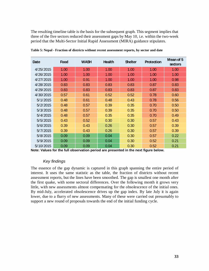
33
The resulting timeline table is the basis for the subsequent graph. This segment implies thatthree of the five sectors reduced their assessment gaps by May 10, i.e. within the two-weekperiod that the Multi-Sector Initial Rapid Assessment (MIRA) guidance stipulates.
Table 5: Nepal - Fraction of districts without recent assessment reports, by sector and date
Date Food WASH Health Shelter Protection Mean of 5sectors
4/25/2015 1.00 1.00 1.00 1.00 1.00 1.004/26/2015 1.00 1.00 1.00 1.00 1.00 1.004/27/2015 1.00 0.91 1.00 1.00 1.00 0.984/28/2015 0.83 0.83 0.83 0.83 0.87 0.834/29/2015 0.83 0.83 0.83 0.83 0.87 0.834/30/2015 0.57 0.61 0.52 0.52 0.78 0.60
5/1/2015 0.48 0.61 0.48 0.43 0.78 0.565/2/2015 0.48 0.57 0.39 0.35 0.70 0.505/3/2015 0.48 0.57 0.39 0.35 0.70 0.505/4/2015 0.48 0.57 0.35 0.35 0.70 0.495/5/2015 0.43 0.52 0.30 0.30 0.57 0.435/6/2015 0.39 0.43 0.26 0.30 0.57 0.395/7/2015 0.39 0.43 0.26 0.30 0.57 0.395/8/2015 0.09 0.09 0.04 0.30 0.57 0.225/9/2015 0.09 0.09 0.04 0.30 0.52 0.21
5/10/2015 0.09 0.09 0.04 0.30 0.52 0.21Note: Values for the full observation period are presented in the next figure below.
Key findingsThe essence of the gap dynamic is captured in this graph spanning the entire period ofinterest. It uses the same statistic as the table, the fraction of districts without recentassessment reports, but the lines have been smoothed. The gap is smallest one month afterthe first quake, with some sectoral differences. Over the following month it grows verylittle, with new assessments almost compensating for the obsolescence of the initial ones.By mid-July, accelerated obsolescence drives up the gap index. By late July it is againlower, due to a flurry of new assessments. Many of these were carried out presumably tosupport a new round of proposals towards the end of the initial funding cycle.
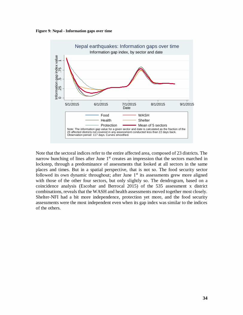
34
Figure 9: Nepal - Information gaps over time
Note that the sectoral indices refer to the entire affected area, composed of 23 districts. Thenarrow bunching of lines after June 1st creates an impression that the sectors marched inlockstep, through a predominance of assessments that looked at all sectors in the sameplaces and times. But in a spatial perspective, that is not so. The food security sectorfollowed its own dynamic throughout; after June 1st its assessments grew more alignedwith those of the other four sectors, but only slightly so. The dendrogram, based on acoincidence analysis (Escobar and Berrocal 2015) of the 535 assessment x districtcombinations, reveals that the WASH and health assessments moved together most closely.Shelter-NFI had a bit more independence, protection yet more, and the food securityassessments were the most independent even when its gap index was similar to the indicesof the others.
0.2
5.5
.75
1In
form
atio
nga
pin
dex
valu
e
5/1/2015 6/1/2015 7/1/2015 8/1/2015 9/1/2015Date
Food WASHHealth ShelterProtection Mean of 5 sectors
Note: The information gap value for a given sector and date is calculated as the fraction of the23 affected districts not covered in any assessment conducted less than 22 days back.Observation period: 117 days. Curves smoothed.
Information gap index, by sector and dateNepal earthquakes: Information gaps over time
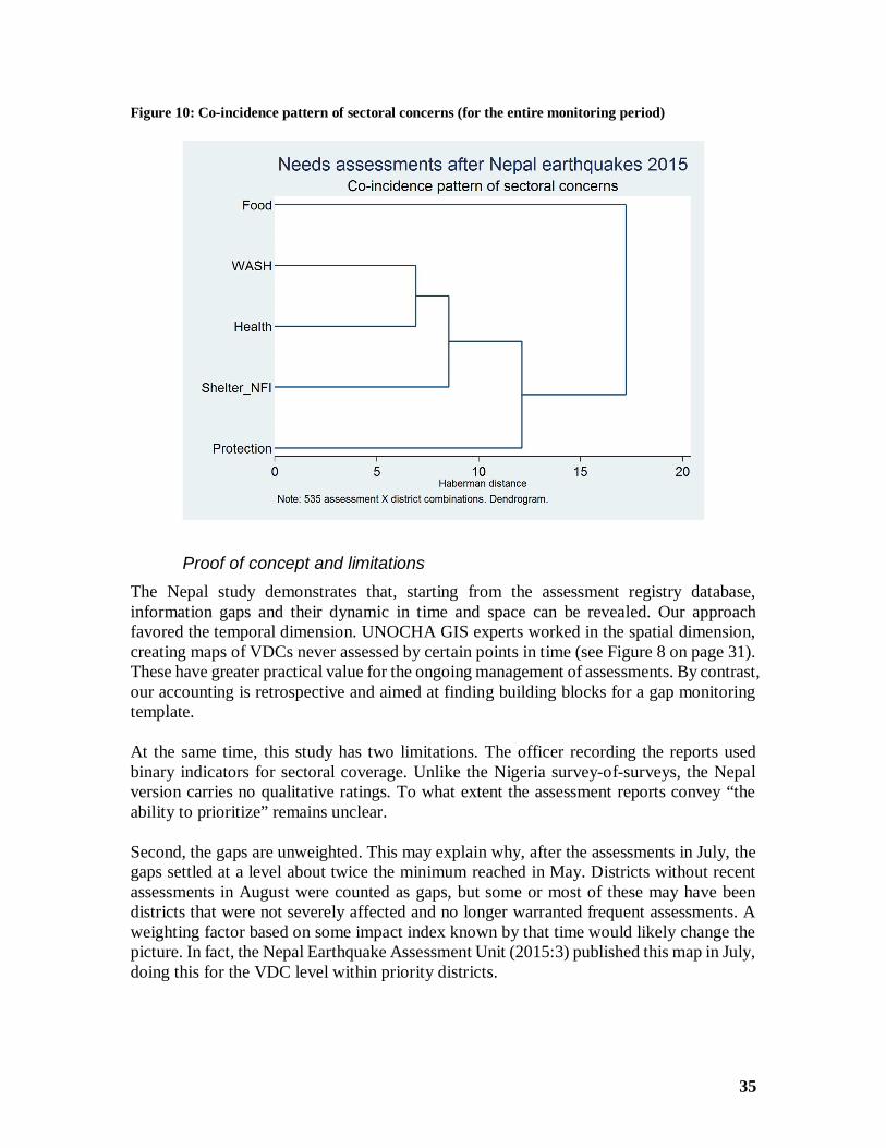
35
Figure 10: Co-incidence pattern of sectoral concerns (for the entire monitoring period)
Proof of concept and limitationsThe Nepal study demonstrates that, starting from the assessment registry database,information gaps and their dynamic in time and space can be revealed. Our approachfavored the temporal dimension. UNOCHA GIS experts worked in the spatial dimension,creating maps of VDCs never assessed by certain points in time (see Figure 8 on page 31).These have greater practical value for the ongoing management of assessments. By contrast,our accounting is retrospective and aimed at finding building blocks for a gap monitoringtemplate.
At the same time, this study has two limitations. The officer recording the reports usedbinary indicators for sectoral coverage. Unlike the Nigeria survey-of-surveys, the Nepalversion carries no qualitative ratings. To what extent the assessment reports convey “theability to prioritize” remains unclear.
Second, the gaps are unweighted. This may explain why, after the assessments in July, thegaps settled at a level about twice the minimum reached in May. Districts without recentassessments in August were counted as gaps, but some or most of these may have beendistricts that were not severely affected and no longer warranted frequent assessments. Aweighting factor based on some impact index known by that time would likely change thepicture. In fact, the Nepal Earthquake Assessment Unit (2015:3) published this map in July,doing this for the VDC level within priority districts.
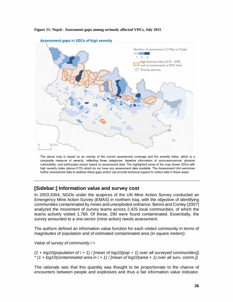
36
Figure 11: Nepal - Assessment gaps among seriously affected VDCs, July 2015
[Sidebar:] Information value and survey costIn 2003-2004, NGOs under the auspices of the UN Mine Action Survey conducted anEmergency Mine Action Survey (EMAS) in northern Iraq, with the objective of identifyingcommunities contaminated by mines and unexploded ordnance. Benini and Conley (2007)analyzed the movement of survey teams across 2,425 local communities, of which theteams actively visited 1,760. Of these, 290 were found contaminated. Essentially, thesurvey amounted to a one-sector (mine action) needs assessment.
The authors defined an information value function for each visited community in terms ofmagnitudes of population and of estimated contaminated area (in square meters):
Value of survey of community i =
(1 + log10(population of i + 1) / [mean of log10(pop + 1) over all surveyed communities])* (1 + log10(contaminated area in i + 1) / [mean of log10(area + 1) over all surv. comm.])
The rationale was that this quantity was thought to be proportionate to the chance ofencounters between people and explosives and thus a fair information value indicator.
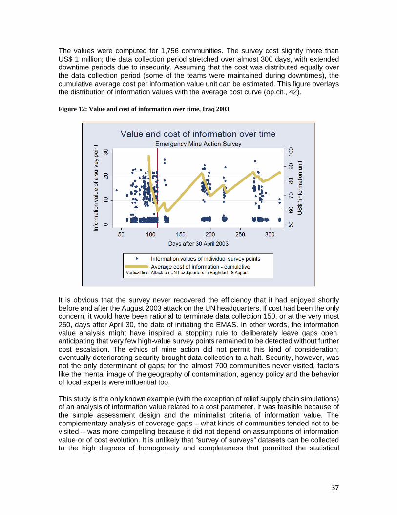
37
The values were computed for 1,756 communities. The survey cost slightly more thanUS$ 1 million; the data collection period stretched over almost 300 days, with extendeddowntime periods due to insecurity. Assuming that the cost was distributed equally overthe data collection period (some of the teams were maintained during downtimes), thecumulative average cost per information value unit can be estimated. This figure overlaysthe distribution of information values with the average cost curve (op.cit., 42).
Figure 12: Value and cost of information over time, Iraq 2003
It is obvious that the survey never recovered the efficiency that it had enjoyed shortlybefore and after the August 2003 attack on the UN headquarters. If cost had been the onlyconcern, it would have been rational to terminate data collection 150, or at the very most250, days after April 30, the date of initiating the EMAS. In other words, the informationvalue analysis might have inspired a stopping rule to deliberately leave gaps open,anticipating that very few high-value survey points remained to be detected without furthercost escalation. The ethics of mine action did not permit this kind of consideration;eventually deteriorating security brought data collection to a halt. Security, however, wasnot the only determinant of gaps; for the almost 700 communities never visited, factorslike the mental image of the geography of contamination, agency policy and the behaviorof local experts were influential too.
This study is the only known example (with the exception of relief supply chain simulations)of an analysis of information value related to a cost parameter. It was feasible because ofthe simple assessment design and the minimalist criteria of information value. Thecomplementary analysis of coverage gaps – what kinds of communities tended not to bevisited – was more compelling because it did not depend on assumptions of informationvalue or of cost evolution. It is unlikely that “survey of surveys” datasets can be collectedto the high degrees of homogeneity and completeness that permitted the statistical
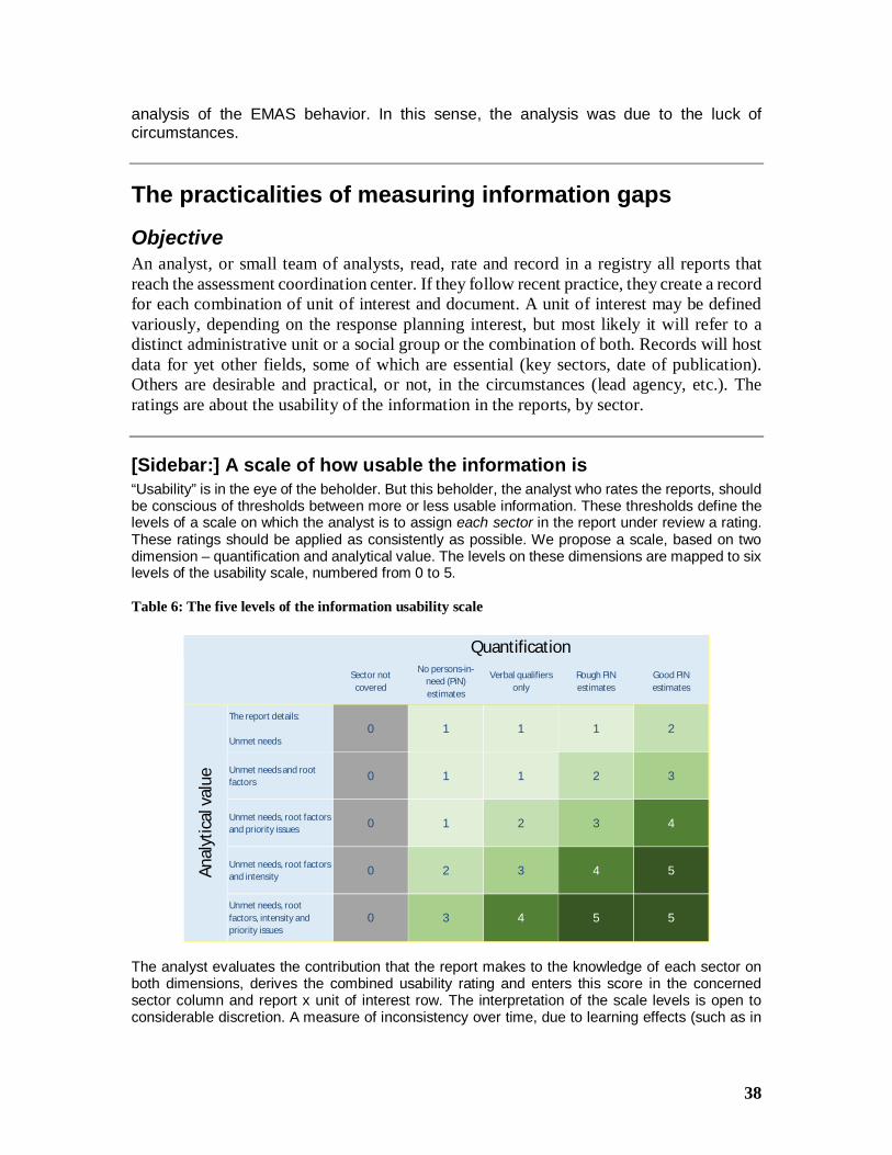
38
analysis of the EMAS behavior. In this sense, the analysis was due to the luck ofcircumstances.
The practicalities of measuring information gaps
ObjectiveAn analyst, or small team of analysts, read, rate and record in a registry all reports thatreach the assessment coordination center. If they follow recent practice, they create a recordfor each combination of unit of interest and document. A unit of interest may be definedvariously, depending on the response planning interest, but most likely it will refer to adistinct administrative unit or a social group or the combination of both. Records will hostdata for yet other fields, some of which are essential (key sectors, date of publication).Others are desirable and practical, or not, in the circumstances (lead agency, etc.). Theratings are about the usability of the information in the reports, by sector.
[Sidebar:] A scale of how usable the information is“Usability” is in the eye of the beholder. But this beholder, the analyst who rates the reports, shouldbe conscious of thresholds between more or less usable information. These thresholds define thelevels of a scale on which the analyst is to assign each sector in the report under review a rating.These ratings should be applied as consistently as possible. We propose a scale, based on twodimension – quantification and analytical value. The levels on these dimensions are mapped to sixlevels of the usability scale, numbered from 0 to 5.
Table 6: The five levels of the information usability scale
The analyst evaluates the contribution that the report makes to the knowledge of each sector onboth dimensions, derives the combined usability rating and enters this score in the concernedsector column and report x unit of interest row. The interpretation of the scale levels is open toconsiderable discretion. A measure of inconsistency over time, due to learning effects (such as in
Sector notcovered
No persons-in-need (PiN)estimates
Verbal qualifiersonly
Rough PiNestimates
Good PiNestimates
The report details:
Unmet needs0 1 1 1 2
Unmet needs and rootfactors 0 1 1 2 3
Unmet needs, root factorsand priority issues 0 1 2 3 4
Unmet needs, root factorsand intensity 0 2 3 4 5
Unmet needs, rootfactors, intensity andpriority issues
0 3 4 5 5
Quantification
Anal
ytic
alva
lue
39
the understanding of “intensity”) and to personnel turnover, may be unavoidable. Yet we trust thatthe intense daily exchanges within coordination centers promote conceptual agreement.
ProductsConceivably, the analysts will be asked for three types of products:
First, users will want a purely descriptive look-up facility to establish whether anassessment report exists that
· Concerns a particular unit of interest· Is no older than a certain number of days, counting back from a particular date
(practically, this will in most situations be the current date)· Speaks to a particular sector (or set of sectors), achieving the needed degree of
usable information or not.
Second, the consumers will want an overview of the assessment activities in terms ofinformation gaps opening and closing over time, for the entire theater. This task needs morethan description. For, naturally, assessment gaps in less severely affected units of interestought to matter less than those in the more severely affected ones. Gaps, therefore, have tobe weighted by a severity measure. However, the severity distribution is the result ofcomplete assessments; it is not known ex ante. This circle of the dog chasing its own tailcan be broken by using the initial assumptions of the humanitarian community, and thenperiodically updating them with the accepted assessment findings17. This requirement isnot without its conceptual problems: in order to serve as weights, the severity scale mustbe ratio-level. If justified, a single indicator with this property can be used, such as thenumber of displaced persons or of destroyed buildings. Else an index of sorts may have tobe improvised using several indicators, or – just as likely – the analysts have to go aroundeliciting expert beliefs, mapping them to a ratio scale, or even, faute de mieux, plug in theirown beliefs.
The third product too depends on severity-weighted gaps. The consumers will find theinstrument much more convenient if it offers an at-a-glance list of the units of interestwith the most highly weighted gaps.
What is needed, then, is a database template that meets the two functions – specific look-up as well as broad overview – and can be modified and expanded with relative ease.
A template and its applicationWe offer such a template in the shape of an Excel workbook. At first, we developed aminimalist template with two tables, one for units of interest, the other as an assessmentregistry:
17 For example, in the Nepal earthquakes, initial assumptions were detailed in the Joint Research Center’sremotely sensed “Nepal Earthquake Severity Index”, which itself underwent several updates (JRC 2015) andsubsequently was overtaken by the knowledge accumulating in the coordination center in Kathmandu.
40
1. Units of interest, with an impact scenario: The template has been populated withsub-districts contained in districts, which in turn are contained in regions, which fillthe affected country. For each sub-district, a severity score was generated,representing the initial beliefs of the humanitarian community.
2. Assessment registry: Concurrently, we populated an assessment registry withhundreds records created during the first 200 days after the onset of the crisis.Again, these numbers are entirely arbitrary. The basic set of fields includes therecord ID, the document ID and title, a date (of publication or end of fieldwork, asappropriate in the context), ID variables and names for the units of interest, as wellas the usability ratings for the sectors. By design, it is the combination of thedocument and the unit of interest that defines the record.
The challenge then is to transform those two sets of information into the desired products.Our Excel template outlines a possible architecture for this purpose. It is not necessarilythe best; there are other architectures conceivable. For simplicity, our does without macrosor functions that require coding (in Excel’s macro language VBA).
For authenticity, and because earlier in the note we have given considerable backgroundon this case, we then filled the template with the Nepal assessment registry data. It is inthis applied version that we present it here to the reader. The loss in generality is minimal:The Nepal registry evaluated only coverage, not usability. However, we have preserved thestructure that would calculate gaps reflecting a user-defined minimum usability level.Should a reader wish to populate the template with data from a registry with usabilityratings, these can be copied into ready columns; the formulas in the workbook will pickthem up and use them as arguments in the gap calculations.
Building blocksThis flow diagram compresses the template structure to its essentials while expressing keyconceptual distinctions and operations in the flow.
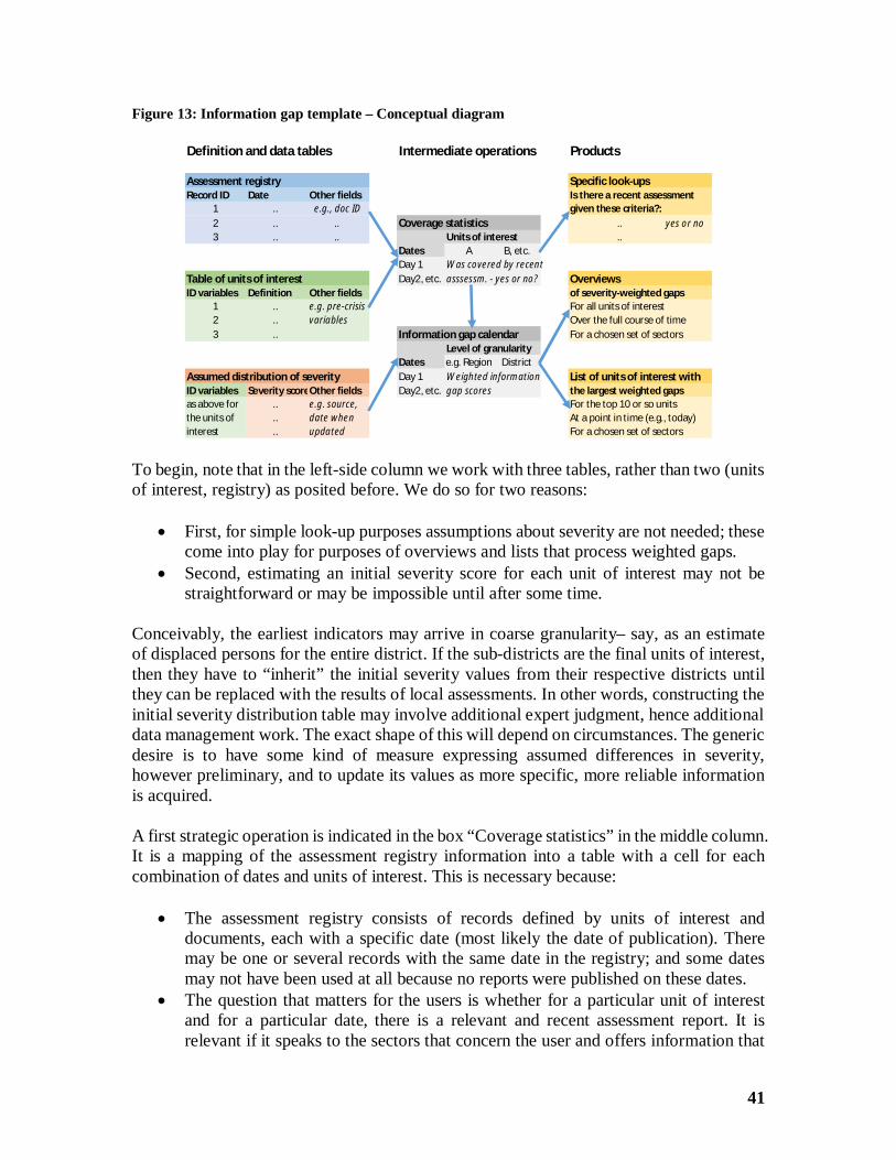
41
Figure 13: Information gap template – Conceptual diagram
To begin, note that in the left-side column we work with three tables, rather than two (unitsof interest, registry) as posited before. We do so for two reasons:
· First, for simple look-up purposes assumptions about severity are not needed; thesecome into play for purposes of overviews and lists that process weighted gaps.
· Second, estimating an initial severity score for each unit of interest may not bestraightforward or may be impossible until after some time.
Conceivably, the earliest indicators may arrive in coarse granularity– say, as an estimateof displaced persons for the entire district. If the sub-districts are the final units of interest,then they have to “inherit” the initial severity values from their respective districts untilthey can be replaced with the results of local assessments. In other words, constructing theinitial severity distribution table may involve additional expert judgment, hence additionaldata management work. The exact shape of this will depend on circumstances. The genericdesire is to have some kind of measure expressing assumed differences in severity,however preliminary, and to update its values as more specific, more reliable informationis acquired.
A first strategic operation is indicated in the box “Coverage statistics” in the middle column.It is a mapping of the assessment registry information into a table with a cell for eachcombination of dates and units of interest. This is necessary because:
· The assessment registry consists of records defined by units of interest anddocuments, each with a specific date (most likely the date of publication). Theremay be one or several records with the same date in the registry; and some datesmay not have been used at all because no reports were published on these dates.
· The question that matters for the users is whether for a particular unit of interestand for a particular date, there is a relevant and recent assessment report. It isrelevant if it speaks to the sectors that concern the user and offers information that
Definition and data tables Intermediate operations Products
Assessment registry Specific look-upsRecord ID Date Other fields Is there a recent assessment
1 .. e.g., doc ID given these criteria?:2 .. .. Coverage statistics .. yes or no3 .. .. Units of interest ..
Dates A B, etc.Day 1 Was covered by recent
Table of units of interest Day2, etc. asssessm. - yes or no? OverviewsID variables Definition Other fields of severity-weighted gaps
1 .. e.g. pre-crisis For all units of interest2 .. variables Over the full course of time3 .. Information gap calendar For a chosen set of sectors
Level of granularityDates e.g. Region District
Assumed distribution of severity Day 1 Weighted information List of units of interest withID variables Severity scoreOther fields Day2, etc. gap scores the largest weighted gapsas above for .. e.g. source, For the top 10 or so unitsthe units of .. date when At a point in time (e.g., today)interest .. updated For a chosen set of sectors
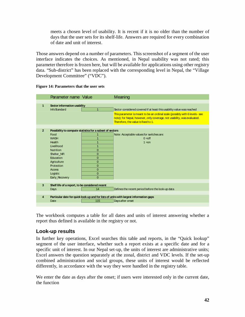
42
meets a chosen level of usability. It is recent if it is no older than the number ofdays that the user sets for its shelf-life. Answers are required for every combinationof date and unit of interest.
Those answers depend on a number of parameters. This screenshot of a segment of the userinterface indicates the choices. As mentioned, in Nepal usability was not rated; thisparameter therefore is frozen here, but will be available for applications using other registrydata. “Sub-district” has been replaced with the corresponding level in Nepal, the “VillageDevelopment Committee” (“VDC”).
Figure 14: Parameters that the user sets
The workbook computes a table for all dates and units of interest answering whether areport thus defined is available in the registry or not.
Look-up resultsIn further key operations, Excel searches this table and reports, in the “Quick lookup”segment of the user interface, whether such a report exists at a specific date and for aspecific unit of interest. In our Nepal set-up, the units of interest are administrative units;Excel answers the question separately at the zonal, district and VDC levels. If the set-upcombined administration and social groups, these units of interest would be reflecteddifferently, in accordance with the way they were handled in the registry table.
We enter the date as days after the onset; if users were interested only in the current date,the function
Parameter name Value Meaning
1 Sector information usabilityInfoStandard 1 Sector considered covered if at least this usability value was reached
2 Possibility to compute statistics for a subset of sectorsFood 1 Note: Acceptable values for switches are:WASH 1 0 =offHealth 1 1 =onLivelihood 1Nutrition 0Shelter_NFI 0Education 0Agriculture 0Protection 0Access 0Logistic 0Early_Recovery 0
3 Shelf life of a report, to be considered recentDays 14 Defines the recent period before the look-up data
4 Particular date for quick look-up and for lists of units with largest information gapsDate 115 Days after onset
This parameter is meant to be an ordinal scale (possibly with 6 levels - seenote); for Nepal, however, only coverage, not usability, was evaluated.Therefore, the value is fixed to 1.
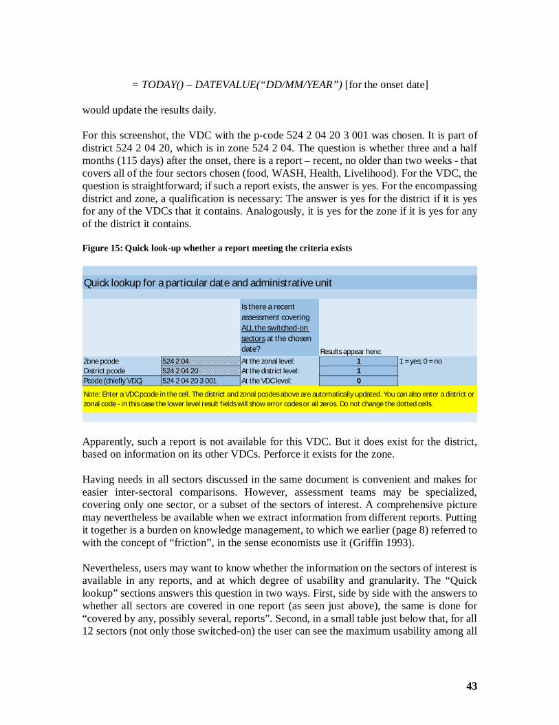
43
= TODAY() – DATEVALUE(“DD/MM/YEAR”) [for the onset date]
would update the results daily.
For this screenshot, the VDC with the p-code 524 2 04 20 3 001 was chosen. It is part ofdistrict 524 2 04 20, which is in zone 524 2 04. The question is whether three and a halfmonths (115 days) after the onset, there is a report – recent, no older than two weeks - thatcovers all of the four sectors chosen (food, WASH, Health, Livelihood). For the VDC, thequestion is straightforward; if such a report exists, the answer is yes. For the encompassingdistrict and zone, a qualification is necessary: The answer is yes for the district if it is yesfor any of the VDCs that it contains. Analogously, it is yes for the zone if it is yes for anyof the district it contains.
Figure 15: Quick look-up whether a report meeting the criteria exists
Apparently, such a report is not available for this VDC. But it does exist for the district,based on information on its other VDCs. Perforce it exists for the zone.
Having needs in all sectors discussed in the same document is convenient and makes foreasier inter-sectoral comparisons. However, assessment teams may be specialized,covering only one sector, or a subset of the sectors of interest. A comprehensive picturemay nevertheless be available when we extract information from different reports. Puttingit together is a burden on knowledge management, to which we earlier (page 8) referred towith the concept of “friction”, in the sense economists use it (Griffin 1993).
Nevertheless, users may want to know whether the information on the sectors of interest isavailable in any reports, and at which degree of usability and granularity. The “Quicklookup” sections answers this question in two ways. First, side by side with the answers towhether all sectors are covered in one report (as seen just above), the same is done for“covered by any, possibly several, reports”. Second, in a small table just below that, for all12 sectors (not only those switched-on) the user can see the maximum usability among all
Quick lookup for a particular date and administrative unit
Is there a recentassessment coveringALL the switched-onsectors at the chosendate? Results appear here:
Zone pcode 524 2 04 At the zonal level: 1 1 = yes; 0 = noDistrict pcode 524 2 04 20 At the district level: 1Pcode (chiefly VDC) 524 2 04 20 3 001 At the VDC level: 0
Note: Enter a VDC pcode in the cell. The district and zonal pcodes above are automatically updated. You can also enter a district orzonal code - in this case the lower level result fields will show error codes or all zeros. Do not change the dotted cells.
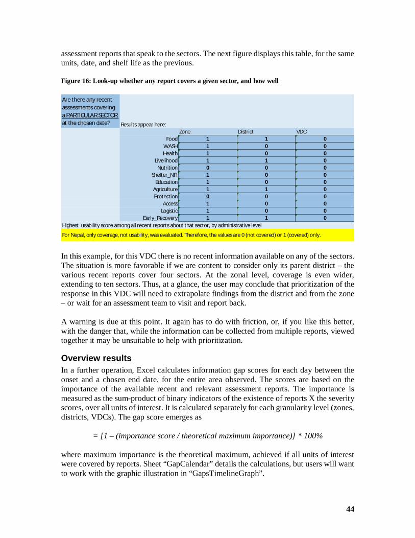
44
assessment reports that speak to the sectors. The next figure displays this table, for the sameunits, date, and shelf life as the previous.
Figure 16: Look-up whether any report covers a given sector, and how well
In this example, for this VDC there is no recent information available on any of the sectors.The situation is more favorable if we are content to consider only its parent district – thevarious recent reports cover four sectors. At the zonal level, coverage is even wider,extending to ten sectors. Thus, at a glance, the user may conclude that prioritization of theresponse in this VDC will need to extrapolate findings from the district and from the zone– or wait for an assessment team to visit and report back.
A warning is due at this point. It again has to do with friction, or, if you like this better,with the danger that, while the information can be collected from multiple reports, viewedtogether it may be unsuitable to help with prioritization.
Overview resultsIn a further operation, Excel calculates information gap scores for each day between theonset and a chosen end date, for the entire area observed. The scores are based on theimportance of the available recent and relevant assessment reports. The importance ismeasured as the sum-product of binary indicators of the existence of reports X the severityscores, over all units of interest. It is calculated separately for each granularity level (zones,districts, VDCs). The gap score emerges as
= [1 – (importance score / theoretical maximum importance)] * 100%
where maximum importance is the theoretical maximum, achieved if all units of interestwere covered by reports. Sheet “GapCalendar” details the calculations, but users will wantto work with the graphic illustration in “GapsTimelineGraph”.
Are there any recentassessments coveringa PARTICULAR SECTORat the chosen date? Results appear here:
Zone District VDCFood 1 1 0
WASH 1 0 0Health 1 0 0
Livelihood 1 1 0Nutrition 0 0 0
Shelter_NFI 1 0 0Education 1 0 0
Agriculture 1 1 0Protection 0 0 0
Access 1 0 0Logistic 1 0 0
Early_Recovery 1 1 0Highest usability score among all recent reports about that sector, by administrative level
For Nepal, only coverage, not usability, was evaluated. Therefore, the values are 0 (not covered) or 1 (covered) only.
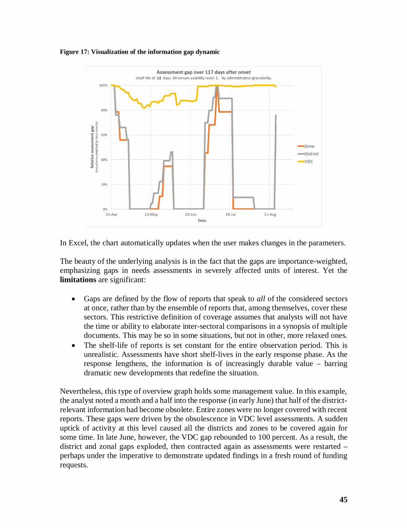
45
Figure 17: Visualization of the information gap dynamic
In Excel, the chart automatically updates when the user makes changes in the parameters.
The beauty of the underlying analysis is in the fact that the gaps are importance-weighted,emphasizing gaps in needs assessments in severely affected units of interest. Yet thelimitations are significant:
· Gaps are defined by the flow of reports that speak to all of the considered sectorsat once, rather than by the ensemble of reports that, among themselves, cover thesesectors. This restrictive definition of coverage assumes that analysts will not havethe time or ability to elaborate inter-sectoral comparisons in a synopsis of multipledocuments. This may be so in some situations, but not in other, more relaxed ones.
· The shelf-life of reports is set constant for the entire observation period. This isunrealistic. Assessments have short shelf-lives in the early response phase. As theresponse lengthens, the information is of increasingly durable value – barringdramatic new developments that redefine the situation.
Nevertheless, this type of overview graph holds some management value. In this example,the analyst noted a month and a half into the response (in early June) that half of the district-relevant information had become obsolete. Entire zones were no longer covered with recentreports. These gaps were driven by the obsolescence in VDC level assessments. A suddenuptick of activity at this level caused all the districts and zones to be covered again forsome time. In late June, however, the VDC gap rebounded to 100 percent. As a result, thedistrict and zonal gaps exploded, then contracted again as assessments were restarted –perhaps under the imperative to demonstrate updated findings in a fresh round of fundingrequests.
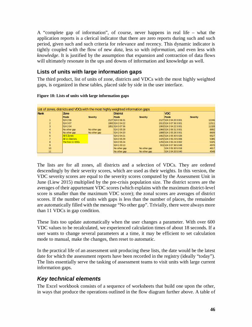
46
A “complete gap of information”, of course, never happens in real life – what theapplication reports is a clerical indicator that there are zero reports during such and suchperiod, given such and such criteria for relevance and recency. This dynamic indicator istightly coupled with the flow of new data, less so with information, and even less withknowledge. It is justified by the assumption that expansion and contraction of data flowswill ultimately resonate in the ups and downs of information and knowledge as well.
Lists of units with large information gapsThe third product, list of units of zone, districts and VDCs with the most highly weightedgaps, is organized in these tables, placed side by side in the user interface.
Figure 18: Lists of units with large information gaps
The lists are for all zones, all districts and a selection of VDCs. They are ordereddescendingly by their severity scores, which are used as their weights. In this version, theVDC severity scores are equal to the severity scores computed by the Assessment Unit inJune (Liew 2015) multiplied by the pre-crisis population size. The district scores are theaverages of their appurtenant VDC scores (which explains with the maximum district-levelscore is smaller than the maximum VDC score); the zonal scores are averages of districtscores. If the number of units with gaps is less than the number of places, the remainderare automatically filled with the message “No other gap”. Trivially, there were always morethan 11 VDCs in gap condition.
These lists too update automatically when the user changes a parameter. With over 600VDC values to be recalculated, we experienced calculation times of about 18 seconds. If auser wants to change several parameters at a time, it may be efficient to set calculationmode to manual, make the changes, then reset to automatic.
In the practical life of an assessment unit producing these lists, the date would be the latestdate for which the assessment reports have been recorded in the registry (ideally “today”).The lists essentially serve the tasking of assessment teams to visit units with large currentinformation gaps.
Key technical elementsThe Excel workbook consists of a sequence of worksheets that build one upon the other,in ways that produce the operations outlined in the flow diagram further above. A table of
List of zones, districts and VDCs with the most highly weighted information gapsRank Zone District VDC
Pcode Severity Pcode Severity Pcode Severity1 524 2 06 2127 524 2 06 31 2127 524 2 04 20 3 001 122462 524 3 07 1993 524 2 04 22 2013 524 3 07 36 3 001 115113 524 2 04 1851 524 3 07 36 1993 524 2 04 22 3 001 113284 No other gap No other gap 524 2 05 28 1966 524 2 06 31 3 001 88925 No other gap No other gap 524 2 04 20 1888 524 2 05 28 3 001 86096 All 5 Zones 524 2 04 21 1662 524 2 05 30 5 026 65277 All 11 Districts 524 2 05 29 1425 524 2 05 23 5 006 53858 The first 11 VDCs 524 2 05 24 1255 524 2 05 24 3 002 53259 524 1 03 13 915 524 3 07 36 5 049 4970
10 No other gap No other gap 524 2 05 30 5 018 461711 No other gap No other gap 524 2 04 20 5 040 4548
47
contents lists the (hyper-linked) sheets by title and function. A diagram demonstrates thearchitecture of the worksheets in greater detail than in this note.
It should be easy for the reader to understand which sheets cooperate in order to bring aboutthe various intermediate operations and results outlined in the flow diagram. Any practicaladaptation of the workbook to the requirements of a field-based crisis response andaccompanying assessment registry will need to preserve the major functions while fine-tuning the parameters and inter-sheet linkages.
The specifics of adaptation are not entirely foreseeable, but it is likely that several of theExcel functions that are key for the mechanics of this present template can be re-used.Some other Excel features will remain similarly important. Working with named ranges isalmost indispensable – the workbook is too complex to simply rely on R1C1-stylereferences in the formulas. Meanwhile the latest versions of Excel offer a more convenienttable syntax in which the template could be modernized. However, it is our impression thatthe majority of humanitarian information management personnel are not yet conversantwith the new style of referencing table elements across sheets.
The workhorse functions that carry the heavy load from sheet to sheet are few, but they aredemanding. In the main, they take several arguments, and some have to be entered as arrayformulas. These are particularly important:
SUMIFS, OFFSET, MATCH, INDEX, MMULT
beyond the more commonly known ones such as IF, COUNT, SUM, MAX, MIN. TheInternet offers ample help; an astute analyst will likely find improvements over the currentarchitecture. Thus, for example, while finishing the template, we discovered a work-aroundthat a blogger (DonkeyOte 2008) contributed in order to overcome the lack in Excel of aMAXIFS function – a device that we briefly demonstrate in the table at the bottom of theuser interface. It could be exploited further in future adaptations of the template.
Most of the devices that we have made use of may not find grace in the eyes of advancedExcel programmers. Many could be replaced, with greater elegance and versatility, withmacros and user-defined functions. However, the addition of such features would makeadaptations in the field increasingly dependent on expert support from agency headquarters.
OutlookOver the past ten years, the quality of humanitarian needs assessments – understood as theamount of useful information - has improved. This is the major finding of a worldwidereview in which ACAPS dissected the reports of 105 so-called “multisectoral coordinatedneeds assessments” (Tax and Noumri 2016). Tools to monitor assessment activities and toidentify information gaps early on have evolved in parallel. This at least can be surmisedlooking at ACAPS’ own learning curve across the four contexts for which we describe itsassessment analysis efforts. One might even adduce a distant analogy with the developmentof meta-analytic methods in statistics, in response to the multiplication of studies incomparable formats and to methodological progress at the individual study level. At the
48
same time, it is obvious that the effectiveness of assessment registries continues to dependon access, goodwill and rapid sharing. It is not by chance that Nepal, a natural disaster,hosted a registry cell right within a coordinating body in the country’s capital. The flowsof assessments in Syria, West Africa and Nigeria were recorded and analyzed in dispersedor remote locations, imposed by limited access, violence or the set-up of the humanitarianresponse itself. The Nepal registry benefitted from experience as well as local conditions.
On this cautiously optimistic note, we return to perspectives on the management ofinformation gaps. Gap identification is an implicit (and sometime explicit) part of the goalsof assessment registries; it is worth citing the list in which Tatham enumerated them forthe “surveys of surveys” of the time (op.cit.:3):
· “Promote a shared understanding of the situation regarding assessment datacollection in the field.
· Promote the temporal, geographic, and methodological harmonisation ofassessment field activities.
· Reduce assessment fatigue, duplication of effort and donor fatigue by identifyingcomplementary assessment plans and organizations for the purpose ofcollaboration.
· Highlight geographic and sectoral areas of overlap and gaps in assessmentinformation and locations.
· Facilitate access to assessment reports, and the aggregation of the results wherepossible.
· Assist in prioritising the allocation of support to organisations conductingassessments to ensure that the data collected results in useful and shareableinformation.
· Create a database of what assessments have been done as a guide for planningfuture field assessments and for assessments to be used as secondary data sourcesof information.
· Contain assessment information in a standard way that can be used to create morevalue-added information products such as maps, charts, and reports with theminimum resource requirements.”
These goals remain largely valid. But we add a couple nuances. Tatham envisionedassessment registries to generate summaries of key findings from among the recordedassessments. He exemplified this potential with a rapid synopsis sheet from Myanmar, withan entry for every surveyed township that provides population figures and a small text cellfor other information. We believe that assessment registries are not the proper place forsynoptic analyses of substantive variables. Either the various assessment agencies followthe same (or at least widely overlapping) formats, in which case data management andanalysis best follow procedures for multi-site surveys. This job then belongs to other
49
sections of the coordination structure18. Or the formats across assessments have littleoverlap and thus call for separate regional or sectoral analysis arrangements.
Assessment registries should pursue other emphases. To monitor information gapsmeaningfully, they should rate reports on their ability to help prioritize the response bysectors, or even sub-sectors. This requires creating and testing scales of how useful theinformation is, to be applied to every unit of interest and sector that the report beingrecorded covers. It further requires vigilance about the shelf-life of the assessments, withreasonable periods to obsolescence depending on the response phase.
We do go beyond Tatham’s recommendations in one point. Gaps should be weighted; theintuition is that missing out on an area or social group is the more harmful the more severelyits people are affected. The weights, however, have to come from some place – they haveto be decided and applied before severity measures covering all or most of the affectedunits become available. Short of these, beliefs about the distribution of severity can fill in.Every unit of potential interest – e.g., the communities in administrative gazetteer – can beassigned a score of assumed severity. The shape of this scale barely matters; our templatetranslates the severity-weighted gaps in a scale-free manner.
What does matter is the updating of these assumptions. If the ignorance of impacts iscomplete at the beginning, the severity scores are simply uniform. Typically, within a shorttime – in Nepal roughly within a week after the first earthquake – it is fairly reliably knownwhich areas and groups are the most severely hit. One can then proceed to updating theseverity score, perhaps in the shape of one prominent indicator such as IDPs, mixing thefirst observed values with assumed ones for the as yet unvisited units. Further updates canfollow apace with the expanding knowledge of the crisis.
[Sidebar:] Weighted information gaps and the idea of updatingThe idea of evaluating information gaps several times, with the importance of particulargaps changing with the latest knowledge of the severity of the crisis, is not immediatelyintuitive. This sequence of diagrams helps to understand it. Because of the limits ofvisualization on paper, we assume that the affected region can be validly represented injust one dimension, such as on an east-west axis.
· Panel 1 summarizes the assumptions that the humanitarian community makes inthe first encounter with the affected region. For lack of any specific knowledge, theinitial belief is that the impact is the same in all locations (equal height across theblue rectangle).
· Panel 2 reports the results of the first field assessments. The impact is significantlyunequally distributed, with a peak in the center of the region. This leads to
18 For example, in the Syria Multi-Sectoral Needs Assessment (MSNA), coverage control (chiefly throughdebriefings of returning enumerators) and data analysis were internally separated (Humanitarian LiaisonGroup 2014).
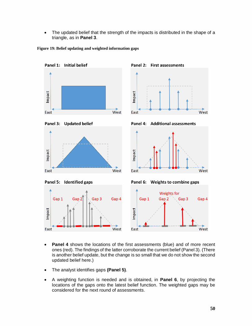
50
· The updated belief that the strength of the impacts is distributed in the shape of atriangle, as in Panel 3.
Figure 19: Belief updating and weighted information gaps
· Panel 4 shows the locations of the first assessments (blue) and of more recentones (red). The findings of the latter corroborate the current belief (Panel 3). (Thereis another belief update, but the change is so small that we do not show the secondupdated belief here.)
· The analyst identifies gaps (Panel 5).
· A weighting function is needed and is obtained, in Panel 6, by projecting thelocations of the gaps onto the latest belief function. The weighted gaps may beconsidered for the next round of assessments.
51
Our template has not yet implemented belief updating. It would be easy. The user wouldonly have to copy-paste updated severity indicator values into the ranges for regions,districts and sub-districts in the sheet “SeverityByAdminLevels”. The algorithm isindifferent to the source and meaning of the indicator (it can change with each updating,such as from Mercalli Scale readings to a compound socio-economic index). However, aratio-level indicator is required in order to have meaningful zero points and equal intervalsin the weights. An ordinal measure, such as the Integrated Food Security PhaseClassification (IPC), would call for a plausible ratio-level re-mapping (e.g., 1 à 1, 2 à 3,3à 6, 4 à 10).
The intent here is simply to expose a concept. There are algorithms for combiningevidence that would likely take care of the several challenges that we have met:redundancy in multiple assessments, multi-resolution, and sequential updating of beliefs(Wikipedia 2011a). They may be powerful, but would be hard to introduce to thehumanitarian information management community and would likely prove a distractionwhile our purpose can be met with simpler, universally understood tools.
Recommendation: Experiment and adaptThe updating concept is motivated by more than a need to weight information gaps. Withthe humility that we can always be wrong, we also accept that assessments are nothing butsystems of belief. Incorporating belief functions into assessment registries has twoadvantages. First, it encourages the responsible information officers to query the othercoordination units for the kinds of information that they need to fashion weights. Thisreinforces feedback loops. Second, while the culture of updating each other frequently isparamount in the humanitarian community, algorithms that do so systematically in largebodies of data are not commonplace. Yet, built-in updating is a powerful driver in the worldof data, from its fundamental place in modern statistics to the design of dynamic databasesto the ways airplanes are piloted. In a suitable form, an updating mechanism should behelpful also in databases that monitor the flow of needs assessments.
Our recommendation therefore is simple and direct. Take this template, study its coremechanisms, rip it apart and rebuild it in a version that ensures your ability to monitorinformation gaps – test it in the real world and update the community of practitioners withyour challenges and successes.
The template file can be downloaded from www.acaps.org/img/documents/i-information-gaps-in-multiple-needs-assessment-in-disaster-and-conflict-areas--demo-files-february-2016.xlsx .
52
References
Banning-Lover, R. (2015, 8 December 2015). "Nine charts that show why the UN'shumanitarian appeal costs $20bn." London. The Guardian, fromhttp://www.theguardian.com/global-development-professionals-network/2015/dec/08/why-the-un-humanitarian-aid-appeal-20-billion-dollars-nine-charts?CMP=share_btn_fb.
Benini, A. (2015). Sierra Leone: Information gaps in monitoring the EVD crisis. A notefor ACAPS (Internal document, 7 April 2015). Geneva, Assessment Capacity Project(ACAPS).
Benini, A., M. S. Aiyob, P. Chataigner and B. Munsch (2015). Confidence in NeedsAssessment Data. The use of confidence ratings in the Syria Multi-Sectoral NeedsAssessment (MSNA) [1 April 2015]. Geneva and Beirut, ACAPS and MapAction.
Benini, A. and C. E. Conley (2007). "Rapid Humanitarian Assessments and Rationality: AValue-of-Information Study of a Recent Assessment in Iraq." Disasters 31(1): 29−48.
Darcy, J. and C.-A. Hofmann (2003). According to Need? Needs Assessment andDecision-Making in the Humanitarian Sector, HPG Report 15, September. London,Overseas Development Institute.
DonkeyOte. (2008). "Needs a MAXIFS function (similar to SUMIFS) [Aug 14th, 2008]."MrExcel.com. Retrieved 7 January 2016, from http://www.mrexcel.com/forum/excel-questions/336139-need-maxifs-function-similar-sumifs.html.
Escobar, M. and J. A. Berrocal. (2015). "Content Analysis with Stata. Presentation givenat the 8th Spanish Stata Users Group meeting. 22 October 2015." Madrid. Retrieved 17December 2015, fromhttp://www.stata.com/meeting/spain15/abstracts/materials/spain15_escobar.pdf.
Griffin, K. (1993). Friction in economics. The necessity of friction: nineteen essays on avital force. N. Akerman. Heidelberg, Physica-Verlag: 181-195.
Humanitarian Liaison Group (2014). MSNA. Syria Multi-Sectoral Needs Assessment[October 2014], Prepared by OCHA, REACH and SNAP on behalf of the HumanitarianLiaison Group based in Turkey.
JRC (2015). NEPAL EARTHQUAKE SEVERITY INDEX – VERSION 4, 30 April 2015.Ispra, Italy, Joint Research Center of the European Commission (JRC).
Liew, A. (2015). "Concept note: Severity Index [16 July 2015]." Kathmandu, NepalEarthquake Assessment Unit. Retrieved 28 July 2015, fromhttps://www.humanitarianresponse.info/en/operations/nepal/document/150716-severity-index.
53
NATF (2015). Multi-Sector Initial Rapid Assessment (MIRA) Guidance [Revision July2015]. Geneva, United Nations Inter-Agency Standing Committee Needs Assessment TaskForce (IASC/NATF)
Nepal Earthquake Assessment Unit. (2015). "Weekly situation update - 17 July 2015."Kathmandu, UNOCHA. Retrieved 9 February 2016, fromhttps://www.humanitarianresponse.info/en/system/files/documents/files/150717_weekly_situation_update.pdf.
Riley, R. D., P. C. Lambert, J. A. Staessen, J. Wang, F. Gueyffier, L. Thijs and F. Boutitie(2008). "Meta‐analysis of continuous outcomes combining individual patient data andaggregate data." Statistics in Medicine 27(11): 1870-1893.
Tatham, H. (2011). "Survey of Surveys - Technical note [July 2011]." Geneva, AssessmentCapacities Project (ACAPS). Retrieved 8 December 2015, fromhttp://www.acaps.org/img/documents/survey-of-surveys-survey-of-surveys.pdf.
Tax, L. (2014). Monitoring Information Availability (Internal note - February 2014 - Thirddraft). Geneva, Assessment Capacity Project (ACAPS).
Tax, L. and N. Noumri. (2015a). "Ebola in West Africa. Mapping of Assessments andIdentification of Gaps - Sierra Leone and Liberia [22 April 2015]." Geneva, AssessmentCapacities Project (ACAPS). Retrieved 8 December 2015, fromhttp://acaps.org/img/documents/t-acaps_mapping_assessments_-identifying_gaps_22_april_2015.pdf.
Tax, L. and N. Noumri. (2015b). "Ebola Outbreak in West Africa. Lessons Learned fromAssessments in Sierra Leone and Liberia [16 July 2015]." Geneva, Assessment CapacitiesProject (ACAPS). Retrieved 9 February 2016, from http://acaps.org/img/documents/t-acaps-lessons-learned-from-assessments-in-sierra-leone-and-liberia-16-jul-2015.pdf.
Tax, L. and N. Noumri. (2016). "Meeting information needs? A review of ten years ofmultisector coordinated needs assessment reports [January 2016]." Geneva, AssessmentCapacity Project. Retrieved 12 January 2016, fromhttp://www.acaps.org/img/documents/a-acaps-review-of-multisectoral-coordinated-needs-assessment-reports-11-jan-2016.pdf.
Wikipedia. (2011a). "Dempster–Shafer theory." Retrieved 29 March 2011, fromhttp://en.wikipedia.org/wiki/Dempster%E2%80%93Shafer_theory.
Wikipedia. (2011b). "Likert scale." Retrieved 28 October 2011, fromhttp://en.wikipedia.org/wiki/Likert_scale.
54
Wikipedia. (2013). "Integrated Food Security Phase Classification." Retrieved 7December 2015, fromhttps://en.wikipedia.org/wiki/Integrated_Food_Security_Phase_Classification.
Wikipedia. (2015a). "Expected value of including uncertainty." Retrieved 30 November2015, from https://en.wikipedia.org/wiki/Expected_value_of_including_uncertainty.
Wikipedia. (2015b). "Expected value of perfect information." Retrieved 30 November2015, from https://en.wikipedia.org/wiki/Expected_value_of_perfect_information.
Wikipedia. (2015c). "Meta-analysis." Retrieved 3 December 2015, fromhttps://en.wikipedia.org/wiki/Meta-analysis.
Wikipedia. (2016a). "April 2015 Nepal earthquake." Retrieved February 9, 2016, fromhttps://en.wikipedia.org/wiki/April_2015_Nepal_earthquake.
Wikipedia. (2016b). "May 2015 Nepal earthquake." Retrieved February 9, 2016, fromhttps://en.wikipedia.org/wiki/May_2015_Nepal_earthquake.
Wikipedia. (2016c). "West African Ebola virus epidemic." Retrieved 9 February 2016,from https://en.wikipedia.org/wiki/West_African_Ebola_virus_epidemic.
Wilkins, M. (2015). Northeast Nigeria Conflict - Mapping of Assessments andIdentification of Gaps - Adamawa, Borno, Gombe, and Yobe states [Survey of Surveys -21 August 2015]. Geneva, Assessment Capacity Project (ACAPS), on behalf of the NGOForum in Nigeria.


![Climate Finance Gaps and Challenges - UNESCAP 5. Climate finance gaps...Climate Finance Gaps and Challenges ... protection, disaster risk reduction) ... Lending interest rate [%] OECD](https://static.fdocuments.in/doc/165x107/5ab54ce47f8b9a156d8ca701/climate-finance-gaps-and-challenges-5-climate-finance-gapsclimate-finance.jpg)

