Information Design for Technical Communicators: Scratching the Surface
44
Information Design: Scratching the Surface Linda Oestreich STC Summit, Columbus, Ohio 24 June 2015
-
Upload
linda-oestreich -
Category
Design
-
view
317 -
download
0
Transcript of Information Design for Technical Communicators: Scratching the Surface
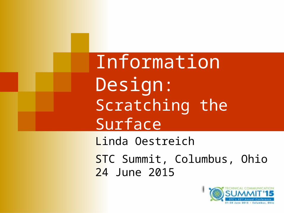
Information Design:Scratching the Surface
Linda Oestreich
STC Summit, Columbus, Ohio24 June 2015
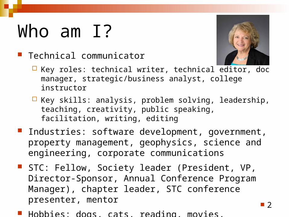
Who am I? Technical communicator
Key roles: technical writer, technical editor, doc manager, strategic/business analyst, college instructor
Key skills: analysis, problem solving, leadership, teaching, creativity, public speaking, facilitation, writing, editing
Industries: software development, government, property management, geophysics, science and engineering, corporate communications
STC: Fellow, Society leader (President, VP, Director-Sponsor, Annual Conference Program Manager), chapter leader, STC conference presenter, mentor
Hobbies: dogs, cats, reading, movies, gardening, Facebook
2

Where we’re going
What, who, and why Definitions Favorite leaders in the field Personas (audience) Principles and examples Typography and color Before and afters Done
3
What, who, and why? What? Info design is “The translating of complex, unorganized, or
unstructured data into valuable, meaningful information.” (STC Info Design SIG) Info design affects everything a human being’s senses can absorb and translate into meaning.
Who? Specialists and generalists in areas such as graphic design, information architecture, interaction design, usability engineering, human computer interaction, writers, editors, library science, and human factors (most all of whom can be called technical communicators!).
Why? Because it includes so much that we see and use: printed matter, information graphics, websites, and interactive, environmental, and experimental design in products such as:
4
• Maps • Forms
• Brochures • Ballots
• Websites • Logos, and brands
• Roadway, airport, city signage • Rx instructions
Definitions Schriver: Information design is the art and science of integrating
writing and design so that people can use content in ways that suit their personal goals. Document design is the act of bringing together prose, graphics (including illustration and photography), and typography for the purposes of instruction, information, or persuasion. Good document design enables people to use the text in ways that serve their interests and needs....the reader's needs should drive design activity.
Redish: (1) It is the overall process of developing a successful document—(2) It is the way the information is presented on the page or screen (that means layout, typography, color, and so forth).
Carliner: Information design can be hard to define, because it is an interdisciplinary approach which combines skills in graphic design, writing and editing, illustration, and human factors. Information designers work to combine skills in these fields to make complex information easier to understand. 5
Favorite leaders in the field?
6
Edward Tufte (also see Information Sage)
Jakob Nielsen
Karen Schriver
Ginny Redish
Saul Carliner
First, define your personas A persona is a composite of the words, attitudes,
appearances, and needs of your audience.
Personas help you design for an individual that you can “see” rather than for an abstract entity that you’ve researched.
Identifying personas for your products adds dimension, reality, and familiarity; solidifies the shift you must make from what the client needs to what the audience needs; and it redirects the source and content of your design to the audience.
7
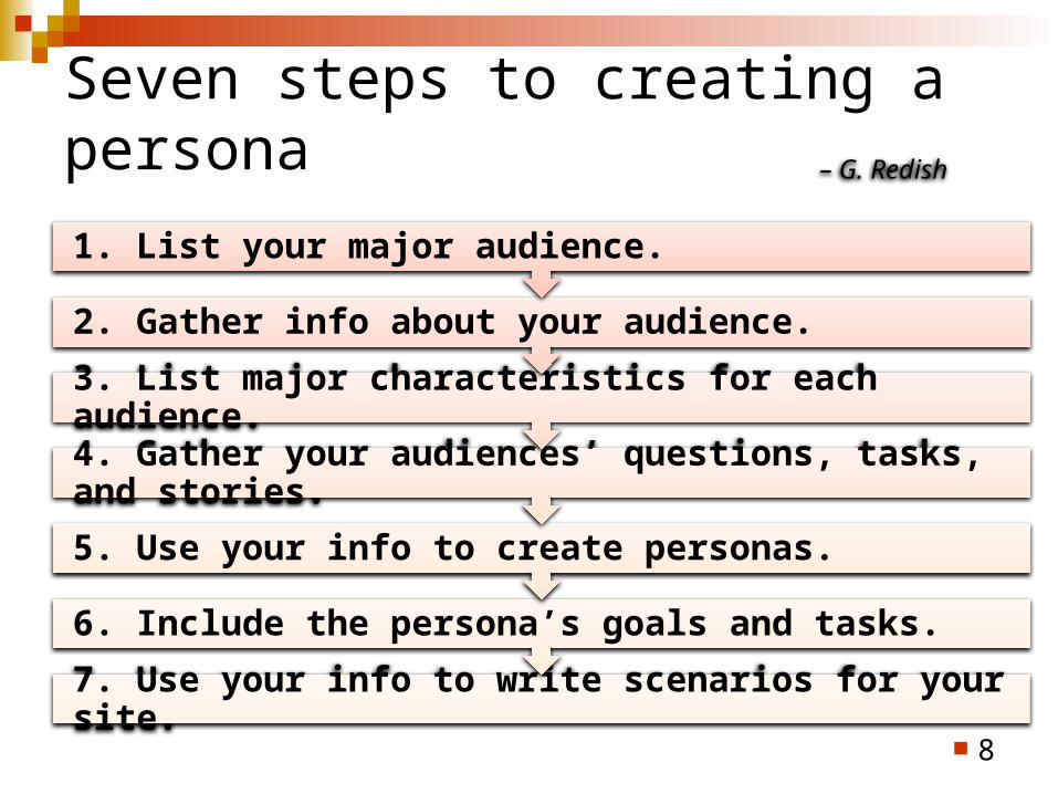
Seven steps to creating a persona
8
7. Use your info to write scenarios for your site.
6. Include the persona’s goals and tasks.
5. Use your info to create personas.
4. Gather your audiences’ questions, tasks, and stories.
3. List major characteristics for each audience.
2. Gather info about your audience.
1. List your major audience.
– G. Redish
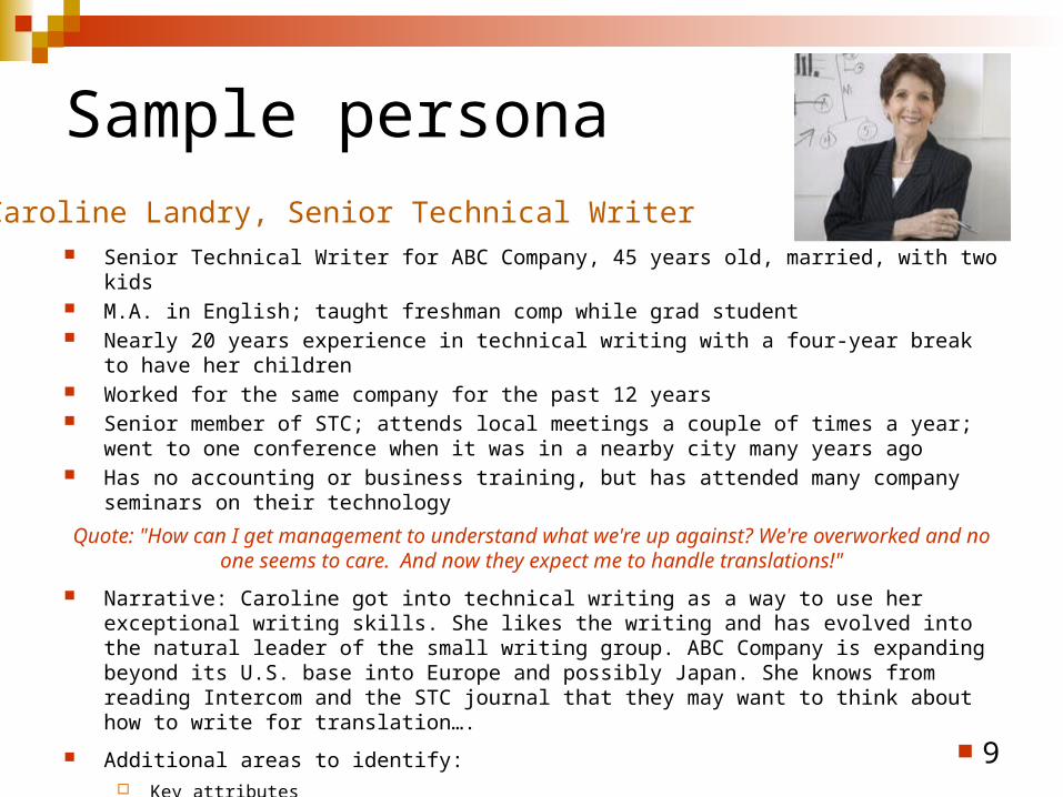
Sample persona
Senior Technical Writer for ABC Company, 45 years old, married, with two kids M.A. in English; taught freshman comp while grad student Nearly 20 years experience in technical writing with a four-year break to have her children Worked for the same company for the past 12 years Senior member of STC; attends local meetings a couple of times a year; went to one conference
when it was in a nearby city many years ago Has no accounting or business training, but has attended many company seminars on their
technology
Quote: "How can I get management to understand what we're up against? We're overworked and no one seems to care. And now they expect me to handle translations!"
Narrative: Caroline got into technical writing as a way to use her exceptional writing skills. She likes the writing and has evolved into the natural leader of the small writing group. ABC Company is expanding beyond its U.S. base into Europe and possibly Japan. She knows from reading Intercom and the STC journal that they may want to think about how to write for translation….
Additional areas to identify: Key attributes Tasks Informational needs/goals Scenario of use
9
Caroline Landry, Senior Technical Writer
Applying the principles Tufte believes that “principles of info design are universal
—like mathematics—and are not tied to unique features of a particular language or culture.” (Envisioning Information, 1990)
Zimmerman believes that the same principles apply to whatever is being designed—paper, posters, web pages, logos, etc.
10
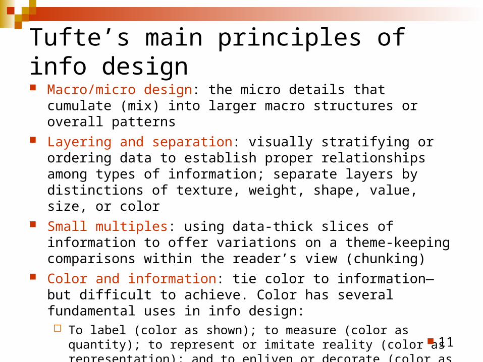
Tufte’s main principles of info design Macro/micro design: the micro details that cumulate (mix) into larger
macro structures or overall patterns Layering and separation: visually stratifying or ordering data to
establish proper relationships among types of information; separate layers by distinctions of texture, weight, shape, value, size, or color
Small multiples: using data-thick slices of information to offer variations on a theme-keeping comparisons within the reader’s view (chunking)
Color and information: tie color to information—but difficult to achieve. Color has several fundamental uses in info design: To label (color as shown); to measure (color as quantity); to represent or
imitate reality (color as representation); and to enliven or decorate (color as beauty)
Integration of words and images: represents heart of info design. Bringing together words and images enables the designer to tell a story; single purpose is to effectively present information. 11
C-R-A-P The C-R-A-P acronym is widely used across the field of design to
group the principles of contrast, repetition, alignment, and proximity. Both Robin Williams and Garr Reynolds feature this grouping in their respective books shown in the references.
Contrast: most important visual attraction; if elements are not purposely the same—you must make them visibly different
Repetition: repeat of visual elements—color, shapes, textures, and so forth—all things that help develop organization and strengthen unity
Alignment: no arbitrary placements of information! Everything must have a visual connection with other elements on the page or you need to remove it
Proximity: group items with a purpose in mind. When things are grouped, your readers see them as one unit. Grouping sets organization while reducing clutter and providing structure. 12
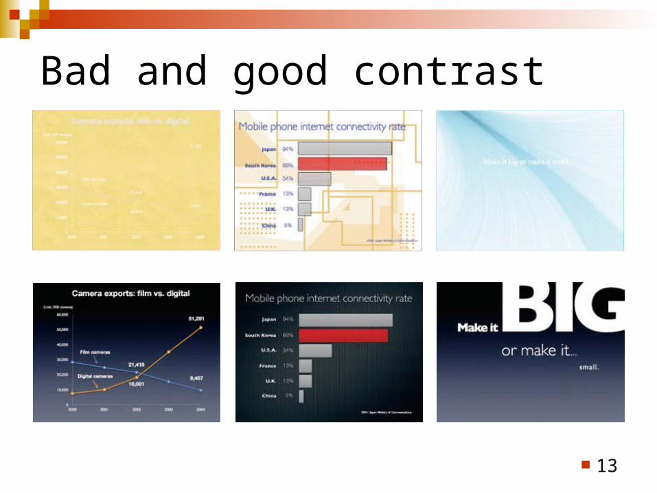
Bad and good contrast
13
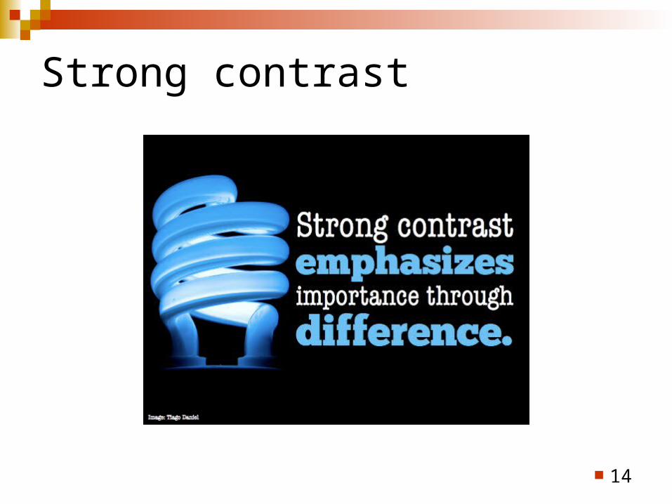
Strong contrast
14
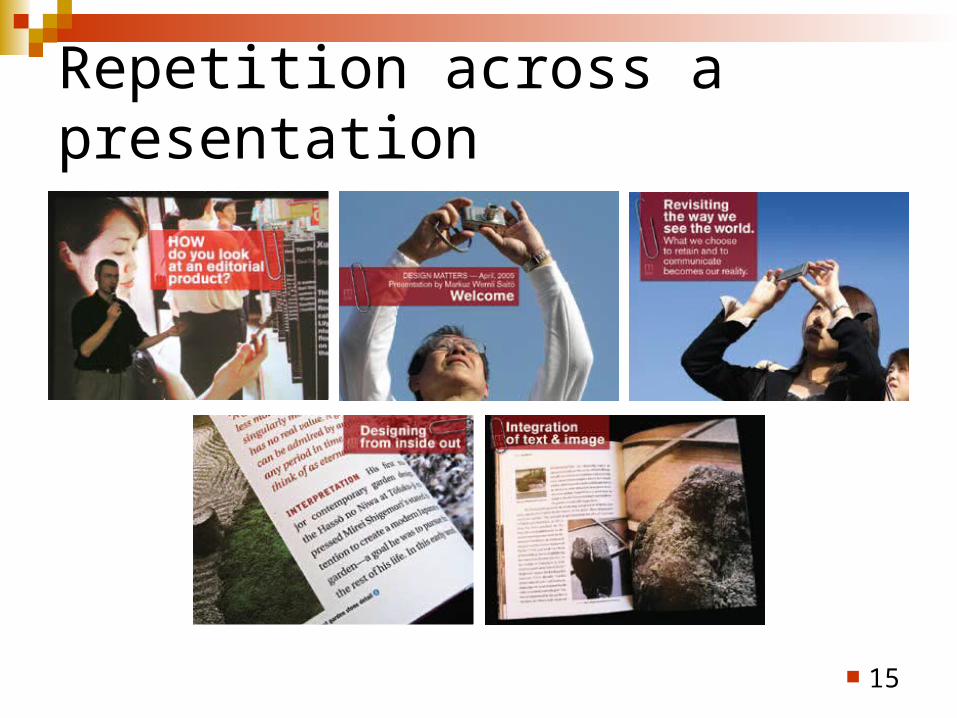
Repetition across a presentation
15
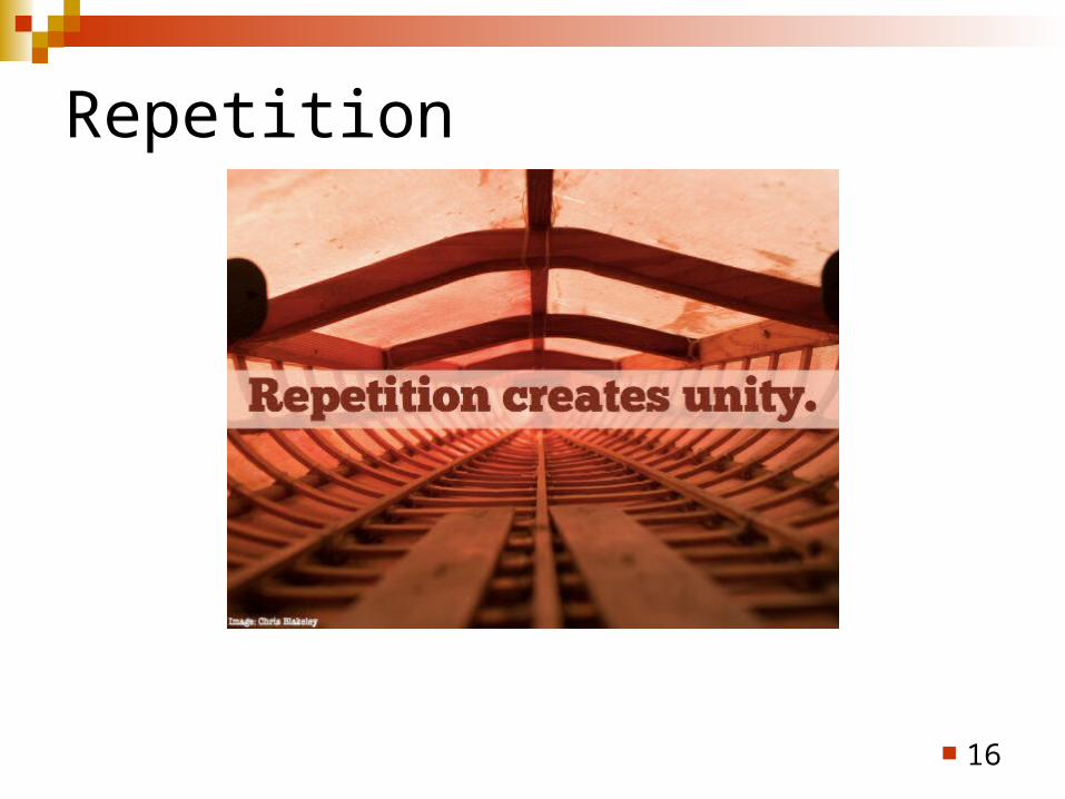
Repetition
16
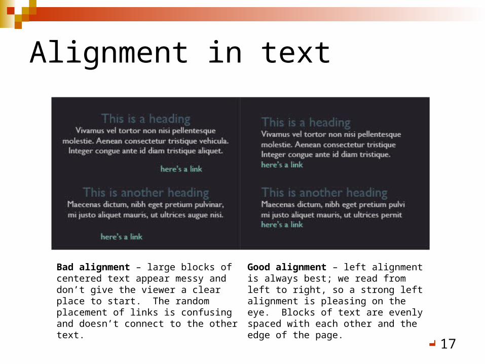
Alignment in text
17
Bad alignment – large blocks of centered text appear messy and don’t give the viewer a clear place to start. The random placement of links is confusing and doesn’t connect to the other text.
Good alignment – left alignment is always best; we read from left to right, so a strong left alignment is pleasing on the eye. Blocks of text are evenly spaced with each other and the edge of the page.
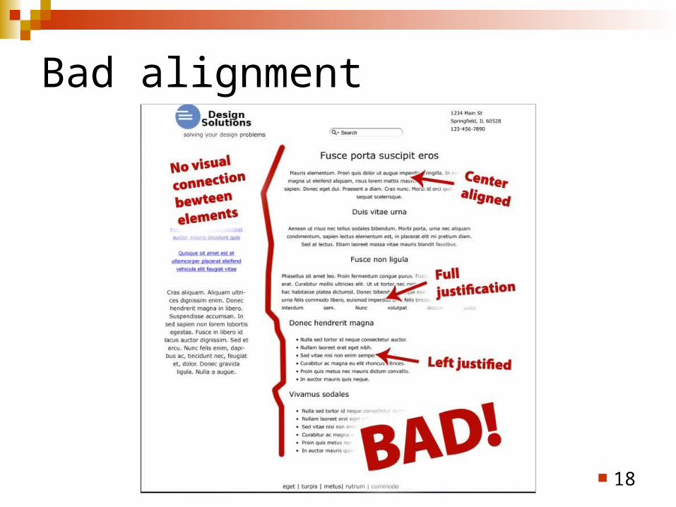
Bad alignment
18

More alignment
19
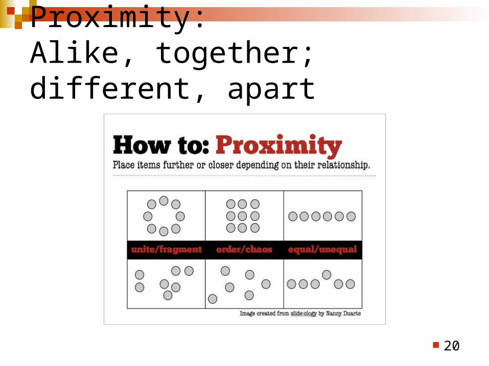
Proximity:Alike, together; different, apart
20
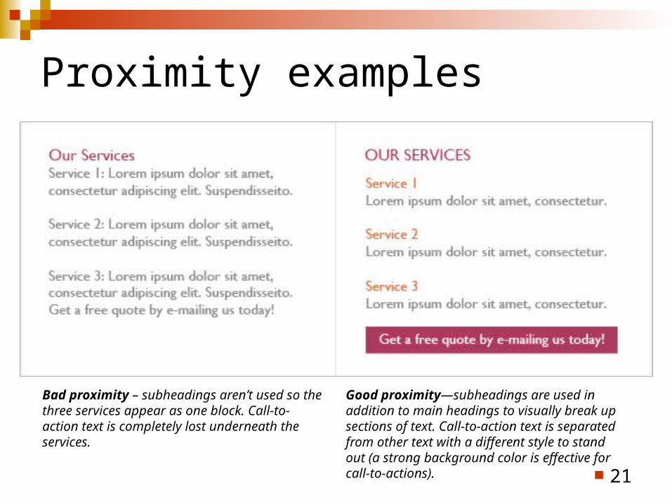
Proximity examples
21
Bad proximity – subheadings aren’t used so the three services appear as one block. Call-to-action text is completely lost underneath the services.
Good proximity—subheadings are used in addition to main headings to visually break up sections of text. Call-to-action text is separated from other text with a different style to stand out (a strong background color is effective for call-to-actions).
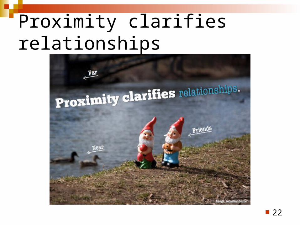
Proximity clarifies relationships
22
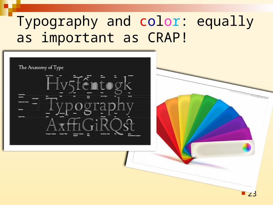
Typography and color: equally as important as CRAP!
23
24

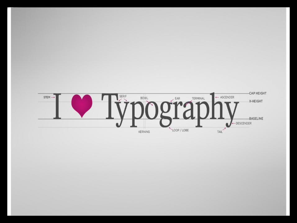
Introducing type The word typography derives from the Greek
roots typos (“impression”) and graphein (“to write”). Typography is the use of letterforms to visually communicate a verbal language. Since letterforms are shaped by the culture that gave rise to them, their use for typographic means is part of a culture's visual language.
Typography has developed over the last 600 years as the printing process has evolved.
Type is the means by which an idea is written and given visual form.
Type is closely connected to language and is affected by reading direction and the history of the country in which it is used.
25
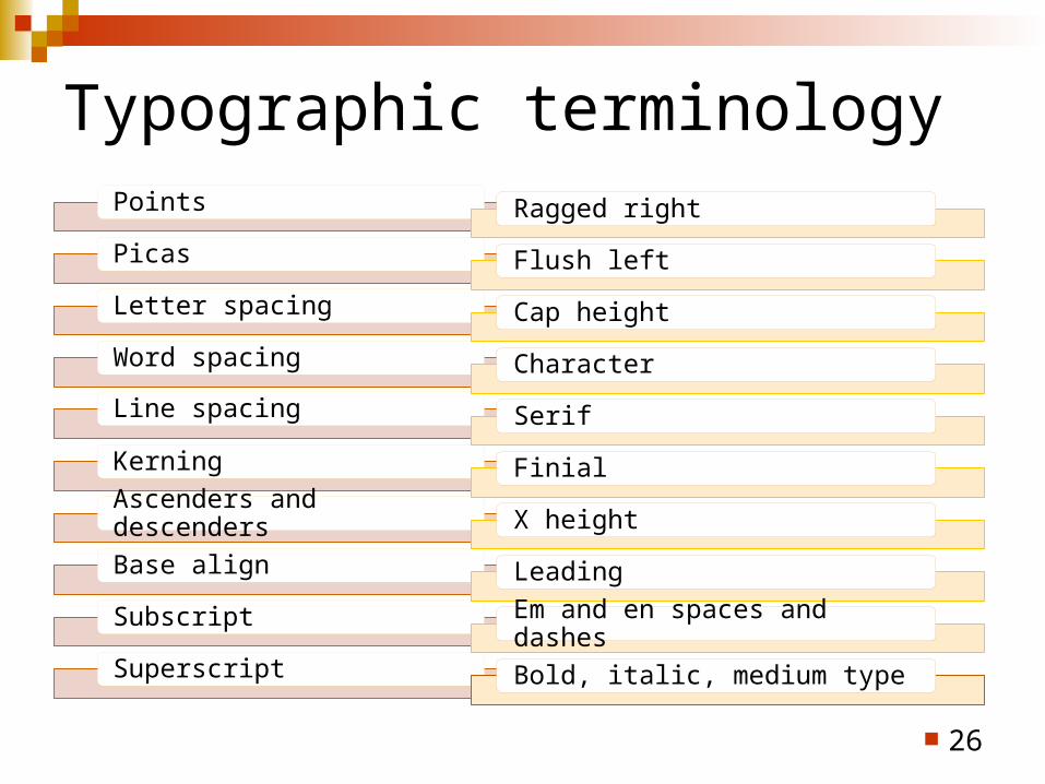
Typographic terminology
26
Points
Picas
Letter spacing
Word spacing
Line spacing
Kerning
Ascenders and descenders
Base align
Subscript
Superscript
Ragged right
Flush left
Cap height
Character
Serif
Finial
X height
Leading
Em and en spaces and dashes
Bold, italic, medium type
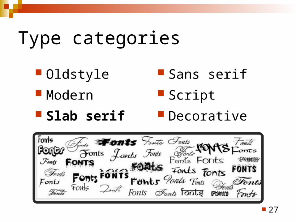
Type categories
Oldstyle Modern Slab serif
Sans serif Script Decorative
27
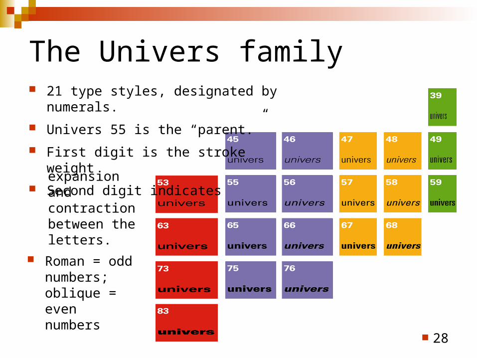
The Univers family 21 type styles, designated by numerals.
Univers 55 is the “parent.”
First digit is the stroke weight
Second digit indicates
28
expansion and contraction between the letters.
Roman = odd numbers; oblique = even numbers
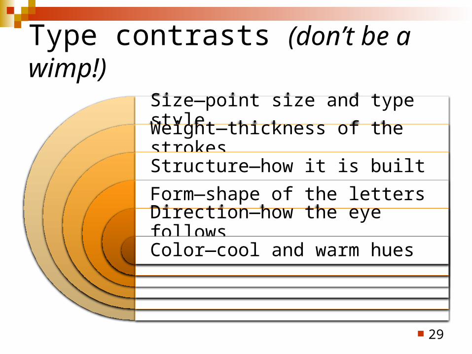
Type contrasts (don’t be a wimp!)
Size—point size and type style
Weight—thickness of the strokes
Structure—how it is built
Form—shape of the letters
Direction—how the eye follows
Color—cool and warm hues
29

Typographic relationships Concordant: use one type family without much variety;
page is harmonious & quiet (dull?).
Conflicting: combine typefaces that are similar but different. When similarities aren’t different enough to contrast, but too different to be concordant, you create confusion.
Contrasting: combine separate typefaces and elements that are clearly distinct from each other—can result in appealing and exciting designs that attract attention…or be so confusing you cause a train wreck!
30
– R. Williams
Color
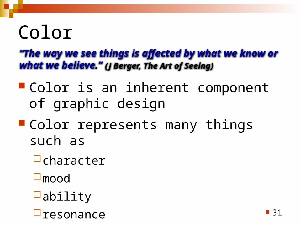
Color is an inherent component of graphic design
Color represents many things such ascharactermood abilityresonance
31
“The way we see things is affected by what we know or what we believe.” (J Berger, The Art of Seeing)
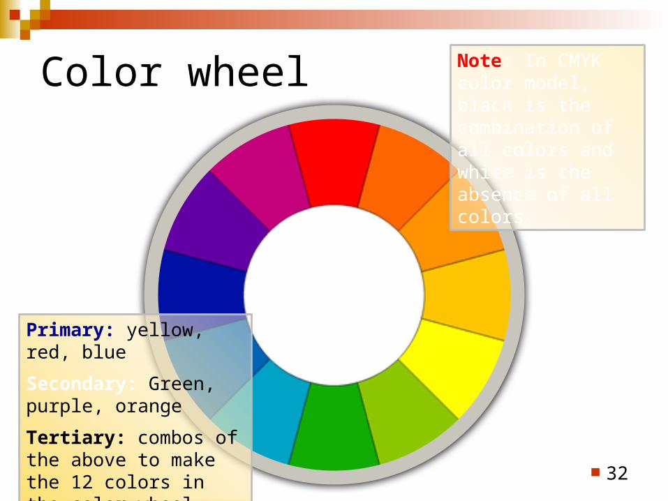
Color wheel
32
Primary: yellow, red, blue
Secondary: Green, purple, orange
Tertiary: combos of the above to make the 12 colors in the color wheel
Note: In CMYK color model, black is the combination of all colors and white is the absence of all colors.
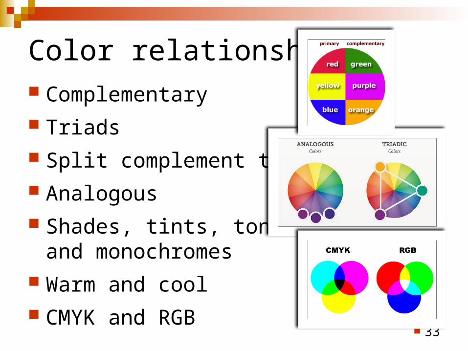
Color relationships Complementary Triads Split complement triads Analogous Shades, tints, tones,
and monochromes Warm and cool CMYK and RGB
33
MAKEOVERSAnd, now a few
34
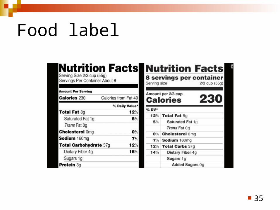
Food label
35
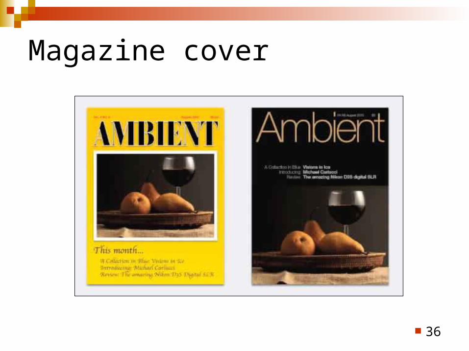
Magazine cover
36
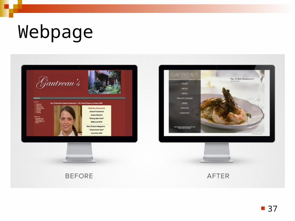
Webpage
37
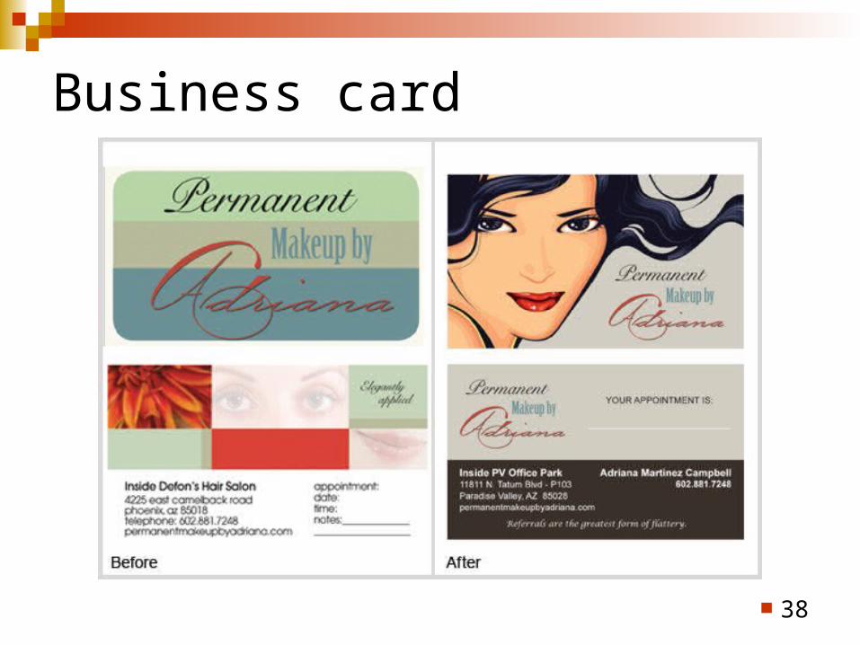
Business card
38
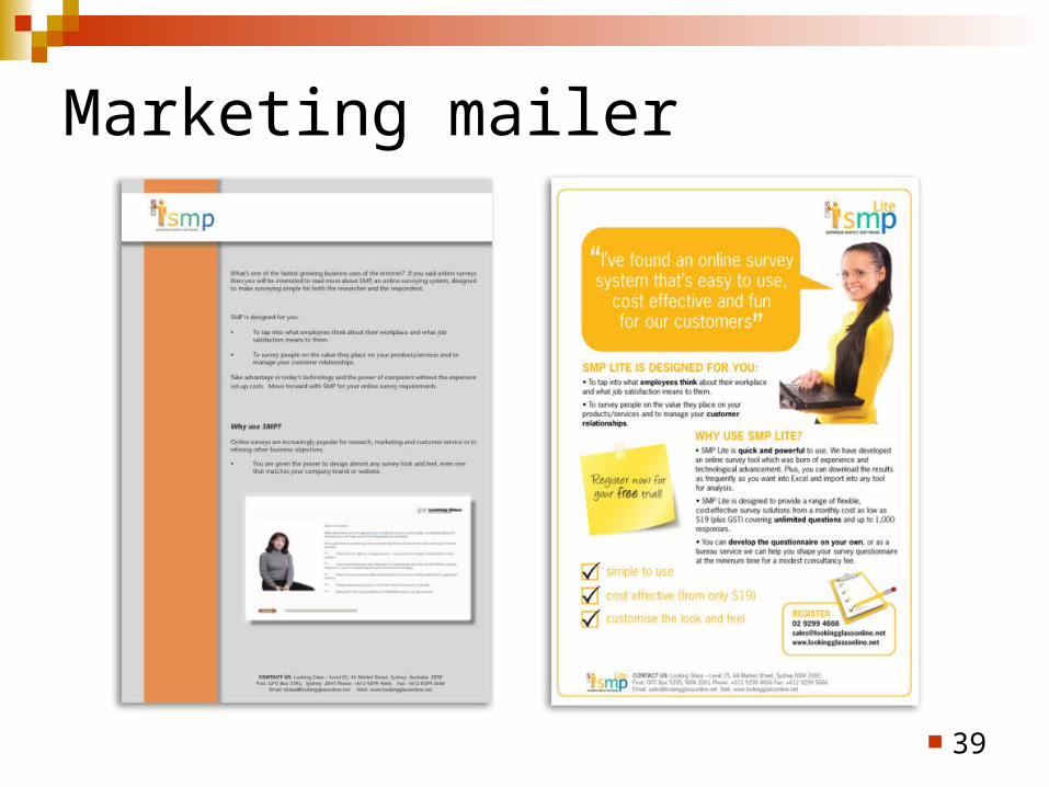
Marketing mailer
39
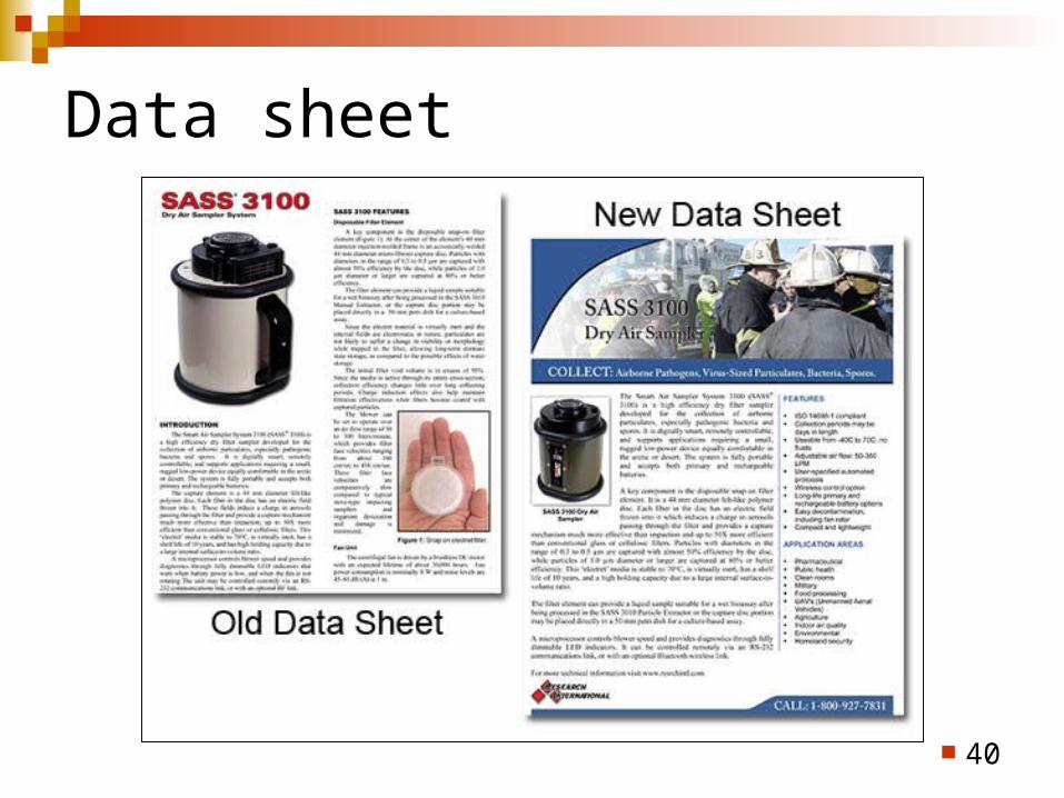
Data sheet
40
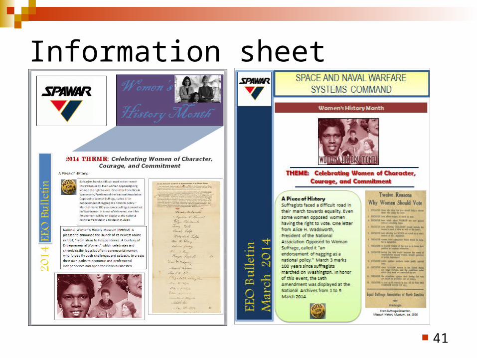
Information sheet
41
In the end… The goal of any information design task is
to communicate a specific message to the end user in a way that is clear, accessible, and easy to understand.
Technical communicators must know enough about information design to present their messages to meet that goal.
42

43

References Presentation Zen (2008), by Garr Reynolds
[Read the Six Minutes book review.] slide:ology (2008), by Nancy Duarte
[Read the Six Minutes book review.] The Non-Designer’s Design Book (1994), by Robin Williams How to Create Pro Slides in Less Time: Don’t Worry, Be CRAPpy; Chiara Ojeda,
(2012) (http://sixminutes.dlugan.com/contrast-repetition-alignment-proximity/) Basic color schemes - Introduction to Color Theory (
http://www.tigercolor.com/color-lab/color-theory/color-theory-intro.htm) Color Works: Best Practices for Graphic Designers (2013), by E. Opara & J. Cantwell,
Rockport Publishing Information Design Workbook (2010), by K. Baer
Typographic Design: Form and Communication, 5th Ed (2011), by Rob Carter et al.
“Applying Tufte’s Principles of Information Design to Creating Effective Web Sites,” Beverly B. Zimmerman, Brigham Young University, SIGDOC 97 Snowbird Utah, 1997 [email protected]
44