In what ways does your media product use, develop or challenge forms and conventions of real media...
8
IN WHAT WAYS DOES YOUR MEDIA PRODUCT USE, DEVELOP OR CHALLENGE FORMS AND CONVENTIONS OF REAL MEDIA PRODUCTS? IN WHAT WAYS DOES YOUR MEDIA PRODUCT USE, DEVELOP OR CHALLENGE FORMS AND CONVENTIONS OF REAL MEDIA PRODUCTS?
-
Upload
shuffyshah -
Category
Documents
-
view
68 -
download
0
Transcript of In what ways does your media product use, develop or challenge forms and conventions of real media...

IN WHAT WAYS DOES YOUR MEDIA PRODUCT USE, DEVELOP OR CHALLENGE FORMS AND CONVENTIONS OF REAL MEDIA PRODUCTS? IN WHAT WAYS DOES YOUR MEDIA PRODUCT USE, DEVELOP OR CHALLENGE FORMS AND CONVENTIONS OF REAL MEDIA PRODUCTS?

My media product uses and challenges real music video. When analysing various music videos, I discovered that most music videos combined a narrative and performance (lip syncing etc.), However for mine I felt a challenged the conventional music video, by purely concentrating on a narrative story it differs from other non-niche videos. Furthermore, although the song I used contained male lead vocals I decided to use two women as the focal point throughout my video. I also used a lesbian relationship instead of a heterosexual one, which is less common in music videos. However, in modern music video's, portraying homosexual couples is becoming more evident, such as in Macklemore's ‘Same Love’ music video. From analysing music videos, I found that close up camera angles were dominate. Therefore I used a combination of close up to convey the characters anguish, high angles to depict the inferiority of characters, and mid angles, all of which I felt followed typical conventions of music videos.
I used a high angle here to depict the weak status of the character.
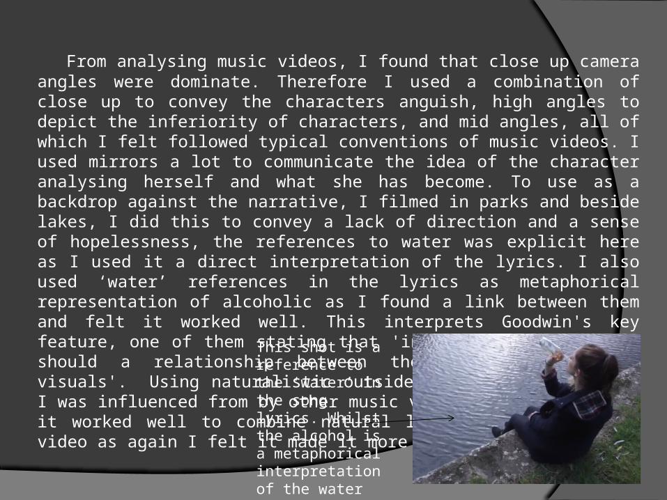
From analysing music videos, I found that close up camera angles were dominate. Therefore I used a combination of close up to convey the characters anguish, high angles to depict the inferiority of characters, and mid angles, all of which I felt followed typical conventions of music videos. I used mirrors a lot to communicate the idea of the character analysing herself and what she has become. To use as a backdrop against the narrative, I filmed in parks and beside lakes, I did this to convey a lack of direction and a sense of hopelessness, the references to water was explicit here as I used it a direct interpretation of the lyrics. I also used ‘water’ references in the lyrics as metaphorical representation of alcoholic as I found a link between them and felt it worked well. This interprets Goodwin's key feature, one of them stating that 'in a music video, there should a relationship between the lyrics, music and visuals'. Using naturalistic outside setting was something I was influenced from by other music videos. I also believed it worked well to combine natural lighting into my music video as again I felt it made it more realistic. This shot is a
reference to the ‘water’ in the song lyrics. Whilst the alcohol is a metaphorical interpretation of the water

Using naturalistic outside setting was something I was influenced from by other music videos. I also believed it worked well to combine natural lighting into my music video as again I felt it made it more realistic. Furthermore, regarding costumes, I didn’t challenge conventions. At times I conveyed a more sexualised look on the women protagonist, something which is often seen in music videos, during this time, my actress wore a short red dress, using the red I felt conveyed a sense of danger and possibly the indication of passion. This interpreted Laura Mulvey’s theory of the male gaze. In other shots, I used normal everyday costumes, such as jeans, leggings and dresses. I placed a strong emphasis on my actress wearing dark coloured clothing as it portrayed her depressed state. I used a red as a motif frequently throughout, such as the red dress, lipstick and alcohol. I felt the red foreshadowed and acted as a warning for destruction. It also conveyed anger and passion, all of which symbolised my main character well. This use of red was prevalent in 2 of the music videos I analysed, Lana Del Rey’s ‘Burning Desire’ and Calvin Harris’s ‘Sweet Nothing’

In terms of editing, I also challenged conventions, by using a slow pace and adding no visible transitions. Because the song I used was fairly monotone and slow, I felt it appropriate to represent this through the editing, therefore I didn't create fast cuts which matched the beat of the music, but rather created a montage of clips with the occasional flashbacks. Flashbacks are often seen in music videos, such as in Maroon 5's Payphone. At the beginning of the non-linear narrative, I included black gaps between the repetitive shots as the main character was drowning, this was done to elongate the suspense and well as convey the idea that the character eyes slowly closing – depicting the possibility of death. Although I didn't follow typical music video convention by inserting fast cuts, I did use short shots, which creates a repeatability factor.

An important convention of magazine adverts that I conformed to was advertising social media, this allows the audience to consume the artists by interacting with them via social networking.
I shot this photography on a wall of graffiti – this introduced an element of grunge, to match this, I chose a graffiti like font, this was prevalent in other music videos. Font that matched the settings.
I created a sense of juxtaposition between the 2 fonts, The album title ‘Blood’, is in formal elongate font, which contrasts against the grungy font used for the band name. I developed this idea when analysing Rudimental ‘Home’ magazine advert.
I conformed to convention by including the date of the release, I felt this was essential for the audience to know especially as I was establishing and branding this band as new & upcoming.
I included a quote from an established source, this again was a convention of music advert, but reinforcing the quality of the album encouraging audiences to purchase it.

A typical convention of digipaks was to use a similar font and style as the magazine advert, this helped create an overall branding for the artists.
I used a variety of costumes for the photography, here I chose my models to wear formal clothing. I chose white shirts so they’ll stand out from the busy backdrop but also felt it conveyed a sense of purity.
I used different camera angles, here I used close up, a typical convention of digipaks, I felt this would bring the audience closer and add a personal connection between the artist and audience
I added a ‘Parental advisory’ label on my digipaks to add realism as it is often prevalent on digipaks to warn the audience of rude lyrics.
Record Labels establishes the dominance and importance of the artists and were also dominant in previous digipaks
I used the same font as the band title for the track listing, this established a style throughout the digipak, often seen in other digipaks.

Using a guitar as the background for the CD cover created a musical link and developed the band’s indie branding. Using instrument in the digipak was prevalent in popular digipaks
I chose do my inside panels in monochrome as I felt it contrasted effectively against the colourful outside panels. It was also a suggestion that derived from audience feedback
I included spines to add realism to my digipak, as it is evident in conventional 6 panel digipaks.
I chose to put my models in less formal costumes for these panels. I felt it conveyed a more contemporary playful image to the band and contrasted nicely against the outside panels.
I blurred out the background so the artists appeared to be the focal point.