In what way does your media project use final evaluation question 1
15
In what way does your media product use, develop or challenge forms and conventions of real media? For our media product myself and April had chosen to create a film trailer that belongs to the Drama genre, along with creating a film magazine front cover and a film poster that were both designed to advertise our film trailer. To be more specific about our chosen genre for our media product, we are going to work in the area of the Teen Drama sub genre. In terms of looking at whether our media product follows the codes and conventions of a Teen Drama film, I would say that our media product both uses and develops these codes and conventions heavily, whilst also breaking some of these conventions. In terms of looking at the camerawork and the editing of our production I would say that we followed the appropriate forms and conventions. In previous Teen Drama film and television programme trailers that I have analysed such as ‘Now Is Good’ and ‘Skins’, the majority of both trailers are made up of establishing/wide, close up and extreme close up camera shots, which is something that we have also incorporated into our own production. The close up and extreme shots that were used in both trailers were mainly character driven, as are the close up and extreme close up shots used in our own production. We made the decision to follow, yet slightly break this convention, by only using a small number of
Transcript of In what way does your media project use final evaluation question 1

In what way does your media product use, develop or challenge forms and conventions of real media?
For our media product myself and April had chosen to create a film trailer that belongs to the Drama genre, along with creating a film magazine front cover and a film poster that were both designed to advertise our film trailer. To be more specific about our chosen genre for our media product, we are going to work in the area of the Teen Drama sub genre. In terms of looking at whether our media product follows the codes and conventions of a Teen Drama film, I would say that our media product both uses and develops these codes and conventions heavily, whilst also breaking some of these conventions.
In terms of looking at the camerawork and the editing of our production I would say that we followed the appropriate forms and conventions. In previous Teen Drama film and television programme trailers that I have analysed such as ‘Now Is Good’ and ‘Skins’, the majority of both trailers are made up of establishing/wide, close up and extreme close up camera shots, which is something that we have also incorporated into our own production. The close up and extreme shots that were used in both trailers were mainly character driven, as are the close up and extreme close up shots used in our own production. We made the decision to follow, yet slightly break this convention, by only using a small number of close up shots and using a lot more wide/establishing camera shots. The close up shots that we have included in our production allow the audience to view the characters on a more intimate and personal level and establish some form of relationship with them. The establishing/wide shots that were used in our production were used to establish each of the various locations and follow the action that is taking place between certain characters.
This particular wide/establishing shot establishes the female character’s location from the sign ‘Shanklin’ that is seen faintly in the distance. This allows our target audience to identify this geographical location from personal identity.
Typically POV (Point Of View) shots are a key convention of Teen Drama trailers. We went against this code slightly by only including one POV camera shot. We made this decision as we wanted to experiment and include other types of camera shots in order to break away from the conventions slightly.

The example of the POV camera shot above taken from our film trailer allows the audience to ‘get inside’ the character’s body as if the audience were the character and be a part of the scene. POV camera shots also allow suspense and tension to build within the audience as the lack of exposure of a scene allows the camera to slowly ‘feed’ the audience into the scene with no idea as to what is to come. We went against one of the codes by having the camera tilted at a slight canted angle which was done to both disorientate the audience and to represent our protagonist, Nathan’s current mental state of mind. The blue tint that is applied to this camera shot was originally used to represent our protagonist’s disorientated state (and in turn disorientate our target audience), but after analysing the ‘Cherrybomb’ trailer (who use various
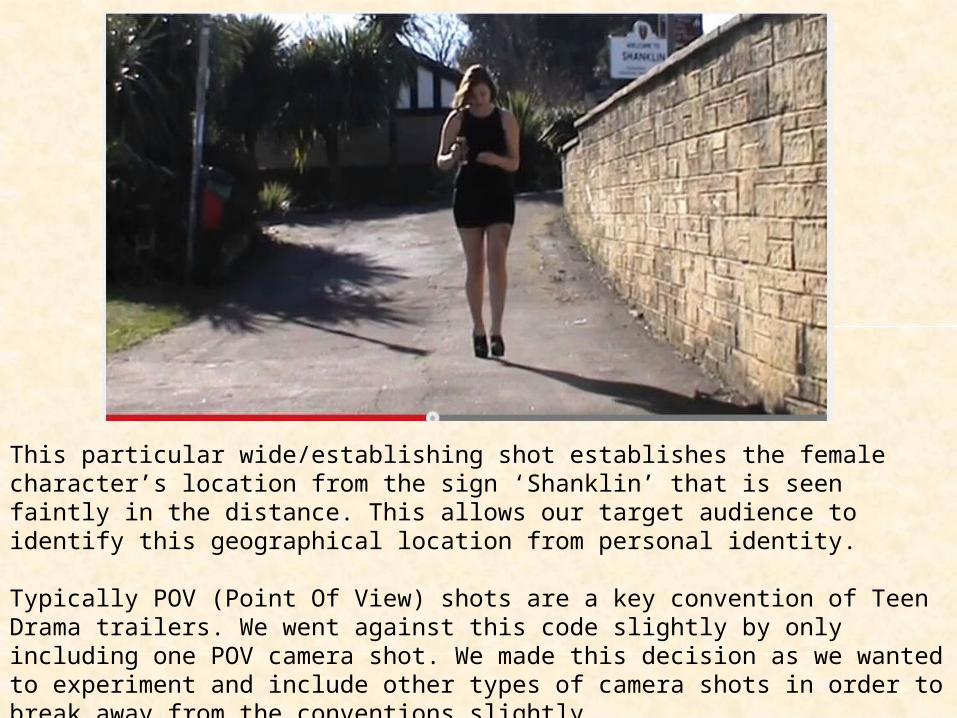
blue and sepia tints to some of their camera shots) we became inspired creatively, and applied a the effect and a series of similar, cold colours to a few of our other camera shots. Although we found that this effect wasn’t a traditional form found in most Teen Drama film trailers, we believed that this effect would be really alluring to our target audience. Our media product continues to use the codes and conventions of a Teen Drama film by including lots of quick cuts/jump cuts. Using lots of quick cuts/jump cuts will intensify and speed up the pace of the film. The clustered collection of camera shots that have a quick jump effect applied to them allow the audience to feel tension and suspense, as the jump cuts are used as a build up to the ‘climax’ of the trailer. The camera shots with the blue tint applied to them however were slightly slowed in pace, acting as a representation of the protagonists confused and bewildered state of mind.
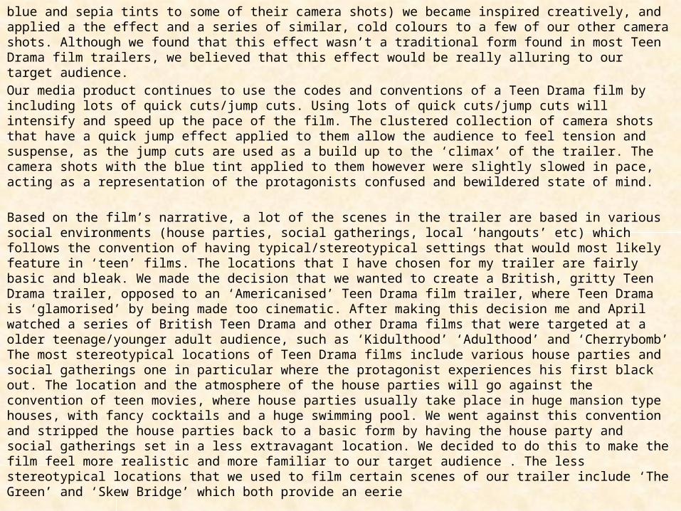
Based on the film’s narrative, a lot of the scenes in the trailer are based in various social environments (house parties, social gatherings, local ‘hangouts’ etc) which follows the convention of having typical/stereotypical settings that would most likely feature in ‘teen’ films. The locations that I have chosen for my trailer are fairly basic and bleak. We made the decision that we wanted to create a British, gritty Teen Drama trailer, opposed to an ‘Americanised’ Teen Drama film trailer, where Teen Drama is ‘glamorised’ by being made too cinematic. After making this decision me and April watched a series of British Teen Drama and other Drama films that were targeted at a older teenage/younger adult audience, such as ‘Kidulthood’ ‘Adulthood’ and ‘Cherrybomb’ The most stereotypical locations of Teen Drama films include various house parties and social gatherings one in particular where the protagonist experiences his first black out. The location and the atmosphere of the house parties will go against the convention of teen movies, where house parties usually take place in huge mansion type houses, with fancy cocktails and a huge swimming pool. We went against this convention and stripped the house parties back to a basic form by having the house party and social gatherings set in a less extravagant location. We decided to do this to make the film feel more realistic and more familiar to our target audience . The less stereotypical locations that we used to film certain scenes of our trailer include ‘The Green’ and ‘Skew Bridge’ which both provide an eerie
and lonely feel for the audience, linking to our protagonist’s loneliness as he is psychologically trapped and cut off from society.
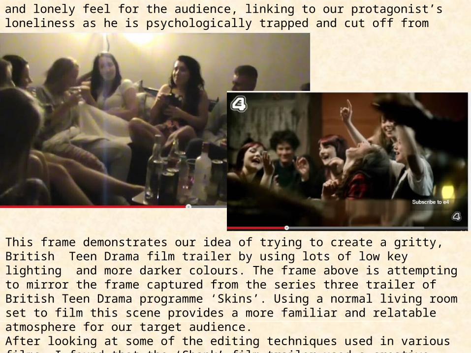
This frame demonstrates our idea of trying to create a gritty, British Teen Drama film trailer by using lots of low key lighting and more darker colours. The frame above is attempting to mirror the frame captured from the series three trailer of British Teen Drama programme ‘Skins’. Using a normal living room set to film this scene provides a more familiar and relatable atmosphere for our target audience. After looking at some of the editing techniques used in various films, I found that the ‘Shank’ film trailer used a creative ‘grainy’ effect. This inspired us to try and combine the slightly ‘grainy’ and ‘gritty’ effect, in order to create a clear representation of a raw, British film trailer.
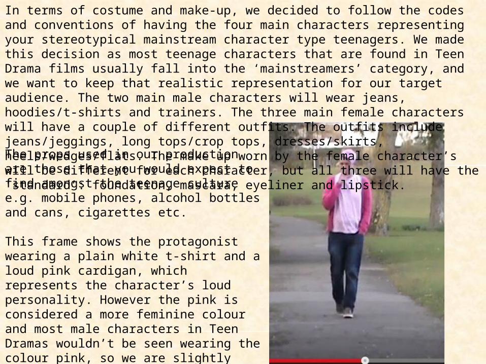
In terms of costume and make-up, we decided to follow the codes and conventions of having the four main characters representing your stereotypical mainstream character type teenagers. We made this decision as most teenage characters that are found in Teen Drama films usually fall into the ‘mainstreamers’ category, and we want to keep that realistic representation for our target audience. The two main male characters will wear jeans, hoodies/t-shirts and trainers. The three main female characters will have a couple of different outfits. The outfits include jeans/jeggings, long tops/crop tops, dresses/skirts, heels/wedges/flats. The make up worn by the female character’s will be different for each character, but all three will have the ‘standard’: foundation, mascara, eyeliner and lipstick.
The props used in our production are those that you would expect to find amongst the teenage culture e.g. mobile phones, alcohol bottles and cans, cigarettes etc.
This frame shows the protagonist wearing a plain white t-shirt and a loud pink cardigan, which represents the character’s loud personality. However the pink is considered a more feminine colour and most male characters in Teen Dramas wouldn’t be seen wearing the colour pink, so we are slightly challenging one of the conventions here.
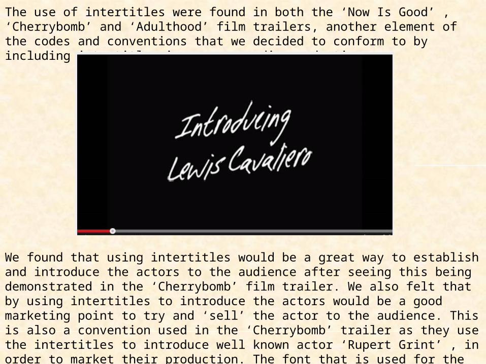
The use of intertitles were found in both the ‘Now Is Good’ , ‘Cherrybomb’ and ‘Adulthood’ film trailers, another element of the codes and conventions that we decided to conform to by including intertitles in our own media production.
We found that using intertitles would be a great way to establish and introduce the actors to the audience after seeing this being demonstrated in the ‘Cherrybomb’ film trailer. We also felt that by using intertitles to introduce the actors would be a good marketing point to try and ‘sell’ the actor to the audience. This is also a convention used in the ‘Cherrybomb’ trailer as they use the intertitles to introduce well known actor ‘Rupert Grint’ , in order to market their production. The font that is used for the production’s intertitles is jagged and is placed at a slight canted angle. This was done for creative effect and to represent the unsmooth balance in terms of the film trailer’s narrative. The font and style used for the film’s title ‘The Cluster B Effect uses a more
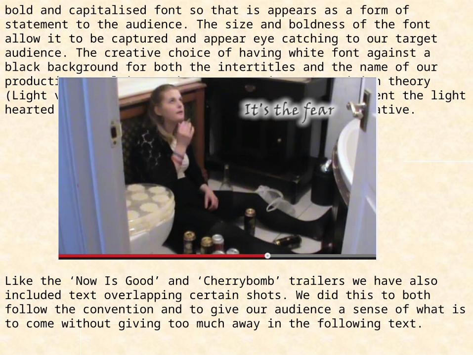
bold and capitalised font so that is appears as a form of statement to the audience. The size and boldness of the font allow it to be captured and appear eye catching to our target audience. The creative choice of having white font against a black background for both the intertitles and the name of our production, applying Levi Strauss’s Binary Opposition theory (Light vs Dark) that the contrasting colours represent the light hearted and dark elements of our film trailer’s narrative.
Like the ‘Now Is Good’ and ‘Cherrybomb’ trailers we have also included text overlapping certain shots. We did this to both follow the convention and to give our audience a sense of what is to come without giving too much away in the following text.

For the narrative of our film trailer we chose to explore a less popular and less stereotypical theme to explore, although our production does obey some of the codes and conventions of what would be expected to feature in a Teen Drama film such as alcohol, smoking, illegal substances, parties, violence and various forms of social groups. Combining the genre and sub genre together (Drama and Teen Drama) allows the codes of conventions of both to blend and be more focused one form of demographic, allowing more options and scenarios surrounding teenage culture to be explored in terms of narrative (broadening plot ideas/synopsis for the film).
In terms of following the codes and conventions of characters that belong to a Teen Drama film, I would say that we have both obeyed and gone against the codes and conventions. Our lead character in the film (the protagonist) is a male character named Nathan, which is typically the case with most Teen Drama films (‘Skins’, ‘Kidulthood’). It is also common that the male lead character is also portrayed as ‘the hero’ of the film, looking to restore the equilibrium. With my own media product, the protagonist is shown developing psychological issues as he is developing a severe personality disorder (although he is unaware of this). Although the protagonist isn’t intentionally setting out to restore the equilibrium (in terms of the plot narrative), but is looking to find out the cause of his strange behaviour. The protagonist also takes on the role of the antagonist as well , as he is fighting with himself and becoming his own worst enemy. Rather than focusing on restoring the equilibrium of the plot, the narrative focuses on the character is trying to restore the equilibrium within himself. The term ‘hero’ draws connotations such as ‘bravery’ and ‘saviour’, but the irony is that the ‘hero’ actually needs saving from himself. We have gone against Propp’s character types and the convention of having the male lead being represented as the strong, fearless character. Instead we have chosen to make him appear vulnerable so that it would it be more interesting for the audience as he begins his psychological journey.
However the other male character in the film has the exact opposite character traits than the protagonist. We have chosen to do this so that the other male character can take on the role as ‘the helper’ of the plot, as he helps his friend overcome and deal with his deteriorating mental state. It also goes against the convention of having the lead character stereotypically ‘saving’ everyone else, and allowing a slightly less prominent character to take on the role of the hero.The two female lead characters in the trailer also contrast with each other. However they both go against the idea of your typical female character that are most likely to appear in Teen Drama films. Stereotypically the female characters take on the role of the ‘damsel in distress’ if we apply Propp’s character types, and always need to be saved by the hero (the protagonist). With my media product, I reversed this so that it is in fact the hero that needs saving. I made this decision to try and create a new, positive representation of women (in Teen Drama films), that women can be equally heroic as, and that men can also be seen as vulnerable (can also take on ‘damsel in distress role). In terms of sound, most Teen Drama films contain ‘rave’ or dubstep style music to represent the youth of the teenage culture. Eerie and intensifying sound effects are also sometimes applied to some Teen Dramas to create tension and suspense for the audience. I have decided to follow and break away from this convention slightly by using one dubstep style music track to play throughout the length of our film trailer. The music track that we have chosen will allow our target audience to identify what sub genre our production belongs to. We went against the idea of including eerie sounds in our production in case our audience misplaced our film trailer (in terms of genre), and we wanted to be absolutely specific about our music so we clearly represented Teen Drama in terms of music. Unlike most Teen Drama film trailers, we challenged the convention of using a vast amount of dialogue in our film trailer. Although there is minimal dialogue in our production we wanted our audience to more effected by the camera shots, and
the limited amount of dialogue allows suspense and mystery to build up for the audience. Both the music track that we had chosen and some of the dialogue contains some forms of explicit language, as we found that taboo language featured in most of the Teen Drama films that we had analysed and is a key feature of the teenage language.
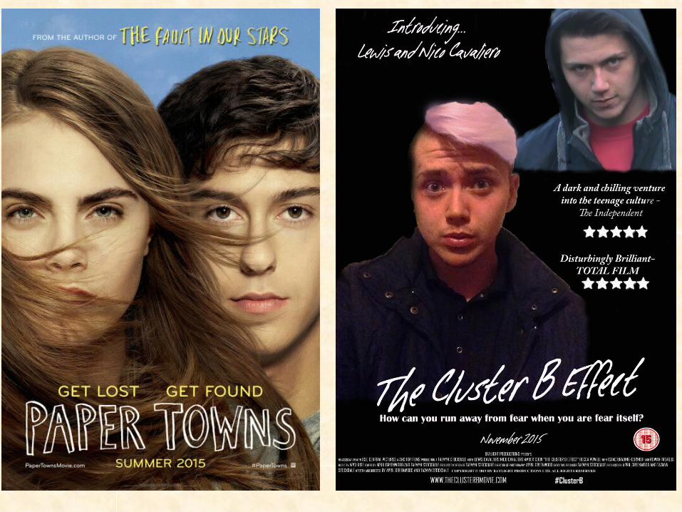
After analysing a series of film posters me and April decided on creating a poster that was more character driven. The film poster for the upcoming film ‘Paper Towns’ appeared similar to our poster design and we began to use the layout for the Paper Towns poster as inspiration for our own design. In terms of positioning we have copied the idea of having the protagonist’s face brought more forward so the character’s importance is emphasised. However where the male character’s face appears just behind the female character’s face, our poster shows the antagonist appear near the top right hand corner of the poster, as though he were lurking in the darkness, making him appear more sinister. The positioning of the film’s release date, website and ‘hashtag’ symbol (linking to social media site ‘Twitter’) are the same, whereas the positioning of the film’s title and slogan have been flipped round, so that on our film poster the film name comes before the film’s slogan. The Paper Towns poster is a lot more simpler than our film poster only using a minimal amount of text. The Paper Towns poster also chooses not to include the names of the actors starring in the production, whereas our poster is more focused on ‘selling’ our production by including the actor’s names right at the top of the film poster along with various ratings of our production. We have also incorporated the billing blocks into our film poster, and followed the convention of the using the same style of font for the billing blocks. The Paper Towns poster uses lots of warm colours suggesting that the film is quite light hearted (in terms of the film’s narrative), with our own film poster using lots of dark, cold colours to emphasise the mood of our film trailer’s narrative.
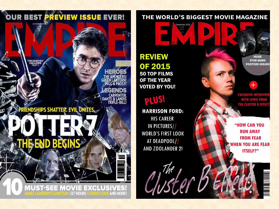
After deciding to advertise our production using ‘EMPIRE’ film magazine, we began looking at various EMPIRE magazine front covers to analyse the differences between some of the front cover layouts. Like the original EMPIRE magazine front cover, we copied the layout of the magazine name and the text included that features above the text ‘EMPIRE’. The size of the text ‘EMPIRE is less dramatised on our magazine front cover, having been reduced to a much smaller size. We have also made our protagonist the main focus of the magazine, along with included text that features and is centred around our production, including an exclusive interview with the actor and the film’s slogan featuring on the front cover. Opposed to the original Empire magazine, other feature articles are positioned on the left side of the magazine front cover, whereas feature articles are positioned on the right side of the magazine front cover on the original Empire magazine. Both film magazine front covers use brightly coloured fonts for creative effect and to stand out against the harsh, dark backgrounds. The positioning of the date and price and barcode are copied of the original Empire magazine.