In what way does your media product use, develop or challenge forms and conventions of real media...
19
EVALUATION
-
Upload
jadeharper -
Category
Education
-
view
48 -
download
0
Transcript of In what way does your media product use, develop or challenge forms and conventions of real media...
EVALUATION

FORMS AND CONVENTIONS
In what way does your media product use, develop or challenge forms and conventions of real media products?
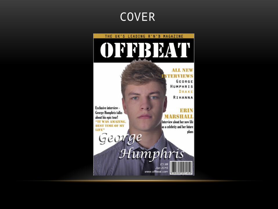
COVER

CONVENTIONS OF MY MUSIC MAGAZINE
• The artist is in the center of the page and takes up majority of the space this balances out the features on the front cover such as the masthead as it is a big feature to.
• The background is just white so it doesn’t take away attention from certain aspects of the front cover.
• Eye contact is used to make a connection with the reader and audience.
• I have placed George in front of the masthead as he is the main focus on the page.

MASTHEAD
• I have placed the masthead at the top of the magazine as this is where it is most visible when placed on the shelves.
• The masthead is the biggest piece of text on the front cover. It takes up ¼ of the front cover as it is the main feature and it is what will make the magazine recognizable and memorable.

COVER LINES
• The cover lines are all aligned to either the left or right. To prevent them from covering Georges face.
• Certain words within the cover lines are a different colour as this will make them stand out and draw more attention to them.

HEADLINES
• The name of the artist in the cover photo in this case George Humphris.
• The headline is the second biggest piece of text on my magazine front cover.

SELLING LINE
• The selling line is normally next to the masthead.
• The colour of the selling line is the same colour featured throughout my magazine. It is the only other colour ecept from black and white I have used on my cover so it makes the selling line stand out.

CONTENTS

PAGE TITLE - CONTENTS
• The title ‘contents’ is in the same font as the title on the front cover this keeps my magazine looking professional.
• Underneath the title it has the magazines name and the date. The magazine name and date is placed in a gold box to make it stand out. The gold is the same gold used throughout my cover.

FEATURES
• The font I have used for the text is the same font I used on my magazine front cover as this font is the house style.
• I have only used the magazines house colours as well. I have selected certain words and made them gold to stand out.
• The number are in a different font from the text to make them more bold. However the font used is the same as the headline.
• I only did one column for my contents page as I did not want it to look crowded I feel one column with enough information and text is simple but effective.

PHOTOS
• The first photo is of Erin as I felt the contents page needed to include an image of her as the article is featuring her. I edited the image to be black and white as this would fit in with my colour scheme. Plus I felt this made the image more modern and stylish so it connected with the rest of the magazine.
• I felt both images suited my contents page as they are both related and represent music.

ARTICLE
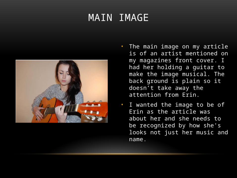
MAIN IMAGE
• The main image on my article is of an artist mentioned on my magazines front cover. I had her holding a guitar to make the image musical. The back ground is plain so it doesn’t take away the attention from Erin.
• I wanted the image to be of Erin as the article was about her and she needs to be recognized by how she's looks not just her music and name.

THE ARTICLE
• For my article I did an interview. To separate the questions from the answers I made them one size bigger and bold. This makes it clear what the interviewer has asked and what the artist has replied.
• I have asked questions I felt my target audience would be interested in and what questions they would ask themselves.
• I have presented the text in 3 columns this is to make it easy and clear to read.

TITLE OF ARTICLE
• The title of my article is presented the same as the title on my cover and contents page. I have used the same font and it is the colour white in a black box. This keeps my magazine looking professional.
• I have added some text underneath the title to persuade the reader to read on.

FORM
• The colour scheme of my magazine is black, white and gold. Black and white are sophisticated and plain colours this makes the gold more prominent and stand out.
• I have used only images because the magazine will be printed. All the images were taken by me.
• The fonts I have used are bold and clear to read. I made sure the fonts were bold as it goes with the genre of my magazine.

DEVELOPING IDEAS

COVER
• For the cover image I developed ideas from Billboard magazine.
• I liked how the artist was just plain and not much was going on in the photo. He is just looking directly at the camera which is simple but effective.
• Also I like the fact that the mast head Is positioned directly at the top center of the page. I feel this makes the mast head more visible and stand out.