
Impression Management in Financial Reports Surrounding CEO Turnover Author
43
Impression Management in Financial Reports Surrounding CEO Turnover Author: Nadesa Goundar A Research Project submitted in partial fulfilment of the requirements for the degree of Master of Professional Accountancy, Unitec New Zealand, 2009.
Transcript of Impression Management in Financial Reports Surrounding CEO Turnover Author

Impression Management in Financial Reports
Surrounding CEO Turnover
Author:
Nadesa Goundar
A Research Project submitted in partial fulfilment
of the requirements for the degree of
Master of Professional Accountancy,
Unitec New Zealand, 2009.


Acknowledgements
The author would like to thank Professor Shane Moriarity for providing the
supervision support in the completion of this research project. Also deserving thanks
are Josefino San Diego for providing assistance in the collection and analysis of the
data and Professor Mike Bradbury for the initial support and guidance in the
selection of the topic.


Declaration
Name of candidate: Nadesa Goundar
This Thesis/Dissertation/Research Project entitled “Impression Management in
Financial Reports Surrounding CEO Turnover” is submitted in partial fulfilment for
the requirements for the Unitec degree of Master of Professional Accountancy.
Candidate’s declaration
I confirm that:
• This Thesis/Dissertation/Research Project represents my own work;
• The contribution of supervisors and others to this work was consistent with the
Unitec Regulations and Policies.
• Research for this work has been conducted in accordance with the Unitec
Research Ethics Committee Policy and Procedures, and has fulfilled any
requirements set for this project by the Unitec Research Ethics Committee.
Research Ethics Committee Approval Number: Not Applicable
Candidate Signature: ……….…………………………………….
Date: …………………
Student number: 1124972

Abstract
This study focuses on whether new management uses impression management to
influence the presentation of performance in the firm’s annual reports surrounding a
changeover in CEO. The study considers the use or non-use of graphs for presenting
information as well as distortions in the graphs.
Overall there is some evidence for impression management, but it is not strong. Thus
impression management as implemented through graphs does not appear to be used
as widely in New Zealand as in other jurisdictions where it has been studied.

Table of Contents
1 Introduction 1
1.1 Overview 1
1.2 Outline of the rest of the paper 1
2 Theoretical Framework and Literature Review 2
2.1 Theoretical Framework 2
2.2 Literature Review 3
2.2.1 Earnings Management 3
2.2.2 Non-accounting Financial Disclosure 4 2.2.3 Impression Management 5
2.2.4 CEO Turnover and Financial Reporting 10
3 Research Methodology 13
3.1 Selectivity 13
3.2 Distortion 14
3.3 Development of Hypotheses 14 3.4 Sample Selection and Data Sources 16
4 Results 18
4.1 Selectivity 18
4.1.1 Earnings 20
4.1.2 Turnover 20
4.1.3 Earnings per Share 21
4.1.4 Dividends per Share 21 4.2 Distortion 21
4.3 Discussion of Results 29
4.3.1 Selectivity 29
4.3.2 Distortion 30
5 Conclusion 32
5.1 Summary & Implications 32
5.2 Limitations 32
6 Reference List 33

0
List of Tables
Table 1: Reconciliation of Sample Page 17
Table 2: The Frequency of Graphs Displaying Key Financial Variables Page 18
Table 3: The Frequency of Graphs Displaying Key Financial Variables
Increase or Decrease Page 19
Table 4: The Frequency of Graphs Displaying the Distortion of Key Financial
Variables when the Key Financial Variables Increase Page 22
Table 5: The Frequency of Graphs Displaying the Distortion of Key Financial
Variables when the Key Financial Variables Decrease Page 23
Table 6: Proportion of Graphs Exhibiting Positive or Negative GDI for
Earnings and Turnover Page 24
Table 7: Proportion of Graphs Exhibiting Positive or Negative GDI for
Earnings per Share and Dividends per Share Page 25
Table 8: Mean Graph Discrepancy Index for each of the Key Financial
Variables for each of the Periods Page 26
Table 9: Descriptive Statistics for Earnings and Turnover Page 28
Table 10: Descriptive Statistics for Earnings per Share and Dividends per
Share Page 29

1
1 Introduction
1.1 Overview
Management’s performance is largely evaluated and remunerated on the performance of the
firm which is displayed in the annual reports. This provides management with a motivation
to influence the content and prominence of the information presented in the annual reports.
One tactic new management may choose is to blame initial poor performance on its
predecessor and then take credit for subsequent good performance. Godfrey et al. (2003)
argue that new CEOs have incentives to increase their welfare by establishing tenure. This is
because managers receive a substantial portion of their wealth in the form of human capital
(Fama, 1980). That is, labour markets effectively award managers with increases in
remuneration and continuity of employment based on the perceived success or failure of the
firms they are managing (Godfrey et al, 2003). Hence, new CEOs strive to create an
impression that they are performing better than their predecessor so as to quickly secure
tenure. Also, most compensation contracts are tied to performance so better performance
and/or the impression of better performance may be expected to lead to increased
compensation.
This study examines one device, graphs, that management can use to influence perceptions
surrounding a change in top management. It finds some support that graphs are used to
influence perceptions, but the overall results are mixed.
1.2 Outline of the rest of the paper
This research project is structured as follows. Section 2 provides the theoretical framework
and literature review. Section 3 follows and describes the research methodology including the
development of the hypotheses and sample selection. In section 4, the results are discussed
while in section 5 the research project is concluded. And finally in section 6 a reference list is
provided.
2
2 Theoretical Framework and Literature Review
2.1 Theoretical Framework
An agency relationship is defined as a contractual agreement between two parties
conventionally called the principal and the agent. The principal engages the agent to perform
some service on the principal’s behalf and delegates some decision making authority to the
agent (Jensen and Meckling, 1976). Jensen and Meckling argue that if both parties (the
principal and agent) are utility maximisers then it is likely that the agent may not always act
in the best interests of the principal. Hence the principal incurs monitoring and bonding costs
designed to limit the aberrant activities of the agent. Given that both the principal and the
agent are utility maximisers, it is generally impossible to assume that the agent will always
make optimal decisions from the principal’s viewpoint. The divergence between the agent’s
decisions and the optimum decisions for the principal gives rise to a reduction in the value of
the welfare of the principal. This reduction is referred to as the residual loss. The sum total of
the costs incurred by the principal is referred to as the agency costs (Jensen and Meckling,
1976).
Two of the many problems that may arise from the agency relationship in most business
settings include adverse selection and moral hazard. Adverse selection is the existence of the
condition where the principal is not able to ascertain if the agent accurately represents his/her
ability to carry out the work for which compensation is made and moral hazard is the
condition under which the principal is not sure whether the agent has given the utmost to the
business (Eisenhardt, 1989).
According to Jensen and Meckling (1976) since both principals and agents (CEO’s) are
utility maximisers there exists motivation for agents to engage in some decisions that are sub-
optimal for the principals. This suggests that CEO’s at times may have incentives to engage
in self-interested wealth maximising behaviour at the expense of principals’ (shareholders).
Thus one can argue that within this framework, CEO’s may be motivated to manage both the
accounting numbers and the way the numbers are represented.

3
Financial reporting researchers have recognised that there exist strong economic and social
incentives for managements to display self interested behaviour in annual reports. Research
has found that some managements make discretionary financial reporting choices in the areas
of measurement, disclosure and presentation (Murphy and Zimmerman, 1993, Beattie and
Jones, 2000). The current study seeks to determine if new managers frequently choose to use
graphs as a means for displaying financial results in a self-interested manner.
2.2 Literature Review
The financial disclosure literature suggests
that managers, shareholders, auditors and standard setters all derive benefits from
selective financial misrepresentation (Revsine, 1991, p.17).
The literature emphasises that management has incentives for ‘selective financial
representation’ (Revsine, 1991). One strand of the literature focuses on manipulation of
accounting numbers by management. This is referred to as earnings management. A second
strand involves the use of non-accounting financial disclosures, and the third is impression
management. The discussion that follows highlights the literature in earnings management.
2.2.1 Earnings Management
Revsine (1991) argues
...that financial reporting is sometimes better characterised by the phrase ‘selective
financial representation’ (p.17)
And that
This selective financial misrepresentation hypothesis cuts across both public and
private sectors since participants in both sectors are motivated to support standards
that selectively misrepresent economic reality when it suits their purpose (p.17)
Revsine illustrated the incentives that motivate various parties to misrepresent financial
events. He reviewed and highlighted prior literature that provided support for his selective
financial misrepresentation hypothesis. The parties that were considered were those that
derived benefits from selective financial misrepresentation and included, managers,

4
shareholders, auditors and standard setters. The evidence gathered from the extensive
literature review supported the hypothesis that observers (the authors of the literature
considered) made inferences about the behaviour of the parties that were consistent with the
misrepresentation hypothesis.
Schipper (1989) provided a framework for thinking about the implications of research design
choices in earnings management research. She defined the object of earnings management,
explores the conditions that give rise to earnings management and provided a design for
empirical tests for earnings management. She defined earnings management as “disclosure
management” in the sense of purposeful intervention in the financial reporting process with
the intention of obtaining some private gain. She argued that research findings related to
earnings management so far are suggestive but not conclusive.
Dechow et al (1995) evaluated alternative models to detect whether in certain circumstances
management uses the financial reporting process to manage reported earnings. They found
that all models they considered appeared to produce reasonably well-specified tests for a
random sample of event-years. However they found that the power of the test for earnings
management was low for economically plausible magnitudes. Of all the models considered
they found that the modified version of the model developed by Jones (1991) provided the
most powerful test of earnings management. The findings also provided three major
implications for research on earnings management. First was that regardless of the model
used to detect earnings management, the power of the tests were relatively low for earnings
management of economically plausible magnitudes. Secondly subtle cases of earnings
management (such as one percent of total assests), require sample sizes of several hundred
firms to provide a reasonable chance of detection. And finally, further research needs to be
carried out to develop models that generate better specified and more powerful tests to detect
earnings management.
2.2.2 Non-accounting Financial Disclosure
Another strand of the financial disclosure literature focuses on the inclusion of disclosures
other than the underlying accounting numbers. Gibbins et al. (1990) theorised that firms

5
develop a stable, two dimensional internal preference for managing disclosures. The first
dimension being the uncritical acceptance of the norms while the second being the propensity
to seek firm-specific advantage in how disclosures are being made and developed. Norms are
defined to be the informal or formal rules, procedures, and standards believed by the
managers to apply to a particular disclosure issue. Twenty interviews were conducted:
1) To develop a vocabulary of constructs and variables to describe disclosure processes
and
2) To identify relations amongst these constructs and variables.
They found five variables that influenced the set of disclosure outputs:
1) The firms disclosure position
2) The antecedents of the firms’ disclosure position
3) The specific disclosure issues faced by the firm
4) External consultants and advisors
5) Structure
The findings also suggested that the disclosure position (one of the variables that influences
disclosure outputs), was influenced by several internal organisational factors such as the
firm’s history, its financial performance, and its CEO. Their theory suggested that there exists
a relation between the changes in the above mentioned internal factors and changes in the
firm’s disclosure position. For example a change in CEO may precipitate a change in a firm’s
disclosure position.
2.2.3 Impression Management
The third strand of the financial disclosure literature is impression management which is the
focus of this study. Impression management refers to management’s attempts to manipulate
the interpretation of disclosed data. The most popular form of impression management is the
use/abuse of graphs. With impression management, firms use graphs contained within annual
reports to present self-interested representations of corporate performance. This approach,
serves to legitimise the actions of management and to convince the owners/shareholders that
the company is being run competently and efficiently.
6
Managements of firms regularly use graphs to convey information to shareholders.
Impression management with graphs occurs when managements use financial graphs in
annual reports to display selected information and present information in ways to convey a
favourable portrait of management in the annual report. Beattie et al. 1999 suggests that
Impression management using financial graphs occurs in three principal ways. First,
management can decide, on an annual basis, whether or not to use graphs at all and,
if used, which specific variables to graph. Second, graphical construction techniques
can be used to manipulate the message conveyed (e.g. non-zero axes or altering a
graph’s shape). Finally, graph design features can be used to enhance the message
conveyed by the accounting numbers in an unwarranted way (e.g. by unduly
emphasising the colour of the last specifier (column) in a sequence). (Beattie and
Jones, 1999. p.47)
One of the first studies on impression management was done by Johnson, Rice and
Roemmich (1980) which considered the issue of distortions in graph construction. Johnson et
al. (1980), examined 50 annual reports randomly selected from US Fortune 500 companies.
These firms included 423 graphs in their annual reports over the period 1977-1978. Their
findings suggested that at least one graph was incorrectly constructed in 42% of the annual
reports and 29.5% of all graphs reviewed were constructed incorrectly.
Taylor and Anderson (1986) provide guidelines for the accountant on the construction of
graphs. They suggest that graphs should be consistent with the financial data so as not to
mislead users or violate certain auditing standards. One such suggestion was that the
percentage change in graphs should reflect the percentage change in the underlying financial
data. When this condition is not met, they said the graph suffers from distortion.
Steinbart (1989) subsequently studied the annual reports of 319 companies from US Fortune
500 companies. Steinbart (1989) examined both distortion and selectivity in annual reports.
His findings suggested that distortion in the graphs of three key financial variables (sales,
profits and dividends) exaggerated the magnitude of change by about 11%. He found an
absolute distortion of greater than 10% in approximately 26% of the graphs of key financial
variables. He also found evidence of selectivity in the use of graphs. His findings suggested
that “good news” companies were more likely (74% compared to 53%) to include graphs of
key financial variables in annual reports while “bad news” companies were more likely to

7
include distorted graphs. He defined “good news” companies as those having an increase in
the net profit for the relevant year while “bad news” companies were those that had a decline
in net profit.
Beattie and Jones (1992), examined the use and abuse of graphs in the UK. They used the
1989 annual reports for 240 UK listed companies and tested hypotheses relating to selectivity
and distortion in the use of graphs. Selectivity refers to management systematically choosing
to include or exclude graphs based on their relation to the firm’s performance. Similar to
Godfrey et al (2003) “favourable selectivity” refers to inclusion of graphs where the
performance trend on the financial variable is positive and deletion of graphs where the
performance trend on the latter is negative. The opposite applies to unfavourable selectivity.
Distortion on the other hand is concerned with the extent to which graphs of financial
variables accurately reflect the underlying data.
Beattie and Jones (1992) found that:
• Graphs were widely used;
• Companies with “good” performance were significantly more likely to use graphs;
• Measurement distortion was significant; and
• The effect of measurement distortion was generally to portray the company’s
performance more favourably (p. 301)
Beattie and Jones (1999) extended the understanding of graphical reporting practices in the
Australian accounting environment. Their study posed four objectives.
1) Establish the nature of graphs used in the annual reports of Australian companies,
2) Document and analyse cases where the principle of representational neutrality is
violated with regards to selectivity, measurement distortion, orientation distortion and
presentational aspects of graph use,
3) Determine whether differences exist in graphical reporting practices between the
industrial and service, extractive, financial services and diversified sectors, and
4) Compare and contrast the results of this study with those of other Australian, USA, UK
and Canadian practices.
8
The 1991 corporate annual reports for eighty-nine of the top hundred Australian listed
companies were sampled. The sample was then categorised into four broad industrial
categories that included industrial or service, extractive, financial services and diversified
companies.
The results revealed that:
1) Eighty-nine percent of Australian companies graphed at least one performance or non-
performance variable and that seventy-two percent of companies graphed at least one
of the four generic key financial variables (sales, profit, earnings per share, dividends
per share).
2) Significant associations were found between the inclusion of at least one Key Financial
Variable (KFV) and the five-year profit and sales trend. Measurement distortion was
also evident with 34.2% of the graphs containing material distortions. Profit and
dividends per share were more than twice as likely to be favourably rather than
unfavourably presented.
3) The findings reinforced the results of earlier studies. In United Sates of America (USA)
and United Kingdom (UK) studies, strong evidence of selectivity was found. These
results were consistent with this Australian study. However, selectivity and the level
of mean measurement distortion were lower for Australian companies compared to
the USA and UK.
Beattie and Jones (2000) investigated whether changes in companies’ use of key financial
graphs, at both the aggregate and individual company level are associated with corporate
performance. A sample of 137 companies from the top 500 listed UK companies as at 31,
March 1989 were selected. The annual reports for five years historical data (1988-1992) were
analysed for each company.
The hypotheses tested were:
1) The aggregate incidence of KFV graphs over time are related positively to aggregate
corporate performance, and
2) Individual company’s changes in KFV graph use are related positively to the individual
company’s performance

9
The evidence supporting the manipulation hypothesis in relation to graph selectivity was very
strong. The results suggested that income and EPS were the dominant determinants. Overall
results clearly showed that companies were significantly more likely to include graphs in
their annual reports when income and EPS increased.
Marther, Ramsay and Sherry (1996), studied the use and representational faithfulness of
graphs in the 1991 and 1992 annual reports of 143 Australian listed companies and in the
1991 annual reports of 44 not-for-profit entities. Their findings were that:
• For the sample of 143 companies, no significant relation between the use of key
financial variables in graphs and company performance was found . However when
the sample was partitioned according to market capitalisation, smaller companies
(those ranked 51-150), were significantly more likely to include graphs of key
financial variables when their performance improved.
• Similarly no significant overall relationship between distortion and company
performance was found.
• The not-for profit entities had very few graphs of key financial variables other than
turnover which was also found to be insignificant.
• For not-for-profit entities, it was found that 51% of graphs were distorted by more
than 5%, with 32% exaggerated and 19% understated.
Mather, Ramsay and Steen (2000) further examined the use and representational faithfulness
of graphs used by Australian companies engaged in an initial public offering (IPO) of shares.
They selected a total of 484 Australian IPO prospectuses and tested for selectivity and
distortion in the graphs included in the prospectuses. The overall findings suggested that there
was significant evidence of selectivity. However for post -1991 IPO’s there was no such
evidence. The change reflects the introduction of institutional and regulatory rules that
reduced managements’ discretion in the choice of graphs. However there was no significant
evidence for distortion in graphs.
Arunachalam, Pei and Steinbart (2002) reported the results of three experiments that
investigated the effects of improperly designed graphs on decision making. The results
indicated that the decision makers’ choices were indeed influenced by improperly designed
graphs, even though such graphs also presented precise, accurate numeric data.

10
2.2.4 CEO Turnover and Financial Reporting
The impact of a change in top management of a firm has attracted research attention
regarding both earnings management and impression management. Pourciau (1993)
investigated the relation between top executive changes and discretionary accounting choices.
A total of 73 companies that had executive changes were sampled. The results suggested that
incoming executives record accruals and write-offs in a way that decreases earnings in the
year of the executive change and increases earnings in the year after the change. However it
was recognised that the research design did not account for the reported changes in earnings
as a result of normal company performance since no control was established.
Murphy and Zimmerman (1993) examined and documented the behaviour of several
financial variables surrounding CEO change and considered the implications of simultaneous
changes among the variables. Their primary objective was to estimate the extent to which
changes in discretionary variables were explained by poor economic performance rather than
direct managerial discretion. The two discretionary decisions considered were:
1) Managerial horizon problem whereby departing CEOs in good performance firms,
having knowledge of their pending retirement commit to investment decisions that
further enhance short-term performance.
2) In firms having deteriorating economic health, the outgoing CEOs cover up the extent
of their poor performance while the incoming CEOs then take a “big bath”.
A sample of 1063 CEO departures during the period 1971 – 1989 from Forbes 500 firms was
considered. Eight financial variables were selected to describe the behaviour of CEOs
surrounding their departures. The Eight variables considered were:
1) Research and Development
2) Advertising
3) Capital Expenditures
4) Accounting Accruals
5) Earnings
6) Sales
7) Assets
8) Stock Prices

11
The evidence presented suggested that firm performance and managers’ exercise of discretion
over financial variables were inextricably linked. They found that all financial variables fall
surrounding CEO turnover. The findings suggested that generally poor performance is
correlated with both CEO turnover and changes in discretionary variables. However there
was little evidence to support the hypothesis that outgoing CEOs exercise their discretion
over accounting or investment variables to increase their earnings based compensation in the
year prior to, or in the year of their departure. But some evidence existed consistent with the
hypothesis that the incoming CEOs take a big bath.
Across the Tasman, Wells (2002) investigated the extent of opportunistic earnings
management in the periods surrounding CEO changes for Australian firms. A total of 100 of
the largest Australian Stock Exchange (ASX) listed firms were identified from 30 June 1984
to 30 June 1994. Firms having CEO changes during the period were identified and a final
sample of 65 CEO changes reported by 42 firms was selected. The evidence gathered
provided little empirical support for CEOs undertaking upward earnings management either
before or after a CEO change. However there was evidence to suggest that incoming CEOs
take an ‘earnings bath’ in the year of the CEO change.
Godfrey, Marther and Ramsay (2003), tested a sample of 63 Australian firms for earnings and
impression management surrounding a change in CEO. They developed hypotheses on the
view that new CEOs have incentives to engage in earnings and impression management such
that they attribute poor performance to their predecessors and claim to be a better manager.
Accordingly they tested their predictions that there will be unfavourable earnings and
impression management in the year of CEO change and favourable earnings and impression
management in the year following the CEO change.
Their findings suggested that there is only limited evidence to suggest that incoming CEOs
take a “big bath” while in the period following CEO change there existed evidence of
favourable earnings management.
For impression management relating to selectivity in the inclusion of graphs there was no
support for the hypothesis that unfavourable selectivity occurred in the year of CEO change,

12
while there was strong support for the hypothesis that favourable selectivity existed in the
year subsequent to the change of CEO.
Impression management results relating to distortion revealed no evidence for favourable or
unfavourable distortion of KFV in either the year of CEO change or the subsequent year.

13
3 Research Methodology
The current study extends the Godfrey, et al. (2003) study to the New Zealand environment.
Specifically it tests:
Do CEOs engage in unfavourable impression management in the year of CEO change
(year of change to the new CEO); and
Do CEOs engage in favourable impression management in the year following a CEO
change (first full year of the new CEO)?
Impression management is measured using both:
a. Selectivity, and
b. Measurement distortion
3.1 Selectivity
Selectivity at its most fundamental level, involves the decision of whether or not to use
graphs. If they are used, there may be further selectivity in the particular choice of the
financial variables graphed (Beattie and Jones (1992), p. 291).
In this study, the presence or absence of the graph of a key financial variable (KFV) was
tested for an association with performance (Beattie and Jones, 1992, 1999; Mather et al.,
2000) across the sample for the years, t-1 (the last full year of the former CEO), t (the year of
the change to a new CEO) and t+1 (the first full year for the new CEO). Consistent with
earlier studies the key financial variables (KFV) examined were earnings, turnover, earnings
per share and dividends per share. Selectivity was tested cumulatively and individually. The
cumulative test considered all the KFVs combined, while individual tests considered each
KFV separately.
14
3.2 Distortion
Measurement distortion is concerned with the extent to which the graphs of any of the four
KFV deviate from a faithful representation of the underlying data. Tufte (1983) called this the
“lie factor”. His “lie factor” was amended slightly in an accounting setting by Taylor and
Anderson (1986) and Steinbart (1989) to produce a graph discrepancy index (GDI). The GDI
was used in this study and was measured as follows:
GDI = 100*((a/b)-1)
Where
a = percentage change depicted in the graph
b = percentage change in the underlying data
A GDI of 0% indicates that a graph represents the data faithfully while a GDI of anything
greater than or less than 0% indicates positive or negative distortion.
3.3 Development of Hypotheses
The specific research questions addressed were:
Do CEOs engage in unfavourable impression management in the year of change to a
new CEO (year t)
and
Do CEOs engage in favourable impression management in the first full year following
the CEO change (year t+1)?
Based on prior literature and the associated research results it was expected that CEOs have
incentives to engage in impression management. The predicted effect was that graphs are
15
used to imply poor or unfavourable performance by the predecessor CEO and subsequent
improved performance by the new CEO. Hence it was expected that management would
engage in unfavourable impression management in the annual reports in the year of CEO
change (year t) and favourable impression management in the annual reports for the first full
year for the new CEO (year t+1). The mechanism examined for conveying favourable or
unfavourable impressions was the use of selectivity and/or distortion when presenting
information using graphs in annual reports.
The nature of the impression management utilised was expected to be conditional on the
firm’s performance. If there are increases in KFVs (referred to as good results) in the year of
the change in CEO, the selectivity of the graphs were expected to display results
“unfavourably” and the opposite would apply when the KFVs decrease (referred to as poor
results). In the new CEO’s first full year after the change (year t+1), when the KFVs increase
(good results), more graphs were expected to present the results “favourably”. The opposite
was anticipated when there is a decline in the KFVs (poor results).
Similarly, distortion was expected to enhance displays of poor performance in the year of
CEO change (year t) and to understate good performance. But in the year following the
change (the first full year for the new CEO (t+1)), it was expected that there would be a
positive distortion of good news and an understatement of bad news.
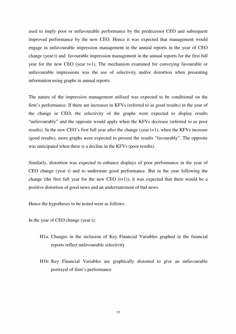
Hence the hypotheses to be tested were as follows:
In the year of CEO change (year t):
H1a: Changes in the inclusion of Key Financial Variables graphed in the financial
reports reflect unfavourable selectivity
H1b: Key Financial Variables are graphically distorted to give an unfavourable
portrayal of firm’s performance
16
In the year following the CEO change (year t+1):
H2a: Changes in the inclusion of Key Financial Variables graphed in the financial
reports reflect favourable selectivity
H2b: Key Financial Variables are graphically distorted to give a favourable portrayal of
firm’s performance
3.4 Sample Selection and Data Sources
The data for this project was obtained from the annual reports of listed companies on the New
Zealand Stock Exchange. The annual reports are available electronically in the NZ Datex
Database. At the time the data was gathered, the NZ Datex Database had electronic copies of
annual reports of listed New Zealand companies for the period 1996 to 2007. This became the
sample frame.
The data collection involved firstly identifying corporations who had new CEO appointments
during the 1997-2006 period. The CEO changes/appointments were obtained from the New
Zealand Stock Exchange Announcements. The Stock Exchange announcements were
analysed to determine when the change was effected. The year of change became year t for
that firm. Once the effective change period was determined, for those corporations that had a
CEO change/appointment, the annual reports of the year the appointment took place referred
to as (t), the year prior to the CEO change/appointment (t-1), and the year subsequent to the
year of CEO change (t+1) were gathered. These annual reports were then analysed to gather
selectivity and distortion measures. For selectivity these annual reports were examined to
determine which of the KFVs graphs were displayed. The next step was to measure distortion
in the graphs displayed by physically measuring the dimensions of the graphs and calculating
the GDI for each.
A total of 82 announcements of a change in CEO were identified during the period 1997 to
2006. Of those announcements, two changes were excluded because the firms also changed
their financial year dates, two changes were excluded because there were multiple intra-
period CEO changes during the period considered, and one change was excluded because of
17
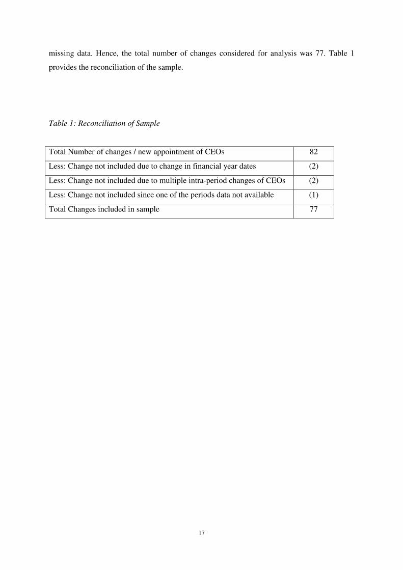
missing data. Hence, the total number of changes considered for analysis was 77. Table 1
provides the reconciliation of the sample.
Table 1: Reconciliation of Sample
Total Number of changes / new appointment of CEOs 82
Less: Change not included due to change in financial year dates (2)
Less: Change not included due to multiple intra-period changes of CEOs (2)
Less: Change not included since one of the periods data not available (1)
Total Changes included in sample 77
18
4 Results
Unfortunately the small number of CEO changes observed in the study period precludes
testing for statistical significance of the results obtained. Consequently only qualitative
results are presented.
4.1 Selectivity
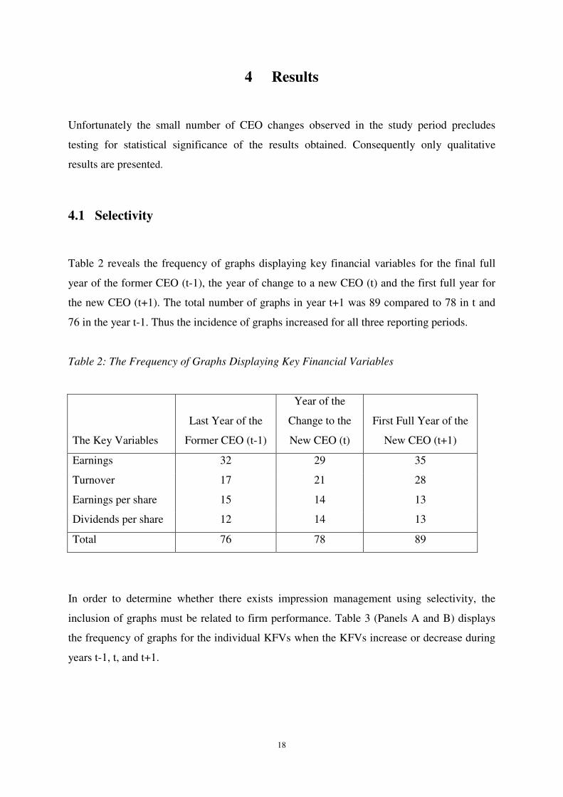
Table 2 reveals the frequency of graphs displaying key financial variables for the final full
year of the former CEO (t-1), the year of change to a new CEO (t) and the first full year for
the new CEO (t+1). The total number of graphs in year t+1 was 89 compared to 78 in t and
76 in the year t-1. Thus the incidence of graphs increased for all three reporting periods.
Table 2: The Frequency of Graphs Displaying Key Financial Variables
The Key Variables
Last Year of the
Former CEO (t-1)
Year of the
Change to the
New CEO (t)
First Full Year of the
New CEO (t+1)
Earnings 32 29 35
Turnover 17 21 28
Earnings per share 15 14 13
Dividends per share 12 14 13
Total 76 78 89
In order to determine whether there exists impression management using selectivity, the
inclusion of graphs must be related to firm performance. Table 3 (Panels A and B) displays
the frequency of graphs for the individual KFVs when the KFVs increase or decrease during
years t-1, t, and t+1.

19
Table 3: Frequency of Graphs Displaying Key financial Variables when the Key Financial
Variables Increase or Decrease
Panel A
The frequency of Graphs Displaying Key Financial Variables when the Key Financial
Variables Increase
The Key Variables
Last Year of the
Former CEO (t-1)
Year of the
Change to the
New CEO (t)
First Full Year of the
New CEO (t+1)
Earnings 23 17 25
Turnover 15 15 19
Earnings per share 8 11 4
Dividends per share 10 11 10
Total 56 54 58
Panel B
The frequency of Graphs Displaying Key Financial Variables when the Key Financial
Variables Decrease
The Key Variables
Last Year of the
Former CEO (t-1)
Year of the
Change to the
New CEO (t)
First Full Year of the
New CEO (t+1)
Earnings 9 12 10
Turnover 2 6 9
Earnings per share 7 3 9
Dividends per share 2 3 3
Total 20 24 31
From a cumulative perspective, when there were increases in the KFVs, the total frequency of
graphs for all KFVs in the years of change to a new CEO was 54 compared to 56 in the last
year of the former CEO. Overall this suggests that good results have been “unfavourably”
displayed. When there were increases in the KFVs, the total frequency of graphs in the first
full year for the new CEO was 58 compared to 54 in the year of change to new CEO
implying that good results have been “favourably” displayed.

20
When there were decreases in the KFVs, there were more graphs (24 in total) in the year of
the change to the new CEO when compared to the last full year of the former CEO (a total of
20) suggesting that poor results have been “favourably” displayed. However the total
frequency of graphs in the first full year of the new CEO was 31, which is 7 more when
compared to the year of the change to the new CEO which is contrary to the hypothesis.
The next section examines the presentations for the individual key financial variables.
4.1.1 Earnings
When earnings increased in the year of the change to a new CEO, the frequency of earnings
graphs decreased from 23 to 17 and in the first full year of the new CEO, the frequency of
graphs increased from 17 to 25. This is consistent with the hypothesis that good performance
is de-emphasised in the year of change to the new CEO and emphasised in the first full year
of the new CEO.
When earnings decreased, the frequency of graphs in the year of the change to a new CEO (t)
increased from 9 in the prior year to 12, while in the first full year of the new CEO (t+1) it
declined from 12 to 10. This is also consistent with the hypothesis that poor results are
emphasised in the year of the change to the new CEO and poor results are de-emphasised in
the first full year of the new CEO.
4.1.2 Turnover
Turnover data was inconclusive when turnover increased in the year of the change to the new
CEO, but it was supportive of the hypothesis in the first full year of the new CEO. When
turnover declined the hypothesis was supported in the year of the change to a new CEO, but
the data is inconsistent with the hypothesis in the first full year of the new CEO.

21
4.1.3 Earnings per Share
All the frequency data for earnings per share was contrary to the hypothesis.
4.1.4 Dividends per Share
When dividends per share increased, the data for both periods were inconsistent with the hypothesis.
When there was a decline in dividends per share, the data supported the hypothesis for the year of the
change to the new CEO (year t), but it was neutral with respect to the first full year of the new CEO
(year t+1).
4.2 Distortion
Table 4 provides the frequency details for distortion in graphs when the KFVs increase for
the years (t+1) and (t). The results reveal that when the KFVs increase, the earnings and
turnover graphs were more likely to display exaggeration in the first full year of the new CEO
compared to the year of the change to a new CEO. The results also reveal that when the
KFVs increased, earnings, turnover and dividends per share had more graphs depicting
understatement in the years of change compared to the first full years of the new CEO. When
all KFVs were considered in total, it was observed that when the KFVs increased, the
percentage of graphs exaggerating the KFVs in the first full year of the new CEO (t+1) was
much higher (76%) than the percentage (61%) in the year of the change to a new CEO (t).
Table 5 provides the frequency details of distortion in graphs when the KFVs decreased.
When the KFVs decreased, only earnings had fewer understatement of graphs in the first full
year of new CEO (t+1) compared to the year of change to the new CEO (t).
However, when there was a decrease in KFVs, more graphs were exaggerated (52%) in the
year of change to the new CEO than in the first full year of the new CEO of 48%. However, a
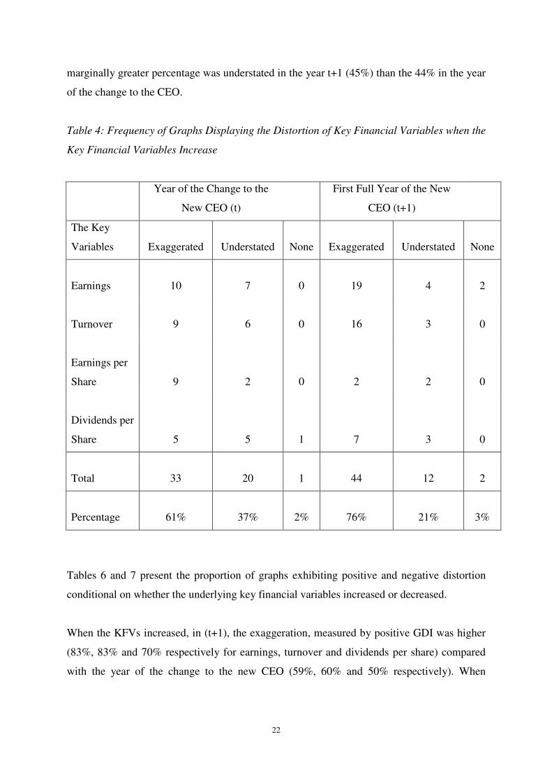
22
marginally greater percentage was understated in the year t+1 (45%) than the 44% in the year
of the change to the CEO.
Table 4: Frequency of Graphs Displaying the Distortion of Key Financial Variables when the
Key Financial Variables Increase
Year of the Change to the
New CEO (t)
First Full Year of the New
CEO (t+1)
The Key
Variables Exaggerated Understated
None Exaggerated Understated
None
Earnings 10 7
0 19 4
2
Turnover 9 6
0 16 3
0
Earnings per
Share 9 2
0 2 2
0
Dividends per
Share 5 5
1 7 3
0
Total 33 20
1 44 12
2
Percentage 61% 37%
2% 76% 21%
3%
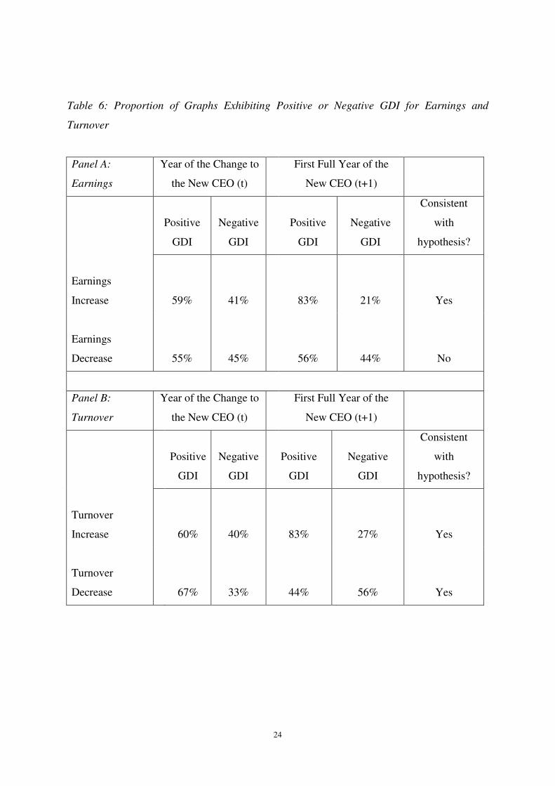
Tables 6 and 7 present the proportion of graphs exhibiting positive and negative distortion
conditional on whether the underlying key financial variables increased or decreased.
When the KFVs increased, in (t+1), the exaggeration, measured by positive GDI was higher
(83%, 83% and 70% respectively for earnings, turnover and dividends per share) compared
with the year of the change to the new CEO (59%, 60% and 50% respectively). When

23
turnover decreased, the year of the change to a new CEO had a greater proportion of
exaggeration (67% positive GDI) than the full first year of the new CEO (44% positive GDI)
Table 5: Frequency of Graphs Displaying the Distortion of Key Financial Variables when the
Key Financial Variables Decrease
Year of the Change to the
New CEO (t)
First Full Year of the New
CEO (t+1)
The Key
Variables Exaggerated Understated
None Exaggerated Understated
None
Earnings 6 5
1 5 4
1
Turnover 4 2
0 4 5
0
Earnings per
Share 1 2
0 4 4
1
Dividends per
Share 2 1
0 2 1
0
Total 13 11
1 15 14
2
Percentage 52% 44%
4% 48% 45%
7%
24
Table 6: Proportion of Graphs Exhibiting Positive or Negative GDI for Earnings and
Turnover
Panel A:
Earnings
Year of the Change to
the New CEO (t)
First Full Year of the
New CEO (t+1)
Positive
GDI
Negative
GDI
Positive
GDI
Negative
GDI
Consistent
with
hypothesis?
Earnings
Increase 59% 41%
83% 21%
Yes
Earnings
Decrease 55% 45%
56% 44%
No
Panel B:
Turnover
Year of the Change to
the New CEO (t)
First Full Year of the
New CEO (t+1)
Positive
GDI
Negative
GDI
Positive
GDI
Negative
GDI
Consistent
with
hypothesis?
Turnover
Increase
60% 40% 83% 27%
Yes
Turnover
Decrease
67% 33% 44% 56%
Yes
25
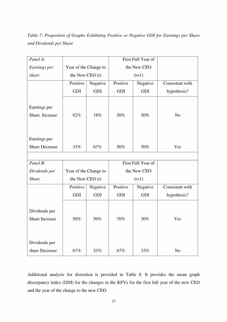
Table 7: Proportion of Graphs Exhibiting Positive or Negative GDI for Earnings per Share
and Dividends per Share
Panel A:
Earnings per
share
Year of the Change to
the New CEO (t)
First Full Year of
the New CEO
(t+1)
Positive
GDI
Negative
GDI
Positive
GDI
Negative
GDI
Consistent with
hypothesis?
Earnings per
Share Increase
82% 18% 50% 50%
No
Earnings per
Share Decrease
33% 67% 50% 50%
Yes
Panel B:
Dividends per
Share
Year of the Change to
the New CEO (t)
First Full Year of
the New CEO
(t+1)
Positive
GDI
Negative
GDI
Positive
GDI
Negative
GDI
Consistent with
hypothesis?
Dividends per
Share Increase
50% 50% 70% 30%
Yes
Dividends per
share Decrease
67% 33% 67% 33%
No
Additional analysis for distortion is provided in Table 8. It provides the mean graph
discrepancy index (GDI) for the changes in the KFVs for the first full year of the new CEO
and the year of the change to the new CEO.

26
Table 8: Mean Graph Discrepancy Index for each of the Key Financial Variables for each of
the Periods
Mean Graph Discrepancy
Index (GDI)
Year of the Change
to the New CEO (t)
First Full Year of
the New CEO
(t+1)
Consistent with
Hypothesis?
Earnings Increase 27.36 128.36
Yes
Earnings Decrease -5.66 -52.42
Yes
Turnover Increase 115.1 59.69
Yes
Turnover decrease 53.69 -91.62
Yes
Earnings per Share Increase -23.01 5.1
Yes
Earnings per Share Decrease -9.39 -31
Yes
Dividends per share Increase 3.13 88.41
Yes
Dividends per share Decrease -14.86 5.08
No
The results show that when earnings increased, the mean GDI in t+1 was 128.36 compared to
27.36 in the year of the change to the new CEO. This is consistent with exaggerating earnings
in the first full year of a new CEO compared to the year of the change in CEO. On the other
hand when earnings decreased, the GDI in t+1 was -52.42 compared to -5.66 in the year of
the change to the new CEO. This is consistent with the hypothesis that the new CEO
understates the bad earnings news graphically in his/her first full year relative to the year of
change.

27
When turnover decreased, there was an understatement (mean GDI = -91.62) in the first full
year of the new CEO and an exaggeration (mean GDI = 53.69) in the year of change to the
new CEO. This is consistent with the hypothesis. However when turnover increased, the
mean GDI in the first full year of the new CEO was 59.69 which suggests exaggeration but it
was lower compared with a GDI of 115.1 in the year of change to the new CEO. So the
hypothesis is not supported.
When earnings per share increased, there was an exaggeration (mean GDI = 5.1) in year t+1
while there was an understatement (mean GDI = -23.01) in year t. When earnings per share
decreased, there was an understatement (mean GDI = -31) in the first full year of the new
CEO (t+1). These results are consistent with the hypothesis.
For dividends per share, the results are mixed. When there was an increase, the mean GDI
was 88.41 in year t+1 suggesting exaggeration for the first full year of the new CEO and
consistent with the hypothesis. However in the year of change to the new CEO, the GDI was
3.13 which is inconsistent with the hypothesis. The results of GDI when dividends per share
decreased are inconsistent with the hypothesis since in year t the GDI was negative while in
the year t+1 it was positive.
Tables 9 and 10 provide more descriptive statistics for each of the KFVs for the year of
change to the new CEO and the new CEO’s first full year.

28
Table 9: Descriptive Statistics for Earnings and Turnover
N Mean GDI
Standard.
Deviation Minimum Maximum
Earnings in year t, Increase
17
27.3641
103.31250
-83.46
399.35
Earnings in year t+1, Increase
25
128.3612
420.05566
-133.38
2005.26
Earnings in year t, Decrease
12
-5.6575
72.94821
-207.79
116.67
Earnings in year t+1, Decrease
9
-
52.42
138.03663
-358.14
36.59
Turnover in year t, Increase
15
115.0700
360.72668
-39.79
1408.77
Turnover in t+1, Increase
19
59.6884
98.45716
-16.24
351.80
Turnover in t, Decrease
6
53.6883
135.47555
-89.87
305.26
Turnover in t+1, Decrease
9
-91.6178
225.03720
-671.43
40.63

29
Table 10: Descriptive Statistics for Earnings per Share and Dividends per Share
N Mean GDI
Standard
Deviation Minimum Maximum
Earnings per share in t, Increase
11
-23.0109
204.01500
-622.88
110.66
Earnings per share in t+1, Increase
4
5.0950
93.69983
-89.64
125.47
Earnings per share in t, Decrease
3
-9.3900
11.71248
-21.97
1.20
Earnings per share in t+1, Decrease
9
-31.0067
63.23287
-168.59
23.20
Dividends per share in t, Increase
11
3.1318
11.83320
-13.04
29.87
Dividends per share in t+1, Increase
10
88.4110
245.44434
-45.50
776.32
Dividends per share in t, Decrease
3
-14.8600
44.11203
-65.71
13.13
Dividends per share in t+1,
Decrease
3
5.0800
10.39795
-3.43
16.67
4.3 Discussion of Results
4.3.1 Selectivity

30
When firms have CEO changes, the incoming CEOs were predicted to have incentives to
highlight poor performance by the previous management by showing graphs of poor results
while dropping graphs that show good results. Hence, when the key financial variables
increase, it was hypothesised that there would be fewer graphs in the year of change to the
new CEO than the prior year. Alternatively when the key financial variables decrease, the
year of change to the new CEO (t) should have more graphs than the prior year. The results
supported the hypothesis for the key financial variables of “earnings”, “turnover” and
“dividends”. KFVs also cumulatively supported Hypothesis 1a where the number of graphs
in the year of the change to a new CEO (24 graphs) is higher than the number of graphs in the
prior year.
It was hypothesised (Hypothesis 2a) that when the key financial variables increase, the first
full year of the new CEO should have more graphs than in the year of the change to a new
CEO. The results for earnings and turnover are consistent with the hypothesis because the
number of graphs for earnings and turnover are higher in year t+1 (25 and 19 respectively)
compared to year t (17 and 15 respectively). Alternatively, when there was a decrease in
KFVs (poor results), the number of graphs in t+1 should be less than the number of graphs in
year t. The results for earnings are consistent with this hypothesis since when there was a
decrease in earnings, the number of graphs in the first full year of the new CEO (t+1) is less
(10 graphs) compared to the year of the change to a new CEO (12 graphs).
The selectivity results reveal that earnings and turnover were dominant in supporting the
impression management hypothesis. This result is consistent with the results of Beattie and
Jones (2000) study.
4.3.2 Distortion
In the year of the change to a new CEO, it was hypothesised (Hypothesis 1b) that the key
financial variables would be graphically distorted to give an unfavourable portrayal of a
firm’s performance. Hence when there was an increase in the KFVs (good results), graphs
were expected to be distorted by understating performance as measured by negative GDI.
Earnings per share was the only variable that was consistent with Hypothesis 1b. When there
was a decrease in KFVs, graphs were expected to be distorted by exaggerating poor

31
performance as measured by positive GDI. Turnover was the only variable that had a positive
GDI in the year of change to a new CEO. Hence the support for the hypothesis is weak.
It was also hypothesised that in the first full year of the new CEO, key financial variables
would be graphically distorted to give a favourable portrayal of the firm’s performance
(Hypothesis 2b). As such when there was an increase in the key financial variable, graphical
performance should be exaggerated as measured by a positive GDI. In the first full year of
the new CEO all KFVs showed positive GDI when the key financial variables increased.
These results support the hypothesis that there is exaggeration of KFVs when the KFVs
increase. The hypothesis also suggested that when there was a decrease in the KFVs, the new
CEO would understate them in year t+1, as measured by negative GDI. Earnings, turnover
and earnings per share display negative GDI providing further support for Hypothesis 2b.

32
5 Conclusion
5.1 Summary & Implications
This study focussed on whether new management uses impression management to influence
the presentation of performance in the firm’s annual reports surrounding a changeover in
CEO. The study considered the use or non-use of graphs for presenting information as well as
distortions in the graphs.
Only the presentation of graphs for earnings was consistent with the existence of impression
management using selectivity. The graphs for the other variables examined were not.
Distortion in turnover graphs was consistent with impression management, both when
turnover increased and decreased. However the results for earnings and earnings per share
were consistent with the impression management only when they declined. In all cases the
small size of the sample precluded tests for statistical significance.
Hence overall there is some evidence for impression management, but it is not strong. Thus
impression management as implemented through graphs does not appear to be used as widely
in New Zealand as in other jurisdictions where it has been studied.
5.2 Limitations
The primary limitation in this study is the sample size. The sample size, however, was
consistent with the size of the securities market in New Zealand. However the sample was not
large enough to produce results that could be subjected to statistical analysis. Also in all cases
even the individual KFVs data size was too small to test for statistical significance of the
results.

33
6 Reference List
Ackerman, D. 1991, A Natural History of the Senses. Random House, New York.
Beattie, V.A. and Jones, M.J. (1992), ‘The Use and Abuse of Graphs in Annual Reports:
Theoretical Framework and Empirical Study’, Accounting and Business Research,
Vol.22, pp. 291-303.
Beattie, V.A. and Jones, M.J. (1999), ‘Australian Financial Graphs: An Empirical Study’,
Abacus, Vol.35 (1), pp. 46-76
Beattie, V.A. and Jones, M.J. (2000), ‘Changing Graph Use in Corporate Annual Reports: A
Time Series Analysis’, Contemporary Accounting Research, Vol.17 (2), pp. 213-226
Clinch, G. and Magliolo, J. (1993), ‘CEO Compensation and Components of Earnings in
Bank Holding Companies’, Journal of Accounting and Economics, Vol.16, pp. 241-272
Dechow, P., Sloan R., and Sweeney, A. (1995), ‘Detecting Earnings Management’, The
Accounting Review, Vol.70, pp. 193-225
Eisenhardt, K. (1989). Agency theory: An assessment and review. Academy of Management
Review, 14(1): 57-74.
Elliot, J. and Shaw, W. (1988), ‘Write-Offs as Accounting Procedures to Manage
Perceptions’, Journal of Accounting Research, Vol. 26, Supplement, pp. 91-119
Fama, E.F. (1980), ‘Agency Problems and the Theory of the Firm’, Journal of Political
Economy, Vol. 88, No. 2, pp. 288-307
Frownfelter, C., and Fulkerson, C. (1998), ‘Linking the Incidence and Quality of Graphics in
Annual Reports to Corporate Performance: An International Comparison’, Advances in
Accounting Information Systems, Vol. 6, pp. 129-151
34
Gibbins, M., Richardson, A. and Waterhouse, J. (1990) ‘The Management of Corporate
Financial Disclosure: Opportunism, Ritualism, Policies and Processes’, Journal of
Accounting Research, Vol. 28, pp. 121-143.
Godfrey, J., Marther, P. and Ramsay, A. (2003), ‘Earnings and Impression Management in
Financial Reports: The Case of CEO Changes’, Abacus, Vol. 39, Issue 1, pp. 95-123.
Graves, O.F., Flescher, D.L. and Jordan, R.E. (1996), ‘Pictures and the Bottom Line: the
Television Epistemology of US Annual Reports’, Accounting, Organisations and Society,
Vol. 21, pp. 57-88.
Jensen, M.C. and W.H. Meckling. (1976), “Theory of the Firm: Managerial Behaviour, Agency Costs
and Ownership Structure”, Journal of Financial Economics 3 (4), pp. 305-360.
Johnson, J.R., Rice, R.R. and Roemmich, R.A. (1980), ‘Pictures that Lie: The abuse of
Graphs in Annual Reports’, Management Accounting, October, pp. 50-56
Mather, P., Ramsay, A. and Serry, A. (1996), ‘The Use and Representational Faithfulness of
Graphs in Annual Reports: Australian Evidence’, Australian Accounting Review,
September, pp. 56-63
Mather, P., Ramsay, A. and Steen, A. (2000), ‘The Use and Representational Faithfulness of
Graphs in IPO Prospectuses’, Accounting, Auditing and Accountability Journal, Vol. 13,
No. 1, pp. 65-83
Murphy, K. J., and Zimmerman, J.L. (1993), ‘Financial Performance Surrounding CEO
Turnover’, Journal of Accounting and Economics, January-July, pp. 273-315
Neu, D. (1991), Trust, Impression Management and the Auditing Profession, Critical
Perspectives on Accounting, pp. 295-313.
Pourciau, S. (1993) ‘Earnings Management and Nonroutine Executive Changes’, Journal of
Accounting and Economics, January-July, pp. 317-336
Revsine, L. (1989), ‘The Selective Financial Misrepresentation Hypothesis’, Accounting
Horizons, December, pp. 16-27

35
Schipper, K. (1989), ‘Commentary on Earnings Management’, Accounting Horizons,
December, pp. 91-102
Steinbart, P. J. (1989), ‘The Auditor's Responsibility for the Accuracy of Graphs in Annual
Reports: Some Evidence of the Need for Additional Guidance’, Accounting Horizons,
September, pp. 60-70
Strong, J., Meyer, J. (1987), ‘Asset Writedowns: Managerial Incentives and Security
Returns’, Journal of Finance, July, pp. 643-661
Taylor, B. G., and Anderson, L.K. (1986), ‘Misleading Graphs: Guidelines for the
Accountant’, Journal of Accountancy, October, pp. 126-128
Tufte, E. R. (1983), The Visual Display of Quantitative Information, Graphic Press.
Wells, P. (2002), ‘Earnings Management Surrounding CEO Changes’, Accounting and
Finance, Vol. 42, No. 2, pp. 169-193