Images i decided not to use for my music magazine middle pages.
3
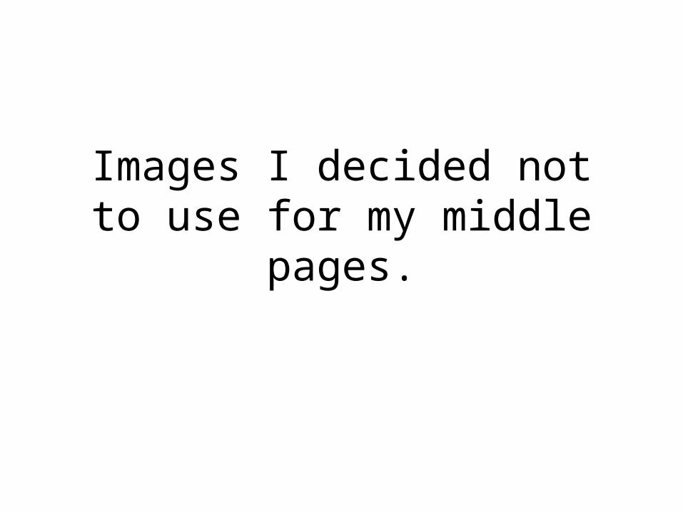
Images I decided not to use for my middle pages.
-
Upload
lauren8908 -
Category
Technology
-
view
150 -
download
0
Transcript of Images i decided not to use for my music magazine middle pages.
Images I decided not to use for my middle pages.
1
3
2
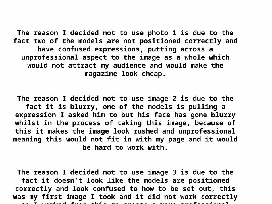
The reason I decided not to use photo 1 is due to the fact two of the models are not positioned correctly and have confused expressions,
putting across a unprofessional aspect to the image as a whole which would not attract my audience and would make the magazine look
cheap.
The reason I decided not to use image 2 is due to the fact it is blurry, one of the models is pulling a expression I asked him to but his face
has gone blurry whilst in the process of taking this image, because of this it makes the image look rushed and unprofessional meaning this
would not fit in with my page and it would be hard to work with.
The reason I decided not to use image 3 is due to the fact it doesn’t look like the models are positioned correctly and look confused to how
to be set out, this was my first image I took and it did not work correctly so I worked from this to create a more professional looking
image which would work with my magazine.


![The Dark Pages of the Middle Ages The Hungarian Chronicles ... · The Dark Pages of the Middle Ages written by Gyula Tóth May 4th 2006 [All footnotes are mine./Kartavirya] The Hungarian](https://static.fdocuments.in/doc/165x107/6055401725ea4540437271f7/the-dark-pages-of-the-middle-ages-the-hungarian-chronicles-the-dark-pages-of.jpg)